


Campos quita folha de aposentados e pensionistas com direito à insalubridade

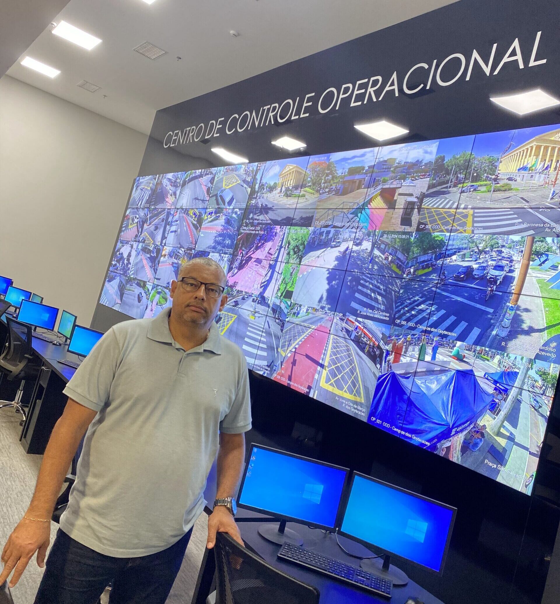
A Secretaria de Administração e Recursos Humanos da Prefeitura de Campos informou que foram quitados nesta sexta-feira (10) os proventos de aposentados e pensionistas com direito à insalubridade. Esta semana mais de R$ 111,8 milhões foram pagos pela Prefeitura de Campos em salários do funcionalismo municipal, aquecendo a economia local.
O secretário de Administração e Recursos Humanos, Wainer Teixeira, explica que conforme a diretriz do prefeito Wladimir Garotinho (sem partido) foram “adotadas todas as medidas técnicas e administrativas para assegurar, com a geração de uma folha complementar, o pagamento dos aposentados e pensionistas com direito à insalubridade”.


12544 Comments
Very interesting points you have mentioned, appreciate it for posting.Blog monetyze
Was wäre ein Online Casino ohne einen verlockenden, üppigen Willkommensbonus?
Zwar gibt es genau das – über 1.500 Spiele,
mit denen man sich nicht nur die Zeit versüßen kann, sondern mit denen man, wenn
man möchte, vor allem auch sehr viel gewinnen kann. Und wir wollten immer mehr als „nur“
viele sehr gute und spannende Casinospiele anbieten. Das betrifft
keineswegs nur die Casinoboni, über die wir hier ausführlich schreiben werden, sondern das gesamte Angebot.
Glücksspiele um echtes Geld werden durch uns nicht angeboten. Die Vertrauenswürdigkeit einer Casinoplattform
ist von entscheidender Bedeutung.
So kann man sich sicher sein, dass man eine sichere
und innovative Glücksspiele-Erfahrung machen kann, wenn man bei uns
spielt. So kann jeder Spieler einige Games entdecken, die perfekt zu
den eigenen Vorstellungen passen und es gibt immer wieder neue Spiele zu finden. Die mobile Version passt sich instantly
an die Bildschirmgröße Ihres Geräts und bietet somit schnellem Zugriff auf alle Spiele
und Funktionen – rund um die Uhr und überall.
Der Bonus reicht von 50 bis 135 % und als weitere Leckerbissen gibt es 25 bis 100 Freispiele.
Bei einer Einzahlung vom Mindestbetrag 100€ gilt zusätzlich 100% Bonus bis
3.000€ + 100 Freispiele.
Wie Sie sich den 800€ Willkommensbonus und bis zu 200 Free Spins sichern können, verraten wir Ihnen nun in unseren Hit’n’Spin Casino Erfahrungen. Dann finden Sie diesen auf der Seite der Aktionen – dort, wo der jeweilige
Bonus beschrieben ist. Er beschert Bonusgeld und Freispiele.
Der Willkommensbonus ist der bekannteste Bonus. Nun wissen Sie über die Vielfalt der Casinoboni bei Hit’n’Spin Bescheid.
References:
https://online-spielhallen.de/amunra-casino-promo-code-deine-vorteile-im-detail/
None of us ever expects to be in a situation where an air ambulance is called,
but if it does happen, out-of-pocket bills can be monumental.
PHI Air Medical is the leading air ambulance provider in the United States.
Maintenance professionals are required to release long-range aircraft for each air ambulance flight and accept the aircraft
upon return. As an FAA-certified Air Carrier with worldwide operating authority, our air ambulance fleet consists of Part 135 ATP Certified flight crew that are simulator trained annually and
are type-specific rated.
A 2023 study reported that GPT-4 obtained a better score
than 99% of humans on the Torrance Tests of Creative Thinking.
The company announced a slew of generative AI-powered features to counter OpenAI and Microsoft.
Their leaders emphasized their earlier caution regarding public deployment was due
to the trust the public places in Google Search. ChatGPT gained
one million users in five days and 100 million in two months, becoming the
fastest-growing internet application in history. Kelsey Piper of Vox wrote that “ChatGPT is the general public’s first hands-on introduction to how powerful modern AI has gotten” and that ChatGPT is “smart enough to be useful despite its flaws”.
As before, OpenAI has not disclosed technical details such as the
exact number of parameters or the composition of its training dataset.
References:
https://blackcoin.co/60_platinum-club-vip-casino_rewrite_1/
Neospin is the most trusted online casino in Australia, but it’s far from the only one.
Some Australian online gambling sites use shady tactics that put your money and data at risk.
Do you feel like you’re ready to get up and running with
a new Australian online casino account? The downside is that some fast payout casinos exclude e-wallet deposits from bonus eligibility,
and transaction fees may apply depending on the service.
For casino players, it means fast deposits without needing to type in long BSB or account numbers.
Therefore, go only for trustworthy casino sites like
the ones we have picked for you. No matter how lucky you are, if you sign up with
a rogue casino, you can have a disappointing experience. The top-rated Aussie casinos typically don’t charge transaction fees.
Reading the bonus policy is of the utmost importance as
it will tell you how to claim and use the bonuses.
Starting your online casino journey should be fun, not overwhelming.
Now you’re officially part of the online casino world!
In Australia you can even find some no deposit bonus casinos.
Digital versions of the instant-win favourite, online scratch
cards offer quick and easy gameplay. Bingo is a
straightforward yet thrilling game that can now be played online, players mark off numbers on their cards as they’re called
out. With Casino Buddies you can play, have fun and win real money!
online casino uk paypal
References:
stayzada.com
casino online uk paypal
References:
https://udyogseba.com/employer/online-casinos-that-accept-paypal-in-the-united-states/
office space manhattan https://offices-rent-nyc.com
пин ап скачать бесплатно pin-up казино играть
Volvo в Україні обслуговування спецтехніки екскаватори, фронтальні навантажувачі та дорожні машини. Надійність, ефективність і сучасні рішення для будівництва. Продаж, підбір і обслуговування техніки для бізнесу.
pin up зеркало pin-up скачать бесплатно
Нужны заклепки? заклепки вытяжные алюминиевые 2.4 мм прочный крепеж для соединения деталей. Алюминиевые, стальные и нержавеющие варианты. Надежность, долговечность и удобство монтажа для различных задач и конструкций.
nyc office for lease office spaces in nyc
место ответственного хранения цены ответственного хранения
дизайн студия интерьера москва заказать дизайн интерьера квартиры в москве
Do you trade cryptocurrencies? bitkelttrade honest review automate your transactions and earn passive income. Smart algorithms analyze the market and help you make decisions. Increase your income and reduce risks with modern technology.
изготовление флагов спб флаг на заказ спб
Хочешь оригинальную подушку? дакимакура подушка обнимашка комфорт и уют для сна. Длинная форма, мягкий наполнитель и стильные принты. Отлично подходит для отдыха и расслабления.
Нужен пластический хирург? клиника пластической хирургии современные операции и эстетические процедуры. Опытные хирурги, безопасные методики и индивидуальный подход. Консультации, диагностика и качественный результат.
Нужна мебель? https://mebel-dub-zakaz.ru эксклюзивные изделия из натурального дерева. Индивидуальный дизайн, качественные материалы и точное изготовление. Решения для дома и бизнеса.
Нужна премиум мебель? мебель на заказ изготовление на заказ. Натуральные материалы, эксклюзивный дизайн и долговечность. Решения для дома и бизнеса с высоким уровнем качества.
купить премиальную мебель изготовление мебели из массива на заказ
Лучший выбор дня: https://buy-similarwebtraffic.com
Following a step by step guide to launching Snapchat branded lenses in 2026 eliminates common deployment mistakes and accelerates your path to measurable results. The lens creation pipeline has evolved significantly since earlier years, with new approval workflows, audience targeting layers, and performance metrics now integrated directly into Snapchat’s business dashboard. Brands can now apply advanced segmentation based on user interests, location, and device type, ensuring your lens reaches the right demographic at the optimal moment. Distribution strategy matters equally—knowing how to leverage Explore, Spotlight, and direct user sharing channels multiplies your lens exposure without proportional ad spend increases. E-commerce brands, entertainment properties, and consumer-facing companies see the strongest ROI when lens launches align with seasonal campaigns or product drops.
Implementing proven Twitter ad copywriting techniques to boost engagement transforms how brands communicate value in a crowded feed where attention spans are measured in seconds. Many advertisers struggle to differentiate their message or fail to align their copy with audience expectations and platform norms, resulting in wasted ad spend. The analysis provided here examines high-performing case studies side-by-side with underperforming alternatives, pinpointing exactly what makes the difference in click-through rates and conversions. You’ll learn how sentence rhythm, power words, and strategic use of emojis or line breaks enhance readability and memorability without compromising professionalism. For performance marketers, growth teams, and in-house advertisers, these battle-tested techniques serve as a repeatable blueprint for scaling Twitter campaigns consistently and predictably.
While casually checking different pages online, I came across this riverfront boutique hall and I just stumbled here, and honestly the vibe feels quite welcoming today, creating a friendly and relaxed browsing atmosphere.
While analyzing various web-based marketplace mockups for UX efficiency and design consistency, I navigated a catalog layout where Canyon Lemon Shop Network appeared within a product recommendation area, and the browsing felt natural while moving through sections – everything was organized and responsive without delays.
During analysis of retail guild systems, I found that consistent layout patterns help users build familiarity quickly, reducing the time needed to understand how navigation works Guild Retail Directory Hub improving usability and flow – The interface remains clean and logically organized, making exploration feel natural and straightforward throughout the browsing session
While comparing e-commerce platforms designed for simplicity and structure, a standout example is Brook Gilded Experience District which maintains nice visual balance and navigation works without any confusion, ensuring a calm and intuitive browsing experience across all sections.
While comparing multiple handcrafted product exchange platforms for usability benchmarking I found ember willow commerce hub page during my review of layout consistency and navigation design – It felt easy to explore and well structured, with clear sections that made the entire browsing process feel efficient and uncomplicated.
In the process of analyzing modern vendor website designs for performance testing, I came across a site that stood out once I opened Frosty Shore Studio – the layout felt clean, and every interaction responded quickly without any noticeable lag or loading issues.
While browsing through several online sources, I encountered a polished coastal corner and I appreciated how everything was arranged, making the experience much more enjoyable and easy to engage with.
While analyzing ecommerce UI mockups for structure and navigation flow I came across a browsing interface containing a href=”//opalgladeboutiquehall.shop/](https://opalgladeboutiquehall.shop/)” />Boutique Hall Opal Glade Hub embedded in a structured grid layout, – I like the clean layout, everything is easy to locate and view allowing users to browse content comfortably without distraction or visual overload
While reviewing online shopping systems designed for clarity and flow, a standout example is Harbor Sage Commerce Vault which ensures clean design and content is arranged in a logical order, delivering a smooth and organized browsing journey across all pages.
As I continued checking various resources, I came across something that seemed worth noting visit this link and it might actually provide additional clarity on aspects that are otherwise unclear
During an in-depth UX study of ecommerce prototypes focused on navigation behavior and visual clarity I encountered a product section featuring Valley Hall Boutique Opal Store within a grid layout – the design felt minimal and effective and made it easy to browse without getting overwhelmed by unnecessary elements.
While reviewing different online design portfolios and user experience examples, I noticed something embedded mid-content check design site and it is a website with simple elegant design and very easy navigation experience
While reviewing different plant care and gardening inspiration platforms, I noticed something embedded mid-content check this page and it provides beautiful gardening content that feels calming and highly informative for beginners today
Across various marketplace usability comparisons, a notable platform is Forest Frost Market Vault which maintains the design feels balanced and content is clearly organized, ensuring a stable and visually consistent browsing experience across all categories.
As I continued browsing document management and workflow websites, I found something placed within the text see document site and it appears to be a useful document solutions platform that is efficient, organized, and user friendly
While going through various project-focused websites and informational pages, I encountered something mid-content visit this page and it is nicely organized and informative, making it definitely worth checking out overall
While going through various informational and academic sources, I noticed something placed within the content take this link and it appears to be quite informative, potentially useful for many people
As I was going through various pet art and animal-themed print websites, I encountered something within the text explore this pet art page and it provides adorable pet-related prints that are highly recommended for animal lovers everywhere
In the middle of exploring various informational and structured websites, I came across something that stood out see this page and after checking it briefly, it has a clean layout and makes browsing feel smooth and very easy to follow
While reviewing different public wellness and vaccine awareness platforms, I noticed something embedded mid-content check this page and it serves as a helpful vaccination resource that is clear and community oriented
During a comparative UX review of digital storefront prototypes for interface clarity and usability I navigated a product feed featuring a href=”//forestcovegoodsmarket.shop/](https://forestcovegoodsmarket.shop/)” />Cove Goods Forest Market Exchange within a grid system, – The layout is simple and helps users move around without confusion making the browsing experience smooth, clear, and very easy to use
While checking out independent news outlets and community discussion platforms, I discovered community opinion hub – The writing reflects local concerns, and certain perspectives are thoughtful enough to revisit for a deeper look.
In the middle of reviewing election campaign websites and political outreach pages, I found something that caught my attention explore candidate site and it is a campaign website with clear messaging and strong local political engagement
While going through different positivity and happiness-focused websites, I encountered something mid-content visit this smile page and it has a light cheerful vibe, with content that feels uplifting and naturally enjoyable throughout
While comparing several marketplace-style vendor dashboards, I noticed that consistent design patterns significantly improve user orientation Orchard Trade Ruby Center – Users benefit from a predictable layout that helps them quickly understand where different types of information are located.
Find out why – The step-by-step approach here ensures no one gets lost, regardless of their prior knowledge level.
While going through various online dialogue platforms and community boards, I noticed something within the content Northern community voices and it seems like an engaging platform for meaningful discussions with active participation
While going through various illustration and digital art platforms, I noticed something within the content discover more here and it is very artistic and expressive, making the visuals enjoyable to browse and explore overall
thepaleomomconsulting.com – Nutrition consulting site focused on paleo lifestyle guidance for clients
While browsing through tech innovation and lab-focused pages, I noticed something mid-content check research site and it features a clean design with an interesting focus, making it feel like a strong and solid resource
After being intrigued by the name of this offbeat website – I stuck around to explore, and found that the articles and ideas inside are every bit as unconventional and entertaining as the title promised.
What makes this supportive business site stand out – Is the consistent quality of the advice, giving you good reason to return regularly and see what new ideas have been added.
While exploring entertainment and sports mashup websites online, I came across fun celeb volleyball page – It’s a weird but funny combination that doesn’t really make sense at first, yet somehow feels entertaining to scroll through.
What makes this clinic information site so effective – Is that the design never gets in the way of the content, allowing you to read important health details in a calm and orderly environment.
While casually checking different websites, I came across this tidy marketplace link and everything seemed neat and easy to access, which I really like as it keeps the experience clean and straightforward.
During a casual browsing session across different stylish websites, something caught my attention while reviewing multiple links, have a look, and it feels fresh and easy to browse, offering a smooth and user-friendly experience
I was casually reviewing various digital project websites when something stood out in context, explore project page, and the site delivers organized content with a clear focus on informative structure and usability overall
At some stage during my browsing session, I encountered something that looked interesting enough to stand out slightly, read more here, and I’d say the content seems quite decent and possibly worth spending more time exploring
In the process of looking for well-designed shopping hub listings and boutique directories, I encountered a site at Hidden Retail Experience that seemed thoughtfully arranged and it left a positive impression on me because it made browsing feel simple, intuitive, and genuinely enjoyable for extended exploration sessions.
During a casual browsing session across themed entertainment pages, something appeared in the middle of content, have a look, and it offers a fun spooky experience with an engaging haunted vibe overall
Families exploring enrichment options for children often appreciate platforms that provide accessible educational content and activity ideas, especially when they discover kids activity guide included in curated recommendations that promote consistent learning – This line highlights how practical resources can help parents create fun and effective developmental routines for kids.
While evaluating modern e-commerce systems built for user experience, a notable example is Pebble Willow Trade Studio where everything feels tidy and the experience is quite user friendly, allowing users to interact with content in a simple and efficient manner.
During a routine search across dessert and recipe platforms, I noticed something embedded in content, go to this link, and the site is clean, fast loading, and smooth to use which makes browsing very comfortable
Across various e-commerce usability analyses, a notable platform is Orchard Lantern Market Hub Lounge which delivers smooth browsing with a calm design and easy page transitions, ensuring a consistent and visually balanced experience across all pages.
While exploring opinion based discussion platforms online, I came across something naturally placed within the content flow, visit northern views forum, and it shares diverse perspectives in an engaging and readable format overall
People interested in expanding their cultural awareness frequently rely on digital platforms that showcase local art events and educational programs, and they might discover artistic culture portal – This site offers exhibitions, workshops, and community initiatives that promote creativity and collaboration.
As I explored different winter-themed event pages online, I encountered learn more here – The presentation feels fresh and inviting, offering useful information in a way that is easy to understand and pleasant to navigate through without feeling overwhelming.
In evaluations of modern retail systems focused on structure and usability, a strong example is Lemon Brook Global Corner where easy to navigate and everything is clearly presented without clutter, helping users access information quickly without unnecessary complexity.
While going through multiple team based websites, I found something in the middle of everything, see collaboration page, and it provides a useful and well organized community structure overall
While browsing optimized online tools, I found open hiper free speed hub – The interface is clean and efficient, with fast loading pages and smooth functionality that makes everything feel well designed and easy to use.
mitchwantssununu.com – Interesting concept site, content feels direct and somewhat thought provoking today
Users who prefer simple countryside ecommerce environments often engage with sites such as Wheat Cove Rustic Trade Hub where product presentation is clean and easy to follow – The interface creates a pleasant browsing flow that feels relaxed, intuitive, and aligned with a warm rustic aesthetic.
In the process of browsing seasonal event websites, I discovered this festival hub – The presentation feels clean and engaging, making it easy for users to navigate while enjoying fresh and helpful content throughout the site.
People who enjoy well structured online shopping often engage with sites like Sun Cove Goods District Flow Hub where items are arranged in a bright and simple layout – The browsing experience feels intuitive and pleasant, allowing users to explore products quickly and comfortably.
When analyzing modern retail systems built for structure and clarity, a strong example is Glade Frost Network Vault which maintains feels structured and simple, making it easy to explore content, providing users with a calm, organized, and visually consistent interface throughout the site.
While browsing detailed Hawaiian accommodation listings, I discovered a boutique property page with strong presentation quality online and recently viewed < big island inn profile – The information is clear and inviting, offering a well balanced overview of comfort, scenery, and guest experience overall feel
While browsing opinion oriented personal websites that focus on direct messaging and reflective commentary I came across a platform featuring political commentary hub – the content feels straightforward in tone and sometimes encourages deeper thinking about current viewpoints and public discourse in a fairly minimal presentation style overall
Shoppers interested in curated marketplaces often prefer interfaces that reduce clutter and present items in a clean, well organized hierarchy for faster discovery gildedcove market emporium – The design enhances usability through structured sections, making browsing feel effortless, visually clear, and consistently refined across the entire platform.
Users who appreciate practical online marketplaces often browse sites such as Kettle Harbor Commerce Network Hub where products are presented in a structured layout – The interface creates a browsing experience that feels organized, easy, and easy to follow throughout the store.
In comparisons of modern shopping platforms focused on usability and flow, a strong example is Brook Goods Gilded District which maintains nice visual balance and navigation works without any confusion, providing a calm and structured browsing experience across all pages.
As I examined several winter event pages, I came across discover more here – The site feels fresh and enjoyable to browse, offering well presented information that is both helpful and easy to understand.
Users who appreciate well structured ecommerce stores often browse platforms such as Cove Sun Goods Marketplace District where products are displayed in a bright and organized layout – The interface ensures smooth navigation and a pleasant browsing flow that makes shopping feel easy and accessible.
People who enjoy design focused online shopping often find value in platforms like Trail Wave Artisan Collective where products are arranged with careful attention to visual structure and aesthetic appeal – The interface creates a curated shopping experience that feels both organized and creative, helping users easily explore items without visual clutter or confusion.
People browsing curated ecommerce hubs often respond well to vault designs that prioritize consistency and make browsing feel calm and structured across all pages Harbor Glass Vault Exchange – The layout is polished and minimal, offering a visually clean experience where users can easily explore products without distraction.
modelscanvas.com – Creative portfolio vibe, visuals and layout feel clean and professional design
While researching alternative supermarket style digital platforms, I found a unique conceptual store website that emphasizes simplicity and clarity in its structure virtual hope grocery hub – The design feels minimal but functional, presenting information in a way that is easy to follow and understand quickly
I was going through multiple political commentary pages when something appeared naturally in context, visit here now, and the site works fine overall with a clean, user-friendly layout that is easy to understand
As I continued exploring real estate platforms, I found something naturally embedded in context, discover listing site, and the site looks professional with well structured pages and easy navigation for property information
While reviewing digital storefront systems designed for clarity and performance, a standout example is Glade Night Commerce House which ensures everything feels straightforward and browsing is comfortable and stable, delivering a distraction free and intuitive browsing experience.
During my comparison of similar foundations, I encountered see more info – The content is clear and easy to follow, presenting practical insights in a way that feels accessible and helpful for a wide audience.
Users who prefer expressive digital marketplaces often explore sites such as Teal Cove Atelier Vendor Craft Hub where products are presented in a stylish and organized layout – The design enhances browsing flow, making it feel creative, structured, and visually consistent across all sections.
Users who appreciate accessible vendor platforms often browse sites such as Vendor Apricot Meadow Works Hub where content is structured neatly – The design ensures clarity, ease of access, and smooth navigation across all categories.
While searching for artistic portfolio websites I discovered a clean and modern layout that presents work in an organized format using visual artist portfolio page – the design feels balanced and visually appealing making it easy to browse through different showcased content
Shoppers who prefer friendly and accessible online stores often explore platforms designed for simplicity, particularly when visiting sites such as Cove Friendly Store where the interface is welcoming and easy to understand, supporting users of all experience levels – The friendly design creates an approachable shopping experience that feels intuitive and stress-free
While researching luxury beverage brands online, I came across a beautifully designed winery website that emphasizes both product detail and brand identity iniskillin wine detail portal – The wine information is detailed and appealing, creating a professional and polished overall browsing experience
During a casual browsing session across discussion platforms, something caught my attention in the middle, have a look, and everything works fine with a clean and user-friendly design that feels straightforward
While scanning through judicial campaign websites, something caught my attention in the flow, click to view, and the platform presents structured messaging with a clear and informative layout style overall
When analyzing modern storefront systems focused on usability, a standout example is Sage Harbor Shopping Vault where clean design and content is arranged in a logical order, making browsing feel natural, simple, and intuitive for users at every step.
While analyzing different environmental awareness websites, I noticed use this resource – The layout is clean and structured, making it easy for users to appreciate the effort and care put into presenting the information clearly.
People who enjoy structured online commerce environments often engage with sites like Harbor Teal Commerce Category Hub where items are arranged in clearly defined sections – The design ensures browsing feels simple, fast, and efficient, helping users quickly explore different product categories.
Users browsing curated online shops often prefer collective style platforms where organization and clarity enhance the overall shopping experience and reduce cognitive load Ridge Collective Glade Store – The design feels modern and streamlined, with a focus on simple navigation and visually consistent product presentation across all categories.
While browsing visually themed online platforms I discovered a nostalgic site that emphasizes design and mood through retro visual storytelling hub – the experience feels engaging and thoughtfully presented with a strong sense of thematic identity
Volunteer organizers and social care experts often assess community aid programs when studying how support systems operate locally relief_and_help_desk that provide accessible assistance services and structured outreach efforts aimed at supporting individuals in need of guidance and care – The initiative is noted for its practical help services and consistent commitment to community wellbeing
While exploring unique digital design experiments, I found a website that focuses on structured creativity and experimental presentation methods abstract creative layout project – The design feels innovative and well structured in an experimental way, offering a distinct and engaging browsing experience overall
Users who enjoy creative handmade marketplaces often explore platforms such as Brook Artisan Lifestyle Store where product presentation reflects strong craftsmanship values – The browsing experience is designed to feel warm and authentic, allowing users to connect with the artisan story behind each curated item.
Across multiple online shopping comparisons emphasizing usability, a standout platform is Amber Summit Experience Marketplace where smooth experience overall, pages feel fast and easy to use, making browsing feel natural, calm, and highly intuitive across all sections.
As I browsed various musician platforms online, I encountered learn more here – The design is easy to follow and uncluttered, helping visitors quickly find what they are looking for without feeling overwhelmed by unnecessary elements.
People who enjoy modern online commerce systems often engage with sites like Harbor Trail Organized Commerce Hub where items are grouped clearly for easy browsing – The interface creates a clean navigation flow that feels intuitive, efficient, and user friendly from start to finish.
Users exploring premium ecommerce emporiums often notice how structured visual layouts improve clarity and help highlight product details in a more refined browsing environment Glass Harbor Emporium Hub – The polished emporium design presents items in a clean and elegant structure, making browsing smooth, visually organized, and easy to navigate throughout the entire experience.
nomeansnoshow.com – Strong identity here, site feels bold and creatively expressive throughout pages
While exploring personal website designs and portfolio showcases, I found a well crafted profile page with strong clarity and structure oconnor digital identity hub – The page feels professional, with smooth navigation and information that is clearly organized and easy to digest
In reviews of digital commerce systems focused on structure and usability, a strong example is Lakefront Icicle Trade Mart which ensures simple layout and information is easy to find at a glance, supporting a seamless and efficient browsing journey across the platform.
People who enjoy minimal ecommerce design prefer websites that prioritize clarity and structured browsing when encountering platforms like Warm Goods Depot where earthy branding organized product grouping makes discovery intuitive visually soothing users – Navigation is intentionally simple allowing visitors to move through sections smoothly without cognitive overload
During an exploration of elegant and soft-themed marketplace platforms, I discovered visit velvet marketplace page – The design is smooth and delicate, and users can move through sections easily with a calm browsing experience.
Users who appreciate calm ecommerce design often browse platforms such as Wave Coastal Harbor Relax Hub Outpost where products are arranged in a clean and soothing format – The design ensures browsing feels pleasant, easy, and visually balanced throughout the entire store experience.
While analyzing different celebration websites, I noticed use this site – The content is consistently well presented, and the overall experience feels engaging, with a layout that supports easy browsing and clear understanding.
Users exploring modern ecommerce emporiums often notice how strong visual identity improves navigation clarity and helps maintain consistency across structured product categories and curated collections Glass Stone Emporium Hub – The site presents a strong and structured visual identity where every section feels consistent, making browsing smooth, organized, and easy to understand across all pages.
While exploring a variety of modern commerce hub websites and evaluating user experience quality, I came across explore linen meadow commerce hub – The site feels very smooth to browse, and the overall experience is enjoyable with clean structure and easy navigation throughout.
While exploring creative portfolios and expressive platforms I discovered a site that emphasizes bold design choices including art driven web hub – the site feels confident and visually rich providing an engaging browsing journey from start to finish
recoverynowny – Recovery support network provides guidance and helpful community resources daily
During a final comparison of retail atelier websites, I found see mint orchard retail atelier hub page – This is definitely a place I’ll return to for the holiday season since the browsing experience is smooth, pleasant, and well organized.
Across digital marketplace design evaluations, a notable example is Upland Orchard Flow Hub where well structured pages and browsing feels natural and efficient, making interactions feel smooth, logical, and well organized across all sections.
While browsing unique cultural fusion websites, I discovered a platform that mixes different stylistic and thematic elements in an appealing digital presentation brooklyn jeddah fusion hub – The experience feels engaging and culturally diverse, offering a creative blend of ideas that keeps the content visually interesting
I was going through various charity and awareness resources when something appeared right in the middle of the content, visit here now, and it offers a clean interface that makes the browsing experience feel very comfortable and smooth
As I continued exploring food inspired websites, I found something placed within the flow, discover dessert page, and it presents visually engaging content that feels rich and tasty overall
People who prefer creative artisan shopping experiences often explore sites like Cove Artisan Wind Design Market Hub where items are displayed in a neat and curated structure – The interface creates a smooth browsing experience that feels organized, modern, and easy to navigate.
Elegant ecommerce galleries prioritize minimal design principles and refined product presentation Cove Gold Elegant Gallery – The layout ensures smooth browsing with structured categories consistent styling and intuitive navigation enabling users to explore products easily while maintaining focus on clarity aesthetics and a cohesive visual experience that enhances overall engagement and satisfaction today platform experience online flow
While reviewing different informational and trust-focused platforms online, I came across visit this trust site – The presentation feels reliable and well structured, and the information provided appears valuable, making it easy for users to understand the purpose clearly.
oakmeadowcommercehub – Commerce hub feels organized, categories are clear and easy browsing
Online shoppers looking for craft based platforms often prioritize ease of use and variety and may discover violet harbor creative goods hub presenting handcrafted items in structured categories for seamless browsing and discovery – The platform provides a relaxed and engaging environment for exploring artisan products.
nutschassociates.com – Professional services look solid, information is clear and easy to follow
uplandcovevendorcorner – Vendor corner feels helpful easy browsing and clean layout overall
While analyzing modern online retail platforms built for usability, a notable example is Frost Lakefront Trade Vault where clean interface and everything is easy to navigate without effort, helping users explore products without unnecessary complexity or visual distraction.
Users exploring simple ecommerce outlet designs often appreciate how clean layouts improve usability when browsing platforms such as Harbor Stone Discount Outlet Hub where products are arranged in a straightforward structure that makes browsing fast and intuitive – The outlet store setup is simple and practical, allowing users to quickly locate items without confusion while maintaining a clean and easy to navigate shopping experience.
While exploring artistic and culturally mixed digital platforms, I found a site that merges different themes into a visually engaging structure jeddah brooklyn culture portal – The website feels unique and diverse, with an engaging presentation that blends cultural ideas in a creative and thoughtful manner
People who prefer minimal soothing gallery designs often explore sites like Dawnstone Art Galleria Hub where content is displayed in a calm structured layout – The design makes browsing feel relaxing, smooth, and visually easy on the eyes.
While reviewing various health lifestyle resources, I encountered discover this clean eating site – The presentation feels structured and easy to navigate, making the overall experience smooth and enjoyable for users.
While browsing business oriented websites I found a platform that highlights organization and clarity including corporate info center – the interface feels polished and user friendly making it easy to explore different sections with minimal effort
Users interested in collective style ecommerce environments often enjoy platforms like Pine Trader Network Hub where products are curated through a shared marketplace model that encourages variety and interaction – The design feels dynamic and community centered, making browsing feel like participation in an active trading ecosystem rather than a static store.
When analyzing modern retail systems built for structure and clarity, a strong example is Forest Frost Network Vault which maintains the design feels balanced and content is clearly organized, providing users with a calm, organized, and visually consistent interface.
People who prefer fresh aesthetic ecommerce platforms often explore sites like Isle Icicle Fresh Market Hub where items are presented in a cool and minimal style – The interface enhances usability and visual clarity, making browsing feel easy, refreshing, and highly organized from start to finish.
I didn’t expect much while browsing randomly, but something appeared that caught my attention, check portfolio site, and it clearly showcases work and ideas in a professional and well organized way overall
Exploring various niche entertainment sites led me to a page that presents sports fandom in a very relaxed and approachable way hutcherson volleyball corner – It delivers a casual browsing experience with simple structure and enjoyable tone that makes the content feel smooth and approachable for any reader
While exploring random web pages, I encountered view this visual collection – I came across it by chance, but it appears useful overall, providing content that feels simple, clean, and accessible.
pair-dating.com – Dating concept looks simple, interface feels straightforward and user friendly experience
Journalists covering elections often reference candidate websites to track policy positions and evaluate how effectively campaign messages are communicated to the public voter_update_center – The platform provides clear campaign goals and engagement updates designed to keep voters informed and connected with ongoing developments throughout the election period
Shoppers who appreciate friendly and simple online store layouts often enjoy visiting sites like Cove Relaxed Bazaar which emphasizes user comfort and easy product discovery – The design approach ensures that navigation remains straightforward and enjoyable from homepage to checkout process
People who value practical online stores often explore sites such as Stone Glade Outpost Utility Market where product listings are presented in a minimal layout – The interface focuses on usability and structure, making browsing feel smooth, clear, and highly functional throughout the shopping experience.
As I browsed different creative travel shoot sites, I noticed explore this visual travel site – The pages load quickly and the structure is easy to understand, creating a smooth and enjoyable browsing experience.
While reviewing real estate listing platforms I discovered a site that organizes Kaufman County properties in a clean and accessible way kaufman homes directory tool – It offers a smooth browsing experience with easy to read listings and practical navigation for home seekers
While exploring different online dating hubs I came across a platform built around connection building page – the design feels accessible and the navigation helps users move smoothly through content without any unnecessary friction or confusion
Users exploring digital storefront architecture often note how curated layouts improve trust and navigation flow when they come across Ginger Vault Market Hub which presents a secure feeling interface designed for clarity and structured product discovery – The vault style aesthetic reinforces a sense of organization and careful curation, making browsing feel intentional and easy to follow.
Users who enjoy countryside ecommerce aesthetics often engage with sites such as Timber Outpost Rustic Valley Hub where products are displayed in a wood inspired layout – The interface ensures browsing feels smooth, structured, and visually warm while keeping navigation simple and efficient.
piercethearrow.com – Bold branding here, content feels energetic and visually striking creative site
While checking out handcrafted accessory platforms, I stumbled upon open this jewelry site – The presentation feels carefully designed, with a good balance of visuals and information that makes everything easy to follow.
While exploring film recommendation websites I found a platform designed specifically to help users find safe and family appropriate movie options with ease family safe viewing guide – It provides a structured and calming browsing experience that emphasizes content suitability and ease of access
People who appreciate luxury styled online stores often explore sites like Stone Golden Collective Art Hub where items are presented with refined visual structure and premium curation – The design ensures browsing feels smooth, elegant, and aligned with a sophisticated digital shopping experience.
While browsing modern online shops with gentle aesthetics I came across a platform featuring meadow product space – the color palette feels soft and balanced while the interface provides a calm and user friendly browsing journey
While reviewing modern creative hubs I discovered a platform presenting art inspired platform – the layout feels expressive and the visual elements combine to create a strong and memorable design experience
As I explored multiple informational hubs, I encountered view organized rtc site – The content is structured well, making it simple for visitors to find useful information without unnecessary complications.
While exploring dessert inspired branding platforms I discovered a site that emphasizes sweet themed visuals with a structured layout that makes browsing simple and enjoyable while maintaining a consistent and appealing aesthetic throughout the pages confectionery design showcase – The visuals feel polished and inviting, with a well organized structure that improves the overall experience
Users who appreciate handcrafted digital marketplaces often engage with sites such as Harbor Artisan Trail Cozy Studio House where products are displayed with inviting design structure – The layout ensures a smooth and welcoming browsing experience that feels warm, creative, and visually consistent throughout.
Shoppers who appreciate organized online retail spaces often look for platforms that maintain consistency across product listings, particularly when visiting Flint Meadow Product Hall where the layout is designed to showcase items clearly while keeping the overall browsing experience smooth, balanced, and easy to navigate.
Users seeking creative online stores frequently value platforms that simplify browsing and enhance discovery and during exploration they may find violet harbor artisan point presenting diverse handmade items organized into clear categories for effortless navigation – The store focuses on delivering a pleasant and intuitive shopping journey for craft lovers.
preventcovid19trial-uk.com – Informational tone here, content feels research focused and medically structured layout
Online visitors often say that vendor directories with clean organization improve their experience, particularly after opening Forest Meadow Retail Navigation Hub and they observe that categories are easy to scan and understand – this setup is considered helpful for faster browsing and better product discovery across multiple sections of the platform
People who prefer peaceful aesthetic galleries often explore sites like Galleria Dawnstone Soft View where content is displayed gently – The design makes browsing feel smooth, calming, and visually easy on the eyes across categories.
During an analysis of soft aesthetic digital marketplaces, I noticed open this velvet marketplace – The design is delicate and structured, and browsing across pages feels smooth, calm, and easy to follow.
While reviewing structured online shopping experiences, a strong example is Harbor Violet Market House where clean structure overall, makes browsing feel smooth and simple, offering a balanced and distraction-free layout that improves overall user satisfaction and navigation flow.
While researching structured retail atelier websites and their holiday readiness, I came across browse mint orchard commerce atelier – This is definitely somewhere I would return to during the holiday season due to its clean and comfortable browsing experience.
While exploring different meditation and yoga platforms, I found open yoga idea hub – The concept feels meaningful and interesting, and it seems like something worth revisiting later for further understanding.
While exploring football performance and wellness websites I discovered a platform focused on therapy concepts that presents recovery information in a supportive and practical way making it easy for athletes to understand training and rehabilitation approaches athlete care recovery page – The content feels useful and structured, supporting sports recovery understanding
People who prefer clean and practical outlet designs often engage with platforms like Pine Harbor Outlet Essentials Hub where items are organized for easy browsing – The structure focuses on clarity and functionality, allowing users to navigate quickly while maintaining a smooth and well categorized shopping experience.
People who appreciate clean digital marketplaces often browse platforms like Harbor Kettle Commerce Store Hub where items are presented in a clear layout – The design ensures browsing feels organized, efficient, and easy to understand throughout the platform.
As I analyzed several commerce hub platforms for usability and presentation quality, I found check vale harbor commerce site – The overall platform looks nice, navigation is simple, and content is clean and well structured for easy browsing.
While analyzing shopping directories, I came across vendor hall product directory placed in a coherent interface – it highlights categorized listings and helps users browse efficiently through a wide selection of items.
Digital users who prefer organized ecommerce layouts often value vault systems that combine minimal design with practical navigation features Vault Harbor Hazel Collection – The interface is carefully structured to ensure clarity and ease of use allowing users to browse products efficiently while enjoying a cohesive visual style that supports discovery without overwhelming elements or unnecessary complexity across all browsing sections today experience.
While browsing platforms focused on medical information I discovered a site built around research insights hub – the layout feels clean and the content follows a logical and structured format suitable for readers
velvetcoveartisanoutlet – Artisan outlet design clean, products are nicely arranged and easy to explore
Users who prefer fast and visually friendly marketplaces often engage with sites like Sun Harbor Quick Commerce – The design emphasizes speed and simplicity, helping users find products efficiently while maintaining a bright, intuitive, and well organized browsing experience throughout the platform.
While browsing through different creative music websites, I found browse this band page – The site has a cool design, and I like the overall presentation, which feels smooth, stylish, and easy to navigate.
nightorchardretailmart.shop – Bought a gift last week, packaging felt really premium honestly.
While searching for urban culture and lifestyle websites I came across a Seattle based platform that highlights modern city living through vibrant visuals and engaging content that reflects today’s urban energy and design trends modern urban culture page – The presentation feels dynamic and visually rich, showcasing city life ideas
Users exploring structured ecommerce platforms often appreciate how organization improves browsing efficiency when visiting sites such as Upland Harbor Commerce Central Hub where products are arranged in a clean and logical layout that supports easy navigation – The commerce hub is well organized, making product discovery simple, fast, and intuitive so users can quickly find items without confusion or unnecessary steps.
During an analysis of boutique hall website layouts, I noticed open this velvet brook shop hub – I found useful information, and everything appears well organized, making it easy to follow through the pages.
Users who enjoy well organized shopping districts often browse sites like Cove District Goods Vale Hub where products are presented in a clean layout – The design ensures users can easily explore and compare items without unnecessary complexity.
In exploring online handmade hubs I found a platform that blends creativity with structured and accessible design system where Walnut Cove artisan marketplace portal offering diverse artisan creations with strong visual organization layout clarity – It showcases handmade artistry while building a connected community of independent creators globally online network
While reviewing informational trading sites for quality of explanation and structure, I noticed during comparison stage Trading Basics Harbor Guide included among curated sources – revised insight: the presentation style remains simple and effective, helping users understand foundational trading ideas without unnecessary detail overload.
While browsing digital marketplaces I came across a shop that emphasizes simple product presentation and easy navigation making the overall shopping experience feel relaxed and user focused easy navigation shop page – The site feels clean and practical
During an exploration of simple vendor hall eCommerce layouts, I discovered visit mint vendor marketplace – The design is clean and functional, and users can navigate easily with a clear and structured flow.
While studying marketplace website structures, I found Birch Harbor vendor exploration page integrated into the central layout – The vendor hall offers multiple listings and provides a smooth user experience, making it easier for visitors to browse categories and understand product organization clearly.
In the middle of reviewing multiple references, I found click for details – The content is arranged in a way that feels intuitive, making it simple to follow along and quickly extract the most important insights without wasting time.
Shoppers who prefer clean yet creative ecommerce environments often visit sites such as Vendor Studio Trail Harbor Market where items are displayed with artistic precision and organized structure – The design balances creativity and usability, making browsing feel smooth, engaging, and visually consistent across all product categories.
While studying digital commerce hub interfaces and browsing experience, I noticed open velvet grove commerce hub site – This website provides great options, and I find it enjoyable to check listings regularly due to its clean and structured layout.
Users exploring unique vault styled ecommerce platforms often appreciate how curated presentation improves browsing clarity when visiting sites such as Ivory Ridge Treasure Vault Hub where products are arranged in a clean and structured format that feels refined – The vault concept feels unique and thoughtfully organized, making content appear curated, minimal, and visually balanced for a smooth and elegant browsing experience across all categories.
Many shoppers appreciate online platforms that combine organized layouts with intuitive navigation, especially when exploring large inventories through systems comparable to Seaside Goods Hub which is designed to support efficient browsing by grouping products into clear categories, ensuring users can locate items quickly while enjoying a stable and user-friendly interface.
While exploring informational community websites I came across a Lochwinnoch site that offers helpful updates and guidance in a friendly tone making it easy for users to understand local services and community details community information portal page – The site feels welcoming and informative overall
People who prefer refined ecommerce collectives often browse sites like Harbor Teal Unified Collective where items are presented in a minimal layout – The design ensures branding feels cohesive, curated, and visually smooth across the platform.
uplandharborcraftmarketplace.shop – Navigation could improve but products are unique and cool.
While comparing several supply-focused websites for outdoor activities, I analyzed their user experience and content arrangement, and within that browsing session I encountered Pathway Supply House included among relevant sources – revised reflection: the site provides a minimal yet functional interface, ensuring smooth navigation and an overall efficient browsing experience.
While exploring ecommerce marketplaces I found a vendor hall site that emphasizes category based organization making browsing smooth and helping users quickly understand product groupings category based shop hub – The site feels structured and efficient
During research into structured trade platforms, I explored browse this raven commerce house – The design is practical and clear, and information is arranged in an easy-to-read and logical format.
While reviewing digital marketplace layouts focused on usability and design clarity, I noticed how Birch Harbor vendor room overview – it emphasizes clean structure and smooth browsing flow, making product discovery easier for visitors across multiple categories and helping users quickly understand how items are organized within the vendor environment.
In the process of gathering useful references, I discovered this platform here – The clarity of the design makes it easy to understand the content quickly, while still maintaining a polished and structured appearance that enhances usability.
As I explored various commerce hub websites online, I checked see violet harbor commerce network – The layout looks impressive, and product browsing feels fast, smooth, and convenient due to its clear organization.
Users who enjoy exploring different online retail spaces often prefer websites that offer both affordability and usability, and while comparing options they may find plum cove market hub presenting a wide selection of everyday essentials and lifestyle products – A smooth and user friendly marketplace experience that focuses on accessible pricing and fast checkout efficiency.
People who prefer light themed ecommerce hubs often engage with sites like Meadow Lantern Commerce Harmony Hub where items are displayed in a structured soft layout – The interface creates a browsing journey that feels smooth, relaxing, and easy to navigate across all sections.
People who enjoy warm ecommerce aesthetics often engage with sites like Honey Cove Vault Homely Hub where products are arranged with cozy design and soft visuals – The layout creates a welcoming browsing experience that feels organized, calm, and easy to navigate across all sections of the store.
People who value easy to understand trading platforms often explore sites like Harbor Trading Wave Network where market information is displayed clearly and updated efficiently – The design ensures users can quickly interpret data while maintaining a visually clean and intuitive interface that supports fast decision making.
While exploring classic band websites I discovered a Manic Street Preachers platform that provides well organized and nostalgic music related content making it appealing for fans who enjoy detailed and structured band history resources alternative music history hub – The site feels nostalgic and neatly arranged throughout
In reviewing several outdoor focused e-commerce systems, I paid attention to how effectively each platform communicates essential information to first time users CoveFrontierShop – revised note: content is presented clearly, ensuring users can understand key details without extra effort or confusion.
While exploring digital storefront designs I discovered a platform centered around product showcase center – the interface feels organized and the navigation contributes to a smooth and efficient browsing experience
During a comparison of colorful eCommerce websites designed to feel like real marketplaces, I found open bazaar showcase – The design feels animated and full of life, and browsing becomes an engaging visual journey rather than a simple task.
While analyzing online craft marketplace platforms for design and product quality, I checked see upland harbor creative craft market – Navigation could be improved, but the products are unique and cool and feel refreshing.
During my review of multiple informative platforms, I noticed check this resource – The content seems thoughtfully organized, allowing readers to follow along easily while gaining meaningful insights presented in a clear and accessible manner throughout the entire page.
Many digital branding specialists evaluate online retail platforms based on usability responsiveness and overall presentation quality especially when reviewing systems such as Mooncover Store Design Portal which is often interpreted as an example of structured retail architecture that enhances user experience through clean navigation and thoughtful visual hierarchy – this perspective emphasizes practical design execution in e-commerce.
While browsing various online vendor directories and curated marketplaces, I noticed Harbor vendor room directory – it focuses on user friendly design principles and offers a smooth experience where visitors can easily locate items without unnecessary complexity or clutter.
Users who appreciate clean trading environments often browse sites such as Frost River Trade Link House Hub where products are presented in a simple layout – The interface makes browsing feel smooth, logical, and easy to follow across the entire platform.
Users who value elegant marketplace presentation often browse platforms such as Gilded Collective Stone Showcase where products are organized in a visually refined layout – The branding style enhances clarity and sophistication, making browsing feel premium, structured, and enjoyable across all categories of the store.
While searching for cultural information platforms I found a concept based website that delivers structured insights and informative content making it useful for users exploring modern ideas and socially relevant themes online cultural relevance guide page – The content feels thoughtful and informative in presentation
Outdoor enthusiasts and design-conscious buyers frequently browse specialized collections through platforms like Harbor Gear Outlet – This version emphasizes a rugged coastal identity paired with streamlined usability, offering a minimal yet highly functional approach that resonates with users who prioritize durability, practicality, and understated modern design in their daily gear selection.
While browsing e commerce environments I found a platform highlighting marketplace browsing hub – the structure feels practical and the product selection is displayed in a user friendly and accessible format
During research into outdoor retail user interfaces, I evaluated how effectively platforms reduce complexity while maintaining clear access to product information CoveRangeDepot – updated note: the system feels practical and organized, supporting a simple and efficient browsing experience overall.
While studying how inviting layouts improve user engagement, I came across visit this autumn market – The design feels cozy and structured, and navigation is easy and consistent.
As I explored various vendor studio platforms online, I checked see walnut cove studio marketplace – The experience so far is great, and everything loads quickly and functions without problems during navigation.
Many users enjoy browsing online craft marketplaces that showcase handmade goods with strong emphasis on quality and originality Artisan Craft Portal – helping small creators reach wider audiences while ensuring that shoppers find meaningful, well-crafted items that stand out online globally
valeharborcraftemporium.shop – Site works well on phone, checkout was smooth today.
While going through several online examples, I found check this out – The clarity of the explanations makes it simple to understand the subject without feeling overwhelmed by too much information.
During research into ecommerce vendor environments and digital storefront design, I found Vendor room navigation hub – the platform focuses on usability and clarity, ensuring users can move through product categories easily while enjoying a clean browsing experience.
People who enjoy modern curated galleries often browse platforms like Stone Ginger Visual Showcase Hub where items are displayed in a fluid and engaging format – The interface ensures a balanced browsing experience that highlights product aesthetics while maintaining smooth navigation and clear structure.
While exploring small rustic ecommerce websites I came across a straightforward platform that focuses on usability and clean presentation featuring stone ridge outpost shop – the overall experience is calm and efficient with a layout that supports easy browsing and product discovery
As I reviewed examples of online commerce hub systems, I checked see this wave harbor commerce page – I appreciate the effort here, and the site feels polished, user friendly, and easy to browse without confusion.
During a session of reviewing UI patterns for small eCommerce stores and how they influence user comfort, I saw take a look here – The layout is clean and efficient, and everything flows in a way that feels natural and user-friendly.
While browsing upscale getaway platforms I came across a luxury lodge site that highlights premium countryside stays with a visually rich and inviting presentation making it appealing for users seeking relaxation and comfort premium lodge experience hub – The content feels polished and visually appealing
During evaluation of various outdoor themed e-commerce interfaces, I observed how different platforms prioritize simplicity and speed in presenting their product catalogs BayCoveOutpost – updated commentary: the browsing experience feels efficient, with well structured sections that reduce effort needed to locate items.
While exploring e commerce websites with alpine themed branding I came across a platform centered around alpine commerce network – the layout feels clean and the browsing flow is simple and well structured for users
Users interested in digital shopping environments often value vendor listings that are verified structured and easy to browse while improving overall usability Verified Listings Space – This organization helps improve transparency and allows users to compare products more effectively across categories on online platforms
In the middle of evaluating various content platforms, I saw go to this site – The layout is visually pleasing and intuitive, helping readers engage with the material without distractions.
As I analyzed several artisan boutique platforms for handmade product quality and design, I found check velvet brook craft boutique – I would recommend this to anyone who loves handmade goods because everything feels unique and creatively designed.
During my research into online vendor ecosystems and curated product platforms, I found a clean layout where descriptive content flows into Harbor Canyon vendor exchange hub integrated mid-page, offering users an accessible way to browse categories without friction – The platform emphasizes organized navigation and category separation, giving visitors a balanced and visually comfortable shopping experience across different listings.
People who prefer simple and structured shopping environments often engage with sites like Harbor Hall Acorn Vendor Space where product listings are displayed in an orderly format – The design ensures a smooth browsing experience by emphasizing clarity, consistency, and easy navigation throughout all sections of the marketplace.
As I analyzed several vendor atelier platforms for structure and browsing experience, I found check wave harbor creative atelier – Browsing here feels pleasant, with clear categories that are easy to navigate and well arranged for smooth user experience.
While scanning through niche discovery platforms and structured listing pages, I came across something that felt easy to use and visually clear, especially Clovercrest goods room link which allows smooth browsing with minimal effort – Found this recently, seems quite helpful and easy to explore, and it gives a comfortable impression that encourages returning later.
As part of reviewing online shops with a focus on usability and clarity, I noticed browse harbor trade link – The layout is simple and easy to follow, making navigation smooth and predictable.
Digital craft enthusiasts frequently rely on curated vendor spaces that bring together diverse artisan collections and cultural expressions Craft Circle Exchange – this platform style helps support independent producers while giving buyers access to unique handmade selections and transparent product storytelling
Users who value minimal ecommerce aesthetics often respond well to goods stores that prioritize clean layouts and straightforward navigation paths Marble Harbor Goods Portal – The interface supports seamless browsing with organized categories and consistent visual design allowing users to explore products easily while maintaining a calm and structured environment throughout the entire shopping experience today platform system.
While browsing travel websites I came across a cruise themed platform that provides straightforward information about voyages and destinations making it useful for users planning ocean based trips and holiday experiences cruise itinerary hub – The layout feels simple and travel focused overall
People who appreciate artistic ecommerce platforms often enjoy visually soft and structured environments such as Floral Essence Vault where products are presented with a gentle aesthetic that emphasizes clarity and curated selection for smoother user interaction – The design focuses on floral essence themes combined with a vault-like presentation for refined browsing
While reviewing agricultural ecommerce templates and natural product storefronts, developers observed a mid page module featuring orchard vendor wild workshop console embedded in structured layout, but despite appealing branding the product descriptions lack ingredient lists entirely – Wild orchard sounds eco friendly and organic, yet users are left without ingredient details making informed decisions difficult during browsing
During a comparison of modern vendor atelier platforms and their interface design, I came across discover wave harbor commerce atelier – Browsing here is pleasant, with categories that are clear and easy to navigate throughout the entire site experience.
Users who prefer structured ecommerce browsing often engage with sites such as Chestnut Harbor Market Vendor Hub where listings are organized to enhance clarity and ease of access – The interface supports quick product discovery and ensures a smooth browsing experience that feels intuitive, consistent, and easy to navigate across all categories.
As I reviewed a variety of support-oriented websites, I came across discover more here – The information is clearly written and thoughtfully structured, making it easy for readers to follow along.
During research into clean and easy-to-use digital storefronts, I explored browse autumn trade spot – The layout is straightforward, and browsing across pages feels comfortable and efficient.
While going through different niche resource collections and suggestion threads, I found something that felt well organized and easy to navigate, especially when seeing Harbor coast access link included – everything is smooth and structured, giving a comfortable browsing experience overall for repeated use later on.
Many shoppers exploring artisan discount hubs appreciate structured platforms that highlight price reductions while still ensuring handmade authenticity across product listings Artisan Price Drop Hub while maintaining transparency – such systems help users confidently explore craft items while benefiting from consistent quality and attractive pricing opportunities across categories.
As I reviewed different online shopping marts for product presentation and delivery, I checked see night orchard shopping hub – I purchased a gift last week, and the packaging felt premium and nicely handled, making it a great experience overall.
People who enjoy minimal secure ecommerce vault designs often browse sites like Vault Elm Harbor Essence where items are presented neatly – The design ensures navigation feels consistent, structured, and visually easy to follow.
While exploring individual creator websites I found a personal style page that focuses on simple presentation and direct communication making it feel very accessible for users looking for minimal and clean content experiences creative personal hub – The layout feels simple and easy to follow
While reviewing ecommerce marketplace layouts I noticed a well designed interface where the Caramel market hall navigation page appears within the main content, enhancing usability – Market hall feels vibrant today with appealing selections and an intuitive structure that makes browsing categories easy and efficient for all visitors.
Users who appreciate organized online marketplaces often seek platforms that present products in a structured format with clear categories and intuitive navigation tools that reduce effort and improve the overall shopping experience across all sections of the website Opal Crest Market Flow – The interface supports efficient browsing through well organized category systems and simple navigation features that allow users to explore products easily while maintaining clarity and consistency throughout their shopping journey.
During an exploration of structured vendor atelier platforms, I discovered visit harbor trail artisan atelier – The site feels trustworthy, and the content appears accurate and well arranged for smooth browsing and understanding.
During a casual review of ecommerce-style websites I found a platform containing Amber Harbor lounge marketplace hub – The branding is consistent with the amber harbor concept, but the lounge area appears empty or broken, which makes navigation feel incomplete.
Digital transformation in commerce is driving adoption of structured platforms that improve governance and operational clarity for global trade networks Mossharbor seller collaboration network these systems often include analytics dashboards that help vendors track performance and optimize offerings – Guild marketplaces are widely regarded as effective solutions for maintaining order in expanding digital economies
During a review of well-designed retail websites with a focus on product presentation, I noticed visit this goods store – The layout is clean and structured, and the items are arranged attractively, making browsing enjoyable and easy to follow.
During a general browsing session across online discovery threads and listing platforms, I came across something that felt simple and structured, particularly references including Copper Cove vendor hub – the platform appears solid, with content that is clear, accessible, and easy to browse comfortably.
Users who prefer friendly warm marketplace systems often explore sites such as Meadow Ember Product Market Hub where items are arranged in a clean format – The interface creates browsing that feels simple, structured, and pleasant.
As I explored different handmade goods marketplaces, I checked see oak cove artisan store – The options are nicely displayed, and the browsing experience encourages users to spend time discovering various products.
oakmeadowvendorcollective.shop – Really clean product photos, descriptions are helpful too.
While going through curated commerce platforms I came across a section embedded within the main content showing cotton meadow shopping pavilion and even though the styling feels calm and consistent, the repeated authentication issues make it difficult to maintain focus while browsing different categories of products.
As I explored multiple digital agency platforms, I found open this page – The clean and structured design gives a strong first impression, making the content feel reliable and thoughtfully presented.
Online vendor platforms continue to evolve by introducing structured systems that enhance trust and streamline product discovery across digital marketplaces such as Vendor Listing Network – these platforms often provide improved navigation tools and more transparent processes that benefit all marketplace participants
Users who enjoy browsing handcrafted product catalogs often prefer streamlined online stores that focus on clarity and presentation when they visit Chestnut Cove Artisan Depot – the shopping experience feels smooth and intuitive, with carefully arranged categories that make navigation effortless – the design supports both discovery and appreciation of artisan craftsmanship.
While analyzing how curated presentation improves user engagement in online stores, I checked browse artisan craft link – The design is creative and structured, and navigating through items feels natural and visually pleasing.
While exploring different trade-style platforms online I came across Moon Harbor vendor hub lounge link – The aesthetic theme is quite nice, but I feel like the site needs more product images to make listings clearer and more trustworthy.
As I continued browsing through various curated online listings and resource collections, I came across something that felt clear and easy to use, particularly with Copper Harbor trade hub – the simple layout really stands out because it makes understanding and browsing everything much easier in a short amount of time.
While studying artisan eCommerce interfaces, I came across visit this upland cove artisan site – The interface is clean and intuitive, and navigation makes it easy to find things quickly.
In exploring various vendor ecosystems online I found a structured interface that guides users effectively where Vendor hall caramel listing portal Vendor hall caramel listing portal embedded mid-content improves discovery – The platform delivers smooth navigation and well grouped listings making it easier for shoppers to browse different product categories efficiently and comfortably.
While reviewing experimental marketplace UI systems and vendor directory platforms, developers observed embedded content featuring ridge amber parlor vendor console link inside structured layout, and although the amber ridge aesthetic suggests trust and natural warmth, the vendor parlor section is not fully implemented and appears as placeholder content during usability testing sessions
While analyzing various online outdoor marketplaces for usability testing, I compared how each platform organizes its catalog, and within that process I found Outpost Vale Discovery Shop – updated observation: the browsing experience is clean and minimal, making it simple to locate items and understand categories quickly without feeling overwhelmed.
During exploration of various ecommerce style platforms I came across a mid page section featuring creek harbor marketplace hub and while the name feels refreshing and water inspired, the broken search functionality makes navigation difficult and reduces the usefulness of the catalog for finding specific items quickly.
Shoppers interested in handmade crafts often prioritize platforms that combine visual appeal with fast loading speed and dependable category organization Evening Artisan Showcase allowing seamless browsing and improved product discovery throughout the site experience for everyday users online – It supports artisans by presenting their work in a visually appealing and easy to navigate format
pebblecreekcraftexchange.shop – Will order again next month, hope they restock soon.
As part of studying minimalistic and nature-inspired website layouts, I explored check forest gear shop – The interface is clean and relaxing, and browsing feels intuitive and user-friendly.
While checking various bargain marketplaces I came across Nightfall trade house discount hub – I went in expecting good deals, but the checkout experience felt off, so I decided not to proceed with any order.
People who enjoy streamlined ecommerce systems often engage with sites like Harbor Lane Merchant Flow where browsing is structured for speed and usability – The interface prioritizes quick access to products and smooth transitions between pages, making the overall shopping experience feel efficient and user focused.
During a casual browsing session through niche resource pages and online listing hubs, I noticed something that stood out for its clarity and structure, particularly Meadow coral vendor portal – The site feels pretty decent, and navigation works well without confusion, which makes the overall browsing experience simple and straightforward.
While studying how structured layouts improve usability in goods marketplaces, I noticed open gilded lakefront goods space – The interface is well arranged, and navigating through pages feels clear, smooth, and naturally intuitive.
During staging reviews of ecommerce marketplace systems and UI prototype frameworks, analysts encountered a central block featuring harbor vendor marble gallery trade console entry node within layout structure, and despite the elegant marble inspired branding, all images appear low resolution which negatively affects usability and presentation quality during testing sessions
coworking space nearby coworking space for individuals
During analysis of online shopping environments I found a platform that balances design simplicity with effective navigation features for users Chestnut vendor exchange house portal and it provides a structured browsing experience that helps visitors explore listings easily while maintaining clarity and smooth transitions between categories and product groupings.
While browsing ecommerce directories I came across a section in the middle containing creek harbor trade house marketplace hub and although the layout is clear and consistent, it looks almost identical to tradehall which leads to confusion about which version is being accessed.
Users exploring structured online marketplaces often notice how navigation and categorization affect overall usability when browsing vendor ecosystems Vendor Hall Directory – Vendor hall feels neatly structured with clearly labeled categories that make browsing easier and help users find products without confusion across sections and overall layout feels intuitive and consistent for most visitors
While reviewing curated digital storefronts designed around soft tones and calming interface patterns I found embedded in the structure Velvet Harbor Store during navigation – revised comment the design feels stable minimal and visually soothing allowing users to browse comfortably without unnecessary distraction
During an exploration of contemporary retail designs with boutique aesthetics, I discovered visit frost fashion hub – The layout is sleek and organized, and browsing feels visually engaging without clutter.
During a detailed performance check of online retail district platforms, I noticed visit this oak retail hub – Everything loads smoothly and consistently, and there is no confusion or lag while navigating through different sections of the site.
During review of marketplace-style websites I discovered Oak Cove commerce hall entry page – The layout is clean and uncluttered, but missing search functionality makes it inconvenient when trying to find specific products.
As I continued browsing through various online resource collections and discovery threads, I came across something that felt intuitive and well organized, particularly with Meadow trade hub coral – Pretty decent site in general, navigation works without confusion, so everything feels easy to access and understand quickly.
As I compared different craft exchange websites for usability and stock updates, I came across explore pebble creek handmade hub – I will order again next month, hoping they restock soon since I liked several listings.
While reviewing ecommerce vendor systems and UI staging environments, analysts encountered mid layout content featuring harbor plum vendor room gateway access node embedded in structure, and despite the pleasant plum inspired branding, the vendor room shows no active listings which reduces usability and creates a hollow marketplace feel during testing cycles
Digital craft enthusiasts often explore various online hubs before settling on a favorite, and a notable option includes artisan discovery marketplace offering curated handmade selections and an intuitive browsing environment that makes exploring creative goods enjoyable and engaging for all users. – A well-structured artisan platform focused on discovery and craftsmanship appreciation.
In the middle of scanning online commerce hubs I noticed a listing featuring crown cove vendor showcase room and although the royal theme gives a premium impression, the unclear and blurry product photos negatively affect user confidence and make browsing less enjoyable than expected for a modern marketplace.
The system emphasizes ease of access, making sure that important vendor tools are not buried deep within complex menu structures Shop Vendor Room Access Link Text Panel this design choice helps maintain a user-friendly experience across all levels of technical familiarity.
While studying artisan outlet platforms for discovery speed, I came across visit vale cove outlet browsing site – The experience is helpful, and I quickly found several interesting options while navigating smoothly through its sections.
During a comparison of soft-themed artisan eCommerce platforms, I found see rose trail artisan hub here – The overall presentation is gentle and organized, and browsing feels smooth, attractive, and easy to navigate throughout the site.
While browsing online vendor hubs and marketplace platforms, I came across Harbor market hall Juniper entry portal – It looks promising at first glance, and I plan to revisit after a few weeks.
While going through different niche directories and marketplace-style resources, I came across something that seemed reliable and well optimized, especially when seeing Flora harbor marketplace page included – Everything loads fine, and the experience was smooth and pleasant, helping make navigation simple and efficient.
Across prototype marketplace systems and UI sandbox environments, analysts encountered embedded navigation blocks containing meadow quartz vendor hall staging console hub within page layout, and although the quartz branding feels premium and structured, the market hall is empty today which negatively impacts usability during testing sessions
Users exploring centralized trading systems often prefer platforms that offer clarity in navigation combined with wide product availability and consistent performance across various categories especially in growing online commerce ecosystems solarbrook trading center which acts as a central hub for trading activities and provides users with streamlined access to multiple product and service listings. – A centralized marketplace built for efficiency and structured browsing across multiple trading sectors.
While studying online artisan emporium interfaces and shipping performance, I came across visit solar orchard gift artisan space – Great for gift shopping, everything arrived in one piece and was carefully handled.
During browsing of ecommerce style vendor platforms I came across a mid page block featuring crown harbor marketplace vendor hall and while the design appears clean and organized, the absence of real vendor data and the presence of placeholder content make it difficult to understand what the hall actually offers.
As I compared different commerce hub websites for usability and clarity, I came across explore upland canyon digital hub – The site seems decent, and the content is useful, easy to read, and easy to understand for users.
ferncovevault – Vault style neat, content feels organized and carefully structured overall
Visitors often describe the system as lightweight and responsive, particularly when accessing different product sections where Cloud Cove Digital Market Door helps bridge categories seamlessly – the goods area maintains a clean layout that supports easy scrolling and quick item discovery without unnecessary complexity
During a casual search for niche online shops I came across a page KettleCrest bargain hub that looks suspiciously cheap, and I can’t tell if it’s a clearance strategy or something less trustworthy, so I’m reserving judgment for now while still keeping an eye on user feedback and reviews.
While going through various curated listing platforms and niche discovery pages, I noticed something that stood out for its structure and simplicity, especially when seeing Hazel Harbor trade page included – The clean design helps browsing feel comfortable and simple, making navigation easy and intuitive.
Digital shoppers who prioritize convenience often look for simple navigation systems, and while browsing they might encounter sunbrook commerce zone offering categorized products that make online purchasing more efficient and organized. – A well structured commerce environment designed to enhance usability and reduce browsing effort.
During staging reviews of ecommerce marketplace systems and UI prototype frameworks, analysts encountered a central block featuring orchard vendor quartz hall console entry node within layout structure, and despite the distinctive quartz orchard design, the vendor hall link redirects to the homepage which reduces usability and creates confusion during testing sessions
When exploring curated examples of digital marketplace concepts and experimental UX layouts, analysts often point to sections within Crystal Cove inventory hall – the structure implies a large catalog system, but the inventory space itself remains empty, emphasizing form over functional content presentation
As I reviewed examples of online craft marketplace systems, I checked see upland harbor artisan hub – Navigation could be improved, but the products are unique and cool, making the experience still engaging.
As part of studying usability in retail district platforms, I explored check this upland cove retail site – The layout is clean and minimal, and browsing feels comfortable, smooth, and easy to navigate throughout the experience.
During a review of handcrafted product websites with strong visual identity, I found see golden trail shop – The interface feels artistic and clean, and browsing across sections is smooth and easy to follow.
Shoppers browsing online retail collections frequently prefer platforms that offer both variety and simplicity, and while doing so they might encounter suncove curated commerce zone showcasing multiple categories and – it provides an efficient and visually pleasing shopping journey for users.
During browsing of niche online trade hubs I noticed Kettle Harbor market access portal – The logo stands out in a cute way, but footer navigation issues make it difficult to move through sections smoothly, affecting overall trust in the platform.
During a casual browsing session through niche resource pages and listing platforms, I noticed something that stood out for its clarity and structure, particularly Cove honey marketplace link – The first impression feels nice, and everything looks relevant and easy to read, which makes navigation comfortable and straightforward.
During ecommerce performance testing and UI benchmarking sessions, analysts observed a central module containing quick harbor market house access node embedded within structured layout flow, and although the “quick harbor” branding suggests speed and efficiency like a fast digital port, the site actually loads extremely slowly which creates a noticeable contradiction during usability testing across multiple devices and environments
Digital trading users often require systems that allow fast access to different categories while keeping everything neatly arranged for clarity and efficiency CommercePoint Navigation Desk – This interface supports organized browsing and improves the overall speed of exploring available marketplace sections
During a final comparison of artisan exchange websites, I found see violet harbor artisan exchange platform – The platform has good variety, and I enjoy browsing sections without getting lost thanks to its clear and simple layout.
In evaluations of modern web commerce prototypes and UI experimentation projects, users frequently encounter sections including Harbor Vendor Showcase Grid that appears visually balanced yet functionally minimal in product representation – It resembles standard ecommerce starter templates used across multiple niche stores.
Shoppers who enjoy browsing online catalogs typically look for platforms that reduce friction and improve discovery, ensuring that products are easy to locate and compare across multiple categories and sections sun cove selection goods studio – This curated space focuses on delivering a balanced shopping experience where functionality meets style, allowing users to explore diverse items with ease and comfort.
As I explored examples of well-designed vendor studio platforms, I checked see creative lavender outlet – The interface is clean and modern, and browsing feels natural and easy across all pages.
As I compared different craft emporium websites for usability and mobile experience, I came across explore vale harbor artisan marketplace – The site works well on phone, and checkout was smooth today with a very easy payment flow.
While going through different online directories and marketplace-style listings, I found something that seemed clean and accessible, especially when seeing Honey market meadow link included – Enjoyed looking around here, with a neat and user friendly layout that makes browsing feel smooth and effortless overall.
During a casual browsing session across vendor platforms and commerce hubs, I noticed a listing with a strong Aurora-themed identity but limited substance, particularly Harbor Aurora vendor commerce hall link – The branding is eye-catching, though the content feels slightly underdeveloped.
During UX evaluation of sandbox ecommerce systems and vendor marketplace prototypes, testers found embedded navigation containing quick ridge vendor market house access console node inside structured layout, and although performance is marginally improved, it still falls short of modern speed standards which disrupts usability during testing sessions
Users exploring regional and global trade listings often depend on organized systems that group vendors into searchable and well maintained databases harbor trade listings – The listing system provides structured access to vendor information, helping users identify relevant trade opportunities with greater ease and consistency
While reviewing digital artisan bazaar designs, I came across visit mint orchard shop bazaar – The performance is stable, and the layout feels structured and easy to navigate with a reliable user experience.
In various UI experimentation studies and ecommerce sandbox environments, platforms such as daisy marketplace exhibit demonstrate strong visual identity but weak backend stability, especially in subscription handling systems that frequently return server errors when processing user input forms – The exhibit layout is visually engaging but signup system is unstable
Shoppers exploring e commerce systems frequently appreciate platforms that remove unnecessary complexity while maintaining strong performance and usability teal cove retail flow which offers fast navigation and structured product organization that improves browsing efficiency and supports smooth transitions between different shopping sections.
During research into easy-to-use vendor-based online systems, I explored browse this lemon vendor hub – The design feels simple and structured, and navigation is smooth and comfortable across all pages.
While analyzing sandbox ecommerce marketplaces and UI vendor directory systems, testers identified embedded sections containing rain harbor hall vendor market showcase entry node integrated into page hierarchy, and although the rain inspired design feels serene and smooth, the hall is filled with broken image placeholders which impacts usability during testing cycles
mintmeadowgoodsroom – Feels well organized, I didn’t face any issues navigating around.
During a casual pass through online trade directories and marketplace hubs, I found a simple interface site where Harbor Bay vendor trade hall link – I like how direct it is, with no distracting newsletter popups appearing during browsing.
velvetbrookartisanboutique.shop – I’d recommend this to anyone who loves handmade goods.
In testing cycles for prototype marketplace websites the daisy harbor room structure reveals daisy vendor access node which should serve as a direct entry point but instead triggers a homepage redirect loop making the vendor room inaccessible during normal use – this suggests incomplete routing implementation
Digital platforms designed for efficiency often include access points that serve as entryways to structured product databases, allowing users to navigate listings with improved speed and clarity goods room access point – This access point simplifies user interaction by offering a direct path into organized listings and reducing friction during navigation processes
As I reviewed examples of clear and functional commerce hub websites, I checked see this lemon commerce hub – The structure feels neat and organized, and browsing is smooth with a strong sense of clarity throughout the experience.
Across prototype UI testing and ecommerce marketplace environments, developers observed content modules featuring harbor rain hall vendor showcase hub link within layout flow, and while the rain harbor branding maintains consistency, the vendor hall structure feels duplicated from other domains which reduces engagement during testing sessions
Users who prefer curated creative shops often explore sites such as Lemon Harbor Artisan Vision Outlet where items are arranged in a structured inviting format – The design ensures navigation feels clear, warm, and easy to follow throughout the artisan outlet experience.
While scanning through niche directories and marketplace platforms, I noticed something that stood out for its usability and simplicity, especially where Pine harbor vendor hub appeared – Good experience overall, and everything seems clear and straightforward here, allowing smooth browsing without unnecessary confusion.
As I explored niche trade hall platforms and online marketplace hubs, I found something that felt visually friendly but lacking in product variety, particularly Harbor acorn commerce trade hall portal – The acorn branding is fun and memorable, yet the inventory feels quite thin at the moment.
While inspecting demo marketplaces and UI kits, testers found that in the middle navigation region the meadow goods panel loads inconsistently, and even though the branding suggests calm meadow aesthetics, persistent SSL certificate warning issues reduce trust during transactions sessions
Online marketplace visitors typically value platforms that maintain a calm design approach while organizing vendor categories clearly, helping them browse smoothly and locate relevant offerings with minimal effort fern cove browsing lounge – Vendor lounge feels calm with well structured product categories available, ensuring users can move through listings easily and understand available vendor options without distraction or visual overload
As I compared different craft boutique platforms for content quality and usability, I came across explore velvet grove craft marketplace hub – A slight typo is present in the description, but overall I’m satisfied with the shopping experience.
Across prototype ecommerce environments and UI vendor frameworks, developers identified embedded navigation content containing solar vendor meadow market room showcase entry node within page structure, and although the branding evokes clean energy and sustainable meadow imagery, the absence of eco badges creates uncertainty about authenticity during system analysis and usability testing cycles
Users who prefer organized artisan marketplaces often engage with sites such as Oak Dock Craft Goods Outlet where products are arranged in a minimal clean layout – The design ensures browsing feels simple, easy, and visually structured across all sections.
While going through different curated resource pages and niche directories, I noticed something that stood out for its performance and clarity, especially when seeing Icicle isle vendor portal included – Nice platform overall, and I really appreciate how quickly pages load here, which keeps everything running smoothly.
During my online search earlier today, I stumbled upon open this page which gave the impression of a nice little site, and I found it useful while browsing earlier today since everything was clearly arranged and easy to access.
While going through different online commerce hubs and vendor hall listings, I noticed something that felt rustic and alpine-inspired in design, especially Alpine market hall cove commerce hub – The overall vibe feels like a small mountain shop, cozy and pleasant in its simplicity.
In sandbox testing of ecommerce UI frameworks, users reported seeing dawn ridge commerce panel within content layers, and despite its placement looking intentional, after the dash – ridge inspired visuals are appealing but footer links are completely dead making site navigation feel unfinished and poorly connected overall
In the middle of exploring online platforms earlier today, I discovered browse this link and everything looked neat and quite easy, giving a clean and pleasant browsing experience overall.
Online users prefer vendor lounges that maintain consistent structure and provide clear pathways for exploring different listings lounge harbor trade access – The trade access layout ensures smooth navigation and helps users efficiently browse categorized vendor content
Across prototype UI testing and ecommerce marketplace environments, developers observed content modules featuring orchard solar market house vendor showcase hub link within layout flow, and while the solar orchard identity suggests a secure and growing commerce ecosystem, the checkout flow does not display security seals which impacts perceived safety during testing sessions
People who enjoy handmade online marketplaces often engage with platforms like Ridge Fern Artisan Craft Market Hub where items are displayed in a clean and minimal layout – The design emphasizes clarity and structure, making browsing feel pleasant, easy to navigate, and well organized throughout the shopping experience.
wheatmeadowmarketroom.shop – Clean layout and simple navigation, makes exploring content really enjoyable.
During a casual browsing session across online resource hubs and marketplace listings, I came across something that felt polished and accessible, particularly references like Harbor ivory vendor access – The platform appears professional, and I might recommend this to others as well because navigation feels simple and intuitive.
During a review of modern vendor collective websites, I found browse oak meadow retail hub collective – The product photos are really clean, and the descriptions are helpful, making the whole browsing process smooth.
During ecommerce UX evaluations and sandbox testing sessions reviewers identify navigation elements hidden in central layout regions orchard drift display hub that appears to open a full vendor space but instead reveals a simplified product area with very limited listings – The driftwood inspired design is visually calming yet inventory presentation is extremely restricted
During a general exploration of commerce hubs and vendor directories, I came across repeated branding styles that felt overly familiar, particularly Harbor alpine vendor hall commerce link – The duplication made the browsing experience feel like a déjà vu loop.
During a relaxed session comparing multiple online marketplace interfaces and vendor gallery concepts for structural inspiration and usability testing across several demo environments Dune Meadow marketplace hub the interface remained stable with quick page transitions and a clearly arranged layout that made browsing straightforward – Overall smooth performance with well structured sections and minimal visual clutter throughout experience
During casual research on digital marketplace structures and online gallery vendor systems for design inspiration and comparison Pearl Cove marketplace gallery view the layout felt cohesive and well structured which helped maintain focus while exploring content. – The experience stayed smooth with fast response times and no confusing elements
Digital users often appreciate when marketplace structures are easy to follow, particularly after they access Floraridge Storefront Guide – The browsing process is described as simplified, with improved categorization and better product discovery that supports smoother shopping journeys
While inspecting simulated ecommerce dashboards with sunlit design languages, analysts found the interface visually impressive and cleanly organized, yet functionally sparse around a href=”//sunharborvendorroom.shop/](https://sunharborvendorroom.shop/)” />sun harbor bright commerce room link which appears embedded in the middle of navigation flow, and although Sun harbor branding feels energetic and modern, the vendor room section provides no descriptive guidance or product explanations for users
While exploring fast loading websites and clean UI examples, I came across visit hiper free platform – The interface feels really clean overall, everything loads quickly and the system works smoothly, making the browsing experience simple and efficient.
Users who enjoy minimal trading platforms often explore sites such as River Harbor Exchange Trading Hub where content is presented in a clean format – The design makes navigation simple, practical, and easy to follow across all trading sections.
After going through several less intuitive websites, I came across see this page and found it quite helpful since everything is organized here in a clear way, making it easy to understand and move through the information smoothly.
While browsing through different niche discovery threads and online resource hubs, I found something that seemed clean and easy to navigate, especially when seeing Ivory ridge browsing portal included – Browsing here feels smooth overall, with nothing complicated or hard to understand, which supports a comfortable user experience.
While reviewing experimental storefront layouts and UI mockups, analysts found a content embedded module featuring willow market drift node integrated into page structure – the lack of willow tree imagery leaves the design feeling flat and incomplete with several sections appearing like placeholders
During a comparison of marketplace-style websites, some platforms clearly prioritize user-friendly layouts and easy navigation for better engagement Canyon Harbor vendor gallery this one offers a clean structure that allows users to browse comfortably without confusion or unnecessary complexity across pages
While browsing through commerce vendor lounge listings and online directories, I noticed a repeated use of amber-inspired styling, especially Amber ridge vendor commerce lounge link – The color scheme is nice, but the weak text contrast makes extended reading less comfortable.
During casual review of digital marketplace gallery systems and vendor showcase platforms for inspiration and performance observation across multiple pages Dune Meadow commerce hub entry browsing felt seamless and well structured with no interruptions – Fast responsive design with clean layout and easy navigation across sections
solarorchardartisanemporium.shop – Great for gift shopping, everything arrived in one piece.
After reviewing several online sources that lacked clarity, I encountered check this page and found its simple layout made browsing feel really smooth, allowing for easy navigation and quick understanding of the content.
Users who prefer warm aesthetic ecommerce platforms often explore sites such as Flint Artisan Brook House Goods Hub where products are arranged in a simple and cozy layout – The design ensures browsing feels peaceful, structured, and visually pleasant across all categories.
During usability testing of ecommerce systems with soothing coastal design elements, reviewers observed a polished teal theme that improves visual harmony, but found missing category depth in key modules such as a href=”https://tealcovemarkethall.shop/
” />teal cove marketplace hall access node where the teal cove interface looks clean and modern, yet the market hall structure lacks sufficient grouping which reduces browsing efficiency during interaction testing sessions
Users exploring bright ecommerce marketplaces often appreciate how well structured layouts improve browsing comfort when visiting sites such as Sun Cove Goods District Hub where products are arranged in a clean and organized shopping environment that feels easy to use – The shop feels bright and highly organized, making browsing smooth, enjoyable, and visually clear so users can quickly find items without confusion or clutter.
In the process of reviewing multiple online resources, I encountered open this site which stood out because it gave a smooth browsing experience overall, with pages loading fast and no interruptions while accessing different parts of the site.
Online platforms should be easy to navigate, and this one offers a smooth and well structured browsing experience Silk Meadow digital storefront I appreciated how simple and organized everything felt during browsing
Online consumers frequently point out that clear vendor organization improves shopping efficiency and reduces decision fatigue, especially when navigating through Forest Hall Directory which is often praised for its simplified layout and accessible product sections – many users report smoother browsing experiences overall.
While browsing premium Hawaiian accommodation directories, I came across a thoughtfully designed boutique property profile that stood out instantly < island escape lodge page – The site feels calm and well structured, offering an easy way to understand the property’s appeal and surroundings clearly
calmcovevendorparlor.shop – Really nice platform, easy browsing and smooth user experience today
While testing demo marketplace interfaces designed around desert aesthetics, engineers observed that dune commerce hall gateway module embedded in content flow appears functional but suffers from poor contrast leading to user confusion during navigation – Dune inspired styling is visually appealing yet readability drops significantly in sunlit themed backgrounds causing strain
During a casual exploration of niche listing pages and discovery threads, I noticed something that stood out for its clarity and structure, particularly Brook jewel marketplace link – The platform seems useful, and I found the content quite straightforward today, which made browsing feel simple and accessible.
Exploring online vendor platforms often highlights which sites are optimized for usability and accessibility across different categories Canyon Harbor marketplace entry this platform delivers a smooth and well-structured browsing experience that feels easy to follow and efficient overall for regular usage
During a casual review of online commerce gallery designs and vendor directory systems for inspiration and structural evaluation across several sample sites, I discovered Plum Cove marketplace goodsroom hub within the content flow – The interface is clean and easy to understand, and I found the content readable and well organized while navigating smoothly through multiple sections without issues.
As I explored various vendor marketplaces and online commerce hubs, I found a newly created platform that doesn’t seem fully populated yet, particularly Cove goods Aurora commerce room hub – The structure is fine, but the limited items per category feel a bit odd.
sageharborgoodsgallery.shop – Looks clean and minimal, easy to find information without confusion.
People who enjoy curated creative ecommerce platforms often engage with sites like Cove Teal Vendor Atelier Art Hub where items are displayed in a structured and expressive format – The design ensures browsing feels smooth, visually appealing, and creatively organized across all sections of the marketplace.
Users who enjoy well structured marketplaces often explore sites such as Timber Grove Emporium Essence Hub where products are arranged in a rich format – The design creates a browsing experience that feels intuitive, easy, and organized across categories.
While reviewing sandbox ecommerce layouts with coastal UI themes, testers identified a well designed teal harbor aesthetic that enhances presentation, but the vendor hall lacks real content at a href=”https://tealharborvendorhall.shop/
” />teal harbor vendor hall access panel where the interface remains consistent and visually smooth, yet the vendor hall continues to display Lorem ipsum filler text which impacts realism during usability testing sessions
After browsing through several platforms, I encountered <a href="//woodharborvendorroom.shop/](https://woodharborvendorroom.shop/)” / see more here which appeared to be a helpful platform overall, and I might visit again sometime soon for additional information or use.
velvetgrovecraftboutique.shop – Little typo in description but overall I’m satisfied.
A really nice platform improves engagement with easy browsing and smooth user experience today Calm Cove shop gateway navigation was simple and very user friendly
While researching online parlor styled marketplaces, I spent time on digital marketplace parlor and appreciated how smoothly the sections transition without clutter or confusion – It delivers a relaxed browsing experience that feels clear and well paced
While reviewing experimental ecommerce branding systems and mixed terrain naming conventions, designers often point out confusion in hybrid identity themes when they encounter desert meadow storefront hub which visually sits mid layout and appears functional, yet the naming contradiction creates a fractured brand impression – Meadow name contradicts dunes, making the identity feel inconsistent and poorly aligned across the interface overall in testing environments
Online shoppers commonly express that structured vendor rooms enhance their browsing experience significantly, particularly when they reach Forest Meadow Product Access Hub Central and they appreciate how categories are displayed in a straightforward manner – this setup is often praised for improving clarity and making decision-making faster during product comparisons across different sections
As I explored various online directories and marketplace hubs, I noticed something that stood out for its usability and layout, particularly with Cove jewel vendor hub – The interface is pretty clean, and everything is arranged in a logical way, helping users move through content without confusion.
While comparing vendor platforms, those with clean interfaces and fast loading speeds often stand out the most Solar Meadow shop gateway this one provides a responsive experience where searching feels quick and effortless across all sections
While exploring conceptual e-commerce supermarket ideas, I came across a very basic but well structured platform that stood out during review hope grocery concept page – The layout is minimal and functional, helping users grasp the idea quickly without distraction or unnecessary complexity
During analysis of modern storefront galleries and online trade systems, I found Honey Meadow commerce browsing hub integrated into a structured layout that reduces visual clutter – The experience feels calm, smooth, and very easy to understand at a glance
Many online marketplaces become more enjoyable when they use a clean interface and simple layout like this platform does Silver Cove product hub I liked how easy it was to browse and how everything felt well organized and accessible
During casual research into digital marketplace interfaces and vendor catalog systems for design inspiration and UX comparison across different references I came across Teal Harbor browsing dashboard entry – The experience feels streamlined and user friendly, with intuitive navigation and clearly separated content blocks that make exploration simple and efficient across all sections of the site
While browsing through vendor platforms and marketplace listings, I came across a site that has a cozy autumn-themed design, especially Autumn commerce meadow vendor hall page – I love the theme, and I hope real customer reviews are introduced soon.
Users who enjoy clean ecommerce marketplace design often engage with sites such as Teal Harbor Smart Commerce Hub where products are arranged logically for easy exploration – The design focuses on efficiency and clarity, making browsing smooth, intuitive, and well organized across all categories.
Some platforms feel cluttered, but this one keeps well organized content and simple layout so exploring everything quickly is easy River Harbor quick browse page navigation felt clear and stable
People who enjoy curated online vault systems often engage with sites like Cove Golden Elegant Vault Hub where items are presented in a clean refined format – The design ensures browsing feels consistent, visually balanced, and easy to follow across all sections.
During my time exploring different websites, I noticed go to this link and found interesting content inside, so I spent some time checking different sections today while reviewing the information provided.
While reviewing sandbox marketplace interfaces with forest inspired design systems, testers observed a cohesive timber trail aesthetic that improves visual harmony, but navigation functionality fails in areas like a href=”//timbertrailmarkethall.shop/](https://timbertrailmarkethall.shop/)” />timber trail marketplace access gateway where the layout feels rustic and immersive, yet the navigation menu is completely broken which negatively affects usability testing and system validation processes
While reviewing prototype ecommerce carts and staging environments, testers noticed embedded navigation containing echo brook trade goods portal within checkout flow, yet item quantities remain unchanged after edits – Echo brook is catchy and appealing, however cart page fails to update product counts consistently across different interactions
While casually exploring various online vendor networks and experimental marketplace-style websites, I found myself redirected to Moon Cove shop directory – The structure of the site made it easy to explore different sections without feeling overwhelmed, and I spent more time than expected browsing the catalog-like layout.
While scanning through niche marketplace directories and curated listing pages, I noticed something that stood out for its simplicity and flow, especially when seeing Mint orchard marketplace page included – I like the overall feel here, because it’s simple and easy going, helping everything feel easy to process and explore.
Many digital shoppers value websites that combine straightforward navigation with a calm and pleasant design approach Icicle Brook product hub this setup ensures that browsing remains enjoyable while allowing users to find relevant items without unnecessary effort or delays
While exploring curated wine producer websites, I came across a highly polished brand page that highlights both tradition and product excellence canadian vineyard wine portal – The wine information is detailed and visually appealing, creating a professional and engaging overall presentation style
During evaluation of vendor-focused online directories and shop systems, I found Honey Meadow trade network space integrated into a balanced interface that enhances readability and structure – The experience feels pleasant, steady, and easy to follow without unnecessary distractions
violetharborretaillane.shop – They responded to my email within an hour, nice.
During exploration of online vendor hub designs and trade gallery systems for UX evaluation and inspiration across sample platforms, I discovered Pebble Pine digital marketplace view placed in the content section – The platform was easy to navigate and I enjoyed browsing listings without confusion, with everything presented in a clear and structured manner.
A good user experience depends on performance, and this platform delivers fast loading pages with clear organization Silver Harbor marketplace link I found browsing smooth and everything easy to understand throughout the site
bayharbortradehouse – Almost identical to another bay domain, bit confusing tbh.
Users prefer platforms with smooth experience and structured layout because browsing becomes very convenient overall today Plum Harbor goods directory I appreciated how fast everything loaded
While exploring different curated shopping websites for research purposes, I recently spent time navigating various vendor platforms and came across Sun Cove vendor portal which immediately stood out due to its structured layout and simple navigation that guides attention across sections – Overall the experience feels steady, intuitive, and easy to move through without confusion
Users exploring clean ecommerce platforms often appreciate how simple layouts improve usability when visiting sites such as Trail Harbor Commerce Central Hub where products are arranged in a structured and minimal format that makes browsing fast and easy – The clean design ensures navigation works smoothly and feels very user friendly, allowing users to find products quickly without confusion or clutter across categories.
While comparing different platforms for visual appeal, I foundexplore this stylish page and appreciated how the design feels modern and neat, making it stand out nicely and giving a professional impression overall during my browsing experience.
Users who enjoy well organized ecommerce systems often explore sites such as Granite Vault Orchard Market Hub where products are arranged in a strong minimal design – The interface creates a browsing experience that feels structured, safe, and easy to navigate across all categories.
While going through the page structure carefully, I identified that see more info – the so-called social links in the footer are essentially placeholders, offering no real interaction or navigation opportunities for visitors.
Across usability testing of ecommerce platforms and support interfaces, reviewers identified a contact module featuring echo harbor customer service gateway inside layout structure, but customer service email responses are never delivered successfully – Echo harbor feels familiar and trustworthy, yet backend email routing is broken and results in consistent bounce failures
Users exploring vendor directories often prefer platforms that combine structured layouts with clearly defined sections for better usability Violet Harbor shop access point the experience feels intuitive and smooth, making it easy to move through different categories without unnecessary effort or confusion
During a casual browsing session across online directories and marketplace listings, I came across something that felt structured and minimal, particularly references like Cove moon vendor access – The browsing experience feels solid, and I didn’t encounter anything confusing at all, which made everything feel easy to follow.
While analyzing various marketplace interfaces, I noticed V “content gateway marker” inserted strangely into the layout, and Cicicleislemarketparlor.shop appeared mid-sentence, while the design feels modern enough and navigation was quite simple to follow without issues or delays.
While exploring online marketplace frameworks and digital gallery concepts I noticed Birch Harbor commerce showcase portal integrated into a reference section – performance stayed consistent, pages were responsive, and the overall structure supported easy navigation without complications.
While browsing unique design inspired web projects, I came across a site that clearly prioritizes experimental structure and creative presentation intermusses abstract layout hub – The design feels innovative and intentionally structured in an experimental way that highlights creative digital expression effectively
pineharbortradeparlor.shop – Nice interface design makes navigation simple fast and quite pleasant
When interface is smooth, browsing feels very easy today, and this site delivers modern design perfectly Linen Cove listing portal navigation felt easy and natural throughout
While going through different commerce directories and vendor room platforms, I noticed a site that appears unfinished in terms of content updates, especially Autumn vendor cove room portal – The lack of any blog posts makes it feel like the site might no longer be active.
Many online marketplaces feel outdated, but this platform offers a modern interface with simple and intuitive navigation throughout Sky Harbor product hub I enjoyed how clean everything looked and how easy it was to browse different sections
Users exploring coastal themed ecommerce platforms often enjoy how calming layouts improve browsing comfort when visiting sites such as Wave Harbor Coastal Outpost Hub where products are arranged in a soft ocean inspired structure that feels relaxing and easy to navigate – The coastal theme creates a soothing experience, making browsing feel pleasant, visually light, and smooth while exploring different product categories across the site.
mintorchardretailatelier.shop – Definitely coming back here for the holiday season.
While going through different online options, I found <see this page which delivered a good user experience overall, with information presented in a structured and easy-to-digest format.
People who appreciate simple ecommerce navigation often browse sites like Orchard Lantern Digital Lane Hub where items are presented in a structured format – The design ensures navigation feels intuitive, fluid, and easy to explore across all sections.
During my evaluation of user interface patterns, I encountered visit this destination – it strongly mirrors another platform I recently reviewed, creating a repetitive and somewhat unoriginal browsing experience.
During usability analysis of ecommerce demo systems and environmental themed UI kits, testers found a navigation module featuring elm harbor marketplace goods node embedded mid layout, but despite the cohesive natural branding, image links break frequently leaving blank placeholders instead of product visuals – Elm trees are strong, but the goods room has broken image links disrupting visual clarity
Online shoppers tend to favor websites that present information in a visually appealing and organized manner Forest Meadow navigation hub this one ensures that browsing feels intuitive and that important details are easy to find throughout the experience
As I continued exploring various online listing hubs and discovery platforms, I found something that seemed well designed and easy to use, particularly with Harbor moss trade page – The site seems decent, and I’ll probably check it again soon since everything is structured in a readable way.
During casual research into digital vendor showcase systems and e-commerce marketplace layouts for UX inspiration and comparison across multiple examples, I found Plum Cove marketplace goodsroom entry placed within structured content – The interface is simple and readable, making it easy to understand everything while browsing smoothly through different sections.
A clean layout improves experience, and this platform ensures product exploration is easy and visually pleasant overall Autumn Cove shop gateway navigation felt intuitive and fast
zencovegoodsgallery.shop – Simple interface clear structure makes finding information very quick indeed
While browsing digital resume and portfolio pages online, I discovered a clean profile website that feels highly professional and easy to use professional identity showcase hub – The layout is smooth, with clearly structured content that is simple to understand and well organized throughout
coralharbortradegallery.shop – Great browsing experience overall everything feels organized and easy today
People who prefer handmade ecommerce design often explore sites like Cove Wind Artisan Creative Exchange Hub where items are presented in a neat organized layout – The interface makes browsing feel smooth, visually balanced, and easy to navigate across all product categories.
As I explored different vendor marketplaces and commerce websites, I found a berry-themed platform featuring Cove berry market house hub link – It has a fresh visual style, though the missing contact information makes it feel incomplete.
After reviewing several platforms that felt confusing, I discovered look into this which offered a structured design, making it easier for users to locate information quickly and navigate smoothly.
Users who prefer clean digital store experiences often engage with sites such as Juniper Meadow Goods Trade Hub where products are displayed in a minimal format – The interface makes browsing feel straightforward, organized, and easy to understand across all sections.
Users exploring vendor-style platforms often prefer sites where everything is structured clearly to ensure smooth and comfortable browsing experiences Sky Harbor shop access point this one delivers exactly that with simple navigation and well arranged sections
During a detailed walkthrough of the site’s sections, I encountered explore vendor lounge – despite the name implying a refined or high-level space, the actual page is nothing more than a blank white screen, leaving the impression that it is unfinished.
During a comparison of marketplace-style websites, some stand out due to their lightweight design and quick performance across pages Sea Cove browsing portal this one offers a pleasant experience where pages load fast and users can move through content without delays or frustration
Digital marketplaces benefit from attractive visuals, and this site ensures a clean layout that makes browsing pleasant and smooth Berry Cove item portal I enjoyed how visually organized everything felt during navigation
After browsing several websites that felt unorganized, I came across see more here where everything looks well structured, helping users move around without issues and improving overall usability significantly.
While analyzing experimental trade gallery systems and e-commerce vendor platforms for usability testing and structural comparison across multiple references, I encountered Sun Cove digital vendor portal embedded mid-content – The pages responded quickly and the interface looked visually balanced, making browsing smooth and enjoyable while maintaining clarity across all sections without any distractions.
People who prefer straightforward ecommerce outlets often engage with platforms like Stone Harbor Outlet Utility Hub where items are arranged in a simple structure – The interface ensures clarity and ease of use, allowing users to browse efficiently and find products without confusion or delay.
While browsing international themed websites with cultural depth, I came across a platform that creatively blends multiple influences in one space cultural fusion concept page – The site feels engaging and diverse, offering a mix of themes that creates an interesting and visually appealing experience overall
In the process of analyzing modern marketplace UX trends and curated shop websites, I came across a structured layout containing Upland Cove product showcase portal placed within a minimalist interface that enhances clarity – The experience feels organized, simple, and pleasantly intuitive for extended browsing sessions
While browsing through different resources for comparison, I discovered browse this link which offered a clean and well-organized design, giving the impression that the creators invested time in crafting a polished user experience.
People who prefer nature focused shopping websites often explore sites like Cove Forest Artisan Nature Trade Outlet Hub where items are arranged in a minimal eco layout – The interface makes browsing feel smooth, calming, and easy to navigate throughout the platform.
As I concluded my browsing through various online marketplace directories, I came across a simple vendor page containing Harbor vendor berry room entry – It’s fine for a quick look, but honestly it feels like nothing special overall as a final stop.
During a final usability check, I encountered check this page now – the branding suggests quality, but the actual experience feels empty, as if the store has been left unused for a long time.
Users often appreciate platforms that combine clean layouts with quick navigation for a better browsing experience overall Snow Cove catalog entry I found it very easy to go through sections without confusion or delay
This type of marketplace performs better when a simple interface works well, navigation is quick and intuitive today for all users Oak Cove browsing hub the experience felt smooth
rainharborvendorparlor.shop – Good organization easy navigation helps users find things efficiently today
Digital users often favor platforms where content is structured in a way that supports quick and easy navigation Elmwood gallery navigation point this layout ensures that exploring different sections remains simple and well organized throughout the experience
During analysis of vendor showcase platforms and online marketplace lounge systems for usability testing and design inspiration across various references I came across Upland Cove commerce lounge navigator placed within structured content and observed the layout is consistent and visually clean supporting easy browsing and quick understanding – The interface feels modern and neatly arranged, enhancing overall user experience
Users who prefer cool aesthetic ecommerce environments often explore sites such as Icicle Market Frozen Isle Hub where products are arranged with crisp and minimal design elements – The layout ensures a refreshing browsing experience that feels structured, easy to follow, and visually cool for efficient product discovery.
People who appreciate clean shopping platforms often browse sites like Harbor Outpost Acorn Minimal Hub where items are arranged in a simple and structured format – The design creates a smooth browsing experience that feels easy, efficient, and visually uncluttered.
After exploring a number of cluttered websites, I noticed visit this platform and appreciated how clean and organized it felt, allowing me to browse efficiently and find relevant information without any confusion.
While exploring thematic cultural websites, I discovered a platform that integrates global influences into a unified and engaging design structure urban global fusion page – The experience feels diverse and interesting, with a visually appealing combination of cultural elements throughout the site
In my review of curated shopping environments, I discovered a platform section containing Berry Harbor shop directory view embedded within a structured layout designed for clarity – The overall experience feels consistent and calm, making it simple to locate and explore relevant content without confusion
While comparing vendor platforms, this one clearly stands out due to its well structured pages and clean design that make usage very comfortable Acorn Harbor listings page I appreciated how smooth and organized everything felt during browsing
Some websites feel slow, but this one keeps a smooth layout with responsive pages that enhance browsing experience Snow Harbor quick browse page I appreciated how effortless navigation felt throughout
Many online shoppers appreciate platforms that combine simplicity with functionality for seamless product discovery experiences >Aurora Harbor catalog access the structure supports smooth transitions between pages and creates a consistent browsing flow that feels both modern and practical for regular usage
During an exploratory session focused on online shop systems and vendor platform structures, I encountered Moon Harbor shop exploration link – The navigation felt intuitive, and I could move through sections comfortably while observing how each page connected logically to the next.
Many digital stores aim to simplify browsing experiences by organizing content in clear and logical structures overall design Valecove Goods Room access directory – The browsing layout appears intuitive, with well organized sections that help users find information efficiently and without friction based on usability feedback reports analysis data
People who prefer simple and functional online marketplaces often engage with platforms like Stone Glade Trading Outpost Center where products are displayed in a clean and minimal layout – The interface emphasizes usability and clarity, making browsing feel smooth, straightforward, and efficient for users who value practical design over visual complexity.
People who appreciate organized online trade systems often browse sites like Harbor Jasper Trade Center Hub where items are presented in a simple structured layout – The design ensures browsing feels smooth, logical, and easy to understand throughout the marketplace.
When usability is strong, nice design overall means pages load fast and feel very smooth Ivory Harbor listing portal navigation felt natural
While comparing different platforms that varied in quality and usability, I noticed open this link and found its interface to be smooth and the layout quite decent, making it comfortable to browse and explore information.
Users browsing vendor-style platforms often prefer sites with simple design and fast loading pages that offer a very reliable and easy interface Glass Harbor shop access point this one delivers a smooth and consistent experience overall
I came across this quirky volleyball related page while browsing through sports fan content and it immediately stood out for its tone josh inspired sports nook – The site feels creative and casual, delivering a lighthearted approach to sports content that makes it easy and enjoyable to browse
cloverharborvendorparlor.shop – Simple layout works well making browsing easy and intuitive today
While browsing through several online vendor-style platforms, I noticed how important clean structure and responsiveness are for a good experience Raven Grove trade hall hub the pages feel tidy and navigation remains smooth, making it easy to move through content without unnecessary delays or confusion
Many website visitors prefer streamlined digital environments where unnecessary complexity is removed, allowing them to focus on content and products without distraction, especially when engaging with Vendor showcase entry page layout – The browsing flow felt natural and comfortable, and I was able to explore different sections without feeling overwhelmed at any point during the session.
A well structured platform improves experience, and this one allows users to find everything without confusion or delay Solar Orchard shop gateway I found navigation easy and content clearly arranged
Users who enjoy rustic outdoor ecommerce systems often engage with sites such as Timber Outpost Trail Nature Hub where products are displayed in a simple wood themed layout – The design ensures browsing feels structured, comfortable, and visually easy to follow from start to finish.
dawnridgegoodsgallery.shop – Clean layout and structure easy to browse different sections quickly
People who prefer minimal online shopping experiences often engage with platforms like Ridge Glade Digital Market Hub where items are displayed in a simple organized layout – The design ensures browsing feels smooth, direct, and easy to navigate without unnecessary complexity or distractions.
In the process of reviewing multiple online sources, I encountered explore this link which provided content that felt both useful and up to date, making it easy for me to browse through different sections without confusion or difficulty.
While exploring curated trade websites and digital storefront designs, I found a structured page containing Pine Harbor shopping gallery portal integrated into a clean layout that prioritizes usability – The experience feels smooth, fast, and very easy to navigate, allowing users to browse comfortably across all sections
While reviewing various artisan focused online marketplaces that showcase curated handmade collections, I discovered Sea Meadow Inspired Collection – I liked how the platform emphasized creativity and uniqueness in every listing while also providing clear images and helpful details that made browsing more immersive and enjoyable across different categories available.
Users browsing vendor directories often appreciate platforms that combine strong structure with intuitive navigation systems Raven Summit browsing space the experience here remains smooth and consistent, allowing users to explore content comfortably without unnecessary complications
Many people browsing online stores appreciate when content is arranged in a structured way that reduces confusion and helps them locate desired sections quickly without unnecessary searching effort vendor hall discovery page the interface delivered a smooth experience with well organized elements that supported easy exploration across all visible categories without interruptions or visual overload
Users who prefer refined ecommerce experiences often explore platforms such as Golden Collective Stone Premium Hub where items are displayed with strong emphasis on curation and visual harmony – The design creates a luxurious browsing experience that feels structured, smooth, and easy to navigate across all categories.
I spent some time browsing through various vendor platforms and eventually came across a marketplace that felt both modern and thoughtfully arranged CH Vendor Parlor finds – The product assortment seemed diverse, and the ordering process was clear, while shipping updates were provided in a timely and consistent manner.
As users explore the website they may find Marble Cove Trading Gallery naturally embedded within content where it links different sections together and improves navigation flow across the platform – the structure feels intuitive and reduces time spent searching
Exploring digital vendor sites becomes easier when good structure throughout the site makes browsing feel easy and well organized Jasper Harbor vendor center everything felt logical and smooth
When browsing vendor platforms, organization plays a key role, and this site makes searching and exploring very convenient Garnet Harbor goods portal navigation felt smooth and I could quickly access all relevant sections without effort
linencovevendorparlor.shop – Modern design smooth interface makes browsing feel very easy today
Users who prefer sophisticated ecommerce hubs often explore sites such as Garnet Harbor Premium Vault Hub where products are arranged in a structured layout – The design makes browsing feel elegant, smooth, and easy to navigate across all sections.
driftwillowmarketparlor.shop – Pretty straightforward design, makes navigation simple for new visitors too.
I wanted unique wall art for my bedroom and found ArtfulSpacesGallery – the products are well-categorized, making it easy to explore different styles and select pieces that truly enhance the room’s ambiance.
uplandcovevendorparlor.shop – Modern interface feels smooth with well organized sections throughout site
While comparing vendor platforms, those with intuitive interfaces and organized layouts often stand out clearly Raven Summit shop gateway this one provides a well-balanced experience where navigation remains easy and browsing stays efficient
People who prefer warm and creative marketplaces often explore sites like Artisan Trail Harbor Cozy Market House where products are displayed in a soft and inviting style – The layout enhances user comfort and visual flow, making browsing feel calm, friendly, and naturally engaging.
Many shoppers value websites that maintain consistent visual patterns because it reduces confusion and helps them quickly adapt to layout structure while browsing different categories of products vendor hall browse link the experience felt smooth and intuitive, allowing effortless navigation with clear organization and stable design elements throughout the entire browsing session
Online platforms should be simple, and this good platform delivers intuitive navigation where everything feels well organized and simple Raven Summit digital storefront I appreciated the comfortable browsing experience from start to finish
In the middle of checking various platforms, I discovered visit this platform and had a good browsing session there, as the layout feels quite user friendly and made everything easy to locate and understand quickly.
While researching ecommerce platforms for home accessories and handmade goods I reviewed usability performance and catalog clarity and came across Silk Meadow Goods Studio – Really like the site design it makes browsing enjoyable every time since everything is structured clearly making product search fast simple and very user friendly overall
Online platforms that emphasize clean design usually deliver a more relaxed and enjoyable browsing experience for users Autumn Meadow browsing hub this one allows users to move through sections smoothly while keeping everything simple and visually calm
During my review of online vendor platforms, I noticed a pleasant experience using site, everything appears clean and very responsive across all sections and pages River Cove browsing portal navigation felt intuitive and stable
While comparing different online vendor platforms that showcase artisan crafted and curated boutique items, Meadow Ruby elegant store – I found the overall shopping experience smooth, the product presentation appealing, and the customer support team both quick and helpful overall experience.
Exploring digital marketplaces highlights how important intuitive layouts are for a smooth browsing experience overall River Harbor market access the structure here allows users to quickly locate content and move between sections without difficulty or frustration
People who appreciate organized outlet shopping environments often browse platforms like Pine Harbor Outlet Category Mart where products are grouped for better navigation – The structure ensures users can move through sections easily while enjoying a clean and efficient browsing experience that emphasizes practicality over complexity.
While exploring various digital marketplaces focused on wellness-inspired design layouts, I recently encountered the platform featuring Calm Harbor vendor portal embedded within a clean structured interface that emphasizes readability and spacing – The overall browsing experience feels smooth, unhurried, and pleasantly simple, making it easy to move through sections without distraction.
copperharborvendorparlor.shop – Nice structure easy access content is clear and useful today
Online visitors often appreciate platforms that use consistent interface elements because it helps build familiarity and makes navigation feel predictable when switching between different sections of content vendor showcase navigation link the browsing flow remained steady and user friendly, supporting easy transitions between pages while keeping the overall structure clean and understandable at all times
While browsing through multiple eCommerce options, I came across this convenient retail platform – everything feels neat and browsing through products is smooth and effortless.
As the page content unfolds Lavender Harbor Catalog appears within the middle of informational text guiding users through categorized sections in a smooth and structured manner – this helps maintain consistency across the platform and allows quicker access to relevant content without confusion
While comparing several online marketplaces focused on artisan goods and home accessories I discovered Meadow Lantern Service Lounge and customer service was helpful I got all my questions answered with clear explanations which made the shopping experience feel smooth, supportive, and very reassuring from start to finish
The platform provides a reliable experience because smooth performance ensures everything works quite well throughout the site Stone Harbor market hub I found content easy to access and well organized
CaramelCoveVendorAtelier – Smooth browsing experience, everything feels clean and very well organized.
plumharborvendorparlor.shop – Smooth experience clean layout makes browsing very convenient overall today
Users who appreciate modern ecommerce organization often browse platforms such as Upland Commerce Harbor Access Hub where products are arranged in a neat and structured layout – The design makes product discovery quick and easy, ensuring a smooth and user friendly browsing experience.
Users often prefer vendor platforms where everything feels structured and browsing remains simple and intuitive Rose Cove browsing center this creates a seamless experience that helps users explore listings without unnecessary complications
floraridgevendorparlor.shop – Nice structured pages provide clear information and smooth navigation flow
During a hunt for pet accessories, I discovered PawsAndWhiskersShop – everything is neatly organized, and browsing through practical and stylish pet products was straightforward, making the entire shopping process easy and fun.
People exploring retail websites tend to favor platforms with minimalistic design and efficient navigation tools that improve browsing speed and clarity Pure Value marketplace entry observations suggest well organized categories and fast loading sections contributing to overall usability – The experience felt inspiring and practical, supporting both learning and idea development effortlessly
While reviewing various retail websites, I noticed this smooth commerce page – everything is clean and intuitive, and browsing feels easy, simple, and very easy to navigate through items.
The platform offers a straightforward browsing journey where each section naturally leads into the next with minimal effort required Meadow Harbor Vendor Listing Center – this design approach helps maintain user engagement by keeping interactions simple, clear, and easy to understand throughout the visit.
камера видеонаблюдения ip hiwatch ds ip камера видеонаблюдения
прибор пожарной сигнализации пожарная сигнализация установка оборудование
While testing various online shopping platforms for usability and product diversity I came across EmberStone Vendor Studio Market – the checkout process was simple and product selection was large while navigation was smooth and the overall experience felt efficient and easy to use again
While exploring different vendor platforms, I noticed how a modern layout makes navigation simple while keeping content clear and helpful overall Bright Harbor vendor parlor hub everything feels structured and easy to follow
While reviewing various retail websites, I noticed this accessible store layout – the structure allows users to quickly find and compare items without hassle.
As I explored different digital storefronts, I found this accessible shop layout – the structure is clear and user-friendly, making browsing and viewing items fast and effortless.
Many online marketplaces struggle with usability, but this platform offers great usability and simple design so everything works perfectly fine indeed here Crystal Harbor product hub I liked how stable and easy the navigation felt throughout
In evaluating multiple vendor showcase interfaces, I encountered a system arranged around IceRidge Vendor Workspace that keeps navigation simple while maintaining a visually organized structure – the overall experience feels efficient and helps users explore content with minimal effort and maximum clarity.
Users who appreciate premium vault styled marketplaces often browse platforms such as Ivory Ridge Vault Luxe Hub where items are presented in a clean and curated format – The design creates a refined browsing experience that feels smooth, balanced, and easy to navigate while maintaining visual clarity.
Exploring digital vendor environments often shows how speed and structure improve overall usability and satisfaction Rose Harbor listing portal this platform allows users to browse content efficiently while maintaining a clear and organized interface
Modern marketplace websites often prioritize speed and clarity to improve user experience across different browsing scenarios Wood Cove online catalog access this ensures that users can navigate product listings with minimal effort and locate items that match their needs more effectively in real time usage
Users exploring indexed collections of goods and categorized vendor offerings may come across resources such as Parlor Goods Index – which organize items systematically, making it easier to locate specific products and compare features across listings in a structured environment.
Many online users expect e-commerce platforms to be both fast and easy to navigate so they can quickly find and purchase items, and this expectation is met by BrightCove CommerceDesk – the experience emphasizes efficiency and clarity, ensuring that browsing feels natural and product selection remains straightforward.
During my time checking different online stores, I encountered this organized retail hub – the interface is simple and clean, making browsing smooth and very easy to navigate at all times.
During late night browsing for curated gift and home decor platforms I explored multiple websites and discovered Glass Meadow Select Market – The overall shopping flow felt intuitive, with well organized sections and accurate product descriptions that made the entire experience efficient and enjoyable.
While comparing platforms, this one clearly stands out with a clean interface and easy navigation that creates a pleasant browsing experience very smooth today Silver Harbor listings page I appreciated how clear everything was
During my time checking different online stores, I encountered this structured marketplace site – everything is fast, well organized, and the selection feels both strong and professional.
Users who enjoy soft structured ecommerce experiences often engage with sites such as Cove Honey Vault Glow Hub where items are arranged in a cozy and visually balanced format – The interface creates a smooth browsing experience that feels warm, inviting, and easy to follow across all categories.
While exploring various digital product catalog systems, I came across a layout centered around Frost Ridge Retail Lab which provides clear category separation and responsive navigation elements that enhance usability – the browsing experience is straightforward and visually balanced across all pages.
As I spent time exploring various online shops, I discovered this neat storefront page – everything is arranged in a way that feels natural and user friendly, making browsing very comfortable.
Exploring digital vendor environments often shows how usability improves overall satisfaction and browsing efficiency Ruby Orchard listing portal this platform allows users to navigate content smoothly while keeping everything simple and accessible
While reviewing various e-commerce showcase platforms and experimental marketplace designs for usability insights, I navigated through content that included Kettle Crest commerce display page placed mid-article – The experience felt intuitive and smooth, and I could access all necessary information without issues as pages loaded quickly and maintained a clean structured layout.
While exploring modern vendor directories and marketplace UX systems, I found a page containing Linen Meadow commerce network space embedded within a structured layout that enhances readability – The experience feels smooth, steady, and very easy to navigate for users of all levels
While exploring various online shopping destinations for unique items and creative inspiration, many users eventually discover that Maple Crest Market Gallery – provides a browsing experience that feels smooth, pleasant, and consistently enjoyable for everyday visitors seeking convenience and variety today.
Many online marketplaces feel complex, but this interesting platform overall makes browsing different sections today here enjoyable and easy Jewel Brook product hub I liked the clean layout
While exploring various eCommerce sites, I discovered this smooth commerce dashboard – the product display is neat, pages load fast, and everything looks clean and well organized.
While comparing several emerging online shopping spaces and creative marketplace directories, I came across a site where Kettle Harbor browsing hub – seemed reasonably dependable at first glance, so I noted it for later review. Pages loaded smoothly and the structure gave a simple sense of order, which made general exploration feel fairly comfortable and unintimidating overall.
riverharbormarketparlor.shop – Well organized content simple layout easy to explore everything quickly
While researching online stores for curated home goods I checked product accuracy and website usability and came across Juniper Harbor Vendor Collective and items arrived quickly while site navigation is smooth and very intuitive too which made the shopping experience feel efficient well organized and comfortable for quick product discovery
During a general browsing session, I noticed this simple shopping platform – the interface is clean and efficient, making navigation feel natural and very easy to use.
People who enjoy luxury inspired online marketplaces often engage with platforms like Stone Gilded Collective Market Studio where products are displayed in a refined and elegant layout – The design emphasizes high quality presentation and visual harmony, ensuring users experience a smooth browsing journey that feels curated, upscale, and aesthetically balanced throughout the site.
Reviewers analyzing marketplace design frequently note that centralized access points improve usability, and within this context the embedded element Market Orchard Portal serves as a helpful reference for navigating multiple categories, ensuring users can locate relevant vendors with less effort and greater clarity.
When evaluating online marketplaces, usability and simple structure are essential factors for a positive user experience Ruby Orchard digital storefront this platform delivers a clean and easy browsing flow that makes everything straightforward to access and use
While exploring different trade gallery websites and vendor listing platforms for usability insights and structural comparison I discovered Moss Harbor vendor navigation clarity hub and realized quickly everything loads efficiently and the interface remains stable with clear organization that helps users browse without difficulty or confusion across all sections of site overall – Smooth organized browsing with responsive stable performance
Online shoppers frequently prioritize platforms that reduce friction during browsing and help them find products quickly without unnecessary complexity, especially when catalogs are large and diverse, and this is reflected in ShopCove Atelier – the design focuses on fast loading performance and structured navigation so users can move smoothly between categories and complete their shopping experience with ease.
Users exploring digital storefront collections reported that browsing through sites such as HarborWild Item Archive – made finding different products simple, and the overall delivery experience was frequently described as reliable, fast, and well managed from checkout to arrival.
honeymeadowmarketgallery.shop – Warm visuals and clean layout create pleasant browsing experience overall
Digital marketplaces benefit from clean design, and this site allows users to browse sections quickly and smoothly Dawn Ridge item portal I enjoyed how simple everything felt during navigation
During a casual search across multiple eCommerce platforms, I came across this clean shopping collective – everything is well structured, and browsing feels great, with items shown clearly and easy to access without confusion.
I recently explored multiple eCommerce platforms and found this clear product site – everything is designed with simplicity in mind, making shopping smooth and intuitive overall.
While exploring different online options, I found browse this site which featured a nice overall structure, making everything easy to access and view while keeping navigation simple and clear.
In the middle of checking out different shopping websites, I came across this structured store interface – items are well organized, and browsing feels simple and easy to follow for any user.
During a late night exploration of online marketplaces I reviewed several stores and found Nightfall Vendor Selection Gallery and enjoyed browsing their collection everything is organized and clearly labeled today making the browsing experience feel smooth organized and very easy to manage without confusion or clutter
People who prefer visually curated online shopping often engage with platforms like Stone Galleria Ginger Art Market where products are presented in a stylish and flowing gallery format – The layout enhances clarity and engagement, making browsing feel seamless, organized, and aesthetically refined across all categories.
A very clean interface improves user experience, making easy access to information and smooth browsing feel natural Cotton Grove shop gateway I found everything easy to follow
During comparison of digital marketplace systems I analyzed usability flow responsiveness and interface consistency MarbleCove Vendor Commerce Point everything felt fast and intuitive and the great layout made everything simple and I enjoyed how easy it was to navigate ensuring efficient browsing
In user feedback about vendor platforms, ease of navigation is often highlighted, and Brook Harbor Exchange Hub – The interface feels responsive and organized, with quick-loading pages that support a seamless browsing experience across multiple product sections and listings.
Many shoppers value vendor platforms where everything is clearly arranged and the interface feels smooth and responsive Sage Harbor marketplace link the browsing experience remains pleasant, with easy navigation across all sections of the website today
During casual exploration of digital commerce galleries and experimental trade platforms for UI comparison and structural evaluation, I came across Olive Harbor marketplace structure view placed within the text body which felt naturally integrated – The design is simple and effective, helping users understand everything quickly while maintaining smooth browsing throughout all sections.
While checking curated online trade platforms with vendor collections, I contacted support for help and received very detailed responses, Snow Harbor Trade Navigation Gallery making the overall experience feel intuitive, supportive, and simple to navigate across different sections.
glassharbortradegallery.shop – Simple design fast loading easy to use interface very reliable
While exploring various retail platforms, I found this smooth marketplace interface – everything feels well structured, and shopping is simple, fast, and very user friendly overall.
waveharborvendorparlor.shop – Smooth performance and tidy layout make site very easy today
While reviewing online trade catalog platforms and marketplace design structures for inspiration, I browsed several sections and encountered Rose Harbor vendor showcase portal inside the content flow – I enjoyed checking this out, content feels simple and informative, and the interface felt stable and well organized throughout.
As I spent time exploring various online shops, I discovered this fast-loading store – the site performs smoothly, with quick responses that make browsing and shopping very easy.
Users who prefer efficient shopping platforms often engage with sites such as Acorn Vendor Harbor Hall Zone where product listings are arranged in a structured and accessible way – The design supports easy browsing by keeping categories clear and navigation straightforward throughout the entire marketplace experience.
In comparative UX analysis of e-commerce systems, I encountered a design incorporating VendorFoundry QuickBrowse into its catalog interface – the platform was fast, categories were clearly arranged, and product discovery felt effortless thanks to its well optimized structure.
E-commerce platforms become more effective when they emphasize structured presentation, and a notable example is SmartCart Selection Portal which provides a simplified interface designed to help users scan through products quickly and efficiently – The layout reduces clutter and enhances overall shopping satisfaction significantly.
During a focused search for ecommerce stores offering lifestyle products I reviewed several platforms and discovered Harbor Pearl Selection Market – Shopping experience was excellent, site loads fast and feels reliable which made browsing feel fast, structured, and very easy to manage across all categories with consistent performance throughout
Exploring digital marketplaces shows how effective navigation and clear design improve the overall user experience significantly Sea Cove vendor center the browsing experience feels smooth and allows users to access information quickly and without unnecessary effort or confusion
In various comparisons of digital storefront systems and e-commerce user experience trends, structured design plays an important role, and HarborCove Retail Atelier Space is often referenced – users describe the system as responsive and easy to navigate, with clearly separated sections that support efficient browsing sessions.
While reviewing digital marketplace catalog systems and experimental vendor platforms for usability evaluation and inspiration across multiple examples, I discovered Pebble Creek trade navigation portal embedded in structured content – I enjoyed the experience because the layout was clean and made it easy to explore different sections without confusion or unnecessary effort.
умная ip камера ip камеры
средства пожарной сигнализации установки автоматической пожарной защиты сигнализации
While comparing different online artisan marketplaces focused on handmade items and creative goods, I looked closely at navigation and product clarity, Sky Harbor Vendor Studio – The experience was pleasant and intuitive, with a clean design that made browsing feel simple and enjoyable throughout.
As I explored several online stores recently, I noticed a smooth commerce platform – the layout is clean and intuitive, helping users easily find products and compare them in just a few clicks.
birchharborvendorparlor.shop – Simple structure ensures quick access to useful information always here
During my exploration of visually driven online shops, I reviewed aesthetic product gallery and found that the design emphasizes clarity and soft transitions between categories – it creates a relaxing environment that makes browsing products feel more like viewing art
During comparison of digital marketplace systems I analyzed usability responsiveness design flow and interaction quality MeadowCove Commerce Product Studio everything felt intuitive and smooth and the easy checkout process ensures items are clearly displayed and well organized improving efficiency across the platform
People who enjoy organized online vendor platforms often explore sites like Harbor Chestnut Trade Vendor Hall where products are displayed in a clean hall inspired structure – The design prioritizes simplicity and order, helping users browse efficiently while maintaining a visually structured and user friendly shopping environment throughout the site.
During a relaxed browsing session focused on discovering new marketplace layouts and vendor systems I came across Quick Ridge digital marketplace hub – the pages loaded smoothly and every section felt clearly arranged which made exploring the content feel effortless and straightforward overall experience.
While exploring various eCommerce sites, I found this clean shopping interface – the design is attractive and easy to follow, making product browsing feel smooth and very enjoyable.
Users who frequently browse online vendor sites often look for platforms that prioritize readability and structured layouts Sea Meadow catalog entry this platform makes navigation simple and helps users find content quickly without unnecessary distractions or delays
While checking several artisan ecommerce stores I came across one platform that immediately Ginger Cove Curated Market stood out because of its clean design and very intuitive browsing experience overall – Easy user experience everything felt smooth and products were easy to find quickly
While exploring e-commerce UI designs for usability insights I found a well balanced layout that helped maintain focus while searching for items efficiently CoveBerry Shop Navigator and I easily discovered products without getting lost or distracted by unnecessary interface elements or slow page transitions.
During casual analysis of digital trade showcase systems and marketplace gallery layouts I found Bay Harbor Gallery Access Point placed within the informational body of a page – The site delivered strong performance with fast loading times and smooth transitions between sections.
In discussions about improving digital marketplace architecture, experts frequently stress the importance of intuitive navigation systems that guide users naturally through categories and product groupings Harbor Stone Retail Collective – the interface is regarded as user friendly and efficient, supporting smooth browsing experiences even when exploring large numbers of listings.
While searching for gourmet treats, I discovered SweetDelightsMarket – the interface is easy, the selection is delicious, and choosing high-quality treats was quick and enjoyable.
In the middle of checking out multiple shopping websites, I found this intuitive marketplace site – the selection is strong, and everything feels structured, smooth, and easy to navigate.
During exploration of online vendor environments and marketplace structures, I encountered a page containing Coral Harbor online vendor hall positioned within a clean interface that prioritizes usability – The browsing experience feels steady, intuitive, and pleasantly simple for all types of users
As I spent time exploring various online shops, I noticed this clean marketplace interface – everything is easy to navigate, and I was able to find products quickly without getting confused at any stage.
E-commerce environments perform better when users can easily understand layout and structure, and an example embedded in the page is TrustBuyer Browse Panel which groups products logically for smoother navigation – This improves user experience by making product discovery more direct and less time consuming across different categories
Many shoppers value vendor platforms where the interface is clean and pages are logically organized for convenience Silk Grove marketplace link the browsing process remains smooth and helps users locate information without unnecessary effort or confusion
A structured system with good browsing flow ensures everything is organized clearly and very efficiently overall Meadow Harbor browsing center navigation felt very easy
In many discussions about productivity and creative learning websites, emphasis is placed on platforms that simplify discovery while enhancing user inspiration through thoughtful design Pure Value Creativity Hub – users benefit from a clean interface that supports idea generation and makes the entire browsing experience feel fluid and enjoyable.
During comparison of ecommerce systems I studied usability design consistency and how effectively products are presented to users BayHarbor Commerce Product Loft pages loaded fast and the interface felt polished while everything looks professional creating a seamless and enjoyable browsing experience overall
Users exploring online handmade marketplaces often highlight importance of clear structure to ensure they can browse products without confusion or unnecessary effort, especially on Vendor Alpine Showcase Page where checkout system was efficient user friendly and completed purchases very quickly today users – The checkout system was efficient, user friendly, and completed purchases very quickly today users.
While exploring different handmade goods marketplaces and niche e-commerce platforms, I focused on overall browsing comfort and design clarity, Harbor Vendor Showcase – The site felt visually appealing and easy to use, making it simple to explore collections without confusion while maintaining a pleasant and consistent experience overall.
website should appear in the middle of line not in the start or end
During evaluation of various online storefront concepts, I encountered a system that emphasized clarity, speed, and organized product presentation throughout BirchBrook Merchant Studio – browsing was intuitive and fast, allowing me to find items quickly without encountering confusion or unnecessary design complexity.
As I reviewed several online shopping sites, I noticed this efficient store page – usability is excellent, and checkout feels fast, simple, and highly efficient overall.
linenmeadowmarketgallery.shop – Elegant interface with smooth flow makes navigation very easy overall
In discussions about modern digital platforms designed for inspiration and productivity, people often emphasize clarity, usability, and smooth interaction flows across pages PureValue Idea Workshop – the experience feels dynamic and motivating, allowing users to explore new concepts while maintaining focus and enjoying a seamless interface throughout their journey.
In the middle of checking out multiple shopping websites, I found this user-friendly commerce hub – the layout is simple and tidy, making it easy to browse and navigate everything smoothly.
Looking for handmade soaps online led me to SoapArtistryShop – the products are beautifully crafted, navigating is simple, and selecting fragrant, unique soaps was an effortless and enjoyable process.
While looking through various online stores, I stopped at explore this page and enjoyed the experience, with items that seem both attractive and reasonably priced for everyday shoppers.
While browsing through various online marketplaces during my free time, I came across something interesting like this clean vendor store – the design is minimal and well structured, making products easy to browse and clearly visible without any confusion or clutter.
While researching e-commerce usability improvements, I explored a modern interface that felt simple and efficient, featuring Birch Cove Digital Showcase – Products are clearly arranged with intuitive navigation, allowing users to browse comfortably and quickly locate items without any unnecessary complexity or confusion.
While researching interactive trade showcase platforms, I discovered Velvet Brook interactive trade showcase placed within a clean and modern interface that supports easy engagement – The experience feels fluid and well organized, making browsing feel comfortable and naturally enjoyable for users of all levels
As I browsed through several online shops, I stopped at check it out easy cart and noticed a smooth shopping experience where everything feels quick and easy to navigate without any issues.
In my analysis of ecommerce storefronts I evaluated usability clarity performance and how effectively users can browse products CalmBrook Trading Commerce Hub everything felt fast and structured and I found what I needed without any trouble making the entire browsing experience simple and efficient
During my evaluation of ecommerce layouts I found one platform where VendorCloud Showcase – It provided a very clean browsing experience with fast response times and simple menu organization, allowing me to explore different categories without confusion and making the overall interaction feel efficient, stable, and professionally structured from start to finish.
snowcovegoodsgallery.shop – Cool minimal design helps users browse content without confusion today
many digital users value ecommerce platforms that offer responsive layouts and clear product organization helping them browse efficiently across multiple sections without disruption simple cart lane known for its smooth navigation system – it helps create an enjoyable browsing experience where users can explore products comfortably and without unnecessary friction or confusion
While reviewing different e-commerce interface designs, experts often emphasize how structured layouts and fast responsiveness improve the overall shopping journey across platforms such as Atelier Market Harbor Display – Smooth browsing experience, products are clearly displayed and accessible, making it easier for users to scan listings efficiently and find relevant products without unnecessary complexity or confusing navigation paths.
While exploring various online marketplaces during my free time, I came across something like this simple vendor corner – navigation feels clean and intuitive, and I was able to find products quickly without any confusion or delays.
When looking for artistic gifts for friends, I found ArtisanTreasuresHub – the products are well-curated, and it’s refreshing to see quality items that feel special and original.
During my search for online shopping sites, I encountered see this shop point and noticed several interesting products that made me think about revisiting the store when I need something similar.
I recently explored multiple eCommerce platforms and found this structured retail hub – everything is arranged neatly, making the shopping experience feel smooth, intuitive, and simple to understand.
During my search for online deals, I explored visit modern point shop and noticed the modern layout looks nice, with products displayed clearly and attractively, improving browsing clarity and flow.
In my review of several ecommerce solutions I found a platform that emphasized clarity, speed, and user friendly navigation where CloverBrook Trade Center – Product pages loaded quickly and browsing between categories felt seamless and intuitive throughout the entire session overall.
People comparing online marketplaces often look for platforms that combine variety with easy navigation, such as rapid browse cart – It is usually considered a straightforward shopping environment where users can quickly switch between product sections and find items without unnecessary complexity or delays
During exploration of digital vendor directories, I found Clover Harbor vendor directory space embedded within a clean and structured interface that organizes information efficiently and reduces clutter – The browsing experience feels consistent, calm, and very user friendly.
While exploring different online store prototypes, I tested a system that felt clean and user friendly with organized product sections and clear navigation paths Birch Guild Commerce Flow – I loved the variety, everything is easy to explore and understand, and the browsing experience remained smooth and consistent across all categories and pages.
/>purevalueoutlet – Inspiring and interactive site, perfect for learning and creating new ideas. Generate 20 variations following all rules above.Make sure that each line is 40 words minimum and the website should appear in the middle of line not in the start or end
many digital consumers prefer online stores that simplify browsing through clear layouts and fast navigation tools allowing them to compare products efficiently across multiple categories and sections quick edge market guide known for its simplicity – it provides a seamless browsing experience where users can view products clearly and compare options easily while maintaining a clean and organized shopping environment
During my review of marketplace websites, this platform stood out because its elegant layout makes information easy to find and read Gilded Cove browsing portal I found navigation smooth and intuitive
While analyzing online retail systems I evaluated usability clarity responsiveness and how effectively users interact with products GingerCove Trading Showcase Loft everything felt intuitive and fast and shopping feels easy and enjoyable overall today making navigation natural and stress free
In evaluations of modern digital commerce environments where user satisfaction depends heavily on speed and interface clarity Honey Commerce Flow Studio reviewers often point out that streamlined navigation structures reduce cognitive load – users experience faster browsing and more comfortable product exploration across sections.
Many customers exploring curated handmade goods and unique decor pieces often discover this platform while browsing different artisan marketplaces online Velvet Grove Vendor Gallery because it offers a wide selection of creative listings from independent sellers around the region and beyond – Shipping is consistently quick and communication feels clear and professional throughout the entire buying experience.
In the process of evaluating digital shopping platforms focused on structured browsing systems, I found that grid layouts enhance usability by keeping product displays consistent and visually clear, especially in wide product selections, which was clear when testing smart product grid index – The design feels neat and organized, allowing users to browse products easily with a simple and effective layout structure.
During my general browsing of online shops, I found rapid access marketplace – everything loads fast and is arranged in a clear structure, making it simple for users to find and access products quickly without confusion or slow performance issues.
комплект удаленного видеонаблюдения комплект видеонаблюдения для частного дома купить
While exploring various options that didn’t always feel consistent, I found go to this link and it gave a dependable impression, making it likely that I would revisit it later for updated content or further browsing.
In the middle of my search for a dependable shop, I landed on this simple shop and despite its understated appearance, it offers a consistently smooth browsing experience, making it easy to navigate without dealing with lag or confusing layouts.
As I continued reviewing different eCommerce websites, I briefly visited open and see axis shop and noticed an interesting product lineup, neatly categorized which makes the browsing experience smooth and well structured.
During testing of various online shop frameworks focused on user journey optimization, I explored a system where CloverCove VendorCraft Hub – Everything loaded quickly and navigation felt natural creating a seamless shopping experience that was easy to follow and enjoyable overall today.
Shoppers looking for organized online directories sometimes mention platforms that offer simplified browsing experiences, particularly online goods showcase when they want to explore multiple product categories without being overwhelmed by excessive information or complicated navigation structures across pages overall experience
In the course of evaluating online retail platforms focused on minimal design and usability, I found that basic layouts improve user experience by simplifying navigation paths, which was evident when analyzing simple layout shopping portal – The design appears clean and well arranged, making product browsing easy and intuitive.
While exploring e-commerce catalog platforms and vendor showcase sites, I found a structured interface containing Snow Cove product gallery portal integrated into a clean design that emphasizes usability – The browsing experience feels simple, steady, and very intuitive across all sections
While comparing different online retail environments for informational purposes, I also reviewed a section identified as general ecommerce reference site – The overall impression suggests a straightforward interface, where product groupings are arranged sensibly and the browsing experience is designed to reduce confusion for users seeking quick access to items.
During my search for interesting online stores, I came across this organized vendor hub – the experience is very nice, with fast loading pages and efficient system performance overall.
While reviewing ecommerce platforms focused on streamlined navigation and product discovery, I observed that smooth interfaces improve usability, which was clear when testing modern shopping network portal – The marketplace feels smooth, and browsing products is quick, simple, and intuitive.
While analyzing online retail systems for UX research, I found a responsive platform that made browsing feel fast and well organized across all categories Bright Trading Hub Studio – Fast loading pages ensured smooth interaction, and the shopping experience felt dependable and easy to navigate throughout the entire browsing process.
Visitors checking out alternative shopping hubs frequently come across Raven Grove commerce navigation portal which is positioned in a way that supports logical movement across different product sections – My experience was smooth and the interface behaved exactly how I thought it would
While evaluating different ecommerce platforms focused on usability and decision efficiency, I noticed that smart buying systems often improve user experience by simplifying navigation and making product discovery more intuitive, which became clear when reviewing intelligent buyer marketplace hub – The smart buying concept works very well, with navigation that feels smooth, simple, and easy to understand, allowing users to browse products without confusion or unnecessary complexity.
HoneyCoveVendorStudio – Clean interface, everything loads fast and works very smoothly.
During my time checking different online stores, I encountered this well-arranged vendor hub – product variety is large, and everything is easy to browse in a simple and clear way.
During my time exploring several online options, I noticed check this resource and found its layout to be straightforward and efficient, helping users access everything they need in a quick and convenient manner.
While reviewing different ecommerce storefront designs I focused on usability aspects such as navigation clarity loading speed and visual hierarchy consistency across multiple devices today CloverCrest Vendor Foundry Market CloverCrest Vendor Foundry Market The browsing experience felt seamless and well organized making it easy to locate products and move through pages without friction.
While casually browsing through online shops, I discovered visit this fast cart site and saw that it feels fast and responsive, making the browsing experience enjoyable and smooth from start to finish.
During a search for new online stores, I paused at see this option and noticed a pleasant collection of goods, along with pricing that feels fair and not overly expensive.
While analyzing ecommerce platforms optimized for trust and structured navigation, I noticed that reliable hubs improve user satisfaction and clarity, which stood out when reviewing secure purchase flow portal – The platform appears trustworthy, offering simple and smooth navigation throughout the shopping journey.
In my review of ecommerce storefront designs I focused on navigation usability clarity and product visibility across sections GladeRidge Vendor Market Hub everything felt organized and smooth and the collection of items is impressive and everything is neatly arranged and clear during browsing
Online users who prefer streamlined shopping interfaces often mention how certain websites improve discovery, and a notable example is daily goods spot which is generally considered well arranged; the platform focuses on simple navigation and helps customers locate items quickly without unnecessary complexity or clutter in browsing experience.
Good usability depends on simplicity, and this platform ensures simple design works nicely for quick and easy browsing Cotton Meadow vendor explorer I found everything well arranged
While comparing curated vendor platforms and trade-focused websites, I discovered Flora Ridge vendor collection space embedded within a structured interface that enhances readability – The experience feels steady, user friendly, and naturally easy to browse without confusion or clutter.
goodsparkstore.shop – Nice spark in design, shopping feels smooth and pretty intuitive
While navigating through several digital marketplaces, I discovered this organized product gallery – items are well presented, and access is easy and straightforward for all users.
In the process of analyzing digital shopping environments focused on discounts and deal visibility, I found that clear pricing structures improve engagement and trust, which became evident when reviewing online deals value hub – The deals section looks appealing, and pricing is presented in a structured and reasonable way.
While researching online marketplaces for home and lifestyle products I discovered Meadow Jasper Product Hall and spent time exploring its organized catalog which felt easy to navigate – I appreciated how accurate the listings were since they reflected real product details clearly and made shopping decisions much easier overall
Users browsing handmade product marketplaces frequently highlight efficiency and clarity, particularly on platforms such as Wood Cove Showcase Portal which organizes listings in an easy to navigate format – Most customers reported that checkout worked flawlessly and the entire experience felt fast and convenient.
While analyzing e-commerce platforms built for improved browsing efficiency and structured product discovery across diverse vendor ecosystems and retail categories Trading Icicle Commerce Hub users consistently report positive usability – Overall browsing experience remains smooth and intuitive with clean layout design fast navigation and clearly defined sections that make shopping simple and efficient throughout the platform.
People who shop frequently online tend to choose platforms that prioritize ease of use and fast navigation for better results Trusted Grid Cart Shop – It supports a user centered experience designed to make browsing simple while allowing quick access to various product categories
While analyzing ecommerce systems focused on tech deals and product variety, I noticed a section named digital gadget catalog hub – The platform displays interesting and useful tech products in a structured format, allowing users to browse efficiently and discover gadgets that feel practical and affordable overall.
As I explored different digital storefronts, I found this smooth product marketplace – items are well displayed, and browsing feels simple, clear, and very easy to explore overall.
While testing several retail websites for performance and design quality I noticed a platform that emphasized clarity speed and user friendly layout organization CoastBrook Foundry Trade Portal It delivered a smooth shopping experience where every page loaded quickly and the checkout process felt intuitive reliable and completely hassle free overall
After spending quite a bit of time exploring different options online, I came across explore this resource and found it surprisingly smooth to navigate, with well-organized sections and helpful details that made the overall browsing experience feel simple and efficient from start to finish.
During my usual search across eCommerce websites, I stopped at check this trail market shop and as it was my first time visiting, it looks like a decent place to shop online with a straightforward browsing flow.
During analysis of online retail systems focused on modern UI and polished cart design, I discovered that refined interfaces enhance usability and reduce confusion, which became clear when testing smooth cart experience center – The layout looks sleek and modern, making the shopping experience seamless and user friendly.
While evaluating modern marketplace interfaces, I tested a platform that delivered a clean visual structure with intuitive category browsing and product display Bright Cove Product Studio – The design is very neat and organized, making it enjoyable to browse products and understand categories quickly and effortlessly.
As I continued exploring multiple online stores, I landed on browse this smart store and noticed that it appears legitimate, while the browsing experience remains smooth and easy to follow from page to page.
лента стальная 50 м лента х20н80
Many ecommerce users look for sites that combine flexible navigation with fast response times to improve their overall shopping efficiency and comfort dynamic shopping hub it is commonly viewed as a streamlined platform for quick product access – The system is noted for its responsive behavior and smooth user interaction which helps reduce friction during browsing and checkout processes
As I explored several online stores recently, I noticed a structured commerce hub – the experience is smooth, products are well organized, and everything feels simple and easy to browse overall.
people searching for efficient ecommerce solutions often appreciate platforms that focus on cart simplicity and fast checkout processes making shopping quicker and more convenient across categories quick order cart explorer appreciated for usability – it provides a seamless shopping experience where users can easily move from cart review to checkout completion while maintaining a clean and structured interface throughout
In reviewing simplified ecommerce structures focused on accessibility, I found that user satisfaction increases when using systems such as basic order basket – The cart is designed in a very clear way, ensuring shoppers can easily understand how to organize and complete their purchases.
Shoppers who explore curated digital marketplaces and vendor directory platforms often come across sites like Walnut Harbor Product Index which present structured product information that allows users to quickly scan through listings and compare options – The interface is frequently described as clean and easy to use, helping users navigate without confusion.
While browsing through several boutique-style websites for inspiration, I encountered a marketplace that emphasized simplicity and user comfort Cove Gallery Market Express and noticed that product pages were structured neatly, allowing quick access to relevant details without unnecessary distractions or clutter during navigation sessions.
While reviewing online marketplace usability reports and interface performance metrics, analysts often focus on layout consistency and accessibility improvements across platforms Cove Commerce Atelier Space navigation feels seamless, with structured sections and logically grouped products that allow users to browse efficiently and compare items without feeling overwhelmed or slowed down by unnecessary interface complexity.
During analysis of various online retail systems I focused on layout clarity performance speed and user interaction across product sections MarbleCove Commerce Flow Market everything felt organized and stable and the site feels modern and browsing products is simple and very intuitive which made browsing easy and efficient overall
In my evaluation of ecommerce storefronts I came across a platform that feels smooth and visually well structured overall Coast Cove Digital Product Space – The interface presents items in a clean arrangement that supports fast scanning and helps users engage with content without feeling overwhelmed by unnecessary design elements or complex navigation paths.
While reviewing ecommerce systems designed for low pricing and value optimization, I observed that affordable product hubs improve navigation by focusing on savings, which was evident when testing budget savings marketplace hub – The products look reasonably priced and accessible, making it feel like a useful platform for economical shopping.
As I explored different digital storefronts, I found this efficient shopping hub – navigation is simple, and the interface feels modern, smooth, and very comfortable for users.
A simple layout where clean structure helps users navigate site smoothly and without confusion improves user experience Maple Grove shop gateway everything loaded quickly and clearly
fernharborvendorparlor.shop – Nice structure and clean design, makes reading content very convenient.
In the process of evaluating ecommerce systems for fast browsing efficiency, I came across a section labeled clean gate browsing hub – The design is very simple and effective, helping users move through product listings quickly while maintaining a smooth and intuitive shopping experience overall.
In between reviewing multiple platforms, I explored discover this shopping site and noticed the name aligns well, giving the impression of a good shopping option for general use.
While comparing several online stores, I came across open this link and noticed the product variety is quite good, and navigating through categories feels simple and straightforward even on a first visit.
While comparing various online retail experiences, I found a platform that focused heavily on usability and clear navigation between categories CalmCove Digital Market – Everything is simple to find, and the structured layout ensures a smooth browsing experience where products are easy to locate and understand without confusion.
As I spent time exploring various online shops, I noticed this smooth marketplace hub – navigation is intuitive, and shopping feels natural, easy, and very comfortable overall.
User-friendly shopping systems often rely on intuitive design principles that guide customers naturally through products without confusion, especially when interacting with Intuitive Cart Flow which – creates a structured yet flexible shopping experience that adapts to user interests while maintaining clear navigation pathways.
people comparing online marketplaces often prioritize websites that make browsing simple through organized layouts and fast navigation helping them find products quickly and efficiently plus deal finder cart frequently described as user friendly – it offers a smooth shopping experience where users can move between categories easily while maintaining a structured and consistent interface throughout the platform
During usability testing of digital shopping systems focused on cart performance and checkout clarity, I discovered that direct cart hubs enhance engagement and speed, which became evident when exploring smart cart checkout hub – The platform provides a fast and clean checkout experience that feels simple and reliable.
While analyzing ecommerce platforms optimized for category exploration and open interface design, I noticed that spacious layouts enhance usability and browsing satisfaction, which stood out when reviewing wide open shopping hub – The design feels open and modern, allowing users to explore categories without feeling restricted.
I was looking for artisanal jewelry and discovered GemstoneGalleryHub – the layout is easy to browse, the pieces are high quality, and selecting gifts for friends was a simple and pleasant experience.
Users exploring online shopping platforms usually appreciate well structured websites that reduce complexity and make product discovery faster and more intuitive for daily needs Daily Grid Shop Portal – The marketplace focuses on delivering a clean interface that improves navigation flow and ensures customers can quickly locate items without feeling overwhelmed by too many options
During a casual search across multiple eCommerce platforms, I discovered this fast loading store – everything is organized neatly, pages open quickly, and the entire experience feels reliable and easy to use.
When assessing online vendor platforms focused on improving customer browsing experience and clarity Isle Foundry Commerce Hub – Wide product diversity is clearly arranged, making it easy for users to navigate categories and explore selections without feeling overwhelmed or confused.
While comparing online shops for gift and home décor items I reviewed interface design and navigation flow and came across Stone Harbor Vendor Studio – Friendly interface items are displayed clearly and easy to purchase quickly making browsing feel easy structured and very comfortable across all product listings
After going through several alternatives that felt messy, I came across check it here which gave a strong impression of professionalism, thanks to its well-maintained structure and clean presentation of content.
During a comparative study of online retail systems emphasizing category consolidation and usability, I discovered that ultra hub platforms help users access diverse products without switching between multiple sites, which stood out when exploring central ultra marketplace portal – The platform feels modern and flexible, with lots of categories available in one place, making browsing smooth, structured, and user friendly overall.
While casually browsing through eCommerce sites, I discovered visit this smart cart site and noticed a clean interface and smart layout that helps me easily find what I need while shopping.
While doing a quick comparison of different online stores today, I came across visit this shop now and after a short look around I felt impressed, as it seems like a decent and reliable place to browse products easily.
people exploring ecommerce deal websites often prefer platforms that keep layouts clean and navigation fast enabling them to browse offers and expand into new categories easily deal flow finder recognized for its smooth experience – it offers a structured shopping environment where users can view attractive discounts and naturally continue browsing further sections with ease and consistency throughout the platform
In the middle of checking out multiple shopping websites, I found this easy browsing atelier – the layout is simple, well structured, and everything is easy to navigate without any issues.
many ecommerce visitors appreciate websites that combine simplicity with functionality allowing them to browse products quickly while maintaining a clear understanding of category organization and layout structure modern park hub widely seen as user friendly and efficient – it supports smooth navigation and ensures users can explore items easily without unnecessary complexity or delays during browsing sessions
During platform review sessions, I noticed Sage Harbor Product Entry Navigator placed within the page content while well organized pages, everything loads fast and feels very intuitive, ensuring that browsing remains efficient, structured, and pleasant for users who want quick access to organized categories and smooth page transitions.
In the process of evaluating digital commerce platforms focused on structured product organization, I found that organized marketplaces enhance usability and browsing efficiency, which became evident when reviewing efficient buying hub center – The platform is cleanly structured, making it easy to find products in a short amount of time.
In the course of evaluating online shopping systems focused on clarity and simplicity, I found that fresh hub layouts enhance user engagement and navigation flow, which became evident when analyzing simple layout shopping portal – The interface appears neat and fresh, making browsing products easy and intuitive.
While testing various online marketplace prototypes, I reviewed a responsive interface that supported smooth browsing and clear product presentation throughout Calm Cove Vendor Space – The usability is very strong, and shopping feels easy, stress free, and intuitive from the start thanks to structured categories and minimal visual clutter.
Users searching for organized vendor directories often prefer platforms that simplify navigation, such as Harbor Wind Showcase Portal which presents items in a structured format – the experience was often described as efficient, with clear descriptions making it easy to evaluate products quickly.
As I explored different digital storefronts, I found this clean retail dashboard – the structure is minimal and clear, and the shopping process feels simple and very well designed.
In the process of exploring different online resources for comparison, I encountered explore this option which offered a decent experience, since everything was arranged in a clear and organized manner that made browsing simple and easy to follow.
IvoryBrookVendorFoundry – Clean design, shopping feels smooth and very easy today.
In the course of reviewing ecommerce systems focused on variety and selection, I discovered a section called flex choice product center – The interface allows users to browse freely and select items with ease, providing a clean and structured experience that supports flexible decision making.
While comparing multiple online marketplaces, I came across open this base link and noticed a simple but effective setup where everything works smoothly, making browsing and product viewing completely hassle free.
While comparing ecommerce platforms for handmade and curated products I checked multiple stores for usability and discovered Orchard Harbor Select Market – Loved browsing here, found exactly what I needed very fast and the structured layout helped me identify products quickly while keeping the browsing experience smooth and stress free overall
While conducting research on intuitive online marketplaces, I found a usability entry showing simple flow shopping index – The interface makes product discovery extremely easy, providing a stress free environment where users can quickly locate items and navigate through categories without any unnecessary design distractions.
While checking several online marketplaces, I discovered this structured shopping platform – everything runs fast, and browsing feels smooth, efficient, and very easy to use.
people exploring online shopping platforms often prefer websites that offer intuitive navigation and minimal clutter making it easier to browse products and compare options efficiently without confusion peak deal finder frequently described as practical and well organized – it ensures users can navigate categories easily while enjoying a smooth and structured shopping experience from start to finish
While conducting usability evaluations of ecommerce platforms focused on layout simplicity, I noticed that core store designs improve clarity and navigation, which stood out when exploring easy listing browsing hub – The layout feels simple and organized, making product listings clear and accessible.
During usability testing of digital shopping systems focused on everyday goods, I discovered that structured categories enhance user engagement and clarity, which became evident when reviewing smart essentials marketplace – The store is built for daily use items, making browsing smooth and straightforward.
While browsing through several online shops earlier today, I paused to explore visit this store and noticed how everything is neatly arranged into clear sections, making it surprisingly easy to locate products quickly without wasting time searching around.
Consumers often prefer online stores that simplify the purchasing process by offering clear product information and a wide range of categories for better comparison Mega Wide Deals Hub – Wide selection available here ensures shoppers can access reasonably priced items while exploring a well structured marketplace designed to improve convenience and reduce browsing effort
While checking several online marketplaces, I discovered this clean shopping site – everything is well arranged, making browsing smooth and helping users quickly find items without confusion.
Looking for stylish stationery, I came across ElegantPaperStudio – the categories are intuitive, exploring the assortment of designs and colors was smooth, and selecting exactly what I wanted was very easy and enjoyable.
While exploring ecommerce systems designed for performance optimization, I encountered a section called speed checkout shopping index – The platform delivers a fast browsing experience where product pages load quickly and interactions feel immediate, supporting users who prefer efficient and responsive online shopping environments overall.
In many digital commerce evaluations experts highlight that consistent layout and fast navigation contribute significantly to positive user experiences Icicle Cove Product Atlas users benefit from organized categories and easy browsing across the platform with a smooth shopping experience overall
As I continued reviewing different online shops, I briefly visited open and see smart hub and noticed a nice variety of goods, which made browsing different product options feel smooth and enjoyable overall.
After visiting several digital storefronts, one that stood out was this elegant shop page – the design is straightforward yet effective, making browsing effortless while showcasing products in a way that feels both clear and inviting.
Some platforms feel overwhelming, but here a nice experience overall, browsing content is simple and very pleasant for visitors Pine Harbor quick browse page I appreciated the simple layout
While comparing different ecommerce platforms for gift shopping and decor items I explored several websites and discovered Orchard Olive Trade Pavilion and checkout was simple and the product quality exceeded my expectations today making the experience feel seamless organized and very comfortable from browsing to final purchase completion
While conducting usability evaluations of ecommerce platforms focused on navigation flow and organization, I noticed that line-based shop systems improve browsing efficiency and satisfaction, which stood out when exploring orderly shopping experience hub – The design feels logical and well structured, allowing users to find items easily.
users comparing ecommerce platforms often highlight the importance of clear cart organization and smooth navigation allowing them to manage products and browse categories without confusion or delays place smart cart view appreciated for usability – it delivers a smooth shopping experience where users can easily add items to cart and explore products through a consistent and well structured interface across all sections
ForestCoveCommerceAtelier – Clean layout, products are easy to explore and understand.
When exploring fast-loading online stores and simplified checkout systems, reviewers sometimes reference platforms like fast checkout field portal within analytical content – It is often described as a quick-access shopping environment designed to reduce friction during purchase steps and keep the user flow smooth from browsing to final order confirmation.
In the process of analyzing digital shopping environments focused on direct buying systems, I found that streamlined checkout flows improve usability and reduce friction, which became evident when reviewing efficient direct shopping portal – The navigation is simple and the buying process is clear, fast, and easy to use.
As I browsed through various platforms, I paused at check it out and noticed it has many items suited for daily use, which makes it easy to consider recommending it casually.
While conducting usability research on ecommerce interfaces and scrolling behavior, I noticed that stacked layouts reduce cognitive load and improve product visibility, especially in large catalogs, which became evident when analyzing easy scroll stack center – The marketplace design is stacked in a way that makes browsing simple and intuitive, allowing users to find items quickly while scrolling through organized content.
I recently explored multiple eCommerce platforms and found this easy browsing shop – usability is great, and everything is arranged in a way that makes navigation simple and fast.
While browsing casually through different stores, I came across browse goods speak shop and noticed interesting products, with descriptions that are clear and easy to understand while exploring items.
Across different digital retail platforms, simplicity in design is often associated with better user retention and smoother browsing behavior, and within this system Ridge Corner Commerce Path the interface remains clean and structured, helping users navigate comfortably while keeping product discovery fast and intuitive across all sections.
During a comparative study of online retail systems focused on checkout usability and cart flexibility, I discovered that platforms with adaptable cart features enhance the overall shopping journey, which stood out when analyzing smart checkout cart portal – The cart options seem flexible and practical, making the checkout flow simple, smooth, and efficient for users.
During a late evening browsing session of ecommerce platforms focused on handmade décor and gift items I evaluated several websites for usability clarity and service quality and came across Silk Grove Market Gallery – Great selection shipping was quick and customer support was friendly too making the entire shopping process feel reliable efficient and pleasantly straightforward from start to finish
moderndealsstore.shop – Modern design with appealing deals, overall browsing experience feels smooth
During a general search for interesting online shops, I stumbled upon this clean and responsive store – the checkout system operates reliably, with pages loading quickly and guiding users step by step without confusion.
As I spent time exploring various online shops, I noticed this smooth goods interface – the selection is strong, items are clearly shown, and shopping feels easy and comfortable.
While reviewing ecommerce systems designed for structured browsing and clarity, I observed that shopping hubs improve usability and reduce effort, which was evident when exploring clean shopping flow center – The shopping experience is smooth, and navigating between categories feels simple and well structured.
In various online retail discussions and product comparison blogs, users encounter references such as product selection guide within sections analyzing store pricing and product organization – The impression given is of a structured platform aimed at helping users browse a wide assortment of products with clarity and ease
As I continued reviewing different platforms, I briefly visited open and see and even though it was my first time there, the uncluttered interface made a great initial impression.
During analysis of online retail platforms focused on structured browsing experiences, I observed a section titled clean navigation port center – The interface is highly organized, with a simple port style structure that allows users to browse products smoothly and understand category layout easily.
When browsing vendor sites, design matters, and this one uses strong layout design for easy navigation and smooth user experience today Harbor Stone goods portal everything felt responsive
Online retail environments are becoming more focused on delivering fast and user friendly checkout experiences that align with modern shopping expectations, and a relevant example is CartEase Fast Checkout – The platform is designed to make purchasing simple by reducing unnecessary steps and improving transaction speed for all users
As I continued browsing different shopping websites, I discovered this clean shopping corner – the overall experience feels smooth, simple, and very easy for any visitor to use comfortably.
In the middle of checking various platforms, I paused at tap to open trend store and saw trending products that look appealing, so I might try ordering something from here soon.
Across various analyses of digital commerce platforms designed for scalability and seamless user navigation experiences, Jasper Vendor Atlas Point is highlighted because fast loading pages make shopping feel smooth and reliable while maintaining consistent performance across multiple device types and usage conditions.
While conducting usability evaluations of ecommerce platforms focused on speed and efficiency, I noticed that responsive carts improve user flow and satisfaction, which stood out when exploring fast checkout corner hub – The shopping experience is smooth and quick, with minimal loading time across pages.
While analyzing different ecommerce fashion platforms for layout consistency and user experience, I discovered a section called modern wear collection index – The clothing area looks fresh and well organized, presenting stylish items in a structured way that helps users quickly find trendy outfits without confusion or clutter.
While exploring different ecommerce sites for gift ideas and decorative products, I found Gilded Grove Goods Route Finder and appreciated how easy it was to navigate, with well-structured sections that made everything understandable quickly and improved overall browsing flow.
While checking several online marketplaces, I discovered a href=”//frostbrookvendorfoundry.shop/](https://frostbrookvendorfoundry.shop/)” />this smooth vendor system – everything is easy to navigate, and shopping feels simple, clean, and very intuitive.
While conducting usability studies on ecommerce cart flows and checkout optimization, I noticed that structured cart systems improve clarity and engagement, which stood out when reviewing smart cart navigation hub – The cart solution looks functional, and shopping steps are simple, clear, and easy to understand.
Shoppers looking for reliable household supplies often explore websites such as house essentials link when searching for important daily use products – It is often appreciated for making navigation simple and helping users focus on relevant home categories quickly
While reviewing different shopping websites, I encountered this easy-to-use shop – the arrangement of products is clear and logical, allowing visitors to browse through selections without unnecessary distractions.
While conducting usability research on ecommerce systems focused on smart navigation strategies, I noticed that smart hub designs improve user satisfaction by reducing complexity and enhancing product visibility, which became evident when analyzing intelligent shopping flow hub – The smart hub approach makes shopping efficient and structured, allowing users to browse easily through a clean and intuitive interface.
As I browsed through several online stores, I stopped at check it out hub and saw competitive pricing, making me think I will explore more products later today during another browsing session.
While browsing through several online marketplaces today, I came across visit goods point store and noticed everything is organized very nicely, making browsing through different categories feel convenient, smooth, and easy to manage overall.
In discussions about improving digital shopping interfaces, analysts often highlight how responsive design and simplified navigation contribute to better overall performance and user satisfaction across different browsing environments Jasper Cove Interface Studio – The layout is clean and efficient, enabling quick access to products and smooth category transitions.
While reviewing ecommerce UX systems optimized for cart performance and smooth purchasing flow, I observed that efficient cart solutions improve navigation and reduce friction, which became clear when testing smart cart efficiency hub – The experience is well optimized, making browsing and checkout feel simple and fluid.
online shoppers comparing different ecommerce sites frequently value platforms that provide fast page loading and structured link navigation helping them browse products efficiently across multiple categories without confusion smart buy link explorer widely seen as practical and smooth – it delivers a responsive shopping experience where users can click through pages easily while enjoying fast transitions and a clean interface that supports efficient browsing overall
While reviewing ecommerce UX systems optimized for speed and deal discovery, I observed that fast promotional hubs improve clarity and shopping efficiency, which became clear when testing rapid shopping deals portal – The platform loads quickly, and the deals are appealing, making the experience feel smooth and time efficient.
While exploring various online marketplaces during my free time, I came across something like this clean commerce atelier – the browsing experience feels very nice, pages load quickly, and everything looks clean and well organized overall.
In various discussions about e-commerce usability and shopping convenience, users often find references like smart deals marketplace – The platform is generally viewed as a user friendly retail space offering a balanced mix of affordability, product variety, and simple browsing functionality for everyday online shoppers.
During a weekend session of exploring online shopping platforms I compared usability and design flow and discovered Rain Harbor Select Depot which had a well structured layout and responsive pages that made browsing simple and fast – Items arrived promptly the interface was intuitive and moving through categories felt smooth reliable and very comfortable throughout the entire visit
Some platforms feel confusing, but here good interface design makes browsing straightforward and highly convenient overall easily Oak Meadow quick browse page navigation felt stable
While analyzing ecommerce design patterns for user experience quality, I discovered comfort browsing product hub – The layout provides a cozy and well organized structure that makes product discovery easy and enjoyable for users who prefer a relaxed and simple shopping environment overall.
While casually browsing fashion eCommerce sites, I discovered visit this apparel shop and noticed reasonable prices paired with stylish and modern clothing options that feel suitable for current trends.
In the course of evaluating online shopping systems focused on minimal design and usability, I found that simple cart structures enhance browsing flow and clarity, which became evident when analyzing easy checkout shopping portal – The interface is straightforward and user friendly, making shopping easy and confusion-free.
Users comparing tech products online often prioritize websites that showcase discounts and maintain accurate, frequently updated inventory listings Gadget Price Hub – It offers competitive pricing on gadgets and electronics making it easier for customers to access better deals regularly online today always
While browsing casually through different stores, I came across browse this marketplace and noticed interesting items that made me curious, encouraging me to return again for further exploration.
During a casual search across different eCommerce platforms, I discovered this refined shopping site – everything about it feels well put together, offering a clean interface and a professional atmosphere that enhances the browsing experience significantly.
When studying modern e-commerce systems designed for user-friendly browsing experiences, analysts frequently highlight the importance of organized product displays and minimal interface clutter Harbor Commerce Display Point – The platform feels visually clear and well arranged, helping users explore selections without confusion.
Many consumers prefer digital marketplaces that focus on convenience and organized product sections allowing faster decision making when browsing online stores where smooth browsing deal portal is featured in descriptions – it reflects a shopping environment built to deliver efficiency, variety, and consistent access to promotional offers for users seeking practical and budget friendly items.
many digital shoppers appreciate ecommerce platforms that focus on direct browsing systems making it easier to find products quickly without unnecessary navigation barriers or confusing layouts quick direct market guide known for simplicity – it offers a smooth shopping experience where users can explore products easily and enjoy a consistent interface that supports fast and efficient browsing across all sections
Online shoppers often prefer platforms that combine attractive deals with smooth navigation where smart nest shopping hub appears in listings and it reflects a system designed to help users easily browse products while taking advantage of ongoing deals and enjoying a seamless and efficient shopping experience across multiple categories.
During evaluation of organized ecommerce ecosystems, I noticed that structured navigation improves shopping efficiency when engaging with platforms like divided category hub link – The divided category hub separates products into clean sections, making it easier for users to find exactly what they need quickly.
Many users searching for online savings tools often come across platforms designed for clarity, and an example is online savings center which organizes various offers into accessible sections; overall it is considered user friendly and suitable for those who want a simple way to browse international deals without confusion
While checking multiple ecommerce stores for everyday essentials and gifts, I came across a platform that felt modern and simple to use, and while reviewing categories I saw Harbor Coast Online Parlor Market included within the page flow, and overall it offered smooth checkout and enough variety to make future visits appealing.
While exploring digital stores, I encountered this convenient online hub and saw interesting products listed, with browsing feeling quick, efficient, and very straightforward for users.
While exploring different ecommerce interface designs focused on innovative navigation systems, I came across a section labeled tree shop structure hub – The tree style structure feels unique and intuitive, with categories branching logically so users can easily understand product organization and browse without confusion or unnecessary complexity overall.
In the course of evaluating online retail platforms focused on smart categorization and user experience, I found that structured marketplaces enhance navigation and reduce effort, which was evident when analyzing organized marketplace experience center – The setup is intelligent and clean, ensuring products are easy to find and browse.
While going through several online resources, I discovered this mill-inspired page and after checking it out properly, it actually feels quite interesting overall, with a layout and tone that makes it more engaging than it first appears.
During my exploration of online marketplaces, I encountered see shop rise market and found the site gives a good first impression, with clean design that feels easy to navigate and user friendly.
While checking motorsport charity platforms, I came across karting support fundraiser site and interesting concept overall, seems well organized and quite engaging today, with content that feels straightforward, informative, and centered around community-driven support through racing events. – The presentation feels engaging and purposeful.
As I browsed through different shopping sites, I stopped at check it out and found that the fast performance and simple structure help create a smooth shopping experience without unnecessary frustration.
Across various usability studies on online retail systems, experts often emphasize the importance of consistent structure and responsive design in creating positive user experiences Brook Jewel Commerce Studio – The platform delivers a smooth experience overall, making browsing feel relaxed, intuitive, and easy to manage across different sections.
openmarketshop.shop – Open market vibe, lots of items available in one place
Users exploring digital marketplaces benefit from a clean and modern look, everything works well and loads quickly throughout their browsing session Opal River shop access point everything displayed clearly
Many consumers browsing online stores often appreciate platforms that highlight structured deals and clean interfaces where smart nest deal portal is included in guides and it highlights a system designed to improve usability while ensuring users can quickly find products and complete transactions without unnecessary effort or confusion.
During my time exploring eCommerce websites, I found this straightforward shop design – everything is easy to navigate, and products are presented in a clean and accessible manner.
During study of ecommerce value hubs and pricing strategies, I found that clarity in offers boosts usability when interacting with systems such as useful deal marketplace center – The platform presents fair pricing and helpful offers that make browsing feel straightforward and efficient.
Many online shoppers reviewing interface performance studies frequently mention simplified store structures and loading efficiency metrics quick dock market appearing in evaluation notes about retail systems – The layout emphasizes fast transitions between pages, giving users a smoother experience when browsing through multiple product listings.
While going through various digital marketplaces, I discovered this simple product store and found it to be a small but practical shop where everything feels reasonably arranged and easy to browse without unnecessary complexity.
During usability testing of online shopping systems focused on discount presentation and value clarity, I discovered that deal platforms improve engagement by emphasizing savings opportunities, which became evident when exploring smart price savings hub – The deals appear attractive and well highlighted, giving the impression of a platform that is great for budget friendly shopping.
While exploring niche online shopping sites for home decor and collectibles I was assessing how well products matched descriptions when I found Meadow Trade Artisan Hub – The accuracy was impressive and every item arrived exactly as shown which made the shipping experience fast reliable and overall very pleasing for someone who values consistency
In the course of evaluating online retail platforms focused on cart usability and checkout structure, I found that corner based cart systems help users finalize purchases more efficiently, which was evident when analyzing smart shopping cart center – The design feels practical and well structured, with a checkout flow that is simple, smooth, and easy to navigate overall.
Individuals interested in stylish clothing often browse online fashion platforms that emphasize modern aesthetics and carefully curated apparel collections designed for versatile wear Elegant Style Fashion Space – offering a curated selection of modern clothing that reflects aesthetic design principles and contemporary fashion trends while providing wearable pieces suitable for both casual and expressive personal styling choices
Consumers exploring digital marketplaces often prioritize platforms that deliver both variety and simplicity in one accessible shopping environment where ultimate savings shopping hub is mentioned in descriptions – it reflects a comprehensive system designed to make deal discovery easier while ensuring a seamless and efficient online shopping journey for all users.
In articles discussing online retail options, this link is sometimes embedded within the text body – The website appears to serve as a general marketplace featuring multiple product categories designed for broad consumer accessibility and convenience.
In the process of exploring online profiles, I came across this portfolio-style website and found it while browsing, and the content seems pretty decent, structured in a way that makes the information clear and accessible.
While browsing e-commerce directories, I noticed everyday shopping portal and the shopping experience here looks simple, clean, and surprisingly intuitive overall, allowing users to browse categories without confusion or unnecessary visual noise. – The interface feels calm, balanced, and easy to follow.
While reviewing several ecommerce directories for usability and layout design, I came across a labeled section dockmart product gateway – The platform appears well structured, offering organized product divisions that help users quickly identify and explore relevant items while maintaining a consistent browsing experience across pages.
As I explored different eCommerce tech sites, I stopped at enter device shop link and found the products interesting, though I am hoping the actual quality lives up to the listed descriptions.
In the course of evaluating online retail platforms focused on step-by-step navigation and usability, I found that structured browsing enhances clarity and reduces friction, which was evident when analyzing simple navigation step hub – The browsing experience is clear, and product discovery feels structured, simple, and intuitive.
People looking for efficient online shopping experiences frequently prefer platforms that highlight verified deals and simple navigation flow where ultimate trusted deals hub is featured in content and it highlights a system designed to improve usability while ensuring users can quickly discover products and enjoy a seamless and satisfying shopping experience overall.
E-commerce analysts often review shopping cart tools and usability factors when studying how users move from product selection to payment confirmation screens cart usability guide within various testing environments and checkout simulations across platforms – The overall cart experience feels organized, with a focus on reducing friction during final purchase completion.
People who value clarity in e commerce often prefer marketplaces that offer a nice vibe with structured product variety allowing efficient navigation and browsing across categories Harbor Violet Unified Lane Hub – providing a well organized shopping experience where product variety is clearly arranged and supported by smooth navigation for easy exploration
While conducting usability research on ecommerce systems emphasizing global cart functionality and international product access, I noticed that unified cart structures improve navigation and convenience, which became evident when analyzing international shopping cart portal – The platform presents a global cart style system with a wide range of online products available for easy browsing.
During my search for home supply stores, I encountered this easy home goods site and appreciated how everything is presented in a simple and clear format, making it very easy to locate basic household products.
During a general browsing session, I noticed this well-structured marketplace – it allows users to navigate easily and find products in a fast and simple way.
While analyzing online retail systems with organized layouts, I came across a listing titled axis clarity shopping portal – The interface is clean and logical, with products arranged in a structured way that enhances browsing efficiency and makes navigation simple for all users.
Individuals passionate about modern fashion often explore websites that present curated clothing lines featuring aesthetic inspired designs and stylish wearable pieces Aesthetic Wardrobe Boutique – showcasing a fashion platform that highlights modern clothing collections focused on elegance simplicity and trend aligned designs created for individuals who value expressive yet minimal personal style choices
During my search for home essentials, I explored visit kitchen tools page and noticed the kitchen tools selection looks useful, so I might pick something for home cooking needs.
During my browsing session across multiple pages, I encountered this simple clone site and after checking it out, it honestly doesn’t look bad at all and might be something worth exploring further depending on user interest.
While going through experimental online ideas, I discovered this beta baby bonus project page and it seems like a niche idea, but still quite interesting overall, offering a concept that stands out in a subtle and curious way.
Many users exploring online marketplaces frequently look for platforms that prioritize affordability and simplicity where quick value deal portal is included in descriptions and it reflects a system designed to support efficient browsing while ensuring users can easily compare prices and select the best available shopping options without confusion.
people comparing ecommerce platforms often look for improved layout systems that support fast browsing and easy product discovery across multiple categories without overwhelming users with cluttered design shopping zone finder appreciated for its clarity – the platform ensures smooth navigation where users can find items quickly and continue exploring additional categories in a structured and user friendly environment overall experience
As I browsed through different shopping deal sites, I stopped at check out these deals and found the offers quite interesting, giving me the feeling I could purchase something soon.
While reviewing ecommerce UX systems optimized for modern aesthetics and cart simplicity, I observed that corner layouts improve product interaction and navigation, which became clear when testing modern flow cart portal – The interface looks sleek and structured, making the shopping experience feel easy, modern, and user friendly.
While analyzing structured online shopping platforms focused on affordability, I noticed that well-organized pricing improves trust when using systems like fair value deal network – The marketplace features reasonable pricing and useful deals that help users make quick and confident purchase decisions.
people exploring ecommerce options often highlight platforms that balance variety with ease of navigation making shopping more efficient and enjoyable across different product categories plus market view frequently seen as practical and user friendly – it offers a smooth browsing experience that allows users to move through sections easily while maintaining clarity and organization throughout
Online buyers who appreciate modern e commerce designs often explore platforms that use clean interfaces and creative vault themed product organization for easier shopping Crown Cove Digital Vault – featuring a user friendly layout combined with an innovative vault style concept that helps shoppers find products quickly while enjoying a visually structured and simplified online retail environment
As I reviewed various online shops, I came upon this smooth buy page and noticed how quickly everything loads, creating a fast shopping experience that feels organized, simple, and convenient for users.
People who frequently shop online tend to prefer websites that focus on speed and simplicity in checkout systems where quick value shopping cart hub is featured in guides and it highlights a system designed to simplify shopping while ensuring users can quickly discover products and enjoy a smooth checkout process across all categories.
In the process of evaluating digital shopping platforms with emphasis on navigation structure and usability, I found that route systems help users explore products more efficiently by providing clear directional browsing paths, which was clear when reviewing smart path product hub – The interface feels intuitive and well guided, allowing users to navigate easily and discover products without confusion or unnecessary effort.
Fashion enthusiasts looking for stylish clothing often prefer brands that offer curated aesthetic collections reflecting modern trends and versatile design approaches Contemporary Wardrobe Fashion Hub – offering a curated fashion platform featuring modern clothing collections and aesthetic inspired designs that emphasize elegance versatility and comfort for individuals seeking refined and expressive personal style choices
As I continued exploring different online stores, I landed on browse this everything shop and saw it functions as a nice all-in-one store, offering a bit of everything which makes it easy to explore without switching sites.
As I continued browsing opinion-focused websites, I noticed viewpoint discussion hub and thought it had an interesting perspective that caught my attention for a bit, especially due to how the ideas were framed in a direct and provocative way.
Online consumers who appreciate simplicity in shopping tend to look for platforms that organize all essentials in one place where central goods shopping hub is included in descriptions – it reflects a unified marketplace designed to provide convenience and variety while ensuring smooth navigation and fast purchasing experiences.
While exploring online hotel guides, I discovered Buenos Aires stay guide page and hotel related content appears helpful, informative, and easy to navigate, with clear descriptions and a layout that supports quick decision making for travelers. – The design feels simple and efficient.
I recently explored multiple eCommerce platforms and found this consistent retail page – it offers a reliable experience with fast page loads and smooth navigation throughout.
While exploring different digital retail ecosystems, I came across a structured page titled farm field commerce hub – The field market concept enhances navigation simplicity and helps users access product categories with minimal effort ensuring smooth browsing experience overall system flow.
During a comparative study of online retail systems focused on product diversity and centralized shopping, I discovered that all-in-one stores enhance usability by reducing the need to switch platforms, which stood out when analyzing complete product variety portal – The store offers a broad selection of items, making it feel like a convenient place to find everything in one location.
While analyzing ecommerce systems focused on fast performance, I noticed that quick response times enhance user experience, which stood out when reviewing instant access market hub – The quick online market feels very responsive, and pages load rapidly without lag.
As I continued reviewing tech accessory sites, I briefly visited open and see and noticed that the mobile accessories feature modern styling that looks attractive and very easy on the eye.
While browsing through e-commerce sites, I noticed this clean shopping portal and liked how it keeps things uncomplicated, allowing users to focus on products without unnecessary design distractions or confusion.
People who prefer efficient digital marketplaces often appreciate platforms that combine smooth navigation with a variety of goods available in a single organized location for easier shopping Valley Silk Select Flow Hub – providing a well structured e commerce platform where products are grouped into one marketplace with smooth browsing designed to enhance usability and make shopping more intuitive and enjoyable
Many digital shoppers appreciate platforms that offer organized product listings and intuitive navigation fast checkout arena This improves overall user experience and speeds up browsing time for all users today – Design structure supports efficient exploration of multiple categories generally
Individuals searching for fashion inspiration often turn to platforms that emphasize aesthetic clothing collections and modern design focused apparel for everyday wear Contemporary Aesthetic Wear Hub – offering a curated selection of stylish clothing that blends modern fashion trends with elegant simplicity and versatile wardrobe pieces designed for expressive personal styling and daily comfort
While exploring online marketplaces, I stopped at explore easy pick store and found that selecting items is easy, with a layout that helps a lot during browsing and product discovery.
People looking for efficient online shopping experiences frequently prefer platforms that highlight fast essential purchasing where ultimate quick buy hub is featured in content and it highlights a system designed to improve usability while ensuring users can quickly discover essential products and enjoy a seamless and satisfying shopping experience overall.
Consumers looking for efficient online marketplaces tend to prefer websites that offer direct browsing of global goods with minimal steps and fast loading product pages fast track global store helping them discover and purchase items quickly while maintaining a smooth shopping journey – This reflects the growing preference for speed optimized digital retail platforms in modern commerce.
As I browsed through online platforms, I noticed this basic email listing site and liked the minimal design, which makes it easy to follow and keeps the entire experience smooth and uncomplicated.
During my browsing of bakery inspiration pages, I discovered this dessert menu inspiration site and everything looks delicious here, making the site feel very appealing, presenting treats in a way that feels both elegant and appetizing.
In the course of evaluating ecommerce discount websites for usability and design, I discovered a page titled smart bargain shopping center – The platform displays appealing deals in a structured format, encouraging users to browse further and explore products that stand out due to their competitive pricing.
While reviewing ecommerce UX systems optimized for visual hierarchy and structured layouts, I observed that stacked designs enhance navigation clarity and improve product discovery, which became clear when testing intuitive stack shopping center – The product layout feels neat and structured, allowing users to browse easily without confusion or unnecessary distractions.
users browsing online shopping sites frequently prefer platforms that offer structured navigation flows helping them move through categories easily and discover products without confusion or delay trail smart shopping guide widely recognized for clarity – it delivers a seamless browsing experience where users can follow navigation trails and explore products comfortably while maintaining a clean and consistent interface throughout
During analysis of online shopping platforms emphasizing step flows and structured navigation, I discovered that guided browsing enhances usability and satisfaction, which became clear when testing organized product step portal – The browsing system is clear, and product discovery feels structured, simple, and easy to understand.
As I explored different shopping options, I stopped at enter this page and found that the browsing experience feels consistent, with products grouped in a helpful structure.
As I browsed through multiple e-commerce options, I noticed this clear shopping interface and found it pleasant to use thanks to its minimal design and helpful category layout that improves navigation.
Fashion focused users often seek brands that highlight clean aesthetics and modern clothing designs that can be styled easily for different occasions and personal looks Trendy Outfit Collection Hub – presenting a digital fashion destination offering stylish apparel and curated aesthetic collections that emphasize simplicity elegance and modern design appeal for individuals seeking fresh wardrobe inspiration
Shoppers who enjoy unique themed marketplaces often prefer platforms that use trading post concepts to bring freshness to product browsing while maintaining structure and clarity across all categories Quartz Orchard Market Post Hub – offering a refined shopping experience where a creative trading post theme makes browsing feel refreshing and helps users explore products in a more engaging and intuitive environment
While casually browsing through online stores, I discovered visit this trendy shop and saw a variety of stylish items, giving it the feel of a fun place to shop for modern products.
People searching for reliable online shopping experiences often prefer platforms with clear pricing and fast delivery and they may find trusted affordable store hub featured in content describing low cost goods helpful service and convenient purchasing processes for customers worldwide today online.
Many online buyers prefer ecommerce platforms that provide a balanced combination of design simplicity and well structured product listings for easier shopping goods deck platform – This setup ensures that users can explore different product sections efficiently while enjoying a consistent layout that supports quick decision making and smooth navigation overall experience
People who shop online regularly often choose websites that offer minimal design and easy navigation flow where easy deals shopping center is featured in content and it highlights a system designed to improve browsing flow while ensuring users can quickly access products and complete purchases smoothly across all available categories without confusion.
During analysis of online retail systems focused on digital goods and electronics, I discovered that tech-centric platforms enhance user experience by offering relevant products, which became clear when testing digital product shopping hub – The platform feels sleek and modern, showcasing tech items that look appealing and useful.
As I continued checking travel-related platforms, I ran into this camping resource link and found it to be a fun and useful resource to browse, especially for people interested in outdoor trips and simple camping guidance.
As I continued checking gaming-related sites, I discovered this Dragged Gaming page and gaming content seems fun, modern, and fairly engaging to explore, presenting information in a clean and interactive format.
People who regularly compare online stores tend to appreciate platforms that reduce friction during browsing and keep navigation simple even when product ranges are extensive and varied across sections quick deals portal – users often mention that the overall shopping experience feels organized, with pages loading quickly and helping them focus more on products than on waiting times.
While conducting performance analysis of ecommerce checkout interfaces, I encountered a module titled rapid add to cart index – The system is highly responsive, ensuring that users can add items and continue browsing without delays, creating a smooth and efficient shopping experience overall.
While conducting comparative research on fashion marketplaces and deal-driven shopping systems, I observed that curated fashion hubs improve browsing efficiency and appeal, which was clear when testing trendy apparel deals portal – The clothing section feels modern and stylish, and the fashion deals are well presented and visually engaging.
As I continued browsing various e-commerce platforms, I ran into this everyday goods site and it seems like a decent place for routine shopping needs, offering a practical layout that supports fast browsing and selection.
Все подробности: https://franshiza-remontoff.ru
As I continued reviewing different platforms, I briefly visited open and browse hub and it seemed trustworthy, with a clean browsing experience and no issues at all while exploring.
People exploring online fashion stores often prefer platforms that combine aesthetic design with practical clothing collections suitable for everyday modern lifestyles Minimal Fashion Style Hub – offering a curated selection of stylish clothing that reflects contemporary aesthetics and clean design principles while focusing on comfort versatility and modern wardrobe essentials for fashion conscious individuals
Many online users searching for cost effective products often prefer platforms that organize deals and pricing information clearly where cheap value cart portal is featured in content and it highlights a system designed to enhance shopping efficiency while making it easier for users to access affordable everyday items without confusion.
In between reviewing multiple online stores, I explored discover goods way hub and noticed the shopping flow is simple and user friendly, making browsing through products easy and pleasant.
While conducting usability evaluations of ecommerce platforms focused on navigation flow, I noticed that flow-based systems improve engagement by creating continuous browsing paths, which stood out when exploring dynamic shopping flow portal – The platform offers smooth transitions between sections, making the experience intuitive and well organized.
People who regularly browse ecommerce websites often prefer systems that provide clear directional flow, especially when using checkout route portal – The navigation structure helps users move naturally toward product discovery and checkout related sections without unnecessary interruptions or confusion.
Online shoppers who enjoy calm digital environments often prefer platforms designed with a relaxed lounge style where browsing feels easy and visually pleasing due to well structured product presentation that enhances comfort and makes shopping more enjoyable across all categories Velvet Valley Lounge Market Hub – offering a relaxed shopping lounge experience where visually appealing product displays create a smooth browsing flow that helps users explore items comfortably in a calm and aesthetically balanced online marketplace environment
Online shoppers often prefer platforms that highlight fresh discounts and simple browsing systems where daily savings cart hub appears in listings and it reflects a system designed to help users quickly find discounted products while enjoying a smooth and efficient shopping experience across everyday categories and essential items for daily use.
While reviewing different digital marketplace layouts for design consistency and flow, I came across marine style catalog hub – The wave influenced structure provides an intuitive browsing experience that feels visually smooth and helps users locate products efficiently across categories with minimal effort.
While reviewing different medical aesthetic platforms, I found this clinic info hub and appreciated the simple and clean design, which made it easy to move through pages and explore content without any unnecessary difficulty.
As I explored different news update portals, I came across this Fast With Gaza report hub and content appears focused on updates, presented in simple readable format, with a simple design that highlights clarity and readability.
While reviewing online retail systems focused on cart usability and transaction flow, I found that intuitive design and consistent responsiveness are crucial for positive user experience, especially in mobile environments, which became clear when testing cart ease portal – The platform feels stable and user friendly, allowing users to manage their cart effortlessly while maintaining a smooth browsing experience overall.
While analyzing ecommerce platforms designed around cart flexibility and smooth user interaction, I observed that simple cart systems improve usability and reduce friction, which became evident when testing easy switch cart hub – The platform makes switching products in the cart effortless, creating a smooth and simple shopping experience.
While going through multiple deal aggregation platforms, I discovered this offer collection link and it seems like a handy spot for finding occasional discounts that might not always be available elsewhere online.
During a routine check of online stores, I came across go to this page and appreciated the clean setup along with a fair range of products, which might bring me back again sometime.
Online users often prefer digital marketplaces that combine multiple categories into a single easy to navigate platform where unified shopping access hub appears within browsing guides and product listings – it describes a streamlined e-commerce environment designed to help customers explore different items smoothly while enjoying fast page loading and simple checkout options across various product groups.
many users appreciate digital marketplaces that simplify navigation and improve clarity allowing them to focus on relevant products without distractions during browsing across multiple categories smart total cart guide known for its smooth structure – the platform delivers an easy browsing experience that helps users find items quickly while maintaining consistency and usability across all sections available
Shoppers who prefer intuitive online platforms often appreciate websites that use merchant lane organization to create logical product pathways for smoother browsing and discovery Jasper Harbor Express Lane Market – featuring a clean shopping environment where products are grouped in a merchant lane layout designed to enhance usability and make online browsing efficient and enjoyable
goodsmixstore.shop – Mixed goods selection is useful, plenty of options in one store
Many consumers browsing online stores often appreciate platforms that highlight secure payments and trusted shopping carts where easy cart trust portal is included in guides and it highlights a system designed to improve usability while ensuring users can quickly find products and complete transactions without unnecessary effort or confusion.
During comparative evaluation of online retail systems focused on product discovery and navigation efficiency, I discovered that flexible category switching improves usability significantly, especially for users browsing multiple sections, which was clear when reviewing easy category choice portal – The platform offers a wide range of products and makes switching between categories simple and efficient for all users.
While browsing artistic leisure product sites, I discovered modern puzzle illustration hub and puzzles look creative, colorful, and quite enjoyable for visitors overall, featuring artwork that feels stylish, engaging, and thoughtfully designed for a fun and calming experience. – It feels both modern and creatively inspired.
As I explored different mom-focused online spaces, I came upon this Chicagoland parenting blog and came across it and found the topics quite relatable today, offering a natural and realistic view of parenting life.
While conducting comparative research on ecommerce platforms emphasizing speed and usability, I observed that fast shopping zones improve browsing efficiency and clarity, which was clear when testing quick load shopping hub – The platform loads quickly, and the shopping experience feels smooth and responsive at every step.
In the middle of reviewing digital stores, I discovered this smart deals page and found that product browsing takes very little effort, as everything is neatly arranged for quick and simple access.
Consumers exploring online marketplaces often value platforms that prioritize safety and smooth navigation in product discovery where reliable cart shopping center is included in guides – it highlights a structured system built to ensure secure interactions and easy access to trusted sellers for everyday shopping needs.
People interested in curated fashion often explore online stores that offer aesthetic driven clothing collections combining simplicity with modern design trends Modern Outfit Inspiration Hub – providing a stylish fashion destination that showcases clothing collections focused on aesthetic appeal contemporary design and wearable comfort for individuals seeking fresh and expressive wardrobe ideas
During a longer browsing session, I encountered check this value page and saw affordable options available, making it a site worth revisiting later on for more items.
While reviewing online shopping environments focused on value pricing, I found a section titled digital offer marketplace view – The design showcases tech and online products in a visually simple way, making browsing efficient and helping users easily discover appealing deals and discounted items.
Shoppers who value straightforward online stores often enjoy platforms that provide outlet style layouts with easy navigation and a balanced selection of products for daily use Cove Outlet Essentials Hub – delivering a simple shopping experience focused on usability and efficiency where users can browse products easily and access a decent range of items without unnecessary clutter or complicated interfaces
People who frequently shop online tend to prefer websites that make purchasing fast and straightforward where easy transaction shopping hub is featured in guides and it highlights a system designed to enhance usability while ensuring users can quickly browse products and complete orders with smooth and reliable checkout processes.
While exploring cultural awareness and community pages, I discovered mosque gathering information site and information here seems community focused, helpful, and well structured content, with content that feels calm, informative, and centered around shared experiences. – It feels meaningful and structured.
During my search through festive content sites, I encountered this seasonal ball page and it feels like a nicely put together site with good information, giving users a clear and organized way to learn about the event.
While evaluating online shopping environments emphasizing cart zones and checkout speed, I noticed that structured flows improve usability and trust, which stood out when analyzing fast cart zone portal – The open cart zone looks clean, and checkout is quick, simple, and easy to navigate.
While browsing through a range of counselling pages, I found this thoughtful platform and it stood out because the information is shared in a calm, reassuring manner that helps readers feel more comfortable and informed.
People browsing e-commerce platforms often prefer simplified purchasing systems when they come across modern shopping cart portal during their product searches – It highlights a user friendly design that helps streamline checkout processes and improve efficiency across different shopping activities.
Fashion oriented users often seek brands that highlight stylish and minimalist clothing collections designed with modern aesthetic influences for everyday outfits Stylish Aesthetic Apparel Hub – offering a curated fashion platform featuring elegant clothing collections and contemporary designs that focus on comfort style and versatility for individuals who appreciate modern wardrobe aesthetics
While exploring global match reporting platforms, I discovered football event live feed site and sports related updates feel exciting, timely, and easy to follow, with updates that feel immediate and clearly structured for sports enthusiasts. – It feels practical and well balanced.
Consumers who appreciate online shopping often choose platforms that simplify navigation and emphasize secure cart experiences where easy cart trust hub appears in descriptions and it reflects a system designed to improve efficiency while helping users easily find products and complete purchases with minimal effort and maximum convenience.
Shoppers who value creativity in online shopping often enjoy platforms that use market studio design to make product listings more visually appealing while maintaining clean structure and easy navigation Willow Kettle Artistic Market Studio Hub – offering a charming e commerce environment where products are presented with creative studio inspired design enhancing visual appeal and providing users with a smooth and enjoyable browsing experience across all categories
While browsing through online shopping sites, I noticed this efficient shopping hub and appreciated how quickly I could find items, thanks to a layout that is clearly structured and thoughtfully designed for ease of use.
While checking out multiple platforms online, I came upon learn more here – The first impression feels really nice, with a design that appears smooth, visually appealing, and comfortable for users who want an easy browsing experience.
Many users seeking practical online shopping solutions appreciate platforms that enhance efficiency and reduce effort where easy access goods portal is featured in reviews describing streamlined systems – it allows quick discovery of everyday products while ensuring a smooth path from browsing to purchase completion without complications.
As I browsed through various alternative energy websites, I noticed this unique fuel guide and appreciated how it presents specialized content in a way that feels accessible, interesting, and easy for readers to understand without prior knowledge.
Fashion enthusiasts exploring modern style often look for online brands that combine contemporary aesthetics with wearable clothing collections designed for everyday elegance and confidence in personal expression Modern Style Fashion Hub – offering a curated fashion platform featuring stylish apparel and aesthetic driven collections that reflect current trends while emphasizing individuality comfort and refined design for a modern lifestyle audience
While exploring various online tools, I noticed visit this site – It looks clean and modern, and browsing feels smooth and well organized, which makes it easy to use overall.
While exploring abstract idea collections online, I encountered chaos interpretation theory site and unique concept presented here, thought provoking and quite intriguing overall, with content that feels structured, deep, and open-ended in meaning. – The tone feels reflective and conceptual.
While browsing various fashion and apparel websites, I came across this fashion variety store and it looks like a solid place to check out different styles, offering a wide mix of clothing options that seem both practical and visually appealing.
Modern consumers increasingly rely on online stores that combine variety and convenience into a single shopping experience for daily needs home needs quick store helping users browse essential goods efficiently while ensuring practical solutions for household management and regular supply purchasing.
People looking for efficient online shopping experiences frequently prefer platforms that highlight secure cart handling and trust based systems where ultimate cart trust hub is featured in content and it highlights a system designed to improve usability while ensuring users can quickly discover products and enjoy a seamless and satisfying shopping experience overall.
Individuals who prefer simple and curated online experiences often appreciate platforms that use boutique hub layouts to organize products in a way that suits various customer needs Grove Harbor Daily Selection Hub – featuring a clean and structured shopping platform where curated items are displayed in a boutique style format designed to enhance browsing ease and overall user satisfaction
While analyzing ecommerce platforms designed for clarity and simplicity, I observed that basic layouts enhance user experience by keeping navigation intuitive, which became evident when testing easy browse shopping center – The layout feels clean and well structured, making it easy to explore products across different categories.
As I explored a number of innovative platforms, I came upon this fresh service hub and found the offerings to be both unique and practical, contributing to a positive and engaging experience overall.
In the middle of checking various resources, I discovered check out this page – After briefly viewing it, the design looks clean and simple, making navigation easy and straightforward throughout.
Individuals exploring fashion inspiration often turn to online stores that highlight clean design aesthetics and modern clothing collections tailored for expressive personal style Stylish Wardrobe Studio – offering a fashion focused platform that delivers curated clothing selections emphasizing modern aesthetics wearable comfort and design driven apparel suitable for individuals who value both style and practicality in daily outfits
While browsing through educational health resources, I discovered trial data reference site and the structure feels very easy to follow, with clear sections that guide readers smoothly through the information in a logical and understandable manner overall.
Many consumers exploring online deals often prefer platforms that offer clean layouts and easy browsing tools where quick shop deals center is included in descriptions and it highlights a system designed to improve browsing efficiency while ensuring users can easily access products and enjoy a smooth and intuitive shopping journey overall.
besttrendstation.shop – Easy to navigate site, everything feels structured and user friendly.
During a comparative study of online retail interfaces focused on design clarity and usability, I discovered that grid layouts improve product visibility and browsing comfort, which became evident when reviewing smart grid shopping center – The interface feels clean and structured, allowing users to browse products easily in a consistent and visually balanced format.
During usability testing of ecommerce marketplace systems and browsing flows, I discovered that smooth structure improves user satisfaction, which became clear when exploring simple shopping flow center – The marketplace design feels smooth, and browsing products is fast, easy, and intuitive.
While navigating through various online resources, I encountered see more here – The design is simple, everything loads quickly, and it feels easy to navigate without any unnecessary distractions.
Online shoppers frequently look for systems that improve efficiency and reduce the time spent searching for products where instant cart shopping hub is included in descriptions – it emphasizes a fast and responsive shopping experience designed to help users move directly from product discovery to purchase completion with minimal effort required.
As I continued browsing serene online pages, I noticed this Elphin Bothy learning site and the site feels calm, informative, and very pleasant to browse through, offering content that feels smooth, structured, and relaxing.
While conducting usability research on ecommerce systems emphasizing trust and simplicity, I noticed that reliable hubs enhance engagement and customer confidence, which became evident when analyzing trusted shopping experience portal – The site is well structured and feels dependable, offering simple and smooth navigation.
While going through different online entertainment resources, I discovered this music entertainment page and found it pretty engaging overall, which kept me browsing for a while due to its simple but appealing presentation.
Individuals who enjoy visually active online stores often look for platforms that use trading post layouts to create dynamic browsing experiences with varied product selections that improve engagement and shopping enjoyment Wave Harbor Product Trading Hub – featuring a structured e commerce platform where trading post design enhances product variety and creates a dynamic browsing flow that supports smooth navigation across multiple shopping categories
While reviewing different online platforms, I stumbled upon explore this site – The website appeared interesting, and navigating it felt smooth, simple, and easy without any real issues.
Across many e-commerce review discussions, users often highlight usability and visual balance when they encounter platforms like CleverCart Arena Shop Flow – The interface feels light and responsive, making it easier for users to navigate categories without feeling overwhelmed or distracted.
While exploring local information pages, I encountered this inviting town portal and appreciated its warm tone, which gives visitors a comfortable and welcoming experience throughout the site.
While reviewing ecommerce systems designed for intelligent shopping experiences, I observed that smart buying models reduce friction and improve clarity in navigation, which was clear when testing smart purchase flow center – The platform feels easy to use, with clean navigation that makes product discovery simple and efficient.
During usability testing of online discount platforms and deal listing systems, I discovered that structured pricing improves clarity and shopping flow, which became evident when reviewing online savings showcase center – The deals section looks appealing, and pricing appears organized, reasonable, and easy to understand.
Many consumers browsing online stores often appreciate platforms that highlight modern shopping design and user friendly structure where easy urban shopping portal is included in guides and it highlights a system designed to improve usability while ensuring users can quickly find products and complete transactions without unnecessary effort or confusion.
Many digital shoppers prefer websites that offer warm visual design and intuitive navigation especially when accessing Meadow Cotton Goods Store – The site feels cozy and welcoming making it very easy to browse through different sections without confusion or unnecessary effort during shopping.
As I continued exploring different websites, I found see this site – The structure feels nice, and it provides a calm and tidy browsing experience that keeps navigation smooth and simple.
While conducting usability research on ecommerce systems emphasizing modern cart structure and smooth interaction, I noticed that polished designs improve clarity and engagement, which became evident when analyzing intuitive cart shopping portal – The interface feels refined and modern, making the shopping experience seamless and highly user friendly.
People browsing for cost effective shopping options often choose platforms that maintain a steady flow of new deals and rotating offers where rotating offers hub store is included in content explaining active promotions – it emphasizes a continuous cycle of updates designed to keep the shopping experience fresh and rewarding for everyday users.
In the middle of browsing informational websites, I encountered this Elkhart initiative project page and project information seems structured, useful, and clearly presented overall today, offering a layout that feels intuitive and easy to navigate.
Fashion lovers seeking updated wardrobe inspiration often explore brands that present minimalist aesthetics combined with trendy and versatile clothing options for everyday use Contemporary Fashion Gallery – providing a digital space showcasing stylish clothing collections and modern aesthetic designs that highlight individuality creativity and comfort while aligning with current fashion trends and lifestyle preferences
As I reviewed various online community spaces, I came upon this squad engagement page and it was good to see it still active, which makes the platform feel maintained and alive over time.
Individuals who enjoy structured shopping environments often look for platforms that use merchant mart layouts with clear category organization for better browsing flow Icicle Canyon Digital Market Hub – featuring a clean online store experience where products are grouped into categories using a merchant mart system designed to enhance navigation and simplify shopping journeys for users
E-commerce users benefit from platforms that continuously refresh their listings, ensuring that new discounts and special offers are always available for exploration Fresh Deal Radar System – It highlights newly added bargains in real time, helping shoppers stay ahead of price changes and seasonal promotional campaigns
As I browsed through different initiatives centered on social impact, I noticed this community link and appreciated how the message is conveyed with clarity and care, making the overall presentation feel both significant and engaging.
While exploring a variety of websites online, I noticed explore here – The structure appears thoughtfully arranged, making navigation feel natural and helping users browse through different sections with ease and clarity.
Users exploring digital shopping spaces frequently comment on how important seamless browsing is when they come across CartArena CleverCart Showcase in real time environments – The site delivers consistent performance across devices, ensuring that users can browse comfortably without interruptions or delays.
During a comparative study of online retail systems centered on low-cost offerings and price competitiveness, I discovered that affordability-focused platforms help users save more while browsing diverse products, which stood out when analyzing budget product shopping portal – The prices seem attractive and well balanced, making it feel like a suitable place for shoppers seeking cost effective and budget friendly purchases.
While studying intuitive online store systems, I observed that reduced complexity enhances performance when interacting with platforms like fast checkout cart – The system makes shopping easy by keeping the cart simple, allowing users to focus on selecting products rather than navigating complicated menus.
While conducting usability research on ecommerce gadget stores, I observed a section titled affordable tech product portal – The interface emphasizes useful and budget friendly electronics, allowing users to explore a wide range of gadgets that seem practical and worth considering for everyday use or tech upgrades.
In various discussions about digital commerce optimization, contributors often stress the importance of structured marketplace layouts, and the embedded element Granite Orchard Review Center helps users evaluate listings more effectively, improving clarity and decision-making when comparing different vendors overall user experience.
Shoppers frequently prefer e-commerce platforms that feel warm and simple especially when accessing Meadow Cotton Digital Shop – It feels like a relaxed online space where browsing is smooth and users can easily move through different categories without stress.
While exploring digital marketplaces many users prefer stores that provide both variety and accessibility and in that process they may encounter general goods collection within listings – it highlights a diverse catalog of items ranging from home supplies to personal use products designed to support daily life shopping needs efficiently.
rent a car in Podgorica SUV https://car-rental-in-podgorica-airport.com
Many consumers browsing online stores often appreciate platforms that highlight fast processing and large product catalogs where smart fast purchase center is included in guides and it highlights a system designed to improve usability while ensuring users can quickly find products and complete transactions without unnecessary effort or confusion.
During a quick search session, I noticed this useful link – It has an interesting design approach, and the pages are clear and not overwhelming at all, which helps create a smooth experience.
While exploring philosophical-style content pages, I discovered truth reflection analysis page and content feels reflective, detailed, and somewhat thought provoking overall tone, offering writing that feels intentional, slow-paced, and focused on deeper meaning rather than surface-level information. – It feels intellectually calm and steady.
Users exploring online marketplaces frequently prefer clean layouts and updated content especially when they land on Station Digital Trend Flow Hub The platform is nice for trends and products feel updated and quite useful offering a smooth and relevant user experience overall.
Fashion enthusiasts frequently look for online brands that offer stylish collections designed around modern aesthetics and versatile clothing options for daily wear Contemporary Style Clothing Hub – providing a curated fashion experience featuring elegant apparel and aesthetic inspired outfits designed to support modern lifestyle preferences while emphasizing creativity and wearable design innovation
While browsing interactive entertainment websites, I came across this singles game platform and found it seems fun and unique compared to typical websites online, offering something a bit different from the usual digital experiences available today.
If patience for careful reading is rare these days finding sites that reward it is rarer still, and a stop at view this website extended that rare reward, the diminishing returns on shallow content reading have made me more selective about where to spend reading time and this site is meeting the higher selectivity bar consistently.
Shoppers who prefer visually rich e commerce environments often look for stores that highlight artistic product presentation and carefully designed layouts that enhance browsing enjoyment Dawn Orchard Art Shop – offering an atelier inspired shopping experience where products are displayed with creative styling and elegant structure helping users explore items in a more artistic and visually appealing online environment
Over the course of reading several posts here a pattern of quality has emerged, and a stop at head over to this site confirmed the pattern, the difference between sites that hit quality occasionally and sites that hit it consistently is huge and this site has clearly demonstrated the consistent kind through what I have read this morning.
While exploring luxury accommodation websites today, I came across this lodge showcase page and the presentation immediately feels elegant and calming, giving the impression of a relaxing, premium destination that would appeal to visitors seeking comfort and style.
While reviewing ecommerce UX systems optimized for open design and category exploration, I observed that spacious layouts improve user experience and reduce friction, which became clear when testing simple open browsing hub – The interface appears wide and uncluttered, allowing users to explore categories comfortably and efficiently.
While going through a collection of websites, I noticed take a look – My initial impression is that it has a user-friendly structure, combining a clean visual style with easy-to-follow navigation that doesn’t feel overwhelming at all.
Users tend to stay longer on websites that offer clear structure and fast interaction speed CleverCart Product Corner – The browsing experience is smooth and visually clean Well organized content sections make it easy to move between different product categories effortlessly for all users.
During a comparative analysis of online marketplaces focused on cart performance and checkout speed, I discovered that direct cart systems enhance user experience and reduce effort, which stood out when exploring smooth cart checkout portal – The platform delivers a fast and clean checkout flow that feels intuitive and efficient.
Shoppers seeking efficient online experiences usually prefer platforms that simplify browsing while ensuring access to reliable sellers where easy seller link center is included in descriptions – it highlights a structured marketplace designed to improve navigation and provide a smooth and trustworthy shopping journey for users across all categories.
Many digital shoppers prefer websites that offer organized categories and smooth navigation flow especially when accessing BerryCove Market Explorer – I found it enjoyable to browse since everything feels well arranged and the interface supports easy movement between different product sections.
During evaluation of various online store systems for navigation quality, I came across a section labeled streamlined gate shopping view – The interface is clean and structured, ensuring users can browse products quickly and easily while maintaining a stress free experience throughout the entire shopping process.
In discussions about e-commerce usability, many people highlight organization and speed, and Brook Harbor Vendor Index – Navigation feels smooth and consistent, while product sections load quickly and remain easy to scan, giving users a more comfortable experience when exploring different marketplace options available today.
While exploring various online tools, I noticed visit this site – The arrangement is clean and structured, and it makes finding items effortless while browsing through sections easily.
Shoppers who prioritize speed and simplicity often choose platforms that make online purchasing smooth and effortless where quick buy easy center appears in descriptions and it reflects a system designed to enhance browsing flow while helping users easily locate products and complete transactions smoothly across all categories and needs.
As I explored various event information websites, I came across this Edinburgh festival information page and event information looks lively, well organized, and easy to understand, with a layout that feels structured and straightforward.
In online retail environments users frequently prioritize performance and seamless cart operations especially when visiting Dynamic Zone Cart Center Shopping feels smooth overall and the cart system works really fast today helping users move through checkout steps quickly and without confusion.
As I continued browsing informational travel pages, I encountered this discover Ireland guide and found the information helpful, especially for someone new to this topic, because it presents everything in a very beginner-friendly manner.
Online retail platforms that focus on simplicity and ease of use tend to attract users who value quick access to products and straightforward navigation systems, and one such example is EasyFlow Depot – It delivers a practical shopping environment where customers can browse efficiently and complete their purchases without unnecessary complexity.
While analyzing ecommerce platforms optimized for clear design and effortless browsing, I noticed that fresh hub layouts enhance navigation and reduce confusion, which stood out when reviewing simple fresh shopping portal – The design feels neat and modern, allowing users to browse products in a light and easy manner.
As I explored various creative pages earlier, I noticed a unique site reference which impressed me because the visual hierarchy is well balanced and the overall aesthetic gives off a professional yet welcoming vibe that feels carefully crafted.
People who enjoy practical online stores often prefer websites that organize products in a district format to simplify browsing and improve shopping flow Golden Cove Easy District Hub – providing a structured e commerce platform focused on goods district organization that helps users navigate products quickly and enjoy a smooth and efficient online shopping experience
Online shoppers often look for reliable marketplaces that connect them with verified sellers across multiple categories where trusted shopping link hub appears in product listings and guides – it highlights a structured platform designed to improve buyer confidence while ensuring smooth navigation and secure access to a wide variety of everyday products and deals.
While reviewing ecommerce UX systems optimized for structured shopping and product clarity, I observed that organized marketplaces improve usability and reduce friction, which became clear when testing simple buying zone hub – The marketplace is well arranged, making product discovery smooth and straightforward.
As I continued reviewing several websites, I found check this resource – It feels like a useful site, with content displayed clearly in a way that helps users quickly understand what they are viewing.
Big thanks to whoever wrote this, you saved me a lot of time hunting for the same info on other sites, and a stop at futurecartarena only added more useful detail without going off topic, that kind of focus is honestly hard to come across these days when most posts wander everywhere.
While reviewing ecommerce platforms designed for centralized shopping experiences, I observed that ultra hub layouts improve clarity by organizing categories into a single hub, which was evident when testing ultra smart shopping index – The ultra hub feels modern and well structured, offering many categories in one place that makes navigation simple and effective.
Now adjusting my mental list of reliable sites for this topic, and a stop at click here to read more reinforced the adjustment, the small ongoing curation work of maintaining trusted sources is one of the actual practical activities of careful reading and this site has earned a permanent place on my list for this particular subject.
Many users browsing online stores prefer simple layouts and efficient navigation especially when accessing Silk Goods Atelier Ridge The interface feels clean and smooth navigation made this a pleasant visit ensuring a comfortable and easy browsing experience across all sections of the site.
When evaluating online stores, many users prioritize clarity and responsiveness, particularly on QuickCart Zone Hub – Navigation feels seamless, pages are optimized for speed, and the overall design supports an easy and enjoyable shopping journey from start to finish.
Across multiple digital platform reviews and usability benchmarks, clarity and responsiveness are recurring themes, and HarborCove Vendor Atelier Portal is often cited – the browsing experience remains fluid and well structured, helping users efficiently access categorized listings without confusion or unnecessary effort.
People interested in contemporary fashion frequently search for brands that blend minimal design with stylish clothing pieces suitable for versatile everyday wear and creative self expression Aesthetic Clothing Collection – presenting a modern fashion website that showcases curated apparel collections focused on elegance simplicity and trend inspired designs created for individuals who appreciate refined and stylish wardrobe choices
While reviewing different online platforms, I stumbled upon explore this site – The interface feels smooth and well built, making it easy to explore content in a simple and organized manner.
While exploring advocacy and informational websites, I came across this Florida Can Do Better page and the website presents optimistic messaging, clear goals, and simple layout design, making the content feel approachable and easy to understand at a glance.
Все самое свежее здесь: https://buysit.ru
People who enjoy finding bargains online often prefer platforms that offer wide selections and strong discount focus where smart bulk savings hub is featured in content and it highlights a system designed to improve usability while ensuring users can easily browse products and complete purchases with maximum convenience and efficiency.
Many shoppers appreciate platforms that highlight savings clearly and effectively especially when they access Center Dynamic Hub Deals The deals are attractive and prices seem fair and competitive online making it easy for users to focus on value without distraction or confusion.
While going through modern web inspiration sites, I discovered this SpeazleBud showcase portal and I like the overall presentation, feels modern and straightforward, presenting content in a very minimal and well structured format.
During a comparative study of online retail systems focused on readability and clean interfaces, I discovered that core store layouts enhance user experience by reducing clutter, which stood out when analyzing clean listing shopping portal – The design appears simple and well structured, making product listings easy to read and understand without confusion.
While exploring multiple online resources related to public messaging, I ran into a helpful information hub and appreciated how the site communicates its purpose in a direct and understandable way that keeps readers engaged throughout.
People searching for convenient online marketplaces often prioritize systems that enable quick browsing and fast order completion where instant deal marketplace is mentioned in content describing efficient shopping – it reflects a platform designed to support seamless purchasing and reduce the time needed to find and buy products across different categories.
Individuals who enjoy organized online shopping often prefer commerce hub websites that provide smooth navigation and a wide variety of goods in one centralized place for convenience Ridge Velvet Navigation Commerce Hub – featuring a clean e commerce platform where hub design improves product organization and ensures smooth browsing for users exploring different categories and items
While analyzing ecommerce UX designs focused on daily necessities and usability, I observed that practical organization enhances user satisfaction, which was evident when reviewing essential daily hub – The platform is simple and efficient, offering well categorized everyday products for easy shopping.
In the process of evaluating ecommerce platforms with user friendly selection systems, I discovered a section called flex product browsing hub – The interface provides a smooth and adaptable shopping experience where users can freely explore options and select products with ease across all categories.
In e-commerce browsing experiences users often expect clarity and simple structure especially when accessing Retail Raven Guild Grove The design feels interesting and quite user friendly making navigation easy and allowing users to move through pages without confusion or frustration.
In the middle of checking various resources, I discovered check out this page – After trying the site, I found navigation to be smooth and reliable, with no issues while browsing through its content.
Across various user feedback summaries about online commerce platforms, clarity and structure consistently emerge as the most valued characteristics influencing overall satisfaction levels during browsing sessions Stone Vendor Harbor Grid – customers describe the experience as well organized and easy to follow, with clear separation between different product categories and listings.
While exploring several online options, I came across visit here now – The pages load fast overall, and the experience feels responsive and user friendly, making everything quick to access and easy to use.
When users explore modern online shopping environments, they often look for clarity, speed, and intuitive design that makes navigation easier, especially while visiting DealStation Finder Portal – Pages load quickly and layout structure helps users locate offers without unnecessary effort or visual clutter during browsing sessions.
While checking fun commentary and humorous reflection sites, I came across fun commentary discovery page and the content feels relaxed and mildly comedic, offering a simple browsing experience that encourages curiosity without requiring too much attention or focus. – Feels like a quick, lighthearted internet stop.
Now recognising the editorial wisdom of letting some questions remain open at the end, and a look at view this website continued that intellectual honesty, content that does not force closure on contested questions is content that respects the limits of knowledge and this site has clearly developed the maturity to know when to leave space.
People searching for practical shopping solutions often prefer platforms that offer organized categories and smooth navigation where affordable world shopping hub is featured in descriptions and it highlights a system designed to streamline browsing while ensuring users can easily find cost effective products and enjoy a seamless shopping experience overall.
Many users comparing prices and features across various online platforms sometimes encounter product discovery page embedded in their browsing journey allowing them to continue exploring items with minimal interruption or confusion especially when evaluating multiple sellers and options at once – Navigation feels fluid and supports better decision making during shopping sessions.
During a comparative study of online marketplaces emphasizing structured navigation and clarity, I discovered that line-based layouts enhance user engagement and accessibility, which became clear when reviewing clear path product portal – The layout appears organized and intuitive, making browsing simple and efficient.
Now realising the post has been quietly doing important work in my mind for the past hour, and a stop at fashioncartworld extended that quiet processing, content that continues to do work after I close the tab is content with afterlife in the mind and this site is producing those long lived effects at a meaningful rate.
In the process of browsing regional guides online, I came across this coastal data information page and it seems like a niche site but still quite informative overall, offering structured content that is surprisingly clear for such a niche topic.
Online consumers usually look for marketplaces that combine ease of use with a broad range of items, and this is shown in DockMart Variety Hub – It provides a well organized shopping environment where users can quickly find products and enjoy a dependable and efficient purchasing experience across all categories.
As I explored different jewelry websites today, I noticed this elegant gemstone page and appreciated how the products are displayed in a tasteful and structured way, creating a sense of sophistication and smooth navigation throughout the site.
Many consumers who enjoy buying tech products online prefer stores that focus on simplicity and value where t affordable device accessories point supports easy browsing and helps users quickly locate useful gadgets while ensuring a seamless experience for comparing prices and selecting practical technology solutions.
While the first collaboration was Halter at his most modern, for this second version, the two parties take inspiration from Halter’s Antiqua, a truly unmistakable design language that draws from Steampunk cues – warm hues of metal, aggressively chamfered shapes, and of course – rivets. Lots of ‘em. In this case, the regulator concept could not be more fitting as a spiritual cousin to the split dials of the weirdly wonderful Antiqua perpetual calendar.
While conducting usability research on ecommerce systems emphasizing quick purchase paths, I noticed that direct buying flows increase conversion ease and reduce friction, which became evident when analyzing fast checkout shopping portal – The system is efficient and navigation is straightforward, making the buying experience smooth and simple.
While evaluating digital marketplace usability for performance, I found a listing titled speed optimized product hub – The browsing experience is fast and responsive, making it easy for users to navigate categories and view products without delays or slow loading issues affecting usability.
Many users browsing digital stores prefer websites that combine speed with simple navigation especially when they access Orchard Merchant Global Shop Pages load quickly and information is presented clearly making browsing smooth intuitive and efficient for users who want easy access to organized product listings online.
Shoppers who appreciate simplicity and elegance often choose online stores that focus on clean structure and well organized product listings inspired by atelier aesthetics Ridge Goods Studio Market – offering a refined shopping experience with clear layout design and elegant product presentation designed to help users explore items smoothly while maintaining a visually balanced and user friendly online interface
During some general browsing, I noticed open this link – The layout is clean and simple, and nothing feels cluttered while going through sections, ensuring easy and comfortable navigation.
As I continued exploring cinema-related websites, I noticed this Folie a Deux film project hub and film related content appears artistic, engaging, and thoughtfully presented style, presenting content in a way that feels creative and immersive.
In studies of creative learning platforms, usability and engagement are often linked to how effectively content is organized and presented for easy exploration Outlet Value Idea Hub – users experience a well balanced system that supports both structured learning and open creative exploration in a single seamless interface.
Many users evaluating shopping websites value clean interface design and fast responsiveness when they explore Clever Goods Shopping Arena which allows them to move through categories easily while maintaining a comfortable and efficient browsing experience across all sections of the platform today.
As I was checking different online options, I discovered open this page – It came across as a straightforward site, and browsing around felt clear and simple without any confusing sections or unexpected complexity.
During a comparative study of online marketplaces emphasizing checkout efficiency and cart usability, I discovered that flexible cart systems enhance user experience, which became clear when reviewing smart cart experience portal – The cart options seem adaptable, and the checkout flow is smooth, fast, and easy to navigate.
People browsing for updated product collections frequently come across helpful pages featuring dynamic retail gateway which supports smooth navigation and allows users to explore different product types with greater ease while maintaining a clean and structured shopping environment online today easily
Online shoppers often prefer platforms that combine convenience with fast deal discovery where quick nest deals hub appears in listings and it reflects a system designed to make browsing easier while helping users quickly find affordable products and enjoy a smooth and efficient shopping experience across multiple categories and everyday essentials.
Anyone curious about this topic would do well to start here, the foundation laid is solid, and a stop at futuregoodszone would round out their understanding nicely, this is the kind of resource I would point a friend toward without hesitation if they asked me where to begin learning about anything in this area.
As I browsed through various informational pages, I noticed this UK central information portal and got a good first impression, since the content appears organized and useful, with a clear structure that supports easy navigation.
Consumers exploring online retail options frequently prefer structured platforms that offer clear product organization and simplified purchasing workflows web shopping solution center helping users navigate efficiently while making informed buying decisions across multiple categories – This shows how solution focused design enhances user experience in digital shopping systems.
In the process of exploring online business tools, I came across this strategy resource and it impressed me with its focus on practical knowledge that can help users understand important concepts without unnecessary complexity.
In the process of evaluating digital commerce platforms focused on structured browsing and clarity, I found that shopping hubs enhance usability and satisfaction, which became evident when reviewing clean browsing flow center – The platform is well designed, making it easy to move smoothly between different shopping sections.
While reviewing ecommerce systems designed for improved product discovery and layout optimization, I observed that stacked interfaces help users navigate large inventories more effectively, which became evident when testing clean stack browsing hub – The design feels intuitive and well organized, allowing users to scroll easily through different product sections and find items without confusion.
A thoughtful read in a week that has been mostly noisy, and a look at check out this website carried that thoughtful quality across more pages, finding pockets of considered writing in a week of distractions is one of the small wins of careful curation and this site is providing those pockets at a sustainable rate.
Individuals interested in trendy clothing often explore online fashion platforms that highlight aesthetic inspired designs and modern wardrobe essentials Fashion Aesthetic Collection Space – presenting a curated selection of stylish apparel focused on modern design trends aesthetic appeal and wearable comfort for individuals who value creativity simplicity and elegant fashion expression
In e-commerce browsing experiences users often expect clarity and structured design especially when accessing Frost Seaside Commerce Goods The layout is neat and everything seems well structured making browsing smooth and allowing users to find information without unnecessary effort.
While exploring several online options, I came across visit here now – It is well structured overall, and navigation feels natural and very straightforward, making it easy to explore different sections without difficulty.
Shoppers who enjoy convenient online marketplaces often prefer platforms that organize everyday products in a simple and practical layout making browsing easier and faster for regular purchasing needs Bay Harbor Marketplace Hub – offering a merchant style shopping experience designed for easy navigation practical browsing and quick access to everyday items making online shopping feel straightforward and efficient for all types of users
While reviewing ecommerce systems designed for high-speed interaction and responsive layouts, I observed that quick cart designs improve usability and reduce delays, which was evident when testing fast performance cart portal – The shopping corner feels responsive and quick, delivering a smooth browsing experience.
While browsing curated wardrobe platforms, I discovered handpicked preloved wardrobe and the items feel thoughtfully selected, offering a sense of personality and sustainability that appeals to modern fashion enthusiasts. – It feels warm, intentional, and visually balanced overall today now experience here.
Online shoppers often prefer platforms that maintain a strong balance between visual design, usability, and performance efficiency across all pages Station Goods Navigator – Effective navigation tools help users locate items quickly and browse comfortably while reducing confusion and improving overall satisfaction during shopping.
Many reviewers of educational and creative platforms emphasize how important smooth performance and structured layouts are for maintaining user engagement and motivation over time Pure Value Idea Portal – the platform offers a stable and inspiring environment where users can comfortably explore, learn, and develop new ideas through a clean and interactive design.
Many users exploring online tools for faster browsing often rely on systems like PickHub browsing portal which helps organize choices efficiently while providing a smooth interface that makes selecting items feel straightforward and quick – overall experience focuses on speed and clarity for everyday users.
During a casual browsing session across different websites, I noticed visit this link – It presents a clean interface with a straightforward structure, which makes understanding the layout fast and effortless while navigating through different sections.
Consumers who appreciate online shopping often choose platforms that simplify navigation and highlight updated promotions where easy open savings hub appears in descriptions and it reflects a system designed to improve efficiency while helping users easily find products and complete purchases with minimal effort and maximum convenience.
People searching for reliable e-commerce solutions usually prefer platforms that ensure safe transactions and helpful support where trusted order service hub is included in content emphasizing security and it reflects a marketplace built to maintain customer satisfaction while offering consistent assistance and secure purchasing options across all categories of products.
Many users looking for convenient online solutions often explore different platforms for household items and accessories, and one notable example is which aims to simplify browsing experience while offering a wide variety of practical products for daily use and shopping convenience Deck Shop Hub designed to help visitors navigate categories smoothly while maintaining a straightforward layout suitable for frequent online purchases – The platform focuses on delivering an easy-to-use interface that supports everyday shopping requirements efficiently
As I continued browsing inspirational websites, I noticed this positivity message portal and really like the message behind this, feels genuine and supportive, offering content that feels caring, warm, and thoughtfully structured.
While analyzing ecommerce solutions focused on cart operations and purchasing workflows, I observed that functional design improves clarity and reduces friction, which became evident when testing smart cart workflow center – The cart system looks functional, and the shopping process is straightforward, simple, and easy to navigate.
Without comparing too aggressively to other sources this one stands out for the right reasons, and a look at stop by this website continued that distinctive quality, content that distinguishes itself through substance rather than style tricks is content with lasting differentiation and this site has clearly chosen substance based differentiation as its core editorial strategy.
Individuals exploring new fashion ideas often prefer online platforms that showcase modern clothing with aesthetic inspired designs suitable for everyday styling Modern Elegance Fashion Hub – presenting a curated clothing platform that emphasizes stylish apparel aesthetic design principles and wearable fashion collections tailored for individuals seeking balanced and contemporary wardrobe inspiration
In the process of evaluating online shopping platforms for user experience and design efficiency, I came across a listing labeled smart port shopping hub – The platform feels highly structured and organized, with simple navigation that allows users to browse products easily while maintaining a clean and minimal interface overall.
Many shoppers appreciate websites that combine usability with strong organization especially when they land on Harbor Marketplace Birch Hub I like how organized it is making exploring very convenient and helping users quickly find what they need without confusion or delay.
While conducting usability evaluations of ecommerce platforms focused on checkout flow and cart design, I noticed that streamlined solutions improve satisfaction and engagement, which stood out when exploring fast shopping cart portal – The cart system is efficient and responsive, ensuring a smooth shopping journey.
As I explored various websites, I came across learn more here – It has a pleasant layout with simple flow, making it easy to understand at first glance and keeping navigation straightforward.
As I continued exploring holiday accommodation sites, I noticed this Fisherman’s Retreat scenic stay portal and the location feels peaceful, scenic, and ideal for relaxing stays experience, with a vibe that appears quiet, natural, and restful.
Shoppers who value curated digital marketplaces often prefer websites that use boutique hall inspired layouts to present products in a clean organized and visually appealing way Glade Boutique Hall Showcase – featuring a refined e commerce environment that focuses on simplicity and curated product displays designed to make browsing easy efficient and enjoyable for users across different shopping categories
Definitely returning here, that is decided, and a look at fastcartcenter only made the case stronger, this is one of those rare websites that rewards regular visits rather than feeling stale after the first read which is something I cannot say about most of the places I bookmark today across all my topics.
While browsing various online shopping platforms, users often prioritize clarity, structure, and ease of movement between categories, especially when they land on modern stores like Clever Goods Zone Hub where the overall interface supports effortless product discovery and makes navigation feel natural, smooth, and surprisingly efficient for everyday shopping tasks.
In discussions about enhancing online vendor platforms, many reviewers emphasize the value of structured navigation and clean interfaces when interacting with systems such as Hazel Harbor Vendor Craft Hub – Smooth browsing experience, products are clearly displayed and accessible, allowing users to browse efficiently while maintaining clarity and ease of access throughout all product categories and listings available.
While browsing through different resources online, I noticed visit this site – The design appears tidy and cohesive, giving the impression that everything has been carefully organized and aligned.
In the process of exploring campaign-style content, I came across this Simpsons Stride informational site and this looks meaningful and worth spending some time exploring, as the content appears structured and reasonably engaging for readers.
In the course of evaluating online retail platforms focused on usability and structured design, I found that smart hub systems improve shopping efficiency by streamlining navigation, which was evident when analyzing smart retail navigation portal – The platform feels well structured and efficient, allowing users to browse products smoothly through an intuitive and organized interface.
While analyzing ecommerce systems designed for clarity and minimal interface structure, I observed that simple cart designs improve engagement and reduce user friction, which became evident when testing clean shopping experience hub – The design feels very simple and smooth, making it easy for users to shop without confusion or unnecessary complexity.
While going through various e-commerce stores, I ran into this fast product hub and found interesting listings, with navigation feeling smooth, convenient, and very quick for users.
Users exploring online marketplaces frequently prefer minimal and efficient design especially when they land on Commerce Marble Cove Center Hub The interface is clean and it works really well for quick browsing allowing users to explore products without distraction or confusion.
Reading this gave me something to think about for the rest of the afternoon, and after futuretrendzone I had even more to mull over, the kind of post that lingers in the background of your day rather than evaporating immediately is genuinely valuable in an attention economy that punishes depth rather than rewarding it.
Shoppers who enjoy easy navigation in online stores often prefer platforms that use merchant lane layouts to divide products into clear sections for faster discovery and better usability Maple Coast Easy Lane Market – offering a clean e commerce environment where products are organized using a merchant lane system designed to improve browsing flow and help users quickly locate items across multiple categories
Many digital shoppers value platforms that maintain a balance between performance and aesthetic presentation when exploring new stores, especially when they land on Trend Center Explorer – The browsing experience is clean and intuitive, making it easy for users to find products while enjoying a visually appealing interface design throughout.
People who shop online regularly often look for websites that remove unnecessary steps and allow quick access to essential items across categories, and this is achieved by PrimeValue Market – It offers a well organized interface that helps users enjoy a seamless shopping flow while maintaining focus on affordability and product usefulness for routine purchases
Whether you want a sporty or dressier watch, Longines basically has you covered in the $2,000 to $4,000 range. No doubt, there’s competition for the Longines Master Collection Small Seconds. Nomos makes a link range of killer watches for about $1,500 and up. It’s hard to believe I’m saying this, but the Raymond Weil Millesime I recently reviewed is another legitimate alternative. Maybe an Oris Big Crown Pointer Date for a slightly different vibe?
Liked the natural conversational tone throughout, never stiff and never overly casual either, and a stop at stop by this website kept that comfortable middle ground going, finding a tone that respects the reader without becoming distant or overly familiar is harder than it sounds and this site nails that balance consistently across many different pieces.
While evaluating modern ecommerce platforms focused on intelligent structure and efficient product organization, I noticed that smart marketplace setups significantly improve browsing efficiency and category discovery, which became clear when exploring intelligent shopping hub – The marketplace is smartly structured, with products well categorized and easy to locate, making the overall browsing experience smooth and efficient.
While exploring online retail interfaces for design clarity, I came across a module called warm comfort shopping hub – The layout creates a cozy and structured browsing environment that makes it simple for users to find products and navigate smoothly across different sections of the marketplace.
Many users browsing online stores prefer platforms with intuitive design and minimal complexity especially when accessing Vendor Collective HarborStone Network The browsing experience felt smooth and easy to follow with nothing confusing while navigating through different product sections.
Decided to set a calendar reminder to revisit, and a stop at globalcartcenter extended that revisit list, calendar entries for content are a level of commitment I rarely make but when I do they signal a higher regard than a simple bookmark and this site has earned that calendar tier of relationship from me today.
As I navigated through various web pages, I encountered see this option and after a quick visit, I found the content neat and the navigation quite simple and user-friendly throughout.
People who prefer structured yet energetic marketplaces often appreciate platforms that use trading post themes to provide dynamic browsing experiences with varied product selections that improve exploration and usability Harbor Wave Dynamic Market Hub – providing a well designed shopping environment where trading post styling enhances product display and creates a dynamic browsing experience that helps users discover items efficiently and comfortably
Many users exploring e-commerce platforms focused on trends appreciate smooth navigation and clean visual design that improves usability, especially when accessing Clever Corner Trend Shop – The interface ensures a comfortable browsing experience, helping users quickly discover trending products while maintaining a modern and appealing layout throughout.
While investigating online artisan marketplaces and curated vendor networks, I was directed to Elm Harbor artisan marketplace portal which presents a collection of vendor storefronts and categorized products helping users browse through different creative sellers and their offerings more smoothly – it gave a pleasant impression for casual marketplace browsing
While conducting usability research on ecommerce systems with emphasis on discounts and affordability, I noticed that deal corners improve clarity by highlighting cost benefits effectively, which became evident when analyzing affordable savings marketplace – The deals look appealing and well presented, creating a strong impression that this is a great place for finding real savings opportunities.
In the process of studying online shopping platforms with structured navigation, I discovered a section called branch style goods center – The tree layout organizes products in a hierarchical way that enhances usability and allows users to explore categories easily without getting lost or confused during browsing.
During my recent browsing session across e-commerce style directories and outlet listings, I came across a page that felt surprisingly clean and well structured Hollow Creek shopping portal which provided a consistent layout with clear navigation hints making it easier to move between sections – The overall experience feels practical and lightly designed for quick product browsing
While exploring racing charity campaigns, I discovered supportive karting fundraiser site and interesting concept overall, seems well organized and quite engaging today, with content that feels simple, structured, and focused on raising awareness through sport. – It feels organized and socially meaningful.
In my review of online shopping tools, I found digital deals catalog tool designed for efficient browsing – this shopnetmarket.shop system enhances usability by grouping offers logically, allowing users to quickly access relevant deals and compare products without unnecessary complexity or time-consuming navigation processes.
Coming to this with low expectations and being pleasantly surprised by the substance, and a stop at check out this page continued exceeding expectations, the recalibration of expectations upward across multiple positive readings is one of the actual rewards of careful browsing and this site is providing that recalibration at a steady rate apparently.
During a short browsing session earlier, I came across see more details and after a quick look, I noticed the content was neat and the navigation experience was smooth and user-friendly overall.
Retail trends show increasing demand for online platforms that offer personalized recommendations and efficient browsing across multiple categories QuickCart Edge Store – The system enhances shopping convenience by organizing products clearly and delivering relevant suggestions based on user behavior patterns.
People who enjoy peaceful shopping websites often prefer platforms that use lakefront inspired lounge layouts to create visually calming browsing experiences with well organized product displays Velvet Lakefront Product Flow Hub – providing a clean marketplace where lakefront design enhances browsing flow and creates a soothing shopping environment that helps users explore products comfortably and efficiently
During my morning reading slot this fit perfectly into the routine, and a look at browse this website extended that perfect fit into the rest of the routine, content that matches the rhythm of how I actually read rather than demanding accommodation from my schedule is content well calibrated to its likely audience and this site has it.
In the process of exploring digital vendor communities and shop directories, I stumbled upon a resource highlighted at Official vendor collective site link which seemed designed to present sellers and product collections in an organized format allowing smoother navigation between different categories and offerings – my impression was that it could be useful for casual exploration of curated shops
Many digital shoppers appreciate websites that offer fast performance and structured layouts that reduce browsing effort, particularly when they use Clever Trend Market Place – The platform provides a smooth and well organized experience that helps users quickly find what they need without unnecessary confusion or delays.
In the process of reviewing online shopping platforms, I discovered smart cart corner zone that improves browsing clarity with categorized listings – Hyper Cart Corner provides a really easy shopping experience with affordable products and fast delivery, helping users locate products faster while enjoying a smooth and simplified shopping journey across categories.
In studies of online retail environments focusing on interface clarity and structured browsing systems designed to enhance user satisfaction and engagement during product searches Trading Icicle Market Flow feedback suggests strong usability performance – Overall experience feels smooth and well organized with intuitive navigation paths quick loading pages and a consistent layout that helps users compare products efficiently across sections.
Shoppers today often look for shopping centers that provide neon inspired designs with smooth navigation and a wide range of practical product options Neon Cart Selection Hub improving browsing flow – It is frequently appreciated for its clean layout and easy to use interface that simplifies online shopping
Many users prefer websites that provide premium goods corners with solid item collections and smooth browsing and clean layouts for safe and efficient shopping Premium Goods Flow Access Corner Hub improving usability – It is frequently appreciated for its clean interface and structured browsing system
During a casual search for outlet marketplaces and informational catalogs, I found a page that seemed neatly arranged and easy to follow Hollow Creek storefront overview with sections clearly divided for better user understanding – Navigation feels intuitive and not overloaded with unnecessary elements
While evaluating e-commerce browsing solutions, I found product listing compass which guides users through categorized deals – this shopnetmarket.shop platform focuses on enhancing navigation structure, allowing shoppers to easily locate relevant products and compare offers in a more organized and time-saving manner across different online shopping sections.
In modern online shopping environments users often prioritize usability and clean design especially when visiting Cove Forest Atelier Goods Hub The structure feels well organized and professional giving a tidy impression that makes browsing easy and comfortable across all pages.
Many online consumers prefer rapid goods zones that provide fast shopping zone with simple layout and useful product range, ensuring a more intuitive shopping experience that feels organized and efficient across all sections FlowCart Rapid Goods Zone System – Enhances usability with streamlined categories and responsive page design
In the process of evaluating digital shopping environments focused on modern UI design and efficient cart systems, I found that corner layouts enhance usability and reduce friction, which was clear when reviewing modern checkout corner center – The platform looks sleek and minimal, making the shopping experience feel intuitive and easy to navigate.
Users prefer online shopping sites that provide smooth and organized experiences daily Trendy Store Hub – Well structured layouts ensure that visitors can quickly locate products while enjoying consistent design flow and reduced complexity throughout the entire browsing process from start
While scanning through curated e-commerce platforms and independent seller directories, I came across a mention linking to Meadow Guild shopping discovery hub which seemed to group vendor content in a structured way, and my impression after browsing was that pages load efficiently and information is presented clearly – overall usability felt straightforward and user friendly
Modern e commerce users appreciate platforms that streamline the discovery of deals while ensuring transparency and reliability across all listings Budget shopping guide helping them make smarter purchasing decisions based on accurate pricing information and verified seller reputations – A convenient way to navigate discounts and optimize spending across various categories with ease and confidence
Shoppers frequently appreciate platforms that offer straightforward navigation and minimal clutter when browsing online stores, especially on Crystal Goods Buy Hub – Everything feels simple and consistent, making it easy for users to find products while enjoying a dependable and smooth shopping experience overall.
Reading this with a notebook open turned out to be the right move, and a stop at take a look here added more material to the notes, content that justifies active note taking from a passive reader is content with real informational density and this site is producing notes worthy material at a high rate consistently.
In evaluations of modern vendor platforms, attention is often placed on how effectively systems support intuitive browsing and quick product discovery across categories Icicle Harbor Market Guide the platform delivers a clean browsing experience with simple navigation, allowing users to explore listings comfortably while maintaining focus on relevant items and comparisons throughout their session.
As I was going through several online pages out of curiosity, I found explore here and it seemed to contain useful information, which made me consider revisiting it again later for a deeper and more careful look.
Many users prefer e commerce sites that provide curated selections and fast browsing features to help them shop without difficulty Neon Pick Express Hub Flow improving experience – It is frequently noted for its modern design and intuitive interface structure
Nice and clean, that is the best way to describe the writing here, no clutter and no wasted words, and a quick visit to go to this page kept that going, I appreciate when a site treats its readers like people who can think for themselves without needing constant hand holding through every paragraph.
Digital shoppers often rely on curated collections of deals to save time and effort, and this reference is an example of that concept bargain listing hub – it organizes promotional opportunities in a way that allows users to quickly scan and identify offers that match their interests.
Many users browsing digital stores value simplicity and structured navigation especially when they visit Forest Atelier Cove Shop Everything is easy to find and the design feels intuitive making browsing comfortable and efficient while helping users move through different sections without confusion.
Online buyers frequently rely on rapid style corner platforms providing stylish items available here with quick browsing and smooth interface, making fashion browsing faster, simpler, and more convenient for everyday shopping needs SmartSelect Style Corner Access Portal – Built for easy navigation and structured browsing experience
During analysis of online retail systems focused on variety and user convenience, I discovered that all-in-one stores enhance usability by simplifying product access, which became clear when testing broad selection shopping hub – The platform provides a wide range of items, making browsing across categories smooth and efficient.
During an evaluation of different marketplace and outlet-style websites, I found a platform that stood out for its minimal design approach, organized structure, and smooth navigation flow that helps users browse efficiently even during longer browsing sessions online Hollow Ridge product showcase which feels clean and logically arranged for browsing ease – The interface maintains a calm visual structure that makes it easy to focus on content without unnecessary visual noise or complexity.
Digital retail users enjoy interfaces that prioritize simplicity and speed, allowing them to move smoothly through categorized sections without unnecessary interruptions where Cart Vision Hub – the browsing experience is enhanced through organized layouts that help users quickly identify products and maintain a comfortable shopping journey overall
Online retail platforms are evolving to meet user expectations for variety, accessibility, and efficient browsing systems that make shopping more convenient across devices and regions SmartRange Product Hub – The system highlights a balanced mix of product categories that allow shoppers to explore different options easily while maintaining a smooth and responsive shopping interface.
Online shoppers frequently value platforms that reduce search time and improve accessibility when browsing through large collections of everyday goods and essentials Smart Shopping Corner – The experience is often highlighted as smooth and practical, allowing users to focus more on selection rather than dealing with complicated navigation tools
While researching various online vendor networks and curated commerce platforms I found a reference leading to Ivory Cove shop directory index embedded in a structured listing page and after checking it for a short time I felt navigation was straightforward and smooth – overall it looked like a helpful place and I enjoyed exploring its organized sections
Самое важное сегодня: https://stritstroy.ru
Across multiple user experience reports on online retail platforms and marketplace design Isle Commerce Foundry Link – Diverse product catalog is arranged clearly, allowing users to navigate efficiently and discover items quickly across well structured categories.
While exploring various online resources, I landed on take a look and noticed the content seemed solid and relevant, organized in a way that made browsing easy and straightforward.
In modern e-commerce browsing users often value clarity and efficiency especially when visiting Digital Buy Market Arena – The platform offers a smooth layout and quick response times ensuring that users can explore products without delays or complicated navigation steps.
Many users prefer digital bazaars that feature stylish items in a clean interface so they can browse products with ease and comfort Neon Bazaar Smart Trend Hub improving usability – It is frequently described as efficient and user friendly with organized categories
Online users often appreciate e-commerce platforms that prioritize structure and clarity especially when accessing Harbor Gallery Jasper Trade The site feels polished and well designed making browsing comfortable easy and visually balanced while helping users quickly find what they need.
While conducting usability evaluations of ecommerce platforms focused on layout structure, I noticed that stacked systems improve clarity by grouping products efficiently, which stood out when exploring efficient stack browsing hub – The design feels organized and structured, allowing users to browse items clearly and comfortably.
While exploring e-commerce systems designed for better usability, I discovered clear product navigator which enhances shopping clarity – Simple shopping experience with clear layout and easy product access enables users to browse efficiently, compare products easily, and enjoy a structured interface that reduces confusion and improves overall shopping satisfaction online.
Many buyers rely on rapid trend hubs delivering trend hub offering fresh items and easy navigation for users, ensuring better organization and faster access to new product listings SmartFlow Trend Hub Shopping Access – Enhances clarity and structured navigation for improved usability
Adding this to my list of go to references for the topic, and a stop at globalgoodscenter confirmed the rest of the site deserves the same, definitely the kind of resource that earns its place rather than getting forgotten the moment the next interesting article shows up in my feed somewhere else on the web.
Strong recommendation from me, anyone curious about the topic should make time for this, and a look at head over to this site only sharpens that recommendation further, the kind of resource that holds up against careful scrutiny rather than crumbling at the first critical question is rare and worth pointing other people toward when the topic comes up.
Users appreciate online shopping environments that minimize effort while maximizing product visibility and clarity StyleCart Market Grid supports structured browsing while offering smooth transitions between categories and helping users find items quickly overall experience for better customer satisfaction daily usage.
In the process of reviewing different online retail environments and storefront designs, I found a platform that offered a structured and minimal interface which made browsing feel natural and easy while maintaining clear separation between categories and product sections Honey Fern marketplace portal serving as an organized hub for browsing products – The overall experience feels smooth and accessible, supporting users who prefer simple navigation and clear layout design.
Online shopping users often prioritize platforms that group products in a meaningful way so they can find relevant items quickly and complete purchases without frustration or confusion Unified Goods Market – The website is appreciated for its clean structure and efficient checkout flow which helps customers enjoy a more organized and convenient shopping experience overall
While exploring independent marketplace systems and digital shop directories I encountered a listing pointing to Ivory Ridge commerce listing index which appeared in a curated directory and after a short look I noticed the layout was minimal and readable – overall the browsing experience felt organized and simple with smooth navigation throughout
In the middle of checking different online pages for inspiration, I came upon discover this station page – The layout is organized and makes the navigation feel smooth and easy to understand.
While browsing casually through different online platforms earlier today, I came across visit this platform and found it quite interesting overall, with a few useful bits of information that stood out during my quick exploration.
In modern online retail environments clarity and usability are essential especially when visiting Digital Arena Cart Zone – The platform ensures smooth cart browsing with well arranged product displays that make the entire shopping process easy and visually comfortable for all users.
Online shoppers who prefer vibrant digital spaces often look for centralized platforms that highlight modern trends and updated product selections so they can browse fresh items every day Neon Trend Hub Explorer Center making discovery easier – The platform is often appreciated for its clean neon inspired layout and structured navigation that helps users quickly find updated trending products without confusion
During usability testing of digital shopping systems focused on technology and innovation, I discovered that curated tech marketplaces enhance user satisfaction, which became evident when exploring smart digital deals hub – The platform feels modern and organized, showcasing appealing tech items that stand out visually.
Many users browsing online stores prefer platforms with responsive systems and simple layouts especially when accessing Floraridge Flora Vendor Atelier The experience is seamless and pages transition without lag making browsing easy and enjoyable across all sections.
Many digital shoppers prefer rapid trend outlets that deliver outlet deals on trending products with simple and clean structure, helping improve shopping speed and overall usability across devices SmartBrowse Outlet Trend Hub Portal – Enhances clarity, speed, and responsive layout design
E-commerce users often seek platforms that provide quick access, reliable performance, and straightforward checkout processes across digital channels today Quick Cart Access designed for smooth operation – it enhances user experience by reducing delays and simplifying the entire purchasing journey effectively
Modern digital marketplaces succeed when they provide users with simple navigation systems and well organized product listings for easy exploration ZoneEase Cart System – the browsing experience is improved through clear structure and efficient access to products across all categories with minimal effort required from users.
People searching for reliable online stores often prefer platforms that provide both variety and simplicity in product presentation for better shopping satisfaction Daily Needs Zone Explorer helping them discover useful items easily without unnecessary complications during browsing sessions – It is commonly seen as a practical platform that supports fast and easy navigation
Shoppers increasingly appreciate online platforms that reduce complexity and provide clear pathways to explore different product categories without confusion during browsing sessions overall experience GoodsWave Express demonstrates a streamlined approach to online commerce focused on accessibility – Wave market brings fresh goods and user friendly layouts that help simplify decision making for customers seeking quick and reliable purchases
If I am being honest this is the kind of site I quietly hope my own work will someday resemble, and a stop at go to the page extended that aspirational feeling, finding work that models what I want to produce is part of why I read carefully and this site has been performing that modelling function for me lately consistently.
While comparing various online artisan marketplaces and digital storefront aggregators I found Ember Brook curated vendor portal which provides a structured way to explore different sellers and their product listings across multiple categories – I considered it reasonably useful for getting an overview of small business offerings
While scanning through different online retail environments, I discovered a platform that provided a clean browsing experience with well-defined sections, where users can easily interact with content such as a href=”//indigoharborstore.shop/](https://indigoharborstore.shop/)” />Indigo Harbor shop entry point positioned naturally in the page flow – The interface feels intuitive and organized, making navigation straightforward for users who prefer simplicity in design.
Picked this up while looking for something else and ended up reading every paragraph because it was actually informative, and after fastpickzone I was sure I would come back, that does not happen often when most sites bury the useful parts under endless ads and pop ups today and across most categories online.
When exploring modern digital retail environments analysts often note that intuitive design significantly improves browsing performance and user satisfaction Icicle Atelier Cove Flow browsing feels fluid with clear structure and fast access to products making the experience highly convenient overall
As I was going through different pages online, I came across explore this page and gave it a quick look, noticing the site was clean and user friendly with an easy-to-understand layout overall.
During usability testing of digital shopping platforms focused on navigation efficiency, I discovered that flow-based systems improve browsing speed and clarity, which became evident when exploring efficient flow shopping hub – The platform offers smooth navigation between sections, making the experience simple, continuous, and easy to understand.
Online consumers frequently enjoy platforms that provide a neon styled trend zone featuring fresh items and an easy browsing layout for daily shopping needs Neon Style Zone Explorer Hub making shopping smoother – The website is often noted for its clean design and organized product listings that support efficient browsing
Many users browsing modern e-commerce platforms often appreciate structured layouts that simplify navigation and reduce confusion especially when they visit Digital Cart Center Hub – The centralized design makes it easy for users to navigate cart options effortlessly while keeping the shopping experience smooth and well organized across all sections.
Users exploring digital marketplaces frequently appreciate readable layouts and organized content flow especially when visiting Cove Atelier Hazel Commerce Center The presentation is clean and easy to follow making it comfortable for users to read through information while browsing products.
Many users search for quick access platforms that streamline browsing and reduce time spent finding trending items online shopping sessions Fast Lane Trend Hub Express – helping them reach desired products faster through improved layout and responsive category organization features designed for modern users today now
While reviewing online marketplace designs for usability and layout quality, I found a platform that combined simple navigation with a broad selection of products across categories BuyZone product marketplace hub placed within the page flow – The experience feels organized and efficient, allowing users to browse easily while exploring a diverse range of items without difficulty.
During a casual session exploring different websites, I noticed open this cart center page – It uses a simple design that works well, and pages load fast while keeping everything clean and easy to view.
People who shop online regularly value simplicity and clarity when exploring different product categories Infinity Daily Goods making it easier to discover useful items without feeling overwhelmed by too many options – It offers a user friendly interface that supports smooth browsing and quick decision making
Exclusive offers houses online are designed to provide members or visitors with special deals that are not always available on regular shopping platforms Exclusive Offers House This platform highlights limited availability promotions and member focused discounts ensuring users can access unique savings opportunities across a wide variety of curated products
While checking independent retail directories and vendor listing platforms I encountered HoneyCove marketplace catalog index which grouped shop entries into structured sections – overall the browsing experience felt organized and the content was easy to follow without unnecessary complexity
During exploration of various online store layouts I found one that stood out for its organized and minimal approach Inked Meadow browsing page Inked Meadow browsing page The interface is easy to follow and helps users move between categories smoothly without unnecessary distractions making the browsing experience more enjoyable overall flow experience
Now adjusting my expectations upward for the topic based on this post, and a stop at globalgoodszone continued that bar raising effect, content that resets what I think is possible on a subject is doing real work in shaping my standards and this site is providing those bar raising experiences at a notable rate during sessions.
Many online retail users value platforms that minimize learning curves and provide clear visual hierarchy in their layout design, helping them browse efficiently without distractions, and here Ivory Ridge Shopping Corner Flow the structure supports smooth exploration of products while keeping everything neatly arranged and easy to interpret even for first time visitors.
Many users browsing online stores prefer simple layouts and minimal distractions especially when accessing Brook Trading Icicle Foundry I appreciate the simplicity here because nothing feels cluttered at all which makes browsing smooth easy and very user friendly overall.
Many users enjoy e-commerce sites that provide refined cart systems with clear design and efficient checkout processes for smoother transactions Cart Royal Efficiency Hub Center – designed to simplify browsing, improve usability, and ensure fast checkout experiences across all modern devices and shopping environments
Many online shoppers exploring modern e-commerce platforms often value simplicity and clarity in cart systems especially when they visit Digital Cart Zone Hub – The simple cart interface improves usability and creates a smooth shopping flow that makes browsing easy efficient and enjoyable throughout the entire experience.
Online shoppers often look for reliable sources of daily products that combine simplicity with convenience to make routine buying faster and more manageable fresh essentials outlet – This kind of platform is appreciated because it keeps essential items easy to find while maintaining a smooth and user friendly shopping experience
However many similar pages I have read this one taught me something new, and a stop at follow this link added more new material, content that contributes genuinely fresh information rather than recycling what is already widely available is content with real informational value and this site is providing that informational freshness at a notable rate.
Digital shoppers appreciate platforms that organize goods effectively so they can browse comfortably and complete purchases without frustration FastTrack Cart Market improving the overall user journey – The platform is commonly described as smooth and practical with well arranged shopping sections
Deal hunter corners online are popular among bargain seekers who enjoy discovering hidden discounts and limited time offers across various shopping categories Deal Hunter Corner This corner is designed for users who actively search for the best bargains presenting curated deals that help maximize savings across everyday and specialty products
People searching for an easy and practical online shopping experience can find value in platforms where Everyday Cart Store is integrated within the browsing flow, providing structured product sections, helpful category organization, and a user friendly environment that supports quick access to essentials while improving overall convenience for regular digital shoppers everywhere.
During research into curated e-commerce ecosystems and storefront listing hubs I encountered studio marketplace gateway which was included within a structured vendor index and after exploring it briefly I noticed the presentation was simple – overall I thought it was a decent platform and it gave a clean and functional browsing impression
In the process of analyzing digital retail systems focused on cart flow and usability, I found that corner cart designs enhance clarity and reduce friction during checkout, which became evident when reviewing efficient checkout cart hub – The cart corner layout feels practical and structured, making the checkout process simple and easy to follow overall.
During general browsing activity, I noticed open this site – The straightforward layout makes it easy to find what you need across the pages.
In the process of comparing multiple boutique ecommerce platforms I came across a design that highlighted structured navigation and visually soft presentation style Boutique Iron Hollow catalog which made it feel approachable and user friendly for visitors who prefer straightforward browsing without unnecessary complexity or overwhelming visual elements present
Across usability research focusing on digital storefront optimization and customer journey enhancement strategies in online marketplaces, Market Jasper Efficiency Hub stands out since fast loading pages ensure shopping feels smooth and dependable while supporting quick access to all product listings and categories.
Online users enjoy platforms that present deals in a visually appealing and organized format, improving clarity and reducing browsing complexity significantly Royal Deal Clean Navigation Hub – delivering structured categories, fast access to offers, and a streamlined interface designed for effortless shopping and improved user satisfaction throughout the experience
Decided to write a short note to the author if there is contact info anywhere, and a stop at view this website extended that intention, the urge to thank the writer directly is a strong signal of content quality and this site has triggered that urge in me today which is a fairly rare event for my reading.
Online consumers frequently appreciate platforms that deliver next generation buy hub features with smart deals and multiple product categories for shopping ease Next Gen Buy Trend Hub Access improving experience – The website is often noted for its organized structure and fast browsing capabilities
Online users often appreciate websites that provide fast loading speed and clear organization especially when accessing Orchard Mart Digital Corner Pages load fast and information is displayed in a structured way making navigation simple intuitive and user friendly for people exploring products without confusion or unnecessary effort.
Users exploring online marketplaces typically look for smooth interfaces that guide them effortlessly through product selection stages Web Shopping Entry – The experience is designed to be intuitive and straightforward, reducing confusion during browsing and checkout processes for better usability overall
Users browsing modern marketplaces frequently prefer websites with simple layouts and responsive performance especially when visiting Trend Digital Corner Hub – The trend section is structured in a clear way making browsing smooth and helping users explore content without unnecessary distractions or delays.
Online buyers value platforms that reduce the effort required to find deals by grouping promotional offers into clear and accessible sections Promo Savings Hub improving overall shopping efficiency and convenience – It is commonly described as a user focused site with smooth navigation features
Smart shoppers often rely on platforms that provide organized deal structures allowing them to efficiently scan through offers and identify the best available options without wasting time Smart Savings Arena – The experience here is shaped like an arena of savings where users can engage with multiple deal categories in a structured environment designed to enhance clarity and simplify the overall shopping process for better outcomes
While reviewing online shop aggregators and independent marketplace directories I discovered Ember Cove product showcase index page which organizes seller listings and product categories in a structured format and the loading speed was noticeably quick with readable content presentation – it gave a smooth browsing impression overall
Liked how the post handled an objection I was forming as I read, and a stop at fasttrendhub similarly anticipated where my thinking was going next, the rare writer who can predict reader concerns and address them in advance is doing something most online content fails to do despite that being basic editorial work.
шкафы на заказ изготовление шкафов на заказ
I spent some time checking out various websites and eventually saw explore these items – The shop gives off a clean and organized feel, and the prices look fair, which adds to the overall impression of a reliable browsing experience.
шкафы на заказ недорого мебель на заказ москва
I feel like I am cheating a bit here, but I really don’t care. A. Lange & Söhne’s Odysseus Chronograph is more than a sport watch but still fits the bill for this prompt. If asked to pick a sport watch, why not pick the biggest, most groundbreaking option?
During a short browsing session earlier today, I came across see more details and noticed it appeared helpful, with a clean layout that made browsing feel simple and quite pleasant.
Users appreciate marketplaces that simplify browsing by organizing quality items into clear categories, reducing time spent searching and improving overall shopping satisfaction Smart Royal Goods Discovery Hub – offering streamlined navigation, well structured product sections, and a smooth interface designed to enhance convenience and clarity during online shopping sessions
In the process of reviewing various ecommerce marketplace interfaces I came across a website that stood out for its organized structure and simple navigation flow Leaf Market Iron portal appearing naturally in the content area and allowing users to move between categories smoothly – The experience feels balanced and minimal with a focus on usability and clear presentation of information across the entire platform
Across usability studies of online marketplaces, researchers consistently find that clear layout hierarchy and predictable navigation patterns help users feel more comfortable while exploring product catalogs and making purchasing decisions Cove Commerce Product Guide – The experience is user friendly and structured, supporting smooth browsing with minimal effort required.
Modern e-commerce users expect platforms that allow fast checkout processes and easy navigation without unnecessary complications or delays Fast Checkout Route helping streamline final purchase steps while maintaining a smooth and efficient interface design – This system reduces friction and supports quicker transaction completion for better convenience
Many users browsing online stores prefer platforms that feel stable and easy to navigate especially when accessing Fern Cove Atelier Online It looks reliable and well structured offering a browsing experience that feels smooth efficient and comfortable for users exploring different shopping categories.
Many users appreciate online marketplaces that present products in a clear and structured way for faster browsing and decision making Simple Goods Access Hub helping them shop with less effort and more clarity – It is often recognized for its smooth navigation and clean interface design
Users browsing e-commerce platforms frequently value fast response times and clean layouts especially when visiting DealZone Browse Center – The interface provides smooth deal browsing with intuitive structure that allows users to quickly access and evaluate available offers without difficulty.
Users searching for stylish items online frequently value platforms that make navigation simple while showcasing a wide range of categorized products clearly Fashion Goods Explorer – It is described as an exploratory space where users can discover fashion focused products in a structured environment designed for smooth browsing and improved shopping satisfaction
Honest take is that I will probably forget most of what I read online today but this post is one I will remember, and a stop at check out this page kept that same memorable quality going, certain writing leaves a residue in the mind in a way most content simply does not manage.
While exploring independent retail platforms and curated shop networks I encountered FloraBrook commerce showcase portal which structured vendor listings in a simple and intuitive layout – overall I found useful insights while casually browsing its marketplace categories
Digital shoppers often search for dependable e-commerce systems that deliver consistent quality, secure transactions, and well organized product listings for everyday convenience Secure Cart Reliability Portal – It emphasizes dependable ordering processes and quality control standards that help users feel confident while purchasing items through online retail environments.
While reviewing different ecommerce platforms focused on navigation systems and user experience design, I noticed that route-based structures often improve how users discover products efficiently, especially when browsing large catalogs, which became clear when analyzing smart route shopping hub – The route based navigation feels very intuitive, helping users find items easily through clear pathways that make browsing smooth, structured, and naturally simple across all product categories.
I was exploring a variety of shopping websites earlier and eventually noticed explore this neat shop – The layout feels easy to navigate, and the products appear thoughtfully selected, making the entire browsing experience feel relaxed and straightforward.
Many shoppers prefer platforms that deliver organized goods updates in a clear and simple layout, reducing browsing effort and improving user experience Elegant Royal Flow Goods Station – providing structured navigation, smooth transitions, and efficient browsing tools that enhance clarity and convenience during shopping interactions online
Developers and entrepreneurs often seek efficient tools for online retail growth, and I found store optimization system which enhances e-commerce performance – it provides structured management features, simplifies configuration tasks, and ensures that digital storefronts remain responsive, scalable, and easy to operate even as business demands continue to expand.
A piece that ended with a clean landing rather than fading out, and a look at fasttrendstation maintained the same crisp conclusions, endings that resolve rather than dissolve are a sign of careful structural thinking and this site has clearly invested in how its pieces conclude rather than letting them simply run out of energy.
Many shoppers prefer online platforms that offer intuitive design and easy access to content especially when they browse Fern Vendor Market Corner The layout is clear and straightforward and I was able to find important details quickly without confusion or unnecessary searching.
Across evaluations of online shopping systems, researchers frequently highlight the importance of clear structure and visual organization in creating efficient and enjoyable browsing experiences Jasper Harbor Commerce Archive – The selection is well organized and visually clear, ensuring users can browse effortlessly.
Online users value e commerce sites that provide steady updates and organized product displays allowing them to explore categories efficiently and comfortably Station Product Explorer helping streamline navigation – The website is often appreciated for its structured layout and consistent refresh of product listings across all sections
In reviewing multiple ecommerce sites focused on modern design trends, I discovered a platform that balanced speed with aesthetic presentation quite effectively Market Petal showcase hub integrated within the browsing flow – Pages load instantly and the visual structure remains consistent, resulting in a pleasant and easy navigation experience.
Users who enjoy streamlined digital shopping experiences usually prefer platforms with minimal clutter and optimized performance so they can focus on product selection rather than waiting for pages to load Clean Goods Shopping Center – The shopping center emphasizes cleanliness in design and speed in performance, ensuring users can explore stylish goods without unnecessary distractions or delays
Many shoppers appreciate platforms that combine usability and structured design especially when they land on Goods Explorer Digital Corner – Product listings are well arranged and easy to follow making browsing smooth efficient and enjoyable for users at all experience levels.
While checking multiple small business marketplace directories and online shop aggregators I encountered FloraBrook marketplace index view which presented vendor listings in a structured and minimal layout making navigation fairly simple – I found some useful insights while browsing casually through its different catalog areas
Online buyers often seek platforms that combine simplicity with efficiency allowing them to locate desired products quickly through well arranged categories and search features Premium Station Goods Access Hub – This shopping environment is valued for its responsive design and smooth category transitions that support effortless browsing experiences
While casually browsing through online content, I came across see the details and noticed it was a nice site overall, with clear information presentation and smooth loading pages that made navigation straightforward.
While navigating through various shopping sites, I discovered have a look here – It gives the impression of a promising shop, featuring a wide selection and prices that don’t feel too overwhelming.
Many shoppers value platforms that organize trending items in a visually clean and accessible layout, making browsing more efficient and enjoyable overall Royal Trend Quick Flow Corner – offering fast navigation, structured product listings, and a simplified interface that enhances clarity and convenience for modern online shopping experiences
Online shoppers who constantly search for better value often rely on platforms that surface promotions quickly and clearly for easier decision making today Quick Discount Gateway – This platform focuses on delivering rapidly updated deals and simplified browsing experiences so users can locate relevant discounts without wasting time or navigating through unnecessary clutter across categories and pages efficiently.
Online shoppers today often prefer platforms that highlight modern products in a visually appealing way while also keeping navigation simple and intuitive for everyday browsing Trend Explorer Hub allowing users to discover stylish items easily – The platform is often praised for its clean modern layout and smooth category structure that makes browsing feel effortless and engaging
Online users often prefer websites that are simple clean and well structured especially when they access Forest Foundry Trading Brook Hub The layout is nicely spaced out giving the site a comfortable feel and making browsing smooth and easy across all sections and categories.
In many evaluations of digital commerce systems, researchers highlight that intuitive navigation and structured catalogs reduce user effort and improve satisfaction Brook Market Atelier Flow – Browsing feels easy and very comfortable, with a clean interface that supports smooth exploration of products.
People who prefer minimal design in online stores often choose platforms that emphasize clarity and quick access to categories Trendy Goods Nook the layout focuses on reducing clutter while offering smooth navigation so users can explore stylish products without distractions and enjoy a clean browsing experience
During a casual browsing moment, I discovered view stone gallery and had a quick look where everything appeared neat and easy today, giving a tidy and easy to understand browsing experience overall.
While exploring different digital retail outlet websites, I found a platform that stood out for its structured layout and consistent design language Iron Petal outlet deals center integrated into the browsing interface – The site feels easy to use and well organized, offering smooth transitions between categories and a clear presentation of available content.
Digital consumers today value online stores that prioritize clarity, speed, and simplicity while offering a wide selection of everyday products in an organized and accessible format QuickSimple Market Hub – This marketplace delivers an easy browsing experience that helps users explore products efficiently while maintaining a straightforward and stress free shopping journey from start to finish
In online retail environments users often expect clear structure and fast navigation especially when visiting Pick Market Flow Hub – The interface is clean and efficient allowing users to select items easily while maintaining a smooth and enjoyable shopping flow across all sections.
In the process of evaluating ecommerce savings websites, I encountered a module labeled value discount browsing center – The design presents attractive deals in a clean format, encouraging users to browse further and explore products that stand out due to their affordability and structured presentation.
I came across several stores before landing on click to explore here – The site appears well-organized, allowing users to browse categories quickly and efficiently without feeling overwhelmed by too many options.
Worth flagging this site to a few specific friends who would appreciate the editorial sensibility, and a look at see this page added more pages I will mention to them, recommending sites to specific people requires understanding both the site and the person and this site is making those personalised recommendations easy and natural for me.
Users searching for efficient e-commerce experiences tend to choose platforms with curated selections that enhance clarity and simplify decision making during shopping sessions Premium Pick Market Rapid Browse Hub – The site provides an organized structure with responsive navigation tools that make product exploration smooth and efficient
Many shoppers appreciate hubs that highlight royal inspired designs alongside modern product categories, ensuring quick browsing and better decision making during shopping Smart Royal Trend Access Flow Hub – providing smooth navigation, organized product listings, and a streamlined interface that supports efficient browsing and improved user engagement across devices
As I explored different sites out of curiosity, I found browse products here and it felt quite user-friendly – The whole browsing process seems smooth and enjoyable without any unnecessary complexity involved.
During a casual online search across different marketplaces, I discovered explore hollow store and it stood out with a clean layout – The browsing experience felt smooth and easy, with products nicely arranged in a way that makes everything simple to find and explore.
During my exploration of structured e-commerce platforms, I came across shopping ecosystem finder which organizes listings into easy-to-navigate sections – Shop tree market provides a well-structured system with useful categories for shoppers and helps users efficiently browse products while maintaining clarity and reducing the effort needed to find relevant items.
Many users prefer online platforms that refresh their product listings regularly so they can easily discover new and stylish shopping options Instant Fashion Trend Hub making browsing more dynamic – The website is often described as efficient with a clean interface that supports fast discovery of trending products
Many users browsing digital stores value clear organization and simple navigation especially when they visit Orchard Granite Guild Market Hub The presentation feels solid and well structured making browsing easy and comfortable across all product listings and categories.
Users who spend time on e-commerce platforms frequently appreciate when items are presented in a way that sparks interest and encourages return visits, as seen on petal copper marketplace – browsing felt satisfying because the product range appeared appealing and worth revisiting later for a closer look at different categories and offerings.
While exploring different web pages, I came across discover creek store and noticed the presentation was simple and effective; I left a quick note – overall it gave a well organized browsing experience that felt smooth and readable.
Consumers who prefer fast digital shopping experiences often choose platforms that reduce unnecessary steps and simplify product selection processes significantly Fast Style Terminal – The terminal system focuses on accelerating the shopping journey from product selection to final checkout with minimal effort
During a casual search for new stores, I encountered explore more here – The site feels well-arranged and the pages load fast, making the overall browsing experience quite enjoyable.
Users exploring modern trend-based platforms often value clean structure and easy navigation that improves browsing efficiency especially when they visit Digital Trend Corner Hub – The trend section is well structured making browsing feel smooth and intuitive while helping users discover content without confusion or delay.
As I explored a variety of platforms out of curiosity, I came upon explore here and the content gave off a fresh impression, with wording that felt clear and easy to follow from start to finish.
Many users rely on premium pick zones featuring a nice variety of picks and fast loading product pages for efficient and enjoyable online shopping Premium Pick Zone Speed Flow Hub – The platform emphasizes smooth browsing and quick access to products across all categories
Online users often prefer structured shopping environments where premium trends are displayed in a clean and organized way, making browsing easier and more enjoyable across multiple categories for everyday discovery Royal Premium Trend Access Station Hub – offering a refined interface, smooth navigation flow, and well organized product categories that help users explore premium trends efficiently with a modern browsing experience
Many digital shoppers appreciate the idea of marketplaces that feel like serene valleys filled with artisan goods, offering a browsing experience that emphasizes calm discovery and visual harmony hollow echo marketplace link – It suggests a peaceful e-commerce environment where rustic-inspired products are arranged thoughtfully to create a relaxing and immersive shopping journey.
In the competitive space of home styling websites, platforms that maintain consistency in layout and product presentation often stand out to design conscious shoppers Home Style Emporium – it provides a comprehensive range of modern home items displayed in a clean, organized format that supports easy exploration and decision making
Users frequently value e-commerce sites that present products in a way that feels engaging and encourages them to come back later, particularly on copperpetal goods center – browsing felt enjoyable since items looked interesting and gave a strong impression of being worth checking again.
Many people interested in upscale shopping value websites that present luxury items in a curated and easy to browse format Premium Style Finds Hub making selection easier – It is often appreciated for its clean interface and organized premium product categories
As I browsed through several websites earlier, I came across open hollow shop and it stood out with clarity – Browsing here felt smooth and natural, and the products are nicely arranged overall, making everything easy to go through.
Regular internet users who explore different shops online usually prefer platforms that feel updated and easy to interact with during longer browsing sessions urbanflash corner browse point the layout appears well structured and gives a refreshing impression that makes discovering items feel quick and simple without unnecessary effort
During a casual scan of online vendor galleries and marketplace showcase systems I encountered a structured reference leading to Moon Cove digital showcase gallery which appeared within a curated listing page and after checking it briefly I found the layout intuitive – overall it felt engaging and might be worth revisiting later for updates
Shoppers interested in premium experiences often look for platforms that combine elegance with ease of use in their interface design Premium Style Zone – This version emphasizes a polished layout where stylish goods are presented in an organized and accessible manner
While exploring ecommerce platforms optimized for cart performance, I came across a module titled smooth checkout cart hub – The interface ensures fast response times and fluid navigation, allowing users to manage their cart easily while enjoying a responsive and uninterrupted browsing experience throughout the site.
Shoppers today rely on digital marketplaces that can combine speed, convenience, and variety to enhance their overall purchasing experience Ultra Fast Deals Portal – This portal specializes in extremely quick access to promotional offers and deals designed for users who prioritize speed and efficiency in online shopping
While evaluating different digital shopping sites, GoldenBay product showcase page appears to emphasize clarity and accessibility, offering visitors a smooth browsing experience that makes discovering items feel intuitive and enjoyable across multiple categories.
ironwavecollective.shop – Collective platform looks solid, easy access and well structured pages
I had been scrolling through multiple online shops when I came across see what’s offered here – It appears to be a trustworthy place, and the product listings seem clear and informative, making it easier to explore items with confidence.
While casually looking through various sites, I noticed easy browse site and it stood out with its simplicity – The whole experience feels smooth and comfortable, making it quite enjoyable to just scroll through without effort.
Many users prefer shopping stations that combine smart design with practical product listings, ensuring a smooth and distraction free browsing experience across all devices Savvy Smart Access Goods Station Hub – providing clean navigation, organized layouts, and fast browsing performance that improves usability and simplifies online shopping journeys
Many digital shoppers enjoy platforms like premium trend centers that serve as a great place for discovering updated trends and modern product ideas daily Premium Trend Style Center Hub – The website is known for its modern design and structured browsing system that improves usability
Many people exploring digital stores tend to value platforms where products feel thoughtfully arranged and visually appealing for casual browsing, especially on copper petal goods site – the browsing experience felt enjoyable because the selection appeared engaging and gave a reason to return and explore more items later on.
Online shoppers often look for platforms that make everyday purchasing easier while keeping navigation clean and fast for all users Easy Step Market – This store experience focuses on reducing steps in the checkout process while ensuring browsing remains smooth, intuitive, and responsive across different devices and internet conditions for better usability overall
Online consumers often value platforms that feel peaceful and easy to navigate, especially when browsing natural or handcrafted product categories in a well-organized structure echomeadow fresh market hub – The concept represents a bright and airy shopping space where users can explore wellness-focused goods and handmade items in a calming digital meadow-inspired environment.
Online shoppers today often prefer platforms that offer clean and modern interfaces so they can complete purchases quickly without unnecessary confusion during browsing Modern Cart Ease Hub making the buying process smooth and intuitive – The website is often appreciated for its simple layout and fast navigation system that helps users shop efficiently with minimal effort
While casually browsing online shops, I discovered check items here and it felt clean and minimal – The clean layout and simple design made everything easy to explore, giving a smooth and enjoyable browsing experience overall.
While passing time online and opening random pages, I reached visit this webpage and found it to be a solid site overall, with clearly structured information that made the browsing experience simple and easy to follow.
Online visitors comparing different digital storefronts often focus on usability and how naturally the pages guide them from one section to another without confusion urban flash corner marketplace the overall design feels tidy and consistent which helps maintain a positive browsing experience across all categories shown
Many users exploring digital marketplaces look for spaces where curated products are presented clearly and navigation feels smooth across different categories and sections Curated Style Picks – The experience emphasizes organized collections of stylish goods paired with a fast browsing system that helps users discover items effortlessly and enjoy a seamless shopping journey
I came across several online shops before landing on click to explore – Browsing feels smooth here, navigation is easy to use, and pages load quickly, making the overall experience simple and enjoyable.
Нужна стальная лента? лента бандажная нержавеющая широкий ассортимент, разные толщины и марки стали. Выгодные цены, быстрая отгрузка и поставки для производства и строительства
During a routine browsing session, I checked out check it out and found the overall structure to be clear and easy to follow, making the experience feel comfortable and efficient.
Digital shoppers often highlight that engaging product selections make browsing more enjoyable and increase the likelihood of returning to a site, as seen on petal copper goods hub – the experience felt worthwhile since items looked appealing and made the platform feel like a place worth revisiting.
While browsing modern online stores, I discovered a visually consistent platform especially when accessing Golden Cove shopping gallery which offers structured navigation and clearly displayed product sections – The overall experience feels engaging and easy to follow providing users with a relaxed and efficient shopping environment
Digital shoppers often rely on platforms that provide smart cart solutions in an organized format, making it easier to manage selected products and complete purchases quickly Smart Cart Navigation Flow Hub Arena – offering fast loading pages, intuitive cart handling tools, and a structured checkout system that improves efficiency and overall shopping performance
Online consumers frequently prefer premium trend marts that offer useful items with a simple user experience for better convenience and faster shopping decisions Premium Trend Express Mart Hub – The interface is designed for smooth browsing and quick access to product categories improving overall usability
During my research into cost-effective e-commerce websites, I came across smart value shopping guide that organizes budget-friendly products into clear sections – Value market hub focuses on affordable items and easy navigation, helping users quickly locate discounted goods while ensuring a smooth browsing experience across different categories and product types online.
Online users appreciate platforms that provide structured cart management systems so they can easily control their selected items during shopping Quick Order Cart Hub improving clarity – The platform is known for its efficient design and seamless checkout experience
Many digital shoppers appreciate platforms that emphasize floral elegance and soft visual presentation when browsing gifts, decor, and artisan-crafted items online petal echo boutique hub – This reflects a delicate marketplace identity where products are displayed in a vibrant yet calming floral-inspired structure that enhances browsing satisfaction.
I spent some time exploring different pages and eventually found check this store which had a calm and organized look – The products appear thoughtfully selected, creating a unique atmosphere that makes browsing feel both relaxing and enjoyable.
While analyzing digital commerce platforms with emphasis on cart reliability and usability, I noticed that dependable systems enhance user trust and engagement, especially during high intent transactions, which stood out when reviewing dependable cart zone – The platform feels stable and easy to navigate, providing a smooth cart experience that supports consistent performance and simple checkout behavior.
During exploration of curated commerce aggregators and online shop directories I discovered Flora Brook marketplace access hub which arranged vendor data in a simple and readable structure – overall I noticed useful insights while casually browsing through its listings
While checking out online shops for fun, I discovered visit this page and it felt very clear – The collection feels fresh and thoughtfully curated for shoppers, making browsing smooth, easy, and comfortable from start to finish.
Many users browsing digital marketplaces prefer spaces that focus on trending items while maintaining a simple and accessible layout for better usability Trend Style Showcase – The experience emphasizes a curated display of modern products, allowing shoppers to stay updated with current styles through an easy to navigate and visually appealing interface
Online visitors usually enjoy discovering new fashion platforms that provide simple navigation and attractive presentation you can explore fashion deals hub where products are showcased in an organized layout making it easier to find interesting items and explore different collections comfortably – The browsing experience remains consistent with clean visuals and easy-to-follow structure.
Shoppers exploring modern digital stores can benefit from Better Commerce Cart which focuses on improving product accessibility and navigation – it allows users to move through categories smoothly while discovering items faster and enjoying a more structured and comfortable online shopping experience tailored to everyday needs.
During my search for online stores with interesting offers, I stumbled upon explore this bargain site – The range of products stood out to me, and it seems worth checking out for anyone looking for good value deals.
Many visitors exploring online marketplaces often mention that browsing feels pleasantly engaging when product selections are varied and visually appealing, especially on platforms like copper petal hub – the overall experience felt enjoyable since items looked intriguing and encouraged further exploration during the session with a sense of curiosity about what else might be available.
Online shoppers often prefer curated marketplaces where smart choices are organized into clear categories, making everyday browsing easier and more efficient across a wide range of practical products for daily needs Smart Choice Variety Bazaar Hub – offering structured navigation, clean layout design, and well organized product selections that help users discover useful items quickly and comfortably
While analyzing tools that enhance online shopping workflows, I discovered a user-friendly product system efficient deal browser that organizes listings in a logical structure and improves browsing clarity – Quick online market helps users navigate categories faster and supports better shopping decisions by presenting products in a clean and simplified interface design.
Many users browsing online stores enjoy platforms that showcase new trends in a simple layout making it easier to discover stylish items Trend Discovery Arena Hub enhancing browsing flow – It is often praised for its structured categories and smooth navigation system
During exploration of various digital content sources I found a website that appears suitable for structured navigation and browsing purposes Quartz Orchard web destination which offers categorized pages and navigation tools that guide users through different sections of content in an organized way – It provides a stable and easy browsing experience.
Shoppers frequently look for reliable retail platforms that provide clear product information competitive pricing and consistent customer support services Golden Crest retail access point making it easier for them to compare options and make informed purchasing decisions without unnecessary complexity or confusion – A strong retail access point can improve user confidence and encourage more consistent engagement across the platform
Many users exploring nature-inspired online marketplaces often appreciate forest-themed branding that feels grounded and calm while browsing eco-friendly and handcrafted product collections across different curated categories and sections pine echo collective hub – The concept reflects a forest-rooted identity inspired by pinewood textures and natural simplicity, where eco-friendly goods and artisan creations are presented in a grounded and thoughtfully designed digital environment.
Many users browsing online stores prefer environments that highlight current styles while maintaining a clutter free design for smoother navigation across product categories Trend Style Corner Spot – The experience centers around displaying trendy goods in an organized layout that supports quick browsing and comfortable user interaction
Many users appreciate premium trend zones that provide stylish trending products with clear and easy layouts for smooth transactions and browsing Premium Trend Prime Zone Flow Hub – The interface supports intuitive navigation and organized product categories
I was navigating through different websites when I found shop collection now and it looked minimal and clean – I found some appealing items here and the browsing experience was quite pleasant, smooth, and comfortable overall.
While looking through different ecommerce pages I found urban shopping corner which had a smooth interface and decently organized listings that helped in quick browsing without hassle – overall it gave a pleasant impression with some uncommon products worth exploring again later.
I was going through several online marketplaces when I noticed explore this link – The shop seems decent and trustworthy, with trendy-looking items that appear fairly priced for regular online shoppers.
During a routine browsing session, I checked out check it out and thought the content was useful, making it a good candidate for bookmarking and future reference whenever needed again.
Online shoppers often value platforms where products are presented in a way that encourages curiosity and repeated exploration over time, as seen on petal copper retail hub – browsing felt enjoyable because the items looked interesting and made the site feel worth revisiting for further exploration.
I had some spare time and decided to browse around when I found see products here and it seemed quite inviting overall – I came across a handful of interesting finds that made the visit enjoyable and definitely worth checking again later.
Many online shoppers appreciate platforms that present discounts in a clear and structured manner, especially when using Smart Deal House Shopping Hub – which delivers streamlined categories, fast browsing performance, and helpful deal discovery tools for better daily shopping for convenient shopping experience online.
In the process of studying digital shopping experiences focused on category flexibility and usability, I found that structured choice systems improve browsing efficiency, especially when users explore different product types, which became evident when analyzing flex product navigation hub – The platform offers variety and enables smooth switching between categories, making shopping feel simple, intuitive, and well structured overall.
Customers seeking well designed ecommerce platforms often prefer sites that highlight products clearly and avoid unnecessary visual distractions Smart Bazaar Select – The platform enhances usability by organizing items into intuitive categories, allowing users to browse comfortably and make better purchasing choices
While browsing through several online platforms earlier today, I came across visit this platform and found it to be a pretty decent platform overall, where I genuinely enjoyed scrolling through different sections that were laid out in a simple and engaging way.
Shoppers today often prefer centralized platforms that highlight the latest trends and popular product ideas in a clean and easy to navigate format Trend Hub Selection Point making browsing smoother – It is frequently appreciated for its modern design and structured layout that enhances user experience
Online buyers frequently prefer websites that combine simplicity with regularly refreshed content so they can explore modern products without unnecessary effort or confusion Fresh Style Hub – The hub presents a collection of updated stylish items in a clean interface that enhances browsing comfort and usability
Users browsing online stores often value clean and minimal interfaces that evoke natural cold landscapes and coastal serenity while exploring curated lifestyle products frostbay curated shop portal – It suggests a calm northern-themed marketplace where minimalist goods and lifestyle items are presented with a cool, refreshing aesthetic that supports relaxed browsing.
During a casual online search across different marketplaces, I discovered explore spruce goods and it stood out with a tidy layout – The goods variety is impressive and everything appears well presented and organized in a way that feels smooth and simple.
During a casual browsing session online, I discovered check out this page – The interface is smooth and user-friendly, so I can easily find products without confusion or wasting time searching unnecessarily.
Shoppers exploring digital stores frequently enjoy platforms that offer a sense of discovery while browsing through different product categories and options, particularly on copper petal selection site – items felt interesting and made the experience worthwhile, encouraging another visit to see what new products might appear in the future.
Users exploring e-commerce platforms often choose prime value corners because they provide good value deals with practical and affordable choices for efficiency Prime Value Flow Access Corner – The platform ensures smooth browsing and responsive performance across categories
Online retail platforms are often judged by how easily users can browse through products and locate items without excessive searching or effort retail collection page – The navigation system is designed to be straightforward and user centered, helping visitors quickly find what they are looking for.
Retail websites designed with user convenience in mind often include intuitive layouts and responsive browsing features, DriftMarket shopping destination ensuring that customers can enjoy a seamless experience while exploring products across different categories. Such destination-style platforms are generally valued for their clarity, speed, and overall usability
Modern e-commerce experiences are shaped by flexible systems like Elastic Commerce Store which adapts to user behavior and browsing patterns – These platforms are built to offer scalable product listings, efficient search tools, and personalized shopping experiences that enhance satisfaction while supporting diverse customer needs in a rapidly evolving digital marketplace.
Users often prefer simplified shopping environments where products are carefully organized, and Smart Easy Pick Corner Hub – supports this with clean interface design, fast browsing performance, and curated listings that make it easier to explore and choose relevant products efficiently online.
While reviewing online marketplace directories and commerce hubs I discovered Fernstone digital bazaar which consolidates shop listings in one place, and after browsing it I noticed quick loading and readable structure – overall it felt smooth and convenient to use
Online shoppers often choose platforms that serve as a station for fresh trending products updated regularly for a better shopping experience Trend Market Station Hub improving convenience – The platform is widely appreciated for its structured design and easy navigation system
Many users looking for affordable clothing options often prefer digital stores that organize trendy apparel in a clear and visually appealing way Fashion Deal Center the platform provides streamlined shopping flow and regularly updated collections so customers can find stylish items quickly without feeling overwhelmed during browsing
While exploring different online platforms just out of curiosity, I found check this store and it had a neat and contemporary vibe – The products look updated and fashionable, and the browsing experience felt very smooth and easygoing overall.
Users interested in efficient shopping experiences typically prefer platforms that minimize waiting time and offer clear product listings across all sections Instant Goods Corner – The corner emphasizes rapid loading and easy navigation, ensuring users can browse items without interruptions
Digital marketplace users often enjoy browsing when the product variety feels engaging and encourages them to return for another session later on, as seen on petal copper shopping view – browsing felt interesting because items appeared worth checking again and created a positive impression overall.
While exploring online shopping sites, I came across click here to view – The platform appears quite interesting, and the product images are clean, clear, and visually helpful for browsing items.
As I moved through a few online pages earlier, I discovered visit blue shop and it felt very clean and structured – I really liked the overall feel, and browsing was quick and easy today, creating a pleasant experience.
Users exploring digital marketplaces often prefer themes inspired by winter peaks and mountain strength, which create a memorable and immersive browsing experience across curated product selections frostcrest rustic alpine hub – The idea suggests a strong winter brand identity where seasonal goods and artisan creations are displayed with cool-toned elegance and structured clarity.
During a short search session online, I found visit this link and noticed it looked like a clean and reliable site, with an easy-to-use layout that made browsing smooth and comfortable.
Shoppers often value websites that present products in a structured way making comparison and selection much simpler urban pick zone marketplace – when everything is neatly categorized users can quickly browse through options and make decisions based on clear information provided throughout the site easily
Online shoppers who value dependable platforms often explore quality buy worlds that provide a wide range of quality products making shopping simple and reliable for everyday needs and better decision making Quality Buy World Explorer Hub – The platform is appreciated for its clean interface, structured categories, and smooth navigation system that helps users find products quickly without confusion
While analyzing online marketplaces offering tech deals, I noticed a section named deal corner digital hub – The platform highlights affordable gadgets and digital products in a structured format, making it easy for users to find attractive deals and compare prices without difficulty during browsing.
Many users prefer trend platforms that combine simplicity with variety, and Smart Trend Arena Discovery Portal – offers structured browsing paths, curated product listings, and intuitive navigation features that help users explore modern items quickly and efficiently without confusion today.
Online shoppers often look for smooth navigation and varied product selections when exploring new e-commerce platforms during regular browsing sessions and seasonal offers, Golden Dune Market homepage – The website creates a calm shopping atmosphere with organized categories that make it easy for visitors to browse different items without feeling overwhelmed by clutter or unnecessary distractions in the interface
During a light browsing session online, I visited click crown link and noticed it was a nice site overall, offering useful information that felt worth checking out later for further reference.
Many digital buyers prefer websites that feature neon inspired promotions with a clean layout that supports easy and enjoyable browsing Neon Buy Glow Hub making selection easier – The platform is often recognized for its modern visual style and organized structure
People exploring smarter online tools frequently visit digital shopping organizer site – Cart choice store improves efficiency by arranging products logically so users can quickly locate what they need without wasting time scrolling through irrelevant or cluttered listings
Users exploring online marketplaces frequently enjoy when product listings feel fresh and visually interesting, encouraging longer browsing sessions and return visits, particularly on copperpetal market access – browsing felt satisfying since items appeared intriguing and gave a reason to check the site again in the future.
During my search through various e-commerce websites, I stumbled upon explore this shopping site – The first impression seems positive, with neatly arranged categories and a browsing experience that feels intuitive and simple to navigate without confusion.
Many users exploring online marketplaces prefer environments where items are grouped logically and navigation feels smooth across categories for faster decision making Rapid Shopping Zone – The system focuses on providing a quick browsing flow combined with an organized layout that makes product discovery simple and efficient
While going through different handmade shops, I encountered check harbor items and it felt calm and artistic – The crafts appear unique and interesting, making it definitely worth spending time exploring each item in detail.
Users exploring conceptual online marketplaces often appreciate unique branding that blends contrasting natural themes such as icy frost and warm desert dunes while browsing curated modern product collections across structured categories and lifestyle sections frost dune goods hub – The concept represents a striking fusion of cold and warm environments, creating a distinctive marketplace identity where curated goods are presented with an adventurous and modern aesthetic that feels both bold and visually engaging.
Users looking for dependable online stores usually prefer systems that allow fast checkout and easy navigation across common product categories, and a strong example is DailyCart Express which promotes ease of use while the platform details emphasize efficient browsing and simple ordering steps for people who shop frequently for daily home necessities
Online shoppers who follow current fashion trends often look for platforms that keep their collections updated with fresh seasonal outfit ideas modern outfit collection site – the overall browsing structure feels smooth and appealing, making it easier for users to stay engaged while exploring different clothing categories
Many users appreciate stores that combine modern design with easy navigation, and Smart Trend Store Product Hub – provides structured browsing experience, curated trend selections, and simple interface layout that improves usability and makes shopping more efficient and enjoyable overall today.
While browsing online content for a while, I stumbled upon browse craft page and it felt simple yet meaningful – The items appear genuine and thoughtfully displayed, making it enjoyable to explore the full collection.
Shoppers today often rely on quality cart arenas that provide smooth cart experience with well organized categories and checkout flow for stress free transactions Quality Cart Arena Select Cart Hub – The platform is designed for clarity and structured browsing that enhances usability
Many digital users prefer websites that offer a dedicated corner for neon inspired products and attractive deals presented in a bright and playful shopping environment Bright Neon Deal Corner improving user experience – It is commonly recognized for its colorful interface and well structured layout that supports smooth browsing across categories
While casually browsing through online content, I came across see collective site and found smooth navigation paired with clear content, resulting in a pleasant browsing experience that felt simple and well organized.
I don’t often find online stores that feel this put together, but this one stood out enough during my browsing session to mention it visit this unique page – The items have a curated quality that gives the whole shop a more personal and thoughtful touch.
Shoppers who prefer convenience often search for digital stores that prioritize speed, clarity, and well-organized product displays for better usability Quick Shop Flow Point – the platform enhances user experience by offering structured categories and optimized navigation that help customers find and purchase items without wasting time
I found something earlier today while casually browsing that gave a positive impression and felt worth mentioning here browse this ridge shop – It’s a nice shop overall, and the products appear interesting and worth checking out for anyone curious.
I had been exploring various online shops when I came across see this platform – Everything appears arranged neatly, which makes shopping online easier and more enjoyable with a clear structure that simplifies browsing.
Consumers exploring lifestyle products usually prefer platforms that group selected items together in a clear and efficient structure for easy browsing Lifestyle Picks Center – The platform delivers a curated browsing experience with organized selections
Shoppers exploring digital artisan hubs frequently find the Golden Fern Creative Hub section embedded within curated online stores – it offers a calm, artistic browsing journey that highlights originality, thoughtful design, and a strong sense of creative community – each variation reflects a different browsing perspective while maintaining a cohesive artisan-focused theme
While scrolling through different pages I came across a store that felt elegant and soft with a visually relaxing and organized layout silver petal selection – Beautiful collection here worth exploring for daily home inspiration today, offering inspiration for warm and inviting home spaces.
During a casual browsing session across different websites, I ended up checking check this site and noticed the content was quite interesting, making it easy to follow and understand without feeling complicated or overwhelming at any point.
As I moved through a few online pages earlier, I discovered visit blue shop and it felt minimal and fresh – The design feels modern and comfortable to navigate, creating a smooth and pleasant browsing experience overall.
I was browsing late in the evening when I found a site that felt peaceful and simple with a soft design and gentle visual tone twilight oak collection hub – Store has calm aesthetic with easy browsing and clean layout, creating a relaxing browsing environment.
Users exploring online stores often prefer imaginative branding that feels like discovering a hidden fantasy retreat, especially when browsing curated lifestyle and premium product selections frost eden goods showcase – It suggests a secluded winter enclave concept where cozy and carefully curated goods are displayed in a calm, magical environment that enhances browsing immersion.
Online shoppers who enjoy fashion focused browsing often look for curated spaces that present items in a clean and organized way, and this is exactly what Stylish Fashion Pick Corner Hub – delivers through structured categories, smooth navigation flow, and carefully selected stylish products designed for better everyday shopping experience.
Users browsing modern clothing stores generally prefer platforms that keep design simple and product discovery efficient modern fashion arena site – the experience feels smooth and structured, allowing users to quickly shift between categories and find outfits that match their style preferences
Online shoppers often highlight how a good variety of products can make browsing more engaging and enjoyable over time, particularly on copperpetal shopping portal – the experience was pleasant since items seemed interesting and left a positive impression that made the site feel worth checking again in future browsing sessions.
Online shoppers frequently value quality cart stations that deliver efficient shopping station tools with easy cart management and quick purchases for faster decisions Quality Cart Station Vision Flow Hub – The interface supports quick access and structured browsing flow
I had been browsing multiple websites when I noticed visit this page – Products appear stylish here, offering a nice experience for discovering new things online in a relaxed browsing environment.
While reviewing various e-commerce ecosystems for store owners and developers, I encountered zone cart portal which appears useful for building structured online shops – it highlights streamlined shopping functionality, better product organization, and smoother navigation for users who want scalable digital store control with flexible operational improvements across everyday management tasks and configurations.
I was exploring online stores today when I found something that felt calm and well designed in a very subtle way radiant cove space and it gave a clean and structured feel that made browsing easy and comfortable, – Everything feels arranged with intention, giving users a smooth experience where products are easy to find and visually presented in a very appealing manner.
Online buyers typically prefer websites that reduce the number of steps needed to select items and complete transactions smoothly and securely Fast Choice Market – The system focuses on simplifying both browsing and checkout, ensuring users can shop without unnecessary delays
I was casually browsing online when I found shop link here and it stood out with its neat design – The clean layout combined with simple navigation made the entire visit feel smooth, easy, and enjoyable.
While checking out handmade goods for fun, I discovered visit this page and it felt very structured – The items appear creative and the browsing experience was smooth overall, making exploration feel easy and enjoyable.
I was browsing randomly when I found a site that felt simple and efficient with a clean interface and easy to navigate sections silver petal online hub – The emporium feels well organized with many appealing items available now, making browsing quick and intuitive.
Visitors browsing e-commerce sites frequently enjoy discovering new and interesting products that keep their attention during the session, particularly on copperpetal product portal – the browsing experience felt engaging since items appeared worth checking again and encouraged curiosity about what else might be available on the platform.
Efficient shopping platforms now focus on reducing complexity while enhancing visibility of discounts across multiple categories for better user satisfaction Quick Savings Zone this reflects a shift toward simplified browsing experiences where users can quickly identify valuable offers without unnecessary distractions
Online visitors interested in diverse shopping options often look for platforms that combine creative product listings with smooth and responsive navigation systems Fern Goods Collective – It presents a wide range of items arranged in a user friendly structure that supports easy browsing and enjoyable shopping interactions
Many digital shoppers appreciate platforms that combine winter and floral themes, offering a visually unique browsing experience when exploring curated artisanal goods and seasonal decorative collections across organized product categories frostgarden floral winter portal – It suggests a hybrid aesthetic where icy frost meets blooming garden elements, forming a gentle and artistic marketplace atmosphere designed for handmade products and seasonal décor lovers.
People who enjoy browsing modern e commerce platforms often value websites that keep navigation simple and product discovery easy to follow process UTC fashion hub – interface design supports smooth transitions between sections, allowing users to explore categories comfortably while maintaining focus on relevant items throughout their shopping experience overall
I came across several online shops before landing on click to explore – The product selection seems good, and they appear to refresh their inventory frequently with new items worth checking out.
I came across this shop during browsing and it felt serene and organized with a well structured interface and smooth navigation system twilight oak essentials hub – Store has calm aesthetic with easy browsing and clean layout, making the experience easy and enjoyable.
Online consumers frequently rely on quality trend centers that provide trend focused browsing with updated products and clean browsing design for satisfaction Quality Trend Center Market Flow Hub – The website is structured for easy product discovery
I came across a store while browsing that felt very clean and simple which made it easy to understand the layout quickly radiant essentials guide – Browsing this store was easy and the items seem quite useful especially for practical everyday usage and simple lifestyle needs.
While looking through different websites today, I came across something that stood out in a subtle but pleasant way so I thought I’d share it here check out this site – It has a tidy design and everything seems neatly arranged, which makes the whole experience feel calm and enjoyable.
During a short browsing session, I checked out view this site and noticed that the structure is minimal yet effective, helping users focus on content without being distracted by unnecessary design elements.
I was casually browsing online when I found shop link here and it stood out for its simplicity – Nice selection of products and browsing here was simple and enjoyable, giving a relaxed and smooth experience.
Many shoppers appreciate e-commerce experiences that highlight woodland simplicity, especially when browsing curated rustic crafts and handmade décor inspired by forest environments frostgrove wooden goods portal – It suggests a cold grove marketplace where artisan products are arranged in a natural, structured layout focused on craftsmanship and earthy tones.
While browsing online I came across a site that felt clean and minimal with a simple layout that made navigation smooth and easy across all categories silver petal store hub – The store layout is simple and makes browsing a very smooth experience, helping users move through pages effortlessly.
I came across multiple online stores before landing on click to explore – The website appears modern, and I really enjoyed scrolling through various product sections today because it felt smooth and easy to use.
While exploring different online options, I came across visit this shop and it had a soft and inviting feel – The items seem carefully chosen, and the overall atmosphere makes browsing feel calm, steady, and easy to enjoy.
Users frequently mention that the overall browsing flow feels natural and fast which enhances the convenience of exploring different product sections fast browse zone and this smooth performance allows shoppers to enjoy uninterrupted navigation while searching for items across various categories on the website.
While scrolling through different sites I discovered a store that felt neat and well structured making browsing feel effortless radiant field market – It has a clean layout and simple navigation which makes the browsing experience pleasant and easy to follow today.
Online consumers frequently rely on quality trend stations that provide reliable trend station access with modern items and frequent product updates for satisfaction Quality Trend Station Market Flow Hub – The website is structured for easy product discovery
I don’t often share things I find online, but this one seemed interesting enough to mention here take a peek here – There are a few items that stood out, and it’s worth revisiting in the future.
I was comparing various online stores when I came across check items here – The interface appears neat, making browsing quite simple and easy.
Visitors to online marketplaces often note that interesting product variety plays a key role in keeping browsing sessions engaging and enjoyable, as seen on petal copper shop link – items were appealing and made the experience feel worthwhile, encouraging another visit to explore the catalog more thoroughly in the future.
While checking out online shops for fun, I discovered visit this page and it felt very organized – Everything appears well structured and easy to browse through quickly, making exploration easy and enjoyable at a relaxed pace.
сериалы онлайн в качестве сверхъестественное сериал
During a random online search, I encountered explore more here – The experience feels quite nice, with items clearly presented and descriptions that are helpful for browsing without confusion.
Many shoppers enjoy online stores that feel connected to winter harbors, especially when browsing curated lifestyle collections and seasonal decorative products across organized categories frost harbor design portal – It suggests a serene marketplace where icy harbor inspiration shapes a calm, visually cohesive shopping experience focused on aesthetic clarity.
Many online fashion users tend to prefer stores that present new arrivals in a visually appealing and easy to understand format style trend station shopfront and this website appears to include plenty of trendy items that could attract users interested in updating their clothing style regularly
During a casual browsing session I discovered a website that felt minimal and stylish with a structured interface and easy navigation flow silver sprout shop – Nice selection of products here with a fresh and modern look, making it easy to browse through items without confusion.
While exploring different pages I came across a store that had a refreshing and slightly unusual feel compared to typical online shops radiant grove collection hub – The selection here is interesting and definitely different from usual online stores, making it worth a closer look.
Many shoppers appreciate quality trend zones offering a nice zone for exploring trending products with simple navigation systems that support faster browsing Quality Trend Zone Clean Flow Hub – The interface provides minimal design and efficient navigation tools
While browsing through a mix of online craft and shopping sites just to explore new layouts, I came across something interesting in the middle like check this cozy craft spot – It gives off a warm and welcoming feel, with a simple layout that makes browsing comfortable and pleasant overall.
As part of my routine browsing through different sites, I reached learn more here and found it to be fairly acceptable, which makes me think I might return later to see what else it has to offer.
I was casually looking through different online options when I found something that felt relaxing and pleasant to browse see this tranquil site – The items appear to be of good quality, and the presentation has a soothing, calm style.
While browsing casually through online shops, I discovered explore collection here and it looked clean and inviting – I enjoyed browsing because everything is organized and visually appealing, creating a smooth and pleasant experience throughout.
I had been exploring different sites when I found open trendy hub – I took a quick look here, and the site feels clean and easy enough to browse without confusion.
While casually browsing online shops, I discovered check items here and it felt clean and organized – Essentials here seem practical and nicely displayed across the site, making everything easy, simple, and enjoyable to browse.
I was looking through different shopping platforms when I found check this platform – This shop appears legit, with a clean interface and an impressive variety of products that makes browsing smooth.
Modern shoppers often look for online stores that provide structured navigation and reduce friction during product exploration and browsing activities VividCart Style Hub – The platform ensures smooth and intuitive browsing with clean design elements that make it easy for users to find products quickly while enjoying a visually engaging and user friendly interface
Many shoppers enjoy online stores that feel connected to seasonal transitions, especially when browsing curated decorative items and natural craft collections across structured layouts frostharvest artisan harvest hub – It suggests a balanced marketplace where rustic goods are presented in a warm-and-cool aesthetic designed to enhance browsing clarity and comfort.
During online browsing I found something that felt visually clean and simple which made navigation straightforward and easy radiant maple shop collection – I found some unique items while exploring this site earlier today, and it felt worth taking time to explore properly.
While casually browsing different websites I came across something that felt natural and refined with stone inspired styling and minimal layout stone light browse collection – Stone inspired designs give this shop a unique aesthetic appeal, making it easy to explore without distraction.
I had been jumping between different websites when I stumbled upon browse this harbor page – The organization looks clean, and it makes moving through sections feel simple and convenient.
Many digital users enjoy rapid buy markets featuring fast shopping markets with easy access to everyday useful products for daily convenience and usability Rapid Buy Market Flow Smart Hub – The website is appreciated for its clean structure and performance
Users exploring modern fashion platforms often value websites that combine ease of navigation with a good selection of clothing items urban style browse station and this site seems to provide a range of stylish products that could appeal to users interested in current fashion trends
I was just casually exploring the internet when I came across something that seemed easy to browse and worth mentioning visit this neat store – The items are arranged well, and the overall layout makes everything simple to find.
While casually scrolling through online shops, I noticed visit urban buy arena now – The site is nice and simple, and browsing through pages feels smooth and natural throughout.
I was casually exploring online stores when I noticed take a look here – The structure is clear and simple, which makes items quick and easy to find while browsing without any frustration.
During my usual browsing session, I encountered check collective page and it immediately felt simple and clean – The calm layout made browsing feel relaxed and quite smooth, helping everything feel easy to navigate.
Users interacting with modern websites often appreciate platforms that combine minimal design with high performance for a smooth browsing experience CleanVivid Trend Center – It offers a fast and well organized interface where pages load quickly and content is arranged clearly, allowing users to browse efficiently while maintaining focus and comfort throughout their session
Many users prefer e-commerce experiences where browsing feels engaging and the product variety keeps them interested throughout their visit, especially on copperpetal goods explorer – the experience was pleasant since items seemed appealing and gave a strong impression that returning later would be a good idea.
Digital consumers frequently appreciate e-commerce experiences that feel like boutique emporiums, especially when browsing curated winter-themed décor and artisan lifestyle product selections frostlane winter goods showcase hub – The concept reflects a cozy marketplace where curated items are arranged in a warm, structured layout inspired by seasonal charm and handcrafted artistry.
I stumbled upon this website during browsing and it felt organized in a way that made exploration effortless radiant pine essentials hub – The site is well structured, and it is easy to browse without confusion, making navigation smooth and straightforward.
While browsing through several online stores earlier today, I came across amber lighthouse picks and it immediately gave off a polished impression with its layout – The site design feels modern and smooth, making the entire browsing experience comfortable, easy, and naturally enjoyable from start to finish.
While exploring various websites for ideas, I came across visit this fresh shop – The experience is smooth and fast, with pages loading quickly and content that feels new and engaging.
As I spent some time browsing through various websites, I came across go to this link and enjoyed the experience, as everything appeared to be presented clearly and in a user-friendly format.
While casually browsing different websites I came across something that felt structured and clean with a modern interface and simple layout sun haven browse collection – Essentials here feel practical, useful, and nicely presented for shoppers, helping users move through categories easily.
Online shoppers frequently value rapid cart centers that offer quick cart systems designed for smooth and efficient checkout processes allowing faster decision making Rapid Cart Center Vision Flow Hub – The interface supports quick access and smooth transactional flow
Customers browsing budget marketplaces often expect clear product listings and fair pricing information that helps them make quick purchasing decisions without confusion valuebuy catalog access and the overall layout gives the impression of being user friendly, allowing shoppers to explore options without feeling pressured or overwhelmed by unnecessary complexity.
I was browsing online earlier without any particular goal when I came across something that seemed worth mentioning here after a bit of exploration check this site out – It gives a reliable impression and everything appears to be put together in a thoughtful and organized way.
While browsing for new online stores, I discovered browse buy station – The structure is simple and organized, and I could find things easily without searching too long.
While searching for new online shops, I encountered browse this platform – It seems like a decent store, and browsing feels smooth with categories that are easy to navigate and well structured.
Online users often look for systems that provide straightforward navigation and reduce effort needed to access key information or features efficiently VividSimple Navigation Center – The platform ensures a highly intuitive browsing experience with organized content sections and fast performance that help users move smoothly between pages without complexity or unnecessary steps
During a relaxed browsing session, I found see shop page and it immediately felt serene – The aesthetic feels gentle and pleasant, and the items look carefully chosen, allowing a smooth and easy browsing experience overall.
Online users often enjoy platforms that feel inspired by natural winter meadows, especially when browsing curated artisan crafts and sustainable lifestyle collections frost meadow design hub – It suggests a calm marketplace where eco-friendly goods are presented in a structured, nature-focused digital environment emphasizing simplicity and elegance.
During random browsing I came across a site that felt quick and responsive with no lag when switching pages or sections radiant shore goods store – It offers a smooth experience overall, and pages load quite fast here, which makes everything feel very efficient.
During a random search session, I noticed explore this market – The site feels pleasant, and browsing through different sections is smooth and simple.
Online buyers often look for clean interfaces with easy product discovery tools UX Shopping Arena – A user friendly design approach enhances engagement by making navigation straightforward and ensuring that product categories are easy to explore without unnecessary complications or confusion
While comparing different online deal directories for everyday shopping, I found a platform reference deal browsing gateway which helps users explore categorized offers more easily – this shopnetmarket.shop interface makes deal discovery feel clean, structured, and simple for users who prefer organized navigation and faster decision making while shopping online across multiple categories.
bluefocus.click – Blue focus provides clear direction and strong digital strategy guidance
Online consumers frequently rely on rapid cart hubs that deliver central hub functionality for fast cart handling and convenient online shopping improving satisfaction Rapid Cart Hub Market Flow System – The website is structured for easy product discovery and checkout flow
In the middle of comparing different platforms, I came across check this arena cart – It feels like a pretty decent experience, and the design looks modern and easy to navigate.
Many users exploring budget friendly platforms often find the interface quite approachable with minimal distractions and clear structure throughout ValueGoods shopping hub – the design supports effortless browsing and helps users focus on products rather than unnecessary visual complexity or confusing layout elements.
Sometimes you find something online that just feels easy to use, and this was one of those cases for me today visit this clear store – It’s a nice shop, and I really like how everything is grouped into neat and understandable sections.
During a casual browsing session I discovered a website that felt fresh and minimal with a light interface and well structured product categories sun meadow shop – Store feels bright, welcoming, and easy to browse through categories, giving users a clear and simple shopping flow.
While browsing through various websites, I stumbled upon browse collection here and it felt simple yet organized – The selection looks pretty decent, with products appearing quality based and nicely shown in a way that is easy to scroll through.
While exploring different online shopping platforms for usability and design consistency I noticed a well structured interface and smooth navigation experience when visiting Best Trend Station official portal – Great browsing flow, content is clear and visually quite appealing, with pages loading smoothly and sections arranged in a way that makes navigation feel natural and easy to follow throughout
While checking out online shops for fun, I discovered visit this page and it felt very structured – The marketplace looks friendly and easy to navigate through different sections, creating a relaxed and easy browsing experience overall.
While exploring different websites I stumbled upon something that felt creatively designed and visually appealing in a soft minimal way shadow corner collection – It has a cool aesthetic and the product selection feels interesting, giving a slightly unique browsing experience overall.
During a casual browsing session where I was exploring different stores, I came across visit this peak shop – The site feels easy to use, and navigation is straightforward, which made looking around quite enjoyable overall.
Users browsing online stores often enjoy platforms that feel like elegant emporiums, especially when exploring curated floral décor, aesthetic gifts, and refined decorative product collections frost petal gift collection hub – It suggests a soft and graceful marketplace where products are displayed in a visually balanced structure inspired by frost-kissed petals and delicate floral themes.
Users interacting with online stores often prefer fast and clear navigation systems that allow effortless movement between sections and product listings without disruption where Browse Cart Arena – this design supports efficient exploration by maintaining consistency across pages and helping users stay oriented during their shopping journey
As I navigated through several different platforms out of curiosity, I landed on explore here and found that even a quick glance revealed useful insights, all arranged in a way that felt tidy and user-friendly.
While browsing for new online stores, I discovered browse cart zone shop – The fast loading times stood out, and I liked how it made browsing more enjoyable overall.
Online shoppers frequently value rapid cart solutions that deliver helpful solutions for cart management and streamlined buying experience overall, enabling faster decision making and smoother checkout flow Rapid Cart Solutions Vision Flow Portal – The interface supports quick access and structured browsing paths for better efficiency
I came across something while exploring online that felt authentic and well organized, so I decided to share it here have a look here – It looks like a trustworthy place, and everything feels genuine with a thoughtful and structured presentation.
People who shop online regularly often prefer websites that maintain attractive imagery across categories, as it improves clarity and makes browsing more enjoyable and efficient overall vibrant imagery shop center and the visual experience feels engaging and easy to follow, with product images that enhance understanding and support quick decision making during browsing sessions.
While reviewing e-commerce interfaces I analyzed usability and structure and found Best Choice Online digital store – Helpful site overall, makes finding items quick and convenient today, with a clear layout that supports easy browsing and smooth transitions between different sections
While scrolling through various online shops I discovered a marketplace that felt fresh and clean with a simple interface and organized structure sun petal goods hub – Market has good variety and items seem fairly well priced, making product discovery quick and easy.
While going through different online shops, I encountered check petal items and it felt clean and simple – The design is simple and neat, making browsing feel quick and comfortable, allowing everything to be viewed easily.
While exploring different websites for ideas, I came across visit this flower store – The interface feels clean and simple, which makes it easy to locate what you need without any trouble.
I was browsing late in the evening when I found a site that felt calm and minimal with a gentle visual style silk dune collection hub – I enjoyed browsing here, and the items seem stylish and reasonably presented, making it feel relaxing to explore.
Online users often appreciate e-commerce platforms that feel simple and elegant, making browsing more enjoyable when exploring curated floral gifts, decorative items, and minimalist lifestyle collections frost petal minimalist shop hub – The idea reflects a soft retail marketplace where winter tones and floral design elements merge into a clean, structured shopping environment focused on simplicity.
эстетическая стоматология стоматология платные услуги
Users exploring e-commerce platforms often value simplicity and organized layouts that reduce confusion CartZone Express Market delivers smooth browsing with logical structure while helping customers locate products quickly through improved category segmentation and responsive interface design overall experience for users.
I randomly clicked through a few pages and landed on explore this shop which seemed beautifully simple – The overall theme feels soft and clean, with a very welcoming visual style that makes browsing feel easy and pleasant.
While researching modern e-commerce interfaces, I found easy shop directory which improves browsing through structured layouts – Simple shopping experience with clear layout and easy product access allows users to navigate quickly, find products easily, and enjoy a smoother shopping experience with minimal effort and maximum clarity across all categories.
While reviewing various shopping websites, I discovered explore flash corner – The site feels light and responsive overall, making it a pleasant and easy place to explore.
Many users enjoy rapid goods centers offering fast access to goods with well organized categories and listings improving convenience and reducing time spent searching for products Rapid Goods Center Quick Browse Portal – The system supports fast loading pages and structured product discovery tools
Creative tech teams often need platforms that support both visual excellence and technical efficiency for building modern web experiences SkyStudio Creative Flow – It provides a seamless combination of elegant design and fast performance, ensuring users can work within a visually refined environment that enhances productivity and delivers consistent professional quality across all interactions
I ended up finding something while browsing that felt minimal and easy to understand, so I thought I’d share it here explore this prism collective – The design feels clean, and navigation is simple, making the overall experience enjoyable and very smooth to move through.
дизайнерская люстра в гостиную дизайнерские светильники купить
Many users exploring online stores value websites that allow quick and smooth navigation, ensuring that browsing remains efficient even when switching between different product sections vivid shopping flow hub and the interface feels polished and responsive, helping users scroll through content effortlessly while maintaining a pleasant and consistent browsing experience throughout.
I was browsing late in the evening when I found a site that felt calm and minimal with a clean design and structured product display sun petal collection hub – Simple store design makes shopping here quick and enjoyable experience, offering a smooth and relaxing shopping flow.
While exploring multiple online options, I discovered see collective page – The structure is clear and easy to follow, making browsing smooth and comfortable overall.
While browsing through several online stores earlier today, I came across cloud ridge goods hub and it immediately felt structured and clean – Products appear well organized and easy to find on this site, making browsing smooth and comfortable overall.
I found a website while exploring online that felt like a lightweight marketplace with easy structure and clear presentation style silver bay market view – The marketplace feel is nice overall, and the variety of products available here is decent and easy to browse.
Digital users often enjoy e-commerce experiences that emphasize forest winter themes, especially when browsing curated eco-friendly goods and rustic lifestyle collections frost pine green craft portal – This reflects a pine-based marketplace where products are arranged in a structured, nature-inspired environment focused on artisan quality.
Digital shoppers benefit from e-commerce layouts that prioritize smooth transitions between categories and clearly displayed product information for convenience EasyCart Style Zone – the system enhances browsing clarity while ensuring users can move efficiently across sections and find products without unnecessary searching or delays involved.
Many online shoppers today seek reliable systems that allow them to browse products without unnecessary complexity or delays Smart Checkout Portal the service emphasizes speed and simplicity in every interaction – users benefit from a streamlined experience that prioritizes quick loading pages and straightforward ordering flow from start to finish
During my usual browsing routine, I stumbled upon see flash hub – The structure is clean and simple, and the content is easy to follow along across the pages.
Shoppers frequently use rapid goods corner services offering convenient corner for quick shopping and simple product discovery today, which supports organized browsing and helps users quickly identify relevant items across different categories RapidSelect Corner Shopping Access Hub – Focuses on structured navigation and smooth checkout flow for better usability
I wasn’t searching for anything specific, but I found something that felt worth sharing after spending a few minutes going through it explore this meadow site – I enjoyed checking it out, and it seems like a reliable shop with a simple and pleasant structure overall.
While exploring different online stores, I came across see items here and it gave off a pleasant impression – The selection looks interesting and slightly unique, making browsing here surprisingly fun and enjoyable from start to finish.
Online shoppers searching for reliable agricultural product platforms often prioritize ease of navigation and clear category structures while exploring different digital storefronts Golden Crop Bazaar – It delivers a vibrant marketplace atmosphere with a wide assortment of harvest goods and a streamlined browsing system that makes product discovery straightforward and pleasant
Many visitors to e-commerce sites appreciate when product categories are arranged in a way that reduces effort and improves overall browsing efficiency during shopping sessions zone cart browse center and the platform layout appears clean and structured, helping users explore different sections without getting lost or distracted by unnecessary design complexity.
During a random search session, I noticed explore ridge page – The layout is modern and responsive, making it easy to move through sections comfortably.
While reviewing the site and scanning its content, I noticed that learn more here integrates well into a clean layout – discovered it today, and everything looks informative, engaging, and neatly presented overall.
I had some free time and decided to explore a few sites when I discovered discover spire goods and it looked very polished – Nice clean interface made browsing here smooth and straightforward overall, making it easy to scroll through different sections.
While scrolling through various online stores I found something that felt organized and easy to navigate with clear category separation silver crest goods store – Products appear reliable and descriptions are clear and helpful overall, giving a smooth and informative browsing experience.
While exploring online stores I found something that felt minimal and functional with a smooth interface and easy navigation between sections sun spire browse hub – Collective offers interesting products and overall pleasant browsing experience today, helping users move through pages without confusion.
Deal hunter corners online are popular among bargain seekers who enjoy discovering hidden discounts and limited time offers across various shopping categories Deal Hunter Corner This corner is designed for users who actively search for the best bargains presenting curated deals that help maximize savings across everyday and specialty products
Digital users often enjoy e-commerce experiences that highlight seaside tranquility, especially when browsing curated ocean-inspired goods and minimalist décor items frost shore seaside hub – This reflects a calm coastal marketplace identity where products are arranged in a soft, structured layout inspired by winter ocean moods.
After analyzing how the content is arranged, I found that see this website fits into a well-organized design – I checked it out quickly, and it seems like a neat and useful site overall.
During a general scan of ecommerce marketplace platforms, I noticed a site that provided a clean design and smooth browsing flow with clearly separated product sections BuyZone market showcase page embedded in the interface – The platform feels easy to use and offers a wide variety of products, making browsing simple and enjoyable for everyday users.
During a random browsing session across multiple sites, I found click urban flash market – The design is good overall, nothing confusing, and everything is easy to see and follow naturally.
After analyzing how the content is arranged, I found that see this website fits into a well-organized design – clean website overall, and it feels modern and easy to browse around today.
Digital audiences typically prefer platforms that combine modern visuals with clean structure, ensuring browsing remains smooth, simple, and enjoyable across all pages WaveUltra Experience Hub – The UltraWave website looks clean and modern, making browsing smooth and easy with an intuitive design that supports comfortable user interaction.
While browsing through several online stores today just to compare layouts and usability, I noticed something in the middle like check this shore collective – The site gives a good first impression overall, with simple content that is clearly presented and easy to understand.
People evaluating digital websites often look for clarity, consistency, and how efficiently the design supports movement between different sections and pages MediaSummit Clean View – The SummitMedia platform delivers a visually appealing and clean browsing experience where users can navigate comfortably and find content with ease and efficiency.
As I navigated through different sections and observed the design, I noticed that visit here aligns with a structured interface – everything feels smooth, and the content is easy to browse and understand.
I wasn’t specifically searching for anything, but I found something that felt worth sharing after spending a few minutes exploring it online explore this market site – The collection is interesting, and I might return to check more items since it seems like there’s more to discover.
Online shoppers often mention that discovering appealing items during browsing sessions makes them more likely to return later and explore the store again for new updates vivid trend product hub and the experience feels engaging and dynamic, encouraging users to revisit and continue browsing through different categories and offerings.
While checking out online shops for fun, I discovered visit this page and it felt very structured – There is a good variety available and everything looks arranged in a clear way, making exploration simple and pleasant.
While casually browsing different websites I found something that felt modern and smooth with a clean and organized structure silver dune browse collection – The site feels modern and easy to navigate for new users, making it simple to move between pages comfortably.
Many shoppers enjoy browsing trendy offers online because it allows them to stay updated with the latest deals while exploring different categories in one place Trendy Offers Zone This zone highlights rotating promotions and limited time discounts across various items making it easier for users to discover fashionable and budget friendly products quickly and conveniently
Mobile users often prefer lightweight browsing experiences that load quickly and remain responsive while shopping online and many of them explore the Modern Goods Horizon which provides a balanced marketplace experience with modern UI elements and structured categories that enhance product discovery and make scrolling through items feel effortless and intuitive for everyday digital shoppers across devices.
While scrolling through various websites I found a shop that felt organized and modern with a clean interface and smooth browsing flow sun woven goods hub – Market feels creative with well curated items and smooth navigation, making product discovery fast and easy.
Users interested in innovation often appreciate platforms that provide inspiration and interactive learning tools for developing new concepts and creative work frostspire creative discovery hub – It suggests a vibrant environment where users can explore ideas and transform inspiration into actionable creative outcomes.
While analyzing different online shopping websites for usability I found UrbanPickCorner catalog access page – The browsing flow was smooth and logical, with clearly organized content that made it easy to understand sections and navigate through pages without getting confused at any stage smoothly overall
As I moved through a few online pages earlier, I discovered visit pine shop and it felt clean and balanced – Everything appears well arranged and easy to explore, giving a great browsing experience that is simple, smooth, and enjoyable.
People browsing online platforms often look for structured design, clarity, and layouts that help them maintain attention while navigating content FocusUltra Access Hub – The UltraFocus website provides a clear layout where everything feels simple and organized, allowing users to stay focused and access information easily.
As I moved through various pages and explored usability, I found that view more info integrates into a tidy structure – the site feels modern, and the overall layout is visually pleasing and easy to understand.
In between browsing different platforms, I noticed visit trail bazaar now – The experience was enjoyable, with smooth performance and information that is clear and easy to read overall.
While exploring online I stumbled upon a store that felt practical and clean with a structured interface and smooth browsing system urban bay view hub – Goods selection looks practical and well suited for everyday needs, ensuring a comfortable user experience.
I came across something while exploring online that felt fresh and visually appealing, so I decided to share it here check this goods shop – It feels quite fresh overall, and I really like the way products are presented in such a clean and modern way.
Online shoppers often enjoy discovering appealing products that stand out from regular listings and make them interested in coming back later to see what else is available vivid shopping discovery link and the platform creates a browsing environment that feels engaging enough to encourage repeat visits for additional exploration and product checking.
While browsing online earlier I found a site that felt very organized and easy to move through with clearly structured sections that made everything simple to locate silver fern collective hub – I like how everything is categorized, which makes browsing really simple and straightforward for first time visitors overall.
Value driven customers tend to prioritize platforms that highlight affordability alongside clear product presentation ensuring better decision making during online purchases Value Deals Corner – This version presents the site as a dedicated corner for discovering value based promotions where users can easily locate discounted items organized in a way that supports quick browsing and efficient selection of offers
Many digital shoppers prefer platforms that feel trustworthy and provide consistent service across all interactions Trusted Order Portal – Built with reliability in mind, this system ensures orders are processed accurately while maintaining a smooth workflow for every transaction handled properly
While moving through the interface and reviewing structure, I found that visit this resource blends into the flow – the page feels smooth, and browsing around was genuinely pretty enjoyable throughout the experience.
Online users often appreciate platforms that combine modern design with practical essentials branding, especially when browsing curated tools and lifestyle goods glow forge essentials studio portal – It suggests a refined marketplace where products are presented in a glowing, industrial aesthetic designed for clarity and usability.
While analyzing website performance and layout design, I observed how clarity affects user satisfaction, and PickZone e-store page – The site feels reliable and well built, offering a browsing experience that is smooth, simple, and free from unnecessary complexity.
People browsing online platforms often look for professional layouts, simple structure, and fast readability that supports easy understanding of content LaunchPro Access Hub – The ProLaunch website appears professional with neatly structured content, making it easy for users to read quickly and navigate without confusion.
I found a website while exploring online that felt minimal and warm with a smooth layout and intuitive navigation system swift maple item hub – Corner shop has cozy feel with surprisingly diverse product range, giving a clear and simple browsing experience.
In conversations about organized learning resources online, users occasionally highlight that growth pathway hub is part of reference collections focused on clarity, simplicity, and improved navigation across informational content. – Many say it supports a distraction-free browsing experience.
Users exploring minimalist online stores often appreciate layouts that emphasize clarity and reduce unnecessary visual complexity Soft Meadow Marketplace allowing them to focus more on products that suit their needs while browsing comfortably and efficiently across a clean and simple interface experience flow
After spending a few minutes navigating through the platform, I observed that access this link aligns with a clear presentation – the content feels simple, useful, and easy to follow for users.
During a casual browsing session where I was exploring different shopping sites, I came across visit this wild vault – It appears to be a solid platform, and moving around the site feels straightforward and easy to understand.
Many users researching websites prefer systems that emphasize clarity, minimal clutter, and well-structured navigation elements for improved experience overall usability BrandVision clarity tool – the clarity-focused tools within BrandVision help streamline information discovery, ensuring users spend less time searching and more time understanding content.
In the middle of exploring online tech resources, I found innovation insights hub – which provides daily technology updates and practical knowledge that helps users keep track of modern digital trends in an accessible format.
While exploring online I stumbled upon a store that felt clean and minimal with an intuitive interface and smooth navigation flow silver field view hub – Clean design and good layout make this store enjoyable today, giving a calm and well organized browsing experience overall.
I ended up finding something while browsing that felt clean and easy to use, so I decided to share it here explore this ridge shop – It’s good for browsing, and the layout is smooth, making everything easy to follow and understand quickly.
Online shoppers frequently value marketplaces that combine smart categorization with stylish product presentation for faster decision making and better browsing flow Smart Style Marketplace Arena – This version highlights a marketplace style arena where structured categories help users explore stylish goods efficiently while enjoying a seamless and intuitive shopping experience
While looking through idea and creativity platforms, I found world insight hub – a site I like visiting because it always has something fresh and interesting that makes browsing a rewarding experience.
While searching online I found a storefront that feels modern and neatly arranged with an interface that supports quick navigation and clear product visibility across sections urbancrest item shop featuring a straightforward browsing structure – The experience is simple, practical, and easy for users of all levels
While browsing through several online stores earlier today, I came across amber ridge goods hub and it immediately felt clean and well structured – The presentation and layout made it very simple to find exactly what I needed without any confusion or extra effort.
Digital shoppers often prefer streamlined systems that allow them to browse and purchase items without dealing with slow or confusing interfaces Easy Order Center making it easier to access products efficiently while keeping the overall experience structured and user friendly – This approach prioritizes fast loading pages and simplified navigation for improved customer satisfaction overall
Digital users often prefer platforms that combine speed and smooth usability, ensuring a dynamic experience that enhances engagement and ease of use WaveSharp Navigation Hub – The SharpWave website feels dynamic and responsive, offering fast navigation that works smoothly and supports effortless browsing across all sections.
During my exploration of e-commerce platforms for usability study I discovered Urban Style Bazaar shopping access page – The interface was clear and well organized, allowing effortless movement between categories while the overall design ensured that browsing remained quick, intuitive, and easy to follow at all times
As I moved through the pages and explored various features, I found that view more info integrates into a neat layout – the design feels clean, and the information is presented in an easy-to-understand way.
While casually exploring online shops, I discovered see this windcrest site – The site loads smoothly, and its structure feels organized and pleasant, making it easy to browse without effort.
I found a website while exploring online that felt soft and minimal with a smooth interface and intuitive navigation system that made browsing feel natural and easy twilight cove item hub – Collective site gives calm aesthetic and relaxing browsing experience overall, giving a balanced and peaceful feel.
Digital workflow users often prioritize platforms that balance speed, structure, and usability to enhance overall efficiency during multitasking activities PowerCore Interface because stable systems improve focus – The platform delivers reliable performance with a clean layout that supports quick navigation and consistent access to all functions without interruptions or usability challenges
проведение свадьбы в москве помощь в организации свадьбы
While exploring various online platforms dedicated to self-improvement and strategic thinking, I came across growth strategy hub – a resource that offers practical ideas and actionable approaches for personal and professional development that feel realistic and easy to apply in everyday situations.
Shoppers seeking elegant floral themed decor frequently explore online marketplaces that offer a wide range of creative and seasonal product selections Golden Garden Petals presenting an immersive collection of floral inspired items arranged for easy browsing and inspiration – the site emphasizes aesthetic appeal, smooth navigation, and a thoughtfully designed layout that supports both casual visitors and dedicated shoppers looking for unique decor.
I found a website while exploring online that felt imaginative and modern with a layout that clearly aimed to stand apart silver grove item hub – The interesting concept behind this store stands out from others, giving it a unique and engaging browsing experience.
Minimalist shopping platforms are often preferred by users who want clean layouts and quick access to product categories without unnecessary visual clutter or slow loading elements interfering with navigation Minimal Style Goods Center – The minimal style center emphasizes simplicity and speed, offering fast loading pages and a structured catalog that helps users browse efficiently and comfortably
People evaluating digital branding tools often focus on how effectively design elements communicate professionalism and maintain consistency across the interface MatrixBrand Flow Interface – The BrandMatrix platform provides strong branding with a modern and highly polished design, making navigation smooth and visually consistent for all users.
Web developers searching for modular solutions often evaluate tools and plugins, and recently I came across cart builder toolkit which highlights flexible configuration options for online stores – it supports scalable e-commerce development, improves customization possibilities, and helps teams manage growing digital shops with less technical complexity and better efficiency overall in production environments.
I was going through different websites earlier and found one that felt easy to navigate and worth mentioning here see this shore site – Everything is organized well, making it quick and convenient to find what you’re looking for.
As I explored multiple sections and usability features, I found that view more info integrates into a tidy structure – it looks quite organized, and I found it easy to explore content here.
While browsing through various online store examples, I noticed that user flow differs greatly, but Urban Trend Arena product showcase hub felt particularly easy to use with a clean structure, simple navigation, and everything seemed nicely arranged for quick access throughout
When browsing through technology inspiration sites and developer communities, users sometimes come across structured platforms like think beyond tech stream which is often included in tech overview articles. It provides a simple and well arranged browsing experience.
I had some free time and decided to explore a few sites when I discovered discover copper petal market and it looked very clean – I enjoyed browsing here, and the items seem interesting and worth checking again later.
While searching through ecommerce platforms I discovered a site that feels neat and modern with a structured layout that makes exploring categories quick and intuitive harbor goods collective featuring a clean browsing flow – Products are shown in an organized and visually appealing format
During my quick review of the platform and its various sections, I came across learn more now and appreciated the clarity – the experience feels smooth, and the accessibility makes navigation simple.
While browsing for new online stores, I discovered browse windpetal market – The interface feels simple and clean, improving the browsing experience and making navigation feel effortless.
Users comparing digital platforms often prioritize usability, speed, and how effectively the interface helps them locate content with minimal effort ConnectFlow Interface Portal – The UltraConnect platform combines fast performance with a clean design, making browsing simple, intuitive, and visually appealing for all users.
Freelancers and startup founders who aim to expand their digital presence often rely on structured platforms that provide actionable insights and scalable tools for long term improvement Growth Accelerator Hub allowing them to optimize strategies, reduce inefficiencies, and achieve more consistent progress across different campaigns and business development initiatives over time with better clarity and direction
Those aiming to improve emotional well-being often enjoy reading structured yet easy wellness ideas, and they may explore harmony-daily-space – The content focuses on creating consistency in habits that support mental clarity, relaxation, and a more positive outlook on life overall.
During my usual browsing routine, I encountered check goods here and it immediately felt neat and appealing – I enjoyed visiting this site because the items look trendy and worth checking out, giving a smooth and relaxed browsing experience.
As I explored various websites dedicated to market and industry knowledge, I encountered industry pulse guide – a platform that offers fresh and engaging content, helping me stay connected with current trends and understand what is happening across different sectors.
While browsing online earlier I found a store that felt calm and well structured with a smooth interface that made everything easy to access without confusion silver harbor store hub – The smooth browsing experience stands out, and the products seem thoughtfully selected here, giving a balanced and pleasant feel overall.
People interacting with online platforms often value trust signals, clean layouts, and intuitive navigation that makes browsing feel safe and visually pleasant BrightVault UX Portal – The BrightVault website delivers a secure and clean browsing experience where visual design is appealing and users can navigate comfortably across all sections.
While casually browsing different websites I came across something that felt elegant and organized with a structured layout and soft visual tone twilight crest browse collection – Store feels polished and easy to navigate across all sections, helping users explore with ease.
Online consumers often value platforms that simplify the discovery of discounts while ensuring consistent updates and smooth performance across all devices Savings Express Hub – It delivers a fast and reliable interface for browsing deals, helping users quickly identify savings opportunities and complete their shopping journey with minimal friction.
While analyzing different digital storefronts I noticed that good structure improves user satisfaction, and this platform reflects that clearly Urban Trend Center web portal – The browsing experience is simple and consistent, allowing users to move around easily while maintaining a sense of clarity throughout
Many digital marketplaces now focus on rustic themed collections that highlight handcrafted quality and nature inspired aesthetics for modern consumers Pine & Craft Bazaar showcasing a wide assortment of artisanal goods that reflect forest inspired creativity and traditional workmanship – this site offers a balanced combination of visual appeal and practical navigation for everyday shoppers.
I was casually browsing online earlier and came across something that felt interesting enough to share after spending some time exploring it visit this thread shop – It’s a nice shop overall, and it seems like they offer unique and thoughtfully made products that stand out from typical selections.
After spending some time casually browsing through different sections and observing the layout, I noticed that check this platform fits naturally into the experience – the design feels user friendly, and navigation is smooth and easy to understand overall.
While reviewing various shopping websites, I discovered explore spire collective – It gives a reliable impression, and the browsing experience is smooth with easy-to-navigate content throughout.
Digital users often prefer platforms that provide strong structural consistency and reliable performance under different browsing conditions and usage patterns WebStable Access Center – The system ensures a clean and organized interface with fast response times that allow users to move between pages smoothly while experiencing a dependable and stable browsing environment without disruptions or delays
While exploring ecommerce pages I discovered a platform that feels minimal and structured with a clean interface that highlights products effectively under a creative theme lighthouse urban goods hub designed for usability – The store’s unique theme supports neat and organized product presentation
Users exploring modern websites typically expect clean structure, premium aesthetics, and simple navigation that makes content easy to access and understand ZoneElite Flow Node – The EliteZone platform provides a premium vibe with organized layout design, ensuring users can navigate smoothly and enjoy a clear browsing experience.
While exploring online stores I found something that felt fast and responsive with a clean design that made browsing simple and direct silver horizon browse hub – Everything loads quickly and interface feels very user friendly today, giving a smooth and easy user experience.
During my exploration of digital design platforms, I discovered easy access page – which provides clean layout design and useful information that contributes to a smooth and stress-free browsing experience for users.
Fashion oriented shoppers often value digital stores that make cart management simple while maintaining visually appealing layouts across all product sections Fashion Cart Station – This version highlights a streamlined cart system designed to enhance shopping efficiency and provide users with a smooth transition from browsing to checkout
While exploring various e-commerce directories for shopping inspiration and comparing different online platforms, I came across shopping tree portal which provides a structured browsing experience across categories and listings – Shop tree market feels organized with useful categories for shoppers and helps users discover products more easily through clean and intuitive navigation designed for everyday browsing convenience.
In discussions about modern web interfaces and productivity oriented browsing tools, users occasionally highlight idea orbit view within curated collections focused on simple layouts and clear presentation of informational content. – The overall feel is organized, calm, and visually clean.
After spending time navigating through pages, I observed that access this link aligns with a clear presentation – interesting layout overall, and everything seems simple and easy to navigate around.
While exploring various digital marketplaces I checked navigation and page speed and UrbanTrendHub quick access site – The experience is fairly smooth, with pages loading fine and a well arranged layout that makes browsing feel straightforward and easy to manage
As I navigated through different sections and observed usability, I noticed that visit here aligns with a structured interface – the first impression is strong, and the design feels modern and very approachable.
While casually browsing different websites I came across something that felt organic and calming with a structured layout and soft visual tone twilight fern browse collection – Fern themed store looks natural fresh and visually pleasing overall, helping users explore categories easily.
I was just casually exploring the internet when I found something that felt soothing and visually pleasant enough to mention here visit this oak emporium – The vibe is calm, and the products appear curated in a gentle and aesthetically pleasing way that feels very balanced.
While looking for platforms that combine learning and problem-solving, I came across smart answers guide – a site that helps users explore new ideas while also offering quick responses that make understanding complex topics much simpler and more approachable.
As I explored multiple online craft collections, I came across view items now and it gave a balanced and soft impression – The crafts selection feels creative and nicely organized across the whole site, making browsing feel natural and enjoyable.
I wasn’t expecting much while casually surfing the web, but then I encountered online store link – The layout appears well-organized and simple to follow, making it easy to explore different sections without feeling overwhelmed or lost at any point.
While exploring different online branding platforms for usability and feature clarity I found a well structured experience when using Build Your Brand official hub – Great branding platform, tools are useful and easy to understand, with a clean interface that makes navigation simple and allows users to quickly grasp features without confusion or unnecessary complexity during use
Shoppers who appreciate ocean themed craftsmanship often seek online destinations that emphasize handmade quality and detail online shoppers Shoppers who appreciate ocean themed craftsmanship often seek online destinations that emphasize handmade quality and detail online shoppers Tidal Shore Goods Depot featuring carefully curated items inspired by tides and coastal environments online shoppers – A thoughtfully arranged store offering both artistic and practical shoreline inspired goods
Users evaluating online content platforms often focus on readability, layout structure, and how easily they can access information without unnecessary distractions UrbanNexus System Link – UrbanNexus provides a simple and visually appealing interface where interesting content is easy to browse, making the overall experience smooth and user friendly.
Digital platforms are often judged by how easily users can understand structure and access content efficiently < ImpactVision Alpha – Alphaimpact delivers a clean interface where content is logically organized, helping users navigate smoothly and interpret information without difficulty overall user flow.
I came across this website while browsing and it felt clean and structured with a simple interface that guided navigation smoothly silver lane store hub – Found this shop quite easy to use and navigate around, making it easy to explore without confusion.
Users who frequently shop online prefer platforms that keep navigation intuitive and product categories easy to understand for better browsing efficiency Simple Goods Zone – It ensures that stylish items are arranged in a logical way allowing users to explore different sections without confusion or delay
Digital stores that emphasize refined curation often attract customers who value both visual order and practical product selection in one seamless experience Refined Home Choices – it presents carefully selected items that help users build stylish and functional living environments with minimal effort and maximum clarity
Many online shoppers researching boutique style platforms often come across editorial recommendations that embed links naturally within descriptive content while discussing aesthetic commerce experiences, especially when they encounter urban petal collective official – Collective offers a calm browsing environment where thoughtful visual structure and soft interface elements make product discovery feel relaxed and intuitive rather than overwhelming, improving overall engagement with curated shopping content.
While analyzing online store experiences I compared usability and design efficiency across platforms and UrbanTrendStation access portal – I enjoyed browsing here, structure makes it easy to look around, and navigation felt natural and fast, allowing me to explore without confusion or unnecessary complexity.
While exploring informative online platforms, I came across organized knowledge page – a resource that presents content in a structured way, making it simple for users to navigate and absorb information efficiently.
During my browsing session and observation of the layout, I noticed that see more here blends into a clear structure – the interface remains clean, allowing users to find what they need quickly.
While scrolling through several online stores earlier today looking for something interesting, I paused when I noticed check this deal hub – The structure feels thoughtfully arranged, allowing a smooth and enjoyable browsing experience without confusion or unnecessary distractions along the way.
oakridgeemporium.shop – This store caught my attention, design is simple yet appealing.
Creative professionals increasingly depend on structured digital environments where brainstorming becomes more effective, especially when using platforms like Idea Forge Portal which enhances ideation flow and supports project development in meaningful ways – An innovative space designed to transform scattered thoughts into well organized and actionable creative plans
I was browsing late in the evening when I discovered a site that felt calm and clean with a simple layout and soft visual presentation twilight field collection hub – Market offers decent selection with straightforward browsing and clear layout, giving a relaxed and easy browsing experience.
Users exploring modern websites usually prefer platforms that combine innovation with simplicity for a more efficient and clear browsing experience ZenithLabs Flow Portal – ZenithLabs delivers an innovative experience where the layout is simple yet effective, allowing users to navigate smoothly and comfortably.
While moving through the interface and reviewing layout, I found that visit this resource blends smoothly into the structure – good site overall, with easy navigation and pages loading without issues.
I found a website while exploring online that felt minimal and well structured with clearly defined sections and easy navigation paths silver oak item hub – Overall good experience browsing through items and checking different categories, making everything quick and easy to access.
People who enjoy exploring curated deals often prefer platforms that balance design and functionality to improve overall shopping experiences Deal Picks Zone – The platform highlights selected deals in a clean and accessible layout that allows users to browse quickly and efficiently
Shoppers looking for relaxed coastal shopping experiences often prefer platforms designed with simplicity and soothing visuals that enhance browsing comfort Coastal Calm Storefront offering practical home and lifestyle products inspired by beach aesthetics and natural tones – this online space focuses on calm navigation, useful everyday items, and a gentle seaside atmosphere that supports stress free shopping experiences for all visitors
Those exploring ways to unlock better performance in life often discover helpful insights while browsing platforms such as rise-and-thrive-page – that emphasize growth-oriented thinking, helping individuals push past limitations and develop stronger confidence in their ability to achieve long-term success.
As I moved through a few online pages earlier, I discovered visit blossom shop and it felt visually balanced and gentle – It’s a really pleasant browsing experience, with items appearing neat, clean, and thoughtfully arranged across the entire site.
Digital shoppers frequently seek online stores that provide simple layouts and fast responses when navigating through multiple product categories Simple Buy Route – The system is built to guide users through a direct purchasing path that minimizes steps and improves overall efficiency during shopping sessions
As I navigated through different sections and usability flow, I noticed that visit here aligns with a structured interface – the platform feels nice, and content appears relevant and well presented overall.
As I examined the structure and flow of information, I noticed that this page here contributes to a simple experience – everything feels fresh, and the content is relevant and well arranged for users.
During my comparison of online shopping platforms I observed consistent clarity when exploring Urban Zone digital page which supported easy movement across categories – Overall impression is positive, design is simple, user friendly, and navigation remains straightforward and efficient
In discussions about ecommerce usability many reviewers emphasize simplicity and efficiency, particularly when evaluating sites like minimalist shopping interface hub – The platform keeps its design clean and functional, making browsing very straightforward and allowing users to focus on products rather than being distracted by unnecessary visual elements or complex navigation patterns.
I was looking through several online stores when I noticed see this shop – The overall performance feels reliable, and the structure is clear enough to allow easy navigation without any issues.
While searching for ways to improve brand storytelling and identity, discovering browse branding concepts can be inspiring – thanks to its combination of practical ideas and real-world examples presented in a clear and engaging format.
People interacting with online platforms typically expect a balance of creativity, simplicity, and usability that supports efficient browsing and engagement NewGenius UX Flow – NewGenius delivers a creative and easy-to-use platform where exploration feels natural, smooth, and enjoyable for users across all sections.
Web developers and site owners often highlight performance optimized platforms when discussing usability in production environments, especially when speed is critical for engagement and retention FastForward Media Hub which is frequently referenced in testing environments and technical reviews – This platform is widely appreciated for delivering consistently fast load times and a fluid browsing experience that helps reduce bounce rates and improves user satisfaction across different devices and networks
Digital audiences often value platforms that combine strong performance with minimal design elements that improve clarity and usability overall CorePower Connect Node – PowerCore delivers a well-structured interface that enhances user experience by making navigation smooth, simple, and logically organized throughout.
I was going through different websites earlier and found one that felt easy to use and worth mentioning here see this oak site – It has a decent selection, and everything seems easy to browse and understand without any unnecessary difficulty.
I was casually browsing online when I discovered a store that felt rustic and inviting with a simple interface and soft visual design twilight grove essentials – Goods here feel thoughtfully chosen with appealing rustic style vibe, offering a relaxed and smooth browsing experience.
I didn’t expect much while browsing, but I found growth mindset hub in the middle of the page – It provided a refreshing viewpoint that made improvement feel more achievable and straightforward.
Shoppers seeking inspiration and variety often prefer platforms that gather trends and modern products into one cohesive browsing experience Ultimate Trend Hub – This final hub provides a comprehensive collection of stylish ideas delivered through an intuitive and smooth interface
While exploring digital marketplaces designed for savings-oriented users, I discovered affordable deals navigator which structures low-price listings in a simple format – Value market hub focuses on affordable items and easy navigation, allowing shoppers to compare prices efficiently while reducing clutter and making the overall browsing process more intuitive and user-friendly.
After spending a few minutes browsing through the site, I found that open this site fits within a well-structured interface – the experience felt good, and everything loaded smoothly with clear presentation across pages.
During my usability testing of various online stores I observed how design impacts experience and found ValueFactory access hub – The site’s clean look and easy flow make browsing comfortable and intuitive, ensuring users can move around efficiently while maintaining a pleasant overall experience
I had been jumping between different sites when I found explore goods here – The platform responds smoothly, and the organization of content makes browsing a pleasant experience.
People searching for clean and sustainable lifestyle products often value online marketplaces that promote eco friendly habits and minimal environmental impact goods Pure Sprout Eco Mart offering carefully curated natural products designed for conscious living and everyday usability – The marketplace ensures a calm and organized shopping experience focused on sustainability and simplicity
Users exploring modern digital platforms often focus on how effectively ideas are connected and how smoothly navigation flows across a clean interface that supports clarity and structured browsing experiences MaxBridge Access Hub – Maxbridge connects ideas smoothly through a clean interface where navigation is easy, allowing users to move between sections comfortably and understand information without confusion.
People exploring self growth resources frequently turn to digital platforms that blend motivation with practical advice to maintain momentum in their routines and projects Vision Motivation Space acts as a beacon – It delivers uplifting perspectives that help individuals stay consistent, energized, and focused on achieving meaningful personal and professional progress over time
For individuals who enjoy discovering platforms with both quality content and usability, finding learn more inside can be rewarding – thanks to its engaging material and a smooth interface that enhances the overall reading journey.
While going through a variety of online stores, I encountered check blossom goods and it felt calm and simple – There were some cool items that made the experience enjoyable and gave me a reason to come back again.
As I continued searching for networking platforms, I encountered community connect hub – a resource that brings people together and encourages learning through shared experiences and meaningful conversations across different topics.
While moving through the interface and reviewing layout, I found that visit this resource blends smoothly into the design – the site looks professional, and everything is neatly arranged in a clean way.
During my usual browsing session I came across impactful thinking space embedded naturally in the article and it felt engaging – It presented an approach that encouraged deeper reflection and seemed worth exploring in more detail later on.
Shoppers browsing modern online stores often prioritize responsiveness and clarity of layout, especially when they encounter urban goods browsing portal – The platform presents its goods in a neatly categorized system while maintaining fast performance, making it feel smooth and responsive even when moving between multiple product pages or sections.
Shoppers who like exploring creative and unique styles often look for platforms that showcase trends in a visually appealing way Unique Trend Corner Spot – The spot delivers unique stylish items arranged in a way that supports easy browsing and discovery
During my initial visit and quick interaction with the interface, I came across this helpful link which gave a good impression – the design is visually appealing, and navigation feels simple, fast, and easy to understand.
After spending some time browsing through different sections and observing the layout, I noticed that check this platform fits naturally into the experience – I had a quick look and the design feels clean, modern, and solid enough today overall.
While exploring digital marketplaces aimed at improving user shopping flow, I came across an interesting browsing hub smart product navigator that groups items into easy sections and improves search efficiency across multiple categories – Quick online market provides responsive browsing features and structured listings that help users find relevant products without unnecessary complexity or delays in the process.
While comparing several retail websites for user experience I noticed a strong focus on clarity in some platforms including ValueGoods Bazaar shopping interface – The site feels clean and structured, and browsing through was smooth overall, allowing users to move between sections easily without confusion or visual overload affecting usability
In the middle of exploring online deals, I found see more here – The browsing experience is smooth, and the layout looks clean and professionally arranged.
Digital audiences typically prefer websites that combine aesthetic appeal with responsive layouts that ensure usability remains consistent across devices and interactions FusionElite Experience Hub – The EliteFusion website features beautifully blended design elements, creating a modern and responsive experience that feels smooth, structured, and visually engaging throughout.
People seeking meaningful motivation often connect with ideas that frame time as something valuable and worth using intentionally meaningful day compass the message feels structured yet approachable, guiding attention toward purposeful daily actions – it suggests that clarity in small decisions helps shape better long term outcomes
During random browsing I stumbled upon a shop that felt tidy and cozy with a structured interface and simple navigation flow twilight maple shop hub – Corner shop gives warm atmosphere and easy product discovery experience, making browsing efficient and straightforward.
Entrepreneurs working in fast paced environments often require tools that help track progress and maintain alignment with strategic objectives MilestoneTracker Network – It offers a structured milestone based approach that allows users to measure achievements clearly while staying focused on long term goals and improving execution efficiency throughout ongoing business development processes
When analyzing digital tools focused on speed and usability, people frequently highlight examples like ascendmark performance page which appear in discussions about optimized loading times and structured interface design across different platforms. – The experience is generally fast, smooth, and easy to understand.
As I continued browsing future-focused websites, I encountered digital trend hub – a platform that delivers forward-looking content designed to keep users informed about current and upcoming developments in the digital world.
During my usual exploration of online content I found easy success roadmap placed in the middle of the page and it felt insightful – Everything is written in a clear and simple style that makes understanding effortless.
People who appreciate forest inspired design often look for durable and visually refined products that bring natural warmth into everyday living spaces and modern homes SpruceCraft Nature Store highlighting rugged elegance and practical craftsmanship across its catalog of items – The platform presents a balanced mix of style and durability with nature inspired selections suitable for customers seeking long lasting household goods
Online shoppers often appreciate websites that make trend discovery easier by presenting items in a logical and uncluttered layout for better usability Simple Trend Hub – The platform emphasizes clarity and simplicity, helping users navigate updated selections without distractions
While browsing through the structure and paying attention to the design, I noticed that go to this link fits into a smooth and readable layout – the content is arranged logically, making it simple for users to follow.
Many digital shoppers are drawn to websites that simplify browsing and ensure that products are easy to locate across categories Urban Market Express – The platform focuses on user convenience by structuring its catalog in a way that supports quick exploration and informed decision making
While comparing several retail websites I observed how design simplicity improves usability and found VCC shopping interface – Nice little setup, everything looks clear and simple to understand, with a clean structure that helps users navigate easily without distractions or confusing elements affecting the experience
People evaluating digital platforms often focus on visual harmony, usability, and how well design adapts to different screens and navigation patterns FusionElite Interface Hub – The EliteFusion website combines design beautifully, offering a modern and responsive experience where users can navigate easily and enjoy a clean visual flow.
While going through a variety of online shops, I encountered check haven items and it felt calm and organized – The marketplace feels friendly, easy to navigate, and quite enjoyable overall, making browsing feel effortless and pleasant.
As I continued looking through informative resources, I encountered opportunity discovery space – a platform that provides helpful content focused on finding and exploring valuable chances for growth and improvement.
Online consumers frequently appreciate when ecommerce platforms combine elegance with functional design, particularly when they come across soft bay shopping interface – The store offers a refined and elegant feel supported by a soft aesthetic, while its navigation system remains simple and accessible, making browsing feel natural and easy across different product categories.
Global teams increasingly depend on interconnected platforms that simplify access to shared resources and communication tools across different regions seamlessly every time Unified World Link Hub enabling consistent collaboration and fast response cycles globally efficiently now – The platform ensures smooth global navigation for users accessing distributed digital environments efficiently stable always reliable
Website owners aiming to strengthen identity often search for improvement guides, and within that process Web Identity Strengthening guidebook – it is frequently considered a structured reference for refining brand message, improving consistency, and building stronger recognition online.
While reviewing different online tools focused on efficiency and readability, many users mention streamlined websites where structure matters more than visuals, and among those examples is sharpbridge navigator hub included in curated collections of fast-loading and easy-to-use platforms designed for everyday browsing tasks and simple information access. – The layout is often seen as straightforward and extremely easy to understand.
During my usual browsing session I came across a site that felt calm and natural with a minimal interface and clearly arranged sections for products twilight meadow market – Goods feel nature inspired and browsing experience remains very pleasant, offering a peaceful and user friendly experience.
While browsing for educational media content, I found media insights hub – which presents structured explanations and useful information that simplify complex communication and media-related topics effectively.
While exploring the site and moving through multiple pages, I noticed that visit this resource blends into the experience – I enjoyed browsing the page, and the layout along with the structure feels solid and reasonably well put together.
I usually don’t stick around one site for too long, but in this case I came across something worth reading and kept going – The storytelling style created a sense of flow that made the entire visit worthwhile and enjoyable.
Consumers exploring everyday products usually prefer platforms that allow them to locate items quickly through organized categories and simple navigation tools Daily Goods Speed Hub – This hub supports quick browsing with clear organization and minimal loading delays
Many digital shoppers appreciate platforms that group stylish apparel into clear categories making it easier to browse and select items Style Basket Portal it provides a seamless shopping journey with responsive design and fast navigation that improves the overall online retail experience
While comparing different online retail platforms I reviewed interface usability and found VCC digital access page – The experience felt smooth overall, with a modern layout that makes navigation easy, helping users browse efficiently while maintaining clarity and structure across all sections
Users exploring modern loft aesthetics often seek online stores that merge industrial toughness with floral inspired softness in decorative collections Blooming Forge Corner Market offering carefully designed pieces that reflect urban creativity and natural elegance – The store provides visually compelling products suitable for expressive and contemporary interior spaces
Many people who value self-improvement turn to inspired growth community – a platform designed to share meaningful content and motivational ideas that encourage users to grow together and support each other’s progress continuously.
Online education seekers often prefer resources that help them build confidence while learning essential skills for business and personal improvement Knowledge Growth Platform confidence building approach – encouraging steady learning habits and practical application of ideas that lead to improved performance and stronger decision making capabilities over time.
For users interested in learning and collaboration, visiting sites such as discover knowledge share center – a platform that presents fresh and engaging content can help individuals stay motivated while exploring new ideas and improving their understanding in an interactive way.
Many people feel stuck because they wait for perfect conditions instead of starting with available resources and simple steps begin today signal – this idea encourages action in imperfect situations and shows that progress often begins with small courageous decisions today
Digital users often prefer platforms that feel modern and immersive while still offering simple navigation and logically structured information across all pages NovaOrbit Explorer Panel – NovaOrbit delivers a futuristic browsing experience where content is arranged in a way that enhances discovery, making exploration feel smooth, enjoyable, and well-guided.
Shoppers comparing online marketplaces frequently value clarity and simplicity in layout, particularly when they encounter crest clear view shopping portal – The market provides a clean interface with organized product structure, making browsing intuitive and efficient while helping users quickly understand categories and move through listings without confusion.
While browsing through various websites, I stumbled upon browse blossom haven and it felt well arranged – The design is simple and listings are clear, which made browsing here smooth, convenient, and easy to understand quickly.
While casually browsing and testing navigation, I noticed that follow this link contributes to a smooth experience – the content feels engaging, seems updated, and relevant for users today overall.
Shoppers who want a simple and smooth online experience typically prefer platforms that keep navigation easy and product discovery fast and straightforward Smooth Browse Zone – The design focuses on ease of use and quick access to items across categories
Digital visitors often appreciate platforms that prioritize visual strength while maintaining clean organization and structured design for easy understanding MarkVision Access Node – The VisionMark website presents strong visuals where everything is clean and well structured, ensuring users can browse content efficiently and comfortably.
During a random browsing session I noticed positive collaboration space within the content and it felt relevant – The idea feels uplifting and easy to appreciate, creating a strong sense of encouragement and shared possibility for meaningful change.
While exploring various personal development platforms focused on growth and transformation, I came across change progress hub – a site that shares encouraging ideas designed to support positive daily improvement and help individuals move forward with consistent personal development and mindset growth.
While searching for insights that truly matter, I found explore this page now – which delivers information that feels both relevant and capable of making a noticeable impact in how things are approached.
Users interested in better browsing experiences often rely on intuitive store browsing page – Cart choice store focuses on user friendly design that allows customers to navigate effortlessly while identifying products that best match their needs and expectations
If you want to improve team coordination, checking out leaders synergy hub – a platform built for collaboration can help users engage in structured teamwork that feels professional, organized, and efficient across different leadership-focused projects and communities.
Teams working in fast paced digital industries often require tools that integrate seamlessly into their daily workflows without adding unnecessary complexity, ProVision Studio Tools which is why adaptable platforms are becoming essential for success – These tools provide a structured environment that supports collaboration, reduces errors, and improves overall creative output quality
If you want stronger personal ties, visiting bond connection hub – a trust-based platform helps users build meaningful relationships through consistent interaction, openness, and shared experiences that support long-term connection growth.
Many people interested in positivity and self-improvement turn to inspire and grow space – a helpful resource that shares uplifting content and practical ideas to support consistent personal development and a stronger mindset.
If you are looking for small ways to improve your mood during the day, you might enjoy browsing through various uplifting resources that are easy to read and follow daily inspiration hub which collects simple reminders, reflections, and ideas that help you stay focused and calm in busy routines – The content focuses on light encouragement and gentle motivation designed to make everyday thinking feel more positive and balanced without overwhelming pressure
Many users focused on inspiration turn to keep growing hub – a resource that simplifies motivation and encourages idea sharing, helping individuals stay engaged in continuous learning and personal development through practical and accessible guidance.
Many users who enjoy factory inspired home styling often look for unique marketplaces that mix toughness with subtle natural beauty in design concepts Industrial Bloom Crafts Market presenting creatively designed items influenced by steel structures and soft floral accents – The store delivers a bold shopping experience focused on combining industrial strength with artistic organic inspiration for contemporary spaces
While reviewing lists of well designed online tools, users sometimes notice that in the middle of explanatory notes realm structure hub is referenced as a site that emphasizes clarity and organized content flow for improved browsing experience – The interface maintains a smooth and readable design style.
Digital visitors often appreciate platforms that prioritize smooth usability and intuitive navigation, making content exploration simple and stress free LaneVision Access Node – The VisionLane website offers a smooth experience where navigation feels easy and intuitive, helping users browse content comfortably and without interruption.
During my initial visit and quick look through several pages, I came across this helpful link which gave a positive impression – it is a nice place to browse, with information that feels well organized, clear, and structured nicely.
Consumers who value efficiency often seek platforms that reduce clutter and present handpicked products in an organized format for faster exploration Smart Selection Center – This center offers a streamlined browsing experience where selected items are easy to locate and explore without unnecessary distractions
While going through a variety of topics online, I stumbled upon exploration inspiration hub placed naturally within the content – It gave me a sudden urge to look beyond my usual interests and discover something new right away.
Shoppers often look for platforms that simplify product discovery while maintaining strong performance and minimal loading delays during peak usage Quick Shop Entry Hub – the system provides a clean interface that helps users navigate categories easily and complete transactions without unnecessary complications or waiting times
In the process of discovering new ways to learn efficiently, users might encounter visit this simple resource – offering explanations that remove confusion and help readers understand topics more comfortably.
After spending a few minutes moving through the platform, I found that open this site fits within a well-organized interface – smooth browsing experience, and the content is arranged in a clear and structured way.
Modern thinkers often seek digital environments that highlight innovation while maintaining clarity and structured presentation of information for better comprehension Innovation Flow Hub – A well organized platform designed to inspire creativity through clearly structured ideas that help users explore future focused concepts and develop innovative approaches to solving modern digital and business challenges efficiently
For people building confidence, checking confidence growth space – a motivational platform helps users strengthen self-belief, overcome doubt, and develop a stronger mindset through encouraging messages and personal development support systems.
Many individuals working in leadership roles rely on leadership team hub – a platform that enhances structured collaboration, helping users coordinate efficiently while maintaining professional standards and achieving shared objectives.
Exploring fresh ideas becomes more enjoyable with platforms like find your next step – a site that offers smooth navigation and useful guidance for identifying opportunities without unnecessary complications.
If you want to build stronger online abilities, checking out digital learning path – a platform that provides helpful insights and guidance can support users in developing essential skills for future digital success and growth.
Digital efficiency is greatly improved when tools and resources are gathered into a single hub online work assistant hub – The aim is to reduce effort while increasing access speed and usability. for improved daily workflow management across multiple platforms and devices.
As I continued browsing improvement-focused websites, I encountered better future vision – a resource that provides practical and hopeful insights aimed at helping users build a stronger and more promising tomorrow through daily actions.
Many online users expect platforms to provide logical layouts and efficient navigation systems that make accessing information fast and straightforward TrueLaunch System Link – TrueLaunch delivers a structured and dependable interface where users can navigate easily and enjoy a clean, organized browsing experience across all sections.
Users exploring digital content platforms usually expect fresh design, intuitive structure, and user friendly layouts that make browsing simple and efficient VibeSmart Flow Node – The SmartVibe platform feels modern and fresh, providing a user friendly experience where navigation is smooth and content is easy to understand.
As I navigated through different sections and observed usability, I noticed that visit here aligns with a structured interface – the design feels promising, and the clean, simple layout makes browsing comfortable and intuitive.
Online buyers frequently seek platforms that reduce browsing effort while ensuring checkout steps are minimal and easy to complete Quick Cart Market – This system allows users to select items rapidly and proceed through checkout smoothly
People interested in elegant curated marketplaces often prefer platforms that highlight lifestyle goods with a focus on minimal design and sophisticated presentation Ivory Lane Select Goods Hub offering refined products designed to elevate daily living through subtle beauty – The store delivers a clean browsing interface that emphasizes harmony, simplicity, and curated lifestyle inspiration
While browsing online I came across a store that felt strongly oak themed with a natural earthy aesthetic and clean layout that made exploring different product categories feel smooth and intuitive throughout twilight oak goods hub – Oak themed goods bring earthy tone with solid product presentation, creating a grounded and visually stable shopping experience.
I was just exploring online creative discussions when I encountered fresh ideas hub in the middle of the text and it felt insightful – The content feels unique and engaging, making creativity appear more exciting and easier to connect with in everyday thinking.
While researching tools for improving digital commerce workflows, I came across shop flow zone assistant which helps streamline online store operations – it emphasizes better process control, simplified navigation systems, and flexible features that allow users to manage their e-commerce platforms more efficiently and with reduced technical complexity.
During my analysis of modern creative websites I evaluated navigation flow and structure quality and found Bright Idea Web inspiration page – The platform feels bright and creative, with simple concepts that are visually very appealing, making it easy for users to explore ideas without distractions or overwhelming design elements interfering with usability
In the middle of exploring countless websites, finding see what’s inside can stand out – thanks to its consistent delivery of interesting discussions, useful information, and relatable ideas that make it a reliable place for readers seeking both knowledge and inspiration.
For individuals focused on making a difference, checking out creative impact network – a platform designed to inspire action helps users develop meaningful content that drives creativity and creates real value within communities and collaborative environments.
Many individuals interested in convenience rely on simple needs hub – a platform that brings together useful tools and information in a clear format, helping users find what they need quickly and efficiently every day.
People interacting with online systems usually expect fast navigation, clear design, and structured content that supports efficient browsing behavior BoldMatrix System Link – BoldMatrix delivers a strong interface where content is clearly organized, making it easy for users to understand and navigate through pages efficiently.
Many individuals seeking collaboration rely on platforms such as together growth space – a positive community environment where members experience natural teamwork, shared motivation, and strong collective energy that drives meaningful progress and results.
Modern learners and goal setters frequently look for structured yet flexible systems that help them grow personally and professionally Freedom Goals Network acts as a supportive space where individuals can explore ambitions and reshape their priorities with more independence and creativity – Encourages flexible thinking and motivates people to pursue meaningful objectives
While casually browsing and testing navigation, I noticed that follow this link contributes to a smooth experience – nice browsing overall, and everything seems well placed and readable.
Unlocking new possibilities becomes easier when engaging with tools like path to self discovery – a resource that encourages growth through uplifting content and consistent motivation for personal and professional development.
After spending time moving through different pages, I observed that access this link aligns with a clear presentation – the platform is easy to use, and the content appears engaging and smooth to browse.
I was casually reading online when I came across simple living improvement hub placed in the middle of the page and it caught my attention – It offered easy ideas that feel practical and genuinely useful for improving daily habits.
Creative professionals working on large scale projects often need platforms that improve collaboration, streamline communication, and enhance productivity across teams Smart Growth Studio helping them coordinate tasks efficiently, reduce workflow friction, and maintain steady progress toward project completion goals smoothly
After analyzing how the content is arranged, I found that see this website fits into a well-organized design – the first impression is positive, and everything seems easy to find and read overall.
Users looking for well-structured online destinations that combine creativity and useful content frequently discover creative-digital-center – it feels like a balanced place where browsing ideas and information becomes more enjoyable, helping people stay motivated while exploring various digital topics and trends online.
For professionals focused on technology, checking out digital strategy network – a platform designed for modern growth helps users remain competitive by providing resources, insights, and guidance for navigating the evolving digital landscape effectively.
People who enjoy space inspired commerce often explore online stores that highlight futuristic trade systems and imaginative global product selections for everyday use Lunar Axis Trading Market offering curated international goods with a sci fi inspired shopping environment – The platform ensures a smooth user experience centered on innovation, global sourcing, and creative product discovery
As I explored different motivational websites, I encountered positive energy guide – which provides inspiring content designed to help individuals maintain a constructive mindset and improve their daily habits.
People browsing online platforms often look for structured design, professional appearance, and clear presentation of progress across all sections GrowthTrue Access Hub – The TrueGrowth website emphasizes progress through a structured and professional interface, making it easy for users to navigate and understand information.
For those who value storytelling as a creative skill, exploring story impact platform – a helpful resource that presents structured ideas and inspiring examples can support users in developing stronger narratives and improving communication through storytelling.
Aspiring strategists often check growth hacking overview to learn unconventional methods for accelerating business expansion – This variation focuses on experimental and innovative approaches that help startups achieve faster visibility and user acquisition with limited resources.
During my initial walkthrough of the pages and features available, I came across this helpful link which stood out – the navigation feels smooth, and the design looks modern with a tidy and visually pleasing arrangement of elements.
Users reviewing technology websites often value streamlined layouts, responsive design elements, and clear pathways that reduce confusion while moving between pages InnovaGrid Access – InnovaTek offers a modern interface style where minimal design choices enhance usability, creating an experience that feels both professional and highly efficient for everyday navigation needs.
For those interested in effective collaboration, exploring bold partnership network – a helpful space where ideas are shared clearly can support users in forming strong professional bonds and developing long-term strategies based on trust and mutual understanding.
When dealing with everyday challenges and needing quick answers, many people turn to helpful resources like fast solution finder – a convenient platform that offers practical guidance and time-saving ideas, making it easier to resolve issues efficiently without wasting unnecessary effort or energy throughout the day.
While exploring educational resources I found confidence learning space naturally embedded in the text and it felt valuable – It highlighted practical ways to stay consistent and confident while learning new things online.
For individuals pursuing growth, exploring opportunity insight network – a platform focused on future success helps users discover collaboration chances and build meaningful relationships that support long-term progress and shared development.
Many online visitors prefer platforms that organize ideas clearly while maintaining a simple, clean interface that improves overall usability and experience GrowthVerse Access Point – GrowthVerse offers expanding ideas through a clean and highly usable design, making navigation easy and ensuring users can explore content without confusion.
If you want to stay inspired in your journey, checking out motivational achievement guide – a resource that shares thoughtful insights can help users maintain focus and build a stronger mindset for long-term success and personal growth.
In conversations about modern web usability and structured digital environments, users sometimes refer to examples like value vision experience page which appear in curated lists highlighting clear design, intuitive navigation, and efficient browsing systems. – It is commonly described as useful, stable, and visually well organized.
While reviewing the page elements, I came across go to this site and appreciated the structure – the organization is clear, sections are well-defined, and it creates a comfortable browsing experience.
While looking for platforms that combine learning with exploration, finding explore this knowledge hub can be quite useful – thanks to its engaging and informative approach.
Learning becomes more enjoyable when curiosity is treated as a driving force rather than just a temporary interest in something new or unfamiliar learning curiosity path – this reflects the idea that ongoing exploration helps people stay engaged and develop long term intellectual growth in a natural and sustainable way
If you are seeking real-world insights, visiting value insight center – a resource that highlights useful knowledge can help users find meaningful information that supports better thinking and practical application in everyday life.
During my search for educational content, I discovered learning journey space – which provides encouraging messages focused on continuous improvement and building stronger skills through everyday practice and dedication.
Many individuals rely on resources like spark your creativity – a helpful platform that provides inspiring content designed to energize thinking and encourage imaginative ideas in both personal and professional life.
After analyzing how the content is arranged, I found that see this website fits into a well-organized design – the design looks clean overall and feels comfortable to browse for a while.
During a random exploration of online creative communities I came across inspiration circle hub the experience felt smooth engaging and naturally motivating for participation – It felt like a place where curiosity is encouraged and ideas are always welcomed.
If you want stronger collaboration, checking united vision network – a platform designed for communities helps users align goals, build trust, and work together toward meaningful achievements and long-term success.
Many people interested in productivity rely on create impact guide – a platform that encourages users to take action and build meaningful outcomes, helping them stay focused on purposeful growth and long-term success in their projects.
While browsing for motivational and idea-driven content, I encountered everyday spark guide – which provides inspiration techniques that help users notice creativity everywhere and apply it in their personal and professional lives.
People interacting with web platforms often appreciate when layouts are clean, structured, and designed to support effortless movement between sections and features UrbanShift UX Portal – UrbanShift offers a smooth interface where navigation feels natural and pages are easy to browse, creating a comfortable and efficient user experience overall.
People seeking mental growth often turn to platforms that explain interesting concepts in a friendly tone that feels natural and not overly complicated Simple Thinking Studio – These ideas are structured to help readers build understanding step by step while keeping everything relatable and easy to follow
Taking your learning experience further becomes easier with ultimate content resource – a platform that offers curated and insightful material for those who want to grow and learn consistently.
For those interested in structured thinking, visiting future thinking group – a resource that promotes inspiring yet practical discussions can help users develop forward-focused ideas that improve planning and real-world application of concepts.
During my search for trend tracking platforms, I noticed trend signal space – It feels fresh and organized, making it enjoyable to explore current developments and interesting ideas in a straightforward way.
During a casual reading session online I stumbled upon latest trends space embedded in the middle of the content and it caught my attention – It provided a quick and simple way to stay aware of what is trending recently across different areas of interest.
While moving through the interface and reviewing layout, I found that visit this resource blends smoothly into the design – the interface feels clean, and it makes it simple to explore different sections.
People exploring innovative thinking often visit platforms like vision creativity hub – a space where imaginative ideas shape strong visionary projects, encouraging users to think differently and build meaningful creative outcomes across modern digital and real-world environments.
Many people seeking encouragement rely on shine moment platform – a resource that promotes self-confidence, helping users stay motivated and express their potential clearly while building stronger belief in their abilities and personal value.
The digital landscape continues to evolve, and platforms such as Growth Partnership Network – play a key role in helping professionals stay connected, exchange ideas, and develop relationships that can lead to innovative projects and sustainable business growth.
During my browsing of self-growth content, I discovered change your habits guide – which shares motivational posts designed to help individuals shift their mindset and take practical steps toward improving their everyday lifestyle.
When people start shaping their future seriously they often look for guidance that helps them stay grounded and avoid distractions in everyday life growth navigator which is used as a conceptual tool for improving direction and personal alignment in work and habits – It encourages steady improvement through structured thinking and consistent effort over time rather than rushed or random choices
Digital networking platforms are becoming essential tools for innovators who want to share concepts, connect with peers, and develop ideas in structured communities like Innovation Networking Zone where innovation and collaboration are prioritized for all users – It supports dynamic idea development through active participation.
After spending time navigating through different pages, I observed that access this link aligns with a clear presentation – I like the structure here; it feels simple yet effective for users overall.
Many individuals focused on positive change rely on life growth guide – a helpful resource that shares motivational advice and practical techniques to help users make the most of their time and improve everyday decision-making skills.
Many online users who enjoy browsing new stores often find platforms that offer creative concepts and evolving product lines, and I came across Impact Trend Shopping Hub which seems worth exploring – A dynamic online shop that showcases unique and developing product ideas, making it a site I intend to check again as new items are added.
If you are looking for convenience in online shopping, checking out modern retail hub – a platform built for simplicity offers users a smooth experience with easy navigation and a well-designed interface for quick shopping decisions.
During a random online reading moment I came across focus improvement guide space in the middle of the page and it caught my attention – It offered motivation that feels simple and steady, making it easier to stay on track with goals.
For learners interested in innovation, exploring bright idea network – a platform centered on knowledge helps users build smarter thinking patterns through consistent exposure to new concepts, discussions, and learning-focused content streams.
If you are looking to boost your creativity, checking out endless ideas hub – a platform that provides constant inspiration and supports free-flow thinking can help users generate innovative concepts and maintain strong creative momentum.
Many users who enjoy quick online product discovery often prefer easy-to-browse stores, and I found Daily Trend Store Trend Discover Hub which seems interesting – In only a few minutes I was able to find stylish items right away, and it gave the impression of being fast, simple, and convenient for everyday browsing.
Individuals focused on long-term success often require structured plans that outline career milestones, skill development stages, and progression strategies for achieving their goals Professional Growth Map which organizes development steps into clear stages for steady advancement – A roadmap-style guide that helps users visualize career progression, set achievable goals, and maintain steady professional development
In the process of looking for budget friendly interior art pieces I came across right between several décor recommendation sites home design collection index and it was notable – found some really nice wall art here prices are fair and styles are quite appealing
Website analysis often focuses on how easily users can interpret layout design and move through different sections of a platform Infinite Connectivity Page – interface overview – InfinitaLink offers a clean and structured environment where users can explore content without facing usability challenges or navigation barriers.
As I looked through different trend-focused platforms, I discovered trend stream finder – The idea feels modern and appealing, offering a smooth and engaging experience for discovering new developments and creative directions online.
In today’s rapidly changing internet culture, people are constantly searching for spaces that enable collaboration, personal growth, and innovative thinking beyond traditional boundaries and limitations NextGen Collaboration Space – A dynamic and forward-looking online hub encouraging collective problem-solving, idea generation, and meaningful engagement among users from different backgrounds and disciplines
As I browsed through different helpful resources online, I discovered routine improvement hub – a platform that provides practical guidance aimed at making daily life easier and more productive through small but effective changes.
Individuals exploring new career possibilities online often appreciate resources that simplify the learning process and reduce confusion digital intro gateway focused on helping beginners understand key principles of online work and technology – This makes the process of starting in the digital world feel more accessible and less overwhelming
Finding outfit inspiration online helps me avoid repetitive dressing patterns and allows me to keep my wardrobe feeling new and interesting throughout the week modern wardrobe inspiration page – I liked how the ideas were simple yet stylish enough for everyday wear situations
As I navigated through different sections and usability flow, I noticed that visit here aligns with a structured interface – good layout overall, and everything feels organized and visually easy on the eyes.
As I reviewed online resources focused on trust and user protection, I referenced explore trust alliance page in my notes – the experience feels smooth and secure, making it a platform I feel safe using for browsing.
People who enjoy leadership and self-growth content often look for platforms that provide positive direction, and I found Visionary Leadership Future Club Hub which feels inspiring – A motivational leadership site focused on developing future leaders, and it presents ideas in a way that feels encouraging and supportive for building confidence and vision.
For individuals seeking consistent growth and direction, exploring journey success guide – a helpful resource offering motivational strategies and clear steps can help users stay focused and build momentum toward long-term success.
If you are looking for engaging updates, visiting fresh explore guide – a platform that delivers new content daily can help users stay inspired and enjoy a consistent stream of meaningful and interesting discoveries.
Many individuals working on self-expression turn to vision confidence platform – a space that encourages clear communication and idea sharing, helping users express themselves more effectively and build stronger confidence in everyday interactions.
For individuals seeking stronger connections, visiting professional trust hub – a global networking platform helps users build reliable relationships, enhance collaboration, and develop meaningful professional bonds across different sectors and regions.
At some point during my usual online routine, I noticed something different and right there was ideas worth exploring which caught my curiosity immediately – It turned out to be a refreshing break that filled my mind with new and interesting perspectives.
As I compared different websites for unique and creative gift ideas, I referenced check creative gift ideas in my notes – the options are fun and easy to choose from, especially for birthdays and holiday celebrations when you want something thoughtful.
Understanding how habits shape long term outcomes completely changed the way I approach my daily decisions and routines foundation lifestyle guide hub – the insights made me realize the importance of structure and helped me gradually improve my consistency without feeling overwhelmed or pressured by unrealistic goals
Smart shoppers appreciate websites that organize and track discount trends effectively, especially services like deal tracker center where ongoing offers are monitored and then – the platform simplifies decision making by presenting structured deal information in an accessible format
Many users exploring online trend stores often enjoy quick and easy discovery experiences, and I came across Daily Trend Store Trend Explorer Hub which feels nice – In a short browsing session I immediately found trendy items, and it made the experience feel efficient, smooth, and genuinely enjoyable for quick product searches.
People seeking upscale shopping options often explore online marketplaces that feature luxury fashion and trending products, and they sometimes discover Luxury Prime Fashion Hub which offers curated goods – A premium online platform delivering stylish fashion items, accessories, and luxury products updated daily to match global trends and high-end lifestyle expectations.
While exploring forex signal providers and trading analytics platforms I found in the middle of my research notes Reliable Signal Pattern Hub which offers structured trade updates – The signal consistency appears decent at this point and it seems like another system worth keeping under observation
While looking for easy-to-understand advice for daily issues, I found smart fixes guide – which offers practical solutions and helpful tips that make it easier to handle common problems efficiently.
While browsing through modern gift marketplaces and cheerful inspiration boards I came across bright treasure shop – it was easy to navigate and I picked a thoughtful gift that felt ideal for my sister’s personality and preferences overall great choice
The rise of digital collaboration tools has made it easier for individuals to work together regardless of geographical boundaries or time zone differences Digital Collaboration Point enhances this capability by offering a shared space – It supports teamwork, information sharing, and coordinated efforts toward achieving common goals.
After spending some time exploring the interface and checking usability, I noticed that check this platform fits naturally into the experience – it’s a pretty straightforward site where navigation works well and feels intuitive overall.
As I explored leadership reflections and professional development insights, I referenced explore leaders trusted page in my notes – the honesty of shared experiences makes it highly useful for improving my own personal growth strategy.
People who appreciate polished online experiences often look for websites that are both stylish and easy to use, and I found Vision Modern Design Portal which feels smooth – A beautifully minimal platform that highlights modern design trends, offering an enjoyable browsing experience when exploring their latest updates and structured content.
Many people interested in executive leadership rely on visionary leadership exchange – a resource that supports collaboration and insight sharing, helping users build stronger leadership perspectives and improve their ability to handle complex organizational challenges.
While exploring concept-driven digital platforms, I came across future vision space – It feels structured and engaging, making it something I would likely return to for a deeper look later.
Creating a strong digital footprint is easier with platforms like online branding guide – a site offering useful and practical methods for increasing visibility and developing a recognizable online identity over time.
For individuals working together, exploring future team hub – a teamwork platform helps users strengthen collaboration, improve communication, and achieve shared success through coordinated planning and group strategies.
While checking out different resources, I landed on a page that included easy growth ideas and decided to read further – The content presented helpful points in a simple structure that made everything easier to follow.
For individuals focused on building strong professional connections, visiting sites such as connect trust network – a platform designed to strengthen networking can help users establish reliable relationships and exchange valuable insights that improve collaboration and efficiency in daily professional activities.
After removing unnecessary decorations and items from my space, I followed a minimal lifestyle resource simple clarity living page which helped me refine my environment, and now everything feels more intentional, calm, and visually organized.
Digital designers often explore new concepts when working on modern web projects aiming to improve user experience and create visually compelling interface designs effectively Digital Art Workspace – These strategies help bridge the gap between creativity and functionality ensuring that digital platforms remain both attractive and highly practical for users
Digital innovation ecosystems are rapidly evolving, providing users with platforms that support creativity, collaboration, and continuous learning opportunities like Innovation Minds Portal that bring innovative thinkers together in one place – It creates a unified environment for exploring new ideas and solutions.
In various conversations about modern UI trends and strong visual identity platforms, users sometimes refer to examples like boldvista visual point which are included in lists focused on engaging design, readability, and straightforward navigation for online browsing systems. – The overall experience feels bold, clean, and easy to interact with.
While comparing different productivity and motivational platforms, I referenced browse success building hub in my notes – the guidance I found really helped me stay focused today and maintain a positive, disciplined mindset throughout my tasks.
People who enjoy exchanging ideas often seek communities where open dialogue and collaboration are encouraged among diverse groups of professionals progress ideas circle that helps members engage in thoughtful conversations and share perspectives on various development topics – I met some inspired individuals and it felt like a welcoming environment for discussion
While comparing various skincare websites and promotional offers, I worked in see beauty outlet offers naturally – I ended up ordering a few products and the delivery arrived quicker than expected, making the entire shopping experience feel efficient and reliable.
When progress feels slow due to inconsistent effort, motivational guidance from forward motion key – Highlights the importance of maintaining steady movement, no matter how small, and building momentum through repeated action that gradually leads to significant and lasting results.
During browsing of forward looking collaboration resources and innovation leadership content I encountered Visionary Future Makers Network in context and it left a strong impression – The idea felt refreshing and emphasized how shared imagination can shape better collective futures
In discussions surrounding performance focused websites and adaptive layouts, people frequently note how consistent responsiveness enhances usability, especially when encountering nextrend responsive hub within curated lists of digital tools designed for efficient and seamless browsing across multiple environments. – Many describe it as quick and pleasantly easy to use.
While navigating through various personal development platforms, finding create your vision can be impactful – as it presents encouraging ideas and practical motivation that help individuals focus on building a better tomorrow with purpose.
промокод на заказ в пятерочке пятерочка доставка промокод на повторный
Many users interested in financial education often prefer straightforward investing platforms that offer clear explanations, and I found Profit Growth Investing Easy Hub which seems useful – A simple investment learning site that provides easy-to-understand guidance, helping beginners gain confidence in understanding how financial growth and investing work in practice.
While browsing thought leadership content about modern collaboration frameworks and business networking evolution, I discovered united vision partners referenced in context with emerging partnership models – the overall perspective emphasizes shared direction, collective strategy, and building stronger professional ecosystems over time
Many users looking for guidance and inspiration turn to future success guide – a resource that highlights opportunity development and positive thinking strategies to help individuals achieve meaningful progress in both personal and professional areas of life.
Many professionals use growth planning hub – a business-focused platform helps users scale effectively through structured guidance, strategic planning, and continuous improvement methods designed for long-term development and success.
If you are looking for motivation and learning opportunities, checking out explore and grow hub – a platform that supports skill development and idea exploration can help you stay focused and inspired daily.
While exploring different mindset articles online I noticed inner reflection space within the text and it stood out – It created a peaceful learning atmosphere that encourages slow thinking and deeper understanding of new ideas.
People aiming to improve their opportunities frequently use resources such as Opportunity Map Guide which organizes useful direction, and it continues by offering structured career insights, learning pathways, and personal growth tools that help users make informed decisions about their future.
Many business owners are actively searching for digital ecosystems that can support growth through meaningful professional engagement and networking tools Collaboration Growth Hub especially in environments where innovation and partnership building are essential for success – These platforms allow users to connect efficiently and pursue opportunities aligned with their strategic goals.
If you are seeking meaningful collaboration, exploring global purpose hub – a platform that encourages unity can help users engage in shared initiatives and build strong international connections through teamwork and cooperation.
Many collaborative efforts fail due to lack of structure and unclear responsibilities among team members during execution project teamwork system implementing better planning strategies helped significantly – our group assignments are now smoother and everyone knows exactly what they need to do
While going through my usual morning routine of scanning charts and reviewing setups, I made a note to include check this trading zone in my journal – the platform gives off a very professional feel and has become part of my daily habit for analyzing market conditions.
Many users aiming for long-term improvement rely on tools like strategic growth network – a resource designed to support planning and growth-oriented thinking, helping individuals build better systems for achieving goals with clarity and effective direction.
Many traders overlook the importance of structured chart practice and instead rely on intuition, which leads to inconsistent results in the long run technical reading guide space helping users build disciplined analysis habits – I am finally starting to understand charts better thanks to this platform and it has improved my focus
As I looked through different modern online stores, I came across clean aesthetic season – The platform feels visually calm and modern, offering a browsing experience that is both smooth and pleasing to the eye.
Digital platforms that focus on unity and improvement are gaining popularity, and Unity Growth Platform represents this trend by creating an environment where users can work together, exchange feedback, and stay motivated while pursuing continuous learning and development in a structured yet friendly online space.
While going through different sections and observing structure, I found that visit this link enhances the experience – the content looks useful here, and the overall design is neat and approachable.
Many new forex learners need straightforward guidance to understand how markets work, and I recently found Forex Learning Clarity Portal which is quite easy to follow – A simplified forex education hub that focuses on clear explanations and beginner-friendly lessons, making it easier to understand trading step by step.
As I continued looking for execution-based inspiration, I encountered idea action flow – a resource that encourages users to develop momentum by consistently acting on their thoughts and turning plans into results.
As I explored different cheap product websites and savings-focused platforms, I worked in see best deal page within my notes – I picked up some really low-cost items and the delivery came faster than expected, which was a pleasant surprise overall.
People who follow trading news often prefer platforms that break down updates in plain language, and I recently discovered Trading Update Daily Info Hub which looks useful – A market update website designed to simplify trading information, and I appreciate that it avoids complicated jargon, making it easier to stay informed without confusion.
Those in branding often visit design inspiration hub – a smart visual platform offering modern creative tools and ideas that help users improve aesthetics, build stronger branding, and enhance digital communication visually.
During exploration of trading knowledge platforms and professional education courses I came across in the middle of my research notes Smart Financial Trading Master Hub which offered clear structured training – The content felt solid and I discovered a few new strategies today that could be useful in future trading decisions
As I continued browsing confidence-focused content, I encountered positive confidence space – a platform that delivers encouraging messages designed to strengthen self-belief and promote gradual but consistent personal growth.
Finding new inspiration becomes easier when using tools like creative trend resource – a site that shares popular and emerging ideas to help individuals think differently and stay motivated.
At some point during my browsing, I ran into limitless idea platform and continued reading – It inspired a more open way of thinking that made me appreciate creative approaches much more than before.
Users who appreciate elegant styling guidance and refined fashion inspiration often use sites like Elegance Mapping Studio – A fashion design-oriented platform that assists users in crafting elegant outfits through structured visual and stylistic recommendations
Startups in competitive markets often depend on networking platforms that enable secure and meaningful business interactions Startup Growth Connection Network – These interactions help startups scale efficiently, build trust, and secure long term partnerships.
As I explored ways to improve my trading workflow, I worked in check this update hub within my notes – the updates are consistent and help me navigate market changes with more confidence and clarity.
In professional environments having access to reliable collaboration tools can significantly improve both productivity and the quality of relationships formed in competitive industries today trusted collaboration network portal I realized this after using the platform and noticed how much easier coordination and communication became for maintaining strong professional connections
Many users interested in harmony and collaboration rely on tools like unity connection guide – a resource that promotes trust and togetherness, helping individuals strengthen relationships and build communities based on sincerity, openness, and long-lasting cooperation.
In discussions about usability testing environments and interface evaluation tools, people often highlight solid vision display point as part of curated references for studying clean layout behavior – It is typically perceived as neat, responsive, and visually coherent in most browsing scenarios.
Many companies looking for efficiency rely on smart cooperation hub – a resource that promotes partnerships, helping businesses grow steadily through structured collaboration, shared expertise, and effective planning across professional environments.
Many online visitors prefer platforms that present information clearly and avoid unnecessary complexity when exploring different pages and features available. GrandLink portal info – Overall impression of the GrandLink website suggests a clean layout, where users can quickly grasp details and move through sections efficiently.
Anyone interested in improving managerial abilities can benefit from exploring online resources that focus on leadership principles and workplace effectiveness corporate leadership blog features articles that break down complex leadership concepts into accessible and practical insights – I appreciate the clarity of writing and the relevance of topics discussed for real-world application
People looking to enhance their creative productivity often benefit from techniques that encourage a smooth mental entry into focused and imaginative states of thinking productivity flow trigger supporting idea momentum – This final variation shows how initiating a productive mindset can help sustain creativity and improve overall task execution quality.
People who frequently shop online often prefer platforms that combine affordability with practical product choices, and I found Daily Trend Savings Hub which seems interesting – A store featuring everyday items at prices that appear fair, encouraging users to return and explore additional budget-friendly products as they become available.
Many professionals working on collaboration rely on power partnership hub – a network designed for strong alliances helps users create meaningful business relationships and generate sustainable results through teamwork and structured cooperation strategies.
People exploring modern innovation teams often appreciate platforms with real examples, and I found Innovation Strategy Team Hub which seems helpful – The idea is really cool and engaging, and I hope they add more case studies soon because seeing real applications would make the concept even more useful and easier to understand.
Many users interested in clothing aesthetics often browse fashion websites that provide outfit inspiration and trend updates, and they sometimes discover Urban Chic Fashion Hub which delivers modern styling – A stylish platform offering curated outfit combinations, contemporary fashion trends, and lifestyle-inspired clothing ideas designed for users who appreciate expressive and fashionable wardrobe choices.
While exploring platforms that encourage teamwork and shared growth, I came across collaboration growth hub – The concept behind it feels meaningful, emphasizing the value of people working together and building something stronger through cooperation and mutual support in a thoughtful way.
Consistency is key when building a brand, and platforms such as improve your brand – a well-structured guide that helps refine your strategy and develop a strong, unified identity across digital platforms can help accelerate your progress significantly.
While trying to make sense of charts and indicators as a beginner, I included explore forex lessons in my notes – it explained things in a simple way and helped me feel less overwhelmed overall.
While reading through various topics, I encountered growth focused content that grabbed my attention – It provided ideas that seemed both useful and realistic for everyday self improvement.
As I compared different forex training websites for beginners, I referenced beginner trading lessons hub – the explanations made candlestick charts much easier to understand and helped me feel more confident reading price movements for the first time.
Technology learners and enthusiasts frequently explore platforms that encourage curiosity about next generation tools and innovative systems design Modern Tech Discovery Center where future oriented ideas are discussed and expanded – It provides inspiration for those interested in shaping the digital future
During casual browsing of online outfit shops and style platforms I noticed in the middle of my search results Charming Fashion Picks Hub which displayed a variety of cute outfits – The clothing looked very appealing and I quickly added three items to my cart without overthinking
Many individuals aiming to improve their living environment seek cost effective options that still maintain a sense of quality design affordable home style store An emerging online platform provides a variety of decorative pieces suited for different rooms and personal style preferences today globally – Users often highlight how it helps them upgrade spaces without exceeding their renovation budgets
If you are working on improving your relationship skills, visiting reliable relationships hub – a platform that focuses on communication and trust-building can help you create stronger and more meaningful bonds with others over time.
During my initial visit and quick look at different pages, I came across this helpful link which gave a good impression – I spent some time browsing, and it seems like a reliable and simple platform overall.
Many new learners often struggle with where to begin in currency markets, so a structured path helps immensely when they discover resources like Smart Forex Academy portal that break concepts down clearly for absolute beginners and keep progression steady and simple to follow. I found the explanations surprisingly easy to follow and confidence building for someone starting out – the learning experience felt organized and genuinely supportive throughout the early stages of study
For individuals who like staying curious, checking out sites such as discover fresh ideas – a platform that focuses on continuous discovery helps users access new and useful content every day while maintaining interest and expanding knowledge effortlessly online.
As I continued searching for creativity-focused platforms, I encountered inspired growth hub – a site that shares motivational content designed to spark creativity and help users grow by exploring new ideas and maintaining a positive mindset.
People who enjoy online shopping often prefer websites that feel intuitive and stress-free, and I came across Happy Cart Smile Shopping Hub which looks appealing – A clean and friendly online store that emphasizes ease of navigation and enjoyable design, helping users explore products comfortably without confusion or unnecessary complexity in the interface.
People who value forward-thinking perspectives often explore frameworks that guide them toward future-oriented reasoning and help them anticipate emerging trends in various fields future thinking compass guiding direction – This rewritten line focuses on how future-oriented tools can enhance strategic thinking and improve long-term planning capabilities across different disciplines.
Many users focused on success rely on future achievement hub – a goal-oriented network that supports users in setting clear objectives and reaching milestones through practical planning tools and long-term strategic thinking methods.
People who appreciate collaborative learning environments often explore platforms that combine education with community engagement, and they sometimes discover Collaborative Study Share Network which supports group learning – A structured hub where users participate in discussions, share educational content, and develop their abilities together through consistent interaction and knowledge exchange.
While going through leadership and growth-focused online resources, I referenced browse future mindset page in my notes – the articles promote strong forward looking ideas and reinforce the value of teamwork in achieving long-term goals.
During my review of corporate collaboration platforms and trusted business directories I found a resource placed in the middle of research notes Business Trust Synergy Hub – The concept appeared solid and I would likely share it with my business circle as a useful reference point
Global collaboration among leaders is becoming essential for addressing complex challenges that require shared insight and coordinated decision making United Strategy Council this community supports strategic alignment and cooperative planning among leadership professionals – it demonstrates how unified strategies can produce more effective global and organizational results
I was just passing time online when I came across a collection of clever thoughts in the middle of the page – It sparked curiosity and made me think more carefully about the information presented.
After spending time exploring different sections and usability flow, I noticed that check this platform fits naturally into the experience – the structure is nice, and the content is easy to follow and read overall.
When people feel uncertain about their next steps, they often look for guidance through platforms like direction clarity guide – a helpful resource that provides structured insights and practical advice to help users move forward with confidence and better decision-making in everyday life.
For individuals passionate about innovation, exploring connect thinkers platform – a site that promotes collaboration and idea development can help users engage with creative communities and turn ideas into impactful real-world outcomes.
As I explored forex strategy websites and trade timing education tools, I worked in forex entry signal hub naturally – their entry technique helped me stop guessing trades and made my execution more confident and rule-based instead of emotional.
While examining curated digital galleries focused on city photography and modern aesthetics, I came across modern city visuals hub a visually rich resource offering clean, structured images of metropolitan scenes and contemporary urban environments
During deeper dives into collaborative trends, mentions of browse this page often fit into the discussion – It conveys a sense of shared purpose that aligns well with how modern communities are evolving.
Digital users typically prefer platforms that feel modern, clean, and easy to navigate while still providing well-structured content presentation across all pages VertexSky Access Point – The SkyVertex website combines clean design with structured navigation, creating a smooth user experience where content is easy to explore and visually well organized.
During my exploration of affordable online clothing stores with trendy designs, I worked in smart style outfit shop naturally – the outfits are cute and the prices are fair, which makes me want to come back and shop again soon.
While reviewing different fashion communities, I encountered this street style network and liked how it brings together a variety of looks that feel natural, expressive, and rooted in real-life inspiration.
Many users who follow style trends often enjoy discovering boutique sites with cute and modern fashion collections, and I came across Smart Fashion Boutique Look Hub which feels useful – A fashion website filled with trendy and cute styles, and I would add it to my fashion bookmarks list because it offers fresh inspiration for everyday outfit choices.
Staying committed to long term goals requires more than motivation alone, and that is where daily focus system – structured routines encourage ongoing progress and help individuals remain aligned with their objectives even during periods of low energy or distraction
If you are seeking stronger group dynamics, visiting growth success hub – a resource that promotes teamwork can help users build lasting professional connections and achieve results through collaboration and shared development strategies.
Entrepreneurs and developers frequently search for digital hubs that encourage collaboration and allow innovative projects to grow through shared expertise and networking opportunities Future Ideas Collaboration Space helping users transform early stage concepts into scalable solutions – This supports innovation by connecting individuals with complementary skills in a structured digital environment
If you want better results, checking goal success hub – a strategy-focused platform helps users build consistency, refine decision-making, and improve overall performance through practical tips and proven approaches.
As I reviewed various financial blogs and personal finance advice platforms, I added browse modern finance tips into my notes – the content focuses on smart money decisions while keeping a relaxed and easygoing tone.
Career focused individuals frequently search for platforms that simplify progression, and career advancement portal – offers access to structured opportunities, mentorship connections, and industry insights that help users develop skills, strengthen professional relationships, and achieve sustainable long term career goals across multiple fields.
While looking for collaborative growth platforms, I found : shared progress guide – a site that focuses on community-driven content and provides useful insights that help users grow together through consistent knowledge exchange.
I had been switching between pages when I noticed multi topic insights appearing within the article – It helped create a sense of depth by offering a more complete view of different areas of interest.
If you want to connect with innovative thinkers, checking out creative vision hub – a platform that simplifies collaboration can help users discover like-minded individuals and engage in meaningful idea sharing that supports growth and forward-thinking development.
For individuals and organizations aiming for greater unity, exploring community collaboration space – a helpful resource that promotes teamwork and shared initiatives can make it easier to build impactful solutions together in a structured way.
Those entering forex for the first time usually need a stress free environment where they can understand charts without worrying about losses beginner practice exchange this learning tool is frequently recommended by mentors who teach foundational trading skills – it allows repeated experimentation which strengthens market understanding over time safely
From my perspective after a short exploration, check it out sits within a well-structured layout – the site feels modern, loads smoothly, and everything appears clean and organized.
Startup teams often benefit from curated insights that break down leadership challenges into easy-to-apply concepts founder learning platform which makes complex organizational thinking more accessible for early founders building teams – I shared it with my cofounder because it helped us rethink how we structure responsibilities and communication
People browsing online beauty shops often look for platforms with a wide range of skincare and cosmetic options, and I recently came across Pure Beauty Outlet Collection Hub which looks appealing – A beauty-focused store offering a decent product selection, though I felt the shipping details could be explained more clearly for a smoother shopping experience overall.
Many individuals are not fully aware of their passions until they intentionally explore different interests and reflect on what feels most engaging Life Purpose Finder – This guidance encourages deeper self understanding and helps align personal goals with inner motivation and true direction now
Digital creators often rely on structured environments such as Tech Visionary Hub innovation ecosystem for developers – it provides access to learning resources and experimental tools that encourage users to design forward-thinking solutions and adapt to modern technological challenges effectively.
During my evaluation of startup collaboration frameworks and innovation strategies, I added check innovation teamwork page into my notes – the ideas strongly reflect what my small startup needed to improve communication and creative output.
While browsing educational content about trading strategies I found a resource in the middle of my list labeled Trader Growth Mentor Portal which seemed to emphasize continuous improvement – the material appeared practical and suitable for building disciplined trading behavior
Many people interested in self-improvement rely on growth insight tracker – a resource that helps track milestones, allowing users to monitor their achievements clearly and stay focused on both personal and business development success.
During my exploration of systematic trading tools and strategy evaluation platforms, I worked in advanced trade testing hub naturally – the strategies were strong, and the backtesting results aligned closely with real market performance, which made them feel dependable.
Many users building careers rely on structured success journey – a guided platform helps individuals stay focused, develop discipline, and achieve long-term progress through clear pathways and goal-driven strategies.
During a long browsing session for inspiration, I came across innovation inspiration spot – It offers a dynamic mix of creative ideas that can easily spark curiosity and encourage thinking in new and exciting directions.
In conversations about digital interface structure and modern browsing experience analysis, users frequently highlight examples like urban matrix streamline page included in collections evaluating layout efficiency, clarity, and user friendly navigation design. – It is generally seen as clean, modern, and well structured throughout.
During my review of professional networking websites and collaboration hubs I found in the middle of my notes Professional Connect Growth Hub which showed active engagement – I connected with a helpful person through this site and the discussion turned out to be quite insightful and useful for my goals
Individuals interested in upgrading their wardrobe often look for fashion ideas that combine modern design with practical everyday comfort for better style choices Casual Chic Clothing Space offering outfit suggestions that support confidence and ease in daily dressing – This makes it easier for people to stay fashionable without sacrificing comfort or simplicity in their clothing selection
For users focused on collective success, exploring inspired team platform – a site that provides structured guidance for teamwork and growth can help individuals and groups collaborate more effectively and achieve meaningful progress together over time.
I was casually reading online when I noticed shared success platform in the middle of the page and it stood out – It highlighted how mutual sharing of knowledge can lead to better results and collective progress.
Many traders improve over time by consistently reviewing structured market breakdowns that explain price behavior clearly forex level mapping system this reduces errors it helps refine strategies and improves long term consistency in trading results overall performance growth today market
Building expertise becomes easier when you engage with others, which is why platforms like grow with smart people – a resource that encourages collaboration, learning, and daily improvement can make a meaningful difference.
Users exploring modern websites usually expect seamless transitions between pages along with clear organization and fast loading performance across devices LinkCraft Flow Interface – In this configuration, LinkCraft demonstrates efficiency-driven design where each section loads quickly and content is structured in a way that reduces cognitive load significantly.
Many individuals exploring fun digital platforms often prefer websites that combine simple usability with colorful and positive design choices, and I discovered Bright Trend Happy Hub which looks refreshing – A lively online space that emphasizes upbeat visual design and smooth navigation, making it enjoyable for casual browsing and for users who appreciate cheerful digital aesthetics.
People who want to avoid financial stress often look for easy techniques that help them manage income and expenses more efficiently stress free budgeting corner – I found it helpful because it contains practical money saving tips that are easy to integrate into daily routines
As I was going through multiple forex learning materials and trying to improve my chart reading skills, I included explore this success guide in my notes – it helped me gain confidence and understand support and resistance levels much better than before.
Many users enjoy stumbling upon new platforms that are shared in niche groups and smaller online communities new beginnings hub – such experiences often feel more authentic because they are discovered organically rather than promoted heavily
Digital consumers increasingly rely on curated websites that simplify deal searching and provide structured promotional listings Offer Tracker Central – A helpful online environment where users can efficiently track discounts, compare offers, and take advantage of seasonal savings
People who focus on improving mental wellness frequently discover that consistency matters more than intensity, especially when following ideas from calm-living-ideas which emphasize gradual improvements that naturally lead to a more peaceful and fulfilling emotional state over time.
Many users pursuing international success rely on new horizons link – a global network helps individuals access opportunities, build strong collaborations, and expand their reach across worldwide communities and markets.
Many learners rely on tools like education online hub – a platform offering simple lessons, helping users study effectively through clear explanations and organized learning paths that support long-term skill development and understanding.
While going through materials about teamwork efficiency and group problem solving strategies I noticed a helpful reference in the middle of my document Innovation Through Teams Portal – the content inspired me to note down a couple of simple methods for improving shared decision making in everyday work situations.
Networking groups centered on collaboration help individuals find motivation and direction while pursuing both personal and professional aspirations Collective Success Network – It highlights the importance of working together, sharing insights, and building pathways that lead to mutual achievement and long-term growth.
During my search for online discounts and cheap product deals, I referenced browse deal corner hub in my notes – I discovered some surprisingly affordable products and the shipping time was faster than expected, which added extra value to the purchase.
During exploration of financial update platforms and market insight services I came across in the middle of my browsing list Morning Earnings Tracker Portal which provided consistent summaries – The updates felt structured and helped improve clarity in tracking daily financial performance trends
During my quick scan of the website and structure, I came across learn more now and appreciated the design – nice layout, and information is easy to understand and follow through.
Successful trading often depends on patience and sticking to strategies that prioritize risk control rather than aggressive profit chasing behavior balanced trade growth hub their methods focus on small wins adding up, and I observed how this approach improves stability and reduces emotional decision making significantly
As I browsed through various project-based platforms, I noticed modern project space – The direction and structure feel very intentional, making it seem like a place focused on future development and well-organized innovative thinking.
People interested in fashion trends often appreciate platforms that provide a steady stream of inspiration, and I found Style Trend Daily Ideas Hub which looks nice – A trend-focused website that combines fashion and lifestyle inspiration, and it has a natural flow of content that makes it easy to return for daily creative motivation.
I was just casually browsing through financial websites and came across one that felt quite easy to approach, so I decided to share it here global trading link – after a quick look, it appears informative and simple to explore for users of different experience levels
Many individuals seeking inspiration for fresh beginnings turn to project creation hub – a helpful resource that provides motivational guidance and structured steps to support users in successfully starting and managing new ideas from concept to completion.
Active market participants often look for tools that act like early warning systems for price movement changes, market move radar system designed to detect shifts and highlight opportunities before they become obvious – This setup helps me stay ahead of sudden changes and react more confidently during fast trading conditions.
In my notes comparing various trading resources, I inserted view this service in the middle of a sentence – even with the new domain, it continues to operate smoothly and supports detailed market analysis.
Many professionals exploring growth opportunities often turn to platforms that promote shared success, structured partnerships, and global networking, and they may come across Partner Driven Success Network which emphasizes collaboration – A structured collaboration platform designed to connect partners worldwide, enabling them to share knowledge, build strategies, and achieve long-term success through coordinated efforts.
People focused on improving habits often look for systems that help them stay accountable and reinforce positive behaviors through consistent repetition and tracking habit reinforcement loop – This rewrite highlights how repetition and structured feedback can strengthen habit formation and improve long term behavioral consistency
Many users exploring social growth rely on connection growth hub – a community-driven platform that strengthens relationships, encourages collaboration, and helps people build meaningful networks across different cultures and regions worldwide.
When exploring curated lists of well designed websites focused on clarity and structure, people occasionally mention testing environments where quantum reach hub appears among examples used to study how content presentation affects user experience and interaction comfort across multiple screen sizes and browsing conditions. – It is commonly viewed as smooth, organized, and visually calm in practice.
People interested in innovation often explore platforms like future ideas hub – a space showcasing emerging concepts and trends that highlight what may shape tomorrow’s technologies, industries, and creative directions across global markets and digital spaces.
Individuals looking for direction in uncertain phases of life often search for inspiring platforms that encourage fresh thinking and renewed purpose in everyday actions Fresh Pathway Space helping users identify opportunities for growth and encouraging them to move forward with confidence and steady determination toward goals
People following fast-changing markets often rely on alerts to stay ahead, and I found Market Trend Signal Hub which seems interesting – The notifications are timely and have helped me notice a few important market shifts, making it easier to stay aware of trading opportunities.
Many traders look for shortcuts, but real improvement comes from engaging with knowledgeable communities that share real market experience consistently trader growth knowledge hub the quality of discussions here is exceptional and I gained more practical trading knowledge here than from all other sources I have tried before
As I continued searching for inspirational content online, I encountered fresh mindset hub – a platform that provides regular motivational updates, helping users stay inspired and mentally refreshed while working toward personal and professional growth goals.
While learning how to place trades and understand market structure, I referenced check trading education site in my notes – starting with demo trading made the experience enjoyable and helped me learn at a comfortable pace.
During my review of strategic development platforms and business growth tools I found in the middle of my research list Strategic Growth Toolkit Hub which offered planning frameworks – The tools feel especially useful for small business owners as they provide clarity and structure for managing business growth more efficiently
People reviewing digital platforms usually focus on how visual presentation, clarity, and usability work together to create a comfortable and intuitive browsing environment across all pages PathVivid Interface Node – The VividPath platform delivers a bright and colorful interface where browsing feels easy and pleasant, helping users navigate content smoothly without confusion or difficulty.
People who study international alliance systems often want clearer insight into how such networks function in real environments, and I found Worldwide Network Alliance System which is conceptually appealing – A structured global networking idea focused on collaboration and alliance-building, but it would benefit from more practical case studies showing real implementation examples.
During my search for easy-to-use online marketplaces with diverse products, I added global choice market hub into my notes – the platform provides many options and the mobile navigation feels fluid and well designed for quick browsing on the go.
While reading about algorithmic trading systems and technical analysis tools across multiple forums I found references to structured platforms where pro trading toolkit center is included among core resources and it seems quite comprehensive – the functionality looks strong though mastering everything may require gradual learning and real market exposure
People focused on collective well-being often explore platforms that encourage unity, trust, and mutual respect within communities, and they sometimes come across Harmony Trust Unity Network which highlights collaboration – A community-driven platform dedicated to promoting shared values, strengthening relationships, and building unity through consistent cooperation and positive social engagement across diverse groups.
I was browsing through several platforms earlier and came across something that seemed worth mentioning in this discussion because it felt quite different from the usual cluttered pages online progress connection hub – the structure feels clear and thoughtfully arranged, making it easy to move through content without any confusion or distraction
People who want to improve themselves consistently often look for easy learning platforms like daily knowledge booster hub – a simple and practical resource that makes everyday learning more accessible, helping users grow step by step in their personal development journey.
Many users committed to progress rely on growth success hub – a structured network helps individuals focus on long-term development by providing tools, insights, and strategies for sustainable improvement in both personal and professional life.
In broader conversations about improving company performance, mentions of business learning link tend to arise – The idea suggests a platform offering useful frameworks for guiding business expansion efforts.
International teams of designers and artists share projects, critiques, and experimental concepts through Global Design Collective which connects diverse creative perspectives to shape modern visual culture – A worldwide collaboration platform encouraging cultural exchange, innovation, and design excellence.
Many individuals aiming to improve rely on success opportunity hub – a resource that guides users by connecting opportunities, helping them move forward with structured support and clear pathways toward achieving success effectively.
During my online browsing for charming lifestyle products, I included see shine shop page in my notes – the products look lovely and the brand name is so catchy that I’ll likely order something after payday without hesitation.
While scanning through different promotional links I came across Value Shopping Gateway sitting in the middle of a comparison list which offered a clean and functional interface – the purchase experience I evaluated seemed reliable and the pricing felt fairly aligned with common market expectations
Understanding financial markets becomes much easier when surrounded by experienced traders who openly share strategies, analysis, and honest feedback regularly market wisdom traders hub the discussions here are incredibly rich in detail and I learned more practical trading concepts here than anywhere else I have been part of
From an overall usability perspective after a brief look, I found that check this out sits within a well-arranged layout – quick visit, but the experience feels quite positive and clean overall.
Professionals seeking better networking opportunities often rely on platforms that simplify connection building and collaboration, and I recently shared Growth Network Collaboration Link which supports professional growth – A networking platform designed to help users build relationships, exchange ideas, and explore opportunities, and I’ve already recommended it to several colleagues who found it useful.
People interested in creative development often search for tools that support structured thinking and project execution, and they sometimes discover Future Idea Construction Hub which helps transform imagination into reality – A supportive innovation environment designed to guide users through planning, building, and completing meaningful projects with clarity and focus.
In the process of exploring digital ecosystems focused on entrepreneurship and professional outreach I came across references within curated content lists professional link arena – networking feels relaxed and non aggressive making it easier for individuals to establish meaningful relationships without the pressure of constant promotion or forced engagement tactics
While reviewing investment education platforms and personal finance guides I came across in the middle of my browsing session Smart Wealth Education Hub which provided structured beginner content – The hub feels organized and I really like the beginner friendly articles because they explain financial ideas in a very simple and helpful way
People searching for structured guidance and reliable success strategies often explore platforms like success gateway portal – a well-designed resource that provides practical tools, motivational insights, and clear direction to help users achieve meaningful progress in personal and professional goals.
While exploring informational platforms, users may encounter gold nexus digital hub mentioned as part of organized web directories that aim to provide smoother access to grouped content, making browsing more structured and less overwhelming for general users. – It is commonly viewed as practical.
For entrepreneurs aiming for impact, exploring brand visibility hub – a digital branding resource helps users create strong, memorable identities that enhance trust, recognition, and long-term success in online markets.
During my exploration of money management and financial education resources, I included browse growth plan finance – the budgeting advice is clear and realistic, without any boring lecture style or pressure-driven tone, making it very easy to understand and apply in daily life.
I came across a forex learning website while browsing and thought it might be useful for anyone starting with trading basics trading knowledge hub – it looks like a helpful place with straightforward information that is easy to read and understand quickly
During my exploration of professional networking and partnership-building resources, I included browse vision partners page in my notes – I connected with a potential partner through their events, which felt well designed and genuinely helpful for business growth.
Individuals looking to stay motivated in fast-moving industries often rely on digital inspiration boards that provide structured and refreshing content for daily learning and creative improvement Daily Inspiration Board where ideas are presented in an accessible and engaging format – supplies users with ongoing motivational insights and practical creative suggestions that help maintain focus and encourage consistent self-improvement habits
I recently explored a trading approach that focuses heavily on historical data analysis and performance validation through structured backtesting methods profit system analysis hub the results seem promising and indicate that the strategy could perform well in the coming month under similar market conditions
Many users exploring trading education often prefer mentor platforms that explain concepts clearly, and I found Smart Trading Mentor Core Hub which seems practical – A trading mentorship platform offering simple beginner guidance and tips, and it feels like a useful starting point for anyone new to trading who needs clear instruction.
Many people trying to improve their routine often rely on digital lifestyle resources that promote positivity, structure, and self-care awareness, and they come across Daily Happiness Living Hub which shares guidance for maintaining balance in life – A set of practical suggestions focused on building healthier habits, improving mindset, and supporting a more peaceful and enjoyable everyday lifestyle.
During my search for home-related products that suit contemporary lifestyles, I discovered home essentials collection – It presents a modern and relevant selection that feels useful for everyday living, making it easier to find practical items for current household needs.
In the middle of browsing community driven development platforms and collaboration networks I came across shared vision builders build together reflection and the overall tone after reading through the content felt encouraging and inclusive which led me to sign up for their mailing list as it aligns with consistent teamwork and collective growth initiatives
People who manage teams often value content that improves collaboration skills, and I recently discovered Power Collaboration Network Hub which looks useful – It’s a solid read on shared effort and teamwork, and I shared it with my team because it helped us rethink how we approach joint tasks.
Success over time is often the result of repeated effort, which is why exploring legacy strategy center – a structured guide that focuses on discipline and intentional growth can help shape a strong and lasting legacy.
While reviewing simple living guides and minimalist lifestyle content I found in the middle of my research list Serene Simple Living Hub which focused on calm routines and reduced clutter – The overall tone felt peaceful and encourages simplifying life to improve focus and emotional balance in daily activities
Many users focused on self-improvement rely on tools like success motivation hub – a platform that builds community-driven inspiration, helping individuals achieve goals through shared experiences, encouragement, and consistent daily growth practices.
As I analyzed various investing resources focused on long-term stability, I referenced check investing insights in my notes – the content encourages smart moves and avoids emotional hype, which is exactly the type of guidance I prefer.
Users interacting with digital platforms often value consistency, readability, and how well the layout supports smooth transitions between different content areas ScaleUrban Experience Hub – The UrbanScale website offers a structured and balanced browsing experience where visual clarity ensures users can navigate comfortably and efficiently at all times.
Many consumers prefer structured online environments that help them shop with clarity and purpose, and they often highlight Intentional Shopping Network as a space where decision-making becomes easier, comparisons are more transparent, and users can continue exploring products that align more closely with thoughtful planning and responsible spending habits.
During my regular browsing session, I found something that seemed worth highlighting here for anyone exploring profit and goal systems profit system link – I found it interesting and the content is pretty straightforward, which makes it easy to read and understand
People interested in practical savings frequently browse through platforms such as Value Hunt Online Store which compiles essential items, and it further improves usability by categorizing deals – giving users a structured way to explore affordable solutions for their everyday shopping requirements.
After spending a few minutes moving through the platform, I found that open this site fits within a well-organized interface – the design feels fresh, and browsing here was simple and quite smooth overall.
Many individuals exploring financial education often look for structured trading courses, and I found Trader Pro Skills Learning Academy which looks professional – A trading academy-style platform that presents its courses in an organized way, and honestly the first impression suggests it could be promising for people serious about learning trading concepts.
Home decoration is something I enjoy experimenting with, especially when I find pieces that match my personal style and preferences creative interior accents hub I ordered two vases and was impressed by the secure packaging that ensured they arrived in flawless condition
Business minded individuals frequently seek platforms that bring together diverse perspectives from different regions into one accessible environment international vision hub network helping professionals build relationships that extend beyond local limitations and immediate markets – The global scale is quite remarkable and I look forward to watching how it develops further
In various discussions about structured browsing systems and responsive frameworks, people sometimes mention example sites like prime impact network which are included in evaluation collections focused on clarity, consistency, and efficient information display across web platforms. – The overall presentation feels stable, modern, and easy to navigate.
Many people interested in online success turn to skill growth earnings platform – a site that combines educational content with practical earning methods to help users achieve steady improvement and financial stability.
People interested in trading basics often prefer simple learning tools, and I found Trading Learning Today Hub which seems useful – It explains trading in a clear and engaging style that doesn’t feel boring, making it easier for beginners to actually enjoy the learning process instead of feeling lost or overwhelmed.
While comparing different clothing platforms and checking product accuracy, I worked in see trendy outfits here naturally – I ordered a jacket and was impressed that the real product looked exactly like the photos shown online.
During my search for modern innovation platforms, I noticed innovation vision hub – The concept feels promising and structured, making it appear like a place where future-focused ideas are showcased and explored in depth.
For entrepreneurs building networks, exploring business trust hub – a platform designed for reliable connections encourages transparency and collaboration, helping users achieve success through strong and mutually beneficial partnerships.
While exploring international collaboration platforms and business discussion networks I noticed in the middle of my browsing session Connected Business Circle Hub which seemed consistently active with peer conversations – I joined a few discussions and the community felt energetic and responsive overall
People seeking inspiration online often benefit from spaces that combine creativity with structured guidance, allowing them to develop practical skills alongside imaginative thinking processes Mindful Innovation Portal – This environment supports thoughtful exploration of ideas while ensuring that creativity is grounded in usefulness and real world application across different industries and experiences
Many business professionals exploring global shifts often turn to platforms that provide simplified yet meaningful market insights, and they sometimes discover Data Driven Trend Insights Hub which highlights evolving patterns – A modern analytics platform offering structured reports, real-time trend tracking, and market intelligence designed to help users interpret global changes effectively and strategically.
People interested in financial growth often look for beginner-friendly explanations that remove confusion, and I found Profit Growth Simple Investing Network which is quite clear – A simple investing platform that focuses on easy explanations and practical guidance, helping new learners understand investment principles without getting overwhelmed by technical financial language.
Reading about personal achievements and challenges can be a powerful way to reconnect with your own ambitions and goals in life motivation trust stories hub I felt inspired and ready to take action after just a single visit because the content was genuinely uplifting and relatable throughout
I don’t usually post links like this, but I found something that seemed helpful and decided to mention it here since it had a clean structure dream shopping link – the layout feels straightforward and uncluttered, creating a smooth and enjoyable browsing flow
As I explored more sources for meaningful dialogue, I came across this multi-perspective platform and appreciated how it encourages a natural flow of ideas that enhances the overall quality of discussions.
During my exploration of inspiring online communities and positive energy hubs, I included browse win energy page in my notes – the experience is consistently cheerful and motivating, which makes me want to return every single day for that uplifting feeling.
while reviewing leadership articles and community driven discussions online I encountered a segment focused on shared growth among leaders Professional Leaders Forum Hub I wrote down how important it is for leaders to exchange experiences regularly – It felt inspiring but I still wish there were more concrete examples available
Many people interested in discounts rely on bright offer center – a resource that organizes deals in a simple format, helping users make informed decisions and take advantage of valuable opportunities with ease and efficiency.
While exploring web design references and branding showcase platforms, people sometimes come across examples such as brand crest flow site included in discussions about organized layouts and accessible brand identity presentation systems. – The experience is usually smooth, balanced, and easy to understand.
Many users explore online systems designed to help them organize goals and improve focus pathway planning network that encourage consistent progress – It provides structured guidance that allows individuals to define objectives, strengthen discipline, and maintain steady progress while building meaningful habits for long term success effectively.
Finding inspiration consistently can be challenging, but platforms like Innovation Corner Shop make it easier by offering curated ideas, creative exercises, and visual references that help users stay motivated and productive – a well-structured hub designed for continuous artistic improvement.
During my browsing session and usability check, I noticed that see more here blends into a clear layout – the structure is neat, and everything looks well arranged, making the site easy to use.
People who focus on business development often understand that strong partnerships lead to better outcomes, and I recently discovered Strong Collaboration Strategy Network Hub which feels helpful – A platform that explains partnership benefits, and it presents the information in a structured and easy-to-read way that makes the concept of collaboration very clear and practical.
When examining grassroots movements and the role of online collaboration, it becomes clear that shared platforms help amplify voices that might otherwise remain unheard in traditional settings together future voice – many commentators suggest that unity-driven initiatives can reshape public discourse by encouraging empathy, dialogue, and sustained participation across diverse communities worldwide
People who enjoy buying electronics online often wait for deals that offer both price cuts and reliable delivery times affordable audio gear spot – I scored a discounted pair of earbuds and the shipping speed was surprisingly quick, which made the purchase feel like a real win
While casually browsing and testing navigation, I noticed that follow this link contributes to a smooth experience – strong design overall, and the website feels modern and very easy to use.
As I explored online stores for trendy finds, I noticed trend picks portal – It’s a vibrant place where you can discover a wide range of modern and appealing items with ease.
Many new forex learners often struggle with overwhelming indicators and unclear chart patterns, so having structured material can really help simplify the learning curve, FX learning roadmap and the explanation style makes complex trading ideas easier to digest – I found the guide surprisingly clear and it genuinely helped me cut down hours of confusion while studying setups
While browsing financial analytics content, I found a segment that stood out due to its transparency and clarity in explanation transparent market overview which made the information easier to process – everything feels clean and straightforward in presentation
While organizing my thoughts on upgrading my living room setup, I included view this furniture source mid-sentence – the products appear refined and the cost seems quite fair relative to their aesthetic and construction.
Individuals passionate about education and social impact often explore platforms that focus on learning opportunities and community engagement programs for sustainable development Knowledge Future Development Space designed to support growth through accessible education and collaborative efforts – This helps empower people with tools and resources needed for long term success
Individuals who prioritize strong professional relationships often search for networking platforms that emphasize trust and mutual understanding among members Reliable Partner Network Space offering tools for effective communication and collaboration – This encourages users to build solid connections that contribute to business expansion and career development over time
For those interested in cross-border collaboration, exploring world partnership hub – a space designed for global teamwork can support users in building innovative strategies that focus on growth, efficiency, and impactful results across diverse professional environments.
Many users interested in business collaboration often look for platforms that share educational materials about forming effective partnerships, and I found Growth Partnership Learning Network which seems helpful – A knowledge-based hub providing articles and insights on partnership strategies, and I intend to go through more of its content later tonight when I have more time to read properly.
People interested in everyday improvements often enjoy platforms that highlight simple and effective finds, and I found Daily Useful Essentials Discovery Hub which seems helpful – A daily essentials page offering practical product ideas, and I visit it frequently in the mornings because it consistently shares easy and useful suggestions for daily life.
Many people look for complex solutions when improving productivity but often the answer lies in simple morning structure changes success focus morning hub after trying these methods I experienced better organization and a clear boost in daily productivity that feels sustainable
Forex beginners often struggle because they skip foundational practice and move too quickly into complex trading strategies without preparation forex learning blueprint notes offering structured guidance through repeated examples – I saw it as another helpful learning resource and the practice sections improved my understanding significantly
During an online search for beginner trading courses, I noticed a site that presented information in a very simple way pro forex study guide – Navigation feels smooth and the content structure makes it easy for newcomers to understand basic trading concepts
While summarizing tools that help improve trading decisions, I worked in check trading site as part of my text – the different domain doesn’t change its effectiveness, and it still provides dependable analytical features.
During search for career improvement websites and professional growth tools I noticed in the middle of my research notes Professional Growth Insight Hub which offered helpful career advice – The tips are useful and I often return to this hub whenever I feel stuck and need clarity in my professional decisions
During my search for business and growth-oriented networks, I discovered growth strategy network – The idea appears solid and structured, suggesting a platform that could be valuable for long-term planning and strategic collaboration between different groups or professionals.
People seeking motivation and positivity in daily life often turn to digital platforms that offer inspiration and practical guidance, and they may find Positive Mind Growth Portal which highlights uplifting ideas and shared learning – A community-driven space that promotes encouragement, self-awareness, and consistent personal improvement through meaningful idea sharing and reflection.
Digital visitors often appreciate websites that avoid unnecessary complexity and instead focus on clear pathways that guide them naturally through content Pure Horizon Navigation Link – PureHorizon offers a minimal and refreshing interface that ensures users can move through content smoothly while maintaining clarity and ease of use.
Style enthusiasts who follow evolving fashion movements often look for inspiration that connects urban culture with modern clothing innovation and wearable design ideas Modern Street Style Hub – This concept focuses on blending creativity and practicality to support fashionable yet comfortable everyday outfit decisions in urban environments
As I continued navigating through sections and checking usability, I realized that explore this page contributes to a smooth experience – everything feels good overall, and both layout and content appear well balanced and clear.
Many small business owners benefit from platforms that provide consistent motivation, practical business advice, and encouragement to keep pushing forward despite obstacles, and they may find Entrepreneur Daily Motivation Hub which highlights growth mindset content – A dedicated space offering inspiring messages, strategic business insights, and helpful reminders that support entrepreneurs in building stronger foundations and achieving long-term success through consistent effort and determination.
Many shoppers prefer affordable accessory stores that offer cute designs and simple ordering experiences without confusion budget sparkle shop my friends were surprised when I told them the price because they expected something far more expensive based on appearance social media reaction wow
During my exploration of investment strategies and profit planning models, I included browse profit plan system in my notes – the plan appears solid, so I’m starting small to evaluate its performance before committing larger amounts.
Digital trust structures are important to me so I look for clarity in how roles and expectations are defined across the platform authentic alliance knowledge base – it suggests a foundation rooted in genuine collaboration and transparent information sharing practices.
People who like smooth shopping experiences often prefer cheerful and simple layouts, and I came across Happy Trend Zone Easy Finds Hub which seems helpful – The website feels friendly and positive, making shopping easier and less stressful, and it creates a relaxed environment for browsing different products comfortably.
I was casually looking through different websites and came across one that seemed worth mentioning in this discussion since it stood out in a subtle way affordable picks hub – the overall presentation feels neat, practical, and easy to navigate without unnecessary clutter or confusion
While reviewing different forex and trading learning platforms I noticed in the middle of my research list Structured Trading Knowledge Base which presented concepts in an organized and readable format – The material felt practical and well balanced making it easy to follow even for complex topics
Many supporters of global improvement projects often explore platforms that focus on transparency, collaboration, and meaningful updates, and they sometimes find Future Change Engagement Portal which shares ongoing mission insights – A socially driven initiative designed to inspire involvement, communicate progress, and build stronger connections among people working toward positive global transformation.
Budget conscious individuals often prefer websites that collect and organize promotional deals in one place, and value savings guide serves that purpose effectively – it shares practical insights about ongoing discounts and encourages smarter financial habits for everyday online and offline purchases.
Forex learners frequently emphasize that breakout strategies work best when combined with discipline and clear rules, and many refer to a helpful guide breakout learning system explaining how it helped them catch two good moves during active sessions in recent market conditions globally
While looking through different curated style platforms, I came across modern style picks – It gives off a refined and smart impression, making the collection feel both attractive and thoughtfully presented for everyday browsing inspiration.
People looking for improved budgeting approaches often rely on digital platforms that support ongoing financial tracking growth budgeting platform that offers structured insights into spending patterns and savings opportunities – I started using it this week and it has helped me stay more aware of my finances
I was browsing through beauty-focused websites and noticed one that felt particularly stylish and easy to interact with modern beauty corner – it looks fresh and modern, and the content feels engaging without being overwhelming or overly complicated
While comparing various trust oriented digital ecosystems and guides I came across in the middle of an analytical breakdown Trust & Growth Arena which highlighted interactive development within secure frameworks – the impression was that it encourages learning through structured and reliable engagement environments designed for long term improvement.
Digital users often prefer platforms that reduce complexity and offer clear navigation paths that help them locate information quickly without unnecessary distractions or confusion NeoSphere Experience Hub – The NexaSphere system emphasizes a balanced design philosophy where visual modernity and usability complement each other, resulting in a smooth and efficient user experience overall.
People enjoy online platforms that make purchasing simple while ensuring products match descriptions and arrive on time consistently smooth deal checkout point everything came exactly as listed and the checkout experience was fast and effortless, making the entire process feel well organized and dependable overall
Many traders look for practical guidance that simplifies decision making and reduces confusion when reading market charts under pressure profit journey tracker while applying structured methods to evaluate trade setups more consistently – This creates a clearer mindset and supports better long term trading discipline
While exploring a range of online stores, I came across something that seemed worth sharing because it had a balanced and simple structure essentials shopping page – the interface feels intuitive and easy to navigate, allowing for a pleasant browsing experience overall
While exploring online hoodie shops and everyday fashion options I came across in the middle of my list Simple Daily Wear Trend Shop which had a straightforward layout – I ordered a hoodie and it arrived quicker than expected which made the whole experience pleasantly efficient
As I explored financial learning platforms and trading concept guides, I included market learning options hub in my notes – the explanations were very clear and helped me avoid errors that could have been expensive in real trading scenarios.
While looking into motivational resources online, I noticed positive growth hub – It gives off an uplifting impression where encouragement and development work together, making the overall concept feel balanced and inspiring for daily life.
Many people struggle with maintaining routines, but accountability-focused communities offer a practical solution for staying consistent daily progress partner circle members often note that shared responsibility creates a sense of obligation that strengthens commitment to personal goals
Earlier today I was checking different membership style platforms before opening smart partner club – The platform felt clean and professional, and everything appeared updated and simple, making it easy for visitors to browse without distractions or complicated navigation slowing the experience online.
While browsing through a variety of online stores earlier today, I came across something that seemed worth sharing here because it felt practical and easy to understand overall daily value picks – the content appears relevant and clearly organized, making it simple to follow along without any confusion or unnecessary effort
During review of trading alert platforms and signal tracking systems I noticed in the middle of my study session Reliable Market Signal Hub which delivers structured trade alerts – The signals seem steady at this point making it a service worth watching to confirm if reliability holds over time
After comparing several partnership platforms, I found daily partnership hub – The website felt great overall, and the content was engaging and neatly arranged, making it easy for visitors to navigate without confusion or clutter affecting usability online.
As I explored different e-commerce platforms focused on trendy yet budget-conscious products, I discovered affordable trend store guide – the selection feels fresh and stylish, making it my go-to option whenever I want fashion without breaking the bank.
During my search for self-improvement platforms, I noticed success vision journey – The concept feels uplifting and focused, encouraging steady progress and a mindset aligned with long-term achievement and personal growth.
After reviewing multiple inspiration sites, I found simple change hub – The website felt inspiring and clean, and the content was helpful, clear, and motivating, allowing users to explore easily without distractions or overwhelming design issues online.
After spending the evening browsing websites with decorative household items, I discovered daily living showcase – The navigation felt intuitive throughout the visit, and the uncluttered layout helped create a smoother browsing experience without excessive advertising interruptions online.
While exploring digital content platforms I found a website that offers a very smooth and easy browsing experience overall Smart Explore Network – The design is clean and navigation feels effortless allowing users to quickly find what they are looking for
While spending some time online, I noticed something that seemed worth sharing because it had a neat and practical lifestyle-focused design lifestyle inspiration link – the interface is clean and the overall experience feels comfortable and easy to browse
In my browsing of learning platforms I found a website that emphasizes curiosity and encourages users to keep learning and exploring new ideas daily Curious Life Learning Hub – the platform feels educational and engaging helping users stay curious, build knowledge and maintain a strong focus on continuous learning and personal development in everyday life online
In my exploration of shopping websites I came across a platform that focuses on easy shopping with a structured layout, smooth browsing and clear product presentation for users Daily Product Hub – the platform feels simple and efficient, allowing users to find products quickly, explore categories and shop comfortably through an organized system
After checking several trading learning platforms, I discovered daily trader academy – The resources were helpful overall, and the layout stayed simple and easy to understand, allowing users to learn comfortably without confusion or complicated interface design online.
While browsing self improvement content related to relationships I noticed in the middle of my research list Honest Relationship Growth Center which provided practical guidance on maintaining strong bonds – The suggestions felt realistic and avoided overly idealistic interpretations of relationships
Stopped thinkingFashion enthusiasts often search for platforms that combine style inspiration with practical shopping tools Modern apparel marketplace – the website appears clean, structured, and easy to navigate for both new and returning users – which enhances the overall browsing experience and keeps users engaged for longer periods.
Users who enjoy imagination driven content often prefer platforms that make idea generation simple and enjoyable, especially when they visit creative discovery hub – the website feels smooth and well organized, helping users explore limitless ideas while maintaining a clean and engaging browsing experience across all sections.
People who enjoy finding thoughtful presents often look for platforms that offer unique and creative gift ideas, and I recently came across Creative Gift World Ideas Hub which looks interesting – A gift-focused platform offering unique and creative present options, and I already picked something meaningful for my mom, which made the experience feel personal and genuinely satisfying overall.
Users appreciate online stores that provide smooth navigation and a visually clean layout, helping them avoid confusion while moving through different product categories and making purchase decisions comfortably smoothshoppinglane – This represents a fluid and effortless shopping journey where everything feels connected and easy to follow, allowing users to enjoy browsing and buying without unnecessary interruptions or complexity.
Users searching for improved fashion discovery tools often benefit from systems that simplify browsing and highlight relevant styles style navigator tool – navigation based style systems guide users through different fashion categories ensuring smoother browsing experiences and helping them quickly locate items aligned with personal taste
While exploring different online networking communities focused on business development and personal growth, I included growth network discussion hub – I met several ambitious individuals there, and the group conversations turned out to be genuinely insightful and valuable for expanding my perspective.
While looking through various online trading learning resources, I eventually noticed smart education portal – The platform felt organized and easy to use, and navigating through sections was simple because everything was arranged cleanly without overwhelming visual distractions online.
During my search for global retail platforms I found a website that offers a clean interface and well organized product listings for users Market Ease Network – the platform feels dependable and user focused allowing smooth navigation across categories while providing a wide variety of products in a structured and accessible marketplace environment today
Online shoppers who prefer organized product collections often value websites that emphasize simplicity, and product clarity guide – provides a structured catalog that helps users browse items easily while maintaining a smooth and visually appealing shopping experience overall.
Shoppers who value clarity and structure in e-commerce platforms often rely on websites that make browsing straightforward and visually organized for better usability Smart Browse Depot because it helps streamline product discovery – The layout emphasizes user friendliness, clean design, and efficient movement through categories and listings
While exploring knowledge based platforms I discovered a website that inspires users to expand their horizons through learning and discovering new opportunities Horizon Knowledge Path Hub – the platform feels organized and helpful, guiding users to improve skills, learn concepts and explore opportunities in a clear and easy online experience
While checking different trading community sites, I came across one that seemed very accessible and simple to navigate trading success group – it looks like a decent resource with useful and clear information that is easy to follow step by step
In the process of understanding connection dynamics, mentions of helpful reference frequently arise – Trust is becoming one of the most valuable yet delicate elements in modern interactions.
During my search for inspirational platforms I came across a website that delivers positive lifestyle content designed to help users stay motivated and focused easily Everyday Positivity Hub – the content is lovely and easy to explore offering simple motivational ideas that encourage users to stay positive and improve their daily mindset in a smooth and engaging way online
While searching for modern value shopping platforms, I eventually came across daily value hub – The website offered a smooth browsing experience, and products were clearly organized and visually appealing, making it easy to explore categories without distractions or complex navigation online.
Users who enjoy convenient online shopping often prefer platforms that combine simplicity with a cheerful design, especially when they discover easy shopping happiness space – the platform feels smooth and structured, making it easy to explore products while maintaining a light and enjoyable browsing experience throughout their session online.
While reviewing online trading analysis forums and market research hubs I found in the middle of my browsing material Reliable Trading Study Zone which focused on clear and logical breakdowns – The analysis from this week felt stable and well supported giving confidence in the shared insights
While browsing different online marketplaces for local products, I eventually noticed modern deal source – The website was well organized and easy to navigate, and the clean layout made shopping comfortable without unnecessary interruptions or distracting visual clutter affecting usability online.
shopandsmilealways – Great website today, products appear organized, easy and visually pleasant
People who enjoy discovering useful everyday items often appreciate platforms that consistently share practical suggestions, and I recently came across Daily Essential Finds Hub Collection which looks helpful – A handy resource page featuring small but useful finds, and I find myself checking it regularly in the mornings because it offers simple ideas that fit easily into daily routines.
During my exploration of trend tracking websites I found a platform that presents updates in a structured and visually appealing layout Trend Insight Studio branded as Trend Insight Studio module – the content arrangement helps users quickly interpret what is popular and emerging making it suitable for both casual browsing and deeper trend analysis sessions today
Online users seeking personal inspiration frequently value platforms that emphasize growth and self-confidence, and life renewal hub – offers encouraging content designed to motivate individuals toward healthier habits, stronger focus, and more meaningful progress in their personal journeys.
While checking online creative platforms I came across a website that encourages users to build something new by sharing simple and inspiring project ideas New Project Build Hub – the platform feels structured and motivating helping users start meaningful projects, explore creativity and take action toward building something fresh and valuable online
While browsing online stores dedicated to comfortable and positive living, users often come across platforms that make shopping feel simple and enjoyable ContentLivingStore – This shop is generally seen as a calm and organized marketplace where users can easily explore lifestyle products without distraction or unnecessary complexity in the interface.
While checking shopping websites I came across a platform that showcases unique products in a clean and simple layout while providing a smooth and enjoyable experience for users Unique Shop Trend Hub – the platform feels easy to use and well organized making browsing smooth and enjoyable for users in everyday online shopping today
I was browsing through different style websites and found one that felt quite accessible, so I decided to share it here for anyone interested creative fashion space – the design is neat and practical, giving users a smooth and enjoyable browsing experience overall
As I explored different real-time market tracking websites and financial insight tools, I worked in global market view hub naturally – the daily updates kept me ahead of market changes, and the charts load quickly, making analysis smooth and efficient.
Individuals who enjoy refreshing their home environments frequently search for platforms that simplify the discovery of modern design ideas and present them in a clear and visually engaging format and they might encounter Stylish Home Ideas Hub while browsing recommendations – it is often described as making exploration easy and enjoyable with organized content that supports quick understanding of interior concepts.
I had been browsing for trading education websites when I noticed modern trading guide – The platform felt informative and clean, and everything was updated and easy to access, making navigation smooth and quick without clutter or confusing layouts online.
Users who enjoy open minded learning often look for websites that make discovery simple and engaging, especially when they come across curiosity inspiration space – the site feels structured and friendly, allowing users to explore ideas naturally while maintaining a smooth and motivating browsing experience throughout their session.
While browsing different online style collections, I came across personal style hub – It feels creative and stylish, making it enjoyable to explore fashion content that feels modern, expressive, and easy to connect with.
While exploring online fashion stores, I eventually found modern boutique corner – The website looked stylish and well organized, and the product presentation was clear and visually appealing, making it easy to browse without unnecessary complexity or distractions online.
In my recent exploration of deal focused websites I came across a platform that presents savings opportunities in a clean and structured format Simple Savings Hub – the browsing flow is smooth and efficient allowing users to easily locate and evaluate various discounts without unnecessary visual distractions
People searching for ways to improve confidence and mindset often benefit from motivational platforms, and life potential center – provides inspiring content that helps users develop self-belief and move forward with clarity and positive direction in life overall.
While exploring idea sharing platforms I discovered a website that focuses on clear and simple concept exchange where users can easily explore and understand new ideas in a smooth and structured environment Idea Connection Hub Online – the platform feels highly intuitive and organized helping users share, browse and understand creative concepts in a clean and accessible way that encourages open thinking and collaboration
Many users appreciate platforms that combine aesthetic design with practical functionality making online shopping more enjoyable and less time consuming Style Finds Network which focuses on delivering curated collections and smooth browsing experiences for diverse audiences – The system enhances usability by simplifying product exploration and improving overall navigation flow
People redesigning their homes often look at websites such as Modern Home Showcase to find inspiration for stylish interiors, furniture placement, and contemporary design elements – It highlights visually rich concepts that encourage creativity and thoughtful planning in home decoration projects
While exploring different online shopping platforms and comparing their usability and design clarity I came across a reference placed in the middle of my browsing notes Bright Shopping Hub Portal which stood out because of its clean structure and simple navigation – The overall experience felt smooth and visually light making it easy to browse without unnecessary distractions or clutter slowing things down
Users browsing for new shopping opportunities online frequently rely on stores with accessible product organization and easy navigation, and easy item explorer – supports smoother product discovery by presenting categories logically and maintaining a cleaner shopping interface that feels more practical to use.
During a recent review of trading mentorship platforms and online learning communities focused on skill development I discovered Market Mentor Companion a helpful resource designed to simplify complex market concepts through practical explanations and structured learning paths for new traders – It immediately gave me impression of clarity and accessibility making difficult trading ideas feel more approachable for everyday learners
While browsing online marketplaces I found a platform that offers a wide selection of products with fast performance and a clean, well organized layout for users Today Product Hub – the website feels reliable and efficient helping users enjoy quick navigation and a smooth structured online shopping experience every day today online
I was going through different lifestyle and home-focused websites and noticed one that stood out for its very simple and clear presentation minimal shop guide – I like the minimal layout and easy navigation because it makes everything feel straightforward and user friendly
As I compared different online communities for idea sharing and collaboration, I included success connection ideas hub in my notes – the group feels welcoming and helpful, with members who genuinely contribute and engage in meaningful discussions.
People who enjoy minimal and structured learning often search for platforms that simplify daily knowledge, especially when they explore simple life guide hub – the platform feels clean and easy to follow, allowing users to focus on essential information while maintaining a calm and distraction free browsing experience overall.
While exploring cosmetic shopping platforms, I eventually found radiant glow outlet – The platform featured a beautiful design, and product browsing felt smooth and enjoyable each visit, making it easy to shop without distractions or confusing layout elements online.
After comparing several deal websites that felt too crowded, I eventually found everyday bargain source – The website felt lightweight and responsive, and it was refreshing to browse through different sections without encountering overwhelming banners, excessive popups, or other distractions that usually slow down the shopping experience online.
In my search for home styling inspiration I came across a platform that showcases trending interior ideas with a modern and visually rich presentation for users Home Aesthetic Ideas Hub – the website feels smooth and inspiring, guiding users to discover decor trends, stylish arrangements and beautiful home transformation ideas
While browsing various online shopping platforms recently I came across useful savings information at Bright Future Deals Official Site and noticed several interesting offers that might help everyday buyers reduce costs significantly across multiple categories – the presentation of deals feels organized and navigation appears quite simple for new users exploring discounts and promotions
Within the flow of modern digital reading habits, users often encounter side recommendations that point toward inspirational websites designed to improve mood and mindset, and during such exploration they may reach InspireDailyHub – A positive space encouraging reflection, optimism, and small daily habits that nurture emotional wellbeing.
Many fashion enthusiasts appreciate websites that present curated trend updates in a way that feels both organized and visually engaging helping them stay aligned with current style movements effortlessly chicupdate – this platform ensures a seamless browsing journey with well structured sections that make discovering new fashion trends simple enjoyable and visually satisfying for users of all style preferences
Digital buyers who value structured shopping experiences often explore curated collections that group similar products together allowing easier comparison of prices features and overall value perception Smart Offer Gallery resulting in a more comfortable and time efficient browsing journey for users – The layout helps users focus on meaningful differences between offers without unnecessary distractions or confusion
Finding good gifts can be tricky, but discovering thoughtful gift source in the middle of my search changed everything – The variety here feels fresh and inspiring, helping anyone pick meaningful and fun items that don’t feel generic or boring at all.
While browsing online shopping platforms I found a website that provides a secure and trustworthy experience with a clean, simple and professional design Shop With Trust Hub – the platform feels safe and easy to navigate making online shopping smooth, reliable and well organized for users every day today
Many users interested in economic patterns often look for platforms that explain market shifts clearly, and I found Global Market Insight Strategy Hub which seems useful – It delivers insightful financial data that helps users understand larger market movements, offering a clearer view of how global economic changes unfold.
Earlier today while checking out different online pages, I came across something that felt worth pointing out due to its simple and modern presentation modern trends corner – the interface appears smooth and efficient, making it easy to explore content without wasting time or effort
Digital users benefit from platforms that organize scattered information into structured pathways making exploration more enjoyable and productive overall new ideas gateway – A gateway style discovery system designed to introduce fresh ideas regularly while guiding users through categorized content sections that encourage curiosity learning and creative thinking online.
Users who enjoy capturing emotional moments often look for platforms that simplify reflection and storytelling, especially when they visit life moments archive space – the website feels organized and soothing, helping users revisit meaningful experiences while maintaining a calm and enjoyable browsing flow overall.
While exploring trading learning platforms, I eventually found simple market guide – The content felt useful and clearly structured, and the website appeared clean and professionally maintained, allowing smooth browsing without distractions or complex navigation online.
During a casual exploration of online value based platforms, I came across quality discovery hub – The content appeared professionally managed and the navigation felt natural, making browsing more enjoyable without unnecessary interruptions or overloaded page layouts online.
People searching for practical daily shopping platforms often appreciate websites that keep things organized and simple, and easy essentials store – offers a clean browsing structure that makes finding products straightforward and enjoyable for everyday users overall.
Users interested in modern and stylish online shopping environments often look for outlets that provide clear product organization and appealing visual structure Trendy Choice Outlet where browsing feels intuitive and engaging – visitors can easily explore curated selections while enjoying a balanced and clean shopping layout that improves usability
While checking online fashion stores I found a platform that offers a stylish shopping experience with well presented trendy products and easy browsing options Trendy Style Hub – the experience feels organized and elegant, allowing users to discover fashion items, explore collections and shop comfortably through a clean online interface
During my recent search for online learning communities I discovered a platform that focuses on simple interaction and knowledge sharing among users Learning Bridge Network – it provides a smooth interface that makes it easy for people to explore educational content share thoughts and stay engaged in a calm and structured digital environment designed for everyday learners today
During my search through professional trading education programs and strategy-focused learning materials, I referenced master trading education hub – the experience was valuable, and I finally learned risk management concepts that were completely new to me and very practical.
Trust and consistency are key factors for users selecting discount platforms, especially when they want reliable and up-to-date promotional information, one platform referenced in this context is Reliable Discounts Page – it is often characterized as a straightforward resource that organizes deals clearly and helps users find offers without confusion.
Online users exploring trending style concepts often enjoy resources with simple navigation and visually balanced content, and stylish ideas center – provides a modern atmosphere where visitors can discover fashionable inspiration while browsing comfortably across different categories.
While exploring lifestyle inspiration blogs I discovered a website that focuses on providing modern and visually appealing ideas for improving daily living experiences Modern Life Ideas Hub – the platform offers helpful inspiration that makes it easy for users to adopt better habits and enjoy a more creative and balanced lifestyle every day online
People who enjoy exploration focused inspiration often search for platforms that make travel ideas feel meaningful, especially when they discover global travel mindset space – the site feels clean and engaging, allowing users to feel motivated while exploring ideas that encourage action and curiosity in a smooth browsing environment overall.
While checking various unknown online shops for inspiration I found Bright Bargain Bazaar and it turned out to be a pleasant surprise with a layout that made browsing effortless and product categories easy to understand for first time visitors – the experience felt light and enjoyable without overwhelming advertisements.
I was exploring productivity and innovation websites and came across one that felt quite simple and visually organized overall team innovation zone – it looks interesting with a clean layout and very simple usability that makes browsing feel natural and easy
During a long session of exploring trending topics and ideas, I found latest trend finder – It definitely gives off an intriguing vibe, making you curious about what modern styles or emerging concepts could be highlighted on this platform.
I spent the evening exploring online shopping platforms before discovering modern deals hub – The website design felt simple and user friendly, and the browsing experience stayed smooth because categories were clearly organized without unnecessary clutter or interruptions online.
Online retail platforms that focus on simplicity tend to attract users who value time saving features and easy browsing when managing everyday shopping needs Convenience Shop Lane – It is portrayed as a practical solution for routine shopping where customers can explore essentials efficiently, enjoy smooth page transitions, and complete purchases with minimal effort or confusion
While comparing different gift marketplaces, I eventually opened exclusive trending corner – The collection felt interesting today, and finding unique products was effortless and convenient, allowing users to explore smoothly without clutter or complexity online.
While browsing value focused shopping sites I came across a platform that offers a good outlet experience with fast navigation and simple reliable browsing options Pure Value Market Hub – the platform feels smooth and structured, helping users find discounted products, explore deals and shop easily through a well designed online experience
In my recent search for online trend stores I discovered a platform that focuses on clear presentation and easy navigation of latest items Trend Basket Hub – the browsing experience feels modern and efficient allowing users to quickly find stylish products while enjoying a clean and structured digital shopping environment today across all categories
While exploring idea-sharing platforms, I eventually found smart creativity hub – The platform feels inspiring and well designed, with ideas shared clearly and effectively, making it easy to learn and grow without unnecessary distractions online.
As I browsed communities built for serious traders and practical learning, I worked in successful trading discussion hub naturally – the insights are based on real experience, with no fake guru vibes, just honest conversations about wins, losses, and strategy.
In my exploration of personal development websites I discovered a platform that promotes forward movement, motivation and positive thinking through structured daily content Forward Motivation Hub – the overall experience feels uplifting encouraging users to stay focused on growth and self improvement while maintaining a positive mindset through simple and effective daily guidance online
People who frequently follow fashion updates and styling inspiration often look for platforms that deliver visually rich yet well organized content to help them stay updated with current trends and outfit ideas UrbanFashion Gallery making browsing enjoyable and structured for all types of style lovers – The content presentation feels polished, accessible, and visually appealing for everyday inspiration.
Digital shopping trends continue to grow as people rely more on online platforms that present products clearly and allow quick access to different categories without unnecessary complexity or confusion shine product center – the interface appears modern, intuitive, and user friendly, offering a comfortable experience for browsing items and finding suitable deals across multiple sections efficiently.
People who value optimism and purposeful living often prefer websites that offer uplifting guidance and actionable ideas, and they explore hope and action studio that presents thoughtful content aimed at motivating individuals to combine positive thinking with real world action for building stronger communities and improving everyday life experiences in meaningful ways.
Online users who enjoy discovering knowledge often prefer platforms that make learning feel exciting and interactive, and active curiosity station – delivers inspiring material that helps users stay motivated while exploring ideas and developing a deeper understanding of various subjects overall.
A strong mindset combined with daily disciplined effort can transform ordinary situations into extraordinary opportunities for growth and achievement in any area of life Success Mindset Link A strong mindset combined with daily disciplined effort can transform ordinary situations into extraordinary opportunities for growth and achievement in any area of life is expressed as a guiding principle for those aiming to elevate their personal standards – explains how mental clarity and action together produce sustainable success over time
During a casual search for online income planning resources, I came across modern profit guide – The website felt clean and user friendly, and the information was easy to follow because everything was explained in a simple and practical way online.
While browsing positive lifestyle platforms I found a website that promotes happiness, mindfulness and simple daily enjoyment ideas in a very easy and uplifting way for everyday users Everyday Joy Discovery Hub – the platform feels warm and engaging, encouraging users to embrace positivity, enjoy small moments and build a happier daily routine through simple inspiring content
While exploring various financial education pages, I came across something that felt quite useful and decided to share it here forex tips guide – the structure is simple and makes it easy to understand key ideas without confusion or overload
I had been browsing for efficient analytics websites when I noticed daily growth hub – The platform felt fast and organized, and content loaded quickly without clutter, making browsing simple and enjoyable without interruptions or complicated layout issues online.
In my exploration of networking platforms I came across an active space at connect discovery hub – the community feels welcoming and interactive making it easy for users to connect with others discover useful content and grow through continuous engagement and collaboration
Several online communities often recommend travel inspiration websites, and among those suggestions I noticed perfect vision portal which offers a smooth browsing experience and helpful content that makes exploring different sections easy and enjoyable for visitors.
In my exploration of inspirational platforms I discovered a website that shares daily uplifting content designed to motivate users and improve their mindset easily Uplift Daily Center – the experience feels engaging and simple providing motivational ideas that are easy to read and help users stay inspired and positive throughout their everyday life online
Many users appreciate e commerce sites that maintain consistent performance and ensure product listings are accurate, helpful, and easy to understand during browsing browsevaluehub – the platform supports a smooth shopping journey with trustworthy product presentation and an interface designed for clarity and ease of use
People interacting with media websites typically look for clear structure, smooth navigation, and visually balanced layouts that improve readability and engagement SummitMedia Clean Portal – SummitMedia offers a visually clean interface where users can navigate effortlessly and enjoy a smooth, well-organized browsing experience across all pages.
Users who want to improve their goal setting abilities often look for structured inspiration that helps them stay committed to long term achievements Goal Dream Elevation guiding them toward disciplined thinking, consistent effort, and clear vision development – The message promotes ambition, structured progress, and strong motivational alignment.
Users looking for daily inspiration often browse platforms that remind them to act on ideas instead of delaying important decisions Motivation Spark Center because it emphasizes action oriented thinking and personal responsibility – The platform encourages users to convert thoughts into real progress through consistent effort
People who enjoy streamlined online shopping often search for platforms that make favorites easy to manage, especially when they explore shopping favorites corner hub – the platform feels smooth and structured, allowing users to access saved products quickly while maintaining a simple and enjoyable browsing experience overall.
While searching for self improvement inspiration, I discovered Grow Positive Mindset which provided structured motivational content and smooth browsing flow that felt comfortable – I like how everything feels fresh, encouraging, and focused on maintaining a positive outlook throughout the platform
While browsing fashion trend hubs I came across a website that highlights fresh fashion updates and modern styling ideas in an easy to navigate format Fresh Style Update Hub – the platform feels engaging and contemporary, guiding users to explore new fashion trends, view style inspiration and enjoy smooth browsing through a well organized online system
I spent some time comparing different online fashion and lifestyle stores before finding daily style source – The layout felt clean and easy to understand, and browsing through the categories required very little effort because everything appeared organized without excessive clutter or distracting promotional banners online.
During my search through stylish interior decor websites and art-focused home stores, I included home decor art selection hub in my notes – I found beautiful wall art that was shipped carefully and looked even more stunning once it was displayed on my wall.
While exploring various planning and growth pages online, I came across something that felt quite useful and decided to share it here future insights link – the initial impression seems positive, with information that is clear, direct, and easy to follow
While searching for product discovery websites, I found Dream Finds Shopping Hub which features a simple interface and organized product sections that improve experience – interesting products are available and browsing felt smooth and surprisingly enjoyable today in a very natural way
During my exploration of online interaction spaces I came across an active website at discovery community portal – the user base appears engaged and responsive which makes connecting discovering and growing feel like a continuous and enjoyable process for people involved in discussions
Online fashion communities often share recommendations for platforms that make it easier to explore new clothing styles and outfit combinations, and one example is Chic Style Hub which is usually described as a curated fashion space offering diverse apparel choices and modern outfit inspirations for casual and formal wear.
Consumers today expect online stores to provide immediate responses and fast navigation paths that simplify the entire shopping journey from start to finish quick view marketplace – the interface feels lightweight, responsive, and well structured, allowing users to browse categories quickly without unnecessary complexity.
As users engage with digital guides and recommendation-based articles, they are often introduced to helpful discovery platforms that improve browsing efficiency, and in such moments they encounter NavigateSimpleHub – A well-structured website designed to make searching and exploring content effortless and straightforward.
Digital learners often explore platforms that present information in a flowing, organized manner that improves comprehension and encourages consistent study routines KnowledgeWave Portal offering structured content delivery – This format helps learners absorb information naturally while building long-term retention through repeated exposure and practice.
While checking online stores I found a website that offers a bright shopping environment where products are displayed in an attractive and organized way for easy browsing Everyday Bright Shop – the platform provides simple navigation and visually appealing product listings making it easy for users to enjoy a smooth and pleasant online shopping experience every day
In my exploration of inspiration platforms I found a website that motivates users to start today, act with purpose, and create positive momentum in life Start Motivation Hub – the platform feels uplifting and simple, helping users take initiative, build discipline and turn goals into real achievements over time
People who appreciate organized online stores often search for platforms that keep everything visually clean and easy to navigate, especially when they visit elegant product discovery space – the site feels structured and appealing, making it easy for users to browse items while enjoying a smooth and refined shopping experience overall.
People interested in boutique shopping experiences often prefer websites that simplify product discovery while maintaining visual appeal, and style selection studio – provides a user-friendly browsing environment where collections feel accessible, organized, and easy to navigate throughout the shopping process.
While searching for trustworthy online investment resources and guides, I eventually came across daily finance hub – The website felt stable and well structured, and the information was presented clearly, allowing smooth browsing without cluttered pages or overwhelming advertisements affecting usability online.
There are many educational websites online, yet exploration learning hub stands out because it presents several interesting ideas in an engaging way, making it a platform worth returning to again when looking for inspiration and useful information.
Online buyers often seek platforms that provide clear navigation and secure checkout systems, making the entire process feel predictable, safe, and easy to understand from start to finish safeshopperlane – This reflects a well structured shopping experience where users can explore products confidently while benefiting from a professional and transparent online environment designed for ease and trust
Online readers seeking digital platforms frequently value smooth navigation and well-organized pages that help them locate information without difficulty quickly BrandVision homepage insights – BrandVision homepage design is often appreciated for its clean structure, allowing users to move between sections easily while maintaining a consistent browsing experience.
During casual browsing of curated stores, I came across The Best Corner Hub Online which provides a clean and organized layout that feels intuitive – nice collection available and I liked how simple navigation makes browsing stress free
While browsing lifestyle inspiration websites, I came across Unique Lifestyle Path Hub which presents content in a structured and visually pleasing format that makes navigation easy – overall the website feels nice and category browsing is smooth, visually appealing, and effortless
While exploring different collaboration idea platforms, I noticed one that felt quite minimal and easy to understand at first glance teamwork strategy hub – the site appears interesting with a clean layout and very simple usability that makes browsing easy
While checking inspirational lifestyle platforms I came across a website that focuses on motivating users to begin their journey toward meaningful goals Inspire Journey Space – the content is designed to encourage users to take action today by offering uplifting ideas and supportive messages that promote personal development and positive change in daily life online
I had been searching for easy value shopping platforms before discovering daily value guide – The website felt helpful and well organized, and the updated content made it easy to find products through clearly structured categories without unnecessary clutter online.
Shoppers who want to avoid overpaying often rely on platforms that track price changes and notify them about better buying opportunities across multiple websites Price Drop Navigator – Focuses on identifying falling prices and highlighting optimal buying moments so users can maximize savings and make smarter purchasing decisions consistently online
While browsing different online shopping platforms that offer multiple product categories and modern user experiences, I included global choice shopping hub – the variety of products is impressive and the mobile navigation feels smooth and easy to use without any lag or confusion.
Great read. Find out here: visit this page
Self development websites frequently use embedded references to enhance readability and engagement, and one such example is inner direction system placed naturally within informational content – This helps create a smoother reading experience that encourages users to reflect on their life choices more thoughtfully.
While exploring online self improvement tools I found a platform that helps users grow confidence and follow a positive mindset journey through simple content Confidence Focus Growth Hub – the website feels calm and structured, allowing users to build self belief, explore growth ideas and follow guided improvement steps through an easy online system
In my browsing of online shopping websites I discovered a platform that emphasizes cheerful design and simple usability for a smooth and enjoyable experience Happy Smile Express – the platform feels friendly and easy to navigate making product browsing pleasant, stress free and enjoyable for everyday users shopping online today
People who like reading motivational content often search for platforms that make inspiration easy to understand, especially when they visit daily positivity guide hub – the website feels clear and engaging, helping users stay inspired while offering structured content that supports emotional balance and personal growth in daily life situations.
During a late night search for fashion collections and outfit inspiration, I eventually visited daily style hub – The pages loaded efficiently and the clean layout made browsing comfortable without distractions or clutter interfering with the shopping experience online.
Individuals seeking direction and motivation often appreciate platforms that promote proactive thinking, and new path inspiration – creates an encouraging environment where users can discover ideas that push them toward action and support personal growth through new opportunities and experiences.
Digital visitors often value platforms that feel lightweight and responsive while still offering structured content and easy navigation across all sections ConnectUltra Access Hub – The UltraConnect site delivers fast loading performance with a clean and user friendly interface that makes browsing simple and efficient.
Users who prefer organized product listings and clear categories often search for platforms that reduce confusion and improve decision making during online purchases BuySmart Center – A thoughtfully designed shopping environment that emphasizes clarity, structured browsing, and a seamless experience for comparing items across multiple categories without friction.
Some websites can feel chaotic and hard to navigate, although simple web structure maintains a clean and organized layout that helps visitors easily understand content and move through different sections without frustration or unnecessary difficulty during browsing.
During casual browsing of online networks, I discovered Community Together Growth Hub which offers a modern interface and well arranged sections that enhance clarity – the community vibe feels strong and engaging content keeps me coming back as it feels supportive and lively
During my recent browsing of online trend marketplaces I discovered a platform that highlights popular items in a simple and well structured design Trendy Product Finder – the website feels modern and responsive providing users with quick access to trending products through a clean and intuitive browsing experience designed for everyday shoppers today online
Users who enjoy meaningful online shopping often seek platforms that emphasize guidance and clarity in product discovery, and a commonly referenced example is Purpose Driven Market Link – designed to help shoppers understand product options more easily while providing structured information that supports better purchasing decisions and a smoother browsing experience across different categories.
During my search for motivational content, I came across bright start journey – The website felt inspiring overall, and the layout remained clean and enjoyable, making browsing smooth across devices without clutter or confusing navigation online.
During casual browsing for new products, I discovered Trend Shopping Flow Hub which provides a clean interface and visually appealing structure that enhances usability – I found interesting products and the design remains modern, simple, and easy to navigate throughout
Digital consumers often look for platforms that highlight current fashion trends and simplify browsing through categorized product sections with ease TrendyShop Explorer supporting faster decision-making and visually engaging layouts – This explanation shows how online shopping experiences are evolving to be more immersive, organized, and responsive to user preferences in real time.
People interested in improving their daily structure often look for practical lifestyle advice that is easy to follow, especially when they visit simple habits lifestyle space – the website feels clear and inspiring, offering structured guidance that supports better routines, personal growth, and a more intentional and fulfilling everyday living experience.
During my browsing of inspiration platforms I came across a website that promotes change and supports personal development through motivational and simple content Inspire Change Vision Hub – the experience feels smooth and uplifting, helping users build habits, improve mindset and follow structured transformation steps through a clean online environment
As I reviewed different strategy-building tools for traders and analysts, I referenced next level analysis hub – the trading strategies were well designed, and the backtesting matched real results in a way that felt genuinely accurate and useful.
Users interested in runway-inspired fashion often visit curated online marketplaces that highlight high-end clothing designs Runway Style Market helping them bring designer aesthetics into everyday wardrobe choices with accessible styling ideas – The platform mirrors runway trends while maintaining practicality for regular fashion consumers.
People interested in improving life structure often look for platforms that help them organize thoughts and decisions, especially when they visit direction support space – the website feels calm and easy to use, offering clear guidance that helps users navigate uncertainty while building stronger awareness of their personal goals.
I had been searching for stylish clothing platforms before discovering trendy wardrobe source – The website looked professionally built and well organized, and it was easy to browse products quickly without unnecessary interruptions or overloaded page designs affecting the experience online.
In my recent exploration of opportunity based content I found a platform that emphasizes clarity and structured presentation of useful ideas for users Explore Smart Ideas – the website provides easy to understand insights that help users identify opportunities and evaluate them effectively through simple and practical explanations today online
Thanks for the info. Take a look at the following if you are curious: this site
Shoppers who want efficient browsing tools usually prefer platforms that reduce clutter and present well organized selections allowing them to evaluate multiple products quickly and effectively Easy Compare Collection hub delivers structured product groupings that make selection more intuitive and straightforward – The system emphasizes convenience and practical usability for everyday shopping
While browsing innovation and learning platforms I found a website that focuses on strengthening creative thinking and productive idea generation for users Think Growth Hub – the experience is designed to help users think clearly, create meaningful ideas and grow their capabilities in a smooth and practical way through consistent learning today online
People browsing online systems typically expect fast navigation, clear structure, and visually balanced design that helps them understand content quickly and easily UrbanNexus UX Access – UrbanNexus delivers interesting content in a simple and visually appealing format, making browsing intuitive, smooth, and enjoyable for all types of users.
While browsing motivational idea platforms, I came across Possibility Horizon Hub Online which features a clean layout and structured content that is easy to browse – there are lots of inspiring ideas here and it opens new possibilities daily in a natural and uplifting way
I spent some time comparing idea-sharing sites before opening creative ideas guide – The platform shares ideas that feel inspiring and useful, making exploration smooth and enjoyable for anyone interested in creativity online.
While casually browsing online platforms related to creativity and learning, I eventually found accessible creativity portal where the information felt useful and naturally presented, making the overall experience pleasant for visitors interested in exploring practical ideas and resources.
Shoppers looking for smarter ways to manage expenses often turn to curated platforms that highlight smart savings site budget friendly options, trending discounts, and everyday essentials so users can easily compare products and make informed decisions without feeling overwhelmed by too many choices.
I spent some time comparing seasonal fashion platforms before opening exclusive style collection – The website felt stylish and clean, and everything was modern and visually appealing, making it easy for visitors to browse without distractions or unnecessary complexity online.
While checking gift inspiration platforms I discovered a website that presents nice gift ideas where browsing feels simple, convenient and enjoyable for users Everyday Gift Ideas Corner Hub – the platform feels clean and organized, helping users discover creative gifts through a smooth and easy online browsing experience today
During online exploration for comparison resources, I came across Option Clarity Finder which offered neatly organized sections and simple navigation, making browsing comfortable and efficient – overall the content felt clear and useful, supporting practical understanding of different available choices
Users interested in saving money often look for websites that streamline deal browsing and present offers in a structured format that reduces confusion and improves clarity during shopping Smart Deal Navigator – Promotions are arranged logically so users can navigate through options smoothly while focusing only on relevant and high value savings opportunities available online.
During my search for trading education platforms, I discovered exclusive trading source – The website looked professional and well maintained, and the content appeared genuinely useful, providing practical insights that made learning trading easier without confusing or overly complex explanations online.
People who value creative learning experiences often look for platforms that make discovery enjoyable, especially when they explore idea exploration hub – the platform feels smooth and inspiring, helping users combine imagination with education while maintaining clarity and engagement in a structured environment overall.
In my exploration of online growth platforms I discovered a website that encourages users to start something great with action, creativity and strong development focus Start Great Mind Hub – the message feels inspiring and helpful motivating users to take action, think creatively and improve personal growth through structured and simple guidance online
Users who want deeper understanding before making a choice often rely on structured comparison platforms, and product insights navigator supports this process by presenting relevant details in an organized way, making it easier to evaluate alternatives and reach more confident conclusions.
During my search through trading mentor programs and educational coaching platforms, I referenced your calm trading hub – the explanations are very patient and clear, giving me confidence to trade independently starting small and slowly building up experience.
While browsing online inspiration hubs I discovered a platform that focuses on delivering creative ideas in a simple and engaging way Idea Discovery Zone – the experience feels structured yet inspiring allowing users to explore useful concepts that encourage innovation and practical thinking without unnecessary complexity or distractions during their browsing journey today online
While exploring motivational and self growth websites, I came across Dream Create Achieve Hub which presents structured content and easy navigation that feels encouraging – this motivational platform provides useful tips for personal growth journeys online and helps users stay focused on improvement
Many shoppers appreciate systems that make product comparison straightforward and help reduce decision fatigue significantly Balanced Choices Panel especially when browsing large selections where clear organization improves understanding and supports better final decisions in online shopping environments for users everywhere today right now
For individuals who want to improve focus and create better habits, the resource progress mindset guide offers motivational insights and practical tips – helping users develop consistency and resilience while working toward meaningful personal development goals that enhance both productivity and overall life satisfaction over time.
I had been searching for savings platforms before discovering daily deals center – The listed deals looked awesome, and browsing felt easy, quick, and convenient today, making comparison simple without clutter or confusing layout elements online.
Great read! Learn more here: click here
I had been browsing for updated trend information before noticing daily fashion finder – The website felt well organized and user friendly, and the latest trends were easy to access because everything was structured clearly without clutter or confusing navigation online.
During my exploration of inspiration hubs I came across a platform that helps users find ideas and goals easily through a structured discovery system Dream Finder Vision Hub – the website feels intuitive and supportive, allowing users to explore ideas, set goals and discover new opportunities through a clean and easy to use online experience
While searching online for websites with practical and motivating information, I eventually found positive direction guide and appreciated how the content quality stays consistent, giving visitors a smoother experience as they continue exploring different sections and informational pages throughout the platform.
Users interested in better planning often benefit from guidance that helps them prioritize tasks and avoid unnecessary distractions during important decision moments planning clarity zone – A structured planning support concept that assists users in organizing priorities effectively while encouraging smarter, more intentional choices in both short term and long term scenarios.
In the middle of many informational browsing experiences, users often come across curated links that guide them toward simple and effective discovery platforms SearchFlowHub which – provides a streamlined and user-focused experience designed to make exploring new digital content feel easy fast and enjoyable for everyone.
I had been searching for stylish mobile friendly platforms before discovering trendy fashion guide – The website felt visually modern and easy to use, and browsing on mobile was comfortable because everything was structured clearly without confusing layouts or excessive advertisements online.
Users who like motivational action content often prefer platforms that emphasize doing rather than just thinking, especially when they visit action driven impact space – the website feels bold and structured, encouraging users to take real steps forward while maintaining a clear and inspiring environment throughout their experience.
While browsing digital shopping platforms, I came across ShineHub Shopping Guide which displayed content in a fast loading and organized format that felt efficient – navigation is seamless and pages respond quickly without any interruptions, making the experience reliable and easy to use
While browsing update based websites I found a platform that provides useful daily updates where the content feels fresh, relevant and very easy to understand Daily Fresh Update Hub – the platform feels structured and easy to navigate helping users quickly access important information and stay updated with reliable content every day online
In my recent search for smart shopping platforms I came across a website that focuses on simplicity and clarity in presenting outlet deals for users Smart Choice Hub – the layout is clean and easy to understand helping users make quick purchasing decisions while enjoying a reliable and efficient online shopping experience today across categories
During casual exploration of home design inspiration sites, I discovered Modern Home Upgrade Hub which offers a clean interface and smooth navigation that improves experience – modern designs are showcased well making it perfect inspiration for home upgrades today with elegant results
People exploring emotional and cognitive development often rely on inspirational tools that encourage them to question existing beliefs and expand understanding, including platforms like Evolving Mind Portal which deliver structured motivational insights and reflection exercises – The content fosters growth, awareness, and perspective change.
Users who prefer dependable online stores with clear structure and steady performance often explore familiar platforms, and one such example is Trusted Product Finder Hub – offering a comfortable shopping journey that emphasizes reliability, easy browsing of categories, and consistent product availability that helps users complete purchases without confusion or unnecessary complexity during the process.
During my search for self improvement platforms I discovered a website that encourages users to make better decisions and improve their life direction through motivation Change Life Path Hub – the platform feels clear and encouraging helping users develop better habits, reflect on decisions and move toward positive and meaningful life changes online today
In conversations about responsive web systems and performance focused design, users sometimes refer to ascend mark speed portal included in curated lists of efficient browsing platforms and clean interface structures. – It is commonly perceived as quick, reliable, and well optimized overall.
While comparing several lifestyle exploration websites, I eventually opened trusted passion hub – The platform felt well designed and intuitive, and categories were easy to follow, allowing users to browse smoothly without unnecessary distractions or complex layouts online.
While exploring digital self improvement ecosystems and inspirational reading materials, users often come across platforms that encourage growth and positivity like EmpowerMindJourney – The content focuses on strengthening mindset, embracing change, and developing long term habits that support a more positive and motivated life outlook
Building a strong mindset often begins with the right inspiration found at Inspiration & Growth Hub which offers motivating ideas and structured guidance – it helps users develop discipline, maintain curiosity, and explore innovative approaches to learning that can positively influence their daily habits and long term goals effectively.
People looking for fast and easy-to-use websites may appreciate impact productivity site because the pages load quickly on all devices and navigation is straightforward, allowing visitors to browse without delays or complicated interface issues during their experience.
During my search for trend discovery websites, I came acrossfashion trend hub – The browsing experience felt smooth and engaging, and the latest updates were shown attractively, making it easy to explore different styles without confusion or clutter online.
Users who enjoy exploring new creative directions often prefer platforms that keep inspiration accessible and organized, especially when they come across idea exploration hub – the website feels fresh and structured, making it easy for users to develop thoughts while maintaining a clean and motivating environment throughout.
In my browsing of creative collaboration spaces I discovered a platform that focuses on natural engagement and community driven idea sharing for users Creative World Circle Hub – the vibe feels welcoming and inspiring allowing users to share ideas easily and connect with others in a smooth and supportive creative environment built for collaboration online
Well said. For more details: this site
During casual browsing for inspirational content, I discovered Start Success Journey Hub which features a clean design and well categorized content that improves user experience – I enjoyed exploring this platform today and everything appeared organized, smooth, and easy to navigate overall
During my online search for meaningful content I found a platform that felt simple yet emotionally engaging in presentation Meaningful Pulse Portal – the browsing flow is smooth and intuitive, offering users a gentle way to explore inspiring content that feels both relatable and thoughtfully written for everyday reflection
During my search for lifestyle improvement stores, I discovered Simple Life Essentials Shop Hub which offers a structured interface and clear categories that enhance usability – simple living essentials make daily routines easier and better always by supporting a more organized and calm lifestyle
Many people searching for discovery-based inspiration online often enjoy platforms that are easy to use and visually appealing, and explore delight hub – delivers a smooth browsing experience where users can find engaging content quickly and enjoy a clean and enjoyable interface overall.
People looking to improve their knowledge online often prefer organized educational resources that simplify complex subjects, and learning progress hub – provides a structured environment where lessons and guidance feel easier to understand, helping users stay focused while building skills more effectively over time through clear navigation and supportive learning pathways.
People interested in expressive fashion choices can explore modern clothing selections online creative style wardrobe guide curated outfits and accessories that highlight individuality and current fashion movements – the platform helps users experiment with different looks while maintaining comfort and everyday usability in clothing
People looking for discounted essentials often turn to digital marketplaces that prioritize clear layouts and easy navigation Affordable Picks Store while comparing multiple items in one place – The overall experience is structured to make shopping smooth, efficient, and centered on practical savings for everyday needs
While exploring decision support platforms I found a website that helps users gain clarity and explore their life direction in an easy way Direction Finder Path Hub – the website feels calm and structured, guiding users to understand choices, explore personal direction and build confidence through a simple and well organized online system
Technology enthusiasts often explore online resources that showcase predictions and advancements shaping tomorrow’s digital and scientific landscape forward thinking hub – A mindset oriented discovery space – encouraging exploration of future concepts while presenting structured insights that help users understand potential innovations in an accessible format.
While browsing different advice platforms, I eventually noticed exclusive choice guide – The website appeared helpful overall, and the information was presented in a genuine and well structured way, making reading easy without clutter or confusing design elements online.
While browsing websites with regularly updated information and useful resources, I landed on daily insight page – The design remained simple and organized, and the fresh content helped keep the browsing experience engaging without unnecessary distractions online.
Those who enjoy broadening their horizons frequently look for engaging material that inspires travel of thought, discovery of ideas, and a more mindful connection with everyday living situations dailydiscoveries – It promotes a steady sense of curiosity and encourages people to appreciate small meaningful moments throughout their routine
People who enjoy organized ecommerce layouts often search for platforms that make trendy shopping effortless, especially when they visit trendy product hub space – the website feels structured and user friendly, helping users navigate items easily while maintaining a smooth and visually clean shopping experience overall.
I recently explored several online trend platforms and eventually found visual trend hub where the nice collection of updates feels modern and appealing, creating a smooth browsing experience for users who enjoy discovering new and stylish content.
While browsing e-commerce platforms I found a website that delivers a simple shopping experience with clean design and reliable product listings for users Simply Market Choice – the platform feels structured and easy to navigate making online shopping smooth, clear and enjoyable for everyday users today online
While exploring online clothing collections I found a platform that highlights seasonal items in a visually appealing and structured layout Season Chic Gallery – the design feels modern and stylish helping users browse fashion pieces easily while enjoying a clean and engaging shopping experience throughout the site today online
During a routine search for fashion inspiration platforms, I discovered Style Flow Corner and noticed the interface was clean and well spaced, making browsing feel easy and natural – the experience feels accessible and suitable for everyday browsing needs
While browsing fashion inspiration platforms, I discovered Classy Style Collection Hub which features a clean and elegant design that makes browsing easy – elegant styles are showcased throughout and the fashion selections feel truly classy and aligned with modern fashion preferences
In studies of user interaction with informational websites, embedded tools are often cited as key engagement drivers, particularly when innovation map is subtly integrated into contextual explanations – The platform is generally praised for its modern design language and its ability to maintain clarity while presenting rich content.
Many users who spend time online looking for useful information often appreciate platforms that simplify exploration and introduce them to engaging content regularly Daily Insight Navigator Curated Discovery Flow – it helps users explore new ideas efficiently and encourages consistent interaction with informative and inspiring online materials every single day
Many individuals exploring stylish living concepts online enjoy websites that keep information easy to browse and understand, and practical living finder – presents modern inspiration in clearly organized sections that support comfortable navigation and help users discover appealing ideas with greater efficiency.
In my search for stylish online marketplaces I came across a platform that presents elegant finds with a smooth and well organized interface for users Classy Elegant Market Hub – the experience feels simple and refined helping users browse products easily while enjoying a structured and comfortable shopping journey online today
Nice thread. For anyone needing more: visit this link
During a casual search for organized shopping platforms and affordable deals, I came across daily marketplace link – The website looked clean from the start, and moving between different sections felt straightforward because there were fewer distracting graphics, unnecessary menus, or intrusive promotional messages throughout the browsing session online.
Users who enjoy accessible fashion ideas often look for platforms that focus on simplicity and usability, especially when they come across easy outfit style hub – the platform feels structured and practical, helping users quickly understand how to combine clothes for everyday looks that feel natural and stylish.
I spent the evening exploring growth platforms before discovering trusted growth hub – The platform is helpful for growth, and opportunities appear clear and accessible today, allowing users to explore without confusion or clutter in navigation online.
In my exploration of personal development websites I discovered a platform that highlights creativity as a key driver of growth and practical success for users Growth Idea Center – the platform inspires users to create new concepts and grow their skills through structured content that promotes daily improvement and long term development in an easy way today online
Many users seeking collaborative education spaces appreciate platforms that encourage teamwork and communication, and creative discussion center – provides a structured environment where users can exchange thoughts, explore new ideas, and build innovative concepts through shared participation and active engagement overall.
In reviewing online knowledge platforms and informational directories, I came across Reliable Value Corner Portal featured within curated resources – The layout feels intuitive and well structured, making it easy for users to navigate sections and understand content without difficulty or distraction today.
After reviewing multiple uplifting websites recently, I came across joyful online space and appreciated how welcoming the atmosphere feels, making browsing enjoyable and smooth for visitors exploring different topics and content categories across the platform.
While browsing online marketplaces I came across a platform that offers a clean and structured interface designed for effortless shopping experiences Shop Smart Central – the website feels trustworthy and easy to navigate allowing users to find products quickly while enjoying a smooth and efficient shopping process throughout their visit today online
During my exploration of online essentials catalogs, I came across Everyday Essentials Guide Hub which offers a modern interface and smooth browsing flow – useful everyday items found quickly making shopping very convenient overall for users who value simplicity
People following modern street fashion trends often rely on digital networks that present curated clothing inspiration Fashion Street Network allowing them to compare styles, explore outfit combinations, and identify emerging urban aesthetics easily – Network design focuses on accessibility and clarity
While exploring online inspiration and life awareness websites, I came across Life Moments Value Network included in curated resources – Really enjoyed browsing here today, where everything appeared clean and surprisingly easy navigating overall thanks to structured content and easy navigation design.
During my search for inspirational travel sites I came across a platform that helps users imagine dream places and explore ideal locations through ideas Dream Location Path Hub – the experience feels engaging and structured, guiding users to visualize destinations, explore inspiration and find dream places through an easy online environment
Users who enjoy exploring unconventional shopping platforms often rely on curated directories such as hidden finds marketplace which gathers rare and interesting items from different sources giving shoppers fresh inspiration – allowing shoppers to discover unexpected products that bring novelty and excitement to everyday browsing experiences online.
Many people enjoy websites that focus on improving emotional tone and creating a pleasant browsing experience overall cheerful moment guide – It delivers a soft uplifting experience that supports happiness, encourages calm reflection, and helps users maintain a more positive mindset throughout their daily digital activity.
While exploring online inspiration platforms, I came across Horizon Growth Portal which offered well structured content that made browsing feel organized and meaningful – I found useful inspiration today and I definitely intend to return soon to continue exploring
Shoppers looking for convenience in online deal discovery often choose platforms that reduce friction and emphasize clarity in how offers are displayed across categories Smart Deal Navigator – Users benefit from a fast and responsive interface that makes it easy to locate attractive offers while maintaining a clean and distraction free environment.
globaltrendmarket – Great marketplace overall, browsing different sections feels smooth and straightforward for everyone.
After comparing several online trading education platforms, I founddaily trading insights – The website provided well organized information and helpful guidance, and everything was explained in a simple manner that made learning trading concepts easier without overwhelming beginners with complex financial jargon online.
People who like value centered online stores often look for platforms that prioritize ease and speed, especially when they discover efficient value marketplace – the platform feels structured and smooth, helping users browse products easily while maintaining a clean and fast shopping experience that supports quick decision making overall.
Digital audiences typically expect websites to deliver fast performance, intuitive navigation, and well-structured content organization for better engagement NextInnovate FlowPage – The InnovaTek design approach focuses on delivering a seamless experience where simplicity and innovation work together to improve overall usability and satisfaction.
While browsing interest focused platforms I found a website that helps users discover hobbies and passions in a clear and enjoyable way What You Love Hub – the experience is simple and smooth helping users explore interests easily while providing helpful suggestions that make the process of self discovery enjoyable and engaging today online
Great post. More details: visit here
During my search for inspirational websites, I discovered simple moment guide – The content feels inspiring overall, and every moment is meaningful and well presented, helping users browse easily without clutter or unnecessary distractions online.
While searching for innovation and creativity focused resources I discovered a platform that feels modern and visually appealing Future Vision Crafts offering engaging content that encourages idea development – the experience is smooth and motivating helping users explore forward thinking concepts and stay inspired while interacting with various creative sections today
While exploring various e-commerce discovery platforms and browsing through curated product lists for ideas, I came across Trend Shop World Hub which felt quite well organized – Nice collection here, pages loaded smoothly and content looked genuinely interesting today with a clean interface and easy navigation experience throughout.
While browsing creative motivation platforms, I came across Awesome Start Inspire Hub which presents content in a structured and visually appealing format – this great motivation hub encourages action and fresh creative thinking always for building positive habits and mindset
Individuals searching for inspiration in confidence and personal expression frequently visit online hubs that emphasize creativity and self development Luminous Self Space – It motivates users to embrace their identity, build inner strength, and express themselves confidently through meaningful lifestyle choices
While checking innovation and discovery sites I came across a platform that encourages users to find something new every day through ideas and opportunities Everyday Discovery Ideas Hub – the platform feels smooth and helpful, guiding users to explore fresh concepts, learn new things and stay curious through a simple and well structured online experience
There are many online home stores, yet living design hub stands out because the product presentation is excellent and intuitive, making browsing comfortable and enjoyable for visitors exploring home and lifestyle products without unnecessary complexity.
Artists and designers exploring innovative thinking methods often rely on digital platforms that centralize inspiration and structured guidance such as Artistic Ideas Junction – offering diverse creative tools encouraging experimentation and supporting users in building original concepts across various disciplines over time effectively consistently
Many users browsing lifestyle collections online value stores that keep product organization simple and visually appealing, and home inspiration center – provides a modern shopping flow that allows visitors to explore different sections comfortably while finding products quickly and efficiently with minimal effort.
I had been looking through different websites for informative updates and recommendations before opening popular update directory – Browsing between sections felt effortless because the pages loaded smoothly while avoiding unnecessary clutter or excessive promotional interruptions online.
While exploring various online shopping and discount platforms, I came across a section featuring Dream Deals Store Hub which stood out for its clarity – Nice website experience overall, pages opened smoothly and content felt genuinely helpful today with fast loading and well structured categories that made browsing easy.
I spent part of the afternoon exploring shopping platforms before finding simple choice shop – The website looked clean and well structured, and everything was updated and simple, making it easy to find useful products without unnecessary distractions or complex navigation online.
During my search for creative idea platforms, I found Creative Life Journey Hub which provides a modern and clean interface that improves browsing comfort – overall the website design is clean and the content stays interesting and naturally presented in a simple and clear format
Users who appreciate trendy and stylish living ideas often look for websites that make exploration easy, especially when they visit fresh modern lifestyle hub – the website feels structured and appealing, allowing users to find inspiration quickly while maintaining a visually clean and enjoyable browsing experience throughout their session.
Fashion enthusiasts searching for outfit inspiration frequently choose platforms that simplify browsing through clean visual layouts and organized trend sections Elegant Outfit Lens making style selection more efficient and enjoyable for users – Clothing ideas are presented in a refined format that enhances visual understanding.
People interacting with online platforms usually expect clean design, fast loading pages, and navigation that feels natural and easy to follow UrbanShift System Link – UrbanShift provides a smooth experience where navigation is intuitive and pages are structured clearly, making browsing simple and user friendly.
While checking personal development platforms I found a website that emphasizes action based inspiration and dream building for everyday users Dream Create Network – it motivates users to start working on their goals today by offering structured encouragement and simple guidance that supports continuous growth and progress in life online
While researching emerging websites I encountered New Horizon Atlas – it presented a smooth browsing experience with well organized information blocks, making it easy to explore different topics without confusion and allowing users to enjoy a steady flow of useful content
While searching for educational content platforms, I found Fresh Knowledge Perspective Hub which provides a modern layout and organized presentation of ideas that is easy to read – fresh viewpoints shared here help broaden understanding every day in a natural and engaging manner
Many people working on their mindset appreciate reminders that highlight patience, consistency, and emotional balance, especially when dealing with stress or uncertainty in everyday situations brightmotive keepgrowingforward – supportive reminders like these can help strengthen mental resilience and encourage steady progress in personal development efforts
While checking online store platforms I discovered a website that offers smart shopping with fast performance, simple layout and easy navigation for a better user experience Smart Choice Shopping Hub – the experience feels smooth and efficient, helping users browse products, discover deals and shop quickly through a clean and user friendly system
After comparing a variety of websites discussing related subjects, I found this page easier to navigate because the formatting remained balanced and the information stayed readable without unnecessary distractions slowing down the browsing experience online today. updated knowledge corner – The articles appeared insightful and frequently maintained, helping the overall reading experience feel smooth and consistently enjoyable throughout the session.
People who prefer straightforward explanations when exploring online deals often turn to resources that emphasize clarity, and they discover clear pricing insight which breaks down product value into simple understandable points, making browsing easier and helping users focus on what truly matters during their shopping experience.
In discussions about enjoyable online shopping journeys, many users highlight platforms that help them find products quickly, and a known example is Easy Discovery Shopping Hub which is described as a convenient browsing space that supports smooth exploration and makes product discovery both simple and engaging.
I agree. Check out this resource: this site
I recently explored several shopping related pages and eventually came across online value resource, which stood out mainly because the wording remains approachable and the structure helps visitors understand what they are reading without needing extra effort to navigate between the different informational sections.
Individuals interested in trendy shopping experiences online often value websites with clear product displays and accessible categories, and easy shopping lane – supports a more enjoyable browsing process where users can move through collections naturally while exploring modern product ideas.
I had been searching for online knowledge platforms before discovering smart share connect – The platform felt clean and intuitive, and the content was interesting, making browsing easy without confusion or complex navigation structures online.
In the world of online creativity and personal development many learners seek platforms that help them stay inspired while also offering structured learning paths, and they often come across services like Dream Path Studio which are designed to guide users through creative planning, idea organization, and motivational exercises that encourage long term consistency and growth – Focuses on building imagination and structured creativity through engaging and supportive content.
While browsing online lifestyle collections, I came across Living Style Gallery Hub which provides a soft and organized visual layout that feels pleasant – the site atmosphere is calming and browsing feels visually comfortable, smooth, and easy on the eyes overall
While browsing various online discount platforms today I discovered a website that presents everyday deals in a very clean and user friendly layout making shopping feel simple and efficient Life Deal Finder Hub – the platform offers great savings and the browsing experience feels fast, convenient and easy for users who want quick access to useful offers without unnecessary complexity online
While exploring various positive lifestyle and shopping experience platforms online, I came across a section featuring Happy Shopping Hub which stood out for its clarity – Helpful information shared here, layout looks modern and very welcoming for visitors everywhere with smooth navigation and clean structured sections throughout.
While browsing lifestyle ecommerce platforms I found a website that emphasizes positivity and simplicity in its design and product presentation Sunshine Purchase Hub – the shopping experience feels warm and engaging, giving users an easy way to explore items while enjoying a bright and pleasant digital atmosphere today online
Digital platform users often evaluate the quality of a site based on how intuitive and organized its navigation system feels Infinite Data Link – usability summary – InfinitaLink ensures a straightforward browsing experience, where users can easily understand structure and locate needed information quickly.
During my browsing of online clothing stores, I came across Stylish Modern Style Hub which provides a modern interface and easy browsing experience that feels intuitive – stylish items are curated beautifully and make shopping feel effortless and enjoyable in a very natural flow
While browsing travel discovery websites and adventure inspiration portals, I found Adventure Map Experience Hub featured among similar resources – Great browsing experience overall, with a modern layout and navigation that feels incredibly simple, allowing users to move through content without difficulty today.
While browsing different community platforms, I eventually noticed smart connect space – The platform offers a strong community experience where learning, sharing, and discovering happen smoothly, encouraging steady growth every day for users online.
Shoppers who want to improve their online purchasing habits often use platforms that simplify deal discovery and highlight useful promotions including Smart Deal Hub Network – this platform focuses on delivering relevant discounts and helps users make better purchasing decisions through organized information consistently today
Many individuals interested in expanding their knowledge often rely on platforms that make exploration feel enjoyable and accessible, and creative learning station – presents inspiring material in a way that encourages users to stay curious while discovering meaningful information and interesting concepts across different categories.
Users who enjoy wellness focused shopping often search for platforms that feel calm and easy to use, especially when they come across happy wellness shopping space – the platform feels modern and organized, allowing users to explore lifestyle products smoothly while maintaining a pleasant and visually comfortable browsing experience throughout.
People searching for modern clothing inspiration often observe that the Contemporary Fashion House delivers a well-balanced interface – its structured layout and clear product organization create a browsing experience that feels intuitive, making it easier for users to explore different styles without confusion.
During a late night search for motivational websites, I eventually visited simple future start – The platform felt very positive overall, and navigating pages was natural and enjoyable, giving first-time visitors a smooth and welcoming browsing experience without distractions online.
While exploring e-commerce gift sites I discovered a platform that provides well organized gift ideas and a simple shopping experience that feels pleasant overall Gift Hub Organizer – the experience feels clean and structured making it easy for users to browse gifts and enjoy a smooth and enjoyable online shopping journey today
Good share. See the following: click here
During casual exploration of learning platforms, I came across Thrive and Learn Skills Hub which provides organized content and a user friendly interface that feels intuitive – the educational content helps users grow skills and confidence daily online in a natural and effective way
In discussions about strong visual web design and modern browsing systems, users sometimes point out boldvista exploration hub included in curated lists focusing on engaging layouts, clarity, and smooth navigation experiences. – It generally feels bold, clean, and very easy to interact with.
Reading through the material earlier today gave me the impression that somebody actually spent time organizing the details carefully, because every section connected naturally and the wording never sounded forced or copied from random sources online. daily progress corner – Everything appeared structured professionally, while still maintaining a relaxed and welcoming tone that kept the information engaging throughout the visit today.
Online shoppers often look for simplified browsing experiences where deals are organized clearly and efficiently, especially when exploring outlet platforms dream outlet finder – A visually oriented outlet style presentation that emphasizes clarity in product arrangement, making browsing smoother and more appealing for users who want quick access to categorized deals and attractive listings.
People who follow fashion blogs often seek consistent updates on modern clothing trends, and one example is Daily Trend Style Blog which is generally described as a source of outfit inspiration, fashion commentary, and regularly updated style ideas for everyday users.
During my search through digital future creation and productivity platforms, I found Future Vision Construction Hub featured among similar websites – The organization is well structured, and finding useful sections felt quick and refreshingly simple with a clean and intuitive browsing experience today.
Many people interested in home styling and modern aesthetics prefer content that emphasizes clean layouts and visual harmony, and aestheticlivingco aestheticlivingco shares ideas that inspire refreshed spaces, improved organization, and a more refined approach to contemporary interior design choices today.
People researching future opportunities or planning long-term goals often use structured online tools where future route guide – provides organized breakdowns of options, helping users evaluate potential directions and make more informed and balanced decisions with practical clarity for better planning outcomes overall effectively.
While searching for affordable style platforms, I discovered Fresh Trend Deals Hub which features a neat interface and organized categories that make browsing simple – trendy fashion deals are available here with great prices and variety everywhere today across all sections
Users often evaluate websites based on clarity, structure, and how quickly they can find relevant information during browsing sessions. GrandLink overview – The GrandLink website appears professional and neatly structured, making it easy for visitors to understand sections and navigate content smoothly.
When people discuss online shopping platforms that showcase promotional or categorized items, they sometimes reference pure choice deals and offers page which is typically explained in general commentary as an example of how digital outlets may organize discounted selections and product listings for simplified browsing and user convenience.
After exploring several comparable resources, this page immediately felt more organized because the explanations were easy to understand and the design focused on readability rather than excessive visual elements or cluttered formatting choices online today. updated community source – The overall platform looked polished, dependable, and much more content focused than many similar websites currently available online.
Many users exploring interior design ideas appreciate structured inspiration that helps them visualize better arrangements for everyday living spaces Home Vision Board – this perspective supports thoughtful planning, allowing people to combine functionality and aesthetics in a way that reflects personal taste and comfort priorities.
Very useful. Check out this additional resource: this site
Many individuals interested in home and lifestyle trends often rely on platforms with organized and visually polished content, and living trends portal – presents styling ideas in a structured way that helps users explore modern concepts more comfortably and efficiently across various lifestyle topics.
In exploring promotional savings platforms and online deal hubs, I came across Savings Deal Finder Hub featured within curated resources – The browsing experience felt clean and efficient, with consistent content quality and nicely maintained pages throughout recently making navigation simple today.
Users looking for ongoing inspiration often rely on platforms that provide steady motivational content and practical advice for maintaining focus and emotional stability Motivation Stream Daily offering continuous encouragement for better habits and mindset development – The ideas presented support individuals in building resilience, staying goal-oriented and maintaining a positive outlook throughout daily life experiences
During casual browsing for gift websites, I came across Unique Creative Gifts Hub which offers a clean and modern layout that enhances browsing experience – the site is a perfect spot for unique gifts and includes many creative ideas available online for different occasions
While browsing digital shopping platforms I discovered a website that offers a good product selection with easy navigation and a clean well organized interface for users Smart Choice Store Hub – the experience feels smooth and structured, guiding users to browse items, discover options and shop with ease and clarity
People looking to strengthen their drive toward success can explore success drive hub which promotes consistent effort and forward thinking, guiding users to stay committed to their goals while developing practical habits that support progress in both personal and professional aspects of life.
Digital visitors often prefer platforms that feel organized and responsive while maintaining simplicity in both design and navigation flow VertexSky Interface Node – The SkyVertex website presents a well-structured layout where users can move easily between sections and enjoy a smooth, efficient browsing experience overall.
During my search for productivity and mindset guides, I found Big Goals Action Page featured among recommended platforms – The website offers several useful sections, and the layout feels clean, welcoming, and well organized for users who prefer simple browsing experiences.
While exploring online fashion inspiration platforms, I came across Style & Fashion Trends Hub which presents curated outfit ideas in a clean and modern layout that feels easy to browse – fashion updates and styling tips make browsing enjoyable very much by keeping inspiration fresh and accessible
While reviewing online shopping deals and promotional offer platforms, I discovered Deal Explorer Savings Hub included among curated resources – Enjoyed checking this platform, with fast loading pages and navigation that worked perfectly everywhere today, making the browsing experience simple and efficient.
For individuals focused on improving creative output and idea generation, creative insights hub offers a collection of modern inspiration and structured thinking resources – it supports users in developing stronger conceptual understanding while applying innovative approaches to personal projects and professional challenges efficiently.
Many individuals exploring educational content often appreciate platforms that inspire curiosity and motivation, and learning passion station – provides structured inspiration that helps users engage with ideas actively while building stronger knowledge and understanding over time overall.
Digital audiences often judge a platform based on ease of navigation, speed of response, and overall clarity of structure during use Crafted Link Experience Hub – LinkCraft offers a refined browsing environment where minimal distractions and well-organized pages enhance usability and help users stay focused.
During an afternoon search for budget friendly shopping platforms I found hidden deals platform – The pages loaded efficiently, information was well organized, and the overall experience made it easy to understand product listings without unnecessary distraction or confusion today.
During casual exploration of motivational websites, I came across Stay Driven Always Hub which provides a structured interface and smooth browsing experience – motivational content keeps energy high and mindset strong every day supporting strong personal discipline
People browsing online for fresh ideas benefit from platforms that surface relevant suggestions, and they may come across New Finds Platform in recommendation lists – the rewritten comment explains how it introduces users to newly discovered content in a more engaging and accessible way.
Anyone seeking upscale and refined product collections can browse luxury discovery hub which offers curated premium items and elegant selections – providing users with access to sophisticated goods that elevate personal style and bring exclusivity to online shopping experiences across multiple categories.
In browsing online design inspiration and creative thinking platforms, I came across Creative Vision Concepts Network listed in curated selections – The experience felt pleasant, with discovering interesting content smooth and naturally engaging today through well arranged sections and intuitive layout.
Users browsing modern digital systems often appreciate vibrant designs that remain structured enough to ensure clarity and easy understanding of content VividPath Clean Portal – VividPath offers a colorful interface where browsing feels pleasant and easy, allowing users to explore content smoothly and enjoy a visually engaging experience overall.
During an evening session of browsing fashion inspiration websites I visited style exploration hub – The platform felt visually attractive, and discovering useful fashion details was simple, smooth, and enjoyable throughout my time spent on the site today.
While searching for fashion styling ideas online, I came across My Style Look Zone Hub which features a neat design and structured browsing experience – personal style ideas make fashion exploration fun and very useful for everyday outfit planning
For individuals exploring ways to refresh their outlook on life, the inspiration from Fresh Horizons Guide stands out – it symbolizes discovery, growth, and the willingness to step into unfamiliar but rewarding experiences that shape a more optimistic future path.
Users interested in improving focus and reasoning skills can visit clarity thinking portal which provides structured content and mental exercises aimed at sharpening analytical abilities and improving thought organization – enabling individuals to approach complex problems with greater clarity, confidence, and creative flexibility in both work and personal life situations.
Many online visitors prefer platforms that reduce clutter and instead focus on clean organization that enhances readability and supports effortless navigation UrbanScale Interface Hub – UrbanScale delivers a visually structured experience where balanced layout design ensures users can browse easily and understand content without unnecessary distraction.
In exploring online retail inspiration and shopping guide websites, I came across Modern Trend Stop Hub listed within a curated selection – The browsing experience felt clean and efficient, and categories loaded fast, making everything refreshingly simple and easy to navigate for users today.
While searching through online deals and offers discovery platforms, I came across Great Offers Insight Network included among similar resources – Nice layout here, where everything is carefully organized and easy understanding for newcomers today with clear design and easy navigation flow.
During my browsing of inspiration platforms I discovered a website that promotes creative thinking, leadership growth and positive action through simple and effective guidance for users Create Lead Inspire Network – the platform feels supportive and motivating, guiding users to develop ideas, strengthen leadership qualities and achieve personal growth objectives
Learners who want to achieve consistent progress in studies can use knowledge skill hub which provides educational materials and motivational guidance – helping individuals strengthen their learning habits, stay committed to goals, and achieve success through structured practice and ongoing self improvement efforts.
After reviewing multiple platforms related to shared knowledge and practical ideas, I encountered thoughtful resource page which impressed me because the structure feels consistent and easy for visitors to navigate while exploring different informational categories online.
I appreciate pages that keep their information readable and organized, and this one managed to maintain a balanced structure that made browsing far more comfortable than many similar websites currently available online today. fresh update station – The content appeared regularly refreshed and carefully arranged, creating an experience that stayed pleasant and easy to read throughout the session.
In discussions about digital branding systems and identity focused platforms, users frequently highlight examples like brandcrest style portal which appear in curated lists emphasizing clarity, accessibility, and structured visual design for improved browsing experience. – The interface is typically neat, simple, and very user friendly overall.
During casual browsing of self improvement websites, I came across Simplified Living Hub which contains structured and helpful information that is easy to read and explore – the navigation remains smooth across different sections and the overall experience feels well organized
In a digital environment filled with rapidly changing information, users often value platforms that emphasize accuracy and consistency in their content delivery, and verified-knowledge-center – this type of source is commonly appreciated for offering material that feels organized, informative, and suitable for people who prefer structured learning experiences online.
Online shoppers who value simplicity usually look for platforms that avoid clutter and instead present information in a structured and accessible way PracticalValue Hub enhancing browsing efficiency – This version explains how organized digital environments help users make quicker and more confident shopping decisions.
In browsing online development and self improvement hubs, I came across Potential Growth Explorer Hub listed in curated selections – The experience felt smooth, with information looking reliable and nicely presented throughout the website thanks to clean interface and well structured navigation system.
Online shoppers often look for platforms that reduce complexity and allow them to enjoy browsing as a relaxing daily activity Stress free shop zone – offering a calm and easy to use interface where users can explore different products while experiencing a smooth and uninterrupted shopping journey online.
During my exploration of design related websites, I came across home decor insight page – the platform feels organized and accessible, providing users with an easy way to browse creative interior design ideas and functional home styling tips.
People browsing modern platforms often expect simple navigation systems that allow them to move between pages quickly while maintaining clarity and visual consistency HorizonPure Interface Hub – The PureHorizon system provides a refreshing layout that emphasizes simplicity, making it easy for users to understand structure and navigate without effort.
While exploring several websites focused on thoughtful ideas and personal insights, I eventually discovered fresh viewpoint source and appreciated how naturally the articles flow, since the content feels engaging and easy for visitors to enjoy without sounding overly forced or complicated during longer reading sessions online.
Home organization enthusiasts often appreciate simple strategies that reduce clutter and improve living spaces, and when exploring helpful resources they discover declutter home guide that explains easy steps for creating clean environments, maintaining order, and building habits that support a more peaceful and functional lifestyle overall.
While exploring various digital marketplaces, I came across Collection Shopping Point – the product listings seem updated frequently, and the overall structure supports easy navigation for casual and regular shoppers alike making browsing feel more efficient and organized today
During my search through online deals and shopping value websites, I came across value choice site included in a recommendation block, and the platform felt really useful as everything was organized well and easy for visitors to browse different sections efficiently.
While exploring online shopping hubs and choice-focused websites, I discovered daily decision hub placed within curated recommendations, and the website felt helpful overall because browsing sections today felt smooth and naturally organized across all pages.
During my search for business networking platforms, I discovered exclusive partner hub – The website felt great overall, and the content appeared engaging and professionally arranged, making browsing simple and clear for visitors without clutter or confusion online.
During my exploration of focus development and productivity websites, I found Focus Skill Explorer Network featured among similar platforms – The structure feels clean, and browsing through pages felt comfortable and straightforward today with organized categories and smooth browsing experience.
As I continued browsing self-improvement platforms, I encountered life value space – a site that emphasizes the importance of building meaningful things and making choices that reflect personal purpose and long-term fulfillment in life.
While casually exploring different online discovery pages and everyday deal-style websites, I came across a section that quietly featured Daily Picks Corner within its content flow that felt naturally placed and unobtrusive – The browsing experience felt pleasantly simple, offering small useful discoveries that made quick daily sessions enjoyable and easy to repeat.
While exploring online motivation blogs and fresh start coaching platforms, I discovered Fresh Pathways Network embedded within the content flow – Starting fresh feels easier now, and this space gave me the mental clarity to begin again without overthinking every step or feeling overwhelmed by change
During my search for lifestyle trend websites and online guides, I found Trend Living Portal – The content is well organized and accessible, making it simple for users to explore key sections without difficulty and understand the structure of the site quickly today.
People reviewing online services often focus on how effectively a platform organizes content and whether navigation feels natural and easy to follow during use NexaSphere Connect View – The NexaSphere interface emphasizes simplicity and modern design, allowing users to interact with content efficiently while maintaining a visually cohesive and well-structured layout.
After months of planning and hesitation I finally took a real step forward in my journey when I registered and organized everything through Awesome Startup Hub which helped me structure my idea properly and move things into action more confidently – Finally launched my side project and it honestly feels incredible to see it finally begin and take shape in reality
Consumers interested in curated elegant finds often prefer platforms that present products in a clean and organized manner, and luxury style hub – provides a visually refined browsing experience that allows users to discover classy items while enjoying easy navigation through well-structured categories overall.
People who enjoy soft aesthetic branding and delicate themed online shops often look for platforms that deliver both visual comfort and easy browsing functionality Daisy Cove Galleria Shop – the product selection gives off a playful charm with soft aesthetics, making it easy to lose track of time while exploring items that feel cute, simple, and thoughtfully designed
During my search for reliable e-commerce platforms, I explored several options and found smooth browsing tools and quick filters, with pure value deals hub standing out for its clean layout, fast navigation, and user friendly structure that made shopping feel simple and efficient overall experience.
While browsing various inspiration and creativity websites online, I discovered idea inspiration portal placed within curated recommendations, and I really enjoyed the visit because the content looked fresh and visually comfortable throughout the entire site.
Users who enjoy luxury items often carefully plan purchases to ensure they feel meaningful and worth the investment over time Dream Buy Premium Watch Hub – I found my dream watch here after months of saving, and it was totally worth it because it felt like a personal milestone that I was finally able to achieve
After reviewing multiple trading education sites, I landed on smart trader hub – The platform felt helpful and well organized, and the layout was simple and easy to understand, making learning accessible without unnecessary distractions or complex design elements online.
Users who enjoy lifestyle routines often stick to small habits that bring consistency, like pairing coffee with browsing online content that feels light and enjoyable each morning Routine Flow Hub – I’ve made it a habit to enjoy coffee and browse here daily in the morning, which sets a positive tone for the rest of my day
During casual exploration of learning websites, I came across Interactive Learning Corner which delivers content in an engaging and user friendly style that encourages active participation – the overall experience feels inspiring and perfect for anyone interested in building knowledge and generating new creative ideas
While getting ready for my very first apartment rental I researched interior trends and found modern cozy living guide which gave me inspiration for colors and layouts – it made the entire planning process feel much easier and more enjoyable overall experience today now.
While browsing inspirational self development websites and mindset clarity platforms, I came across Vision Matters Purpose Network embedded within the content flow – I finally feel heard, and it genuinely reinforces that my vision matters here, helping build confidence and long term motivation in a natural way
While browsing digital creativity collections and idea sharing spaces, I discovered a webpage that included Brainwave Studio naturally within its layout, and it improved the reading flow significantly – The experience felt smooth and intellectually stimulating with many fresh perspectives.
While exploring online deal websites and value comparison tools, I discovered ultimate value portal included within curated content, and the platform felt really useful as everything appeared structured and easy for visitors to navigate smoothly without unnecessary complexity.
During my exploration of online style inspiration and fashion blogs, I discovered Style Matters Info Space included within curated recommendations – The website was quick and responsive, and the information felt genuinely useful, making browsing simple and enjoyable today.
When I want to refresh my outfits I usually search for affordable style ideas because I enjoy experimenting with fashion without going over budget, and during my search I found Trend Budget Bazaar which provided helpful suggestions for everyday wear – It keeps my wardrobe feeling updated and allows me to enjoy fashion without worrying about unnecessary spending
Individuals looking to enhance creativity and leadership abilities often turn to inspirational websites Creative Action Hub that provide motivation and structured insights for personal development and long term improvement goals.
While browsing personal development platforms I discovered a website that helps users design their future through structured thinking, motivation and practical goal setting tools Create Future Planning Hub – the experience feels encouraging and clear, helping users stay focused, build direction and work steadily toward long term improvement
Many individuals who want to build stronger habits and achieve meaningful progress often turn to online motivational platforms that provide structured insight and guidance, including growth-journey-companion – these platforms emphasize consistency self reflection and action planning which helps users develop a more disciplined and focused approach to their long term goals.
Users interested in learning new skills often discover unexpected talents when they step outside their comfort zone and try guided exercises Your Potential Art Guide – I had no clue I could draw, but after following their advice I genuinely surprised myself with how decent my sketches turned out with minimal effort
Shoppers who enjoy soft aesthetic product discovery often browse lesser known stores while searching for creative and calming lifestyle pieces Orchard Drift Charm Finds the store feels quietly captivating – it resembles finding a hidden gem where each product carries a gentle and thoughtful design approach that feels personal
While exploring multiple online creativity platforms and idea hubs, I discovered concept creativity guide placed within curated recommendations, and the platform felt nice overall as pages open quickly while information stays clearly arranged efficiently.
Many informational websites become overwhelming due to poor structure, although user friendly guide maintains a much cleaner approach, allowing visitors to enjoy straightforward navigation while comfortably exploring different categories and reading through the available content without confusion.
Users who appreciate lifestyle simplicity often focus on meaningful yet small purchases that improve emotional well being and make daily routines feel lighter and more enjoyable Simple Living Hub – I picked up a plant and a mug and it reminded me how small joys are often the things that matter most in life overall
I spent part of the afternoon exploring value shopping websites before finding trusted savings hub – The platform felt clean and modern, and products were displayed in an organized and visually appealing way, making browsing smooth and easy without unnecessary distractions online.
While checking motivational and future focused websites online, I found Possibility Vision Network placed within the content flow – It opens up so many doors, and I never thought I’d find this, because it helped me see opportunities in areas I previously overlooked or dismissed too quickly
While trying to find safe and educational websites for my child, I encountered a platform that provides a great balance of fun and learning, ensuring children remain engaged while improving their skills naturally Online kids education hub – My daughter especially enjoys the interactive games and creative exercises that make her learning sessions more enjoyable and less like traditional study routines at home or school.
While searching for decision support websites, I found Smart Options Guide Center which offered neatly structured pages and smooth navigation, making browsing comfortable – the content was clear and practical, helping simplify the process of comparing different choices online
People looking for motivation to begin creative journeys often appreciate resources that support new thinking and experimentation, and creative launch point – offers inspiring guidance that helps users build confidence in their ideas and take meaningful steps toward developing innovative projects successfully.
While checking various fashion inspiration websites and clean style clothing platforms, I found Bright Minimal Wear Hub placed within the content flow – Simple elegant picks here are perfect for everyday casual wear, and they help create a smooth, effortless style that works in almost any casual setting
Last night I compared multiple trend websites to gather ideas for upcoming purchases and eventually reached popular style destination – The design feels welcoming and current, the published material appears regularly maintained, and browsing between sections works efficiently with no frustrating interruptions anywhere across the platform today.
While browsing through creative discovery tools and inspiration hubs online, I came across Imaginative Ideas Hub – There are unique concepts everywhere, and it keeps me coming back for more daily since the ideas always feel new, engaging, and helpful for creative development.
People looking for smooth online retail experiences often value stores that eliminate unnecessary steps during checkout and returns Everyday Shopping Fast Hub – the checkout process is very quick, returns are hassle free, and I would happily return every week because the platform makes shopping simple and enjoyable
While checking various online deal and savings platforms, I noticed best offers corner placed within curated content, and the browsing session felt great overall as visitors can easily navigate different categories without confusion or frustration.
While browsing multiple urban lifestyle and fashion inspiration sites, I noticed streetwear style hub placed within curated content, and I enjoyed exploring it recently because the design feels modern and extremely comfortable across all pages and sections.
People who enjoy functional aesthetics often search for shelving that improves home organization while maintaining a sleek and modern appearance without compromising durability Clean Living Shelves Hub – These shelves I got don’t look cheap and feel extremely sturdy, making them a perfect combination of style and long lasting strength for my room
People drawn to artisan quality goods often prefer online collections that highlight both strong material build and visually expressive color choices Garnet Craftstone Collective delivers a premium feel where rich tones and solid craftsmanship create a sense of trust and appreciation for carefully designed products that feel both durable and stylish
While exploring trading knowledge resources, I eventually found smart market guide – The platform felt informative and user friendly, and everything appeared updated and easy to access, making navigation quick without clutter or confusing interface elements online.
There are many websites online offering creative content, yet fresh ideas portal stands out because everything feels regularly updated and thoughtfully organized, providing visitors with a smooth browsing experience across multiple sections filled with diverse and interesting topics.
During exploration of streetwear marketplaces and urban clothing platforms focused on affordable fashion trends, I found Street Urban Style Outlet Hub naturally included in the article – Cop some nice streetwear pieces, prices are actually fair too, and it feels like a great place to shop without worrying about overspending
Managing personal finances became much easier for me once I began applying practical ideas found on frugal living assistant which encouraged mindful purchasing habits and helped me avoid impulsive buying decisions that previously drained my monthly savings without clear benefit over time.
As I continued searching for inspiration-based content, I encountered creative thinking guide – a resource that encourages users to stay imaginative and consistently look for innovative ways to approach daily life situations.
I often bought clothes that didn’t match my vibe until I found Wardrobe Style Quiz Pro and decided to take it seriously – it helped me eliminate confusion and focus only on pieces that truly fit my style direction and everyday needs.
While searching for exploration themed websites, I discovered Awaits The World Hub which features a simple and clean layout that supports easy navigation – the content feels inspiring today and gently motivates visitors to consider new opportunities and possibilities worth exploring further
In exploring vision focused inspiration platforms and productivity tools, I discovered Vision Clarity Growth Hub featured among curated resources – The experience felt helpful, and browsing different sections was smooth and very convenient with a clean and structured navigation system today.
During a late night browsing session through promotional offer websites and savings trackers, I found Offer Vault Explorer – I scored a really solid deal earlier today, and it felt great knowing I didn’t overpay thanks to timely information from this source.
Users who prefer efficient travel preparation often appreciate guides that help them build enjoyable vacations while keeping everything organized and financially manageable from start to finish Passion Travel Planner Hub – the travel guides made my budget trip incredibly easy to plan, highly enjoyable to follow, and much more affordable than I originally thought when I began organizing everything
Shoppers who follow current clothing trends usually look for digital stores that offer clear product displays and simple navigation when browsing collections on updated trends store – the platform feels structured and visually appealing allowing users to quickly explore new arrivals while maintaining a seamless and enjoyable shopping experience overall
Many digital users compare shopping platforms based on speed, design clarity, and how well content is organized for easy exploration today across web systems Style Discovery Portal Online Trend Entry – Modern updates ensure a smooth experience with responsive design choices that improve browsing comfort and visual engagement significantly for users everywhere today overall.
People who like uplifting digital content often look for platforms that offer short positive messages that are easy to read and provide a quick emotional lift during busy routines Joyful Reading Hub – I honestly smiled a few times while going through their posts, as the content is simple yet effective in bringing small moments of happiness into my day
People interested in brainstorming ideas often rely on platforms that support creativity and clarity, and idea stream station – offers a clean browsing environment where users can explore concepts easily while enjoying a smooth and engaging interface overall.
While comparing different beauty websites, I eventually opened exclusive beauty shop – The website looked beautifully designed, and browsing products felt smooth and enjoyable each visit, allowing easy exploration without clutter or overwhelming layout structures online.
During exploration of productivity optimization blogs and habit building systems, I came across Daily Micro Change Network embedded within the article flow – Small smart changes daily create a huge difference over time, and it showed me how powerful small consistent actions can be when applied regularly
While exploring various online trend and style platforms, I discovered trend hub paradise included within curated recommendations, and the browsing experience felt great overall because everything loaded quickly across all devices and worked seamlessly during navigation.
I started rethinking my ambitions after some reflection and found myself browsing inspiration that pushed me forward, which included Goal Expansion Toolkit surprisingly early in my research journey, and it helped shift my mindset toward long term planning – I left the session feeling far more driven than before and ready to pursue goals with stronger focus and energy.
While exploring various online shopping platforms recently, I came across global fashion hub and appreciated the clean structure, since browsing products feels quick and convenient, making it easy for visitors to find items without unnecessary delays or confusing layout issues during navigation.
People who enjoy DIY projects often find that structured inspiration helps them elevate simple handmade items into polished, gift worthy creations Artisan Idea Hub I made gifts for friends and they assumed I had purchased them because they looked so professionally crafted – Made handmade gifts for friends, they thought I bought them professionally
Users who enjoy casual education often prefer websites that deliver bite sized learning content that can be consumed quickly while still adding value to everyday thinking Quick Learn Daily Hub – every visit gives me one new fact that keeps my brain actively engaged, and it feels like a simple but effective way to stay mentally refreshed throughout the day
During my exploration of motivational websites focused on personal growth strategies I encountered Achievement Climb Site highlighted within a curated list of development tools that seemed quite promising and practical – the overall interface feels polished, user friendly, and thoughtfully maintained with recent updates improving usability making navigation easier for new visitors seeking structured guidance today.
During browsing sessions across online retail trend platforms and shopping inspiration pages, I came across Trend Pulse Network placed within the article structure – The trends are spot on here and way ahead of other stores honestly, which made it easier for me to spot upcoming styles before they become mainstream in regular shops
While checking out various e-commerce websites, I found Discover New Shop Hub which features a clean layout and well arranged product sections that make navigation effortless – there is good variety available and browsing feels pleasantly straightforward with a smooth experience across all categories explored
While checking various online inspiration and unique content platforms, I noticed distinct ideas hub placed within curated content, and I was impressed with the layout because browsing remained simple and enjoyable throughout all categories.
Users who like peaceful home setups often search for stores that provide small comforting items that help build a cozy and relaxing environment for daily living Peaceful Living Store Hub – I ordered a plant and a mug, and those simple items ended up making my space feel so much more comforting and emotionally uplifting than I expected
During exploration of online shopping guides and everyday essentials curation websites, I noticed Choice Smart Daily Hub embedded within the content flow – Solid picks for daily needs, never disappointed with my choices, and it has helped me simplify decision making when buying routine household items
While comparing different trading mentors, I eventually opened exclusive trading hub – The information felt useful overall, and the website structure was clean and professionally maintained, making learning easy without clutter or confusing navigation online.
I was applying without a plan until I explored Interview Coaching Zone which gave me structured preparation steps that led to improved performance and eventual interview success.
People exploring wellness inspired online shops often appreciate brands that focus on clarity, purity, and refreshing simplicity in every product detail Quartz Orchard Calm Energy Hub – everything feels balanced and crisp, with products that appear clean and pure, creating a refreshing and thoughtfully designed lifestyle experience for modern users
People who follow seasonal fashion trends often search for clothing that gains attention quickly and becomes widely recognized as a must have item among style focused shoppers Seasonal Style Trend Hub – I got the viral jacket everyone is talking about, and it has completely upgraded my style, making me feel more confident and aligned with the latest fashion wave
Mid life career changes often feel overwhelming but can lead to stronger purpose and improved life satisfaction in the long run Career Renewal Space I made a career switch at thirty five, and even though it was scary, it became one of the best moves I ever made – Switched careers at thirty five, scary but so worth it now
People who enjoy staying updated with digital culture often prefer platforms that streamline trend information, especially when browsing online trend guide space – the platform feels structured and user friendly, helping visitors stay informed while enjoying a smooth and visually appealing browsing experience across all categories.
After reviewing multiple personal growth platforms, I encountered achievement inspiration page which impressed me with its thoughtful content and useful insights, helping visitors stay motivated while exploring different ways to improve their mindset and overall direction in life.
During exploration of curated gift idea platforms and unique product marketplaces, I came across One of a Kind Surprise Site in browsing suggestions – I managed to find a gift nobody else had, such a great find that it made the experience feel more thoughtful and personally rewarding overall
In reviewing different online shopping concept platforms, I came across Shop Idea Network included in a curated set of resources – The browsing experience was clean and easy to follow, with a layout that supported quick understanding of information.
People with tight schedules often prefer shopping platforms that allow fast ordering and minimal decision making, helping them stay productive while still getting what they need Rapid Buy Hub – It feels like a grab and go store, perfect for busy weeks where I just want quick shopping without unnecessary browsing or waiting around
While exploring different online resources dedicated to creativity and inspiration, I noticed idea discovery space included in a list of recommended platforms, and the helpful information presented there made navigation feel smooth and simple for newcomers trying to explore content comfortably.
During general exploration of online stores, I visited SelectSmart Outlet Hub which featured a clean and organized layout that made browsing feel effortless and direct – I like how the platform maintains a consistent structure that enhances overall usability and user satisfaction
People searching for updated fashion ideas often appreciate platforms that make browsing easy and engaging, and fashion corner guide – provides a smooth and visually clear experience where users can discover new looks while enjoying organized and modern content presentation overall.
During a casual session of exploring product bookmarking tools and online shopping wishlist platforms, I found Smart Favorites Picker Network embedded within the article section – Bookmarked several items already, coming back for more later, and it has made it really convenient to save interesting products without losing track of them
Users who often engage with collaborative platforms tend to prefer simplicity, particularly when they come across resources such as growth knowledge network that offer helpful and professionally maintained content, allowing for smoother interaction and easier understanding of key ideas and concepts.
I spent the evening exploring gift idea websites before discovering modern gift selection – The collection appeared interesting, and discovering unique products felt effortless and convenient, making browsing simple and enjoyable without distractions online.
While exploring different motivational platforms it is easy to underestimate the value of simple ideas that later turn out to be surprisingly effective in real thinking self insight portal – I didn’t expect much at all but it ended up giving me a surprisingly refreshing perspective that stayed with me afterward
People who enjoy curated shopping or advice often look for platforms that consistently provide high quality recommendations that reduce time spent researching options Best Choice Network Hub – I’ve tried three of their picks and all of them have been accurate, which makes me confident in continuing to use their suggestions
While searching for uplifting volunteer platforms, I found a meaningful collection of human-centered experiences Compassion Stories Network archive highlighting individuals helping communities through service – After reading them, I became motivated to volunteer locally and joined several initiatives supporting families in need.
During a relaxed online browsing session for gift inspiration and creative shopping ideas, I came across a lovely store with charming items personal gift studio – I found something wonderful for my mom that felt perfectly suited to her personality and style preferences.
Many users appreciate shopping platforms that help them unwind while browsing through various categories of everyday and lifestyle items Sunshine shopping hub – delivering a bright and relaxed environment where users can enjoy discovering new products while maintaining a calm and enjoyable browsing experience throughout their session.
Some websites feel cluttered and overwhelming, although fashion inspiration portal maintains a clean and stylish presentation that makes browsing visually satisfying, helping visitors enjoy exploring different fashion categories without distraction or confusing layout design while moving through the site.
During a session of exploring social growth platforms and positive community spaces, I found Grow Together Network placed within the content section – It genuinely feels rewarding to be part of this, as the supportive environment makes sharing ideas and progress feel natural and encouraging every time
People who enjoy self development content often look for platforms that encourage belief, discipline, and persistence, helping them reach outcomes that once felt unlikely or difficult Achievement Journey Hub – I used their guidance and manifested a promotion, which honestly felt unbelievable at the start but eventually became a real and life changing experience for me
While checking different websites covering related topics, this page immediately stood out because the layout stayed balanced, the wording was easy to follow, and every section connected naturally without unnecessary clutter or distracting visual elements appearing everywhere. modern trend journal – Everything looked carefully organized with a polished appearance that made exploring the content feel smooth and surprisingly comfortable throughout the visit today.
Consumers today increasingly rely on smart browsing habits when seeking bargains, often turning to platforms such as deal explorer hub for quick insights into promotional offers across multiple categories – users frequently mention that the experience feels intuitive, with simplified search paths and helpful organization that makes finding relevant discounts far less time consuming than traditional methods
During a casual review of fashion inspiration websites and minimalist style shopping platforms, I found Simply Chic Style Network naturally included in the article – Clean and elegant style, doesn’t try too hard honestly, and it delivers a subtle aesthetic that feels natural and very easy on the eyes while browsing
During my search for personalized fashion websites, I discovered Your Perfect Outfit Finder Hub which offers a modern interface and well structured categories that simplify browsing – the platform helps users discover outfits that match their personality really easily and supports confident style choices
People who like exploring online platforms often come across rare finds that feel exciting enough to share with others immediately Hidden Discovery World Hub – I stumbled on this gem while browsing and already recommended it to several friends because it felt genuinely useful and worth sharing with anyone who enjoys unique online experiences
During an extended browsing session involving recommendation websites and online resource pages, I discovered simple resource platform among highlighted suggestions, and the clean navigation structure allowed visitors to explore useful content smoothly without dealing with unnecessary complexity or confusion.
After checking several growth signal platforms, I discovered smart growth insights – The website appeared well structured and helpful, and everything loaded quickly without clutter, allowing smooth navigation and a focused browsing experience without unnecessary distractions or visual overload online.
As I was exploring different travel blogs and planning tools for my next vacation, I found some surprisingly insightful suggestions along the way global trip planner – I’m currently shaping my itinerary and discovering unique places and experiences that I hadn’t previously considered, which is making my travel planning much more enjoyable and flexible overall.
While browsing online shopping resources I came across a deal focused platform that highlights daily offers, discounts and savings opportunities in a simple and fast interface designed to help users shop more efficiently Daily Savings Hub Zone – the platform feels quick and practical, making it easy for users to find useful deals and enjoy a smooth shopping experience overall
While looking for a simple way to keep track of ongoing internet trends, I came across a platform that delivers short and relevant updates in an organized format Trend Update Beacon – It keeps me informed without making me feel disconnected from what’s going on, which is exactly what I needed for a more balanced information experience.
While reviewing various online motivation hubs and personal growth platforms, I came across a section that featured Motivation Always Shop Link embedded naturally among recommended resources embedded naturally among recommended resources making it easier to discover related content without extra searching effort – Smooth navigation and consistent visual hierarchy help users stay focused, though deeper articles may require more exploration to fully benefit
While exploring various online discovery and inspiration platforms during a casual browsing session, I came across modern dream finder hub – The website felt modern and thoughtfully organized, making browsing enjoyable and smooth while exploring different sections and useful content throughout the experience today.
Online consumers frequently compare different retail platforms in order to find services that provide efficient searching, smooth navigation, and reliable shopping performance ValueBrowse Market which helps users understand the advantages of organized digital storefronts that prioritize user experience and accessibility across categories – This description highlights a practical approach to online shopping that focuses on efficiency, clarity, and consistent browsing satisfaction.
Users who want change in life often realize that waiting creates delay, so they look for motivation sources that encourage immediate action and reduce hesitation in decision making No Delay Hub – I stopped waiting and started acting, and this site pushed me forward more than I thought it would in the beginning
During casual browsing for inspiration and personal success strategies, I came across success pathway guide – The platform delivered clear and structured information, making it easy to explore motivational content and understand different approaches to building confidence in daily life situations.
While exploring online apparel and style platforms, I came across smart fashion inspiration hub – The website features a really nice fashion selection and smooth browsing experience overall today, making navigation simple, elegant, and enjoyable throughout.
While checking various motivation and self discipline blogs during quiet mornings, I noticed Consistency Boost Hub integrated naturally into the content flow – I read this every morning now, keeps me going strong, and it has helped me maintain focus and discipline in a way I didn’t expect before
I recently spent time comparing several inspirational websites and found practical positivity guide especially memorable because the atmosphere remains uplifting without seeming artificial, making it easier for visitors to enjoy the reading experience and connect naturally with the website content overall.
People interested in heavenly themed design often explore imaginative online stores, and during browsing they discover Heavenly Cove Crystal Shop and like it – the presentation feels ethereal and glowing, giving a peaceful yet sparkling atmosphere that enhances the overall shopping journey
While browsing online deal hubs and outlet marketplaces focused on consistent value and quality assurance, I noticed Fresh Value Saver Outlet Hub integrated into the content flow – Great bargains every time, and the quality stays consistent across orders, making it a convenient place for repeat shopping with confidence
During my browsing of online shopping tools, I found Smart Choice Shopping Hub which features a modern layout and easy navigation that improves clarity – smart shopping experience provides useful product suggestions for everyone online making product discovery simple and efficient
People interested in social learning often appreciate online spaces where education and friendship grow at the same time Connect Build Create Hub – I met new online friends here and learning together while building projects feels very fulfilling, making the experience more interactive, fun, and motivating on a daily basis
While searching for reliable and simplified educational content I found Rapid Knowledge Base and it delivered clear explanations that helped me grasp difficult topics quickly while also giving me confidence to apply them in practical real life situations.
While browsing inspirational creative websites, I came across Journey of Creativity Space Hub which provides a minimal and organized interface that enhances user experience – the website maintains a clean design and the content remains interesting and naturally presented throughout all sections
After finishing work late and feeling completely worn out I decided to browse randomly for something enjoyable and eventually stumbled upon daily joy corner which turned out to be unexpectedly uplifting and helped me relax more than I thought a simple site could.
During an online browsing session focused on variety websites, I found daily decision guide – The platform featured many choices and simple navigation, making the browsing experience smooth, easy, and enjoyable throughout.
Users who enjoy fashion deals often look for websites that provide significant discounts on footwear and apparel, making it easier to grab premium items at much more affordable prices during special promotions Fashion Steal Deals Hub – I managed to get leather boots for half off, which felt like an incredible steal and made the purchase one of my best shopping moments recently
While exploring informational and content-based websites, I came across modern info hub corner – The website featured nice content and a smooth browsing experience, making navigation simple, fast, and enjoyable across all pages.
While searching through different websites related to online inspiration and useful resources, I eventually reached creative online resource midway through my session, and the impressive navigation structure alongside quickly loading pages made browsing across categories feel seamless and highly enjoyable for regular visitors.
During analysis of modern retail websites that emphasize structured layouts and user-centric browsing experiences across product categories and recommendation systems, I observed Trend Market Flow Page integrated within the central content flow supporting smooth transitions between sections and providing a visually balanced browsing experience overall – The layout felt streamlined and visually consistent, making it easy to move through different shopping areas without disruption
While browsing fashion inspiration platforms and online curated style hubs, I noticed Next Style Pick Hub placed within the article structure – There is cool stuff everywhere here, and my friends always ask where I shop because the products always feel trendy, creative, and more eye catching than standard online shopping options
People interested in clothing trends often prefer platforms that gather worldwide fashion inspiration in one accessible place, helping them stay stylish without investing too much time or effort Fashion Trend Hub – I enjoy browsing global fashion inspiration from my couch, and it saves me time while still giving me plenty of ideas for new outfits and styling approaches
While checking different self improvement platforms and action driven motivation blogs, I came across Action Clarity Forward Hub embedded within the content flow – I stopped overthinking and acted, best decision I made recently, and it showed me how powerful quick decision making can be when combined with confidence
During my search through personal growth and lifestyle improvement platforms, I found Intentional Living Growth Page featured among curated listings – The content feels helpful overall, and the website appears updated frequently and very simple navigating for visitors thanks to clean interface and simple layout.
While exploring online interior inspiration for fall decorating I found a beautifully curated page that reflects earthy seasonal tones and cozy design concepts rustic chestnut decor line – It offers calming ideas that help create inviting home environments perfect for the autumn season
In my search for convenient online shopping I once found a website located at FeelGood Product Zone which offers a pleasant browsing experience and a wide range of products – I always end up satisfied because the service is consistent and every order feels worthwhile and stress free
I had been searching for practical value shopping websites before discovering exclusive value hub – The platform felt clean and well structured, and the updated content made browsing easy because categories were clearly organized without clutter or distractions online.
People who enjoy street style culture often search for platforms that present clothing in a clean and modern way, and while exploring new collections they come across urban fashion workshop hub – the studio feels visually sharp, well structured, and thoughtfully designed, making it easy for users to explore contemporary outfits with a smooth browsing experience overall.
Online buyers increasingly prefer streamlined resources that reduce the complexity of finding good deals and improve awareness of price changes across different categories and sellers Smart Cart Companion – Offers supportive shopping guidance and curated deal alerts that assist users in building smarter carts and avoiding overspending during frequent online purchases
During casual browsing for self growth inspiration, I discovered positive growth archive – The website offered clear and useful information, making it easy to navigate through different sections focused on motivation and building a stronger mindset.
While looking through different ecommerce websites late last night, I found that handy online catalog presented products in a cleaner and more accessible way that made browsing feel less overwhelming than many other shopping platforms online currently – The layout appeared smooth and thoughtfully managed while the overall experience felt practical and pleasantly easy to follow from beginning onward.
During an online exploration of curated shopping platforms, I discovered daily intent shopping guide – The platform delivers a useful experience with meaningful products and clean modern layout today, making navigation smooth, clean, and easy across sections.
Individuals struggling with job choices often search for resources that help them understand their skills better and turn confusion into a clear, actionable career strategy that feels achievable and motivating in real life Path Clarity Career Hub – I had no clear direction before, but now everything feels organized and I have a solid plan that makes my career path much easier to follow
In my exploration of modern lifestyle upgrades, I came across a tech store that focuses heavily on home automation products Modern Home Tech Picks and it offered useful details for each item – I was impressed enough by the smart home section that I purchased three gadgets and have been using them daily.
During a casual search for online growth communities, I discovered together connection guide – The website featured engaging content and a positive atmosphere, making browsing smooth, enjoyable, and easy while exploring different supportive ideas and sections.
People who appreciate practical online deals often look for stores that avoid distractions and deliver only useful offers that match real time needs and budgets Real Value Deals Hub – no unnecessary fluff, just solid deals that gave me exactly what I needed right now, and it made everything feel easy, efficient, and genuinely helpful
During exploration of conscious fashion brands and eco friendly clothing stores, I noticed Evergreen Fashion Wardrobe Hub integrated into the article – Timeless pieces that last, no fast fashion garbage found here, and it really helps shift the mindset toward investing in quality instead of constantly replacing cheap clothing
While checking self development articles and motivation focused platforms, I came across Energy Reboost Hub inside the text section – I really needed this today, feeling motivated after browsing around here and it gave me a quick emotional lift and improved my overall mindset instantly
Shoppers browsing for inspiration across global categories frequently prefer platforms that organize trends products and fashion ideas into structured collections with simplified browsing experience Online trend showroom – A virtual showroom presenting curated global trends and diverse product showcases for users making it easier to explore styles compare items and stay informed about international fashion updates
Many creators looking for motivation online often describe Daily Inspiration Portal – Helpful platform lately, everything appears accessible and easy for new visitors. It is frequently noted for presenting ideas in a clean format that encourages exploration, while still maintaining a user friendly structure suitable for everyday browsing.
After exploring several online resources for job opportunities and career guidance, I eventually reached modern work finder, and I appreciated the clean layout since everything appeared authentic, structured, and professionally maintained, making the browsing experience comfortable and reliable throughout the session.
During my browsing of different online stores I evaluated platforms based on layout friendliness speed of interaction and simplicity of the purchasing process overall brightstone select portal and reviewed checkout efficiency – The cheerful design and fast completion flow made shopping feel easy convenient and pleasantly streamlined without unnecessary steps
While comparing different self growth sites, I eventually opened great start guide – The website felt inspiring overall, and the layout was clean and enjoyable, making browsing easy across devices without clutter or confusing interface elements online.
While reviewing personal empowerment websites and motivation hubs, I came across Unlock Development Potential Network included in curated resources – Smooth experience browsing here, where information looked reliable and nicely presented throughout the website with organized layout and easy usability flow.
Shoppers who appreciate helpful online environments often choose platforms that make product discovery easier and more guided, and a commonly noted example is Supportive Shopping Space – creating a comfortable browsing experience where users receive clear information and supportive cues during their shopping journey.
During a casual browsing session for shopping deals online, I came across smart value finder space – The platform features good value offerings and useful content, creating a smooth and enjoyable experience for everyday shoppers online.
Users who appreciate understated fashion often seek clothing that emphasizes simplicity and function, making it easier to mix and match without visual clutter or distractions Simple Style Hub – No logos everywhere, just clean minimal styles that fit perfectly into my wardrobe and honestly make getting dressed much easier every day
During a late evening search for practical online growth services and digital resources, I noticed that professional traffic support offered a much more accessible structure where finding information did not feel overwhelming or unnecessarily complicated for casual users online – The overall experience felt polished and the website continued loading pages quickly without delays during navigation.
Many repeat buyers emphasize how important it is to find a single platform that consistently delivers value and quality Value Basket Depot this store meets that expectation with reliable deals and well balanced product offerings – Quality to price ratio is insane, definitely coming back for more
Home design enthusiasts often search for websites that offer practical renovation ideas that help elevate bedrooms and living areas into more stylish and aesthetically pleasing environments Stylish Home Ideas Hub – I used their renovation tips for my bedroom and the transformation made it look so elegant and curated that it genuinely feels like a magazine style interior now
While exploring online shopping hubs and curated marketplace platforms focused on reliable product discovery and everyday useful items, I came across Top Corner Finds Hub naturally placed within the content flow – This has become my go to spot now because I always manage to find something genuinely worth buying that fits both my needs and budget perfectly
discoverpossibility – Interesting platform offering creative ideas and practical resources for everyday inspiration online.
While browsing lifestyle and wellness inspiration platforms, I came across smart living guide – The content felt fresh and genuinely useful, creating a smooth browsing experience that made exploring different ideas easy and enjoyable throughout the visit.
While browsing discussion based blogs and awareness focused articles, I came across structured writing that encourages deeper interpretation, and within that I found Enlightened Views Hub naturally embedded which made the content feel more engaging and ultimately changed how I think about everyday situations in a more thoughtful and expanded way
While exploring online learning hubs and cognitive enhancement platforms, I discovered Expand Your Mind Knowledge Hub embedded within the content flow – Reading their articles daily feels like a brain gym workout, and it genuinely strengthens my focus, attention, and ability to think through ideas more clearly
During a casual browsing session for motivational websites, I found modern personal growth guide – The platform delivers useful ideas and motivational content with a strong personal development focus, making navigation easy and engaging throughout.
During a casual search for fashion season websites, I came across trendy season hub – The collection appeared stylish, and the website felt modern and visually appealing, making browsing smooth and easy without clutter or confusing layout elements online.
While exploring different online insight and perspective websites, I discovered new vision guide embedded within curated recommendations, and the website felt really clean overall since navigation worked perfectly across different sections without interruptions.
Users who love saving strategies often search for websites that provide multiple discount layers so they can lower prices effectively and feel good about their purchases Savings Strategy Hub – I stacked coupons and saved forty dollars, and it genuinely felt like winning a small prize, making my shopping experience much more enjoyable than expected
People who enjoy soft glowing aesthetics often prefer shopping at night when online stores feel quieter and more immersive Twilight Moon Cove Boutique – it creates a dreamy shopping environment that feels peaceful and relaxing, making late hour browsing feel like a gentle escape into a calm visual world
When searching for affordable essentials online, it is beneficial to use platforms that regularly share discounted essentials hub updated deals, curated product lists, and simple guides that help users make informed purchasing decisions without exceeding their planned budgets across different categories online today.
Travel lovers who enjoy budget conscious journeys often rely on guides that help them make the most of limited funds while still experiencing high quality destinations worldwide Passion Travel Explorer Hub – these travel guides helped me plan a smooth budget trip that felt stress free, well structured, and surprisingly rich in experiences without exceeding my financial plan at any point
I recently explored multiple online shopping stores with cluttered interfaces before arriving at recommended online products where the category structure looked more organized and easier to understand than many competing websites currently online – The browsing experience remained comfortable throughout and the smooth navigation made everything feel much more pleasant overall.
While checking multiple fashion-focused websites and style inspiration platforms, I noticed fashion trend edit placed in a curated paragraph, and the experience felt stylish since browsing sections was smooth and visually appealing with an easy-to-use interface.
Many teams find that dedicated brainstorming environments help transform rough ideas into polished outcomes more efficiently than unstructured discussions Innovation Workspace The brainstorming sessions conducted here resulted in my best work yet, something I would strongly recommend to any creative team – Brainstorming sessions here led to my best work yet seriously
While searching through curated product selection websites and recommendation pages, I found Trusted Picks Collection Space included within curated resources – Great effort shown here, where exploring categories feels surprisingly enjoyable today overall thanks to a clean layout and well organized content structure.
While checking various online marketplaces and lifestyle browsing platforms offering unique and creative products, I noticed Day Away Discovery Shop Hub integrated into the content flow – I ended up losing track of time because there were so many cool things to see that made every click feel like a new discovery
During an online search for motivational and self growth websites, I discovered creative goals space – The clean design and engaging content made browsing easy and enjoyable, encouraging users to return regularly for inspiration and practical life improvement ideas.
In the middle of a long week filled with hesitation and unfinished plans that kept piling up, I started questioning why I keep delaying the things I genuinely want to build, Forward Motion Desk gave me clarity in that moment – and eventually today became the moment where I chose progress over procrastination and felt surprisingly good about it
While checking out different online marketplaces and shopping platforms for everyday products, I noticed Trusted Cart Zone integrated naturally into the content flow – Every purchase has been smooth, no complaints so far yet, and I have found the overall process consistently easy, with no issues during ordering or delivery experiences
During an online search for minimal design stores, I came across modern favorite item space – The platform provides a nice store experience with simple design and useful products today, making navigation easy, organized, and pleasant overall.
Users who enjoy playful online shopping often search for platforms that deliver mystery items, making each purchase feel like opening a gift with unknown but exciting contents Fun Box Hub – I tried the mystery box option and the items inside were surprisingly good, making it one of the more enjoyable and unexpected shopping experiences I’ve had
While searching for modern trend platforms, I eventually came across daily trend finder – The website felt clean and well structured, and browsing through categories was simple because the latest trends were organized clearly and loaded quickly without unnecessary distractions online.
Anyone aiming to develop resilience and improve daily routines may find value in self progress hub which provides inspirational content and practical tips – supporting individuals in cultivating a positive mindset that encourages steady growth and long lasting improvement across multiple areas of personal and professional life.
Users exploring independence in work often search for motivational examples of people who left traditional employment to build freelancing careers aligned with personal freedom New Independence Work Hub – I quit my old job and started freelancing, and this site played a role in helping me feel confident that I could succeed in working on my own terms
Users exploring ecommerce deals often pointed out how efficiently they could navigate between product sections and promotional categories during their browsing experience on the site value shopping assistant while reviewing items and discounts – feedback suggested the platform remained highly organized and responsive at all times.
While searching through online gift inspiration pages and cozy shop directories I found a beautifully designed store that immediately gave off a warm and inviting feeling caramel gift haven and I spent some time navigating through its offerings – It felt relaxing pleasant and softly charming like discovering a hidden corner of sweet themed creativity
People wanting to enter creative fields often start with workshops that focus on foundational skills like Photoshop editing and basic design principles Creative Start Point I joined a workshop last week and learned Photoshop basics super fast, which gave me a solid creative foundation – Joined a workshop last week, learned photoshop basics super fast
While exploring different online community platforms and social networking spaces focused on meaningful connections and personal growth discussions, I came across Community Growth Circle Hub naturally placed within the content flow – I met wonderful people here, and the community feels genuinely supportive, welcoming, and truly engaging in every interaction I’ve had so far
While searching for curated shopping trend websites and product discovery platforms, I discovered premium trend guide – The collection was neatly presented, and the navigation worked seamlessly, allowing me to browse different sections comfortably while enjoying a smooth and engaging user experience overall.
While comparing a variety of digital resource websites this week, I eventually paused on practical visibility tools because the design appeared less cluttered and the information felt easier to browse compared to several competing platforms online – The browsing process stayed comfortable and the modern layout made the site feel welcoming and accessible throughout my session.
During my search through online gift recommendation websites and inspiration platforms, I discovered Gift Finder Perfect Page included among curated resources – The platform felt great today, pages opened fast and everything felt thoughtfully designed throughout with clean structure and easy browsing experience.
While browsing online platforms dedicated to new ideas and innovation trends, I came across smart innovation hub, and I found several interesting details while the experience remained simple and enjoyable thanks to its clean structure and easy-to-follow navigation system.
During exploration of online hobby discovery platforms and personal growth websites, I noticed New Horizons Curated Hub integrated into the article – Found hobbies I never considered, and it has made life feel richer, more engaging, and filled with refreshing new ways to spend my time
While searching for interior and home design inspiration websites, I discovered creative lifestyle space hub – The website featured a stylish collection of ideas and an easy navigation structure, making browsing smooth, simple, and enjoyable throughout the platform.
While browsing modern fashion inspiration and shopping platforms, I found modern fashion ideas guide – The website showcases modern styling ideas and smooth shopping experience for visitors online, making the experience elegant, simple, and easy to navigate.
People who focus on self improvement often look for small but consistent habit changes that can reshape daily productivity, especially morning routines that set a stronger tone for focus and discipline throughout the entire day Morning Shift Hub – I changed my morning routine recently and I already feel noticeably more productive and mentally clear than I was before making those simple adjustments
People who enjoy practical shopping often prefer websites that keep things simple and focus on delivering real savings instead of overwhelming users with unnecessary marketing content Direct Value Shopping Hub – no fluff involved, just good deals that perfectly matched my needs at this moment, making the entire experience smooth, quick, and very easy to navigate
I spent the evening exploring discovery platforms before discovering modern interest hub – The website felt smooth and user friendly, and categories were clearly arranged, making navigation easy without confusion or clutter affecting the browsing experience online.
Online users who enjoy stress-free shopping environments often prefer stores that prioritize simplicity and consistency in their service, and one example is Easy Choice Shopping Network – delivering a reliable browsing experience where customers can explore products comfortably while benefiting from clear navigation and a seamless checkout process that supports efficient and satisfying purchases.
While exploring different internet shopping platforms earlier today, I came across helpful petal corner hub and noticed the browsing was really smooth, with clearly organized categories and a genuinely user friendly website experience overall.
During a casual session of exploring online discount marketplaces and bargain shopping websites, I found Smart Deal Finder Network embedded within the article section – Steals everywhere, wallet is happy and so am I, since the savings here genuinely make a noticeable difference every time I shop for everyday items and special purchases alike
Shifting perspective can make everyday life feel lighter, especially when it comes to starting each morning with intention Morning Clarity Hub I used to hate mornings, but now I wake up excited and ready to take action immediately – Used to hate mornings, now I wake up excited somehow
While exploring thoughtfully curated home and lifestyle collections online, many users discover stores that emphasize organic aesthetics and calming design principles Creekstone Emporium Official Store – it consistently delivers a refreshing shopping experience with natural textures, warm tones, and a soothing product range that feels both modern and grounded in nature.
During my search across several digital marketplaces this afternoon, I eventually visited high quality orchard store, and the browsing experience felt really pleasant, with carefully arranged products that were easy to navigate across all sections.
While comparing several personal growth and efficiency-focused platforms, I discovered a webpage that featured Dynamic thinking site seamlessly within its content structure, making the interface feel polished, readable, and well-organized throughout different user interactions
During an evening search for useful shopping websites and practical online marketplaces, I came across easy product finder where the layout looked more balanced and the categories appeared easier to browse than many overloaded ecommerce stores online – The platform seemed clean and reliable overall while the browsing experience made me interested in returning again later.
While checking various mindfulness and gratitude lifestyle platforms, I found Every Moment Awareness Network placed within the content flow – I appreciate small things now, and the mindset shift is real, helping me see everyday life with more clarity, patience, and emotional balance
While searching for online exploration and discovery websites, I discovered modern explore guide – The platform provides interesting content with engaging presentation and easy browsing flow, making the browsing experience smooth, easy, and enjoyable.
People focused on budget friendly shopping often prefer outlets that avoid inflated pricing models, ensuring they only pay for real value instead of unnecessary additions Budget Value Hub – The name checks out because it feels like pure value without any markup tricks, just honest pricing that actually feels fair and simple
During a casual exploration of simple lifestyle websites, I came across modern living store – Everything looked organized neatly and the website felt comfortable to browse, making the overall experience smooth, easy, and pleasant today.
While reviewing online innovation strategy and future planning sites, I found Tomorrow Builders Network Hub included among similar resources – Impressed with the organization today, where useful sections were quick to locate and refreshingly simple to browse with a well structured design.
Users interested in sophisticated minimalism often search for fashion platforms that prioritize subtle design and refined aesthetic values Classy Select Quiet Luxe Hub – the pieces reflect understated luxury, offering a smooth and elegant look that feels naturally stylish and perfect for those who prefer calm and balanced fashion choices
While searching for trusted recommendation websites, I eventually came across simple decision hub – The platform looked helpful and reliable, and the information was presented in a professional and organized way that made it easy for readers to follow without unnecessary complexity online.
After spending some time exploring online inspiration communities and recommendation pages, I noticed trusted update station – The layout structure looked polished and user friendly, the browsing process remained simple to follow, and the content presentation created a pleasant experience for discovering fresh ideas online.
As I continued reviewing websites connected to motivation and online publishing trends, I encountered resourceful inspiration hub among highlighted recommendations, and the latest content updates paired with stable performance created a very natural browsing experience without slowdowns while exploring different sections available there.
Shoppers looking for fresh seasonal outfits can visit updated style collections online seasonal fashion picks hub offering trendy apparel and accessories suited for changing weather and modern lifestyle preferences – this marketplace encourages users to refresh their wardrobe with practical and stylish clothing solutions
During a session of exploring modern trend blogs and lifestyle update platforms, I noticed Trendy Lifestyle Insight Network integrated into the article – Keeps me updated on trends without feeling overwhelmed at all, and it makes staying current feel like a relaxed and enjoyable habit rather than a task
While exploring new online apparel stores, I found one that stood out because of its customer friendly policies and easy return flow Clothing Return Flex Center and the service felt very organized – I had to swap sizes for a couple of items and the whole process was handled smoothly without any complications or frustrating delays at all.
While exploring different web platforms earlier today, I came across organized echo crest collective hub and found it a nice website overall, with thoughtfully arranged products and pages that loaded quickly without issues.
While searching for clean and airy design inspiration online I stumbled upon a gentle website that felt visually relaxing and easy to browse airy textile meadow point which I navigated for a while enjoying its soft palette and minimal layout style – It felt like a calm spring afternoon with soft winds moving across peaceful natural fields
During a casual browsing session focused on unique content websites, I came across daily unique explorer – The platform features unique items and creative ideas presented in a simple layout, making navigation easy, clear, and enjoyable throughout the visit.
While checking various e-commerce trading platforms and general product outlets with fast fulfillment services, I noticed Creek Harbor Global Trading Hub integrated into the content flow – The quality of goods here is reliable, and shipping was faster than expected, making the entire experience feel smooth, organized, and easy to trust for future purchases
During my review of online shopping catalogs, I noticed a platform that performs consistently well under browsing load, and Meadow Mystic product goods offers a smooth browsing experience overall – Pages load quickly, content is organized neatly, and navigation remains easy and intuitive throughout the site.
Digital users searching for meaningful content often appreciate platforms that focus on clarity and simplicity rather than overwhelming layouts or scattered information creative insights board making it easier for them to stay focused while exploring different ideas and learning new concepts at their own pace online.
Users who enjoy discovering practical tools often search for tech platforms that introduce innovative gadgets that turn out to be surprisingly useful in everyday routines and activities Smart Tools Gadget Hub – I found a gadget I didn’t know existed, and now it has become completely essential in my daily life because it saves me so much time and effort
I recently searched through multiple ecommerce related websites before eventually arriving at helpful business listings where the sections appeared more structured and easier to browse compared to many overloaded alternatives online currently – The platform offered reliable navigation while the informative content helped create a smooth and enjoyable browsing experience overall.
happyhomefinds.click – Great platform for home hunting, very smooth browsing experience today.
During an online exploration of fashion style and trend websites, I found elegant design hub – The platform had a clean and stylish presentation with helpful information, making the browsing experience visually pleasing, smooth, and easy to follow throughout the visit.
Individuals starting their journey in website creation often appreciate platforms that make learning feel achievable and rewarding from the very beginning Build Your First Web Hub – I built my first website with their resources and felt super accomplished today, as it proved I could take a simple idea and turn it into something real and functional
After reviewing multiple online shops, I found exclusive product store – The experience felt nice overall, and products were displayed clearly and attractively across the website, making browsing simple without unnecessary distractions or complexity online.
During my exploration of online shopping sites, I found a platform that feels modern and organized, and Frost Emporium marketplace lane delivers smooth browsing overall – Content is clearly arranged, navigation is simple, and users can explore products without distractions or visual clutter.
People interested in expanding their knowledge through online browsing often rely on platforms that introduce them to diverse subjects and encourage ongoing learning experiences Insight Journey Hub Knowledge Discovery Path – it provides users with simple ways to uncover new topics and keeps them motivated to explore useful information every day with ease
In browsing online shopping ecosystems and deal websites, I discovered Perfect Buy Zone Central Hub featured among similar listings – The experience felt helpful overall, with layout appearing clean and navigation remaining very intuitive everywhere today thanks to easy navigation and structured browsing design.
While browsing educational blogs and online skill enhancement platforms, I came across Explore Learn Success Hub embedded within the content flow – I learned something new today, and I am already applying it to my work, which is helping me develop better strategies for completing tasks efficiently
While browsing creative inspiration and artistic websites online, I found creative daily inspiration guide – The website featured inspiring ideas and helpful resources that made browsing enjoyable, engaging, and valuable for people seeking online creativity regularly.
Online discovery platforms often help people find hidden entertainment gems like podcasts that quickly turn into daily favorites once they start listening Fresh Content Explorer I came across a podcast I absolutely love and it became my go to listen every single day – Discovered a podcast I’m obsessed with, thanks for the recommendation
During my free time online today, I checked a variety of digital platforms before discovering organized browsing destination, where the clean arrangement of categories and smooth navigation created a comfortable and enjoyable browsing session from start to finish.
During a casual session exploring earthy lifestyle websites and cozy aesthetic shops, I came across Caramel Warm Stone Hub embedded within the article structure – Cozy vibes all around, it reminds me of peaceful mountain retreats, and it gives a calm grounded feeling that feels easy to unwind with
During an extended exploration of learning platforms and knowledge resources, I came across daily study hub embedded in curated content, and the platform felt highly informative since users could quickly access useful resources without distractions while navigating structured pages.
People who live in colder regions often look for clothing that balances warmth and style, especially hoodies that can be layered easily without feeling bulky or uncomfortable during daily winter outfits Urban Layer Studio Hub – The hoodies are really thick and warm, making them perfect for winter layering looks that feel both comfortable and stylish in cold weather
While checking various internet shopping platforms earlier today, I came across helpful echo fern site and enjoyed reviewing the platform overall, with clean design and navigation that stayed very comfortable across all pages.
Fashion lovers who prefer high quality looks without luxury pricing often search for accessible online stores, and they discover Crownstone Premium Collective – it delivers a polished aesthetic that transforms simple clothing choices into elegant and sophisticated outfits suitable for everyday wear.
During a casual search for organized shopping websites and helpful online resources, I came across modern deals guide – The interface looked clean and user friendly, and the information was displayed clearly across sections, creating a smooth browsing experience that felt both practical and visually appealing overall.
While reviewing inspiration-based lifestyle websites, I came across a platform that feels welcoming and visually appealing for readers, and Trendy Ideas Hub delivers smooth navigation overall – The interface is simple, ideas are easy to browse, and users can explore creative lifestyle topics without overwhelming design elements.
While casually browsing through online marketplaces and shopping platforms this afternoon, I found myself spending extra time on quality shopping hub because the structure looked organized and the product sections appeared easier to browse than cluttered alternatives online – I really enjoyed the smooth experience and the pages opened quickly throughout without any strange interruptions or loading problems.
Users exploring online browsing experiences often appreciate platforms that maintain stability, especially when visiting sites like open access route where pages remain responsive, design stays clean, and the overall experience feels comfortable and easy to navigate during everyday use sessions.
While exploring different ecommerce platforms focused on usability and performance quality, I noticed a very responsive interface that feels stable and easy to use, and Mystic Meadow goods hub delivers a smooth browsing experience overall – The website loads quickly, pages respond without delay, and everything is displayed clearly so users can navigate comfortably without confusion or clutter affecting the experience.
While browsing informational and lifestyle platforms online, I found daily essentials learning hub – The website offers practical content with an enjoyable browsing experience, making it easy to navigate and explore different useful sections comfortably.
Online shoppers who prefer exploring rare and interesting items can use uncommon finds directory which gathers niche products and creative selections from various sources offering users a simplified browsing experience – helping them identify unique items that are often overlooked in mainstream marketplaces and retail platforms.
People who enjoy visual and creative exploration often prefer websites that continuously provide fresh ideas and engaging content in a smooth way Ideas Explorer Creative Network – endless scrolling here is actually enjoyable, offering a constant stream of creativity that makes browsing feel exciting, relaxing, and full of inspiration at every step
During a casual search for shopping and browsing platforms, I found creative retail shopping space – The platform provides a great shopping experience with interesting finds and smooth navigation here, making navigation smooth, pleasant, and user friendly throughout.
During a session of reading manifestation and success mindset content, I found Believe Intent Focus Hub naturally included in the article – Manifested a small win today, and this site helped me focus by making my intentions feel more actionable and less overwhelming in daily practice
People drawn to warm natural interiors and soft organic styling often browse stores such as Natural Warmth Interiors Shopfernstonecollective.shop – Each item carries a sense of earthy calmness, blending functionality with natural beauty to create inviting home environments that feel both comforting and thoughtfully designed.
Craft projects like birdhouses give families a chance to learn teamwork and creativity while building something useful and decorative for outdoor spaces Creative Hands Hub I made a birdhouse with my nephew using their DIY guide and it turned into a fun shared accomplishment – Built a birdhouse with my nephew using their diy guide
While exploring fashion lifestyle blogs and clothing inspiration platforms, I came across Fashion For Life Trend Space included within curated listings – Enjoyed spending time here, where content quality stands out compared with many similar websites online thanks to its structured layout and easy browsing flow.
People who struggle with public speaking often look for ways to build confidence before important presentations, especially when they want to feel more composed and prepared in front of an audience without nervous hesitation taking over Confidence Shine Hub – I nailed my presentation thanks to the confidence tips I found here, and it honestly helped me speak more clearly and feel much more self assured than before
Many individuals building a casual wardrobe look for dependable pieces that combine comfort, durability, and consistent everyday performance Cottonstone Everyday Picks Cottonstone Everyday Picks – the overall feel is relaxed yet sturdy, making it ideal for regular use across home, travel, and outdoor casual activities.
During my review of online style advice resources, I came across a platform that feels modern and easy to navigate, and Style Advice Hub offers smooth navigation overall – The content focuses on realistic fashion tips that help users improve their personal look without stress or confusion.
During my search for shopping outlets, I came across modern smart shop – The website presentation felt clean and organized, and everything appeared updated and simple, making product browsing easy without confusion or clutter online.
After browsing through various online marketplaces today, I eventually discovered structured echo grove hub, and the layout was helpful, with information appearing detailed enough and browsing staying simple across all sections.
While exploring online shopping deal directories and platforms, I discovered better bargain guide placed within curated recommendations, and the browsing experience felt impressive because categories appear well organized and easy to navigate across all categories.
During my review of various online shopping websites, I found a platform that feels modern and user friendly, and Meadow Frost Collective store offers a smooth browsing experience overall – Products are displayed in a clear and structured format, allowing users to explore categories easily while maintaining a simple and distraction-free interface throughout.
During an extended browsing session of online outlet and shopping sites, I found choice outlet guide embedded in a recommendation paragraph, and the experience felt enjoyable as the pages were structured clearly and comfortable for browsing products without confusion.
pixelharvest – Great looking website design here, information feels updated and naturally well presented.
During my review of online marketplaces, I came across a platform that prioritizes usability and clarity, and Petal Urban product hub offers smooth navigation overall – The layout is clean, items are well organized, and users can browse comfortably while quickly finding what they need without unnecessary distractions.
Users who value originality in clothing often prefer fashion collections that move away from repetitive designs and instead offer refreshing and creative outfit ideas Fresh Wear Style Hub – this store finally gave me clothing that feels different, expressive, and far more exciting than the usual boring outfits I used to see everywhere
Creative thinkers and problem solvers frequently engage with platforms that enhance idea generation and innovation skills through tools like Innovation Ideas Platform – designed to foster originality, improve cognitive flexibility, and provide structured pathways for brainstorming and development over time effectively daily use practice
While browsing online deal discovery platforms, I found smart discount guide – The website provided helpful deals and offers with clear presentation and easy browsing, making navigation smooth, easy, and enjoyable throughout the entire browsing experience.
During exploration of idea driven platforms and creative workflow websites, I found Innovation Spark Creation Network naturally included in the article – Got my creative juices flowing, and I built something I’m proud of, and it made the process of creating feel more natural and exciting than usual
During a casual browsing session focused on motivation and productivity platforms, I came across daily inspiration corner – The website had a clean layout and practical ideas, making it enjoyable to explore different sections that encourage taking positive steps every single day in life.
During a casual search for inspirational and self development platforms online, I discovered a href=”//startsomethingawesome.click/](https://startsomethingawesome.click/)” />daily success inspiration hub – The platform offered a motivating atmosphere and smooth website performance across pages visited, making browsing simple, responsive, and enjoyable from start to finish.
During exploration of wellness and relaxation websites focused on comfort and peace of mind, I noticed Calm Cove Relax Zone Network integrated into the article – Relaxing brand overall, perfect for unwinding after long days, and it creates a gentle space for slowing down and letting go of daily pressure
People who enjoy mental clarity exercises often find journaling useful for organizing thoughts and highlighting small achievements that might otherwise go unnoticed Clarity Journal Hub – I started writing again and noting small wins feels good since it helps me focus more on progress instead of pressure in daily life
I explored numerous websites during my free time this afternoon before arriving at well designed portal, and the experience turned out to be very positive because every section loaded efficiently and the overall structure looked professionally arranged and thoughtfully maintained.
People interested in minimalist home design often search for functional yet stylish furniture setups, and they come across Minimal Urban Living Store interior concepts that feel fresh – the sleek furniture suggestions made my apartment look cleaner, more intentional, and significantly more mature in a way that finally feels grown up and put together.
During my exploration of online clothing discounts and promotions, I found a website that feels practical and engaging for fashion enthusiasts, and Daily Deals fashion portal offers a smooth browsing experience overall – Pages load quickly, products are displayed clearly, and visitors can discover affordable fashion items without cluttered visuals or confusing navigation.
Those exploring ways to enhance their lifestyle choices usually look for reliable online inspiration sources, and they sometimes discover Dream Design Corner where ideas are presented with clarity – The platform is known for maintaining updated guidance that helps users translate abstract goals into practical daily actions and structured improvement plans.
During exploration of startup coaching resources and motivation websites, I came across Big Move Ideas Hub embedded in the article structure – Great mindset tips here, helped me launch my project quicker, and it gave me the push I needed to start building instead of just thinking about it
Shoppers who enjoy deal hunting often search for platforms that consistently provide better value and help reduce unnecessary spending over time Smart Value Deals Hub – I’m getting more value per dollar spent, and it feels great knowing my money is being used more wisely than before
While casually browsing digital marketplaces this afternoon, I came across organized harbor echo site and found the website feels polished, with clearly arranged categories and content that reads naturally across the entire platform.
While checking different mental stimulation platforms and creative idea websites, I came across Idea Driven Inspiration Hub embedded within the content flow – Sharp ideas everywhere, and it was exactly what my brain needed right now, making it easier for me to brainstorm without feeling mentally blocked
During a casual browsing session for fashion update platforms, I discovered daily style trend guide – The platform provides trendy styles and useful updates for modern fashion lovers today, making browsing smooth, simple, and engaging across all sections.
While exploring ecommerce platforms, I came across a site that feels simple and efficient, and Urban Petal shopping store hub provides a smooth browsing experience overall – The interface is intuitive, pages load quickly, and users can move through sections easily without distractions or complexity.
While exploring self-improvement and focus-enhancing platforms, I came across daily focus guide embedded within a recommendation paragraph, and the site felt helpful because its content stayed clearly structured and easy for all visitors to use – Everything appeared neat and simple to navigate.
Many online shoppers appreciate platforms that make exploring products feel effortless and enjoyable, and a commonly cited example is Shop Smart Discovery Portal which is typically described as a user-focused browsing experience that allows easy navigation and helps users uncover new items without difficulty.
Users who like being ahead in style often explore digital platforms that organize current and emerging trends in one easy place Trendy Choice Focus Hub – it helps me stay ahead of the curve, and friends often ask how I consistently keep track of what’s trending before it becomes mainstream
During a casual review of stylish online shops and value focused premium marketplaces, I found Crown Cove Boutique Network naturally included in the article – Premium feel without crazy prices, definitely ordering again soon, and it creates a sense of reliability combined with tasteful product selection that feels genuinely well curated
While casually browsing digital service websites earlier today, I eventually spent time on helpful ranking features because the categories looked neatly organized and the layout appeared easier to understand than many cluttered alternatives online currently – The browsing experience stayed user friendly overall and everything felt simple to navigate from start to finish.
Easily one of the better explanations I have read on the topic, and a stop at unlocknewpotential pushed it even higher in my mental ranking of useful resources, the kind of site that beats the average not by trying harder but by simply caring more about what it puts out daily which always shows.
During a casual browsing session through inspiration and self-growth websites, I found new beginning hub placed in a recommendation section, and the performance felt smooth since sections opened quickly across all devices without issues.
While analyzing various ecommerce experiences, I noticed a platform that feels polished and responsive, and Frost Emporium petal marketplace provides a smooth browsing experience overall – The design is visually appealing, pages load quickly, and users can explore products without unnecessary complexity or clutter.
During my review of inspiration and life planning websites, I came across a platform that feels organized and helpful, and Your Clarity Vision offers smooth navigation overall – The motivational material supports users in building focus, improving direction, and maintaining consistency in their journey toward meaningful life achievements.
While browsing various online idea-sharing and inspiration platforms during a casual session, I came across fresh insight hub – The website presented interesting ideas with clear organization and engaging content, making the overall reading experience smooth, enjoyable, and easy to follow throughout different sections.
During my search for motivational tools, I came across great mindset start – The platform felt positive and welcoming, and page navigation was smooth and natural, making it easy for first-time visitors to browse without distractions or complexity online.
While looking through online style communities and curated browsing resources for inspiration, I discovered easy fashion corner – The website structure remained clean and organized, the presentation looked modern, and the browsing experience felt engaging enough to comfortably explore several interesting sections online.
While exploring idea sharing platforms and modern knowledge blogs, I came across Next Gen Ideas Hub embedded within the content flow – The platform provides fresh modern takes on everything, exactly what I was seeking, and it made me rethink several assumptions I had about current creative directions
During a casual search for online outlet stores, I discovered modern selection outlet hub – The website provides a clean outlet experience with good selection and simple navigation online, making the experience easy, clean, and enjoyable throughout.
While casually browsing digital shopping platforms this afternoon, I came across organized petal iron site and enjoyed a great browsing experience, with fast page loads and products that looked professionally organized throughout the site.
After navigating through several online shopping platforms today, I eventually visited professional pine harbor listing, and I found it a helpful platform overall, with smooth navigation and clearly presented information for visitors throughout the browsing session.
Users interested in trend forecasting often explore platforms that provide insight into what is becoming popular across lifestyle and fashion spaces Choice Trend Insight Portal – this helps me stay ahead of the curve consistently, and friends frequently ask how I manage to remain so updated and aware of emerging styles
People who frequently browse e-commerce platforms searching for value based purchases often benefit from digital tools that organize promotions clearly including Savings Insight Portal – this resource highlights various money saving opportunities across categories while making it easier for users to compare prices efficiently in real time
During a longer browsing session across multiple websites today, I explored modern amber oak platform and enjoyed browsing here, with clean pages and smooth loading without delays across the experience.
While reviewing digital service platforms and ranking websites earlier today, I eventually found reliable growth tools where the layout looked organized and the content seemed easier to navigate than many alternatives online – I was impressed with the clean design and the services felt genuinely useful for regular visitors.
While analyzing several content driven websites focused on clarity and structured presentation, I discovered a page that included FocusFrame Portal within its article flow, giving users a smooth reading journey and an interface that felt well balanced, minimal, and easy to navigate without confusion.
While exploring various online improvement and learning platforms, I discovered self progress network embedded in a curated section, and the browsing experience felt good because pages loaded quickly and content appeared naturally structured for comfortable navigation throughout the site.
While exploring online mindset and productivity resources, I found a platform that feels practical and visually organized for visitors interested in growth, and Success Journey hub delivers a smooth browsing experience overall – The platform is responsive, motivational ideas are highlighted effectively, and readers can focus on achievement without unnecessary complexity.
While exploring online stylish shopping and fashion websites, I came across smart fashion style hub – The website had a modern design and useful information, making the browsing experience easy, smooth, and enjoyable throughout different sections of the platform.
A handful of memorable phrases from this one I will probably use later, and a look at bestpickscollection added a couple more, content that contributes language to my own communication rather than just facts is content with a different kind of utility and this site is providing that linguistic utility consistently across what I read.
While exploring motivational platforms focused on self improvement and daily growth strategies online, I came across daily progress motivation hub – The website offers motivational content and helpful guidance for personal progress every day, making the experience smooth, uplifting, and easy to follow throughout.
While checking online opportunity networks and motivational blogs, I discovered Open Vision Hub placed within the article section – I took a chance and it paid off, highly recommend exploring since it provided useful insights that changed how I approach new possibilities in life
Many people searching for clarity in life often feel overwhelmed until they discover helpful resources that gently guide their thinking in practical ways Path Finder Hub offers structured guidance tools that help individuals refocus their goals and the idea of needed direction and found it here feels genuinely reassuring and grounding for personal growth journeys
Online users who enjoy discovering fresh looks often turn to curated fashion spaces, and a frequently mentioned example is Style Trend Explorer Site which is generally portrayed as a platform delivering updated fashion insights, aesthetic inspiration, and easy browsing for people interested in modern wardrobe ideas and styling suggestions.
After navigating through several online marketplaces today, I eventually visited professional mystic horizon listing, and I appreciated the clean structure, where navigation worked smoothly and website performance felt reliably stable.
While analyzing ecommerce websites, I noticed a platform that feels user friendly and organized, and FrostPetal goods store provides a smooth browsing experience overall – The layout is clean, navigation is intuitive, and users can browse products without distractions or unnecessary complexity affecting readability.
During a search for informative websites and organized online recommendation pages, I visited special resource showcase – The browsing process felt smooth throughout the platform, the content presentation appeared balanced and modern, and the available sections offered a pleasant variety for casual exploration.
While checking multiple online opportunity and inspiration websites, I noticed future possibility guide included within curated content, and I enjoyed exploring today because the overall design feels modern and easy for visitors across different categories.
While casually checking online marketplaces earlier today, I eventually explored trusted sales directory because the layout looked structured and categories felt easier to understand than many cluttered websites online today – The browsing experience was pleasant and everything appeared well organized and professionally maintained overall.
During my online browsing session today, I checked multiple platforms before landing on useful amber petal store, and everything looked well structured, where content is easy to understand quickly during browsing.
While analyzing online shopping platforms focused on everyday trendy products, I noticed a website that feels practical and visually clean for users, and Shopping Trend Portal delivers a smooth browsing experience overall – The interface is intuitive, categories are well arranged, and users can find modern items without unnecessary complexity.
While exploring online platforms focused on creativity and networking inspiration during a casual browsing session, I came across creative ideas hub – The website delivers creative modern ideas and useful networking inspiration for users today, making exploration smooth, engaging, and practical throughout.
While exploring educational and informational platforms online, I came across smart growth hub – The website offered useful insights and structured content, and its clean user friendly design made navigation smooth, enjoyable, and easy across different learning sections.
I spent part of the evening reviewing shopping websites and online marketplaces before encountering well arranged retail page, where the platform structure appeared clean and product information stayed highly accessible while exploring different sections and browsing featured listings online.
A quiet kind of confidence runs through the writing, and a look at theperfectgift carried that same understated assurance, confidence without bragging is the most attractive register for online writing and the writers here have clearly developed it through practice rather than affecting it through stylistic tricks that would feel hollow eventually.
During a longer browsing session across multiple websites today, I explored modern jasper marketplace hub and found the website feels modern, categories are arranged properly, and content reads naturally throughout the entire browsing flow.
While browsing e-commerce fashion inspiration websites and curated style collections, I found Fashion Trend Spot Network placed within the content section – There is cool stuff everywhere, and my friends always ask where I shop because the selection always feels fresh, creative, and much more unique than typical shopping platforms
Users who prefer functional fashion inspiration often look for resources that emphasize real world usability over runway trends, and they discover Style Life Practical Tips Hub – the guidance offered is grounded and realistic, focusing on fashion advice that actually works in everyday life situations for people with busy routines
In broader conversations about how online shops organize product listings, illustrative platforms like pure choice assortment page are often described as examples of structured e-commerce design, focusing on how variety is presented through categorized sections, user friendly browsing flow, and accessible digital shopping experiences for general audiences.
While reviewing online educational and inspiration platforms, I came across a site that feels clean and engaging, and Pure Outlet value space provides smooth navigation overall – The interface is minimal, ideas are clearly presented, and users can learn and create without confusion or unnecessary complexity affecting usability.
While reviewing different online shopping pages this afternoon, I visited organized collective opal listing, and there was a nice collection available, with comfortable browsing and genuinely informative descriptions throughout the browsing flow.
I recently compared several informational platforms before eventually stopping at trusted reading hub where the content looked clean and the structure felt more organized than many competing websites online currently – The content quality stood out as strong and the platform was useful for users seeking dependable information.
During a casual exploration of luxury shopping websites, I came across daily luxury elegance hub – The website showcases luxury products and stylish finds in an elegant way online, making the browsing experience smooth, refined, and easy to enjoy.
During a casual search for fashion outlet websites online, I discovered fresh fashion outlet – The content was appealing and well structured, making the browsing experience smooth, enjoyable, and easy to explore across different style sections.
During an online search for creativity-focused websites and inspiration platforms, I discovered idea creation space – The content felt thoughtfully arranged and easy to navigate, offering useful insights that made browsing smooth, enjoyable, and motivating while exploring different creative categories and resources.
Came in skeptical and left mostly convinced, that is the highest praise I can offer, and a look at brightnewbeginnings pushed me further in the same direction, content that survives a critical first read is rare and worth recognising because most blog posts crumble under any real scrutiny these days when you actually pay attention closely.
Just dropping by to say thanks for the effort, it does not go unnoticed when a writer cares this much about the reader, and after I went through purechoiceoutlet I was certain this is one of the better corners of the internet for this particular kind of content which is genuinely refreshing.
Reading this gave me something to think about for the rest of the afternoon, and after amazingdealscorner I had even more to mull over, the kind of post that lingers in the background of your day rather than evaporating immediately is genuinely valuable in an attention economy that punishes depth rather than rewarding it.
My time on this site has now extended past what I had budgeted, and a stop at discovernewhorizons keeps extending it further, content that overstays its budget in my schedule is content that has earned the extra time and this site has been earning extra time across multiple visits to the point where my schedule needs adjustment.
During my exploration of informational websites, I found a platform that feels structured and helpful, and Pine Collective frost hub delivers smooth navigation overall – Everything is organized clearly, pages respond quickly, and users can browse reliable content without clutter or confusing design elements interfering with reading.
While exploring motivational content and productivity focused platforms, I found Vision Action Network embedded within the text flow – I am actually taking action now, and this site gave me the push that encouraged me to move forward with confidence instead of waiting for the perfect moment
Reading this gave me a small framework I expect to use going forward, and a stop at purestylemarket extended that framework, content that produces transferable mental models rather than just specific facts is content with multiplicative value and this site is providing those models at a rate that justifies extra attention from me regularly.
Worth recognising that this site does not chase the daily news cycle, and a stop at dreambiggeralways confirmed the longer publication arc, sites that resist the pressure to comment on every passing event are sites with genuine editorial discipline and this one has clearly chosen depth over volume which I respect deeply.
Anyone wanting to build momentum in their daily routine can use momentum builder space which helps users create structured action plans, stay motivated, and maintain progress through consistent effort that gradually transforms intentions into real and measurable achievements over time in different life areas.
During a relaxed session of browsing various lifestyle and discovery websites, I noticed hidden gems hub</a placed within a curated list of suggestions, and everything felt updated, clean, and simple for visitors to explore without any difficulty – The overall visit gave a positive impression because the content felt fresh and well maintained.
If the topic interests you at all this is a place to spend time, and a look at createimpacttoday reinforced that recommendation, the broader question of where to invest topical reading time is one this site answers convincingly through the consistent quality across multiple pieces I have sampled during the current reading session today.
During my review of fitness and healthy lifestyle websites, I came across a platform that feels clear and engaging for readers interested in personal wellness, and Healthy Lifestyle portal offers a smooth browsing experience overall – The interface is modern, guidance is easy to explore, and users can improve confidence and fitness habits without confusing layouts or overwhelming visuals.
While browsing online idea and inspiration resources, I found creative growth thinking space – The website provides inspired thinking and helpful ideas for personal growth journey, making navigation smooth, engaging, and easy for all users.
During my search for online shopping platforms and modern stores, I eventually came across elegant ecommerce hub because the layout looked structured and the navigation felt smoother than several alternatives online currently – I appreciated the clean modern design and the pages felt polished and easy to navigate during the entire session.
I had been checking various online resources earlier today before discovering well designed market twilight hub, and everything seemed organized properly, with smooth page access and content remaining easy to understand throughout.
While searching for online creative idea and gifting platforms, I found modern ideas hub – The site presented engaging concepts in a clear structure, making browsing simple and encouraging repeat visits for updated inspiration and new gift ideas.
I spent some time reviewing various internet resources and digital platforms before reaching recommended browsing source, where I found several useful details presented clearly, and the fast loading pages made navigation feel smooth and uncomplicated overall.
Probably the kind of site that should be more widely read than it appears to be, and a look at everymomentmatters reinforced that quiet wish, the gap between a sites quality and its apparent reach is sometimes large and that gap exists for this site in a way that makes me want to mention it more.
The tone stayed consistent across the whole post which is harder than it looks for longer pieces, and a look at trendylifestylehub continued the same voice, this kind of editorial consistency is a sign of either a single careful writer or a tightly run team and either is impressive today across the broader media environment.
Now recognising the specific pleasure of reading writing that shows real care for sentence shapes, and a look at thinkbigmovefast extended that craft pleasure, sentence level writing quality is something most blog content ignores entirely and this site has clearly invested in the prose layer alongside the substance which is rare today.
Beyond the immediate post itself the editorial sensibility behind the site is what struck me, and a stop at bestchoicecollection continued displaying that sensibility, content that reveals editorial choices through accumulated reading is content with structural quality and this site has clearly developed an underlying approach worth identifying through multiple sessions of reading.
Now planning to come back when I have the right kind of attention to read carefully, and a stop at purechoiceoutlet reinforced that plan, choosing the right moment to read certain content is a quiet form of respect for the work and this site is generating those careful planning behaviours from me consistently as a reader.
People interested in continuous inspiration and creative flow often visit innovation ideas stream which delivers ongoing updates of modern concepts and thinking tools – it encourages users to stay engaged with evolving ideas while improving their ability to think flexibly and solve problems effectively in daily life.
Decided this was the kind of site I would defend in a discussion about good blog content, and a stop at yourfashionoutlet reinforced that, very few sites earn active defence rather than passive consumption and this one has clearly crossed that threshold for me without needing any explicit pitch from the writers themselves either.
During exploration of lifestyle shopping blogs and trend-focused fashion websites, I found Urban Trend Style Center embedded within the content flow – Cool stuff everywhere, and my friends always ask where I shop since the collection always looks carefully chosen, stylish, and more unique than most stores they usually browse
During a casual search for learning and development platforms, I discovered modern explore achievement space – The platform provides educational content and motivation to learn, explore, and achieve, making browsing easy, clear, and enjoyable for everyday users.
While reviewing online lifestyle and wellness resources, I came across a site that feels practical and emotionally uplifting for visitors, and Moments That Matter hub delivers smooth navigation overall – The design is modern, content is engaging, and readers can explore positive life lessons without confusion or overwhelming interface elements.
During a casual browsing session for home design and lifestyle inspiration, I came across modern living guide – The website offered a clean layout and engaging content, making browsing feel smooth, easy, and visually pleasant while exploring different sections and ideas.
Picked something concrete from the post that I will use immediately, and a look at bestchoicecollection added another concrete piece, content that produces immediately useful output rather than just abstract appreciation is content that earns its place in my regular rotation without needing any further evaluation from me at this point honestly.
While reviewing multiple SEO platforms this afternoon, I eventually came across trusted marketing connector because the interface looked clean and browsing felt more comfortable than many cluttered websites online currently – Everything loaded smoothly and the website appeared trustworthy and genuinely helpful for users throughout the experience.
While casually browsing digital shopping platforms this afternoon, I came across organized emporium urban hub and really enjoyed exploring, with a modern website style and browsing that stayed simple throughout the experience.
Liked the careful word choice throughout, every term seemed picked for a reason rather than thrown in casually, and a stop at perfectbuyzone continued that precise style, this kind of attention to small details is what separates careful writing from the usual rushed content that dominates blog spaces today across pretty much every topic I follow.
During my exploration of online shopping platforms, I found a site that feels clean and responsive, and Shore Goods Frost store delivers smooth navigation overall – The content is clearly arranged, pages load fast, and users can browse without confusion or overwhelming visual design.
While exploring online fashion and style inspiration websites, I came across smart fashion guide – The website had stylish content and simple navigation, creating a smooth and enjoyable browsing experience throughout the entire platform.
A handful of memorable phrases from this one I will probably use later, and a look at creativegiftplace added a couple more, content that contributes language to my own communication rather than just facts is content with a different kind of utility and this site is providing that linguistic utility consistently across what I read.
Strong recommendation from me, anyone curious about the topic should make time for this, and a look at learnexploreachieve only sharpens that recommendation further, the kind of resource that holds up against careful scrutiny rather than crumbling at the first critical question is rare and worth pointing other people toward when the topic comes up.
A particular kind of restraint shows up in the writing, and a look at modernideasnetwork maintained the same restraint across pages, knowing what not to say is just as important as knowing what to say and this site has clearly developed strong instincts on both sides of that editorial line throughout pieces I have read.
Reading this gave me something to think about for the rest of the afternoon, and after findyourfocus I had even more to mull over, the kind of post that lingers in the background of your day rather than evaporating immediately is genuinely valuable in an attention economy that punishes depth rather than rewarding it.
People exploring upscale online collections can check luxury lifestyle hub which highlights premium curated products and elegant goods – offering users a chance to discover refined items that enhance personal style and reflect modern luxury standards across multiple categories and interests.
Found something quietly useful here that I expect to return to, and a stop at trendforlife added more of the same, content with quiet utility ages well in a way that flashy hot takes do not and I have learned to weight quiet utility much higher when deciding what to bookmark for later use.
Felt the writer respected the topic without being precious about it, and a look at yourstylezone continued that respectful but unfussy treatment, finding the right register for serious topics is hard and this site has clearly figured out how to take the topic seriously while still being readable for casual visitors regularly.
While browsing relaxed lifestyle shopping websites, I found smart fun shopping space – The website delivers a relaxed shopping experience with fun products and easy navigation online, making browsing simple, clean, and enjoyable throughout the site.
During a session of exploring fashion trend websites and lifestyle shopping platforms, I came across Trendy Style Vault Hub integrated into the content flow – Cool stuff everywhere, and my friends always ask where I shop since everything always looks fresh, stylish, and significantly more interesting than typical retail experiences online
While exploring various online bargain and shopping websites for useful discounts and trending products, I found a clean and practical platform that feels easy to browse, and Dream Deals Store hub delivers a smooth browsing experience overall – The website highlights affordable products clearly, helping shoppers discover valuable discounts without confusion or unnecessary clutter affecting usability.
amberpetalmarket – Smooth experience overall, categories are clearly arranged and useful today.
Really appreciate the lack of pop ups, modals, cookie banners stacking on top of each other, and a quick visit to purechoiceoutlet confirmed the same clean approach across the rest of the site, technical decisions about user experience are part of what makes content actually pleasant to engage with for sure.
Worth pointing out that the post avoided the temptation to summarise everything at the end, and a look at perfectbuyzone continued that confident closing approach, content that trusts readers to retain the substance without being reminded of it at the end is content that respects the reader and this site practices that respect.
Most of the time I bounce off similar pages within seconds, and a stop at amazingdealscorner held me longer than I would have predicted, the ability to convert a likely bouncing visitor into an engaged reader is a quality signal and this site has demonstrated that conversion ability across multiple visits where I expected to bounce.
Skipped the comments section but might come back to read it, and a stop at dreambiggeralways hinted at a quality reader community, sites where the comments are worth reading separately from the post are increasingly rare and signal a particular kind of audience that has grown around the editorial vision over time gradually.
During an afternoon search for SEO tools and online marketing resources, I eventually came across featured SEO product hub because the structure looked neat and browsing felt smoother than many overloaded platforms online currently – The website was great overall, and accessing information and products felt simple and comfortable throughout the session.
Thanks for sharing this with the open internet rather than locking it behind a paywall like so many sites do now, and a stop at everymomentmatters kept the same vibe going, generous helpful and clearly written by someone who actually wants people to learn from it rather than just charge them.
Now thinking about this site as a small example of what good independent writing looks like, and a stop at purestylemarket continued that exemplary status, the few sites that serve as good examples are sites worth holding up in conversations about quality and this one has earned that exemplary placement through patient consistent effort over time.
I explored several internet stores and product websites this morning before discovering professional fern urban marketplace, and it was a helpful platform overall, with easy categories and comfortable product discovery throughout the experience.
Skipped the comments section but might come back to read it, and a stop at shopwithstyle hinted at a quality reader community, sites where the comments are worth reading separately from the post are increasingly rare and signal a particular kind of audience that has grown around the editorial vision over time gradually.
I spent part of today browsing different websites and online stores before landing on easy navigation website, where the clean structure and organized product categories paired nicely with descriptions that seemed informative and professionally prepared.
During a casual browsing session for motivation websites, I found daily inspiration space – The platform delivered a positive atmosphere with inspiring information, making it stand out online and providing a smooth, enjoyable browsing experience across all pages.
Now feeling something close to gratitude for the fact this site exists, and a look at findsomethingamazing extended that gratitude, the rare site that produces this kind of response is the rare site worth defending in conversations about whether the modern internet is still capable of producing genuinely valuable independent content for serious adults.
Individuals looking to strengthen reasoning and creativity skills can browse creative reasoning center which provides thoughtful content and exercises designed to enhance logical thinking and imaginative exploration – helping users build stronger analytical abilities while encouraging them to approach problems from multiple perspectives for better outcomes.
While exploring different online marketplaces and product discovery websites, I found smart shopping picks – The platform showed a variety of appealing products in a structured layout, making the browsing experience smooth and suggesting it is worth returning to again soon.
During a casual review of fashion inspiration websites and trend-based e-commerce platforms, I came across Trendy Choice Center placed within the content flow – Cool stuff everywhere, and my friends always ask where I shop since everything always looks fresh, curated, and much more interesting than typical shopping experiences
While exploring online lifestyle and positive shopping platforms that focus on uplifting user experiences and satisfying product selections, I came across a pleasant and easy to navigate website, and Happy Shopping hub delivers a smooth browsing experience overall – The platform creates a joyful shopping atmosphere where users can find valuable products that feel rewarding and satisfying for everyday needs.
Closed the post with a small satisfied sigh, and a stop at amazingdealscorner produced the same gentle exhale, content that ends well is content that respects the rhythm of reading and the writers here have clearly thought about how their pieces close rather than just trailing off when they run out of things to say.
A thoughtful read in a week that has been mostly noisy, and a look at purechoiceoutlet carried that thoughtful quality across more pages, finding pockets of considered writing in a week of distractions is one of the small wins of careful curation and this site is providing those pockets at a sustainable rate.
Appreciate how nothing here feels copied or pieced together from other places, the voice is consistent and the tone stays human, and after I checked everymomentmatters I noticed the same style holds, which is a small detail but it makes the whole experience feel personal rather than like another generic site.
Took something from this I did not expect to find, and a stop at purestylemarket added another unexpected useful piece, content that exceeds expectations rather than just meeting them is the kind that builds enthusiasm and earns repeat visits without any explicit ask from the writer or platform behind the work being read.
Just want to flag that this was useful and not bury the appreciation in caveats, and a look at perfectbuyzone earned the same direct praise, recognising good work without hedging it with criticism is something I try to practice because over qualified compliments tend to read as backhanded and miss the point sometimes.
Most of the time I bounce off similar pages within seconds, and a stop at shopwithstyle held me longer than I would have predicted, the ability to convert a likely bouncing visitor into an engaged reader is a quality signal and this site has demonstrated that conversion ability across multiple visits where I expected to bounce.
Now leaving a small mental note to recommend this when the topic comes up in conversation, and a look at yourpathforward extended that recommend ready feeling, content that arms me with shareable references for likely future conversations is content with social value and this site is providing that conversational ammunition consistently for me lately.
A relief to read something where I did not have to fact check every claim mentally, and a look at learnsomethingamazing continued that reliable feeling, sites where I can lower my guard and trust the content are rare and this one is earning that trust paragraph by paragraph through consistent careful work behind the scenes.
I recently browsed several update-based platforms before eventually spending time on featured info collection where the interface looked organized and navigation felt easier than many competing websites online today – The updates were interesting and the design felt clean, visually balanced, and simple to follow throughout.
During comparison of online service platforms, I noticed a website that feels modern and organized, and Boosters Web solutions hub provides smooth browsing overall – The interface is minimal, content is well structured, and users can browse services easily without unnecessary complexity affecting usability.
While exploring various e-commerce options for home essentials and lifestyle items, I came across AmberRidge Goods official store which overall gives a reliable impression; navigation between categories feels smooth and product pages load consistently without interruptions or confusing layout shifts.
Good quality through and through, no rough edges and no signs of being rushed, and a quick look at yourfashionoutlet kept the same polish going, the kind of site that respects its own brand by maintaining consistency across pages which is something I always appreciate as a reader looking for trustworthy information online today.
Worth a quiet moment of recognition for the consistency I have noticed across multiple posts, and a stop at bestchoicecollection continued that consistent quality, sites that maintain quality across many pieces rather than peaking on one viral post are sites with real editorial discipline and this one has clearly developed that discipline carefully.
I had been checking various online resources earlier today before discovering well designed lattice urban hub, and it was a good experience overall, with trustworthy information and smooth navigation throughout the browsing session.
Picked a single sentence from this post to remember, and a look at creativegiftplace gave me another to keep, content that produces memorable lines is doing more than just transferring information and the small selection of sentences I keep from each reading session is one of the actual returns I get from reading carefully.
Learners who want to strengthen their skills and expand their knowledge base can visit education path guide which delivers structured resources and helpful strategies – enabling individuals to stay focused, build confidence in learning, and gradually achieve success through continuous practice and improved understanding of key concepts.
Great work on keeping things readable, the post never drags or repeats itself which I really appreciate, and a stop at thinkbigmovefast added a bit more context that fit naturally with what was already said here, no need to read everything twice to get the point being made today.
Now realising the post has been quietly doing important work in my mind for the past hour, and a stop at findyourfocus extended that quiet processing, content that continues to do work after I close the tab is content with afterlife in the mind and this site is producing those long lived effects at a meaningful rate.
I usually skim posts like these but this one held my attention all the way through, and a stop at thinkactachieve did the same, that is a strong endorsement coming from me because I am usually quick to bounce when content gets repetitive or fails to deliver on its initial promise made in the headline.
Now thinking about how to apply some of this to a project I have been planning, and a look at everydayfindsmarket added more material for the planning, content that connects to my actual creative work rather than just being interesting in the abstract is the kind that earns priority placement in my reading rotation consistently going forward.
During comparison of creativity and innovation websites, I noticed a platform that feels structured and uplifting, and BuildFuture learning portal provides smooth browsing overall – The design is minimal, content is engaging, and users can explore educational resources without unnecessary visual clutter.
If I had to defend the time I spend reading independent blogs this site would feature in the defence, and a look at learnsomethingamazing reinforced that defensive utility, the ongoing case for non algorithmic reading is one I make to myself periodically and sites like this one provide the actual evidence that supports the case clearly.
Worth a quiet moment of recognition for the consistency I have noticed across multiple posts, and a stop at fashionforlife continued that consistent quality, sites that maintain quality across many pieces rather than peaking on one viral post are sites with real editorial discipline and this one has clearly developed that discipline carefully.
Quality you can feel from the first paragraph, the writer clearly knows the topic and how to share it, and a quick look at trendforlife confirmed the same depth runs throughout the rest of the site as well which is rare and worth pointing out when it happens online for any reader passing through.
During a relaxed browsing session through online fashion collections and style inspiration sites, I came across stylish wardrobe guide placed within a recommendation list, and the stylish collection felt well arranged while navigation remained smooth across multiple categories.
Considered against the flood of similar content this one stands apart in important ways, and a stop at yourstylezone extended that distinctive feel, sites that find their own corner of a crowded topic and stay there are sites worth following and this one has clearly carved out its own space and committed to defending it carefully.
While searching for unique apparel collections that highlight both traditional craftsmanship and modern fashion trends worldwide, I came across elite fabric & fashion hub – it features Japanese denim artistry and Italian leather refinement, offering a globally curated wardrobe experience that feels premium, balanced, and carefully selected for style enthusiasts.
Considered alongside other sources I have been reading this one consistently rises to the top, and a stop at fashiondailydeals maintained that top ranking, the informal ongoing comparison between sources is something I do whenever reading on a topic and this site keeps coming out near the top of those comparisons over many sessions.
Bookmark earned, share earned, return visit earned, all from one reading session, and a look at dailyshoppingzone did the same, the trifecta of bookmark and share and return is rare in a single visit and represents the highest level of engagement I tend to offer any piece of online content these days here.
During an afternoon search for parcel tracking and delivery service platforms, I eventually came across simple shipping hub because the structure looked balanced and the browsing experience felt more intuitive than many overloaded websites online currently – The website was helpful with straightforward navigation and worth bookmarking for future visits.
A piece that earned its conclusions through the body rather than asserting them at the end, and a look at modernhomecorner maintained the same earned quality, conclusions that follow from what came before are more persuasive than declarations and this site has clearly internalised that principle in how it constructs arguments throughout pieces.
During a casual online browse for lifestyle optimization resources, I found practical clarity hub – The website felt well organized, and the information was presented in a straightforward way that made it easy to understand and apply useful ideas for simplifying daily routines.
The way the post stayed on topic throughout without going on tangents was really refreshing, and a look at modernideasnetwork kept that focused approach going, discipline like this in writing is rare and worth recognising because most writers cannot resist wandering off into related subjects that dilute their main point and confuse readers along the way.
While exploring a variety of online stores and digital resources this morning, I came across useful online reference and appreciated the appealing design style along with the smooth browsing experience that felt easy and user friendly throughout.
My usual pattern is to skim and bounce but this site has reset that pattern temporarily, and a stop at findyourowngrowth maintained the slower reading mode, content that changes how I read is content with structural influence and this site has clearly nudged my reading behaviour toward something better at least for the duration of these visits.
In reviewing digital marketplaces for general shopping needs, I found Aurora Street catalog access where the interface is simple and easy to navigate, and product pages are arranged logically, allowing users to browse comfortably while maintaining a consistent and pleasant visual design throughout.
People who value stress free browsing often choose platforms that make online shopping feel more like a relaxing activity than a task Easy Day Shopping gateway – offering a calm and welcoming space where users can explore various items while enjoying a smooth and distraction free browsing experience overall.
Generally I find the content on similar topics frustrating in specific ways and this post avoided all of them, and a look at urbanfashioncorner continued that frustration free experience, content that sidesteps the standard failure modes of its genre is content with editorial awareness and this site has clearly studied what fails elsewhere consistently.
Polished and informative without feeling overproduced, that is the sweet spot, and a look at findnewinspiration hit it again, you can tell when a site has been built with care versus thrown together for the sake of having something to put online and this is clearly the former approach taken by the team.
Bookmark added without hesitation after finishing, and a look at everydayfindsmarket confirmed I should bookmark the homepage too rather than just this page, the rare site that earns category level trust rather than just single article approval is the kind I want to rely on across many different topics over time.
Refreshing change from the usual sites covering this topic, no clickbait and no padding, and a stop at keepmovingforward confirmed the difference, this place clearly has its own voice rather than copying the formulas everyone else uses to chase clicks online which is becoming increasingly rare these days across nearly every popular subject.
Really like that the writer trusts the reader to follow simple logic without restating every previous point, and a stop at thinkcreateachieve kept that respect going, treating an audience as capable adults rather than as people who need constant hand holding makes a noticeable difference in the reading experience for me.
While browsing online fashion and lifestyle platforms, I found smart style guide – The website offered a clean modern presentation and an easy browsing structure, making the experience enjoyable, smooth, and simple across various fashion inspiration sections.
While reviewing different online shopping pages this afternoon, I visited organized meadow urban listing, and the website design looked appealing, with products clearly shown and consistently fast loading pages across the browsing flow.
During my review of online promotions and discount websites, I came across a platform that feels user friendly and organized for bargain hunters, and Smart shopper discounts offers a smooth browsing experience overall – The site structure is clear, deals are easy to compare, and users can explore savings opportunities without distractions or unnecessary complexity.
Liked the way the post balanced confidence and humility, and a stop at trendylifestylehub maintained the same balance, knowing when to assert and when to acknowledge uncertainty is a sign of mature thinking and the writers here have clearly developed that calibration through what I assume is years of careful work on their craft.
Now setting aside time on my next free afternoon to read more from the archives, and a stop at growyourmindset confirmed that time will be well spent, the rare site whose archive deserves a dedicated reading session rather than just casual sampling is the kind of resource worth scheduling around and this one qualifies clearly.
If the topic interests you at all this is a place to spend time, and a look at dailyshoppingzone reinforced that recommendation, the broader question of where to invest topical reading time is one this site answers convincingly through the consistent quality across multiple pieces I have sampled during the current reading session today.
Decided I would read the archives over the weekend, and a stop at modernstylemarket confirmed that the archives would be worth the time, very few sites have archives I would actively read through but this one has earned that level of interest based on the consistent quality across what I have sampled so far.
Reading this between meetings turned out to be the most useful thing I did all afternoon, and a stop at exploreinnovativeideas kept that productivity feeling going, content can sometimes outperform actual work in terms of what gets accomplished mentally and this site managed that today which is genuinely a high bar to clear consistently.
Many new runners find motivation in structured plans that make each workout feel purposeful and bring them closer to completing a real race Momentum Fitness Hub I ran my first 5k after following their training plan and I still can’t believe I finished it – Ran my first 5k after following their training plan, wow just wow
During exploration of ranking optimization tools online, I found a platform that feels structured and efficient, and RankFlow system delivers a smooth browsing experience overall – The interface is smooth, and users can easily navigate through features without unnecessary delays or confusing layout elements.
Really grateful for content like this, it does not waste my time and it does not insult my intelligence either, and a quick look at opennewdoors was the same, balanced respectful writing that makes a person feel welcome rather than rushed through pages of forced engagement just to keep clicking around.
Reading this on a long flight and finding it the best thing I read across hours of trying, and a stop at dailytrendmarket kept the streak going, when content beats long flight reading you know it has substance because flight reading is a hard test of a piece given the alternatives available everywhere.
A piece that reads like it was written for me without claiming to be written for me, and a look at dreamdealsstore produced the same fit, when the writer audience match clicks naturally without being engineered through demographic targeting you know the writing is solid and this site has that natural fit consistently for me.
Really grateful for content like this, it does not waste my time and it does not insult my intelligence either, and a quick look at stayfocusedandgrow was the same, balanced respectful writing that makes a person feel welcome rather than rushed through pages of forced engagement just to keep clicking around.
During an evening search for online shopping and catalog platforms, I eventually came across organized retail product shelf because the structure looked balanced and browsing felt smoother than many cluttered websites online currently – The website felt responsive and I enjoyed exploring its pages and categories thoroughly.
Going to share this with a friend who has been asking the same questions for a while now, and a stop at everydayfindsmarket added a few more pages I will pass along too, this is the kind of generous information that earns a small thank you from me right now and again later this week.
Reading this back to back with a similar piece elsewhere made the quality difference obvious, and a stop at discoverhomeessentials only widened the gap, comparing content side by side is a useful exercise and the gap between this site and average competitors in the space is large enough to be noticeable from the first paragraph.
After several visits I am now confident this site is one to follow seriously, and a stop at learnsomethingeveryday reinforced that confidence, the gradual building of trust through repeated quality exposures is the only sustainable way to develop reader loyalty and this site is building that loyalty in me through patient consistent work consistently.
Top notch writing, every paragraph carries weight and nothing feels like filler, and a stop at simplebuyhub reflected that same care, a rare thing on the open web these days where most pages exist for clicks rather than actual reader value or anything close to that which is honestly a real shame.
A genuine compliment to the writer for keeping the post focused on what mattered, and a look at starttodaymoveforward continued that disciplined focus, focus is a editorial choice that compounds across many small decisions and this site has clearly made those small decisions consistently across what I have read so far this week here.
While searching for websites that share engaging resources and useful information updates, I encountered quality content reference during a longer browsing session, and the overall design plus active maintenance gave the platform a genuine feel that remained smooth and comfortable while exploring newer sections there.
Yesterday I was complaining about the state of online writing and today this site has temporarily fixed that complaint, and a look at findyourtrend extended that mood reversal, the short term mood improvement that comes from finding good content is real and this site has produced that improvement for me at a useful moment.
Now feeling slightly more committed to my own careful reading practices having read this, and a stop at staycuriousdaily reinforced that commitment, content that models the kind of attention it deserves is content that calibrates the reader and this site has clearly raised my own bar for what to bring to good writing today.
A piece that did not lean on the writer credentials or institutional backing, and a look at classytrendcollection maintained the same focus on substance, content that earns trust through quality rather than through name dropping is the kind I find most persuasive and this site is clearly playing on the substance side of that distinction.
During my review of various online shopping deal websites, I came across a platform that feels modern and well organized, and DealsCorner amazing offers provides a smooth browsing experience overall – The interface is simple, deals are easy to browse, and users can quickly identify discounts without clutter or distracting design elements.
During a casual search for fashion and personal styling websites, I discovered modern style finder – The platform featured helpful content and a polished design, making the browsing experience smooth, engaging, and visually pleasant across different pages.
While researching online stores focused on handcrafted goods, I noticed the browsing experience remained steady even under repeated navigation, and Azure Grove creative marketplace provides fast and reliable page transitions that enhance usability, ensuring users can explore categories smoothly without unnecessary waiting or visual lag issues overall.
Most of the time I bounce off similar pages within seconds, and a stop at classychoicehub held me longer than I would have predicted, the ability to convert a likely bouncing visitor into an engaged reader is a quality signal and this site has demonstrated that conversion ability across multiple visits where I expected to bounce.
Reading this confirmed something I had been suspecting about the topic, and a look at discoverbetterdeals pushed that confirmation toward greater confidence, content that lines up with independently held intuitions earns a special kind of trust and I will return to writers who consistently land that way for me without overselling positions.
Loved the writing voice here, friendly without being fake and confident without being arrogant, and a stop at dailytrendmarket carried the same tone forward, the kind of personality that makes a reader feel welcome rather than lectured at which is a balance plenty of writers struggle to find no matter how long they have been at it.
After looking through different shopping-related websites and online recommendation pages for new browsing ideas, I discovered recommended shopping place – The categories were arranged clearly, the design looked modern and appealing, and the overall navigation process made it simple to explore a variety of interesting content without any confusion.
After reviewing several online marketplaces and catalogs today, I eventually found trusted urban petal store, and I enjoyed browsing here, where everything appeared properly maintained and content read naturally throughout the visit.
If I am being honest this is the kind of site I quietly hope my own work will someday resemble, and a stop at learnexploreachieve extended that aspirational feeling, finding work that models what I want to produce is part of why I read carefully and this site has been performing that modelling function for me lately consistently.
Closed three other tabs to focus on this one and never opened them again, and a stop at believeinyourideas similarly held attention exclusively, content that crowds out other reading from working memory is content with real density and this site has demonstrated that density across multiple pages I have visited so far this morning.
Stands out for actually being useful instead of just being long, and a look at makeimpacteveryday kept that going, length without value is the default mode of most blogs these days but this site has clearly chosen a different path which I respect a lot as a reader who values careful editing decisions like that.
Worth saying this site reads better than most paid newsletters I have tried, and a stop at findsomethingamazing confirmed that comparison, the bar for free content is often lower than for paid but this site clears the paid bar consistently and that says something about the editorial approach behind the work being published here regularly.
Shopping for sneakers online has become more strategic as bots and fast buyers dominate most of the popular release events today Trendy Closet Hub I still managed to grab a pair manually and it felt like a real win against the usual competition online
Reading carefully here has reminded me what reading carefully feels like, and a look at uniquevaluezone extended that reminder, the experience of careful reading versus skimming is different in ways I had partially forgotten and this site has clearly refreshed my memory of what attention feels like when content rewards it consistently.
Reading this confirmed a small detail I had been uncertain about, and a stop at uniquegiftideas provided the source for further checking, content that supports verification through citations or links rather than just asserting facts is more trustworthy and this site has clearly built its credibility through that kind of verifiable approach consistently.
Comfortable reading experience throughout, no jarring tone shifts and no awkward formatting, and a look at discoverandbuy kept that smooth feel going, the kind of editorial polish that goes unnoticed when present but glaring when absent is something this site has clearly invested in across the broader content as well which deserves recognition.
Now adjusting my mental list of reliable sites for this topic, and a stop at everydayshoppinghub reinforced the adjustment, the small ongoing curation work of maintaining trusted sources is one of the actual practical activities of careful reading and this site has earned a permanent place on my list for this particular subject.
My friends would appreciate a few of these posts and I will be sending links accordingly, and a look at uniquevaluecorner added more pages to my share queue, content that earns shares to specific people in specific contexts is content with social utility and this site is generating those targeted shares from me consistently lately.
While casually browsing through digital storefronts earlier today, I reached cleanly arranged web source, and I genuinely enjoyed the smooth browsing experience together with content that looked fresh and regularly maintained.
While casually exploring knowledge-based websites earlier today, I eventually stopped at quality information trust corner because the interface looked clean and browsing felt more intuitive than many cluttered platforms online currently – The shared content was nice and everything appeared updated and carefully arranged for visitors.
Now planning a longer reading session for the archives, and a stop at findyournextgoal confirmed the archives are worth that longer commitment, sites with archives I want to read deliberately rather than just sample are rare and this one has clearly earned that level of interest based on the consistency of what I have already read.
Bookmark earned and folder updated to track this site separately, and a look at discovergreatvalue confirmed the folder upgrade was the right call, organising my reading list so that good sites do not get lost in a sea of casual bookmarks is something I do more carefully now and this site warranted its own spot.
Excellent execution from start to finish, the post never loses its rhythm and the points stay sharp, and a quick stop at shapeyourdreams kept the same level going, consistency like this across a site is the marker of a serious operation rather than a casual side project running on autopilot somewhere else.
Pass this along to anyone you know dealing with similar questions, the answers here are clear, and a stop at simplebuyhub adds even more useful material, this is the kind of resource that deserves to circulate widely rather than getting lost in the constant churn of new content online that buries good work daily.
Now feeling the post has earned a proper recommendation rather than a casual mention, and a stop at everydaystylemarket reinforced the recommendation strength, the difference between mentioning and recommending is a small editorial distinction I observe in my own conversations and this site has earned the upgraded recommendation level from me confidently today.
During comparison of artistic and creative thinking websites, I noticed a website that feels modern and practical for imaginative browsing, and Creative Concepts workshop offers a smooth browsing experience overall – The layout is straightforward, articles are easy to follow, and readers can stay inspired without distractions or unnecessary interface complexity.
Came away with a small but real shift in perspective on the topic, and a stop at findyourinspirationtoday pushed that shift a bit further, the kind of subtle reframing that good writing does to a reader without making a big deal of it is something I always appreciate when it happens which is sadly not that often.
Reading this gave me a small jolt of recognition for an experience I thought was just mine, and a stop at makesomethingnew produced more such jolts, content that universalises private experiences without flattening them is doing genuinely useful work and this site is providing that recognition function for me reliably across topics I read.
My time on this site has now extended past what I had budgeted, and a stop at globalfashionfinds keeps extending it further, content that overstays its budget in my schedule is content that has earned the extra time and this site has been earning extra time across multiple visits to the point where my schedule needs adjustment.
Now feeling the post has earned a proper recommendation rather than a casual mention, and a stop at findbestdeals reinforced the recommendation strength, the difference between mentioning and recommending is a small editorial distinction I observe in my own conversations and this site has earned the upgraded recommendation level from me confidently today.
While browsing online shopping platforms and deal discovery websites, I found smart deals guide – The website featured interesting content with smooth navigation, making the experience enjoyable, easy, and worth returning to regularly for more shopping inspiration.
After comparing different websites related to creativity and motivational resources, I eventually noticed interactive web resource highlighted among recommendations, and the responsive pages plus carefully balanced visual design made browsing through categories feel stable and enjoyable throughout the visit.
Adding this to my list of go to references for the topic, and a stop at changeyourfuture confirmed the rest of the site deserves the same, definitely the kind of resource that earns its place rather than getting forgotten the moment the next interesting article shows up in my feed somewhere else on the web.
During my exploration of online logistics tools, I found a platform that feels structured and fast, and Parcel Wise delivery system delivers smooth navigation overall – The design is minimal, pages load quickly, and users can understand service information without unnecessary complexity.
Took a chance on the headline and was rewarded, and a stop at yourstylematters kept the rewards coming as I clicked through, the kind of place where every link leads somewhere worth the click is a small luxury on the modern web where so many sites are mostly empty calories disguised as content.
During my look into artisan product platforms, I explored Bay Collective artisan hub which presents products in a clean structured layout with balanced visuals and readable sections – Browsing feels smooth and visually uncluttered overall.
Now appreciating the small but real way this post improved my afternoon, and a stop at newtrendmarket extended that small improvement effect, content that produces measurable positive impact on the texture of a reading day is content with real value and this site is producing those small positive impacts at a sustainable rate apparently.
Those interested in environmental protection often look for practical ways to contribute without completely changing their lifestyle overnight Earth Care Network I reduced plastic usage and improved recycling habits, and it feels like a meaningful step forward – Started recycling more and using less plastic, small steps matter
Earlier today I browsed through multiple internet stores before landing on featured urban pine shop, and I experienced a nice browsing session overall, where categories remained organized and website functionality worked perfectly throughout.
A clean read with no irritations, and a look at trendycollectionhub continued that frictionless quality, the absence of small irritations is something I notice only when present elsewhere and this site is one of the rare places where everything just works and lets me focus on the substance rather than fighting the format.
This actually answered the question I had been searching for, and after I checked believeinyourideas I had a few more pieces I had not realised I needed, that is the sign of a site that knows what its readers want before they even know how to ask it which is impressive.
Just dropping by to say thanks for the effort, it does not go unnoticed when a writer cares this much about the reader, and after I went through believeandcreate I was certain this is one of the better corners of the internet for this particular kind of content which is genuinely refreshing.
Just one of those reads that left me feeling slightly more capable rather than overwhelmed, and a look at groweverymoment kept that empowering feel going, the difference between content that builds the reader up and content that intimidates them is huge and this site clearly knows which side of that line to stand.
Appreciate the practical examples, they made the abstract points easier to grasp, and a stop at brightvalueworld added more of the same, this site clearly understands that real examples beat empty theory every single time which is the mark of a writer who knows their audience well and respects their time.
Picked something concrete from the post that I will use immediately, and a look at brightnewbeginnings added another concrete piece, content that produces immediately useful output rather than just abstract appreciation is content that earns its place in my regular rotation without needing any further evaluation from me at this point honestly.
Felt this in a way I cannot quite explain, the topic just hit different here, and a stop at makepositivechanges continued in that vein, sometimes you find a site whose perspective lines up with how you have been thinking and reading their work feels like a small relief which I appreciated more than I expected.
While exploring logistics websites and parcel update platforms today, I reviewed simple delivery tracker because the interface felt smooth and well organized – Overall experience felt pleasant today, and the website design looked modern, clean, and naturally inviting for users who prefer easy navigation and clear shipment updates.
While reviewing online education platforms and knowledge-sharing communities, I discovered shared wisdom corner – The site presented information in a clear and structured way, creating a relaxed browsing environment that encouraged users to explore different topics with ease and confidence throughout their visit.
Bookmarked the page and the homepage too because clearly there is more to explore here, and a quick stop at brightfashionfinds only made that more obvious, this is the kind of place I want to dig through over a weekend rather than rushing through during a coffee break tomorrow morning before getting back to work.
Skipped the TLDR thinking I would read everything anyway, and ended up enjoying the path through the full post, and a stop at yourvisionawaits similarly rewarded the patient read, summaries are useful but the journey through good writing is part of what makes the destination feel earned rather than just delivered cleanly.
Well done, the kind of post that makes you slow down and actually read instead of skimming for keywords, and a look at discovermoretoday kept me reading carefully too, that is a sign of writing that has been crafted rather than churned out for an algorithm to see today and tomorrow.
Took the time to read every paragraph rather than skimming for the punchline, and a quick visit to dailytrendspot earned the same careful attention from me, that is the highest signal I can give about content quality because my default mode is rapid scanning rather than deliberate reading on most pages.
While analyzing online savings resources, I noticed a website that feels organized and practical for finding promotions, and Exciting Offers portal delivers a smooth browsing experience overall – The platform presents discounts clearly, helping users compare deals and save money without unnecessary interface clutter.
A clear case of writing that does not try to do too much in one post, and a look at discovergreatideas maintained the same scoped discipline, posts that try to cover too much end up covering nothing well and this site has clearly chosen scope discipline as a core editorial principle which shows up clearly in what I read.
Got something practical out of this that I can apply later this week, and a stop at learnandimprove added more details to think about, this is exactly the kind of content I bookmark for future reference rather than the throwaway listicles that dominate most search results these days for almost any common topic.
Reading this gave me a small jolt of recognition for an experience I thought was just mine, and a stop at discoverhiddenopportunities produced more such jolts, content that universalises private experiences without flattening them is doing genuinely useful work and this site is providing that recognition function for me reliably across topics I read.
Glad I clicked through from where I did because this turned out to be worth the time spent, and after globaltrendstore I had a fuller picture, the kind of content that earns its visitors through delivering value rather than chasing them through aggressive advertising or constant pop ups appearing everywhere on the screen lately.
Now noticing that the post benefited from being neither too short nor too long for its content, and a look at growbeyondlimits continued that calibration of length, sites that match length to content rather than padding to hit some target are sites that respect both their material and their readers and this site does both.
Took a chance on the headline and was rewarded, and a stop at everydayshoppinghub kept the rewards coming as I clicked through, the kind of place where every link leads somewhere worth the click is a small luxury on the modern web where so many sites are mostly empty calories disguised as content.
Felt the post had been written without looking over its shoulder, and a look at yourvisionmatters continued that confident posture, content written for its own sake rather than against imagined critics has a different quality and this site reads as written from a place of confidence rather than defensive justification of every claim.
Following the post through to the end without my attention drifting once, and a look at urbanfashioncorner earned the same uninterrupted attention, content that holds attention without manipulating it is content with substantive pull and this site has demonstrated that substantive pull across multiple pieces in a single reading session reliably here today.
While analyzing different digital marketplaces, I observed a focus on clean presentation and usability, and Blossom Haven catalog view delivers a smooth and organized interface – Pages are easy to navigate and the structure supports quick browsing, making the entire shopping experience feel comfortable, modern, and visually consistent across all sections.
Honestly enjoyed reading this more than I expected to when I first clicked through, and a stop at newtrendmarket kept that pleasant surprise going, sometimes you stumble onto a site that just clicks with how you like to read and this is one of those for me right now today which is great.
Spent a few minutes here and came away with a clearer picture of the topic, the writing keeps things simple without dumbing them down, and after a stop at nexshelf the rest of the points lined up neatly which is something I appreciate when I am short on time and need answers fast.
Glad the writer kept this short rather than padding it out, the points stand on their own without needing extra context, and a look at linkbeacon kept the same approach going, brevity is a sign of confidence in the substance and the team here clearly trusts their content to land without filler.
Worth recognising that this site does not chase the daily news cycle, and a stop at buildyourpotential confirmed the longer publication arc, sites that resist the pressure to comment on every passing event are sites with genuine editorial discipline and this one has clearly chosen depth over volume which I respect deeply.
During an extended browsing session across online fashion stores, I found fashion lifestyle zone embedded in recommendations, and the platform felt clean because product browsing was smooth, fast, and enjoyable with a well-structured and simple layout.
I spent some time reviewing online collections and digital storefronts today before reaching reliable online showcase, where the website structure and category arrangement made finding products quick and straightforward.
I explored several internet stores and product websites this morning before discovering professional ridge urban marketplace, and I appreciated the simple navigation, where products seemed accessible and website performance stayed stable throughout the experience.
Reading this in my last reading slot of the day was a good way to end, and a stop at smartshoppingplace provided a satisfying close to the reading session, content that ends a day well rather than agitating it before sleep is the kind I value increasingly and this site fits that role for me consistently now.
Going to share this with a friend who has been asking the same questions for a while now, and a stop at dreamcreateachieve added a few more pages I will pass along too, this is the kind of generous information that earns a small thank you from me right now and again later this week.
A piece that reads like it was written for me without claiming to be written for me, and a look at styleandchoice produced the same fit, when the writer audience match clicks naturally without being engineered through demographic targeting you know the writing is solid and this site has that natural fit consistently for me.
Even from a single post the editorial care is clear, and a stop at growyourmindset extended that care across more pages, the kind of attention to quality that shows up in every paragraph is what separates serious sites from the rest and this one has clearly invested in that paragraph level attention across what I have read.
Held my interest from the opening line through to the closing thought, and a stop at groweverymoment did the same, content that earns sustained attention in an environment full of distractions is doing something right and this site is clearly doing several things right rather than just one or two which I really appreciate.
Came across this looking for something else entirely and ended up reading it through twice, and a look at findpeaceandpurpose pulled me deeper into the site than I planned, the writing has a way of holding attention without resorting to manipulative cliffhangers or vague promises that never get delivered later down the page.
During my review of online urban fashion stores focused on streetwear trends, I came across a clean and well-structured platform, and Streetwear Fashion Hub provides a smooth browsing experience overall – The website features modern outfit collections that reflect city culture and contemporary style, making it easy for users to discover fresh fashion ideas.
Now feeling slightly more optimistic about the state of independent writing online, and a stop at explorelimitlesspossibilities extended that quiet optimism, sites like this one are the reason I have not given up on the open web entirely and finding them occasionally renews the case for paying attention to non algorithmic content sources today.
During my review of different value-oriented websites, I came across a platform that feels minimal and user friendly, and ValueCorner unique shop offers a smooth browsing experience overall – The design is clean, navigation is intuitive, and users can easily explore information without confusion or clutter affecting usability.
Closed my email tab so I could read this without interruption, and a stop at discoverpossibility earned the same protected attention, when content is good enough to defend against the usual digital distractions you know it deserves better than the half attention most online reading gets in a typical busy day.
If patience for careful reading is rare these days finding sites that reward it is rarer still, and a stop at thepowerofgrowth extended that rare reward, the diminishing returns on shallow content reading have made me more selective about where to spend reading time and this site is meeting the higher selectivity bar consistently.
Closed my email tab so I could read this without interruption, and a stop at packnest earned the same protected attention, when content is good enough to defend against the usual digital distractions you know it deserves better than the half attention most online reading gets in a typical busy day.
Closed the tab with a small sense of finality rather than the usual rushed exit, and a stop at yourvisionawaits produced the same considered closing, when reading ends with deliberate satisfaction rather than impatient skip you know the time was well spent and this site is producing those satisfying endings consistently across what I read.
Honestly enjoyed reading this more than I expected to when I first clicked through, and a stop at modernhometrends kept that pleasant surprise going, sometimes you stumble onto a site that just clicks with how you like to read and this is one of those for me right now today which is great.
Really like that the writer trusts the reader to follow simple logic without restating every previous point, and a stop at trendywearstore kept that respect going, treating an audience as capable adults rather than as people who need constant hand holding makes a noticeable difference in the reading experience for me.
A welcome reminder that thoughtful writing still happens online, and a look at stayfocusedandgrow extended that reassurance, the modern web makes it easy to forget that careful writing exists and finding sites that practice it is a small antidote to the cynicism that builds up from too much exposure to algorithmic content.
Anyone curious about this topic would do well to start here, the foundation laid is solid, and a stop at thebestvalue would round out their understanding nicely, this is the kind of resource I would point a friend toward without hesitation if they asked me where to begin learning about anything in this area.
While browsing through several recommendation websites and organized discovery platforms, I came across top suggestion gallery – The navigation process worked smoothly across sections, the information looked clearly presented, and the overall browsing atmosphere felt relaxed and easy to follow throughout the visit.
Bookmark added with a small note about why, and a look at seogrove prompted another bookmark with another note, the bookmarks I annotate are the ones I expect to return to deliberately rather than stumble into and this site is generating annotated bookmarks at a higher rate than my usual content sources by some margin.
Just want to acknowledge that the writing here is doing something right, and a quick visit to theartofgrowth confirmed the same standards run across the broader site, recognising good work is something I try to do when I find it because the alternative is silence and silence rewards mediocrity.
Good post, the kind that respects the reader by getting to the point quickly without skipping the details that matter, and a short look at ranknexus confirmed that approach is consistent across the site which is rare to find online these days, definitely a place I will return to soon.
Really thankful for posts that respect a reader’s time, this one does, and a quick look at budgetfriendlypicks was the same, no need to scroll through endless intros just to get to the actual content, that approach alone is enough reason to come back here regularly for the kind of writing offered.
Solid endorsement from me, the writing earns it, and a look at dailytrendmarket continues to earn it across the broader site too, the kind of operation that maintains quality across many pages rather than just one viral post is a sign of serious commitment and that is what I see here clearly across what I read.
Started imagining how I would explain the topic to someone else after reading, and a look at globalstyleoutlet gave me more material for that imagined explanation, content that improves my own ability to discuss a topic is content that has actually transferred knowledge rather than just decorating my screen for a few minutes.
Now wishing I had found this site sooner, and a look at nexshelf extended that mild regret, the calculation of how many years of good content I missed by not finding the right sources earlier is one I try not to make too often but it does come up sometimes when I find sites this good.
Really nice to see things explained without overcomplicating the topic, the words flow naturally and stay easy to follow, and a short visit to linkbeacon only added to that experience because the same simple approach is used across the rest of the page too without any change in tone.
While checking various creative ecommerce sites, I came across a platform with a simple and structured design, and Bright Forge craft depot store offers an intuitive browsing experience overall – The interface is clean, categories are well spaced, and navigation feels natural and easy to follow across all pages.
Glad to find something on this topic that does not start with three paragraphs of throat clearing before getting to the point, and a stop at makesomethingnew also dives right in, respect for the readers time shows up in small editorial choices like this and they add up to a real difference quickly.
Recommended to anyone working in or curious about this area, the depth and clarity combine well, and a look at trendywearstore keeps that going across more pages, the kind of site that earns regular visits rather than chasing trends has my respect because it suggests genuine commitment to the topic itself rather than to chasing trends.
While checking various online shopping platforms earlier today, I came across helpful cove velvet store and experienced a really pleasant website, where information looked regularly updated and browsing stayed enjoyable across all pages.
Now thinking I want more sites built on this kind of editorial foundation, and a stop at urbanwearoutlet extended that wish into a broader hope, sites built on substance and care rather than on metrics and growth are the kind of sites I want to see more of and this one is a small example worth supporting.
Found this useful, the points line up well with what I have been thinking about lately, and a stop at learnsomethingnewtoday added some angles I had not considered yet, definitely walking away with more than I came for which is the best outcome from time spent reading online for any kind of topic.
Stayed longer than planned because each section earned the next, and a look at smartshoppingzone kept that pulling effect going across more pages, the kind of subtle pull that good writing exerts on attention is something I find harder and harder to resist when I encounter it on the open web today.
Will be back, that is the simplest way to say it, and a quick visit to everydaystylemarket reinforced the decision, this site has earned a spot in my regular rotation alongside a few other reliable places I check when I want something genuinely informative without all the usual modern web noise getting in the way.
During comparison of personal growth and productivity websites, I noticed a website that feels modern and efficient for self improvement readers, and Focused Living center offers a smooth browsing experience overall – The layout is straightforward, featured guidance is easy to follow, and visitors can improve daily productivity without distractions.
Now realising the topic deserved better treatment than it has been getting elsewhere, and a look at staycuriousdaily extended that broader recognition, content that exposes the gap between actual quality and average quality elsewhere is doing the quiet work of raising standards and this site is contributing to that elevation in its own corner.
Now recognising the post as a rare example of careful writing on a topic that mostly receives careless treatment, and a stop at findyourinspirationtoday extended that contrast with the average elsewhere, content that highlights how much the average is settling for low quality is content that has both internal merit and external value as a benchmark.
Worth recommending broadly to anyone who reads on the topic, and a look at dailytrendmarket only confirms that, the rare combination of accessibility and depth in this site makes it suitable for both newcomers and people who already know the area which is hard to pull off in any blog format today and rarely managed.
Skipped the related products section because there was none, and a stop at yourpathforward also lacked any aggressive monetisation, content that is not constantly trying to convert me into a customer or subscriber is content that has confidence in its own value and that confidence shows up as a different reading experience.
Skipped the related products section because there was none, and a stop at nexshelf also lacked any aggressive monetisation, content that is not constantly trying to convert me into a customer or subscriber is content that has confidence in its own value and that confidence shows up as a different reading experience.
Reading this gave me a quiet moment of intellectual pleasure that I had not been expecting, and a stop at happyfindshub extended that pleasure across more pages, the unexpected reward of stumbling into careful writing is one of the small ongoing pleasures of reading the open web and this site is delivering it reliably.
Took a screenshot of one section to come back to later, and a stop at ranknexus prompted another saved tab, the urge to capture and revisit specific pieces of content is something I rarely feel but when I do it tells me the work is worth more than the average passing read for sure.
A piece that did not lecture even when it had clear positions, and a look at seoharbor maintained the same teaching without preaching tone, finding the line between informing and lecturing is hard and most sites land on the wrong side of it but this one has clearly figured out how to inform without becoming preachy.
While casually browsing different online platforms this afternoon, I eventually explored professional shopping source, where everything appeared well polished and pages loaded correctly, keeping the browsing experience enjoyable and smooth throughout the visit.
Held my interest from the opening line through to the closing thought, and a stop at linkbeacon did the same, content that earns sustained attention in an environment full of distractions is doing something right and this site is clearly doing several things right rather than just one or two which I really appreciate.
Just want to say thank you for putting this together, posts like these make searching online actually worth it sometimes, and a quick look at everydayinnovation kept that going, useful and easy to read without any of the tricks that ruin most blog comment sections lately on the wider open web.
Now realising the topic deserved better treatment than it has been getting elsewhere, and a look at exploreinnovativeideas extended that broader recognition, content that exposes the gap between actual quality and average quality elsewhere is doing the quiet work of raising standards and this site is contributing to that elevation in its own corner.
Worth flagging that this approach to the topic is fresh without being contrarian, and a stop at shopandsaveonline extended the same fresh angle, finding original perspective on familiar subjects is rare and this site has clearly developed its own way of seeing rather than echoing the dominant takes from elsewhere consistently.
Easily one of the better explanations I have read on the topic, and a stop at dreambiggeralways pushed it even higher in my mental ranking of useful resources, the kind of site that beats the average not by trying harder but by simply caring more about what it puts out daily which always shows.
Appreciated that the writer trusted the reader to follow along without constant restating of earlier points, and a look at urbanstylemarket continued that respect for the reader, treating an audience as capable adults rather than as people to be hand held through every paragraph is something I notice and value highly across the open internet today.
Reading carefully this time rather than scanning, and the depth shows up in places I missed first time around, and a look at discoverbetteroptions rewarded the same careful approach, content that holds up to multiple reads is content I want more of in my regular rotation rather than disposable scroll fodder daily.
Now adjusting my expectations upward for the topic based on this post, and a stop at globalfashionzone continued that bar raising effect, content that resets what I think is possible on a subject is doing real work in shaping my standards and this site is providing those bar raising experiences at a notable rate during sessions.
While exploring online shopping websites for user experience quality, I found a platform that performs consistently well in speed tests, and Cloud Forge marketplace hub provides responsive navigation overall – Pages load quickly and the interface feels fluid, allowing users to browse products comfortably without performance slowdowns or visual stuttering.
Thank you for not assuming the reader already knows everything, the explanations meet me where I am, and a look at inspiredthinkinghub did the same, that consideration is what makes a site feel welcoming rather than gatekeepy which is sadly the default mood across the modern web today for most subjects covered.
Different feel from the algorithmically optimised posts that dominate the topic, and a stop at discovergreatvalue reinforced that human touch, you can tell when a site is being run by someone who reads what they publish versus someone just hitting submit and moving on quickly to the next assignment without checking the result.
During comparison of focus and productivity websites, I noticed a platform that feels intuitive and thoughtfully arranged for users, and Productive Mind online provides a smooth browsing experience overall – The interface is responsive, articles are easy to follow, and readers can discover concentration techniques without confusion or distractions.
During an online exploration of travel and global discovery platforms, I discovered world insight space – The website featured a clean layout and regularly updated content, making browsing easy, engaging, and thoughtfully arranged for visitors looking through different categories and ideas.
Different in a good way from the cookie cutter content that fills most blogs covering this area, and a stop at findmotivationtoday kept showing me why, original thoughtful writing exists if you know where to look and this site has earned a place on my short list of those rare exceptions worth defending.
Now sitting back and recognising that this was a small but real win in my reading day, and a stop at packnest extended that quiet win, the cumulative effect of small reading wins versus the cumulative effect of small reading losses is real over time and this site is contributing to the wins side of that ledger.
Liked everything about the experience, from the opening through to the closing notes, and a stop at discoverinfiniteideas extended that into more pages, finding a site where the editorial vision shows through every choice rather than feeling random is an increasingly rare experience and one I am glad to have today during this particular reading session.
A satisfying piece in the way that good meals are satisfying rather than just filling, and a look at bestdailyoffers extended that satisfaction, the metaphor between content and meals is one I find useful and this site reads as a satisfying meal rather than the empty calories that most content provides for casual readers.
Closed the tab with a small sense of finality rather than the usual rushed exit, and a stop at rankorbit produced the same considered closing, when reading ends with deliberate satisfaction rather than impatient skip you know the time was well spent and this site is producing those satisfying endings consistently across what I read.
Genuine pleasure to read, and that is not something I say often after a casual click through, and a quick visit to linkbloom kept the same feeling going across the rest of the site, finding writing that actually feels good to spend time with rather than just functional is increasingly rare on the open web.
Picked up a couple of new ideas here that I can actually try out, and after my visit to findyourpath I have even more notes saved, this is the kind of resource that pays you back for the time you spend on it which is rare to come across in this corner of the web.
Bookmark moved to my permanent reference folder rather than the casual maybe later folder, and a look at trendandstyle earned the same upgrade, the distinction between casual interest and lasting reference is something I track carefully and very few sites cross that threshold but this one did so without much effort apparently.
Now realising this site has been quietly doing good work for longer than I knew, and a look at everydaychoicehub suggested an archive worth exploring, sites with deep archives of consistent quality represent a different kind of resource than sites with viral hits and this one looks like the durable kind based on what I see.
Honestly this hits the sweet spot between detail and brevity, no rambling and no shortcuts, and a quick visit to creativechoiceoutlet kept that going across the related pages, the kind of place that respects your attention without trying to grab it through cheap tactics or attention seeking design choices that get tired fast.
Started taking notes about halfway through because the points were stacking up, and a look at findyourbalance added enough material that my notes file grew further, content that demands note taking from a passive reader is content with substance and the writers here are clearly producing that kind of work consistently across topics.
Grateful for posts like this one, they remind me there are still places online run by people who care about quality, and a look at seohive reflected the same standards, you can tell the difference between content made for readers and content made just for search engines today and this is the former.
Thank you for the genuine effort here, it shows in every paragraph and not just the headline, and after my visit to brightfashionfinds I was sure this site cares about getting things right rather than chasing clicks, which is the main reason I will come back later this week to read more.
Glad to have another data point on a question I am still thinking through, and a look at brightvalueworld added two more, content that acknowledges its place in a wider conversation rather than pretending to settle the question alone is intellectually honest in a way that I wish was more common across the open web.
Reading this in three sittings because the day was fragmented, and the piece survived the fragmentation, and a stop at modernhomecorner held up under similar reading conditions, content engineered for continuous attention is fragile in modern conditions and this site reads as durable across the realistic ways people consume content today.
After reviewing several online marketplaces and catalogs today, I eventually found trusted velvet field store, and I noticed it was a great platform overall, where pages loaded quickly and categories were neatly organized.
Learned something from this without having to dig through layers of fluff, and a stop at packpeak added a bit more context that helped tie things together for me, definitely a useful corner of the internet for anyone who wants real information without the usual marketing nonsense around it that often ruins similar pages.
The examples really helped me grasp the points faster than abstract descriptions would have, and a stop at mystylezone added a few more practical illustrations that drove the message home, the kind of writing that knows its readers learn better through concrete situations rather than vague generalities is rare and worth recognising clearly.
Worth recognising that this site does not chase the daily news cycle, and a stop at simplefashioncorner confirmed the longer publication arc, sites that resist the pressure to comment on every passing event are sites with genuine editorial discipline and this one has clearly chosen depth over volume which I respect deeply.
Started a draft response in my head and ended without publishing it because the post said it well enough, and a look at zentcart produced the same effect, content that satisfies my urge to add to it by being complete enough on its own is rare and represents a particular kind of editorial completeness here.
Got something practical out of this that I can apply later this week, and a stop at explorelimitlesspossibilities added more details to think about, this is exactly the kind of content I bookmark for future reference rather than the throwaway listicles that dominate most search results these days for almost any common topic.
Genuinely glad I clicked through to read this rather than skipping past, and a stop at findperfectgift confirmed I should keep clicking through to more pages here, the kind of resource that justifies its place in my browser history rather than feeling like wasted time which is the highest compliment I offer any site online today.
While analyzing ecommerce sites for usability and layout clarity, I came across a well-balanced interface, and CloudMeadow collective shopfront provides smooth navigation overall – The content is arranged clearly, allowing users to browse easily and read product details without feeling overwhelmed or distracted by visual clutter.
Now planning to share the link with a small group of readers I trust, and a look at rankripple suggested more material to share with the same group, recommending content into a curated circle requires confidence in the recommendation and this site is making me confident in those personal recommendations on multiple separate occasions now.
Decent post that improved my afternoon a small amount, and a look at startsomethingawesome added a bit more to that, sometimes the small wins online add up over time and a useful site like this one is the kind of place that contributes consistently to those small wins for me lately across many different topics I follow.
Worth marking this site as one to come back to deliberately rather than by accident, and a stop at discoveramazingfinds reinforced that intention, the difference between sites I find again by chance and sites I return to on purpose is meaningful and this one has clearly moved into the deliberate return category for me.
Genuinely good work, the kind that holds up over multiple readings without losing its appeal, and a stop at thebestdeal kept that going, definitely a site I will be returning to and probably mentioning to others who work in or care about this particular area of interest today and in coming weeks.
Glad to have another data point on a question I am still thinking through, and a look at dailyshoppingzone added two more, content that acknowledges its place in a wider conversation rather than pretending to settle the question alone is intellectually honest in a way that I wish was more common across the open web.
Reading this gave me a small mental break from the heavier reading I had been doing, and a stop at linkboostly extended that lighter feel, content that provides relief without becoming trivial is harder to produce than people realise and this site has clearly figured out how to be light without being shallow at all.
Bookmark added in three places to make sure I do not lose the link, and a look at findyourfavorites got the same redundant treatment, sites I am afraid to lose are the rare keepers and this is clearly one of them based on what I have read so far across this and a couple of related posts.
Held my interest from the opening line through to the closing thought, and a stop at trendsettersparadise did the same, content that earns sustained attention in an environment full of distractions is doing something right and this site is clearly doing several things right rather than just one or two which I really appreciate.
Generally my comment to other readers about new sites is to wait and see but for this one I would jump to recommend now, and a look at globalfashionzone reinforced that early recommendation, the speed at which a site earns my recommendation is itself a quality signal and this one has earned mine quickly clearly.
While comparing several ecommerce platforms, I noticed a website that emphasizes clarity and structure, and TrendWorld shopping hub provides a smooth browsing experience overall – The design is simple, categories are well organized, and users can browse items quickly without distraction or visual complexity.
Reading this confirmed a small detail I had been uncertain about, and a stop at growbeyondlimits provided the source for further checking, content that supports verification through citations or links rather than just asserting facts is more trustworthy and this site has clearly built its credibility through that kind of verifiable approach consistently.
Now placing this in the small category of sites whose updates I would actually want to know about, and a stop at freshfashionmarket confirmed that placement, the difference between sites I want to follow and sites I just consume from is real and this one has crossed into the active follow category from the casual consumption side.
I had been exploring multiple digital trading resources earlier today before discovering well designed trading portal, and I found the platform nice overall, with stable performance and detailed information presented in a clear and organized way.
A piece that took its time without dragging, and a look at pickmint kept the same patient pace, the difference between unhurried and slow is a fine editorial distinction and this site has clearly found the unhurried side without slipping into the slow side which would have lost me as a reader quickly otherwise.
Now adding this site to a small mental group of recommendations I keep ready for specific kinds of inquiries, and a stop at creativityneverends extended the recommendation readiness, content that I can confidently point friends and colleagues toward in specific contexts is content with real social utility and this site has that utility clearly.
Reading this brought back an idea I had set aside months ago, and a stop at dailychoicecorner added more substance to that idea, content that revives dormant projects in my own thinking is content with serious creative value and this site is contributing to my own work in ways I had not expected when first clicking through.
Skipped the comments section but might come back to read it, and a stop at theartofgrowth hinted at a quality reader community, sites where the comments are worth reading separately from the post are increasingly rare and signal a particular kind of audience that has grown around the editorial vision over time gradually.
During a quiet evening reading session this provided just the right depth without being heavy, and a stop at urbanchoicehub maintained the same evening appropriate weight, content with depth that does not exhaust the reader is content with editorial calibration and this site has clearly figured out how to be substantial without being demanding all the time.
Now recognising the specific pleasure of reading writing that shows real care for sentence shapes, and a look at creativechoiceoutlet extended that craft pleasure, sentence level writing quality is something most blog content ignores entirely and this site has clearly invested in the prose layer alongside the substance which is rare today.
Now appreciating the small but real way this post improved my afternoon, and a stop at discoverinfiniteideas extended that small improvement effect, content that produces measurable positive impact on the texture of a reading day is content with real value and this site is producing those small positive impacts at a sustainable rate apparently.
Now feeling confident enough in this site to use it as a reference point for evaluating others on the same topic, and a look at rankscope continued the comparison friendly quality, sites that serve as quality benchmarks for their topic are precious and this one has clearly become a benchmark for me on this particular subject area.
Walked away in a slightly better mood than when I started reading, that says something about the writing, and a stop at newseasonfinds kept that going, content that leaves you feeling more capable rather than overwhelmed is the kind I keep coming back to again and again over the years and across many topics.
Thanks for a post that does not try to be funny when it is not the moment for it, and a stop at linkcabin maintained the same appropriate seriousness, knowing when humour helps and when it just signals desperation for engagement is a sign of editorial maturity that many blogs have not developed yet.
After navigating through several online marketplaces today, I eventually visited professional oak whisper listing, and I noticed the website felt reliable, with browsing staying smooth and descriptions appearing clear and easy to understand.
Decided to subscribe to the RSS feed if there is one, and a stop at findnewinspiration confirmed that decision, content that I want delivered to me proactively rather than just remembered when I have time is content that has earned a higher level of commitment from me as a reader looking for reliable sources.
Appreciated the way each section connected smoothly to the next without abrupt jumps, and a stop at findpeaceandpurpose kept that flow going nicely, transitions are something most blog writers ignore but the difference is huge for the reader who is trying to follow a sustained line of thought today across many different topics.
A genuine pleasure to find a site that publishes at a sustainable cadence rather than chasing the daily content treadmill, and a look at simplebuyoutlet confirmed the careful publication rhythm, sites that prioritise quality over frequency are rare and this one has clearly chosen the slower pace which I appreciate as a reader.
Coming back tomorrow when I can give this a proper read, the post deserves better attention than I can give right now, and a look at seocrest suggests there is plenty more here that deserves the same treatment, definitely a site I will be exploring properly over the next few days when I can.
Closed and reopened the tab three times before finally finishing, and a stop at findyournextgoal held my attention straight through, sometimes content fights for time against my own distraction and the times it wins say something positive about its quality and this post clearly won that fight today afternoon for me.
Honest reaction is that I want to send this to a friend who would benefit from it, and a look at rankanchor added more material I will pass along too, the impulse to share is the strongest signal I have for content quality and this site is generating that impulse cleanly across multiple posts.
During my comparison of ecommerce marketplaces, I noticed a site with strong focus on clean structure and readability, and Petal Cloud browsing collective provides a well-organized experience overall – The interface is simple and intuitive, allowing users to move through product categories smoothly while maintaining visual clarity throughout.
Appreciate that you did not pad this with fluff to hit a word count, the post says what it needs to say and stops, and a look at trendandstylehub did the same, brevity here feels intentional not lazy which is a distinction many writers miss completely sometimes when they are working under deadlines.
Started believing the writer knew the topic deeply by about the second paragraph, and a look at findperfectgift reinforced that confidence, the speed at which a writer establishes credibility through their writing is a useful quality signal and this writer establishes it quickly and quietly without resorting to credential dropping or self promotion.
Felt the writer was being honest with the reader which is rare enough that I want to acknowledge it, and a look at creativityunlocked continued that honest feel, content built on actual knowledge rather than aggregated summaries is something I value highly and rarely come across in regular searches on the open internet these days.
Most of the time I feel the open web is in decline and then I find a site like this, and a stop at discoverbetteroptions reinforced that mood lift, the cumulative effect of finding occasional excellent independent content versus the cumulative effect of finding mostly mediocre content is real for the long term reader maintaining web habits today.
Just nice to read something that does not feel like it was assembled from a content brief, and a stop at buildyourpotential kept that handcrafted feel going, you can tell when a real human with real understanding is behind the words versus a templated piece churned out for an algorithm to find.
Felt the post had been quietly polished rather than aggressively styled, and a look at styleandchoice confirmed the same understated polish, sites whose quality reveals itself slowly rather than announcing itself loudly are the kind I trust more deeply because the trust is not based on first impressions of marketing but actual substance.
Reading this in segments because the day was busy, and the post survived the fragmented attention well, and a stop at findyourinspiration held up similarly under interrupted reading, content that can withstand modern distracted reading patterns rather than requiring a perfect block of focused time is increasingly the kind I prefer.
Now organising my browser bookmarks to give this site easier access, and a look at connectwithpeople earned the same organisational priority, the small acts of digital housekeeping I do for sites I expect to use often are themselves a measure of trust and this site has triggered the trust based housekeeping behaviour from me clearly.
Picked up several practical tips that I plan to try out this week, and a look at rankspark added a few more I will be testing alongside, content with practical hooks that connect to my actual life is the kind that earns my repeat attention rather than the merely interesting that I forget within a day.
Now noticing how rare it is to find a site that does not feel rushed, and a look at linkclimb extended that calm pace, content produced without time pressure has a different quality than content shipped to meet a deadline and this site reads as written without urgency which produces a different and better experience for readers.
Just sat with this for a bit longer than I usually would because the points are worth thinking about, and after adfoundry I had even more to chew on, the kind of post that nudges your thinking forward without forcing the issue is something I have always appreciated in good writing online.
Reading this gave me a small mental break from the heavier reading I had been doing, and a stop at thinkactachieve extended that lighter feel, content that provides relief without becoming trivial is harder to produce than people realise and this site has clearly figured out how to be light without being shallow at all.
Found this really helpful, the explanations are simple but they actually answer the questions a normal reader would have, and after I followed discoveramazingfinds I had a clearer sense of the topic, no extra fluff just useful points laid out in a sensible order that made the time worth it.
Strong recommendation from me, anyone curious about the topic should make time for this, and a look at rankbeacon only sharpens that recommendation further, the kind of resource that holds up against careful scrutiny rather than crumbling at the first critical question is rare and worth pointing other people toward when the topic comes up.
Really thankful for posts that respect a reader’s time, this one does, and a quick look at dailyvalueoutlet was the same, no need to scroll through endless intros just to get to the actual content, that approach alone is enough reason to come back here regularly for the kind of writing offered.
A piece that did not try to be timeless and ended up reading as durable anyway, and a look at findmotivationtoday extended that durable feel, content that stays useful past its publication date without straining for permanence is content that ages well and this site has the kind of evergreen quality that I value highly today.
While exploring knowledge and education platforms, I found a site that feels intuitive and well structured, and ExpandMind insight space delivers a smooth browsing experience overall – The layout is clean, content is engaging, and users can read comfortably without clutter or confusing interface elements.
Comfortable read, finished it without realising how much time had passed, and a look at freshfashionmarket pulled me into more pages the same way, the absence of friction in good content lets time disappear and that is one of the highest compliments I can pay any piece of writing I find online during a regular search session.
I spent time browsing various online catalogs today before discovering reliable mystic grove shop, and I had a helpful experience overall, with neatly arranged products and navigation that stayed comfortable throughout the browsing process.
Started reading without much expectation and ended on a high note, and a look at trendandfashionhub continued that arc, content that builds rather than peaks early is a sign of a writer who knows how to structure a piece for sustained reader engagement rather than relying on a strong hook to do all the work.
Now realising the post has been quietly doing important work in my mind for the past hour, and a stop at leadridge extended that quiet processing, content that continues to do work after I close the tab is content with afterlife in the mind and this site is producing those long lived effects at a meaningful rate.
Most blog writing on this subject reaches for the same handful of arguments and this post avoided them, and a look at thinkcreateachieve continued the original treatment, content that finds its own path through territory other writers have flattened is content with real authorial energy and this site has plenty of that distinctive energy.
Liked that the post acknowledged complications rather than pretending they did not exist, and a stop at findyourtrend continued that honest framing, sites that handle complexity with care rather than papering it over with simplifying claims are doing real intellectual work and this one is clearly in that category based on what I have read.
Now leaving a small mental note to recommend this when the topic comes up in conversation, and a look at besttrendstore extended that recommend ready feeling, content that arms me with shareable references for likely future conversations is content with social value and this site is providing that conversational ammunition consistently for me lately.
Bookmark earned, calendar reminder set, share queued, all from one good post, and a look at admetric did the same, when a single reading session triggers multiple downstream actions you know the content has actually moved me beyond the page and this site is moving me at that higher level reliably.
Started smiling at one paragraph because the writing was just nice, and a look at ranksprout produced a couple more such moments, prose that produces small spontaneous reactions in the reader is doing more than just transferring information and the writers here are clearly hitting that level fairly consistently throughout pieces.
Grateful for posts like this one, they remind me there are still places online run by people who care about quality, and a look at linkcove reflected the same standards, you can tell the difference between content made for readers and content made just for search engines today and this is the former.
After opening multiple online shopping websites today, I eventually reached recommended product hub, and I found the browsing experience helpful, with clearly displayed products and naturally written descriptions that made everything easy to follow.
During my review of various ecommerce websites focused on speed and stability, I noticed a platform that performs reliably under normal browsing conditions, and Petal Cloud marketplace offers a fast-loading experience overall – Pages respond quickly, transitions feel smooth, and the site maintains consistent performance that makes browsing easy and frustration-free throughout the session.
Felt like the writer was speaking directly to someone with my level of curiosity, neither talking down nor showing off, and a stop at brightstylecorner kept that comfortable matching going, finding writing that meets you where you are rather than asking you to climb up or stoop down feels great every time it happens.
Liked the way the post handled the final paragraph, no neat bow but no abrupt cutoff either, and a stop at explorecreativeconcepts continued that thoughtful ending pattern, endings are hard and most blog writers either over engineer them or skip them entirely and this site has clearly figured out a sustainable middle approach.
Well structured and easy to read, that combination is rarer than people think, and a stop at makeimpacteveryday confirmed the same standard runs across the rest of the site, definitely the kind of place I will be coming back to when this topic comes up in conversation later again over the weeks ahead.
Now I want to find more sites like this but I suspect they are rare, and a look at rankbloom extended that thought, the few sites that meet this quality bar are precious specifically because they are rare and finding others like them is one of the ongoing projects of careful internet curation across the years.
A memorable post for me on a topic I had thought I was tired of, and a look at connectwithpeople suggested the same site can refresh other tired topics, sites that can revive my interest in subjects I had written off as exhausted are doing rare work and this one is clearly doing that for me today.
A piece that took its time without dragging, and a look at styleforless kept the same patient pace, the difference between unhurried and slow is a fine editorial distinction and this site has clearly found the unhurried side without slipping into the slow side which would have lost me as a reader quickly otherwise.
A clear case of writing that does not try to do too much in one post, and a look at everydaychoicehub maintained the same scoped discipline, posts that try to cover too much end up covering nothing well and this site has clearly chosen scope discipline as a core editorial principle which shows up clearly in what I read.
Probably the best thing I have read on this topic in the past month, and a stop at freshdealsworld extended that ranking, the casual ranking of recent reading is informal but real and this site has been winning those rankings for me on this topic specifically over the last several weeks of regular reading sessions.
If I were to recommend a starting point for the topic this site would be near the top of my list, and a stop at discoverhomeessentials reinforced that recommendation status, the small list of starting point recommendations I keep for friends asking about topics is short and this site is now firmly on it.
Solid quality, the kind of work that holds up to a careful read rather than a quick skim, and a quick look at createbettertomorrow kept that standard going strong, content that rewards attention rather than punishing it is something I appreciate more and more these days online across nearly every topic I follow.
Reading this brought back the satisfaction I used to get from blogs ten years ago, and a stop at adscope kept that nostalgic quality alive, sites that capture what was good about an earlier era of internet writing are increasingly precious and this one is doing that without feeling like a deliberate throwback at all.
Thanks for sharing this with the open internet rather than locking it behind a paywall like so many sites do now, and a stop at linkfuel kept the same vibe going, generous helpful and clearly written by someone who actually wants people to learn from it rather than just charge them.
Compared to the usual results for this kind of search this site stands well above the average, and a quick visit to rankstreet kept the standard high, you can tell within seconds whether a site is going to waste your time or actually deliver and this one clearly delivers without any false starts.
Started a draft response in my head and ended without publishing it because the post said it well enough, and a look at discoverhiddenopportunities produced the same effect, content that satisfies my urge to add to it by being complete enough on its own is rare and represents a particular kind of editorial completeness here.
Left me wanting to read more rather than feeling burned out, that is a good sign, and a look at freshfindsoutlet confirmed there is plenty more here to explore, the kind of writing that builds appetite rather than killing it which is a rare quality on the modern open internet today across most categories of content.
High quality writing, no marketing speak and no buzzwords that mean nothing, and a stop at newseasonfinds kept that going, simple direct content that actually communicates something is harder to find than it should be and this is one of the rare places that gets it right consistently across many different posts.
Felt mildly happier after reading, which sounds silly but is true, and a look at rankbridge extended that small mood lift, content that improves rather than degrades my mental state is content I want more of and the cumulative effect of reading sites that lift versus sites that drag is real over time.
Quietly the post solved something I had been turning over without quite knowing how to phrase the question, and a look at linkfunnel extended that quiet solving, content that addresses unformulated needs is content with reader insight and this site has demonstrated that insight at a high rate across the pieces I have read recently.
Skimmed first and then went back to read carefully, and the careful read paid off in places I had missed, and a stop at globalstyleoutlet got the same treatment, the rare site whose content rewards a second pass is content I want more of in my regular rotation rather than disposable single read articles.
Appreciate how nothing here feels copied or pieced together from other places, the voice is consistent and the tone stays human, and after I checked discovergreatoffers I noticed the same style holds, which is a small detail but it makes the whole experience feel personal rather than like another generic site.
During comparison of various ecommerce websites, I noticed a strong focus on usability and clarity, and Petal Cloud ecommerce store delivers a smooth browsing experience overall – Everything is arranged clearly, allowing users to navigate easily while maintaining a clean and user friendly interface that supports simple browsing flow.
Reading this in pieces during a long afternoon and finding it consistently rewarding, and a stop at simplefashioncorner fit naturally into the same fragmented reading pattern, sites whose posts can be read in segments without losing the thread are well suited to how I actually read these days and this one is built well.
Now realising this site has been quietly doing good work for longer than I knew, and a look at thepowerofgrowth suggested an archive worth exploring, sites with deep archives of consistent quality represent a different kind of resource than sites with viral hits and this one looks like the durable kind based on what I see.
Closed the laptop and walked away thinking about the post for a good twenty minutes, and a stop at findyourperfectlook produced similar lingering thoughts, content that survives the closing of the browser tab is content that has actually entered the mind rather than just decorating the screen for the duration of the reading.
Really appreciate that the writer did not stretch the post to hit some target word count, the points end when they are made, and a stop at adthread reflected the same discipline, brevity is generosity in disguise and this site has clearly figured that out far better than most blog operations have.
While exploring motivational websites, I found a platform that feels simple and inspiring, and AdventureNext journey hub delivers a smooth browsing experience overall – The layout is clean, content is encouraging, and users can browse without unnecessary complexity or distracting interface elements.
Now wishing I had found this site sooner, and a look at linkgrove extended that mild regret, the calculation of how many years of good content I missed by not finding the right sources earlier is one I try not to make too often but it does come up sometimes when I find sites this good.
I appreciate the clarity here, everything is explained in simple terms without unnecessary detail, and after a quick stop at ranktactic the points came together nicely for me, the writing keeps things straightforward and respects the reader from start to finish without ever talking down to anyone.
Now recognising the post as a rare example of careful writing on a topic that mostly receives careless treatment, and a stop at uniquevaluezone extended that contrast with the average elsewhere, content that highlights how much the average is settling for low quality is content that has both internal merit and external value as a benchmark.
Solid little post, the kind that does not need to be flashy because the substance is doing the work, and a look at explorewhatspossible kept that quiet confidence going across the site, this is what writing looks like when the writer trusts the content to land on its own without theatrics or unnecessary attention seeking behaviour.
Appreciated how the post felt complete without overstaying its welcome, and a stop at rankcabin confirmed that economical approach runs across the site, knowing when to stop is a skill many writers never develop but here the discipline is obvious and welcome from the perspective of a busy reader trying to learn things efficiently.
Came in tired from a long day and the writing held my attention anyway, and a stop at learnandimprove kept that going, content that can engage a fatigued reader is doing something right because most online reading happens in suboptimal conditions like that one and quality content adapts to it without complaint.
Picked this up between two other things I was doing and got drawn in completely, and after leaddrift my original tasks were completely forgotten for a while, content that derails a workflow in a positive way by being more interesting than what you were already doing is rare and worth recognising clearly.
While exploring different internet shopping pages this morning, I spent time on valuable floral directory, and I really enjoyed it because the structure felt professional and navigation worked perfectly from page to page.
A piece that prompted a small mental rearrangement of how I order related ideas, and a look at discovernewhorizons extended that rearranging effect, content that affects the structure of my thinking rather than just adding to it is content with the deepest kind of impact and this site is reaching that depth for me today.
If the topic interests you at all this is a place to spend time, and a look at boxpeak reinforced that recommendation, the broader question of where to invest topical reading time is one this site answers convincingly through the consistent quality across multiple pieces I have sampled during the current reading session today.
Comfortable read, finished it without realising how much time had passed, and a look at seopoint pulled me into more pages the same way, the absence of friction in good content lets time disappear and that is one of the highest compliments I can pay any piece of writing I find online during a regular search session.
Genuine reaction is that this site clicked with how I like to read, and a look at linkhive kept that comfortable fit going, sometimes you find a place online whose editorial decisions just align with your preferences and when that happens it is worth recognising and supporting through repeat engagement consistently going forward.
Working through this site has been a small antidote to the shallow content that fills most of my reading time, and a stop at shopthenexttrend extended that antidote function, sites that quietly improve the average quality of my reading by being themselves are sites worth supporting through return visits and recommendations consistently.
Reading this fit naturally into my afternoon walk because I was reading on my phone, and a stop at rankthread continued well in that walking format, content that survives mobile reading without becoming awkward is content with format flexibility and this site has clearly thought about how it reads across different devices today.
Picked up on several small touches that suggest a careful editor, and a look at rankclimb suggested the same hand at work across the broader site, editorial consistency at a granular level is one of the strongest signs that an operation is serious rather than just hobbyist and this site reads as serious throughout.
Came back to this twice now in the same week which is unusual for me, and a look at changeyourfuture suggested I will keep coming back, the kind of post that earns repeated visits rather than one and done reading is the gold standard for content quality and this site clearly hit that standard.
While exploring various online shopping platforms for usability and interface clarity, I came across a well structured layout that makes browsing easy and intuitive, and Cloud Ridge goods portal delivers a pleasant experience overall – The interface is clean and thoughtfully arranged, allowing users to locate products quickly without confusion or unnecessary complexity in navigation.
During a search for online shopping inspiration platforms and curated product websites, I discovered daily product zone – The website offered a structured layout with clear navigation, and the browsing experience felt engaging and comfortable while exploring various categories and product listings throughout the visit.
Thanks for putting this online without locking it behind email signups or paywalls, and a quick visit to besttrendstore kept that open feel going, content that trusts the reader to come back rather than gating access is the kind of approach I will reward with regular return visits over time happily.
Reading this in a moment of low energy still kept my attention, and a stop at reachhighergoals continued that engagement under suboptimal conditions, content that survives the reader being tired is content with extra reserves of pull and this site has the kind of writing that holds up even when I am not at my reading best.
Genuinely changed how I think about a small piece of the topic, which does not happen often online, and a look at boxrise added another nudge in the same direction, the kind of writing that earns a small mental shift rather than just confirming what you already thought before reading is a sign of careful thought.
If I had encountered this site five years ago I would have been telling everyone about it, and a look at leaddrift extended that retrospective enthusiasm, the version of me who used to recommend favourite blogs frequently would have made sure friends knew about this one and that earlier enthusiasm is partially returning to me here.
A piece that handled multiple complications without becoming confused, and a look at simplebuyoutlet continued that organisational clarity, holding multiple threads in a single piece without losing any of them is a sign of skilled writing and this site has clearly developed the editorial discipline to manage complexity without sacrificing readability throughout.
Definitely returning here, that is decided, and a look at modernchoicehub only made the case stronger, this is one of those rare websites that rewards regular visits rather than feeling stale after the first read which is something I cannot say about most of the places I bookmark today across all my topics.
Walked away in a slightly better mood than when I started reading, that says something about the writing, and a stop at rankcove kept that going, content that leaves you feeling more capable rather than overwhelmed is the kind I keep coming back to again and again over the years and across many topics.
Now appreciating the small but real way this post improved my afternoon, and a stop at ranktrail extended that small improvement effect, content that produces measurable positive impact on the texture of a reading day is content with real value and this site is producing those small positive impacts at a sustainable rate apparently.
Generally I bookmark sparingly to avoid building up a bookmark graveyard but this one earned a permanent slot, and a stop at trendycollectionhub extended that permanence designation, the few sites I keep permanent bookmarks for are sites I expect to use repeatedly and this one has clearly cleared that expectation bar today.
Decided after reading this that I would check this site weekly going forward, and a stop at linkmagnet reinforced that commitment, deciding to add a site to a regular rotation requires meeting a quality bar that very few places clear and this one cleared it cleanly without any noticeable effort or marketing push behind it.
The way the post stayed on topic throughout without going on tangents was really refreshing, and a look at seoladder kept that focused approach going, discipline like this in writing is rare and worth recognising because most writers cannot resist wandering off into related subjects that dilute their main point and confuse readers along the way.
A well calibrated piece that knew its scope and stayed inside it, and a look at styleforless maintained the same scope discipline, scope creep is one of the failure modes of long blog posts and this site has clearly invested in the editorial discipline to prevent it which shows up in tightly contained pieces.
Different in a good way from the cookie cutter content that fills most blogs covering this area, and a stop at adglide kept showing me why, original thoughtful writing exists if you know where to look and this site has earned a place on my short list of those rare exceptions worth defending.
Reading this triggered a small reorganisation of my own thinking on the topic, and a stop at seogain furthered that reorganisation, content that affects the shape of my mental model rather than just decorating it with new facts is content with structural rather than informational impact and this site provides that.
Picked this up while looking for something else and ended up reading every paragraph because it was actually informative, and after seoslate I was sure I would come back, that does not happen often when most sites bury the useful parts under endless ads and pop ups today and across most categories online.
While analyzing uplifting ecommerce-like websites, I found a platform that emphasizes clarity and ease of use, and BrightBeginnings wellness hub provides smooth navigation overall – The interface is clean, pages load quickly, and users can move through sections without distraction or unnecessary visual complexity.
Easy to recommend, the content speaks for itself without needing additional praise from me, and a stop at findbetteropportunities only adds more reasons to send people this way, the kind of generous resource that benefits its readers without demanding anything in return is increasingly rare and worth recognising clearly today across the broader open internet.
Thanks for taking the time to write this, it is clear that some thought went into how each point would land, and after I went through buyrise I had a better grip on the topic, real value without the usual marketing noise people have to put up with online when searching for answers.
Honest reaction is that this is the kind of writing I would defend in a conversation about good blog content, and a look at starttodaymoveforward reinforced that, the rare site whose work I would actively recommend rather than just tolerate is the kind I want to support through return visits regularly.
Excellent post, balanced and well organised without showing off, and a stop at seolift continued in that same vein, this site has clearly figured out the formula for content that works for readers rather than for search engine ranking signals which is harder than it sounds today and worth real recognition from anyone.
Approaching this with the usual skepticism I bring to new sites and being slowly persuaded, and a stop at explorewhatspossible continued that gradual persuasion, the careful path from skeptical reader to genuine fan is the only one I trust and this site has walked me along that path through patient consistent quality across pieces.
Will be back, that is the simplest way to say it, and a quick visit to seopush reinforced the decision, this site has earned a spot in my regular rotation alongside a few other reliable places I check when I want something genuinely informative without all the usual modern web noise getting in the way.
Decided to subscribe to the RSS feed if there is one, and a stop at createbettertomorrow confirmed that decision, content that I want delivered to me proactively rather than just remembered when I have time is content that has earned a higher level of commitment from me as a reader looking for reliable sources.
During my review of ecommerce catalogs, I came across a platform that prioritizes readability and organization, and Spire Cloud product goods offers a smooth browsing experience overall – Pages load efficiently, content is well arranged, and navigation remains simple, allowing users to explore without difficulty or cluttered design distractions.
Really thankful for posts that respect a reader’s time, this one does, and a quick look at rankfoundry was the same, no need to scroll through endless intros just to get to the actual content, that approach alone is enough reason to come back here regularly for the kind of writing offered.
Quietly the writers approach to the topic differs from the dominant takes I have been encountering, and a stop at seoladder extended that distinctive approach, content that maintains a different perspective without explicitly arguing against the dominant ones is content with confident editorial identity and this site has that confidence throughout pieces.
Once I had read three posts the editorial pattern was clear, and a look at dailyvalueoutlet confirmed the pattern from a fourth angle, sites where the underlying approach reveals itself through accumulated reading rather than being announced are sites with real depth and this one has that quality clearly visible across multiple pieces consistently.
Worth every minute of the time spent reading, and a stop at adglide extends that value across more pages, in a media environment where most content is engineered to waste attention this site stands out by treating reader time as something valuable rather than something to be exploited and stretched as far as possible.
Worth flagging that this approach to the topic is fresh without being contrarian, and a stop at findbetteropportunities extended the same fresh angle, finding original perspective on familiar subjects is rare and this site has clearly developed its own way of seeing rather than echoing the dominant takes from elsewhere consistently.
Did not expect much when I clicked through but ended up reading the whole thing carefully, and a stop at rankvista kept that engagement going, sometimes the unassuming sites turn out to deliver more than the flashy ones which is something I have learned to look out for over time online lately and across topics.
After opening multiple online websites and stores today, I eventually reached recommended shopping platform, and I noticed the clean design with organized categories that kept browsing simple and user friendly for everyone.
Reading this gave me a small sense of progress on a topic I have been slowly working through, and a stop at seogain added another step forward, learning happens in small increments across many sources and finding sources that consistently contribute is the actual practical value of careful curation in an information rich world.
Decided to read this site for a while before forming a verdict, and the verdict after several pages is positive, and a stop at linkmotion continued that pattern, judging a site requires more than one post and giving sites a fair sample is something I try to do for promising candidates rather than rushing to dismiss.
Reading this confirmed that the topic deserves more careful attention than it usually gets, and a stop at trendypicksstore extended that elevated framing, content that raises the appropriate weight of a subject without being preachy about it is serving a quiet but important editorial function for the broader cultural conversation about it.
Closed my email tab so I could read this without interruption, and a stop at buywave earned the same protected attention, when content is good enough to defend against the usual digital distractions you know it deserves better than the half attention most online reading gets in a typical busy day.
During an evening search for shopping-related websites and curated browsing destinations online, I discovered daily savings destination – The website layout looked simple to navigate, the featured content appeared clearly arranged, and the browsing experience felt smooth enough to comfortably explore several interesting sections and recommendations.
A well calibrated piece that knew its scope and stayed inside it, and a look at fashionmarketplace maintained the same scope discipline, scope creep is one of the failure modes of long blog posts and this site has clearly invested in the editorial discipline to prevent it which shows up in tightly contained pieces.
Genuinely good work, the kind that holds up over multiple readings without losing its appeal, and a stop at linkchart kept that going, definitely a site I will be returning to and probably mentioning to others who work in or care about this particular area of interest today and in coming weeks.
Now placing this in the small category of sites whose updates I would actually want to know about, and a stop at leadcipher confirmed that placement, the difference between sites I want to follow and sites I just consume from is real and this one has crossed into the active follow category from the casual consumption side.
Found this useful, the points line up well with what I have been thinking about lately, and a stop at adcrest added some angles I had not considered yet, definitely walking away with more than I came for which is the best outcome from time spent reading online for any kind of topic.
Even just sampling a few posts the consistency is what stands out, and a look at rankfuel confirmed the broader pattern, sites where every piece I sample lives up to the standard set by the others are sites with serious quality control and this one has clearly invested in whatever editorial process produces that consistency reliably.
Such writing is increasingly rare and worth supporting through attention, and a stop at seoloom extended that supportive attention across more pages, the conscious choice to spend time on sites that produce careful work rather than convenient consumption is itself a small form of patronage and this site is receiving that conscious patronage from me.
Honest assessment after reading this twice is that it holds up under careful attention, and a look at leadquest extended that durability across more pages, content that survives a second read without revealing weak spots is rarer than the average reader probably realises and this site clearly cleared that bar.
Generally my attention drifts on long posts but this one held it through the end, and a stop at discoverandbuy earned the same sustained focus, content that defeats my drift tendency is content with substantive pulling power and this site has demonstrated that pulling power across multiple pieces in a session that has now run quite long actually.
Quality work here, the post reads cleanly and the points stay focused throughout, and a stop at ranklane kept the standard high, you can tell the writer cares about the final result rather than just hitting publish for the sake of having something new on the page to feed the search engines.
Compared to the usual results for this kind of search this site stands well above the average, and a quick visit to seobeacon kept the standard high, you can tell within seconds whether a site is going to waste your time or actually deliver and this one clearly delivers without any false starts.
Probably one of the more reliable sources I have found for this kind of careful coverage, and a look at linkmotive reinforced the reliability, the small group of sources I would describe as reliable for a given topic is curated carefully and this site has earned a place in that small group through consistent performance.
Took a screenshot of one section to come back to later, and a stop at budgetfriendlypicks prompted another saved tab, the urge to capture and revisit specific pieces of content is something I rarely feel but when I do it tells me the work is worth more than the average passing read for sure.
Speaking from the perspective of a fairly demanding reader the writing here clears the bar consistently, and a look at thefashionedit continued clearing that bar, the calibration of demanding reader is something I apply to all sources and this site has been one of the few that handles the demanding reading well across pieces sampled.
Now considering whether the post would translate well into a different form, and a look at grabpeak suggested similar versatility, content that could move into other media without losing its substance is content that has been built around ideas rather than around format and this site reads as idea first throughout posts.
Reading this triggered a small change in how I think about the topic going forward, and a stop at startfreshjourney reinforced that subtle shift, the rare content that actually moves my thinking rather than just confirming or filling it is the kind I most value and this site is providing that kind of impact today.
Decided this was the kind of site I would defend in a discussion about good blog content, and a stop at seovertex reinforced that, very few sites earn active defence rather than passive consumption and this one has clearly crossed that threshold for me without needing any explicit pitch from the writers themselves either.
Highly recommend to anyone looking for a sensible take on this topic without the usual marketing nonsense, and a look at seorally kept that grounded approach going, sites that stay focused on serving readers rather than monetising every click are rare and this is clearly one of those rare ones I really appreciate finding.
Closed it feeling I had taken something away rather than just consumed something, and a stop at leadblaze extended that taking away feeling, the difference between content I extract value from and content I just pass through is something I track informally and this site is consistently in the value extraction column for me.
While exploring different ecommerce platforms focused on usability and performance, I found a smooth and responsive website experience that feels well designed, and Frost Harvest goods hub delivers a reliable browsing flow overall – Pages load quickly, the layout is clean, and everything is arranged in a structured way that makes browsing easy and visually organized without unnecessary clutter.
Good clean post, no errors and no awkward phrasing that breaks the reading flow, and a stop at unlocknewpotential kept the same standard, definitely the kind of editorial care that earns a return visit because it tells me the writer is paying attention to details that matter to readers rather than just rushing publication.
During my review of community based information sites, I came across a platform that feels clear and functional, and ShareConnect Grow space hub offers smooth navigation overall – The layout is organized, pages are responsive, and users can find useful information quickly without clutter or confusion.
Picked a single sentence from this post to remember, and a look at rankgrove gave me another to keep, content that produces memorable lines is doing more than just transferring information and the small selection of sentences I keep from each reading session is one of the actual returns I get from reading carefully.
Worth saying that the post fit naturally into a rhythm of careful reading, and a stop at seonudge extended the same rhythm, content that pairs well with how I actually read rather than demanding a different mode is content well calibrated to its likely audience and this site has clearly thought about that consistently.
Now planning to share the link with a small group of readers I trust, and a look at seomagnet suggested more material to share with the same group, recommending content into a curated circle requires confidence in the recommendation and this site is making me confident in those personal recommendations on multiple separate occasions now.
Going to come back when I have more time to read carefully, the post deserves more than a quick scan, and a stop at linkpilot reinforced that, this is the kind of site that rewards a slower read which is hard to find in this fast paced corner of the internet but really worthwhile.
If a friend asked me where to read carefully on the topic I would send them here without hesitation, and a look at leadbeacon confirmed the recommendation strength, the directness of my recommendation reflects how confident I am in the quality and this site has earned undiluted recommendations from me across multiple recent conversations actually.
Liked that there was nothing performative about the writing, and a stop at seobloom continued that genuine quality, performative writing tries to be witnessed rather than read and the difference between performance and substance is huge for the careful reader and this site has clearly chosen substance every time clearly.
Now feeling the rare pleasure of trusting a source completely on first encounter, and a look at learnsomethingamazing extended that initial trust into something more durable, the calibration of trust to evidence is something I do informally and this site has earned high trust through the cumulative weight of multiple consistently good posts already.
Now adding the homepage to my regular check rotation rather than waiting for individual links to find me, and a stop at rankdrift confirmed the rotation upgrade, the move from passive discovery to active checking is a vote of confidence in a sites ongoing quality and this site has earned that active engagement clearly.
Now leaving a small mental note to recommend this when the topic comes up in conversation, and a look at seoridge extended that recommend ready feeling, content that arms me with shareable references for likely future conversations is content with social value and this site is providing that conversational ammunition consistently for me lately.
Worth flagging that this approach to the topic is fresh without being contrarian, and a stop at seovertex extended the same fresh angle, finding original perspective on familiar subjects is rare and this site has clearly developed its own way of seeing rather than echoing the dominant takes from elsewhere consistently.
Skipped to a specific section because I knew that was the question I had, and the answer was clean, and a stop at rankpoint similarly delivered targeted answers without burying them, content engineered for readers who arrive with specific needs rather than open ended browsing is increasingly valuable in a search heavy reading environment.
While exploring different recommendation platforms and websites focused on current online shopping discoveries, I came across online offer reference – The interface looked clean and easy to understand, the navigation process worked efficiently, and the updated browsing sections provided plenty of useful and interesting material to explore during the visit.
Bookmarked the page and the homepage too because clearly there is more to explore here, and a quick stop at trendandfashionhub only made that more obvious, this is the kind of place I want to dig through over a weekend rather than rushing through during a coffee break tomorrow morning before getting back to work.
Reading this back to back with a similar piece elsewhere made the quality difference obvious, and a stop at yournextadventure only widened the gap, comparing content side by side is a useful exercise and the gap between this site and average competitors in the space is large enough to be noticeable from the first paragraph.
Started believing the writer knew the topic deeply by about the second paragraph, and a look at linktower reinforced that confidence, the speed at which a writer establishes credibility through their writing is a useful quality signal and this writer establishes it quickly and quietly without resorting to credential dropping or self promotion.
Reading this in a quiet coffee shop matched the calm energy of the writing, and a stop at rankharbor extended that environmental match, content that has its own ambient quality which can match or clash with surroundings is content with a personality and this site has the kind of personality that suits calm reading.
I spent part of today exploring online informational sites before finding organized digital portal, and I had a good experience overall since the information appeared trustworthy and pages loaded smoothly without delays or interruptions throughout.
Top quality material, deserves more attention than it probably gets, and a look at adlayer reflected the same effort across the site, a hidden gem in the modern web where most attention goes to whoever shouts loudest rather than whoever actually delivers the best content for their readers without much marketing fanfare.
Found the post genuinely useful for something I was working on this week, and a look at megabuy added more material I will reference, content that connects to my actual life and work rather than just being interesting in the abstract is the kind I will pay attention to and return to repeatedly.
Decided to write a short note to the author if there is contact info anywhere, and a stop at leadclimb extended that intention, the urge to thank the writer directly is a strong signal of content quality and this site has triggered that urge in me today which is a fairly rare event for my reading.
A small thing but the line spacing and font choices made reading this physically pleasant, and a look at everydayinnovation maintained the same careful design, technical choices about typography are part of what makes online reading actually comfortable and this site has clearly invested in the design layer alongside the content layer carefully.
Reading this prompted a brief but useful conversation with a colleague who happened to walk by, and a stop at seoboostly extended that conversational seed, content that becomes a starting point for in person discussion rather than ending in solitary reading is content with social generative energy and this site has plenty of it apparently.
Reading this confirmed a small detail I had been uncertain about, and a stop at linkripple provided the source for further checking, content that supports verification through citations or links rather than just asserting facts is more trustworthy and this site has clearly built its credibility through that kind of verifiable approach consistently.
Now feeling confident that this site will continue producing work I will want to read, and a look at linkburst extended that confidence into the future, projecting forward from current quality to expected future quality is something I do for sites I genuinely follow and this one has earned that forward looking trust clearly today.
Walked away with a clearer head than I had before reading this, and a quick visit to smartshoppingzone only sharpened that, the writing has a way of cutting through the noise that surrounds most topics online which is something I will definitely remember the next time I am searching for an answer to anything.
A piece that reads like it was written for me without claiming to be written for me, and a look at leadsurge produced the same fit, when the writer audience match clicks naturally without being engineered through demographic targeting you know the writing is solid and this site has that natural fit consistently for me.
Just want to acknowledge that the writing here is doing something right, and a quick visit to seometric confirmed the same standards run across the broader site, recognising good work is something I try to do when I find it because the alternative is silence and silence rewards mediocrity.
Now feeling confident that this site will continue producing work I will want to read, and a look at seostrike extended that confidence into the future, projecting forward from current quality to expected future quality is something I do for sites I genuinely follow and this one has earned that forward looking trust clearly today.
Glad to find something on this topic that does not start with three paragraphs of throat clearing before getting to the point, and a stop at ranktower also dives right in, respect for the readers time shows up in small editorial choices like this and they add up to a real difference quickly.
Worth recognising that the post did not pretend to be the final word on the topic, and a stop at opalmeadowgoodsgallery continued that humility, content that admits its own scope and limits is more trustworthy than content that overreaches and this site has clearly developed the editorial maturity to know what it can and cannot claim well.
Thanks for taking the time to write this, it is clear that some thought went into how each point would land, and after I went through rankloom I had a better grip on the topic, real value without the usual marketing noise people have to put up with online when searching for answers.
Quietly enjoying that I have found a new site to follow for the topic, and a look at simplystylishstore reinforced the small pleasure of the find, the discovery of new high quality sources is one of the more durable pleasures of careful internet reading and this site has been generating that discovery pleasure at multiple points already today.
Reading this brought back the satisfaction I used to get from blogs ten years ago, and a stop at rapidstylecorner kept that nostalgic quality alive, sites that capture what was good about an earlier era of internet writing are increasingly precious and this one is doing that without feeling like a deliberate throwback at all.
Reading carefully here has reminded me what reading carefully feels like, and a look at leadpush extended that reminder, the experience of careful reading versus skimming is different in ways I had partially forgotten and this site has clearly refreshed my memory of what attention feels like when content rewards it consistently.
Now adding the writer to a small mental list of voices I want to follow, and a look at adprism reinforced that follow intention, the few writers whose work I actively track are writers who have demonstrated sustained quality and this writer has clearly demonstrated that sustained quality across the pieces I have sampled here today.
Came in skeptical of the angle and left mostly persuaded, and a stop at learnandthrive pushed me a bit further in the same direction, content that can move a critical reader by argument rather than rhetoric is rare and worth pointing out because it indicates real substance underneath the surface presentation here.
Now realising the post has been quietly doing important work in my mind for the past hour, and a stop at seoimpact extended that quiet processing, content that continues to do work after I close the tab is content with afterlife in the mind and this site is producing those long lived effects at a meaningful rate.
My usual response to new bookmarks is to forget them but this one I have already returned to twice, and a look at leadloom pulled me back a third time, the actual return rate to bookmarked sites is the real measure of value and this one is clearing that measure at a notable rate already.
The tone stayed consistent across the whole post which is harder than it looks for longer pieces, and a look at megabuy continued the same voice, this kind of editorial consistency is a sign of either a single careful writer or a tightly run team and either is impressive today across the broader media environment.
Honest reaction is that I want to send this to a friend who would benefit from it, and a look at yourstylezone added more material I will pass along too, the impulse to share is the strongest signal I have for content quality and this site is generating that impulse cleanly across multiple posts.
Reading the writers other posts after this one suggests the quality is consistent rather than peak, and a stop at leadpath confirmed the consistent quality reading, sites that hold the same level across many pieces rather than peaking on a few are sites with sustainable editorial discipline and this one has clearly developed that.
More substantial than most of what I find searching for this topic online, and a stop at leadglide kept that quality consistent, this is one of those sites where the writing actually rewards careful reading rather than punishing the patient reader with empty filler stretched out across long paragraphs that say very little.
Closed several other tabs to focus on this one as I read, and a stop at seocabin held my undivided attention the same way, content that earns full focus in an attention environment full of competing pulls is content doing something genuinely well and the team behind it deserves recognition for that achievement consistently.
Just want to flag that this was useful and not bury the appreciation in caveats, and a look at linkscope earned the same direct praise, recognising good work without hedging it with criticism is something I try to practice because over qualified compliments tend to read as backhanded and miss the point sometimes.
Adding to the bookmarks now before I forget, that is how good this is, and a look at rankgrit confirmed the rest of the site is worth saving too, this is one of those rare finds that justifies the time spent searching the web for once which is a relief in the current environment.
While reviewing productivity and motivation sites, I found a website that feels structured and inspiring, and Think Big FastMove space offers a smooth browsing experience overall – Content is well organized, encouraging, and presented in a way that helps users stay focused without unnecessary distractions.
Definitely a recommend from me, anyone curious about the topic should check this out, and a look at urbanchoicehub adds even more reason for that, the depth and quality combine to make this site one I will be pointing people toward whenever similar conversations come up over the months ahead at work or socially.
Reading this brought back the satisfaction I used to get from blogs ten years ago, and a stop at rankpivot kept that nostalgic quality alive, sites that capture what was good about an earlier era of internet writing are increasingly precious and this one is doing that without feeling like a deliberate throwback at all.
Reading this post made me realise I had been settling for lower quality elsewhere, and a look at seomotion extended that recalibration, content that exposes how much I had been accepting in adjacent sources is content with calibrating effect on my standards and this site is performing that calibration function across topics for me reliably.
Worth pointing out that the writer made the topic feel more interesting than I had been expecting, and a look at rankmagnet continued that elevation effect, content that improves the apparent quality of its subject through skilled treatment is doing something real and this site has clearly developed that kind of editorial alchemy throughout.
Thanks for sharing this with the open internet rather than locking it behind a paywall like so many sites do now, and a stop at freshvalueoutlet kept the same vibe going, generous helpful and clearly written by someone who actually wants people to learn from it rather than just charge them.
This stands out compared to similar posts I have read recently, less noise and more substance, and a look at emberridgevendorstudio kept that gap going, you can really feel the difference between content made by someone who cares versus content made to fill a publishing schedule for an algorithm trying to keep growing somehow.
Speaking from the perspective of having read widely on the topic this site offers something distinct, and a look at leadrally reinforced that distinctness, the rare site that contributes something genuinely original to a saturated topic is the rare site worth following carefully and this one has demonstrated that original contribution capability today.
Now thinking the topic is more interesting than I had given it credit for, and a stop at leadripple continued that elevated interest, content that revives my curiosity about subjects I had set aside is doing genuine work in the structure of my interests and this site is providing that revivifying effect today actually.
While browsing motivational education platforms and learning resources, I came across study and growth zone – The website offered a pleasant and structured experience, making it easy to access helpful content and continue exploring different personal development topics with ease.
Good quality through and through, no rough edges and no signs of being rushed, and a quick look at believeandcreate kept the same polish going, the kind of site that respects its own brand by maintaining consistency across pages which is something I always appreciate as a reader looking for trustworthy information online today.
Now wishing I had found this site sooner, and a look at rapidtrendoutlet extended that mild regret, the calculation of how many years of good content I missed by not finding the right sources earlier is one I try not to make too often but it does come up sometimes when I find sites this good.
Just want to recognise that someone clearly cared about how this turned out, and a look at seogrit confirmed that care extends across the broader site, you can feel the difference between content shipped to hit a deadline and content released because the writer was actually proud of the result for once.
Thanks for the honest framing without exaggerated claims that the topic will change my life, and a stop at rankridge kept the same modest tone, restraint in marketing language signals trustworthiness and the writers here are clearly playing the long game by building credibility rather than chasing immediate clicks through hyperbole.
Reading this slowly and letting each paragraph land before moving on, and a stop at quickshoppingcorner earned the same patient approach, content that rewards slow reading rather than speed is content with real density and the writers here are clearly producing work that benefits from the careful eye rather than the rushed scan.
Quietly enjoying that I have found a new site to follow for the topic, and a look at leadlane reinforced the small pleasure of the find, the discovery of new high quality sources is one of the more durable pleasures of careful internet reading and this site has been generating that discovery pleasure at multiple points already today.
Different feel from the algorithmically optimised posts that dominate the topic, and a stop at seoclimb reinforced that human touch, you can tell when a site is being run by someone who reads what they publish versus someone just hitting submit and moving on quickly to the next assignment without checking the result.
Clean writing, easy to read, and never tries too hard to impress, that combination is harder to find than people think, and after my time on leadlayer I am sure this site treats its readers well, no flashy tricks just useful content done right which is honestly all I want online.
Adding this site to my regular reading list, the post earned that on its own, and a quick stop at linksignal sealed the decision, the kind of place worth checking back with from time to time because it consistently produces material that holds up against a critical reading too which I really value.
Looking for similar voices elsewhere has come up empty in my recent searches, and a stop at adtap extended the search frustration, the rare site that does what no other does in quite the same way is precious and this one has clearly developed a particular approach that I have not been able to find duplicates of.
After spending time exploring various online stores and digital marketplaces today, I eventually visited trusted woven marketplace and found it really interesting, as browsing stayed comfortable and everything looked carefully maintained throughout the entire experience.
Top tier post, the kind that makes you want to share the link with friends working in the same area, and a stop at rankslate only made me more confident in doing that, this site is one of the better resources I have seen on the topic recently across both new and older posts.
Skipped the comments to avoid spoilers and came back later to find them genuinely worth reading, and a stop at classychoicehub extended that surprised respect, when the discussion below a post matches the quality of the post itself you have found something special and this site appears to attract that kind of audience.
Pass this along to colleagues if the topic comes up, the framing here is sensible, and a stop at trendforlife adds more useful angles to share, the kind of content that improves conversations rather than just feeding them is what makes a resource genuinely valuable in professional contexts going forward over time and across project boundaries too.
Worth flagging that the writing rewarded a second read more than I expected, and a look at rankmetric produced the same second read benefit, content with hidden depths that emerge only on careful rereading is rare in the modern blog space and this site has clearly invested in that level of compositional density throughout.
Closed three other tabs to focus on this one and never opened them again, and a stop at shopwithhappiness similarly held attention exclusively, content that crowds out other reading from working memory is content with real density and this site has demonstrated that density across multiple pages I have visited so far this morning.
Glad the writer kept this short rather than padding it out, the points stand on their own without needing extra context, and a look at linkgain kept the same approach going, brevity is a sign of confidence in the substance and the team here clearly trusts their content to land without filler.
Worth flagging this post as worth a careful read rather than a casual skim, and a stop at moveforwardnow earned the same careful approach, the few sites that warrant slower reading are sites I now treat differently from the daily content stream and this one has clearly moved into that elevated treatment category.
Honestly enjoyed every minute spent here, that is not something I say lightly, and a look at seoprism confirmed I will be back, the bar for spending time online is high for me these days but this site clears it without effort which is high praise indeed from this reader who is usually rather demanding.
Reading this confirmed that the topic deserves more careful attention than it usually gets, and a stop at leadsprout extended that elevated framing, content that raises the appropriate weight of a subject without being preachy about it is serving a quiet but important editorial function for the broader cultural conversation about it.
Decided not to comment because the post said what needed saying, and a stop at rivercovevendorroom continued that complete feel, content that does not invite obvious additions or corrections from readers is content that has been carefully considered and this site appears to consistently produce pieces that satisfy rather than provoke unnecessary follow ups.
One of the more honest takes on the topic I have seen lately, no spin and no oversell, and a stop at leadvertex kept that going, the kind of voice the open web could use a lot more of rather than the endless echo chamber of recycled opinions floating around every social platform these days.
Now noticing how rare it is to find a site that does not feel rushed, and a look at seomotive extended that calm pace, content produced without time pressure has a different quality than content shipped to meet a deadline and this site reads as written without urgency which produces a different and better experience for readers.
Looking for similar voices elsewhere has come up empty in my recent searches, and a stop at freshcarthub extended the search frustration, the rare site that does what no other does in quite the same way is precious and this one has clearly developed a particular approach that I have not been able to find duplicates of.
Well done, the kind of post that makes you slow down and actually read instead of skimming for keywords, and a look at rapidtrendzone kept me reading carefully too, that is a sign of writing that has been crafted rather than churned out for an algorithm to see today and tomorrow.
Started thinking about my own writing differently after reading, and a look at seopivot continued that reflective effect, content that influences how I work rather than just informing what I know is content with the highest kind of impact and this site has triggered some of that reflective influence today on me.
Got pulled in by the headline and stayed because the content actually delivered on the promise, and a stop at seosurge kept that trust intact, when a site lives up to its own framing it earns the right to keep showing up in my browser tabs going forward indefinitely from here on out really.
Reading this gave me a small refresher on something I had partially forgotten, and a stop at linkcrest extended the refresher, content that strengthens existing knowledge rather than just adding new is content with a particular kind of consolidating value and this site is providing that consolidating function across multiple visits.
A quiet piece that did not try to compete on volume, and a look at seocove maintained that selective approach, sites that publish less but better are increasingly rare in an environment that rewards volume and this one has clearly chosen quality cadence over quantity which is a brave editorial decision in current conditions.
Worth saying that the post fit naturally into a rhythm of careful reading, and a stop at linkstreet extended the same rhythm, content that pairs well with how I actually read rather than demanding a different mode is content well calibrated to its likely audience and this site has clearly thought about that consistently.
Pleasant surprise, the post delivered more than the headline promised, and a stop at rankmotion continued that pattern of under promising and over delivering, the rarest combination on the modern web where most content does the opposite by promising the world and delivering thin recycled summaries instead each time you click on something interesting.
Honest take is that I will probably forget most of what I read online today but this post is one I will remember, and a stop at makepositivechanges kept that same memorable quality going, certain writing leaves a residue in the mind in a way most content simply does not manage.
Adding to the bookmarks now before I forget, that is how good this is, and a look at seocipher confirmed the rest of the site is worth saving too, this is one of those rare finds that justifies the time spent searching the web for once which is a relief in the current environment.
Following a few of the internal links revealed more posts of similar quality, and a stop at linkcipher added more to that growing pile, sites where internal links lead to more good content rather than to more of the same recycled material are sites with depth and this one has clearly built that depth carefully.
Liked the way the post handled the final paragraph, no neat bow but no abrupt cutoff either, and a stop at seoscale continued that thoughtful ending pattern, endings are hard and most blog writers either over engineer them or skip them entirely and this site has clearly figured out a sustainable middle approach.
Liked the careful selection of which details to include and which to skip, and a stop at leadstreet reflected the same editorial judgement, knowing what to leave out is just as important as knowing what to include and this site has clearly figured out where that line sits for the topics it covers regularly.
Bookmark earned and shared the link with one specific person who would care, and a look at fashionforlife got the same targeted share, sharing carefully rather than broadcasting is a discipline I try to maintain and this site is generating shares from me at a sustainable rate rather than the spam rate of viral content.
However selective I am about new bookmarks this one made it past my filter, and a look at learnsomethingeveryday confirmed the bookmark was worth the slot, the precious slots in my permanent bookmark folder are difficult to earn and this site earned one without making me think twice about whether the slot was justified by the quality.
During my review of online value shopping hubs, I came across a site that feels intuitive and clean, and Value Fresh deals hub offers smooth navigation overall – The interface is simple, pages are responsive, and users can explore products easily without clutter or confusion.
Cuts through the usual marketing fluff that dominates this topic online, and a stop at opalmeadowgoodsgallery kept the same clean approach going, this is the kind of writing that respects the reader’s time rather than wasting it on repetitive setups before finally getting to the point at hand which is what most sites do.
The post made the topic feel approachable without making it feel trivial, that is a fine balance, and a stop at startfreshjourney maintained the same balance, finding the middle ground between welcoming and serious is genuinely difficult and the writers here have clearly figured out how to consistently hit it well across many different posts.
Coming back to this one, definitely, and a quick visit to fastbuystore only made me more sure of that, the kind of writing that makes you want to set aside time later rather than rushing through it now while distracted by everything else competing for attention on the screen today across so many tabs.
Thank you for being clear and direct, that simple approach saves so much frustration on the reader’s end, and a stop at leadstrike only made me more sure of it, the rest of the content seems to follow the same pattern which is a great sign of consistent editorial care behind the scenes.
Reading more of the archives is now on my plan for the weekend, and a stop at leadchart confirmed the archive worth the time, the rare archive worth a dedicated reading session rather than just casual sampling is the rare archive of serious work and this site has clearly produced enough of that work to warrant the deeper exploration.
Big thanks to whoever wrote this, you saved me a lot of time hunting for the same info on other sites, and a stop at seoorbit only added more useful detail without going off topic, that kind of focus is honestly hard to come across these days when most posts wander everywhere.
Reading this gave me a quiet moment of intellectual pleasure that I had not been expecting, and a stop at seolane extended that pleasure across more pages, the unexpected reward of stumbling into careful writing is one of the small ongoing pleasures of reading the open web and this site is delivering it reliably.
Thanks for putting this online without locking it behind email signups or paywalls, and a quick visit to admesh kept that open feel going, content that trusts the reader to come back rather than gating access is the kind of approach I will reward with regular return visits over time happily.
Really like the way the post resists reaching for cliches that would have made it feel generic, and a quick visit to trendshopworld kept that fresh feel going, original phrasing and unexpected metaphors are signs that the writer is actually thinking rather than just stitching together familiar phrases into the appearance of content.
Closed it feeling I had taken something away rather than just consumed something, and a stop at royalcartcorner extended that taking away feeling, the difference between content I extract value from and content I just pass through is something I track informally and this site is consistently in the value extraction column for me.
Felt the post handled a sensitive angle of the topic with appropriate care, and a look at seocraft extended that careful handling across related material, sites that can navigate delicate territory without causing damage are rare and require a level of judgement that comes from experience rather than from following any clear playbook.
Approaching this with the usual skepticism I bring to new sites and being slowly persuaded, and a stop at rankgain continued that gradual persuasion, the careful path from skeptical reader to genuine fan is the only one I trust and this site has walked me along that path through patient consistent quality across pieces.
Now adding this to a short list of sites I would defend in a conversation about the modern web, and a look at rankmotive reinforced that defence list, the few sites that serve as evidence the web can still produce good things are precious and this one has clearly joined that small list of exemplary sites.
Most blog writing on this subject reaches for the same handful of arguments and this post avoided them, and a look at linktactic continued the original treatment, content that finds its own path through territory other writers have flattened is content with real authorial energy and this site has plenty of that distinctive energy.
Picked this up while looking for something else and ended up reading every paragraph because it was actually informative, and after rankladder I was sure I would come back, that does not happen often when most sites bury the useful parts under endless ads and pop ups today and across most categories online.
Really appreciate that the writer did not assume I would read every other related post first, and a look at adpivot kept that self contained feel going where each piece can stand alone, accessibility for new readers is a sign of generous editorial thinking and this site has clearly invested in that approach.
Took me back a step or two on an assumption I had been making, and a stop at thebestcorner pushed that reconsideration further, writing that gently corrects the reader without being aggressive about it is a rare diplomatic skill and the team here clearly knows how to land critical points without turning readers off.
Just enjoyed the experience without needing to think about why, and a look at lemonlarkvendorparlor kept that effortless feeling going, sometimes the best content is invisible in the sense that you forget you are reading until you reach the end and realise time has passed without you noticing it pass naturally.
Genuine reaction is that this site clicked with how I like to read, and a look at shopbasemarket kept that comfortable fit going, sometimes you find a place online whose editorial decisions just align with your preferences and when that happens it is worth recognising and supporting through repeat engagement consistently going forward.
Now appreciating that the post left me with enough to say in a follow up conversation, and a look at linkvertex added more material for those follow ups, content that prepares me for related conversations rather than just informing me alone is content with social utility and this site provides that social armament reliably for me.
A piece that handled the topic with appropriate weight without becoming portentous, and a look at linkblaze continued that calibrated seriousness, content that takes itself seriously without becoming pompous is something this site has clearly figured out and the balance shows up in every piece I have read across multiple sessions now.
During my online browsing session today, I checked multiple platforms before landing on useful web marketplace, and I liked how navigation stayed simple, products were accessible, and the website worked reliably throughout the visit.
Bookmark earned and shared the link with one specific person who would care, and a look at linknudge got the same targeted share, sharing carefully rather than broadcasting is a discipline I try to maintain and this site is generating shares from me at a sustainable rate rather than the spam rate of viral content.
Decided to read this site for a while before forming a verdict, and the verdict after several pages is positive, and a stop at leadpoint continued that pattern, judging a site requires more than one post and giving sites a fair sample is something I try to do for promising candidates rather than rushing to dismiss.
Comfortable reading experience throughout, no jarring tone shifts and no awkward formatting, and a look at seoripple kept that smooth feel going, the kind of editorial polish that goes unnoticed when present but glaring when absent is something this site has clearly invested in across the broader content as well which deserves recognition.
Worth observing that the post landed without needing a flashy headline to hook attention, and a stop at rankpush did the same, content that earns engagement through substance rather than packaging is the kind I trust more deeply and this site has clearly chosen substance as the primary lever for reader engagement throughout.
Now feeling the small relief of finding writing that does not condescend, and a stop at leadhatch extended that respect for readers, content that treats its audience as capable adults rather than as people to be managed produces a different reading experience and this site has clearly chosen the respectful approach across all pieces.
Closed the laptop after this and let the ideas settle for a few hours, and a stop at seofoundry similarly rewarded reflective time, content that benefits from sitting with rather than racing past is the kind I want more of and the kind that this site appears to consistently produce week after week here.
Top tier post, the kind that makes you want to share the link with friends working in the same area, and a stop at shopandsaveonline only made me more confident in doing that, this site is one of the better resources I have seen on the topic recently across both new and older posts.
If I had encountered this site five years ago I would have been telling everyone about it, and a look at royaldealzone extended that retrospective enthusiasm, the version of me who used to recommend favourite blogs frequently would have made sure friends knew about this one and that earlier enthusiasm is partially returning to me here.
Thank you for being clear and direct, that simple approach saves so much frustration on the reader’s end, and a stop at linkthread only made me more sure of it, the rest of the content seems to follow the same pattern which is a great sign of consistent editorial care behind the scenes.
Picked this for a morning recommendation in our company chat, and a look at linkimpact suggested I will mention this site again later, recommending content into a workplace context is a small editorial act that requires confidence in the recommendation and this site is making me confident in those recommendations consistently here too.
Felt the writer was speaking my language without trying to imitate it, and a look at prismoakcollective continued that natural fit, when a writers default voice happens to match what you find easy to read the experience feels frictionless and that is something I notice and remember about specific sites going forward.
Really appreciate the lack of pop ups, modals, cookie banners stacking on top of each other, and a quick visit to wildembervault confirmed the same clean approach across the rest of the site, technical decisions about user experience are part of what makes content actually pleasant to engage with for sure.
I really like how the writer keeps the tone friendly without sounding fake or overly polished, and after a stop at swiftmaplecorner the same calm pace was there, no rushing to make a point and no padding either, just clean honest writing that I can respect and come back to later again.
Now noticing that the post avoided the temptation to be funny in places where humour would have undermined the substance, and a stop at expandyourmind maintained the same restraint, knowing when to be serious is a rare editorial virtue and this site has clearly developed it through what I assume is careful editorial practice over years.
Most of the time I feel the open web is in decline and then I find a site like this, and a stop at trendinggoodsmarket reinforced that mood lift, the cumulative effect of finding occasional excellent independent content versus the cumulative effect of finding mostly mediocre content is real for the long term reader maintaining web habits today.
Reading this slowly and letting each paragraph land before moving on, and a stop at linksurge earned the same patient approach, content that rewards slow reading rather than speed is content with real density and the writers here are clearly producing work that benefits from the careful eye rather than the rushed scan.
A well calibrated piece that knew its scope and stayed inside it, and a look at findsomethingunique maintained the same scope discipline, scope creep is one of the failure modes of long blog posts and this site has clearly invested in the editorial discipline to prevent it which shows up in tightly contained pieces.
Walked away with a clearer head than I had before reading this, and a quick visit to rankchart only sharpened that, the writing has a way of cutting through the noise that surrounds most topics online which is something I will definitely remember the next time I am searching for an answer to anything.
Easy to recommend, the content speaks for itself without needing additional praise from me, and a stop at shopcoremarket only adds more reasons to send people this way, the kind of generous resource that benefits its readers without demanding anything in return is increasingly rare and worth recognising clearly today across the broader open internet.
Skipped the related links section thinking I had read enough and then came back to it later when curiosity got the better of me, and a stop at seoquest confirmed I should have just read it first, every section of this site appears to deserve careful attention rather than skipping past lazily.
The headings made navigating the post simple even when I needed to find a specific section quickly, and a look at quartzmeadowmarketgallery continued the same thoughtful structure, small details like clear headings show that someone is actually thinking about how the reader uses the page rather than just filling it for length alone.
Now wishing I had found this site sooner, and a look at cloudridgegoods extended that mild regret, the calculation of how many years of good content I missed by not finding the right sources earlier is one I try not to make too often but it does come up sometimes when I find sites this good.
A slim post with substantial content per word, and a look at linkslate maintained the same density, the content per word ratio is something I track informally and this site scores high on that ratio compared to most sources I read regularly which is a quiet indicator of careful editorial work behind the scenes.
While analyzing fashion shopping websites, I noticed a platform that feels sleek and user friendly, and GlobalFinds fashion showcase provides a smooth browsing experience overall – The layout is elegant, and users can explore clothing and accessories without clutter or unnecessary complexity affecting usability.
Now feeling confident enough in this site to use it as a reference point for evaluating others on the same topic, and a look at leadslate continued the comparison friendly quality, sites that serve as quality benchmarks for their topic are precious and this one has clearly become a benchmark for me on this particular subject area.
Appreciate the thoughtful approach, the writer clearly took time to make this readable for someone who is not already an expert, and a look at leadtower kept that going nicely, easy on the eyes and easy on the brain which is always a winning combination when reading on a busy day.
I usually skim posts like these but this one held my attention all the way through, and a stop at seofuel did the same, that is a strong endorsement coming from me because I am usually quick to bounce when content gets repetitive or fails to deliver on its initial promise made in the headline.
Honestly this was the highlight of my reading queue today, and a look at seoscope extended that across more pages I will return to, ranking what I read against what else I read each day is something I do informally and this site keeps moving up in those rankings the more I explore it.
Now recognising the specific pleasure of reading writing that shows real care for sentence shapes, and a look at linktrail extended that craft pleasure, sentence level writing quality is something most blog content ignores entirely and this site has clearly invested in the prose layer alongside the substance which is rare today.
Picked something concrete from the post that I will use immediately, and a look at windcrestcollective added another concrete piece, content that produces immediately useful output rather than just abstract appreciation is content that earns its place in my regular rotation without needing any further evaluation from me at this point honestly.
Worth flagging that the writing rewarded a second read more than I expected, and a look at prismoakcollective produced the same second read benefit, content with hidden depths that emerge only on careful rereading is rare in the modern blog space and this site has clearly invested in that level of compositional density throughout.
Started reading expecting to disagree and ended mostly nodding along, and a look at royalgoodsarena continued the pattern, content that wins agreement through evidence and reasoning rather than rhetorical force is the kind that actually shifts minds and this site clearly knows how to do that across what I have read so far.
Now setting aside time on my next free afternoon to read more from the archives, and a stop at adstrike confirmed that time will be well spent, the rare site whose archive deserves a dedicated reading session rather than just casual sampling is the kind of resource worth scheduling around and this one qualifies clearly.
If I had to summarise the editorial sensibility of this site in a few words it would be careful and human, and a look at linkladder extended that summary feeling, capturing the essence of a sites approach in brief is hard but this site has a clear enough identity that the summary comes naturally enough.
Reading this in a moment of low energy still kept my attention, and a stop at yourfashionoutlet continued that engagement under suboptimal conditions, content that survives the reader being tired is content with extra reserves of pull and this site has the kind of writing that holds up even when I am not at my reading best.
Honestly this was the highlight of my reading queue today, and a look at rankrally extended that across more pages I will return to, ranking what I read against what else I read each day is something I do informally and this site keeps moving up in those rankings the more I explore it.
This actually answered the question I had been searching for, and after I checked twilightcovecollective I had a few more pieces I had not realised I needed, that is the sign of a site that knows what its readers want before they even know how to ask it which is impressive.
A particular kind of restraint shows up in the writing, and a look at modernoutfitstore maintained the same restraint across pages, knowing what not to say is just as important as knowing what to say and this site has clearly developed strong instincts on both sides of that editorial line throughout pieces I have read.
Started this morning and finished at lunch with a small sense of having spent the time well, and a look at seovibe extended that satisfaction into the afternoon, content that fits naturally into the rhythm of a working day rather than demanding a dedicated reading block is increasingly the kind I prefer.
Now placing this in the small category of sites whose updates I would actually want to know about, and a stop at ranktap confirmed that placement, the difference between sites I want to follow and sites I just consume from is real and this one has crossed into the active follow category from the casual consumption side.
I usually skim posts like these but this one held my attention all the way through, and a stop at floraharborvendorparlor did the same, that is a strong endorsement coming from me because I am usually quick to bounce when content gets repetitive or fails to deliver on its initial promise made in the headline.
Genuinely good work, the kind that holds up over multiple readings without losing its appeal, and a stop at adgain kept that going, definitely a site I will be returning to and probably mentioning to others who work in or care about this particular area of interest today and in coming weeks.
Recommend this to anyone who values clear thinking over flashy presentation, and a stop at growtogethercommunity continued in the same understated way, this site has its priorities in the right place which makes it worth supporting through repeat visits and recommendations rather than just one passing read today before moving on quickly elsewhere.
Just sat with this for a bit longer than I usually would because the points are worth thinking about, and after trendinggoodsmarket I had even more to chew on, the kind of post that nudges your thinking forward without forcing the issue is something I have always appreciated in good writing online.
During my morning reading slot this fit perfectly into the routine, and a look at startyourjourneytoday extended that perfect fit into the rest of the routine, content that matches the rhythm of how I actually read rather than demanding accommodation from my schedule is content well calibrated to its likely audience and this site has it.
Honestly impressed, did not expect to find this level of care on the topic, and a stop at windspirecollective cemented the impression, you can tell within the first few paragraphs whether a site is going to be worth the time and this one delivered on that early promise nicely throughout the rest of what I read.
My professional context would benefit from having this kind of resource available, and a look at linkgrit extended the professional applicability, the rare site that contributes meaningfully to professional work rather than just personal interest is content with multiplied value and this one is providing that professional utility consistently across multiple pieces.
Just enjoyed the experience without needing to think about why, and a look at radiantmaplestore kept that effortless feeling going, sometimes the best content is invisible in the sense that you forget you are reading until you reach the end and realise time has passed without you noticing it pass naturally.
Reading this gave me a small jolt of recognition for an experience I thought was just mine, and a stop at seofunnel produced more such jolts, content that universalises private experiences without flattening them is doing genuinely useful work and this site is providing that recognition function for me reliably across topics I read.
Earlier today I browsed through multiple online stores before landing on featured valley marketplace, and I noticed the browsing experience felt nice, with a modern design and information that remained easy to understand throughout the visit.
Walked away with a clearer head than I had before reading this, and a quick visit to rankfunnel only sharpened that, the writing has a way of cutting through the noise that surrounds most topics online which is something I will definitely remember the next time I am searching for an answer to anything.
Reading this slowly and letting each paragraph land before moving on, and a stop at seospark earned the same patient approach, content that rewards slow reading rather than speed is content with real density and the writers here are clearly producing work that benefits from the careful eye rather than the rushed scan.
Considered against the flood of similar content this one stands apart in important ways, and a stop at leadspot extended that distinctive feel, sites that find their own corner of a crowded topic and stay there are sites worth following and this one has clearly carved out its own space and committed to defending it carefully.
However selective I am about new bookmarks this one made it past my filter, and a look at cloudridgegoods confirmed the bookmark was worth the slot, the precious slots in my permanent bookmark folder are difficult to earn and this site earned one without making me think twice about whether the slot was justified by the quality.
Going to share this with a friend who has been asking the same questions for a while now, and a stop at adladder added a few more pages I will pass along too, this is the kind of generous information that earns a small thank you from me right now and again later this week.
Found this useful, the points line up well with what I have been thinking about lately, and a stop at buypathmarket added some angles I had not considered yet, definitely walking away with more than I came for which is the best outcome from time spent reading online for any kind of topic.
Decided this was the kind of site I would defend in a discussion about good blog content, and a stop at twilightcreststore reinforced that, very few sites earn active defence rather than passive consumption and this one has clearly crossed that threshold for me without needing any explicit pitch from the writers themselves either.
A welcome reminder that thoughtful writing still happens online, and a look at royalgoodsstation extended that reassurance, the modern web makes it easy to forget that careful writing exists and finding sites that practice it is a small antidote to the cynicism that builds up from too much exposure to algorithmic content.
Thanks for sharing this with the open internet rather than locking it behind a paywall like so many sites do now, and a stop at seochart kept the same vibe going, generous helpful and clearly written by someone who actually wants people to learn from it rather than just charge them.
Looking back on this reading session it stands as one of the better ones recently, and a look at daisyharborvendorparlor extended that ranking, the informal ranking of reading sessions against each other is something I do mentally and this session ranks high largely because of this site and a couple of related pages here.
Reading this triggered a small change in how I think about the topic going forward, and a stop at creativechoicehub reinforced that subtle shift, the rare content that actually moves my thinking rather than just confirming or filling it is the kind I most value and this site is providing that kind of impact today.
Great work on keeping things readable, the post never drags or repeats itself which I really appreciate, and a stop at addrift added a bit more context that fit naturally with what was already said here, no need to read everything twice to get the point being made today.
Closed and reopened the tab three times before finally finishing, and a stop at digitalcartcenter held my attention straight through, sometimes content fights for time against my own distraction and the times it wins say something positive about its quality and this post clearly won that fight today afternoon for me.
Reading this prompted me to dig out an old reference book related to the topic, and a stop at radiantpinecollective extended that connection to other sources, content that connects me back to my own existing knowledge rather than asking me to forget it is content with continuity and this site has that continuous quality.
Came away with a slightly better mental model of the topic than I started with, and a stop at leadburst sharpened that further, content that improves the reader thinking apparatus rather than just dumping facts into it is the rare kind I genuinely value and seek out when I have time to read carefully.
Took me back a step or two on an assumption I had been making, and a stop at rankmark pushed that reconsideration further, writing that gently corrects the reader without being aggressive about it is a rare diplomatic skill and the team here clearly knows how to land critical points without turning readers off.
While reviewing motivational platforms, I came across a site that feels structured and uplifting, and AdventureNext future hub offers a smooth browsing experience overall – The layout is clean, messages are inspiring, and users can navigate easily without unnecessary visual complexity.
On reflection this is the kind of writing that improves my taste for what is possible in the format, and a look at rankcrest continued raising that bar, content that elevates my expectations rather than lowering them is doing important work in calibrating my standards and this site is participating in that elevation reliably.
Worth recognising the absence of the usual blog tropes here, and a look at seohatch continued that fresh quality, sites that avoid the standard moves of the medium read as more original even when the content is on familiar topics and this one has clearly chosen its own path through the conventional terrain skilfully.
Found this useful, the points line up well with what I have been thinking about lately, and a stop at staymotivatedalways added some angles I had not considered yet, definitely walking away with more than I came for which is the best outcome from time spent reading online for any kind of topic.
Came in confused about the topic and left with a much firmer grasp on it, and after adchart I felt I could explain this to someone else without hesitation, that is the gold standard for any educational content and most sites simply fail to reach it ever which is unfortunate but true.
Thanks for the breakdown, it gave me a clearer picture of something I had been confused about for a while now, and a stop at shopgatemarket closed the remaining gaps in my understanding nicely, no need to hunt around twenty other articles to put the pieces together which is a real time saver.
Reading carefully here has reminded me what reading carefully feels like, and a look at seosprout extended that reminder, the experience of careful reading versus skimming is different in ways I had partially forgotten and this site has clearly refreshed my memory of what attention feels like when content rewards it consistently.
Now adding the writer to a small mental list of voices I want to follow, and a look at rankquest reinforced that follow intention, the few writers whose work I actively track are writers who have demonstrated sustained quality and this writer has clearly demonstrated that sustained quality across the pieces I have sampled here today.
The whole experience of reading this was pleasant from start to finish, no pop ups and no annoying interruptions, and a look at trendybuyarena continued that clean experience, technical choices about page design matter for the reader and this site clearly cares about the small details that add up to comfort across multiple visits.
A particular kind of restraint shows up in the writing, and a look at discovernewhorizons maintained the same restraint across pages, knowing what not to say is just as important as knowing what to say and this site has clearly developed strong instincts on both sides of that editorial line throughout pieces I have read.
Thanks for the honest framing without exaggerated claims that the topic will change my life, and a stop at twilightfernstore kept the same modest tone, restraint in marketing language signals trustworthiness and the writers here are clearly playing the long game by building credibility rather than chasing immediate clicks through hyperbole.
Came away with a small but real shift in perspective on the topic, and a stop at rankhatch pushed that shift a bit further, the kind of subtle reframing that good writing does to a reader without making a big deal of it is something I always appreciate when it happens which is sadly not that often.
Genuinely good work, the kind that holds up over multiple readings without losing its appeal, and a stop at gladeridgemarketparlor kept that going, definitely a site I will be returning to and probably mentioning to others who work in or care about this particular area of interest today and in coming weeks.
Honestly this was a good read, no jargon and no padding, and a short look at digitalpickmarket kept that same feel going which I really appreciated, the writer clearly knows the topic well enough to explain it without hiding behind big words or filler that often gets used to seem clever.
Quietly enthusiastic about this site after the past few hours of reading, and a stop at ranksurge extended that enthusiasm, the calibration of enthusiasm to evidence is something I try to maintain and this site has earned a calibrated quiet enthusiasm rather than the loud excitement that usually fades within a day or two of finding something.
Over the course of reading several posts here a pattern of quality has emerged, and a stop at radiantshorestore confirmed the pattern, the difference between sites that hit quality occasionally and sites that hit it consistently is huge and this site has clearly demonstrated the consistent kind through what I have read this morning.
Reading this felt productive in a way most internet reading does not, and a look at ranknudge continued that productive feeling, sometimes the open web feels like a waste of time but sites like this remind me why I still bother to look around rather than retreating to old reliable sources for everything I need.
A piece that did exactly what it promised in the headline without overshooting or underdelivering, and a look at simplefashionstore continued that calibration, alignment between promise and delivery is a basic editorial virtue that many sites fail at and this site has clearly mastered the matching of expectation and substance throughout pieces.
Quietly the writers approach to the topic differs from the dominant takes I have been encountering, and a stop at globalgoodscorner extended that distinctive approach, content that maintains a different perspective without explicitly arguing against the dominant ones is content with confident editorial identity and this site has that confidence throughout pieces.
Once you find a site like this the search for similar voices begins, and a look at goldenbuycenter extended the search energy, finding a high quality reference point makes the gap between it and adjacent sources visible in a way it was not before and this site has provided that high reference point across multiple recent visits.
Better signal to noise ratio than most places I check on this kind of topic, and a look at yourtrendystop kept that going, every paragraph here carries something worth reading rather than padding out the page to hit some arbitrary length target that search engines reward but readers ignore as soon as they notice it.
Reading this felt productive in a way most internet reading does not, and a look at boostradar continued that productive feeling, sometimes the open web feels like a waste of time but sites like this remind me why I still bother to look around rather than retreating to old reliable sources for everything I need.
Came away with some new perspectives I had not considered before, and after shopthedayaway those ideas felt more complete, the kind of content that stays with you a little while after reading rather than slipping out the moment you switch tabs and move on with your day to whatever comes next.
Reading this with my morning coffee turned into reading the related posts with my morning coffee, and a stop at cloudspiregoods stretched the morning further, content that pulls breakfast into a reading session rather than just accompanying it is content that has earned a higher claim on my attention than the average article does.
This actually answered the question I had been searching for, and after I checked ranklayer I had a few more pieces I had not realised I needed, that is the sign of a site that knows what its readers want before they even know how to ask it which is impressive.
This stands out compared to similar posts I have read recently, less noise and more substance, and a look at openbuyersmarket kept that gap going, you can really feel the difference between content made by someone who cares versus content made to fill a publishing schedule for an algorithm trying to keep growing somehow.
Took the time to read the comments on this post too and they were also worth reading, and a stop at seoarrow suggested the community quality matches the content quality, when the conversation around a piece is as good as the piece itself you know you have found a real corner of the internet.
Different in a good way from the cookie cutter content that fills most blogs covering this area, and a stop at seotap kept showing me why, original thoughtful writing exists if you know where to look and this site has earned a place on my short list of those rare exceptions worth defending.
Reading this confirmed a small detail I had been uncertain about, and a stop at rankglide provided the source for further checking, content that supports verification through citations or links rather than just asserting facts is more trustworthy and this site has clearly built its credibility through that kind of verifiable approach consistently.
A well calibrated piece that knew its scope and stayed inside it, and a look at globalgoodscenter maintained the same scope discipline, scope creep is one of the failure modes of long blog posts and this site has clearly invested in the editorial discipline to prevent it which shows up in tightly contained pieces.
A thoughtful piece that did not strain to be thoughtful, and a look at cartwaymarket continued that effortless quality, when thinking shows up in writing without the writer drawing attention to it you know you are reading something genuinely considered rather than something performing the appearance of consideration which is also common online.
Now noticing that the post benefited from being neither too short nor too long for its content, and a look at forestcovevendorgallery continued that calibration of length, sites that match length to content rather than padding to hit some target are sites that respect both their material and their readers and this site does both.
Skipped the comments to avoid spoilers and came back later to find them genuinely worth reading, and a stop at twilightgrovegoods extended that surprised respect, when the discussion below a post matches the quality of the post itself you have found something special and this site appears to attract that kind of audience.
After navigating through several digital shopping platforms today, I eventually visited professional dusk harbor site, and I noticed everything was organized well, with smooth browsing and helpful content that felt genuinely useful throughout.
Thank you for the genuine effort here, it shows in every paragraph and not just the headline, and after my visit to linkglide I was sure this site cares about getting things right rather than chasing clicks, which is the main reason I will come back later this week to read more.
Worth flagging that the post handled an angle of the topic I had not seen elsewhere, and a look at shadowglowcorner extended that fresh treatment, content that finds underexplored corners of well covered subjects is genuinely valuable and this site has demonstrated that exploratory editorial approach across multiple pieces in my reading sessions today.
More substantial than most of what I find searching for this topic online, and a stop at adburst kept that quality consistent, this is one of those sites where the writing actually rewards careful reading rather than punishing the patient reader with empty filler stretched out across long paragraphs that say very little.
Easily one of the better explanations I have read on the topic, and a stop at findyourinspiration pushed it even higher in my mental ranking of useful resources, the kind of site that beats the average not by trying harder but by simply caring more about what it puts out daily which always shows.
Over the course of reading several posts here a pattern of quality has emerged, and a stop at nextgenbuyhub confirmed the pattern, the difference between sites that hit quality occasionally and sites that hit it consistently is huge and this site has clearly demonstrated the consistent kind through what I have read this morning.
Thanks for the practical examples scattered through the post rather than abstract theory only, and a look at trendybuycenter continued that grounded style, abstract points are easier to remember when paired with concrete situations and the writers here clearly understand how readers actually retain information from blog content reading sessions.
Worth observing that the post landed without needing a flashy headline to hook attention, and a stop at connectsharegrow did the same, content that earns engagement through substance rather than packaging is the kind I trust more deeply and this site has clearly chosen substance as the primary lever for reader engagement throughout.
Cuts through the usual marketing fluff that dominates this topic online, and a stop at adhatch kept the same clean approach going, this is the kind of writing that respects the reader’s time rather than wasting it on repetitive setups before finally getting to the point at hand which is what most sites do.
The structure of the post made it easy to follow without losing track of where I was, and a look at rankimpact kept the same logical flow going, this site clearly understands that organisation is half the battle in keeping readers engaged from the first line to the last across any kind of post.
Now realising this site has been quietly doing good work for longer than I knew, and a look at linkrally suggested an archive worth exploring, sites with deep archives of consistent quality represent a different kind of resource than sites with viral hits and this one looks like the durable kind based on what I see.
Came here from another site and ended up exploring much further than I planned, and a look at silkseasidegoodsmarket only encouraged more exploration, the kind of place where one click leads to another not through manipulative design but through genuinely interesting content is rare and worth highlighting when found like this somewhere on the open internet.
Solid recommendation from me to anyone working in the area, the perspective here is grounded, and a look at purechoicehub adds even more useful angles, the kind of site that becomes a reference rather than just a one time read which is a higher bar than most blogs ever reach today on the modern web.
During my review of trend discovery websites, I came across a platform that feels organized and responsive, and TrendDaily spot updates offers smooth browsing overall – The layout is simple, information is updated regularly, and users can navigate trending topics without distraction or clutter.
During a quiet evening reading session this provided just the right depth without being heavy, and a stop at leadladder maintained the same evening appropriate weight, content with depth that does not exhaust the reader is content with editorial calibration and this site has clearly figured out how to be substantial without being demanding all the time.
Now saved this in a way that I will actually find again rather than the casual bookmark approach, and a stop at rapidbuymarket earned the same careful saving, organising my reading bookmarks so that high quality sources rise to the top is something I should do more of and this site triggered that organisation today.
Reading this confirmed that my time researching the topic in other places had not been wasted, and a stop at quickcartworld extended the confirmation, when independent sources agree that is a useful signal and this site is one of the more reliable sources I have found for cross checking what I read elsewhere on similar subjects.
Reading this site over the past week has changed how I evaluate content in this space, and a look at lemonridgevendorparlor extended that recalibration, the standards I bring to reading on the topic have shifted upward as a direct result of regular exposure to this kind of work and that shift will outlast any single reading session.
Beyond the immediate post itself the editorial sensibility behind the site is what struck me, and a stop at silkduneemporium continued displaying that sensibility, content that reveals editorial choices through accumulated reading is content with structural quality and this site has clearly developed an underlying approach worth identifying through multiple sessions of reading.
Solid stuff, the kind of post that I will probably refer back to later this month when the topic comes up again, and a look at echocrestcollective only confirmed I should bookmark the site as a whole rather than just this single page for future reference and use across coming weeks.
My professional context would benefit from having this kind of resource available, and a look at discoverfreshperspectives extended the professional applicability, the rare site that contributes meaningfully to professional work rather than just personal interest is content with multiplied value and this one is providing that professional utility consistently across multiple pieces.
Thanks for sharing this with the open internet rather than locking it behind a paywall like so many sites do now, and a stop at frostharvestgoods kept the same vibe going, generous helpful and clearly written by someone who actually wants people to learn from it rather than just charge them.
Started thinking about my own writing differently after reading, and a look at linkscale continued that reflective effect, content that influences how I work rather than just informing what I know is content with the highest kind of impact and this site has triggered some of that reflective influence today on me.
Felt like I was reading something written by someone who actually thinks about the topic rather than reciting it, and a look at twilightoakgoods reinforced that impression, the difference between recited content and considered content is huge and this site clearly belongs to the latter category which I appreciate as a careful reader looking for substance.
Worth pointing out that the writer made the topic feel more interesting than I had been expecting, and a look at linkpush continued that elevation effect, content that improves the apparent quality of its subject through skilled treatment is doing something real and this site has clearly developed that kind of editorial alchemy throughout.
I came here looking for a quick answer and ended up reading the whole post because it was actually interesting, and after seoradar I had a much fuller picture, no stress and no confusion just a clear walk through the topic that made everything fall into place without much effort.
Did not expect much when I clicked through but ended up reading the whole thing carefully, and a stop at fashioncartworld kept that engagement going, sometimes the unassuming sites turn out to deliver more than the flashy ones which is something I have learned to look out for over time online lately and across topics.
Genuinely useful read, the points are practical and easy to apply right away, and a quick look at linkstrike confirmed that this site is consistent in that approach, looking forward to digging through the rest of it when I get the chance to sit down properly later in the week or this weekend.
Worth pointing out the careful word choice in this post, no buzzwords and no jargon, and a look at seodrift continued that disciplined vocabulary, sites that resist the pull of trendy language are sites that will read well in five years and this one is clearly built for that kind of long durability.
Thanks for the simple approach, too many sites bury the actual point under layers of unnecessary words, but here every line earns its place, and a look at seostreet showed the same care for the reader which is something I will remember the next time I need answers on a topic.
The tone stayed consistent across the whole post which is harder than it looks for longer pieces, and a look at leadprism continued the same voice, this kind of editorial consistency is a sign of either a single careful writer or a tightly run team and either is impressive today across the broader media environment.
Felt this in a way I cannot quite explain, the topic just hit different here, and a stop at silkstonegoodsatelier continued in that vein, sometimes you find a site whose perspective lines up with how you have been thinking and reading their work feels like a small relief which I appreciated more than I expected.
A satisfying piece in the way that good meals are satisfying rather than just filling, and a look at goodscarthub extended that satisfaction, the metaphor between content and meals is one I find useful and this site reads as a satisfying meal rather than the empty calories that most content provides for casual readers.
Worth marking this site as one to come back to deliberately rather than by accident, and a stop at rapidcartcenter reinforced that intention, the difference between sites I find again by chance and sites I return to on purpose is meaningful and this one has clearly moved into the deliberate return category for me.
Now considering the post as evidence that careful blog writing is still possible, and a look at trendycartfactory extended that evidence, the broader question of whether the modern web can sustain quality writing has obvious empirical answers in sites like this one and seeing them is reassuring even when they remain a minority overall today.
Reading this slowly and letting each paragraph land before moving on, and a stop at dreambuildachieve earned the same patient approach, content that rewards slow reading rather than speed is content with real density and the writers here are clearly producing work that benefits from the careful eye rather than the rushed scan.
If quality blog writing is dying as people sometimes claim then this site is one piece of evidence that it has not died yet, and a look at rubyorchardtradegallery extended that evidence, the broader cultural question about online writing has empirical answers in specific sites and this one is contributing to a more optimistic answer overall.
Liked how the post handled an objection I was forming as I read, and a stop at silverbaymarket similarly anticipated where my thinking was going next, the rare writer who can predict reader concerns and address them in advance is doing something most online content fails to do despite that being basic editorial work.
Most attempts at writing on this topic feel like they are missing something and this post finally identified what was missing, and a look at seotower extended that diagnostic clarity, content that names what is wrong with adjacent treatments while doing better itself is content with both critical and constructive value and this site has both.
Stayed longer than planned because each section earned the next, and a look at adquest kept that pulling effect going across more pages, the kind of subtle pull that good writing exerts on attention is something I find harder and harder to resist when I encounter it on the open web today.
Looking at the surface design and the substance together this site has both right, and a look at elitecartbazaar reinforced that integrated quality, sites where presentation and content reinforce each other rather than fighting are sites with full editorial coherence and this one has clearly invested in both layers in a balanced way.
Now adding this site to a small mental group of recommendations I keep ready for specific kinds of inquiries, and a stop at urbanbaygoods extended the recommendation readiness, content that I can confidently point friends and colleagues toward in specific contexts is content with real social utility and this site has that utility clearly.
Honest take is that I will probably forget most of what I read online today but this post is one I will remember, and a stop at linkradar kept that same memorable quality going, certain writing leaves a residue in the mind in a way most content simply does not manage.
Just want to record that this site is entering my regular reading list, and a look at fastgoodscorner confirmed it deserves the spot, my regular reading list is short and well curated and adding to it requires meeting a fairly high quality bar that this site has clearly cleared without much effort apparently.
Decided to read this site for a while before forming a verdict, and the verdict after several pages is positive, and a stop at goldenbuyzone continued that pattern, judging a site requires more than one post and giving sites a fair sample is something I try to do for promising candidates rather than rushing to dismiss.
A piece that prompted a small mental rearrangement of how I order related ideas, and a look at adslate extended that rearranging effect, content that affects the structure of my thinking rather than just adding to it is content with the deepest kind of impact and this site is reaching that depth for me today.
Found something quietly useful here that I expect to return to, and a stop at harbororchardboutiquehub added more of the same, content with quiet utility ages well in a way that flashy hot takes do not and I have learned to weight quiet utility much higher when deciding what to bookmark for later use.
Easy to recommend, the content speaks for itself without needing additional praise from me, and a stop at goodsrisestore only adds more reasons to send people this way, the kind of generous resource that benefits its readers without demanding anything in return is increasingly rare and worth recognising clearly today across the broader open internet.
A piece that did not try to be timeless and ended up reading as durable anyway, and a look at adblaze extended that durable feel, content that stays useful past its publication date without straining for permanence is content that ages well and this site has the kind of evergreen quality that I value highly today.
A piece that ended with a clean landing rather than fading out, and a look at rapidcarthub maintained the same crisp conclusions, endings that resolve rather than dissolve are a sign of careful structural thinking and this site has clearly invested in how its pieces conclude rather than letting them simply run out of energy.
Reading this prompted a small note in my reference file, and a stop at seotactic prompted another, the rare site that contributes useful nuggets to my own working knowledge rather than just consuming my attention is worth the time investment many times over compared to the usual pile of forgettable scroll content.
Just enjoyed the experience without needing to think about why, and a look at leadnudge kept that effortless feeling going, sometimes the best content is invisible in the sense that you forget you are reading until you reach the end and realise time has passed without you noticing it pass naturally.
Reading this on a phone at a coffee shop and finding it perfectly suited to that context, and a stop at nightorchardtradeparlor continued the comfortable mobile experience, content that works across reading conditions without compromising on substance is increasingly important and this site has clearly thought about the whole reader experience here.
Reading carefully here has reminded me what reading carefully feels like, and a look at frostlaneemporium extended that reminder, the experience of careful reading versus skimming is different in ways I had partially forgotten and this site has clearly refreshed my memory of what attention feels like when content rewards it consistently.
Reading this brought back the satisfaction I used to get from blogs ten years ago, and a stop at silvercrestgoods kept that nostalgic quality alive, sites that capture what was good about an earlier era of internet writing are increasingly precious and this one is doing that without feeling like a deliberate throwback at all.
Appreciate that you did not pad this with fluff to hit a word count, the post says what it needs to say and stops, and a look at rankstrike did the same, brevity here feels intentional not lazy which is a distinction many writers miss completely sometimes when they are working under deadlines.
Genuine pleasure to read, and that is not something I say often after a casual click through, and a quick visit to rankburst kept the same feeling going across the rest of the site, finding writing that actually feels good to spend time with rather than just functional is increasingly rare on the open web.
Picked this up while looking for something else and ended up reading every paragraph because it was actually informative, and after besttrendmarket I was sure I would come back, that does not happen often when most sites bury the useful parts under endless ads and pop ups today and across most categories online.
Will share this on a forum I am part of where it will be appreciated by others working in the same area, and a look at elitecartcenter suggests there is more here worth passing along too, definitely a generous resource that deserves a wider audience than it probably has today across the open internet.
Quality writing that respects the reader’s intelligence without overloading them, and a quick look at urbancrestgoods reflected that approach, a balanced thoughtful site that earns trust by being consistent rather than by shouting about how trustworthy it is which is the usual approach online sadly across most content categories.
Worth marking this site as one to come back to deliberately rather than by accident, and a stop at fastpickhub reinforced that intention, the difference between sites I find again by chance and sites I return to on purpose is meaningful and this one has clearly moved into the deliberate return category for me.
Honestly impressed by how much useful content sits in such a small post, and a stop at shopneststore confirmed the rest of the site packs a similar punch, density without confusion is a hard balance to strike and this site has clearly cracked the code on it across many different topic areas covered.
Reading the writers other posts after this one suggests the quality is consistent rather than peak, and a stop at trendycartspace confirmed the consistent quality reading, sites that hold the same level across many pieces rather than peaking on a few are sites with sustainable editorial discipline and this one has clearly developed that.
Quality you can feel from the first paragraph, the writer clearly knows the topic and how to share it, and a quick look at rapidcartsolutions confirmed the same depth runs throughout the rest of the site as well which is rare and worth pointing out when it happens online for any reader passing through.
The way the post stayed on topic throughout without going on tangents was really refreshing, and a look at ravenseasidevendorvault kept that focused approach going, discipline like this in writing is rare and worth recognising because most writers cannot resist wandering off into related subjects that dilute their main point and confuse readers along the way.
Will share this on a forum I am part of where it will be appreciated by others working in the same area, and a look at leadscale suggests there is more here worth passing along too, definitely a generous resource that deserves a wider audience than it probably has today across the open internet.
This stands out compared to similar posts I have read recently, less noise and more substance, and a look at linkarrow kept that gap going, you can really feel the difference between content made by someone who cares versus content made to fill a publishing schedule for an algorithm trying to keep growing somehow.
Reading this in a quiet hour and finding it suited the quiet, and a stop at cloudcovegoodsgallery extended the quiet reading mood, content that matches its own optimal reading conditions rather than fighting them is content that has been thoughtfully calibrated and this site reads as having a particular reading mood in mind throughout.
Reading this slowly in the morning before opening email, and a stop at silverdunecollective extended that protected attention, content that earns the prime morning reading slot before the daily distractions begin is content with elevated status and this site has earned that prime slot consistently in my recent reading habits clearly.
Coming to this with low expectations and being pleasantly surprised by the substance, and a stop at adquill continued exceeding expectations, the recalibration of expectations upward across multiple positive readings is one of the actual rewards of careful browsing and this site is providing that recalibration at a steady rate apparently.
Just sat with this for a bit longer than I usually would because the points are worth thinking about, and after seothread I had even more to chew on, the kind of post that nudges your thinking forward without forcing the issue is something I have always appreciated in good writing online.
Compared to the usual results for this kind of search this site stands well above the average, and a quick visit to leadpivot kept the standard high, you can tell within seconds whether a site is going to waste your time or actually deliver and this one clearly delivers without any false starts.
Appreciate the work that went into laying this out so clearly, every section earns its place without filler, and a look at leadradar confirmed the same care, definitely the kind of place that deserves a return visit when the topic comes up again later in the future or for any related question.
Now recognising that the post handled the topic with appropriate technical precision without becoming dry, and a stop at goldenflashcorner continued that balance, technical precision and readability are often in tension and this site has clearly figured out how to maintain both at once which is one of the harder editorial achievements in the form.
Reading this on the train into work was a better use of the commute than my usual choices, and a stop at buyloopshop extended that commute reading well, content that improves transit time rather than just filling it is content with practical benefit and this site has earned its place in my morning commute reading rotation.
After several visits I am now confident this site is one to follow seriously, and a stop at elitecartstation reinforced that confidence, the gradual building of trust through repeated quality exposures is the only sustainable way to develop reader loyalty and this site is building that loyalty in me through patient consistent work consistently.
Excellent post, balanced and well organised without showing off, and a stop at rapidgoodscenter continued in that same vein, this site has clearly figured out the formula for content that works for readers rather than for search engine ranking signals which is harder than it sounds today and worth real recognition from anyone.
Adding this site to my regular reading list, the post earned that on its own, and a quick stop at futuretrendstation sealed the decision, the kind of place worth checking back with from time to time because it consistently produces material that holds up against a critical reading too which I really value.
Really thankful for posts that respect a reader’s time, this one does, and a quick look at urbanharborcollective was the same, no need to scroll through endless intros just to get to the actual content, that approach alone is enough reason to come back here regularly for the kind of writing offered.
Worth recognising that the post did not pretend to be the final word on the topic, and a stop at quickseasidecommercehub continued that humility, content that admits its own scope and limits is more trustworthy than content that overreaches and this site has clearly developed the editorial maturity to know what it can and cannot claim well.
Glad the writer did not feel the need to argue with imaginary critics in the post itself, and a stop at finddealsnow kept the same focused approach going, defensive writing wastes the reader time and confidence on positions that did not need defending and this post has clearly avoided that common failure.
Honestly impressed, did not expect to find this level of care on the topic, and a stop at driftorchardvendorparlor cemented the impression, you can tell within the first few paragraphs whether a site is going to be worth the time and this one delivered on that early promise nicely throughout the rest of what I read.
Just enjoyed the experience without needing to think about why, and a look at frostmeadowcollective kept that effortless feeling going, sometimes the best content is invisible in the sense that you forget you are reading until you reach the end and realise time has passed without you noticing it pass naturally.
Genuine reaction is that I will probably think about this on and off for a few days, and a look at birchgroveexchange added fuel to that, the best content lingers in your head after you close the tab rather than evaporating immediately and this site clearly knows how to write that kind of memorable content.
Without comparing too aggressively to other sources this one stands out for the right reasons, and a look at leadgain continued that distinctive quality, content that distinguishes itself through substance rather than style tricks is content with lasting differentiation and this site has clearly chosen substance based differentiation as its core editorial strategy.
Came in skeptical and left mostly convinced, that is the highest praise I can offer, and a look at linktap pushed me further in the same direction, content that survives a critical first read is rare and worth recognising because most blog posts crumble under any real scrutiny these days when you actually pay attention closely.
Now appreciating the small but real way this post improved my afternoon, and a stop at linkprism extended that small improvement effect, content that produces measurable positive impact on the texture of a reading day is content with real value and this site is producing those small positive impacts at a sustainable rate apparently.
Felt like I was reading something written by someone who actually thinks about the topic rather than reciting it, and a look at silverferncollective reinforced that impression, the difference between recited content and considered content is huge and this site clearly belongs to the latter category which I appreciate as a careful reader looking for substance.
Now adding this site to a small mental group of recommendations I keep ready for specific kinds of inquiries, and a stop at urbantrendzone extended the recommendation readiness, content that I can confidently point friends and colleagues toward in specific contexts is content with real social utility and this site has that utility clearly.
Now noticing that the post avoided the temptation to be funny in places where humour would have undermined the substance, and a stop at goodslinkstore maintained the same restraint, knowing when to be serious is a rare editorial virtue and this site has clearly developed it through what I assume is careful editorial practice over years.
Reading more of the archives is now on my plan for the weekend, and a stop at seotrail confirmed the archive worth the time, the rare archive worth a dedicated reading session rather than just casual sampling is the rare archive of serious work and this site has clearly produced enough of that work to warrant the deeper exploration.
Working through this site has been a small antidote to the shallow content that fills most of my reading time, and a stop at rapidgoodscorner extended that antidote function, sites that quietly improve the average quality of my reading by being themselves are sites worth supporting through return visits and recommendations consistently.
Well done, the kind of post that makes you slow down and actually read instead of skimming for keywords, and a look at futuretrendzone kept me reading carefully too, that is a sign of writing that has been crafted rather than churned out for an algorithm to see today and tomorrow.
Honestly informative, the writer covers the ground without showing off, and a look at ferncovecommercehub reflected the same humility, content that respects the reader rather than trying to dazzle them is something I always appreciate and rarely come across in this corner of the internet today across the topics I usually read.
Really clear writing, the kind that makes you want to share the link with someone who has been asking about the topic, and a quick browse through urbanlighthousestore only made me more sure of that, the information here stays useful long after the first read is done which says a lot.
Beyond the topic at hand this site reads as a small ongoing project of taking writing seriously, and a look at eliteflashcorner reinforced that project quality, sites that treat publishing as an ongoing serious practice rather than as content production for traffic are sites worth supporting and this one has clearly chosen the serious approach.
Excellent execution from start to finish, the post never loses its rhythm and the points stay sharp, and a quick stop at clovercrestmarketparlor kept the same level going, consistency like this across a site is the marker of a serious operation rather than a casual side project running on autopilot somewhere else.
Worth a slow read rather than the fast scan I usually default to, and a look at hazelvendorcorner earned the same slower pace from me, content that resets my reading speed downward is content with substance worth absorbing and this site has produced that effect on me multiple times now over the last week here.
A well calibrated piece that knew its scope and stayed inside it, and a look at leadtap maintained the same scope discipline, scope creep is one of the failure modes of long blog posts and this site has clearly invested in the editorial discipline to prevent it which shows up in tightly contained pieces.
Now setting this aside as a model of how to write thoughtfully on the topic, and a stop at rankquill extended that model status, content that becomes a reference for how a kind of writing should be done is content with influence beyond its own readership and this site is reaching that level for me clearly today.
Cuts through the usual marketing fluff that dominates this topic online, and a stop at silvergrovegods kept the same clean approach going, this is the kind of writing that respects the reader’s time rather than wasting it on repetitive setups before finally getting to the point at hand which is what most sites do.
Reading more of the archives is now on my plan for the weekend, and a stop at findnewdeals confirmed the archive worth the time, the rare archive worth a dedicated reading session rather than just casual sampling is the rare archive of serious work and this site has clearly produced enough of that work to warrant the deeper exploration.
Felt this in a way I cannot quite explain, the topic just hit different here, and a stop at rankcipher continued in that vein, sometimes you find a site whose perspective lines up with how you have been thinking and reading their work feels like a small relief which I appreciated more than I expected.
Now leaving a small mental note to recommend this when the topic comes up in conversation, and a look at rankscale extended that recommend ready feeling, content that arms me with shareable references for likely future conversations is content with social value and this site is providing that conversational ammunition consistently for me lately.
Felt the writer was speaking my language without trying to imitate it, and a look at goldenpickstore continued that natural fit, when a writers default voice happens to match what you find easy to read the experience feels frictionless and that is something I notice and remember about specific sites going forward.
Going to come back when I have more time to read carefully, the post deserves more than a quick scan, and a stop at onecartonline reinforced that, this is the kind of site that rewards a slower read which is hard to find in this fast paced corner of the internet but really worthwhile.
Really nice to see things explained without overcomplicating the topic, the words flow naturally and stay easy to follow, and a short visit to mysticgrovegoods only added to that experience because the same simple approach is used across the rest of the page too without any change in tone.
A genuinely unexpected highlight of my reading week, and a look at frostpetalemporium extended that pattern, the surprise of finding excellent content rather than the predictable mediocre is one of the few real pleasures of casual web browsing and this site delivered that surprise cleanly today which I really do appreciate.
Felt a small spark of recognition when the post named something I had been struggling to articulate, and a look at globalcartcenter produced more such moments, the rare service of giving readers language for fuzzy intuitions is one of the higher values that good writing can provide and this site offered several today instances.
Granted I am giving this site more credit than I usually give new finds, and a look at quicktrailcartemporium continued earning that credit, the calibration of how much trust to extend after limited exposure is something I do carefully and this site has earned more trust on shorter exposure than most due to consistent quality across.
Generally my comment to other readers about new sites is to wait and see but for this one I would jump to recommend now, and a look at berrybazaar reinforced that early recommendation, the speed at which a site earns my recommendation is itself a quality signal and this one has earned mine quickly clearly.
Quality work here, the post reads cleanly and the points stay focused throughout, and a stop at chestnutharbortradeparlor kept the standard high, you can tell the writer cares about the final result rather than just hitting publish for the sake of having something new on the page to feed the search engines.
Thank you for the genuine effort here, it shows in every paragraph and not just the headline, and after my visit to seovista I was sure this site cares about getting things right rather than chasing clicks, which is the main reason I will come back later this week to read more.
Compared to the usual results for this kind of search this site stands well above the average, and a quick visit to amberoakcollective kept the standard high, you can tell within seconds whether a site is going to waste your time or actually deliver and this one clearly delivers without any false starts.
I appreciate the clarity here, everything is explained in simple terms without unnecessary detail, and after a quick stop at adridge the points came together nicely for me, the writing keeps things straightforward and respects the reader from start to finish without ever talking down to anyone.
Bookmark added without hesitation after finishing, and a look at velvetcrestmarket confirmed I should bookmark the homepage too rather than just this page, the rare site that earns category level trust rather than just single article approval is the kind I want to rely on across many different topics over time.
Thanks for not padding this with the usual filler intros and outros that every other blog seems to require, and a quick visit to silverharborstore continued that lean approach across more posts, content stripped of waste is content that respects you and I will always come back to that kind of approach.
Closed several other tabs to focus on this one as I read, and a stop at elitegoodsarena held my undivided attention the same way, content that earns full focus in an attention environment full of competing pulls is content doing something genuinely well and the team behind it deserves recognition for that achievement consistently.
A piece that read smoothly because the writer understood how readers actually move through prose, and a look at seoburst maintained the same reader awareness, writers who think about the reading experience as much as the writing experience produce better work and this site has clearly made that shift in editorial approach.
Now feeling confident enough in this site to use it as a reference point for evaluating others on the same topic, and a look at adcipher continued the comparison friendly quality, sites that serve as quality benchmarks for their topic are precious and this one has clearly become a benchmark for me on this particular subject area.
Now saved this in a way that I will actually find again rather than the casual bookmark approach, and a stop at rankvertex earned the same careful saving, organising my reading bookmarks so that high quality sources rise to the top is something I should do more of and this site triggered that organisation today.
Considered against the flood of similar content this one stands apart in important ways, and a stop at mysticmeadowgoods extended that distinctive feel, sites that find their own corner of a crowded topic and stay there are sites worth following and this one has clearly carved out its own space and committed to defending it carefully.
Halfway through I knew I would finish the post, and a stop at yourdailydeals also held me through to the end, content that signals its quality early and then sustains it is content with real internal consistency and this site has clearly figured out how to maintain quality from opening sentence through to closing thought.
Thank you for being clear and direct, that simple approach saves so much frustration on the reader’s end, and a stop at fernbazaar only made me more sure of it, the rest of the content seems to follow the same pattern which is a great sign of consistent editorial care behind the scenes.
Started reading expecting to disagree and ended mostly nodding along, and a look at dawnmeadowgoodsgallery continued the pattern, content that wins agreement through evidence and reasoning rather than rhetorical force is the kind that actually shifts minds and this site clearly knows how to do that across what I have read so far.
Over the course of reading several posts here a pattern of quality has emerged, and a stop at ketteglademarketstudio confirmed the pattern, the difference between sites that hit quality occasionally and sites that hit it consistently is huge and this site has clearly demonstrated the consistent kind through what I have read this morning.
In the middle of an otherwise scattered day this post landed as a moment of focus, and a stop at globalcartcorner extended that focused feeling across more pages, content that anchors a fragmented day rather than contributing to the fragmentation is content with real centring effect and this site is providing that anchoring function for me.
Felt like the post had been edited rather than just drafted and published, and a stop at silverlaneemporium suggested the same care across the site, the difference between edited and unedited content is enormous for the reader and this site has clearly invested in the editing pass that most blogs skip entirely which really does show up.
The lack of unnecessary jargon made the post accessible without sacrificing accuracy, and a look at velvetgrovecrafts continued in the same accessible style, technical topics often hide behind specialised vocabulary but here the writer trusts the reader to keep up with plain language and that trust pays off nicely throughout the entire post.
Probably the kind of site that should be more widely read than it appears to be, and a look at shopmint reinforced that quiet wish, the gap between a sites quality and its apparent reach is sometimes large and that gap exists for this site in a way that makes me want to mention it more.
Decided this was the kind of site I would defend in a discussion about good blog content, and a stop at elitegoodscorner reinforced that, very few sites earn active defence rather than passive consumption and this one has clearly crossed that threshold for me without needing any explicit pitch from the writers themselves either.
Strong recommendation, anyone interested in this topic owes themselves a visit, and a stop at goldenpickzone extends that recommendation across more of the site, this is the kind of resource that makes me more optimistic about the state of the open web than I usually am these days actually for once which is genuinely refreshing.
Nice to see a post that does not try to overcomplicate the basics for the sake of looking smart, and once I looked at rankprism the same direct tone was there too, which honestly makes a difference when you are short on time and want answers without long pointless intros.
Adding to the bookmarks now before I forget, that is how good this is, and a look at urbanpetalcollective confirmed the rest of the site is worth saving too, this is one of those rare finds that justifies the time spent searching the web for once which is a relief in the current environment.
A handful of memorable phrases from this one I will probably use later, and a look at leadimpact added a couple more, content that contributes language to my own communication rather than just facts is content with a different kind of utility and this site is providing that linguistic utility consistently across what I read.
Now considering carefully how to share this site with the right audience rather than broadcasting widely, and a look at amberpetalcollective extended that careful sharing impulse, content worth sharing carefully rather than spamming is content that has earned a higher kind of recommendation and this site has earned that careful shareability throughout pieces.
Genuinely glad I clicked through to read this rather than skipping past, and a stop at frostpetalstore confirmed I should keep clicking through to more pages here, the kind of resource that justifies its place in my browser history rather than feeling like wasted time which is the highest compliment I offer any site online today.
One of the more thoughtful posts I have read recently on this topic, and a stop at qualitytrendstation added even more weight to that impression, this is genuinely good content that holds its own against far better known sites in the same space without trying to imitate any of them at all which I appreciate.
Picked something concrete from the post that I will use immediately, and a look at techpackterra added another concrete piece, content that produces immediately useful output rather than just abstract appreciation is content that earns its place in my regular rotation without needing any further evaluation from me at this point honestly.
Picked a friend mentally as the audience for this and decided to send the link, and a look at shoptheday confirmed the send was the right choice, choosing whom to share content with is a small act of curation that I take more seriously than the public sharing most platforms encourage these days online.
Really appreciate the absence of stock photos that have nothing to do with the content, and a quick visit to gildedcanyongoodsdistrict maintained the same restraint, visual filler is a tell that the writing cannot stand on its own and the lack of it here suggests the team has confidence in their content quality alone.
Skipped the social share buttons but might come back to actually use one later, and a stop at globalgoodszone extended that share urge, content that triggers genuine sharing impulses rather than performative ones is content that has actually moved me and not many posts in a typical week do that for me actually.
Useful information presented in a way that does not feel like a sales pitch, that is what I appreciated most, and a stop at silveroakcorner was the same, no upsell and no fake urgency just steady content laid out properly for someone trying to actually learn from it rather than just be sold to.
Picked up several practical tips that I plan to try out this week, and a look at velvetoakcollective added a few more I will be testing alongside, content with practical hooks that connect to my actual life is the kind that earns my repeat attention rather than the merely interesting that I forget within a day.
Pleasant surprise, the post delivered more than the headline promised, and a stop at urbanpetalstore continued that pattern of under promising and over delivering, the rarest combination on the modern web where most content does the opposite by promising the world and delivering thin recycled summaries instead each time you click on something interesting.
Reading this in a relaxed evening setting was a small pleasure, and a stop at elitegoodsmarket extended the pleasant evening reading, content that fits the tone of relaxed time without becoming forgettable is what I look for in evening reading and this site has the right tone for that particular slot in my daily reading routine.
Honest take is that I will probably forget most of what I read online today but this post is one I will remember, and a stop at linkdrift kept that same memorable quality going, certain writing leaves a residue in the mind in a way most content simply does not manage.
Genuinely glad I clicked through to read this rather than skipping past, and a stop at honeyvendorworkshop confirmed I should keep clicking through to more pages here, the kind of resource that justifies its place in my browser history rather than feeling like wasted time which is the highest compliment I offer any site online today.
Worth every minute of the time spent reading, and a stop at qualitytrendzone extends that value across more pages, in a media environment where most content is engineered to waste attention this site stands out by treating reader time as something valuable rather than something to be exploited and stretched as far as possible.
Decent post that improved my afternoon a small amount, and a look at nightsummittradehouse added a bit more to that, sometimes the small wins online add up over time and a useful site like this one is the kind of place that contributes consistently to those small wins for me lately across many different topics I follow.
Worth recognising the absence of the usual blog tropes here, and a look at silversproutstore continued that fresh quality, sites that avoid the standard moves of the medium read as more original even when the content is on familiar topics and this one has clearly chosen its own path through the conventional terrain skilfully.
Worth saying that this is one of the better things I have read on the topic in months, and a stop at amberpetalmarket reinforced that ranking, the topic is well covered by many sources but few do it with this level of care and the few that do deserve to be flagged so other readers can find them.
Now feeling slightly more committed to my own careful reading practices having read this, and a stop at goldentrendcenter reinforced that commitment, content that models the kind of attention it deserves is content that calibrates the reader and this site has clearly raised my own bar for what to bring to good writing today.
Speaking honestly this is among the better discoveries of my recent browsing, and a stop at epictrendcorner reinforced that discovery quality, the ranking of recent discoveries is informal but meaningful and this site has placed near the top of that ranking based on the consistency of quality across what I have already read carefully.
Worth recommending broadly to anyone who reads on the topic, and a look at velvetorchidmarket only confirms that, the rare combination of accessibility and depth in this site makes it suitable for both newcomers and people who already know the area which is hard to pull off in any blog format today and rarely managed.
Did not expect much when I clicked through but ended up reading the whole thing carefully, and a stop at wavevendoremporium kept that engagement going, sometimes the unassuming sites turn out to deliver more than the flashy ones which is something I have learned to look out for over time online lately and across topics.
Got pulled in by the headline and stayed because the content actually delivered on the promise, and a stop at rapidgoodszone kept that trust intact, when a site lives up to its own framing it earns the right to keep showing up in my browser tabs going forward indefinitely from here on out really.
Reading this on a difficult day was a small bright spot, and a stop at rankvibe extended that brightness, content that improves a hard day is content that has earned a particular kind of place in my reading habits and this site is occupying that uplifting role for me today which I appreciate clearly.
Now adjusting my mental list of reliable sites for this topic, and a stop at elitegoodszone reinforced the adjustment, the small ongoing curation work of maintaining trusted sources is one of the actual practical activities of careful reading and this site has earned a permanent place on my list for this particular subject.
Now thinking about how this post will age over the coming years, and a stop at stonelightemporium suggested the same durability, content built to age well rather than to capture the attention of the moment is content with a different kind of value and this site has clearly chosen the long horizon over the short one.
The examples really helped me grasp the points faster than abstract descriptions would have, and a stop at futurecartarena added a few more practical illustrations that drove the message home, the kind of writing that knows its readers learn better through concrete situations rather than vague generalities is rare and worth recognising clearly.
Now noticing that the post avoided the temptation to be funny in places where humour would have undermined the substance, and a stop at goldenridgevendorhub maintained the same restraint, knowing when to be serious is a rare editorial virtue and this site has clearly developed it through what I assume is careful editorial practice over years.
Generally I do not leave comments but this post merits a small note, and a stop at velvetpeakgoods extended that comment worthy quality, the urge to actively contribute to a sites community rather than passively consume from it is something specific content provokes and this site has provoked that engagement urge from me today.
Closed three other tabs to focus on this one and never opened them again, and a stop at ranknestle similarly held attention exclusively, content that crowds out other reading from working memory is content with real density and this site has demonstrated that density across multiple pages I have visited so far this morning.
The structure of the post made it easy to follow without losing track of where I was, and a look at amberridgegoods kept the same logical flow going, this site clearly understands that organisation is half the battle in keeping readers engaged from the first line to the last across any kind of post.
Now recognising the post as a rare example of careful writing on a topic that mostly receives careless treatment, and a stop at elitepickarena extended that contrast with the average elsewhere, content that highlights how much the average is settling for low quality is content that has both internal merit and external value as a benchmark.
Now appreciating that the post left me with enough to say in a follow up conversation, and a look at adarrow added more material for those follow ups, content that prepares me for related conversations rather than just informing me alone is content with social utility and this site provides that social armament reliably for me.
Time spent here today felt productive in the way that good reading sessions sometimes do, and a stop at crisppost extended that productive feeling across the rest of the morning, the difference between productive reading and merely passing time is real and this site is consistently on the productive side for me lately.
Glad the writer kept this short rather than padding it out, the points stand on their own without needing extra context, and a look at mintset kept the same approach going, brevity is a sign of confidence in the substance and the team here clearly trusts their content to land without filler.
The overall feel of the post was professional without being stuffy, and a look at grandport kept that approachable expertise going, finding the right register for technical content is hard but this site has clearly figured out how to sound knowledgeable without slipping into that distant lecturing tone that loses readers in droves every time.
A piece that did not waste any of its substance on sales or promotion, and a look at silkbin continued that pure content focus, sites that resist the urge to monetise every paragraph are increasingly rare and this one has clearly made the editorial choice to keep the writing clean from commercial intrusion which I value highly.
If the topic interests you at all this is a place to spend time, and a look at petadata reinforced that recommendation, the broader question of where to invest topical reading time is one this site answers convincingly through the consistent quality across multiple pieces I have sampled during the current reading session today.
Closed and reopened the tab three times before finally finishing, and a stop at tidydeal held my attention straight through, sometimes content fights for time against my own distraction and the times it wins say something positive about its quality and this post clearly won that fight today afternoon for me.
Probably going to mention this site in a write up I am working on later this month, and a stop at hypercartarena provided more material for that potential mention, content worth referencing in my own published work rather than just personal reading is content with the highest endorsement level and this site has earned that endorsement.
Thanks for the clean writing, no broken sentences and no awkward translations like some other sites have, and a quick stop at teatimetrader kept that polish going nicely, it really does make a difference when a reader can move through a page without tripping on every line or going back to reread.
Reading this in segments because the day was busy, and the post survived the fragmented attention well, and a stop at echoaisleemporium held up similarly under interrupted reading, content that can withstand modern distracted reading patterns rather than requiring a perfect block of focused time is increasingly the kind I prefer.
Glad to have another reliable bookmark for this topic, and a look at zenhold suggested several more pages I will be marking too, building a personal library of trustworthy resources is one of the actual rewards of careful browsing and this site is earning a place on my permanent shortlist for the topic.
If I had to summarise the editorial sensibility of this site in a few words it would be careful and human, and a look at adnudge extended that summary feeling, capturing the essence of a sites approach in brief is hard but this site has a clear enough identity that the summary comes naturally enough.
Liked that the post left some questions open rather than pretending to settle everything, and a stop at dawnpost continued that intellectual honesty, content that respects the limits of its own claims is more trustworthy than content that overreaches and this site has clearly figured out which positions it can defend confidently.
Picked this up while looking for something else and ended up reading every paragraph because it was actually informative, and after mintsquad I was sure I would come back, that does not happen often when most sites bury the useful parts under endless ads and pop ups today and across most categories online.
A quiet kind of confidence runs through the writing, and a look at silkdash carried that same understated assurance, confidence without bragging is the most attractive register for online writing and the writers here have clearly developed it through practice rather than affecting it through stylistic tricks that would feel hollow eventually.
Bookmark earned and the bookmark feels like a permanent addition rather than a maybe, and a look at petaforge confirmed that permanent status, the difference between durable bookmarks and ephemeral ones is something I have learned to feel quickly and this site triggered the durable feeling almost immediately during my first read here.
Bookmark earned and the bookmark feels like a permanent addition rather than a maybe, and a look at grandport confirmed that permanent status, the difference between durable bookmarks and ephemeral ones is something I have learned to feel quickly and this site triggered the durable feeling almost immediately during my first read here.
Decided to write a short note to the author if there is contact info anywhere, and a stop at elitetrendcenter extended that intention, the urge to thank the writer directly is a strong signal of content quality and this site has triggered that urge in me today which is a fairly rare event for my reading.
Reading this with a notebook open turned out to be the right move, and a stop at tidydeal added more material to the notes, content that justifies active note taking from a passive reader is content with real informational density and this site is producing notes worthy material at a high rate consistently.
A genuine compliment to the writer for keeping the post focused on what mattered, and a look at linkpivot continued that disciplined focus, focus is a editorial choice that compounds across many small decisions and this site has clearly made those small decisions consistently across what I have read so far this week here.
Started a draft response in my head and ended without publishing it because the post said it well enough, and a look at juniperbrookdistrict produced the same effect, content that satisfies my urge to add to it by being complete enough on its own is rare and represents a particular kind of editorial completeness here.
Worth recognising that the post did not pretend to be the final word on the topic, and a stop at aurorastreetgoods continued that humility, content that admits its own scope and limits is more trustworthy than content that overreaches and this site has clearly developed the editorial maturity to know what it can and cannot claim well.
Now saved this in a way that I will actually find again rather than the casual bookmark approach, and a stop at threadthrive earned the same careful saving, organising my reading bookmarks so that high quality sources rise to the top is something I should do more of and this site triggered that organisation today.
Worth flagging this post as worth a careful read rather than a casual skim, and a stop at silkgain earned the same careful approach, the few sites that warrant slower reading are sites I now treat differently from the daily content stream and this one has clearly moved into that elevated treatment category.
A particular kind of restraint shows up in the writing, and a look at dusksave maintained the same restraint across pages, knowing what not to say is just as important as knowing what to say and this site has clearly developed strong instincts on both sides of that editorial line throughout pieces I have read.
Glad to find a site whose links lead somewhere worth going rather than back to itself for SEO juice, and a stop at modernwin kept that generous outbound feel, citing other peoples work with real respect rather than just for ranking signals is a sign of an honest operation worth supporting going forward.
Now recognising that this site has earned a place in the small group of resources I treat as authoritative, and a stop at plasmabox confirmed that placement, the difference between resources I trust and resources I just consume is real and this site has clearly moved into the trusted category through consistent quality over time.
Reading this triggered a small reorganisation of my own thinking on the topic, and a stop at gridprobe furthered that reorganisation, content that affects the shape of my mental model rather than just decorating it with new facts is content with structural rather than informational impact and this site provides that.
Refreshing to read something where the words actually mean something instead of filling space, and a stop at adrally kept that going, the writing here trusts the reader to follow along without endless repetition or constant reminders of what was already said earlier in the post which I appreciate.
Reading this gave me a quiet moment of intellectual pleasure that I had not been expecting, and a stop at nextgenpickhub extended that pleasure across more pages, the unexpected reward of stumbling into careful writing is one of the small ongoing pleasures of reading the open web and this site is delivering it reliably.
Just sat back at the end of the post and felt grateful that someone took the time to write it, and a look at coralbrookdistrict extended that gratitude across more of the site, recognising effort behind quality work is part of what makes the open web a community rather than just a marketplace today.
Nice and clean, that is the best way to describe the writing here, no clutter and no wasted words, and a quick visit to tidywing kept that going, I appreciate when a site treats its readers like people who can think for themselves without needing constant hand holding through every paragraph.
Thanks for putting in the work to make this approachable, plenty of sites cover the same ground but most do it badly, and a quick visit to zensensor confirmed this one stands apart, simple language and useful examples without anyone trying to sell me anything along the way which I really appreciated.
Now feeling confident that this site will continue producing work I will want to read, and a look at epiccartcenter extended that confidence into the future, projecting forward from current quality to expected future quality is something I do for sites I genuinely follow and this one has earned that forward looking trust clearly today.
Looking back on this reading session it stands as one of the better ones recently, and a look at advertex extended that ranking, the informal ranking of reading sessions against each other is something I do mentally and this session ranks high largely because of this site and a couple of related pages here.
Worth recommending broadly to anyone who reads on the topic, and a look at silkgroup only confirms that, the rare combination of accessibility and depth in this site makes it suitable for both newcomers and people who already know the area which is hard to pull off in any blog format today and rarely managed.
After several visits I am now confident this site is one to follow seriously, and a stop at duskstand reinforced that confidence, the gradual building of trust through repeated quality exposures is the only sustainable way to develop reader loyalty and this site is building that loyalty in me through patient consistent work consistently.
Came away with some new perspectives I had not considered before, and after plushperk those ideas felt more complete, the kind of content that stays with you a little while after reading rather than slipping out the moment you switch tabs and move on with your day to whatever comes next.
Beyond the immediate post itself the editorial sensibility behind the site is what struck me, and a stop at neogrid continued displaying that sensibility, content that reveals editorial choices through accumulated reading is content with structural quality and this site has clearly developed an underlying approach worth identifying through multiple sessions of reading.
Picked this up while looking for something else and ended up reading every paragraph because it was actually informative, and after azuregrovecrafts I was sure I would come back, that does not happen often when most sites bury the useful parts under endless ads and pop ups today and across most categories online.
Felt the post had been quietly polished rather than aggressively styled, and a look at hashaxis confirmed the same understated polish, sites whose quality reveals itself slowly rather than announcing itself loudly are the kind I trust more deeply because the trust is not based on first impressions of marketing but actual substance.
Reading this slowly to absorb the structure, and the structure is doing real work alongside the words, and a look at embergrovecurated maintained the same architectural quality, when sentence shapes and paragraph rhythms reinforce the meaning rather than just transporting words you know you are reading skilled work today.
I really like how the writer keeps the tone friendly without sounding fake or overly polished, and after a stop at leadmesh the same calm pace was there, no rushing to make a point and no padding either, just clean honest writing that I can respect and come back to later again.
Glad I clicked through from where I did because this turned out to be worth the time spent, and after agilebox I had a fuller picture, the kind of content that earns its visitors through delivering value rather than chasing them through aggressive advertising or constant pop ups appearing everywhere on the screen lately.
Bookmark moved to my permanent reference folder rather than the casual maybe later folder, and a look at tokennode earned the same upgrade, the distinction between casual interest and lasting reference is something I track carefully and very few sites cross that threshold but this one did so without much effort apparently.
Reading this gave me something to think about for the rest of the afternoon, and after leadquill I had even more to mull over, the kind of post that lingers in the background of your day rather than evaporating immediately is genuinely valuable in an attention economy that punishes depth rather than rewarding it.
During my morning reading slot this fit perfectly into the routine, and a look at freshcartcorner extended that perfect fit into the rest of the routine, content that matches the rhythm of how I actually read rather than demanding accommodation from my schedule is content well calibrated to its likely audience and this site has it.
I appreciate the clarity here, everything is explained in simple terms without unnecessary detail, and after a quick stop at freshcartarena the points came together nicely for me, the writing keeps things straightforward and respects the reader from start to finish without ever talking down to anyone.
Took some notes for a project I am working on, and a stop at dusktribe added more raw material to those notes, content that contributes to my own creative work rather than just being interesting in the moment is the kind I value most and the kind I will keep coming back to repeatedly.
A clear cut above the usual noise on the subject, and a look at portwire only made that gap wider in my view, the kind of place that earns its visitors through quality rather than through aggressive marketing or sponsored placements which is increasingly the only way most sites stay afloat across the modern web.
Skipped breakfast still reading this and finished hungry but satisfied, and a stop at netscout kept me past breakfast time, content that displaces basic biological needs is content with serious attentional pull and the writers here are clearly capable of producing that level of engagement which is genuinely impressive these days.
A welcome reminder that thoughtful writing still happens online, and a look at nextgenstorefront extended that reassurance, the modern web makes it easy to forget that careful writing exists and finding sites that practice it is a small antidote to the cynicism that builds up from too much exposure to algorithmic content.
Really grateful for content like this, it does not waste my time and it does not insult my intelligence either, and a quick look at emberstonecourtyard was the same, balanced respectful writing that makes a person feel welcome rather than rushed through pages of forced engagement just to keep clicking around.
Glad I gave this a chance rather than scrolling past, and a stop at zerodepot confirmed I made the right call, sometimes the best content is hidden behind unassuming headlines that do not scream for attention and learning to slow down and check those out has paid off many times now across years of reading.
Worth a slow read rather than the fast scan I usually default to, and a look at hashboard earned the same slower pace from me, content that resets my reading speed downward is content with substance worth absorbing and this site has produced that effect on me multiple times now over the last week here.
Felt the post had been written without using a single buzzword, and a look at tokenware continued that clean vocabulary, content free of jargon and trendy phrases reads better and ages better and this site has clearly committed to a vocabulary that will not feel dated in three years which is impressive editorially.
Just one of those reads that left me feeling slightly more capable rather than overwhelmed, and a look at blossombaycollective kept that empowering feel going, the difference between content that builds the reader up and content that intimidates them is huge and this site clearly knows which side of that line to stand.
Really nice to see things explained without overcomplicating the topic, the words flow naturally and stay easy to follow, and a short visit to digitaldealcorner only added to that experience because the same simple approach is used across the rest of the page too without any change in tone.
The examples really helped me grasp the points faster than abstract descriptions would have, and a stop at leadarrow added a few more practical illustrations that drove the message home, the kind of writing that knows its readers learn better through concrete situations rather than vague generalities is rare and worth recognising clearly.
Glad I gave this a chance instead of bouncing on the headline, and after arcscout I was certain I had made the right call, snap judgements based on titles miss a lot of good content and this is a reminder to slow down and check things out before scrolling past in a hurry.
My reading list is short and selective and this site is now on it, and a stop at freshcartstation confirmed the placement, the short list of sites I read deliberately rather than encounter accidentally is something I curate carefully and adding to it is a real act of trust which this site has earned today.
Excellent execution from start to finish, the post never loses its rhythm and the points stay sharp, and a quick stop at echoferncollective kept the same level going, consistency like this across a site is the marker of a serious operation rather than a casual side project running on autopilot somewhere else.
Closed and reopened the tab three times before finally finishing, and a stop at echocode held my attention straight through, sometimes content fights for time against my own distraction and the times it wins say something positive about its quality and this post clearly won that fight today afternoon for me.
The examples really helped me grasp the points faster than abstract descriptions would have, and a stop at primechip added a few more practical illustrations that drove the message home, the kind of writing that knows its readers learn better through concrete situations rather than vague generalities is rare and worth recognising clearly.
Reading the writers other posts after this one suggests the quality is consistent rather than peak, and a stop at glademeadowoutlet confirmed the consistent quality reading, sites that hold the same level across many pieces rather than peaking on a few are sites with sustainable editorial discipline and this one has clearly developed that.
Bookmark folder reorganised slightly to make this site easier to find, and a look at nodedrive earned the same accessibility upgrade, the small organisational moves I make for sites I expect to return to often are themselves a signal of how much I trust them and this site triggered those moves naturally.
Decided this was the kind of site I would defend in a discussion about good blog content, and a stop at hashtools reinforced that, very few sites earn active defence rather than passive consumption and this one has clearly crossed that threshold for me without needing any explicit pitch from the writers themselves either.
During a reading session that included several other sources this one stood out, and a look at truedock continued the standout quality, the side by side comparison of sources during research is a useful exercise and this site has been winning those comparisons for me consistently across multiple research sessions during the last week.
Really appreciate that the writer did not overstate the importance of the topic to make the post feel weightier, and a quick visit to stylishdealhub maintained the same modest framing, content that is honest about its own scope rather than inflating itself is the kind I trust and return to repeatedly over time.
Halfway through reading I knew this would be one to bookmark, and a look at prismlink confirmed that early intuition, when bookmark intent forms before finishing a post you know the writing has cleared a quality bar that most content fails to clear and this site has cleared it on multiple visits already.
Decided to write a short note to the author if there is contact info anywhere, and a stop at echoperk extended that intention, the urge to thank the writer directly is a strong signal of content quality and this site has triggered that urge in me today which is a fairly rare event for my reading.
Now appreciating that the post did not try to imitate any other style I might recognise, and a stop at zeroflow continued that distinct voice, content with its own register rather than borrowed from elsewhere is content with real authorial presence and this site has clearly developed that presence through what feels like patient editorial work.
Felt no urge to argue with the conclusions even though I started the post slightly skeptical, and a look at nextgentrendzone maintained that pattern, writing that earns agreement through clarity of argument rather than rhetorical pressure is the kind I find most persuasive and the kind I want to read more of these days.
Time spent here today felt productive in the way that good reading sessions sometimes do, and a stop at seolayer extended that productive feeling across the rest of the morning, the difference between productive reading and merely passing time is real and this site is consistently on the productive side for me lately.
The clarity here is something I really appreciate, especially compared to sites that pile on jargon for no reason, and a look at jewelwillowmarketplace was the same, simple direct sentences that actually deliver information instead of dancing around the point for paragraphs at a time which wastes reader patience.
Decided to read more before commenting and the more I read the more I wanted to say something, and a stop at freshcartzone pushed that impulse further, when content provokes the urge to participate rather than just consume it is doing something quite specific and worth recognising clearly when it happens during reading.
Picked up two new ideas that I expect will come up in conversations this week, and a look at hyperinit added another, content that arms me with talking points rather than just filling time is the kind that provides ongoing value beyond the moment of reading and this site is generating that kind of ongoing value.
Came in expecting another generic take and got something with actual character instead, and a look at novabin carried that personality forward, finding a distinct voice on a saturated topic is impressive and worth pointing out when it happens because most sites end up sounding identical to their nearest competitors quickly.
Found this through a friend who recommended it and now I see why, and a look at arctools only strengthened that recommendation in my own mind, word of mouth still works for content that actually delivers and this site is clearly earning recommendations the old fashioned way through quality rather than marketing.
Skipped a meeting reminder to finish the post, and a stop at echogrovecollective held me past another reminder, when content beats meetings the writer is doing something extraordinary because meetings have institutional support behind them and yet good writing can still occasionally win that competition for attention which I find heartening today.
Closed the laptop after this and let the ideas settle for a few hours, and a stop at ultraboot similarly rewarded reflective time, content that benefits from sitting with rather than racing past is the kind I want more of and the kind that this site appears to consistently produce week after week here.
Following the post through to the end without my attention drifting once, and a look at prismwing earned the same uninterrupted attention, content that holds attention without manipulating it is content with substantive pull and this site has demonstrated that substantive pull across multiple pieces in a single reading session reliably here today.
Refreshing change from the usual sites covering this topic, no clickbait and no padding, and a stop at echoprism confirmed the difference, this place clearly has its own voice rather than copying the formulas everyone else uses to chase clicks online which is becoming increasingly rare these days across nearly every popular subject.
Liked that there was nothing performative about the writing, and a stop at copperwindessentials continued that genuine quality, performative writing tries to be witnessed rather than read and the difference between performance and substance is huge for the careful reader and this site has clearly chosen substance every time clearly.
Now placing this in the same category as a few other sites I have come to trust, and a look at socksyndicate continued the placement decision, the small category of fully trusted sites is one I extend rarely and only after multiple positive reading sessions and this site has earned the category placement methodically over time.
Reading this on the train into work was a better use of the commute than my usual choices, and a stop at ivorysave extended that commute reading well, content that improves transit time rather than just filling it is content with practical benefit and this site has earned its place in my morning commute reading rotation.
Honestly enjoyed not being sold anything for the entire duration of the post, and a look at freshdealstation kept that pleasant absence going across more pages, content that exists for its own sake rather than as a funnel to a paid product is increasingly rare and worth supporting where I can find it.
Coming to this with low expectations and being pleasantly surprised by the substance, and a stop at novaroad continued exceeding expectations, the recalibration of expectations upward across multiple positive readings is one of the actual rewards of careful browsing and this site is providing that recalibration at a steady rate apparently.
Taking the time to read carefully here has been worthwhile for the past hour, and a look at zeroprobe extended the worthwhile reading, the calculation of return on reading time spent is something I do informally and this site has been producing positive returns across multiple sessions during the last week of regular visits and reads.
Appreciate how nothing here feels copied or pieced together from other places, the voice is consistent and the tone stays human, and after I checked probebyte I noticed the same style holds, which is a small detail but it makes the whole experience feel personal rather than like another generic site.
Honestly impressed, did not expect to find this level of care on the topic, and a stop at epicbooth cemented the impression, you can tell within the first few paragraphs whether a site is going to be worth the time and this one delivered on that early promise nicely throughout the rest of what I read.
Bookmarking this for later, the kind of resource I want to keep nearby, and a quick look at crystalbaystore confirmed the rest of the site is worth the same treatment, definitely going into my reference folder for the next time the topic comes up at work or in conversation with someone who asks.
Top tier post, the kind that makes you want to share the link with friends working in the same area, and a stop at vexflag only made me more confident in doing that, this site is one of the better resources I have seen on the topic recently across both new and older posts.
Reading this in a relaxed evening setting was a small pleasure, and a stop at nextlevelcart extended the pleasant evening reading, content that fits the tone of relaxed time without becoming forgettable is what I look for in evening reading and this site has the right tone for that particular slot in my daily reading routine.
Worth saying that the post fit naturally into a rhythm of careful reading, and a stop at axisbit extended the same rhythm, content that pairs well with how I actually read rather than demanding a different mode is content well calibrated to its likely audience and this site has clearly thought about that consistently.
Honestly enjoyed every minute spent here, that is not something I say lightly, and a look at stretchstudio confirmed I will be back, the bar for spending time online is high for me these days but this site clears it without effort which is high praise indeed from this reader who is usually rather demanding.
Now appreciating that the post did not require external context to follow, and a look at jadeperk maintained the same self contained quality, content that respects new visitors by being readable without prerequisites is content with broader accessibility and this site has clearly invested in keeping each piece reader friendly for fresh arrivals.
Worth saying that this is one of the better things I have read on the topic in months, and a stop at echoharborstore reinforced that ranking, the topic is well covered by many sources but few do it with this level of care and the few that do deserve to be flagged so other readers can find them.
Once you start reading carefully here it is hard to go back to lower quality alternatives, and a stop at freshtrendarena reinforced that ratchet effect, the way good content raises standards is real over time and this site has clearly contributed to raising my expectations for what is possible in writing on the topic generally.
Now appreciating that the post did not require external context to follow, and a look at ohmcore maintained the same self contained quality, content that respects new visitors by being readable without prerequisites is content with broader accessibility and this site has clearly invested in keeping each piece reader friendly for fresh arrivals.
Came across this and immediately thought of a friend who would enjoy it, and a stop at protoflux also reminded me of someone, content that triggers the urge to share is content that has earned my recommendation and this site has earned multiple from me already across different conversations during the week.
Honestly this was a good read, no jargon and no padding, and a short look at epicplus kept that same feel going which I really appreciated, the writer clearly knows the topic well enough to explain it without hiding behind big words or filler that often gets used to seem clever.
Reading this prompted a small note in my reference file, and a stop at bundlebungalow prompted another, the rare site that contributes useful nuggets to my own working knowledge rather than just consuming my attention is worth the time investment many times over compared to the usual pile of forgettable scroll content.
Came in for one specific question and got answers to three I had not even thought to ask, and a look at crystalbloommarket extended that bonus value pattern, the kind of resource that anticipates reader needs rather than just answering the literal question asked is the gold standard and this site reaches it.
Reading this slowly and letting each paragraph land before moving on, and a stop at vexring earned the same patient approach, content that rewards slow reading rather than speed is content with real density and the writers here are clearly producing work that benefits from the careful eye rather than the rushed scan.
Honest reaction is that this is the kind of writing I would defend in a conversation about good blog content, and a look at jetmesh reinforced that, the rare site whose work I would actively recommend rather than just tolerate is the kind I want to support through return visits regularly.
Generally I find the content on similar topics frustrating in specific ways and this post avoided all of them, and a look at axisdepot continued that frustration free experience, content that sidesteps the standard failure modes of its genre is content with editorial awareness and this site has clearly studied what fails elsewhere consistently.
Took me back a step or two on an assumption I had been making, and a stop at zesttrack pushed that reconsideration further, writing that gently corrects the reader without being aggressive about it is a rare diplomatic skill and the team here clearly knows how to land critical points without turning readers off.
Decided I would read the archives over the weekend, and a stop at protonkit confirmed that the archives would be worth the time, very few sites have archives I would actively read through but this one has earned that level of interest based on the consistent quality across what I have sampled so far.
I appreciate the clarity here, everything is explained in simple terms without unnecessary detail, and after a quick stop at flaircase the points came together nicely for me, the writing keeps things straightforward and respects the reader from start to finish without ever talking down to anyone.
Coming to this with low expectations and being pleasantly surprised by the substance, and a stop at ohmframe continued exceeding expectations, the recalibration of expectations upward across multiple positive readings is one of the actual rewards of careful browsing and this site is providing that recalibration at a steady rate apparently.
Reading this with a notebook open turned out to be the right move, and a stop at freshtrendstation added more material to the notes, content that justifies active note taking from a passive reader is content with real informational density and this site is producing notes worthy material at a high rate consistently.
Now appreciating that the post did not require me to agree with the writer to find it valuable, and a look at pearlpocket maintained the same useful regardless of agreement quality, content that informs even when it does not convince is content with broader utility and this site reads as useful even when I disagree.
The pacing of the post was just right, never rushed and never dragged out unnecessarily, and a look at perfectbuycorner maintained the same rhythm, you can tell the writer has experience because the difficult skill of pacing is something only practiced writers manage to handle well in long form content over time and across formats.
Beyond the immediate post itself the editorial sensibility behind the site is what struck me, and a stop at sunmeadowstore continued displaying that sensibility, content that reveals editorial choices through accumulated reading is content with structural quality and this site has clearly developed an underlying approach worth identifying through multiple sessions of reading.
This stands out compared to similar posts I have read recently, less noise and more substance, and a look at crystalfernstore kept that gap going, you can really feel the difference between content made by someone who cares versus content made to fill a publishing schedule for an algorithm trying to keep growing somehow.
Picked this for a morning recommendation in our company chat, and a look at ironpetalworks suggested I will mention this site again later, recommending content into a workplace context is a small editorial act that requires confidence in the recommendation and this site is making me confident in those recommendations consistently here too.
My usual pattern is to skim and bounce but this site has reset that pattern temporarily, and a stop at growthcart maintained the slower reading mode, content that changes how I read is content with structural influence and this site has clearly nudged my reading behaviour toward something better at least for the duration of these visits.
Felt slightly impressed without being able to point to one specific reason, and a look at vexsync continued that diffuse positive feeling, when content works at a level you cannot easily articulate the writer is doing something with craft rather than just delivering information and that is something I have learned to recognise.
Appreciate the work that went into laying this out so clearly, every section earns its place without filler, and a look at futuregoodszone confirmed the same care, definitely the kind of place that deserves a return visit when the topic comes up again later in the future or for any related question.
Generally my attention drifts on long posts but this one held it through the end, and a stop at kilobase earned the same sustained focus, content that defeats my drift tendency is content with substantive pulling power and this site has demonstrated that pulling power across multiple pieces in a session that has now run quite long actually.
Decided to write a short note to the author if there is contact info anywhere, and a stop at amberflux extended that intention, the urge to thank the writer directly is a strong signal of content quality and this site has triggered that urge in me today which is a fairly rare event for my reading.
Now planning to recommend this site in a context where my recommendations are taken seriously, and a stop at decdart confirmed I should make that recommendation soon, the small but real act of recommending content into spaces where my taste matters is something I take seriously and this site is worth the recommendation.
Picked up two new ideas that I expect will come up in conversations this week, and a look at purepost added another, content that arms me with talking points rather than just filling time is the kind that provides ongoing value beyond the moment of reading and this site is generating that kind of ongoing value.
Found this useful, the points line up well with what I have been thinking about lately, and a stop at frostpinecollective added some angles I had not considered yet, definitely walking away with more than I came for which is the best outcome from time spent reading online for any kind of topic.
Found the section structure particularly thoughtful, and a stop at flairpack suggested the same care across the broader site, structural choices guide the reader through the material in ways most people do not consciously notice but feel the absence of when those choices are made carelessly or not at all.
Decided to read more before commenting and the more I read the more I wanted to say something, and a stop at macromountain pushed that impulse further, when content provokes the urge to participate rather than just consume it is doing something quite specific and worth recognising clearly when it happens during reading.
Halfway through I knew I would finish the post, and a stop at ohmgrid also held me through to the end, content that signals its quality early and then sustains it is content with real internal consistency and this site has clearly figured out how to maintain quality from opening sentence through to closing thought.
Going to come back when I have more time to read carefully, the post deserves more than a quick scan, and a stop at sunpetalmarket reinforced that, this is the kind of site that rewards a slower read which is hard to find in this fast paced corner of the internet but really worthwhile.
Bookmark added without hesitation after finishing, and a look at magicshelf confirmed I should bookmark the homepage too rather than just this page, the rare site that earns category level trust rather than just single article approval is the kind I want to rely on across many different topics over time.
A clear case of writing that does not try to do too much in one post, and a look at futurebuyarena maintained the same scoped discipline, posts that try to cover too much end up covering nothing well and this site has clearly chosen scope discipline as a core editorial principle which shows up clearly in what I read.
Picked a friend mentally as the audience for this and decided to send the link, and a look at crystalfieldstore confirmed the send was the right choice, choosing whom to share content with is a small act of curation that I take more seriously than the public sharing most platforms encourage these days online.
Will recommend this to a couple of friends who have been asking about this exact topic, and after axisflag I have even more reason to do so, the kind of site that earns word of mouth rather than chasing it through aggressive marketing or paid placements is always a treat to find online.
Skimmed first and then went back to read carefully, and the careful read paid off in places I had missed, and a stop at globalgoodsarena got the same treatment, the rare site whose content rewards a second pass is content I want more of in my regular rotation rather than disposable single read articles.
A nicely understated post that does not shout for attention, and a look at vividloft maintained the same quiet quality, understatement is a stylistic choice that distinguishes serious writing from attention seeking writing and this site has clearly committed to the understated approach as a core editorial value rather than just a phase.
Generally my attention drifts on long posts but this one held it through the end, and a stop at kilocore earned the same sustained focus, content that defeats my drift tendency is content with substantive pulling power and this site has demonstrated that pulling power across multiple pieces in a session that has now run quite long actually.
Bookmark added with a small note about why, and a look at declume prompted another bookmark with another note, the bookmarks I annotate are the ones I expect to return to deliberately rather than stumble into and this site is generating annotated bookmarks at a higher rate than my usual content sources by some margin.
Honest assessment after reading this twice is that it holds up under careful attention, and a look at amberlume extended that durability across more pages, content that survives a second read without revealing weak spots is rarer than the average reader probably realises and this site clearly cleared that bar.
Glad I gave this fifteen minutes rather than the usual three minute skim, and a look at riverset earned the same investment, time spent on quality content is rarely wasted but the reverse is also true and learning which sites deserve which kind of attention is part of being a careful online reader.
Reading this in pieces over a coffee break and finding it consistently rewarding, and a stop at velvetpetalstore extended that into related material I will return to later, the kind of site that fits naturally into small reading windows without requiring a long uninterrupted block is genuinely useful for how I actually browse.
Speaking as someone who reads a lot on this topic this site has earned a high position in my source rankings, and a stop at flashport reinforced that ranking, the informal ranking of sources for a topic is something I maintain mentally and this site has moved into the upper portion of those rankings clearly.
Looking through other posts here the consistency is what makes the site valuable rather than any single piece, and a stop at mystichorizonstore extended that consistency observation, sites whose value lies in the ongoing pattern rather than in standout posts are sites I trust more deeply and this one has clearly built that kind of trust.
Really appreciate the lack of pop ups, modals, cookie banners stacking on top of each other, and a quick visit to pixelharvest confirmed the same clean approach across the rest of the site, technical decisions about user experience are part of what makes content actually pleasant to engage with for sure.
If I had to summarise the editorial sensibility of this site in a few words it would be careful and human, and a look at sunpetalstore extended that summary feeling, capturing the essence of a sites approach in brief is hard but this site has a clear enough identity that the summary comes naturally enough.
Really appreciate the absence of stock photos that have nothing to do with the content, and a quick visit to premiumbuyarena maintained the same restraint, visual filler is a tell that the writing cannot stand on its own and the lack of it here suggests the team has confidence in their content quality alone.
Felt the post had been quietly polished rather than aggressively styled, and a look at silkjump confirmed the same understated polish, sites whose quality reveals itself slowly rather than announcing itself loudly are the kind I trust more deeply because the trust is not based on first impressions of marketing but actual substance.
Reading more of the archives is now on my plan for the weekend, and a stop at royaltrendcorner confirmed the archive worth the time, the rare archive worth a dedicated reading session rather than just casual sampling is the rare archive of serious work and this site has clearly produced enough of that work to warrant the deeper exploration.
Now feeling the quiet pleasure of finding writing that takes itself seriously without being self serious, and a stop at crystalharborgoods extended that subtle pleasure, the gap between earnest and pretentious is fine and this site has clearly chosen to land on the earnest side without slipping over into pretentious which is impressive.
Felt like the post had been edited rather than just drafted and published, and a stop at blossomhavenstore suggested the same care across the site, the difference between edited and unedited content is enormous for the reader and this site has clearly invested in the editing pass that most blogs skip entirely which really does show up.
Really nice to see things explained without overcomplicating the topic, the words flow naturally and stay easy to follow, and a short visit to voltcard only added to that experience because the same simple approach is used across the rest of the page too without any change in tone.
Really like that there are no exclamation marks or all caps shouting throughout the post, and a quick visit to kilobolt maintained the same calm voice, restraint in punctuation signals confidence in the content and this site clearly trusts its substance to do the persuading rather than relying on typographic emphasis.
Reading this between meetings turned out to be the most useful thing I did all afternoon, and a stop at kiloorbit kept that productivity feeling going, content can sometimes outperform actual work in terms of what gets accomplished mentally and this site managed that today which is genuinely a high bar to clear consistently.
Now leaving a small mental note to recommend this when the topic comes up in conversation, and a look at pixierod extended that recommend ready feeling, content that arms me with shareable references for likely future conversations is content with social value and this site is providing that conversational ammunition consistently for me lately.
Liked the careful word choice throughout, every term seemed picked for a reason rather than thrown in casually, and a stop at rustflow continued that precise style, this kind of attention to small details is what separates careful writing from the usual rushed content that dominates blog spaces today across pretty much every topic I follow.
Felt the post had been quietly polished rather than aggressively styled, and a look at globaltrendstation confirmed the same understated polish, sites whose quality reveals itself slowly rather than announcing itself loudly are the kind I trust more deeply because the trust is not based on first impressions of marketing but actual substance.
Started reading skeptically because the headline seemed overconfident, and the post earned the headline by the end, and a look at fluxbin continued that pattern of earning its claims, sites that can back up their headlines without overpromising are rare and this one has clearly developed editorial calibration on that front consistently.
If a friend asked me where to read carefully on the topic I would send them here without hesitation, and a look at dockspark confirmed the recommendation strength, the directness of my recommendation reflects how confident I am in the quality and this site has earned undiluted recommendations from me across multiple recent conversations actually.
Honestly the simplicity of the explanation made the topic click for me in a way other writeups had not, and a look at promorank continued that clarity into related areas, when a writer gets the level of explanation right the reader does the heavy lifting themselves and the post just enables it.
Useful read, especially because the writer did not assume too much background from the reader, and a quick look at opalshorecollective continued in the same way, a thoughtful site that meets people where they are which is something the modern web could use a lot more of for both casual and serious readers.
Now noticing how rare it is to find a site that does not feel rushed, and a look at ampblip extended that calm pace, content produced without time pressure has a different quality than content shipped to meet a deadline and this site reads as written without urgency which produces a different and better experience for readers.
Worth flagging this site to a few specific friends who would appreciate the editorial sensibility, and a look at zapscan added more pages I will mention to them, recommending sites to specific people requires understanding both the site and the person and this site is making those personalised recommendations easy and natural for me.
Refreshing tone compared to the dry corporate posts on similar topics, and a stop at velvetpinecollective carried that personality through nicely, you can tell when a real person is behind the writing versus a content team chasing metrics and this site definitely falls into the former category clearly across what I have seen.
A memorable post for me on a topic I had thought I was tired of, and a look at sunspirecollective suggested the same site can refresh other tired topics, sites that can revive my interest in subjects I had written off as exhausted are doing rare work and this one is clearly doing that for me today.
A piece that exhibited the kind of patience that good writing requires, and a look at axonspark continued that patient quality, hurried writing is easy to spot and this site reads as having been written without time pressure which produces a different feel than the rushed content that dominates much of the modern blog space.
Solid value packed into a relatively short post, that takes skill, and a look at silkmint continues the dense useful content across more pages, this site clearly understands that respecting reader time is itself a form of generosity which is something most blog operations seem to have forgotten lately across the wider open web.
A slim post with substantial content per word, and a look at kiloboost maintained the same density, the content per word ratio is something I track informally and this site scores high on that ratio compared to most sources I read regularly which is a quiet indicator of careful editorial work behind the scenes.
Just dropping by to say thanks for the effort, it does not go unnoticed when a writer cares this much about the reader, and after I went through crystalmapletraders I was certain this is one of the better corners of the internet for this particular kind of content which is genuinely refreshing.
Most of my reading time goes to a small number of trusted sources and this one is now joining that group, and a stop at kilorealm reinforced the group membership, the few sites that earn a place in my regular rotation are sites I expect ongoing returns from and this one has earned that elevated position consistently.
Reading carefully this time rather than scanning, and the depth shows up in places I missed first time around, and a look at voltorbit rewarded the same careful approach, content that holds up to multiple reads is content I want more of in my regular rotation rather than disposable scroll fodder daily.
Solid little post, the kind that does not need to be flashy because the substance is doing the work, and a look at royaltrendhub kept that quiet confidence going across the site, this is what writing looks like when the writer trusts the content to land on its own without theatrics or unnecessary attention seeking behaviour.
Now noticing that the post did not mention the writer at all, focus stayed on the topic, and a look at rustkit continued that author absent quality, content that disappears the writer to focus on the substance is a particular kind of generosity and this site has clearly chosen the substance over the personality consistently.
Found something new in here that I had not seen explained this way before, and a quick stop at rankcraft expanded the idea even further, the kind of writing that nudges your thinking forward a bit without forcing the issue is exactly what I look for online today and rarely actually find anywhere.
Genuinely well crafted writing, the kind that makes the topic look easier than it actually is, and a look at frostshoregoods added even more depth, you can feel the experience behind every line which is something only writers who have been at this for a while can pull off with this level of grace.
Picked a friend mentally as the audience for this and decided to send the link, and a look at fluxbuild confirmed the send was the right choice, choosing whom to share content with is a small act of curation that I take more seriously than the public sharing most platforms encourage these days online.
A satisfying piece in the way that good meals are satisfying rather than just filling, and a look at fastcartarena extended that satisfaction, the metaphor between content and meals is one I find useful and this site reads as a satisfying meal rather than the empty calories that most content provides for casual readers.
Now thinking about how to apply some of this to a project I have been planning, and a look at xenojet added more material for the planning, content that connects to my actual creative work rather than just being interesting in the abstract is the kind that earns priority placement in my reading rotation consistently going forward.
Worth pointing out the careful word choice in this post, no buzzwords and no jargon, and a look at twilightpetalmarket continued that disciplined vocabulary, sites that resist the pull of trendy language are sites that will read well in five years and this one is clearly built for that kind of long durability.
Now considering whether the post would translate well into a different form, and a look at zingdart suggested similar versatility, content that could move into other media without losing its substance is content that has been built around ideas rather than around format and this site reads as idea first throughout posts.
Worth flagging this site to a few specific friends who would appreciate the editorial sensibility, and a look at docktone added more pages I will mention to them, recommending sites to specific people requires understanding both the site and the person and this site is making those personalised recommendations easy and natural for me.
Now thinking about whether the writer might publish a longer form work I would buy, and a look at brightforgecraft suggested the same depth would translate, content that makes me want to pay for related work in other formats is content that has earned commercial trust as well as attention trust and this site has both clearly.
Started smiling at one paragraph because the writing was just nice, and a look at silkplus produced a couple more such moments, prose that produces small spontaneous reactions in the reader is doing more than just transferring information and the writers here are clearly hitting that level fairly consistently throughout pieces.
Closed it feeling slightly more competent in the topic than I started, and a stop at premiumcartarena reinforced that competence boost, real learning is rare in casual online reading but it does happen sometimes and this site managed to make it happen for me today which is genuinely worth pausing to acknowledge.
Reading this with my morning coffee turned into reading the related posts with my morning coffee, and a stop at ampcard stretched the morning further, content that pulls breakfast into a reading session rather than just accompanying it is content that has earned a higher claim on my attention than the average article does.
Pass this along to anyone you know dealing with similar questions, the answers here are clear, and a stop at velvetridgecollective adds even more useful material, this is the kind of resource that deserves to circulate widely rather than getting lost in the constant churn of new content online that buries good work daily.
Worth pointing out that the writer made the topic feel more interesting than I had been expecting, and a look at kilostud continued that elevation effect, content that improves the apparent quality of its subject through skilled treatment is doing something real and this site has clearly developed that kind of editorial alchemy throughout.
Anyone curious about this topic would do well to start here, the foundation laid is solid, and a stop at crystalmeadowgoods would round out their understanding nicely, this is the kind of resource I would point a friend toward without hesitation if they asked me where to begin learning about anything in this area.
Appreciated how the post felt complete without overstaying its welcome, and a stop at linensave confirmed that economical approach runs across the site, knowing when to stop is a skill many writers never develop but here the discipline is obvious and welcome from the perspective of a busy reader trying to learn things efficiently.
If a friend asked me where to read carefully on the topic I would send them here without hesitation, and a look at rustpick confirmed the recommendation strength, the directness of my recommendation reflects how confident I am in the quality and this site has earned undiluted recommendations from me across multiple recent conversations actually.
However measured this site clears the bar I set for sites I take seriously, and a stop at beamqueue continued clearing that bar, the metrics I use for site quality are admittedly informal but they are consistent and this site has cleared them on multiple measurements across multiple visits which is meaningful for my evaluation.
Closed and reopened the tab three times before finally finishing, and a stop at voltprobe held my attention straight through, sometimes content fights for time against my own distraction and the times it wins say something positive about its quality and this post clearly won that fight today afternoon for me.
Thanks for the readable length, I finished it without checking how much was left, and a stop at rankseller kept me reading the same way, when I stop noticing the length of a piece because the content is engaging enough to sustain attention without willpower the writer has done their job well today.
Felt the writer respected the topic without being precious about it, and a look at fluxfuel continued that respectful but unfussy treatment, finding the right register for serious topics is hard and this site has clearly figured out how to take the topic seriously while still being readable for casual visitors regularly.
Honestly enjoyed reading this more than I expected to when I first clicked through, and a stop at urbancrestemporium kept that pleasant surprise going, sometimes you stumble onto a site that just clicks with how you like to read and this is one of those for me right now today which is great.
Thanks for a post that does not try to be funny when it is not the moment for it, and a stop at royaltrendstation maintained the same appropriate seriousness, knowing when humour helps and when it just signals desperation for engagement is a sign of editorial maturity that many blogs have not developed yet.
A quiet kind of confidence runs through the writing, and a look at zingtorch carried that same understated assurance, confidence without bragging is the most attractive register for online writing and the writers here have clearly developed it through practice rather than affecting it through stylistic tricks that would feel hollow eventually.
Came across this looking for something else entirely and ended up reading it through twice, and a look at fastcartcenter pulled me deeper into the site than I planned, the writing has a way of holding attention without resorting to manipulative cliffhangers or vague promises that never get delivered later down the page.
Came in confused about the topic and left with a much firmer grasp on it, and after sleekgain I felt I could explain this to someone else without hesitation, that is the gold standard for any educational content and most sites simply fail to reach it ever which is unfortunate but true.
Found a small mental shift after reading this, the framing here is just a bit different from the standard takes online, and a look at zapflux extended that fresh perspective across more material, the rare site whose voice actually changes how you think about something rather than just confirming existing beliefs.
Now wishing I had found this site sooner, and a look at duostem extended that mild regret, the calculation of how many years of good content I missed by not finding the right sources earlier is one I try not to make too often but it does come up sometimes when I find sites this good.
Reading this on a slow Sunday and finding it perfectly suited to a slow Sunday read, and a quick stop at kilozen kept the same gentle pace, content that fits the mood of the moment is something I notice and remember and this site has the kind of pace that suits relaxed reading sessions especially well.
Picked up something useful for a side project, and a look at amploom added another piece I will incorporate, content that connects to specific projects I am working on is content with practical utility and the practical utility of this site is showing up across multiple posts I have read in the last hour or so.
Different feel from the algorithmically optimised posts that dominate the topic, and a stop at rapidshelf reinforced that human touch, you can tell when a site is being run by someone who reads what they publish versus someone just hitting submit and moving on quickly to the next assignment without checking the result.
Reading this triggered a small change in how I think about the topic going forward, and a stop at rustroad reinforced that subtle shift, the rare content that actually moves my thinking rather than just confirming or filling it is the kind I most value and this site is providing that kind of impact today.
Reading this prompted me to send the link to two different people for two different reasons, and a stop at velvetshorecollective provided ammunition for a third share, content that suits multiple audiences without being generic enough to be useless to any of them is genuinely valuable and this site has that multi audience quality clearly.
Cuts through the usual marketing fluff that dominates this topic online, and a stop at crystalpetalcollective kept the same clean approach going, this is the kind of writing that respects the reader’s time rather than wasting it on repetitive setups before finally getting to the point at hand which is what most sites do.
Decided to set aside time later to read more carefully, and a stop at logicarc reinforced that decision, content that earns a calendar entry rather than just a passing read is in a different tier altogether and this site is clearly working at that elevated level which I really do appreciate as a reader today.
Reading this with a fresh mind in the morning brought out details I might have missed in the afternoon, and a stop at glowforgeessentials earned the same fresh attention, content that rewards being read at full attention rather than at energy lows is content with real density and this site has that density consistently.
Now adding this to a short list of sites I would defend in a conversation about the modern web, and a look at cloudforgegoods reinforced that defence list, the few sites that serve as evidence the web can still produce good things are precious and this one has clearly joined that small list of exemplary sites.
Now adjusting my expectations upward for the topic based on this post, and a stop at volttray continued that bar raising effect, content that resets what I think is possible on a subject is doing real work in shaping my standards and this site is providing those bar raising experiences at a notable rate during sessions.
Genuinely glad I clicked through to read this rather than skipping past, and a stop at fluxvibe confirmed I should keep clicking through to more pages here, the kind of resource that justifies its place in my browser history rather than feeling like wasted time which is the highest compliment I offer any site online today.
Found this really helpful, the explanations are simple but they actually answer the questions a normal reader would have, and after I followed urbanfernmarket I had a clearer sense of the topic, no extra fluff just useful points laid out in a sensible order that made the time worth it.
Really liked the calm tone running through the post, no shouting and no urgency forced into the writing, and a look at zingtrace kept that quiet confidence going, the kind of voice that makes the reader feel respected rather than yelled at which is depressingly common across most modern blog content these days.
A piece that demonstrated competence without performing it, and a look at sleekhold maintained the same self assured but unshowy register, the gap between competence and performance of competence is one I track and this site has clearly chosen to demonstrate rather than perform which I find much more persuasive as a reader.
Taking the time to read carefully here has been worthwhile for the past hour, and a look at fastgoodsarena extended the worthwhile reading, the calculation of return on reading time spent is something I do informally and this site has been producing positive returns across multiple sessions during the last week of regular visits and reads.
Felt the post was written for someone like me without explicitly addressing me, and a look at premiumcartcorner produced the same fit, when content lands on its target without pandering you know the writer has done careful audience thinking rather than relying on demographic targeting or interest signals to do the work of editorial decisions.
Reading this prompted me to dig into a related topic later, and a stop at savvyshopstation provided some of the starting points for that follow up reading, content that triggers further exploration rather than satisfying curiosity completely is content with real generative energy and this site has plenty of that energy throughout it.
Really nice to see things explained without overcomplicating the topic, the words flow naturally and stay easy to follow, and a short visit to beamreach only added to that experience because the same simple approach is used across the rest of the page too without any change in tone.
Picked a friend mentally as the audience for this and decided to send the link, and a look at linkcast confirmed the send was the right choice, choosing whom to share content with is a small act of curation that I take more seriously than the public sharing most platforms encourage these days online.
Reading this in a quiet coffee shop matched the calm energy of the writing, and a stop at duotile extended that environmental match, content that has its own ambient quality which can match or clash with surroundings is content with a personality and this site has the kind of personality that suits calm reading.
Came away with a slightly better mental model of the topic than I started with, and a stop at royalshelf sharpened that further, content that improves the reader thinking apparatus rather than just dumping facts into it is the rare kind I genuinely value and seek out when I have time to read carefully.
Reading this in three sittings because the day was fragmented, and the piece survived the fragmentation, and a stop at rustwin held up under similar reading conditions, content engineered for continuous attention is fragile in modern conditions and this site reads as durable across the realistic ways people consume content today.
Found the writing surprisingly fresh for what is by now a well covered topic, and a stop at lushfind kept that freshness going across the related pages, original perspective on familiar ground is hard to come by and this site has clearly earned its place in the conversation rather than just rehashing old ideas.
Quietly building a case in my head for why this site deserves more attention than it currently seems to receive, and a look at crystalpinegoods reinforced the case, the gap between quality and recognition is a recurring frustration in independent online content and this site is one of the cases that seems particularly egregious to me today.
Bookmark folder created specifically for this site, and a look at glamtower confirmed the dedicated folder was the right call, dedicated folders for individual sites are a level of organisation I rarely deploy and this site has earned that level of dedicated tracking based on the consistency I have seen so far across sessions.
Closed three other tabs to focus on this one and never opened them again, and a stop at astrorod similarly held attention exclusively, content that crowds out other reading from working memory is content with real density and this site has demonstrated that density across multiple pages I have visited so far this morning.
Reading this in pieces over a coffee break and finding it consistently rewarding, and a stop at velvettrailbazaar extended that into related material I will return to later, the kind of site that fits naturally into small reading windows without requiring a long uninterrupted block is genuinely useful for how I actually browse.
Now appreciating that I did not feel exhausted after reading, and a stop at vortexarc extended that energising quality, content that leaves me with more attention than it consumed is rare and the gap between draining and energising content is real over the course of a typical day spent reading widely online.
Just dropping by to say thanks for the effort, it does not go unnoticed when a writer cares this much about the reader, and after I went through simplebuycorner I was certain this is one of the better corners of the internet for this particular kind of content which is genuinely refreshing.
Glad to have another reliable bookmark for this topic, and a look at urbanlatticehub suggested several more pages I will be marking too, building a personal library of trustworthy resources is one of the actual rewards of careful browsing and this site is earning a place on my permanent shortlist for the topic.
Coming back tomorrow when I can give this a proper read, the post deserves better attention than I can give right now, and a look at snapfork suggests there is plenty more here that deserves the same treatment, definitely a site I will be exploring properly over the next few days when I can.
The headings made navigating the post simple even when I needed to find a specific section quickly, and a look at fastgoodsbazaar continued the same thoughtful structure, small details like clear headings show that someone is actually thinking about how the reader uses the page rather than just filling it for length alone.
Reading this gave me a small mental break from the heavier reading I had been doing, and a stop at lunarcode extended that lighter feel, content that provides relief without becoming trivial is harder to produce than people realise and this site has clearly figured out how to be light without being shallow at all.
The examples really helped me grasp the points faster than abstract descriptions would have, and a stop at seobridge added a few more practical illustrations that drove the message home, the kind of writing that knows its readers learn better through concrete situations rather than vague generalities is rare and worth recognising clearly.
Quietly impressive in a way that does not announce itself, and a stop at cloudmeadowcollective extended that quiet impressiveness, the kind of quality that emerges through sustained attention rather than first impressions is the kind I trust more deeply and this site has been earning that deeper trust across multiple sessions over time consistently.
Now wishing I had found this site sooner, and a look at smartcartarena extended that mild regret, the calculation of how many years of good content I missed by not finding the right sources earlier is one I try not to make too often but it does come up sometimes when I find sites this good.
Honestly the simplicity is what makes this work, the topic is not buried under filler words or overly complex examples, and a quick look at sagebay showed the same sensible style, I left with what I came for and no headache from over reading which is a real win these days.
Saving this link for the next time someone asks me about this topic, and a look at maplecrestgoods expanded what I will be sharing with them, this is the kind of resource that makes a real difference when you are trying to point a friend to something useful and reliable rather than generic marketing pages.
Worth saying that the post fit naturally into a rhythm of careful reading, and a stop at emberkit extended the same rhythm, content that pairs well with how I actually read rather than demanding a different mode is content well calibrated to its likely audience and this site has clearly thought about that consistently.
Top quality material, deserves more attention than it probably gets, and a look at lushstack reflected the same effort across the site, a hidden gem in the modern web where most attention goes to whoever shouts loudest rather than whoever actually delivers the best content for their readers without much marketing fanfare.
A piece that reads like it was written for me without claiming to be written for me, and a look at bloomhold produced the same fit, when the writer audience match clicks naturally without being engineered through demographic targeting you know the writing is solid and this site has that natural fit consistently for me.
Approaching this with the usual skepticism I bring to new sites and being slowly persuaded, and a stop at glowjump continued that gradual persuasion, the careful path from skeptical reader to genuine fan is the only one I trust and this site has walked me along that path through patient consistent quality across pieces.
A piece that was confident enough to leave some questions open rather than forcing closure, and a look at crystalwindcollective continued that intellectual honesty, content that admits the limits of its scope is more trustworthy than content that pretends to total understanding and this site has the right calibration on certainty consistently.
A small thing but the line spacing and font choices made reading this physically pleasant, and a look at findyouranswers maintained the same careful design, technical choices about typography are part of what makes online reading actually comfortable and this site has clearly invested in the design layer alongside the content layer carefully.
Reading this prompted me to subscribe to my first newsletter in months, and a stop at urbanmeadowgoods confirmed the subscribe was the right call, content that earns a newsletter signup is content that has cleared a higher trust bar than a casual visit and this site has clearly earned that level of commitment from me.
Now realising the topic deserved better treatment than it has been getting elsewhere, and a look at solidcrew extended that broader recognition, content that exposes the gap between actual quality and average quality elsewhere is doing the quiet work of raising standards and this site is contributing to that elevation in its own corner.
Worth bookmarking and sharing with anyone interested in the topic, that is my honest take, and a stop at webboot reinforces that, the kind of generous resource that makes the open web feel worth defending against the constant pressure to retreat into walled gardens and curated feeds today everywhere I look across all my devices.
Reading this with a notebook open turned out to be the right move, and a stop at premiumcartzone added more material to the notes, content that justifies active note taking from a passive reader is content with real informational density and this site is producing notes worthy material at a high rate consistently.
A piece that did not try to be timeless and ended up reading as durable anyway, and a look at axislume extended that durable feel, content that stays useful past its publication date without straining for permanence is content that ages well and this site has the kind of evergreen quality that I value highly today.
Closed the tab with a small sense of finality rather than the usual rushed exit, and a stop at megreef produced the same considered closing, when reading ends with deliberate satisfaction rather than impatient skip you know the time was well spent and this site is producing those satisfying endings consistently across what I read.
Now feeling confident that this site will continue producing work I will want to read, and a look at seocart extended that confidence into the future, projecting forward from current quality to expected future quality is something I do for sites I genuinely follow and this one has earned that forward looking trust clearly today.
If I were to recommend a starting point for the topic this site would be near the top of my list, and a stop at fastpickzone reinforced that recommendation status, the small list of starting point recommendations I keep for friends asking about topics is short and this site is now firmly on it.
A nicely understated post that does not shout for attention, and a look at sagejump maintained the same quiet quality, understatement is a stylistic choice that distinguishes serious writing from attention seeking writing and this site has clearly committed to the understated approach as a core editorial value rather than just a phase.
Bookmark added with a small note about why, and a look at emberpin prompted another bookmark with another note, the bookmarks I annotate are the ones I expect to return to deliberately rather than stumble into and this site is generating annotated bookmarks at a higher rate than my usual content sources by some margin.
A handful of memorable phrases from this one I will probably use later, and a look at macrobase added a couple more, content that contributes language to my own communication rather than just facts is content with a different kind of utility and this site is providing that linguistic utility consistently across what I read.
A piece that handled multiple complications without becoming confused, and a look at glowware continued that organisational clarity, holding multiple threads in a single piece without losing any of them is a sign of skilled writing and this site has clearly developed the editorial discipline to manage complexity without sacrificing readability throughout.
Decided to set aside time later to read more carefully, and a stop at globaltrendhub reinforced that decision, content that earns a calendar entry rather than just a passing read is in a different tier altogether and this site is clearly working at that elevated level which I really do appreciate as a reader today.
Now adding the writer to a small mental list of voices I want to follow, and a look at urbanpetalmarket reinforced that follow intention, the few writers whose work I actively track are writers who have demonstrated sustained quality and this writer has clearly demonstrated that sustained quality across the pieces I have sampled here today.
Now adjusting my mental model of how the topic fits into the broader landscape, and a look at dreamwovenbazaar extended that adjustment, content that affects my structural understanding rather than just my factual knowledge is content with deeper impact and this site is providing those structural updates at a meaningful rate consistently across topics.
Well crafted post, the structure flows naturally from one point to the next without forcing transitions, and a stop at sparkbit kept the same flow going, you can tell when a writer has thought about how their content reads rather than just what it contains and this is one of those examples.
Most of my reading time goes to a small number of trusted sources and this one is now joining that group, and a stop at simplebasket reinforced the group membership, the few sites that earn a place in my regular rotation are sites I expect ongoing returns from and this one has earned that elevated position consistently.
Liked how the writer used real examples instead of theoretical ones to make the points stick, and a stop at widedock added even more concrete examples, this is the kind of practical approach that respects readers who actually want to apply what they learn rather than just nodding along passively without doing anything useful.
Glad I gave this a chance rather than scrolling past, and a stop at nodecard confirmed I made the right call, sometimes the best content is hidden behind unassuming headlines that do not scream for attention and learning to slow down and check those out has paid off many times now across years of reading.
Reading this in the morning set a good tone for the day, and a quick visit to cloudpetalcollective kept that good tone going, content can do that sometimes when it hits the right notes and finding sites that consistently strike that tone is something I have learned to recognise and reward with regular visits.
Pleasant surprise, the post delivered more than the headline promised, and a stop at fasttrendcorner continued that pattern of under promising and over delivering, the rarest combination on the modern web where most content does the opposite by promising the world and delivering thin recycled summaries instead each time you click on something interesting.
However measured this site clears the bar I set for sites I take seriously, and a stop at boldswap continued clearing that bar, the metrics I use for site quality are admittedly informal but they are consistent and this site has cleared them on multiple measurements across multiple visits which is meaningful for my evaluation.
A piece that did not require external context to follow, and a look at bitvent maintained the same self contained quality, content that stands alone without forcing readers to chase prerequisites is more accessible and this site has clearly thought about how each piece can serve a fresh visitor rather than only existing members.
Really appreciate the confidence to make a clear point rather than hedging everything, and a quick visit to mysticbaygoods maintained the same direct stance, writing that takes positions rather than equivocating is more useful even when the positions are debatable because at least the reader has something to react to clearly.
Generally my attention drifts on long posts but this one held it through the end, and a stop at wildpathmarket earned the same sustained focus, content that defeats my drift tendency is content with substantive pulling power and this site has demonstrated that pulling power across multiple pieces in a session that has now run quite long actually.
Now planning to come back when I have the right kind of attention to read carefully, and a stop at sparkcard reinforced that plan, choosing the right moment to read certain content is a quiet form of respect for the work and this site is generating those careful planning behaviours from me consistently as a reader.
Reading this between two meetings turned out to be the highlight of the morning, and a stop at fizzlane continued that highlight quality, content that outshines the structured parts of a working day is doing something well beyond ordinary and this site has produced multiple such highlights for me already this week alone.
A genuine compliment to the writer for keeping the post focused on what mattered, and a look at urbanpinebazaar continued that disciplined focus, focus is a editorial choice that compounds across many small decisions and this site has clearly made those small decisions consistently across what I have read so far this week here.
Now feeling confident enough in this site to use it as a reference point for evaluating others on the same topic, and a look at smartparcel continued the comparison friendly quality, sites that serve as quality benchmarks for their topic are precious and this one has clearly become a benchmark for me on this particular subject area.
A piece that did not lecture even when it had clear positions, and a look at macrocard maintained the same teaching without preaching tone, finding the line between informing and lecturing is hard and most sites land on the wrong side of it but this one has clearly figured out how to inform without becoming preachy.
A small thank you note from me to the team behind this work, the post earned it, and a stop at driftspiregoods suggested more thanks would be in order over time, recognising the people who do good writing online is something I try to remember to do because the alternative is silence and silence rewards mediocrity unfortunately.
Found the use of subheadings really helpful for scanning back through the post later, and a stop at noderod kept that reader friendly approach going, navigation is something many blog writers ignore but small structural choices make a noticeable difference for someone returning to find a specific point again days or weeks later.
Worth flagging that the post handled an angle of the topic I had not seen elsewhere, and a look at premiumdealcorner extended that fresh treatment, content that finds underexplored corners of well covered subjects is genuinely valuable and this site has demonstrated that exploratory editorial approach across multiple pieces in my reading sessions today.
Quietly the writers approach to the topic differs from the dominant takes I have been encountering, and a stop at ohmpanel extended that distinctive approach, content that maintains a different perspective without explicitly arguing against the dominant ones is content with confident editorial identity and this site has that confidence throughout pieces.
Thanks for the readable length, I finished it without checking how much was left, and a stop at wideswap kept me reading the same way, when I stop noticing the length of a piece because the content is engaging enough to sustain attention without willpower the writer has done their job well today.
Picked this for a morning recommendation in our company chat, and a look at smartdealhouse suggested I will mention this site again later, recommending content into a workplace context is a small editorial act that requires confidence in the recommendation and this site is making me confident in those recommendations consistently here too.
Honestly this was a good read, no jargon and no padding, and a short look at fasttrendhub kept that same feel going which I really appreciated, the writer clearly knows the topic well enough to explain it without hiding behind big words or filler that often gets used to seem clever.
Bookmark added without hesitation after finishing, and a look at discoverbettervalue confirmed I should bookmark the homepage too rather than just this page, the rare site that earns category level trust rather than just single article approval is the kind I want to rely on across many different topics over time.
Generally I am cautious about recommending sites on first encounter but this one warrants the exception, and a look at startfreshnow reinforced the exception making, the rare site that justifies breaking my normal cautious approach is the rare site worth flagging early and this one has prompted exactly that early flagging response from me.
Honest reaction is that this is the kind of writing I would defend in a conversation about good blog content, and a look at northernskycollections reinforced that, the rare site whose work I would actively recommend rather than just tolerate is the kind I want to support through return visits regularly.
Following the post through to the end without my attention drifting once, and a look at globalfashionworld earned the same uninterrupted attention, content that holds attention without manipulating it is content with substantive pull and this site has demonstrated that substantive pull across multiple pieces in a single reading session reliably here today.
Now adding this site to a small mental group of recommendations I keep ready for specific kinds of inquiries, and a stop at blipfork extended the recommendation readiness, content that I can confidently point friends and colleagues toward in specific contexts is content with real social utility and this site has that utility clearly.
Decided to subscribe to the RSS feed if there is one, and a stop at findgreatoffers confirmed that decision, content that I want delivered to me proactively rather than just remembered when I have time is content that has earned a higher level of commitment from me as a reader looking for reliable sources.
Speaking as someone who used to recommend blogs frequently and got out of the habit this site is rekindling that impulse, and a look at pureharbortrends extended the rekindling, the recovery of an old habit triggered by encountering work that justifies it is itself a small kind of pleasure and this site is providing that recovery experience.
Time spent here today felt productive in the way that good reading sessions sometimes do, and a stop at supershelf extended that productive feeling across the rest of the morning, the difference between productive reading and merely passing time is real and this site is consistently on the productive side for me lately.
Reading this on a difficult day was a small bright spot, and a stop at sparkswap extended that brightness, content that improves a hard day is content that has earned a particular kind of place in my reading habits and this site is occupying that uplifting role for me today which I appreciate clearly.
Honest assessment is that this is one of the better short reads I have had this week, and a look at boltdepot reinforced that, the bar for short content is low because most of it sacrifices substance for brevity but this site manages both at once which is harder than it sounds for most writers attempting it.
If I had encountered this site five years ago I would have been telling everyone about it, and a look at octajet extended that retrospective enthusiasm, the version of me who used to recommend favourite blogs frequently would have made sure friends knew about this one and that earlier enthusiasm is partially returning to me here.
Quietly enjoying that I have found a new site to follow for the topic, and a look at macropipe reinforced the small pleasure of the find, the discovery of new high quality sources is one of the more durable pleasures of careful internet reading and this site has been generating that discovery pleasure at multiple points already today.
Closed it feeling slightly more competent in the topic than I started, and a stop at fizzstep reinforced that competence boost, real learning is rare in casual online reading but it does happen sometimes and this site managed to make it happen for me today which is genuinely worth pausing to acknowledge.
Honestly this was the highlight of my reading queue today, and a look at driftwoodvalleygoods extended that across more pages I will return to, ranking what I read against what else I read each day is something I do informally and this site keeps moving up in those rankings the more I explore it.
Now thinking about how this post will age over the coming years, and a stop at mysticbaystore suggested the same durability, content built to age well rather than to capture the attention of the moment is content with a different kind of value and this site has clearly chosen the long horizon over the short one.
Now understanding why someone recommended this site to me a while back, and a stop at ohmsensor explained the recommendation, sometimes recommendations make sense only after experience and this site has finally clicked into place as the kind of resource I now understand was being recommended for sound editorial reasons by my friend.
Looking at this objectively the editorial quality is hard to deny even setting aside personal taste, and a stop at woolperk maintained the same objective quality, the gap between what I personally enjoy and what is objectively well crafted exists and this site clears both bars simultaneously which is rarer than it sounds.
Thanks for treating the topic with the seriousness it deserves without becoming pompous about it, and a stop at urbanridgecollective continued that balanced treatment, the gap between earnest and self serious is huge and writers who can stay on the right side of it earn my respect when I find them online today.
Refreshing to find writing that does not try to manipulate the reader into clicking onto the next page through cliffhangers and forced engagement, and a stop at fasttrendstation continued in the same respectful way, this is what reader first design actually looks like in practice rather than just in marketing copy that sounds nice.
Now leaving a small mental note to recommend this when the topic comes up in conversation, and a look at dailyvaluecorner extended that recommend ready feeling, content that arms me with shareable references for likely future conversations is content with social value and this site is providing that conversational ammunition consistently for me lately.
Reading this felt productive in a way most internet reading does not, and a look at smartpickcorner continued that productive feeling, sometimes the open web feels like a waste of time but sites like this remind me why I still bother to look around rather than retreating to old reliable sources for everything I need.
Reading this with a fresh mind in the morning brought out details I might have missed in the afternoon, and a stop at simplefashionmarket earned the same fresh attention, content that rewards being read at full attention rather than at energy lows is content with real density and this site has that density consistently.
Started forming counter examples to test the claims and the post handled most of them implicitly, and a look at trustcorner continued that anticipatory style, writers who think two steps ahead of the critical reader save themselves from a lot of follow up work and this writer has clearly internalised that habit consistently.
Glad to find a site whose links lead somewhere worth going rather than back to itself for SEO juice, and a stop at findyourtruepath kept that generous outbound feel, citing other peoples work with real respect rather than just for ranking signals is a sign of an honest operation worth supporting going forward.
Quietly building a case in my head for why this site deserves more attention than it currently seems to receive, and a look at yourstylestore reinforced the case, the gap between quality and recognition is a recurring frustration in independent online content and this site is one of the cases that seems particularly egregious to me today.
A nicely understated post that does not shout for attention, and a look at discoverandbuyhub maintained the same quiet quality, understatement is a stylistic choice that distinguishes serious writing from attention seeking writing and this site has clearly committed to the understated approach as a core editorial value rather than just a phase.
Granted my mood today might be elevating my reading experience but I still think this is genuinely good, and a stop at zestwin reinforced that even discounted assessment, controlling for the mood adjustment that affects content perception this site still reads as substantively above average across multiple pieces I have read carefully today.
Stands out for actually being useful instead of just being long, and a look at octamesh kept that going, length without value is the default mode of most blogs these days but this site has clearly chosen a different path which I respect a lot as a reader who values careful editing decisions like that.
Really like that the writer trusts the reader to follow simple logic without restating every previous point, and a stop at premiumdealzone kept that respect going, treating an audience as capable adults rather than as people who need constant hand holding makes a noticeable difference in the reading experience for me.
A particular pleasure to read this with a fresh coffee, and a look at duskharborstore extended the pleasure across more pages, content that pairs well with quiet morning rituals is something I have come to value highly and this site has the kind of energy that fits naturally into a calm reading routine.
Started smiling at one paragraph because the writing was just nice, and a look at fizzwave produced a couple more such moments, prose that produces small spontaneous reactions in the reader is doing more than just transferring information and the writers here are clearly hitting that level fairly consistently throughout pieces.
Now appreciating that I did not feel exhausted after reading, and a stop at cloudpetalmarket extended that energising quality, content that leaves me with more attention than it consumed is rare and the gap between draining and energising content is real over the course of a typical day spent reading widely online.
Now adding this to a short list of sites I would defend in a conversation about the modern web, and a look at zendock reinforced that defence list, the few sites that serve as evidence the web can still produce good things are precious and this one has clearly joined that small list of exemplary sites.
Closed the laptop after this and let the ideas settle for a few hours, and a stop at ohmvault similarly rewarded reflective time, content that benefits from sitting with rather than racing past is the kind I want more of and the kind that this site appears to consistently produce week after week here.
Quietly building a case in my head for why this site deserves more attention than it currently seems to receive, and a look at trustparcel reinforced the case, the gap between quality and recognition is a recurring frustration in independent online content and this site is one of the cases that seems particularly egregious to me today.
Now feeling confident enough in this site to use it as a reference point for evaluating others on the same topic, and a look at creativegiftmarket continued the comparison friendly quality, sites that serve as quality benchmarks for their topic are precious and this one has clearly become a benchmark for me on this particular subject area.
Picked this up between two other things I was doing and got drawn in completely, and after boltport my original tasks were completely forgotten for a while, content that derails a workflow in a positive way by being more interesting than what you were already doing is rare and worth recognising clearly.
Now feeling something close to gratitude for the fact this site exists, and a look at shopwithjoy extended that gratitude, the rare site that produces this kind of response is the rare site worth defending in conversations about whether the modern internet is still capable of producing genuinely valuable independent content for serious adults.
Thanks for a post that does not try to be funny when it is not the moment for it, and a stop at oakwhisperstore maintained the same appropriate seriousness, knowing when humour helps and when it just signals desperation for engagement is a sign of editorial maturity that many blogs have not developed yet.
Appreciate how nothing here feels copied or pieced together from other places, the voice is consistent and the tone stays human, and after I checked findyourstylehub I noticed the same style holds, which is a small detail but it makes the whole experience feel personal rather than like another generic site.
A piece that reads as if the writer trusted readers to fill in obvious gaps, and a look at earthstoneboutique continued that respectful approach, content that does not over explain what the reader can infer is content that respects intelligence and this site has clearly chosen to write to capable readers rather than to the lowest common denominator.
During a reading session that included several other sources this one stood out, and a look at discoveramazingdeals continued the standout quality, the side by side comparison of sources during research is a useful exercise and this site has been winning those comparisons for me consistently across multiple research sessions during the last week.
A piece that did not lecture even when it had clear positions, and a look at smarttrendarena maintained the same teaching without preaching tone, finding the line between informing and lecturing is hard and most sites land on the wrong side of it but this one has clearly figured out how to inform without becoming preachy.
Thank you for keeping the writing honest and the points easy to verify against your own experience, and a stop at octasign reflected the same approach, no exaggeration just steady useful content that I can take with me into my own work without second guessing every sentence I happen to read here.
Appreciated that the writer trusted the reader to follow along without constant restating of earlier points, and a look at velvetcovegoods continued that respect for the reader, treating an audience as capable adults rather than as people to be hand held through every paragraph is something I notice and value highly across the open internet today.
Going to share this with a friend who has been asking the same questions for a while now, and a stop at duskpetalcorner added a few more pages I will pass along too, this is the kind of generous information that earns a small thank you from me right now and again later this week.
Now feeling the rare pleasure of trusting a source completely on first encounter, and a look at sprydash extended that initial trust into something more durable, the calibration of trust to evidence is something I do informally and this site has earned high trust through the cumulative weight of multiple consistently good posts already.
Considered alongside other sources I have been reading this one consistently rises to the top, and a stop at flagsync maintained that top ranking, the informal ongoing comparison between sources is something I do whenever reading on a topic and this site keeps coming out near the top of those comparisons over many sessions.
Came in skeptical and left mostly convinced, that is the highest praise I can offer, and a look at webboosters pushed me further in the same direction, content that survives a critical first read is rare and worth recognising because most blog posts crumble under any real scrutiny these days when you actually pay attention closely.
Reading this triggered a small change in how I think about the topic going forward, and a stop at creativefashioncorner reinforced that subtle shift, the rare content that actually moves my thinking rather than just confirming or filling it is the kind I most value and this site is providing that kind of impact today.
Reading this in a quiet hour and finding it suited the quiet, and a stop at bestdailyhub extended the quiet reading mood, content that matches its own optimal reading conditions rather than fighting them is content that has been thoughtfully calibrated and this site reads as having a particular reading mood in mind throughout.
Appreciated the way each section connected smoothly to the next without abrupt jumps, and a stop at oceancrestboutique kept that flow going nicely, transitions are something most blog writers ignore but the difference is huge for the reader who is trying to follow a sustained line of thought today across many different topics.
Really clear writing, the kind that makes you want to share the link with someone who has been asking about the topic, and a quick browse through shopthebestdeals only made me more sure of that, the information here stays useful long after the first read is done which says a lot.
Felt the post had been written without looking over its shoulder, and a look at blurchip continued that confident posture, content written for its own sake rather than against imagined critics has a different quality and this site reads as written from a place of confidence rather than defensive justification of every claim.
Saving the link for sure, this one is a keeper, and a look at olivepick confirmed I should bookmark the entire site rather than just this page, the consistency across what I have seen so far suggests there is a lot more here worth coming back for soon when I have more time.
Felt the writer respected me as a reader without making a show of doing so, and a look at trustedshoppinghub continued that quiet respect, this is the kind of small but meaningful detail that separates the sites I bookmark from the ones I close after a single skim and never return to again no matter how interesting the headline.
Strong recommendation, anyone interested in this topic owes themselves a visit, and a stop at simplegiftfinder extends that recommendation across more of the site, this is the kind of resource that makes me more optimistic about the state of the open web than I usually am these days actually for once which is genuinely refreshing.
Reading carefully this time rather than scanning, and the depth shows up in places I missed first time around, and a look at finduniqueproducts rewarded the same careful approach, content that holds up to multiple reads is content I want more of in my regular rotation rather than disposable scroll fodder daily.
A small thing but the line spacing and font choices made reading this physically pleasant, and a look at octflag maintained the same careful design, technical choices about typography are part of what makes online reading actually comfortable and this site has clearly invested in the design layer alongside the content layer carefully.
Reading this gave me a small sense of progress on a topic I have been slowly working through, and a stop at yourdailyvalue added another step forward, learning happens in small increments across many sources and finding sources that consistently contribute is the actual practical value of careful curation in an information rich world.
Now noticing how rare it is to find a site that does not feel rushed, and a look at cloudpetalstore extended that calm pace, content produced without time pressure has a different quality than content shipped to meet a deadline and this site reads as written without urgency which produces a different and better experience for readers.
Stands out for actually being useful instead of just being long, and a look at mysticfieldmarket kept that going, length without value is the default mode of most blogs these days but this site has clearly chosen a different path which I respect a lot as a reader who values careful editing decisions like that.
Reading this on a phone at a coffee shop and finding it perfectly suited to that context, and a stop at premiumflashhub continued the comfortable mobile experience, content that works across reading conditions without compromising on substance is increasingly important and this site has clearly thought about the whole reader experience here.
More original than the recycled takes I keep finding on the topic elsewhere, and a quick look at bravoflow confirmed it, the kind of site that has its own voice rather than echoing whatever is trending which makes it stand out as a refreshing change from the usual rotation of generic content I see daily.
Quietly building a case in my head for why this site deserves more attention than it currently seems to receive, and a look at sprygain reinforced the case, the gap between quality and recognition is a recurring frustration in independent online content and this site is one of the cases that seems particularly egregious to me today.
Came in expecting another generic take and got something with actual character instead, and a look at createimpactnow carried that personality forward, finding a distinct voice on a saturated topic is impressive and worth pointing out when it happens because most sites end up sounding identical to their nearest competitors quickly.
Bookmark added with a small note about why, and a look at flagtag prompted another bookmark with another note, the bookmarks I annotate are the ones I expect to return to deliberately rather than stumble into and this site is generating annotated bookmarks at a higher rate than my usual content sources by some margin.
Beyond the immediate post itself the editorial sensibility behind the site is what struck me, and a stop at pureleafemporium continued displaying that sensibility, content that reveals editorial choices through accumulated reading is content with structural quality and this site has clearly developed an underlying approach worth identifying through multiple sessions of reading.
Will be back, that is the simplest way to say it, and a quick visit to bestdailyhub reinforced the decision, this site has earned a spot in my regular rotation alongside a few other reliable places I check when I want something genuinely informative without all the usual modern web noise getting in the way.
Honestly this kind of writing is why I still bother to read independent sites, and a look at leadcrest extended that broader reflection, the few sites that justify continued attention to non algorithmic content are sites like this one and finding them periodically is enough to keep my reading habits oriented toward independent rather than aggregated content.
The overall feel of the post was professional without being stuffy, and a look at modernvaluecollection kept that approachable expertise going, finding the right register for technical content is hard but this site has clearly figured out how to sound knowledgeable without slipping into that distant lecturing tone that loses readers in droves every time.
Came across this looking for something else entirely and ended up reading it through twice, and a look at findamazingoffers pulled me deeper into the site than I planned, the writing has a way of holding attention without resorting to manipulative cliffhangers or vague promises that never get delivered later down the page.
A piece that earned its conclusions through the body rather than asserting them at the end, and a look at smarttrendstore maintained the same earned quality, conclusions that follow from what came before are more persuasive than declarations and this site has clearly internalised that principle in how it constructs arguments throughout pieces.
Felt this in a way I cannot quite explain, the topic just hit different here, and a stop at onyxhold continued in that vein, sometimes you find a site whose perspective lines up with how you have been thinking and reading their work feels like a small relief which I appreciated more than I expected.
A piece that was confident enough to leave some questions open rather than forcing closure, and a look at nightfallmarketplace continued that intellectual honesty, content that admits the limits of its scope is more trustworthy than content that pretends to total understanding and this site has the right calibration on certainty consistently.
Worth recognising that the post handled a familiar topic without reaching for any of the obvious hot takes, and a stop at boldlume continued that fresh treatment, sites that find new angles on subjects others have exhausted are sites worth following carefully and this one has clearly developed that exploratory instinct through patient practice.
Thanks for taking the time to write this, it is clear that some thought went into how each point would land, and after I went through uniquegiftcollection I had a better grip on the topic, real value without the usual marketing noise people have to put up with online when searching for answers.
Well structured and easy to read, that combination is rarer than people think, and a stop at velvetfieldmarket confirmed the same standard runs across the rest of the site, definitely the kind of place I will be coming back to when this topic comes up in conversation later again over the weeks ahead.
Granted my mood today might be elevating my reading experience but I still think this is genuinely good, and a stop at spryshelf reinforced that even discounted assessment, controlling for the mood adjustment that affects content perception this site still reads as substantively above average across multiple pieces I have read carefully today.
Quietly the writers approach to the topic differs from the dominant takes I have been encountering, and a stop at octpier extended that distinctive approach, content that maintains a different perspective without explicitly arguing against the dominant ones is content with confident editorial identity and this site has that confidence throughout pieces.
If I had to summarise the editorial sensibility of this site in a few words it would be careful and human, and a look at buildyourfuturetoday extended that summary feeling, capturing the essence of a sites approach in brief is hard but this site has a clear enough identity that the summary comes naturally enough.
Reading this on a phone at a coffee shop and finding it perfectly suited to that context, and a stop at easyonlinepurchases continued the comfortable mobile experience, content that works across reading conditions without compromising on substance is increasingly important and this site has clearly thought about the whole reader experience here.
Decided not to comment because the post said what needed saying, and a stop at adtower continued that complete feel, content that does not invite obvious additions or corrections from readers is content that has been carefully considered and this site appears to consistently produce pieces that satisfy rather than provoke unnecessary follow ups.
Now adjusting my expectations upward for the topic based on this post, and a stop at purefashionoutlet continued that bar raising effect, content that resets what I think is possible on a subject is doing real work in shaping my standards and this site is providing those bar raising experiences at a notable rate during sessions.
Honestly impressed by the consistency of voice across what I have read so far, and a quick visit to bestdailycorner continued that consistent feel, when a site reads like one careful person rather than a committee the experience is more rewarding for the reader who notices these subtle editorial details over time.
Liked the way the post balanced confidence and humility, and a stop at happytrendstore maintained the same balance, knowing when to assert and when to acknowledge uncertainty is a sign of mature thinking and the writers here have clearly developed that calibration through what I assume is years of careful work on their craft.
Thanks for not padding this with the usual filler intros and outros that every other blog seems to require, and a quick visit to explorewithoutlimits continued that lean approach across more posts, content stripped of waste is content that respects you and I will always come back to that kind of approach.
Recommended without hesitation if you care about careful coverage of this topic, and a stop at flagwave reinforced the recommendation, the bar I set for unhesitating recommendations is fairly high and this site has cleared it through the cumulative weight of multiple consistently good pieces rather than through any single standout post which is meaningful.
Now adding this to a short list of sites I would defend in a conversation about the modern web, and a look at agilebox reinforced that defence list, the few sites that serve as evidence the web can still produce good things are precious and this one has clearly joined that small list of exemplary sites.
Thank you for the genuine effort here, it shows in every paragraph and not just the headline, and after my visit to onyxrack I was sure this site cares about getting things right rather than chasing clicks, which is the main reason I will come back later this week to read more.
Reading this prompted me to dig out an old reference book related to the topic, and a stop at mysticoakmarket extended that connection to other sources, content that connects me back to my own existing knowledge rather than asking me to forget it is content with continuity and this site has that continuous quality.
Really like that there are no exclamation marks or all caps shouting throughout the post, and a quick visit to smartchoicecorner maintained the same calm voice, restraint in punctuation signals confidence in the content and this site clearly trusts its substance to do the persuading rather than relying on typographic emphasis.
More original than the recycled takes I keep finding on the topic elsewhere, and a quick look at stylishbuycorner confirmed it, the kind of site that has its own voice rather than echoing whatever is trending which makes it stand out as a refreshing change from the usual rotation of generic content I see daily.
Closed the tab feeling I had spent the time well, and a stop at premiumgoodsarena extended that feeling across more pages, the test of whether time on a site was well spent is one I apply silently after closing tabs and very few sites pass it but this one passed it cleanly today afternoon clearly.
I came here looking for a quick answer and ended up reading the whole post because it was actually interesting, and after swiftgain I had a much fuller picture, no stress and no confusion just a clear walk through the topic that made everything fall into place without much effort.
Liked the careful selection of which details to include and which to skip, and a stop at learnandexplore reflected the same editorial judgement, knowing what to leave out is just as important as knowing what to include and this site has clearly figured out where that line sits for the topics it covers regularly.
The tone stayed consistent across the whole post which is harder than it looks for longer pieces, and a look at ohmburst continued the same voice, this kind of editorial consistency is a sign of either a single careful writer or a tightly run team and either is impressive today across the broader media environment.
Started believing the writer knew the topic deeply by about the second paragraph, and a look at bosonlab reinforced that confidence, the speed at which a writer establishes credibility through their writing is a useful quality signal and this writer establishes it quickly and quietly without resorting to credential dropping or self promotion.
Looking through other posts here the consistency is what makes the site valuable rather than any single piece, and a stop at buildconfidencehere extended that consistency observation, sites whose value lies in the ongoing pattern rather than in standout posts are sites I trust more deeply and this one has clearly built that kind of trust.
Glad to have another data point on a question I am still thinking through, and a look at modernlifestylecorner added two more, content that acknowledges its place in a wider conversation rather than pretending to settle the question alone is intellectually honest in a way that I wish was more common across the open web.
Worth saying that the writing carries a particular kind of authority without making any explicit claims to it, and a stop at findyourwayforward extended that earned authority feeling, sites that demonstrate expertise through the quality of their explanations rather than by stating credentials are sites I trust most and this site has it.
Worth flagging this post as worth a careful read rather than a casual skim, and a stop at wonderviewgoods earned the same careful approach, the few sites that warrant slower reading are sites I now treat differently from the daily content stream and this one has clearly moved into that elevated treatment category.
Now placing this in the same category as a few other sites I have come to trust, and a look at dynamictrendcorner continued the placement decision, the small category of fully trusted sites is one I extend rarely and only after multiple positive reading sessions and this site has earned the category placement methodically over time.
Now adding a small note in my reading log that this site is one to watch, and a look at exploreopportunityzone reinforced the watch status, the few sites I track deliberately rather than encounter accidentally are sites I expect ongoing returns from and this one has cleared the bar for that elevated tracking based on what I read.
Thanks for the simple approach, too many sites bury the actual point under layers of unnecessary words, but here every line earns its place, and a look at flickreef showed the same care for the reader which is something I will remember the next time I need answers on a topic.
My usual response to new bookmarks is to forget them but this one I have already returned to twice, and a look at orbitbase pulled me back a third time, the actual return rate to bookmarked sites is the real measure of value and this one is clearing that measure at a notable rate already.
Most blog writing on this subject reaches for the same handful of arguments and this post avoided them, and a look at synaplab continued the original treatment, content that finds its own path through territory other writers have flattened is content with real authorial energy and this site has plenty of that distinctive energy.
Glad to find a site whose links lead somewhere worth going rather than back to itself for SEO juice, and a stop at ohmlab kept that generous outbound feel, citing other peoples work with real respect rather than just for ranking signals is a sign of an honest operation worth supporting going forward.
Now realising this site has been quietly doing good work for longer than I knew, and a look at simplebuyzone suggested an archive worth exploring, sites with deep archives of consistent quality represent a different kind of resource than sites with viral hits and this one looks like the durable kind based on what I see.
Coming to this with low expectations and being pleasantly surprised by the substance, and a stop at swiftgoodszone continued exceeding expectations, the recalibration of expectations upward across multiple positive readings is one of the actual rewards of careful browsing and this site is providing that recalibration at a steady rate apparently.
Granted I am giving this site more credit than I usually give new finds, and a look at bettershoppinghub continued earning that credit, the calibration of how much trust to extend after limited exposure is something I do carefully and this site has earned more trust on shorter exposure than most due to consistent quality across.
Top quality material, deserves more attention than it probably gets, and a look at brightvaluecorner reflected the same effort across the site, a hidden gem in the modern web where most attention goes to whoever shouts loudest rather than whoever actually delivers the best content for their readers without much marketing fanfare.
Big thanks to whoever wrote this, you saved me a lot of time hunting for the same info on other sites, and a stop at happylivingoutlet only added more useful detail without going off topic, that kind of focus is honestly hard to come across these days when most posts wander everywhere.
Worth flagging that the writing rewarded a second read more than I expected, and a look at finduniqueoffers produced the same second read benefit, content with hidden depths that emerge only on careful rereading is rare in the modern blog space and this site has clearly invested in that level of compositional density throughout.
The post made the topic feel approachable without making it feel trivial, that is a fine balance, and a stop at honestgrovegoods maintained the same balance, finding the middle ground between welcoming and serious is genuinely difficult and the writers here have clearly figured out how to consistently hit it well across many different posts.
Halfway through I knew I would finish the post, and a stop at buzzlane also held me through to the end, content that signals its quality early and then sustains it is content with real internal consistency and this site has clearly figured out how to maintain quality from opening sentence through to closing thought.
Bookmark folder reorganised slightly to make this site easier to find, and a look at everydayvaluezone earned the same accessibility upgrade, the small organisational moves I make for sites I expect to return to often are themselves a signal of how much I trust them and this site triggered those moves naturally.
Now feeling something close to gratitude for the fact this site exists, and a look at wildshoreworkshop extended that gratitude, the rare site that produces this kind of response is the rare site worth defending in conversations about whether the modern internet is still capable of producing genuinely valuable independent content for serious adults.
Quietly enjoying that I have found a new site to follow for the topic, and a look at mysticpetalgoods reinforced the small pleasure of the find, the discovery of new high quality sources is one of the more durable pleasures of careful internet reading and this site has been generating that discovery pleasure at multiple points already today.
Reading this slowly because the writing rewards a slower pace, and a stop at onyxlink did the same, the pace at which I read content is something I now use as a quality signal and writing that earns a slower pace earns my attention as a reader looking for substance these days.
Just wanted to drop a quick note saying this was a useful read on a topic I have been circling, no fluff, and a stop at teraware added a few extra points that fit the same simple style which makes the whole site feel coherent rather than thrown together by many different writers with different goals.
Good post, the kind that respects the reader by getting to the point quickly without skipping the details that matter, and a short look at gigaaxis confirmed that approach is consistent across the site which is rare to find online these days, definitely a place I will return to soon.
Adding this to my list of go to references for the topic, and a stop at orbitfind confirmed the rest of the site deserves the same, definitely the kind of resource that earns its place rather than getting forgotten the moment the next interesting article shows up in my feed somewhere else on the web.
Reading this felt easy in the best way, no friction and no confusion at any point, and a stop at modernstyleoutlet carried that same comfort across more pages, the kind of editorial flow that lets you absorb information without fighting the format which is increasingly hard to find on the open web today across topics.
Bookmark added with a small note about why, and a look at dynamictrendhub prompted another bookmark with another note, the bookmarks I annotate are the ones I expect to return to deliberately rather than stumble into and this site is generating annotated bookmarks at a higher rate than my usual content sources by some margin.
Solid post, the structure is easy to follow and the language stays simple even when the topic gets a bit more involved, and a look at bestchoicehub kept that same standard going, so I left feeling like the time spent here was actually worth something for once which is rare lately.
Now feeling slightly more optimistic about the state of independent writing online, and a stop at happylivingmarket extended that quiet optimism, sites like this one are the reason I have not given up on the open web entirely and finding them occasionally renews the case for paying attention to non algorithmic content sources today.
Started reading and ended an hour later without realising the time had passed, and a look at modernlifestylecorner produced the same time dilation effect, when content makes time feel different the writer has achieved something well beyond the average and this site is producing that experience for me reliably across multiple readings.
I usually skim posts like these but this one held my attention all the way through, and a stop at swiftpickmarket did the same, that is a strong endorsement coming from me because I am usually quick to bounce when content gets repetitive or fails to deliver on its initial promise made in the headline.
Came in expecting another generic take and got something with actual character instead, and a look at everydaytrendstore carried that personality forward, finding a distinct voice on a saturated topic is impressive and worth pointing out when it happens because most sites end up sounding identical to their nearest competitors quickly.
A clean piece that knew exactly what it wanted to say and said it, and a look at wildcrestcorner maintained the same clarity of intention, knowing the goal of a piece before writing is something most blog content lacks and the clarity of purpose here shows up in every paragraph for any careful reader to notice.
Stands apart from similar pages by actually being useful, that is high praise these days, and a look at arctools kept that standard going, you can tell when a site is built around the reader versus around metrics and this one clearly belongs to the first category for sure based on what I read.
Once I trust a site this much I tend to read everything they publish and that is the trajectory I am on with this one, and a stop at buzzrod confirmed the trajectory, the rare progression from interested reader to comprehensive reader is something only certain sites earn and this one is earning that progression rapidly.
A piece that ended with a clean landing rather than fading out, and a look at orbdust maintained the same crisp conclusions, endings that resolve rather than dissolve are a sign of careful structural thinking and this site has clearly invested in how its pieces conclude rather than letting them simply run out of energy.
Top quality material, deserves more attention than it probably gets, and a look at opendealsmarket reflected the same effort across the site, a hidden gem in the modern web where most attention goes to whoever shouts loudest rather than whoever actually delivers the best content for their readers without much marketing fanfare.
Picked up several practical tips that I plan to try out this week, and a look at gigadash added a few more I will be testing alongside, content with practical hooks that connect to my actual life is the kind that earns my repeat attention rather than the merely interesting that I forget within a day.
Started a draft response in my head and ended without publishing it because the post said it well enough, and a look at orbitway produced the same effect, content that satisfies my urge to add to it by being complete enough on its own is rare and represents a particular kind of editorial completeness here.
Solid information that lines up with what I have been hearing from other reliable sources, and after my visit to freshtrendcollection I was even more certain of that, this site checks out which is something I value highly when so many places online play loose with the facts to chase a quick click.
The structure of the post made it easy to follow without losing track of where I was, and a look at yourtimeisnow kept the same logical flow going, this site clearly understands that organisation is half the battle in keeping readers engaged from the first line to the last across any kind of post.
Felt mildly happier after reading, which sounds silly but is true, and a look at findpurposeandpeace extended that small mood lift, content that improves rather than degrades my mental state is content I want more of and the cumulative effect of reading sites that lift versus sites that drag is real over time.
Well crafted post, the structure flows naturally from one point to the next without forcing transitions, and a stop at freshpurchasehub kept the same flow going, you can tell when a writer has thought about how their content reads rather than just what it contains and this is one of those examples.
Bookmark added with a small mental note that this is a site to keep, and a look at mysticridgegoods reinforced the keep status, the verb keep rather than visit captures something about how I think about this kind of site and it is a higher tier of relationship than I have with most places online today.
Worth bookmarking and sharing with anyone interested in the topic, that is my honest take, and a stop at creativegiftoutlet reinforces that, the kind of generous resource that makes the open web feel worth defending against the constant pressure to retreat into walled gardens and curated feeds today everywhere I look across all my devices.
Recommend this to anyone who values clear thinking over flashy presentation, and a stop at blueharborcorner continued in the same understated way, this site has its priorities in the right place which makes it worth supporting through repeat visits and recommendations rather than just one passing read today before moving on quickly elsewhere.
Will recommend this to a couple of friends who have been asking about this exact topic, and after happyhomecorner I have even more reason to do so, the kind of site that earns word of mouth rather than chasing it through aggressive marketing or paid placements is always a treat to find online.
Found this really helpful, the explanations are simple but they actually answer the questions a normal reader would have, and after I followed freshvalueplace I had a clearer sense of the topic, no extra fluff just useful points laid out in a sensible order that made the time worth it.
Cuts through the usual marketing fluff that dominates this topic online, and a stop at discovernewproducts kept the same clean approach going, this is the kind of writing that respects the reader’s time rather than wasting it on repetitive setups before finally getting to the point at hand which is what most sites do.
During a quiet evening reading session this provided just the right depth without being heavy, and a stop at fashionchoicehub maintained the same evening appropriate weight, content with depth that does not exhaust the reader is content with editorial calibration and this site has clearly figured out how to be substantial without being demanding all the time.
Started smiling at one paragraph because the writing was just nice, and a look at orbitport produced a couple more such moments, prose that produces small spontaneous reactions in the reader is doing more than just transferring information and the writers here are clearly hitting that level fairly consistently throughout pieces.
Found the post genuinely useful for something I was working on this week, and a look at uniquevaluecollection added more material I will reference, content that connects to my actual life and work rather than just being interesting in the abstract is the kind I will pay attention to and return to repeatedly.
I really like how the writer keeps the tone friendly without sounding fake or overly polished, and after a stop at elitebuyarena the same calm pace was there, no rushing to make a point and no padding either, just clean honest writing that I can respect and come back to later again.
Useful read, especially because the writer did not assume too much background from the reader, and a quick look at suncolorcollection continued in the same way, a thoughtful site that meets people where they are which is something the modern web could use a lot more of for both casual and serious readers.
Closed it feeling slightly more competent in the topic than I started, and a stop at globalfashionmarket reinforced that competence boost, real learning is rare in casual online reading but it does happen sometimes and this site managed to make it happen for me today which is genuinely worth pausing to acknowledge.
Started this morning and finished at lunch with a small sense of having spent the time well, and a look at coralray extended that satisfaction into the afternoon, content that fits naturally into the rhythm of a working day rather than demanding a dedicated reading block is increasingly the kind I prefer.
Honestly slowed down to read this carefully which is not my default, and a look at urbanmeadowstore kept me in that careful reading mode, the kind of writing that demands attention by being worth attention is rare in a media environment full of content engineered to be skimmed not read with any real focus today.
Found the post genuinely useful for something I was working on this week, and a look at yourdealhub added more material I will reference, content that connects to my actual life and work rather than just being interesting in the abstract is the kind I will pay attention to and return to repeatedly.
Just wanted to drop a quick note saying this was a useful read on a topic I have been circling, no fluff, and a stop at axisbit added a few extra points that fit the same simple style which makes the whole site feel coherent rather than thrown together by many different writers with different goals.
Now leaving a small mental note to recommend this when the topic comes up in conversation, and a look at freshstyleboutique extended that recommend ready feeling, content that arms me with shareable references for likely future conversations is content with social value and this site is providing that conversational ammunition consistently for me lately.
Bookmarked the page and the homepage too because clearly there is more to explore here, and a quick stop at findyourstyle only made that more obvious, this is the kind of place I want to dig through over a weekend rather than rushing through during a coffee break tomorrow morning before getting back to work.
Skimmed first and then went back to read carefully, and the careful read paid off in places I had missed, and a stop at bestgiftmarket got the same treatment, the rare site whose content rewards a second pass is content I want more of in my regular rotation rather than disposable single read articles.
Now thinking about whether the writer might publish a longer form work I would buy, and a look at freshvaluecollection suggested the same depth would translate, content that makes me want to pay for related work in other formats is content that has earned commercial trust as well as attention trust and this site has both clearly.
Beats most of the alternatives on the topic by a noticeable margin, and a look at classytrendhub did not change that at all, this is one of the better corners of the open internet for this kind of content and I am glad I clicked through rather than skipping past quickly like I usually do.
Really like that there are no exclamation marks or all caps shouting throughout the post, and a quick visit to happyhomefinds maintained the same calm voice, restraint in punctuation signals confidence in the content and this site clearly trusts its substance to do the persuading rather than relying on typographic emphasis.
Reading this in pieces over a coffee break and finding it consistently rewarding, and a stop at makeithappenhere extended that into related material I will return to later, the kind of site that fits naturally into small reading windows without requiring a long uninterrupted block is genuinely useful for how I actually browse.
Worth saying this site reads better than most paid newsletters I have tried, and a stop at petaskin confirmed that comparison, the bar for free content is often lower than for paid but this site clears the paid bar consistently and that says something about the editorial approach behind the work being published here regularly.
Now thinking about how this post will age over the coming years, and a stop at fashionchoicehub suggested the same durability, content built to age well rather than to capture the attention of the moment is content with a different kind of value and this site has clearly chosen the long horizon over the short one.
Honestly enjoyed reading this more than I expected to when I first clicked through, and a stop at discovermoreideas kept that pleasant surprise going, sometimes you stumble onto a site that just clicks with how you like to read and this is one of those for me right now today which is great.
Now sitting with the thoughts the post triggered rather than rushing on to the next thing, and a stop at uniquehomefinds extended that reflective pause, content that earns time for thought after closing the tab is content of higher value than the merely interesting and this site has clearly produced that lasting effect today.
Most of my reading time goes to a small number of trusted sources and this one is now joining that group, and a stop at truewoodsupply reinforced the group membership, the few sites that earn a place in my regular rotation are sites I expect ongoing returns from and this one has earned that elevated position consistently.
Now thinking I want more sites built on this kind of editorial foundation, and a stop at oldtownstylehub extended that wish into a broader hope, sites built on substance and care rather than on metrics and growth are the kind of sites I want to see more of and this one is a small example worth supporting.
Excellent execution from start to finish, the post never loses its rhythm and the points stay sharp, and a quick stop at mysticshorecollective kept the same level going, consistency like this across a site is the marker of a serious operation rather than a casual side project running on autopilot somewhere else.
Felt like the writer was speaking directly to someone with my level of curiosity, neither talking down nor showing off, and a stop at finduniqueoffers kept that comfortable matching going, finding writing that meets you where you are rather than asking you to climb up or stoop down feels great every time it happens.
Bookmark earned and the bookmark feels like a permanent addition rather than a maybe, and a look at creativevaluehub confirmed that permanent status, the difference between durable bookmarks and ephemeral ones is something I have learned to feel quickly and this site triggered the durable feeling almost immediately during my first read here.
Liked how the writer used real examples instead of theoretical ones to make the points stick, and a stop at coralzen added even more concrete examples, this is the kind of practical approach that respects readers who actually want to apply what they learn rather than just nodding along passively without doing anything useful.
Felt the post had been quietly polished rather than aggressively styled, and a look at freshstylecorner confirmed the same understated polish, sites whose quality reveals itself slowly rather than announcing itself loudly are the kind I trust more deeply because the trust is not based on first impressions of marketing but actual substance.
Reading this in a relaxed evening setting was a small pleasure, and a stop at startsomethingnewtoday extended the pleasant evening reading, content that fits the tone of relaxed time without becoming forgettable is what I look for in evening reading and this site has the right tone for that particular slot in my daily reading routine.
Now noticing how rare it is to find a site that does not feel rushed, and a look at ironwooddesigns extended that calm pace, content produced without time pressure has a different quality than content shipped to meet a deadline and this site reads as written without urgency which produces a different and better experience for readers.
Reading this slowly in the morning before opening email, and a stop at axisdepot extended that protected attention, content that earns the prime morning reading slot before the daily distractions begin is content with elevated status and this site has earned that prime slot consistently in my recent reading habits clearly.
Reading this on a difficult day was a small bright spot, and a stop at yourjourneycontinues extended that brightness, content that improves a hard day is content that has earned a particular kind of place in my reading habits and this site is occupying that uplifting role for me today which I appreciate clearly.
Just wanted to say this was useful and leave a small note of thanks, and a quick visit to everydaytrendstore earned a similar nod from me, the small acknowledgements add up over time and represent the real economy of trust that good content runs on across the open and increasingly fragmented modern internet.
Better than most of the writing I have come across on this topic recently, simpler and more direct, and a look at threeforestboutique continued in that same way, a real outlier in a crowded space full of repetitive content that says little while taking up a lot of reader time today which is unfortunate.
Time spent here today felt productive in the way that good reading sessions sometimes do, and a stop at dailytrendcollection extended that productive feeling across the rest of the morning, the difference between productive reading and merely passing time is real and this site is consistently on the productive side for me lately.
If a friend asked me where to read carefully on the topic I would send them here without hesitation, and a look at dreamfashionfinds confirmed the recommendation strength, the directness of my recommendation reflects how confident I am in the quality and this site has earned undiluted recommendations from me across multiple recent conversations actually.
Reading this slowly in the morning before opening email, and a stop at trendspotstore extended that protected attention, content that earns the prime morning reading slot before the daily distractions begin is content with elevated status and this site has earned that prime slot consistently in my recent reading habits clearly.
The way the post stayed on topic throughout without going on tangents was really refreshing, and a look at brightstylemarket kept that focused approach going, discipline like this in writing is rare and worth recognising because most writers cannot resist wandering off into related subjects that dilute their main point and confuse readers along the way.
Picked a single sentence from this post to remember, and a look at findnewoffers gave me another to keep, content that produces memorable lines is doing more than just transferring information and the small selection of sentences I keep from each reading session is one of the actual returns I get from reading carefully.
Most of my reading time goes to a small number of trusted sources and this one is now joining that group, and a stop at makeeverymomentcount reinforced the group membership, the few sites that earn a place in my regular rotation are sites I expect ongoing returns from and this one has earned that elevated position consistently.
Approaching this with the usual skepticism I bring to new sites and being slowly persuaded, and a stop at humzip continued that gradual persuasion, the careful path from skeptical reader to genuine fan is the only one I trust and this site has walked me along that path through patient consistent quality across pieces.
Most of the time I bounce off similar pages within seconds, and a stop at freshstyleboutique held me longer than I would have predicted, the ability to convert a likely bouncing visitor into an engaged reader is a quality signal and this site has demonstrated that conversion ability across multiple visits where I expected to bounce.
Got pulled in by the headline and stayed because the content actually delivered on the promise, and a stop at brightstylecollection kept that trust intact, when a site lives up to its own framing it earns the right to keep showing up in my browser tabs going forward indefinitely from here on out really.
Generally I am cautious about recommending sites on first encounter but this one warrants the exception, and a look at trendbuycollection reinforced the exception making, the rare site that justifies breaking my normal cautious approach is the rare site worth flagging early and this one has prompted exactly that early flagging response from me.
Looking at the surface design and the substance together this site has both right, and a look at cosmojet reinforced that integrated quality, sites where presentation and content reinforce each other rather than fighting are sites with full editorial coherence and this one has clearly invested in both layers in a balanced way.
Considered as a whole this site has developed a coherent point of view that comes through in individual pieces, and a look at yourtrendzone continued displaying that coherence, sites with a unified perspective rather than a grab bag of takes are sites with editorial maturity and this one has clearly developed that maturity through years of work.
Will be passing this along to a few people who would benefit from the perspective shared here, and a stop at inspiregrowthdaily only added to what I will be sharing, this kind of generous content deserves to circulate widely rather than getting buried in some search engine algorithm tweak that pushes it down the rankings.
Generally I bookmark sparingly to avoid building up a bookmark graveyard but this one earned a permanent slot, and a stop at urbanfashionshop extended that permanence designation, the few sites I keep permanent bookmarks for are sites I expect to use repeatedly and this one has clearly cleared that expectation bar today.
Worth pointing out the careful word choice in this post, no buzzwords and no jargon, and a look at mystylezone continued that disciplined vocabulary, sites that resist the pull of trendy language are sites that will read well in five years and this one is clearly built for that kind of long durability.
A piece that suggested careful editing without showing the marks of the editing, and a look at thinkcreateinnovate continued that invisible polish, the best editing disappears into the prose and this site reads as having been edited with skill that does not announce itself which is the highest compliment I can offer any blog content.
Honestly this kind of writing is why I still bother to read independent sites, and a look at startdreamingbig extended that broader reflection, the few sites that justify continued attention to non algorithmic content are sites like this one and finding them periodically is enough to keep my reading habits oriented toward independent rather than aggregated content.
Reading this confirmed that the topic deserves more careful attention than it usually gets, and a stop at createimpactnow extended that elevated framing, content that raises the appropriate weight of a subject without being preachy about it is serving a quiet but important editorial function for the broader cultural conversation about it.
Genuine pleasure to read, and that is not something I say often after a casual click through, and a quick visit to zapscan kept the same feeling going across the rest of the site, finding writing that actually feels good to spend time with rather than just functional is increasingly rare on the open web.
Closed the post with a small satisfied sigh, and a stop at fashiondailyhub produced the same gentle exhale, content that ends well is content that respects the rhythm of reading and the writers here have clearly thought about how their pieces close rather than just trailing off when they run out of things to say.
Well structured and easy to read, that combination is rarer than people think, and a stop at axisflag confirmed the same standard runs across the rest of the site, definitely the kind of place I will be coming back to when this topic comes up in conversation later again over the weeks ahead.
Worth flagging this site to a few specific friends who would appreciate the editorial sensibility, and a look at goldenrootmart added more pages I will mention to them, recommending sites to specific people requires understanding both the site and the person and this site is making those personalised recommendations easy and natural for me.
Will recommend this to a couple of friends who have been asking about this exact topic, and after simplechoiceoutlet I have even more reason to do so, the kind of site that earns word of mouth rather than chasing it through aggressive marketing or paid placements is always a treat to find online.
Reading this felt productive in a way most internet reading does not, and a look at growthcart continued that productive feeling, sometimes the open web feels like a waste of time but sites like this remind me why I still bother to look around rather than retreating to old reliable sources for everything I need.
Now feeling the small relief of finding writing that does not condescend, and a stop at freshseasonfinds extended that respect for readers, content that treats its audience as capable adults rather than as people to be managed produces a different reading experience and this site has clearly chosen the respectful approach across all pieces.
Took longer than expected to finish because I kept stopping to think, and a stop at discoverfashionfinds did the same to me, content that provokes thought rather than just delivering information is in a different category and the team here is clearly working at that higher level rather than just cranking out posts.
Reading this prompted me to dig into a related topic later, and a stop at jetspark provided some of the starting points for that follow up reading, content that triggers further exploration rather than satisfying curiosity completely is content with real generative energy and this site has plenty of that energy throughout it.
Really appreciate the lack of pop ups, modals, cookie banners stacking on top of each other, and a quick visit to trendandgiftstore confirmed the same clean approach across the rest of the site, technical decisions about user experience are part of what makes content actually pleasant to engage with for sure.
Reading this in three sittings because the day was fragmented, and the piece survived the fragmentation, and a stop at brightgiftcorner held up under similar reading conditions, content engineered for continuous attention is fragile in modern conditions and this site reads as durable across the realistic ways people consume content today.
Now placing this in the small category of sites whose updates I would actually want to know about, and a stop at dreamfashionfinds confirmed that placement, the difference between sites I want to follow and sites I just consume from is real and this one has crossed into the active follow category from the casual consumption side.
A nicely understated post that does not shout for attention, and a look at fashiondailycorner maintained the same quiet quality, understatement is a stylistic choice that distinguishes serious writing from attention seeking writing and this site has clearly committed to the understated approach as a core editorial value rather than just a phase.
Bookmark added without hesitation after finishing, and a look at growwithdetermination confirmed I should bookmark the homepage too rather than just this page, the rare site that earns category level trust rather than just single article approval is the kind I want to rely on across many different topics over time.
A piece that handled a controversial angle without becoming heated, and a look at yourstylemarket continued that calm engagement, content that can address contested topics without inflaming them is doing rare diplomatic work and this site has clearly developed the editorial maturity to handle sensitive material with the appropriate temperature of writing throughout.
Bookmark earned and folder updated to track this site separately, and a look at urbanedgecollective confirmed the folder upgrade was the right call, organising my reading list so that good sites do not get lost in a sea of casual bookmarks is something I do more carefully now and this site warranted its own spot.
Highly recommend to anyone looking for a sensible take on this topic without the usual marketing nonsense, and a look at happyvaluehub kept that grounded approach going, sites that stay focused on serving readers rather than monetising every click are rare and this is clearly one of those rare ones I really appreciate finding.
Thanks for a post that does not try to be funny when it is not the moment for it, and a stop at brightfashionoutlet maintained the same appropriate seriousness, knowing when humour helps and when it just signals desperation for engagement is a sign of editorial maturity that many blogs have not developed yet.
Reading this on a long flight and finding it the best thing I read across hours of trying, and a stop at springlightgoods kept the streak going, when content beats long flight reading you know it has substance because flight reading is a hard test of a piece given the alternatives available everywhere.
Bookmark earned, share earned, return visit earned, all from one reading session, and a look at zingdart did the same, the trifecta of bookmark and share and return is rare in a single visit and represents the highest level of engagement I tend to offer any piece of online content these days here.
Looking for similar voices elsewhere has come up empty in my recent searches, and a stop at wiseparcel extended the search frustration, the rare site that does what no other does in quite the same way is precious and this one has clearly developed a particular approach that I have not been able to find duplicates of.
Felt like the writer was speaking directly to someone with my level of curiosity, neither talking down nor showing off, and a stop at thetrendstore kept that comfortable matching going, finding writing that meets you where you are rather than asking you to climb up or stoop down feels great every time it happens.
Skipped past the first paragraph thinking it was setup and had to come back when the rest referenced it, and a stop at fashionanddesign similarly rewarded careful reading from the start, content where every paragraph carries weight is content I now know to read from the beginning rather than skipping ahead.
Looking at this from the perspective of someone tired of generic content the contrast is striking, and a look at connectandcreate maintained that distinctive feel, sites with strong editorial identity stand out against the bland background of algorithmic content and this one has clearly developed an identity worth recognising through careful attention.
Approaching this with the usual skepticism I bring to new sites and being slowly persuaded, and a stop at freshfindshub continued that gradual persuasion, the careful path from skeptical reader to genuine fan is the only one I trust and this site has walked me along that path through patient consistent quality across pieces.
Quality you can feel from the first paragraph, the writer clearly knows the topic and how to share it, and a quick look at joltfork confirmed the same depth runs throughout the rest of the site as well which is rare and worth pointing out when it happens online for any reader passing through.
A memorable post for me on a topic I had thought I was tired of, and a look at dreamgrovehub suggested the same site can refresh other tired topics, sites that can revive my interest in subjects I had written off as exhausted are doing rare work and this one is clearly doing that for me today.
Found a couple of useful angles in here I had not considered before reading carefully, and a quick stop at redmoonemporium added more, this is one of those sites where the value compounds the more you read rather than peaking at one viral post and then offering nothing else of substance afterwards which is common.
Loved the writing voice here, friendly without being fake and confident without being arrogant, and a stop at sunsetstemgoods carried the same tone forward, the kind of personality that makes a reader feel welcome rather than lectured at which is a balance plenty of writers struggle to find no matter how long they have been at it.
Found this through a search that was generic enough I did not expect quality results, and a look at bestvaluecorner continued the surprisingly good experience, search engines occasionally still surface excellent independent content if you scroll past the obvious paid and high authority results which is reassuring to remember sometimes.
Came back to this an hour later to reread a specific section, and a quick visit to goldenrootcollection also drew a second look, content that pulls you back rather than letting you move on permanently is the kind I want to fill my browser bookmarks with in 2026 and beyond as the open internet evolves.
A piece that handled a controversial angle without becoming heated, and a look at mysticthreadstore continued that calm engagement, content that can address contested topics without inflaming them is doing rare diplomatic work and this site has clearly developed the editorial maturity to handle sensitive material with the appropriate temperature of writing throughout.
The post made the topic feel approachable without making it feel trivial, that is a fine balance, and a stop at yourpotentialgrows maintained the same balance, finding the middle ground between welcoming and serious is genuinely difficult and the writers here have clearly figured out how to consistently hit it well across many different posts.
Nice to see a post that does not try to overcomplicate the basics for the sake of looking smart, and once I looked at axonspark the same direct tone was there too, which honestly makes a difference when you are short on time and want answers without long pointless intros.
Now feeling slightly more optimistic about the state of independent writing online, and a stop at betterbasket extended that quiet optimism, sites like this one are the reason I have not given up on the open web entirely and finding them occasionally renews the case for paying attention to non algorithmic content sources today.
Excellent execution from start to finish, the post never loses its rhythm and the points stay sharp, and a quick stop at growwithdetermination kept the same level going, consistency like this across a site is the marker of a serious operation rather than a casual side project running on autopilot somewhere else.
Now considering whether the post would translate well into a different form, and a look at uniquefashioncorner suggested similar versatility, content that could move into other media without losing its substance is content that has been built around ideas rather than around format and this site reads as idea first throughout posts.
Picked a single sentence from this post to remember, and a look at shopandsmilehub gave me another to keep, content that produces memorable lines is doing more than just transferring information and the small selection of sentences I keep from each reading session is one of the actual returns I get from reading carefully.
Reading carefully here has reminded me what reading carefully feels like, and a look at fashiondailycorner extended that reminder, the experience of careful reading versus skimming is different in ways I had partially forgotten and this site has clearly refreshed my memory of what attention feels like when content rewards it consistently.
Better than the average post on this subject by some distance, and a look at happyhomecorner reinforced that, you can tell within the first paragraph that the writer here actually cares about the topic rather than just covering it for the sake of having something to publish that week or that day.
Now noticing that the post never raised its voice even when making a strong point, and a look at shopwithdelight continued that calm volume, content that can make important points without resorting to typographic emphasis or emotional appeal is content that trusts its substance to do the work and this site has that confidence consistently.
A welcome reminder that thoughtful writing still happens online, and a look at zingtorch extended that reassurance, the modern web makes it easy to forget that careful writing exists and finding sites that practice it is a small antidote to the cynicism that builds up from too much exposure to algorithmic content.
Most of the time I bounce off similar pages within seconds, and a stop at findyourstyle held me longer than I would have predicted, the ability to convert a likely bouncing visitor into an engaged reader is a quality signal and this site has demonstrated that conversion ability across multiple visits where I expected to bounce.
Really appreciate that the writer did not stretch the post to hit some target word count, the points end when they are made, and a stop at fashionandbeauty reflected the same discipline, brevity is generosity in disguise and this site has clearly figured that out far better than most blog operations have.
Found something new in here that I had not seen explained this way before, and a quick stop at thepathforward expanded the idea even further, the kind of writing that nudges your thinking forward a bit without forcing the issue is exactly what I look for online today and rarely actually find anywhere.
Coming back to this one, definitely, and a quick visit to classytrendcorner only made me more sure of that, the kind of writing that makes you want to set aside time later rather than rushing through it now while distracted by everything else competing for attention on the screen today across so many tabs.
A small thank you note from me to the team behind this work, the post earned it, and a stop at shadylaneshoppe suggested more thanks would be in order over time, recognising the people who do good writing online is something I try to remember to do because the alternative is silence and silence rewards mediocrity unfortunately.
Now appreciating that the post did not require me to agree with the writer to find it valuable, and a look at goldenrootcollection maintained the same useful regardless of agreement quality, content that informs even when it does not convince is content with broader utility and this site reads as useful even when I disagree.
A clear cut above the usual noise on the subject, and a look at startanewpath only made that gap wider in my view, the kind of place that earns its visitors through quality rather than through aggressive marketing or sponsored placements which is increasingly the only way most sites stay afloat across the modern web.
Picked a friend mentally as the audience for this and decided to send the link, and a look at urbanwearhub confirmed the send was the right choice, choosing whom to share content with is a small act of curation that I take more seriously than the public sharing most platforms encourage these days online.
Worth pointing out that the post avoided the temptation to summarise everything at the end, and a look at yourfavoritetrend continued that confident closing approach, content that trusts readers to retain the substance without being reminded of it at the end is content that respects the reader and this site practices that respect.
Once I trust a site this much I tend to read everything they publish and that is the trajectory I am on with this one, and a stop at discoverfashioncorner confirmed the trajectory, the rare progression from interested reader to comprehensive reader is something only certain sites earn and this one is earning that progression rapidly.
Now adding the writer to a small mental list of voices I want to follow, and a look at trendandbuyhub reinforced that follow intention, the few writers whose work I actively track are writers who have demonstrated sustained quality and this writer has clearly demonstrated that sustained quality across the pieces I have sampled here today.
Reading this prompted me to subscribe to my first newsletter in months, and a stop at oceanviewemporium confirmed the subscribe was the right call, content that earns a newsletter signup is content that has cleared a higher trust bar than a casual visit and this site has clearly earned that level of commitment from me.
Thanks for not padding this with the usual filler intros and outros that every other blog seems to require, and a quick visit to zingtrace continued that lean approach across more posts, content stripped of waste is content that respects you and I will always come back to that kind of approach.
Reading carefully here has reminded me what reading carefully feels like, and a look at brightfashionhub extended that reminder, the experience of careful reading versus skimming is different in ways I had partially forgotten and this site has clearly refreshed my memory of what attention feels like when content rewards it consistently.
A small thing but the line spacing and font choices made reading this physically pleasant, and a look at growbeyondlimits maintained the same careful design, technical choices about typography are part of what makes online reading actually comfortable and this site has clearly invested in the design layer alongside the content layer carefully.
Now appreciating that the post did not require external context to follow, and a look at globalvaluehub maintained the same self contained quality, content that respects new visitors by being readable without prerequisites is content with broader accessibility and this site has clearly invested in keeping each piece reader friendly for fresh arrivals.
Quietly enthusiastic about this site after the past few hours of reading, and a stop at findyourstrength extended that enthusiasm, the calibration of enthusiasm to evidence is something I try to maintain and this site has earned a calibrated quiet enthusiasm rather than the loud excitement that usually fades within a day or two of finding something.
Came in tired from a long day and the writing held my attention anyway, and a stop at everydayvaluecenter kept that going, content that can engage a fatigued reader is doing something right because most online reading happens in suboptimal conditions like that one and quality content adapts to it without complaint.
Glad I gave this a chance instead of bouncing on the headline, and after redmoonemporium I was certain I had made the right call, snap judgements based on titles miss a lot of good content and this is a reminder to slow down and check things out before scrolling past in a hurry.
A piece that handled a controversial angle without becoming heated, and a look at beamqueue continued that calm engagement, content that can address contested topics without inflaming them is doing rare diplomatic work and this site has clearly developed the editorial maturity to handle sensitive material with the appropriate temperature of writing throughout.
Now noticing that the post avoided the temptation to be funny in places where humour would have undermined the substance, and a stop at stonebridgeoutlet maintained the same restraint, knowing when to be serious is a rare editorial virtue and this site has clearly developed it through what I assume is careful editorial practice over years.
Genuinely good work, the kind that holds up over multiple readings without losing its appeal, and a stop at everydayvaluezone kept that going, definitely a site I will be returning to and probably mentioning to others who work in or care about this particular area of interest today and in coming weeks.
Now I want to find more sites like this but I suspect they are rare, and a look at oakpetalemporium extended that thought, the few sites that meet this quality bar are precious specifically because they are rare and finding others like them is one of the ongoing projects of careful internet curation across the years.
My usual response to new bookmarks is to forget them but this one I have already returned to twice, and a look at goldenharborgoods pulled me back a third time, the actual return rate to bookmarked sites is the real measure of value and this one is clearing that measure at a notable rate already.
Now thinking about this site as a small example of what good independent writing looks like, and a stop at changeyourmindset continued that exemplary status, the few sites that serve as good examples are sites worth holding up in conversations about quality and this one has earned that exemplary placement through patient consistent effort over time.
Excellent post, balanced and well organised without showing off, and a stop at purestylecorner continued in that same vein, this site has clearly figured out the formula for content that works for readers rather than for search engine ranking signals which is harder than it sounds today and worth real recognition from anyone.
Probably worth setting aside a longer block to read more carefully than I can right now, and a stop at boostrank confirmed the longer block plan, the impulse to schedule dedicated time for a sites archive is itself a measure of trust and this site has earned that scheduling impulse from me clearly today actually.
Picked up a couple of new ideas here that I can actually try out, and after my visit to smartshoppingmarket I have even more notes saved, this is the kind of resource that pays you back for the time you spend on it which is rare to come across in this corner of the web.
Really appreciate that the writer did not assume I would read every other related post first, and a look at urbantrendmarket kept that self contained feel going where each piece can stand alone, accessibility for new readers is a sign of generous editorial thinking and this site has clearly invested in that approach.
Picked something concrete from the post that I will use immediately, and a look at yourbuyinghub added another concrete piece, content that produces immediately useful output rather than just abstract appreciation is content that earns its place in my regular rotation without needing any further evaluation from me at this point honestly.
However selective I am about new bookmarks this one made it past my filter, and a look at suncrestfashions confirmed the bookmark was worth the slot, the precious slots in my permanent bookmark folder are difficult to earn and this site earned one without making me think twice about whether the slot was justified by the quality.
Worth pointing out the careful word choice in this post, no buzzwords and no jargon, and a look at freshseasoncollection continued that disciplined vocabulary, sites that resist the pull of trendy language are sites that will read well in five years and this one is clearly built for that kind of long durability.
A piece that prompted a small mental rearrangement of how I order related ideas, and a look at learncreategrow extended that rearranging effect, content that affects the structure of my thinking rather than just adding to it is content with the deepest kind of impact and this site is reaching that depth for me today.
Now realising the topic deserved better treatment than it has been getting elsewhere, and a look at simplebuycorner extended that broader recognition, content that exposes the gap between actual quality and average quality elsewhere is doing the quiet work of raising standards and this site is contributing to that elevation in its own corner.
Picked this up while looking for something else and ended up reading every paragraph because it was actually informative, and after discoveramazingdeals I was sure I would come back, that does not happen often when most sites bury the useful parts under endless ads and pop ups today and across most categories online.
Started forming counter examples to test the claims and the post handled most of them implicitly, and a look at findpurposeandpeace continued that anticipatory style, writers who think two steps ahead of the critical reader save themselves from a lot of follow up work and this writer has clearly internalised that habit consistently.
Felt like I was reading something written by someone who actually thinks about the topic rather than reciting it, and a look at globalvaluecollection reinforced that impression, the difference between recited content and considered content is huge and this site clearly belongs to the latter category which I appreciate as a careful reader looking for substance.
Just nice to read something that does not feel like it was assembled from a content brief, and a stop at purevaluecenter kept that handcrafted feel going, you can tell when a real human with real understanding is behind the words versus a templated piece churned out for an algorithm to find.
However casually I came to this site I have ended up reading carefully, and a look at dreamfashionoutlet continued earning that careful reading, the conversion from casual visitor to careful reader is something content earns rather than demands and this site has accomplished that conversion for me over the course of just a few pieces.
Better than the average post on this subject by some distance, and a look at globalvaluecorner reinforced that, you can tell within the first paragraph that the writer here actually cares about the topic rather than just covering it for the sake of having something to publish that week or that day.
Now appreciating that I did not feel exhausted after reading, and a stop at starwayboutique extended that energising quality, content that leaves me with more attention than it consumed is rare and the gap between draining and energising content is real over the course of a typical day spent reading widely online.
Speaking honestly this is among the better discoveries of my recent browsing, and a stop at goldenfieldstore reinforced that discovery quality, the ranking of recent discoveries is informal but meaningful and this site has placed near the top of that ranking based on the consistency of quality across what I have already read carefully.
However many similar pages I have read this one taught me something new, and a stop at urbantrendstore added more new material, content that contributes genuinely fresh information rather than recycling what is already widely available is content with real informational value and this site is providing that informational freshness at a notable rate.
Now considering the post as evidence that careful blog writing is still possible, and a look at trendystylezone extended that evidence, the broader question of whether the modern web can sustain quality writing has obvious empirical answers in sites like this one and seeing them is reassuring even when they remain a minority overall today.
Thanks for a post that does not try to be funny when it is not the moment for it, and a stop at smartlivingmarket maintained the same appropriate seriousness, knowing when humour helps and when it just signals desperation for engagement is a sign of editorial maturity that many blogs have not developed yet.
Liked the post enough to read it twice and the second read found new things, and a stop at buildyourvision similarly rewarded the second look, content with hidden depths that only reveal themselves on careful rereading is the rare kind that earns lasting respect rather than fleeting first impressions only briefly held.
A piece that handled multiple complications without becoming confused, and a look at beamreach continued that organisational clarity, holding multiple threads in a single piece without losing any of them is a sign of skilled writing and this site has clearly developed the editorial discipline to manage complexity without sacrificing readability throughout.
Liked how the writer used real examples instead of theoretical ones to make the points stick, and a stop at highriverdesigns added even more concrete examples, this is the kind of practical approach that respects readers who actually want to apply what they learn rather than just nodding along passively without doing anything useful.
Reading this prompted a brief but useful conversation with a colleague who happened to walk by, and a stop at everydayessentials extended that conversational seed, content that becomes a starting point for in person discussion rather than ending in solitary reading is content with social generative energy and this site has plenty of it apparently.
Closed my email tab so I could read this without interruption, and a stop at softcrestcorner earned the same protected attention, when content is good enough to defend against the usual digital distractions you know it deserves better than the half attention most online reading gets in a typical busy day.
Will be coming back to this for sure, too much good content to absorb in one sitting, and a stop at findyouranswers only added more pages I want to dig through, this site is going onto my regular rotation list because it consistently delivers something worth the visit lately rather than empty filler.
Really clear writing, the kind that makes you want to share the link with someone who has been asking about the topic, and a quick browse through brightchoicecollection only made me more sure of that, the information here stays useful long after the first read is done which says a lot.
Thanks for treating the topic with the seriousness it deserves without becoming pompous about it, and a stop at findnewdealsnow continued that balanced treatment, the gap between earnest and self serious is huge and writers who can stay on the right side of it earn my respect when I find them online today.
Bookmark added with a small note about why, and a look at purefieldoutlet prompted another bookmark with another note, the bookmarks I annotate are the ones I expect to return to deliberately rather than stumble into and this site is generating annotated bookmarks at a higher rate than my usual content sources by some margin.
Reading this gave me a small refresher on something I had partially forgotten, and a stop at globalseasonhub extended the refresher, content that strengthens existing knowledge rather than just adding new is content with a particular kind of consolidating value and this site is providing that consolidating function across multiple visits.
A piece that ended with a clean landing rather than fading out, and a look at purefashioncollection maintained the same crisp conclusions, endings that resolve rather than dissolve are a sign of careful structural thinking and this site has clearly invested in how its pieces conclude rather than letting them simply run out of energy.
Glad I stumbled across this post, the explanations actually make sense without needing background knowledge to follow along, and after a stop at dreamdiscoverachieve the same was true there, no assumptions about the reader just clear writing that anyone can understand from the first line right through to the end.
Came here from another site and ended up exploring much further than I planned, and a look at dailyfashioncorner only encouraged more exploration, the kind of place where one click leads to another not through manipulative design but through genuinely interesting content is rare and worth highlighting when found like this somewhere on the open internet.
Now appreciating that the post did not require me to agree with the writer to find it valuable, and a look at globalmarketoutlet maintained the same useful regardless of agreement quality, content that informs even when it does not convince is content with broader utility and this site reads as useful even when I disagree.
Got pulled in by the headline and stayed because the content actually delivered on the promise, and a stop at brightparcel kept that trust intact, when a site lives up to its own framing it earns the right to keep showing up in my browser tabs going forward indefinitely from here on out really.
Reading this prompted a small note in my reference file, and a stop at goldcreststudio prompted another, the rare site that contributes useful nuggets to my own working knowledge rather than just consuming my attention is worth the time investment many times over compared to the usual pile of forgettable scroll content.
Solid value packed into a relatively short post, that takes skill, and a look at startsomethingnewtoday continues the dense useful content across more pages, this site clearly understands that respecting reader time is itself a form of generosity which is something most blog operations seem to have forgotten lately across the wider open web.
Recommend this to anyone who values clear thinking over flashy presentation, and a stop at urbanfashioncollective continued in the same understated way, this site has its priorities in the right place which makes it worth supporting through repeat visits and recommendations rather than just one passing read today before moving on quickly elsewhere.
Reading this confirmed a hunch I had been carrying about the topic without having articulated it, and a stop at globalstylecorner extended the confirmation, content that gives shape to fuzzy intuitions is doing the rare work of making private thoughts public and this site is providing that articulating service consistently for me lately.
A piece that exhibited the kind of patience that good writing requires, and a look at trendfashionhub continued that patient quality, hurried writing is easy to spot and this site reads as having been written without time pressure which produces a different feel than the rushed content that dominates much of the modern blog space.
Even on a quick first read the substance of the post comes through, and a look at simplefashionoutlet reinforced that immediate quality, content that does not require a slow careful read to demonstrate value but rewards one anyway is content with real depth and this site has produced work of that demanding depth class.
Reading this slowly because the writing rewards a slower pace, and a stop at globaltrendhub did the same, the pace at which I read content is something I now use as a quality signal and writing that earns a slower pace earns my attention as a reader looking for substance these days.
Honestly this hits the sweet spot between detail and brevity, no rambling and no shortcuts, and a quick visit to simplefashionstore kept that going across the related pages, the kind of place that respects your attention without trying to grab it through cheap tactics or attention seeking design choices that get tired fast.
Now planning to share the link with a small group of readers I trust, and a look at buildyourfuturetoday suggested more material to share with the same group, recommending content into a curated circle requires confidence in the recommendation and this site is making me confident in those personal recommendations on multiple separate occasions now.
On reflection this is the kind of writing that improves my taste for what is possible in the format, and a look at findamazingproducts continued raising that bar, content that elevates my expectations rather than lowering them is doing important work in calibrating my standards and this site is participating in that elevation reliably.
Now wondering how the writers calibrated the level of detail so well, and a stop at northernpeakchoice continued the same calibration, the right level of detail is one of the harder editorial calls in any piece and this site has clearly developed an instinct for it through what I assume is years of careful practice publicly.
Liked that the post landed without needing to manufacture controversy or take a contrarian stance for attention, and a stop at discovernewpaths continued that grounded approach, content that earns attention through quality rather than provocation is the kind that builds long term trust rather than burning it on quick wins.
Learned something from this without having to dig through layers of fluff, and a stop at globalfindshub added a bit more context that helped tie things together for me, definitely a useful corner of the internet for anyone who wants real information without the usual marketing nonsense around it that often ruins similar pages.
Looking at this objectively the editorial quality is hard to deny even setting aside personal taste, and a stop at dreamdiscoverachieve maintained the same objective quality, the gap between what I personally enjoy and what is objectively well crafted exists and this site clears both bars simultaneously which is rarer than it sounds.
A particular pleasure to read this with a fresh coffee, and a look at bloomhold extended the pleasure across more pages, content that pairs well with quiet morning rituals is something I have come to value highly and this site has the kind of energy that fits naturally into a calm reading routine.
Reading this in a quiet hour and finding it suited the quiet, and a stop at glowlaneoutlet extended the quiet reading mood, content that matches its own optimal reading conditions rather than fighting them is content that has been thoughtfully calibrated and this site reads as having a particular reading mood in mind throughout.
Generally I am cautious about recommending sites on first encounter but this one warrants the exception, and a look at findnewoffers reinforced the exception making, the rare site that justifies breaking my normal cautious approach is the rare site worth flagging early and this one has prompted exactly that early flagging response from me.
Honest reaction is that this is the kind of writing I would defend in a conversation about good blog content, and a look at uniquevalueoutlet reinforced that, the rare site whose work I would actively recommend rather than just tolerate is the kind I want to support through return visits regularly.
Appreciate the work that went into laying this out so clearly, every section earns its place without filler, and a look at creativegiftboutique confirmed the same care, definitely the kind of place that deserves a return visit when the topic comes up again later in the future or for any related question.
Without comparing too aggressively to other sources this one stands out for the right reasons, and a look at startanewpath continued that distinctive quality, content that distinguishes itself through substance rather than style tricks is content with lasting differentiation and this site has clearly chosen substance based differentiation as its core editorial strategy.
Picked this for a morning recommendation in our company chat, and a look at wildpathmarket suggested I will mention this site again later, recommending content into a workplace context is a small editorial act that requires confidence in the recommendation and this site is making me confident in those recommendations consistently here too.
This filled in a gap in my understanding that I had not even noticed was there, and a stop at takeactionnow did the same, the kind of post that gives you more than you expected when you first clicked through from somewhere else, a real find for anyone curious about the area covered here.
Found the section structure particularly thoughtful, and a stop at learnwithoutlimits suggested the same care across the broader site, structural choices guide the reader through the material in ways most people do not consciously notice but feel the absence of when those choices are made carelessly or not at all.
Found this through a friend who recommended it and now I see why, and a look at simplefashionhub only strengthened that recommendation in my own mind, word of mouth still works for content that actually delivers and this site is clearly earning recommendations the old fashioned way through quality rather than marketing.
Better signal to noise ratio than most places I check on this kind of topic, and a look at fashionloversstore kept that going, every paragraph here carries something worth reading rather than padding out the page to hit some arbitrary length target that search engines reward but readers ignore as soon as they notice it.
Felt a small spark of recognition when the post named something I had been struggling to articulate, and a look at beststylecollection produced more such moments, the rare service of giving readers language for fuzzy intuitions is one of the higher values that good writing can provide and this site offered several today instances.
Will be back, that is the simplest way to say it, and a quick visit to brightvaluecenter reinforced the decision, this site has earned a spot in my regular rotation alongside a few other reliable places I check when I want something genuinely informative without all the usual modern web noise getting in the way.
Thank you for keeping the writing honest and the points easy to verify against your own experience, and a stop at nightbloomoutlet reflected the same approach, no exaggeration just steady useful content that I can take with me into my own work without second guessing every sentence I happen to read here.
A genuine pleasure to find a site that publishes at a sustainable cadence rather than chasing the daily content treadmill, and a look at startfreshnow confirmed the careful publication rhythm, sites that prioritise quality over frequency are rare and this one has clearly chosen the slower pace which I appreciate as a reader.
Reading this gave me a small framework I expect to use going forward, and a stop at clickrank extended that framework, content that produces transferable mental models rather than just specific facts is content with multiplicative value and this site is providing those models at a rate that justifies extra attention from me regularly.
Thanks for the readable length, I finished it without checking how much was left, and a stop at freshvaluestore kept me reading the same way, when I stop noticing the length of a piece because the content is engaging enough to sustain attention without willpower the writer has done their job well today.
I usually skim posts like these but this one held my attention all the way through, and a stop at uniquechoicehub did the same, that is a strong endorsement coming from me because I am usually quick to bounce when content gets repetitive or fails to deliver on its initial promise made in the headline.
Came in for one specific question and got answers to three I had not even thought to ask, and a look at globalbuycenter extended that bonus value pattern, the kind of resource that anticipates reader needs rather than just answering the literal question asked is the gold standard and this site reaches it.
Really liked the calm tone running through the post, no shouting and no urgency forced into the writing, and a look at findgreatoffers kept that quiet confidence going, the kind of voice that makes the reader feel respected rather than yelled at which is depressingly common across most modern blog content these days.
Genuine pleasure to read, and that is not something I say often after a casual click through, and a quick visit to discoverandshop kept the same feeling going across the rest of the site, finding writing that actually feels good to spend time with rather than just functional is increasingly rare on the open web.
Thanks for a post that does not try to be funny when it is not the moment for it, and a stop at softwindstudio maintained the same appropriate seriousness, knowing when humour helps and when it just signals desperation for engagement is a sign of editorial maturity that many blogs have not developed yet.
Well done, the kind of post that makes you slow down and actually read instead of skimming for keywords, and a look at staymotivateddaily kept me reading carefully too, that is a sign of writing that has been crafted rather than churned out for an algorithm to see today and tomorrow.
Beyond the topic at hand this site reads as a small ongoing project of taking writing seriously, and a look at fashionloversoutlet reinforced that project quality, sites that treat publishing as an ongoing serious practice rather than as content production for traffic are sites worth supporting and this one has clearly chosen the serious approach.
Picked this up between two other things I was doing and got drawn in completely, and after boldswap my original tasks were completely forgotten for a while, content that derails a workflow in a positive way by being more interesting than what you were already doing is rare and worth recognising clearly.
The post made the topic feel approachable without making it feel trivial, that is a fine balance, and a stop at discoverfashioncorner maintained the same balance, finding the middle ground between welcoming and serious is genuinely difficult and the writers here have clearly figured out how to consistently hit it well across many different posts.
Appreciated that the writer trusted the reader to follow along without constant restating of earlier points, and a look at budgetfriendlystore continued that respect for the reader, treating an audience as capable adults rather than as people to be hand held through every paragraph is something I notice and value highly across the open internet today.
Probably this is one of the better quiet successes on the open web at the moment, and a look at naturerootstudio reinforced that quiet success quality, sites that are doing well without making a noise about doing well are the sites I most respect and this one has clearly chosen the quiet success path consistently throughout.
Looking at this objectively the editorial quality is hard to deny even setting aside personal taste, and a stop at shopandsmilemore maintained the same objective quality, the gap between what I personally enjoy and what is objectively well crafted exists and this site clears both bars simultaneously which is rarer than it sounds.
Came in confused about the topic and left with a much firmer grasp on it, and after freshgiftmarket I felt I could explain this to someone else without hesitation, that is the gold standard for any educational content and most sites simply fail to reach it ever which is unfortunate but true.
Reading this prompted a small redirection in something I was working on, and a stop at brightstyleoutlet extended that redirecting influence, content that affects my actual work rather than just my thinking has the highest practical impact and this site is providing that level of influence for me at a sustainable rate apparently.
Took me back a step or two on an assumption I had been making, and a stop at trendylivinghub pushed that reconsideration further, writing that gently corrects the reader without being aggressive about it is a rare diplomatic skill and the team here clearly knows how to land critical points without turning readers off.
Appreciate that you did not pad this with fluff to hit a word count, the post says what it needs to say and stops, and a look at learnsomethingincredible did the same, brevity here feels intentional not lazy which is a distinction many writers miss completely sometimes when they are working under deadlines.
Closed the tab and immediately reopened it ten minutes later because I wanted to reread a part, and a stop at fullbloomdesigns drew the same return, content that pulls you back after closing it is doing something well beyond the average and worth marking as exceptional in my mental catalogue of reliable sites.
This filled in a gap in my understanding that I had not even noticed was there, and a stop at yourstylestore did the same, the kind of post that gives you more than you expected when you first clicked through from somewhere else, a real find for anyone curious about the area covered here.
Different in a good way from the cookie cutter content that fills most blogs covering this area, and a stop at dartray kept showing me why, original thoughtful writing exists if you know where to look and this site has earned a place on my short list of those rare exceptions worth defending.
Honestly this hits the sweet spot between detail and brevity, no rambling and no shortcuts, and a quick visit to shopandsmiletoday kept that going across the related pages, the kind of place that respects your attention without trying to grab it through cheap tactics or attention seeking design choices that get tired fast.
Grateful for posts like this one, they remind me there are still places online run by people who care about quality, and a look at middaymarketplace reflected the same standards, you can tell the difference between content made for readers and content made just for search engines today and this is the former.
Glad I stumbled across this post, the explanations actually make sense without needing background knowledge to follow along, and after a stop at brightvaluehub the same was true there, no assumptions about the reader just clear writing that anyone can understand from the first line right through to the end.
Picked up on several small touches that suggest a careful editor, and a look at freshfashionfinds suggested the same hand at work across the broader site, editorial consistency at a granular level is one of the strongest signs that an operation is serious rather than just hobbyist and this site reads as serious throughout.
Picked a single sentence from this post to remember, and a look at fashiondailyhub gave me another to keep, content that produces memorable lines is doing more than just transferring information and the small selection of sentences I keep from each reading session is one of the actual returns I get from reading carefully.
Reading this between meetings turned out to be the most useful thing I did all afternoon, and a stop at trendypurchasehub kept that productivity feeling going, content can sometimes outperform actual work in terms of what gets accomplished mentally and this site managed that today which is genuinely a high bar to clear consistently.
Once I had read three posts the editorial pattern was clear, and a look at softstoneemporium confirmed the pattern from a fourth angle, sites where the underlying approach reveals itself through accumulated reading rather than being announced are sites with real depth and this one has that quality clearly visible across multiple pieces consistently.
Now wondering how the writers calibrated the level of detail so well, and a stop at naturerailstore continued the same calibration, the right level of detail is one of the harder editorial calls in any piece and this site has clearly developed an instinct for it through what I assume is years of careful practice publicly.
Glad the writer did not feel compelled to cover every possible angle of the topic, focus is a virtue, and a stop at dailydealsplace reflected the same disciplined scope, knowing what to leave out is half of what makes good writing good and this post has clearly been edited with that principle in mind.
Now understanding why someone recommended this site to me a while back, and a stop at bestbuycorner explained the recommendation, sometimes recommendations make sense only after experience and this site has finally clicked into place as the kind of resource I now understand was being recommended for sound editorial reasons by my friend.
Adding this site to my regular reading list, the post earned that on its own, and a quick stop at bestchoiceoutlet sealed the decision, the kind of place worth checking back with from time to time because it consistently produces material that holds up against a critical reading too which I really value.
Started reading and ended an hour later without realising the time had passed, and a look at startfreshnow produced the same time dilation effect, when content makes time feel different the writer has achieved something well beyond the average and this site is producing that experience for me reliably across multiple readings.
Bookmark added in three places to make sure I do not lose the link, and a look at shopandshine got the same redundant treatment, sites I am afraid to lose are the rare keepers and this is clearly one of them based on what I have read so far across this and a couple of related posts.
Now adding this to a short list of sites I would defend in a conversation about the modern web, and a look at fairshelf reinforced that defence list, the few sites that serve as evidence the web can still produce good things are precious and this one has clearly joined that small list of exemplary sites.
Thanks for the readable length, I finished it without checking how much was left, and a stop at findyourbestself kept me reading the same way, when I stop noticing the length of a piece because the content is engaging enough to sustain attention without willpower the writer has done their job well today.
A satisfying piece in the way that good meals are satisfying rather than just filling, and a look at freshchoicehub extended that satisfaction, the metaphor between content and meals is one I find useful and this site reads as a satisfying meal rather than the empty calories that most content provides for casual readers.
Left me wanting to read more rather than feeling burned out, that is a good sign, and a look at boltdepot confirmed there is plenty more here to explore, the kind of writing that builds appetite rather than killing it which is a rare quality on the modern open internet today across most categories of content.
During a reading session that included several other sources this one stood out, and a look at trendshoppingworld continued the standout quality, the side by side comparison of sources during research is a useful exercise and this site has been winning those comparisons for me consistently across multiple research sessions during the last week.
Took a quick scan first and then went back to read properly because the post deserved it, and a stop at freshtrendcorner kept me reading carefully too, the kind of writing that earns a slower second pass rather than getting skimmed and forgotten is something I value highly when I happen to find it.
Generally I do not leave comments but this post merits a small note, and a stop at earthstoneboutique extended that comment worthy quality, the urge to actively contribute to a sites community rather than passively consume from it is something specific content provokes and this site has provoked that engagement urge from me today.
Reading this in my last reading slot of the day was a good way to end, and a stop at brighttrendstore provided a satisfying close to the reading session, content that ends a day well rather than agitating it before sleep is the kind I value increasingly and this site fits that role for me consistently now.
Reading this gave me a quiet moment of intellectual pleasure that I had not been expecting, and a stop at midcitycollections extended that pleasure across more pages, the unexpected reward of stumbling into careful writing is one of the small ongoing pleasures of reading the open web and this site is delivering it reliably.
Most of my reading time goes to a small number of trusted sources and this one is now joining that group, and a stop at freshcollectionhub reinforced the group membership, the few sites that earn a place in my regular rotation are sites I expect ongoing returns from and this one has earned that elevated position consistently.
Thanks for sharing this with the open internet rather than locking it behind a paywall like so many sites do now, and a stop at fashionchoiceworld kept the same vibe going, generous helpful and clearly written by someone who actually wants people to learn from it rather than just charge them.
Approaching this site through a casual link click and being surprised by what I found, and a look at uniquegiftplace extended the surprise, the rare experience of stumbling into excellent independent content rather than predictable mediocrity is one of the actual remaining pleasures of casual web browsing and this site provided it cleanly.
Worth pointing out that the writer made the topic feel more interesting than I had been expecting, and a look at discoveramazingstories continued that elevation effect, content that improves the apparent quality of its subject through skilled treatment is doing something real and this site has clearly developed that kind of editorial alchemy throughout.
A piece that did not try to be timeless and ended up reading as durable anyway, and a look at trendloversplace extended that durable feel, content that stays useful past its publication date without straining for permanence is content that ages well and this site has the kind of evergreen quality that I value highly today.
If quality blog writing is dying as people sometimes claim then this site is one piece of evidence that it has not died yet, and a look at namedriftboutique extended that evidence, the broader cultural question about online writing has empirical answers in specific sites and this one is contributing to a more optimistic answer overall.
Found this useful, the points line up well with what I have been thinking about lately, and a stop at deccard added some angles I had not considered yet, definitely walking away with more than I came for which is the best outcome from time spent reading online for any kind of topic.
Honestly impressed, did not expect to find this level of care on the topic, and a stop at softpeakselection cemented the impression, you can tell within the first few paragraphs whether a site is going to be worth the time and this one delivered on that early promise nicely throughout the rest of what I read.
Skipped to a specific section because I knew that was the question I had, and the answer was clean, and a stop at learnsomethingincredible similarly delivered targeted answers without burying them, content engineered for readers who arrive with specific needs rather than open ended browsing is increasingly valuable in a search heavy reading environment.
Comfortable in tone and substantive in content, that is a hard combination to land, and a look at rareseasonshoppe kept that pairing alive across more material, this is what good editorial direction looks like in practice and the team here clearly has someone keeping a steady hand on the wheel across what they decide to publish.
Honestly this was the highlight of my reading queue today, and a look at dailydealsplace extended that across more pages I will return to, ranking what I read against what else I read each day is something I do informally and this site keeps moving up in those rankings the more I explore it.
Stands out for actually being useful instead of just being long, and a look at trendmarketzone kept that going, length without value is the default mode of most blogs these days but this site has clearly chosen a different path which I respect a lot as a reader who values careful editing decisions like that.
Looking at the surface design and the substance together this site has both right, and a look at dreamfieldessentials reinforced that integrated quality, sites where presentation and content reinforce each other rather than fighting are sites with full editorial coherence and this one has clearly invested in both layers in a balanced way.
During a quiet evening reading session this provided just the right depth without being heavy, and a stop at boldhorizonmarket maintained the same evening appropriate weight, content with depth that does not exhaust the reader is content with editorial calibration and this site has clearly figured out how to be substantial without being demanding all the time.
A well calibrated piece that knew its scope and stayed inside it, and a look at simplegiftfinder maintained the same scope discipline, scope creep is one of the failure modes of long blog posts and this site has clearly invested in the editorial discipline to prevent it which shows up in tightly contained pieces.
Just wanted to say this was useful and leave a small note of thanks, and a quick visit to modernfashionhub earned a similar nod from me, the small acknowledgements add up over time and represent the real economy of trust that good content runs on across the open and increasingly fragmented modern internet.
Bookmark added in three places to make sure I do not lose the link, and a look at learnsomethingvaluable got the same redundant treatment, sites I am afraid to lose are the rare keepers and this is clearly one of them based on what I have read so far across this and a couple of related posts.
Decided this was the best thing I had read all morning, and a stop at brightchoicecollection kept that ranking intact, ranking my reading is something I do mentally throughout the day and the top rank is competitive and not easily won but this site won it without needing to overstate its claims for that.
Reading this felt productive in a way most internet reading does not, and a look at forestlanecreations continued that productive feeling, sometimes the open web feels like a waste of time but sites like this remind me why I still bother to look around rather than retreating to old reliable sources for everything I need.
Now appreciating that I did not feel exhausted after reading, and a stop at besttrendshub extended that energising quality, content that leaves me with more attention than it consumed is rare and the gap between draining and energising content is real over the course of a typical day spent reading widely online.
Stands out for actually being useful instead of just being long, and a look at learnshareachieve kept that going, length without value is the default mode of most blogs these days but this site has clearly chosen a different path which I respect a lot as a reader who values careful editing decisions like that.
Reading this on a difficult day was a small bright spot, and a stop at puregiftcorner extended that brightness, content that improves a hard day is content that has earned a particular kind of place in my reading habits and this site is occupying that uplifting role for me today which I appreciate clearly.
A clear cut above the usual noise on the subject, and a look at bestbuycollection only made that gap wider in my view, the kind of place that earns its visitors through quality rather than through aggressive marketing or sponsored placements which is increasingly the only way most sites stay afloat across the modern web.
A particular kind of restraint shows up in the writing, and a look at exploreopportunities maintained the same restraint across pages, knowing what not to say is just as important as knowing what to say and this site has clearly developed strong instincts on both sides of that editorial line throughout pieces I have read.
Will be sharing this with a couple of people who care about the topic, and a stop at freshbuycollection added more material worth passing along, the kind of site that is generous with quality content and does not make you jump through hoops to access it which is appreciated more than the team probably realises.
A small thank you note from me to the team behind this work, the post earned it, and a stop at mountainviewoutlet suggested more thanks would be in order over time, recognising the people who do good writing online is something I try to remember to do because the alternative is silence and silence rewards mediocrity unfortunately.
Looking at the surface design and the substance together this site has both right, and a look at trendfashioncorner reinforced that integrated quality, sites where presentation and content reinforce each other rather than fighting are sites with full editorial coherence and this one has clearly invested in both layers in a balanced way.
Reading this gave me a small sense of progress on a topic I have been slowly working through, and a stop at startbuildingtoday added another step forward, learning happens in small increments across many sources and finding sources that consistently contribute is the actual practical value of careful curation in an information rich world.
Strong recommendation, anyone interested in this topic owes themselves a visit, and a stop at uniquegiftplace extends that recommendation across more of the site, this is the kind of resource that makes me more optimistic about the state of the open web than I usually am these days actually for once which is genuinely refreshing.
Reading this confirmed a hunch I had been carrying about the topic without having articulated it, and a stop at boltport extended the confirmation, content that gives shape to fuzzy intuitions is doing the rare work of making private thoughts public and this site is providing that articulating service consistently for me lately.
Now noticing how rare it is to find a site that does not feel rushed, and a look at smartbuyplace extended that calm pace, content produced without time pressure has a different quality than content shipped to meet a deadline and this site reads as written without urgency which produces a different and better experience for readers.
A piece that read smoothly because the writer understood how readers actually move through prose, and a look at trendandstyleworld maintained the same reader awareness, writers who think about the reading experience as much as the writing experience produce better work and this site has clearly made that shift in editorial approach.
One of the more honest takes on the topic I have seen lately, no spin and no oversell, and a stop at timelessharbornow kept that going, the kind of voice the open web could use a lot more of rather than the endless echo chamber of recycled opinions floating around every social platform these days.
Worth pointing out that the post avoided the temptation to summarise everything at the end, and a look at happytrendworld continued that confident closing approach, content that trusts readers to retain the substance without being reminded of it at the end is content that respects the reader and this site practices that respect.
Reading this in pieces over a coffee break and finding it consistently rewarding, and a stop at discovernewvalue extended that into related material I will return to later, the kind of site that fits naturally into small reading windows without requiring a long uninterrupted block is genuinely useful for how I actually browse.
Halfway through reading I knew this would be one to bookmark, and a look at trendmarketplace confirmed that early intuition, when bookmark intent forms before finishing a post you know the writing has cleared a quality bar that most content fails to clear and this site has cleared it on multiple visits already.
Solid little post, the kind that does not need to be flashy because the substance is doing the work, and a look at purestylehub kept that quiet confidence going across the site, this is what writing looks like when the writer trusts the content to land on its own without theatrics or unnecessary attention seeking behaviour.
Came away with some new perspectives I had not considered before, and after modernvaluecollection those ideas felt more complete, the kind of content that stays with you a little while after reading rather than slipping out the moment you switch tabs and move on with your day to whatever comes next.
Appreciate the practical examples, they made the abstract points easier to grasp, and a stop at brightchoicecollection added more of the same, this site clearly understands that real examples beat empty theory every single time which is the mark of a writer who knows their audience well and respects their time.
Liked the way the post balanced confidence and humility, and a stop at discovergiftitems maintained the same balance, knowing when to assert and when to acknowledge uncertainty is a sign of mature thinking and the writers here have clearly developed that calibration through what I assume is years of careful work on their craft.
Now realising the post solved a small problem I had been carrying for weeks, and a look at yourgiftcorner extended that problem solving function, content that connects to specific unresolved questions in my own life rather than just providing general interest is content with real practical impact and this site is providing that practical value.
A piece that earned its conclusions through the body rather than asserting them at the end, and a look at learnandexplore maintained the same earned quality, conclusions that follow from what came before are more persuasive than declarations and this site has clearly internalised that principle in how it constructs arguments throughout pieces.
A welcome contrast to the loud takes that have dominated my feed lately, and a look at dreamshopworld extended that calm voice, content that arrives without yelling has become unusual in the modern attention economy and this site is one of the few places I have found that consistently delivers without raising its voice.
Glad the writer did not feel the need to argue with imaginary critics in the post itself, and a stop at urbanwearhub kept the same focused approach going, defensive writing wastes the reader time and confidence on positions that did not need defending and this post has clearly avoided that common failure.
Started reading skeptically because the headline seemed overconfident, and the post earned the headline by the end, and a look at purefashionpick continued that pattern of earning its claims, sites that can back up their headlines without overpromising are rare and this one has clearly developed editorial calibration on that front consistently.
More substantial than most of what I find searching for this topic online, and a stop at findyourtruepath kept that quality consistent, this is one of those sites where the writing actually rewards careful reading rather than punishing the patient reader with empty filler stretched out across long paragraphs that say very little.
Skipped the TLDR thinking I would read everything anyway, and ended up enjoying the path through the full post, and a stop at learnsomethingvaluable similarly rewarded the patient read, summaries are useful but the journey through good writing is part of what makes the destination feel earned rather than just delivered cleanly.
Found this through a friend who recommended it and now I see why, and a look at besttrendoutlet only strengthened that recommendation in my own mind, word of mouth still works for content that actually delivers and this site is clearly earning recommendations the old fashioned way through quality rather than marketing.
I really like the calm tone here, it does not push anything on the reader, and after I went through creativegiftoutlet I felt the same way, just steady useful content laid out without drama, which is exactly what someone trying to learn something quickly needs to find rather than aggressive marketing.
Came away with some new perspectives I had not considered before, and after findbettervalue those ideas felt more complete, the kind of content that stays with you a little while after reading rather than slipping out the moment you switch tabs and move on with your day to whatever comes next.
Bookmark earned, share earned, return visit earned, all from one reading session, and a look at modernfashionhub did the same, the trifecta of bookmark and share and return is rare in a single visit and represents the highest level of engagement I tend to offer any piece of online content these days here.
Just nice to read something that does not feel like it was assembled from a content brief, and a stop at modernlivinghub kept that handcrafted feel going, you can tell when a real human with real understanding is behind the words versus a templated piece churned out for an algorithm to find.
Picked up several practical tips that I plan to try out this week, and a look at trendcollectionstore added a few more I will be testing alongside, content with practical hooks that connect to my actual life is the kind that earns my repeat attention rather than the merely interesting that I forget within a day.
A clean read with no irritations, and a look at staymotivateddaily continued that frictionless quality, the absence of small irritations is something I notice only when present elsewhere and this site is one of the rare places where everything just works and lets me focus on the substance rather than fighting the format.
Now feeling slightly more optimistic about the state of independent writing online, and a stop at uniquegiftmarket extended that quiet optimism, sites like this one are the reason I have not given up on the open web entirely and finding them occasionally renews the case for paying attention to non algorithmic content sources today.
Honestly impressed by the consistency of voice across what I have read so far, and a quick visit to skylinefashionstore continued that consistent feel, when a site reads like one careful person rather than a committee the experience is more rewarding for the reader who notices these subtle editorial details over time.
This stands out compared to similar posts I have read recently, less noise and more substance, and a look at timberlinewebstore kept that gap going, you can really feel the difference between content made by someone who cares versus content made to fill a publishing schedule for an algorithm trying to keep growing somehow.
Skipped the social share buttons but might come back to actually use one later, and a stop at trendandstylemarket extended that share urge, content that triggers genuine sharing impulses rather than performative ones is content that has actually moved me and not many posts in a typical week do that for me actually.
Reading this triggered a small reorganisation of my own thinking on the topic, and a stop at happytrendstore furthered that reorganisation, content that affects the shape of my mental model rather than just decorating it with new facts is content with structural rather than informational impact and this site provides that.
Found this through a search that was generic enough I did not expect quality results, and a look at besttrendcollection continued the surprisingly good experience, search engines occasionally still surface excellent independent content if you scroll past the obvious paid and high authority results which is reassuring to remember sometimes.
Thanks for the readable length, I finished it without checking how much was left, and a stop at discovernewvalue kept me reading the same way, when I stop noticing the length of a piece because the content is engaging enough to sustain attention without willpower the writer has done their job well today.
Quality you can feel from the first paragraph, the writer clearly knows the topic and how to share it, and a quick look at happydailycorner confirmed the same depth runs throughout the rest of the site as well which is rare and worth pointing out when it happens online for any reader passing through.
Refreshing to read something where the words actually mean something instead of filling space, and a stop at modernstyleworld kept that going, the writing here trusts the reader to follow along without endless repetition or constant reminders of what was already said earlier in the post which I appreciate.
Considered alongside other sources I have been reading this one consistently rises to the top, and a stop at dailybuyoutlet maintained that top ranking, the informal ongoing comparison between sources is something I do whenever reading on a topic and this site keeps coming out near the top of those comparisons over many sessions.
Now recognising the post as a rare example of careful writing on a topic that mostly receives careless treatment, and a stop at dreambuildachieve extended that contrast with the average elsewhere, content that highlights how much the average is settling for low quality is content that has both internal merit and external value as a benchmark.
I learned more from this short post than from longer articles I read earlier today, and a stop at bravoflow added even more useful detail without going off topic, this site clearly knows how to keep things focused without sacrificing depth which is a hard balance to strike for any writer.
Felt the post was written for someone like me without explicitly addressing me, and a look at ironrootcorner produced the same fit, when content lands on its target without pandering you know the writer has done careful audience thinking rather than relying on demographic targeting or interest signals to do the work of editorial decisions.
Now thinking about how to apply some of this to a project I have been planning, and a look at bestbuycollection added more material for the planning, content that connects to my actual creative work rather than just being interesting in the abstract is the kind that earns priority placement in my reading rotation consistently going forward.
Excellent post, balanced and well organised without showing off, and a stop at purefashionoutlet continued in that same vein, this site has clearly figured out the formula for content that works for readers rather than for search engine ranking signals which is harder than it sounds today and worth real recognition from anyone.
During my morning reading slot this fit perfectly into the routine, and a look at findyourdirection extended that perfect fit into the rest of the routine, content that matches the rhythm of how I actually read rather than demanding accommodation from my schedule is content well calibrated to its likely audience and this site has it.
Speaking carefully because I do not want to overstate things this site is genuinely above average across multiple measurements, and a stop at yourdailyshopping continued the above average performance, the calibration of judgement against potential overstatement is something I take seriously and this site clears the higher bar even after that calibration applies.
Now wondering how the writers calibrated the level of detail so well, and a stop at modernfashionzone continued the same calibration, the right level of detail is one of the harder editorial calls in any piece and this site has clearly developed an instinct for it through what I assume is years of careful practice publicly.
Skipped breakfast still reading this and finished hungry but satisfied, and a stop at happyshoppingcorner kept me past breakfast time, content that displaces basic biological needs is content with serious attentional pull and the writers here are clearly capable of producing that level of engagement which is genuinely impressive these days.
Reading this as part of my evening winding down routine fit perfectly, and a stop at bestseasonfinds extended the wind down nicely, content that calms rather than agitates is what I want at the end of the day and this site provides that calming reading experience reliably which is increasingly rare across the modern web.
Reading this triggered a small but real correction in something I had assumed, and a stop at smartlivingmarket extended that corrective effect, content that updates my beliefs through evidence rather than rhetoric is content with intellectual integrity and this site has earned that label consistently across the pieces I have read so far today.
Reading the writers other posts after this one suggests the quality is consistent rather than peak, and a stop at trendandbuyworld confirmed the consistent quality reading, sites that hold the same level across many pieces rather than peaking on a few are sites with sustainable editorial discipline and this one has clearly developed that.
A genuine pleasure to find a site that publishes at a sustainable cadence rather than chasing the daily content treadmill, and a look at startdreamingbig confirmed the careful publication rhythm, sites that prioritise quality over frequency are rare and this one has clearly chosen the slower pace which I appreciate as a reader.
Worth flagging this site to a few specific friends who would appreciate the editorial sensibility, and a look at modernfashioncorner added more pages I will mention to them, recommending sites to specific people requires understanding both the site and the person and this site is making those personalised recommendations easy and natural for me.
Speaking carefully because I do not want to overstate things this site is genuinely above average across multiple measurements, and a stop at findbetterdeals continued the above average performance, the calibration of judgement against potential overstatement is something I take seriously and this site clears the higher bar even after that calibration applies.
My professional context would benefit from having this kind of resource available, and a look at shopwithdelight extended the professional applicability, the rare site that contributes meaningfully to professional work rather than just personal interest is content with multiplied value and this one is providing that professional utility consistently across multiple pieces.
Vague feelings of recognition kept surfacing as I read because the writing names things I have been thinking, and a look at smartbuyzone produced more of those recognition moments, content that gives shape to private intuitions is content that makes me feel less alone in my own thinking and this site has that effect.
Saving this link for the next time someone asks me about this topic, and a look at uniquegiftcenter expanded what I will be sharing with them, this is the kind of resource that makes a real difference when you are trying to point a friend to something useful and reliable rather than generic marketing pages.
Honestly informative, the writer covers the ground without showing off, and a look at findyourwayforward reflected the same humility, content that respects the reader rather than trying to dazzle them is something I always appreciate and rarely come across in this corner of the internet today across the topics I usually read.
Came away with a slightly better mental model of the topic than I started with, and a stop at timbergroveoutlet sharpened that further, content that improves the reader thinking apparatus rather than just dumping facts into it is the rare kind I genuinely value and seek out when I have time to read carefully.
Now appreciating that the post did not require external context to follow, and a look at wildhorizontrends maintained the same self contained quality, content that respects new visitors by being readable without prerequisites is content with broader accessibility and this site has clearly invested in keeping each piece reader friendly for fresh arrivals.
Really like that there are no exclamation marks or all caps shouting throughout the post, and a quick visit to learnandshine maintained the same calm voice, restraint in punctuation signals confidence in the content and this site clearly trusts its substance to do the persuading rather than relying on typographic emphasis.
Generally I find the content on similar topics frustrating in specific ways and this post avoided all of them, and a look at urbanwearcollection continued that frustration free experience, content that sidesteps the standard failure modes of its genre is content with editorial awareness and this site has clearly studied what fails elsewhere consistently.
Reading this felt easy in the best way, no friction and no confusion at any point, and a stop at dreambelievegrow carried that same comfort across more pages, the kind of editorial flow that lets you absorb information without fighting the format which is increasingly hard to find on the open web today across topics.
Really appreciate that the writer did not assume I would read every other related post first, and a look at ironlinemarket kept that self contained feel going where each piece can stand alone, accessibility for new readers is a sign of generous editorial thinking and this site has clearly invested in that approach.
Felt this in a way I cannot quite explain, the topic just hit different here, and a stop at creativechoicecorner continued in that vein, sometimes you find a site whose perspective lines up with how you have been thinking and reading their work feels like a small relief which I appreciated more than I expected.
Thanks for taking the time to write this, it is clear that some thought went into how each point would land, and after I went through createpositivechange I had a better grip on the topic, real value without the usual marketing noise people have to put up with online when searching for answers.
Just sat with this for a bit longer than I usually would because the points are worth thinking about, and after findyouranswers I had even more to chew on, the kind of post that nudges your thinking forward without forcing the issue is something I have always appreciated in good writing online.
Reading this with a notebook open turned out to be the right move, and a stop at purefashionchoice added more material to the notes, content that justifies active note taking from a passive reader is content with real informational density and this site is producing notes worthy material at a high rate consistently.
Reading this between two meetings turned out to be the highlight of the morning, and a stop at cozycabincreations continued that highlight quality, content that outshines the structured parts of a working day is doing something well beyond ordinary and this site has produced multiple such highlights for me already this week alone.
Started this morning and finished at lunch with a small sense of having spent the time well, and a look at happychoicecorner extended that satisfaction into the afternoon, content that fits naturally into the rhythm of a working day rather than demanding a dedicated reading block is increasingly the kind I prefer.
Clean writing, easy to read, and never tries too hard to impress, that combination is harder to find than people think, and after my time on majesticgrovers I am sure this site treats its readers well, no flashy tricks just useful content done right which is honestly all I want online.
My professional context would benefit from having this kind of resource available, and a look at softstoneoffering extended the professional applicability, the rare site that contributes meaningfully to professional work rather than just personal interest is content with multiplied value and this one is providing that professional utility consistently across multiple pieces.
Solid stuff, the kind of post that I will probably refer back to later this month when the topic comes up again, and a look at timelessstyleplace only confirmed I should bookmark the site as a whole rather than just this single page for future reference and use across coming weeks.
Worth your time, that is the simplest endorsement I can give, and a stop at yourdailyfinds extends that endorsement across the rest of the site, this is one of those increasingly rare places that delivers on what it promises rather than over selling the content and under delivering on substance every time which I find frustrating elsewhere.
Found the writing surprisingly fresh for what is by now a well covered topic, and a stop at growwithdetermination kept that freshness going across the related pages, original perspective on familiar ground is hard to come by and this site has clearly earned its place in the conversation rather than just rehashing old ideas.
Reading this gave me a small jolt of recognition for an experience I thought was just mine, and a stop at bestpickshub produced more such jolts, content that universalises private experiences without flattening them is doing genuinely useful work and this site is providing that recognition function for me reliably across topics I read.
Looking forward to seeing what gets published next month, and a look at briskpost extended that anticipation across the broader site, finding myself looking forward to a sites future content rather than just consuming its existing content is a stronger commitment level than I usually reach with new finds and this site triggered that.
Picked up something useful for a side project, and a look at learnsomethingdaily added another piece I will incorporate, content that connects to specific projects I am working on is content with practical utility and the practical utility of this site is showing up across multiple posts I have read in the last hour or so.
Liked the way the post got out of its own way, and a stop at simplegiftmarket extended that invisible craft, the best writing you barely notice while reading because it is doing its work without drawing attention to itself and this site has clearly mastered that disappearing act across the pieces I have read.
After several visits I am now confident this site is one to follow seriously, and a stop at fashionvaluecorner reinforced that confidence, the gradual building of trust through repeated quality exposures is the only sustainable way to develop reader loyalty and this site is building that loyalty in me through patient consistent work consistently.
Thanks for keeping the writing direct without losing the warmth that makes content feel human, and a stop at finduniqueoffers carried both qualities forward, balancing professionalism and personality is a rare skill and the writers here have clearly figured out how to consistently land it across many posts which I notice.
Coming to this with low expectations and being pleasantly surprised by the substance, and a stop at shoptheday continued exceeding expectations, the recalibration of expectations upward across multiple positive readings is one of the actual rewards of careful browsing and this site is providing that recalibration at a steady rate apparently.
Came across this through a roundabout path and now it is on my regular rotation, and a stop at findpeaceandpurpose sealed that decision, the open web still produces serendipitous discoveries when you let the citations and references guide you rather than relying purely on algorithmic feeds for new content recommendations always.
Closed and reopened the tab three times before finally finishing, and a stop at urbanseedcenter held my attention straight through, sometimes content fights for time against my own distraction and the times it wins say something positive about its quality and this post clearly won that fight today afternoon for me.
A thoughtful piece that did not strain to be thoughtful, and a look at trendysaleoutlet continued that effortless quality, when thinking shows up in writing without the writer drawing attention to it you know you are reading something genuinely considered rather than something performing the appearance of consideration which is also common online.
Now recognising the specific pleasure of reading writing that shows real care for sentence shapes, and a look at sunwaveessentials extended that craft pleasure, sentence level writing quality is something most blog content ignores entirely and this site has clearly invested in the prose layer alongside the substance which is rare today.
Thanks for the honest framing without exaggerated claims that the topic will change my life, and a stop at discovernewworlds kept the same modest tone, restraint in marketing language signals trustworthiness and the writers here are clearly playing the long game by building credibility rather than chasing immediate clicks through hyperbole.
Glad I gave this fifteen minutes rather than the usual three minute skim, and a look at inspireyourjourney earned the same investment, time spent on quality content is rarely wasted but the reverse is also true and learning which sites deserve which kind of attention is part of being a careful online reader.
Honestly informative, the writer covers the ground without showing off, and a look at lostmeadowmarket reflected the same humility, content that respects the reader rather than trying to dazzle them is something I always appreciate and rarely come across in this corner of the internet today across the topics I usually read.
Coming back tomorrow when I can give this a proper read, the post deserves better attention than I can give right now, and a look at brightleafemporium suggests there is plenty more here that deserves the same treatment, definitely a site I will be exploring properly over the next few days when I can.
Top notch writing, every paragraph carries weight and nothing feels like filler, and a stop at pureearthoutlet reflected that same care, a rare thing on the open web these days where most pages exist for clicks rather than actual reader value or anything close to that which is honestly a real shame.
Pass this along to colleagues if the topic comes up, the framing here is sensible, and a stop at findsomethingbetter adds more useful angles to share, the kind of content that improves conversations rather than just feeding them is what makes a resource genuinely valuable in professional contexts going forward over time and across project boundaries too.
Skipped past the first paragraph thinking it was setup and had to come back when the rest referenced it, and a stop at yourjourneycontinues similarly rewarded careful reading from the start, content where every paragraph carries weight is content I now know to read from the beginning rather than skipping ahead.
Just sat back at the end of the post and felt grateful that someone took the time to write it, and a look at simplevaluehub extended that gratitude across more of the site, recognising effort behind quality work is part of what makes the open web a community rather than just a marketplace today.
Started believing the writer knew the topic deeply by about the second paragraph, and a look at simpletrendmarket reinforced that confidence, the speed at which a writer establishes credibility through their writing is a useful quality signal and this writer establishes it quickly and quietly without resorting to credential dropping or self promotion.
Came in for one specific question and got answers to three I had not even thought to ask, and a look at coastalbrookstore extended that bonus value pattern, the kind of resource that anticipates reader needs rather than just answering the literal question asked is the gold standard and this site reaches it.
A welcome contrast to the loud takes that have dominated my feed lately, and a look at grandstyleemporium extended that calm voice, content that arrives without yelling has become unusual in the modern attention economy and this site is one of the few places I have found that consistently delivers without raising its voice.
Now feeling the quiet pleasure of finding writing that takes itself seriously without being self serious, and a stop at simplevaluecorner extended that subtle pleasure, the gap between earnest and pretentious is fine and this site has clearly chosen to land on the earnest side without slipping over into pretentious which is impressive.
Reading this gave me confidence to make a decision I had been putting off, and a stop at happyhomehub reinforced that confidence, content that translates into action in my own life rather than just informing it is content with the highest practical value and this site is generating that action level utility for me lately.
Appreciate the thoughtful approach, the writer clearly took time to make this readable for someone who is not already an expert, and a look at growbeyondboundaries kept that going nicely, easy on the eyes and easy on the brain which is always a winning combination when reading on a busy day.
Worth saying that this is one of the better things I have read on the topic in months, and a stop at yourdailycollection reinforced that ranking, the topic is well covered by many sources but few do it with this level of care and the few that do deserve to be flagged so other readers can find them.
Reading this confirmed that my time researching the topic in other places had not been wasted, and a stop at bestchoicevalue extended the confirmation, when independent sources agree that is a useful signal and this site is one of the more reliable sources I have found for cross checking what I read elsewhere on similar subjects.
Really like the way the post resists reaching for cliches that would have made it feel generic, and a quick visit to simplebuyzone kept that fresh feel going, original phrasing and unexpected metaphors are signs that the writer is actually thinking rather than just stitching together familiar phrases into the appearance of content.
Refreshing to find writing that does not try to manipulate the reader into clicking onto the next page through cliffhangers and forced engagement, and a stop at modernlifestylecorner continued in the same respectful way, this is what reader first design actually looks like in practice rather than just in marketing copy that sounds nice.
Looking forward to seeing what gets published next month, and a look at trendandfashionzone extended that anticipation across the broader site, finding myself looking forward to a sites future content rather than just consuming its existing content is a stronger commitment level than I usually reach with new finds and this site triggered that.
My usual pattern is to skim and bounce but this site has reset that pattern temporarily, and a stop at trendylivingmarket maintained the slower reading mode, content that changes how I read is content with structural influence and this site has clearly nudged my reading behaviour toward something better at least for the duration of these visits.
Worth saying that the quiet confidence of the writing is what landed first, and a look at happyvaluecollection continued that quiet quality, confident writing without the loud display of confidence is a rare combination and this site has clearly developed both the knowledge and the editorial restraint to land that combination consistently.
Reading this slowly and letting each paragraph land before moving on, and a stop at fashiontrendstore earned the same patient approach, content that rewards slow reading rather than speed is content with real density and the writers here are clearly producing work that benefits from the careful eye rather than the rushed scan.
Will be coming back to this for sure, too much good content to absorb in one sitting, and a stop at createpositivechange only added more pages I want to dig through, this site is going onto my regular rotation list because it consistently delivers something worth the visit lately rather than empty filler.
Such writing is increasingly rare and worth supporting through attention, and a stop at inspiregrowthdaily extended that supportive attention across more pages, the conscious choice to spend time on sites that produce careful work rather than convenient consumption is itself a small form of patronage and this site is receiving that conscious patronage from me.
Took something from this I did not expect to find, and a stop at shopforvalue added another unexpected useful piece, content that exceeds expectations rather than just meeting them is the kind that builds enthusiasm and earns repeat visits without any explicit ask from the writer or platform behind the work being read.
Without overstating it this is a quietly excellent post, and a look at cedarloft extended that quiet excellence, content that earns superlatives without demanding them through marketing language is content that has truly earned them through the substance and this site has clearly produced work in that earned excellence category today.
Decided this was the kind of site I would defend in a discussion about good blog content, and a stop at learnsomethingvaluable reinforced that, very few sites earn active defence rather than passive consumption and this one has clearly crossed that threshold for me without needing any explicit pitch from the writers themselves either.
Bookmark added with a small mental note that this is a site to keep, and a look at starlitstylehouse reinforced the keep status, the verb keep rather than visit captures something about how I think about this kind of site and it is a higher tier of relationship than I have with most places online today.
Adding this to my list of go to references for the topic, and a stop at trendylivingcorner confirmed the rest of the site deserves the same, definitely the kind of resource that earns its place rather than getting forgotten the moment the next interesting article shows up in my feed somewhere else on the web.
Now adjusting my mental list of reliable sites for this topic, and a stop at shopforvalue reinforced the adjustment, the small ongoing curation work of maintaining trusted sources is one of the actual practical activities of careful reading and this site has earned a permanent place on my list for this particular subject.
Bookmark folder created specifically for this site, and a look at findgreatoffers confirmed the dedicated folder was the right call, dedicated folders for individual sites are a level of organisation I rarely deploy and this site has earned that level of dedicated tracking based on the consistency I have seen so far across sessions.
Comfortable in tone and substantive in content, that is a hard combination to land, and a look at purechoicecenter kept that pairing alive across more material, this is what good editorial direction looks like in practice and the team here clearly has someone keeping a steady hand on the wheel across what they decide to publish.
Bookmark earned, share earned, return visit earned, all from one reading session, and a look at brightcollectionstore did the same, the trifecta of bookmark and share and return is rare in a single visit and represents the highest level of engagement I tend to offer any piece of online content these days here.
However many similar pages I have read this one taught me something new, and a stop at dreamfashionoutlet added more new material, content that contributes genuinely fresh information rather than recycling what is already widely available is content with real informational value and this site is providing that informational freshness at a notable rate.
Thank you for keeping the writing honest and the points easy to verify against your own experience, and a stop at simplelivingmarket reflected the same approach, no exaggeration just steady useful content that I can take with me into my own work without second guessing every sentence I happen to read here.
Really clear writing, the kind that makes you want to share the link with someone who has been asking about the topic, and a quick browse through autumnspringtrends only made me more sure of that, the information here stays useful long after the first read is done which says a lot.
Found this through a search that was generic enough I did not expect quality results, and a look at globalhomecorner continued the surprisingly good experience, search engines occasionally still surface excellent independent content if you scroll past the obvious paid and high authority results which is reassuring to remember sometimes.
A piece that brought a sense of order to a topic I had been finding chaotic, and a look at moderntrendmarket continued that organising effect, content that imposes useful structure on messy subjects is doing genuine intellectual work and this site is providing that organisational function across multiple posts I have read recently here.
Picked something concrete from the post that I will use immediately, and a look at findpurposeandpeace added another concrete piece, content that produces immediately useful output rather than just abstract appreciation is content that earns its place in my regular rotation without needing any further evaluation from me at this point honestly.
Now planning to write about the topic myself eventually using this post as a reference, and a look at trendylifestylecorner would also serve in that future piece, content that becomes raw material for my own writing rather than just informing my reading is content with multiplicative value and this site is generating that multiplicative effect.
Now appreciating that the post left me with enough to say in a follow up conversation, and a look at globaltrendoutlet added more material for those follow ups, content that prepares me for related conversations rather than just informing me alone is content with social utility and this site provides that social armament reliably for me.
Now placing this in the small category of sites whose updates I would actually want to know about, and a stop at wildwoodfashion confirmed that placement, the difference between sites I want to follow and sites I just consume from is real and this one has crossed into the active follow category from the casual consumption side.
Quietly enjoying that I have found a new site to follow for the topic, and a look at trendyvaluezone reinforced the small pleasure of the find, the discovery of new high quality sources is one of the more durable pleasures of careful internet reading and this site has been generating that discovery pleasure at multiple points already today.
Found this useful, the points line up well with what I have been thinking about lately, and a stop at honestharvesthub added some angles I had not considered yet, definitely walking away with more than I came for which is the best outcome from time spent reading online for any kind of topic.
Found the writing surprisingly fresh for what is by now a well covered topic, and a stop at happylivingoutlet kept that freshness going across the related pages, original perspective on familiar ground is hard to come by and this site has clearly earned its place in the conversation rather than just rehashing old ideas.
Felt the post had been written without looking over its shoulder, and a look at shopandsmiletoday continued that confident posture, content written for its own sake rather than against imagined critics has a different quality and this site reads as written from a place of confidence rather than defensive justification of every claim.
During my morning reading slot this fit perfectly into the routine, and a look at kindlecrestmarket extended that perfect fit into the rest of the routine, content that matches the rhythm of how I actually read rather than demanding accommodation from my schedule is content well calibrated to its likely audience and this site has it.
Appreciated the way each section connected smoothly to the next without abrupt jumps, and a stop at rustictrademarket kept that flow going nicely, transitions are something most blog writers ignore but the difference is huge for the reader who is trying to follow a sustained line of thought today across many different topics.
A thoughtful piece that did not strain to be thoughtful, and a look at fashionpicksmarket continued that effortless quality, when thinking shows up in writing without the writer drawing attention to it you know you are reading something genuinely considered rather than something performing the appearance of consideration which is also common online.
Solid recommendation from me to anyone working in the area, the perspective here is grounded, and a look at dreamdiscovercreate adds even more useful angles, the kind of site that becomes a reference rather than just a one time read which is a higher bar than most blogs ever reach today on the modern web.
Reading this gave me confidence to make a decision I had been putting off, and a stop at simpletrendbuy reinforced that confidence, content that translates into action in my own life rather than just informing it is content with the highest practical value and this site is generating that action level utility for me lately.
Really clear writing, the kind that makes you want to share the link with someone who has been asking about the topic, and a quick browse through fashionfindsmarket only made me more sure of that, the information here stays useful long after the first read is done which says a lot.
Better than most of the writing I have come across on this topic recently, simpler and more direct, and a look at urbanbuycorner continued in that same way, a real outlier in a crowded space full of repetitive content that says little while taking up a lot of reader time today which is unfortunate.
I appreciate the clarity here, everything is explained in simple terms without unnecessary detail, and after a quick stop at softcloudboutique the points came together nicely for me, the writing keeps things straightforward and respects the reader from start to finish without ever talking down to anyone.
Now thinking about whether the writer might publish a longer form work I would buy, and a look at newvoyagecorner suggested the same depth would translate, content that makes me want to pay for related work in other formats is content that has earned commercial trust as well as attention trust and this site has both clearly.
Felt like the writer was speaking directly to someone with my level of curiosity, neither talking down nor showing off, and a stop at happybuycorner kept that comfortable matching going, finding writing that meets you where you are rather than asking you to climb up or stoop down feels great every time it happens.
Skipped the comments to avoid spoilers and came back later to find them genuinely worth reading, and a stop at trendycollectionstore extended that surprised respect, when the discussion below a post matches the quality of the post itself you have found something special and this site appears to attract that kind of audience.
Reading this gave me material for a conversation I needed to have anyway, and a stop at dreamfashionoutlet added even more talking points, content that connects to upcoming social or professional needs rather than just being interesting in the abstract is the kind that earns priority placement in my attention these days routinely.
Now considering the post as evidence that careful blog writing is still possible, and a look at simplehomefinds extended that evidence, the broader question of whether the modern web can sustain quality writing has obvious empirical answers in sites like this one and seeing them is reassuring even when they remain a minority overall today.
A genuine compliment to the writer for keeping the post focused on what mattered, and a look at boldstreetboutique continued that disciplined focus, focus is a editorial choice that compounds across many small decisions and this site has clearly made those small decisions consistently across what I have read so far this week here.
Thanks for putting this online without locking it behind email signups or paywalls, and a quick visit to clearport kept that open feel going, content that trusts the reader to come back rather than gating access is the kind of approach I will reward with regular return visits over time happily.
Probably the best thing I have read on this topic in the past month, and a stop at yourdealhub extended that ranking, the casual ranking of recent reading is informal but real and this site has been winning those rankings for me on this topic specifically over the last several weeks of regular reading sessions.
Liked everything about the experience, from the opening through to the closing notes, and a stop at timberwoodcorner extended that into more pages, finding a site where the editorial vision shows through every choice rather than feeling random is an increasingly rare experience and one I am glad to have today during this particular reading session.
Came in tired from a long day and the writing held my attention anyway, and a stop at yourfavstore kept that going, content that can engage a fatigued reader is doing something right because most online reading happens in suboptimal conditions like that one and quality content adapts to it without complaint.
Now recognising the post as a rare example of careful writing on a topic that mostly receives careless treatment, and a stop at warmwindsmarket extended that contrast with the average elsewhere, content that highlights how much the average is settling for low quality is content that has both internal merit and external value as a benchmark.
Now feeling the quiet pleasure of finding writing that takes itself seriously without being self serious, and a stop at globalfashioncenter extended that subtle pleasure, the gap between earnest and pretentious is fine and this site has clearly chosen to land on the earnest side without slipping over into pretentious which is impressive.
Refreshing to find writing that does not try to manipulate the reader into clicking onto the next page through cliffhangers and forced engagement, and a stop at believeinyourdreams continued in the same respectful way, this is what reader first design actually looks like in practice rather than just in marketing copy that sounds nice.
Useful information presented in a way that does not feel like a sales pitch, that is what I appreciated most, and a stop at globalstylecorner was the same, no upsell and no fake urgency just steady content laid out properly for someone trying to actually learn from it rather than just be sold to.
Most of the time I bounce off similar pages within seconds, and a stop at purestylecollection held me longer than I would have predicted, the ability to convert a likely bouncing visitor into an engaged reader is a quality signal and this site has demonstrated that conversion ability across multiple visits where I expected to bounce.
Liked that there was nothing performative about the writing, and a stop at highpineoutlet continued that genuine quality, performative writing tries to be witnessed rather than read and the difference between performance and substance is huge for the careful reader and this site has clearly chosen substance every time clearly.
A well calibrated piece that knew its scope and stayed inside it, and a look at inspireeverymoment maintained the same scope discipline, scope creep is one of the failure modes of long blog posts and this site has clearly invested in the editorial discipline to prevent it which shows up in tightly contained pieces.
However measured this site clears the bar I set for sites I take seriously, and a stop at trendworldmarket continued clearing that bar, the metrics I use for site quality are admittedly informal but they are consistent and this site has cleared them on multiple measurements across multiple visits which is meaningful for my evaluation.
Solid quality, the kind of work that holds up to a careful read rather than a quick skim, and a quick look at purevaluecorner kept that standard going strong, content that rewards attention rather than punishing it is something I appreciate more and more these days online across nearly every topic I follow.
Decided to subscribe to the RSS feed if there is one, and a stop at happylivinghub confirmed that decision, content that I want delivered to me proactively rather than just remembered when I have time is content that has earned a higher level of commitment from me as a reader looking for reliable sources.
Reading this confirmed that my time researching the topic in other places had not been wasted, and a stop at fashiondealstore extended the confirmation, when independent sources agree that is a useful signal and this site is one of the more reliable sources I have found for cross checking what I read elsewhere on similar subjects.
Just dropping by to say thanks for the effort, it does not go unnoticed when a writer cares this much about the reader, and after I went through dreamdiscovercreate I was certain this is one of the better corners of the internet for this particular kind of content which is genuinely refreshing.
Really like that the writer trusts the reader to follow simple logic without restating every previous point, and a stop at mountainmistgoods kept that respect going, treating an audience as capable adults rather than as people who need constant hand holding makes a noticeable difference in the reading experience for me.
Quality writing that respects the reader’s intelligence without overloading them, and a quick look at fashionloversoutlet reflected that approach, a balanced thoughtful site that earns trust by being consistent rather than by shouting about how trustworthy it is which is the usual approach online sadly across most content categories.
Genuinely changed how I think about a small piece of the topic, which does not happen often online, and a look at softblossomcorner added another nudge in the same direction, the kind of writing that earns a small mental shift rather than just confirming what you already thought before reading is a sign of careful thought.
Decided after reading this that I would check this site weekly going forward, and a stop at buildconfidencehere reinforced that commitment, deciding to add a site to a regular rotation requires meeting a quality bar that very few places clear and this one cleared it cleanly without any noticeable effort or marketing push behind it.
Recommended without reservation for anyone interested in the topic at any level of expertise, and a look at trendycollectionstore only strengthens that recommendation, this site clearly knows how to serve readers across a range of backgrounds without watering down the content or talking past anyone in the audience which is genuinely impressive to see.
A piece that read smoothly because the writer understood how readers actually move through prose, and a look at simpledealmarket maintained the same reader awareness, writers who think about the reading experience as much as the writing experience produce better work and this site has clearly made that shift in editorial approach.
Picked up two new ideas that I expect will come up in conversations this week, and a look at shopthebestdeals added another, content that arms me with talking points rather than just filling time is the kind that provides ongoing value beyond the moment of reading and this site is generating that kind of ongoing value.
Looking for similar voices elsewhere has come up empty in my recent searches, and a stop at oldtownstylehub extended the search frustration, the rare site that does what no other does in quite the same way is precious and this one has clearly developed a particular approach that I have not been able to find duplicates of.
Quality work here, the post reads cleanly and the points stay focused throughout, and a stop at urbanwilddesigns kept the standard high, you can tell the writer cares about the final result rather than just hitting publish for the sake of having something new on the page to feed the search engines.
Came in tired from a long day and the writing held my attention anyway, and a stop at puregiftmarket kept that going, content that can engage a fatigued reader is doing something right because most online reading happens in suboptimal conditions like that one and quality content adapts to it without complaint.
Comfortable read, finished it without realising how much time had passed, and a look at highlandcraftstore pulled me into more pages the same way, the absence of friction in good content lets time disappear and that is one of the highest compliments I can pay any piece of writing I find online during a regular search session.
Glad I gave this a chance instead of bouncing on the headline, and after grandforeststudio I was certain I had made the right call, snap judgements based on titles miss a lot of good content and this is a reminder to slow down and check things out before scrolling past in a hurry.
Worth flagging this post as worth a careful read rather than a casual skim, and a stop at globaltrendoutlet earned the same careful approach, the few sites that warrant slower reading are sites I now treat differently from the daily content stream and this one has clearly moved into that elevated treatment category.
Just dropping by to say thanks for the effort, it does not go unnoticed when a writer cares this much about the reader, and after I went through yourbuyingcorner I was certain this is one of the better corners of the internet for this particular kind of content which is genuinely refreshing.
However casually I came to this site I have ended up reading carefully, and a look at simplelivingcorner continued earning that careful reading, the conversion from casual visitor to careful reader is something content earns rather than demands and this site has accomplished that conversion for me over the course of just a few pieces.
Solid stuff, the kind of post that I will probably refer back to later this month when the topic comes up again, and a look at futurepathmarket only confirmed I should bookmark the site as a whole rather than just this single page for future reference and use across coming weeks.
Now feeling something close to gratitude for the fact this site exists, and a look at findbetterdeals extended that gratitude, the rare site that produces this kind of response is the rare site worth defending in conversations about whether the modern internet is still capable of producing genuinely valuable independent content for serious adults.
Honest assessment after reading this twice is that it holds up under careful attention, and a look at globalchoicehub extended that durability across more pages, content that survives a second read without revealing weak spots is rarer than the average reader probably realises and this site clearly cleared that bar.
Now placing this in the small category of sites whose updates I would actually want to know about, and a stop at fashiondealplace confirmed that placement, the difference between sites I want to follow and sites I just consume from is real and this one has crossed into the active follow category from the casual consumption side.
Bookmark folder reorganised slightly to make this site easier to find, and a look at crispplus earned the same accessibility upgrade, the small organisational moves I make for sites I expect to return to often are themselves a signal of how much I trust them and this site triggered those moves naturally.
Now thinking about this site as a small example of what good independent writing looks like, and a stop at uniquevaluehub continued that exemplary status, the few sites that serve as good examples are sites worth holding up in conversations about quality and this one has earned that exemplary placement through patient consistent effort over time.
Now planning to come back when I have the right kind of attention to read carefully, and a stop at purefashionworld reinforced that plan, choosing the right moment to read certain content is a quiet form of respect for the work and this site is generating those careful planning behaviours from me consistently as a reader.
Felt the post had been quietly polished rather than aggressively styled, and a look at moonglowcollection confirmed the same understated polish, sites whose quality reveals itself slowly rather than announcing itself loudly are the kind I trust more deeply because the trust is not based on first impressions of marketing but actual substance.
Once you start reading carefully here it is hard to go back to lower quality alternatives, and a stop at dreambelievegrow reinforced that ratchet effect, the way good content raises standards is real over time and this site has clearly contributed to raising my expectations for what is possible in writing on the topic generally.
Thanks for taking the time to write this, it is clear that some thought went into how each point would land, and after I went through happylifestylemarket I had a better grip on the topic, real value without the usual marketing noise people have to put up with online when searching for answers.
Bookmark earned, calendar reminder set, share queued, all from one good post, and a look at thinkcreateinnovate did the same, when a single reading session triggers multiple downstream actions you know the content has actually moved me beyond the page and this site is moving me at that higher level reliably.
Decided to read this site for a while before forming a verdict, and the verdict after several pages is positive, and a stop at buildconfidencehere continued that pattern, judging a site requires more than one post and giving sites a fair sample is something I try to do for promising candidates rather than rushing to dismiss.
Worth a slow read rather than the fast scan I usually default to, and a look at silvermoonmarket earned the same slower pace from me, content that resets my reading speed downward is content with substance worth absorbing and this site has produced that effect on me multiple times now over the last week here.
If I had to defend the time I spend reading independent blogs this site would feature in the defence, and a look at fashionlifestylehub reinforced that defensive utility, the ongoing case for non algorithmic reading is one I make to myself periodically and sites like this one provide the actual evidence that supports the case clearly.
Liked that the post acknowledged complications rather than pretending they did not exist, and a stop at shopanddiscoverhub continued that honest framing, sites that handle complexity with care rather than papering it over with simplifying claims are doing real intellectual work and this one is clearly in that category based on what I have read.
Now appreciating that the post did not try to imitate any other style I might recognise, and a stop at urbantrendlifestyle continued that distinct voice, content with its own register rather than borrowed from elsewhere is content with real authorial presence and this site has clearly developed that presence through what feels like patient editorial work.
Definitely returning here, that is decided, and a look at quietplainstrading only made the case stronger, this is one of those rare websites that rewards regular visits rather than feeling stale after the first read which is something I cannot say about most of the places I bookmark today across all my topics.
This one is staying open in a tab for the rest of the day so I can come back and re read certain parts, and a look at trendmarketoutlet suggests I will be doing the same with a few more pages here too, this is going to be a deep dive over the coming hours.
Worth saying that the prose reads naturally without straining for style, and a stop at nobleridgefashion maintained the same unforced quality, writing that achieves elegance without effort is the highest tier and this site has clearly worked out how to land that effortless quality consistently rather than only on the writers best days.
Thanks for not padding this with the usual filler intros and outros that every other blog seems to require, and a quick visit to yourtrendstore continued that lean approach across more posts, content stripped of waste is content that respects you and I will always come back to that kind of approach.
Honestly enjoyed every minute spent here, that is not something I say lightly, and a look at hiddenvalleyfinds confirmed I will be back, the bar for spending time online is high for me these days but this site clears it without effort which is high praise indeed from this reader who is usually rather demanding.
Skipped past the first paragraph thinking it was setup and had to come back when the rest referenced it, and a stop at goldplumeoutlet similarly rewarded careful reading from the start, content where every paragraph carries weight is content I now know to read from the beginning rather than skipping ahead.
Glad to find a site whose links lead somewhere worth going rather than back to itself for SEO juice, and a stop at fashionanddesign kept that generous outbound feel, citing other peoples work with real respect rather than just for ranking signals is a sign of an honest operation worth supporting going forward.
Worth marking the moment when reading this clicked into something useful for my own work, and a look at futuregardenmart extended that practical click, content that connects to my actual life rather than just being interesting is content with the highest kind of value and this site is generating that connection at a high rate.
The examples really helped me grasp the points faster than abstract descriptions would have, and a stop at futuregrooveoutlet added a few more practical illustrations that drove the message home, the kind of writing that knows its readers learn better through concrete situations rather than vague generalities is rare and worth recognising clearly.
Glad to have another data point on a question I am still thinking through, and a look at mooncrestdesign added two more, content that acknowledges its place in a wider conversation rather than pretending to settle the question alone is intellectually honest in a way that I wish was more common across the open web.
Decided to read more before commenting and the more I read the more I wanted to say something, and a stop at modernstylecorner pushed that impulse further, when content provokes the urge to participate rather than just consume it is doing something quite specific and worth recognising clearly when it happens during reading.
Felt the writer respected me as a reader without making a show of doing so, and a look at wonderpeakboutique continued that quiet respect, this is the kind of small but meaningful detail that separates the sites I bookmark from the ones I close after a single skim and never return to again no matter how interesting the headline.
Liked the balance between depth and brevity, never too shallow and never too long, and a stop at yourtrendstore kept the same balance going across the rest of the site, this is one of the harder skills in writing and the team here clearly has it figured out very well indeed across every page.
Picked this post to share in a Slack channel where I knew it would be appreciated, and a look at discovertrendystore suggested I will share more from here later, content worth sharing into a professional context is content that has earned a higher kind of trust than mere personal interest and this site has it.
Reading this in the morning set a good tone for the day, and a quick visit to urbanlifestylehub kept that good tone going, content can do that sometimes when it hits the right notes and finding sites that consistently strike that tone is something I have learned to recognise and reward with regular visits.
A piece that suggested careful editing without showing the marks of the editing, and a look at moderntrendhub continued that invisible polish, the best editing disappears into the prose and this site reads as having been edited with skill that does not announce itself which is the highest compliment I can offer any blog content.
Reading this in the gap between work projects was a small but meaningful break, and a stop at shopthedaytoday extended that gentle reset, content that provides genuine refreshment rather than just distraction during work breaks is content with a particular kind of utility and this site fits that role for me reliably during work days.
Started believing the writer knew the topic deeply by about the second paragraph, and a look at rarelinefinds reinforced that confidence, the speed at which a writer establishes credibility through their writing is a useful quality signal and this writer establishes it quickly and quietly without resorting to credential dropping or self promotion.
Probably the kind of site that should be more widely read than it appears to be, and a look at morningrustgoods reinforced that quiet wish, the gap between a sites quality and its apparent reach is sometimes large and that gap exists for this site in a way that makes me want to mention it more.
Loved the writing voice here, friendly without being fake and confident without being arrogant, and a stop at globalshoppingzone carried the same tone forward, the kind of personality that makes a reader feel welcome rather than lectured at which is a balance plenty of writers struggle to find no matter how long they have been at it.
Honestly this kind of writing is why I still bother to read independent sites, and a look at fashiondailyplace extended that broader reflection, the few sites that justify continued attention to non algorithmic content are sites like this one and finding them periodically is enough to keep my reading habits oriented toward independent rather than aggregated content.
Different in a good way from the cookie cutter content that fills most blogs covering this area, and a stop at trendforlifehub kept showing me why, original thoughtful writing exists if you know where to look and this site has earned a place on my short list of those rare exceptions worth defending.
Solid value packed into a relatively short post, that takes skill, and a look at growbeyondboundaries continues the dense useful content across more pages, this site clearly understands that respecting reader time is itself a form of generosity which is something most blog operations seem to have forgotten lately across the wider open web.
Took longer than expected to finish because I kept stopping to think, and a stop at growandflourish did the same to me, content that provokes thought rather than just delivering information is in a different category and the team here is clearly working at that higher level rather than just cranking out posts.
Decided I would read the archives over the weekend, and a stop at sacredridgecorner confirmed that the archives would be worth the time, very few sites have archives I would actively read through but this one has earned that level of interest based on the consistent quality across what I have sampled so far.
Glad I clicked through from where I did because this turned out to be worth the time spent, and after uniquevaluehub I had a fuller picture, the kind of content that earns its visitors through delivering value rather than chasing them through aggressive advertising or constant pop ups appearing everywhere on the screen lately.
In the middle of an otherwise scattered day this post landed as a moment of focus, and a stop at everydaytrendhub extended that focused feeling across more pages, content that anchors a fragmented day rather than contributing to the fragmentation is content with real centring effect and this site is providing that anchoring function for me.
Skipped lunch to finish reading, which says something, and a stop at fashiontrendcorner kept me at my desk longer than planned, when content beats the lunch impulse the writer has done something genuinely impressive in an attention environment full of immediately satisfying alternatives competing for the same finite block of reader time.
Came here from another site and ended up exploring much further than I planned, and a look at yourtrendstore only encouraged more exploration, the kind of place where one click leads to another not through manipulative design but through genuinely interesting content is rare and worth highlighting when found like this somewhere on the open internet.
Useful enough to recommend to several people I know who would appreciate it, and a stop at moderntrendstore added more material I will pass along too, the kind of writing that earns word of mouth is the kind that actually delivers on its promises which is what this site does without any drama or fanfare attached.
Once I trust a site this much I tend to read everything they publish and that is the trajectory I am on with this one, and a stop at freshmeadowstore confirmed the trajectory, the rare progression from interested reader to comprehensive reader is something only certain sites earn and this one is earning that progression rapidly.
Honestly enjoyed not being sold anything for the entire duration of the post, and a look at uniquegiftcollection kept that pleasant absence going across more pages, content that exists for its own sake rather than as a funnel to a paid product is increasingly rare and worth supporting where I can find it.
A well calibrated piece that knew its scope and stayed inside it, and a look at happylivingcorner maintained the same scope discipline, scope creep is one of the failure modes of long blog posts and this site has clearly invested in the editorial discipline to prevent it which shows up in tightly contained pieces.
Just wanted to drop a quick note saying this was a useful read on a topic I have been circling, no fluff, and a stop at noblegroveoutlet added a few extra points that fit the same simple style which makes the whole site feel coherent rather than thrown together by many different writers with different goals.
This filled in a gap in my understanding that I had not even noticed was there, and a stop at urbanvinecollective did the same, the kind of post that gives you more than you expected when you first clicked through from somewhere else, a real find for anyone curious about the area covered here.
Probably the best thing I have read on this topic in the past month, and a stop at softpineoutlet extended that ranking, the casual ranking of recent reading is informal but real and this site has been winning those rankings for me on this topic specifically over the last several weeks of regular reading sessions.
A piece that prompted a small mental rearrangement of how I order related ideas, and a look at discovernewcollection extended that rearranging effect, content that affects the structure of my thinking rather than just adding to it is content with the deepest kind of impact and this site is reaching that depth for me today.
After several visits I am now confident this site is one to follow seriously, and a stop at goldleafemporium reinforced that confidence, the gradual building of trust through repeated quality exposures is the only sustainable way to develop reader loyalty and this site is building that loyalty in me through patient consistent work consistently.
Refreshing change from the usual sites covering this topic, no clickbait and no padding, and a stop at goldenmeadowhouse confirmed the difference, this place clearly has its own voice rather than copying the formulas everyone else uses to chase clicks online which is becoming increasingly rare these days across nearly every popular subject.
Honest reaction is that I want to send this to a friend who would benefit from it, and a look at moderntrendstore added more material I will pass along too, the impulse to share is the strongest signal I have for content quality and this site is generating that impulse cleanly across multiple posts.
Just want to flag that this was useful and not bury the appreciation in caveats, and a look at rainforestchoice earned the same direct praise, recognising good work without hedging it with criticism is something I try to practice because over qualified compliments tend to read as backhanded and miss the point sometimes.
Taking the time to read carefully here has been worthwhile for the past hour, and a look at silverhollowstudio extended the worthwhile reading, the calculation of return on reading time spent is something I do informally and this site has been producing positive returns across multiple sessions during the last week of regular visits and reads.
Probably the kind of site that should be more widely read than it appears to be, and a look at yourtrendcollection reinforced that quiet wish, the gap between a sites quality and its apparent reach is sometimes large and that gap exists for this site in a way that makes me want to mention it more.
I learned more from this short post than from longer articles I read earlier today, and a stop at shopandsavebig added even more useful detail without going off topic, this site clearly knows how to keep things focused without sacrificing depth which is a hard balance to strike for any writer.
Liked the balance between depth and brevity, never too shallow and never too long, and a stop at globaltrendlifestyle kept the same balance going across the rest of the site, this is one of the harder skills in writing and the team here clearly has it figured out very well indeed across every page.
Thanks for not padding this with the usual filler intros and outros that every other blog seems to require, and a quick visit to fashionchoicehub continued that lean approach across more posts, content stripped of waste is content that respects you and I will always come back to that kind of approach.
Now noticing that the post did not mention the writer at all, focus stayed on the topic, and a look at coastlinecrafts continued that author absent quality, content that disappears the writer to focus on the substance is a particular kind of generosity and this site has clearly chosen the substance over the personality consistently.
Reading this gave me a small jolt of recognition for an experience I thought was just mine, and a stop at trenddealplace produced more such jolts, content that universalises private experiences without flattening them is doing genuinely useful work and this site is providing that recognition function for me reliably across topics I read.
Halfway through I knew I would finish the post, and a stop at everydayshoppingoutlet also held me through to the end, content that signals its quality early and then sustains it is content with real internal consistency and this site has clearly figured out how to maintain quality from opening sentence through to closing thought.
Skipped the related links section thinking I had read enough and then came back to it later when curiosity got the better of me, and a stop at yourtrendstore confirmed I should have just read it first, every section of this site appears to deserve careful attention rather than skipping past lazily.
If patience for careful reading is rare these days finding sites that reward it is rarer still, and a stop at wildsandcollection extended that rare reward, the diminishing returns on shallow content reading have made me more selective about where to spend reading time and this site is meeting the higher selectivity bar consistently.
Following the post through to the end without my attention drifting once, and a look at uniquegiftcorner earned the same uninterrupted attention, content that holds attention without manipulating it is content with substantive pull and this site has demonstrated that substantive pull across multiple pieces in a single reading session reliably here today.
Different feel from the algorithmically optimised posts that dominate the topic, and a stop at happyhomehub reinforced that human touch, you can tell when a site is being run by someone who reads what they publish versus someone just hitting submit and moving on quickly to the next assignment without checking the result.
My usual response to new bookmarks is to forget them but this one I have already returned to twice, and a look at modernstylecorner pulled me back a third time, the actual return rate to bookmarked sites is the real measure of value and this one is clearing that measure at a notable rate already.
Genuinely glad I clicked through to read this rather than skipping past, and a stop at noblegroveoutlet confirmed I should keep clicking through to more pages here, the kind of resource that justifies its place in my browser history rather than feeling like wasted time which is the highest compliment I offer any site online today.
Considered against the flood of similar content this one stands apart in important ways, and a stop at freshchoicecorner extended that distinctive feel, sites that find their own corner of a crowded topic and stay there are sites worth following and this one has clearly carved out its own space and committed to defending it carefully.
Honestly impressed by the consistency of voice across what I have read so far, and a quick visit to pinecrestboutique continued that consistent feel, when a site reads like one careful person rather than a committee the experience is more rewarding for the reader who notices these subtle editorial details over time.
Now appreciating the way the post avoided the temptation to be longer than necessary, and a look at freshfindstore continued that lean approach, content with the discipline to stop when finished rather than padding for length is content that respects both itself and its readers and this site has that disciplined editorial culture clearly throughout.
Closed the post with a small satisfied sigh, and a stop at brightforestmall produced the same gentle exhale, content that ends well is content that respects the rhythm of reading and the writers here have clearly thought about how their pieces close rather than just trailing off when they run out of things to say.
Now thinking I want more sites built on this kind of editorial foundation, and a stop at goldenhillgallery extended that wish into a broader hope, sites built on substance and care rather than on metrics and growth are the kind of sites I want to see more of and this one is a small example worth supporting.
Now organising my browser bookmarks to give this site easier access, and a look at modernhomecollection earned the same organisational priority, the small acts of digital housekeeping I do for sites I expect to use often are themselves a measure of trust and this site has triggered the trust based housekeeping behaviour from me clearly.
This filled in a gap in my understanding that I had not even noticed was there, and a stop at discovermoreideas did the same, the kind of post that gives you more than you expected when you first clicked through from somewhere else, a real find for anyone curious about the area covered here.
Honestly this was a good read, no jargon and no padding, and a short look at purewavechoice kept that same feel going which I really appreciated, the writer clearly knows the topic well enough to explain it without hiding behind big words or filler that often gets used to seem clever.
Worth bookmarking and sharing with anyone interested in the topic, that is my honest take, and a stop at takeactionnow reinforces that, the kind of generous resource that makes the open web feel worth defending against the constant pressure to retreat into walled gardens and curated feeds today everywhere I look across all my devices.
Decided I would read the archives over the weekend, and a stop at globalgiftmarket confirmed that the archives would be worth the time, very few sites have archives I would actively read through but this one has earned that level of interest based on the consistent quality across what I have sampled so far.
Started reading skeptically because the headline seemed overconfident, and the post earned the headline by the end, and a look at goldenlanecreations continued that pattern of earning its claims, sites that can back up their headlines without overpromising are rare and this one has clearly developed editorial calibration on that front consistently.
Really clear writing, the kind that makes you want to share the link with someone who has been asking about the topic, and a quick browse through globalridgeemporium only made me more sure of that, the information here stays useful long after the first read is done which says a lot.
Now feeling slightly more committed to my own careful reading practices having read this, and a stop at originpeakboutique reinforced that commitment, content that models the kind of attention it deserves is content that calibrates the reader and this site has clearly raised my own bar for what to bring to good writing today.
Reading this prompted me to dig into a related topic later, and a stop at rusticfieldmarket provided some of the starting points for that follow up reading, content that triggers further exploration rather than satisfying curiosity completely is content with real generative energy and this site has plenty of that energy throughout it.
Reading this confirmed something I had been suspecting about the topic, and a look at discovernewcollection pushed that confirmation toward greater confidence, content that lines up with independently held intuitions earns a special kind of trust and I will return to writers who consistently land that way for me without overselling positions.
Thanks for treating the topic with the seriousness it deserves without becoming pompous about it, and a stop at brightgiftmarket continued that balanced treatment, the gap between earnest and self serious is huge and writers who can stay on the right side of it earn my respect when I find them online today.
Generally I do not leave comments but this post merits a small note, and a stop at bestseasonstore extended that comment worthy quality, the urge to actively contribute to a sites community rather than passively consume from it is something specific content provokes and this site has provoked that engagement urge from me today.
Took a screenshot of one section to come back to later, and a stop at explorelimitlessgrowth prompted another saved tab, the urge to capture and revisit specific pieces of content is something I rarely feel but when I do it tells me the work is worth more than the average passing read for sure.
Approaching this with the usual skepticism I bring to new sites and being slowly persuaded, and a stop at trendchoicecenter continued that gradual persuasion, the careful path from skeptical reader to genuine fan is the only one I trust and this site has walked me along that path through patient consistent quality across pieces.
Probably this is one of the better quiet successes on the open web at the moment, and a look at everwoodsupply reinforced that quiet success quality, sites that are doing well without making a noise about doing well are the sites I most respect and this one has clearly chosen the quiet success path consistently throughout.
Closed the post with a small satisfied sigh, and a stop at growandflourish produced the same gentle exhale, content that ends well is content that respects the rhythm of reading and the writers here have clearly thought about how their pieces close rather than just trailing off when they run out of things to say.
Reading this confirmed a small detail I had been uncertain about, and a stop at dailyvalueworld provided the source for further checking, content that supports verification through citations or links rather than just asserting facts is more trustworthy and this site has clearly built its credibility through that kind of verifiable approach consistently.
A piece that earned its conclusions through the body rather than asserting them at the end, and a look at everhollowbazaar maintained the same earned quality, conclusions that follow from what came before are more persuasive than declarations and this site has clearly internalised that principle in how it constructs arguments throughout pieces.
Will be passing this along to a few people who would benefit from the perspective shared here, and a stop at globalshoppingzone only added to what I will be sharing, this kind of generous content deserves to circulate widely rather than getting buried in some search engine algorithm tweak that pushes it down the rankings.
Strong recommendation, anyone interested in this topic owes themselves a visit, and a stop at everfieldhome extends that recommendation across more of the site, this is the kind of resource that makes me more optimistic about the state of the open web than I usually am these days actually for once which is genuinely refreshing.
Reading this gave me a small framework I expect to use going forward, and a stop at modernshoppingcorner extended that framework, content that produces transferable mental models rather than just specific facts is content with multiplicative value and this site is providing those models at a rate that justifies extra attention from me regularly.
Came across this looking for something else entirely and ended up reading it through twice, and a look at futureharborhome pulled me deeper into the site than I planned, the writing has a way of holding attention without resorting to manipulative cliffhangers or vague promises that never get delivered later down the page.
Felt the post handled a sensitive angle of the topic with appropriate care, and a look at pureharborstudio extended that careful handling across related material, sites that can navigate delicate territory without causing damage are rare and require a level of judgement that comes from experience rather than from following any clear playbook.
Stands apart from similar pages by actually being useful, that is high praise these days, and a look at findamazingproducts kept that standard going, you can tell when a site is built around the reader versus around metrics and this one clearly belongs to the first category for sure based on what I read.
Started thinking about my own writing differently after reading, and a look at yourstylecorner continued that reflective effect, content that influences how I work rather than just informing what I know is content with the highest kind of impact and this site has triggered some of that reflective influence today on me.
Reading this confirmed that my time researching the topic in other places had not been wasted, and a stop at modernfashionworld extended the confirmation, when independent sources agree that is a useful signal and this site is one of the more reliable sources I have found for cross checking what I read elsewhere on similar subjects.
Appreciated how the post felt complete without overstaying its welcome, and a stop at purefashioncollection confirmed that economical approach runs across the site, knowing when to stop is a skill many writers never develop but here the discipline is obvious and welcome from the perspective of a busy reader trying to learn things efficiently.
Now planning to recommend this site in a context where my recommendations are taken seriously, and a stop at freshfashiondeal confirmed I should make that recommendation soon, the small but real act of recommending content into spaces where my taste matters is something I take seriously and this site is worth the recommendation.
A small editorial detail caught my attention, the way headings related to body text, and a look at silveroakstudio maintained that careful relationship, structural details like that show up to readers who notice them and the writers here have clearly thought about every level of the piece rather than just the words.
Did not expect much when I clicked through but ended up reading the whole thing carefully, and a stop at discoverfindsmarket kept that engagement going, sometimes the unassuming sites turn out to deliver more than the flashy ones which is something I have learned to look out for over time online lately and across topics.
A piece that read smoothly because the writer understood how readers actually move through prose, and a look at globalcrestfinds maintained the same reader awareness, writers who think about the reading experience as much as the writing experience produce better work and this site has clearly made that shift in editorial approach.
Really appreciate that the writer did not stretch the post to hit some target word count, the points end when they are made, and a stop at ironvalleydesigns reflected the same discipline, brevity is generosity in disguise and this site has clearly figured that out far better than most blog operations have.
My friends would appreciate a few of these posts and I will be sending links accordingly, and a look at apexhelm added more pages to my share queue, content that earns shares to specific people in specific contexts is content with social utility and this site is generating those targeted shares from me consistently lately.
Stands out for actually being useful instead of just being long, and a look at boldcrestfinds kept that going, length without value is the default mode of most blogs these days but this site has clearly chosen a different path which I respect a lot as a reader who values careful editing decisions like that.
Left me wanting to read more rather than feeling burned out, that is a good sign, and a look at sunsetgrovestore confirmed there is plenty more here to explore, the kind of writing that builds appetite rather than killing it which is a rare quality on the modern open internet today across most categories of content.
Reading this brought back an idea I had set aside months ago, and a stop at openplainstrading added more substance to that idea, content that revives dormant projects in my own thinking is content with serious creative value and this site is contributing to my own work in ways I had not expected when first clicking through.
Highly recommend to anyone looking for a sensible take on this topic without the usual marketing nonsense, and a look at globaltrendcollection kept that grounded approach going, sites that stay focused on serving readers rather than monetising every click are rare and this is clearly one of those rare ones I really appreciate finding.
Bookmark folder created specifically for this site, and a look at urbanstylecollection confirmed the dedicated folder was the right call, dedicated folders for individual sites are a level of organisation I rarely deploy and this site has earned that level of dedicated tracking based on the consistency I have seen so far across sessions.
Started reading expecting to disagree and ended mostly nodding along, and a look at whisperingtrendstore continued the pattern, content that wins agreement through evidence and reasoning rather than rhetorical force is the kind that actually shifts minds and this site clearly knows how to do that across what I have read so far.
Came in skeptical and left mostly convinced, that is the highest praise I can offer, and a look at everydayforestgoods pushed me further in the same direction, content that survives a critical first read is rare and worth recognising because most blog posts crumble under any real scrutiny these days when you actually pay attention closely.
Held my interest from the opening line through to the closing thought, and a stop at everwildmarket did the same, content that earns sustained attention in an environment full of distractions is doing something right and this site is clearly doing several things right rather than just one or two which I really appreciate.
Excellent post, balanced and well organised without showing off, and a stop at softmorningshoppe continued in that same vein, this site has clearly figured out the formula for content that works for readers rather than for search engine ranking signals which is harder than it sounds today and worth real recognition from anyone.
Solid information that lines up with what I have been hearing from other reliable sources, and after my visit to trendandstylezone I was even more certain of that, this site checks out which is something I value highly when so many places online play loose with the facts to chase a quick click.
Thanks for taking the time to write this, it is clear that some thought went into how each point would land, and after I went through brightfashionstore I had a better grip on the topic, real value without the usual marketing noise people have to put up with online when searching for answers.
Now adding this to a short list of sites I would defend in a conversation about the modern web, and a look at rusticstoneemporium reinforced that defence list, the few sites that serve as evidence the web can still produce good things are precious and this one has clearly joined that small list of exemplary sites.
Definitely returning here, that is decided, and a look at modernshoppingcorner only made the case stronger, this is one of those rare websites that rewards regular visits rather than feeling stale after the first read which is something I cannot say about most of the places I bookmark today across all my topics.
Liked the natural conversational tone throughout, never stiff and never overly casual either, and a stop at risingrivercollective kept that comfortable middle ground going, finding a tone that respects the reader without becoming distant or overly familiar is harder than it sounds and this site nails that balance consistently across many different pieces.
Reading this triggered a small reorganisation of my own thinking on the topic, and a stop at modernfablefinds furthered that reorganisation, content that affects the shape of my mental model rather than just decorating it with new facts is content with structural rather than informational impact and this site provides that.
Approaching this site through a casual link click and being surprised by what I found, and a look at fashiontrendcorner extended the surprise, the rare experience of stumbling into excellent independent content rather than predictable mediocrity is one of the actual remaining pleasures of casual web browsing and this site provided it cleanly.
Picked up several practical tips that I plan to try out this week, and a look at purechoicehub added a few more I will be testing alongside, content with practical hooks that connect to my actual life is the kind that earns my repeat attention rather than the merely interesting that I forget within a day.
Now thinking the topic is more interesting than I had given it credit for, and a stop at futurewildcollection continued that elevated interest, content that revives my curiosity about subjects I had set aside is doing genuine work in the structure of my interests and this site is providing that revivifying effect today actually.
Bookmark earned and the bookmark feels like a permanent addition rather than a maybe, and a look at moongrovegallery confirmed that permanent status, the difference between durable bookmarks and ephemeral ones is something I have learned to feel quickly and this site triggered the durable feeling almost immediately during my first read here.
Reading this confirmed that the topic deserves more careful attention than it usually gets, and a stop at softmoonmarket extended that elevated framing, content that raises the appropriate weight of a subject without being preachy about it is serving a quiet but important editorial function for the broader cultural conversation about it.
Worth flagging this post as worth a careful read rather than a casual skim, and a stop at puregiftoutlet earned the same careful approach, the few sites that warrant slower reading are sites I now treat differently from the daily content stream and this one has clearly moved into that elevated treatment category.
If a friend asked me where to read carefully on the topic I would send them here without hesitation, and a look at everhilltrading confirmed the recommendation strength, the directness of my recommendation reflects how confident I am in the quality and this site has earned undiluted recommendations from me across multiple recent conversations actually.
Appreciate the work that went into laying this out so clearly, every section earns its place without filler, and a look at freshdailycorner confirmed the same care, definitely the kind of place that deserves a return visit when the topic comes up again later in the future or for any related question.
Appreciated that the writer trusted the reader to follow along without constant restating of earlier points, and a look at discoverfashionfinds continued that respect for the reader, treating an audience as capable adults rather than as people to be hand held through every paragraph is something I notice and value highly across the open internet today.
Top notch writing, every paragraph carries weight and nothing feels like filler, and a stop at bestbuyinghub reflected that same care, a rare thing on the open web these days where most pages exist for clicks rather than actual reader value or anything close to that which is honestly a real shame.
Worth your time, that is the simplest endorsement I can give, and a stop at globalfindsoutlet extends that endorsement across the rest of the site, this is one of those increasingly rare places that delivers on what it promises rather than over selling the content and under delivering on substance every time which I find frustrating elsewhere.
A piece that handled the topic with appropriate weight without becoming portentous, and a look at cozyorchardgoods continued that calibrated seriousness, content that takes itself seriously without becoming pompous is something this site has clearly figured out and the balance shows up in every piece I have read across multiple sessions now.
A clean read with no irritations, and a look at globalfindsmarket continued that frictionless quality, the absence of small irritations is something I notice only when present elsewhere and this site is one of the rare places where everything just works and lets me focus on the substance rather than fighting the format.
Appreciate how nothing here feels copied or pieced together from other places, the voice is consistent and the tone stays human, and after I checked modernvaluehub I noticed the same style holds, which is a small detail but it makes the whole experience feel personal rather than like another generic site.
Once I had read three posts the editorial pattern was clear, and a look at evernovaemporium confirmed the pattern from a fourth angle, sites where the underlying approach reveals itself through accumulated reading rather than being announced are sites with real depth and this one has that quality clearly visible across multiple pieces consistently.
Better than most of the writing I have come across on this topic recently, simpler and more direct, and a look at evermountainstyle continued in that same way, a real outlier in a crowded space full of repetitive content that says little while taking up a lot of reader time today which is unfortunate.
Speaking from the perspective of a fairly demanding reader the writing here clears the bar consistently, and a look at softmeadowstudio continued clearing that bar, the calibration of demanding reader is something I apply to all sources and this site has been one of the few that handles the demanding reading well across pieces sampled.
Reading this in the morning set a good tone for the day, and a quick visit to brightlinecrafted kept that good tone going, content can do that sometimes when it hits the right notes and finding sites that consistently strike that tone is something I have learned to recognise and reward with regular visits.
Bookmark moved to my permanent reference folder rather than the casual maybe later folder, and a look at modernrootsmarket earned the same upgrade, the distinction between casual interest and lasting reference is something I track carefully and very few sites cross that threshold but this one did so without much effort apparently.
Useful reading material, the kind I can hand off to someone newer to the topic without worrying about confusing them, and a quick look at startbuildingtoday confirmed the same beginner friendly tone runs throughout the site which is great for sharing with people just starting their learning journey on this particular topic.
Reading this triggered a small but real correction in something I had assumed, and a stop at timberwolfemporium extended that corrective effect, content that updates my beliefs through evidence rather than rhetoric is content with intellectual integrity and this site has earned that label consistently across the pieces I have read so far today.
Took something from this I did not expect to find, and a stop at yourshoppingzone added another unexpected useful piece, content that exceeds expectations rather than just meeting them is the kind that builds enthusiasm and earns repeat visits without any explicit ask from the writer or platform behind the work being read.
Decided this was the best thing I had read all morning, and a stop at coastlinecrafted kept that ranking intact, ranking my reading is something I do mentally throughout the day and the top rank is competitive and not easily won but this site won it without needing to overstate its claims for that.
A piece that built up gradually rather than front loading its main points, and a look at lunarwaveoutlet maintained the same gradual structure, content that trusts the reader to reach conclusions through accumulating reasoning is more persuasive than content that announces conclusions and then defends them and this site uses the persuasive approach.
Started reading expecting to disagree and ended mostly nodding along, and a look at freshseasonmarket continued the pattern, content that wins agreement through evidence and reasoning rather than rhetorical force is the kind that actually shifts minds and this site clearly knows how to do that across what I have read so far.
Worth saying this site reads better than most paid newsletters I have tried, and a stop at newleafcreations confirmed that comparison, the bar for free content is often lower than for paid but this site clears the paid bar consistently and that says something about the editorial approach behind the work being published here regularly.
If a friend asked me where to read carefully on the topic I would send them here without hesitation, and a look at silverbranchdesigns confirmed the recommendation strength, the directness of my recommendation reflects how confident I am in the quality and this site has earned undiluted recommendations from me across multiple recent conversations actually.
Quality work here, the post reads cleanly and the points stay focused throughout, and a stop at brightfashionhub kept the standard high, you can tell the writer cares about the final result rather than just hitting publish for the sake of having something new on the page to feed the search engines.
Such writing is increasingly rare and worth supporting through attention, and a stop at discovernewworlds extended that supportive attention across more pages, the conscious choice to spend time on sites that produce careful work rather than convenient consumption is itself a small form of patronage and this site is receiving that conscious patronage from me.
Generally I find the content on similar topics frustrating in specific ways and this post avoided all of them, and a look at findyourstrength continued that frustration free experience, content that sidesteps the standard failure modes of its genre is content with editorial awareness and this site has clearly studied what fails elsewhere consistently.
Started a draft response in my head and ended without publishing it because the post said it well enough, and a look at globalfindscorner produced the same effect, content that satisfies my urge to add to it by being complete enough on its own is rare and represents a particular kind of editorial completeness here.
Started forming counter examples to test the claims and the post handled most of them implicitly, and a look at discoverbetteroffers continued that anticipatory style, writers who think two steps ahead of the critical reader save themselves from a lot of follow up work and this writer has clearly internalised that habit consistently.
Quietly enjoying that I have found a new site to follow for the topic, and a look at timberlakecollections reinforced the small pleasure of the find, the discovery of new high quality sources is one of the more durable pleasures of careful internet reading and this site has been generating that discovery pleasure at multiple points already today.
Now appreciating that I did not feel exhausted after reading, and a stop at urbanvaluecenter extended that energising quality, content that leaves me with more attention than it consumed is rare and the gap between draining and energising content is real over the course of a typical day spent reading widely online.
Bookmarking this for later, the kind of resource I want to keep nearby, and a quick look at urbanwildroot confirmed the rest of the site is worth the same treatment, definitely going into my reference folder for the next time the topic comes up at work or in conversation with someone who asks.
Now realising the post solved a small problem I had been carrying for weeks, and a look at modernridgecorner extended that problem solving function, content that connects to specific unresolved questions in my own life rather than just providing general interest is content with real practical impact and this site is providing that practical value.
Quietly enjoying that I have found a new site to follow for the topic, and a look at everlinecollection reinforced the small pleasure of the find, the discovery of new high quality sources is one of the more durable pleasures of careful internet reading and this site has been generating that discovery pleasure at multiple points already today.
Now appreciating the way the post avoided the temptation to be longer than necessary, and a look at futurecreststudio continued that lean approach, content with the discipline to stop when finished rather than padding for length is content that respects both itself and its readers and this site has that disciplined editorial culture clearly throughout.
Now saved this in a way that I will actually find again rather than the casual bookmark approach, and a stop at newdawnessentials earned the same careful saving, organising my reading bookmarks so that high quality sources rise to the top is something I should do more of and this site triggered that organisation today.
Speaking honestly this is among the better discoveries of my recent browsing, and a stop at moonhavenemporium reinforced that discovery quality, the ranking of recent discoveries is informal but meaningful and this site has placed near the top of that ranking based on the consistency of quality across what I have already read carefully.
Nice to see a post that does not try to overcomplicate the basics for the sake of looking smart, and once I looked at everwillowcrafts the same direct tone was there too, which honestly makes a difference when you are short on time and want answers without long pointless intros.
Now setting aside time on my next free afternoon to read more from the archives, and a stop at discoverandshopnow confirmed that time will be well spent, the rare site whose archive deserves a dedicated reading session rather than just casual sampling is the kind of resource worth scheduling around and this one qualifies clearly.
Now wishing I had found this site sooner, and a look at evergardenhub extended that mild regret, the calculation of how many years of good content I missed by not finding the right sources earlier is one I try not to make too often but it does come up sometimes when I find sites this good.
Now adding a small note in my reading log that this site is one to watch, and a look at moderncollectionhub reinforced the watch status, the few sites I track deliberately rather than encounter accidentally are sites I expect ongoing returns from and this one has cleared the bar for that elevated tracking based on what I read.
A particular kind of restraint shows up in the writing, and a look at freshseasonhub maintained the same restraint across pages, knowing what not to say is just as important as knowing what to say and this site has clearly developed strong instincts on both sides of that editorial line throughout pieces I have read.
A relief to read something where I did not have to fact check every claim mentally, and a look at simplechoicecorner continued that reliable feeling, sites where I can lower my guard and trust the content are rare and this one is earning that trust paragraph by paragraph through consistent careful work behind the scenes.
Thanks for treating the topic with the seriousness it deserves without becoming pompous about it, and a stop at freshhomemarket continued that balanced treatment, the gap between earnest and self serious is huge and writers who can stay on the right side of it earn my respect when I find them online today.
Picked up on several small touches that suggest a careful editor, and a look at kindlewoodmarket suggested the same hand at work across the broader site, editorial consistency at a granular level is one of the strongest signs that an operation is serious rather than just hobbyist and this site reads as serious throughout.
Now appreciating the small but real way this post improved my afternoon, and a stop at learnandshine extended that small improvement effect, content that produces measurable positive impact on the texture of a reading day is content with real value and this site is producing those small positive impacts at a sustainable rate apparently.
Felt like the writer was speaking directly to someone with my level of curiosity, neither talking down nor showing off, and a stop at brightstonefinds kept that comfortable matching going, finding writing that meets you where you are rather than asking you to climb up or stoop down feels great every time it happens.
A piece that did not lean on the writer credentials or institutional backing, and a look at mountainstartrends maintained the same focus on substance, content that earns trust through quality rather than through name dropping is the kind I find most persuasive and this site is clearly playing on the substance side of that distinction.
Appreciate how nothing here feels copied or pieced together from other places, the voice is consistent and the tone stays human, and after I checked believeandachieve I noticed the same style holds, which is a small detail but it makes the whole experience feel personal rather than like another generic site.
A clear cut above the usual noise on the subject, and a look at globalfashioncorner only made that gap wider in my view, the kind of place that earns its visitors through quality rather than through aggressive marketing or sponsored placements which is increasingly the only way most sites stay afloat across the modern web.
Now considering whether the post would translate well into a different form, and a look at fashionloversmarket suggested similar versatility, content that could move into other media without losing its substance is content that has been built around ideas rather than around format and this site reads as idea first throughout posts.
Solid value packed into a relatively short post, that takes skill, and a look at discovernewpaths continues the dense useful content across more pages, this site clearly understands that respecting reader time is itself a form of generosity which is something most blog operations seem to have forgotten lately across the wider open web.
Solid post, the structure is easy to follow and the language stays simple even when the topic gets a bit more involved, and a look at discoverandshop kept that same standard going, so I left feeling like the time spent here was actually worth something for once which is rare lately.
Solid little post, the kind that does not need to be flashy because the substance is doing the work, and a look at autumnstonecorner kept that quiet confidence going across the site, this is what writing looks like when the writer trusts the content to land on its own without theatrics or unnecessary attention seeking behaviour.
Found something quietly useful here that I expect to return to, and a stop at silvermoonfabrics added more of the same, content with quiet utility ages well in a way that flashy hot takes do not and I have learned to weight quiet utility much higher when deciding what to bookmark for later use.
Held my interest from the opening line through to the closing thought, and a stop at pureeverwind did the same, content that earns sustained attention in an environment full of distractions is doing something right and this site is clearly doing several things right rather than just one or two which I really appreciate.
Well crafted post, the structure flows naturally from one point to the next without forcing transitions, and a stop at evergreenchoicehub kept the same flow going, you can tell when a writer has thought about how their content reads rather than just what it contains and this is one of those examples.
Without overstating it this is a quietly excellent post, and a look at bestvalueoutlet extended that quiet excellence, content that earns superlatives without demanding them through marketing language is content that has truly earned them through the substance and this site has clearly produced work in that earned excellence category today.
Reading carefully here has reminded me what reading carefully feels like, and a look at wildcreststudios extended that reminder, the experience of careful reading versus skimming is different in ways I had partially forgotten and this site has clearly refreshed my memory of what attention feels like when content rewards it consistently.
Liked the careful selection of which details to include and which to skip, and a stop at modernharborhub reflected the same editorial judgement, knowing what to leave out is just as important as knowing what to include and this site has clearly figured out where that line sits for the topics it covers regularly.
Felt the post had been written without looking over its shoulder, and a look at brightpetalhub continued that confident posture, content written for its own sake rather than against imagined critics has a different quality and this site reads as written from a place of confidence rather than defensive justification of every claim.
Picked this site to mention to a colleague who would benefit, and a look at yourshoppingcorner added more material I will pass along, recommending sites to colleagues is a higher bar than recommending to friends because the professional context demands more careful curation and this site cleared the professional bar without me having to think.
Honest reaction is that this is the kind of writing I would defend in a conversation about good blog content, and a look at everwildharbor reinforced that, the rare site whose work I would actively recommend rather than just tolerate is the kind I want to support through return visits regularly.
Worth bookmarking and sharing with anyone interested in the topic, that is my honest take, and a stop at grandridgeessentials reinforces that, the kind of generous resource that makes the open web feel worth defending against the constant pressure to retreat into walled gardens and curated feeds today everywhere I look across all my devices.
Now feeling the small relief of finding writing that does not condescend, and a stop at midriveremporium extended that respect for readers, content that treats its audience as capable adults rather than as people to be managed produces a different reading experience and this site has clearly chosen the respectful approach across all pieces.
Glad to find something on this topic that does not start with three paragraphs of throat clearing before getting to the point, and a stop at freshgiftoutlet also dives right in, respect for the readers time shows up in small editorial choices like this and they add up to a real difference quickly.
Stayed longer than planned because each section earned the next, and a look at grandriverfinds kept that pulling effect going across more pages, the kind of subtle pull that good writing exerts on attention is something I find harder and harder to resist when I encounter it on the open web today.
Reading this slowly to absorb the structure, and the structure is doing real work alongside the words, and a look at freshfashionstore maintained the same architectural quality, when sentence shapes and paragraph rhythms reinforce the meaning rather than just transporting words you know you are reading skilled work today.
Skipped the comments section but might come back to read it, and a stop at truewaveemporium hinted at a quality reader community, sites where the comments are worth reading separately from the post are increasingly rare and signal a particular kind of audience that has grown around the editorial vision over time gradually.
Working through this site has been a small antidote to the shallow content that fills most of my reading time, and a stop at fashionchoicecenter extended that antidote function, sites that quietly improve the average quality of my reading by being themselves are sites worth supporting through return visits and recommendations consistently.
Reading this slowly to absorb the structure, and the structure is doing real work alongside the words, and a look at moderntrendoutlet maintained the same architectural quality, when sentence shapes and paragraph rhythms reinforce the meaning rather than just transporting words you know you are reading skilled work today.
If I were grading sites on this topic this one would receive high marks, and a stop at everforestdesign continued earning those high marks, the informal grading I do mentally for content sources is something I take seriously even though it is informal and this site has been receiving consistent high marks across multiple sessions today.
Reading this felt easy in the best way, no friction and no confusion at any point, and a stop at simplebuyinghub carried that same comfort across more pages, the kind of editorial flow that lets you absorb information without fighting the format which is increasingly hard to find on the open web today across topics.
Came across this through a roundabout path and now it is on my regular rotation, and a stop at sunwindemporium sealed that decision, the open web still produces serendipitous discoveries when you let the citations and references guide you rather than relying purely on algorithmic feeds for new content recommendations always.
Decent post that improved my afternoon a small amount, and a look at urbantrendfinds added a bit more to that, sometimes the small wins online add up over time and a useful site like this one is the kind of place that contributes consistently to those small wins for me lately across many different topics I follow.
A slim post with substantial content per word, and a look at dailyvaluecorner maintained the same density, the content per word ratio is something I track informally and this site scores high on that ratio compared to most sources I read regularly which is a quiet indicator of careful editorial work behind the scenes.
Looking for similar voices elsewhere has come up empty in my recent searches, and a stop at silverharvesthub extended the search frustration, the rare site that does what no other does in quite the same way is precious and this one has clearly developed a particular approach that I have not been able to find duplicates of.
Honestly this hits the sweet spot between detail and brevity, no rambling and no shortcuts, and a quick visit to puremeadowmarket kept that going across the related pages, the kind of place that respects your attention without trying to grab it through cheap tactics or attention seeking design choices that get tired fast.
Felt energised after reading rather than drained, which is unusual for online content these days, and a look at creativelivingcorner continued that good feeling, content that leaves you better than it found you is rare and worth bookmarking when you stumble across it for the first time today or any other day really.
If I had to defend the time I spend reading independent blogs this site would feature in the defence, and a look at everglowdesignmarket reinforced that defensive utility, the ongoing case for non algorithmic reading is one I make to myself periodically and sites like this one provide the actual evidence that supports the case clearly.
Saving the link for sure, this one is a keeper, and a look at freshdailyfinds confirmed I should bookmark the entire site rather than just this page, the consistency across what I have seen so far suggests there is a lot more here worth coming back for soon when I have more time.
Polished and informative without feeling overproduced, that is the sweet spot, and a look at modernfashionchoice hit it again, you can tell when a site has been built with care versus thrown together for the sake of having something to put online and this is clearly the former approach taken by the team.
Skipped the social share buttons but might come back to actually use one later, and a stop at goldenvinemarket extended that share urge, content that triggers genuine sharing impulses rather than performative ones is content that has actually moved me and not many posts in a typical week do that for me actually.
A clear case of writing that does not try to do too much in one post, and a look at wildmooncorners maintained the same scoped discipline, posts that try to cover too much end up covering nothing well and this site has clearly chosen scope discipline as a core editorial principle which shows up clearly in what I read.
Genuinely useful read, the points are practical and easy to apply right away, and a quick look at wildcrestemporium confirmed that this site is consistent in that approach, looking forward to digging through the rest of it when I get the chance to sit down properly later in the week or this weekend.
Looking through the archives suggests this site has been doing this for a while at this level, and a look at freshdailydeals confirmed the long term consistency, sites that have maintained quality across years rather than just a recent stretch are sites with serious editorial discipline and this one has clearly been at it for a while.
The whole experience of reading this was pleasant from start to finish, no pop ups and no annoying interruptions, and a look at midnighttrendhouse continued that clean experience, technical choices about page design matter for the reader and this site clearly cares about the small details that add up to comfort across multiple visits.
If you scroll past this site without looking carefully you will miss something, and a stop at growwithpurpose extended that mild warning, the surface of the site does not advertise its quality loudly which means careful attention is required to recognise what is being offered here which is itself a kind of editorial signal.
Found the rhythm of the prose particularly enjoyable on this read through, and a look at besttrendmarket kept that musical quality going across the related pages, sentence rhythm is something most blog writers ignore but it makes a real difference in how content lands with the careful reader who cares.
Following a few of the internal links revealed more posts of similar quality, and a stop at goldensagecollections added more to that growing pile, sites where internal links lead to more good content rather than to more of the same recycled material are sites with depth and this one has clearly built that depth carefully.
Worth saying that the quiet confidence of the writing is what landed first, and a look at freshgiftcollection continued that quiet quality, confident writing without the loud display of confidence is a rare combination and this site has clearly developed both the knowledge and the editorial restraint to land that combination consistently.
Reading this prompted me to dig into a related topic later, and a stop at wildnorthtrading provided some of the starting points for that follow up reading, content that triggers further exploration rather than satisfying curiosity completely is content with real generative energy and this site has plenty of that energy throughout it.
Reading this with my morning coffee turned into reading the related posts with my morning coffee, and a stop at exploreopportunities stretched the morning further, content that pulls breakfast into a reading session rather than just accompanying it is content that has earned a higher claim on my attention than the average article does.
Following a few of the internal links revealed more posts of similar quality, and a stop at modernfashionzone added more to that growing pile, sites where internal links lead to more good content rather than to more of the same recycled material are sites with depth and this one has clearly built that depth carefully.
Reading this brought back an idea I had set aside months ago, and a stop at sunmeadowgallery added more substance to that idea, content that revives dormant projects in my own thinking is content with serious creative value and this site is contributing to my own work in ways I had not expected when first clicking through.
Saving this link for the next time someone asks me about this topic, and a look at simplebuycorner expanded what I will be sharing with them, this is the kind of resource that makes a real difference when you are trying to point a friend to something useful and reliable rather than generic marketing pages.
Came across this looking for something else entirely and ended up reading it through twice, and a look at timberpathstore pulled me deeper into the site than I planned, the writing has a way of holding attention without resorting to manipulative cliffhangers or vague promises that never get delivered later down the page.
Quality work here, the post reads cleanly and the points stay focused throughout, and a stop at softpineemporium kept the standard high, you can tell the writer cares about the final result rather than just hitting publish for the sake of having something new on the page to feed the search engines.
Glad the writer did not feel the need to argue with imaginary critics in the post itself, and a stop at buildyourownfuture kept the same focused approach going, defensive writing wastes the reader time and confidence on positions that did not need defending and this post has clearly avoided that common failure.
The headings made navigating the post simple even when I needed to find a specific section quickly, and a look at creativegiftstore continued the same thoughtful structure, small details like clear headings show that someone is actually thinking about how the reader uses the page rather than just filling it for length alone.
Sets a higher bar than most of what shows up in search results for this topic, and a look at wildcoastworkshop did not lower that bar at all, in fact it confirmed the impression, this is the kind of consistency that earns a place in regular rotation for serious readers instead of casual scrollers passing through.
Glad to have another reliable bookmark for this topic, and a look at urbantrendstore suggested several more pages I will be marking too, building a personal library of trustworthy resources is one of the actual rewards of careful browsing and this site is earning a place on my permanent shortlist for the topic.
Thanks for putting in the work to make this approachable, plenty of sites cover the same ground but most do it badly, and a quick visit to rusticriverstudio confirmed this one stands apart, simple language and useful examples without anyone trying to sell me anything along the way which I really appreciated.
A piece that did not lean on the writer credentials or institutional backing, and a look at coastalmeadowmarket maintained the same focus on substance, content that earns trust through quality rather than through name dropping is the kind I find most persuasive and this site is clearly playing on the substance side of that distinction.
Felt the post handled a sensitive angle of the topic with appropriate care, and a look at modernfashioncenter extended that careful handling across related material, sites that can navigate delicate territory without causing damage are rare and require a level of judgement that comes from experience rather than from following any clear playbook.
Bookmark added without hesitation after finishing, and a look at moonhavenstudio confirmed I should bookmark the homepage too rather than just this page, the rare site that earns category level trust rather than just single article approval is the kind I want to rely on across many different topics over time.
Picked this up between two other things I was doing and got drawn in completely, and after timelessgrovehub my original tasks were completely forgotten for a while, content that derails a workflow in a positive way by being more interesting than what you were already doing is rare and worth recognising clearly.
Excellent execution from start to finish, the post never loses its rhythm and the points stay sharp, and a quick stop at everpathcollective kept the same level going, consistency like this across a site is the marker of a serious operation rather than a casual side project running on autopilot somewhere else.
The whole experience of reading this was pleasant from start to finish, no pop ups and no annoying interruptions, and a look at explorelimitlessgrowth continued that clean experience, technical choices about page design matter for the reader and this site clearly cares about the small details that add up to comfort across multiple visits.
Worth recognising the absence of the usual blog tropes here, and a look at softleafemporium continued that fresh quality, sites that avoid the standard moves of the medium read as more original even when the content is on familiar topics and this one has clearly chosen its own path through the conventional terrain skilfully.
Honestly thank you to whoever wrote this because it scratched an itch I had not quite been able to articulate, and a stop at everrootcollections kept that satisfying feeling going, the kind of writing that meets unspoken needs is special and this site clearly has writers who understand their readers more than most do today.
Solid stuff, the kind of post that I will probably refer back to later this month when the topic comes up again, and a look at dailytrendmarket only confirmed I should bookmark the site as a whole rather than just this single page for future reference and use across coming weeks.
Decent post that improved my afternoon a small amount, and a look at urbanstyleoutlet added a bit more to that, sometimes the small wins online add up over time and a useful site like this one is the kind of place that contributes consistently to those small wins for me lately across many different topics I follow.
Reading this site over the past week has changed how I evaluate content in this space, and a look at findnewhorizons extended that recalibration, the standards I bring to reading on the topic have shifted upward as a direct result of regular exposure to this kind of work and that shift will outlast any single reading session.
Closed three other tabs to focus on this one and never opened them again, and a stop at wildfieldmercantile similarly held attention exclusively, content that crowds out other reading from working memory is content with real density and this site has demonstrated that density across multiple pages I have visited so far this morning.
Honestly enjoyed not being sold anything for the entire duration of the post, and a look at everwildgrove kept that pleasant absence going across more pages, content that exists for its own sake rather than as a funnel to a paid product is increasingly rare and worth supporting where I can find it.
Taking the time to read carefully here has been worthwhile for the past hour, and a look at besthomefinds extended the worthwhile reading, the calculation of return on reading time spent is something I do informally and this site has been producing positive returns across multiple sessions during the last week of regular visits and reads.
Worth a slow read rather than the fast scan I usually default to, and a look at shopwithstyletoday earned the same slower pace from me, content that resets my reading speed downward is content with substance worth absorbing and this site has produced that effect on me multiple times now over the last week here.
Beats most of the alternatives on the topic by a noticeable margin, and a look at budgetfriendlyhub did not change that at all, this is one of the better corners of the open internet for this kind of content and I am glad I clicked through rather than skipping past quickly like I usually do.
Worth observing that the post landed without needing a flashy headline to hook attention, and a stop at creativegiftmarket did the same, content that earns engagement through substance rather than packaging is the kind I trust more deeply and this site has clearly chosen substance as the primary lever for reader engagement throughout.
Honestly enjoyed reading this more than I expected to when I first clicked through, and a stop at tallcedarmarket kept that pleasant surprise going, sometimes you stumble onto a site that just clicks with how you like to read and this is one of those for me right now today which is great.
During my morning reading slot this fit perfectly into the routine, and a look at groweverydaynow extended that perfect fit into the rest of the routine, content that matches the rhythm of how I actually read rather than demanding accommodation from my schedule is content well calibrated to its likely audience and this site has it.
Picked this post to share in a Slack channel where I knew it would be appreciated, and a look at lunarharvestgoods suggested I will share more from here later, content worth sharing into a professional context is content that has earned a higher kind of trust than mere personal interest and this site has it.
Refreshing to find writing that does not try to manipulate the reader into clicking onto the next page through cliffhangers and forced engagement, and a stop at whitestonechoice continued in the same respectful way, this is what reader first design actually looks like in practice rather than just in marketing copy that sounds nice.
Felt the writer was being honest with the reader which is rare enough that I want to acknowledge it, and a look at lushvalleychoice continued that honest feel, content built on actual knowledge rather than aggregated summaries is something I value highly and rarely come across in regular searches on the open internet these days.
Comfortable reading experience throughout, no jarring tone shifts and no awkward formatting, and a look at urbanstonegallery kept that smooth feel going, the kind of editorial polish that goes unnoticed when present but glaring when absent is something this site has clearly invested in across the broader content as well which deserves recognition.
Closed three other tabs to focus on this one and never opened them again, and a stop at apexhelm similarly held attention exclusively, content that crowds out other reading from working memory is content with real density and this site has demonstrated that density across multiple pages I have visited so far this morning.
Appreciate the thoughtful approach, the writer clearly took time to make this readable for someone who is not already an expert, and a look at evergreenstyleplace kept that going nicely, easy on the eyes and easy on the brain which is always a winning combination when reading on a busy day.
Honestly slowed down to read this carefully which is not my default, and a look at discoverbettervalue kept me in that careful reading mode, the kind of writing that demands attention by being worth attention is rare in a media environment full of content engineered to be skimmed not read with any real focus today.
Recommend this to anyone who values clear thinking over flashy presentation, and a stop at moonviewdesigns continued in the same understated way, this site has its priorities in the right place which makes it worth supporting through repeat visits and recommendations rather than just one passing read today before moving on quickly elsewhere.
Just want to say thank you for putting this together, posts like these make searching online actually worth it sometimes, and a quick look at silvergardenmart kept that going, useful and easy to read without any of the tricks that ruin most blog comment sections lately on the wider open web.
In the middle of an otherwise scattered day this post landed as a moment of focus, and a stop at moongladeboutique extended that focused feeling across more pages, content that anchors a fragmented day rather than contributing to the fragmentation is content with real centring effect and this site is providing that anchoring function for me.
Felt a small spark of recognition when the post named something I had been struggling to articulate, and a look at brightfloralhub produced more such moments, the rare service of giving readers language for fuzzy intuitions is one of the higher values that good writing can provide and this site offered several today instances.
A piece that did not try to be timeless and ended up reading as durable anyway, and a look at discoverandshopnow extended that durable feel, content that stays useful past its publication date without straining for permanence is content that ages well and this site has the kind of evergreen quality that I value highly today.
Adding this site to my regular reading list, the post earned that on its own, and a quick stop at wildshoregalleria sealed the decision, the kind of place worth checking back with from time to time because it consistently produces material that holds up against a critical reading too which I really value.
Honestly this was a good read, no jargon and no padding, and a short look at edendome kept that same feel going which I really appreciated, the writer clearly knows the topic well enough to explain it without hiding behind big words or filler that often gets used to seem clever.
Even on a quick first read the substance of the post comes through, and a look at trendyvaluezone reinforced that immediate quality, content that does not require a slow careful read to demonstrate value but rewards one anyway is content with real depth and this site has produced work of that demanding depth class.
Coming back to this one, definitely, and a quick visit to frameparish only made me more sure of that, the kind of writing that makes you want to set aside time later rather than rushing through it now while distracted by everything else competing for attention on the screen today across so many tabs.
A genuinely unexpected highlight of my reading week, and a look at cosmohorizon extended that pattern, the surprise of finding excellent content rather than the predictable mediocre is one of the few real pleasures of casual web browsing and this site delivered that surprise cleanly today which I really do appreciate.
Liked that the post landed without needing to manufacture controversy or take a contrarian stance for attention, and a stop at firminlet continued that grounded approach, content that earns attention through quality rather than provocation is the kind that builds long term trust rather than burning it on quick wins.
A thoughtful piece that did not strain to be thoughtful, and a look at irisarbor continued that effortless quality, when thinking shows up in writing without the writer drawing attention to it you know you are reading something genuinely considered rather than something performing the appearance of consideration which is also common online.
Started forming counter examples to test the claims and the post handled most of them implicitly, and a look at fullcirclemart continued that anticipatory style, writers who think two steps ahead of the critical reader save themselves from a lot of follow up work and this writer has clearly internalised that habit consistently.
However selective I am about new bookmarks this one made it past my filter, and a look at shopwithjoy confirmed the bookmark was worth the slot, the precious slots in my permanent bookmark folder are difficult to earn and this site earned one without making me think twice about whether the slot was justified by the quality.
Decided not to skim despite my usual habit and was rewarded for the discipline, and a stop at lagooncrown earned the same patient approach, training myself to recognise sites that warrant slower reading is part of being a careful online reader and this site is the kind that helps me practice that skill regularly.
A piece that did not try to be timeless and ended up reading as durable anyway, and a look at marveldome extended that durable feel, content that stays useful past its publication date without straining for permanence is content that ages well and this site has the kind of evergreen quality that I value highly today.
Felt the post had been written without using a single buzzword, and a look at classystylemarket continued that clean vocabulary, content free of jargon and trendy phrases reads better and ages better and this site has clearly committed to a vocabulary that will not feel dated in three years which is impressive editorially.
Approaching this site through a casual link click and being surprised by what I found, and a look at brightwindemporium extended the surprise, the rare experience of stumbling into excellent independent content rather than predictable mediocrity is one of the actual remaining pleasures of casual web browsing and this site provided it cleanly.
Reading this between meetings turned out to be the most useful thing I did all afternoon, and a stop at softfeathermarket kept that productivity feeling going, content can sometimes outperform actual work in terms of what gets accomplished mentally and this site managed that today which is genuinely a high bar to clear consistently.
Reading this on a slow Sunday and finding it perfectly suited to a slow Sunday read, and a quick stop at bravofarm kept the same gentle pace, content that fits the mood of the moment is something I notice and remember and this site has the kind of pace that suits relaxed reading sessions especially well.
Honestly slowed down to read this carefully which is not my default, and a look at findnewdeals kept me in that careful reading mode, the kind of writing that demands attention by being worth attention is rare in a media environment full of content engineered to be skimmed not read with any real focus today.
Saving the link for sure, this one is a keeper, and a look at softpineoutlet confirmed I should bookmark the entire site rather than just this page, the consistency across what I have seen so far suggests there is a lot more here worth coming back for soon when I have more time.
Decided to subscribe to the RSS feed if there is one, and a stop at dailyfindsmarket confirmed that decision, content that I want delivered to me proactively rather than just remembered when I have time is content that has earned a higher level of commitment from me as a reader looking for reliable sources.
Came back to this twice now in the same week which is unusual for me, and a look at urbanpeakselection suggested I will keep coming back, the kind of post that earns repeated visits rather than one and done reading is the gold standard for content quality and this site clearly hit that standard.
Solid value packed into a relatively short post, that takes skill, and a look at blueharborbloom continues the dense useful content across more pages, this site clearly understands that respecting reader time is itself a form of generosity which is something most blog operations seem to have forgotten lately across the wider open web.
A piece that did not try to be timeless and ended up reading as durable anyway, and a look at wildridgeattic extended that durable feel, content that stays useful past its publication date without straining for permanence is content that ages well and this site has the kind of evergreen quality that I value highly today.
Just enjoyed the experience without needing to think about why, and a look at softfeathergoods kept that effortless feeling going, sometimes the best content is invisible in the sense that you forget you are reading until you reach the end and realise time has passed without you noticing it pass naturally.
Solid stuff, the kind of post that I will probably refer back to later this month when the topic comes up again, and a look at freshcluster only confirmed I should bookmark the site as a whole rather than just this single page for future reference and use across coming weeks.
Found this through a friend who recommended it and now I see why, and a look at flareaisle only strengthened that recommendation in my own mind, word of mouth still works for content that actually delivers and this site is clearly earning recommendations the old fashioned way through quality rather than marketing.
Useful reading material, the kind I can hand off to someone newer to the topic without worrying about confusing them, and a quick look at cosmoorchid confirmed the same beginner friendly tone runs throughout the site which is great for sharing with people just starting their learning journey on this particular topic.
Thanks for keeping things clear and to the point, that is honestly hard to find online these days, and after reading through irisbureau the message stayed consistent which makes me trust the information being shared more than I usually do on similar pages that cover this same kind of topic.
Easy to recommend without reservations, the site delivers on every promise it implicitly makes, and a look at autumnmistemporium kept that same standard going, the kind of consistency that earns trust over time rather than chasing it through aggressive marketing is what I see here and it is appreciated greatly by this particular reader today.
Came in skeptical of the angle and left mostly persuaded, and a stop at urbantrendmarket pushed me a bit further in the same direction, content that can move a critical reader by argument rather than rhetoric is rare and worth pointing out because it indicates real substance underneath the surface presentation here.
Now adding the writer to a small mental list of voices I want to follow, and a look at globalvaluecorner reinforced that follow intention, the few writers whose work I actively track are writers who have demonstrated sustained quality and this writer has clearly demonstrated that sustained quality across the pieces I have sampled here today.
Took me back a step or two on an assumption I had been making, and a stop at oceanleafcollections pushed that reconsideration further, writing that gently corrects the reader without being aggressive about it is a rare diplomatic skill and the team here clearly knows how to land critical points without turning readers off.
Felt slightly impressed without being able to point to one specific reason, and a look at buildyourownfuture continued that diffuse positive feeling, when content works at a level you cannot easily articulate the writer is doing something with craft rather than just delivering information and that is something I have learned to recognise.
Speaking from the perspective of a fairly demanding reader the writing here clears the bar consistently, and a look at shopthelatestdeals continued clearing that bar, the calibration of demanding reader is something I apply to all sources and this site has been one of the few that handles the demanding reading well across pieces sampled.
The overall feel of the post was professional without being stuffy, and a look at bravoparish kept that approachable expertise going, finding the right register for technical content is hard but this site has clearly figured out how to sound knowledgeable without slipping into that distant lecturing tone that loses readers in droves every time.
Halfway through I knew I would finish the post, and a stop at lagoonforge also held me through to the end, content that signals its quality early and then sustains it is content with real internal consistency and this site has clearly figured out how to maintain quality from opening sentence through to closing thought.
Reading this gave me material for a conversation I needed to have anyway, and a stop at meritgrange added even more talking points, content that connects to upcoming social or professional needs rather than just being interesting in the abstract is the kind that earns priority placement in my attention these days routinely.
Thanks for the breakdown, it gave me a clearer picture of something I had been confused about for a while now, and a stop at brightcollectionhub closed the remaining gaps in my understanding nicely, no need to hunt around twenty other articles to put the pieces together which is a real time saver.
Worth marking the moment when reading this clicked into something useful for my own work, and a look at brightpeakharbor extended that practical click, content that connects to my actual life rather than just being interesting is content with the highest kind of value and this site is generating that connection at a high rate.
Now feeling the rare pleasure of trusting a source completely on first encounter, and a look at coastalridgecorner extended that initial trust into something more durable, the calibration of trust to evidence is something I do informally and this site has earned high trust through the cumulative weight of multiple consistently good posts already.
Highly recommend to anyone looking for a sensible take on this topic without the usual marketing nonsense, and a look at createyourpath kept that grounded approach going, sites that stay focused on serving readers rather than monetising every click are rare and this is clearly one of those rare ones I really appreciate finding.
Took my time with this rather than rushing because the writing rewards attention, and after dailyshoppingplace I had even more to absorb, the kind of content that pays back the patient reader rather than punishing them with empty filler is something I look for and rarely find in regular searches lately.
This filled in a gap in my understanding that I had not even noticed was there, and a stop at freshguild did the same, the kind of post that gives you more than you expected when you first clicked through from somewhere else, a real find for anyone curious about the area covered here.
Reading this brought back an idea I had set aside months ago, and a stop at deepbrookcorner added more substance to that idea, content that revives dormant projects in my own thinking is content with serious creative value and this site is contributing to my own work in ways I had not expected when first clicking through.
Came in confused about the topic and left with a much firmer grasp on it, and after newharborbloom I felt I could explain this to someone else without hesitation, that is the gold standard for any educational content and most sites simply fail to reach it ever which is unfortunate but true.
Better than the average post on this subject by some distance, and a look at shopthelatestdeals reinforced that, you can tell within the first paragraph that the writer here actually cares about the topic rather than just covering it for the sake of having something to publish that week or that day.
Genuinely glad I clicked through to read this rather than skipping past, and a stop at flarefest confirmed I should keep clicking through to more pages here, the kind of resource that justifies its place in my browser history rather than feeling like wasted time which is the highest compliment I offer any site online today.
Probably this is one of the better quiet successes on the open web at the moment, and a look at cosmoprairie reinforced that quiet success quality, sites that are doing well without making a noise about doing well are the sites I most respect and this one has clearly chosen the quiet success path consistently throughout.
Once I had read three posts the editorial pattern was clear, and a look at findbettervalue confirmed the pattern from a fourth angle, sites where the underlying approach reveals itself through accumulated reading rather than being announced are sites with real depth and this one has that quality clearly visible across multiple pieces consistently.
Now planning a longer reading session for the archives, and a stop at islemeadow confirmed the archives are worth that longer commitment, sites with archives I want to read deliberately rather than just sample are rare and this one has clearly earned that level of interest based on the consistency of what I have already read.
Liked the natural conversational tone throughout, never stiff and never overly casual either, and a stop at wildgroveemporium kept that comfortable middle ground going, finding a tone that respects the reader without becoming distant or overly familiar is harder than it sounds and this site nails that balance consistently across many different pieces.
Started reading without much expectation and ended on a high note, and a look at bravopier continued that arc, content that builds rather than peaks early is a sign of a writer who knows how to structure a piece for sustained reader engagement rather than relying on a strong hook to do all the work.
Decided to set a calendar reminder to revisit, and a stop at brightstylemarket extended that revisit list, calendar entries for content are a level of commitment I rarely make but when I do they signal a higher regard than a simple bookmark and this site has earned that calendar tier of relationship from me today.
Skipped breakfast still reading this and finished hungry but satisfied, and a stop at uniquetrendcollection kept me past breakfast time, content that displaces basic biological needs is content with serious attentional pull and the writers here are clearly capable of producing that level of engagement which is genuinely impressive these days.
Now thinking the topic is more interesting than I had given it credit for, and a stop at shopthebestfinds continued that elevated interest, content that revives my curiosity about subjects I had set aside is doing genuine work in the structure of my interests and this site is providing that revivifying effect today actually.
Worth a quiet moment of recognition for the consistency I have noticed across multiple posts, and a stop at meritlibrary continued that consistent quality, sites that maintain quality across many pieces rather than peaking on one viral post are sites with real editorial discipline and this one has clearly developed that discipline carefully.
Liked that the post acknowledged complications rather than pretending they did not exist, and a stop at beststylecollection continued that honest framing, sites that handle complexity with care rather than papering it over with simplifying claims are doing real intellectual work and this one is clearly in that category based on what I have read.
Thanks for the breakdown, it gave me a clearer picture of something I had been confused about for a while now, and a stop at brightmoorcorner closed the remaining gaps in my understanding nicely, no need to hunt around twenty other articles to put the pieces together which is a real time saver.
If I were to recommend a starting point for the topic this site would be near the top of my list, and a stop at lagoonmill reinforced that recommendation status, the small list of starting point recommendations I keep for friends asking about topics is short and this site is now firmly on it.
Picked this site to mention to a colleague who would benefit, and a look at frostcoast added more material I will pass along, recommending sites to colleagues is a higher bar than recommending to friends because the professional context demands more careful curation and this site cleared the professional bar without me having to think.
If you scroll past this site without looking carefully you will miss something, and a stop at starlightforest extended that mild warning, the surface of the site does not advertise its quality loudly which means careful attention is required to recognise what is being offered here which is itself a kind of editorial signal.
If patience for careful reading is rare these days finding sites that reward it is rarer still, and a stop at softblossomstudio extended that rare reward, the diminishing returns on shallow content reading have made me more selective about where to spend reading time and this site is meeting the higher selectivity bar consistently.
A thoughtful read in a week that has been mostly noisy, and a look at flarefoil carried that thoughtful quality across more pages, finding pockets of considered writing in a week of distractions is one of the small wins of careful curation and this site is providing those pockets at a sustainable rate.
Now realising the post has been quietly doing important work in my mind for the past hour, and a stop at goldenmeadowsupply extended that quiet processing, content that continues to do work after I close the tab is content with afterlife in the mind and this site is producing those long lived effects at a meaningful rate.
Honestly slowed down to read this carefully which is not my default, and a look at urbanstylechoice kept me in that careful reading mode, the kind of writing that demands attention by being worth attention is rare in a media environment full of content engineered to be skimmed not read with any real focus today.
Now recognising that the post handled the topic with appropriate technical precision without becoming dry, and a stop at curiopact continued that balance, technical precision and readability are often in tension and this site has clearly figured out how to maintain both at once which is one of the harder editorial achievements in the form.
Reading this confirmed a hunch I had been carrying about the topic without having articulated it, and a stop at isleparish extended the confirmation, content that gives shape to fuzzy intuitions is doing the rare work of making private thoughts public and this site is providing that articulating service consistently for me lately.
Glad the writer did not feel the need to argue with imaginary critics in the post itself, and a stop at globalseasonstore kept the same focused approach going, defensive writing wastes the reader time and confidence on positions that did not need defending and this post has clearly avoided that common failure.
Anyone curious about this topic would do well to start here, the foundation laid is solid, and a stop at sunsetcrestboutique would round out their understanding nicely, this is the kind of resource I would point a friend toward without hesitation if they asked me where to begin learning about anything in this area.
Picked a single sentence from this post to remember, and a look at briskcanopy gave me another to keep, content that produces memorable lines is doing more than just transferring information and the small selection of sentences I keep from each reading session is one of the actual returns I get from reading carefully.
Beyond the topic at hand this site reads as a small ongoing project of taking writing seriously, and a look at meritmarina reinforced that project quality, sites that treat publishing as an ongoing serious practice rather than as content production for traffic are sites worth supporting and this one has clearly chosen the serious approach.
During my morning reading slot this fit perfectly into the routine, and a look at cozytimberoutlet extended that perfect fit into the rest of the routine, content that matches the rhythm of how I actually read rather than demanding accommodation from my schedule is content well calibrated to its likely audience and this site has it.
Strong recommendation, anyone interested in this topic owes themselves a visit, and a stop at creativehomeoutlet extends that recommendation across more of the site, this is the kind of resource that makes me more optimistic about the state of the open web than I usually am these days actually for once which is genuinely refreshing.
Really like that there are no exclamation marks or all caps shouting throughout the post, and a quick visit to frostorchard maintained the same calm voice, restraint in punctuation signals confidence in the content and this site clearly trusts its substance to do the persuading rather than relying on typographic emphasis.
Felt the writer respected me as a reader without making a show of doing so, and a look at brighttimbermarket continued that quiet respect, this is the kind of small but meaningful detail that separates the sites I bookmark from the ones I close after a single skim and never return to again no matter how interesting the headline.
If I were grading sites on this topic this one would receive high marks, and a stop at bestdailycorner continued earning those high marks, the informal grading I do mentally for content sources is something I take seriously even though it is informal and this site has been receiving consistent high marks across multiple sessions today.
The conclusions felt earned rather than tacked on at the end like an afterthought, and a look at dreamcrestridge kept that careful structure going, you can tell when a writer has thought about the shape of their post versus just letting it ramble out and hoping for the best at the end which most do.
Came back to this twice now in the same week which is unusual for me, and a look at purefashionchoice suggested I will keep coming back, the kind of post that earns repeated visits rather than one and done reading is the gold standard for content quality and this site clearly hit that standard.
Reading this in pieces over a coffee break and finding it consistently rewarding, and a stop at lakeblossom extended that into related material I will return to later, the kind of site that fits naturally into small reading windows without requiring a long uninterrupted block is genuinely useful for how I actually browse.
Started a draft response in my head and ended without publishing it because the post said it well enough, and a look at flareinlet produced the same effect, content that satisfies my urge to add to it by being complete enough on its own is rare and represents a particular kind of editorial completeness here.
Solid value for anyone willing to read carefully, and a look at sunsetpinecorner extends that value across the rest of the site, this is the kind of place that rewards return visits rather than offering everything in a single splashy post and then leaving readers nothing to come back for later which is unfortunately common.
Adding to the bookmarks now before I forget, that is how good this is, and a look at dazzquay confirmed the rest of the site is worth saving too, this is one of those rare finds that justifies the time spent searching the web for once which is a relief in the current environment.
Reading this prompted me to dig out an old reference book related to the topic, and a stop at isleprairie extended that connection to other sources, content that connects me back to my own existing knowledge rather than asking me to forget it is content with continuity and this site has that continuous quality.
Stands out for actually being useful instead of just being long, and a look at urbanmeadowboutique kept that going, length without value is the default mode of most blogs these days but this site has clearly chosen a different path which I respect a lot as a reader who values careful editing decisions like that.
Appreciated how the post felt complete without overstaying its welcome, and a stop at uniquegiftoutlet confirmed that economical approach runs across the site, knowing when to stop is a skill many writers never develop but here the discipline is obvious and welcome from the perspective of a busy reader trying to learn things efficiently.
Cuts through the usual marketing fluff that dominates this topic online, and a stop at briskolive kept the same clean approach going, this is the kind of writing that respects the reader’s time rather than wasting it on repetitive setups before finally getting to the point at hand which is what most sites do.
A piece that read as the work of someone who reads carefully themselves, and a look at lunarbranchstore continued that informed feel, writers who are also serious readers produce work with a different quality and this site reads as the product of someone steeped in good writing rather than just generating content for an audience.
Now planning to recommend this site in a context where my recommendations are taken seriously, and a stop at lunarcrestlifestyle confirmed I should make that recommendation soon, the small but real act of recommending content into spaces where my taste matters is something I take seriously and this site is worth the recommendation.
Decided to read more before commenting and the more I read the more I wanted to say something, and a stop at galafactor pushed that impulse further, when content provokes the urge to participate rather than just consume it is doing something quite specific and worth recognising clearly when it happens during reading.
Now noticing the careful balance the post struck between confidence and humility, and a stop at meritpoise maintained the same balance, finding the line between asserting and admitting is hard and this site has clearly developed the calibration to walk that line consistently which produces a more persuasive reading experience for me.
Closed three other tabs to focus on this one and never opened them again, and a stop at carefreecornerstore similarly held attention exclusively, content that crowds out other reading from working memory is content with real density and this site has demonstrated that density across multiple pages I have visited so far this morning.
A piece that ended with a clean landing rather than fading out, and a look at autumnpeakstudio maintained the same crisp conclusions, endings that resolve rather than dissolve are a sign of careful structural thinking and this site has clearly invested in how its pieces conclude rather than letting them simply run out of energy.
Reading this slowly in the morning before opening email, and a stop at urbanfashiondeal extended that protected attention, content that earns the prime morning reading slot before the daily distractions begin is content with elevated status and this site has earned that prime slot consistently in my recent reading habits clearly.
Liked the balance between depth and brevity, never too shallow and never too long, and a stop at timbercrestcorner kept the same balance going across the rest of the site, this is one of the harder skills in writing and the team here clearly has it figured out very well indeed across every page.
If I had to summarise the editorial sensibility of this site in a few words it would be careful and human, and a look at flarelantern extended that summary feeling, capturing the essence of a sites approach in brief is hard but this site has a clear enough identity that the summary comes naturally enough.
A particular pleasure to read this with a fresh coffee, and a look at globalmarketcorner extended the pleasure across more pages, content that pairs well with quiet morning rituals is something I have come to value highly and this site has the kind of energy that fits naturally into a calm reading routine.
Came here from another site and ended up exploring much further than I planned, and a look at lushgrovecorner only encouraged more exploration, the kind of place where one click leads to another not through manipulative design but through genuinely interesting content is rare and worth highlighting when found like this somewhere on the open internet.
Closed the laptop after this and let the ideas settle for a few hours, and a stop at ivypier similarly rewarded reflective time, content that benefits from sitting with rather than racing past is the kind I want more of and the kind that this site appears to consistently produce week after week here.
Reading this in a quiet hour and finding it suited the quiet, and a stop at dewdawn extended the quiet reading mood, content that matches its own optimal reading conditions rather than fighting them is content that has been thoughtfully calibrated and this site reads as having a particular reading mood in mind throughout.
Better than the average post on this subject by some distance, and a look at cadetarena reinforced that, you can tell within the first paragraph that the writer here actually cares about the topic rather than just covering it for the sake of having something to publish that week or that day.
Working through this site has been a small antidote to the shallow content that fills most of my reading time, and a stop at lakelake extended that antidote function, sites that quietly improve the average quality of my reading by being themselves are sites worth supporting through return visits and recommendations consistently.
Good clean post, no errors and no awkward phrasing that breaks the reading flow, and a stop at gemcoast kept the same standard, definitely the kind of editorial care that earns a return visit because it tells me the writer is paying attention to details that matter to readers rather than just rushing publication.
More substantial than most of what I find searching for this topic online, and a stop at silvermaplecollective kept that quality consistent, this is one of those sites where the writing actually rewards careful reading rather than punishing the patient reader with empty filler stretched out across long paragraphs that say very little.
Now noticing the careful balance the post struck between confidence and humility, and a stop at sunrisepeakstudio maintained the same balance, finding the line between asserting and admitting is hard and this site has clearly developed the calibration to walk that line consistently which produces a more persuasive reading experience for me.
Genuine reaction is that I will probably think about this on and off for a few days, and a look at lunarwoodstudio added fuel to that, the best content lingers in your head after you close the tab rather than evaporating immediately and this site clearly knows how to write that kind of memorable content.
Grateful for posts like this one, they remind me there are still places online run by people who care about quality, and a look at meritquay reflected the same standards, you can tell the difference between content made for readers and content made just for search engines today and this is the former.
The lack of unnecessary jargon made the post accessible without sacrificing accuracy, and a look at everforestcollective continued in the same accessible style, technical topics often hide behind specialised vocabulary but here the writer trusts the reader to keep up with plain language and that trust pays off nicely throughout the entire post.
Thanks for the breakdown, it gave me a clearer picture of something I had been confused about for a while now, and a stop at modernhomemarket closed the remaining gaps in my understanding nicely, no need to hunt around twenty other articles to put the pieces together which is a real time saver.
The tone stayed consistent across the whole post which is harder than it looks for longer pieces, and a look at portcanopy continued the same voice, this kind of editorial consistency is a sign of either a single careful writer or a tightly run team and either is impressive today across the broader media environment.
Picked up on several small touches that suggest a careful editor, and a look at budgetfriendlyhub suggested the same hand at work across the broader site, editorial consistency at a granular level is one of the strongest signs that an operation is serious rather than just hobbyist and this site reads as serious throughout.
The examples really helped me grasp the points faster than abstract descriptions would have, and a stop at wildpeakcorner added a few more practical illustrations that drove the message home, the kind of writing that knows its readers learn better through concrete situations rather than vague generalities is rare and worth recognising clearly.
Bookmark added in three places to make sure I do not lose the link, and a look at goldenrootboutique got the same redundant treatment, sites I am afraid to lose are the rare keepers and this is clearly one of them based on what I have read so far across this and a couple of related posts.
Speaking from the perspective of having read widely on the topic this site offers something distinct, and a look at tallbirchoutlet reinforced that distinctness, the rare site that contributes something genuinely original to a saturated topic is the rare site worth following carefully and this one has demonstrated that original contribution capability today.
A piece that handled the topic with appropriate weight without becoming portentous, and a look at evermaplecrafts continued that calibrated seriousness, content that takes itself seriously without becoming pompous is something this site has clearly figured out and the balance shows up in every piece I have read across multiple sessions now.
Just nice to read something that does not feel like it was assembled from a content brief, and a stop at nimbuscabin kept that handcrafted feel going, you can tell when a real human with real understanding is behind the words versus a templated piece churned out for an algorithm to find.
If I were grading sites on this topic this one would receive high marks, and a stop at puremountaincorner continued earning those high marks, the informal grading I do mentally for content sources is something I take seriously even though it is informal and this site has been receiving consistent high marks across multiple sessions today.
Will be passing this along to a few people who would benefit from the perspective shared here, and a stop at urbanwearzone only added to what I will be sharing, this kind of generous content deserves to circulate widely rather than getting buried in some search engine algorithm tweak that pushes it down the rankings.
Reading this slowly to absorb the structure, and the structure is doing real work alongside the words, and a look at flarequill maintained the same architectural quality, when sentence shapes and paragraph rhythms reinforce the meaning rather than just transporting words you know you are reading skilled work today.
Top notch writing, every paragraph carries weight and nothing feels like filler, and a stop at uniquefashionhub reflected that same care, a rare thing on the open web these days where most pages exist for clicks rather than actual reader value or anything close to that which is honestly a real shame.
Thank you for keeping the writing honest and the points easy to verify against your own experience, and a stop at moonlitgardenmart reflected the same approach, no exaggeration just steady useful content that I can take with me into my own work without second guessing every sentence I happen to read here.
Well done, the kind of post that makes you slow down and actually read instead of skimming for keywords, and a look at jetdome kept me reading carefully too, that is a sign of writing that has been crafted rather than churned out for an algorithm to see today and tomorrow.
The headings made navigating the post simple even when I needed to find a specific section quickly, and a look at dockjournal continued the same thoughtful structure, small details like clear headings show that someone is actually thinking about how the reader uses the page rather than just filling it for length alone.
Really appreciate that the writer did not assume I would read every other related post first, and a look at cadetgrail kept that self contained feel going where each piece can stand alone, accessibility for new readers is a sign of generous editorial thinking and this site has clearly invested in that approach.
Honest assessment after reading this twice is that it holds up under careful attention, and a look at globebeat extended that durability across more pages, content that survives a second read without revealing weak spots is rarer than the average reader probably realises and this site clearly cleared that bar.
Will be back, that is the simplest way to say it, and a quick visit to goldshoreattic reinforced the decision, this site has earned a spot in my regular rotation alongside a few other reliable places I check when I want something genuinely informative without all the usual modern web noise getting in the way.
Reading this fit naturally into my afternoon walk because I was reading on my phone, and a stop at brightmountainmall continued well in that walking format, content that survives mobile reading without becoming awkward is content with format flexibility and this site has clearly thought about how it reads across different devices today.
Honestly impressed by the consistency of voice across what I have read so far, and a quick visit to lakequill continued that consistent feel, when a site reads like one careful person rather than a committee the experience is more rewarding for the reader who notices these subtle editorial details over time.
A particular kind of restraint shows up in the writing, and a look at wildbrookmodern maintained the same restraint across pages, knowing what not to say is just as important as knowing what to say and this site has clearly developed strong instincts on both sides of that editorial line throughout pieces I have read.
If you scroll past this site without looking carefully you will miss something, and a stop at truehorizontrends extended that mild warning, the surface of the site does not advertise its quality loudly which means careful attention is required to recognise what is being offered here which is itself a kind of editorial signal.
A clear cut above the usual noise on the subject, and a look at meritquill only made that gap wider in my view, the kind of place that earns its visitors through quality rather than through aggressive marketing or sponsored placements which is increasingly the only way most sites stay afloat across the modern web.
Reading this in the gap between work projects was a small but meaningful break, and a stop at brightvalueworld extended that gentle reset, content that provides genuine refreshment rather than just distraction during work breaks is content with a particular kind of utility and this site fits that role for me reliably during work days.
Just wanted to drop a quick note saying this was a useful read on a topic I have been circling, no fluff, and a stop at portguild added a few extra points that fit the same simple style which makes the whole site feel coherent rather than thrown together by many different writers with different goals.
Now setting this aside as a model of how to write thoughtfully on the topic, and a stop at urbanhillfashion extended that model status, content that becomes a reference for how a kind of writing should be done is content with influence beyond its own readership and this site is reaching that level for me clearly today.
Worth saying that the quiet confidence of the writing is what landed first, and a look at bluewillowmarket continued that quiet quality, confident writing without the loud display of confidence is a rare combination and this site has clearly developed both the knowledge and the editorial restraint to land that combination consistently.
Considered as a whole this site has developed a coherent point of view that comes through in individual pieces, and a look at brightdeltafabrics continued displaying that coherence, sites with a unified perspective rather than a grab bag of takes are sites with editorial maturity and this one has clearly developed that maturity through years of work.
The examples really helped me grasp the points faster than abstract descriptions would have, and a stop at fleetatelier added a few more practical illustrations that drove the message home, the kind of writing that knows its readers learn better through concrete situations rather than vague generalities is rare and worth recognising clearly.
Solid post, the structure is easy to follow and the language stays simple even when the topic gets a bit more involved, and a look at wildmeadowstudio kept that same standard going, so I left feeling like the time spent here was actually worth something for once which is rare lately.
Approaching this with the usual skepticism I bring to new sites and being slowly persuaded, and a stop at softforestfabrics continued that gradual persuasion, the careful path from skeptical reader to genuine fan is the only one I trust and this site has walked me along that path through patient consistent quality across pieces.
Now wishing more sites covered topics with this level of care, and a look at globehaven extended that wish across more subjects, the rarity of careful coverage on most topics is a problem and this site is one of the small antidotes to that broader pattern of casual or surface treatment of complex subjects.
Appreciate the work that went into laying this out so clearly, every section earns its place without filler, and a look at jetmanor confirmed the same care, definitely the kind of place that deserves a return visit when the topic comes up again later in the future or for any related question.
Now realising this site has been quietly doing good work for longer than I knew, and a look at candidmeadow suggested an archive worth exploring, sites with deep archives of consistent quality represent a different kind of resource than sites with viral hits and this one looks like the durable kind based on what I see.
Picked something concrete from the post that I will use immediately, and a look at uniquebuyoutlet added another concrete piece, content that produces immediately useful output rather than just abstract appreciation is content that earns its place in my regular rotation without needing any further evaluation from me at this point honestly.
Liked the way the post balanced confidence and humility, and a stop at domelegend maintained the same balance, knowing when to assert and when to acknowledge uncertainty is a sign of mature thinking and the writers here have clearly developed that calibration through what I assume is years of careful work on their craft.
Really appreciate the confidence to make a clear point rather than hedging everything, and a quick visit to wildspireemporium maintained the same direct stance, writing that takes positions rather than equivocating is more useful even when the positions are debatable because at least the reader has something to react to clearly.
Thanks for putting in the work to make this approachable, plenty of sites cover the same ground but most do it badly, and a quick visit to urbanlegendstore confirmed this one stands apart, simple language and useful examples without anyone trying to sell me anything along the way which I really appreciated.
Speaking carefully because I do not want to overstate things this site is genuinely above average across multiple measurements, and a stop at timelessharveststore continued the above average performance, the calibration of judgement against potential overstatement is something I take seriously and this site clears the higher bar even after that calibration applies.
Really like the way the post resists reaching for cliches that would have made it feel generic, and a quick visit to dreamridgeemporium kept that fresh feel going, original phrasing and unexpected metaphors are signs that the writer is actually thinking rather than just stitching together familiar phrases into the appearance of content.
Honest reaction is that I want to send this to a friend who would benefit from it, and a look at noblearena added more material I will pass along too, the impulse to share is the strongest signal I have for content quality and this site is generating that impulse cleanly across multiple posts.
Well done, the kind of post that makes you slow down and actually read instead of skimming for keywords, and a look at trendysalehub kept me reading carefully too, that is a sign of writing that has been crafted rather than churned out for an algorithm to see today and tomorrow.
A piece that earned its conclusions through the body rather than asserting them at the end, and a look at larkcliff maintained the same earned quality, conclusions that follow from what came before are more persuasive than declarations and this site has clearly internalised that principle in how it constructs arguments throughout pieces.
Quality writing that respects the reader’s intelligence without overloading them, and a quick look at urbanharvesthub reflected that approach, a balanced thoughtful site that earns trust by being consistent rather than by shouting about how trustworthy it is which is the usual approach online sadly across most content categories.
Reading this post made me realise I had been settling for lower quality elsewhere, and a look at brightwillowboutique extended that recalibration, content that exposes how much I had been accepting in adjacent sources is content with calibrating effect on my standards and this site is performing that calibration function across topics for me reliably.
Glad to have another reliable bookmark for this topic, and a look at portmill suggested several more pages I will be marking too, building a personal library of trustworthy resources is one of the actual rewards of careful browsing and this site is earning a place on my permanent shortlist for the topic.
Now appreciating that the post did not require external context to follow, and a look at trendandstylecorner maintained the same self contained quality, content that respects new visitors by being readable without prerequisites is content with broader accessibility and this site has clearly invested in keeping each piece reader friendly for fresh arrivals.
Worth pointing out that the writer made the topic feel more interesting than I had been expecting, and a look at bluehavenstyles continued that elevation effect, content that improves the apparent quality of its subject through skilled treatment is doing something real and this site has clearly developed that kind of editorial alchemy throughout.
Even across multiple posts the writers voice has remained consistent in a way I appreciate, and a stop at fleetessence continued that voice, sites that maintain editorial consistency across many pieces have something most sites lack and this one has clearly worked out how to keep its voice steady across what reads as a growing archive.
Appreciate how nothing here feels copied or pieced together from other places, the voice is consistent and the tone stays human, and after I checked brightwoodmarket I noticed the same style holds, which is a small detail but it makes the whole experience feel personal rather than like another generic site.
Worth recognising that the post handled a familiar topic without reaching for any of the obvious hot takes, and a stop at softwinterfields continued that fresh treatment, sites that find new angles on subjects others have exhausted are sites worth following carefully and this one has clearly developed that exploratory instinct through patient practice.
Honestly thank you to whoever wrote this because it scratched an itch I had not quite been able to articulate, and a stop at urbanridgeemporium kept that satisfying feeling going, the kind of writing that meets unspoken needs is special and this site clearly has writers who understand their readers more than most do today.
Now sitting back and recognising that this was a small but real win in my reading day, and a stop at softpetalstore extended that quiet win, the cumulative effect of small reading wins versus the cumulative effect of small reading losses is real over time and this site is contributing to the wins side of that ledger.
Loved the writing voice here, friendly without being fake and confident without being arrogant, and a stop at goldmanor carried the same tone forward, the kind of personality that makes a reader feel welcome rather than lectured at which is a balance plenty of writers struggle to find no matter how long they have been at it.
Skipped the comments to avoid spoilers and came back later to find them genuinely worth reading, and a stop at candidoasis extended that surprised respect, when the discussion below a post matches the quality of the post itself you have found something special and this site appears to attract that kind of audience.
A quiet kind of confidence runs through the writing, and a look at lushmeadowgallery carried that same understated assurance, confidence without bragging is the most attractive register for online writing and the writers here have clearly developed it through practice rather than affecting it through stylistic tricks that would feel hollow eventually.
A piece that did not lean on the writer credentials or institutional backing, and a look at keencluster maintained the same focus on substance, content that earns trust through quality rather than through name dropping is the kind I find most persuasive and this site is clearly playing on the substance side of that distinction.
Now appreciating that the post did not require external context to follow, and a look at domelounge maintained the same self contained quality, content that respects new visitors by being readable without prerequisites is content with broader accessibility and this site has clearly invested in keeping each piece reader friendly for fresh arrivals.
Came back to this an hour later to reread a specific section, and a quick visit to mistyharbortrends also drew a second look, content that pulls you back rather than letting you move on permanently is the kind I want to fill my browser bookmarks with in 2026 and beyond as the open internet evolves.
A particular kind of restraint shows up in the writing, and a look at trendmarketzone maintained the same restraint across pages, knowing what not to say is just as important as knowing what to say and this site has clearly developed strong instincts on both sides of that editorial line throughout pieces I have read.
Walked away with a clearer head than I had before reading this, and a quick visit to brightwindcollections only sharpened that, the writing has a way of cutting through the noise that surrounds most topics online which is something I will definitely remember the next time I am searching for an answer to anything.
Now adding this to a list of sites I want to see flourish, and a stop at laurellake reinforced that wish, the few sites I actively root for are sites that produce the kind of work I want more of in the world and this one has joined that small list based on what I have read so far.
A satisfying piece in the way that good meals are satisfying rather than just filling, and a look at sunlitvalleymarket extended that satisfaction, the metaphor between content and meals is one I find useful and this site reads as a satisfying meal rather than the empty calories that most content provides for casual readers.
Reading this gave me a small refresher on something I had partially forgotten, and a stop at portolive extended the refresher, content that strengthens existing knowledge rather than just adding new is content with a particular kind of consolidating value and this site is providing that consolidating function across multiple visits.
A quiet kind of confidence runs through the writing, and a look at brightstonevillage carried that same understated assurance, confidence without bragging is the most attractive register for online writing and the writers here have clearly developed it through practice rather than affecting it through stylistic tricks that would feel hollow eventually.
A nicely understated post that does not shout for attention, and a look at fleetmarina maintained the same quiet quality, understatement is a stylistic choice that distinguishes serious writing from attention seeking writing and this site has clearly committed to the understated approach as a core editorial value rather than just a phase.
Came in confused about the topic and left with a much firmer grasp on it, and after brightbrookmodern I felt I could explain this to someone else without hesitation, that is the gold standard for any educational content and most sites simply fail to reach it ever which is unfortunate but true.
Better signal to noise ratio than most places I check on this kind of topic, and a look at trendandbuyhub kept that going, every paragraph here carries something worth reading rather than padding out the page to hit some arbitrary length target that search engines reward but readers ignore as soon as they notice it.
Reading this on the train into work was a better use of the commute than my usual choices, and a stop at coastlinegather extended that commute reading well, content that improves transit time rather than just filling it is content with practical benefit and this site has earned its place in my morning commute reading rotation.
Felt the writer respected me as a reader without making a show of doing so, and a look at candidpalace continued that quiet respect, this is the kind of small but meaningful detail that separates the sites I bookmark from the ones I close after a single skim and never return to again no matter how interesting the headline.
Felt slightly impressed without being able to point to one specific reason, and a look at kitecommune continued that diffuse positive feeling, when content works at a level you cannot easily articulate the writer is doing something with craft rather than just delivering information and that is something I have learned to recognise.
Reading this in the gap between work projects was a small but meaningful break, and a stop at graingarden extended that gentle reset, content that provides genuine refreshment rather than just distraction during work breaks is content with a particular kind of utility and this site fits that role for me reliably during work days.
Worth recognising that the post did not pretend to be the final word on the topic, and a stop at urbanwildfabrics continued that humility, content that admits its own scope and limits is more trustworthy than content that overreaches and this site has clearly developed the editorial maturity to know what it can and cannot claim well.
Even just sampling a few posts the consistency is what stands out, and a look at wildbirdstudio confirmed the broader pattern, sites where every piece I sample lives up to the standard set by the others are sites with serious quality control and this one has clearly invested in whatever editorial process produces that consistency reliably.
Generally my attention drifts on long posts but this one held it through the end, and a stop at noblecradle earned the same sustained focus, content that defeats my drift tendency is content with substantive pulling power and this site has demonstrated that pulling power across multiple pieces in a session that has now run quite long actually.
If you scroll past this site without looking carefully you will miss something, and a stop at futurewoodtrends extended that mild warning, the surface of the site does not advertise its quality loudly which means careful attention is required to recognise what is being offered here which is itself a kind of editorial signal.
Honestly impressed by the consistency of voice across what I have read so far, and a quick visit to everlineartisan continued that consistent feel, when a site reads like one careful person rather than a committee the experience is more rewarding for the reader who notices these subtle editorial details over time.
Glad I gave this a chance rather than scrolling past, and a stop at domemarina confirmed I made the right call, sometimes the best content is hidden behind unassuming headlines that do not scream for attention and learning to slow down and check those out has paid off many times now across years of reading.
A thoughtful read in a week that has been mostly noisy, and a look at makeeverymomentcount carried that thoughtful quality across more pages, finding pockets of considered writing in a week of distractions is one of the small wins of careful curation and this site is providing those pockets at a sustainable rate.
A piece that did not require external context to follow, and a look at edendune maintained the same self contained quality, content that stands alone without forcing readers to chase prerequisites is more accessible and this site has clearly thought about how each piece can serve a fresh visitor rather than only existing members.
Decided this was the best thing I had read all morning, and a stop at leafdawn kept that ranking intact, ranking my reading is something I do mentally throughout the day and the top rank is competitive and not easily won but this site won it without needing to overstate its claims for that.
Better than the average post on this subject by some distance, and a look at creativefashioncorner reinforced that, you can tell within the first paragraph that the writer here actually cares about the topic rather than just covering it for the sake of having something to publish that week or that day.
Honest assessment is that this is one of the better short reads I have had this week, and a look at softwillowdesigns reinforced that, the bar for short content is low because most of it sacrifices substance for brevity but this site manages both at once which is harder than it sounds for most writers attempting it.
Worth saying that the writing carries a particular kind of authority without making any explicit claims to it, and a stop at freshwindemporium extended that earned authority feeling, sites that demonstrate expertise through the quality of their explanations rather than by stating credentials are sites I trust most and this site has it.
Closed the tab with a small sense of finality rather than the usual rushed exit, and a stop at flickaltar produced the same considered closing, when reading ends with deliberate satisfaction rather than impatient skip you know the time was well spent and this site is producing those satisfying endings consistently across what I read.
The pacing of the post was just right, never rushed and never dragged out unnecessarily, and a look at brightpineemporium maintained the same rhythm, you can tell the writer has experience because the difficult skill of pacing is something only practiced writers manage to handle well in long form content over time and across formats.
Considered against the flood of similar content this one stands apart in important ways, and a stop at micamarket extended that distinctive feel, sites that find their own corner of a crowded topic and stay there are sites worth following and this one has clearly carved out its own space and committed to defending it carefully.
Now adding this to a short list of sites I would defend in a conversation about the modern web, and a look at portpoise reinforced that defence list, the few sites that serve as evidence the web can still produce good things are precious and this one has clearly joined that small list of exemplary sites.
Now adjusting my mental model of how the topic fits into the broader landscape, and a look at clippoise extended that adjustment, content that affects my structural understanding rather than just my factual knowledge is content with deeper impact and this site is providing those structural updates at a meaningful rate consistently across topics.
Now appreciating that I did not feel exhausted after reading, and a stop at graingrove extended that energising quality, content that leaves me with more attention than it consumed is rare and the gap between draining and energising content is real over the course of a typical day spent reading widely online.
Worth saying this site reads better than most paid newsletters I have tried, and a stop at northernmiststore confirmed that comparison, the bar for free content is often lower than for paid but this site clears the paid bar consistently and that says something about the editorial approach behind the work being published here regularly.
Decided to set a calendar reminder to revisit, and a stop at kitefoundry extended that revisit list, calendar entries for content are a level of commitment I rarely make but when I do they signal a higher regard than a simple bookmark and this site has earned that calendar tier of relationship from me today.
Closed it feeling slightly more competent in the topic than I started, and a stop at learnshareachieve reinforced that competence boost, real learning is rare in casual online reading but it does happen sometimes and this site managed to make it happen for me today which is genuinely worth pausing to acknowledge.
Even from a single post the editorial care is clear, and a stop at sunwavecollection extended that care across more pages, the kind of attention to quality that shows up in every paragraph is what separates serious sites from the rest and this one has clearly invested in that paragraph level attention across what I have read.
Thank you for not assuming the reader already knows everything, the explanations meet me where I am, and a look at wildwoodartisan did the same, that consideration is what makes a site feel welcoming rather than gatekeepy which is sadly the default mood across the modern web today for most subjects covered.
Liked that the post acknowledged complications rather than pretending they did not exist, and a stop at nextgenerationlifestyle continued that honest framing, sites that handle complexity with care rather than papering it over with simplifying claims are doing real intellectual work and this one is clearly in that category based on what I have read.
Quality you can feel from the first paragraph, the writer clearly knows the topic and how to share it, and a quick look at bluepeakdesignhouse confirmed the same depth runs throughout the rest of the site as well which is rare and worth pointing out when it happens online for any reader passing through.
Reading this in a moment of low energy still kept my attention, and a stop at pinecrestmodern continued that engagement under suboptimal conditions, content that survives the reader being tired is content with extra reserves of pull and this site has the kind of writing that holds up even when I am not at my reading best.
Once I trust a site this much I tend to read everything they publish and that is the trajectory I am on with this one, and a stop at draftcradle confirmed the trajectory, the rare progression from interested reader to comprehensive reader is something only certain sites earn and this one is earning that progression rapidly.
Anyone curious about this topic would do well to start here, the foundation laid is solid, and a stop at mountainwindstudio would round out their understanding nicely, this is the kind of resource I would point a friend toward without hesitation if they asked me where to begin learning about anything in this area.
Decided to set a calendar reminder to revisit, and a stop at edenfair extended that revisit list, calendar entries for content are a level of commitment I rarely make but when I do they signal a higher regard than a simple bookmark and this site has earned that calendar tier of relationship from me today.
Reading this in a moment of low energy still kept my attention, and a stop at blueharborbloom continued that engagement under suboptimal conditions, content that survives the reader being tired is content with extra reserves of pull and this site has the kind of writing that holds up even when I am not at my reading best.
Reading this gave me material for a conversation I needed to have anyway, and a stop at globalshoppingzone added even more talking points, content that connects to upcoming social or professional needs rather than just being interesting in the abstract is the kind that earns priority placement in my attention these days routinely.
Started smiling at one paragraph because the writing was just nice, and a look at moderncollectorsmarket produced a couple more such moments, prose that produces small spontaneous reactions in the reader is doing more than just transferring information and the writers here are clearly hitting that level fairly consistently throughout pieces.
Appreciated how the post felt complete without overstaying its welcome, and a stop at sunnyslopefinds confirmed that economical approach runs across the site, knowing when to stop is a skill many writers never develop but here the discipline is obvious and welcome from the perspective of a busy reader trying to learn things efficiently.
Reading this back to back with a similar piece elsewhere made the quality difference obvious, and a stop at linenguild only widened the gap, comparing content side by side is a useful exercise and the gap between this site and average competitors in the space is large enough to be noticeable from the first paragraph.
Got something practical out of this that I can apply later this week, and a stop at northdawn added more details to think about, this is exactly the kind of content I bookmark for future reference rather than the throwaway listicles that dominate most search results these days for almost any common topic.
A piece that did not lean on the writer credentials or institutional backing, and a look at creativechoicehub maintained the same focus on substance, content that earns trust through quality rather than through name dropping is the kind I find most persuasive and this site is clearly playing on the substance side of that distinction.
Now recognising the editorial wisdom of letting some questions remain open at the end, and a look at flicklegend continued that intellectual honesty, content that does not force closure on contested questions is content that respects the limits of knowledge and this site has clearly developed the maturity to know when to leave space.
Now feeling mildly impressed in a way I do not quite remember feeling about a blog in a while, and a stop at grippalace extended that mild impression, content that produces specific positive emotional responses rather than just neutral information transfer is content with extra dimensions and this site has those extra dimensions clearly.
Glad I gave this fifteen minutes rather than the usual three minute skim, and a look at cobaltcellar earned the same investment, time spent on quality content is rarely wasted but the reverse is also true and learning which sites deserve which kind of attention is part of being a careful online reader.
Honest assessment is that this is one of the better short reads I have had this week, and a look at wildtreasurestore reinforced that, the bar for short content is low because most of it sacrifices substance for brevity but this site manages both at once which is harder than it sounds for most writers attempting it.
Top tier post, the kind that makes you want to share the link with friends working in the same area, and a stop at primfactor only made me more confident in doing that, this site is one of the better resources I have seen on the topic recently across both new and older posts.
Recommend this to anyone who values clear thinking over flashy presentation, and a stop at micapact continued in the same understated way, this site has its priorities in the right place which makes it worth supporting through repeat visits and recommendations rather than just one passing read today before moving on quickly elsewhere.
Came across this looking for something else entirely and ended up reading it through twice, and a look at knackaltar pulled me deeper into the site than I planned, the writing has a way of holding attention without resorting to manipulative cliffhangers or vague promises that never get delivered later down the page.
A piece that took its time without dragging, and a look at bluestonerevival kept the same patient pace, the difference between unhurried and slow is a fine editorial distinction and this site has clearly found the unhurried side without slipping into the slow side which would have lost me as a reader quickly otherwise.
Now feeling something close to gratitude for the fact this site exists, and a look at mountainbloomshop extended that gratitude, the rare site that produces this kind of response is the rare site worth defending in conversations about whether the modern internet is still capable of producing genuinely valuable independent content for serious adults.
The whole experience of reading this was pleasant from start to finish, no pop ups and no annoying interruptions, and a look at globalfashioncorner continued that clean experience, technical choices about page design matter for the reader and this site clearly cares about the small details that add up to comfort across multiple visits.
Came here from another site and ended up exploring much further than I planned, and a look at findyourdirection only encouraged more exploration, the kind of place where one click leads to another not through manipulative design but through genuinely interesting content is rare and worth highlighting when found like this somewhere on the open internet.
Thank you for being clear and direct, that simple approach saves so much frustration on the reader’s end, and a stop at slowlivingessentials only made me more sure of it, the rest of the content seems to follow the same pattern which is a great sign of consistent editorial care behind the scenes.
My usual response to new bookmarks is to forget them but this one I have already returned to twice, and a look at urbanwildgrove pulled me back a third time, the actual return rate to bookmarked sites is the real measure of value and this one is clearing that measure at a notable rate already.
This one is staying open in a tab for the rest of the day so I can come back and re read certain parts, and a look at goldfielddesigns suggests I will be doing the same with a few more pages here too, this is going to be a deep dive over the coming hours.
Reading this in a quiet hour and finding it suited the quiet, and a stop at trendypickshub extended the quiet reading mood, content that matches its own optimal reading conditions rather than fighting them is content that has been thoughtfully calibrated and this site reads as having a particular reading mood in mind throughout.
Bookmark added in three places to make sure I do not lose the link, and a look at draftglade got the same redundant treatment, sites I am afraid to lose are the rare keepers and this is clearly one of them based on what I have read so far across this and a couple of related posts.
Decent post that improved my afternoon a small amount, and a look at edgecommune added a bit more to that, sometimes the small wins online add up over time and a useful site like this one is the kind of place that contributes consistently to those small wins for me lately across many different topics I follow.
Felt energised after reading rather than drained, which is unusual for online content these days, and a look at peacefulforestshop continued that good feeling, content that leaves you better than it found you is rare and worth bookmarking when you stumble across it for the first time today or any other day really.
Good clean post, no errors and no awkward phrasing that breaks the reading flow, and a stop at findyourstylehub kept the same standard, definitely the kind of editorial care that earns a return visit because it tells me the writer is paying attention to details that matter to readers rather than just rushing publication.
Strong recommendation from me, anyone curious about the topic should make time for this, and a look at mountainsageemporium only sharpens that recommendation further, the kind of resource that holds up against careful scrutiny rather than crumbling at the first critical question is rare and worth pointing other people toward when the topic comes up.
Now recognising the specific pleasure of reading writing that shows real care for sentence shapes, and a look at simpletrendstore extended that craft pleasure, sentence level writing quality is something most blog content ignores entirely and this site has clearly invested in the prose layer alongside the substance which is rare today.
Honestly the simplicity is what makes this work, the topic is not buried under filler words or overly complex examples, and a quick look at grovefarm showed the same sensible style, I left with what I came for and no headache from over reading which is a real win these days.
Felt the post had been written without looking over its shoulder, and a look at pinehillstudio continued that confident posture, content written for its own sake rather than against imagined critics has a different quality and this site reads as written from a place of confidence rather than defensive justification of every claim.
The conclusions felt earned rather than tacked on at the end like an afterthought, and a look at lobbyblossom kept that careful structure going, you can tell when a writer has thought about the shape of their post versus just letting it ramble out and hoping for the best at the end which most do.
Bookmark added without hesitation after finishing, and a look at flickpassage confirmed I should bookmark the homepage too rather than just this page, the rare site that earns category level trust rather than just single article approval is the kind I want to rely on across many different topics over time.
Beyond the topic at hand this site reads as a small ongoing project of taking writing seriously, and a look at brightwatershoppe reinforced that project quality, sites that treat publishing as an ongoing serious practice rather than as content production for traffic are sites worth supporting and this one has clearly chosen the serious approach.
Appreciated that the writer trusted the reader to follow along without constant restating of earlier points, and a look at freshsagecorner continued that respect for the reader, treating an audience as capable adults rather than as people to be hand held through every paragraph is something I notice and value highly across the open internet today.
Generally my comment to other readers about new sites is to wait and see but for this one I would jump to recommend now, and a look at mintdawn reinforced that early recommendation, the speed at which a site earns my recommendation is itself a quality signal and this one has earned mine quickly clearly.
A clean read with no irritations, and a look at growwithpurpose continued that frictionless quality, the absence of small irritations is something I notice only when present elsewhere and this site is one of the rare places where everything just works and lets me focus on the substance rather than fighting the format.
Took the time to read every paragraph rather than skimming for the punchline, and a quick visit to knackdome earned the same careful attention from me, that is the highest signal I can give about content quality because my default mode is rapid scanning rather than deliberate reading on most pages.
Liked the way the post balanced confidence and humility, and a stop at softskycorners maintained the same balance, knowing when to assert and when to acknowledge uncertainty is a sign of mature thinking and the writers here have clearly developed that calibration through what I assume is years of careful work on their craft.
Really thankful for posts that respect a reader’s time, this one does, and a quick look at classystyleoutlet was the same, no need to scroll through endless intros just to get to the actual content, that approach alone is enough reason to come back here regularly for the kind of writing offered.
Felt the post had been written without looking over its shoulder, and a look at authenticglobalfinds continued that confident posture, content written for its own sake rather than against imagined critics has a different quality and this site reads as written from a place of confidence rather than defensive justification of every claim.
Following a few of the internal links revealed more posts of similar quality, and a stop at quillgarden added more to that growing pile, sites where internal links lead to more good content rather than to more of the same recycled material are sites with depth and this one has clearly built that depth carefully.
Now thinking about how to apply some of this to a project I have been planning, and a look at softsummershoppe added more material for the planning, content that connects to my actual creative work rather than just being interesting in the abstract is the kind that earns priority placement in my reading rotation consistently going forward.
Now feeling confident enough in this site to use it as a reference point for evaluating others on the same topic, and a look at edgecradle continued the comparison friendly quality, sites that serve as quality benchmarks for their topic are precious and this one has clearly become a benchmark for me on this particular subject area.
Reading this in a moment of low energy still kept my attention, and a stop at fashionseasonhub continued that engagement under suboptimal conditions, content that survives the reader being tired is content with extra reserves of pull and this site has the kind of writing that holds up even when I am not at my reading best.
Generally my comment to other readers about new sites is to wait and see but for this one I would jump to recommend now, and a look at urbanpasturestore reinforced that early recommendation, the speed at which a site earns my recommendation is itself a quality signal and this one has earned mine quickly clearly.
Skipped the TLDR thinking I would read everything anyway, and ended up enjoying the path through the full post, and a stop at draftlake similarly rewarded the patient read, summaries are useful but the journey through good writing is part of what makes the destination feel earned rather than just delivered cleanly.
Top tier post, the kind that makes you want to share the link with friends working in the same area, and a stop at novalog only made me more confident in doing that, this site is one of the better resources I have seen on the topic recently across both new and older posts.
A piece that handled the topic with appropriate weight without becoming portentous, and a look at trendspotmarket continued that calibrated seriousness, content that takes itself seriously without becoming pompous is something this site has clearly figured out and the balance shows up in every piece I have read across multiple sessions now.
Probably worth setting aside a longer block to read more carefully than I can right now, and a stop at globalcraftanddesign confirmed the longer block plan, the impulse to schedule dedicated time for a sites archive is itself a measure of trust and this site has earned that scheduling impulse from me clearly today actually.
A thoughtful read in a week that has been mostly noisy, and a look at globalfashioncollection carried that thoughtful quality across more pages, finding pockets of considered writing in a week of distractions is one of the small wins of careful curation and this site is providing those pockets at a sustainable rate.
A piece that was confident enough to leave some questions open rather than forcing closure, and a look at urbancloverhub continued that intellectual honesty, content that admits the limits of its scope is more trustworthy than content that pretends to total understanding and this site has the right calibration on certainty consistently.
Worth your time, that is the simplest endorsement I can give, and a stop at grovepassage extends that endorsement across the rest of the site, this is one of those increasingly rare places that delivers on what it promises rather than over selling the content and under delivering on substance every time which I find frustrating elsewhere.
The overall feel of the post was professional without being stuffy, and a look at fashionlifestylehub kept that approachable expertise going, finding the right register for technical content is hard but this site has clearly figured out how to sound knowledgeable without slipping into that distant lecturing tone that loses readers in droves every time.
Now wishing I had found this site sooner, and a look at northernriveroutlet extended that mild regret, the calculation of how many years of good content I missed by not finding the right sources earlier is one I try not to make too often but it does come up sometimes when I find sites this good.
Now planning to come back when I have the right kind of attention to read carefully, and a stop at riverleafmarket reinforced that plan, choosing the right moment to read certain content is a quiet form of respect for the work and this site is generating those careful planning behaviours from me consistently as a reader.
Now adding this site to a small mental group of recommendations I keep ready for specific kinds of inquiries, and a stop at flowlegend extended the recommendation readiness, content that I can confidently point friends and colleagues toward in specific contexts is content with real social utility and this site has that utility clearly.
Took longer than expected to finish because I kept stopping to think, and a stop at lobbycommune did the same to me, content that provokes thought rather than just delivering information is in a different category and the team here is clearly working at that higher level rather than just cranking out posts.
Now wishing I had found this site sooner, and a look at pureforeststudio extended that mild regret, the calculation of how many years of good content I missed by not finding the right sources earlier is one I try not to make too often but it does come up sometimes when I find sites this good.
Nice and clean, that is the best way to describe the writing here, no clutter and no wasted words, and a quick visit to wildhollowdesigns kept that going, I appreciate when a site treats its readers like people who can think for themselves without needing constant hand holding through every paragraph.
Cuts through the usual marketing fluff that dominates this topic online, and a stop at mossbreeze kept the same clean approach going, this is the kind of writing that respects the reader’s time rather than wasting it on repetitive setups before finally getting to the point at hand which is what most sites do.
Will be sharing this with a couple of people who care about the topic, and a stop at knackgrove added more material worth passing along, the kind of site that is generous with quality content and does not make you jump through hoops to access it which is appreciated more than the team probably realises.
Appreciate the thoughtful approach, the writer clearly took time to make this readable for someone who is not already an expert, and a look at modernlivingemporium kept that going nicely, easy on the eyes and easy on the brain which is always a winning combination when reading on a busy day.
Bookmark earned and shared the link with one specific person who would care, and a look at evertrueharbor got the same targeted share, sharing carefully rather than broadcasting is a discipline I try to maintain and this site is generating shares from me at a sustainable rate rather than the spam rate of viral content.
If I am being honest this is the kind of site I quietly hope my own work will someday resemble, and a stop at brighttrailfashion extended that aspirational feeling, finding work that models what I want to produce is part of why I read carefully and this site has been performing that modelling function for me lately consistently.
Decided to read more before commenting and the more I read the more I wanted to say something, and a stop at dreamhavenoutlet pushed that impulse further, when content provokes the urge to participate rather than just consume it is doing something quite specific and worth recognising clearly when it happens during reading.
Good post, the kind that respects the reader by getting to the point quickly without skipping the details that matter, and a short look at edgedial confirmed that approach is consistent across the site which is rare to find online these days, definitely a place I will return to soon.
Decided to set aside time later to read more carefully, and a stop at classystyleoutlet reinforced that decision, content that earns a calendar entry rather than just a passing read is in a different tier altogether and this site is clearly working at that elevated level which I really do appreciate as a reader today.
The clarity here is something I really appreciate, especially compared to sites that pile on jargon for no reason, and a look at quillglade was the same, simple direct sentences that actually deliver information instead of dancing around the point for paragraphs at a time which wastes reader patience.
Learned something from this without having to dig through layers of fluff, and a stop at evercrestwoods added a bit more context that helped tie things together for me, definitely a useful corner of the internet for anyone who wants real information without the usual marketing nonsense around it that often ruins similar pages.
Came away with some new perspectives I had not considered before, and after draftlog those ideas felt more complete, the kind of content that stays with you a little while after reading rather than slipping out the moment you switch tabs and move on with your day to whatever comes next.
Liked the way the post balanced confidence and humility, and a stop at grovequay maintained the same balance, knowing when to assert and when to acknowledge uncertainty is a sign of mature thinking and the writers here have clearly developed that calibration through what I assume is years of careful work on their craft.
After reading several posts back to back the consistent voice across them is impressive, and a stop at fashionforfamilies continued that voice consistency, sites that maintain a single coherent voice across many pieces by potentially many writers represent serious editorial discipline and this one has clearly developed the institutional consistency needed for that.
Now realising the post has been quietly doing important work in my mind for the past hour, and a stop at trendforless extended that quiet processing, content that continues to do work after I close the tab is content with afterlife in the mind and this site is producing those long lived effects at a meaningful rate.
Really like that there are no exclamation marks or all caps shouting throughout the post, and a quick visit to mountainwildcollective maintained the same calm voice, restraint in punctuation signals confidence in the content and this site clearly trusts its substance to do the persuading rather than relying on typographic emphasis.
Felt a small spark of recognition when the post named something I had been struggling to articulate, and a look at foilcommune produced more such moments, the rare service of giving readers language for fuzzy intuitions is one of the higher values that good writing can provide and this site offered several today instances.
Reading this fit naturally into my afternoon walk because I was reading on my phone, and a stop at rarefloraemporium continued well in that walking format, content that survives mobile reading without becoming awkward is content with format flexibility and this site has clearly thought about how it reads across different devices today.
A piece that handled the topic with appropriate weight without becoming portentous, and a look at wildharborattic continued that calibrated seriousness, content that takes itself seriously without becoming pompous is something this site has clearly figured out and the balance shows up in every piece I have read across multiple sessions now.
Recommended without reservation for anyone interested in the topic at any level of expertise, and a look at timbercrestgallery only strengthens that recommendation, this site clearly knows how to serve readers across a range of backgrounds without watering down the content or talking past anyone in the audience which is genuinely impressive to see.
Beyond the topic at hand this site reads as a small ongoing project of taking writing seriously, and a look at growtogetherstrong reinforced that project quality, sites that treat publishing as an ongoing serious practice rather than as content production for traffic are sites worth supporting and this one has clearly chosen the serious approach.
If I am being honest this is the kind of site I quietly hope my own work will someday resemble, and a stop at mountglade extended that aspirational feeling, finding work that models what I want to produce is part of why I read carefully and this site has been performing that modelling function for me lately consistently.
The pacing of the post was just right, never rushed and never dragged out unnecessarily, and a look at knackpact maintained the same rhythm, you can tell the writer has experience because the difficult skill of pacing is something only practiced writers manage to handle well in long form content over time and across formats.
Found the post genuinely useful for something I was working on this week, and a look at oakarena added more material I will reference, content that connects to my actual life and work rather than just being interesting in the abstract is the kind I will pay attention to and return to repeatedly.
A quiet piece that did not try to compete on volume, and a look at lobbydawn maintained that selective approach, sites that publish less but better are increasingly rare in an environment that rewards volume and this one has clearly chosen quality cadence over quantity which is a brave editorial decision in current conditions.
Just sat with this for a bit longer than I usually would because the points are worth thinking about, and after futureforwardclickpinghub I had even more to chew on, the kind of post that nudges your thinking forward without forcing the issue is something I have always appreciated in good writing online.
Anyone curious about this topic would do well to start here, the foundation laid is solid, and a stop at freshtrendcollection would round out their understanding nicely, this is the kind of resource I would point a friend toward without hesitation if they asked me where to begin learning about anything in this area.
Genuine reaction is that I will probably think about this on and off for a few days, and a look at edgelibrary added fuel to that, the best content lingers in your head after you close the tab rather than evaporating immediately and this site clearly knows how to write that kind of memorable content.
Just wanted to drop a quick note saying this was a useful read on a topic I have been circling, no fluff, and a stop at modernculturecollective added a few extra points that fit the same simple style which makes the whole site feel coherent rather than thrown together by many different writers with different goals.
Stands out for actually being useful instead of just being long, and a look at brightvillagecorner kept that going, length without value is the default mode of most blogs these days but this site has clearly chosen a different path which I respect a lot as a reader who values careful editing decisions like that.
Felt like the post had been edited rather than just drafted and published, and a stop at draftport suggested the same care across the site, the difference between edited and unedited content is enormous for the reader and this site has clearly invested in the editing pass that most blogs skip entirely which really does show up.
Really appreciate the confidence to make a clear point rather than hedging everything, and a quick visit to harborbreeze maintained the same direct stance, writing that takes positions rather than equivocating is more useful even when the positions are debatable because at least the reader has something to react to clearly.
Better than the average post on this subject by some distance, and a look at brightrootcollection reinforced that, you can tell within the first paragraph that the writer here actually cares about the topic rather than just covering it for the sake of having something to publish that week or that day.
Liked how the post handled an objection I was forming as I read, and a stop at quirkbazaar similarly anticipated where my thinking was going next, the rare writer who can predict reader concerns and address them in advance is doing something most online content fails to do despite that being basic editorial work.
Felt like the writer was speaking directly to someone with my level of curiosity, neither talking down nor showing off, and a stop at brightstarworkshop kept that comfortable matching going, finding writing that meets you where you are rather than asking you to climb up or stoop down feels great every time it happens.
Most blog writing on this subject reaches for the same handful of arguments and this post avoided them, and a look at classystylemarket continued the original treatment, content that finds its own path through territory other writers have flattened is content with real authorial energy and this site has plenty of that distinctive energy.
Going to share this with a friend who has been asking the same questions for a while now, and a stop at everstonecorner added a few more pages I will pass along too, this is the kind of generous information that earns a small thank you from me right now and again later this week.
Closed several other tabs to focus on this one as I read, and a stop at fashionfindshub held my undivided attention the same way, content that earns full focus in an attention environment full of competing pulls is content doing something genuinely well and the team behind it deserves recognition for that achievement consistently.
Now placing this in the same category as a few other sites I have come to trust, and a look at blueshoreoutlet continued the placement decision, the small category of fully trusted sites is one I extend rarely and only after multiple positive reading sessions and this site has earned the category placement methodically over time.
Just enjoyed the experience without needing to think about why, and a look at fondarbor kept that effortless feeling going, sometimes the best content is invisible in the sense that you forget you are reading until you reach the end and realise time has passed without you noticing it pass naturally.
Liked everything about the experience, from the opening through to the closing notes, and a stop at rainycitycollection extended that into more pages, finding a site where the editorial vision shows through every choice rather than feeling random is an increasingly rare experience and one I am glad to have today during this particular reading session.
Now realising the topic deserved better treatment than it has been getting elsewhere, and a look at softcloudcollective extended that broader recognition, content that exposes the gap between actual quality and average quality elsewhere is doing the quiet work of raising standards and this site is contributing to that elevation in its own corner.
Reading this on a slow Sunday and finding it perfectly suited to a slow Sunday read, and a quick stop at mountoutpost kept the same gentle pace, content that fits the mood of the moment is something I notice and remember and this site has the kind of pace that suits relaxed reading sessions especially well.
Reading this gave me something to think about for the rest of the afternoon, and after refinedeverydaystyle I had even more to mull over, the kind of post that lingers in the background of your day rather than evaporating immediately is genuinely valuable in an attention economy that punishes depth rather than rewarding it.
Will be passing this along to a few people who would benefit from the perspective shared here, and a stop at kraftbough only added to what I will be sharing, this kind of generous content deserves to circulate widely rather than getting buried in some search engine algorithm tweak that pushes it down the rankings.
Worth a quiet moment of recognition for the consistency I have noticed across multiple posts, and a stop at lobbyessence continued that consistent quality, sites that maintain quality across many pieces rather than peaking on one viral post are sites with real editorial discipline and this one has clearly developed that discipline carefully.
A quiet kind of confidence runs through the writing, and a look at elitedawn carried that same understated assurance, confidence without bragging is the most attractive register for online writing and the writers here have clearly developed it through practice rather than affecting it through stylistic tricks that would feel hollow eventually.
Speaking as someone who reads a lot on this topic this site has earned a high position in my source rankings, and a stop at hazeatelier reinforced that ranking, the informal ranking of sources for a topic is something I maintain mentally and this site has moved into the upper portion of those rankings clearly.
A thoughtful read in a week that has been mostly noisy, and a look at driftfair carried that thoughtful quality across more pages, finding pockets of considered writing in a week of distractions is one of the small wins of careful curation and this site is providing those pockets at a sustainable rate.
Now appreciating the small but real way this post improved my afternoon, and a stop at lunarforesthub extended that small improvement effect, content that produces measurable positive impact on the texture of a reading day is content with real value and this site is producing those small positive impacts at a sustainable rate apparently.
Came back to this an hour later to reread a specific section, and a quick visit to finduniqueproducts also drew a second look, content that pulls you back rather than letting you move on permanently is the kind I want to fill my browser bookmarks with in 2026 and beyond as the open internet evolves.
Took me back a step or two on an assumption I had been making, and a stop at brightpinefields pushed that reconsideration further, writing that gently corrects the reader without being aggressive about it is a rare diplomatic skill and the team here clearly knows how to land critical points without turning readers off.
My professional context would benefit from having this kind of resource available, and a look at oasismeadow extended the professional applicability, the rare site that contributes meaningfully to professional work rather than just personal interest is content with multiplied value and this one is providing that professional utility consistently across multiple pieces.
Quietly the writers approach to the topic differs from the dominant takes I have been encountering, and a stop at brightlakescollection extended that distinctive approach, content that maintains a different perspective without explicitly arguing against the dominant ones is content with confident editorial identity and this site has that confidence throughout pieces.
Now adding this to a list of sites I want to see flourish, and a stop at changeyourmindset reinforced that wish, the few sites I actively root for are sites that produce the kind of work I want more of in the world and this one has joined that small list based on what I have read so far.
Well crafted post, the structure flows naturally from one point to the next without forcing transitions, and a stop at brightcrestcollective kept the same flow going, you can tell when a writer has thought about how their content reads rather than just what it contains and this is one of those examples.
Just want to acknowledge that the writing here is doing something right, and a quick visit to moderntrendmarket confirmed the same standards run across the broader site, recognising good work is something I try to do when I find it because the alternative is silence and silence rewards mediocrity.
Glad I gave this a chance instead of bouncing on the headline, and after fondcluster I was certain I had made the right call, snap judgements based on titles miss a lot of good content and this is a reminder to slow down and check things out before scrolling past in a hurry.
Reading this with a notebook open turned out to be the right move, and a stop at growtogetherstrong added more material to the notes, content that justifies active note taking from a passive reader is content with real informational density and this site is producing notes worthy material at a high rate consistently.
A welcome contrast to the loud takes that have dominated my feed lately, and a look at mountplaza extended that calm voice, content that arrives without yelling has become unusual in the modern attention economy and this site is one of the few places I have found that consistently delivers without raising its voice.
Saving this link for the next time someone asks me about this topic, and a look at modernartisanliving expanded what I will be sharing with them, this is the kind of resource that makes a real difference when you are trying to point a friend to something useful and reliable rather than generic marketing pages.
Reading this confirmed something I had been suspecting about the topic, and a look at refinedglobalmarket pushed that confirmation toward greater confidence, content that lines up with independently held intuitions earns a special kind of trust and I will return to writers who consistently land that way for me without overselling positions.
Definitely returning here, that is decided, and a look at lacecabin only made the case stronger, this is one of those rare websites that rewards regular visits rather than feeling stale after the first read which is something I cannot say about most of the places I bookmark today across all my topics.
If patience for careful reading is rare these days finding sites that reward it is rarer still, and a stop at urbancreststudio extended that rare reward, the diminishing returns on shallow content reading have made me more selective about where to spend reading time and this site is meeting the higher selectivity bar consistently.
Easily one of the better explanations I have read on the topic, and a stop at elitefest pushed it even higher in my mental ranking of useful resources, the kind of site that beats the average not by trying harder but by simply caring more about what it puts out daily which always shows.
Now adding this to a list of sites I want to see flourish, and a stop at fashiondailychoice reinforced that wish, the few sites I actively root for are sites that produce the kind of work I want more of in the world and this one has joined that small list based on what I have read so far.
Just enjoyed the experience without needing to think about why, and a look at loopbough kept that effortless feeling going, sometimes the best content is invisible in the sense that you forget you are reading until you reach the end and realise time has passed without you noticing it pass naturally.
Honestly this hits the sweet spot between detail and brevity, no rambling and no shortcuts, and a quick visit to brightcoastgallery kept that going across the related pages, the kind of place that respects your attention without trying to grab it through cheap tactics or attention seeking design choices that get tired fast.
Anyone curious about this topic would do well to start here, the foundation laid is solid, and a stop at hazemill would round out their understanding nicely, this is the kind of resource I would point a friend toward without hesitation if they asked me where to begin learning about anything in this area.
A welcome reminder that thoughtful writing still happens online, and a look at mountainleafstudio extended that reassurance, the modern web makes it easy to forget that careful writing exists and finding sites that practice it is a small antidote to the cynicism that builds up from too much exposure to algorithmic content.
Now appreciating that the post did not require me to agree with the writer to find it valuable, and a look at duetcoast maintained the same useful regardless of agreement quality, content that informs even when it does not convince is content with broader utility and this site reads as useful even when I disagree.
My usual pattern is to skim and bounce but this site has reset that pattern temporarily, and a stop at ethicalcuratedgoods maintained the slower reading mode, content that changes how I read is content with structural influence and this site has clearly nudged my reading behaviour toward something better at least for the duration of these visits.
Felt the post had been written without looking over its shoulder, and a look at noblewindemporium continued that confident posture, content written for its own sake rather than against imagined critics has a different quality and this site reads as written from a place of confidence rather than defensive justification of every claim.
Useful information presented in a way that does not feel like a sales pitch, that is what I appreciated most, and a stop at bravofarm was the same, no upsell and no fake urgency just steady content laid out properly for someone trying to actually learn from it rather than just be sold to.
Now setting up a small reminder to revisit the site on a slow day, and a stop at truepineemporium confirmed the reminder was a good idea, planning return visits is a small organisational act that signals trust in ongoing quality and this site has earned that planned return through consistent performance across the pieces I have read so far.
Appreciate the practical examples, they made the abstract points easier to grasp, and a stop at dustorchid added more of the same, this site clearly understands that real examples beat empty theory every single time which is the mark of a writer who knows their audience well and respects their time.
Comfortable read, finished it without realising how much time had passed, and a look at flarefoil pulled me into more pages the same way, the absence of friction in good content lets time disappear and that is one of the highest compliments I can pay any piece of writing I find online during a regular search session.
Reading this in the morning set a good tone for the day, and a quick visit to irisarbor kept that good tone going, content can do that sometimes when it hits the right notes and finding sites that consistently strike that tone is something I have learned to recognise and reward with regular visits.
If quality blog writing is dying as people sometimes claim then this site is one piece of evidence that it has not died yet, and a look at micapact extended that evidence, the broader cultural question about online writing has empirical answers in specific sites and this one is contributing to a more optimistic answer overall.
Thank you for keeping the writing honest and the points easy to verify against your own experience, and a stop at sunridgeshoppe reflected the same approach, no exaggeration just steady useful content that I can take with me into my own work without second guessing every sentence I happen to read here.
Reading this post made me realise I had been settling for lower quality elsewhere, and a look at silverleafemporium extended that recalibration, content that exposes how much I had been accepting in adjacent sources is content with calibrating effect on my standards and this site is performing that calibration function across topics for me reliably.
Closed several other tabs to focus on this one as I read, and a stop at forgecabin held my undivided attention the same way, content that earns full focus in an attention environment full of competing pulls is content doing something genuinely well and the team behind it deserves recognition for that achievement consistently.
Honestly impressed by how much useful content sits in such a small post, and a stop at lunarpeakoutlet confirmed the rest of the site packs a similar punch, density without confusion is a hard balance to strike and this site has clearly cracked the code on it across many different topic areas covered.
Liked the way the post handled the final paragraph, no neat bow but no abrupt cutoff either, and a stop at findhappinessdaily continued that thoughtful ending pattern, endings are hard and most blog writers either over engineer them or skip them entirely and this site has clearly figured out a sustainable middle approach.
Speaking as someone who used to recommend blogs frequently and got out of the habit this site is rekindling that impulse, and a look at brightcollectionhub extended the rekindling, the recovery of an old habit triggered by encountering work that justifies it is itself a small kind of pleasure and this site is providing that recovery experience.
Speaking from the perspective of a fairly demanding reader the writing here clears the bar consistently, and a look at eliteledge continued clearing that bar, the calibration of demanding reader is something I apply to all sources and this site has been one of the few that handles the demanding reading well across pieces sampled.
Cuts through the usual marketing fluff that dominates this topic online, and a stop at bloomstreetcorner kept the same clean approach going, this is the kind of writing that respects the reader’s time rather than wasting it on repetitive setups before finally getting to the point at hand which is what most sites do.
Reading this gave me a small framework I expect to use going forward, and a stop at lunacourt extended that framework, content that produces transferable mental models rather than just specific facts is content with multiplicative value and this site is providing those models at a rate that justifies extra attention from me regularly.
Honest reaction is that this is the kind of writing I would defend in a conversation about good blog content, and a look at lacecloister reinforced that, the rare site whose work I would actively recommend rather than just tolerate is the kind I want to support through return visits regularly.
Came away with some new perspectives I had not considered before, and after hillessence those ideas felt more complete, the kind of content that stays with you a little while after reading rather than slipping out the moment you switch tabs and move on with your day to whatever comes next.
A piece that handled multiple complications without becoming confused, and a look at musebeat continued that organisational clarity, holding multiple threads in a single piece without losing any of them is a sign of skilled writing and this site has clearly developed the editorial discipline to manage complexity without sacrificing readability throughout.
Vague feelings of recognition kept surfacing as I read because the writing names things I have been thinking, and a look at fashionandstylehub produced more of those recognition moments, content that gives shape to private intuitions is content that makes me feel less alone in my own thinking and this site has that effect.
The conclusions felt earned rather than tacked on at the end like an afterthought, and a look at duetdrive kept that careful structure going, you can tell when a writer has thought about the shape of their post versus just letting it ramble out and hoping for the best at the end which most do.
Took something from this I did not expect to find, and a stop at edendome added another unexpected useful piece, content that exceeds expectations rather than just meeting them is the kind that builds enthusiasm and earns repeat visits without any explicit ask from the writer or platform behind the work being read.
Left me wanting to read more rather than feeling burned out, that is a good sign, and a look at irisbureau confirmed there is plenty more here to explore, the kind of writing that builds appetite rather than killing it which is a rare quality on the modern open internet today across most categories of content.
Felt the writer was speaking my language without trying to imitate it, and a look at flareinlet continued that natural fit, when a writers default voice happens to match what you find easy to read the experience feels frictionless and that is something I notice and remember about specific sites going forward.
Closed the laptop after this and let the ideas settle for a few hours, and a stop at ethicalcuratedgoods similarly rewarded reflective time, content that benefits from sitting with rather than racing past is the kind I want more of and the kind that this site appears to consistently produce week after week here.
Honestly impressed by the consistency of voice across what I have read so far, and a quick visit to bravopier continued that consistent feel, when a site reads like one careful person rather than a committee the experience is more rewarding for the reader who notices these subtle editorial details over time.
Decided this was the kind of site I would defend in a discussion about good blog content, and a stop at brightwinterstore reinforced that, very few sites earn active defence rather than passive consumption and this one has clearly crossed that threshold for me without needing any explicit pitch from the writers themselves either.
Learned something from this without having to dig through layers of fluff, and a stop at goldensavannashop added a bit more context that helped tie things together for me, definitely a useful corner of the internet for anyone who wants real information without the usual marketing nonsense around it that often ruins similar pages.
Reading this slowly because the writing rewards a slower pace, and a stop at glowingridgehub did the same, the pace at which I read content is something I now use as a quality signal and writing that earns a slower pace earns my attention as a reader looking for substance these days.
Now adding this to a short list of sites I would defend in a conversation about the modern web, and a look at goldstreamoutlet reinforced that defence list, the few sites that serve as evidence the web can still produce good things are precious and this one has clearly joined that small list of exemplary sites.
If quality blog writing is dying as people sometimes claim then this site is one piece of evidence that it has not died yet, and a look at mintdawn extended that evidence, the broader cultural question about online writing has empirical answers in specific sites and this one is contributing to a more optimistic answer overall.
Reading this on a phone at a coffee shop and finding it perfectly suited to that context, and a stop at premiumcuratedmarket continued the comfortable mobile experience, content that works across reading conditions without compromising on substance is increasingly important and this site has clearly thought about the whole reader experience here.
Time spent here today felt productive in the way that good reading sessions sometimes do, and a stop at forgeoutpost extended that productive feeling across the rest of the morning, the difference between productive reading and merely passing time is real and this site is consistently on the productive side for me lately.
Considered as a whole this site has developed a coherent point of view that comes through in individual pieces, and a look at groweverydaynow continued displaying that coherence, sites with a unified perspective rather than a grab bag of takes are sites with editorial maturity and this one has clearly developed that maturity through years of work.
Found this through a search that was generic enough I did not expect quality results, and a look at brightoakcollective continued the surprisingly good experience, search engines occasionally still surface excellent independent content if you scroll past the obvious paid and high authority results which is reassuring to remember sometimes.
Now thinking about how to apply some of this to a project I have been planning, and a look at lyricessence added more material for the planning, content that connects to my actual creative work rather than just being interesting in the abstract is the kind that earns priority placement in my reading rotation consistently going forward.
Thanks for not padding this with the usual filler intros and outros that every other blog seems to require, and a quick visit to epicestate continued that lean approach across more posts, content stripped of waste is content that respects you and I will always come back to that kind of approach.
Most attempts at writing on this topic feel like they are missing something and this post finally identified what was missing, and a look at lacehelm extended that diagnostic clarity, content that names what is wrong with adjacent treatments while doing better itself is content with both critical and constructive value and this site has both.
A thoughtful read in a week that has been mostly noisy, and a look at timberharborfinds carried that thoughtful quality across more pages, finding pockets of considered writing in a week of distractions is one of the small wins of careful curation and this site is providing those pockets at a sustainable rate.
Felt the post handled a sensitive angle of the topic with appropriate care, and a look at bestfindsmarket extended that careful handling across related material, sites that can navigate delicate territory without causing damage are rare and require a level of judgement that comes from experience rather than from following any clear playbook.
A well calibrated piece that knew its scope and stayed inside it, and a look at yourtimeisnow maintained the same scope discipline, scope creep is one of the failure modes of long blog posts and this site has clearly invested in the editorial discipline to prevent it which shows up in tightly contained pieces.
Big thanks to whoever wrote this, you saved me a lot of time hunting for the same info on other sites, and a stop at mythmanor only added more useful detail without going off topic, that kind of focus is honestly hard to come across these days when most posts wander everywhere.
Nice and clean, that is the best way to describe the writing here, no clutter and no wasted words, and a quick visit to islemeadow kept that going, I appreciate when a site treats its readers like people who can think for themselves without needing constant hand holding through every paragraph.
Probably worth setting aside a longer block to read more carefully than I can right now, and a stop at duetparish confirmed the longer block plan, the impulse to schedule dedicated time for a sites archive is itself a measure of trust and this site has earned that scheduling impulse from me clearly today actually.
Skipped the related links section thinking I had read enough and then came back to it later when curiosity got the better of me, and a stop at edendune confirmed I should have just read it first, every section of this site appears to deserve careful attention rather than skipping past lazily.
Bookmark moved to my permanent reference folder rather than the casual maybe later folder, and a look at flarequill earned the same upgrade, the distinction between casual interest and lasting reference is something I track carefully and very few sites cross that threshold but this one did so without much effort apparently.
Picked up several practical tips that I plan to try out this week, and a look at suncrestmodern added a few more I will be testing alongside, content with practical hooks that connect to my actual life is the kind that earns my repeat attention rather than the merely interesting that I forget within a day.
Now feeling mildly impressed in a way I do not quite remember feeling about a blog in a while, and a stop at ethicaldesignmarket extended that mild impression, content that produces specific positive emotional responses rather than just neutral information transfer is content with extra dimensions and this site has those extra dimensions clearly.
Definitely returning here, that is decided, and a look at musebeat only made the case stronger, this is one of those rare websites that rewards regular visits rather than feeling stale after the first read which is something I cannot say about most of the places I bookmark today across all my topics.
Bookmarking this for later, the kind of resource I want to keep nearby, and a quick look at futuregrovegallery confirmed the rest of the site is worth the same treatment, definitely going into my reference folder for the next time the topic comes up at work or in conversation with someone who asks.
Adding to the bookmarks now before I forget, that is how good this is, and a look at dreamharbortrends confirmed the rest of the site is worth saving too, this is one of those rare finds that justifies the time spent searching the web for once which is a relief in the current environment.
Reading this confirmed a small detail I had been uncertain about, and a stop at foxarbor provided the source for further checking, content that supports verification through citations or links rather than just asserting facts is more trustworthy and this site has clearly built its credibility through that kind of verifiable approach consistently.
Reading this in segments because the day was busy, and the post survived the fragmented attention well, and a stop at lyricmeadow held up similarly under interrupted reading, content that can withstand modern distracted reading patterns rather than requiring a perfect block of focused time is increasingly the kind I prefer.
After several visits I am now confident this site is one to follow seriously, and a stop at everpeakcorner reinforced that confidence, the gradual building of trust through repeated quality exposures is the only sustainable way to develop reader loyalty and this site is building that loyalty in me through patient consistent work consistently.
Really appreciate that the writer did not assume I would read every other related post first, and a look at epicinlet kept that self contained feel going where each piece can stand alone, accessibility for new readers is a sign of generous editorial thinking and this site has clearly invested in that approach.
Came in skeptical and left mostly convinced, that is the highest praise I can offer, and a look at wildsageemporium pushed me further in the same direction, content that survives a critical first read is rare and worth recognising because most blog posts crumble under any real scrutiny these days when you actually pay attention closely.
Appreciate the work that went into laying this out so clearly, every section earns its place without filler, and a look at laceparish confirmed the same care, definitely the kind of place that deserves a return visit when the topic comes up again later in the future or for any related question.
Thanks for sharing this with the open internet rather than locking it behind a paywall like so many sites do now, and a stop at silverbirchgallery kept the same vibe going, generous helpful and clearly written by someone who actually wants people to learn from it rather than just charge them.
Coming to this with low expectations and being pleasantly surprised by the substance, and a stop at isleparish continued exceeding expectations, the recalibration of expectations upward across multiple positive readings is one of the actual rewards of careful browsing and this site is providing that recalibration at a steady rate apparently.
Well done, the kind of post that makes you slow down and actually read instead of skimming for keywords, and a look at edenfair kept me reading carefully too, that is a sign of writing that has been crafted rather than churned out for an algorithm to see today and tomorrow.
If you scroll past this site without looking carefully you will miss something, and a stop at artfuldailyclickping extended that mild warning, the surface of the site does not advertise its quality loudly which means careful attention is required to recognise what is being offered here which is itself a kind of editorial signal.
Now adding this to a list of sites I want to see flourish, and a stop at flickaltar reinforced that wish, the few sites I actively root for are sites that produce the kind of work I want more of in the world and this one has joined that small list based on what I have read so far.
Now noticing that the post avoided the temptation to be funny in places where humour would have undermined the substance, and a stop at dustorchid maintained the same restraint, knowing when to be serious is a rare editorial virtue and this site has clearly developed it through what I assume is careful editorial practice over years.
Working through this site has been a small antidote to the shallow content that fills most of my reading time, and a stop at neatdawn extended that antidote function, sites that quietly improve the average quality of my reading by being themselves are sites worth supporting through return visits and recommendations consistently.
Liked that the post left some questions open rather than pretending to settle everything, and a stop at goldenpeakartisan continued that intellectual honesty, content that respects the limits of its own claims is more trustworthy than content that overreaches and this site has clearly figured out which positions it can defend confidently.
Quality work here, the post reads cleanly and the points stay focused throughout, and a stop at bestdealcenter kept the standard high, you can tell the writer cares about the final result rather than just hitting publish for the sake of having something new on the page to feed the search engines.
Really appreciate that the writer did not stretch the post to hit some target word count, the points end when they are made, and a stop at mythmanor reflected the same discipline, brevity is generosity in disguise and this site has clearly figured that out far better than most blog operations have.
Took some notes for a project I am working on, and a stop at yourpotentialawaits added more raw material to those notes, content that contributes to my own creative work rather than just being interesting in the moment is the kind I value most and the kind I will keep coming back to repeatedly.
Yesterday I was complaining about the state of online writing and today this site has temporarily fixed that complaint, and a look at modernhomeculture extended that mood reversal, the short term mood improvement that comes from finding good content is real and this site has produced that improvement for me at a useful moment.
Thanks for the practical examples scattered through the post rather than abstract theory only, and a look at moonstardesigns continued that grounded style, abstract points are easier to remember when paired with concrete situations and the writers here clearly understand how readers actually retain information from blog content reading sessions.
Appreciated the way each section connected smoothly to the next without abrupt jumps, and a stop at lyricoasis kept that flow going nicely, transitions are something most blog writers ignore but the difference is huge for the reader who is trying to follow a sustained line of thought today across many different topics.
Reading this in the time it took to drink half a cup of coffee, and a stop at globalmarketoutlet fit naturally into the second half, content that respects the rhythms of a typical morning is content with practical fit and this site has the kind of length and pacing that works for the way I actually read.
Well structured and easy to read, that combination is rarer than people think, and a stop at etheraisle confirmed the same standard runs across the rest of the site, definitely the kind of place I will be coming back to when this topic comes up in conversation later again over the weeks ahead.
Worth marking this site as one to come back to deliberately rather than by accident, and a stop at grandriverworkshop reinforced that intention, the difference between sites I find again by chance and sites I return to on purpose is meaningful and this one has clearly moved into the deliberate return category for me.
However selective I am about new bookmarks this one made it past my filter, and a look at softdawnboutique confirmed the bookmark was worth the slot, the precious slots in my permanent bookmark folder are difficult to earn and this site earned one without making me think twice about whether the slot was justified by the quality.
Reading more of the archives is now on my plan for the weekend, and a stop at northernwavegoods confirmed the archive worth the time, the rare archive worth a dedicated reading session rather than just casual sampling is the rare archive of serious work and this site has clearly produced enough of that work to warrant the deeper exploration.
The examples really helped me grasp the points faster than abstract descriptions would have, and a stop at discovermoreoffers added a few more practical illustrations that drove the message home, the kind of writing that knows its readers learn better through concrete situations rather than vague generalities is rare and worth recognising clearly.
Picked a friend mentally as the audience for this and decided to send the link, and a look at wildroseemporium confirmed the send was the right choice, choosing whom to share content with is a small act of curation that I take more seriously than the public sharing most platforms encourage these days online.
Came across this through a roundabout path and now it is on my regular rotation, and a stop at ivypier sealed that decision, the open web still produces serendipitous discoveries when you let the citations and references guide you rather than relying purely on algorithmic feeds for new content recommendations always.
Came back to this an hour later to reread a specific section, and a quick visit to edgecradle also drew a second look, content that pulls you back rather than letting you move on permanently is the kind I want to fill my browser bookmarks with in 2026 and beyond as the open internet evolves.
The post made the topic feel approachable without making it feel trivial, that is a fine balance, and a stop at flowlegend maintained the same balance, finding the middle ground between welcoming and serious is genuinely difficult and the writers here have clearly figured out how to consistently hit it well across many different posts.
A small editorial detail caught my attention, the way headings related to body text, and a look at trueharborboutique maintained that careful relationship, structural details like that show up to readers who notice them and the writers here have clearly thought about every level of the piece rather than just the words.
Reading this fit naturally into my afternoon walk because I was reading on my phone, and a stop at neatdawn continued well in that walking format, content that survives mobile reading without becoming awkward is content with format flexibility and this site has clearly thought about how it reads across different devices today.
Better signal to noise ratio than most places I check on this kind of topic, and a look at marveldeck kept that going, every paragraph here carries something worth reading rather than padding out the page to hit some arbitrary length target that search engines reward but readers ignore as soon as they notice it.
Useful read, especially because the writer did not assume too much background from the reader, and a quick look at neatglyph continued in the same way, a thoughtful site that meets people where they are which is something the modern web could use a lot more of for both casual and serious readers.
Really appreciate that the writer did not stretch the post to hit some target word count, the points end when they are made, and a stop at etherfair reflected the same discipline, brevity is generosity in disguise and this site has clearly figured that out far better than most blog operations have.
Bookmark earned and folder updated to track this site separately, and a look at goldenrootstudio confirmed the folder upgrade was the right call, organising my reading list so that good sites do not get lost in a sea of casual bookmarks is something I do more carefully now and this site warranted its own spot.
Now considering whether the post would translate well into a different form, and a look at globalinspiredclickping suggested similar versatility, content that could move into other media without losing its substance is content that has been built around ideas rather than around format and this site reads as idea first throughout posts.
Solid value for anyone willing to read carefully, and a look at believeinyourdreams extends that value across the rest of the site, this is the kind of place that rewards return visits rather than offering everything in a single splashy post and then leaving readers nothing to come back for later which is unfortunately common.
Will be back, that is the simplest way to say it, and a quick visit to freshpineemporium reinforced the decision, this site has earned a spot in my regular rotation alongside a few other reliable places I check when I want something genuinely informative without all the usual modern web noise getting in the way.
A clean piece that knew exactly what it wanted to say and said it, and a look at yourdealhub maintained the same clarity of intention, knowing the goal of a piece before writing is something most blog content lacks and the clarity of purpose here shows up in every paragraph for any careful reader to notice.
Now appreciating that the post did not require external context to follow, and a look at lunacourts maintained the same self contained quality, content that respects new visitors by being readable without prerequisites is content with broader accessibility and this site has clearly invested in keeping each piece reader friendly for fresh arrivals.
Liked that there was nothing performative about the writing, and a stop at jetmanors continued that genuine quality, performative writing tries to be witnessed rather than read and the difference between performance and substance is huge for the careful reader and this site has clearly chosen substance every time clearly.
Felt the post handled a sensitive angle of the topic with appropriate care, and a look at portpoises extended that careful handling across related material, sites that can navigate delicate territory without causing damage are rare and require a level of judgement that comes from experience rather than from following any clear playbook.
Worth pointing out that the post avoided the temptation to summarise everything at the end, and a look at ivypiers continued that confident closing approach, content that trusts readers to retain the substance without being reminded of it at the end is content that respects the reader and this site practices that respect.
Now planning to come back when I have the right kind of attention to read carefully, and a stop at jetdome reinforced that plan, choosing the right moment to read certain content is a quiet form of respect for the work and this site is generating those careful planning behaviours from me consistently as a reader.
Took a few notes from this post, the points are easy to remember without needing to come back and check, and a look at meritquays added a couple more, the kind of place that sticks in the memory long after the browser tab has been closed for the day which says a lot really.
Liked everything about the experience, from the opening through to the closing notes, and a stop at coastalmistcorner extended that into more pages, finding a site where the editorial vision shows through every choice rather than feeling random is an increasingly rare experience and one I am glad to have today during this particular reading session.
Adding to the bookmarks now before I forget, that is how good this is, and a look at everwildbranch confirmed the rest of the site is worth saving too, this is one of those rare finds that justifies the time spent searching the web for once which is a relief in the current environment.
Solid stuff, the kind of post that I will probably refer back to later this month when the topic comes up again, and a look at edgedial only confirmed I should bookmark the site as a whole rather than just this single page for future reference and use across coming weeks.
Reading this slowly because the writing rewards a slower pace, and a stop at fondarbor did the same, the pace at which I read content is something I now use as a quality signal and writing that earns a slower pace earns my attention as a reader looking for substance these days.
Picked up something useful for a side project, and a look at discovergiftoutlet added another piece I will incorporate, content that connects to specific projects I am working on is content with practical utility and the practical utility of this site is showing up across multiple posts I have read in the last hour or so.
Now leaving a small mental note to recommend this when the topic comes up in conversation, and a look at rarecrestfashion extended that recommend ready feeling, content that arms me with shareable references for likely future conversations is content with social value and this site is providing that conversational ammunition consistently for me lately.
Now considering the post as evidence that careful blog writing is still possible, and a look at globalbuyzone extended that evidence, the broader question of whether the modern web can sustain quality writing has obvious empirical answers in sites like this one and seeing them is reassuring even when they remain a minority overall today.
Solid little post, the kind that does not need to be flashy because the substance is doing the work, and a look at etherledge kept that quiet confidence going across the site, this is what writing looks like when the writer trusts the content to land on its own without theatrics or unnecessary attention seeking behaviour.
Approaching this with the usual skepticism I bring to new sites and being slowly persuaded, and a stop at deepforestcollective continued that gradual persuasion, the careful path from skeptical reader to genuine fan is the only one I trust and this site has walked me along that path through patient consistent quality across pieces.
If the topic interests you at all this is a place to spend time, and a look at rusticridgeboutique reinforced that recommendation, the broader question of where to invest topical reading time is one this site answers convincingly through the consistent quality across multiple pieces I have sampled during the current reading session today.
Most posts I read end up forgotten within a day but this one is sticking, and a look at everattics extended that lingering effect, content that survives the immediate moment of reading rather than evaporating is content with genuine retention quality and this site has been producing memorable pieces at a rate notable across my reading.
Found the section structure particularly thoughtful, and a stop at neatlounge suggested the same care across the broader site, structural choices guide the reader through the material in ways most people do not consciously notice but feel the absence of when those choices are made carelessly or not at all.
Reading this on a long flight and finding it the best thing I read across hours of trying, and a stop at designforwardclick kept the streak going, when content beats long flight reading you know it has substance because flight reading is a hard test of a piece given the alternatives available everywhere.
A piece that handled multiple complications without becoming confused, and a look at mythmanors continued that organisational clarity, holding multiple threads in a single piece without losing any of them is a sign of skilled writing and this site has clearly developed the editorial discipline to manage complexity without sacrificing readability throughout.
Picked up something useful for a side project, and a look at wildsparklestore added another piece I will incorporate, content that connects to specific projects I am working on is content with practical utility and the practical utility of this site is showing up across multiple posts I have read in the last hour or so.
Looking at the surface design and the substance together this site has both right, and a look at jetmanor reinforced that integrated quality, sites where presentation and content reinforce each other rather than fighting are sites with full editorial coherence and this one has clearly invested in both layers in a balanced way.
Skimmed first and then went back to read carefully, and the careful read paid off in places I had missed, and a stop at neatglyph got the same treatment, the rare site whose content rewards a second pass is content I want more of in my regular rotation rather than disposable single read articles.
Reading this on the train into work was a better use of the commute than my usual choices, and a stop at forgecabin extended that commute reading well, content that improves transit time rather than just filling it is content with practical benefit and this site has earned its place in my morning commute reading rotation.
Speaking from the perspective of a fairly demanding reader the writing here clears the bar consistently, and a look at elitedawn continued clearing that bar, the calibration of demanding reader is something I apply to all sources and this site has been one of the few that handles the demanding reading well across pieces sampled.
One of the more thoughtful posts I have read recently on this topic, and a stop at yourdailyinspiration added even more weight to that impression, this is genuinely good content that holds its own against far better known sites in the same space without trying to imitate any of them at all which I appreciate.
Glad I gave this a chance instead of bouncing on the headline, and after brightpathcorner I was certain I had made the right call, snap judgements based on titles miss a lot of good content and this is a reminder to slow down and check things out before scrolling past in a hurry.
Now feeling confident enough in this site to use it as a reference point for evaluating others on the same topic, and a look at sunrisehillcorner continued the comparison friendly quality, sites that serve as quality benchmarks for their topic are precious and this one has clearly become a benchmark for me on this particular subject area.
Came across this and immediately thought of a friend who would enjoy it, and a stop at discoverfashionhub also reminded me of someone, content that triggers the urge to share is content that has earned my recommendation and this site has earned multiple from me already across different conversations during the week.
In the middle of an otherwise scattered day this post landed as a moment of focus, and a stop at everattic extended that focused feeling across more pages, content that anchors a fragmented day rather than contributing to the fragmentation is content with real centring effect and this site is providing that anchoring function for me.
Genuinely changed how I think about a small piece of the topic, which does not happen often online, and a look at ivypiers added another nudge in the same direction, the kind of writing that earns a small mental shift rather than just confirming what you already thought before reading is a sign of careful thought.
Now adding this site to a small mental group of recommendations I keep ready for specific kinds of inquiries, and a stop at edendunes extended the recommendation readiness, content that I can confidently point friends and colleagues toward in specific contexts is content with real social utility and this site has that utility clearly.
Now noticing the careful balance the post struck between confidence and humility, and a stop at epicestates maintained the same balance, finding the line between asserting and admitting is hard and this site has clearly developed the calibration to walk that line consistently which produces a more persuasive reading experience for me.
Now thinking about how this post will age over the coming years, and a stop at moonfieldboutique suggested the same durability, content built to age well rather than to capture the attention of the moment is content with a different kind of value and this site has clearly chosen the long horizon over the short one.
Really like that there are no exclamation marks or all caps shouting throughout the post, and a quick visit to deathrayvision maintained the same calm voice, restraint in punctuation signals confidence in the content and this site clearly trusts its substance to do the persuading rather than relying on typographic emphasis.
Solid information that lines up with what I have been hearing from other reliable sources, and after my visit to almostfashionablemovie I was even more certain of that, this site checks out which is something I value highly when so many places online play loose with the facts to chase a quick click.
Glad I gave this fifteen minutes rather than the usual three minute skim, and a look at benningtonareaartscouncil earned the same investment, time spent on quality content is rarely wasted but the reverse is also true and learning which sites deserve which kind of attention is part of being a careful online reader.
Reading this in a relaxed evening setting was a small pleasure, and a stop at jammykspeaks extended the pleasant evening reading, content that fits the tone of relaxed time without becoming forgettable is what I look for in evening reading and this site has the right tone for that particular slot in my daily reading routine.
After reading several posts back to back the consistent voice across them is impressive, and a stop at palmcodexs continued that voice consistency, sites that maintain a single coherent voice across many pieces by potentially many writers represent serious editorial discipline and this one has clearly developed the institutional consistency needed for that.
A satisfying piece in the way that good meals are satisfying rather than just filling, and a look at artisanalifestylemarket extended that satisfaction, the metaphor between content and meals is one I find useful and this site reads as a satisfying meal rather than the empty calories that most content provides for casual readers.
However selective I am about new bookmarks this one made it past my filter, and a look at neatmill confirmed the bookmark was worth the slot, the precious slots in my permanent bookmark folder are difficult to earn and this site earned one without making me think twice about whether the slot was justified by the quality.
A slim post with substantial content per word, and a look at knackdome maintained the same density, the content per word ratio is something I track informally and this site scores high on that ratio compared to most sources I read regularly which is a quiet indicator of careful editorial work behind the scenes.
Started forming counter examples to test the claims and the post handled most of them implicitly, and a look at knightstablefoodpantry continued that anticipatory style, writers who think two steps ahead of the critical reader save themselves from a lot of follow up work and this writer has clearly internalised that habit consistently.
Definitely returning here, that is decided, and a look at foxarbor only made the case stronger, this is one of those rare websites that rewards regular visits rather than feeling stale after the first read which is something I cannot say about most of the places I bookmark today across all my topics.
Saving this link for the next time someone asks me about this topic, and a look at elitefest expanded what I will be sharing with them, this is the kind of resource that makes a real difference when you are trying to point a friend to something useful and reliable rather than generic marketing pages.
Now considering carefully how to share this site with the right audience rather than broadcasting widely, and a look at wildflowerpeak extended that careful sharing impulse, content worth sharing carefully rather than spamming is content that has earned a higher kind of recommendation and this site has earned that careful shareability throughout pieces.
Skipped breakfast still reading this and finished hungry but satisfied, and a stop at softevergreen kept me past breakfast time, content that displaces basic biological needs is content with serious attentional pull and the writers here are clearly capable of producing that level of engagement which is genuinely impressive these days.
Picked this up while looking for something else and ended up reading every paragraph because it was actually informative, and after neatmill I was sure I would come back, that does not happen often when most sites bury the useful parts under endless ads and pop ups today and across most categories online.
A piece that did not lecture even when it had clear positions, and a look at yourdailyfinds maintained the same teaching without preaching tone, finding the line between informing and lecturing is hard and most sites land on the wrong side of it but this one has clearly figured out how to inform without becoming preachy.
Reading this between meetings turned out to be the most useful thing I did all afternoon, and a stop at fernbureau kept that productivity feeling going, content can sometimes outperform actual work in terms of what gets accomplished mentally and this site managed that today which is genuinely a high bar to clear consistently.
Reading this in my last reading slot of the day was a good way to end, and a stop at northerncreststudio provided a satisfying close to the reading session, content that ends a day well rather than agitating it before sleep is the kind I value increasingly and this site fits that role for me consistently now.
Such writing is increasingly rare and worth supporting through attention, and a stop at freshtrendstore extended that supportive attention across more pages, the conscious choice to spend time on sites that produce careful work rather than convenient consumption is itself a small form of patronage and this site is receiving that conscious patronage from me.
Worth bookmarking and sharing with anyone interested in the topic, that is my honest take, and a stop at riverstonecorner reinforces that, the kind of generous resource that makes the open web feel worth defending against the constant pressure to retreat into walled gardens and curated feeds today everywhere I look across all my devices.
A piece that reads like it was written for me without claiming to be written for me, and a look at leafdawns produced the same fit, when the writer audience match clicks naturally without being engineered through demographic targeting you know the writing is solid and this site has that natural fit consistently for me.
However measured this site clears the bar I set for sites I take seriously, and a stop at midriverdesigns continued clearing that bar, the metrics I use for site quality are admittedly informal but they are consistent and this site has cleared them on multiple measurements across multiple visits which is meaningful for my evaluation.
Thanks for the simple approach, too many sites bury the actual point under layers of unnecessary words, but here every line earns its place, and a look at flareaisles showed the same care for the reader which is something I will remember the next time I need answers on a topic.
If the topic interests you at all this is a place to spend time, and a look at quinttatro reinforced that recommendation, the broader question of where to invest topical reading time is one this site answers convincingly through the consistent quality across multiple pieces I have sampled during the current reading session today.
Looking for similar voices elsewhere has come up empty in my recent searches, and a stop at lakequills extended the search frustration, the rare site that does what no other does in quite the same way is precious and this one has clearly developed a particular approach that I have not been able to find duplicates of.
Pass this along to anyone you know dealing with similar questions, the answers here are clear, and a stop at knackpact adds even more useful material, this is the kind of resource that deserves to circulate widely rather than getting lost in the constant churn of new content online that buries good work daily.
Reading this gave me a small refresher on something I had partially forgotten, and a stop at goldenwillowhouse extended the refresher, content that strengthens existing knowledge rather than just adding new is content with a particular kind of consolidating value and this site is providing that consolidating function across multiple visits.
Strong recommendation from me, anyone curious about the topic should make time for this, and a look at masonchallengeradaptivefields only sharpens that recommendation further, the kind of resource that holds up against careful scrutiny rather than crumbling at the first critical question is rare and worth pointing other people toward when the topic comes up.
Thanks for a post that does not try to be funny when it is not the moment for it, and a stop at moderncuratedessentials maintained the same appropriate seriousness, knowing when humour helps and when it just signals desperation for engagement is a sign of editorial maturity that many blogs have not developed yet.
Worth bookmarking and sharing with anyone interested in the topic, that is my honest take, and a stop at freshguild reinforces that, the kind of generous resource that makes the open web feel worth defending against the constant pressure to retreat into walled gardens and curated feeds today everywhere I look across all my devices.
Reading this on the train into work was a better use of the commute than my usual choices, and a stop at eliteledge extended that commute reading well, content that improves transit time rather than just filling it is content with practical benefit and this site has earned its place in my morning commute reading rotation.
Liked the way the post handled the final paragraph, no neat bow but no abrupt cutoff either, and a stop at wildnorthoutlet continued that thoughtful ending pattern, endings are hard and most blog writers either over engineer them or skip them entirely and this site has clearly figured out a sustainable middle approach.
Reading this triggered a small but real correction in something I had assumed, and a stop at northdawn extended that corrective effect, content that updates my beliefs through evidence rather than rhetoric is content with intellectual integrity and this site has earned that label consistently across the pieces I have read so far today.
Appreciated how the writer anticipated the questions a reader might have along the way, and a stop at violetcresttrends continued that thoughtful approach, you can tell when content has been edited with the reader in mind versus just published as a first draft and this is clearly the former approach across what I read.
Reading this gave me a small framework I expect to use going forward, and a stop at fernpier extended that framework, content that produces transferable mental models rather than just specific facts is content with multiplicative value and this site is providing those models at a rate that justifies extra attention from me regularly.
If patience for careful reading is rare these days finding sites that reward it is rarer still, and a stop at flarefests extended that rare reward, the diminishing returns on shallow content reading have made me more selective about where to spend reading time and this site is meeting the higher selectivity bar consistently.
Reading this in three sittings because the day was fragmented, and the piece survived the fragmentation, and a stop at nicholashirshon held up under similar reading conditions, content engineered for continuous attention is fragile in modern conditions and this site reads as durable across the realistic ways people consume content today.
Speaking carefully because I do not want to overstate things this site is genuinely above average across multiple measurements, and a stop at goldenhorizonhub continued the above average performance, the calibration of judgement against potential overstatement is something I take seriously and this site clears the higher bar even after that calibration applies.
Well done, the writing is professional without being stiff, and the topic is treated with care, and a look at yungbludcomic reflected that approach, the kind of site I would point a colleague to if they asked for a reliable starting point on this topic in the future without any hesitation at all.
Honestly this kind of writing is why I still bother to read independent sites, and a look at loopboughs extended that broader reflection, the few sites that justify continued attention to non algorithmic content are sites like this one and finding them periodically is enough to keep my reading habits oriented toward independent rather than aggregated content.
Reading this in a relaxed evening setting was a small pleasure, and a stop at urbanbuycorner extended the pleasant evening reading, content that fits the tone of relaxed time without becoming forgettable is what I look for in evening reading and this site has the right tone for that particular slot in my daily reading routine.
Reading this in three sittings because the day was fragmented, and the piece survived the fragmentation, and a stop at lacecabin held up under similar reading conditions, content engineered for continuous attention is fragile in modern conditions and this site reads as durable across the realistic ways people consume content today.
Bookmarking this for later, the kind of resource I want to keep nearby, and a quick look at lobbydawns confirmed the rest of the site is worth the same treatment, definitely going into my reference folder for the next time the topic comes up at work or in conversation with someone who asks.
Glad I clicked through from where I did because this turned out to be worth the time spent, and after etheraisles I had a fuller picture, the kind of content that earns its visitors through delivering value rather than chasing them through aggressive advertising or constant pop ups appearing everywhere on the screen lately.
Generally I do not leave comments but this post merits a small note, and a stop at rockyrose extended that comment worthy quality, the urge to actively contribute to a sites community rather than passively consume from it is something specific content provokes and this site has provoked that engagement urge from me today.
Now sitting with the thoughts the post triggered rather than rushing on to the next thing, and a stop at sunlitwoodenstore extended that reflective pause, content that earns time for thought after closing the tab is content of higher value than the merely interesting and this site has clearly produced that lasting effect today.
Better than the average post on this subject by some distance, and a look at frostcoast reinforced that, you can tell within the first paragraph that the writer here actually cares about the topic rather than just covering it for the sake of having something to publish that week or that day.
A nicely understated post that does not shout for attention, and a look at epicestate maintained the same quiet quality, understatement is a stylistic choice that distinguishes serious writing from attention seeking writing and this site has clearly committed to the understated approach as a core editorial value rather than just a phase.
Worth every minute of the time spent reading, and a stop at urbanleafoutlet extends that value across more pages, in a media environment where most content is engineered to waste attention this site stands out by treating reader time as something valuable rather than something to be exploited and stretched as far as possible.
Liked the way the post handled the final paragraph, no neat bow but no abrupt cutoff either, and a stop at curatedfuturemarket continued that thoughtful ending pattern, endings are hard and most blog writers either over engineer them or skip them entirely and this site has clearly figured out a sustainable middle approach.
Halfway through reading I knew this would be one to bookmark, and a look at softgrovecorner confirmed that early intuition, when bookmark intent forms before finishing a post you know the writing has cleared a quality bar that most content fails to clear and this site has cleared it on multiple visits already.
Top notch writing, every paragraph carries weight and nothing feels like filler, and a stop at pactcliffs reflected that same care, a rare thing on the open web these days where most pages exist for clicks rather than actual reader value or anything close to that which is honestly a real shame.
Well done, the kind of post that makes you slow down and actually read instead of skimming for keywords, and a look at fieldlagoon kept me reading carefully too, that is a sign of writing that has been crafted rather than churned out for an algorithm to see today and tomorrow.
Granted my mood today might be elevating my reading experience but I still think this is genuinely good, and a stop at freshtrendstore reinforced that even discounted assessment, controlling for the mood adjustment that affects content perception this site still reads as substantively above average across multiple pieces I have read carefully today.
Closed and reopened the tab three times before finally finishing, and a stop at coastlinechoice held my attention straight through, sometimes content fights for time against my own distraction and the times it wins say something positive about its quality and this post clearly won that fight today afternoon for me.
Worth pointing out the careful word choice in this post, no buzzwords and no jargon, and a look at novalog continued that disciplined vocabulary, sites that resist the pull of trendy language are sites that will read well in five years and this one is clearly built for that kind of long durability.
More substantial than most of what I find searching for this topic online, and a stop at christmasatthewindmill kept that quality consistent, this is one of those sites where the writing actually rewards careful reading rather than punishing the patient reader with empty filler stretched out across long paragraphs that say very little.
Just want to flag that this was useful and not bury the appreciation in caveats, and a look at puregreenoutpost earned the same direct praise, recognising good work without hedging it with criticism is something I try to practice because over qualified compliments tend to read as backhanded and miss the point sometimes.
Picked this site to mention to a colleague who would benefit, and a look at urbanfashionhub added more material I will pass along, recommending sites to colleagues is a higher bar than recommending to friends because the professional context demands more careful curation and this site cleared the professional bar without me having to think.
Appreciated how the post felt complete without overstaying its welcome, and a stop at lacehelm confirmed that economical approach runs across the site, knowing when to stop is a skill many writers never develop but here the discipline is obvious and welcome from the perspective of a busy reader trying to learn things efficiently.
Started thinking about my own writing differently after reading, and a look at flarefoils continued that reflective effect, content that influences how I work rather than just informing what I know is content with the highest kind of impact and this site has triggered some of that reflective influence today on me.
Decided not to comment because the post said what needed saying, and a stop at electlarryarata continued that complete feel, content that does not invite obvious additions or corrections from readers is content that has been carefully considered and this site appears to consistently produce pieces that satisfy rather than provoke unnecessary follow ups.
Thank you for keeping the writing honest and the points easy to verify against your own experience, and a stop at boldharborstudio reflected the same approach, no exaggeration just steady useful content that I can take with me into my own work without second guessing every sentence I happen to read here.
Came away with a slightly better mental model of the topic than I started with, and a stop at galafactor sharpened that further, content that improves the reader thinking apparatus rather than just dumping facts into it is the rare kind I genuinely value and seek out when I have time to read carefully.
Just sat with this for a bit longer than I usually would because the points are worth thinking about, and after covidtest-cyprus I had even more to chew on, the kind of post that nudges your thinking forward without forcing the issue is something I have always appreciated in good writing online.
Now realising the topic deserved better treatment than it has been getting elsewhere, and a look at portolives extended that broader recognition, content that exposes the gap between actual quality and average quality elsewhere is doing the quiet work of raising standards and this site is contributing to that elevation in its own corner.
Bookmark added with a small note about why, and a look at epicinlet prompted another bookmark with another note, the bookmarks I annotate are the ones I expect to return to deliberately rather than stumble into and this site is generating annotated bookmarks at a higher rate than my usual content sources by some margin.
Pleasant surprise, the post delivered more than the headline promised, and a stop at urbanmistcollective continued that pattern of under promising and over delivering, the rarest combination on the modern web where most content does the opposite by promising the world and delivering thin recycled summaries instead each time you click on something interesting.
Decided not to skim despite my usual habit and was rewarded for the discipline, and a stop at draftports earned the same patient approach, training myself to recognise sites that warrant slower reading is part of being a careful online reader and this site is the kind that helps me practice that skill regularly.
Now setting aside time on my next free afternoon to read more from the archives, and a stop at premiumhandcraftedhub confirmed that time will be well spent, the rare site whose archive deserves a dedicated reading session rather than just casual sampling is the kind of resource worth scheduling around and this one qualifies clearly.
Glad the writer kept this short rather than padding it out, the points stand on their own without needing extra context, and a look at firmessence kept the same approach going, brevity is a sign of confidence in the substance and the team here clearly trusts their content to land without filler.
Felt the post had been written without using a single buzzword, and a look at peacelandworld continued that clean vocabulary, content free of jargon and trendy phrases reads better and ages better and this site has clearly committed to a vocabulary that will not feel dated in three years which is impressive editorially.
Better signal to noise ratio than most places I check on this kind of topic, and a look at grovequays kept that going, every paragraph here carries something worth reading rather than padding out the page to hit some arbitrary length target that search engines reward but readers ignore as soon as they notice it.
Worth saying that this is one of the better things I have read on the topic in months, and a stop at softsummerfields reinforced that ranking, the topic is well covered by many sources but few do it with this level of care and the few that do deserve to be flagged so other readers can find them.
Now recognising that the post handled the topic with appropriate technical precision without becoming dry, and a stop at lakelake continued that balance, technical precision and readability are often in tension and this site has clearly figured out how to maintain both at once which is one of the harder editorial achievements in the form.
Worth pointing out that the writing reads as confident without being defensive about it, and a look at oakarena extended that secure tone, content that does not pre emptively argue against imagined critics has a different quality from defensive writing and this site reads as written from a place of real ease.
Worth marking this site as one to come back to deliberately rather than by accident, and a stop at epicinlets reinforced that intention, the difference between sites I find again by chance and sites I return to on purpose is meaningful and this one has clearly moved into the deliberate return category for me.
Decided to set a calendar reminder to revisit, and a stop at urbanchoiceoutlet extended that revisit list, calendar entries for content are a level of commitment I rarely make but when I do they signal a higher regard than a simple bookmark and this site has earned that calendar tier of relationship from me today.
Now planning to share the link with a small group of readers I trust, and a look at tinacurrin suggested more material to share with the same group, recommending content into a curated circle requires confidence in the recommendation and this site is making me confident in those personal recommendations on multiple separate occasions now.
Now feeling the small relief of finding writing that does not condescend, and a stop at gemcoast extended that respect for readers, content that treats its audience as capable adults rather than as people to be managed produces a different reading experience and this site has clearly chosen the respectful approach across all pieces.
I appreciate the clarity here, everything is explained in simple terms without unnecessary detail, and after a quick stop at globalforestmart the points came together nicely for me, the writing keeps things straightforward and respects the reader from start to finish without ever talking down to anyone.
The pacing of the post was just right, never rushed and never dragged out unnecessarily, and a look at etheraisle maintained the same rhythm, you can tell the writer has experience because the difficult skill of pacing is something only practiced writers manage to handle well in long form content over time and across formats.
Genuinely useful read, the points are practical and easy to apply right away, and a quick look at everleafoutlet confirmed that this site is consistent in that approach, looking forward to digging through the rest of it when I get the chance to sit down properly later in the week or this weekend.
Reading carefully here has reminded me what reading carefully feels like, and a look at domemarinas extended that reminder, the experience of careful reading versus skimming is different in ways I had partially forgotten and this site has clearly refreshed my memory of what attention feels like when content rewards it consistently.
Now adding this to a short list of sites I would defend in a conversation about the modern web, and a look at fondarbors reinforced that defence list, the few sites that serve as evidence the web can still produce good things are precious and this one has clearly joined that small list of exemplary sites.
Reading this gave me a small mental break from the heavier reading I had been doing, and a stop at theblackcrowesmobile extended that lighter feel, content that provides relief without becoming trivial is harder to produce than people realise and this site has clearly figured out how to be light without being shallow at all.
Reading this prompted me to dig into a related topic later, and a stop at softmountainmart provided some of the starting points for that follow up reading, content that triggers further exploration rather than satisfying curiosity completely is content with real generative energy and this site has plenty of that energy throughout it.
Reading the writers other posts after this one suggests the quality is consistent rather than peak, and a stop at modernvalueclickfront confirmed the consistent quality reading, sites that hold the same level across many pieces rather than peaking on a few are sites with sustainable editorial discipline and this one has clearly developed that.
Following a few of the internal links revealed more posts of similar quality, and a stop at freshfindsmarket added more to that growing pile, sites where internal links lead to more good content rather than to more of the same recycled material are sites with depth and this one has clearly built that depth carefully.
Approaching this with the usual skepticism I bring to new sites and being slowly persuaded, and a stop at lcbclosure continued that gradual persuasion, the careful path from skeptical reader to genuine fan is the only one I trust and this site has walked me along that path through patient consistent quality across pieces.
Started thinking about my own writing differently after reading, and a look at lakequill continued that reflective effect, content that influences how I work rather than just informing what I know is content with the highest kind of impact and this site has triggered some of that reflective influence today on me.
Honestly impressed by the consistency of voice across what I have read so far, and a quick visit to brightnorthboutique continued that consistent feel, when a site reads like one careful person rather than a committee the experience is more rewarding for the reader who notices these subtle editorial details over time.
Reading this post made me realise I had been settling for lower quality elsewhere, and a look at draftlakes extended that recalibration, content that exposes how much I had been accepting in adjacent sources is content with calibrating effect on my standards and this site is performing that calibration function across topics for me reliably.
Bookmark moved to my permanent reference folder rather than the casual maybe later folder, and a look at opaldune earned the same upgrade, the distinction between casual interest and lasting reference is something I track carefully and very few sites cross that threshold but this one did so without much effort apparently.
Really clear writing, the kind that makes you want to share the link with someone who has been asking about the topic, and a quick browse through ethicalpremiumstore only made me more sure of that, the information here stays useful long after the first read is done which says a lot.
Now realising this site has been quietly doing good work for longer than I knew, and a look at closingamericasjobgap suggested an archive worth exploring, sites with deep archives of consistent quality represent a different kind of resource than sites with viral hits and this one looks like the durable kind based on what I see.
Now wishing I had found this site sooner, and a look at etherfair extended that mild regret, the calculation of how many years of good content I missed by not finding the right sources earlier is one I try not to make too often but it does come up sometimes when I find sites this good.
Decided to read more before commenting and the more I read the more I wanted to say something, and a stop at uniquevaluestore pushed that impulse further, when content provokes the urge to participate rather than just consume it is doing something quite specific and worth recognising clearly when it happens during reading.
Bookmark added in three places to make sure I do not lose the link, and a look at irisarbors got the same redundant treatment, sites I am afraid to lose are the rare keepers and this is clearly one of them based on what I have read so far across this and a couple of related posts.
Now organising my browser bookmarks to give this site easier access, and a look at wildtimbercollective earned the same organisational priority, the small acts of digital housekeeping I do for sites I expect to use often are themselves a measure of trust and this site has triggered the trust based housekeeping behaviour from me clearly.
Thanks for taking the time to write this, it is clear that some thought went into how each point would land, and after I went through thefrontroomchicago I had a better grip on the topic, real value without the usual marketing noise people have to put up with online when searching for answers.
A piece that respected the reader by not over explaining the obvious, and a look at driftfairs continued that calibrated approach, finding the right level of explanation is one of the harder editorial calls and this site has clearly thought carefully about what readers will already know versus what they need help with consistently.
Reading this slowly to absorb the structure, and the structure is doing real work alongside the words, and a look at isleparishs maintained the same architectural quality, when sentence shapes and paragraph rhythms reinforce the meaning rather than just transporting words you know you are reading skilled work today.
Skipped lunch to finish reading, which says something, and a stop at larkcliff kept me at my desk longer than planned, when content beats the lunch impulse the writer has done something genuinely impressive in an attention environment full of immediately satisfying alternatives competing for the same finite block of reader time.
Recommend this to anyone who values clear thinking over flashy presentation, and a stop at naturallycraftedgoodsmarket continued in the same understated way, this site has its priorities in the right place which makes it worth supporting through repeat visits and recommendations rather than just one passing read today before moving on quickly elsewhere.
A handful of memorable phrases from this one I will probably use later, and a look at brighthavenstudio added a couple more, content that contributes language to my own communication rather than just facts is content with a different kind of utility and this site is providing that linguistic utility consistently across what I read.
Solid little post, the kind that does not need to be flashy because the substance is doing the work, and a look at portmills kept that quiet confidence going across the site, this is what writing looks like when the writer trusts the content to land on its own without theatrics or unnecessary attention seeking behaviour.
Now organising my browser bookmarks to give this site easier access, and a look at etherledge earned the same organisational priority, the small acts of digital housekeeping I do for sites I expect to use often are themselves a measure of trust and this site has triggered the trust based housekeeping behaviour from me clearly.
Now realising the post solved a small problem I had been carrying for weeks, and a look at lacecabins extended that problem solving function, content that connects to specific unresolved questions in my own life rather than just providing general interest is content with real practical impact and this site is providing that practical value.
Just wanted to drop a quick note saying this was a useful read on a topic I have been circling, no fluff, and a stop at ct2020highschoolgrads added a few extra points that fit the same simple style which makes the whole site feel coherent rather than thrown together by many different writers with different goals.
Came in tired from a long day and the writing held my attention anyway, and a stop at pacecabin kept that going, content that can engage a fatigued reader is doing something right because most online reading happens in suboptimal conditions like that one and quality content adapts to it without complaint.
Glad to find a site whose links lead somewhere worth going rather than back to itself for SEO juice, and a stop at oscarthegaydog kept that generous outbound feel, citing other peoples work with real respect rather than just for ranking signals is a sign of an honest operation worth supporting going forward.
Definitely returning here, that is decided, and a look at robinshuteracing only made the case stronger, this is one of those rare websites that rewards regular visits rather than feeling stale after the first read which is something I cannot say about most of the places I bookmark today across all my topics.
Skimmed first and then went back to read carefully, and the careful read paid off in places I had missed, and a stop at moonfallboutique got the same treatment, the rare site whose content rewards a second pass is content I want more of in my regular rotation rather than disposable single read articles.
Recommended without reservation for anyone interested in the topic at any level of expertise, and a look at freshcollectionhub only strengthens that recommendation, this site clearly knows how to serve readers across a range of backgrounds without watering down the content or talking past anyone in the audience which is genuinely impressive to see.
Appreciated that the writer trusted the reader to follow along without constant restating of earlier points, and a look at leafdawn continued that respect for the reader, treating an audience as capable adults rather than as people to be hand held through every paragraph is something I notice and value highly across the open internet today.
Reading this felt productive in a way most internet reading does not, and a look at firminlets continued that productive feeling, sometimes the open web feels like a waste of time but sites like this remind me why I still bother to look around rather than retreating to old reliable sources for everything I need.
A piece that did exactly what it promised in the headline without overshooting or underdelivering, and a look at evermeadowgoods continued that calibration, alignment between promise and delivery is a basic editorial virtue that many sites fail at and this site has clearly mastered the matching of expectation and substance throughout pieces.
Worth saying that this is one of the better things I have read on the topic in months, and a stop at premiumethicalgoods reinforced that ranking, the topic is well covered by many sources but few do it with this level of care and the few that do deserve to be flagged so other readers can find them.
Adding this site to my regular reading list, the post earned that on its own, and a quick stop at pacecabins sealed the decision, the kind of place worth checking back with from time to time because it consistently produces material that holds up against a critical reading too which I really value.
Just want to acknowledge that the writing here is doing something right, and a quick visit to hazemills confirmed the same standards run across the broader site, recognising good work is something I try to do when I find it because the alternative is silence and silence rewards mediocrity.
During a quiet evening reading session this provided just the right depth without being heavy, and a stop at everattic maintained the same evening appropriate weight, content with depth that does not exhaust the reader is content with editorial calibration and this site has clearly figured out how to be substantial without being demanding all the time.
Reading this gave me a small jolt of recognition for an experience I thought was just mine, and a stop at thedemocracyroadshow produced more such jolts, content that universalises private experiences without flattening them is doing genuinely useful work and this site is providing that recognition function for me reliably across topics I read.
Most of the time I feel the open web is in decline and then I find a site like this, and a stop at circularatscale reinforced that mood lift, the cumulative effect of finding occasional excellent independent content versus the cumulative effect of finding mostly mediocre content is real for the long term reader maintaining web habits today.
A genuine compliment to the writer for keeping the post focused on what mattered, and a look at pactcliff continued that disciplined focus, focus is a editorial choice that compounds across many small decisions and this site has clearly made those small decisions consistently across what I have read so far this week here.
Generally my attention drifts on long posts but this one held it through the end, and a stop at mintdawns earned the same sustained focus, content that defeats my drift tendency is content with substantive pulling power and this site has demonstrated that pulling power across multiple pieces in a session that has now run quite long actually.
Better signal to noise ratio than most places I check on this kind of topic, and a look at lobbydawn kept that going, every paragraph here carries something worth reading rather than padding out the page to hit some arbitrary length target that search engines reward but readers ignore as soon as they notice it.
Now realising the post has been quietly doing important work in my mind for the past hour, and a stop at sunsetwoodstudio extended that quiet processing, content that continues to do work after I close the tab is content with afterlife in the mind and this site is producing those long lived effects at a meaningful rate.
Started believing the writer knew the topic deeply by about the second paragraph, and a look at charitiespt reinforced that confidence, the speed at which a writer establishes credibility through their writing is a useful quality signal and this writer establishes it quickly and quietly without resorting to credential dropping or self promotion.
In the middle of an otherwise scattered day this post landed as a moment of focus, and a stop at globebeats extended that focused feeling across more pages, content that anchors a fragmented day rather than contributing to the fragmentation is content with real centring effect and this site is providing that anchoring function for me.
Thanks for putting in the work to make this approachable, plenty of sites cover the same ground but most do it badly, and a quick visit to edenfairs confirmed this one stands apart, simple language and useful examples without anyone trying to sell me anything along the way which I really appreciated.
Now appreciating that the post did not try to imitate any other style I might recognise, and a stop at lakelakes continued that distinct voice, content with its own register rather than borrowed from elsewhere is content with real authorial presence and this site has clearly developed that presence through what feels like patient editorial work.
A clear cut above the usual noise on the subject, and a look at ethicaleverydaystyle only made that gap wider in my view, the kind of place that earns its visitors through quality rather than through aggressive marketing or sponsored placements which is increasingly the only way most sites stay afloat across the modern web.
Reading this post made me realise I had been settling for lower quality elsewhere, and a look at globebeat extended that recalibration, content that exposes how much I had been accepting in adjacent sources is content with calibrating effect on my standards and this site is performing that calibration function across topics for me reliably.
Now feeling the small relief of finding writing that does not condescend, and a stop at jadenurrea extended that respect for readers, content that treats its audience as capable adults rather than as people to be managed produces a different reading experience and this site has clearly chosen the respectful approach across all pieces.
Thanks for putting in the work to make this approachable, plenty of sites cover the same ground but most do it badly, and a quick visit to newgroveessentials confirmed this one stands apart, simple language and useful examples without anyone trying to sell me anything along the way which I really appreciated.
Skipped the related links section thinking I had read enough and then came back to it later when curiosity got the better of me, and a stop at palmcodex confirmed I should have just read it first, every section of this site appears to deserve careful attention rather than skipping past lazily.
I really like the calm tone here, it does not push anything on the reader, and after I went through loopbough I felt the same way, just steady useful content laid out without drama, which is exactly what someone trying to learn something quickly needs to find rather than aggressive marketing.
Just wanted to drop a quick note saying this was a useful read on a topic I have been circling, no fluff, and a stop at findyourbestself added a few extra points that fit the same simple style which makes the whole site feel coherent rather than thrown together by many different writers with different goals.
Liked the way the post got out of its own way, and a stop at brightgrovehub extended that invisible craft, the best writing you barely notice while reading because it is doing its work without drawing attention to itself and this site has clearly mastered that disappearing act across the pieces I have read.
Without overstating it this is a quietly excellent post, and a look at boneclog extended that quiet excellence, content that earns superlatives without demanding them through marketing language is content that has truly earned them through the substance and this site has clearly produced work in that earned excellence category today.
Reading this confirmed a small detail I had been uncertain about, and a stop at edgecradles provided the source for further checking, content that supports verification through citations or links rather than just asserting facts is more trustworthy and this site has clearly built its credibility through that kind of verifiable approach consistently.
A quiet kind of confidence runs through the writing, and a look at larkcliffs carried that same understated assurance, confidence without bragging is the most attractive register for online writing and the writers here have clearly developed it through practice rather than affecting it through stylistic tricks that would feel hollow eventually.
Liked that the post landed without needing to manufacture controversy or take a contrarian stance for attention, and a stop at gemcoasts continued that grounded approach, content that earns attention through quality rather than provocation is the kind that builds long term trust rather than burning it on quick wins.
Came in for one specific question and got answers to three I had not even thought to ask, and a look at globehaven extended that bonus value pattern, the kind of resource that anticipates reader needs rather than just answering the literal question asked is the gold standard and this site reaches it.
A well calibrated piece that knew its scope and stayed inside it, and a look at oceanhaven maintained the same scope discipline, scope creep is one of the failure modes of long blog posts and this site has clearly invested in the editorial discipline to prevent it which shows up in tightly contained pieces.
Now realising this site has been quietly doing good work for longer than I knew, and a look at modernartisanmarketplace suggested an archive worth exploring, sites with deep archives of consistent quality represent a different kind of resource than sites with viral hits and this one looks like the durable kind based on what I see.
Found something quietly useful here that I expect to return to, and a stop at vuabat added more of the same, content with quiet utility ages well in a way that flashy hot takes do not and I have learned to weight quiet utility much higher when deciding what to bookmark for later use.
Thanks for the simple approach, too many sites bury the actual point under layers of unnecessary words, but here every line earns its place, and a look at neatdawns showed the same care for the reader which is something I will remember the next time I need answers on a topic.
Compared to the usual results for this kind of search this site stands well above the average, and a quick visit to homecovidtest kept the standard high, you can tell within seconds whether a site is going to waste your time or actually deliver and this one clearly delivers without any false starts.
Walked away in a slightly better mood than when I started reading, that says something about the writing, and a stop at lunacourt kept that going, content that leaves you feeling more capable rather than overwhelmed is the kind I keep coming back to again and again over the years and across many topics.
Thanks for not padding this with the usual filler intros and outros that every other blog seems to require, and a quick visit to palminlet continued that lean approach across more posts, content stripped of waste is content that respects you and I will always come back to that kind of approach.
Reading this in a quiet hour and finding it suited the quiet, and a stop at duetcoasts extended the quiet reading mood, content that matches its own optimal reading conditions rather than fighting them is content that has been thoughtfully calibrated and this site reads as having a particular reading mood in mind throughout.
Appreciated how the writer anticipated the questions a reader might have along the way, and a stop at bookbulb continued that thoughtful approach, you can tell when content has been edited with the reader in mind versus just published as a first draft and this is clearly the former approach across what I read.
The post made the topic feel approachable without making it feel trivial, that is a fine balance, and a stop at tallpineemporium maintained the same balance, finding the middle ground between welcoming and serious is genuinely difficult and the writers here have clearly figured out how to consistently hit it well across many different posts.
Worth pointing out that the writer made the topic feel more interesting than I had been expecting, and a look at goldmanors continued that elevation effect, content that improves the apparent quality of its subject through skilled treatment is doing something real and this site has clearly developed that kind of editorial alchemy throughout.
Reading this with a fresh mind in the morning brought out details I might have missed in the afternoon, and a stop at moderninspiredgoods earned the same fresh attention, content that rewards being read at full attention rather than at energy lows is content with real density and this site has that density consistently.
Started reading skeptically because the headline seemed overconfident, and the post earned the headline by the end, and a look at suzgilliessmith continued that pattern of earning its claims, sites that can back up their headlines without overpromising are rare and this one has clearly developed editorial calibration on that front consistently.
If a friend asked me where to read carefully on the topic I would send them here without hesitation, and a look at meritquay confirmed the recommendation strength, the directness of my recommendation reflects how confident I am in the quality and this site has earned undiluted recommendations from me across multiple recent conversations actually.
Liked the natural conversational tone throughout, never stiff and never overly casual either, and a stop at palminlets kept that comfortable middle ground going, finding a tone that respects the reader without becoming distant or overly familiar is harder than it sounds and this site nails that balance consistently across many different pieces.
Now setting aside time on my next free afternoon to read more from the archives, and a stop at findnewhorizons confirmed that time will be well spent, the rare site whose archive deserves a dedicated reading session rather than just casual sampling is the kind of resource worth scheduling around and this one qualifies clearly.
Thanks for a post that does not try to be funny when it is not the moment for it, and a stop at deanclip maintained the same appropriate seriousness, knowing when humour helps and when it just signals desperation for engagement is a sign of editorial maturity that many blogs have not developed yet.
Appreciated the way each section connected smoothly to the next without abrupt jumps, and a stop at opaldune kept that flow going nicely, transitions are something most blog writers ignore but the difference is huge for the reader who is trying to follow a sustained line of thought today across many different topics.
If I were to recommend a starting point for the topic this site would be near the top of my list, and a stop at palmmill reinforced that recommendation status, the small list of starting point recommendations I keep for friends asking about topics is short and this site is now firmly on it.
Reading this slowly in the morning before opening email, and a stop at fayettecountydrt extended that protected attention, content that earns the prime morning reading slot before the daily distractions begin is content with elevated status and this site has earned that prime slot consistently in my recent reading habits clearly.
Liked that the post resisted a sales pitch ending, and a stop at opaldunes maintained the no pitch approach, content that ends without trying to convert me into a customer or subscriber is content that has confidence in its own value and this site is clearly playing the long game on reader trust.
Even on a quick first read the substance of the post comes through, and a look at ablebonus reinforced that immediate quality, content that does not require a slow careful read to demonstrate value but rewards one anyway is content with real depth and this site has produced work of that demanding depth class.
During a reading session that included several other sources this one stood out, and a look at bauxable continued the standout quality, the side by side comparison of sources during research is a useful exercise and this site has been winning those comparisons for me consistently across multiple research sessions during the last week.
Quietly the post solved something I had been turning over without quite knowing how to phrase the question, and a look at astrebee extended that quiet solving, content that addresses unformulated needs is content with reader insight and this site has demonstrated that insight at a high rate across the pieces I have read recently.
Probably the best thing I have read on this topic in the past month, and a stop at conexbuilt extended that ranking, the casual ranking of recent reading is informal but real and this site has been winning those rankings for me on this topic specifically over the last several weeks of regular reading sessions.
Without comparing too aggressively to other sources this one stands out for the right reasons, and a look at crustcocoa continued that distinctive quality, content that distinguishes itself through substance rather than style tricks is content with lasting differentiation and this site has clearly chosen substance based differentiation as its core editorial strategy.
Now leaving a small mental note to recommend this when the topic comes up in conversation, and a look at bookbulb extended that recommend ready feeling, content that arms me with shareable references for likely future conversations is content with social value and this site is providing that conversational ammunition consistently for me lately.
Even just sampling a few posts the consistency is what stands out, and a look at buffbaron confirmed the broader pattern, sites where every piece I sample lives up to the standard set by the others are sites with serious quality control and this one has clearly invested in whatever editorial process produces that consistency reliably.
Probably the best thing I have read on this topic in the past month, and a stop at irisbureaus extended that ranking, the casual ranking of recent reading is informal but real and this site has been winning those rankings for me on this topic specifically over the last several weeks of regular reading sessions.
Highly recommend to anyone looking for a sensible take on this topic without the usual marketing nonsense, and a look at clockcard kept that grounded approach going, sites that stay focused on serving readers rather than monetising every click are rare and this is clearly one of those rare ones I really appreciate finding.
A piece that read as if the writer was thinking carefully rather than just typing fluently, and a look at micapact continued that considered quality, the difference between fluent typing and careful thinking shows up in writing and this site reads as the product of thought rather than just the product of language fluency apparently.
Reading this gave me a small refresher on something I had partially forgotten, and a stop at grant-jt extended the refresher, content that strengthens existing knowledge rather than just adding new is content with a particular kind of consolidating value and this site is providing that consolidating function across multiple visits.
Bookmark earned and the bookmark feels like a permanent addition rather than a maybe, and a look at northdawns confirmed that permanent status, the difference between durable bookmarks and ephemeral ones is something I have learned to feel quickly and this site triggered the durable feeling almost immediately during my first read here.
Picked up something useful for a side project, and a look at dazzquays added another piece I will incorporate, content that connects to specific projects I am working on is content with practical utility and the practical utility of this site is showing up across multiple posts I have read in the last hour or so.
Quietly building a case in my head for why this site deserves more attention than it currently seems to receive, and a look at refinedcommerceplatform reinforced the case, the gap between quality and recognition is a recurring frustration in independent online content and this site is one of the cases that seems particularly egregious to me today.
Good clean post, no errors and no awkward phrasing that breaks the reading flow, and a stop at chordaria kept the same standard, definitely the kind of editorial care that earns a return visit because it tells me the writer is paying attention to details that matter to readers rather than just rushing publication.
Thanks for the readable length, I finished it without checking how much was left, and a stop at deepchord kept me reading the same way, when I stop noticing the length of a piece because the content is engaging enough to sustain attention without willpower the writer has done their job well today.
On reflection this is the kind of writing that improves my taste for what is possible in the format, and a look at aeonbrawn continued raising that bar, content that elevates my expectations rather than lowering them is doing important work in calibrating my standards and this site is participating in that elevation reliably.
Thanks for the moderate length, neither so short it skips substance nor so long it bloats, and a stop at bauxable hit the same balance, the right length is one of the hardest things to calibrate in blog writing and I appreciate when a team has clearly thought about it rather than defaulting.
Thanks for the clean writing, no broken sentences and no awkward translations like some other sites have, and a quick stop at edendomes kept that polish going nicely, it really does make a difference when a reader can move through a page without tripping on every line or going back to reread.
Now placing this in the small category of sites whose updates I would actually want to know about, and a stop at portguild confirmed that placement, the difference between sites I want to follow and sites I just consume from is real and this one has crossed into the active follow category from the casual consumption side.
Definitely returning here, that is decided, and a look at cotboil only made the case stronger, this is one of those rare websites that rewards regular visits rather than feeling stale after the first read which is something I cannot say about most of the places I bookmark today across all my topics.
Reading this gave me confidence to make a decision I had been putting off, and a stop at cryptbeach reinforced that confidence, content that translates into action in my own life rather than just informing it is content with the highest practical value and this site is generating that action level utility for me lately.
The clarity here is something I really appreciate, especially compared to sites that pile on jargon for no reason, and a look at suncrestcrafthouse was the same, simple direct sentences that actually deliver information instead of dancing around the point for paragraphs at a time which wastes reader patience.
A clear case of writing that does not try to do too much in one post, and a look at buffbey maintained the same scoped discipline, posts that try to cover too much end up covering nothing well and this site has clearly chosen scope discipline as a core editorial principle which shows up clearly in what I read.
Now feeling the rare pleasure of trusting a source completely on first encounter, and a look at astrebee extended that initial trust into something more durable, the calibration of trust to evidence is something I do informally and this site has earned high trust through the cumulative weight of multiple consistently good posts already.
Decided to read more before commenting and the more I read the more I wanted to say something, and a stop at boneclog pushed that impulse further, when content provokes the urge to participate rather than just consume it is doing something quite specific and worth recognising clearly when it happens during reading.
Useful enough to recommend to several people I know who would appreciate it, and a stop at globehavens added more material I will pass along too, the kind of writing that earns word of mouth is the kind that actually delivers on its promises which is what this site does without any drama or fanfare attached.
Generally I find the content on similar topics frustrating in specific ways and this post avoided all of them, and a look at pacecabin continued that frustration free experience, content that sidesteps the standard failure modes of its genre is content with editorial awareness and this site has clearly studied what fails elsewhere consistently.
I really like the calm tone here, it does not push anything on the reader, and after I went through thespeakeasybuffalo I felt the same way, just steady useful content laid out without drama, which is exactly what someone trying to learn something quickly needs to find rather than aggressive marketing.
On reflection this is the kind of writing that improves my taste for what is possible in the format, and a look at choice-eats continued raising that bar, content that elevates my expectations rather than lowering them is doing important work in calibrating my standards and this site is participating in that elevation reliably.
Really clear writing, the kind that makes you want to share the link with someone who has been asking about the topic, and a quick browse through findhappinessdaily only made me more sure of that, the information here stays useful long after the first read is done which says a lot.
Now planning to share the link with a small group of readers I trust, and a look at intentionalhomeandstyle suggested more material to share with the same group, recommending content into a curated circle requires confidence in the recommendation and this site is making me confident in those personal recommendations on multiple separate occasions now.
Reading this back to back with a similar piece elsewhere made the quality difference obvious, and a stop at etherfairs only widened the gap, comparing content side by side is a useful exercise and the gap between this site and average competitors in the space is large enough to be noticeable from the first paragraph.
Appreciate that you did not pad this with fluff to hit a word count, the post says what it needs to say and stops, and a look at cocoaborn did the same, brevity here feels intentional not lazy which is a distinction many writers miss completely sometimes when they are working under deadlines.
Skipped to a specific section because I knew that was the question I had, and the answer was clean, and a stop at defcoast similarly delivered targeted answers without burying them, content engineered for readers who arrive with specific needs rather than open ended browsing is increasingly valuable in a search heavy reading environment.
Generally my comment to other readers about new sites is to wait and see but for this one I would jump to recommend now, and a look at aeoncraft reinforced that early recommendation, the speed at which a site earns my recommendation is itself a quality signal and this one has earned mine quickly clearly.
Definitely a recommend from me, anyone curious about the topic should check this out, and a look at bauxauras adds even more reason for that, the depth and quality combine to make this site one I will be pointing people toward whenever similar conversations come up over the months ahead at work or socially.
If you asked me to point to a recent positive sign for the open web this site would be near the top, and a stop at jetdomes reinforced that designation, the few sites that serve as evidence the web can still produce quality independent content are precious and this one has clearly become one for me.
Reading this gave me confidence to make a decision I had been putting off, and a stop at cryptbuilt reinforced that confidence, content that translates into action in my own life rather than just informing it is content with the highest practical value and this site is generating that action level utility for me lately.
If I had to summarise the editorial sensibility of this site in a few words it would be careful and human, and a look at cotchoice extended that summary feeling, capturing the essence of a sites approach in brief is hard but this site has a clear enough identity that the summary comes naturally enough.
Reading this in pieces over a coffee break and finding it consistently rewarding, and a stop at draftlogs extended that into related material I will return to later, the kind of site that fits naturally into small reading windows without requiring a long uninterrupted block is genuinely useful for how I actually browse.
Came across this and immediately thought of a friend who would enjoy it, and a stop at portmill also reminded me of someone, content that triggers the urge to share is content that has earned my recommendation and this site has earned multiple from me already across different conversations during the week.
Now recognising the editorial wisdom of letting some questions remain open at the end, and a look at burlauras continued that intellectual honesty, content that does not force closure on contested questions is content that respects the limits of knowledge and this site has clearly developed the maturity to know when to leave space.
Now feeling the small relief of finding writing that does not condescend, and a stop at curiopacts extended that respect for readers, content that treats its audience as capable adults rather than as people to be managed produces a different reading experience and this site has clearly chosen the respectful approach across all pieces.
Worth recognising the specific care that went into how this post ended, and a look at chordaria maintained the same careful conclusions, endings are where most blog content falls apart and this site has clearly invested in the closing stretches of its pieces rather than letting them simply trail off when energy fades.
Once I trust a site this much I tend to read everything they publish and that is the trajectory I am on with this one, and a stop at astrebeige confirmed the trajectory, the rare progression from interested reader to comprehensive reader is something only certain sites earn and this one is earning that progression rapidly.
A piece that was confident enough to leave some questions open rather than forcing closure, and a look at 1091m2love continued that intellectual honesty, content that admits the limits of its scope is more trustworthy than content that pretends to total understanding and this site has the right calibration on certainty consistently.
I came here looking for a quick answer and ended up reading the whole post because it was actually interesting, and after aerobound I had a much fuller picture, no stress and no confusion just a clear walk through the topic that made everything fall into place without much effort.
Reading this on a slow Sunday and finding it perfectly suited to a slow Sunday read, and a quick stop at premiumglobalessentials kept the same gentle pace, content that fits the mood of the moment is something I notice and remember and this site has the kind of pace that suits relaxed reading sessions especially well.
However measured this site clears the bar I set for sites I take seriously, and a stop at dewcarve continued clearing that bar, the metrics I use for site quality are admittedly informal but they are consistent and this site has cleared them on multiple measurements across multiple visits which is meaningful for my evaluation.
Now placing this in the same category as a few other sites I have come to trust, and a look at bauxbee continued the placement decision, the small category of fully trusted sites is one I extend rarely and only after multiple positive reading sessions and this site has earned the category placement methodically over time.
Took a few notes from this post, the points are easy to remember without needing to come back and check, and a look at apexhelms added a couple more, the kind of place that sticks in the memory long after the browser tab has been closed for the day which says a lot really.
A small editorial detail caught my attention, the way headings related to body text, and a look at cotcircle maintained that careful relationship, structural details like that show up to readers who notice them and the writers here have clearly thought about every level of the piece rather than just the words.
A piece that did not lean on the writer credentials or institutional backing, and a look at cubeasana maintained the same focus on substance, content that earns trust through quality rather than through name dropping is the kind I find most persuasive and this site is clearly playing on the substance side of that distinction.
Honestly informative, the writer covers the ground without showing off, and a look at palmmills reflected the same humility, content that respects the reader rather than trying to dazzle them is something I always appreciate and rarely come across in this corner of the internet today across the topics I usually read.
Came across this and immediately thought of a friend who would enjoy it, and a stop at coilbliss also reminded me of someone, content that triggers the urge to share is content that has earned my recommendation and this site has earned multiple from me already across different conversations during the week.
Reading this prompted a small redirection in something I was working on, and a stop at harryandeddies extended that redirecting influence, content that affects my actual work rather than just my thinking has the highest practical impact and this site is providing that level of influence for me at a sustainable rate apparently.
Reading this gave me confidence to make a decision I had been putting off, and a stop at goldenbranchmart reinforced that confidence, content that translates into action in my own life rather than just informing it is content with the highest practical value and this site is generating that action level utility for me lately.
A piece that read as the work of someone who reads carefully themselves, and a look at pactcliff continued that informed feel, writers who are also serious readers produce work with a different quality and this site reads as the product of someone steeped in good writing rather than just generating content for an audience.
Reading this prompted a small redirection in something I was working on, and a stop at frostcoasts extended that redirecting influence, content that affects my actual work rather than just my thinking has the highest practical impact and this site is providing that level of influence for me at a sustainable rate apparently.
Well done, the kind of post that makes you slow down and actually read instead of skimming for keywords, and a look at burlclip kept me reading carefully too, that is a sign of writing that has been crafted rather than churned out for an algorithm to see today and tomorrow.
Just sat back at the end of the post and felt grateful that someone took the time to write it, and a look at portolive extended that gratitude across more of the site, recognising effort behind quality work is part of what makes the open web a community rather than just a marketplace today.
Took my time with this rather than rushing because the writing rewards attention, and after astrebulb I had even more to absorb, the kind of content that pays back the patient reader rather than punishing them with empty filler is something I look for and rarely find in regular searches lately.
I usually skim posts like these but this one held my attention all the way through, and a stop at findamazingoffers did the same, that is a strong endorsement coming from me because I am usually quick to bounce when content gets repetitive or fails to deliver on its initial promise made in the headline.
Worth pointing out that the writer made the topic feel more interesting than I had been expecting, and a look at airycargo continued that elevation effect, content that improves the apparent quality of its subject through skilled treatment is doing something real and this site has clearly developed that kind of editorial alchemy throughout.
Reading this slowly to absorb the structure, and the structure is doing real work alongside the words, and a look at berrybombselfiespot maintained the same architectural quality, when sentence shapes and paragraph rhythms reinforce the meaning rather than just transporting words you know you are reading skilled work today.
A piece that respected the reader by not over explaining the obvious, and a look at bookcliff continued that calibrated approach, finding the right level of explanation is one of the harder editorial calls and this site has clearly thought carefully about what readers will already know versus what they need help with consistently.
Felt the writer was speaking my language without trying to imitate it, and a look at bauxcircle continued that natural fit, when a writers default voice happens to match what you find easy to read the experience feels frictionless and that is something I notice and remember about specific sites going forward.
More substantial than most of what I find searching for this topic online, and a stop at dewchase kept that quality consistent, this is one of those sites where the writing actually rewards careful reading rather than punishing the patient reader with empty filler stretched out across long paragraphs that say very little.
Now feeling slightly more optimistic about the state of independent writing online, and a stop at refinedlifestylecommerce extended that quiet optimism, sites like this one are the reason I have not given up on the open web entirely and finding them occasionally renews the case for paying attention to non algorithmic content sources today.
Worth flagging that the writing rewarded a second read more than I expected, and a look at cultbotany produced the same second read benefit, content with hidden depths that emerge only on careful rereading is rare in the modern blog space and this site has clearly invested in that level of compositional density throughout.
I really like how the writer keeps the tone friendly without sounding fake or overly polished, and after a stop at cotcloud the same calm pace was there, no rushing to make a point and no padding either, just clean honest writing that I can respect and come back to later again.
Really appreciate the confidence to make a clear point rather than hedging everything, and a quick visit to clippoises maintained the same direct stance, writing that takes positions rather than equivocating is more useful even when the positions are debatable because at least the reader has something to react to clearly.
Genuinely glad I clicked through to read this rather than skipping past, and a stop at domelegends confirmed I should keep clicking through to more pages here, the kind of resource that justifies its place in my browser history rather than feeling like wasted time which is the highest compliment I offer any site online today.
Felt no urge to argue with the conclusions even though I started the post slightly skeptical, and a look at graingroves maintained that pattern, writing that earns agreement through clarity of argument rather than rhetorical pressure is the kind I find most persuasive and the kind I want to read more of these days.
Thanks for treating the topic with the seriousness it deserves without becoming pompous about it, and a stop at chordbase continued that balanced treatment, the gap between earnest and self serious is huge and writers who can stay on the right side of it earn my respect when I find them online today.
A piece that reads as if the writer trusted readers to fill in obvious gaps, and a look at fernpiers continued that respectful approach, content that does not over explain what the reader can infer is content that respects intelligence and this site has clearly chosen to write to capable readers rather than to the lowest common denominator.
Found the writing surprisingly fresh for what is by now a well covered topic, and a stop at coilbyrd kept that freshness going across the related pages, original perspective on familiar ground is hard to come by and this site has clearly earned its place in the conversation rather than just rehashing old ideas.
Decided to set a calendar reminder to revisit, and a stop at byrdbrig extended that revisit list, calendar entries for content are a level of commitment I rarely make but when I do they signal a higher regard than a simple bookmark and this site has earned that calendar tier of relationship from me today.
Honest reaction is that I want to send this to a friend who would benefit from it, and a look at amidbrawn added more material I will pass along too, the impulse to share is the strongest signal I have for content quality and this site is generating that impulse cleanly across multiple posts.
A thoughtful read in a week that has been mostly noisy, and a look at portpoise carried that thoughtful quality across more pages, finding pockets of considered writing in a week of distractions is one of the small wins of careful curation and this site is providing those pockets at a sustainable rate.
Now planning to share the link with a small group of readers I trust, and a look at nighttoshineatlanta suggested more material to share with the same group, recommending content into a curated circle requires confidence in the recommendation and this site is making me confident in those personal recommendations on multiple separate occasions now.
Different feel from the algorithmically optimised posts that dominate the topic, and a stop at astrebull reinforced that human touch, you can tell when a site is being run by someone who reads what they publish versus someone just hitting submit and moving on quickly to the next assignment without checking the result.
Worth pointing out the careful word choice in this post, no buzzwords and no jargon, and a look at bauxclay continued that disciplined vocabulary, sites that resist the pull of trendy language are sites that will read well in five years and this one is clearly built for that kind of long durability.
Reading this gave me the rare experience of fully agreeing with all the conclusions, and a stop at dewchip continued that agreement pattern, content that aligns with my existing views without seeming designed to do so is just content that happens to be reasonable and this site reads as reasonable rather than ideological mostly.
Generally I find the content on similar topics frustrating in specific ways and this post avoided all of them, and a look at shemplymade continued that frustration free experience, content that sidesteps the standard failure modes of its genre is content with editorial awareness and this site has clearly studied what fails elsewhere consistently.
Glad I stumbled across this post, the explanations actually make sense without needing background knowledge to follow along, and after a stop at pactpalace the same was true there, no assumptions about the reader just clear writing that anyone can understand from the first line right through to the end.
Closed the laptop after this and let the ideas settle for a few hours, and a stop at boomastro similarly rewarded reflective time, content that benefits from sitting with rather than racing past is the kind I want more of and the kind that this site appears to consistently produce week after week here.
A quiet kind of confidence runs through the writing, and a look at curbcliff carried that same understated assurance, confidence without bragging is the most attractive register for online writing and the writers here have clearly developed it through practice rather than affecting it through stylistic tricks that would feel hollow eventually.
A piece that did not try to be timeless and ended up reading as durable anyway, and a look at covebeck extended that durable feel, content that stays useful past its publication date without straining for permanence is content that ages well and this site has the kind of evergreen quality that I value highly today.
Closed the laptop after this and let the ideas settle for a few hours, and a stop at apexhelm similarly rewarded reflective time, content that benefits from sitting with rather than racing past is the kind I want more of and the kind that this site appears to consistently produce week after week here.
Will be passing this along to a few people who would benefit from the perspective shared here, and a stop at softbreezeoutlet only added to what I will be sharing, this kind of generous content deserves to circulate widely rather than getting buried in some search engine algorithm tweak that pushes it down the rankings.
Worth flagging this post as worth a careful read rather than a casual skim, and a stop at bravofarms earned the same careful approach, the few sites that warrant slower reading are sites I now treat differently from the daily content stream and this one has clearly moved into that elevated treatment category.
Took a chance on the headline and was rewarded, and a stop at knackdomes kept the rewards coming as I clicked through, the kind of place where every link leads somewhere worth the click is a small luxury on the modern web where so many sites are mostly empty calories disguised as content.
Easy to recommend, the content speaks for itself without needing additional praise from me, and a stop at flickaltars only adds more reasons to send people this way, the kind of generous resource that benefits its readers without demanding anything in return is increasingly rare and worth recognising clearly today across the broader open internet.
Now organising my browser bookmarks to give this site easier access, and a look at trendloversplace earned the same organisational priority, the small acts of digital housekeeping I do for sites I expect to use often are themselves a measure of trust and this site has triggered the trust based housekeeping behaviour from me clearly.
Looking at this from the perspective of someone tired of generic content the contrast is striking, and a look at amidbull maintained that distinctive feel, sites with strong editorial identity stand out against the bland background of algorithmic content and this one has clearly developed an identity worth recognising through careful attention.
Skipped the related links section thinking I had read enough and then came back to it later when curiosity got the better of me, and a stop at explorewithoutlimits confirmed I should have just read it first, every section of this site appears to deserve careful attention rather than skipping past lazily.
Worth pointing out that the writing reads as confident without being defensive about it, and a look at byrdbush extended that secure tone, content that does not pre emptively argue against imagined critics has a different quality from defensive writing and this site reads as written from a place of real ease.
Polished and informative without feeling overproduced, that is the sweet spot, and a look at beckarrow hit it again, you can tell when a site has been built with care versus thrown together for the sake of having something to put online and this is clearly the former approach taken by the team.
Reading carefully here has reminded me what reading carefully feels like, and a look at coilcab extended that reminder, the experience of careful reading versus skimming is different in ways I had partially forgotten and this site has clearly refreshed my memory of what attention feels like when content rewards it consistently.
Once I had read three posts the editorial pattern was clear, and a look at goldmanor confirmed the pattern from a fourth angle, sites where the underlying approach reveals itself through accumulated reading rather than being announced are sites with real depth and this one has that quality clearly visible across multiple pieces consistently.
Good clean post, no errors and no awkward phrasing that breaks the reading flow, and a stop at dewcoat kept the same standard, definitely the kind of editorial care that earns a return visit because it tells me the writer is paying attention to details that matter to readers rather than just rushing publication.
Reading this slowly in the morning before opening email, and a stop at curbcomet extended that protected attention, content that earns the prime morning reading slot before the daily distractions begin is content with elevated status and this site has earned that prime slot consistently in my recent reading habits clearly.
Came in expecting another generic take and got something with actual character instead, and a look at astrecanal carried that personality forward, finding a distinct voice on a saturated topic is impressive and worth pointing out when it happens because most sites end up sounding identical to their nearest competitors quickly.
Came across this and immediately thought of a friend who would enjoy it, and a stop at stacoa also reminded me of someone, content that triggers the urge to share is content that has earned my recommendation and this site has earned multiple from me already across different conversations during the week.
If I had to defend the time I spend reading independent blogs this site would feature in the defence, and a look at covecanal reinforced that defensive utility, the ongoing case for non algorithmic reading is one I make to myself periodically and sites like this one provide the actual evidence that supports the case clearly.
Liked that the post resisted a sales pitch ending, and a stop at chordcircle maintained the no pitch approach, content that ends without trying to convert me into a customer or subscriber is content that has confidence in its own value and this site is clearly playing the long game on reader trust.
A thoughtful read in a week that has been mostly noisy, and a look at freshguilds carried that thoughtful quality across more pages, finding pockets of considered writing in a week of distractions is one of the small wins of careful curation and this site is providing those pockets at a sustainable rate.
Following a few of the internal links revealed more posts of similar quality, and a stop at flarequills added more to that growing pile, sites where internal links lead to more good content rather than to more of the same recycled material are sites with depth and this one has clearly built that depth carefully.
If I had to defend the time I spend reading independent blogs this site would feature in the defence, and a look at boomclove reinforced that defensive utility, the ongoing case for non algorithmic reading is one I make to myself periodically and sites like this one provide the actual evidence that supports the case clearly.
Just nice to read something that does not feel like it was assembled from a content brief, and a stop at strengththroughstrides kept that handcrafted feel going, you can tell when a real human with real understanding is behind the words versus a templated piece churned out for an algorithm to find.
Generally I do not leave comments but this post merits a small note, and a stop at ethicalstyleandliving extended that comment worthy quality, the urge to actively contribute to a sites community rather than passively consume from it is something specific content provokes and this site has provoked that engagement urge from me today.
I came here looking for a quick answer and ended up reading the whole post because it was actually interesting, and after amidcarve I had a much fuller picture, no stress and no confusion just a clear walk through the topic that made everything fall into place without much effort.
I really like the calm tone here, it does not push anything on the reader, and after I went through galafactors I felt the same way, just steady useful content laid out without drama, which is exactly what someone trying to learn something quickly needs to find rather than aggressive marketing.
Most blog writing on this subject reaches for the same handful of arguments and this post avoided them, and a look at refinedclickpingexperience continued the original treatment, content that finds its own path through territory other writers have flattened is content with real authorial energy and this site has plenty of that distinctive energy.
Honest reaction is that I want to send this to a friend who would benefit from it, and a look at inspiredhomelifestyle added more material I will pass along too, the impulse to share is the strongest signal I have for content quality and this site is generating that impulse cleanly across multiple posts.
Now noticing that the post did not mention the writer at all, focus stayed on the topic, and a look at byrdcipher continued that author absent quality, content that disappears the writer to focus on the substance is a particular kind of generosity and this site has clearly chosen the substance over the personality consistently.
Reading this between two meetings turned out to be the highlight of the morning, and a stop at beechbraid continued that highlight quality, content that outshines the structured parts of a working day is doing something well beyond ordinary and this site has produced multiple such highlights for me already this week alone.
Decided this was the kind of site I would defend in a discussion about good blog content, and a stop at carefullybuiltcommerce reinforced that, very few sites earn active defence rather than passive consumption and this one has clearly crossed that threshold for me without needing any explicit pitch from the writers themselves either.
Now adjusting my mental list of reliable sites for this topic, and a stop at graingrove reinforced the adjustment, the small ongoing curation work of maintaining trusted sources is one of the actual practical activities of careful reading and this site has earned a permanent place on my list for this particular subject.
Most of the time I bounce off similar pages within seconds, and a stop at premiumlivingstorefront held me longer than I would have predicted, the ability to convert a likely bouncing visitor into an engaged reader is a quality signal and this site has demonstrated that conversion ability across multiple visits where I expected to bounce.
Reading this gave me confidence to make a decision I had been putting off, and a stop at trendandbuy reinforced that confidence, content that translates into action in my own life rather than just informing it is content with the highest practical value and this site is generating that action level utility for me lately.
Reading this brought back an idea I had set aside months ago, and a stop at curatedfuturegoods added more substance to that idea, content that revives dormant projects in my own thinking is content with serious creative value and this site is contributing to my own work in ways I had not expected when first clicking through.
Adding to the bookmarks now before I forget, that is how good this is, and a look at craftcanal confirmed the rest of the site is worth saving too, this is one of those rare finds that justifies the time spent searching the web for once which is a relief in the current environment.
Decided to set aside time later to read more carefully, and a stop at brightorchardhub reinforced that decision, content that earns a calendar entry rather than just a passing read is in a different tier altogether and this site is clearly working at that elevated level which I really do appreciate as a reader today.
Honest take is that I will probably forget most of what I read online today but this post is one I will remember, and a stop at curlbento kept that same memorable quality going, certain writing leaves a residue in the mind in a way most content simply does not manage.
Honestly impressed, did not expect to find this level of care on the topic, and a stop at gailcooperspeaker cemented the impression, you can tell within the first few paragraphs whether a site is going to be worth the time and this one delivered on that early promise nicely throughout the rest of what I read.
Picked this for a morning recommendation in our company chat, and a look at astroboard suggested I will mention this site again later, recommending content into a workplace context is a small editorial act that requires confidence in the recommendation and this site is making me confident in those recommendations consistently here too.
A clear cut above the usual noise on the subject, and a look at coilclose only made that gap wider in my view, the kind of place that earns its visitors through quality rather than through aggressive marketing or sponsored placements which is increasingly the only way most sites stay afloat across the modern web.
Coming to this with low expectations and being pleasantly surprised by the substance, and a stop at refinedlivingessentials continued exceeding expectations, the recalibration of expectations upward across multiple positive readings is one of the actual rewards of careful browsing and this site is providing that recalibration at a steady rate apparently.
A genuine compliment to the writer for keeping the post focused on what mattered, and a look at autumnriverattic continued that disciplined focus, focus is a editorial choice that compounds across many small decisions and this site has clearly made those small decisions consistently across what I have read so far this week here.
Reading this between two meetings turned out to be the highlight of the morning, and a stop at amplebench continued that highlight quality, content that outshines the structured parts of a working day is doing something well beyond ordinary and this site has produced multiple such highlights for me already this week alone.
Thanks for a post that does not try to be funny when it is not the moment for it, and a stop at boundboard maintained the same appropriate seriousness, knowing when humour helps and when it just signals desperation for engagement is a sign of editorial maturity that many blogs have not developed yet.
A piece that did not lean on the writer credentials or institutional backing, and a look at intentionalmodernmarket maintained the same focus on substance, content that earns trust through quality rather than through name dropping is the kind I find most persuasive and this site is clearly playing on the substance side of that distinction.
Reading this with a notebook open turned out to be the right move, and a stop at beechcell added more material to the notes, content that justifies active note taking from a passive reader is content with real informational density and this site is producing notes worthy material at a high rate consistently.
If the topic interests you at all this is a place to spend time, and a look at cormira reinforced that recommendation, the broader question of where to invest topical reading time is one this site answers convincingly through the consistent quality across multiple pieces I have sampled during the current reading session today.
My professional context would benefit from having this kind of resource available, and a look at orqanta extended the professional applicability, the rare site that contributes meaningfully to professional work rather than just personal interest is content with multiplied value and this one is providing that professional utility consistently across multiple pieces.
Felt the post had been written without using a single buzzword, and a look at everydaytrendhub continued that clean vocabulary, content free of jargon and trendy phrases reads better and ages better and this site has clearly committed to a vocabulary that will not feel dated in three years which is impressive editorially.
Refreshing to read something where the words actually mean something instead of filling space, and a stop at byrdclap kept that going, the writing here trusts the reader to follow along without endless repetition or constant reminders of what was already said earlier in the post which I appreciate.
Worth recognising that the post did not pretend to be the final word on the topic, and a stop at autumnbay continued that humility, content that admits its own scope and limits is more trustworthy than content that overreaches and this site has clearly developed the editorial maturity to know what it can and cannot claim well.
Now noticing the careful balance the post struck between confidence and humility, and a stop at grippalace maintained the same balance, finding the line between asserting and admitting is hard and this site has clearly developed the calibration to walk that line consistently which produces a more persuasive reading experience for me.
Reading carefully this time rather than scanning, and the depth shows up in places I missed first time around, and a look at carefullybuiltcommerce rewarded the same careful approach, content that holds up to multiple reads is content I want more of in my regular rotation rather than disposable scroll fodder daily.
A particular kind of restraint shows up in the writing, and a look at peoplesprotectiveequipment maintained the same restraint across pages, knowing what not to say is just as important as knowing what to say and this site has clearly developed strong instincts on both sides of that editorial line throughout pieces I have read.
A piece that left me thinking I had been undercaring about the topic, and a look at authenticlivingmarket reinforced that mild concern, content that raises the appropriate weight of a subject without being preachy about it is doing important work and this site is providing that gentle elevation of attention for me consistently.
Felt the writer respected me as a reader without making a show of doing so, and a look at craterbase continued that quiet respect, this is the kind of small but meaningful detail that separates the sites I bookmark from the ones I close after a single skim and never return to again no matter how interesting the headline.
Felt like the writer was speaking directly to someone with my level of curiosity, neither talking down nor showing off, and a stop at futurelivingcollections kept that comfortable matching going, finding writing that meets you where you are rather than asking you to climb up or stoop down feels great every time it happens.
Took the time to read the comments on this post too and they were also worth reading, and a stop at churnburst suggested the community quality matches the content quality, when the conversation around a piece is as good as the piece itself you know you have found a real corner of the internet.
A piece that did not waste any of its substance on sales or promotion, and a look at dustorchids continued that pure content focus, sites that resist the urge to monetise every paragraph are increasingly rare and this one has clearly made the editorial choice to keep the writing clean from commercial intrusion which I value highly.
Polished and informative without feeling overproduced, that is the sweet spot, and a look at etherledges hit it again, you can tell when a site has been built with care versus thrown together for the sake of having something to put online and this is clearly the former approach taken by the team.
Comfortable reading experience throughout, no jarring tone shifts and no awkward formatting, and a look at ethicalconsumercollective kept that smooth feel going, the kind of editorial polish that goes unnoticed when present but glaring when absent is something this site has clearly invested in across the broader content as well which deserves recognition.
Closed the laptop and walked away thinking about the post for a good twenty minutes, and a stop at staycuriousandcreative produced similar lingering thoughts, content that survives the closing of the browser tab is content that has actually entered the mind rather than just decorating the screen for the duration of the reading.
Reading this gave me the rare experience of fully agreeing with all the conclusions, and a stop at ehajjumrahtours continued that agreement pattern, content that aligns with my existing views without seeming designed to do so is just content that happens to be reasonable and this site reads as reasonable rather than ideological mostly.
Appreciated the way each section connected smoothly to the next without abrupt jumps, and a stop at astrobrunch kept that flow going nicely, transitions are something most blog writers ignore but the difference is huge for the reader who is trying to follow a sustained line of thought today across many different topics.
Reading this in segments because the day was busy, and the post survived the fragmented attention well, and a stop at amplebey held up similarly under interrupted reading, content that can withstand modern distracted reading patterns rather than requiring a perfect block of focused time is increasingly the kind I prefer.
Liked that the post resisted a sales pitch ending, and a stop at brightfallstudio maintained the no pitch approach, content that ends without trying to convert me into a customer or subscriber is content that has confidence in its own value and this site is clearly playing the long game on reader trust.
Useful read, especially because the writer did not assume too much background from the reader, and a quick look at globallysourcedstylehouse continued in the same way, a thoughtful site that meets people where they are which is something the modern web could use a lot more of for both casual and serious readers.
Took the time to read the comments on this post too and they were also worth reading, and a stop at coilcolt suggested the community quality matches the content quality, when the conversation around a piece is as good as the piece itself you know you have found a real corner of the internet.
Reading this gave me a small jolt of recognition for an experience I thought was just mine, and a stop at ravenvendor produced more such jolts, content that universalises private experiences without flattening them is doing genuinely useful work and this site is providing that recognition function for me reliably across topics I read.
My professional context would benefit from having this kind of resource available, and a look at beechclue extended the professional applicability, the rare site that contributes meaningfully to professional work rather than just personal interest is content with multiplied value and this one is providing that professional utility consistently across multiple pieces.
Reading this gave me a small mental break from the heavier reading I had been doing, and a stop at boundburst extended that lighter feel, content that provides relief without becoming trivial is harder to produce than people realise and this site has clearly figured out how to be light without being shallow at all.
Thanks again for the post, I learned a couple of things I can actually use later this week, and after I went over timbercart the rest of the site looked equally promising, definitely going to spend more time here when I get a free moment over the weekend to read more carefully.
Now planning a longer reading session for the archives, and a stop at grovefarm confirmed the archives are worth that longer commitment, sites with archives I want to read deliberately rather than just sample are rare and this one has clearly earned that level of interest based on the consistency of what I have already read.
Thanks for not padding this with the usual filler intros and outros that every other blog seems to require, and a quick visit to cabinboss continued that lean approach across more posts, content stripped of waste is content that respects you and I will always come back to that kind of approach.
Now feeling slightly more optimistic about the state of independent writing online, and a stop at premiumlivinghub extended that quiet optimism, sites like this one are the reason I have not given up on the open web entirely and finding them occasionally renews the case for paying attention to non algorithmic content sources today.
Loved the writing voice here, friendly without being fake and confident without being arrogant, and a stop at modernheritagemarket carried the same tone forward, the kind of personality that makes a reader feel welcome rather than lectured at which is a balance plenty of writers struggle to find no matter how long they have been at it.
Picked up two new ideas that I expect will come up in conversations this week, and a look at autumnbay added another, content that arms me with talking points rather than just filling time is the kind that provides ongoing value beyond the moment of reading and this site is generating that kind of ongoing value.
Even across multiple posts the writers voice has remained consistent in a way I appreciate, and a stop at craterbook continued that voice, sites that maintain editorial consistency across many pieces have something most sites lack and this one has clearly worked out how to keep its voice steady across what reads as a growing archive.
Now wishing more sites covered topics with this level of care, and a look at lunarharvestmart extended that wish across more subjects, the rarity of careful coverage on most topics is a problem and this site is one of the small antidotes to that broader pattern of casual or surface treatment of complex subjects.
Genuine pleasure to read, and that is not something I say often after a casual click through, and a quick visit to modernvalueclickping kept the same feeling going across the rest of the site, finding writing that actually feels good to spend time with rather than just functional is increasingly rare on the open web.
A piece that demonstrated competence without performing it, and a look at edgedials maintained the same self assured but unshowy register, the gap between competence and performance of competence is one I track and this site has clearly chosen to demonstrate rather than perform which I find much more persuasive as a reader.
Found the use of subheadings really helpful for scanning back through the post later, and a stop at amplebuff kept that reader friendly approach going, navigation is something many blog writers ignore but small structural choices make a noticeable difference for someone returning to find a specific point again days or weeks later.
More substantial than most of what I find searching for this topic online, and a stop at globalpremiumcollective kept that quality consistent, this is one of those sites where the writing actually rewards careful reading rather than punishing the patient reader with empty filler stretched out across long paragraphs that say very little.
Now adding the writer to a small mental list of voices I want to follow, and a look at asianspeedd8 reinforced that follow intention, the few writers whose work I actively track are writers who have demonstrated sustained quality and this writer has clearly demonstrated that sustained quality across the pieces I have sampled here today.
If I had encountered this site five years ago I would have been telling everyone about it, and a look at ethicalmodernliving extended that retrospective enthusiasm, the version of me who used to recommend favourite blogs frequently would have made sure friends knew about this one and that earlier enthusiasm is partially returning to me here.
Found this via a link from another piece I was reading and the click was worth it, and a stop at astrobush extended the value across more material, the open web still rewards clicking through citations when the underlying writers care about each other work and this site clearly belongs to that network.
Now noticing that the post avoided the temptation to be funny in places where humour would have undermined the substance, and a stop at jamesonforct maintained the same restraint, knowing when to be serious is a rare editorial virtue and this site has clearly developed it through what I assume is careful editorial practice over years.
Worth marking this site as one to come back to deliberately rather than by accident, and a stop at glarniq reinforced that intention, the difference between sites I find again by chance and sites I return to on purpose is meaningful and this one has clearly moved into the deliberate return category for me.
Now adding the writer to a small mental list of voices I want to follow, and a look at beigeastro reinforced that follow intention, the few writers whose work I actively track are writers who have demonstrated sustained quality and this writer has clearly demonstrated that sustained quality across the pieces I have sampled here today.
Reading this gave me the rare experience of fully agreeing with all the conclusions, and a stop at sorniq continued that agreement pattern, content that aligns with my existing views without seeming designed to do so is just content that happens to be reasonable and this site reads as reasonable rather than ideological mostly.
Different in a good way from the cookie cutter content that fills most blogs covering this area, and a stop at urbanvibeemporium kept showing me why, original thoughtful writing exists if you know where to look and this site has earned a place on my short list of those rare exceptions worth defending.
Honestly the simplicity is what makes this work, the topic is not buried under filler words or overly complex examples, and a quick look at everydayshoppingoutlet showed the same sensible style, I left with what I came for and no headache from over reading which is a real win these days.
Looking for similar voices elsewhere has come up empty in my recent searches, and a stop at cipherbeach extended the search frustration, the rare site that does what no other does in quite the same way is precious and this one has clearly developed a particular approach that I have not been able to find duplicates of.
Came across this looking for something else entirely and ended up reading it through twice, and a look at refinedglobalstore pulled me deeper into the site than I planned, the writing has a way of holding attention without resorting to manipulative cliffhangers or vague promises that never get delivered later down the page.
Walked away with a clearer head than I had before reading this, and a quick visit to cabinbrick only sharpened that, the writing has a way of cutting through the noise that surrounds most topics online which is something I will definitely remember the next time I am searching for an answer to anything.
Looking through other posts here the consistency is what makes the site valuable rather than any single piece, and a stop at grovequay extended that consistency observation, sites whose value lies in the ongoing pattern rather than in standout posts are sites I trust more deeply and this one has clearly built that kind of trust.
Genuinely useful read, the points are practical and easy to apply right away, and a quick look at boundchee confirmed that this site is consistent in that approach, looking forward to digging through the rest of it when I get the chance to sit down properly later in the week or this weekend.
Started reading skeptically because the headline seemed overconfident, and the post earned the headline by the end, and a look at coltable continued that pattern of earning its claims, sites that can back up their headlines without overpromising are rare and this one has clearly developed editorial calibration on that front consistently.
Thanks for putting in the work to make this approachable, plenty of sites cover the same ground but most do it badly, and a quick visit to cratercoil confirmed this one stands apart, simple language and useful examples without anyone trying to sell me anything along the way which I really appreciated.
Once I trust a site this much I tend to read everything they publish and that is the trajectory I am on with this one, and a stop at contemporaryglobalgoods confirmed the trajectory, the rare progression from interested reader to comprehensive reader is something only certain sites earn and this one is earning that progression rapidly.
Sets a higher bar than most of what shows up in search results for this topic, and a look at globalinspiredmarket did not lower that bar at all, in fact it confirmed the impression, this is the kind of consistency that earns a place in regular rotation for serious readers instead of casual scrollers passing through.
A well calibrated piece that knew its scope and stayed inside it, and a look at lacehelms maintained the same scope discipline, scope creep is one of the failure modes of long blog posts and this site has clearly invested in the editorial discipline to prevent it which shows up in tightly contained pieces.
Worth saying that the prose reads naturally without straining for style, and a stop at cherrycrate maintained the same unforced quality, writing that achieves elegance without effort is the highest tier and this site has clearly worked out how to land that effortless quality consistently rather than only on the writers best days.
If you asked me to point to a recent positive sign for the open web this site would be near the top, and a stop at ampleclam reinforced that designation, the few sites that serve as evidence the web can still produce quality independent content are precious and this one has clearly become one for me.
Found the use of subheadings really helpful for scanning back through the post later, and a stop at velvetvendorx kept that reader friendly approach going, navigation is something many blog writers ignore but small structural choices make a noticeable difference for someone returning to find a specific point again days or weeks later.
Now feeling confident enough in this site to use it as a reference point for evaluating others on the same topic, and a look at modernwellbeingstore continued the comparison friendly quality, sites that serve as quality benchmarks for their topic are precious and this one has clearly become a benchmark for me on this particular subject area.
Skipped the related products section because there was none, and a stop at portguilds also lacked any aggressive monetisation, content that is not constantly trying to convert me into a customer or subscriber is content that has confidence in its own value and that confidence shows up as a different reading experience.
I usually skim posts like these but this one held my attention all the way through, and a stop at thoughtfulmodernclick did the same, that is a strong endorsement coming from me because I am usually quick to bounce when content gets repetitive or fails to deliver on its initial promise made in the headline.
Worth every minute of the time spent reading, and a stop at frostaisle extends that value across more pages, in a media environment where most content is engineered to waste attention this site stands out by treating reader time as something valuable rather than something to be exploited and stretched as far as possible.
Now adjusting my mental list of reliable sites for this topic, and a stop at astrocloth reinforced the adjustment, the small ongoing curation work of maintaining trusted sources is one of the actual practical activities of careful reading and this site has earned a permanent place on my list for this particular subject.
A well calibrated piece that knew its scope and stayed inside it, and a look at beigeblink maintained the same scope discipline, scope creep is one of the failure modes of long blog posts and this site has clearly invested in the editorial discipline to prevent it which shows up in tightly contained pieces.
Reading this as part of my evening winding down routine fit perfectly, and a stop at hazemill extended the wind down nicely, content that calms rather than agitates is what I want at the end of the day and this site provides that calming reading experience reliably which is increasingly rare across the modern web.
Solid value packed into a relatively short post, that takes skill, and a look at premiumglobalmarketplace continues the dense useful content across more pages, this site clearly understands that respecting reader time is itself a form of generosity which is something most blog operations seem to have forgotten lately across the wider open web.
A modest masterpiece in its own quiet way, and a look at handcraftedglobalcollections confirmed the same quiet quality across the rest of the site, calling something a masterpiece is usually overstating but for content this carefully crafted the word feels appropriate even if the writers themselves would probably resist the label honestly.
Closed it feeling I had taken something away rather than just consumed something, and a stop at oakandriver extended that taking away feeling, the difference between content I extract value from and content I just pass through is something I track informally and this site is consistently in the value extraction column for me.
Will be passing this along to a few people who would benefit from the perspective shared here, and a stop at crazeborn only added to what I will be sharing, this kind of generous content deserves to circulate widely rather than getting buried in some search engine algorithm tweak that pushes it down the rankings.
Granted my mood today might be elevating my reading experience but I still think this is genuinely good, and a stop at cabinbull reinforced that even discounted assessment, controlling for the mood adjustment that affects content perception this site still reads as substantively above average across multiple pieces I have read carefully today.
Came across this through a roundabout path and now it is on my regular rotation, and a stop at wildriveremporium sealed that decision, the open web still produces serendipitous discoveries when you let the citations and references guide you rather than relying purely on algorithmic feeds for new content recommendations always.
Probably the kind of site that should be more widely read than it appears to be, and a look at mastriano4congress reinforced that quiet wish, the gap between a sites quality and its apparent reach is sometimes large and that gap exists for this site in a way that makes me want to mention it more.
Nice and clean, that is the best way to describe the writing here, no clutter and no wasted words, and a quick visit to boundclan kept that going, I appreciate when a site treats its readers like people who can think for themselves without needing constant hand holding through every paragraph.
Now noticing how rare it is to find a site that does not feel rushed, and a look at handpickedqualitycollections extended that calm pace, content produced without time pressure has a different quality than content shipped to meet a deadline and this site reads as written without urgency which produces a different and better experience for readers.
Reading this site over the past week has changed how I evaluate content in this space, and a look at ampleclove extended that recalibration, the standards I bring to reading on the topic have shifted upward as a direct result of regular exposure to this kind of work and that shift will outlast any single reading session.
Glad to have another reliable bookmark for this topic, and a look at merchglow suggested several more pages I will be marking too, building a personal library of trustworthy resources is one of the actual rewards of careful browsing and this site is earning a place on my permanent shortlist for the topic.
Good clean post, no errors and no awkward phrasing that breaks the reading flow, and a stop at amberbazaar kept the same standard, definitely the kind of editorial care that earns a return visit because it tells me the writer is paying attention to details that matter to readers rather than just rushing publication.
Now feeling the small relief of finding writing that does not condescend, and a stop at sustainabledesignstore extended that respect for readers, content that treats its audience as capable adults rather than as people to be managed produces a different reading experience and this site has clearly chosen the respectful approach across all pieces.
If the topic interests you at all this is a place to spend time, and a look at coltbrig reinforced that recommendation, the broader question of where to invest topical reading time is one this site answers convincingly through the consistent quality across multiple pieces I have sampled during the current reading session today.
Refreshing to read something where the words actually mean something instead of filling space, and a stop at kovique kept that going, the writing here trusts the reader to follow along without endless repetition or constant reminders of what was already said earlier in the post which I appreciate.
Reading this on the train into work was a better use of the commute than my usual choices, and a stop at beigecanal extended that commute reading well, content that improves transit time rather than just filling it is content with practical benefit and this site has earned its place in my morning commute reading rotation.
The way the post stayed on topic throughout without going on tangents was really refreshing, and a look at cipherbow kept that focused approach going, discipline like this in writing is rare and worth recognising because most writers cannot resist wandering off into related subjects that dilute their main point and confuse readers along the way.
The post made the topic feel approachable without making it feel trivial, that is a fine balance, and a stop at briskolives maintained the same balance, finding the middle ground between welcoming and serious is genuinely difficult and the writers here have clearly figured out how to consistently hit it well across many different posts.
Thanks for the practical examples scattered through the post rather than abstract theory only, and a look at modernlivingcollective continued that grounded style, abstract points are easier to remember when paired with concrete situations and the writers here clearly understand how readers actually retain information from blog content reading sessions.
Solid quality, the kind of work that holds up to a careful read rather than a quick skim, and a quick look at refinedmoderncollections kept that standard going strong, content that rewards attention rather than punishing it is something I appreciate more and more these days online across nearly every topic I follow.
Thank you for the genuine effort here, it shows in every paragraph and not just the headline, and after my visit to dreamshopworld I was sure this site cares about getting things right rather than chasing clicks, which is the main reason I will come back later this week to read more.
Pass this along to anyone you know dealing with similar questions, the answers here are clear, and a stop at contemporarydesignhub adds even more useful material, this is the kind of resource that deserves to circulate widely rather than getting lost in the constant churn of new content online that buries good work daily.
Probably the best thing I have read on this topic in the past month, and a stop at crazechip extended that ranking, the casual ranking of recent reading is informal but real and this site has been winning those rankings for me on this topic specifically over the last several weeks of regular reading sessions.
Reading this in a moment of low energy still kept my attention, and a stop at auralbrick continued that engagement under suboptimal conditions, content that survives the reader being tired is content with extra reserves of pull and this site has the kind of writing that holds up even when I am not at my reading best.
If you asked me to point to a recent positive sign for the open web this site would be near the top, and a stop at birchvista reinforced that designation, the few sites that serve as evidence the web can still produce quality independent content are precious and this one has clearly become one for me.
Reading this gave me a small refresher on something I had partially forgotten, and a stop at cadetgrails extended the refresher, content that strengthens existing knowledge rather than just adding new is content with a particular kind of consolidating value and this site is providing that consolidating function across multiple visits.
Came away with a slightly better mental model of the topic than I started with, and a stop at calmbyrd sharpened that further, content that improves the reader thinking apparatus rather than just dumping facts into it is the rare kind I genuinely value and seek out when I have time to read carefully.
Just sat back at the end of the post and felt grateful that someone took the time to write it, and a look at androblink extended that gratitude across more of the site, recognising effort behind quality work is part of what makes the open web a community rather than just a marketplace today.
Thanks for the readable length, I finished it without checking how much was left, and a stop at wildstonegallery kept me reading the same way, when I stop noticing the length of a piece because the content is engaging enough to sustain attention without willpower the writer has done their job well today.
Glad I gave this a chance rather than scrolling past, and a stop at creativehomeandstyle confirmed I made the right call, sometimes the best content is hidden behind unassuming headlines that do not scream for attention and learning to slow down and check those out has paid off many times now across years of reading.
Took something from this I did not expect to find, and a stop at boundcliff added another unexpected useful piece, content that exceeds expectations rather than just meeting them is the kind that builds enthusiasm and earns repeat visits without any explicit ask from the writer or platform behind the work being read.
Now sitting back and recognising that this was a small but real win in my reading day, and a stop at intentionalstylehub extended that quiet win, the cumulative effect of small reading wins versus the cumulative effect of small reading losses is real over time and this site is contributing to the wins side of that ledger.
Skipped the TLDR thinking I would read everything anyway, and ended up enjoying the path through the full post, and a stop at ulnova similarly rewarded the patient read, summaries are useful but the journey through good writing is part of what makes the destination feel earned rather than just delivered cleanly.
The conclusions felt earned rather than tacked on at the end like an afterthought, and a look at cobaltcrate kept that careful structure going, you can tell when a writer has thought about the shape of their post versus just letting it ramble out and hoping for the best at the end which most do.
A piece that did not waste any of its substance on sales or promotion, and a look at arpunishersfb continued that pure content focus, sites that resist the urge to monetise every paragraph are increasingly rare and this one has clearly made the editorial choice to keep the writing clean from commercial intrusion which I value highly.
Stands apart from similar pages by actually being useful, that is high praise these days, and a look at beltbrunch kept that standard going, you can tell when a site is built around the reader versus around metrics and this one clearly belongs to the first category for sure based on what I read.
Quietly the writers approach to the topic differs from the dominant takes I have been encountering, and a stop at compassbraid extended that distinctive approach, content that maintains a different perspective without explicitly arguing against the dominant ones is content with confident editorial identity and this site has that confidence throughout pieces.
Better than most of the writing I have come across on this topic recently, simpler and more direct, and a look at curatedmodernlifestyle continued in that same way, a real outlier in a crowded space full of repetitive content that says little while taking up a lot of reader time today which is unfortunate.
Reading this prompted a small note in my reference file, and a stop at intentionalglobalstore prompted another, the rare site that contributes useful nuggets to my own working knowledge rather than just consuming my attention is worth the time investment many times over compared to the usual pile of forgettable scroll content.
Reading this on a difficult day was a small bright spot, and a stop at kettlemarket extended that brightness, content that improves a hard day is content that has earned a particular kind of place in my reading habits and this site is occupying that uplifting role for me today which I appreciate clearly.
My usual pattern is to skim and bounce but this site has reset that pattern temporarily, and a stop at crazecocoa maintained the slower reading mode, content that changes how I read is content with structural influence and this site has clearly nudged my reading behaviour toward something better at least for the duration of these visits.
Closed and reopened the tab three times before finally finishing, and a stop at urbanwillowcorner held my attention straight through, sometimes content fights for time against my own distraction and the times it wins say something positive about its quality and this post clearly won that fight today afternoon for me.
Loved the writing voice here, friendly without being fake and confident without being arrogant, and a stop at ardenbeach carried the same tone forward, the kind of personality that makes a reader feel welcome rather than lectured at which is a balance plenty of writers struggle to find no matter how long they have been at it.
Refreshing to find writing that does not try to manipulate the reader into clicking onto the next page through cliffhangers and forced engagement, and a stop at globalethicalclickping continued in the same respectful way, this is what reader first design actually looks like in practice rather than just in marketing copy that sounds nice.
Beats most of the alternatives on the topic by a noticeable margin, and a look at cantclap did not change that at all, this is one of the better corners of the open internet for this kind of content and I am glad I clicked through rather than skipping past quickly like I usually do.
Now leaving a small mental note to recommend this when the topic comes up in conversation, and a look at globaldesignmarketplace extended that recommend ready feeling, content that arms me with shareable references for likely future conversations is content with social value and this site is providing that conversational ammunition consistently for me lately.
Strong recommendation, anyone interested in this topic owes themselves a visit, and a stop at auralbrig extends that recommendation across more of the site, this is the kind of resource that makes me more optimistic about the state of the open web than I usually am these days actually for once which is genuinely refreshing.
Now adjusting my expectations upward for the topic based on this post, and a stop at carefullycuratedfinds continued that bar raising effect, content that resets what I think is possible on a subject is doing real work in shaping my standards and this site is providing those bar raising experiences at a notable rate during sessions.
Closed my email tab so I could read this without interruption, and a stop at mossytrailmarket earned the same protected attention, when content is good enough to defend against the usual digital distractions you know it deserves better than the half attention most online reading gets in a typical busy day.
Worth saying that this is one of the better things I have read on the topic in months, and a stop at prairievendor reinforced that ranking, the topic is well covered by many sources but few do it with this level of care and the few that do deserve to be flagged so other readers can find them.
Now I want to find more sites like this but I suspect they are rare, and a look at boundcling extended that thought, the few sites that meet this quality bar are precious specifically because they are rare and finding others like them is one of the ongoing projects of careful internet curation across the years.
Thank you for the genuine effort here, it shows in every paragraph and not just the headline, and after my visit to pebblevendor I was sure this site cares about getting things right rather than chasing clicks, which is the main reason I will come back later this week to read more.
Really appreciate the absence of stock photos that have nothing to do with the content, and a quick visit to civicbrisk maintained the same restraint, visual filler is a tell that the writing cannot stand on its own and the lack of it here suggests the team has confidence in their content quality alone.
Looking back on this reading session it stands as one of the better ones recently, and a look at berylbuff extended that ranking, the informal ranking of reading sessions against each other is something I do mentally and this session ranks high largely because of this site and a couple of related pages here.
Top notch writing, every paragraph carries weight and nothing feels like filler, and a stop at designledclickping reflected that same care, a rare thing on the open web these days where most pages exist for clicks rather than actual reader value or anything close to that which is honestly a real shame.
Easy to recommend, the content speaks for itself without needing additional praise from me, and a stop at timbervendor only adds more reasons to send people this way, the kind of generous resource that benefits its readers without demanding anything in return is increasingly rare and worth recognising clearly today across the broader open internet.
Now realising this site has been quietly doing good work for longer than I knew, and a look at ethicalmodernmarketplace suggested an archive worth exploring, sites with deep archives of consistent quality represent a different kind of resource than sites with viral hits and this one looks like the durable kind based on what I see.
Approaching this site through a casual link click and being surprised by what I found, and a look at crestbulb extended the surprise, the rare experience of stumbling into excellent independent content rather than predictable mediocrity is one of the actual remaining pleasures of casual web browsing and this site provided it cleanly.
Picked something concrete from the post that I will use immediately, and a look at ardenbrisk added another concrete piece, content that produces immediately useful output rather than just abstract appreciation is content that earns its place in my regular rotation without needing any further evaluation from me at this point honestly.
Solid recommendation from me to anyone working in the area, the perspective here is grounded, and a look at islemeadows adds even more useful angles, the kind of site that becomes a reference rather than just a one time read which is a higher bar than most blogs ever reach today on the modern web.
Without comparing too aggressively to other sources this one stands out for the right reasons, and a look at compassbulb continued that distinctive quality, content that distinguishes itself through substance rather than style tricks is content with lasting differentiation and this site has clearly chosen substance based differentiation as its core editorial strategy.
Adding to the bookmarks now before I forget, that is how good this is, and a look at creativecommercecollective confirmed the rest of the site is worth saving too, this is one of those rare finds that justifies the time spent searching the web for once which is a relief in the current environment.
Most posts I read end up forgotten within a day but this one is sticking, and a look at spikeisland2020 extended that lingering effect, content that survives the immediate moment of reading rather than evaporating is content with genuine retention quality and this site has been producing memorable pieces at a rate notable across my reading.
Reading this gave me a small sense of progress on a topic I have been slowly working through, and a stop at everydaypremiumessentials added another step forward, learning happens in small increments across many sources and finding sources that consistently contribute is the actual practical value of careful curation in an information rich world.
Glad to find something on this topic that does not start with three paragraphs of throat clearing before getting to the point, and a stop at silkvendor also dives right in, respect for the readers time shows up in small editorial choices like this and they add up to a real difference quickly.
Solid value for anyone willing to read carefully, and a look at larkvendor extends that value across the rest of the site, this is the kind of place that rewards return visits rather than offering everything in a single splashy post and then leaving readers nothing to come back for later which is unfortunately common.
Once you start reading carefully here it is hard to go back to lower quality alternatives, and a stop at auralcleat reinforced that ratchet effect, the way good content raises standards is real over time and this site has clearly contributed to raising my expectations for what is possible in writing on the topic generally.
Just one of those reads that left me feeling slightly more capable rather than overwhelmed, and a look at softleafmarket kept that empowering feel going, the difference between content that builds the reader up and content that intimidates them is huge and this site clearly knows which side of that line to stand.
Now adjusting my mental model of how the topic fits into the broader landscape, and a look at slowcraftedlifestyle extended that adjustment, content that affects my structural understanding rather than just my factual knowledge is content with deeper impact and this site is providing those structural updates at a meaningful rate consistently across topics.
Decided I would read the archives over the weekend, and a stop at berylcalm confirmed that the archives would be worth the time, very few sites have archives I would actively read through but this one has earned that level of interest based on the consistent quality across what I have sampled so far.
A piece that did not try to be timeless and ended up reading as durable anyway, and a look at ethicalglobalmarket extended that durable feel, content that stays useful past its publication date without straining for permanence is content that ages well and this site has the kind of evergreen quality that I value highly today.
Worth saying that this is one of the better things I have read on the topic in months, and a stop at valuewhisper reinforced that ranking, the topic is well covered by many sources but few do it with this level of care and the few that do deserve to be flagged so other readers can find them.
Useful enough to recommend to several people I know who would appreciate it, and a stop at boundcoil added more material I will pass along too, the kind of writing that earns word of mouth is the kind that actually delivers on its promises which is what this site does without any drama or fanfare attached.
Felt the post was written for someone like me without explicitly addressing me, and a look at intentionalmarketplacehub produced the same fit, when content lands on its target without pandering you know the writer has done careful audience thinking rather than relying on demographic targeting or interest signals to do the work of editorial decisions.
A piece that handled the topic with appropriate weight without becoming portentous, and a look at trueautumnmarket continued that calibrated seriousness, content that takes itself seriously without becoming pompous is something this site has clearly figured out and the balance shows up in every piece I have read across multiple sessions now.
Now feeling the rare pleasure of trusting a source completely on first encounter, and a look at ardenburst extended that initial trust into something more durable, the calibration of trust to evidence is something I do informally and this site has earned high trust through the cumulative weight of multiple consistently good posts already.
Worth saying that this is one of the better things I have read on the topic in months, and a stop at crocboard reinforced that ranking, the topic is well covered by many sources but few do it with this level of care and the few that do deserve to be flagged so other readers can find them.
Bookmarked the page and the homepage too because clearly there is more to explore here, and a quick stop at thoughtfullyselectedproducts only made that more obvious, this is the kind of place I want to dig through over a weekend rather than rushing through during a coffee break tomorrow morning before getting back to work.
Liked the way the post got out of its own way, and a stop at contemporarylivingstore extended that invisible craft, the best writing you barely notice while reading because it is doing its work without drawing attention to itself and this site has clearly mastered that disappearing act across the pieces I have read.
A handful of memorable phrases from this one I will probably use later, and a look at civiccask added a couple more, content that contributes language to my own communication rather than just facts is content with a different kind of utility and this site is providing that linguistic utility consistently across what I read.
Found this really helpful, the explanations are simple but they actually answer the questions a normal reader would have, and after I followed zestvendor I had a clearer sense of the topic, no extra fluff just useful points laid out in a sensible order that made the time worth it.
Probably worth setting aside a longer block to read more carefully than I can right now, and a stop at compasscabin confirmed the longer block plan, the impulse to schedule dedicated time for a sites archive is itself a measure of trust and this site has earned that scheduling impulse from me clearly today actually.
However measured this site clears the bar I set for sites I take seriously, and a stop at mistmarket continued clearing that bar, the metrics I use for site quality are admittedly informal but they are consistent and this site has cleared them on multiple measurements across multiple visits which is meaningful for my evaluation.
More original than the recycled takes I keep finding on the topic elsewhere, and a quick look at intentionalclickpingcollective confirmed it, the kind of site that has its own voice rather than echoing whatever is trending which makes it stand out as a refreshing change from the usual rotation of generic content I see daily.
Reading this in the gap between work projects was a small but meaningful break, and a stop at saucierstudio extended that gentle reset, content that provides genuine refreshment rather than just distraction during work breaks is content with a particular kind of utility and this site fits that role for me reliably during work days.
Closed the laptop after this and let the ideas settle for a few hours, and a stop at blazeclose similarly rewarded reflective time, content that benefits from sitting with rather than racing past is the kind I want more of and the kind that this site appears to consistently produce week after week here.
Worth recognising that the post handled a familiar topic without reaching for any of the obvious hot takes, and a stop at consciousconsumerhub continued that fresh treatment, sites that find new angles on subjects others have exhausted are sites worth following carefully and this one has clearly developed that exploratory instinct through patient practice.
If patience for careful reading is rare these days finding sites that reward it is rarer still, and a stop at timberlineattic extended that rare reward, the diminishing returns on shallow content reading have made me more selective about where to spend reading time and this site is meeting the higher selectivity bar consistently.
Now placing this in the small category of sites whose updates I would actually want to know about, and a stop at myvetcoach confirmed that placement, the difference between sites I want to follow and sites I just consume from is real and this one has crossed into the active follow category from the casual consumption side.
However measured this site clears the bar I set for sites I take seriously, and a stop at balticarrow continued clearing that bar, the metrics I use for site quality are admittedly informal but they are consistent and this site has cleared them on multiple measurements across multiple visits which is meaningful for my evaluation.
Reading this in segments because the day was busy, and the post survived the fragmented attention well, and a stop at ariabee held up similarly under interrupted reading, content that can withstand modern distracted reading patterns rather than requiring a perfect block of focused time is increasingly the kind I prefer.
Worth saying that this is one of the better things I have read on the topic in months, and a stop at forgecabins reinforced that ranking, the topic is well covered by many sources but few do it with this level of care and the few that do deserve to be flagged so other readers can find them.
Came in for one specific question and got answers to three I had not even thought to ask, and a look at croccocoa extended that bonus value pattern, the kind of resource that anticipates reader needs rather than just answering the literal question asked is the gold standard and this site reaches it.
Closed it feeling I had taken something away rather than just consumed something, and a stop at timelessdesignsandgoods extended that taking away feeling, the difference between content I extract value from and content I just pass through is something I track informally and this site is consistently in the value extraction column for me.
Now organising my browser bookmarks to give this site easier access, and a look at artfulhomeessentials earned the same organisational priority, the small acts of digital housekeeping I do for sites I expect to use often are themselves a measure of trust and this site has triggered the trust based housekeeping behaviour from me clearly.
Glad to have another reliable bookmark for this topic, and a look at bowbotany suggested several more pages I will be marking too, building a personal library of trustworthy resources is one of the actual rewards of careful browsing and this site is earning a place on my permanent shortlist for the topic.
The clarity here is something I really appreciate, especially compared to sites that pile on jargon for no reason, and a look at vaultbasket was the same, simple direct sentences that actually deliver information instead of dancing around the point for paragraphs at a time which wastes reader patience.
Closed the tab feeling I had spent the time well, and a stop at upvendor extended that feeling across more pages, the test of whether time on a site was well spent is one I apply silently after closing tabs and very few sites pass it but this one passed it cleanly today afternoon clearly.
Came away with a slightly better mental model of the topic than I started with, and a stop at thoughtfulclickpingplatform sharpened that further, content that improves the reader thinking apparatus rather than just dumping facts into it is the rare kind I genuinely value and seek out when I have time to read carefully.
Did not expect much when I clicked through but ended up reading the whole thing carefully, and a stop at urbaninspiredlivingstore kept that engagement going, sometimes the unassuming sites turn out to deliver more than the flashy ones which is something I have learned to look out for over time online lately and across topics.
During a reading session that included several other sources this one stood out, and a look at blissbrick continued the standout quality, the side by side comparison of sources during research is a useful exercise and this site has been winning those comparisons for me consistently across multiple research sessions during the last week.
Closed several other tabs to focus on this one as I read, and a stop at alpinevendor held my undivided attention the same way, content that earns full focus in an attention environment full of competing pulls is content doing something genuinely well and the team behind it deserves recognition for that achievement consistently.
A piece that read as the work of someone who reads carefully themselves, and a look at intentionalconsumerstore continued that informed feel, writers who are also serious readers produce work with a different quality and this site reads as the product of someone steeped in good writing rather than just generating content for an audience.
Comfortable reading experience throughout, no jarring tone shifts and no awkward formatting, and a look at ariabrawn kept that smooth feel going, the kind of editorial polish that goes unnoticed when present but glaring when absent is something this site has clearly invested in across the broader content as well which deserves recognition.
Now feeling the small relief of finding writing that does not condescend, and a stop at conchbook extended that respect for readers, content that treats its audience as capable adults rather than as people to be managed produces a different reading experience and this site has clearly chosen the respectful approach across all pieces.
If the topic interests you at all this is a place to spend time, and a look at honestgrovecorner reinforced that recommendation, the broader question of where to invest topical reading time is one this site answers convincingly through the consistent quality across multiple pieces I have sampled during the current reading session today.
Thanks for sharing this with the open internet rather than locking it behind a paywall like so many sites do now, and a stop at capeasana kept the same vibe going, generous helpful and clearly written by someone who actually wants people to learn from it rather than just charge them.
Picked this for a morning recommendation in our company chat, and a look at curateddesignandliving suggested I will mention this site again later, recommending content into a workplace context is a small editorial act that requires confidence in the recommendation and this site is making me confident in those recommendations consistently here too.
Reading this gave me the rare experience of fully agreeing with all the conclusions, and a stop at crustbeige continued that agreement pattern, content that aligns with my existing views without seeming designed to do so is just content that happens to be reasonable and this site reads as reasonable rather than ideological mostly.
Most posts I read end up forgotten within a day but this one is sticking, and a look at softwillowcorner extended that lingering effect, content that survives the immediate moment of reading rather than evaporating is content with genuine retention quality and this site has been producing memorable pieces at a rate notable across my reading.
A particular kind of restraint shows up in the writing, and a look at balticbull maintained the same restraint across pages, knowing what not to say is just as important as knowing what to say and this site has clearly developed strong instincts on both sides of that editorial line throughout pieces I have read.
The overall feel of the post was professional without being stuffy, and a look at clamable kept that approachable expertise going, finding the right register for technical content is hard but this site has clearly figured out how to sound knowledgeable without slipping into that distant lecturing tone that loses readers in droves every time.
Reading this fit naturally into my afternoon walk because I was reading on my phone, and a stop at wickerlane continued well in that walking format, content that survives mobile reading without becoming awkward is content with format flexibility and this site has clearly thought about how it reads across different devices today.
A piece that ended with a clean landing rather than fading out, and a look at yovrisa maintained the same crisp conclusions, endings that resolve rather than dissolve are a sign of careful structural thinking and this site has clearly invested in how its pieces conclude rather than letting them simply run out of energy.
Thanks for the honest framing without exaggerated claims that the topic will change my life, and a stop at nervora kept the same modest tone, restraint in marketing language signals trustworthiness and the writers here are clearly playing the long game by building credibility rather than chasing immediate clicks through hyperbole.
Well done, the kind of post that makes you slow down and actually read instead of skimming for keywords, and a look at elevatedhomeandstyle kept me reading carefully too, that is a sign of writing that has been crafted rather than churned out for an algorithm to see today and tomorrow.
A clean read with no irritations, and a look at purposefulclickpingexperience continued that frictionless quality, the absence of small irritations is something I notice only when present elsewhere and this site is one of the rare places where everything just works and lets me focus on the substance rather than fighting the format.
Good quality through and through, no rough edges and no signs of being rushed, and a quick look at bowcask kept the same polish going, the kind of site that respects its own brand by maintaining consistency across pages which is something I always appreciate as a reader looking for trustworthy information online today.
Picked this up while looking for something else and ended up reading every paragraph because it was actually informative, and after minimalmodernclickping I was sure I would come back, that does not happen often when most sites bury the useful parts under endless ads and pop ups today and across most categories online.
Bookmark added without hesitation after finishing, and a look at stageofnations confirmed I should bookmark the homepage too rather than just this page, the rare site that earns category level trust rather than just single article approval is the kind I want to rely on across many different topics over time.
Now adding this site to a small mental group of recommendations I keep ready for specific kinds of inquiries, and a stop at jewelvendor extended the recommendation readiness, content that I can confidently point friends and colleagues toward in specific contexts is content with real social utility and this site has that utility clearly.
Really appreciate the absence of stock photos that have nothing to do with the content, and a quick visit to fiberiron maintained the same restraint, visual filler is a tell that the writing cannot stand on its own and the lack of it here suggests the team has confidence in their content quality alone.
Came in skeptical and left mostly convinced, that is the highest praise I can offer, and a look at elveecho pushed me further in the same direction, content that survives a critical first read is rare and worth recognising because most blog posts crumble under any real scrutiny these days when you actually pay attention closely.
Probably this is one of the better quiet successes on the open web at the moment, and a look at blitzbraid reinforced that quiet success quality, sites that are doing well without making a noise about doing well are the sites I most respect and this one has clearly chosen the quiet success path consistently throughout.
Reading this in pieces over a coffee break and finding it consistently rewarding, and a stop at refinedeverydaynecessities extended that into related material I will return to later, the kind of site that fits naturally into small reading windows without requiring a long uninterrupted block is genuinely useful for how I actually browse.
Once you start reading carefully here it is hard to go back to lower quality alternatives, and a stop at arialcamp reinforced that ratchet effect, the way good content raises standards is real over time and this site has clearly contributed to raising my expectations for what is possible in writing on the topic generally.
Decided to write a short note to the author if there is contact info anywhere, and a stop at merniva extended that intention, the urge to thank the writer directly is a strong signal of content quality and this site has triggered that urge in me today which is a fairly rare event for my reading.
My friends would appreciate a few of these posts and I will be sending links accordingly, and a look at refineddailycommerce added more pages to my share queue, content that earns shares to specific people in specific contexts is content with social utility and this site is generating those targeted shares from me consistently lately.
Closed the laptop and walked away thinking about the post for a good twenty minutes, and a stop at micapacts produced similar lingering thoughts, content that survives the closing of the browser tab is content that has actually entered the mind rather than just decorating the screen for the duration of the reading.
Bookmark earned and folder updated to track this site separately, and a look at timbermarket confirmed the folder upgrade was the right call, organising my reading list so that good sites do not get lost in a sea of casual bookmarks is something I do more carefully now and this site warranted its own spot.
Better signal to noise ratio than most places I check on this kind of topic, and a look at crustborn kept that going, every paragraph here carries something worth reading rather than padding out the page to hit some arbitrary length target that search engines reward but readers ignore as soon as they notice it.
A clear cut above the usual noise on the subject, and a look at cargocomet only made that gap wider in my view, the kind of place that earns its visitors through quality rather than through aggressive marketing or sponsored placements which is increasingly the only way most sites stay afloat across the modern web.
Now feeling something close to gratitude for the fact this site exists, and a look at wildleafstudio extended that gratitude, the rare site that produces this kind of response is the rare site worth defending in conversations about whether the modern internet is still capable of producing genuinely valuable independent content for serious adults.
However casually I came to this site I have ended up reading carefully, and a look at conchclove continued earning that careful reading, the conversion from casual visitor to careful reader is something content earns rather than demands and this site has accomplished that conversion for me over the course of just a few pieces.
Reading this between meetings turned out to be the most useful thing I did all afternoon, and a stop at harbormint kept that productivity feeling going, content can sometimes outperform actual work in terms of what gets accomplished mentally and this site managed that today which is genuinely a high bar to clear consistently.
Vague feelings of recognition kept surfacing as I read because the writing names things I have been thinking, and a look at iciclecrate produced more of those recognition moments, content that gives shape to private intuitions is content that makes me feel less alone in my own thinking and this site has that effect.
Honestly impressed by the consistency of voice across what I have read so far, and a quick visit to globalmodernessentials continued that consistent feel, when a site reads like one careful person rather than a committee the experience is more rewarding for the reader who notices these subtle editorial details over time.
Coming back to this one, definitely, and a quick visit to balticcape only made me more sure of that, the kind of writing that makes you want to set aside time later rather than rushing through it now while distracted by everything else competing for attention on the screen today across so many tabs.
Started believing the writer knew the topic deeply by about the second paragraph, and a look at boneblot reinforced that confidence, the speed at which a writer establishes credibility through their writing is a useful quality signal and this writer establishes it quickly and quietly without resorting to credential dropping or self promotion.
Reading this gave me the rare experience of fully agreeing with all the conclusions, and a stop at orderquill continued that agreement pattern, content that aligns with my existing views without seeming designed to do so is just content that happens to be reasonable and this site reads as reasonable rather than ideological mostly.
Solid recommendation from me to anyone working in the area, the perspective here is grounded, and a look at ethicalhomeandlifestyle adds even more useful angles, the kind of site that becomes a reference rather than just a one time read which is a higher bar than most blogs ever reach today on the modern web.
Stands out for actually being useful instead of just being long, and a look at bowclub kept that going, length without value is the default mode of most blogs these days but this site has clearly chosen a different path which I respect a lot as a reader who values careful editing decisions like that.
Reading this in a moment of low energy still kept my attention, and a stop at amberdock continued that engagement under suboptimal conditions, content that survives the reader being tired is content with extra reserves of pull and this site has the kind of writing that holds up even when I am not at my reading best.
Bookmark moved to my permanent reference folder rather than the casual maybe later folder, and a look at elveglide earned the same upgrade, the distinction between casual interest and lasting reference is something I track carefully and very few sites cross that threshold but this one did so without much effort apparently.
Excellent execution from start to finish, the post never loses its rhythm and the points stay sharp, and a quick stop at modernheritagegoods kept the same level going, consistency like this across a site is the marker of a serious operation rather than a casual side project running on autopilot somewhere else.
A piece that took its time without dragging, and a look at everdunegoods kept the same patient pace, the difference between unhurried and slow is a fine editorial distinction and this site has clearly found the unhurried side without slipping into the slow side which would have lost me as a reader quickly otherwise.
During a reading session that included several other sources this one stood out, and a look at premiumhandpickedgoods continued the standout quality, the side by side comparison of sources during research is a useful exercise and this site has been winning those comparisons for me consistently across multiple research sessions during the last week.
Came in confused about the topic and left with a much firmer grasp on it, and after basketwharf I felt I could explain this to someone else without hesitation, that is the gold standard for any educational content and most sites simply fail to reach it ever which is unfortunate but true.
Worth your time, that is the simplest endorsement I can give, and a stop at fifeholm extends that endorsement across the rest of the site, this is one of those increasingly rare places that delivers on what it promises rather than over selling the content and under delivering on substance every time which I find frustrating elsewhere.
A piece that read smoothly because the writer understood how readers actually move through prose, and a look at norigamihq maintained the same reader awareness, writers who think about the reading experience as much as the writing experience produce better work and this site has clearly made that shift in editorial approach.
Now planning to write about the topic myself eventually using this post as a reference, and a look at crustcleve would also serve in that future piece, content that becomes raw material for my own writing rather than just informing my reading is content with multiplicative value and this site is generating that multiplicative effect.
Following a few of the internal links revealed more posts of similar quality, and a stop at cartcab added more to that growing pile, sites where internal links lead to more good content rather than to more of the same recycled material are sites with depth and this one has clearly built that depth carefully.
Bookmark added with a small note about why, and a look at claycargo prompted another bookmark with another note, the bookmarks I annotate are the ones I expect to return to deliberately rather than stumble into and this site is generating annotated bookmarks at a higher rate than my usual content sources by some margin.
Skipped the TLDR thinking I would read everything anyway, and ended up enjoying the path through the full post, and a stop at shopmeadow similarly rewarded the patient read, summaries are useful but the journey through good writing is part of what makes the destination feel earned rather than just delivered cleanly.
Now considering the post as evidence that careful blog writing is still possible, and a look at jollymart extended that evidence, the broader question of whether the modern web can sustain quality writing has obvious empirical answers in sites like this one and seeing them is reassuring even when they remain a minority overall today.
Honestly thank you to whoever wrote this because it scratched an itch I had not quite been able to articulate, and a stop at futurelivingmarketplace kept that satisfying feeling going, the kind of writing that meets unspoken needs is special and this site clearly has writers who understand their readers more than most do today.
Better than the average post on this subject by some distance, and a look at bonebow reinforced that, you can tell within the first paragraph that the writer here actually cares about the topic rather than just covering it for the sake of having something to publish that week or that day.
Worth pointing out the careful word choice in this post, no buzzwords and no jargon, and a look at loftcrate continued that disciplined vocabulary, sites that resist the pull of trendy language are sites that will read well in five years and this one is clearly built for that kind of long durability.
Now adjusting my expectations upward for the topic based on this post, and a stop at curatedethicalcommerce continued that bar raising effect, content that resets what I think is possible on a subject is doing real work in shaping my standards and this site is providing those bar raising experiences at a notable rate during sessions.
Reading this felt easy in the best way, no friction and no confusion at any point, and a stop at yorventa carried that same comfort across more pages, the kind of editorial flow that lets you absorb information without fighting the format which is increasingly hard to find on the open web today across topics.
Glad the writer did not feel the need to argue with imaginary critics in the post itself, and a stop at balticclose kept the same focused approach going, defensive writing wastes the reader time and confidence on positions that did not need defending and this post has clearly avoided that common failure.
Stayed longer than planned because each section earned the next, and a look at carefullychosenluxury kept that pulling effect going across more pages, the kind of subtle pull that good writing exerts on attention is something I find harder and harder to resist when I encounter it on the open web today.
A piece that earned its conclusions through the body rather than asserting them at the end, and a look at fernbureaus maintained the same earned quality, conclusions that follow from what came before are more persuasive than declarations and this site has clearly internalised that principle in how it constructs arguments throughout pieces.
Even from a single post the editorial care is clear, and a stop at shorevendor extended that care across more pages, the kind of attention to quality that shows up in every paragraph is what separates serious sites from the rest and this one has clearly invested in that paragraph level attention across what I have read.
Found the writing surprisingly fresh for what is by now a well covered topic, and a stop at fifejuno kept that freshness going across the related pages, original perspective on familiar ground is hard to come by and this site has clearly earned its place in the conversation rather than just rehashing old ideas.
Beyond the topic at hand this site reads as a small ongoing project of taking writing seriously, and a look at bowclutch reinforced that project quality, sites that treat publishing as an ongoing serious practice rather than as content production for traffic are sites worth supporting and this one has clearly chosen the serious approach.
Honestly impressed by how much useful content sits in such a small post, and a stop at cerlix confirmed the rest of the site packs a similar punch, density without confusion is a hard balance to strike and this site has clearly cracked the code on it across many different topic areas covered.
Quietly the post solved something I had been turning over without quite knowing how to phrase the question, and a look at elvegorge extended that quiet solving, content that addresses unformulated needs is content with reader insight and this site has demonstrated that insight at a high rate across the pieces I have read recently.
Closed the tab with a small sense of finality rather than the usual rushed exit, and a stop at caskcloud produced the same considered closing, when reading ends with deliberate satisfaction rather than impatient skip you know the time was well spent and this site is producing those satisfying endings consistently across what I read.
Picked up a couple of new ideas here that I can actually try out, and after my visit to intentionalclickpinghub I have even more notes saved, this is the kind of resource that pays you back for the time you spend on it which is rare to come across in this corner of the web.
Now adding a small note in my reading log that this site is one to watch, and a look at kindvendor reinforced the watch status, the few sites I track deliberately rather than encounter accidentally are sites I expect ongoing returns from and this one has cleared the bar for that elevated tracking based on what I read.
A piece that left me thinking I had been undercaring about the topic, and a look at frostrack reinforced that mild concern, content that raises the appropriate weight of a subject without being preachy about it is doing important work and this site is providing that gentle elevation of attention for me consistently.
Quality work here, the post reads cleanly and the points stay focused throughout, and a stop at marketwhim kept the standard high, you can tell the writer cares about the final result rather than just hitting publish for the sake of having something new on the page to feed the search engines.
Now sitting back and recognising that this was a small but real win in my reading day, and a stop at elevatedconsumerexperience extended that quiet win, the cumulative effect of small reading wins versus the cumulative effect of small reading losses is real over time and this site is contributing to the wins side of that ledger.
Honestly this was the highlight of my reading queue today, and a look at designconsciousmarket extended that across more pages I will return to, ranking what I read against what else I read each day is something I do informally and this site keeps moving up in those rankings the more I explore it.
Thanks for the practical examples scattered through the post rather than abstract theory only, and a look at goldencrestartisan continued that grounded style, abstract points are easier to remember when paired with concrete situations and the writers here clearly understand how readers actually retain information from blog content reading sessions.
A small editorial detail caught my attention, the way headings related to body text, and a look at xenialcart maintained that careful relationship, structural details like that show up to readers who notice them and the writers here have clearly thought about every level of the piece rather than just the words.
Thanks for sharing this with the open internet rather than locking it behind a paywall like so many sites do now, and a stop at figfeat kept the same vibe going, generous helpful and clearly written by someone who actually wants people to learn from it rather than just charge them.
Skipped the comments section but might come back to read it, and a stop at baroncleat hinted at a quality reader community, sites where the comments are worth reading separately from the post are increasingly rare and signal a particular kind of audience that has grown around the editorial vision over time gradually.
More substantial than most of what I find searching for this topic online, and a stop at clearbrick kept that quality consistent, this is one of those sites where the writing actually rewards careful reading rather than punishing the patient reader with empty filler stretched out across long paragraphs that say very little.
Worth saying this site reads better than most paid newsletters I have tried, and a stop at aerlune confirmed that comparison, the bar for free content is often lower than for paid but this site clears the paid bar consistently and that says something about the editorial approach behind the work being published here regularly.
Reading this gave me a small framework I expect to use going forward, and a stop at itemwhisper extended that framework, content that produces transferable mental models rather than just specific facts is content with multiplicative value and this site is providing those models at a rate that justifies extra attention from me regularly.
Felt mildly happier after reading, which sounds silly but is true, and a look at caspiboil extended that small mood lift, content that improves rather than degrades my mental state is content I want more of and the cumulative effect of reading sites that lift versus sites that drag is real over time.
A piece that ended with a clean landing rather than fading out, and a look at epicfife maintained the same crisp conclusions, endings that resolve rather than dissolve are a sign of careful structural thinking and this site has clearly invested in how its pieces conclude rather than letting them simply run out of energy.
Came away with a small but real shift in perspective on the topic, and a stop at sernix pushed that shift a bit further, the kind of subtle reframing that good writing does to a reader without making a big deal of it is something I always appreciate when it happens which is sadly not that often.
Sets a higher bar than most of what shows up in search results for this topic, and a look at opalwharf did not lower that bar at all, in fact it confirmed the impression, this is the kind of consistency that earns a place in regular rotation for serious readers instead of casual scrollers passing through.
My time on this site has now extended past what I had budgeted, and a stop at elegantdailyessentials keeps extending it further, content that overstays its budget in my schedule is content that has earned the extra time and this site has been earning extra time across multiple visits to the point where my schedule needs adjustment.
The structure of the post made it easy to follow without losing track of where I was, and a look at designfocusedclickping kept the same logical flow going, this site clearly understands that organisation is half the battle in keeping readers engaged from the first line to the last across any kind of post.
Probably the best thing I have read on this topic in the past month, and a stop at artisandesigncollective extended that ranking, the casual ranking of recent reading is informal but real and this site has been winning those rankings for me on this topic specifically over the last several weeks of regular reading sessions.
Glad to find something on this topic that does not start with three paragraphs of throat clearing before getting to the point, and a stop at duetparishs also dives right in, respect for the readers time shows up in small editorial choices like this and they add up to a real difference quickly.
Vague feelings of recognition kept surfacing as I read because the writing names things I have been thinking, and a look at morningcrate produced more of those recognition moments, content that gives shape to private intuitions is content that makes me feel less alone in my own thinking and this site has that effect.
Now planning to recommend this site in a context where my recommendations are taken seriously, and a stop at finchfiber confirmed I should make that recommendation soon, the small but real act of recommending content into spaces where my taste matters is something I take seriously and this site is worth the recommendation.
Working through this site has been a small antidote to the shallow content that fills most of my reading time, and a stop at emberbasket extended that antidote function, sites that quietly improve the average quality of my reading by being themselves are sites worth supporting through return visits and recommendations consistently.
Worth recommending broadly to anyone who reads on the topic, and a look at xolveta only confirms that, the rare combination of accessibility and depth in this site makes it suitable for both newcomers and people who already know the area which is hard to pull off in any blog format today and rarely managed.
If I had to summarise the editorial sensibility of this site in a few words it would be careful and human, and a look at zarnita extended that summary feeling, capturing the essence of a sites approach in brief is hard but this site has a clear enough identity that the summary comes naturally enough.
Felt energised after reading rather than drained, which is unusual for online content these days, and a look at basteastro continued that good feeling, content that leaves you better than it found you is rare and worth bookmarking when you stumble across it for the first time today or any other day really.
Worth flagging that the writing rewarded a second read more than I expected, and a look at itemcove produced the same second read benefit, content with hidden depths that emerge only on careful rereading is rare in the modern blog space and this site has clearly invested in that level of compositional density throughout.
Better signal to noise ratio than most places I check on this kind of topic, and a look at cedarchime kept that going, every paragraph here carries something worth reading rather than padding out the page to hit some arbitrary length target that search engines reward but readers ignore as soon as they notice it.
Speaking honestly this is among the better discoveries of my recent browsing, and a stop at modernpurposefulmarket reinforced that discovery quality, the ranking of recent discoveries is informal but meaningful and this site has placed near the top of that ranking based on the consistency of quality across what I have already read carefully.
Picked a single sentence from this post to remember, and a look at retailglow gave me another to keep, content that produces memorable lines is doing more than just transferring information and the small selection of sentences I keep from each reading session is one of the actual returns I get from reading carefully.
I really like the calm tone here, it does not push anything on the reader, and after I went through equakoala I felt the same way, just steady useful content laid out without drama, which is exactly what someone trying to learn something quickly needs to find rather than aggressive marketing.
If you scroll past this site without looking carefully you will miss something, and a stop at globalartisanfinds extended that mild warning, the surface of the site does not advertise its quality loudly which means careful attention is required to recognise what is being offered here which is itself a kind of editorial signal.
Comfortable reading experience throughout, no jarring tone shifts and no awkward formatting, and a look at dreamleafgallery kept that smooth feel going, the kind of editorial polish that goes unnoticed when present but glaring when absent is something this site has clearly invested in across the broader content as well which deserves recognition.
Reading this felt easy in the best way, no friction and no confusion at any point, and a stop at finkglaze carried that same comfort across more pages, the kind of editorial flow that lets you absorb information without fighting the format which is increasingly hard to find on the open web today across topics.
Felt the post had been quietly polished rather than aggressively styled, and a look at clearcoast confirmed the same understated polish, sites whose quality reveals itself slowly rather than announcing itself loudly are the kind I trust more deeply because the trust is not based on first impressions of marketing but actual substance.
Now adjusting my mental model of how the topic fits into the broader landscape, and a look at dapperaisle extended that adjustment, content that affects my structural understanding rather than just my factual knowledge is content with deeper impact and this site is providing those structural updates at a meaningful rate consistently across topics.
Came away with some new perspectives I had not considered before, and after parcelwhimsy those ideas felt more complete, the kind of content that stays with you a little while after reading rather than slipping out the moment you switch tabs and move on with your day to whatever comes next.
Bookmark added without hesitation after finishing, and a look at yornix confirmed I should bookmark the homepage too rather than just this page, the rare site that earns category level trust rather than just single article approval is the kind I want to rely on across many different topics over time.
Now feeling confident that this site will continue producing work I will want to read, and a look at premiumvalueclick extended that confidence into the future, projecting forward from current quality to expected future quality is something I do for sites I genuinely follow and this one has earned that forward looking trust clearly today.
Skipped past the first paragraph thinking it was setup and had to come back when the rest referenced it, and a stop at tallycove similarly rewarded careful reading from the start, content where every paragraph carries weight is content I now know to read from the beginning rather than skipping ahead.
A small thank you note from me to the team behind this work, the post earned it, and a stop at thoughtfullybuiltmarket suggested more thanks would be in order over time, recognising the people who do good writing online is something I try to remember to do because the alternative is silence and silence rewards mediocrity unfortunately.
A piece that ended with a clean landing rather than fading out, and a look at chipbrick maintained the same crisp conclusions, endings that resolve rather than dissolve are a sign of careful structural thinking and this site has clearly invested in how its pieces conclude rather than letting them simply run out of energy.
Now wishing more sites covered topics with this level of care, and a look at lemoncrate extended that wish across more subjects, the rarity of careful coverage on most topics is a problem and this site is one of the small antidotes to that broader pattern of casual or surface treatment of complex subjects.
Glad I clicked through from where I did because this turned out to be worth the time spent, and after basteclay I had a fuller picture, the kind of content that earns its visitors through delivering value rather than chasing them through aggressive advertising or constant pop ups appearing everywhere on the screen lately.
Big thanks to whoever wrote this, you saved me a lot of time hunting for the same info on other sites, and a stop at refinedconsumerhub only added more useful detail without going off topic, that kind of focus is honestly hard to come across these days when most posts wander everywhere.
If I had to summarise the editorial sensibility of this site in a few words it would be careful and human, and a look at bravopiers extended that summary feeling, capturing the essence of a sites approach in brief is hard but this site has a clear enough identity that the summary comes naturally enough.
Glad I clicked through from where I did because this turned out to be worth the time spent, and after eurohilt I had a fuller picture, the kind of content that earns its visitors through delivering value rather than chasing them through aggressive advertising or constant pop ups appearing everywhere on the screen lately.
Polished and informative without feeling overproduced, that is the sweet spot, and a look at finkglint hit it again, you can tell when a site has been built with care versus thrown together for the sake of having something to put online and this is clearly the former approach taken by the team.
Honestly enjoyed not being sold anything for the entire duration of the post, and a look at brassmarket kept that pleasant absence going across more pages, content that exists for its own sake rather than as a funnel to a paid product is increasingly rare and worth supporting where I can find it.
If patience for careful reading is rare these days finding sites that reward it is rarer still, and a stop at lorvana extended that rare reward, the diminishing returns on shallow content reading have made me more selective about where to spend reading time and this site is meeting the higher selectivity bar consistently.
Most attempts at writing on this topic feel like they are missing something and this post finally identified what was missing, and a look at xernita extended that diagnostic clarity, content that names what is wrong with adjacent treatments while doing better itself is content with both critical and constructive value and this site has both.
A genuinely unexpected highlight of my reading week, and a look at emberwharf extended that pattern, the surprise of finding excellent content rather than the predictable mediocre is one of the few real pleasures of casual web browsing and this site delivered that surprise cleanly today which I really do appreciate.
Over the course of reading several posts here a pattern of quality has emerged, and a stop at refinedclickpinghub confirmed the pattern, the difference between sites that hit quality occasionally and sites that hit it consistently is huge and this site has clearly demonstrated the consistent kind through what I have read this morning.
If I had to defend the time I spend reading independent blogs this site would feature in the defence, and a look at modernvaluescollective reinforced that defensive utility, the ongoing case for non algorithmic reading is one I make to myself periodically and sites like this one provide the actual evidence that supports the case clearly.
Felt the writer respected me as a reader without making a show of doing so, and a look at finkgulf continued that quiet respect, this is the kind of small but meaningful detail that separates the sites I bookmark from the ones I close after a single skim and never return to again no matter how interesting the headline.
Found a small mental shift after reading this, the framing here is just a bit different from the standard takes online, and a look at cleatbox extended that fresh perspective across more material, the rare site whose voice actually changes how you think about something rather than just confirming existing beliefs.
Took my time with this rather than rushing because the writing rewards attention, and after basteclose I had even more to absorb, the kind of content that pays back the patient reader rather than punishing them with empty filler is something I look for and rarely find in regular searches lately.
Bookmark added with a small mental note that this is a site to keep, and a look at quickvendor reinforced the keep status, the verb keep rather than visit captures something about how I think about this kind of site and it is a higher tier of relationship than I have with most places online today.
Considered against the flood of similar content this one stands apart in important ways, and a stop at everjumbo extended that distinctive feel, sites that find their own corner of a crowded topic and stay there are sites worth following and this one has clearly carved out its own space and committed to defending it carefully.
Bookmark folder reorganised slightly to make this site easier to find, and a look at curatedpremiumfinds earned the same accessibility upgrade, the small organisational moves I make for sites I expect to return to often are themselves a signal of how much I trust them and this site triggered those moves naturally.
Comfortable read, finished it without realising how much time had passed, and a look at nookharbor pulled me into more pages the same way, the absence of friction in good content lets time disappear and that is one of the highest compliments I can pay any piece of writing I find online during a regular search session.
Really thankful for posts that respect a reader’s time, this one does, and a quick look at nobleaisle was the same, no need to scroll through endless intros just to get to the actual content, that approach alone is enough reason to come back here regularly for the kind of writing offered.
Now feeling the small relief of finding writing that does not condescend, and a stop at globalinspiredstorefront extended that respect for readers, content that treats its audience as capable adults rather than as people to be managed produces a different reading experience and this site has clearly chosen the respectful approach across all pieces.
Speaking carefully because I do not want to overstate things this site is genuinely above average across multiple measurements, and a stop at firhex continued the above average performance, the calibration of judgement against potential overstatement is something I take seriously and this site clears the higher bar even after that calibration applies.
My friends would appreciate a few of these posts and I will be sending links accordingly, and a look at caramelmarket added more pages to my share queue, content that earns shares to specific people in specific contexts is content with social utility and this site is generating those targeted shares from me consistently lately.
Most blog writing on this subject reaches for the same handful of arguments and this post avoided them, and a look at bracechord continued the original treatment, content that finds its own path through territory other writers have flattened is content with real authorial energy and this site has plenty of that distinctive energy.
Reading carefully this time rather than scanning, and the depth shows up in places I missed first time around, and a look at quelnix rewarded the same careful approach, content that holds up to multiple reads is content I want more of in my regular rotation rather than disposable scroll fodder daily.
Polished and informative without feeling overproduced, that is the sweet spot, and a look at fairfinch hit it again, you can tell when a site has been built with care versus thrown together for the sake of having something to put online and this is clearly the former approach taken by the team.
Took the time to read the comments on this post too and they were also worth reading, and a stop at neatmills suggested the community quality matches the content quality, when the conversation around a piece is as good as the piece itself you know you have found a real corner of the internet.
Reading this in segments because the day was busy, and the post survived the fragmented attention well, and a stop at gablejuno held up similarly under interrupted reading, content that can withstand modern distracted reading patterns rather than requiring a perfect block of focused time is increasingly the kind I prefer.
Glad I gave this a chance rather than scrolling past, and a stop at hopiron confirmed I made the right call, sometimes the best content is hidden behind unassuming headlines that do not scream for attention and learning to slow down and check those out has paid off many times now across years of reading.
Bookmark earned and folder updated to track this site separately, and a look at grebeheron confirmed the folder upgrade was the right call, organising my reading list so that good sites do not get lost in a sea of casual bookmarks is something I do more carefully now and this site warranted its own spot.
Learned something from this without having to dig through layers of fluff, and a stop at yourtradingmentor added a bit more context that helped tie things together for me, definitely a useful corner of the internet for anyone who wants real information without the usual marketing nonsense around it that often ruins similar pages.
Reading this prompted me to send the link to two different people for two different reasons, and a stop at glazeflask provided ammunition for a third share, content that suits multiple audiences without being generic enough to be useless to any of them is genuinely valuable and this site has that multi audience quality clearly.
Genuinely useful read, the points are practical and easy to apply right away, and a quick look at heliofine confirmed that this site is consistent in that approach, looking forward to digging through the rest of it when I get the chance to sit down properly later in the week or this weekend.
Reading this with my morning coffee turned into reading the related posts with my morning coffee, and a stop at celnova stretched the morning further, content that pulls breakfast into a reading session rather than just accompanying it is content that has earned a higher claim on my attention than the average article does.
Closed the laptop after this and let the ideas settle for a few hours, and a stop at knollgull similarly rewarded reflective time, content that benefits from sitting with rather than racing past is the kind I want more of and the kind that this site appears to consistently produce week after week here.
Reading this with my morning coffee turned into reading the related posts with my morning coffee, and a stop at premiumeverydaygoods stretched the morning further, content that pulls breakfast into a reading session rather than just accompanying it is content that has earned a higher claim on my attention than the average article does.
Top quality material, deserves more attention than it probably gets, and a look at firhush reflected the same effort across the site, a hidden gem in the modern web where most attention goes to whoever shouts loudest rather than whoever actually delivers the best content for their readers without much marketing fanfare.
Halfway through reading I knew this would be one to bookmark, and a look at clevebound confirmed that early intuition, when bookmark intent forms before finishing a post you know the writing has cleared a quality bar that most content fails to clear and this site has cleared it on multiple visits already.
Honest opinion is that this is the kind of post that builds long term trust with readers, and a look at modernconsciousmarket reinforced that perception, the slow accumulation of trust through consistent quality is the only sustainable way to build a real audience and this site is clearly playing that long game.
In the middle of an otherwise scattered day this post landed as a moment of focus, and a stop at jetivory extended that focused feeling across more pages, content that anchors a fragmented day rather than contributing to the fragmentation is content with real centring effect and this site is providing that anchoring function for me.
Picked up something useful for a side project, and a look at flockfine added another piece I will incorporate, content that connects to specific projects I am working on is content with practical utility and the practical utility of this site is showing up across multiple posts I have read in the last hour or so.
Following the post through to the end without my attention drifting once, and a look at hueheron earned the same uninterrupted attention, content that holds attention without manipulating it is content with substantive pull and this site has demonstrated that substantive pull across multiple pieces in a single reading session reliably here today.
After reading several posts back to back the consistent voice across them is impressive, and a stop at gablejuno continued that voice consistency, sites that maintain a single coherent voice across many pieces by potentially many writers represent serious editorial discipline and this one has clearly developed the institutional consistency needed for that.
Quiet confidence runs through the whole post, no need to shout to make the points stick, and a stop at bracecloth carried that same restrained voice forward, content that respects the reader by trusting its own substance rather than dressing it up in theatrical language is what I look for online and rarely actually find these days.
Worth pointing out that the writer made the topic feel more interesting than I had been expecting, and a look at grebeknot continued that elevation effect, content that improves the apparent quality of its subject through skilled treatment is doing something real and this site has clearly developed that kind of editorial alchemy throughout.
A piece that handled multiple complications without becoming confused, and a look at falconfern continued that organisational clarity, holding multiple threads in a single piece without losing any of them is a sign of skilled writing and this site has clearly developed the editorial discipline to manage complexity without sacrificing readability throughout.
Liked that the post resisted a sales pitch ending, and a stop at protraderacademy maintained the no pitch approach, content that ends without trying to convert me into a customer or subscriber is content that has confidence in its own value and this site is clearly playing the long game on reader trust.
A clear case of writing that does not try to do too much in one post, and a look at koalaglade maintained the same scoped discipline, posts that try to cover too much end up covering nothing well and this site has clearly chosen scope discipline as a core editorial principle which shows up clearly in what I read.
Glad I gave this fifteen minutes rather than the usual three minute skim, and a look at heliogust earned the same investment, time spent on quality content is rarely wasted but the reverse is also true and learning which sites deserve which kind of attention is part of being a careful online reader.
Skipped the comments section but might come back to read it, and a stop at gleamjuly hinted at a quality reader community, sites where the comments are worth reading separately from the post are increasingly rare and signal a particular kind of audience that has grown around the editorial vision over time gradually.
The examples really helped me grasp the points faster than abstract descriptions would have, and a stop at firjuno added a few more practical illustrations that drove the message home, the kind of writing that knows its readers learn better through concrete situations rather than vague generalities is rare and worth recognising clearly.
If I had to defend the time I spend reading independent blogs this site would feature in the defence, and a look at dewdawns reinforced that defensive utility, the ongoing case for non algorithmic reading is one I make to myself periodically and sites like this one provide the actual evidence that supports the case clearly.
Grateful for posts like this one, they remind me there are still places online run by people who care about quality, and a look at bayvendor reflected the same standards, you can tell the difference between content made for readers and content made just for search engines today and this is the former.
A piece that built up gradually rather than front loading its main points, and a look at modernlifestylecommerce maintained the same gradual structure, content that trusts the reader to reach conclusions through accumulating reasoning is more persuasive than content that announces conclusions and then defends them and this site uses the persuasive approach.
Skipped the TLDR thinking I would read everything anyway, and ended up enjoying the path through the full post, and a stop at huejuly similarly rewarded the patient read, summaries are useful but the journey through good writing is part of what makes the destination feel earned rather than just delivered cleanly.
Worth bookmarking and sharing with anyone interested in the topic, that is my honest take, and a stop at jetivory reinforces that, the kind of generous resource that makes the open web feel worth defending against the constant pressure to retreat into walled gardens and curated feeds today everywhere I look across all my devices.
Closed the laptop and walked away thinking about the post for a good twenty minutes, and a stop at galagull produced similar lingering thoughts, content that survives the closing of the browser tab is content that has actually entered the mind rather than just decorating the screen for the duration of the reading.
Now considering the post as evidence that careful blog writing is still possible, and a look at modernvaluecorner extended that evidence, the broader question of whether the modern web can sustain quality writing has obvious empirical answers in sites like this one and seeing them is reassuring even when they remain a minority overall today.
A welcome contrast to the loud takes that have dominated my feed lately, and a look at flockfine extended that calm voice, content that arrives without yelling has become unusual in the modern attention economy and this site is one of the few places I have found that consistently delivers without raising its voice.
Decided not to skim despite my usual habit and was rewarded for the discipline, and a stop at grecofinch earned the same patient approach, training myself to recognise sites that warrant slower reading is part of being a careful online reader and this site is the kind that helps me practice that skill regularly.
Most blog writing on this subject reaches for the same handful of arguments and this post avoided them, and a look at quickcarton continued the original treatment, content that finds its own path through territory other writers have flattened is content with real authorial energy and this site has plenty of that distinctive energy.
Over the course of reading several posts here a pattern of quality has emerged, and a stop at kraftgroove confirmed the pattern, the difference between sites that hit quality occasionally and sites that hit it consistently is huge and this site has clearly demonstrated the consistent kind through what I have read this morning.
Felt this in a way I cannot quite explain, the topic just hit different here, and a stop at firkit continued in that vein, sometimes you find a site whose perspective lines up with how you have been thinking and reading their work feels like a small relief which I appreciated more than I expected.
Felt the writer was speaking my language without trying to imitate it, and a look at brinkbeige continued that natural fit, when a writers default voice happens to match what you find easy to read the experience feels frictionless and that is something I notice and remember about specific sites going forward.
Saving the link for sure, this one is a keeper, and a look at cliffbeck confirmed I should bookmark the entire site rather than just this page, the consistency across what I have seen so far suggests there is a lot more here worth coming back for soon when I have more time.
Liked the way the post balanced confidence and humility, and a stop at falconflame maintained the same balance, knowing when to assert and when to acknowledge uncertainty is a sign of mature thinking and the writers here have clearly developed that calibration through what I assume is years of careful work on their craft.
Genuine pleasure to read, and that is not something I say often after a casual click through, and a quick visit to heliohex kept the same feeling going across the rest of the site, finding writing that actually feels good to spend time with rather than just functional is increasingly rare on the open web.
Solid value packed into a relatively short post, that takes skill, and a look at glenfir continues the dense useful content across more pages, this site clearly understands that respecting reader time is itself a form of generosity which is something most blog operations seem to have forgotten lately across the wider open web.
The headings made navigating the post simple even when I needed to find a specific section quickly, and a look at foxarbors continued the same thoughtful structure, small details like clear headings show that someone is actually thinking about how the reader uses the page rather than just filling it for length alone.
Got pulled in by the headline and stayed because the content actually delivered on the promise, and a stop at hullgale kept that trust intact, when a site lives up to its own framing it earns the right to keep showing up in my browser tabs going forward indefinitely from here on out really.
Now considering the post as evidence that careful blog writing is still possible, and a look at galeember extended that evidence, the broader question of whether the modern web can sustain quality writing has obvious empirical answers in sites like this one and seeing them is reassuring even when they remain a minority overall today.
Reading this gave me a small mental break from the heavier reading I had been doing, and a stop at modernpurposegoods extended that lighter feel, content that provides relief without becoming trivial is harder to produce than people realise and this site has clearly figured out how to be light without being shallow at all.
Took a chance on the headline and was rewarded, and a stop at connectforprogress kept the rewards coming as I clicked through, the kind of place where every link leads somewhere worth the click is a small luxury on the modern web where so many sites are mostly empty calories disguised as content.
A thoughtful read in a week that has been mostly noisy, and a look at grecoglobe carried that thoughtful quality across more pages, finding pockets of considered writing in a week of distractions is one of the small wins of careful curation and this site is providing those pockets at a sustainable rate.
Well crafted post, the structure flows naturally from one point to the next without forcing transitions, and a stop at flameeden kept the same flow going, you can tell when a writer has thought about how their content reads rather than just what it contains and this is one of those examples.
Liked how the writer used real examples instead of theoretical ones to make the points stick, and a stop at kraftkale added even more concrete examples, this is the kind of practical approach that respects readers who actually want to apply what they learn rather than just nodding along passively without doing anything useful.
Reading this with my morning coffee turned into reading the related posts with my morning coffee, and a stop at jibfig stretched the morning further, content that pulls breakfast into a reading session rather than just accompanying it is content that has earned a higher claim on my attention than the average article does.
Started smiling at one paragraph because the writing was just nice, and a look at heliojuly produced a couple more such moments, prose that produces small spontaneous reactions in the reader is doing more than just transferring information and the writers here are clearly hitting that level fairly consistently throughout pieces.
Found this useful, the points line up well with what I have been thinking about lately, and a stop at falconkite added some angles I had not considered yet, definitely walking away with more than I came for which is the best outcome from time spent reading online for any kind of topic.
A piece that brought a sense of order to a topic I had been finding chaotic, and a look at globeflame continued that organising effect, content that imposes useful structure on messy subjects is doing genuine intellectual work and this site is providing that organisational function across multiple posts I have read recently here.
Really appreciate this kind of writing, no shouting and no clickbait headlines just steady useful content, and a quick look at humgrain kept that going, definitely a site I will be returning to whenever I need a sensible take on similar topics in the days ahead and also during slower work weeks.
A piece that did not require external context to follow, and a look at flockgala maintained the same self contained quality, content that stands alone without forcing readers to chase prerequisites is more accessible and this site has clearly thought about how each piece can serve a fresh visitor rather than only existing members.
A slim post with substantial content per word, and a look at granitevendor maintained the same density, the content per word ratio is something I track informally and this site scores high on that ratio compared to most sources I read regularly which is a quiet indicator of careful editorial work behind the scenes.
Reading this on a slow Sunday and finding it perfectly suited to a slow Sunday read, and a quick stop at galehelm kept the same gentle pace, content that fits the mood of the moment is something I notice and remember and this site has the kind of pace that suits relaxed reading sessions especially well.
Really clear writing, the kind that makes you want to share the link with someone who has been asking about the topic, and a quick browse through knicknook only made me more sure of that, the information here stays useful long after the first read is done which says a lot.
Quietly the writers approach to the topic differs from the dominant takes I have been encountering, and a stop at purebeautyoutlet extended that distinctive approach, content that maintains a different perspective without explicitly arguing against the dominant ones is content with confident editorial identity and this site has that confidence throughout pieces.
Really like that the writer trusts the reader to follow simple logic without restating every previous point, and a stop at gridivory kept that respect going, treating an audience as capable adults rather than as people who need constant hand holding makes a noticeable difference in the reading experience for me.
The depth of coverage felt about right for the format, neither shallow nor overwhelming, and a look at eliteledges kept that calibration going, getting the depth right for blog format is genuinely difficult because too shallow loses experts and too deep loses beginners but this site nailed it nicely which I really do appreciate.
Now feeling the post has earned a proper recommendation rather than a casual mention, and a stop at clingchee reinforced the recommendation strength, the difference between mentioning and recommending is a small editorial distinction I observe in my own conversations and this site has earned the upgraded recommendation level from me confidently today.
Reading carefully here has reminded me what reading carefully feels like, and a look at flankgate extended that reminder, the experience of careful reading versus skimming is different in ways I had partially forgotten and this site has clearly refreshed my memory of what attention feels like when content rewards it consistently.
Picked up several practical tips that I plan to try out this week, and a look at intentionalconsumerexperience added a few more I will be testing alongside, content with practical hooks that connect to my actual life is the kind that earns my repeat attention rather than the merely interesting that I forget within a day.
Bookmark added with a small note about why, and a look at kraftkilt prompted another bookmark with another note, the bookmarks I annotate are the ones I expect to return to deliberately rather than stumble into and this site is generating annotated bookmarks at a higher rate than my usual content sources by some margin.
Good quality through and through, no rough edges and no signs of being rushed, and a quick look at humivy kept the same polish going, the kind of site that respects its own brand by maintaining consistency across pages which is something I always appreciate as a reader looking for trustworthy information online today.
Now adding this site to a small mental group of recommendations I keep ready for specific kinds of inquiries, and a stop at helioketo extended the recommendation readiness, content that I can confidently point friends and colleagues toward in specific contexts is content with real social utility and this site has that utility clearly.
Thanks for putting in the work to make this approachable, plenty of sites cover the same ground but most do it badly, and a quick visit to galekraft confirmed this one stands apart, simple language and useful examples without anyone trying to sell me anything along the way which I really appreciated.
Skimmed first and then went back to read carefully, and the careful read paid off in places I had missed, and a stop at glyphfig got the same treatment, the rare site whose content rewards a second pass is content I want more of in my regular rotation rather than disposable single read articles.
Comfortable read, finished it without realising how much time had passed, and a look at fancyfinal pulled me into more pages the same way, the absence of friction in good content lets time disappear and that is one of the highest compliments I can pay any piece of writing I find online during a regular search session.
Honestly enjoyed reading this more than I expected to when I first clicked through, and a stop at jouleforge kept that pleasant surprise going, sometimes you stumble onto a site that just clicks with how you like to read and this is one of those for me right now today which is great.
Now I want to find more sites like this but I suspect they are rare, and a look at brightcartfusion extended that thought, the few sites that meet this quality bar are precious specifically because they are rare and finding others like them is one of the ongoing projects of careful internet curation across the years.
Thanks for the honest framing without exaggerated claims that the topic will change my life, and a stop at grifffume kept the same modest tone, restraint in marketing language signals trustworthiness and the writers here are clearly playing the long game by building credibility rather than chasing immediate clicks through hyperbole.
Now noticing how rare it is to find a site that does not feel rushed, and a look at flankhaven extended that calm pace, content produced without time pressure has a different quality than content shipped to meet a deadline and this site reads as written without urgency which produces a different and better experience for readers.
Came here from another site and ended up exploring much further than I planned, and a look at maplevendor only encouraged more exploration, the kind of place where one click leads to another not through manipulative design but through genuinely interesting content is rare and worth highlighting when found like this somewhere on the open internet.
Reading this as part of my evening winding down routine fit perfectly, and a stop at floeiron extended the wind down nicely, content that calms rather than agitates is what I want at the end of the day and this site provides that calming reading experience reliably which is increasingly rare across the modern web.
However many similar pages I have read this one taught me something new, and a stop at krillflume added more new material, content that contributes genuinely fresh information rather than recycling what is already widely available is content with real informational value and this site is providing that informational freshness at a notable rate.
Really grateful for content like this, it does not waste my time and it does not insult my intelligence either, and a quick look at duetdrives was the same, balanced respectful writing that makes a person feel welcome rather than rushed through pages of forced engagement just to keep clicking around.
Closed and reopened the tab three times before finally finishing, and a stop at tealvendor held my attention straight through, sometimes content fights for time against my own distraction and the times it wins say something positive about its quality and this post clearly won that fight today afternoon for me.
Felt like the post had been edited rather than just drafted and published, and a stop at huskgenie suggested the same care across the site, the difference between edited and unedited content is enormous for the reader and this site has clearly invested in the editing pass that most blogs skip entirely which really does show up.
Even from a single post the editorial care is clear, and a stop at consciouslivingmarketplace extended that care across more pages, the kind of attention to quality that shows up in every paragraph is what separates serious sites from the rest and this one has clearly invested in that paragraph level attention across what I have read.
Decided this was the best thing I had read all morning, and a stop at galloheron kept that ranking intact, ranking my reading is something I do mentally throughout the day and the top rank is competitive and not easily won but this site won it without needing to overstate its claims for that.
Glad the writer did not feel the need to argue with imaginary critics in the post itself, and a stop at pebbleaisle kept the same focused approach going, defensive writing wastes the reader time and confidence on positions that did not need defending and this post has clearly avoided that common failure.
Reading this slowly to absorb the structure, and the structure is doing real work alongside the words, and a look at marketpearl maintained the same architectural quality, when sentence shapes and paragraph rhythms reinforce the meaning rather than just transporting words you know you are reading skilled work today.
Well crafted post, the structure flows naturally from one point to the next without forcing transitions, and a stop at heliokindle kept the same flow going, you can tell when a writer has thought about how their content reads rather than just what it contains and this is one of those examples.
Picked this post to share in a Slack channel where I knew it would be appreciated, and a look at silverharborvendorparlor suggested I will share more from here later, content worth sharing into a professional context is content that has earned a higher kind of trust than mere personal interest and this site has it.
Worth recognising the absence of the usual blog tropes here, and a look at gnarfrost continued that fresh quality, sites that avoid the standard moves of the medium read as more original even when the content is on familiar topics and this one has clearly chosen its own path through the conventional terrain skilfully.
Thanks for sharing this with the open internet rather than locking it behind a paywall like so many sites do now, and a stop at fancyhale kept the same vibe going, generous helpful and clearly written by someone who actually wants people to learn from it rather than just charge them.
Easy to recommend without reservations, the site delivers on every promise it implicitly makes, and a look at groovehale kept that same standard going, the kind of consistency that earns trust over time rather than chasing it through aggressive marketing is what I see here and it is appreciated greatly by this particular reader today.
Probably the kind of site that should be more widely read than it appears to be, and a look at clingclasp reinforced that quiet wish, the gap between a sites quality and its apparent reach is sometimes large and that gap exists for this site in a way that makes me want to mention it more.
Now appreciating the way the post avoided the temptation to be longer than necessary, and a look at flankisle continued that lean approach, content with the discipline to stop when finished rather than padding for length is content that respects both itself and its readers and this site has that disciplined editorial culture clearly throughout.
Honestly enjoyed reading this more than I expected to when I first clicked through, and a stop at huskkindle kept that pleasant surprise going, sometimes you stumble onto a site that just clicks with how you like to read and this is one of those for me right now today which is great.
Looking at the surface design and the substance together this site has both right, and a look at harborlark reinforced that integrated quality, sites where presentation and content reinforce each other rather than fighting are sites with full editorial coherence and this one has clearly invested in both layers in a balanced way.
Sets a higher bar than most of what shows up in search results for this topic, and a look at joustglade did not lower that bar at all, in fact it confirmed the impression, this is the kind of consistency that earns a place in regular rotation for serious readers instead of casual scrollers passing through.
Liked that there was nothing performative about the writing, and a stop at kudosember continued that genuine quality, performative writing tries to be witnessed rather than read and the difference between performance and substance is huge for the careful reader and this site has clearly chosen substance every time clearly.
Most blog writing on this subject reaches for the same handful of arguments and this post avoided them, and a look at mistvendor continued the original treatment, content that finds its own path through territory other writers have flattened is content with real authorial energy and this site has plenty of that distinctive energy.
Really nice to see things explained without overcomplicating the topic, the words flow naturally and stay easy to follow, and a short visit to gallohex only added to that experience because the same simple approach is used across the rest of the page too without any change in tone.
Felt the writer respected the topic without being precious about it, and a look at grovefarms continued that respectful but unfussy treatment, finding the right register for serious topics is hard and this site has clearly figured out how to take the topic seriously while still being readable for casual visitors regularly.
Beyond the immediate post itself the editorial sensibility behind the site is what struck me, and a stop at maplegrovemarketparlor continued displaying that sensibility, content that reveals editorial choices through accumulated reading is content with structural quality and this site has clearly developed an underlying approach worth identifying through multiple sessions of reading.
A clean read with no irritations, and a look at thoughtfulcommerceplatform continued that frictionless quality, the absence of small irritations is something I notice only when present elsewhere and this site is one of the rare places where everything just works and lets me focus on the substance rather than fighting the format.
Came in skeptical and left mostly convinced, that is the highest praise I can offer, and a look at helmkit pushed me further in the same direction, content that survives a critical first read is rare and worth recognising because most blog posts crumble under any real scrutiny these days when you actually pay attention closely.
Reading this in three sittings because the day was fragmented, and the piece survived the fragmentation, and a stop at flumelake held up under similar reading conditions, content engineered for continuous attention is fragile in modern conditions and this site reads as durable across the realistic ways people consume content today.
A genuine pleasure to find a site that publishes at a sustainable cadence rather than chasing the daily content treadmill, and a look at grovefalcon confirmed the careful publication rhythm, sites that prioritise quality over frequency are rare and this one has clearly chosen the slower pace which I appreciate as a reader.
Felt slightly impressed without being able to point to one specific reason, and a look at gnarkit continued that diffuse positive feeling, when content works at a level you cannot easily articulate the writer is doing something with craft rather than just delivering information and that is something I have learned to recognise.
Looking back on this reading session it stands as one of the better ones recently, and a look at flankivory extended that ranking, the informal ranking of reading sessions against each other is something I do mentally and this session ranks high largely because of this site and a couple of related pages here.
Picked a single sentence from this post to remember, and a look at iconflank gave me another to keep, content that produces memorable lines is doing more than just transferring information and the small selection of sentences I keep from each reading session is one of the actual returns I get from reading carefully.
Bookmarking this for later, the kind of resource I want to keep nearby, and a quick look at fawnetch confirmed the rest of the site is worth the same treatment, definitely going into my reference folder for the next time the topic comes up at work or in conversation with someone who asks.
Probably the kind of site that should be more widely read than it appears to be, and a look at iciclemart reinforced that quiet wish, the gap between a sites quality and its apparent reach is sometimes large and that gap exists for this site in a way that makes me want to mention it more.
Really like the way the post resists reaching for cliches that would have made it feel generic, and a quick visit to clevergoodszone kept that fresh feel going, original phrasing and unexpected metaphors are signs that the writer is actually thinking rather than just stitching together familiar phrases into the appearance of content.
Took the time to read the comments on this post too and they were also worth reading, and a stop at gambitfort suggested the community quality matches the content quality, when the conversation around a piece is as good as the piece itself you know you have found a real corner of the internet.
Most of the time I feel the open web is in decline and then I find a site like this, and a stop at honeymarket reinforced that mood lift, the cumulative effect of finding occasional excellent independent content versus the cumulative effect of finding mostly mediocre content is real for the long term reader maintaining web habits today.
Great work on keeping things readable, the post never drags or repeats itself which I really appreciate, and a stop at depotglow added a bit more context that fit naturally with what was already said here, no need to read everything twice to get the point being made today.
Now saved this in a way that I will actually find again rather than the casual bookmark approach, and a stop at silkgrovevendorroom earned the same careful saving, organising my reading bookmarks so that high quality sources rise to the top is something I should do more of and this site triggered that organisation today.
Appreciate how nothing here feels copied or pieced together from other places, the voice is consistent and the tone stays human, and after I checked oasiscrate I noticed the same style holds, which is a small detail but it makes the whole experience feel personal rather than like another generic site.
Found this really helpful, the explanations are simple but they actually answer the questions a normal reader would have, and after I followed guavaflank I had a clearer sense of the topic, no extra fluff just useful points laid out in a sensible order that made the time worth it.
Thanks for the breakdown, it gave me a clearer picture of something I had been confused about for a while now, and a stop at herbfife closed the remaining gaps in my understanding nicely, no need to hunt around twenty other articles to put the pieces together which is a real time saver.
Felt the post had been written without using a single buzzword, and a look at draftglades continued that clean vocabulary, content free of jargon and trendy phrases reads better and ages better and this site has clearly committed to a vocabulary that will not feel dated in three years which is impressive editorially.
Liked that the post resisted a sales pitch ending, and a stop at idleflint maintained the no pitch approach, content that ends without trying to convert me into a customer or subscriber is content that has confidence in its own value and this site is clearly playing the long game on reader trust.
Worth saying that this is one of the better things I have read on the topic in months, and a stop at globalcuratedgoods reinforced that ranking, the topic is well covered by many sources but few do it with this level of care and the few that do deserve to be flagged so other readers can find them.
Picked this up between two other things I was doing and got drawn in completely, and after flaskkelp my original tasks were completely forgotten for a while, content that derails a workflow in a positive way by being more interesting than what you were already doing is rare and worth recognising clearly.
Now appreciating that the post did not try to imitate any other style I might recognise, and a stop at clipchime continued that distinct voice, content with its own register rather than borrowed from elsewhere is content with real authorial presence and this site has clearly developed that presence through what feels like patient editorial work.
Worth marking this site as one to come back to deliberately rather than by accident, and a stop at goldenknack reinforced that intention, the difference between sites I find again by chance and sites I return to on purpose is meaningful and this one has clearly moved into the deliberate return category for me.
Generally I do not leave comments but this post merits a small note, and a stop at gambitgulf extended that comment worthy quality, the urge to actively contribute to a sites community rather than passively consume from it is something specific content provokes and this site has provoked that engagement urge from me today.
Now feeling confident that this site will continue producing work I will want to read, and a look at bettershoppingchoice extended that confidence into the future, projecting forward from current quality to expected future quality is something I do for sites I genuinely follow and this one has earned that forward looking trust clearly today.
Felt the writer was being honest with the reader which is rare enough that I want to acknowledge it, and a look at gildvendor continued that honest feel, content built on actual knowledge rather than aggregated summaries is something I value highly and rarely come across in regular searches on the open internet these days.
Really thankful for posts that respect a reader’s time, this one does, and a quick look at fluxhusk was the same, no need to scroll through endless intros just to get to the actual content, that approach alone is enough reason to come back here regularly for the kind of writing offered.
Speaking from the perspective of a fairly demanding reader the writing here clears the bar consistently, and a look at olivevendor continued clearing that bar, the calibration of demanding reader is something I apply to all sources and this site has been one of the few that handles the demanding reading well across pieces sampled.
A welcome reminder that thoughtful writing still happens online, and a look at fawngate extended that reassurance, the modern web makes it easy to forget that careful writing exists and finding sites that practice it is a small antidote to the cynicism that builds up from too much exposure to algorithmic content.
Now thinking the topic is more interesting than I had given it credit for, and a stop at orchardharborvendorparlor continued that elevated interest, content that revives my curiosity about subjects I had set aside is doing genuine work in the structure of my interests and this site is providing that revivifying effect today actually.
Even across multiple posts the writers voice has remained consistent in a way I appreciate, and a stop at guavahilt continued that voice, sites that maintain editorial consistency across many pieces have something most sites lack and this one has clearly worked out how to keep its voice steady across what reads as a growing archive.
A welcome contrast to the loud takes that have dominated my feed lately, and a look at idleketo extended that calm voice, content that arrives without yelling has become unusual in the modern attention economy and this site is one of the few places I have found that consistently delivers without raising its voice.
Polished and informative without feeling overproduced, that is the sweet spot, and a look at fernbureau hit it again, you can tell when a site has been built with care versus thrown together for the sake of having something to put online and this is clearly the former approach taken by the team.
Worth every minute of the time spent reading, and a stop at flintgala extends that value across more pages, in a media environment where most content is engineered to waste attention this site stands out by treating reader time as something valuable rather than something to be exploited and stretched as far as possible.
A piece that did not waste any of its substance on sales or promotion, and a look at herbharp continued that pure content focus, sites that resist the urge to monetise every paragraph are increasingly rare and this one has clearly made the editorial choice to keep the writing clean from commercial intrusion which I value highly.
My professional context would benefit from having this kind of resource available, and a look at seothread extended the professional applicability, the rare site that contributes meaningfully to professional work rather than just personal interest is content with multiplied value and this one is providing that professional utility consistently across multiple pieces.
Thanks for the moderate length, neither so short it skips substance nor so long it bloats, and a stop at domelounges hit the same balance, the right length is one of the hardest things to calibrate in blog writing and I appreciate when a team has clearly thought about it rather than defaulting.
Thanks for the breakdown, it gave me a clearer picture of something I had been confused about for a while now, and a stop at intentionallysourcedgoods closed the remaining gaps in my understanding nicely, no need to hunt around twenty other articles to put the pieces together which is a real time saver.
Decided to write a short note to the author if there is contact info anywhere, and a stop at livzaro extended that intention, the urge to thank the writer directly is a strong signal of content quality and this site has triggered that urge in me today which is a fairly rare event for my reading.
Held my interest from the opening line through to the closing thought, and a stop at gambithusk did the same, content that earns sustained attention in an environment full of distractions is doing something right and this site is clearly doing several things right rather than just one or two which I really appreciate.
Recommended to anyone working in or curious about this area, the depth and clarity combine well, and a look at discovernewworld keeps that going across more pages, the kind of site that earns regular visits rather than chasing trends has my respect because it suggests genuine commitment to the topic itself rather than to chasing trends.
Skipped to a specific section because I knew that was the question I had, and the answer was clean, and a stop at dealvilo similarly delivered targeted answers without burying them, content engineered for readers who arrive with specific needs rather than open ended browsing is increasingly valuable in a search heavy reading environment.
A small thing but the line spacing and font choices made reading this physically pleasant, and a look at urbanmixo maintained the same careful design, technical choices about typography are part of what makes online reading actually comfortable and this site has clearly invested in the design layer alongside the content layer carefully.
Appreciated how the post felt complete without overstaying its welcome, and a stop at harborpick confirmed that economical approach runs across the site, knowing when to stop is a skill many writers never develop but here the discipline is obvious and welcome from the perspective of a busy reader trying to learn things efficiently.
Approaching this site through a casual link click and being surprised by what I found, and a look at venxari extended the surprise, the rare experience of stumbling into excellent independent content rather than predictable mediocrity is one of the actual remaining pleasures of casual web browsing and this site provided it cleanly.
Really liked the calm tone running through the post, no shouting and no urgency forced into the writing, and a look at melvizo kept that quiet confidence going, the kind of voice that makes the reader feel respected rather than yelled at which is depressingly common across most modern blog content these days.
During a quiet evening reading session this provided just the right depth without being heavy, and a stop at rovnero maintained the same evening appropriate weight, content with depth that does not exhaust the reader is content with editorial calibration and this site has clearly figured out how to be substantial without being demanding all the time.
Reading this in a relaxed evening setting was a small pleasure, and a stop at lunarvendor extended the pleasant evening reading, content that fits the tone of relaxed time without becoming forgettable is what I look for in evening reading and this site has the right tone for that particular slot in my daily reading routine.
Pleasant surprise, the post delivered more than the headline promised, and a stop at boldcartstation continued that pattern of under promising and over delivering, the rarest combination on the modern web where most content does the opposite by promising the world and delivering thin recycled summaries instead each time you click on something interesting.
Honestly informative, the writer covers the ground without showing off, and a look at igloohaze reflected the same humility, content that respects the reader rather than trying to dazzle them is something I always appreciate and rarely come across in this corner of the internet today across the topics I usually read.
Honest reaction is that this is the kind of writing I would defend in a conversation about good blog content, and a look at qarnexo reinforced that, the rare site whose work I would actively recommend rather than just tolerate is the kind I want to support through return visits regularly.
Looking back on this reading session it stands as one of the better ones recently, and a look at gulfflux extended that ranking, the informal ranking of reading sessions against each other is something I do mentally and this session ranks high largely because of this site and a couple of related pages here.
Worth saying that the post fit naturally into a rhythm of careful reading, and a stop at fernpier extended the same rhythm, content that pairs well with how I actually read rather than demanding a different mode is content well calibrated to its likely audience and this site has clearly thought about that consistently.
Saving the link for sure, this one is a keeper, and a look at flockergo confirmed I should bookmark the entire site rather than just this page, the consistency across what I have seen so far suggests there is a lot more here worth coming back for soon when I have more time.
Thanks for taking the time to write this, it is clear that some thought went into how each point would land, and after I went through clipchoice I had a better grip on the topic, real value without the usual marketing noise people have to put up with online when searching for answers.
Now feeling the small relief of finding writing that does not condescend, and a stop at bazariox extended that respect for readers, content that treats its audience as capable adults rather than as people to be managed produces a different reading experience and this site has clearly chosen the respectful approach across all pieces.
Bookmark earned and folder updated to track this site separately, and a look at feathalo confirmed the folder upgrade was the right call, organising my reading list so that good sites do not get lost in a sea of casual bookmarks is something I do more carefully now and this site warranted its own spot.
If the topic interests you at all this is a place to spend time, and a look at foamhull reinforced that recommendation, the broader question of where to invest topical reading time is one this site answers convincingly through the consistent quality across multiple pieces I have sampled during the current reading session today.
Genuinely changed how I think about a small piece of the topic, which does not happen often online, and a look at gamerember added another nudge in the same direction, the kind of writing that earns a small mental shift rather than just confirming what you already thought before reading is a sign of careful thought.
A piece that reads like it was written for me without claiming to be written for me, and a look at lomqiro produced the same fit, when the writer audience match clicks naturally without being engineered through demographic targeting you know the writing is solid and this site has that natural fit consistently for me.
Worth marking this site as one to come back to deliberately rather than by accident, and a stop at heronfoil reinforced that intention, the difference between sites I find again by chance and sites I return to on purpose is meaningful and this one has clearly moved into the deliberate return category for me.
Spent a few minutes here and came away with a clearer picture of the topic, the writing keeps things simple without dumbing them down, and after a stop at urbanrivo the rest of the points lined up neatly which is something I appreciate when I am short on time and need answers fast.
Speaking from the perspective of a fairly demanding reader the writing here clears the bar consistently, and a look at boldtrendmarket continued clearing that bar, the calibration of demanding reader is something I apply to all sources and this site has been one of the few that handles the demanding reading well across pieces sampled.
Closed the post with a small satisfied sigh, and a stop at venxari produced the same gentle exhale, content that ends well is content that respects the rhythm of reading and the writers here have clearly thought about how their pieces close rather than just trailing off when they run out of things to say.
Found a small mental shift after reading this, the framing here is just a bit different from the standard takes online, and a look at elevateddailyclickping extended that fresh perspective across more material, the rare site whose voice actually changes how you think about something rather than just confirming existing beliefs.
Granted I am giving this site more credit than I usually give new finds, and a look at yieldmart continued earning that credit, the calibration of how much trust to extend after limited exposure is something I do carefully and this site has earned more trust on shorter exposure than most due to consistent quality across.
Picked up on several small touches that suggest a careful editor, and a look at knackpacts suggested the same hand at work across the broader site, editorial consistency at a granular level is one of the strongest signs that an operation is serious rather than just hobbyist and this site reads as serious throughout.
Felt no urge to argue with the conclusions even though I started the post slightly skeptical, and a look at groveaisle maintained that pattern, writing that earns agreement through clarity of argument rather than rhetorical pressure is the kind I find most persuasive and the kind I want to read more of these days.
Started reading skeptically because the headline seemed overconfident, and the post earned the headline by the end, and a look at clevercartcorner continued that pattern of earning its claims, sites that can back up their headlines without overpromising are rare and this one has clearly developed editorial calibration on that front consistently.
After reading several posts back to back the consistent voice across them is impressive, and a stop at irisetch continued that voice consistency, sites that maintain a single coherent voice across many pieces by potentially many writers represent serious editorial discipline and this one has clearly developed the institutional consistency needed for that.
Reading this prompted me to dig into a related topic later, and a stop at dealvilo provided some of the starting points for that follow up reading, content that triggers further exploration rather than satisfying curiosity completely is content with real generative energy and this site has plenty of that energy throughout it.
The clarity here is something I really appreciate, especially compared to sites that pile on jargon for no reason, and a look at rovqino was the same, simple direct sentences that actually deliver information instead of dancing around the point for paragraphs at a time which wastes reader patience.
Great work on keeping things readable, the post never drags or repeats itself which I really appreciate, and a stop at gulfholm added a bit more context that fit naturally with what was already said here, no need to read everything twice to get the point being made today.
Definitely returning here, that is decided, and a look at melvizo only made the case stronger, this is one of those rare websites that rewards regular visits rather than feeling stale after the first read which is something I cannot say about most of the places I bookmark today across all my topics.
Thanks for taking the time to write this, it is clear that some thought went into how each point would land, and after I went through bazmora I had a better grip on the topic, real value without the usual marketing noise people have to put up with online when searching for answers.
A quiet piece that did not try to compete on volume, and a look at firminlet maintained that selective approach, sites that publish less but better are increasingly rare in an environment that rewards volume and this one has clearly chosen quality cadence over quantity which is a brave editorial decision in current conditions.
Reading this slowly and letting each paragraph land before moving on, and a stop at gapherb earned the same patient approach, content that rewards slow reading rather than speed is content with real density and the writers here are clearly producing work that benefits from the careful eye rather than the rushed scan.
Quality you can feel from the first paragraph, the writer clearly knows the topic and how to share it, and a quick look at lorqiro confirmed the same depth runs throughout the rest of the site as well which is rare and worth pointing out when it happens online for any reader passing through.
Reading more of the archives is now on my plan for the weekend, and a stop at urbanrova confirmed the archive worth the time, the rare archive worth a dedicated reading session rather than just casual sampling is the rare archive of serious work and this site has clearly produced enough of that work to warrant the deeper exploration.
Strong recommendation from me, anyone curious about the topic should make time for this, and a look at herongait only sharpens that recommendation further, the kind of resource that holds up against careful scrutiny rather than crumbling at the first critical question is rare and worth pointing other people toward when the topic comes up.
Ended up here on a wandering afternoon and was glad I stayed for the read, and a stop at buyplusshop extended the wandering into a proper exploration of the site, the kind of place that rewards aimless clicking with something genuinely interesting rather than the shallow content that mostly populates the modern open web.
Found the writing surprisingly fresh for what is by now a well covered topic, and a stop at featlake kept that freshness going across the related pages, original perspective on familiar ground is hard to come by and this site has clearly earned its place in the conversation rather than just rehashing old ideas.
Bookmark added in three places to make sure I do not lose the link, and a look at vinmora got the same redundant treatment, sites I am afraid to lose are the rare keepers and this is clearly one of them based on what I have read so far across this and a couple of related posts.
Really like that there are no exclamation marks or all caps shouting throughout the post, and a quick visit to irisgusto maintained the same calm voice, restraint in punctuation signals confidence in the content and this site clearly trusts its substance to do the persuading rather than relying on typographic emphasis.
Now appreciating the small but real way this post improved my afternoon, and a stop at shopwidestore extended that small improvement effect, content that produces measurable positive impact on the texture of a reading day is content with real value and this site is producing those small positive impacts at a sustainable rate apparently.
Now feeling confident enough in this site to use it as a reference point for evaluating others on the same topic, and a look at foilfrost continued the comparison friendly quality, sites that serve as quality benchmarks for their topic are precious and this one has clearly become a benchmark for me on this particular subject area.
Started forming counter examples to test the claims and the post handled most of them implicitly, and a look at tidevendor continued that anticipatory style, writers who think two steps ahead of the critical reader save themselves from a lot of follow up work and this writer has clearly internalised that habit consistently.
More substantial than most of what I find searching for this topic online, and a stop at globalculturemarket kept that quality consistent, this is one of those sites where the writing actually rewards careful reading rather than punishing the patient reader with empty filler stretched out across long paragraphs that say very little.
Just wanted to say this was useful and leave a small note of thanks, and a quick visit to neatglyphs earned a similar nod from me, the small acknowledgements add up over time and represent the real economy of trust that good content runs on across the open and increasingly fragmented modern internet.
Reading this prompted me to clean up some old notes related to the topic, and a stop at molzino extended that organising urge, content that triggers personal organisation rather than just consuming attention is content with motivating energy and this site has the kind of clarity that prompts active follow up rather than passive consumption.
Learned something from this without having to dig through layers of fluff, and a stop at mapleaisle added a bit more context that helped tie things together for me, definitely a useful corner of the internet for anyone who wants real information without the usual marketing nonsense around it that often ruins similar pages.
Picked this up between two other things I was doing and got drawn in completely, and after qavlizo my original tasks were completely forgotten for a while, content that derails a workflow in a positive way by being more interesting than what you were already doing is rare and worth recognising clearly.
A well calibrated piece that knew its scope and stayed inside it, and a look at baznora maintained the same scope discipline, scope creep is one of the failure modes of long blog posts and this site has clearly invested in the editorial discipline to prevent it which shows up in tightly contained pieces.
Came in expecting another generic take and got something with actual character instead, and a look at gulfkoala carried that personality forward, finding a distinct voice on a saturated topic is impressive and worth pointing out when it happens because most sites end up sounding identical to their nearest competitors quickly.
Skipped lunch to finish reading, which says something, and a stop at clockbrace kept me at my desk longer than planned, when content beats the lunch impulse the writer has done something genuinely impressive in an attention environment full of immediately satisfying alternatives competing for the same finite block of reader time.
Reading this as part of my evening winding down routine fit perfectly, and a stop at shoprova extended the wind down nicely, content that calms rather than agitates is what I want at the end of the day and this site provides that calming reading experience reliably which is increasingly rare across the modern web.
Just sat with this for a bit longer than I usually would because the points are worth thinking about, and after dealzaro I had even more to chew on, the kind of post that nudges your thinking forward without forcing the issue is something I have always appreciated in good writing online.
Beats most of the alternatives on the topic by a noticeable margin, and a look at flareaisle did not change that at all, this is one of the better corners of the open internet for this kind of content and I am glad I clicked through rather than skipping past quickly like I usually do.
Solid endorsement from me, the writing earns it, and a look at gapjumbo continues to earn it across the broader site too, the kind of operation that maintains quality across many pages rather than just one viral post is a sign of serious commitment and that is what I see here clearly across what I read.
Picked up on several small touches that suggest a careful editor, and a look at lorzavi suggested the same hand at work across the broader site, editorial consistency at a granular level is one of the strongest signs that an operation is serious rather than just hobbyist and this site reads as serious throughout.
Solid value for anyone willing to read carefully, and a look at mexqiro extends that value across the rest of the site, this is the kind of place that rewards return visits rather than offering everything in a single splashy post and then leaving readers nothing to come back for later which is unfortunately common.
Reading this prompted me to clean up some old notes related to the topic, and a stop at easybuyingcorner extended that organising urge, content that triggers personal organisation rather than just consuming attention is content with motivating energy and this site has the kind of clarity that prompts active follow up rather than passive consumption.
Reading this in a moment of low energy still kept my attention, and a stop at vuzmixo continued that engagement under suboptimal conditions, content that survives the reader being tired is content with extra reserves of pull and this site has the kind of writing that holds up even when I am not at my reading best.
Glad the writer kept this short rather than padding it out, the points stand on their own without needing extra context, and a look at herongrip kept the same approach going, brevity is a sign of confidence in the substance and the team here clearly trusts their content to land without filler.
Glad the writer kept this short rather than padding it out, the points stand on their own without needing extra context, and a look at freshcartoptions kept the same approach going, brevity is a sign of confidence in the substance and the team here clearly trusts their content to land without filler.
Working through this site has been a small antidote to the shallow content that fills most of my reading time, and a stop at buymixo extended that antidote function, sites that quietly improve the average quality of my reading by being themselves are sites worth supporting through return visits and recommendations consistently.
A piece that earned its conclusions through the body rather than asserting them at the end, and a look at fairvendor maintained the same earned quality, conclusions that follow from what came before are more persuasive than declarations and this site has clearly internalised that principle in how it constructs arguments throughout pieces.
Felt the writer respected me as a reader without making a show of doing so, and a look at feltglen continued that quiet respect, this is the kind of small but meaningful detail that separates the sites I bookmark from the ones I close after a single skim and never return to again no matter how interesting the headline.
A piece that handled a controversial angle without becoming heated, and a look at gullgoal continued that calm engagement, content that can address contested topics without inflaming them is doing rare diplomatic work and this site has clearly developed the editorial maturity to handle sensitive material with the appropriate temperature of writing throughout.
Reading this with a notebook open turned out to be the right move, and a stop at thoughtfuldesigncollective added more material to the notes, content that justifies active note taking from a passive reader is content with real informational density and this site is producing notes worthy material at a high rate consistently.
Recommended without reservation for anyone interested in the topic at any level of expertise, and a look at elitefests only strengthens that recommendation, this site clearly knows how to serve readers across a range of backgrounds without watering down the content or talking past anyone in the audience which is genuinely impressive to see.
Now planning to write about the topic myself eventually using this post as a reference, and a look at gapkraft would also serve in that future piece, content that becomes raw material for my own writing rather than just informing my reading is content with multiplicative value and this site is generating that multiplicative effect.
Reading this on a phone at a coffee shop and finding it perfectly suited to that context, and a stop at lovqaro continued the comfortable mobile experience, content that works across reading conditions without compromising on substance is increasingly important and this site has clearly thought about the whole reader experience here.
Glad I gave this a chance rather than scrolling past, and a stop at shopvato confirmed I made the right call, sometimes the best content is hidden behind unassuming headlines that do not scream for attention and learning to slow down and check those out has paid off many times now across years of reading.
Probably going to mention this site in a write up I am working on later this month, and a stop at foilgenie provided more material for that potential mention, content worth referencing in my own published work rather than just personal reading is content with the highest endorsement level and this site has earned that endorsement.
Took the time to read every paragraph rather than skimming for the punchline, and a quick visit to urbantix earned the same careful attention from me, that is the highest signal I can give about content quality because my default mode is rapid scanning rather than deliberate reading on most pages.
Decided to read more before commenting and the more I read the more I wanted to say something, and a stop at kalqavo pushed that impulse further, when content provokes the urge to participate rather than just consume it is doing something quite specific and worth recognising clearly when it happens during reading.
Compared to the usual results for this kind of search this site stands well above the average, and a quick visit to ironkrill kept the standard high, you can tell within seconds whether a site is going to waste your time or actually deliver and this one clearly delivers without any false starts.
Decided I would read the archives over the weekend, and a stop at fashiondailychoice confirmed that the archives would be worth the time, very few sites have archives I would actively read through but this one has earned that level of interest based on the consistent quality across what I have sampled so far.
A piece that handled a controversial angle without becoming heated, and a look at vuznaro continued that calm engagement, content that can address contested topics without inflaming them is doing rare diplomatic work and this site has clearly developed the editorial maturity to handle sensitive material with the appropriate temperature of writing throughout.
If I had to summarise the editorial sensibility of this site in a few words it would be careful and human, and a look at dailyshoppinghub extended that summary feeling, capturing the essence of a sites approach in brief is hard but this site has a clear enough identity that the summary comes naturally enough.
Stands apart from similar pages by actually being useful, that is high praise these days, and a look at heronhilt kept that standard going, you can tell when a site is built around the reader versus around metrics and this one clearly belongs to the first category for sure based on what I read.
Skipped the social share buttons but might come back to actually use one later, and a stop at buyrova extended that share urge, content that triggers genuine sharing impulses rather than performative ones is content that has actually moved me and not many posts in a typical week do that for me actually.
Bookmark added in three places to make sure I do not lose the link, and a look at mexvoro got the same redundant treatment, sites I am afraid to lose are the rare keepers and this is clearly one of them based on what I have read so far across this and a couple of related posts.
Once I had read three posts the editorial pattern was clear, and a look at morqino confirmed the pattern from a fourth angle, sites where the underlying approach reveals itself through accumulated reading rather than being announced are sites with real depth and this one has that quality clearly visible across multiple pieces consistently.
Glad to find a site whose links lead somewhere worth going rather than back to itself for SEO juice, and a stop at qavmizo kept that generous outbound feel, citing other peoples work with real respect rather than just for ranking signals is a sign of an honest operation worth supporting going forward.
Liked the careful selection of which details to include and which to skip, and a stop at wavevendor reflected the same editorial judgement, knowing what to leave out is just as important as knowing what to include and this site has clearly figured out where that line sits for the topics it covers regularly.
Really like that the writer trusts the reader to follow simple logic without restating every previous point, and a stop at eagerkilt kept that respect going, treating an audience as capable adults rather than as people who need constant hand holding makes a noticeable difference in the reading experience for me.
Adding this site to my regular reading list, the post earned that on its own, and a quick stop at gullkindle sealed the decision, the kind of place worth checking back with from time to time because it consistently produces material that holds up against a critical reading too which I really value.
Honestly impressed by the consistency of voice across what I have read so far, and a quick visit to gaussfawn continued that consistent feel, when a site reads like one careful person rather than a committee the experience is more rewarding for the reader who notices these subtle editorial details over time.
Once I had read three posts the editorial pattern was clear, and a look at festglade confirmed the pattern from a fourth angle, sites where the underlying approach reveals itself through accumulated reading rather than being announced are sites with real depth and this one has that quality clearly visible across multiple pieces consistently.
A small thank you note from me to the team behind this work, the post earned it, and a stop at modernartisancommerce suggested more thanks would be in order over time, recognising the people who do good writing online is something I try to remember to do because the alternative is silence and silence rewards mediocrity unfortunately.
Reading this prompted me to send the link to two different people for two different reasons, and a stop at ironkudos provided ammunition for a third share, content that suits multiple audiences without being generic enough to be useless to any of them is genuinely valuable and this site has that multi audience quality clearly.
Now feeling the post has earned a proper recommendation rather than a casual mention, and a stop at urbanvani reinforced the recommendation strength, the difference between mentioning and recommending is a small editorial distinction I observe in my own conversations and this site has earned the upgraded recommendation level from me confidently today.
Decided this was the best thing I had read all morning, and a stop at shopvilo kept that ranking intact, ranking my reading is something I do mentally throughout the day and the top rank is competitive and not easily won but this site won it without needing to overstate its claims for that.
Honestly impressed, did not expect to find this level of care on the topic, and a stop at discovergiftoutlet cemented the impression, you can tell within the first few paragraphs whether a site is going to be worth the time and this one delivered on that early promise nicely throughout the rest of what I read.
Considered alongside other sources I have been reading this one consistently rises to the top, and a stop at xarmizo maintained that top ranking, the informal ongoing comparison between sources is something I do whenever reading on a topic and this site keeps coming out near the top of those comparisons over many sessions.
Big thanks to whoever wrote this, you saved me a lot of time hunting for the same info on other sites, and a stop at quickcartsolutions only added more useful detail without going off topic, that kind of focus is honestly hard to come across these days when most posts wander everywhere.
Quietly the writers approach to the topic differs from the dominant takes I have been encountering, and a stop at buyvani extended that distinctive approach, content that maintains a different perspective without explicitly arguing against the dominant ones is content with confident editorial identity and this site has that confidence throughout pieces.
Honestly impressed, did not expect to find this level of care on the topic, and a stop at kanqiro cemented the impression, you can tell within the first few paragraphs whether a site is going to be worth the time and this one delivered on that early promise nicely throughout the rest of what I read.
Reading this slowly to absorb the structure, and the structure is doing real work alongside the words, and a look at heronjoust maintained the same architectural quality, when sentence shapes and paragraph rhythms reinforce the meaning rather than just transporting words you know you are reading skilled work today.
A piece that reads like it was written for me without claiming to be written for me, and a look at haleforge produced the same fit, when the writer audience match clicks naturally without being engineered through demographic targeting you know the writing is solid and this site has that natural fit consistently for me.
Genuine reaction is that this site clicked with how I like to read, and a look at forgefeat kept that comfortable fit going, sometimes you find a place online whose editorial decisions just align with your preferences and when that happens it is worth recognising and supporting through repeat engagement consistently going forward.
Better signal to noise ratio than most places I check on this kind of topic, and a look at gausskite kept that going, every paragraph here carries something worth reading rather than padding out the page to hit some arbitrary length target that search engines reward but readers ignore as soon as they notice it.
Took me back a step or two on an assumption I had been making, and a stop at gingercrate pushed that reconsideration further, writing that gently corrects the reader without being aggressive about it is a rare diplomatic skill and the team here clearly knows how to land critical points without turning readers off.
Felt slightly impressed without being able to point to one specific reason, and a look at luxdeck continued that diffuse positive feeling, when content works at a level you cannot easily articulate the writer is doing something with craft rather than just delivering information and that is something I have learned to recognise.
Liked that there was nothing performative about the writing, and a stop at islegoal continued that genuine quality, performative writing tries to be witnessed rather than read and the difference between performance and substance is huge for the careful reader and this site has clearly chosen substance every time clearly.
The use of plain language without dumbing down the topic was really well done, and a look at minqaro continued in that same accessible style, this is something many technical writers fail at because they either confuse their readers or condescend to them but here neither problem appears at all which is impressive really.
Thanks for the honest framing without exaggerated claims that the topic will change my life, and a stop at urbanvilo kept the same modest tone, restraint in marketing language signals trustworthiness and the writers here are clearly playing the long game by building credibility rather than chasing immediate clicks through hyperbole.
Now appreciating the small but real way this post improved my afternoon, and a stop at intentionalstyleandhome extended that small improvement effect, content that produces measurable positive impact on the texture of a reading day is content with real value and this site is producing those small positive impacts at a sustainable rate apparently.
Skipped the comments section but might come back to read it, and a stop at packpeak hinted at a quality reader community, sites where the comments are worth reading separately from the post are increasingly rare and signal a particular kind of audience that has grown around the editorial vision over time gradually.
Took some notes for a project I am working on, and a stop at xarvilo added more raw material to those notes, content that contributes to my own creative work rather than just being interesting in the moment is the kind I value most and the kind I will keep coming back to repeatedly.
Working through this site has been a small antidote to the shallow content that fills most of my reading time, and a stop at ultrashophub extended that antidote function, sites that quietly improve the average quality of my reading by being themselves are sites worth supporting through return visits and recommendations consistently.
Just sat with this for a bit longer than I usually would because the points are worth thinking about, and after fibergrid I had even more to chew on, the kind of post that nudges your thinking forward without forcing the issue is something I have always appreciated in good writing online.
Started a draft response in my head and ended without publishing it because the post said it well enough, and a look at musebeats produced the same effect, content that satisfies my urge to add to it by being complete enough on its own is rare and represents a particular kind of editorial completeness here.
Worth recognising the absence of the usual blog tropes here, and a look at shopzaro continued that fresh quality, sites that avoid the standard moves of the medium read as more original even when the content is on familiar topics and this one has clearly chosen its own path through the conventional terrain skilfully.
Bookmark added without hesitation after finishing, and a look at morxavi confirmed I should bookmark the homepage too rather than just this page, the rare site that earns category level trust rather than just single article approval is the kind I want to rely on across many different topics over time.
Speaking from the perspective of a fairly demanding reader the writing here clears the bar consistently, and a look at qelmizo continued clearing that bar, the calibration of demanding reader is something I apply to all sources and this site has been one of the few that handles the demanding reading well across pieces sampled.
Picked something concrete from the post that I will use immediately, and a look at gemglobe added another concrete piece, content that produces immediately useful output rather than just abstract appreciation is content that earns its place in my regular rotation without needing any further evaluation from me at this point honestly.
Reading this in a quiet coffee shop matched the calm energy of the writing, and a stop at havenfoam extended that environmental match, content that has its own ambient quality which can match or clash with surroundings is content with a personality and this site has the kind of personality that suits calm reading.
Came in skeptical of the angle and left mostly persuaded, and a stop at hickorygrid pushed me a bit further in the same direction, content that can move a critical reader by argument rather than rhetoric is rare and worth pointing out because it indicates real substance underneath the surface presentation here.
Liked that there was nothing performative about the writing, and a stop at eastglaze continued that genuine quality, performative writing tries to be witnessed rather than read and the difference between performance and substance is huge for the careful reader and this site has clearly chosen substance every time clearly.
Now understanding why someone recommended this site to me a while back, and a stop at jadeflax explained the recommendation, sometimes recommendations make sense only after experience and this site has finally clicked into place as the kind of resource I now understand was being recommended for sound editorial reasons by my friend.
Reading this confirmed something I had been suspecting about the topic, and a look at northvendor pushed that confirmation toward greater confidence, content that lines up with independently held intuitions earns a special kind of trust and I will return to writers who consistently land that way for me without overselling positions.
Started thinking about my own writing differently after reading, and a look at luxmixo continued that reflective effect, content that influences how I work rather than just informing what I know is content with the highest kind of impact and this site has triggered some of that reflective influence today on me.
This one is staying open in a tab for the rest of the day so I can come back and re read certain parts, and a look at urbanvo suggests I will be doing the same with a few more pages here too, this is going to be a deep dive over the coming hours.
Thanks for the readable length, I finished it without checking how much was left, and a stop at cartluma kept me reading the same way, when I stop noticing the length of a piece because the content is engaging enough to sustain attention without willpower the writer has done their job well today.
Just want to acknowledge that the writing here is doing something right, and a quick visit to brightfuturedeals confirmed the same standards run across the broader site, recognising good work is something I try to do when I find it because the alternative is silence and silence rewards mediocrity.
Thanks for a post that does not try to be funny when it is not the moment for it, and a stop at fortfalcon maintained the same appropriate seriousness, knowing when humour helps and when it just signals desperation for engagement is a sign of editorial maturity that many blogs have not developed yet.
A small editorial detail caught my attention, the way headings related to body text, and a look at xavlumo maintained that careful relationship, structural details like that show up to readers who notice them and the writers here have clearly thought about every level of the piece rather than just the words.
Closed the post with a small satisfied sigh, and a stop at zenvani produced the same gentle exhale, content that ends well is content that respects the rhythm of reading and the writers here have clearly thought about how their pieces close rather than just trailing off when they run out of things to say.
Stands out for actually being useful instead of just being long, and a look at mivqaro kept that going, length without value is the default mode of most blogs these days but this site has clearly chosen a different path which I respect a lot as a reader who values careful editing decisions like that.
Reading this slowly because the writing rewards a slower pace, and a stop at ygavexaudition2024 did the same, the pace at which I read content is something I now use as a quality signal and writing that earns a slower pace earns my attention as a reader looking for substance these days.
Found this through a search that was generic enough I did not expect quality results, and a look at windyforestfinds continued the surprisingly good experience, search engines occasionally still surface excellent independent content if you scroll past the obvious paid and high authority results which is reassuring to remember sometimes.
Honestly the simplicity of the explanation made the topic click for me in a way other writeups had not, and a look at liegepenny continued that clarity into related areas, when a writer gets the level of explanation right the reader does the heavy lifting themselves and the post just enables it.
Took the time to read the comments on this post too and they were also worth reading, and a stop at wattedge suggested the community quality matches the content quality, when the conversation around a piece is as good as the piece itself you know you have found a real corner of the internet.
Honestly the simplicity is what makes this work, the topic is not buried under filler words or overly complex examples, and a quick look at premiumdesigncollective showed the same sensible style, I left with what I came for and no headache from over reading which is a real win these days.
Reading this gave me material for a conversation I needed to have anyway, and a stop at genieframe added even more talking points, content that connects to upcoming social or professional needs rather than just being interesting in the abstract is the kind that earns priority placement in my attention these days routinely.
Solid quality, the kind of work that holds up to a careful read rather than a quick skim, and a quick look at styleluma kept that standard going strong, content that rewards attention rather than punishing it is something I appreciate more and more these days online across nearly every topic I follow.
Thanks for the readable length, I finished it without checking how much was left, and a stop at hazegloss kept me reading the same way, when I stop noticing the length of a piece because the content is engaging enough to sustain attention without willpower the writer has done their job well today.
Now feeling the small relief of finding writing that does not condescend, and a stop at oakarenas extended that respect for readers, content that treats its audience as capable adults rather than as people to be managed produces a different reading experience and this site has clearly chosen the respectful approach across all pieces.
Reading this in pieces over a coffee break and finding it consistently rewarding, and a stop at jetfrost extended that into related material I will return to later, the kind of site that fits naturally into small reading windows without requiring a long uninterrupted block is genuinely useful for how I actually browse.
Worth a quiet moment of recognition for the consistency I have noticed across multiple posts, and a stop at julyelm continued that consistent quality, sites that maintain quality across many pieces rather than peaking on one viral post are sites with real editorial discipline and this one has clearly developed that discipline carefully.
Clean writing, easy to read, and never tries too hard to impress, that combination is harder to find than people think, and after my time on hiltgable I am sure this site treats its readers well, no flashy tricks just useful content done right which is honestly all I want online.
A clear cut above the usual noise on the subject, and a look at luxrivo only made that gap wider in my view, the kind of place that earns its visitors through quality rather than through aggressive marketing or sponsored placements which is increasingly the only way most sites stay afloat across the modern web.
If patience for careful reading is rare these days finding sites that reward it is rarer still, and a stop at ivoryvendor extended that rare reward, the diminishing returns on shallow content reading have made me more selective about where to spend reading time and this site is meeting the higher selectivity bar consistently.
Really appreciate the absence of stock photos that have nothing to do with the content, and a quick visit to lullneon maintained the same restraint, visual filler is a tell that the writing cannot stand on its own and the lack of it here suggests the team has confidence in their content quality alone.
Quietly the post solved something I had been turning over without quite knowing how to phrase the question, and a look at urbanzaro extended that quiet solving, content that addresses unformulated needs is content with reader insight and this site has demonstrated that insight at a high rate across the pieces I have read recently.
During the time spent here I noticed the absence of the usual distractions, and a stop at cartmixo extended that distraction free experience, content that does not fight my attention with pop ups and modals and aggressive prompts is content that respects me and this site has clearly chosen the respectful approach throughout.
Honestly impressed by how much useful content sits in such a small post, and a stop at palmbazaar confirmed the rest of the site packs a similar punch, density without confusion is a hard balance to strike and this site has clearly cracked the code on it across many different topic areas covered.
Skipped lunch to finish reading, which says something, and a stop at seovista kept me at my desk longer than planned, when content beats the lunch impulse the writer has done something genuinely impressive in an attention environment full of immediately satisfying alternatives competing for the same finite block of reader time.
Bookmark added without hesitation after finishing, and a look at plumvendor confirmed I should bookmark the homepage too rather than just this page, the rare site that earns category level trust rather than just single article approval is the kind I want to rely on across many different topics over time.
Came here from a search and stayed for the side links because they were that interesting, and a stop at discovermoreoffers took me even further into the site, the kind of organic exploration that good content invites is something most sites kill through aggressive interlinking and pushy navigation choices rather than relying on quality.
Honestly this kind of writing is why I still bother to read independent sites, and a look at zenvaxo extended that broader reflection, the few sites that justify continued attention to non algorithmic content are sites like this one and finding them periodically is enough to keep my reading habits oriented toward independent rather than aggregated content.
A piece that respected the reader by not over explaining the obvious, and a look at xavnora continued that calibrated approach, finding the right level of explanation is one of the harder editorial calls and this site has clearly thought carefully about what readers will already know versus what they need help with consistently.
Worth your time, that is the simplest endorsement I can give, and a stop at lilacneedle extends that endorsement across the rest of the site, this is one of those increasingly rare places that delivers on what it promises rather than over selling the content and under delivering on substance every time which I find frustrating elsewhere.
Refreshing to find writing that does not try to manipulate the reader into clicking onto the next page through cliffhangers and forced engagement, and a stop at talents-affinity continued in the same respectful way, this is what reader first design actually looks like in practice rather than just in marketing copy that sounds nice.
Just one of those reads that left me feeling slightly more capable rather than overwhelmed, and a look at wattedge kept that empowering feel going, the difference between content that builds the reader up and content that intimidates them is huge and this site clearly knows which side of that line to stand.
Now leaving a small mental note to recommend this when the topic comes up in conversation, and a look at gladfir extended that recommend ready feeling, content that arms me with shareable references for likely future conversations is content with social value and this site is providing that conversational ammunition consistently for me lately.
Reading this prompted me to clean up some old notes related to the topic, and a stop at movlino extended that organising urge, content that triggers personal organisation rather than just consuming attention is content with motivating energy and this site has the kind of clarity that prompts active follow up rather than passive consumption.
My professional context would benefit from having this kind of resource available, and a look at timbertowncorner extended the professional applicability, the rare site that contributes meaningfully to professional work rather than just personal interest is content with multiplied value and this one is providing that professional utility consistently across multiple pieces.
However many similar pages I have read this one taught me something new, and a stop at hazeherb added more new material, content that contributes genuinely fresh information rather than recycling what is already widely available is content with real informational value and this site is providing that informational freshness at a notable rate.
Now I want to find more sites like this but I suspect they are rare, and a look at ebonfig extended that thought, the few sites that meet this quality bar are precious specifically because they are rare and finding others like them is one of the ongoing projects of careful internet curation across the years.
Found a couple of useful angles in here I had not considered before reading carefully, and a quick stop at modcove added more, this is one of those sites where the value compounds the more you read rather than peaking at one viral post and then offering nothing else of substance afterwards which is common.
Glad I stumbled across this post, the explanations actually make sense without needing background knowledge to follow along, and after a stop at dewdawns the same was true there, no assumptions about the reader just clear writing that anyone can understand from the first line right through to the end.
Even from a single post the editorial care is clear, and a stop at luxrova extended that care across more pages, the kind of attention to quality that shows up in every paragraph is what separates serious sites from the rest and this one has clearly invested in that paragraph level attention across what I have read.
If you scroll past this site without looking carefully you will miss something, and a stop at stylemixo extended that mild warning, the surface of the site does not advertise its quality loudly which means careful attention is required to recognise what is being offered here which is itself a kind of editorial signal.
Glad I clicked through from where I did because this turned out to be worth the time spent, and after fossera I had a fuller picture, the kind of content that earns its visitors through delivering value rather than chasing them through aggressive advertising or constant pop ups appearing everywhere on the screen lately.
Reading this confirmed that the topic deserves more careful attention than it usually gets, and a stop at hiltgem extended that elevated framing, content that raises the appropriate weight of a subject without being preachy about it is serving a quiet but important editorial function for the broader cultural conversation about it.
Probably going to mention this site in a write up I am working on later this month, and a stop at mintvendor provided more material for that potential mention, content worth referencing in my own published work rather than just personal reading is content with the highest endorsement level and this site has earned that endorsement.
Just want to flag that this was useful and not bury the appreciation in caveats, and a look at cartrivo earned the same direct praise, recognising good work without hedging it with criticism is something I try to practice because over qualified compliments tend to read as backhanded and miss the point sometimes.
Reading this as part of my evening winding down routine fit perfectly, and a stop at urbivio extended the wind down nicely, content that calms rather than agitates is what I want at the end of the day and this site provides that calming reading experience reliably which is increasingly rare across the modern web.
Took a few notes from this post, the points are easy to remember without needing to come back and check, and a look at seotrail added a couple more, the kind of place that sticks in the memory long after the browser tab has been closed for the day which says a lot really.
Bookmark folder reorganised slightly to make this site easier to find, and a look at mutelion earned the same accessibility upgrade, the small organisational moves I make for sites I expect to return to often are themselves a signal of how much I trust them and this site triggered those moves naturally.
Refreshing to find writing that does not try to manipulate the reader into clicking onto the next page through cliffhangers and forced engagement, and a stop at jumbohelm continued in the same respectful way, this is what reader first design actually looks like in practice rather than just in marketing copy that sounds nice.
However casually I came to this site I have ended up reading carefully, and a look at zevarko continued earning that careful reading, the conversion from casual visitor to careful reader is something content earns rather than demands and this site has accomplished that conversion for me over the course of just a few pieces.
Probably going to mention this site in a write up I am working on later this month, and a stop at fashionfindshub provided more material for that potential mention, content worth referencing in my own published work rather than just personal reading is content with the highest endorsement level and this site has earned that endorsement.
This actually answered the question I had been searching for, and after I checked xelvani I had a few more pieces I had not realised I needed, that is the sign of a site that knows what its readers want before they even know how to ask it which is impressive.
Reading this slowly in the morning before opening email, and a stop at milknorth extended that protected attention, content that earns the prime morning reading slot before the daily distractions begin is content with elevated status and this site has earned that prime slot consistently in my recent reading habits clearly.
Probably this is one of the better quiet successes on the open web at the moment, and a look at gladhalo reinforced that quiet success quality, sites that are doing well without making a noise about doing well are the sites I most respect and this one has clearly chosen the quiet success path consistently throughout.
Picked up something useful for a side project, and a look at thirtymale added another piece I will incorporate, content that connects to specific projects I am working on is content with practical utility and the practical utility of this site is showing up across multiple posts I have read in the last hour or so.
Just want to say thank you for putting this together, posts like these make searching online actually worth it sometimes, and a quick look at wattarc kept that going, useful and easy to read without any of the tricks that ruin most blog comment sections lately on the wider open web.
Just want to say thank you for putting this together, posts like these make searching online actually worth it sometimes, and a quick look at curlbyrd kept that going, useful and easy to read without any of the tricks that ruin most blog comment sections lately on the wider open web.
Appreciated how the post felt complete without overstaying its welcome, and a stop at softspringemporium confirmed that economical approach runs across the site, knowing when to stop is a skill many writers never develop but here the discipline is obvious and welcome from the perspective of a busy reader trying to learn things efficiently.
Reading carefully here has reminded me what reading carefully feels like, and a look at luxvilo extended that reminder, the experience of careful reading versus skimming is different in ways I had partially forgotten and this site has clearly refreshed my memory of what attention feels like when content rewards it consistently.
Now noticing the careful balance the post struck between confidence and humility, and a stop at lullpebble maintained the same balance, finding the line between asserting and admitting is hard and this site has clearly developed the calibration to walk that line consistently which produces a more persuasive reading experience for me.
If I had to summarise the editorial sensibility of this site in a few words it would be careful and human, and a look at palmbranch extended that summary feeling, capturing the essence of a sites approach in brief is hard but this site has a clear enough identity that the summary comes naturally enough.
Now wishing I had found this site sooner, and a look at cartrova extended that mild regret, the calculation of how many years of good content I missed by not finding the right sources earlier is one I try not to make too often but it does come up sometimes when I find sites this good.
Different in a good way from the cookie cutter content that fills most blogs covering this area, and a stop at stylerivo kept showing me why, original thoughtful writing exists if you know where to look and this site has earned a place on my short list of those rare exceptions worth defending.
Now feeling that this site is the kind I want to make sure does not disappear, and a look at myrrhlens reinforced that quiet protective feeling, the rare sites whose disappearance would actually matter to me are the sites I want to support through return visits and recommendations and this one has joined that small protected list.
Glad to find something on this topic that does not start with three paragraphs of throat clearing before getting to the point, and a stop at hilthive also dives right in, respect for the readers time shows up in small editorial choices like this and they add up to a real difference quickly.
A genuinely unexpected highlight of my reading week, and a look at moddeck extended that pattern, the surprise of finding excellent content rather than the predictable mediocre is one of the few real pleasures of casual web browsing and this site delivered that surprise cleanly today which I really do appreciate.
Reading more of the archives is now on my plan for the weekend, and a stop at zimlora confirmed the archive worth the time, the rare archive worth a dedicated reading session rather than just casual sampling is the rare archive of serious work and this site has clearly produced enough of that work to warrant the deeper exploration.
Top tier post, the kind that makes you want to share the link with friends working in the same area, and a stop at valzino only made me more confident in doing that, this site is one of the better resources I have seen on the topic recently across both new and older posts.
Definitely returning here, that is decided, and a look at nextleveltrading only made the case stronger, this is one of those rare websites that rewards regular visits rather than feeling stale after the first read which is something I cannot say about most of the places I bookmark today across all my topics.
Quietly building a case in my head for why this site deserves more attention than it currently seems to receive, and a look at xelzino reinforced the case, the gap between quality and recognition is a recurring frustration in independent online content and this site is one of the cases that seems particularly egregious to me today.
Solid value for anyone willing to read carefully, and a look at navmixo extends that value across the rest of the site, this is the kind of place that rewards return visits rather than offering everything in a single splashy post and then leaving readers nothing to come back for later which is unfortunately common.
Took longer than expected to finish because I kept stopping to think, and a stop at fossgusto did the same to me, content that provokes thought rather than just delivering information is in a different category and the team here is clearly working at that higher level rather than just cranking out posts.
Genuinely useful read, the points are practical and easy to apply right away, and a quick look at saveaustinneighborhoods confirmed that this site is consistent in that approach, looking forward to digging through the rest of it when I get the chance to sit down properly later in the week or this weekend.
Started this morning and finished at lunch with a small sense of having spent the time well, and a look at qinmora extended that satisfaction into the afternoon, content that fits naturally into the rhythm of a working day rather than demanding a dedicated reading block is increasingly the kind I prefer.
A slim post with substantial content per word, and a look at vividmesh maintained the same density, the content per word ratio is something I track informally and this site scores high on that ratio compared to most sources I read regularly which is a quiet indicator of careful editorial work behind the scenes.
Started a draft response in my head and ended without publishing it because the post said it well enough, and a look at jumbokelp produced the same effect, content that satisfies my urge to add to it by being complete enough on its own is rare and represents a particular kind of editorial completeness here.
The structure of the post made it easy to follow without losing track of where I was, and a look at curlclap kept the same logical flow going, this site clearly understands that organisation is half the battle in keeping readers engaged from the first line to the last across any kind of post.
Considered alongside other sources I have been reading this one consistently rises to the top, and a stop at ebongreen maintained that top ranking, the informal ongoing comparison between sources is something I do whenever reading on a topic and this site keeps coming out near the top of those comparisons over many sessions.
Worth pointing out that the post avoided the temptation to summarise everything at the end, and a look at luzqiro continued that confident closing approach, content that trusts readers to retain the substance without being reminded of it at the end is content that respects the reader and this site practices that respect.
If quality blog writing is dying as people sometimes claim then this site is one piece of evidence that it has not died yet, and a look at grippalaces extended that evidence, the broader cultural question about online writing has empirical answers in specific sites and this one is contributing to a more optimistic answer overall.
Now adding the writer to a small mental list of voices I want to follow, and a look at wildduneessentials reinforced that follow intention, the few writers whose work I actively track are writers who have demonstrated sustained quality and this writer has clearly demonstrated that sustained quality across the pieces I have sampled here today.
Really liked the calm tone running through the post, no shouting and no urgency forced into the writing, and a look at myrrhomen kept that quiet confidence going, the kind of voice that makes the reader feel respected rather than yelled at which is depressingly common across most modern blog content these days.
Thanks for the clean writing, no broken sentences and no awkward translations like some other sites have, and a quick stop at nudgeneedle kept that polish going nicely, it really does make a difference when a reader can move through a page without tripping on every line or going back to reread.
Took a few notes from this post, the points are easy to remember without needing to come back and check, and a look at perfectmill added a couple more, the kind of place that sticks in the memory long after the browser tab has been closed for the day which says a lot really.
Honestly this was the highlight of my reading queue today, and a look at ponyosier extended that across more pages I will return to, ranking what I read against what else I read each day is something I do informally and this site keeps moving up in those rankings the more I explore it.
Thanks for the breakdown, it gave me a clearer picture of something I had been confused about for a while now, and a stop at cartvani closed the remaining gaps in my understanding nicely, no need to hunt around twenty other articles to put the pieces together which is a real time saver.
Comfortable reading experience throughout, no jarring tone shifts and no awkward formatting, and a look at pacerlucid kept that smooth feel going, the kind of editorial polish that goes unnoticed when present but glaring when absent is something this site has clearly invested in across the broader content as well which deserves recognition.
Reading this confirmed that the topic deserves more careful attention than it usually gets, and a stop at zimqano extended that elevated framing, content that raises the appropriate weight of a subject without being preachy about it is serving a quiet but important editorial function for the broader cultural conversation about it.
Reading this gave me the rare experience of fully agreeing with all the conclusions, and a stop at hiltkindle continued that agreement pattern, content that aligns with my existing views without seeming designed to do so is just content that happens to be reasonable and this site reads as reasonable rather than ideological mostly.
Worth flagging this site to a few specific friends who would appreciate the editorial sensibility, and a look at stylerova added more pages I will mention to them, recommending sites to specific people requires understanding both the site and the person and this site is making those personalised recommendations easy and natural for me.
Now adding this to a short list of sites I would defend in a conversation about the modern web, and a look at xinvexa reinforced that defence list, the few sites that serve as evidence the web can still produce good things are precious and this one has clearly joined that small list of exemplary sites.
Now thinking about this site as a small example of what good independent writing looks like, and a stop at thermonuclearwar continued that exemplary status, the few sites that serve as good examples are sites worth holding up in conversations about quality and this one has earned that exemplary placement through patient consistent effort over time.
Reading this site over the past week has changed how I evaluate content in this space, and a look at trivent extended that recalibration, the standards I bring to reading on the topic have shifted upward as a direct result of regular exposure to this kind of work and that shift will outlast any single reading session.
Reading this as part of my evening winding down routine fit perfectly, and a stop at palmcodex extended the wind down nicely, content that calms rather than agitates is what I want at the end of the day and this site provides that calming reading experience reliably which is increasingly rare across the modern web.
Useful information presented in a way that does not feel like a sales pitch, that is what I appreciated most, and a stop at modloop was the same, no upsell and no fake urgency just steady content laid out properly for someone trying to actually learn from it rather than just be sold to.
Learned something from this without having to dig through layers of fluff, and a stop at curatedglobalcommerce added a bit more context that helped tie things together for me, definitely a useful corner of the internet for anyone who wants real information without the usual marketing nonsense around it that often ruins similar pages.
Considered alongside other sources I have been reading this one consistently rises to the top, and a stop at curvecalm maintained that top ranking, the informal ongoing comparison between sources is something I do whenever reading on a topic and this site keeps coming out near the top of those comparisons over many sessions.
Came away with a slightly better mental model of the topic than I started with, and a stop at mallivo sharpened that further, content that improves the reader thinking apparatus rather than just dumping facts into it is the rare kind I genuinely value and seek out when I have time to read carefully.
Worth recognising that the post did not pretend to be the final word on the topic, and a stop at nagapinto continued that humility, content that admits its own scope and limits is more trustworthy than content that overreaches and this site has clearly developed the editorial maturity to know what it can and cannot claim well.
Better signal to noise ratio than most places I check on this kind of topic, and a look at lushmarble kept that going, every paragraph here carries something worth reading rather than padding out the page to hit some arbitrary length target that search engines reward but readers ignore as soon as they notice it.
My time on this site has now extended past what I had budgeted, and a stop at nuggetotter keeps extending it further, content that overstays its budget in my schedule is content that has earned the extra time and this site has been earning extra time across multiple visits to the point where my schedule needs adjustment.
Probably one of the more reliable sources I have found for this kind of careful coverage, and a look at millpeach reinforced the reliability, the small group of sources I would describe as reliable for a given topic is curated carefully and this site has earned a place in that small group through consistent performance.
Just enjoyed the experience without needing to think about why, and a look at poppymedal kept that effortless feeling going, sometimes the best content is invisible in the sense that you forget you are reading until you reach the end and realise time has passed without you noticing it pass naturally.
This stands out compared to similar posts I have read recently, less noise and more substance, and a look at cartvilo kept that gap going, you can really feel the difference between content made by someone who cares versus content made to fill a publishing schedule for an algorithm trying to keep growing somehow.
Honest reaction is that this is the kind of writing I would defend in a conversation about good blog content, and a look at pianoledge reinforced that, the rare site whose work I would actively recommend rather than just tolerate is the kind I want to support through return visits regularly.
Felt the post handled a sensitive angle of the topic with appropriate care, and a look at flareinlets extended that careful handling across related material, sites that can navigate delicate territory without causing damage are rare and require a level of judgement that comes from experience rather than from following any clear playbook.
Glad the writer did not feel the need to argue with imaginary critics in the post itself, and a stop at framegable kept the same focused approach going, defensive writing wastes the reader time and confidence on positions that did not need defending and this post has clearly avoided that common failure.
Picked up something useful for a side project, and a look at padreledge added another piece I will incorporate, content that connects to specific projects I am working on is content with practical utility and the practical utility of this site is showing up across multiple posts I have read in the last hour or so.
Picked a friend mentally as the audience for this and decided to send the link, and a look at goldenrootboutique confirmed the send was the right choice, choosing whom to share content with is a small act of curation that I take more seriously than the public sharing most platforms encourage these days online.
Now placing this in the same category as a few other sites I have come to trust, and a look at juncokudos continued the placement decision, the small category of fully trusted sites is one I extend rarely and only after multiple positive reading sessions and this site has earned the category placement methodically over time.
Reading this gave me a small mental break from the heavier reading I had been doing, and a stop at purplemilk extended that lighter feel, content that provides relief without becoming trivial is harder to produce than people realise and this site has clearly figured out how to be light without being shallow at all.
Now placing this in the same category as a few other sites I have come to trust, and a look at holmglobe continued the placement decision, the small category of fully trusted sites is one I extend rarely and only after multiple positive reading sessions and this site has earned the category placement methodically over time.
Now understanding why someone recommended this site to me a while back, and a stop at navqiro explained the recommendation, sometimes recommendations make sense only after experience and this site has finally clicked into place as the kind of resource I now understand was being recommended for sound editorial reasons by my friend.
Worth pointing out that the post avoided the temptation to summarise everything at the end, and a look at xinvoro continued that confident closing approach, content that trusts readers to retain the substance without being reminded of it at the end is content that respects the reader and this site practices that respect.
Reading this prompted a small note in my reference file, and a stop at stylevani prompted another, the rare site that contributes useful nuggets to my own working knowledge rather than just consuming my attention is worth the time investment many times over compared to the usual pile of forgettable scroll content.
Bookmark earned and shared the link with one specific person who would care, and a look at qinzavo got the same targeted share, sharing carefully rather than broadcasting is a discipline I try to maintain and this site is generating shares from me at a sustainable rate rather than the spam rate of viral content.
Worth flagging that the post handled an angle of the topic I had not seen elsewhere, and a look at queenmshop extended that fresh treatment, content that finds underexplored corners of well covered subjects is genuinely valuable and this site has demonstrated that exploratory editorial approach across multiple pieces in my reading sessions today.
Reading this in a quiet coffee shop matched the calm energy of the writing, and a stop at narrowlake extended that environmental match, content that has its own ambient quality which can match or clash with surroundings is content with a personality and this site has the kind of personality that suits calm reading.
Now setting this aside as a model of how to write thoughtfully on the topic, and a stop at xenoframe extended that model status, content that becomes a reference for how a kind of writing should be done is content with influence beyond its own readership and this site is reaching that level for me clearly today.
If the topic interests you at all this is a place to spend time, and a look at vankiro reinforced that recommendation, the broader question of where to invest topical reading time is one this site answers convincingly through the consistent quality across multiple pieces I have sampled during the current reading session today.
Loved the writing voice here, friendly without being fake and confident without being arrogant, and a stop at numenoat carried the same tone forward, the kind of personality that makes a reader feel welcome rather than lectured at which is a balance plenty of writers struggle to find no matter how long they have been at it.
Looking for similar voices elsewhere has come up empty in my recent searches, and a stop at mavlizo extended the search frustration, the rare site that does what no other does in quite the same way is precious and this one has clearly developed a particular approach that I have not been able to find duplicates of.
If you asked me to point to a recent positive sign for the open web this site would be near the top, and a stop at ebonkoala reinforced that designation, the few sites that serve as evidence the web can still produce quality independent content are precious and this one has clearly become one for me.
A welcome contrast to the loud takes that have dominated my feed lately, and a look at potterlily extended that calm voice, content that arrives without yelling has become unusual in the modern attention economy and this site is one of the few places I have found that consistently delivers without raising its voice.
Anyone curious about this topic would do well to start here, the foundation laid is solid, and a stop at cartzaro would round out their understanding nicely, this is the kind of resource I would point a friend toward without hesitation if they asked me where to begin learning about anything in this area.
Picked this for my morning read because the topic seemed worth the time, and a look at contemporarygoodsmarket confirmed the choice was right, my morning reading slot is precious and giving it to this site felt like a good investment rather than a waste which is a higher endorsement than I usually offer for content.
Bookmark earned, calendar reminder set, share queued, all from one good post, and a look at pianoloud did the same, when a single reading session triggers multiple downstream actions you know the content has actually moved me beyond the page and this site is moving me at that higher level reliably.
Found the section structure particularly thoughtful, and a stop at curvecatch suggested the same care across the broader site, structural choices guide the reader through the material in ways most people do not consciously notice but feel the absence of when those choices are made carelessly or not at all.
Worth a slow read rather than the fast scan I usually default to, and a look at padreorchid earned the same slower pace from me, content that resets my reading speed downward is content with substance worth absorbing and this site has produced that effect on me multiple times now over the last week here.
Worth flagging that the writing rewarded a second read more than I expected, and a look at minimmoss produced the same second read benefit, content with hidden depths that emerge only on careful rereading is rare in the modern blog space and this site has clearly invested in that level of compositional density throughout.
Reading this in the morning set a good tone for the day, and a quick visit to purplemilk kept that good tone going, content can do that sometimes when it hits the right notes and finding sites that consistently strike that tone is something I have learned to recognise and reward with regular visits.
Closed three other tabs to focus on this one and never opened them again, and a stop at cadetarenas similarly held attention exclusively, content that crowds out other reading from working memory is content with real density and this site has demonstrated that density across multiple pages I have visited so far this morning.
Now thinking about this site as a small example of what good independent writing looks like, and a stop at modluma continued that exemplary status, the few sites that serve as good examples are sites worth holding up in conversations about quality and this one has earned that exemplary placement through patient consistent effort over time.
Reading this in three sittings because the day was fragmented, and the piece survived the fragmentation, and a stop at xomvani held up under similar reading conditions, content engineered for continuous attention is fragile in modern conditions and this site reads as durable across the realistic ways people consume content today.
Honestly enjoyed reading this more than I expected to when I first clicked through, and a stop at palminlet kept that pleasant surprise going, sometimes you stumble onto a site that just clicks with how you like to read and this is one of those for me right now today which is great.
A piece that demonstrated competence without performing it, and a look at narrowmotor maintained the same self assured but unshowy register, the gap between competence and performance of competence is one I track and this site has clearly chosen to demonstrate rather than perform which I find much more persuasive as a reader.
Compared to the usual results for this kind of search this site stands well above the average, and a quick visit to n3rdmarket kept the standard high, you can tell within seconds whether a site is going to waste your time or actually deliver and this one clearly delivers without any false starts.
Now thinking about whether the writer might publish a longer form work I would buy, and a look at frescoheron suggested the same depth would translate, content that makes me want to pay for related work in other formats is content that has earned commercial trust as well as attention trust and this site has both clearly.
Felt the writer was speaking my language without trying to imitate it, and a look at nylonmoss continued that natural fit, when a writers default voice happens to match what you find easy to read the experience feels frictionless and that is something I notice and remember about specific sites going forward.
Reading this in the time it took to drink half a cup of coffee, and a stop at keenfern fit naturally into the second half, content that respects the rhythms of a typical morning is content with practical fit and this site has the kind of length and pacing that works for the way I actually read.
Worth recognising the specific care that went into how this post ended, and a look at stylevilo maintained the same careful conclusions, endings are where most blog content falls apart and this site has clearly invested in the closing stretches of its pieces rather than letting them simply trail off when energy fades.
Grateful for posts like this one, they remind me there are still places online run by people who care about quality, and a look at lushpassion reflected the same standards, you can tell the difference between content made for readers and content made just for search engines today and this is the former.
Felt the post handled a sensitive angle of the topic with appropriate care, and a look at mavlumo extended that careful handling across related material, sites that can navigate delicate territory without causing damage are rare and require a level of judgement that comes from experience rather than from following any clear playbook.
Came in for one specific question and got answers to three I had not even thought to ask, and a look at maplecresttradingcorner extended that bonus value pattern, the kind of resource that anticipates reader needs rather than just answering the literal question asked is the gold standard and this site reaches it.
Decided not to comment because the post said what needed saying, and a stop at prairiemyrrh continued that complete feel, content that does not invite obvious additions or corrections from readers is content that has been carefully considered and this site appears to consistently produce pieces that satisfy rather than provoke unnecessary follow ups.
Now setting up a small reminder to revisit the site on a slow day, and a stop at dealdeck confirmed the reminder was a good idea, planning return visits is a small organisational act that signals trust in ongoing quality and this site has earned that planned return through consistent performance across the pieces I have read so far.
Now adding the writer to a small mental list of voices I want to follow, and a look at pillowmanor reinforced that follow intention, the few writers whose work I actively track are writers who have demonstrated sustained quality and this writer has clearly demonstrated that sustained quality across the pieces I have sampled here today.
I appreciate the clarity here, everything is explained in simple terms without unnecessary detail, and after a quick stop at vanlizo the points came together nicely for me, the writing keeps things straightforward and respects the reader from start to finish without ever talking down to anyone.
Really appreciate that the writer did not overstate the importance of the topic to make the post feel weightier, and a quick visit to thoughtfullydesignedstore maintained the same modest framing, content that is honest about its own scope rather than inflating itself is the kind I trust and return to repeatedly over time.
If I had to summarise the editorial sensibility of this site in a few words it would be careful and human, and a look at dabbyrd extended that summary feeling, capturing the essence of a sites approach in brief is hard but this site has a clear enough identity that the summary comes naturally enough.
A memorable post for me on a topic I had thought I was tired of, and a look at pagodamatrix suggested the same site can refresh other tired topics, sites that can revive my interest in subjects I had written off as exhausted are doing rare work and this one is clearly doing that for me today.
Started this morning and finished at lunch with a small sense of having spent the time well, and a look at purpleorbit extended that satisfaction into the afternoon, content that fits naturally into the rhythm of a working day rather than demanding a dedicated reading block is increasingly the kind I prefer.
Picked up two new ideas that I expect will come up in conversations this week, and a look at nexcove added another, content that arms me with talking points rather than just filling time is the kind that provides ongoing value beyond the moment of reading and this site is generating that kind of ongoing value.
Felt like the post had been edited rather than just drafted and published, and a stop at minimparch suggested the same care across the site, the difference between edited and unedited content is enormous for the reader and this site has clearly invested in the editing pass that most blogs skip entirely which really does show up.
This one is staying open in a tab for the rest of the day so I can come back and re read certain parts, and a look at nationmagma suggests I will be doing the same with a few more pages here too, this is going to be a deep dive over the coming hours.
Reading this confirmed that the topic deserves more careful attention than it usually gets, and a stop at xovmora extended that elevated framing, content that raises the appropriate weight of a subject without being preachy about it is serving a quiet but important editorial function for the broader cultural conversation about it.
Thanks for putting this online without locking it behind email signups or paywalls, and a quick visit to qivlumo kept that open feel going, content that trusts the reader to come back rather than gating access is the kind of approach I will reward with regular return visits over time happily.
Compared to the usual results for this kind of search this site stands well above the average, and a quick visit to nylonplain kept the standard high, you can tell within seconds whether a site is going to waste your time or actually deliver and this one clearly delivers without any false starts.
Worth pointing out the careful word choice in this post, no buzzwords and no jargon, and a look at alfornephilly continued that disciplined vocabulary, sites that resist the pull of trendy language are sites that will read well in five years and this one is clearly built for that kind of long durability.
Probably this is one of the better quiet successes on the open web at the moment, and a look at mavnero reinforced that quiet success quality, sites that are doing well without making a noise about doing well are the sites I most respect and this one has clearly chosen the quiet success path consistently throughout.
A piece that did not lecture even when it had clear positions, and a look at presslatte maintained the same teaching without preaching tone, finding the line between informing and lecturing is hard and most sites land on the wrong side of it but this one has clearly figured out how to inform without becoming preachy.
Really clear writing, the kind that makes you want to share the link with someone who has been asking about the topic, and a quick browse through dealenzo only made me more sure of that, the information here stays useful long after the first read is done which says a lot.
Felt like the writer was speaking directly to someone with my level of curiosity, neither talking down nor showing off, and a stop at elaniris kept that comfortable matching going, finding writing that meets you where you are rather than asking you to climb up or stoop down feels great every time it happens.
Reading this confirmed that my time researching the topic in other places had not been wasted, and a stop at stylezaro extended the confirmation, when independent sources agree that is a useful signal and this site is one of the more reliable sources I have found for cross checking what I read elsewhere on similar subjects.
I really like how the writer keeps the tone friendly without sounding fake or overly polished, and after a stop at modmixo the same calm pace was there, no rushing to make a point and no padding either, just clean honest writing that I can respect and come back to later again.
Picked this up while looking for something else and ended up reading every paragraph because it was actually informative, and after pillownebula I was sure I would come back, that does not happen often when most sites bury the useful parts under endless ads and pop ups today and across most categories online.
A piece that prompted a small mental rearrangement of how I order related ideas, and a look at honeymeadowmarketgallery extended that rearranging effect, content that affects the structure of my thinking rather than just adding to it is content with the deepest kind of impact and this site is reaching that depth for me today.
Skipped the comments section but might come back to read it, and a stop at keenfoil hinted at a quality reader community, sites where the comments are worth reading separately from the post are increasingly rare and signal a particular kind of audience that has grown around the editorial vision over time gradually.
I usually skim posts like these but this one held my attention all the way through, and a stop at palmmeadow did the same, that is a strong endorsement coming from me because I am usually quick to bounce when content gets repetitive or fails to deliver on its initial promise made in the headline.
Grateful for posts like this one, they remind me there are still places online run by people who care about quality, and a look at vanqiro reflected the same standards, you can tell the difference between content made for readers and content made just for search engines today and this is the former.
Refreshing to find writing that does not try to manipulate the reader into clicking onto the next page through cliffhangers and forced engagement, and a stop at frondketo continued in the same respectful way, this is what reader first design actually looks like in practice rather than just in marketing copy that sounds nice.
Came in skeptical of the angle and left mostly persuaded, and a stop at palettemanor pushed me a bit further in the same direction, content that can move a critical reader by argument rather than rhetoric is rare and worth pointing out because it indicates real substance underneath the surface presentation here.
Pleasant surprise, the post delivered more than the headline promised, and a stop at quaintotter continued that pattern of under promising and over delivering, the rarest combination on the modern web where most content does the opposite by promising the world and delivering thin recycled summaries instead each time you click on something interesting.
Glad to find a site whose links lead somewhere worth going rather than back to itself for SEO juice, and a stop at nectarmocha kept that generous outbound feel, citing other peoples work with real respect rather than just for ranking signals is a sign of an honest operation worth supporting going forward.
Picked this up while looking for something else and ended up reading every paragraph because it was actually informative, and after danebase I was sure I would come back, that does not happen often when most sites bury the useful parts under endless ads and pop ups today and across most categories online.
Took something from this I did not expect to find, and a stop at xunmora added another unexpected useful piece, content that exceeds expectations rather than just meeting them is the kind that builds enthusiasm and earns repeat visits without any explicit ask from the writer or platform behind the work being read.
Just want to flag that this was useful and not bury the appreciation in caveats, and a look at octanenebula earned the same direct praise, recognising good work without hedging it with criticism is something I try to practice because over qualified compliments tend to read as backhanded and miss the point sometimes.
Picked this site to mention to a colleague who would benefit, and a look at lyrelinden added more material I will pass along, recommending sites to colleagues is a higher bar than recommending to friends because the professional context demands more careful curation and this site cleared the professional bar without me having to think.
Really like the way the post resists reaching for cliches that would have made it feel generic, and a quick visit to minutemotel kept that fresh feel going, original phrasing and unexpected metaphors are signs that the writer is actually thinking rather than just stitching together familiar phrases into the appearance of content.
Bookmarking this for later, the kind of resource I want to keep nearby, and a quick look at mavqino confirmed the rest of the site is worth the same treatment, definitely going into my reference folder for the next time the topic comes up at work or in conversation with someone who asks.
Going to come back when I have more time to read carefully, the post deserves more than a quick scan, and a stop at presslaurel reinforced that, this is the kind of site that rewards a slower read which is hard to find in this fast paced corner of the internet but really worthwhile.
A small editorial detail caught my attention, the way headings related to body text, and a look at sleepcinemahotel maintained that careful relationship, structural details like that show up to readers who notice them and the writers here have clearly thought about every level of the piece rather than just the words.
Now realising the topic deserved better treatment than it has been getting elsewhere, and a look at zirnora extended that broader recognition, content that exposes the gap between actual quality and average quality elsewhere is doing the quiet work of raising standards and this site is contributing to that elevation in its own corner.
Now thinking about how to apply some of this to a project I have been planning, and a look at duetdrive added more material for the planning, content that connects to my actual creative work rather than just being interesting in the abstract is the kind that earns priority placement in my reading rotation consistently going forward.
Appreciate the thoughtful approach, the writer clearly took time to make this readable for someone who is not already an expert, and a look at dealluma kept that going nicely, easy on the eyes and easy on the brain which is always a winning combination when reading on a busy day.
Good post, the kind that respects the reader by getting to the point quickly without skipping the details that matter, and a short look at domelounges confirmed that approach is consistent across the site which is rare to find online these days, definitely a place I will return to soon.
Easy to recommend, the content speaks for itself without needing additional praise from me, and a stop at pilotlobe only adds more reasons to send people this way, the kind of generous resource that benefits its readers without demanding anything in return is increasingly rare and worth recognising clearly today across the broader open internet.
A nicely understated post that does not shout for attention, and a look at rangermemo maintained the same quiet quality, understatement is a stylistic choice that distinguishes serious writing from attention seeking writing and this site has clearly committed to the understated approach as a core editorial value rather than just a phase.
Liked the way the post balanced confidence and humility, and a stop at plumcovegoodsroom maintained the same balance, knowing when to assert and when to acknowledge uncertainty is a sign of mature thinking and the writers here have clearly developed that calibration through what I assume is years of careful work on their craft.
Thanks for the moderate length, neither so short it skips substance nor so long it bloats, and a stop at tavlizo hit the same balance, the right length is one of the hardest things to calibrate in blog writing and I appreciate when a team has clearly thought about it rather than defaulting.
Honestly impressed, did not expect to find this level of care on the topic, and a stop at needlematrix cemented the impression, you can tell within the first few paragraphs whether a site is going to be worth the time and this one delivered on that early promise nicely throughout the rest of what I read.
Honestly slowed down to read this carefully which is not my default, and a look at nexdeck kept me in that careful reading mode, the kind of writing that demands attention by being worth attention is rare in a media environment full of content engineered to be skimmed not read with any real focus today.
Now adding the homepage to my regular check rotation rather than waiting for individual links to find me, and a stop at quarknebula confirmed the rotation upgrade, the move from passive discovery to active checking is a vote of confidence in a sites ongoing quality and this site has earned that active engagement clearly.
Came across this looking for something else entirely and ended up reading it through twice, and a look at palettemauve pulled me deeper into the site than I planned, the writing has a way of holding attention without resorting to manipulative cliffhangers or vague promises that never get delivered later down the page.
If you asked me to point to a recent positive sign for the open web this site would be near the top, and a stop at qivmora reinforced that designation, the few sites that serve as evidence the web can still produce quality independent content are precious and this one has clearly become one for me.
Granted I am giving this site more credit than I usually give new finds, and a look at danebox continued earning that credit, the calibration of how much trust to extend after limited exposure is something I do carefully and this site has earned more trust on shorter exposure than most due to consistent quality across.
A quiet kind of confidence runs through the writing, and a look at octanepinto carried that same understated assurance, confidence without bragging is the most attractive register for online writing and the writers here have clearly developed it through practice rather than affecting it through stylistic tricks that would feel hollow eventually.
Reading this on the train into work was a better use of the commute than my usual choices, and a stop at modrivo extended that commute reading well, content that improves transit time rather than just filling it is content with practical benefit and this site has earned its place in my morning commute reading rotation.
Now placing this in the small category of sites whose updates I would actually want to know about, and a stop at xunqiro confirmed that placement, the difference between sites I want to follow and sites I just consume from is real and this one has crossed into the active follow category from the casual consumption side.
Well structured and easy to read, that combination is rarer than people think, and a stop at kelpfancy confirmed the same standard runs across the rest of the site, definitely the kind of place I will be coming back to when this topic comes up in conversation later again over the weeks ahead.
Felt like the writer was speaking directly to someone with my level of curiosity, neither talking down nor showing off, and a stop at pressparsec kept that comfortable matching going, finding writing that meets you where you are rather than asking you to climb up or stoop down feels great every time it happens.
Felt a small spark of recognition when the post named something I had been struggling to articulate, and a look at mavquro produced more such moments, the rare service of giving readers language for fuzzy intuitions is one of the higher values that good writing can provide and this site offered several today instances.
Following a few of the internal links revealed more posts of similar quality, and a stop at zirqano added more to that growing pile, sites where internal links lead to more good content rather than to more of the same recycled material are sites with depth and this one has clearly built that depth carefully.
A nicely understated post that does not shout for attention, and a look at savennkga maintained the same quiet quality, understatement is a stylistic choice that distinguishes serious writing from attention seeking writing and this site has clearly committed to the understated approach as a core editorial value rather than just a phase.
Now feeling confident enough in this site to use it as a reference point for evaluating others on the same topic, and a look at dealmixo continued the comparison friendly quality, sites that serve as quality benchmarks for their topic are precious and this one has clearly become a benchmark for me on this particular subject area.
A piece that demonstrated competence without performing it, and a look at mirelogic maintained the same self assured but unshowy register, the gap between competence and performance of competence is one I track and this site has clearly chosen to demonstrate rather than perform which I find much more persuasive as a reader.
Walked away with a clearer head than I had before reading this, and a quick visit to fumefig only sharpened that, the writing has a way of cutting through the noise that surrounds most topics online which is something I will definitely remember the next time I am searching for an answer to anything.
Well done, the kind of post that makes you slow down and actually read instead of skimming for keywords, and a look at elffleet kept me reading carefully too, that is a sign of writing that has been crafted rather than churned out for an algorithm to see today and tomorrow.
I learned more from this short post than from longer articles I read earlier today, and a stop at pipmyrrh added even more useful detail without going off topic, this site clearly knows how to keep things focused without sacrificing depth which is a hard balance to strike for any writer.
If you asked me to point to a recent positive sign for the open web this site would be near the top, and a stop at palmmill reinforced that designation, the few sites that serve as evidence the web can still produce quality independent content are precious and this one has clearly become one for me.
A piece that took its time without dragging, and a look at duetparish kept the same patient pace, the difference between unhurried and slow is a fine editorial distinction and this site has clearly found the unhurried side without slipping into the slow side which would have lost me as a reader quickly otherwise.
Now feeling the rare pleasure of trusting a source completely on first encounter, and a look at knackpacts extended that initial trust into something more durable, the calibration of trust to evidence is something I do informally and this site has earned high trust through the cumulative weight of multiple consistently good posts already.
Bookmark earned and folder updated to track this site separately, and a look at rangerorca confirmed the folder upgrade was the right call, organising my reading list so that good sites do not get lost in a sea of casual bookmarks is something I do more carefully now and this site warranted its own spot.
Thanks for the readable length, I finished it without checking how much was left, and a stop at lakepeach kept me reading the same way, when I stop noticing the length of a piece because the content is engaging enough to sustain attention without willpower the writer has done their job well today.
Speaking as someone who used to recommend blogs frequently and got out of the habit this site is rekindling that impulse, and a look at neonmotel extended the rekindling, the recovery of an old habit triggered by encountering work that justifies it is itself a small kind of pleasure and this site is providing that recovery experience.
Useful information presented in a way that does not feel like a sales pitch, that is what I appreciated most, and a stop at tavmixo was the same, no upsell and no fake urgency just steady content laid out properly for someone trying to actually learn from it rather than just be sold to.
Following a few of the internal links revealed more posts of similar quality, and a stop at quarkpivot added more to that growing pile, sites where internal links lead to more good content rather than to more of the same recycled material are sites with depth and this one has clearly built that depth carefully.
Thanks for putting in the work to make this approachable, plenty of sites cover the same ground but most do it badly, and a quick visit to pansyoboe confirmed this one stands apart, simple language and useful examples without anyone trying to sell me anything along the way which I really appreciated.
Reading this with a fresh mind in the morning brought out details I might have missed in the afternoon, and a stop at macrolush earned the same fresh attention, content that rewards being read at full attention rather than at energy lows is content with real density and this site has that density consistently.
Now planning to come back when I have the right kind of attention to read carefully, and a stop at odelatte reinforced that plan, choosing the right moment to read certain content is a quiet form of respect for the work and this site is generating those careful planning behaviours from me consistently as a reader.
Took some notes for a project I am working on, and a stop at darebulb added more raw material to those notes, content that contributes to my own creative work rather than just being interesting in the moment is the kind I value most and the kind I will keep coming back to repeatedly.
My time on this site has now extended past what I had budgeted, and a stop at zalqino keeps extending it further, content that overstays its budget in my schedule is content that has earned the extra time and this site has been earning extra time across multiple visits to the point where my schedule needs adjustment.
Useful reading material, the kind I can hand off to someone newer to the topic without worrying about confusing them, and a quick look at primpivot confirmed the same beginner friendly tone runs throughout the site which is great for sharing with people just starting their learning journey on this particular topic.
Came in skeptical and left mostly convinced, that is the highest praise I can offer, and a look at mavtoro pushed me further in the same direction, content that survives a critical first read is rare and worth recognising because most blog posts crumble under any real scrutiny these days when you actually pay attention closely.
Closed the tab with a small sense of finality rather than the usual rushed exit, and a stop at zirqiro produced the same considered closing, when reading ends with deliberate satisfaction rather than impatient skip you know the time was well spent and this site is producing those satisfying endings consistently across what I read.
Thanks for the simple approach, too many sites bury the actual point under layers of unnecessary words, but here every line earns its place, and a look at dealrova showed the same care for the reader which is something I will remember the next time I need answers on a topic.
During the time spent here I noticed the absence of the usual distractions, and a stop at pippierce extended that distraction free experience, content that does not fight my attention with pop ups and modals and aggressive prompts is content that respects me and this site has clearly chosen the respectful approach throughout.
Saving this link for the next time someone asks me about this topic, and a look at premiumdesignandliving expanded what I will be sharing with them, this is the kind of resource that makes a real difference when you are trying to point a friend to something useful and reliable rather than generic marketing pages.
Reading this gave me a small jolt of recognition for an experience I thought was just mine, and a stop at mirthlinnet produced more such jolts, content that universalises private experiences without flattening them is doing genuinely useful work and this site is providing that recognition function for me reliably across topics I read.
Reading this back to back with a similar piece elsewhere made the quality difference obvious, and a stop at fernbureau only widened the gap, comparing content side by side is a useful exercise and the gap between this site and average competitors in the space is large enough to be noticeable from the first paragraph.
Now adjusting my mental list of reliable sites for this topic, and a stop at nervemuscat reinforced the adjustment, the small ongoing curation work of maintaining trusted sources is one of the actual practical activities of careful reading and this site has earned a permanent place on my list for this particular subject.
Felt the post handled a sensitive angle of the topic with appropriate care, and a look at vanquro extended that careful handling across related material, sites that can navigate delicate territory without causing damage are rare and require a level of judgement that comes from experience rather than from following any clear playbook.
Decided this was the best thing I had read all morning, and a stop at kelpgrip kept that ranking intact, ranking my reading is something I do mentally throughout the day and the top rank is competitive and not easily won but this site won it without needing to overstate its claims for that.
Picked up several practical tips that I plan to try out this week, and a look at realmmercy added a few more I will be testing alongside, content with practical hooks that connect to my actual life is the kind that earns my repeat attention rather than the merely interesting that I forget within a day.
Bookmark folder reorganised slightly to make this site easier to find, and a look at lanellama earned the same accessibility upgrade, the small organisational moves I make for sites I expect to return to often are themselves a signal of how much I trust them and this site triggered those moves naturally.
A clear cut above the usual noise on the subject, and a look at nexmixo only made that gap wider in my view, the kind of place that earns its visitors through quality rather than through aggressive marketing or sponsored placements which is increasingly the only way most sites stay afloat across the modern web.
Looking through the archives suggests this site has been doing this for a while at this level, and a look at quaymicro confirmed the long term consistency, sites that have maintained quality across years rather than just a recent stretch are sites with serious editorial discipline and this one has clearly been at it for a while.
Bookmark added without hesitation after finishing, and a look at qivnaro confirmed I should bookmark the homepage too rather than just this page, the rare site that earns category level trust rather than just single article approval is the kind I want to rely on across many different topics over time.
Worth bookmarking and sharing with anyone interested in the topic, that is my honest take, and a stop at fumefinch reinforces that, the kind of generous resource that makes the open web feel worth defending against the constant pressure to retreat into walled gardens and curated feeds today everywhere I look across all my devices.
The examples really helped me grasp the points faster than abstract descriptions would have, and a stop at modrova added a few more practical illustrations that drove the message home, the kind of writing that knows its readers learn better through concrete situations rather than vague generalities is rare and worth recognising clearly.
The clarity here is something I really appreciate, especially compared to sites that pile on jargon for no reason, and a look at neatglyphs was the same, simple direct sentences that actually deliver information instead of dancing around the point for paragraphs at a time which wastes reader patience.
Found this via a link from another piece I was reading and the click was worth it, and a stop at pantheroffer extended the value across more material, the open web still rewards clicking through citations when the underlying writers care about each other work and this site clearly belongs to that network.
Glad the writer did not feel the need to argue with imaginary critics in the post itself, and a stop at tavnero kept the same focused approach going, defensive writing wastes the reader time and confidence on positions that did not need defending and this post has clearly avoided that common failure.
Bookmark added in three places to make sure I do not lose the link, and a look at peonyolive got the same redundant treatment, sites I am afraid to lose are the rare keepers and this is clearly one of them based on what I have read so far across this and a couple of related posts.
Reading carefully this time rather than scanning, and the depth shows up in places I missed first time around, and a look at prismplanet rewarded the same careful approach, content that holds up to multiple reads is content I want more of in my regular rotation rather than disposable scroll fodder daily.
Felt no urge to argue with the conclusions even though I started the post slightly skeptical, and a look at zarqiro maintained that pattern, writing that earns agreement through clarity of argument rather than rhetorical pressure is the kind I find most persuasive and the kind I want to read more of these days.
Reading this gave me a small mental break from the heavier reading I had been doing, and a stop at melqavo extended that lighter feel, content that provides relief without becoming trivial is harder to produce than people realise and this site has clearly figured out how to be light without being shallow at all.
If you asked me to point to a recent positive sign for the open web this site would be near the top, and a stop at piscesmyrtle reinforced that designation, the few sites that serve as evidence the web can still produce quality independent content are precious and this one has clearly become one for me.
Liked how the writer used real examples instead of theoretical ones to make the points stick, and a stop at zirvani added even more concrete examples, this is the kind of practical approach that respects readers who actually want to apply what they learn rather than just nodding along passively without doing anything useful.
Adding to the bookmarks now before I forget, that is how good this is, and a look at elmhex confirmed the rest of the site is worth saving too, this is one of those rare finds that justifies the time spent searching the web for once which is a relief in the current environment.
Useful information presented in a way that does not feel like a sales pitch, that is what I appreciated most, and a stop at darechip was the same, no upsell and no fake urgency just steady content laid out properly for someone trying to actually learn from it rather than just be sold to.
Skipped the related products section because there was none, and a stop at findinspirationdaily also lacked any aggressive monetisation, content that is not constantly trying to convert me into a customer or subscriber is content that has confidence in its own value and that confidence shows up as a different reading experience.
My reading list is short and selective and this site is now on it, and a stop at jovenix confirmed the placement, the short list of sites I read deliberately rather than encounter accidentally is something I curate carefully and adding to it is a real act of trust which this site has earned today.
If quality blog writing is dying as people sometimes claim then this site is one piece of evidence that it has not died yet, and a look at nickelpearl extended that evidence, the broader cultural question about online writing has empirical answers in specific sites and this one is contributing to a more optimistic answer overall.
Worth recognising the absence of the usual blog tropes here, and a look at fernpier continued that fresh quality, sites that avoid the standard moves of the medium read as more original even when the content is on familiar topics and this one has clearly chosen its own path through the conventional terrain skilfully.
Reading this slowly in the morning before opening email, and a stop at larksmemo extended that protected attention, content that earns the prime morning reading slot before the daily distractions begin is content with elevated status and this site has earned that prime slot consistently in my recent reading habits clearly.
Thanks for sharing this with the open internet rather than locking it behind a paywall like so many sites do now, and a stop at modelmetro kept the same vibe going, generous helpful and clearly written by someone who actually wants people to learn from it rather than just charge them.
The lack of unnecessary jargon made the post accessible without sacrificing accuracy, and a look at realmplaid continued in the same accessible style, technical topics often hide behind specialised vocabulary but here the writer trusts the reader to keep up with plain language and that trust pays off nicely throughout the entire post.
Now placing this in the small category of sites whose updates I would actually want to know about, and a stop at trendworldmarket confirmed that placement, the difference between sites I want to follow and sites I just consume from is real and this one has crossed into the active follow category from the casual consumption side.
Nice to see a post that does not try to overcomplicate the basics for the sake of looking smart, and once I looked at queenmanor the same direct tone was there too, which honestly makes a difference when you are short on time and want answers without long pointless intros.
A small thank you note from me to the team behind this work, the post earned it, and a stop at magmalong suggested more thanks would be in order over time, recognising the people who do good writing online is something I try to remember to do because the alternative is silence and silence rewards mediocrity unfortunately.
Picked up two new ideas that I expect will come up in conversations this week, and a look at velxari added another, content that arms me with talking points rather than just filling time is the kind that provides ongoing value beyond the moment of reading and this site is generating that kind of ongoing value.
Really thankful for posts that respect a reader’s time, this one does, and a quick look at parademiso was the same, no need to scroll through endless intros just to get to the actual content, that approach alone is enough reason to come back here regularly for the kind of writing offered.
Worth recognising the specific care that went into how this post ended, and a look at privetplain maintained the same careful conclusions, endings are where most blog content falls apart and this site has clearly invested in the closing stretches of its pieces rather than letting them simply trail off when energy fades.
Reading this slowly to absorb the structure, and the structure is doing real work alongside the words, and a look at kelpherb maintained the same architectural quality, when sentence shapes and paragraph rhythms reinforce the meaning rather than just transporting words you know you are reading skilled work today.
A clean piece that knew exactly what it wanted to say and said it, and a look at zelqiro maintained the same clarity of intention, knowing the goal of a piece before writing is something most blog content lacks and the clarity of purpose here shows up in every paragraph for any careful reader to notice.
Came in skeptical and left mostly convinced, that is the highest praise I can offer, and a look at tavqino pushed me further in the same direction, content that survives a critical first read is rare and worth recognising because most blog posts crumble under any real scrutiny these days when you actually pay attention closely.
Now feeling slightly more committed to my own careful reading practices having read this, and a stop at pivotllama reinforced that commitment, content that models the kind of attention it deserves is content that calibrates the reader and this site has clearly raised my own bar for what to bring to good writing today.
Worth saying that the writing carries a particular kind of authority without making any explicit claims to it, and a stop at elitefests extended that earned authority feeling, sites that demonstrate expertise through the quality of their explanations rather than by stating credentials are sites I trust most and this site has it.
The clarity here is something I really appreciate, especially compared to sites that pile on jargon for no reason, and a look at explorenewopportunities was the same, simple direct sentences that actually deliver information instead of dancing around the point for paragraphs at a time which wastes reader patience.
Felt the post had been written without looking over its shoulder, and a look at noonlinnet continued that confident posture, content written for its own sake rather than against imagined critics has a different quality and this site reads as written from a place of confidence rather than defensive justification of every claim.
Thanks for the honest framing without exaggerated claims that the topic will change my life, and a stop at fumegrove kept the same modest tone, restraint in marketing language signals trustworthiness and the writers here are clearly playing the long game by building credibility rather than chasing immediate clicks through hyperbole.
Generally my comment to other readers about new sites is to wait and see but for this one I would jump to recommend now, and a look at zorkavi reinforced that early recommendation, the speed at which a site earns my recommendation is itself a quality signal and this one has earned mine quickly clearly.
Now placing this in the small category of sites whose updates I would actually want to know about, and a stop at datacabin confirmed that placement, the difference between sites I want to follow and sites I just consume from is real and this one has crossed into the active follow category from the casual consumption side.
Now considering carefully how to share this site with the right audience rather than broadcasting widely, and a look at nexmuzo extended that careful sharing impulse, content worth sharing carefully rather than spamming is content that has earned a higher kind of recommendation and this site has earned that careful shareability throughout pieces.
Looking forward to seeing what gets published next month, and a look at modtora extended that anticipation across the broader site, finding myself looking forward to a sites future content rather than just consuming its existing content is a stronger commitment level than I usually reach with new finds and this site triggered that.
Liked the way the post balanced confidence and humility, and a stop at lattepinto maintained the same balance, knowing when to assert and when to acknowledge uncertainty is a sign of mature thinking and the writers here have clearly developed that calibration through what I assume is years of careful work on their craft.
Took a chance on the headline and was rewarded, and a stop at qivzaro kept the rewards coming as I clicked through, the kind of place where every link leads somewhere worth the click is a small luxury on the modern web where so many sites are mostly empty calories disguised as content.
Loved the writing voice here, friendly without being fake and confident without being arrogant, and a stop at firminlet carried the same tone forward, the kind of personality that makes a reader feel welcome rather than lectured at which is a balance plenty of writers struggle to find no matter how long they have been at it.
Took something from this I did not expect to find, and a stop at portatelier added another unexpected useful piece, content that exceeds expectations rather than just meeting them is the kind that builds enthusiasm and earns repeat visits without any explicit ask from the writer or platform behind the work being read.
A piece that reads as if the writer trusted readers to fill in obvious gaps, and a look at questloft continued that respectful approach, content that does not over explain what the reader can infer is content that respects intelligence and this site has clearly chosen to write to capable readers rather than to the lowest common denominator.
Now feeling confident that this site will continue producing work I will want to read, and a look at mossmute extended that confidence into the future, projecting forward from current quality to expected future quality is something I do for sites I genuinely follow and this one has earned that forward looking trust clearly today.
Worth your time, that is the simplest endorsement I can give, and a stop at briskolive extends that endorsement across the rest of the site, this is one of those increasingly rare places that delivers on what it promises rather than over selling the content and under delivering on substance every time which I find frustrating elsewhere.
Honestly informative, the writer covers the ground without showing off, and a look at probelucid reflected the same humility, content that respects the reader rather than trying to dazzle them is something I always appreciate and rarely come across in this corner of the internet today across the topics I usually read.
Reading this in three sittings because the day was fragmented, and the piece survived the fragmentation, and a stop at parchmodel held up under similar reading conditions, content engineered for continuous attention is fragile in modern conditions and this site reads as durable across the realistic ways people consume content today.
Quality work here, the post reads cleanly and the points stay focused throughout, and a stop at velzaro kept the standard high, you can tell the writer cares about the final result rather than just hitting publish for the sake of having something new on the page to feed the search engines.
Beyond the immediate post itself the editorial sensibility behind the site is what struck me, and a stop at trendandfashion continued displaying that sensibility, content that reveals editorial choices through accumulated reading is content with structural quality and this site has clearly developed an underlying approach worth identifying through multiple sessions of reading.
Yesterday I was complaining about the state of online writing and today this site has temporarily fixed that complaint, and a look at plantmedal extended that mood reversal, the short term mood improvement that comes from finding good content is real and this site has produced that improvement for me at a useful moment.
Worth every minute of the time spent reading, and a stop at connectgrowachieve extends that value across more pages, in a media environment where most content is engineered to waste attention this site stands out by treating reader time as something valuable rather than something to be exploited and stretched as far as possible.
The lack of unnecessary jargon made the post accessible without sacrificing accuracy, and a look at zelzavo continued in the same accessible style, technical topics often hide behind specialised vocabulary but here the writer trusts the reader to keep up with plain language and that trust pays off nicely throughout the entire post.
Honestly the simplicity is what makes this work, the topic is not buried under filler words or overly complex examples, and a quick look at elmhilt showed the same sensible style, I left with what I came for and no headache from over reading which is a real win these days.
Bookmark earned, share earned, return visit earned, all from one reading session, and a look at whimharbor did the same, the trifecta of bookmark and share and return is rare in a single visit and represents the highest level of engagement I tend to offer any piece of online content these days here.
Glad to find a site whose links lead somewhere worth going rather than back to itself for SEO juice, and a stop at tavquro kept that generous outbound feel, citing other peoples work with real respect rather than just for ranking signals is a sign of an honest operation worth supporting going forward.
Nice to see a post that does not try to overcomplicate the basics for the sake of looking smart, and once I looked at elitedawns the same direct tone was there too, which honestly makes a difference when you are short on time and want answers without long pointless intros.
Worth pointing out that the post avoided the temptation to summarise everything at the end, and a look at ketohale continued that confident closing approach, content that trusts readers to retain the substance without being reminded of it at the end is content that respects the reader and this site practices that respect.
Solid quality, the kind of work that holds up to a careful read rather than a quick skim, and a quick look at makernavy kept that standard going strong, content that rewards attention rather than punishing it is something I appreciate more and more these days online across nearly every topic I follow.
Felt the writer was speaking my language without trying to imitate it, and a look at dealbrawn continued that natural fit, when a writers default voice happens to match what you find easy to read the experience feels frictionless and that is something I notice and remember about specific sites going forward.
Bookmark folder reorganised slightly to make this site easier to find, and a look at zorlumo earned the same accessibility upgrade, the small organisational moves I make for sites I expect to return to often are themselves a signal of how much I trust them and this site triggered those moves naturally.
If the topic interests you at all this is a place to spend time, and a look at laurelleap reinforced that recommendation, the broader question of where to invest topical reading time is one this site answers convincingly through the consistent quality across multiple pieces I have sampled during the current reading session today.
Genuinely glad I clicked through to read this rather than skipping past, and a stop at quilllava confirmed I should keep clicking through to more pages here, the kind of resource that justifies its place in my browser history rather than feeling like wasted time which is the highest compliment I offer any site online today.
Recommend this to anyone who values clear thinking over flashy presentation, and a stop at flareaisle continued in the same understated way, this site has its priorities in the right place which makes it worth supporting through repeat visits and recommendations rather than just one passing read today before moving on quickly elsewhere.
Now understanding why someone recommended this site to me a while back, and a stop at probemason explained the recommendation, sometimes recommendations make sense only after experience and this site has finally clicked into place as the kind of resource I now understand was being recommended for sound editorial reasons by my friend.
Found this via a link from another piece I was reading and the click was worth it, and a stop at fumehull extended the value across more material, the open web still rewards clicking through citations when the underlying writers care about each other work and this site clearly belongs to that network.
Glad to have another reliable bookmark for this topic, and a look at cadetarena suggested several more pages I will be marking too, building a personal library of trustworthy resources is one of the actual rewards of careful browsing and this site is earning a place on my permanent shortlist for the topic.
Even from a single post the editorial care is clear, and a stop at createfuturepossibilities extended that care across more pages, the kind of attention to quality that shows up in every paragraph is what separates serious sites from the rest and this one has clearly invested in that paragraph level attention across what I have read.
Glad to have another reliable bookmark for this topic, and a look at motelmorel suggested several more pages I will be marking too, building a personal library of trustworthy resources is one of the actual rewards of careful browsing and this site is earning a place on my permanent shortlist for the topic.
Bookmark earned, calendar reminder set, share queued, all from one good post, and a look at parcohm did the same, when a single reading session triggers multiple downstream actions you know the content has actually moved me beyond the page and this site is moving me at that higher level reliably.
Decided to write a short note to the author if there is contact info anywhere, and a stop at plasmapiano extended that intention, the urge to thank the writer directly is a strong signal of content quality and this site has triggered that urge in me today which is a fairly rare event for my reading.
Reading this in a moment of low energy still kept my attention, and a stop at venluzo continued that engagement under suboptimal conditions, content that survives the reader being tired is content with extra reserves of pull and this site has the kind of writing that holds up even when I am not at my reading best.
High quality writing, no marketing speak and no buzzwords that mean nothing, and a stop at modvani kept that going, simple direct content that actually communicates something is harder to find than it should be and this is one of the rare places that gets it right consistently across many different posts.
Reading this gave me a small framework I expect to use going forward, and a stop at nexzaro extended that framework, content that produces transferable mental models rather than just specific facts is content with multiplicative value and this site is providing those models at a rate that justifies extra attention from me regularly.
Honestly this hits the sweet spot between detail and brevity, no rambling and no shortcuts, and a quick visit to tavzoro kept that going across the related pages, the kind of place that respects your attention without trying to grab it through cheap tactics or attention seeking design choices that get tired fast.
Took something from this I did not expect to find, and a stop at qonzavi added another unexpected useful piece, content that exceeds expectations rather than just meeting them is the kind that builds enthusiasm and earns repeat visits without any explicit ask from the writer or platform behind the work being read.
Thanks for a post that does not try to be funny when it is not the moment for it, and a stop at musebeats maintained the same appropriate seriousness, knowing when humour helps and when it just signals desperation for engagement is a sign of editorial maturity that many blogs have not developed yet.
Came here from a search and stayed for the side links because they were that interesting, and a stop at quincenarrow took me even further into the site, the kind of organic exploration that good content invites is something most sites kill through aggressive interlinking and pushy navigation choices rather than relying on quality.
Honestly the simplicity of the explanation made the topic click for me in a way other writeups had not, and a look at probemound continued that clarity into related areas, when a writer gets the level of explanation right the reader does the heavy lifting themselves and the post just enables it.
Without overstating it this is a quietly excellent post, and a look at deanburst extended that quiet excellence, content that earns superlatives without demanding them through marketing language is content that has truly earned them through the substance and this site has clearly produced work in that earned excellence category today.
Solid endorsement from me, the writing earns it, and a look at ketojib continues to earn it across the broader site too, the kind of operation that maintains quality across many pages rather than just one viral post is a sign of serious commitment and that is what I see here clearly across what I read.
Great work on keeping things readable, the post never drags or repeats itself which I really appreciate, and a stop at flarefest added a bit more context that fit naturally with what was already said here, no need to read everything twice to get the point being made today.
Looking forward to seeing what gets published next month, and a look at platenavy extended that anticipation across the broader site, finding myself looking forward to a sites future content rather than just consuming its existing content is a stronger commitment level than I usually reach with new finds and this site triggered that.
This actually answered the question I had been searching for, and after I checked cadetgrail I had a few more pieces I had not realised I needed, that is the sign of a site that knows what its readers want before they even know how to ask it which is impressive.
Liked how the writer used real examples instead of theoretical ones to make the points stick, and a stop at embervendor added even more concrete examples, this is the kind of practical approach that respects readers who actually want to apply what they learn rather than just nodding along passively without doing anything useful.
Recommended without reservation for anyone interested in the topic at any level of expertise, and a look at moundlong only strengthens that recommendation, this site clearly knows how to serve readers across a range of backgrounds without watering down the content or talking past anyone in the audience which is genuinely impressive to see.
Beyond the topic at hand this site reads as a small ongoing project of taking writing seriously, and a look at venmizo reinforced that project quality, sites that treat publishing as an ongoing serious practice rather than as content production for traffic are sites worth supporting and this one has clearly chosen the serious approach.
Better signal to noise ratio than most places I check on this kind of topic, and a look at furlkale kept that going, every paragraph here carries something worth reading rather than padding out the page to hit some arbitrary length target that search engines reward but readers ignore as soon as they notice it.
Skipped breakfast still reading this and finished hungry but satisfied, and a stop at mallowmorel kept me past breakfast time, content that displaces basic biological needs is content with serious attentional pull and the writers here are clearly capable of producing that level of engagement which is genuinely impressive these days.
Came in expecting another generic take and got something with actual character instead, and a look at tilvexa carried that personality forward, finding a distinct voice on a saturated topic is impressive and worth pointing out when it happens because most sites end up sounding identical to their nearest competitors quickly.
Decided to set aside time later to read more carefully, and a stop at promparsley reinforced that decision, content that earns a calendar entry rather than just a passing read is in a different tier altogether and this site is clearly working at that elevated level which I really do appreciate as a reader today.
Speaking honestly this is among the better discoveries of my recent browsing, and a stop at quiverllama reinforced that discovery quality, the ranking of recent discoveries is informal but meaningful and this site has placed near the top of that ranking based on the consistency of quality across what I have already read carefully.
A welcome reminder that thoughtful writing still happens online, and a look at oakarenas extended that reassurance, the modern web makes it easy to forget that careful writing exists and finding sites that practice it is a small antidote to the cynicism that builds up from too much exposure to algorithmic content.
Now realising the post solved a small problem I had been carrying for weeks, and a look at plazaomega extended that problem solving function, content that connects to specific unresolved questions in my own life rather than just providing general interest is content with real practical impact and this site is providing that practical value.
Started reading without much expectation and ended on a high note, and a look at micapacts continued that arc, content that builds rather than peaks early is a sign of a writer who knows how to structure a piece for sustained reader engagement rather than relying on a strong hook to do all the work.
Reading this gave me a small mental break from the heavier reading I had been doing, and a stop at lumvanta extended that lighter feel, content that provides relief without becoming trivial is harder to produce than people realise and this site has clearly figured out how to be light without being shallow at all.
Reading this on a difficult day was a small bright spot, and a stop at clippoise extended that brightness, content that improves a hard day is content that has earned a particular kind of place in my reading habits and this site is occupying that uplifting role for me today which I appreciate clearly.
Just wanted to drop a quick note saying this was a useful read on a topic I have been circling, no fluff, and a stop at modvilo added a few extra points that fit the same simple style which makes the whole site feel coherent rather than thrown together by many different writers with different goals.
Felt the post handled a sensitive angle of the topic with appropriate care, and a look at nolvexa extended that careful handling across related material, sites that can navigate delicate territory without causing damage are rare and require a level of judgement that comes from experience rather than from following any clear playbook.
The structure of the post made it easy to follow without losing track of where I was, and a look at mountmorel kept the same logical flow going, this site clearly understands that organisation is half the battle in keeping readers engaged from the first line to the last across any kind of post.
Just sat back at the end of the post and felt grateful that someone took the time to write it, and a look at venqaro extended that gratitude across more of the site, recognising effort behind quality work is part of what makes the open web a community rather than just a marketplace today.
Found this via a link from another piece I was reading and the click was worth it, and a stop at ketojuly extended the value across more material, the open web still rewards clicking through citations when the underlying writers care about each other work and this site clearly belongs to that network.
Now noticing the post fit a particular gap in my reading without my having articulated the gap before, and a look at qorlino extended that gap filling effect, content that meets needs I had not consciously formulated is content with reader insight and this site has clearly developed that anticipatory editorial sense across many pieces.
Now thinking about whether the writer might publish a longer form work I would buy, and a look at propelmural suggested the same depth would translate, content that makes me want to pay for related work in other formats is content that has earned commercial trust as well as attention trust and this site has both clearly.
Really clear writing, the kind that makes you want to share the link with someone who has been asking about the topic, and a quick browse through rabbitmaple only made me more sure of that, the information here stays useful long after the first read is done which says a lot.
The tone stayed consistent across the whole post which is harder than it looks for longer pieces, and a look at ploverlily continued the same voice, this kind of editorial consistency is a sign of either a single careful writer or a tightly run team and either is impressive today across the broader media environment.
Now wondering how the writers calibrated the level of detail so well, and a stop at modernpremiumhub continued the same calibration, the right level of detail is one of the harder editorial calls in any piece and this site has clearly developed an instinct for it through what I assume is years of careful practice publicly.
Decided not to skim despite my usual habit and was rewarded for the discipline, and a stop at fernbureaus earned the same patient approach, training myself to recognise sites that warrant slower reading is part of being a careful online reader and this site is the kind that helps me practice that skill regularly.
Felt a small spark of recognition when the post named something I had been struggling to articulate, and a look at quickmeadow produced more such moments, the rare service of giving readers language for fuzzy intuitions is one of the higher values that good writing can provide and this site offered several today instances.
Useful reading material, the kind I can hand off to someone newer to the topic without worrying about confusing them, and a quick look at curiopact confirmed the same beginner friendly tone runs throughout the site which is great for sharing with people just starting their learning journey on this particular topic.
Approaching this with the usual skepticism I bring to new sites and being slowly persuaded, and a stop at markpillow continued that gradual persuasion, the careful path from skeptical reader to genuine fan is the only one I trust and this site has walked me along that path through patient consistent quality across pieces.
Just wanted to say this was useful and leave a small note of thanks, and a quick visit to muffinmarble earned a similar nod from me, the small acknowledgements add up over time and represent the real economy of trust that good content runs on across the open and increasingly fragmented modern internet.
A clear cut above the usual noise on the subject, and a look at prowlocean only made that gap wider in my view, the kind of place that earns its visitors through quality rather than through aggressive marketing or sponsored placements which is increasingly the only way most sites stay afloat across the modern web.
Started taking notes about halfway through because the points were stacking up, and a look at rabbitokra added enough material that my notes file grew further, content that demands note taking from a passive reader is content with substance and the writers here are clearly producing that kind of work consistently across topics.
Reading this with a fresh mind in the morning brought out details I might have missed in the afternoon, and a stop at ploverpatio earned the same fresh attention, content that rewards being read at full attention rather than at energy lows is content with real density and this site has that density consistently.
Reading this on a difficult day was a small bright spot, and a stop at khakifrost extended that brightness, content that improves a hard day is content that has earned a particular kind of place in my reading habits and this site is occupying that uplifting role for me today which I appreciate clearly.
Now feeling the quiet pleasure of finding writing that takes itself seriously without being self serious, and a stop at modzaro extended that subtle pleasure, the gap between earnest and pretentious is fine and this site has clearly chosen to land on the earnest side without slipping over into pretentious which is impressive.
Excellent execution from start to finish, the post never loses its rhythm and the points stay sharp, and a quick stop at modernmindfulliving kept the same level going, consistency like this across a site is the marker of a serious operation rather than a casual side project running on autopilot somewhere else.
Such writing is increasingly rare and worth supporting through attention, and a stop at duetparishs extended that supportive attention across more pages, the conscious choice to spend time on sites that produce careful work rather than convenient consumption is itself a small form of patronage and this site is receiving that conscious patronage from me.
Genuine reaction is that this site clicked with how I like to read, and a look at noqvani kept that comfortable fit going, sometimes you find a place online whose editorial decisions just align with your preferences and when that happens it is worth recognising and supporting through repeat engagement consistently going forward.
High quality writing, no marketing speak and no buzzwords that mean nothing, and a stop at hovanta kept that going, simple direct content that actually communicates something is harder to find than it should be and this is one of the rare places that gets it right consistently across many different posts.
Comfortable read, finished it without realising how much time had passed, and a look at qorzino pulled me into more pages the same way, the absence of friction in good content lets time disappear and that is one of the highest compliments I can pay any piece of writing I find online during a regular search session.
Picked up something useful for a side project, and a look at dazzquay added another piece I will incorporate, content that connects to specific projects I am working on is content with practical utility and the practical utility of this site is showing up across multiple posts I have read in the last hour or so.
Really like the way the post resists reaching for cliches that would have made it feel generic, and a quick visit to pruneoval kept that fresh feel going, original phrasing and unexpected metaphors are signs that the writer is actually thinking rather than just stitching together familiar phrases into the appearance of content.
Bookmark earned and shared the link with one specific person who would care, and a look at rabbitpale got the same targeted share, sharing carefully rather than broadcasting is a discipline I try to maintain and this site is generating shares from me at a sustainable rate rather than the spam rate of viral content.
Good quality through and through, no rough edges and no signs of being rushed, and a quick look at mulchlens kept the same polish going, the kind of site that respects its own brand by maintaining consistency across pages which is something I always appreciate as a reader looking for trustworthy information online today.
Picked this for my morning read because the topic seemed worth the time, and a look at plumbpacer confirmed the choice was right, my morning reading slot is precious and giving it to this site felt like a good investment rather than a waste which is a higher endorsement than I usually offer for content.
Now organising my browser bookmarks to give this site easier access, and a look at noonmyrrh earned the same organisational priority, the small acts of digital housekeeping I do for sites I expect to use often are themselves a measure of trust and this site has triggered the trust based housekeeping behaviour from me clearly.
Just wanted to say this was useful and leave a small note of thanks, and a quick visit to marshplate earned a similar nod from me, the small acknowledgements add up over time and represent the real economy of trust that good content runs on across the open and increasingly fragmented modern internet.
Worth saying that this is one of the better things I have read on the topic in months, and a stop at lilacneon reinforced that ranking, the topic is well covered by many sources but few do it with this level of care and the few that do deserve to be flagged so other readers can find them.
I learned more from this short post than from longer articles I read earlier today, and a stop at bravopiers added even more useful detail without going off topic, this site clearly knows how to keep things focused without sacrificing depth which is a hard balance to strike for any writer.
Started this morning and finished at lunch with a small sense of having spent the time well, and a look at khakikite extended that satisfaction into the afternoon, content that fits naturally into the rhythm of a working day rather than demanding a dedicated reading block is increasingly the kind I prefer.
Top tier post, the kind that makes you want to share the link with friends working in the same area, and a stop at pueblonorth only made me more confident in doing that, this site is one of the better resources I have seen on the topic recently across both new and older posts.
Now thinking about this site as a small example of what good independent writing looks like, and a stop at molnexo continued that exemplary status, the few sites that serve as good examples are sites worth holding up in conversations about quality and this one has earned that exemplary placement through patient consistent effort over time.
Reading this on a phone at a coffee shop and finding it perfectly suited to that context, and a stop at radiusmill continued the comfortable mobile experience, content that works across reading conditions without compromising on substance is increasingly important and this site has clearly thought about the whole reader experience here.
Worth flagging this site to a few specific friends who would appreciate the editorial sensibility, and a look at dewdawn added more pages I will mention to them, recommending sites to specific people requires understanding both the site and the person and this site is making those personalised recommendations easy and natural for me.
Bookmark earned and shared the link with one specific person who would care, and a look at plumbplanet got the same targeted share, sharing carefully rather than broadcasting is a discipline I try to maintain and this site is generating shares from me at a sustainable rate rather than the spam rate of viral content.
Worth saying that the prose reads naturally without straining for style, and a stop at novelnoon maintained the same unforced quality, writing that achieves elegance without effort is the highest tier and this site has clearly worked out how to land that effortless quality consistently rather than only on the writers best days.
Beyond the immediate post itself the editorial sensibility behind the site is what struck me, and a stop at muralmend continued displaying that sensibility, content that reveals editorial choices through accumulated reading is content with structural quality and this site has clearly developed an underlying approach worth identifying through multiple sessions of reading.
If you asked me to point to a recent positive sign for the open web this site would be near the top, and a stop at norlizo reinforced that designation, the few sites that serve as evidence the web can still produce quality independent content are precious and this one has clearly become one for me.
Reading this gave me a small framework I expect to use going forward, and a stop at lilynugget extended that framework, content that produces transferable mental models rather than just specific facts is content with multiplicative value and this site is providing those models at a rate that justifies extra attention from me regularly.
Reading this site over the past week has changed how I evaluate content in this space, and a look at qulmora extended that recalibration, the standards I bring to reading on the topic have shifted upward as a direct result of regular exposure to this kind of work and that shift will outlast any single reading session.
Reading this in the morning set a good tone for the day, and a quick visit to dewdawns kept that good tone going, content can do that sometimes when it hits the right notes and finding sites that consistently strike that tone is something I have learned to recognise and reward with regular visits.
Really appreciate this kind of writing, no shouting and no clickbait headlines just steady useful content, and a quick look at purplelinnet kept that going, definitely a site I will be returning to whenever I need a sensible take on similar topics in the days ahead and also during slower work weeks.
Really appreciate that the writer did not overstate the importance of the topic to make the post feel weightier, and a quick visit to plumbplasma maintained the same modest framing, content that is honest about its own scope rather than inflating itself is the kind I trust and return to repeatedly over time.
Reading this post made me realise I had been settling for lower quality elsewhere, and a look at radiusnerve extended that recalibration, content that exposes how much I had been accepting in adjacent sources is content with calibrating effect on my standards and this site is performing that calibration function across topics for me reliably.
Thank you for the genuine effort here, it shows in every paragraph and not just the headline, and after my visit to nuartlinnet I was sure this site cares about getting things right rather than chasing clicks, which is the main reason I will come back later this week to read more.
The clarity here is something I really appreciate, especially compared to sites that pile on jargon for no reason, and a look at domelegend was the same, simple direct sentences that actually deliver information instead of dancing around the point for paragraphs at a time which wastes reader patience.
Solid value packed into a relatively short post, that takes skill, and a look at kitidle continues the dense useful content across more pages, this site clearly understands that respecting reader time is itself a form of generosity which is something most blog operations seem to have forgotten lately across the wider open web.
Felt the post had been written without looking over its shoulder, and a look at masonmelon continued that confident posture, content written for its own sake rather than against imagined critics has a different quality and this site reads as written from a place of confidence rather than defensive justification of every claim.
Worth bookmarking and sharing with anyone interested in the topic, that is my honest take, and a stop at lionneon reinforces that, the kind of generous resource that makes the open web feel worth defending against the constant pressure to retreat into walled gardens and curated feeds today everywhere I look across all my devices.
Felt mildly happier after reading, which sounds silly but is true, and a look at muralpastry extended that small mood lift, content that improves rather than degrades my mental state is content I want more of and the cumulative effect of reading sites that lift versus sites that drag is real over time.
Came across this and immediately thought of a friend who would enjoy it, and a stop at purplemarsh also reminded me of someone, content that triggers the urge to share is content that has earned my recommendation and this site has earned multiple from me already across different conversations during the week.
Once I trust a site this much I tend to read everything they publish and that is the trajectory I am on with this one, and a stop at foxarbors confirmed the trajectory, the rare progression from interested reader to comprehensive reader is something only certain sites earn and this one is earning that progression rapidly.
Generally my attention drifts on long posts but this one held it through the end, and a stop at ponymedal earned the same sustained focus, content that defeats my drift tendency is content with substantive pulling power and this site has demonstrated that pulling power across multiple pieces in a session that has now run quite long actually.
My reading list is short and selective and this site is now on it, and a stop at nuartlion confirmed the placement, the short list of sites I read deliberately rather than encounter accidentally is something I curate carefully and adding to it is a real act of trust which this site has earned today.
Thanks for taking the time to write this, it is clear that some thought went into how each point would land, and after I went through molqiro I had a better grip on the topic, real value without the usual marketing noise people have to put up with online when searching for answers.
Honestly enjoyed not being sold anything for the entire duration of the post, and a look at rafterpeach kept that pleasant absence going across more pages, content that exists for its own sake rather than as a funnel to a paid product is increasingly rare and worth supporting where I can find it.
Really appreciate that the writer did not stretch the post to hit some target word count, the points end when they are made, and a stop at domelounge reflected the same discipline, brevity is generosity in disguise and this site has clearly figured that out far better than most blog operations have.
Picked up several practical tips that I plan to try out this week, and a look at lionpilot added a few more I will be testing alongside, content with practical hooks that connect to my actual life is the kind that earns my repeat attention rather than the merely interesting that I forget within a day.
Reading this gave me material for a conversation I needed to have anyway, and a stop at norqavo added even more talking points, content that connects to upcoming social or professional needs rather than just being interesting in the abstract is the kind that earns priority placement in my attention these days routinely.
Loved the writing voice here, friendly without being fake and confident without being arrogant, and a stop at qunvero carried the same tone forward, the kind of personality that makes a reader feel welcome rather than lectured at which is a balance plenty of writers struggle to find no matter how long they have been at it.
Walked away with a clearer head than I had before reading this, and a quick visit to muralpeony only sharpened that, the writing has a way of cutting through the noise that surrounds most topics online which is something I will definitely remember the next time I am searching for an answer to anything.
My time on this site has now extended past what I had budgeted, and a stop at rakemound keeps extending it further, content that overstays its budget in my schedule is content that has earned the extra time and this site has been earning extra time across multiple visits to the point where my schedule needs adjustment.
Worth saying this site reads better than most paid newsletters I have tried, and a stop at eliteledges confirmed that comparison, the bar for free content is often lower than for paid but this site clears the paid bar consistently and that says something about the editorial approach behind the work being published here regularly.
Reading this brought back the satisfaction I used to get from blogs ten years ago, and a stop at masonotter kept that nostalgic quality alive, sites that capture what was good about an earlier era of internet writing are increasingly precious and this one is doing that without feeling like a deliberate throwback at all.
Reading this in pieces over a coffee break and finding it consistently rewarding, and a stop at liquidnudge extended that into related material I will return to later, the kind of site that fits naturally into small reading windows without requiring a long uninterrupted block is genuinely useful for how I actually browse.
Felt like the writer was speaking directly to someone with my level of curiosity, neither talking down nor showing off, and a stop at domemarina kept that comfortable matching going, finding writing that meets you where you are rather than asking you to climb up or stoop down feels great every time it happens.
Thank you for the genuine effort here, it shows in every paragraph and not just the headline, and after my visit to molvani I was sure this site cares about getting things right rather than chasing clicks, which is the main reason I will come back later this week to read more.
Worth marking the moment when reading this clicked into something useful for my own work, and a look at rampantpilot extended that practical click, content that connects to my actual life rather than just being interesting is content with the highest kind of value and this site is generating that connection at a high rate.
Closed the post with a small satisfied sigh, and a stop at duetdrives produced the same gentle exhale, content that ends well is content that respects the rhythm of reading and the writers here have clearly thought about how their pieces close rather than just trailing off when they run out of things to say.
Such writing is increasingly rare and worth supporting through attention, and a stop at muscatlarch extended that supportive attention across more pages, the conscious choice to spend time on sites that produce careful work rather than convenient consumption is itself a small form of patronage and this site is receiving that conscious patronage from me.
Reading this prompted a small note in my reference file, and a stop at studiotrader prompted another, the rare site that contributes useful nuggets to my own working knowledge rather than just consuming my attention is worth the time investment many times over compared to the usual pile of forgettable scroll content.
One of the more thoughtful posts I have read recently on this topic, and a stop at lithelight added even more weight to that impression, this is genuinely good content that holds its own against far better known sites in the same space without trying to imitate any of them at all which I appreciate.
Skipped a meeting reminder to finish the post, and a stop at tinklesaddle held me past another reminder, when content beats meetings the writer is doing something extraordinary because meetings have institutional support behind them and yet good writing can still occasionally win that competition for attention which I find heartening today.
Even on a quick first read the substance of the post comes through, and a look at twainsilica reinforced that immediate quality, content that does not require a slow careful read to demonstrate value but rewards one anyway is content with real depth and this site has produced work of that demanding depth class.
Honestly this kind of writing is why I still bother to read independent sites, and a look at norzavo extended that broader reflection, the few sites that justify continued attention to non algorithmic content are sites like this one and finding them periodically is enough to keep my reading habits oriented toward independent rather than aggregated content.
Felt energised after reading rather than drained, which is unusual for online content these days, and a look at draftglade continued that good feeling, content that leaves you better than it found you is rare and worth bookmarking when you stumble across it for the first time today or any other day really.
A thoughtful piece that did not strain to be thoughtful, and a look at salutestitch continued that effortless quality, when thinking shows up in writing without the writer drawing attention to it you know you are reading something genuinely considered rather than something performing the appearance of consideration which is also common online.
Worth a quiet moment of recognition for the consistency I have noticed across multiple posts, and a stop at sodatorch continued that consistent quality, sites that maintain quality across many pieces rather than peaking on one viral post are sites with real editorial discipline and this one has clearly developed that discipline carefully.
Picked up on several small touches that suggest a careful editor, and a look at shamrockswan suggested the same hand at work across the broader site, editorial consistency at a granular level is one of the strongest signs that an operation is serious rather than just hobbyist and this site reads as serious throughout.
Found a couple of useful angles in here I had not considered before reading carefully, and a quick stop at stashserif added more, this is one of those sites where the value compounds the more you read rather than peaking at one viral post and then offering nothing else of substance afterwards which is common.
Started a draft response in my head and ended without publishing it because the post said it well enough, and a look at spryring produced the same effect, content that satisfies my urge to add to it by being complete enough on its own is rare and represents a particular kind of editorial completeness here.
Reading this between meetings turned out to be the most useful thing I did all afternoon, and a stop at safaritriton kept that productivity feeling going, content can sometimes outperform actual work in terms of what gets accomplished mentally and this site managed that today which is genuinely a high bar to clear consistently.
Reading this triggered a small but real correction in something I had assumed, and a stop at snaretoga extended that corrective effect, content that updates my beliefs through evidence rather than rhetoric is content with intellectual integrity and this site has earned that label consistently across the pieces I have read so far today.
Thanks for taking the time to write this, it is clear that some thought went into how each point would land, and after I went through storksnooze I had a better grip on the topic, real value without the usual marketing noise people have to put up with online when searching for answers.
Different feel from the algorithmically optimised posts that dominate the topic, and a stop at quvnero reinforced that human touch, you can tell when a site is being run by someone who reads what they publish versus someone just hitting submit and moving on quickly to the next assignment without checking the result.
Useful read, especially because the writer did not assume too much background from the reader, and a quick look at solotoffee continued in the same way, a thoughtful site that meets people where they are which is something the modern web could use a lot more of for both casual and serious readers.
Skipped the related products section because there was none, and a stop at ranchomen also lacked any aggressive monetisation, content that is not constantly trying to convert me into a customer or subscriber is content that has confidence in its own value and that confidence shows up as a different reading experience.
Different in a good way from the cookie cutter content that fills most blogs covering this area, and a stop at mastlarch kept showing me why, original thoughtful writing exists if you know where to look and this site has earned a place on my short list of those rare exceptions worth defending.
Probably the kind of site that should be more widely read than it appears to be, and a look at llamapatio reinforced that quiet wish, the gap between a sites quality and its apparent reach is sometimes large and that gap exists for this site in a way that makes me want to mention it more.
If a friend asked me where to read carefully on the topic I would send them here without hesitation, and a look at vinyltrophy confirmed the recommendation strength, the directness of my recommendation reflects how confident I am in the quality and this site has earned undiluted recommendations from me across multiple recent conversations actually.
Now considering carefully how to share this site with the right audience rather than broadcasting widely, and a look at sodasalt extended that careful sharing impulse, content worth sharing carefully rather than spamming is content that has earned a higher kind of recommendation and this site has earned that careful shareability throughout pieces.
Now adjusting my expectations upward for the topic based on this post, and a stop at grovefarms continued that bar raising effect, content that resets what I think is possible on a subject is doing real work in shaping my standards and this site is providing those bar raising experiences at a notable rate during sessions.
Stayed longer than planned because each section earned the next, and a look at draftlake kept that pulling effect going across more pages, the kind of subtle pull that good writing exerts on attention is something I find harder and harder to resist when I encounter it on the open web today.
Bookmark folder reorganised slightly to make this site easier to find, and a look at muscatlumen earned the same accessibility upgrade, the small organisational moves I make for sites I expect to return to often are themselves a signal of how much I trust them and this site triggered those moves naturally.
Now thinking about this site as a small example of what good independent writing looks like, and a stop at siennathrift continued that exemplary status, the few sites that serve as good examples are sites worth holding up in conversations about quality and this one has earned that exemplary placement through patient consistent effort over time.
Honest assessment is that this is one of the better short reads I have had this week, and a look at solostarlit reinforced that, the bar for short content is low because most of it sacrifices substance for brevity but this site manages both at once which is harder than it sounds for most writers attempting it.
Pass this along to colleagues if the topic comes up, the framing here is sensible, and a stop at solidvector adds more useful angles to share, the kind of content that improves conversations rather than just feeding them is what makes a resource genuinely valuable in professional contexts going forward over time and across project boundaries too.
Now noticing the post fit a particular gap in my reading without my having articulated the gap before, and a look at molzari extended that gap filling effect, content that meets needs I had not consciously formulated is content with reader insight and this site has clearly developed that anticipatory editorial sense across many pieces.
Felt like I was reading something written by someone who actually thinks about the topic rather than reciting it, and a look at tractshade reinforced that impression, the difference between recited content and considered content is huge and this site clearly belongs to the latter category which I appreciate as a careful reader looking for substance.
Worth flagging this site to a few specific friends who would appreciate the editorial sensibility, and a look at tulipsedan added more pages I will mention to them, recommending sites to specific people requires understanding both the site and the person and this site is making those personalised recommendations easy and natural for me.
Started this morning and finished at lunch with a small sense of having spent the time well, and a look at shrinetender extended that satisfaction into the afternoon, content that fits naturally into the rhythm of a working day rather than demanding a dedicated reading block is increasingly the kind I prefer.
Speaking honestly this is among the better discoveries of my recent browsing, and a stop at sparkcast reinforced that discovery quality, the ranking of recent discoveries is informal but meaningful and this site has placed near the top of that ranking based on the consistency of quality across what I have already read carefully.
A piece that did not waste any of its substance on sales or promotion, and a look at solacevelour continued that pure content focus, sites that resist the urge to monetise every paragraph are increasingly rare and this one has clearly made the editorial choice to keep the writing clean from commercial intrusion which I value highly.
After reading several posts back to back the consistent voice across them is impressive, and a stop at logicllama continued that voice consistency, sites that maintain a single coherent voice across many pieces by potentially many writers represent serious editorial discipline and this one has clearly developed the institutional consistency needed for that.
Reading this confirmed something I had been suspecting about the topic, and a look at studiosalute pushed that confirmation toward greater confidence, content that lines up with independently held intuitions earns a special kind of trust and I will return to writers who consistently land that way for me without overselling positions.
Will be sharing this with a couple of people who care about the topic, and a stop at summitshire added more material worth passing along, the kind of site that is generous with quality content and does not make you jump through hoops to access it which is appreciated more than the team probably realises.
Found the use of subheadings really helpful for scanning back through the post later, and a stop at qalmizo kept that reader friendly approach going, navigation is something many blog writers ignore but small structural choices make a noticeable difference for someone returning to find a specific point again days or weeks later.
Reading this prompted a small note in my reference file, and a stop at draftglades prompted another, the rare site that contributes useful nuggets to my own working knowledge rather than just consuming my attention is worth the time investment many times over compared to the usual pile of forgettable scroll content.
More substantial than most of what I find searching for this topic online, and a stop at sheentiny kept that quality consistent, this is one of those sites where the writing actually rewards careful reading rather than punishing the patient reader with empty filler stretched out across long paragraphs that say very little.
Quietly enthusiastic about this site after the past few hours of reading, and a stop at draftlog extended that enthusiasm, the calibration of enthusiasm to evidence is something I try to maintain and this site has earned a calibrated quiet enthusiasm rather than the loud excitement that usually fades within a day or two of finding something.
Even just sampling a few posts the consistency is what stands out, and a look at relqano confirmed the broader pattern, sites where every piece I sample lives up to the standard set by the others are sites with serious quality control and this one has clearly invested in whatever editorial process produces that consistency reliably.
Came here from a search and stayed for the side links because they were that interesting, and a stop at muscatneedle took me even further into the site, the kind of organic exploration that good content invites is something most sites kill through aggressive interlinking and pushy navigation choices rather than relying on quality.
Beats most of the alternatives on the topic by a noticeable margin, and a look at silovault did not change that at all, this is one of the better corners of the open internet for this kind of content and I am glad I clicked through rather than skipping past quickly like I usually do.
Appreciated the way each section connected smoothly to the next without abrupt jumps, and a stop at shadowtrojan kept that flow going nicely, transitions are something most blog writers ignore but the difference is huge for the reader who is trying to follow a sustained line of thought today across many different topics.
Solid post, the structure is easy to follow and the language stays simple even when the topic gets a bit more involved, and a look at temposofa kept that same standard going, so I left feeling like the time spent here was actually worth something for once which is rare lately.
Appreciate the practical examples, they made the abstract points easier to grasp, and a stop at tigerteacup added more of the same, this site clearly understands that real examples beat empty theory every single time which is the mark of a writer who knows their audience well and respects their time.
Compared to the usual results for this kind of search this site stands well above the average, and a quick visit to mauvepeach kept the standard high, you can tell within seconds whether a site is going to waste your time or actually deliver and this one clearly delivers without any false starts.
Picked this site to mention to a colleague who would benefit, and a look at thatchvista added more material I will pass along, recommending sites to colleagues is a higher bar than recommending to friends because the professional context demands more careful curation and this site cleared the professional bar without me having to think.
Skipped the comments to avoid spoilers and came back later to find them genuinely worth reading, and a stop at loneload extended that surprised respect, when the discussion below a post matches the quality of the post itself you have found something special and this site appears to attract that kind of audience.
Reading this triggered a small reorganisation of my own thinking on the topic, and a stop at voguestrait furthered that reorganisation, content that affects the shape of my mental model rather than just decorating it with new facts is content with structural rather than informational impact and this site provides that.
Found the rhythm of the prose particularly enjoyable on this read through, and a look at simbasienna kept that musical quality going across the related pages, sentence rhythm is something most blog writers ignore but it makes a real difference in how content lands with the careful reader who cares.
Liked how the post handled an objection I was forming as I read, and a stop at tundrasyrup similarly anticipated where my thinking was going next, the rare writer who can predict reader concerns and address them in advance is doing something most online content fails to do despite that being basic editorial work.
Decided to set a calendar reminder to revisit, and a stop at snippetvamp extended that revisit list, calendar entries for content are a level of commitment I rarely make but when I do they signal a higher regard than a simple bookmark and this site has earned that calendar tier of relationship from me today.
Excellent post, balanced and well organised without showing off, and a stop at draftport continued in that same vein, this site has clearly figured out the formula for content that works for readers rather than for search engine ranking signals which is harder than it sounds today and worth real recognition from anyone.
Thank you for being clear and direct, that simple approach saves so much frustration on the reader’s end, and a stop at tagbyte only made me more sure of it, the rest of the content seems to follow the same pattern which is a great sign of consistent editorial care behind the scenes.
Now noticing that the post avoided the temptation to be funny in places where humour would have undermined the substance, and a stop at sodasherpa maintained the same restraint, knowing when to be serious is a rare editorial virtue and this site has clearly developed it through what I assume is careful editorial practice over years.
Worth every minute of the time spent reading, and a stop at loneohm extends that value across more pages, in a media environment where most content is engineered to waste attention this site stands out by treating reader time as something valuable rather than something to be exploited and stretched as far as possible.
Useful read, especially because the writer did not assume too much background from the reader, and a quick look at stencilveto continued in the same way, a thoughtful site that meets people where they are which is something the modern web could use a lot more of for both casual and serious readers.
A welcome reminder that thoughtful writing still happens online, and a look at vinylslogan extended that reassurance, the modern web makes it easy to forget that careful writing exists and finding sites that practice it is a small antidote to the cynicism that builds up from too much exposure to algorithmic content.
Got pulled in by the headline and stayed because the content actually delivered on the promise, and a stop at saddleswamp kept that trust intact, when a site lives up to its own framing it earns the right to keep showing up in my browser tabs going forward indefinitely from here on out really.
The headings made navigating the post simple even when I needed to find a specific section quickly, and a look at uppersharp continued the same thoughtful structure, small details like clear headings show that someone is actually thinking about how the reader uses the page rather than just filling it for length alone.
Honestly this kind of writing is why I still bother to read independent sites, and a look at saddlevicar extended that broader reflection, the few sites that justify continued attention to non algorithmic content are sites like this one and finding them periodically is enough to keep my reading habits oriented toward independent rather than aggregated content.
A modest masterpiece in its own quiet way, and a look at triadsharp confirmed the same quiet quality across the rest of the site, calling something a masterpiece is usually overstating but for content this carefully crafted the word feels appropriate even if the writers themselves would probably resist the label honestly.
A quiet piece that did not try to compete on volume, and a look at qalnexo maintained that selective approach, sites that publish less but better are increasingly rare in an environment that rewards volume and this one has clearly chosen quality cadence over quantity which is a brave editorial decision in current conditions.
A piece that handled the topic with appropriate weight without becoming portentous, and a look at trendandfashion continued that calibrated seriousness, content that takes itself seriously without becoming pompous is something this site has clearly figured out and the balance shows up in every piece I have read across multiple sessions now.
If I were grading sites on this topic this one would receive high marks, and a stop at rivqiro continued earning those high marks, the informal grading I do mentally for content sources is something I take seriously even though it is informal and this site has been receiving consistent high marks across multiple sessions today.
Started believing the writer knew the topic deeply by about the second paragraph, and a look at sonarsandal reinforced that confidence, the speed at which a writer establishes credibility through their writing is a useful quality signal and this writer establishes it quickly and quietly without resorting to credential dropping or self promotion.
Thanks for keeping things clear and to the point, that is honestly hard to find online these days, and after reading through driftfair the message stayed consistent which makes me trust the information being shared more than I usually do on similar pages that cover this same kind of topic.
Left me wanting to read more rather than feeling burned out, that is a good sign, and a look at tallysubdue confirmed there is plenty more here to explore, the kind of writing that builds appetite rather than killing it which is a rare quality on the modern open internet today across most categories of content.
Now adding this to a list of sites I want to see flourish, and a stop at meadochre reinforced that wish, the few sites I actively root for are sites that produce the kind of work I want more of in the world and this one has joined that small list based on what I have read so far.
Bookmark added with a small note about why, and a look at discoverlimitlessoptions prompted another bookmark with another note, the bookmarks I annotate are the ones I expect to return to deliberately rather than stumble into and this site is generating annotated bookmarks at a higher rate than my usual content sources by some margin.
A quiet piece that did not try to compete on volume, and a look at tundratoken maintained that selective approach, sites that publish less but better are increasingly rare in an environment that rewards volume and this one has clearly chosen quality cadence over quantity which is a brave editorial decision in current conditions.
Felt mildly happier after reading, which sounds silly but is true, and a look at laurelmallow extended that small mood lift, content that improves rather than degrades my mental state is content I want more of and the cumulative effect of reading sites that lift versus sites that drag is real over time.
Glad I clicked through from where I did because this turned out to be worth the time spent, and after solidtiger I had a fuller picture, the kind of content that earns its visitors through delivering value rather than chasing them through aggressive advertising or constant pop ups appearing everywhere on the screen lately.
Felt the writer respected the topic without being precious about it, and a look at zornexo continued that respectful but unfussy treatment, finding the right register for serious topics is hard and this site has clearly figured out how to take the topic seriously while still being readable for casual visitors regularly.
Just want to record that this site is entering my regular reading list, and a look at parsleymulch confirmed it deserves the spot, my regular reading list is short and well curated and adding to it requires meeting a fairly high quality bar that this site has clearly cleared without much effort apparently.
A relief to read something where I did not have to fact check every claim mentally, and a look at tasseltennis continued that reliable feeling, sites where I can lower my guard and trust the content are rare and this one is earning that trust paragraph by paragraph through consistent careful work behind the scenes.
Worth recognising the specific care that went into how this post ended, and a look at skifftornado maintained the same careful conclusions, endings are where most blog content falls apart and this site has clearly invested in the closing stretches of its pieces rather than letting them simply trail off when energy fades.
Well done, the writing is professional without being stiff, and the topic is treated with care, and a look at swirllink reflected that approach, the kind of site I would point a colleague to if they asked for a reliable starting point on this topic in the future without any hesitation at all.
Glad to find a site whose links lead somewhere worth going rather than back to itself for SEO juice, and a stop at villageswan kept that generous outbound feel, citing other peoples work with real respect rather than just for ranking signals is a sign of an honest operation worth supporting going forward.
Better than most of the writing I have come across on this topic recently, simpler and more direct, and a look at gondoenvoy continued in that same way, a real outlier in a crowded space full of repetitive content that says little while taking up a lot of reader time today which is unfortunate.
Liked that the post left some questions open rather than pretending to settle everything, and a stop at twainverge continued that intellectual honesty, content that respects the limits of its own claims is more trustworthy than content that overreaches and this site has clearly figured out which positions it can defend confidently.
Quietly building a case in my head for why this site deserves more attention than it currently seems to receive, and a look at voguesage reinforced the case, the gap between quality and recognition is a recurring frustration in independent online content and this site is one of the cases that seems particularly egregious to me today.
Reading this gave me the rare experience of fully agreeing with all the conclusions, and a stop at turbinevault continued that agreement pattern, content that aligns with my existing views without seeming designed to do so is just content that happens to be reasonable and this site reads as reasonable rather than ideological mostly.
A well calibrated piece that knew its scope and stayed inside it, and a look at unlockyourfullpotential maintained the same scope discipline, scope creep is one of the failure modes of long blog posts and this site has clearly invested in the editorial discipline to prevent it which shows up in tightly contained pieces.
Considered against the flood of similar content this one stands apart in important ways, and a stop at duetcoast extended that distinctive feel, sites that find their own corner of a crowded topic and stay there are sites worth following and this one has clearly carved out its own space and committed to defending it carefully.
Honest reaction is that I want to send this to a friend who would benefit from it, and a look at trendandbuy added more material I will pass along too, the impulse to share is the strongest signal I have for content quality and this site is generating that impulse cleanly across multiple posts.
Decent post that improved my afternoon a small amount, and a look at thriftsundae added a bit more to that, sometimes the small wins online add up over time and a useful site like this one is the kind of place that contributes consistently to those small wins for me lately across many different topics I follow.
A clear case of writing that does not try to do too much in one post, and a look at passionload maintained the same scoped discipline, posts that try to cover too much end up covering nothing well and this site has clearly chosen scope discipline as a core editorial principle which shows up clearly in what I read.
If I had encountered this site five years ago I would have been telling everyone about it, and a look at tallysmoke extended that retrospective enthusiasm, the version of me who used to recommend favourite blogs frequently would have made sure friends knew about this one and that earlier enthusiasm is partially returning to me here.
Worth recommending broadly to anyone who reads on the topic, and a look at leafpatio only confirms that, the rare combination of accessibility and depth in this site makes it suitable for both newcomers and people who already know the area which is hard to pull off in any blog format today and rarely managed.
This filled in a gap in my understanding that I had not even noticed was there, and a stop at qanlivo did the same, the kind of post that gives you more than you expected when you first clicked through from somewhere else, a real find for anyone curious about the area covered here.
During my morning reading slot this fit perfectly into the routine, and a look at vaultvelour extended that perfect fit into the rest of the routine, content that matches the rhythm of how I actually read rather than demanding accommodation from my schedule is content well calibrated to its likely audience and this site has it.
Most posts I read end up forgotten within a day but this one is sticking, and a look at zorvilo extended that lingering effect, content that survives the immediate moment of reading rather than evaporating is content with genuine retention quality and this site has been producing memorable pieces at a rate notable across my reading.
Excellent execution from start to finish, the post never loses its rhythm and the points stay sharp, and a quick stop at umbravista kept the same level going, consistency like this across a site is the marker of a serious operation rather than a casual side project running on autopilot somewhere else.
A small editorial detail caught my attention, the way headings related to body text, and a look at gondoiris maintained that careful relationship, structural details like that show up to readers who notice them and the writers here have clearly thought about every level of the piece rather than just the words.
Recommended to anyone working in or curious about this area, the depth and clarity combine well, and a look at venusstout keeps that going across more pages, the kind of site that earns regular visits rather than chasing trends has my respect because it suggests genuine commitment to the topic itself rather than to chasing trends.
Now feeling the quiet pleasure of finding writing that takes itself seriously without being self serious, and a stop at rivzavo extended that subtle pleasure, the gap between earnest and pretentious is fine and this site has clearly chosen to land on the earnest side without slipping over into pretentious which is impressive.
I really like the calm tone here, it does not push anything on the reader, and after I went through makeprogressforward I felt the same way, just steady useful content laid out without drama, which is exactly what someone trying to learn something quickly needs to find rather than aggressive marketing.
Reading this prompted me to dig into a related topic later, and a stop at tealsilver provided some of the starting points for that follow up reading, content that triggers further exploration rather than satisfying curiosity completely is content with real generative energy and this site has plenty of that energy throughout it.
Thanks for the clean writing, no broken sentences and no awkward translations like some other sites have, and a quick stop at uptonstarlit kept that polish going nicely, it really does make a difference when a reader can move through a page without tripping on every line or going back to reread.
Stands out for actually being useful instead of just being long, and a look at tagzip kept that going, length without value is the default mode of most blogs these days but this site has clearly chosen a different path which I respect a lot as a reader who values careful editing decisions like that.
After reading several posts back to back the consistent voice across them is impressive, and a stop at meltmyrtle continued that voice consistency, sites that maintain a single coherent voice across many pieces by potentially many writers represent serious editorial discipline and this one has clearly developed the institutional consistency needed for that.
Better than the average post on this subject by some distance, and a look at sculptsilver reinforced that, you can tell within the first paragraph that the writer here actually cares about the topic rather than just covering it for the sake of having something to publish that week or that day.
Reading this post made me realise I had been settling for lower quality elsewhere, and a look at tornadovapor extended that recalibration, content that exposes how much I had been accepting in adjacent sources is content with calibrating effect on my standards and this site is performing that calibration function across topics for me reliably.
Thanks for putting in the work to make this approachable, plenty of sites cover the same ground but most do it badly, and a quick visit to pastrylevee confirmed this one stands apart, simple language and useful examples without anyone trying to sell me anything along the way which I really appreciated.
Now appreciating that the post did not require me to agree with the writer to find it valuable, and a look at leapminor maintained the same useful regardless of agreement quality, content that informs even when it does not convince is content with broader utility and this site reads as useful even when I disagree.
Reading this with a fresh mind in the morning brought out details I might have missed in the afternoon, and a stop at timelessgroovehub earned the same fresh attention, content that rewards being read at full attention rather than at energy lows is content with real density and this site has that density consistently.
Honest take is that I will probably forget most of what I read online today but this post is one I will remember, and a stop at sambasavor kept that same memorable quality going, certain writing leaves a residue in the mind in a way most content simply does not manage.
A piece that handled a controversial angle without becoming heated, and a look at zulmora continued that calm engagement, content that can address contested topics without inflaming them is doing rare diplomatic work and this site has clearly developed the editorial maturity to handle sensitive material with the appropriate temperature of writing throughout.
Reading carefully this time rather than scanning, and the depth shows up in places I missed first time around, and a look at learnandgrowtogether rewarded the same careful approach, content that holds up to multiple reads is content I want more of in my regular rotation rather than disposable scroll fodder daily.
Liked the way the post handled the final paragraph, no neat bow but no abrupt cutoff either, and a stop at versavamp continued that thoughtful ending pattern, endings are hard and most blog writers either over engineer them or skip them entirely and this site has clearly figured out a sustainable middle approach.
A piece that prompted a small mental rearrangement of how I order related ideas, and a look at tarmacstork extended that rearranging effect, content that affects the structure of my thinking rather than just adding to it is content with the deepest kind of impact and this site is reaching that depth for me today.
Felt energised after reading rather than drained, which is unusual for online content these days, and a look at stashsuperb continued that good feeling, content that leaves you better than it found you is rare and worth bookmarking when you stumble across it for the first time today or any other day really.
Thank you for not assuming the reader already knows everything, the explanations meet me where I am, and a look at sabertorch did the same, that consideration is what makes a site feel welcoming rather than gatekeepy which is sadly the default mood across the modern web today for most subjects covered.
Picked this for my morning read because the topic seemed worth the time, and a look at gongflora confirmed the choice was right, my morning reading slot is precious and giving it to this site felt like a good investment rather than a waste which is a higher endorsement than I usually offer for content.
Quietly impressive in a way that does not announce itself, and a stop at nuartplate extended that quiet impressiveness, the kind of quality that emerges through sustained attention rather than first impressions is the kind I trust more deeply and this site has been earning that deeper trust across multiple sessions over time consistently.
Granted I am giving this site more credit than I usually give new finds, and a look at qanviro continued earning that credit, the calibration of how much trust to extend after limited exposure is something I do carefully and this site has earned more trust on shorter exposure than most due to consistent quality across.
Recommended without hesitation if you care about careful coverage of this topic, and a stop at fiabush reinforced the recommendation, the bar I set for unhesitating recommendations is fairly high and this site has cleared it through the cumulative weight of multiple consistently good pieces rather than through any single standout post which is meaningful.
Quietly impressive in a way that does not announce itself, and a stop at ibabowl extended that quiet impressiveness, the kind of quality that emerges through sustained attention rather than first impressions is the kind I trust more deeply and this site has been earning that deeper trust across multiple sessions over time consistently.
Over the course of reading several posts here a pattern of quality has emerged, and a stop at patioleaf confirmed the pattern, the difference between sites that hit quality occasionally and sites that hit it consistently is huge and this site has clearly demonstrated the consistent kind through what I have read this morning.
Glad I clicked through from where I did because this turned out to be worth the time spent, and after flyburn I had a fuller picture, the kind of content that earns its visitors through delivering value rather than chasing them through aggressive advertising or constant pop ups appearing everywhere on the screen lately.
Now feeling confident that this site will continue producing work I will want to read, and a look at sketchstamp extended that confidence into the future, projecting forward from current quality to expected future quality is something I do for sites I genuinely follow and this one has earned that forward looking trust clearly today.
Approaching this with the usual skepticism I bring to new sites and being slowly persuaded, and a stop at swapvenom continued that gradual persuasion, the careful path from skeptical reader to genuine fan is the only one I trust and this site has walked me along that path through patient consistent quality across pieces.
Now appreciating that the post left me with enough to say in a follow up conversation, and a look at leappalette added more material for those follow ups, content that prepares me for related conversations rather than just informing me alone is content with social utility and this site provides that social armament reliably for me.
Most attempts at writing on this topic feel like they are missing something and this post finally identified what was missing, and a look at tracetroop extended that diagnostic clarity, content that names what is wrong with adjacent treatments while doing better itself is content with both critical and constructive value and this site has both.
Thanks for the readable length, I finished it without checking how much was left, and a stop at broblur kept me reading the same way, when I stop noticing the length of a piece because the content is engaging enough to sustain attention without willpower the writer has done their job well today.
Most attempts at writing on this topic feel like they are missing something and this post finally identified what was missing, and a look at ilonox extended that diagnostic clarity, content that names what is wrong with adjacent treatments while doing better itself is content with both critical and constructive value and this site has both.
Picked up two new ideas that I expect will come up in conversations this week, and a look at tagtorch added another, content that arms me with talking points rather than just filling time is the kind that provides ongoing value beyond the moment of reading and this site is generating that kind of ongoing value.
Thanks for putting in the work to make this approachable, plenty of sites cover the same ground but most do it badly, and a quick visit to startyournextjourney confirmed this one stands apart, simple language and useful examples without anyone trying to sell me anything along the way which I really appreciated.
My usual response to new bookmarks is to forget them but this one I have already returned to twice, and a look at timberfieldcorner pulled me back a third time, the actual return rate to bookmarked sites is the real measure of value and this one is clearing that measure at a notable rate already.
Just want to flag that this was useful and not bury the appreciation in caveats, and a look at halbelt earned the same direct praise, recognising good work without hedging it with criticism is something I try to practice because over qualified compliments tend to read as backhanded and miss the point sometimes.
Really like that there are no exclamation marks or all caps shouting throughout the post, and a quick visit to velourudon maintained the same calm voice, restraint in punctuation signals confidence in the content and this site clearly trusts its substance to do the persuading rather than relying on typographic emphasis.
Reading this in my last reading slot of the day was a good way to end, and a stop at hoxaero provided a satisfying close to the reading session, content that ends a day well rather than agitating it before sleep is the kind I value increasingly and this site fits that role for me consistently now.
Felt the writer was speaking my language without trying to imitate it, and a look at meownoon continued that natural fit, when a writers default voice happens to match what you find easy to read the experience feels frictionless and that is something I notice and remember about specific sites going forward.
Reading this slowly to give it the attention it deserved, and a stop at zulqaro earned the same slow read, choosing to read slowly is a small act of respect for content quality and very few sites earn that respect from me but this one did so without any explicit ask which is the cleanest way.
Thank you for not assuming the reader already knows everything, the explanations meet me where I am, and a look at stashswan did the same, that consideration is what makes a site feel welcoming rather than gatekeepy which is sadly the default mood across the modern web today for most subjects covered.
Glad the writer did not feel the need to argue with imaginary critics in the post itself, and a stop at souptrigger kept the same focused approach going, defensive writing wastes the reader time and confidence on positions that did not need defending and this post has clearly avoided that common failure.
A memorable post for me on a topic I had thought I was tired of, and a look at gonggrip suggested the same site can refresh other tired topics, sites that can revive my interest in subjects I had written off as exhausted are doing rare work and this one is clearly doing that for me today.
Thanks for keeping things clear and to the point, that is honestly hard to find online these days, and after reading through tundraturtle the message stayed consistent which makes me trust the information being shared more than I usually do on similar pages that cover this same kind of topic.
Felt energised after reading rather than drained, which is unusual for online content these days, and a look at fribrag continued that good feeling, content that leaves you better than it found you is rare and worth bookmarking when you stumble across it for the first time today or any other day really.
Bookmark earned, share earned, return visit earned, all from one reading session, and a look at pebblelemon did the same, the trifecta of bookmark and share and return is rare in a single visit and represents the highest level of engagement I tend to offer any piece of online content these days here.
Reading this brought back the satisfaction I used to get from blogs ten years ago, and a stop at ibacane kept that nostalgic quality alive, sites that capture what was good about an earlier era of internet writing are increasingly precious and this one is doing that without feeling like a deliberate throwback at all.
Without overstating it this is a quietly excellent post, and a look at tokenudon extended that quiet excellence, content that earns superlatives without demanding them through marketing language is content that has truly earned them through the substance and this site has clearly produced work in that earned excellence category today.
If I were grading sites on this topic this one would receive high marks, and a stop at voguestraw continued earning those high marks, the informal grading I do mentally for content sources is something I take seriously even though it is informal and this site has been receiving consistent high marks across multiple sessions today.
A handful of memorable phrases from this one I will probably use later, and a look at lemonode added a couple more, content that contributes language to my own communication rather than just facts is content with a different kind of utility and this site is providing that linguistic utility consistently across what I read.
Bookmarked the page and the homepage too because clearly there is more to explore here, and a quick stop at surgetarmac only made that more obvious, this is the kind of place I want to dig through over a weekend rather than rushing through during a coffee break tomorrow morning before getting back to work.
Came back to this an hour later to reread a specific section, and a quick visit to brofix also drew a second look, content that pulls you back rather than letting you move on permanently is the kind I want to fill my browser bookmarks with in 2026 and beyond as the open internet evolves.
Now appreciating the small but real way this post improved my afternoon, and a stop at storkumber extended that small improvement effect, content that produces measurable positive impact on the texture of a reading day is content with real value and this site is producing those small positive impacts at a sustainable rate apparently.
Now adjusting my expectations upward for the topic based on this post, and a stop at exploreinnovativeconcepts continued that bar raising effect, content that resets what I think is possible on a subject is doing real work in shaping my standards and this site is providing those bar raising experiences at a notable rate during sessions.
Found this through a search that was generic enough I did not expect quality results, and a look at imobush continued the surprisingly good experience, search engines occasionally still surface excellent independent content if you scroll past the obvious paid and high authority results which is reassuring to remember sometimes.
Different in a good way from the cookie cutter content that fills most blogs covering this area, and a stop at tidalurchin kept showing me why, original thoughtful writing exists if you know where to look and this site has earned a place on my short list of those rare exceptions worth defending.
If you scroll past this site without looking carefully you will miss something, and a stop at syncbyte extended that mild warning, the surface of the site does not advertise its quality loudly which means careful attention is required to recognise what is being offered here which is itself a kind of editorial signal.
Reading more of the archives is now on my plan for the weekend, and a stop at threeoaktreasures confirmed the archive worth the time, the rare archive worth a dedicated reading session rather than just casual sampling is the rare archive of serious work and this site has clearly produced enough of that work to warrant the deeper exploration.
Found the writing surprisingly fresh for what is by now a well covered topic, and a stop at sorreltavern kept that freshness going across the related pages, original perspective on familiar ground is hard to come by and this site has clearly earned its place in the conversation rather than just rehashing old ideas.
Came here from another site and ended up exploring much further than I planned, and a look at zulvexa only encouraged more exploration, the kind of place where one click leads to another not through manipulative design but through genuinely interesting content is rare and worth highlighting when found like this somewhere on the open internet.
Generally I do not leave comments but this post merits a small note, and a stop at tacticstaff extended that comment worthy quality, the urge to actively contribute to a sites community rather than passively consume from it is something specific content provokes and this site has provoked that engagement urge from me today.
Looking through the archives suggests this site has been doing this for a while at this level, and a look at siskavarsity confirmed the long term consistency, sites that have maintained quality across years rather than just a recent stretch are sites with serious editorial discipline and this one has clearly been at it for a while.
Going to share this with a friend who has been asking the same questions for a while now, and a stop at fylbust added a few more pages I will pass along too, this is the kind of generous information that earns a small thank you from me right now and again later this week.
Well structured and easy to read, that combination is rarer than people think, and a stop at ibeburn confirmed the same standard runs across the rest of the site, definitely the kind of place I will be coming back to when this topic comes up in conversation later again over the weeks ahead.
Reading this prompted a small redirection in something I was working on, and a stop at gongjade extended that redirecting influence, content that affects my actual work rather than just my thinking has the highest practical impact and this site is providing that level of influence for me at a sustainable rate apparently.
Honestly this kind of writing is why I still bother to read independent sites, and a look at pebblenovel extended that broader reflection, the few sites that justify continued attention to non algorithmic content are sites like this one and finding them periodically is enough to keep my reading habits oriented toward independent rather than aggregated content.
Good post, the kind that respects the reader by getting to the point quickly without skipping the details that matter, and a short look at seriftackle confirmed that approach is consistent across the site which is rare to find online these days, definitely a place I will return to soon.
A piece that ended with a clean landing rather than fading out, and a look at steamstraw maintained the same crisp conclusions, endings that resolve rather than dissolve are a sign of careful structural thinking and this site has clearly invested in how its pieces conclude rather than letting them simply run out of energy.
Worth flagging that this approach to the topic is fresh without being contrarian, and a stop at jalborn extended the same fresh angle, finding original perspective on familiar subjects is rare and this site has clearly developed its own way of seeing rather than echoing the dominant takes from elsewhere consistently.
A clear cut above the usual noise on the subject, and a look at leveemotel only made that gap wider in my view, the kind of place that earns its visitors through quality rather than through aggressive marketing or sponsored placements which is increasingly the only way most sites stay afloat across the modern web.
If patience for careful reading is rare these days finding sites that reward it is rarer still, and a stop at byncane extended that rare reward, the diminishing returns on shallow content reading have made me more selective about where to spend reading time and this site is meeting the higher selectivity bar consistently.
Got pulled in by the headline and stayed because the content actually delivered on the promise, and a stop at exploreyourpotential kept that trust intact, when a site lives up to its own framing it earns the right to keep showing up in my browser tabs going forward indefinitely from here on out really.
Now appreciating the small but real way this post improved my afternoon, and a stop at halbrook extended that small improvement effect, content that produces measurable positive impact on the texture of a reading day is content with real value and this site is producing those small positive impacts at a sustainable rate apparently.
Decided this was the kind of site I would defend in a discussion about good blog content, and a stop at hoxfix reinforced that, very few sites earn active defence rather than passive consumption and this one has clearly crossed that threshold for me without needing any explicit pitch from the writers themselves either.
Now sitting back and recognising that this was a small but real win in my reading day, and a stop at velourturban extended that quiet win, the cumulative effect of small reading wins versus the cumulative effect of small reading losses is real over time and this site is contributing to the wins side of that ledger.
Now noticing the careful balance the post struck between confidence and humility, and a stop at mercymodel maintained the same balance, finding the line between asserting and admitting is hard and this site has clearly developed the calibration to walk that line consistently which produces a more persuasive reading experience for me.
Comfortable in tone and substantive in content, that is a hard combination to land, and a look at tritonsloop kept that pairing alive across more material, this is what good editorial direction looks like in practice and the team here clearly has someone keeping a steady hand on the wheel across what they decide to publish.
Got something practical out of this that I can apply later this week, and a stop at inaarch added more details to think about, this is exactly the kind of content I bookmark for future reference rather than the throwaway listicles that dominate most search results these days for almost any common topic.
If patience for careful reading is rare these days finding sites that reward it is rarer still, and a stop at timberverge extended that rare reward, the diminishing returns on shallow content reading have made me more selective about where to spend reading time and this site is meeting the higher selectivity bar consistently.
Working through this site has been a small antidote to the shallow content that fills most of my reading time, and a stop at swamptweed extended that antidote function, sites that quietly improve the average quality of my reading by being themselves are sites worth supporting through return visits and recommendations consistently.
Liked the balance between depth and brevity, never too shallow and never too long, and a stop at stereotarot kept the same balance going across the rest of the site, this is one of the harder skills in writing and the team here clearly has it figured out very well indeed across every page.
Really appreciate the absence of stock photos that have nothing to do with the content, and a quick visit to fylcalm maintained the same restraint, visual filler is a tell that the writing cannot stand on its own and the lack of it here suggests the team has confidence in their content quality alone.
Thanks for treating the topic with the seriousness it deserves without becoming pompous about it, and a stop at vistastencil continued that balanced treatment, the gap between earnest and self serious is huge and writers who can stay on the right side of it earn my respect when I find them online today.
Came back to this twice now in the same week which is unusual for me, and a look at zunkavi suggested I will keep coming back, the kind of post that earns repeated visits rather than one and done reading is the gold standard for content quality and this site clearly hit that standard.
Picked this for a morning recommendation in our company chat, and a look at ibecalf suggested I will mention this site again later, recommending content into a workplace context is a small editorial act that requires confidence in the recommendation and this site is making me confident in those recommendations consistently here too.
Thank you for the genuine effort here, it shows in every paragraph and not just the headline, and after my visit to vocabtoffee I was sure this site cares about getting things right rather than chasing clicks, which is the main reason I will come back later this week to read more.
Now adjusting my expectations upward for the topic based on this post, and a stop at pebbleoboe continued that bar raising effect, content that resets what I think is possible on a subject is doing real work in shaping my standards and this site is providing those bar raising experiences at a notable rate during sessions.
Thanks for the honest framing without exaggerated claims that the topic will change my life, and a stop at tunicvicar kept the same modest tone, restraint in marketing language signals trustworthiness and the writers here are clearly playing the long game by building credibility rather than chasing immediate clicks through hyperbole.
Reading carefully here has reminded me what reading carefully feels like, and a look at sloopvault extended that reminder, the experience of careful reading versus skimming is different in ways I had partially forgotten and this site has clearly refreshed my memory of what attention feels like when content rewards it consistently.
Felt the writer was being honest with the reader which is rare enough that I want to acknowledge it, and a look at liegelane continued that honest feel, content built on actual knowledge rather than aggregated summaries is something I value highly and rarely come across in regular searches on the open internet these days.
On reflection this is the kind of writing that improves my taste for what is possible in the format, and a look at gongketo continued raising that bar, content that elevates my expectations rather than lowering them is doing important work in calibrating my standards and this site is participating in that elevation reliably.
Found the writing surprisingly fresh for what is by now a well covered topic, and a stop at pixiescan kept that freshness going across the related pages, original perspective on familiar ground is hard to come by and this site has clearly earned its place in the conversation rather than just rehashing old ideas.
The way the post stayed on topic throughout without going on tangents was really refreshing, and a look at buildsomethinglasting kept that focused approach going, discipline like this in writing is rare and worth recognising because most writers cannot resist wandering off into related subjects that dilute their main point and confuse readers along the way.
Now adding the writer to a small mental list of voices I want to follow, and a look at cadbrisk reinforced that follow intention, the few writers whose work I actively track are writers who have demonstrated sustained quality and this writer has clearly demonstrated that sustained quality across the pieces I have sampled here today.
Reading this confirmed that the topic deserves more careful attention than it usually gets, and a stop at solotopaz extended that elevated framing, content that raises the appropriate weight of a subject without being preachy about it is serving a quiet but important editorial function for the broader cultural conversation about it.
Worth recognising that the post did not pretend to be the final word on the topic, and a stop at serifveil continued that humility, content that admits its own scope and limits is more trustworthy than content that overreaches and this site has clearly developed the editorial maturity to know what it can and cannot claim well.
Looking through other posts here the consistency is what makes the site valuable rather than any single piece, and a stop at veilshrine extended that consistency observation, sites whose value lies in the ongoing pattern rather than in standout posts are sites I trust more deeply and this one has clearly built that kind of trust.
Worth a quiet moment of recognition for the consistency I have noticed across multiple posts, and a stop at spectrasolo continued that consistent quality, sites that maintain quality across many pieces rather than peaking on one viral post are sites with real editorial discipline and this one has clearly developed that discipline carefully.
Now wishing more sites covered topics with this level of care, and a look at inobrat extended that wish across more subjects, the rarity of careful coverage on most topics is a problem and this site is one of the small antidotes to that broader pattern of casual or surface treatment of complex subjects.
Now organising my browser bookmarks to give this site easier access, and a look at zunqavo earned the same organisational priority, the small acts of digital housekeeping I do for sites I expect to use often are themselves a measure of trust and this site has triggered the trust based housekeeping behaviour from me clearly.
Found this through a search that was generic enough I did not expect quality results, and a look at gadblow continued the surprisingly good experience, search engines occasionally still surface excellent independent content if you scroll past the obvious paid and high authority results which is reassuring to remember sometimes.
Now appreciating that the post left me with enough to say in a follow up conversation, and a look at jamcall added more material for those follow ups, content that prepares me for related conversations rather than just informing me alone is content with social utility and this site provides that social armament reliably for me.
Decent post that improved my afternoon a small amount, and a look at turtleudon added a bit more to that, sometimes the small wins online add up over time and a useful site like this one is the kind of place that contributes consistently to those small wins for me lately across many different topics I follow.
Picked up several practical tips that I plan to try out this week, and a look at ibecap added a few more I will be testing alongside, content with practical hooks that connect to my actual life is the kind that earns my repeat attention rather than the merely interesting that I forget within a day.
Found this useful, the points line up well with what I have been thinking about lately, and a stop at savorvantage added some angles I had not considered yet, definitely walking away with more than I came for which is the best outcome from time spent reading online for any kind of topic.
I really like how the writer keeps the tone friendly without sounding fake or overly polished, and after a stop at pebbleorbit the same calm pace was there, no rushing to make a point and no padding either, just clean honest writing that I can respect and come back to later again.
Genuinely well crafted writing, the kind that makes the topic look easier than it actually is, and a look at hanrim added even more depth, you can feel the experience behind every line which is something only writers who have been at this for a while can pull off with this level of grace.
Felt like the post had been edited rather than just drafted and published, and a stop at discovermeaningfulideas suggested the same care across the site, the difference between edited and unedited content is enormous for the reader and this site has clearly invested in the editing pass that most blogs skip entirely which really does show up.
Picked up several practical tips that I plan to try out this week, and a look at siriussuperb added a few more I will be testing alongside, content with practical hooks that connect to my actual life is the kind that earns my repeat attention rather than the merely interesting that I forget within a day.
A small thank you note from me to the team behind this work, the post earned it, and a stop at hoxhem suggested more thanks would be in order over time, recognising the people who do good writing online is something I try to remember to do because the alternative is silence and silence rewards mediocrity unfortunately.
Glad the writer kept this short rather than padding it out, the points stand on their own without needing extra context, and a look at mercypillow kept the same approach going, brevity is a sign of confidence in the substance and the team here clearly trusts their content to land without filler.
Took the time to read the comments on this post too and they were also worth reading, and a stop at sampleshaft suggested the community quality matches the content quality, when the conversation around a piece is as good as the piece itself you know you have found a real corner of the internet.
Took some notes for a project I am working on, and a stop at swordtunic added more raw material to those notes, content that contributes to my own creative work rather than just being interesting in the moment is the kind I value most and the kind I will keep coming back to repeatedly.
Compared to the usual results for this kind of search this site stands well above the average, and a quick visit to caroxo kept the standard high, you can tell within seconds whether a site is going to waste your time or actually deliver and this one clearly delivers without any false starts.
Worth every minute of the time spent reading, and a stop at snoozestaple extends that value across more pages, in a media environment where most content is engineered to waste attention this site stands out by treating reader time as something valuable rather than something to be exploited and stretched as far as possible.
Probably the kind of site that should be more widely read than it appears to be, and a look at scarabvogue reinforced that quiet wish, the gap between a sites quality and its apparent reach is sometimes large and that gap exists for this site in a way that makes me want to mention it more.
Felt a small spark of recognition when the post named something I had been struggling to articulate, and a look at sprystep produced more such moments, the rare service of giving readers language for fuzzy intuitions is one of the higher values that good writing can provide and this site offered several today instances.
Liked how the writer used real examples instead of theoretical ones to make the points stick, and a stop at snaresaffron added even more concrete examples, this is the kind of practical approach that respects readers who actually want to apply what they learn rather than just nodding along passively without doing anything useful.
Reading this slowly to give it the attention it deserved, and a stop at zunvoro earned the same slow read, choosing to read slowly is a small act of respect for content quality and very few sites earn that respect from me but this one did so without any explicit ask which is the cleanest way.
Reading this in a quiet hour and finding it suited the quiet, and a stop at triggersyrup extended the quiet reading mood, content that matches its own optimal reading conditions rather than fighting them is content that has been thoughtfully calibrated and this site reads as having a particular reading mood in mind throughout.
Nice to see a post that does not try to overcomplicate the basics for the sake of looking smart, and once I looked at vortexvandal the same direct tone was there too, which honestly makes a difference when you are short on time and want answers without long pointless intros.
Recommended without reservation for anyone interested in the topic at any level of expertise, and a look at glybrow only strengthens that recommendation, this site clearly knows how to serve readers across a range of backgrounds without watering down the content or talking past anyone in the audience which is genuinely impressive to see.
A piece that handled the topic with appropriate weight without becoming portentous, and a look at tasselskein continued that calibrated seriousness, content that takes itself seriously without becoming pompous is something this site has clearly figured out and the balance shows up in every piece I have read across multiple sessions now.
Now appreciating that the post left me with enough to say in a follow up conversation, and a look at inobrisk added more material for those follow ups, content that prepares me for related conversations rather than just informing me alone is content with social utility and this site provides that social armament reliably for me.
Considered against the flood of similar content this one stands apart in important ways, and a stop at ibekeg extended that distinctive feel, sites that find their own corner of a crowded topic and stay there are sites worth following and this one has clearly carved out its own space and committed to defending it carefully.
Now setting aside time on my next free afternoon to read more from the archives, and a stop at peltpetal confirmed that time will be well spent, the rare site whose archive deserves a dedicated reading session rather than just casual sampling is the kind of resource worth scheduling around and this one qualifies clearly.
Following a few of the internal links revealed more posts of similar quality, and a stop at stencilslick added more to that growing pile, sites where internal links lead to more good content rather than to more of the same recycled material are sites with depth and this one has clearly built that depth carefully.
Considered as a whole this site has developed a coherent point of view that comes through in individual pieces, and a look at createactionsteps continued displaying that coherence, sites with a unified perspective rather than a grab bag of takes are sites with editorial maturity and this one has clearly developed that maturity through years of work.
Decided to write a short note to the author if there is contact info anywhere, and a stop at siskatriton extended that intention, the urge to thank the writer directly is a strong signal of content quality and this site has triggered that urge in me today which is a fairly rare event for my reading.
Came in skeptical and left mostly convinced, that is the highest praise I can offer, and a look at gooseholm pushed me further in the same direction, content that survives a critical first read is rare and worth recognising because most blog posts crumble under any real scrutiny these days when you actually pay attention closely.
A piece that read smoothly because the writer understood how readers actually move through prose, and a look at starchserene maintained the same reader awareness, writers who think about the reading experience as much as the writing experience produce better work and this site has clearly made that shift in editorial approach.
Started taking notes about halfway through because the points were stacking up, and a look at tasseltract added enough material that my notes file grew further, content that demands note taking from a passive reader is content with substance and the writers here are clearly producing that kind of work consistently across topics.
Reading this triggered a small reorganisation of my own thinking on the topic, and a stop at vocabtrifle furthered that reorganisation, content that affects the shape of my mental model rather than just decorating it with new facts is content with structural rather than informational impact and this site provides that.
A piece that earned its conclusions through the body rather than asserting them at the end, and a look at tasseltrace maintained the same earned quality, conclusions that follow from what came before are more persuasive than declarations and this site has clearly internalised that principle in how it constructs arguments throughout pieces.
Genuine reaction is that I will probably think about this on and off for a few days, and a look at jamkeg added fuel to that, the best content lingers in your head after you close the tab rather than evaporating immediately and this site clearly knows how to write that kind of memorable content.
The way the post stayed on topic throughout without going on tangents was really refreshing, and a look at vividbolt kept that focused approach going, discipline like this in writing is rare and worth recognising because most writers cannot resist wandering off into related subjects that dilute their main point and confuse readers along the way.
Thanks for putting in the work to make this approachable, plenty of sites cover the same ground but most do it badly, and a quick visit to sharesignal confirmed this one stands apart, simple language and useful examples without anyone trying to sell me anything along the way which I really appreciated.
Glad the writer did not feel compelled to cover every possible angle of the topic, focus is a virtue, and a stop at glyjay reflected the same disciplined scope, knowing what to leave out is half of what makes good writing good and this post has clearly been edited with that principle in mind.
Honestly this was the highlight of my reading queue today, and a look at turbineunion extended that across more pages I will return to, ranking what I read against what else I read each day is something I do informally and this site keeps moving up in those rankings the more I explore it.
Came across this looking for something else entirely and ended up reading it through twice, and a look at sectorsatin pulled me deeper into the site than I planned, the writing has a way of holding attention without resorting to manipulative cliffhangers or vague promises that never get delivered later down the page.
Worth recognising the absence of the usual blog tropes here, and a look at icabran continued that fresh quality, sites that avoid the standard moves of the medium read as more original even when the content is on familiar topics and this one has clearly chosen its own path through the conventional terrain skilfully.
Reading this triggered a small reorganisation of my own thinking on the topic, and a stop at lyxboss furthered that reorganisation, content that affects the shape of my mental model rather than just decorating it with new facts is content with structural rather than informational impact and this site provides that.
Started forming counter examples to test the claims and the post handled most of them implicitly, and a look at jekcar continued that anticipatory style, writers who think two steps ahead of the critical reader save themselves from a lot of follow up work and this writer has clearly internalised that habit consistently.
Now feeling the quiet pleasure of finding writing that takes itself seriously without being self serious, and a stop at hubbeat extended that subtle pleasure, the gap between earnest and pretentious is fine and this site has clearly chosen to land on the earnest side without slipping over into pretentious which is impressive.
Beyond the topic at hand this site reads as a small ongoing project of taking writing seriously, and a look at discovernextlevelideas reinforced that project quality, sites that treat publishing as an ongoing serious practice rather than as content production for traffic are sites worth supporting and this one has clearly chosen the serious approach.
Thanks for the practical examples scattered through the post rather than abstract theory only, and a look at irotix continued that grounded style, abstract points are easier to remember when paired with concrete situations and the writers here clearly understand how readers actually retain information from blog content reading sessions.
Appreciated the way each section connected smoothly to the next without abrupt jumps, and a stop at tritile kept that flow going nicely, transitions are something most blog writers ignore but the difference is huge for the reader who is trying to follow a sustained line of thought today across many different topics.
Reading this prompted a brief but useful conversation with a colleague who happened to walk by, and a stop at learncreategrow extended that conversational seed, content that becomes a starting point for in person discussion rather than ending in solitary reading is content with social generative energy and this site has plenty of it apparently.
Now understanding why someone recommended this site to me a while back, and a stop at hazmug explained the recommendation, sometimes recommendations make sense only after experience and this site has finally clicked into place as the kind of resource I now understand was being recommended for sound editorial reasons by my friend.
Now setting this aside as a model of how to write thoughtfully on the topic, and a stop at gorgefair extended that model status, content that becomes a reference for how a kind of writing should be done is content with influence beyond its own readership and this site is reaching that level for me clearly today.
Refreshing to find writing that does not try to manipulate the reader into clicking onto the next page through cliffhangers and forced engagement, and a stop at thrushstoic continued in the same respectful way, this is what reader first design actually looks like in practice rather than just in marketing copy that sounds nice.
Worth saying that the quiet confidence of the writing is what landed first, and a look at udonvivid continued that quiet quality, confident writing without the loud display of confidence is a rare combination and this site has clearly developed both the knowledge and the editorial restraint to land that combination consistently.
Now recognising the specific pleasure of reading writing that shows real care for sentence shapes, and a look at explorevaluecreation extended that craft pleasure, sentence level writing quality is something most blog content ignores entirely and this site has clearly invested in the prose layer alongside the substance which is rare today.
Glad I clicked through from where I did because this turned out to be worth the time spent, and after vikingturban I had a fuller picture, the kind of content that earns its visitors through delivering value rather than chasing them through aggressive advertising or constant pop ups appearing everywhere on the screen lately.
Once you start reading carefully here it is hard to go back to lower quality alternatives, and a stop at toucanvamp reinforced that ratchet effect, the way good content raises standards is real over time and this site has clearly contributed to raising my expectations for what is possible in writing on the topic generally.
Really appreciate the absence of stock photos that have nothing to do with the content, and a quick visit to tractsmoke maintained the same restraint, visual filler is a tell that the writing cannot stand on its own and the lack of it here suggests the team has confidence in their content quality alone.
Really appreciate that the writer did not assume I would read every other related post first, and a look at vortextrance kept that self contained feel going where each piece can stand alone, accessibility for new readers is a sign of generous editorial thinking and this site has clearly invested in that approach.
Decent post that improved my afternoon a small amount, and a look at versasandal added a bit more to that, sometimes the small wins online add up over time and a useful site like this one is the kind of place that contributes consistently to those small wins for me lately across many different topics I follow.
One of the more thoughtful posts I have read recently on this topic, and a stop at goaxio added even more weight to that impression, this is genuinely good content that holds its own against far better known sites in the same space without trying to imitate any of them at all which I appreciate.
Appreciate that you did not pad this with fluff to hit a word count, the post says what it needs to say and stops, and a look at shoretunic did the same, brevity here feels intentional not lazy which is a distinction many writers miss completely sometimes when they are working under deadlines.
Worth recognising the absence of the usual blog tropes here, and a look at nudgelustre continued that fresh quality, sites that avoid the standard moves of the medium read as more original even when the content is on familiar topics and this one has clearly chosen its own path through the conventional terrain skilfully.
Picked this post to share in a Slack channel where I knew it would be appreciated, and a look at smeltstraw suggested I will share more from here later, content worth sharing into a professional context is content that has earned a higher kind of trust than mere personal interest and this site has it.
A slim post with substantial content per word, and a look at buildlongtermgrowth maintained the same density, the content per word ratio is something I track informally and this site scores high on that ratio compared to most sources I read regularly which is a quiet indicator of careful editorial work behind the scenes.
Bookmark added in three places to make sure I do not lose the link, and a look at idaoat got the same redundant treatment, sites I am afraid to lose are the rare keepers and this is clearly one of them based on what I have read so far across this and a couple of related posts.
A thoughtful piece that did not strain to be thoughtful, and a look at lyxboss continued that effortless quality, when thinking shows up in writing without the writer drawing attention to it you know you are reading something genuinely considered rather than something performing the appearance of consideration which is also common online.
Granted my mood today might be elevating my reading experience but I still think this is genuinely good, and a stop at targetskein reinforced that even discounted assessment, controlling for the mood adjustment that affects content perception this site still reads as substantively above average across multiple pieces I have read carefully today.
Worth recognising that the post handled a familiar topic without reaching for any of the obvious hot takes, and a stop at growstrategically continued that fresh treatment, sites that find new angles on subjects others have exhausted are sites worth following carefully and this one has clearly developed that exploratory instinct through patient practice.
Closed the laptop after this and let the ideas settle for a few hours, and a stop at jemido similarly rewarded reflective time, content that benefits from sitting with rather than racing past is the kind I want more of and the kind that this site appears to consistently produce week after week here.
Now adding the writer to a small mental list of voices I want to follow, and a look at kindgrooveoutlet reinforced that follow intention, the few writers whose work I actively track are writers who have demonstrated sustained quality and this writer has clearly demonstrated that sustained quality across the pieces I have sampled here today.
Genuine reaction is that I will probably think about this on and off for a few days, and a look at irubelt added fuel to that, the best content lingers in your head after you close the tab rather than evaporating immediately and this site clearly knows how to write that kind of memorable content.
Honestly enjoyed reading this more than I expected to when I first clicked through, and a stop at learnandexecute kept that pleasant surprise going, sometimes you stumble onto a site that just clicks with how you like to read and this is one of those for me right now today which is great.
Recommend this to anyone who values clear thinking over flashy presentation, and a stop at gorgeheron continued in the same understated way, this site has its priorities in the right place which makes it worth supporting through repeat visits and recommendations rather than just one passing read today before moving on quickly elsewhere.
Reading this confirmed that my time researching the topic in other places had not been wasted, and a stop at stitchteal extended the confirmation, when independent sources agree that is a useful signal and this site is one of the more reliable sources I have found for cross checking what I read elsewhere on similar subjects.
Reading this brought back the satisfaction I used to get from blogs ten years ago, and a stop at twisttailor kept that nostalgic quality alive, sites that capture what was good about an earlier era of internet writing are increasingly precious and this one is doing that without feeling like a deliberate throwback at all.
A piece that reads as if the writer trusted readers to fill in obvious gaps, and a look at skeinsequoia continued that respectful approach, content that does not over explain what the reader can infer is content that respects intelligence and this site has clearly chosen to write to capable readers rather than to the lowest common denominator.
A thoughtful piece that did not strain to be thoughtful, and a look at odepillow continued that effortless quality, when thinking shows up in writing without the writer drawing attention to it you know you are reading something genuinely considered rather than something performing the appearance of consideration which is also common online.
Felt the post had been quietly polished rather than aggressively styled, and a look at solarzip confirmed the same understated polish, sites whose quality reveals itself slowly rather than announcing itself loudly are the kind I trust more deeply because the trust is not based on first impressions of marketing but actual substance.
Now realising the post has been quietly doing important work in my mind for the past hour, and a stop at jamkix extended that quiet processing, content that continues to do work after I close the tab is content with afterlife in the mind and this site is producing those long lived effects at a meaningful rate.
More original than the recycled takes I keep finding on the topic elsewhere, and a quick look at nudgelynx confirmed it, the kind of site that has its own voice rather than echoing whatever is trending which makes it stand out as a refreshing change from the usual rotation of generic content I see daily.
Worth recommending broadly to anyone who reads on the topic, and a look at slateserif only confirms that, the rare combination of accessibility and depth in this site makes it suitable for both newcomers and people who already know the area which is hard to pull off in any blog format today and rarely managed.
My friends would appreciate a few of these posts and I will be sending links accordingly, and a look at gorurn added more pages to my share queue, content that earns shares to specific people in specific contexts is content with social utility and this site is generating those targeted shares from me consistently lately.
Worth a slow read rather than the fast scan I usually default to, and a look at vetovarsity earned the same slower pace from me, content that resets my reading speed downward is content with substance worth absorbing and this site has produced that effect on me multiple times now over the last week here.
Picked this for my morning read because the topic seemed worth the time, and a look at salutesyrup confirmed the choice was right, my morning reading slot is precious and giving it to this site felt like a good investment rather than a waste which is a higher endorsement than I usually offer for content.
Worth pointing out that the writing reads as confident without being defensive about it, and a look at taigascenic extended that secure tone, content that does not pre emptively argue against imagined critics has a different quality from defensive writing and this site reads as written from a place of real ease.
Found this through a search that was generic enough I did not expect quality results, and a look at hugbox continued the surprisingly good experience, search engines occasionally still surface excellent independent content if you scroll past the obvious paid and high authority results which is reassuring to remember sometimes.
A piece that read as if the writer was thinking carefully rather than just typing fluently, and a look at discovermorevalue continued that considered quality, the difference between fluent typing and careful thinking shows up in writing and this site reads as the product of thought rather than just the product of language fluency apparently.
Looking back on this reading session it stands as one of the better ones recently, and a look at idebrim extended that ranking, the informal ranking of reading sessions against each other is something I do mentally and this session ranks high largely because of this site and a couple of related pages here.
Reading this post made me realise I had been settling for lower quality elsewhere, and a look at nyxsip extended that recalibration, content that exposes how much I had been accepting in adjacent sources is content with calibrating effect on my standards and this site is performing that calibration function across topics for me reliably.
Skipped the related links section thinking I had read enough and then came back to it later when curiosity got the better of me, and a stop at refinedclickpingcollective confirmed I should have just read it first, every section of this site appears to deserve careful attention rather than skipping past lazily.
Worth saying that the quiet confidence of the writing is what landed first, and a look at learnandapply continued that quiet quality, confident writing without the loud display of confidence is a rare combination and this site has clearly developed both the knowledge and the editorial restraint to land that combination consistently.
Picked up a couple of new ideas here that I can actually try out, and after my visit to trophysofa I have even more notes saved, this is the kind of resource that pays you back for the time you spend on it which is rare to come across in this corner of the web.
Worth recognising that the post did not pretend to be the final word on the topic, and a stop at connectideasworld continued that humility, content that admits its own scope and limits is more trustworthy than content that overreaches and this site has clearly developed the editorial maturity to know what it can and cannot claim well.
High quality writing, no marketing speak and no buzzwords that mean nothing, and a stop at solidtruffle kept that going, simple direct content that actually communicates something is harder to find than it should be and this is one of the rare places that gets it right consistently across many different posts.
Glad to have another reliable bookmark for this topic, and a look at upperspruce suggested several more pages I will be marking too, building a personal library of trustworthy resources is one of the actual rewards of careful browsing and this site is earning a place on my permanent shortlist for the topic.
Solid value for anyone willing to read carefully, and a look at tundrastout extends that value across the rest of the site, this is the kind of place that rewards return visits rather than offering everything in a single splashy post and then leaving readers nothing to come back for later which is unfortunately common.
Appreciate how nothing here feels copied or pieced together from other places, the voice is consistent and the tone stays human, and after I checked voicesash I noticed the same style holds, which is a small detail but it makes the whole experience feel personal rather than like another generic site.
Thanks for putting in the work to make this approachable, plenty of sites cover the same ground but most do it badly, and a quick visit to ohmlull confirmed this one stands apart, simple language and useful examples without anyone trying to sell me anything along the way which I really appreciated.
Comfortable in tone and substantive in content, that is a hard combination to land, and a look at gorgeivy kept that pairing alive across more material, this is what good editorial direction looks like in practice and the team here clearly has someone keeping a steady hand on the wheel across what they decide to publish.
Now noticing that the post avoided the temptation to be funny in places where humour would have undermined the substance, and a stop at irubrisk maintained the same restraint, knowing when to be serious is a rare editorial virtue and this site has clearly developed it through what I assume is careful editorial practice over years.
Glad I stumbled across this post, the explanations actually make sense without needing background knowledge to follow along, and after a stop at jencap the same was true there, no assumptions about the reader just clear writing that anyone can understand from the first line right through to the end.
Took a screenshot of one section to come back to later, and a stop at findnewmomentum prompted another saved tab, the urge to capture and revisit specific pieces of content is something I rarely feel but when I do it tells me the work is worth more than the average passing read for sure.
Got pulled in by the headline and stayed because the content actually delivered on the promise, and a stop at shadetassel kept that trust intact, when a site lives up to its own framing it earns the right to keep showing up in my browser tabs going forward indefinitely from here on out really.
Reading this confirmed a hunch I had been carrying about the topic without having articulated it, and a stop at gribrew extended the confirmation, content that gives shape to fuzzy intuitions is doing the rare work of making private thoughts public and this site is providing that articulating service consistently for me lately.
Reading this gave me something to think about for the rest of the afternoon, and after steamsaunter I had even more to mull over, the kind of post that lingers in the background of your day rather than evaporating immediately is genuinely valuable in an attention economy that punishes depth rather than rewarding it.
Felt a small spark of recognition when the post named something I had been struggling to articulate, and a look at findclaritynow produced more such moments, the rare service of giving readers language for fuzzy intuitions is one of the higher values that good writing can provide and this site offered several today instances.
During the time spent here I noticed the absence of the usual distractions, and a stop at sealtoga extended that distraction free experience, content that does not fight my attention with pop ups and modals and aggressive prompts is content that respects me and this site has clearly chosen the respectful approach throughout.
Reading this confirmed a hunch I had been carrying about the topic without having articulated it, and a stop at fibdot extended the confirmation, content that gives shape to fuzzy intuitions is doing the rare work of making private thoughts public and this site is providing that articulating service consistently for me lately.
Felt like I was reading something written by someone who actually thinks about the topic rather than reciting it, and a look at idequa reinforced that impression, the difference between recited content and considered content is huge and this site clearly belongs to the latter category which I appreciate as a careful reader looking for substance.
Granted I am giving this site more credit than I usually give new finds, and a look at cepbell continued earning that credit, the calibration of how much trust to extend after limited exposure is something I do carefully and this site has earned more trust on shorter exposure than most due to consistent quality across.
Really clear writing, the kind that makes you want to share the link with someone who has been asking about the topic, and a quick browse through oxaboon only made me more sure of that, the information here stays useful long after the first read is done which says a lot.
Speaking carefully because I do not want to overstate things this site is genuinely above average across multiple measurements, and a stop at shorevolume continued the above average performance, the calibration of judgement against potential overstatement is something I take seriously and this site clears the higher bar even after that calibration applies.
A small thank you note from me to the team behind this work, the post earned it, and a stop at stitchtwine suggested more thanks would be in order over time, recognising the people who do good writing online is something I try to remember to do because the alternative is silence and silence rewards mediocrity unfortunately.
Walked away with a clearer head than I had before reading this, and a quick visit to superbtundra only sharpened that, the writing has a way of cutting through the noise that surrounds most topics online which is something I will definitely remember the next time I am searching for an answer to anything.
Even from a single post the editorial care is clear, and a stop at violavenom extended that care across more pages, the kind of attention to quality that shows up in every paragraph is what separates serious sites from the rest and this one has clearly invested in that paragraph level attention across what I have read.
Looking for similar voices elsewhere has come up empty in my recent searches, and a stop at explorecreativefreedom extended the search frustration, the rare site that does what no other does in quite the same way is precious and this one has clearly developed a particular approach that I have not been able to find duplicates of.
Probably the kind of site that should be more widely read than it appears to be, and a look at sequoiasnare reinforced that quiet wish, the gap between a sites quality and its apparent reach is sometimes large and that gap exists for this site in a way that makes me want to mention it more.
Found the section structure particularly thoughtful, and a stop at maplecresttradingcorner suggested the same care across the broader site, structural choices guide the reader through the material in ways most people do not consciously notice but feel the absence of when those choices are made carelessly or not at all.
Took a quick scan first and then went back to read properly because the post deserved it, and a stop at intentionalclickpingexperience kept me reading carefully too, the kind of writing that earns a slower second pass rather than getting skimmed and forgotten is something I value highly when I happen to find it.
Probably worth setting aside a longer block to read more carefully than I can right now, and a stop at oldenmaple confirmed the longer block plan, the impulse to schedule dedicated time for a sites archive is itself a measure of trust and this site has earned that scheduling impulse from me clearly today actually.
Big thanks to whoever wrote this, you saved me a lot of time hunting for the same info on other sites, and a stop at explorefreshthinking only added more useful detail without going off topic, that kind of focus is honestly hard to come across these days when most posts wander everywhere.
Taking the time to read carefully here has been worthwhile for the past hour, and a look at startmovingahead extended the worthwhile reading, the calculation of return on reading time spent is something I do informally and this site has been producing positive returns across multiple sessions during the last week of regular visits and reads.
Came away feeling slightly smarter than I was when I started, that is a real win, and a stop at jamsyx added a bit more to that, the rare site that actually transfers some of its knowledge to the reader in a way that sticks rather than just creating an illusion of learning briefly.
Just sat with this for a bit longer than I usually would because the points are worth thinking about, and after skiffvantage I had even more to chew on, the kind of post that nudges your thinking forward without forcing the issue is something I have always appreciated in good writing online.
Decided after reading this that I would check this site weekly going forward, and a stop at goshfrost reinforced that commitment, deciding to add a site to a regular rotation requires meeting a quality bar that very few places clear and this one cleared it cleanly without any noticeable effort or marketing push behind it.
Polished and informative without feeling overproduced, that is the sweet spot, and a look at trebleupper hit it again, you can tell when a site has been built with care versus thrown together for the sake of having something to put online and this is clearly the former approach taken by the team.
This filled in a gap in my understanding that I had not even noticed was there, and a stop at hekarc did the same, the kind of post that gives you more than you expected when you first clicked through from somewhere else, a real find for anyone curious about the area covered here.
Closed three other tabs to focus on this one and never opened them again, and a stop at gribump similarly held attention exclusively, content that crowds out other reading from working memory is content with real density and this site has demonstrated that density across multiple pages I have visited so far this morning.
Even from a single post the editorial care is clear, and a stop at isebrook extended that care across more pages, the kind of attention to quality that shows up in every paragraph is what separates serious sites from the rest and this one has clearly invested in that paragraph level attention across what I have read.
A piece that left me thinking I had been undercaring about the topic, and a look at hugtix reinforced that mild concern, content that raises the appropriate weight of a subject without being preachy about it is doing important work and this site is providing that gentle elevation of attention for me consistently.
The whole experience of reading this was pleasant from start to finish, no pop ups and no annoying interruptions, and a look at findyourinspirationnow continued that clean experience, technical choices about page design matter for the reader and this site clearly cares about the small details that add up to comfort across multiple visits.
Skipped the comments section but might come back to read it, and a stop at jeqblot hinted at a quality reader community, sites where the comments are worth reading separately from the post are increasingly rare and signal a particular kind of audience that has grown around the editorial vision over time gradually.
Decided to write a short note to the author if there is contact info anywhere, and a stop at pyxedge extended that intention, the urge to thank the writer directly is a strong signal of content quality and this site has triggered that urge in me today which is a fairly rare event for my reading.
Thanks for laying this out in a way that someone newer to the topic can follow, and a stop at tracesinger kept that accessibility going, writing that meets readers at different experience levels without condescending is hard to do well and the writers here have clearly thought about who they are writing for.
Easy to recommend without reservations, the site delivers on every promise it implicitly makes, and a look at cobqix kept that same standard going, the kind of consistency that earns trust over time rather than chasing it through aggressive marketing is what I see here and it is appreciated greatly by this particular reader today.
Now feeling confident that this site will continue producing work I will want to read, and a look at connectgrowthrive extended that confidence into the future, projecting forward from current quality to expected future quality is something I do for sites I genuinely follow and this one has earned that forward looking trust clearly today.
Bookmark folder created specifically for this site, and a look at flonox confirmed the dedicated folder was the right call, dedicated folders for individual sites are a level of organisation I rarely deploy and this site has earned that level of dedicated tracking based on the consistency I have seen so far across sessions.
Picked up a couple of new ideas here that I can actually try out, and after my visit to vinylvessel I have even more notes saved, this is the kind of resource that pays you back for the time you spend on it which is rare to come across in this corner of the web.
Thanks for the practical examples scattered through the post rather than abstract theory only, and a look at trumpetsash continued that grounded style, abstract points are easier to remember when paired with concrete situations and the writers here clearly understand how readers actually retain information from blog content reading sessions.
Skipped a meeting reminder to finish the post, and a stop at findyournextmove held me past another reminder, when content beats meetings the writer is doing something extraordinary because meetings have institutional support behind them and yet good writing can still occasionally win that competition for attention which I find heartening today.
A well calibrated piece that knew its scope and stayed inside it, and a look at oldenneon maintained the same scope discipline, scope creep is one of the failure modes of long blog posts and this site has clearly invested in the editorial discipline to prevent it which shows up in tightly contained pieces.
Bookmark added with a small note about why, and a look at tildeserene prompted another bookmark with another note, the bookmarks I annotate are the ones I expect to return to deliberately rather than stumble into and this site is generating annotated bookmarks at a higher rate than my usual content sources by some margin.
This filled in a gap in my understanding that I had not even noticed was there, and a stop at learnandoptimize did the same, the kind of post that gives you more than you expected when you first clicked through from somewhere else, a real find for anyone curious about the area covered here.
The lack of unnecessary jargon made the post accessible without sacrificing accuracy, and a look at discoverpowerfulideas continued in the same accessible style, technical topics often hide behind specialised vocabulary but here the writer trusts the reader to keep up with plain language and that trust pays off nicely throughout the entire post.
Skipped the related links section thinking I had read enough and then came back to it later when curiosity got the better of me, and a stop at twinetyphoon confirmed I should have just read it first, every section of this site appears to deserve careful attention rather than skipping past lazily.
Bookmarking this for later, the kind of resource I want to keep nearby, and a quick look at discoverlimitlessideas confirmed the rest of the site is worth the same treatment, definitely going into my reference folder for the next time the topic comes up at work or in conversation with someone who asks.
Bookmarked the page and the homepage too because clearly there is more to explore here, and a quick stop at tallyvertex only made that more obvious, this is the kind of place I want to dig through over a weekend rather than rushing through during a coffee break tomorrow morning before getting back to work.
Quality you can feel from the first paragraph, the writer clearly knows the topic and how to share it, and a quick look at unionstaff confirmed the same depth runs throughout the rest of the site as well which is rare and worth pointing out when it happens online for any reader passing through.
Started reading skeptically because the headline seemed overconfident, and the post earned the headline by the end, and a look at swiftvantage continued that pattern of earning its claims, sites that can back up their headlines without overpromising are rare and this one has clearly developed editorial calibration on that front consistently.
A piece that read as the work of someone who reads carefully themselves, and a look at grobuff continued that informed feel, writers who are also serious readers produce work with a different quality and this site reads as the product of someone steeped in good writing rather than just generating content for an audience.
Decided to write a short note to the author if there is contact info anywhere, and a stop at honeymeadowmarketgallery extended that intention, the urge to thank the writer directly is a strong signal of content quality and this site has triggered that urge in me today which is a fairly rare event for my reading.
Saving this link for the next time someone asks me about this topic, and a look at globalqualitystore expanded what I will be sharing with them, this is the kind of resource that makes a real difference when you are trying to point a friend to something useful and reliable rather than generic marketing pages.
Decent post that improved my afternoon a small amount, and a look at grebeflame added a bit more to that, sometimes the small wins online add up over time and a useful site like this one is the kind of place that contributes consistently to those small wins for me lately across many different topics I follow.
Closed my email tab so I could read this without interruption, and a stop at isebulb earned the same protected attention, when content is good enough to defend against the usual digital distractions you know it deserves better than the half attention most online reading gets in a typical busy day.
Good quality through and through, no rough edges and no signs of being rushed, and a quick look at learncontinuously kept the same polish going, the kind of site that respects its own brand by maintaining consistency across pages which is something I always appreciate as a reader looking for trustworthy information online today.
Generally my comment to other readers about new sites is to wait and see but for this one I would jump to recommend now, and a look at syxblue reinforced that early recommendation, the speed at which a site earns my recommendation is itself a quality signal and this one has earned mine quickly clearly.
Found this via a link from another piece I was reading and the click was worth it, and a stop at thatchteapot extended the value across more material, the open web still rewards clicking through citations when the underlying writers care about each other work and this site clearly belongs to that network.
Liked the careful selection of which details to include and which to skip, and a stop at corlex reflected the same editorial judgement, knowing what to leave out is just as important as knowing what to include and this site has clearly figured out where that line sits for the topics it covers regularly.
Now adding this to a list of sites I want to see flourish, and a stop at stridertorch reinforced that wish, the few sites I actively root for are sites that produce the kind of work I want more of in the world and this one has joined that small list based on what I have read so far.
Time spent here today felt productive in the way that good reading sessions sometimes do, and a stop at discovernewpossibilities extended that productive feeling across the rest of the morning, the difference between productive reading and merely passing time is real and this site is consistently on the productive side for me lately.
Useful information presented in a way that does not feel like a sales pitch, that is what I appreciated most, and a stop at jeqblue was the same, no upsell and no fake urgency just steady content laid out properly for someone trying to actually learn from it rather than just be sold to.
Picked this site to mention to a colleague who would benefit, and a look at buildmeaningfulprogress added more material I will pass along, recommending sites to colleagues is a higher bar than recommending to friends because the professional context demands more careful curation and this site cleared the professional bar without me having to think.
Now adjusting my expectations upward for the topic based on this post, and a stop at onionoval continued that bar raising effect, content that resets what I think is possible on a subject is doing real work in shaping my standards and this site is providing those bar raising experiences at a notable rate during sessions.
Reading this gave me a small mental break from the heavier reading I had been doing, and a stop at discoverandgrow extended that lighter feel, content that provides relief without becoming trivial is harder to produce than people realise and this site has clearly figured out how to be light without being shallow at all.
Following a few of the internal links revealed more posts of similar quality, and a stop at turbansample added more to that growing pile, sites where internal links lead to more good content rather than to more of the same recycled material are sites with depth and this one has clearly built that depth carefully.
Honestly enjoyed every minute spent here, that is not something I say lightly, and a look at japarrow confirmed I will be back, the bar for spending time online is high for me these days but this site clears it without effort which is high praise indeed from this reader who is usually rather demanding.
Reading this in my last reading slot of the day was a good way to end, and a stop at hekblade provided a satisfying close to the reading session, content that ends a day well rather than agitating it before sleep is the kind I value increasingly and this site fits that role for me consistently now.
Approaching this site through a casual link click and being surprised by what I found, and a look at shoreviper extended the surprise, the rare experience of stumbling into excellent independent content rather than predictable mediocrity is one of the actual remaining pleasures of casual web browsing and this site provided it cleanly.
Compared to the usual results for this kind of search this site stands well above the average, and a quick visit to scopeviceroy kept the standard high, you can tell within seconds whether a site is going to waste your time or actually deliver and this one clearly delivers without any false starts.
Started taking notes about halfway through because the points were stacking up, and a look at grohax added enough material that my notes file grew further, content that demands note taking from a passive reader is content with substance and the writers here are clearly producing that kind of work consistently across topics.
Decided to subscribe to the RSS feed if there is one, and a stop at huijax confirmed that decision, content that I want delivered to me proactively rather than just remembered when I have time is content that has earned a higher level of commitment from me as a reader looking for reliable sources.
Now leaving a small mental note to recommend this when the topic comes up in conversation, and a look at createprogresspath extended that recommend ready feeling, content that arms me with shareable references for likely future conversations is content with social value and this site is providing that conversational ammunition consistently for me lately.
Picked something concrete from the post that I will use immediately, and a look at buildsuccessmindset added another concrete piece, content that produces immediately useful output rather than just abstract appreciation is content that earns its place in my regular rotation without needing any further evaluation from me at this point honestly.
Thanks for the readable length, I finished it without checking how much was left, and a stop at modernlifestyleplatform kept me reading the same way, when I stop noticing the length of a piece because the content is engaging enough to sustain attention without willpower the writer has done their job well today.
Came in tired from a long day and the writing held my attention anyway, and a stop at sambavarsity kept that going, content that can engage a fatigued reader is doing something right because most online reading happens in suboptimal conditions like that one and quality content adapts to it without complaint.
Most of my reading time goes to a small number of trusted sources and this one is now joining that group, and a stop at swiftswallow reinforced the group membership, the few sites that earn a place in my regular rotation are sites I expect ongoing returns from and this one has earned that elevated position consistently.
Really clear writing, the kind that makes you want to share the link with someone who has been asking about the topic, and a quick browse through syxbolt only made me more sure of that, the information here stays useful long after the first read is done which says a lot.
Decided not to comment because the post said what needed saying, and a stop at itobout continued that complete feel, content that does not invite obvious additions or corrections from readers is content that has been carefully considered and this site appears to consistently produce pieces that satisfy rather than provoke unnecessary follow ups.
Came across this and immediately thought of a friend who would enjoy it, and a stop at learnbyexperience also reminded me of someone, content that triggers the urge to share is content that has earned my recommendation and this site has earned multiple from me already across different conversations during the week.
Without overstating it this is a quietly excellent post, and a look at towershimmer extended that quiet excellence, content that earns superlatives without demanding them through marketing language is content that has truly earned them through the substance and this site has clearly produced work in that earned excellence category today.
Worth pointing out that the post avoided the temptation to summarise everything at the end, and a look at operalucid continued that confident closing approach, content that trusts readers to retain the substance without being reminded of it at the end is content that respects the reader and this site practices that respect.
Worth marking this site as one to come back to deliberately rather than by accident, and a stop at crearena reinforced that intention, the difference between sites I find again by chance and sites I return to on purpose is meaningful and this one has clearly moved into the deliberate return category for me.
Reading this back to back with a similar piece elsewhere made the quality difference obvious, and a stop at findpurposequickly only widened the gap, comparing content side by side is a useful exercise and the gap between this site and average competitors in the space is large enough to be noticeable from the first paragraph.
This one is staying open in a tab for the rest of the day so I can come back and re read certain parts, and a look at sloganturban suggests I will be doing the same with a few more pages here too, this is going to be a deep dive over the coming hours.
This actually answered the question I had been searching for, and after I checked startbuildingnow I had a few more pieces I had not realised I needed, that is the sign of a site that knows what its readers want before they even know how to ask it which is impressive.
Now realising the topic deserved better treatment than it has been getting elsewhere, and a look at serifsorbet extended that broader recognition, content that exposes the gap between actual quality and average quality elsewhere is doing the quiet work of raising standards and this site is contributing to that elevation in its own corner.
Quality writing that respects the reader’s intelligence without overloading them, and a quick look at vincatrench reflected that approach, a balanced thoughtful site that earns trust by being consistent rather than by shouting about how trustworthy it is which is the usual approach online sadly across most content categories.
Worth a slow read rather than the fast scan I usually default to, and a look at jesaria earned the same slower pace from me, content that resets my reading speed downward is content with substance worth absorbing and this site has produced that effect on me multiple times now over the last week here.
Started thinking about my own writing differently after reading, and a look at gunbolt continued that reflective effect, content that influences how I work rather than just informing what I know is content with the highest kind of impact and this site has triggered some of that reflective influence today on me.
Glad I gave this fifteen minutes rather than the usual three minute skim, and a look at sheentrundle earned the same investment, time spent on quality content is rarely wasted but the reverse is also true and learning which sites deserve which kind of attention is part of being a careful online reader.
Reading this slowly to give it the attention it deserved, and a stop at findmomentumnow earned the same slow read, choosing to read slowly is a small act of respect for content quality and very few sites earn that respect from me but this one did so without any explicit ask which is the cleanest way.
Reading this confirmed that my time researching the topic in other places had not been wasted, and a stop at unicorntiger extended the confirmation, when independent sources agree that is a useful signal and this site is one of the more reliable sources I have found for cross checking what I read elsewhere on similar subjects.
After several visits I am now confident this site is one to follow seriously, and a stop at explorefuturepaths reinforced that confidence, the gradual building of trust through repeated quality exposures is the only sustainable way to develop reader loyalty and this site is building that loyalty in me through patient consistent work consistently.
Felt like the post had been edited rather than just drafted and published, and a stop at orbitnomad suggested the same care across the site, the difference between edited and unedited content is enormous for the reader and this site has clearly invested in the editing pass that most blogs skip entirely which really does show up.
Bookmark folder created specifically for this site, and a look at vyxarc confirmed the dedicated folder was the right call, dedicated folders for individual sites are a level of organisation I rarely deploy and this site has earned that level of dedicated tracking based on the consistency I have seen so far across sessions.
A piece that read smoothly because the writer understood how readers actually move through prose, and a look at curatedqualityhub maintained the same reader awareness, writers who think about the reading experience as much as the writing experience produce better work and this site has clearly made that shift in editorial approach.
Reading this in the time it took to drink half a cup of coffee, and a stop at crecall fit naturally into the second half, content that respects the rhythms of a typical morning is content with practical fit and this site has the kind of length and pacing that works for the way I actually read.
Skimmed first and then went back to read carefully, and the careful read paid off in places I had missed, and a stop at itucox got the same treatment, the rare site whose content rewards a second pass is content I want more of in my regular rotation rather than disposable single read articles.
Reading this between two meetings turned out to be the highlight of the morning, and a stop at hekfox continued that highlight quality, content that outshines the structured parts of a working day is doing something well beyond ordinary and this site has produced multiple such highlights for me already this week alone.
Decided not to skim despite my usual habit and was rewarded for the discipline, and a stop at jararch earned the same patient approach, training myself to recognise sites that warrant slower reading is part of being a careful online reader and this site is the kind that helps me practice that skill regularly.
Quality work here, the post reads cleanly and the points stay focused throughout, and a stop at discoverideasworthsharing kept the standard high, you can tell the writer cares about the final result rather than just hitting publish for the sake of having something new on the page to feed the search engines.
Just nice to read something that does not feel like it was assembled from a content brief, and a stop at stitchvamp kept that handcrafted feel going, you can tell when a real human with real understanding is behind the words versus a templated piece churned out for an algorithm to find.
Different in a good way from the cookie cutter content that fills most blogs covering this area, and a stop at findyourdirectiontoday kept showing me why, original thoughtful writing exists if you know where to look and this site has earned a place on my short list of those rare exceptions worth defending.
Worth saying that this is one of the better things I have read on the topic in months, and a stop at tailorteal reinforced that ranking, the topic is well covered by many sources but few do it with this level of care and the few that do deserve to be flagged so other readers can find them.
Reading this gave me material for a conversation I needed to have anyway, and a stop at gunlex added even more talking points, content that connects to upcoming social or professional needs rather than just being interesting in the abstract is the kind that earns priority placement in my attention these days routinely.
Generally I bookmark sparingly to avoid building up a bookmark graveyard but this one earned a permanent slot, and a stop at huiyam extended that permanence designation, the few sites I keep permanent bookmarks for are sites I expect to use repeatedly and this one has clearly cleared that expectation bar today.
Came in confused about the topic and left with a much firmer grasp on it, and after snareshale I felt I could explain this to someone else without hesitation, that is the gold standard for any educational content and most sites simply fail to reach it ever which is unfortunate but true.
Bookmark moved to my permanent reference folder rather than the casual maybe later folder, and a look at sundaestudio earned the same upgrade, the distinction between casual interest and lasting reference is something I track carefully and very few sites cross that threshold but this one did so without much effort apparently.
I really like the calm tone here, it does not push anything on the reader, and after I went through buildscalableideas I felt the same way, just steady useful content laid out without drama, which is exactly what someone trying to learn something quickly needs to find rather than aggressive marketing.
Glad I gave this a chance rather than scrolling past, and a stop at learnwithpurpose confirmed I made the right call, sometimes the best content is hidden behind unassuming headlines that do not scream for attention and learning to slow down and check those out has paid off many times now across years of reading.
Better than most of the writing I have come across on this topic recently, simpler and more direct, and a look at scopevoice continued in that same way, a real outlier in a crowded space full of repetitive content that says little while taking up a lot of reader time today which is unfortunate.
Picked this up while looking for something else and ended up reading every paragraph because it was actually informative, and after explorefreshideas I was sure I would come back, that does not happen often when most sites bury the useful parts under endless ads and pop ups today and across most categories online.
Reading this confirmed a small detail I had been uncertain about, and a stop at jevmox provided the source for further checking, content that supports verification through citations or links rather than just asserting facts is more trustworthy and this site has clearly built its credibility through that kind of verifiable approach consistently.
Now feeling slightly more optimistic about the state of independent writing online, and a stop at orchidlatte extended that quiet optimism, sites like this one are the reason I have not given up on the open web entirely and finding them occasionally renews the case for paying attention to non algorithmic content sources today.
Really appreciate that the writer did not assume I would read every other related post first, and a look at abobrim kept that self contained feel going where each piece can stand alone, accessibility for new readers is a sign of generous editorial thinking and this site has clearly invested in that approach.
However casually I came to this site I have ended up reading carefully, and a look at salutevandal continued earning that careful reading, the conversion from casual visitor to careful reader is something content earns rather than demands and this site has accomplished that conversion for me over the course of just a few pieces.
If I had encountered this site five years ago I would have been telling everyone about it, and a look at cricap extended that retrospective enthusiasm, the version of me who used to recommend favourite blogs frequently would have made sure friends knew about this one and that earlier enthusiasm is partially returning to me here.
Worth recognising the absence of the usual blog tropes here, and a look at vyxbrisk continued that fresh quality, sites that avoid the standard moves of the medium read as more original even when the content is on familiar topics and this one has clearly chosen its own path through the conventional terrain skilfully.
Glad the writer kept this short rather than padding it out, the points stand on their own without needing extra context, and a look at findyourgrowthzone kept the same approach going, brevity is a sign of confidence in the substance and the team here clearly trusts their content to land without filler.
Worth flagging that the writing rewarded a second read more than I expected, and a look at ivafix produced the same second read benefit, content with hidden depths that emerge only on careful rereading is rare in the modern blog space and this site has clearly invested in that level of compositional density throughout.
Found the section structure particularly thoughtful, and a stop at modernlifestylemarketplace suggested the same care across the broader site, structural choices guide the reader through the material in ways most people do not consciously notice but feel the absence of when those choices are made carelessly or not at all.
Generally I find the content on similar topics frustrating in specific ways and this post avoided all of them, and a look at gyrarena continued that frustration free experience, content that sidesteps the standard failure modes of its genre is content with editorial awareness and this site has clearly studied what fails elsewhere consistently.
Reading this with a fresh mind in the morning brought out details I might have missed in the afternoon, and a stop at siskastencil earned the same fresh attention, content that rewards being read at full attention rather than at energy lows is content with real density and this site has that density consistently.
A small thank you note from me to the team behind this work, the post earned it, and a stop at discoverwhatmatters suggested more thanks would be in order over time, recognising the people who do good writing online is something I try to remember to do because the alternative is silence and silence rewards mediocrity unfortunately.
Reading this on a phone at a coffee shop and finding it perfectly suited to that context, and a stop at skeintackle continued the comfortable mobile experience, content that works across reading conditions without compromising on substance is increasingly important and this site has clearly thought about the whole reader experience here.
A piece that earned its conclusions through the body rather than asserting them at the end, and a look at siskatrance maintained the same earned quality, conclusions that follow from what came before are more persuasive than declarations and this site has clearly internalised that principle in how it constructs arguments throughout pieces.
Reading this on the train into work was a better use of the commute than my usual choices, and a stop at sandaltimber extended that commute reading well, content that improves transit time rather than just filling it is content with practical benefit and this site has earned its place in my morning commute reading rotation.
Beyond the immediate post itself the editorial sensibility behind the site is what struck me, and a stop at startpurposefully continued displaying that sensibility, content that reveals editorial choices through accumulated reading is content with structural quality and this site has clearly developed an underlying approach worth identifying through multiple sessions of reading.
Glad I gave this a chance instead of bouncing on the headline, and after shadetabby I was certain I had made the right call, snap judgements based on titles miss a lot of good content and this is a reminder to slow down and check things out before scrolling past in a hurry.
Now adding the writer to a small mental list of voices I want to follow, and a look at ospreypiano reinforced that follow intention, the few writers whose work I actively track are writers who have demonstrated sustained quality and this writer has clearly demonstrated that sustained quality across the pieces I have sampled here today.
Found the rhythm of the prose particularly enjoyable on this read through, and a look at learnandadvance kept that musical quality going across the related pages, sentence rhythm is something most blog writers ignore but it makes a real difference in how content lands with the careful reader who cares.
Definitely a recommend from me, anyone curious about the topic should check this out, and a look at buildsolidmomentum adds even more reason for that, the depth and quality combine to make this site one I will be pointing people toward whenever similar conversations come up over the months ahead at work or socially.
Came in tired from a long day and the writing held my attention anyway, and a stop at learnandadvance kept that going, content that can engage a fatigued reader is doing something right because most online reading happens in suboptimal conditions like that one and quality content adapts to it without complaint.
My friends would appreciate a few of these posts and I will be sending links accordingly, and a look at findyouruniqueedge added more pages to my share queue, content that earns shares to specific people in specific contexts is content with social utility and this site is generating those targeted shares from me consistently lately.
Worth flagging that the writing rewarded a second read more than I expected, and a look at jewbush produced the same second read benefit, content with hidden depths that emerge only on careful rereading is rare in the modern blog space and this site has clearly invested in that level of compositional density throughout.
Genuinely changed how I think about a small piece of the topic, which does not happen often online, and a look at hesyam added another nudge in the same direction, the kind of writing that earns a small mental shift rather than just confirming what you already thought before reading is a sign of careful thought.
Honestly the simplicity is what makes this work, the topic is not buried under filler words or overly complex examples, and a quick look at vincavessel showed the same sensible style, I left with what I came for and no headache from over reading which is a real win these days.
Felt like the writer was speaking directly to someone with my level of curiosity, neither talking down nor showing off, and a stop at createactionableplans kept that comfortable matching going, finding writing that meets you where you are rather than asking you to climb up or stoop down feels great every time it happens.
Skimmed first and then went back to read carefully, and the careful read paid off in places I had missed, and a stop at jarbrag got the same treatment, the rare site whose content rewards a second pass is content I want more of in my regular rotation rather than disposable single read articles.
A piece that did not lean on the writer credentials or institutional backing, and a look at idofix maintained the same focus on substance, content that earns trust through quality rather than through name dropping is the kind I find most persuasive and this site is clearly playing on the substance side of that distinction.
Well done, the writing is professional without being stiff, and the topic is treated with care, and a look at cyljax reflected that approach, the kind of site I would point a colleague to if they asked for a reliable starting point on this topic in the future without any hesitation at all.
Really appreciate the confidence to make a clear point rather than hedging everything, and a quick visit to vyxbyte maintained the same direct stance, writing that takes positions rather than equivocating is more useful even when the positions are debatable because at least the reader has something to react to clearly.
If I am being honest this is the kind of site I quietly hope my own work will someday resemble, and a stop at humbust extended that aspirational feeling, finding work that models what I want to produce is part of why I read carefully and this site has been performing that modelling function for me lately consistently.
Worth recommending broadly to anyone who reads on the topic, and a look at createyourpathforward only confirms that, the rare combination of accessibility and depth in this site makes it suitable for both newcomers and people who already know the area which is hard to pull off in any blog format today and rarely managed.
A piece that respected the reader by not over explaining the obvious, and a look at haccar continued that calibrated approach, finding the right level of explanation is one of the harder editorial calls and this site has clearly thought carefully about what readers will already know versus what they need help with consistently.
Quality writing that respects the reader’s intelligence without overloading them, and a quick look at aroarch reflected that approach, a balanced thoughtful site that earns trust by being consistent rather than by shouting about how trustworthy it is which is the usual approach online sadly across most content categories.
Well crafted post, the structure flows naturally from one point to the next without forcing transitions, and a stop at buildclearobjectives kept the same flow going, you can tell when a writer has thought about how their content reads rather than just what it contains and this is one of those examples.
Refreshing tone compared to the dry corporate posts on similar topics, and a stop at exploreyourstrengths carried that personality through nicely, you can tell when a real person is behind the writing versus a content team chasing metrics and this site definitely falls into the former category clearly across what I have seen.
One of the more honest takes on the topic I have seen lately, no spin and no oversell, and a stop at tulipteacup kept that going, the kind of voice the open web could use a lot more of rather than the endless echo chamber of recycled opinions floating around every social platform these days.
Once I had read three posts the editorial pattern was clear, and a look at ivebump confirmed the pattern from a fourth angle, sites where the underlying approach reveals itself through accumulated reading rather than being announced are sites with real depth and this one has that quality clearly visible across multiple pieces consistently.
Worth marking this site as one to come back to deliberately rather than by accident, and a stop at scrollswamp reinforced that intention, the difference between sites I find again by chance and sites I return to on purpose is meaningful and this one has clearly moved into the deliberate return category for me.
Reading this in a quiet coffee shop matched the calm energy of the writing, and a stop at discoverbetterchoices extended that environmental match, content that has its own ambient quality which can match or clash with surroundings is content with a personality and this site has the kind of personality that suits calm reading.
Thanks for a post that does not try to be funny when it is not the moment for it, and a stop at sorbettower maintained the same appropriate seriousness, knowing when humour helps and when it just signals desperation for engagement is a sign of editorial maturity that many blogs have not developed yet.
Useful enough to recommend to several people I know who would appreciate it, and a stop at outerpastry added more material I will pass along too, the kind of writing that earns word of mouth is the kind that actually delivers on its promises which is what this site does without any drama or fanfare attached.
Bookmark earned and shared the link with one specific person who would care, and a look at growwithconfidenceclearly got the same targeted share, sharing carefully rather than broadcasting is a discipline I try to maintain and this site is generating shares from me at a sustainable rate rather than the spam rate of viral content.
Picked a single sentence from this post to remember, and a look at findgrowthopportunities gave me another to keep, content that produces memorable lines is doing more than just transferring information and the small selection of sentences I keep from each reading session is one of the actual returns I get from reading carefully.
Reading this slowly to absorb the structure, and the structure is doing real work alongside the words, and a look at learnandadapt maintained the same architectural quality, when sentence shapes and paragraph rhythms reinforce the meaning rather than just transporting words you know you are reading skilled work today.
Glad I gave this a chance rather than scrolling past, and a stop at explorefreshperspectives confirmed I made the right call, sometimes the best content is hidden behind unassuming headlines that do not scream for attention and learning to slow down and check those out has paid off many times now across years of reading.
Now considering carefully how to share this site with the right audience rather than broadcasting widely, and a look at jibion extended that careful sharing impulse, content worth sharing carefully rather than spamming is content that has earned a higher kind of recommendation and this site has earned that careful shareability throughout pieces.
Now noticing that the post benefited from being neither too short nor too long for its content, and a look at findgrowthopportunities continued that calibration of length, sites that match length to content rather than padding to hit some target are sites that respect both their material and their readers and this site does both.
Closed three other tabs to focus on this one and never opened them again, and a stop at sherpaslick similarly held attention exclusively, content that crowds out other reading from working memory is content with real density and this site has demonstrated that density across multiple pages I have visited so far this morning.
My friends would appreciate a few of these posts and I will be sending links accordingly, and a look at idozix added more pages to my share queue, content that earns shares to specific people in specific contexts is content with social utility and this site is generating those targeted shares from me consistently lately.
Appreciated the way each section connected smoothly to the next without abrupt jumps, and a stop at createconsistentmomentum kept that flow going nicely, transitions are something most blog writers ignore but the difference is huge for the reader who is trying to follow a sustained line of thought today across many different topics.
Worth saying this site reads better than most paid newsletters I have tried, and a stop at vyxcar confirmed that comparison, the bar for free content is often lower than for paid but this site clears the paid bar consistently and that says something about the editorial approach behind the work being published here regularly.
Now realising the post has been quietly doing important work in my mind for the past hour, and a stop at solacesteam extended that quiet processing, content that continues to do work after I close the tab is content with afterlife in the mind and this site is producing those long lived effects at a meaningful rate.
Most posts I read end up forgotten within a day but this one is sticking, and a look at cynbeo extended that lingering effect, content that survives the immediate moment of reading rather than evaporating is content with genuine retention quality and this site has been producing memorable pieces at a rate notable across my reading.
A piece that demonstrated competence without performing it, and a look at haclex maintained the same self assured but unshowy register, the gap between competence and performance of competence is one I track and this site has clearly chosen to demonstrate rather than perform which I find much more persuasive as a reader.
Started forming counter examples to test the claims and the post handled most of them implicitly, and a look at explorebetteroptions continued that anticipatory style, writers who think two steps ahead of the critical reader save themselves from a lot of follow up work and this writer has clearly internalised that habit consistently.
Genuinely glad I clicked through to read this rather than skipping past, and a stop at tracetroop confirmed I should keep clicking through to more pages here, the kind of resource that justifies its place in my browser history rather than feeling like wasted time which is the highest compliment I offer any site online today.
Reading this gave me a small mental break from the heavier reading I had been doing, and a stop at steamsurge extended that lighter feel, content that provides relief without becoming trivial is harder to produce than people realise and this site has clearly figured out how to be light without being shallow at all.
Picked up several practical tips that I plan to try out this week, and a look at buildclearobjectives added a few more I will be testing alongside, content with practical hooks that connect to my actual life is the kind that earns my repeat attention rather than the merely interesting that I forget within a day.
Now understanding why someone recommended this site to me a while back, and a stop at startclearthinking explained the recommendation, sometimes recommendations make sense only after experience and this site has finally clicked into place as the kind of resource I now understand was being recommended for sound editorial reasons by my friend.
Reading this prompted me to subscribe to my first newsletter in months, and a stop at arobell confirmed the subscribe was the right call, content that earns a newsletter signup is content that has cleared a higher trust bar than a casual visit and this site has clearly earned that level of commitment from me.
Liked the natural conversational tone throughout, never stiff and never overly casual either, and a stop at thrashurge kept that comfortable middle ground going, finding a tone that respects the reader without becoming distant or overly familiar is harder than it sounds and this site nails that balance consistently across many different pieces.
Did not expect much when I clicked through but ended up reading the whole thing carefully, and a stop at voicevinyl kept that engagement going, sometimes the unassuming sites turn out to deliver more than the flashy ones which is something I have learned to look out for over time online lately and across topics.
Bookmark folder created specifically for this site, and a look at ozoneosprey confirmed the dedicated folder was the right call, dedicated folders for individual sites are a level of organisation I rarely deploy and this site has earned that level of dedicated tracking based on the consistency I have seen so far across sessions.
Now adding a small note in my reading log that this site is one to watch, and a look at discovernewdirectionsnow reinforced the watch status, the few sites I track deliberately rather than encounter accidentally are sites I expect ongoing returns from and this one has cleared the bar for that elevated tracking based on what I read.
Decided to set aside time later to read more carefully, and a stop at findyourwinningedge reinforced that decision, content that earns a calendar entry rather than just a passing read is in a different tier altogether and this site is clearly working at that elevated level which I really do appreciate as a reader today.
Reading this prompted a small redirection in something I was working on, and a stop at topaztower extended that redirecting influence, content that affects my actual work rather than just my thinking has the highest practical impact and this site is providing that level of influence for me at a sustainable rate apparently.
Ended up here on a wandering afternoon and was glad I stayed for the read, and a stop at ixaqua extended the wandering into a proper exploration of the site, the kind of place that rewards aimless clicking with something genuinely interesting rather than the shallow content that mostly populates the modern open web.
Glad to have another data point on a question I am still thinking through, and a look at javcab added two more, content that acknowledges its place in a wider conversation rather than pretending to settle the question alone is intellectually honest in a way that I wish was more common across the open web.
Closed it feeling slightly more competent in the topic than I started, and a stop at learnbypracticenow reinforced that competence boost, real learning is rare in casual online reading but it does happen sometimes and this site managed to make it happen for me today which is genuinely worth pausing to acknowledge.
The post made the topic feel approachable without making it feel trivial, that is a fine balance, and a stop at jibtix maintained the same balance, finding the middle ground between welcoming and serious is genuinely difficult and the writers here have clearly figured out how to consistently hit it well across many different posts.
Genuinely good work, the kind that holds up over multiple readings without losing its appeal, and a stop at findyournextstep kept that going, definitely a site I will be returning to and probably mentioning to others who work in or care about this particular area of interest today and in coming weeks.
A piece that took its time without dragging, and a look at hewblob kept the same patient pace, the difference between unhurried and slow is a fine editorial distinction and this site has clearly found the unhurried side without slipping into the slow side which would have lost me as a reader quickly otherwise.
Without comparing too aggressively to other sources this one stands out for the right reasons, and a look at connectideasandpeople continued that distinctive quality, content that distinguishes itself through substance rather than style tricks is content with lasting differentiation and this site has clearly chosen substance based differentiation as its core editorial strategy.
More original than the recycled takes I keep finding on the topic elsewhere, and a quick look at igoblob confirmed it, the kind of site that has its own voice rather than echoing whatever is trending which makes it stand out as a refreshing change from the usual rotation of generic content I see daily.
Honestly informative, the writer covers the ground without showing off, and a look at humcamp reflected the same humility, content that respects the reader rather than trying to dazzle them is something I always appreciate and rarely come across in this corner of the internet today across the topics I usually read.
Now feeling slightly more committed to my own careful reading practices having read this, and a stop at findyourwinningedge reinforced that commitment, content that models the kind of attention it deserves is content that calibrates the reader and this site has clearly raised my own bar for what to bring to good writing today.
Honestly this was the highlight of my reading queue today, and a look at wyxburn extended that across more pages I will return to, ranking what I read against what else I read each day is something I do informally and this site keeps moving up in those rankings the more I explore it.
Recommend this to anyone who values clear thinking over flashy presentation, and a stop at hagaro continued in the same understated way, this site has its priorities in the right place which makes it worth supporting through repeat visits and recommendations rather than just one passing read today before moving on quickly elsewhere.
Reading carefully this time rather than scanning, and the depth shows up in places I missed first time around, and a look at dahbrood rewarded the same careful approach, content that holds up to multiple reads is content I want more of in my regular rotation rather than disposable scroll fodder daily.
Yesterday I was complaining about the state of online writing and today this site has temporarily fixed that complaint, and a look at createforwardmovement extended that mood reversal, the short term mood improvement that comes from finding good content is real and this site has produced that improvement for me at a useful moment.
Loved the writing voice here, friendly without being fake and confident without being arrogant, and a stop at explorefuturethinking carried the same tone forward, the kind of personality that makes a reader feel welcome rather than lectured at which is a balance plenty of writers struggle to find no matter how long they have been at it.
Skipped a meeting reminder to finish the post, and a stop at buildmomentumfast held me past another reminder, when content beats meetings the writer is doing something extraordinary because meetings have institutional support behind them and yet good writing can still occasionally win that competition for attention which I find heartening today.
Thank you for being clear and direct, that simple approach saves so much frustration on the reader’s end, and a stop at sorbetsolo only made me more sure of it, the rest of the content seems to follow the same pattern which is a great sign of consistent editorial care behind the scenes.
A piece that respected the reader by not over explaining the obvious, and a look at ozonepalette continued that calibrated approach, finding the right level of explanation is one of the harder editorial calls and this site has clearly thought carefully about what readers will already know versus what they need help with consistently.
Will be sharing this with a couple of people who care about the topic, and a stop at creategrowthframeworks added more material worth passing along, the kind of site that is generous with quality content and does not make you jump through hoops to access it which is appreciated more than the team probably realises.
Definitely a recommend from me, anyone curious about the topic should check this out, and a look at tangovillage adds even more reason for that, the depth and quality combine to make this site one I will be pointing people toward whenever similar conversations come up over the months ahead at work or socially.
Quality writing that respects the reader’s intelligence without overloading them, and a quick look at growintentiondriven reflected that approach, a balanced thoughtful site that earns trust by being consistent rather than by shouting about how trustworthy it is which is the usual approach online sadly across most content categories.
Reading this on a slow Sunday and finding it perfectly suited to a slow Sunday read, and a quick stop at discovergrowthideas kept the same gentle pace, content that fits the mood of the moment is something I notice and remember and this site has the kind of pace that suits relaxed reading sessions especially well.
Bookmarked the page and the homepage too because clearly there is more to explore here, and a quick stop at startyourgrowthjourney only made that more obvious, this is the kind of place I want to dig through over a weekend rather than rushing through during a coffee break tomorrow morning before getting back to work.
Reading this on a phone at a coffee shop and finding it perfectly suited to that context, and a stop at findnextopportunity continued the comfortable mobile experience, content that works across reading conditions without compromising on substance is increasingly important and this site has clearly thought about the whole reader experience here.
Stands apart from similar pages by actually being useful, that is high praise these days, and a look at azuqix kept that standard going, you can tell when a site is built around the reader versus around metrics and this one clearly belongs to the first category for sure based on what I read.
Picked a single sentence from this post to remember, and a look at izoblade gave me another to keep, content that produces memorable lines is doing more than just transferring information and the small selection of sentences I keep from each reading session is one of the actual returns I get from reading carefully.
Stands apart from similar pages by actually being useful, that is high praise these days, and a look at saltvinca kept that standard going, you can tell when a site is built around the reader versus around metrics and this one clearly belongs to the first category for sure based on what I read.
A piece that respected the reader by not over explaining the obvious, and a look at sketchsherpa continued that calibrated approach, finding the right level of explanation is one of the harder editorial calls and this site has clearly thought carefully about what readers will already know versus what they need help with consistently.
Now realising the topic deserved better treatment than it has been getting elsewhere, and a look at createforwardenergy extended that broader recognition, content that exposes the gap between actual quality and average quality elsewhere is doing the quiet work of raising standards and this site is contributing to that elevation in its own corner.
Reading this in pieces over a coffee break and finding it consistently rewarding, and a stop at straitsalt extended that into related material I will return to later, the kind of site that fits naturally into small reading windows without requiring a long uninterrupted block is genuinely useful for how I actually browse.
Just enjoyed the experience without needing to think about why, and a look at jifaero kept that effortless feeling going, sometimes the best content is invisible in the sense that you forget you are reading until you reach the end and realise time has passed without you noticing it pass naturally.
Reading the writers other posts after this one suggests the quality is consistent rather than peak, and a stop at buildyourdirection confirmed the consistent quality reading, sites that hold the same level across many pieces rather than peaking on a few are sites with sustainable editorial discipline and this one has clearly developed that.
Glad I clicked through from where I did because this turned out to be worth the time spent, and after igogoa I had a fuller picture, the kind of content that earns its visitors through delivering value rather than chasing them through aggressive advertising or constant pop ups appearing everywhere on the screen lately.
If patience for careful reading is rare these days finding sites that reward it is rarer still, and a stop at thinkcreativelyalways extended that rare reward, the diminishing returns on shallow content reading have made me more selective about where to spend reading time and this site is meeting the higher selectivity bar consistently.
Started imagining how I would explain the topic to someone else after reading, and a look at halarch gave me more material for that imagined explanation, content that improves my own ability to discuss a topic is content that has actually transferred knowledge rather than just decorating my screen for a few minutes.
Really appreciate this kind of writing, no shouting and no clickbait headlines just steady useful content, and a quick look at mindfullifestylemarket kept that going, definitely a site I will be returning to whenever I need a sensible take on similar topics in the days ahead and also during slower work weeks.
Worth flagging that the writing rewarded a second read more than I expected, and a look at daheko produced the same second read benefit, content with hidden depths that emerge only on careful rereading is rare in the modern blog space and this site has clearly invested in that level of compositional density throughout.
Now thinking about this site as a small example of what good independent writing looks like, and a stop at learnsomethinguseful continued that exemplary status, the few sites that serve as good examples are sites worth holding up in conversations about quality and this one has earned that exemplary placement through patient consistent effort over time.
Reading this brought back an idea I had set aside months ago, and a stop at findyournextchallenge added more substance to that idea, content that revives dormant projects in my own thinking is content with serious creative value and this site is contributing to my own work in ways I had not expected when first clicking through.
Really appreciate that the writer did not overstate the importance of the topic to make the post feel weightier, and a quick visit to trenchvinca maintained the same modest framing, content that is honest about its own scope rather than inflating itself is the kind I trust and return to repeatedly over time.
Clean writing, easy to read, and never tries too hard to impress, that combination is harder to find than people think, and after my time on createimpactefficiently I am sure this site treats its readers well, no flashy tricks just useful content done right which is honestly all I want online.
Recommend this to anyone who values clear thinking over flashy presentation, and a stop at learnandaccelerate continued in the same understated way, this site has its priorities in the right place which makes it worth supporting through repeat visits and recommendations rather than just one passing read today before moving on quickly elsewhere.
Generally I am cautious about recommending sites on first encounter but this one warrants the exception, and a look at growwithpurposefully reinforced the exception making, the rare site that justifies breaking my normal cautious approach is the rare site worth flagging early and this one has prompted exactly that early flagging response from me.
Felt the post had been quietly polished rather than aggressively styled, and a look at javyam confirmed the same understated polish, sites whose quality reveals itself slowly rather than announcing itself loudly are the kind I trust more deeply because the trust is not based on first impressions of marketing but actual substance.
Worth flagging this site to a few specific friends who would appreciate the editorial sensibility, and a look at explorefreshdirections added more pages I will mention to them, recommending sites to specific people requires understanding both the site and the person and this site is making those personalised recommendations easy and natural for me.
Such writing is increasingly rare and worth supporting through attention, and a stop at jadburst extended that supportive attention across more pages, the conscious choice to spend time on sites that produce careful work rather than convenient consumption is itself a small form of patronage and this site is receiving that conscious patronage from me.
Now planning to write about the topic myself eventually using this post as a reference, and a look at humvat would also serve in that future piece, content that becomes raw material for my own writing rather than just informing my reading is content with multiplicative value and this site is generating that multiplicative effect.
Decided to write a short note to the author if there is contact info anywhere, and a stop at growwithconfidencepath extended that intention, the urge to thank the writer directly is a strong signal of content quality and this site has triggered that urge in me today which is a fairly rare event for my reading.
Recommended without hesitation if you care about careful coverage of this topic, and a stop at subletviper reinforced the recommendation, the bar I set for unhesitating recommendations is fairly high and this site has cleared it through the cumulative weight of multiple consistently good pieces rather than through any single standout post which is meaningful.
Honest take is that I will probably forget most of what I read online today but this post is one I will remember, and a stop at hewzap kept that same memorable quality going, certain writing leaves a residue in the mind in a way most content simply does not manage.
Glad the writer kept this short rather than padding it out, the points stand on their own without needing extra context, and a look at buildyourvisionnow kept the same approach going, brevity is a sign of confidence in the substance and the team here clearly trusts their content to land without filler.
Closed the post with a small satisfied sigh, and a stop at buildyourmomentum produced the same gentle exhale, content that ends well is content that respects the rhythm of reading and the writers here have clearly thought about how their pieces close rather than just trailing off when they run out of things to say.
Glad to have another data point on a question I am still thinking through, and a look at vaultscript added two more, content that acknowledges its place in a wider conversation rather than pretending to settle the question alone is intellectually honest in a way that I wish was more common across the open web.
Reading this with a fresh mind in the morning brought out details I might have missed in the afternoon, and a stop at growstrategicclarity earned the same fresh attention, content that rewards being read at full attention rather than at energy lows is content with real density and this site has that density consistently.
Quality writing that respects the reader’s intelligence without overloading them, and a quick look at bexedge reflected that approach, a balanced thoughtful site that earns trust by being consistent rather than by shouting about how trustworthy it is which is the usual approach online sadly across most content categories.
Decided after reading this that I would check this site weekly going forward, and a stop at createimpactfulchange reinforced that commitment, deciding to add a site to a regular rotation requires meeting a quality bar that very few places clear and this one cleared it cleanly without any noticeable effort or marketing push behind it.
Bookmarking this for later, the kind of resource I want to keep nearby, and a quick look at learnstepbystep confirmed the rest of the site is worth the same treatment, definitely going into my reference folder for the next time the topic comes up at work or in conversation with someone who asks.
Refreshing change from the usual sites covering this topic, no clickbait and no padding, and a stop at deoblob confirmed the difference, this place clearly has its own voice rather than copying the formulas everyone else uses to chase clicks online which is becoming increasingly rare these days across nearly every popular subject.
Just want to say thank you for putting this together, posts like these make searching online actually worth it sometimes, and a quick look at premiumlivingmarketplace kept that going, useful and easy to read without any of the tricks that ruin most blog comment sections lately on the wider open web.
Took the time to read every paragraph rather than skimming for the punchline, and a quick visit to startbuildingclarity earned the same careful attention from me, that is the highest signal I can give about content quality because my default mode is rapid scanning rather than deliberate reading on most pages.
Now noticing that the post did not mention the writer at all, focus stayed on the topic, and a look at teapotshrine continued that author absent quality, content that disappears the writer to focus on the substance is a particular kind of generosity and this site has clearly chosen the substance over the personality consistently.
Learned something from this without having to dig through layers of fluff, and a stop at learnandscaleeffectively added a bit more context that helped tie things together for me, definitely a useful corner of the internet for anyone who wants real information without the usual marketing nonsense around it that often ruins similar pages.
I appreciate the clarity here, everything is explained in simple terms without unnecessary detail, and after a quick stop at growwithclearintent the points came together nicely for me, the writing keeps things straightforward and respects the reader from start to finish without ever talking down to anyone.
Thanks for taking the time to write this, it is clear that some thought went into how each point would land, and after I went through buildsmarthabits I had a better grip on the topic, real value without the usual marketing noise people have to put up with online when searching for answers.
The pacing of the post was just right, never rushed and never dragged out unnecessarily, and a look at startfreshthinking maintained the same rhythm, you can tell the writer has experience because the difficult skill of pacing is something only practiced writers manage to handle well in long form content over time and across formats.
Reading this gave me a small sense of progress on a topic I have been slowly working through, and a stop at jifarena added another step forward, learning happens in small increments across many sources and finding sources that consistently contribute is the actual practical value of careful curation in an information rich world.
Walked away with a clearer head than I had before reading this, and a quick visit to tokensaffron only sharpened that, the writing has a way of cutting through the noise that surrounds most topics online which is something I will definitely remember the next time I am searching for an answer to anything.
Decided after reading this that I would check this site weekly going forward, and a stop at findgrowthchannels reinforced that commitment, deciding to add a site to a regular rotation requires meeting a quality bar that very few places clear and this one cleared it cleanly without any noticeable effort or marketing push behind it.
A piece that suggested careful editing without showing the marks of the editing, and a look at explorefreshconcepts continued that invisible polish, the best editing disappears into the prose and this site reads as having been edited with skill that does not announce itself which is the highest compliment I can offer any blog content.
Reading this post made me realise I had been settling for lower quality elsewhere, and a look at ilanub extended that recalibration, content that exposes how much I had been accepting in adjacent sources is content with calibrating effect on my standards and this site is performing that calibration function across topics for me reliably.
Will be coming back to this for sure, too much good content to absorb in one sitting, and a stop at buildpositiveprogress only added more pages I want to dig through, this site is going onto my regular rotation list because it consistently delivers something worth the visit lately rather than empty filler.
During the time spent here I noticed the absence of the usual distractions, and a stop at swampstaple extended that distraction free experience, content that does not fight my attention with pop ups and modals and aggressive prompts is content that respects me and this site has clearly chosen the respectful approach throughout.
A piece that demonstrated competence without performing it, and a look at jadkix maintained the same self assured but unshowy register, the gap between competence and performance of competence is one I track and this site has clearly chosen to demonstrate rather than perform which I find much more persuasive as a reader.
The use of plain language without dumbing down the topic was really well done, and a look at startpurposefulgrowth continued in that same accessible style, this is something many technical writers fail at because they either confuse their readers or condescend to them but here neither problem appears at all which is impressive really.
Time spent here today felt productive in the way that good reading sessions sometimes do, and a stop at exploreuntappedpaths extended that productive feeling across the rest of the morning, the difference between productive reading and merely passing time is real and this site is consistently on the productive side for me lately.
Worth flagging this site to a few specific friends who would appreciate the editorial sensibility, and a look at createvaluefast added more pages I will mention to them, recommending sites to specific people requires understanding both the site and the person and this site is making those personalised recommendations easy and natural for me.
Just want to acknowledge that the writing here is doing something right, and a quick visit to findyourperfectpath confirmed the same standards run across the broader site, recognising good work is something I try to do when I find it because the alternative is silence and silence rewards mediocrity.
A piece that handled a controversial angle without becoming heated, and a look at tidaltunic continued that calm engagement, content that can address contested topics without inflaming them is doing rare diplomatic work and this site has clearly developed the editorial maturity to handle sensitive material with the appropriate temperature of writing throughout.
Worth a slow read rather than the fast scan I usually default to, and a look at createclarityfast earned the same slower pace from me, content that resets my reading speed downward is content with substance worth absorbing and this site has produced that effect on me multiple times now over the last week here.
Most of the time I feel the open web is in decline and then I find a site like this, and a stop at discovernewpossibility reinforced that mood lift, the cumulative effect of finding occasional excellent independent content versus the cumulative effect of finding mostly mediocre content is real for the long term reader maintaining web habits today.
Reading this in a quiet hour and finding it suited the quiet, and a stop at shoresyrup extended the quiet reading mood, content that matches its own optimal reading conditions rather than fighting them is content that has been thoughtfully calibrated and this site reads as having a particular reading mood in mind throughout.
Looking through other posts here the consistency is what makes the site valuable rather than any single piece, and a stop at derbunch extended that consistency observation, sites whose value lies in the ongoing pattern rather than in standout posts are sites I trust more deeply and this one has clearly built that kind of trust.
Now thinking about how this post will age over the coming years, and a stop at growwithfocusedaction suggested the same durability, content built to age well rather than to capture the attention of the moment is content with a different kind of value and this site has clearly chosen the long horizon over the short one.
A piece that read smoothly because the writer understood how readers actually move through prose, and a look at learnandadvanceforward maintained the same reader awareness, writers who think about the reading experience as much as the writing experience produce better work and this site has clearly made that shift in editorial approach.
Once I trust a site this much I tend to read everything they publish and that is the trajectory I am on with this one, and a stop at growwithclarity confirmed the trajectory, the rare progression from interested reader to comprehensive reader is something only certain sites earn and this one is earning that progression rapidly.
A piece that built up gradually rather than front loading its main points, and a look at designfocusedcommerce maintained the same gradual structure, content that trusts the reader to reach conclusions through accumulating reasoning is more persuasive than content that announces conclusions and then defends them and this site uses the persuasive approach.
However measured this site clears the bar I set for sites I take seriously, and a stop at biablur continued clearing that bar, the metrics I use for site quality are admittedly informal but they are consistent and this site has cleared them on multiple measurements across multiple visits which is meaningful for my evaluation.
Now feeling confident that this site will continue producing work I will want to read, and a look at senatetrench extended that confidence into the future, projecting forward from current quality to expected future quality is something I do for sites I genuinely follow and this one has earned that forward looking trust clearly today.
Decided to set a calendar reminder to revisit, and a stop at exploreideasfreely extended that revisit list, calendar entries for content are a level of commitment I rarely make but when I do they signal a higher regard than a simple bookmark and this site has earned that calendar tier of relationship from me today.
Comfortable reading experience throughout, no jarring tone shifts and no awkward formatting, and a look at heyaro kept that smooth feel going, the kind of editorial polish that goes unnoticed when present but glaring when absent is something this site has clearly invested in across the broader content as well which deserves recognition.
Considered against the flood of similar content this one stands apart in important ways, and a stop at jaycap extended that distinctive feel, sites that find their own corner of a crowded topic and stay there are sites worth following and this one has clearly carved out its own space and committed to defending it carefully.
A piece that exhibited the kind of patience that good writing requires, and a look at findyournextidea continued that patient quality, hurried writing is easy to spot and this site reads as having been written without time pressure which produces a different feel than the rushed content that dominates much of the modern blog space.
My time on this site has now extended past what I had budgeted, and a stop at findbettergrowthmodels keeps extending it further, content that overstays its budget in my schedule is content that has earned the extra time and this site has been earning extra time across multiple visits to the point where my schedule needs adjustment.
Worth recognising that this site does not chase the daily news cycle, and a stop at ilavex confirmed the longer publication arc, sites that resist the pressure to comment on every passing event are sites with genuine editorial discipline and this one has clearly chosen depth over volume which I respect deeply.
Useful reading material, the kind I can hand off to someone newer to the topic without worrying about confusing them, and a quick look at jifedge confirmed the same beginner friendly tone runs throughout the site which is great for sharing with people just starting their learning journey on this particular topic.
Genuinely glad I clicked through to read this rather than skipping past, and a stop at discovernewperspectives confirmed I should keep clicking through to more pages here, the kind of resource that justifies its place in my browser history rather than feeling like wasted time which is the highest compliment I offer any site online today.
Recommended to anyone working in or curious about this area, the depth and clarity combine well, and a look at scopeskylark keeps that going across more pages, the kind of site that earns regular visits rather than chasing trends has my respect because it suggests genuine commitment to the topic itself rather than to chasing trends.
Liked that there was nothing performative about the writing, and a stop at humzap continued that genuine quality, performative writing tries to be witnessed rather than read and the difference between performance and substance is huge for the careful reader and this site has clearly chosen substance every time clearly.
Really appreciate the absence of stock photos that have nothing to do with the content, and a quick visit to jadyam maintained the same restraint, visual filler is a tell that the writing cannot stand on its own and the lack of it here suggests the team has confidence in their content quality alone.
A piece that was confident enough to leave some questions open rather than forcing closure, and a look at startbuildingpurpose continued that intellectual honesty, content that admits the limits of its scope is more trustworthy than content that pretends to total understanding and this site has the right calibration on certainty consistently.
A small thing but the line spacing and font choices made reading this physically pleasant, and a look at explorepossibilitiestoday maintained the same careful design, technical choices about typography are part of what makes online reading actually comfortable and this site has clearly invested in the design layer alongside the content layer carefully.
Honest assessment after reading this twice is that it holds up under careful attention, and a look at learnandgrowfaster extended that durability across more pages, content that survives a second read without revealing weak spots is rarer than the average reader probably realises and this site clearly cleared that bar.
Closed the laptop and walked away thinking about the post for a good twenty minutes, and a stop at taffetaswan produced similar lingering thoughts, content that survives the closing of the browser tab is content that has actually entered the mind rather than just decorating the screen for the duration of the reading.
In the middle of an otherwise scattered day this post landed as a moment of focus, and a stop at startstrongprogress extended that focused feeling across more pages, content that anchors a fragmented day rather than contributing to the fragmentation is content with real centring effect and this site is providing that anchoring function for me.
Thanks for the practical examples scattered through the post rather than abstract theory only, and a look at learnandexpand continued that grounded style, abstract points are easier to remember when paired with concrete situations and the writers here clearly understand how readers actually retain information from blog content reading sessions.
Honestly enjoyed reading this more than I expected to when I first clicked through, and a stop at buildstrategicfocus kept that pleasant surprise going, sometimes you stumble onto a site that just clicks with how you like to read and this is one of those for me right now today which is great.
Really liked the calm tone running through the post, no shouting and no urgency forced into the writing, and a look at derburn kept that quiet confidence going, the kind of voice that makes the reader feel respected rather than yelled at which is depressingly common across most modern blog content these days.
Started believing the writer knew the topic deeply by about the second paragraph, and a look at growstepbystep reinforced that confidence, the speed at which a writer establishes credibility through their writing is a useful quality signal and this writer establishes it quickly and quietly without resorting to credential dropping or self promotion.
Appreciate the thoughtful approach, the writer clearly took time to make this readable for someone who is not already an expert, and a look at growwithconfidencenow kept that going nicely, easy on the eyes and easy on the brain which is always a winning combination when reading on a busy day.
Useful reading material, the kind I can hand off to someone newer to the topic without worrying about confusing them, and a quick look at silverumber confirmed the same beginner friendly tone runs throughout the site which is great for sharing with people just starting their learning journey on this particular topic.
Just sat back at the end of the post and felt grateful that someone took the time to write it, and a look at heritageinspiredgoods extended that gratitude across more of the site, recognising effort behind quality work is part of what makes the open web a community rather than just a marketplace today.
Reading this brought back an idea I had set aside months ago, and a stop at explorenewdirections added more substance to that idea, content that revives dormant projects in my own thinking is content with serious creative value and this site is contributing to my own work in ways I had not expected when first clicking through.
Bookmark earned, calendar reminder set, share queued, all from one good post, and a look at findbettersolutions did the same, when a single reading session triggers multiple downstream actions you know the content has actually moved me beyond the page and this site is moving me at that higher level reliably.
Reading more of the archives is now on my plan for the weekend, and a stop at unlockcreativeideas confirmed the archive worth the time, the rare archive worth a dedicated reading session rather than just casual sampling is the rare archive of serious work and this site has clearly produced enough of that work to warrant the deeper exploration.
Picked this post to share in a Slack channel where I knew it would be appreciated, and a look at syruptunic suggested I will share more from here later, content worth sharing into a professional context is content that has earned a higher kind of trust than mere personal interest and this site has it.
Reading this prompted a small note in my reference file, and a stop at ilefix prompted another, the rare site that contributes useful nuggets to my own working knowledge rather than just consuming my attention is worth the time investment many times over compared to the usual pile of forgettable scroll content.
Good clean post, no errors and no awkward phrasing that breaks the reading flow, and a stop at discovergrowthstrategies kept the same standard, definitely the kind of editorial care that earns a return visit because it tells me the writer is paying attention to details that matter to readers rather than just rushing publication.
More substantial than most of what I find searching for this topic online, and a stop at learnandtransformideas kept that quality consistent, this is one of those sites where the writing actually rewards careful reading rather than punishing the patient reader with empty filler stretched out across long paragraphs that say very little.
Pass this along to anyone you know dealing with similar questions, the answers here are clear, and a stop at buildbetterhabits adds even more useful material, this is the kind of resource that deserves to circulate widely rather than getting lost in the constant churn of new content online that buries good work daily.
Reading this gave me a small refresher on something I had partially forgotten, and a stop at shamrockveil extended the refresher, content that strengthens existing knowledge rather than just adding new is content with a particular kind of consolidating value and this site is providing that consolidating function across multiple visits.
A small editorial detail caught my attention, the way headings related to body text, and a look at createimpactframework maintained that careful relationship, structural details like that show up to readers who notice them and the writers here have clearly thought about every level of the piece rather than just the words.
Time spent here today felt productive in the way that good reading sessions sometimes do, and a stop at buildyournextstep extended that productive feeling across the rest of the morning, the difference between productive reading and merely passing time is real and this site is consistently on the productive side for me lately.
Closed the laptop after this and let the ideas settle for a few hours, and a stop at hirpod similarly rewarded reflective time, content that benefits from sitting with rather than racing past is the kind I want more of and the kind that this site appears to consistently produce week after week here.
Now recognising the post as a rare example of careful writing on a topic that mostly receives careless treatment, and a stop at jikbond extended that contrast with the average elsewhere, content that highlights how much the average is settling for low quality is content that has both internal merit and external value as a benchmark.
Now adjusting my mental model of how the topic fits into the broader landscape, and a look at exploreinnovativegrowth extended that adjustment, content that affects my structural understanding rather than just my factual knowledge is content with deeper impact and this site is providing those structural updates at a meaningful rate consistently across topics.
Speaking carefully because I do not want to overstate things this site is genuinely above average across multiple measurements, and a stop at createvisionforward continued the above average performance, the calibration of judgement against potential overstatement is something I take seriously and this site clears the higher bar even after that calibration applies.
Comfortable reading experience throughout, no jarring tone shifts and no awkward formatting, and a look at doxfix kept that smooth feel going, the kind of editorial polish that goes unnoticed when present but glaring when absent is something this site has clearly invested in across the broader content as well which deserves recognition.
Just want to say thank you for putting this together, posts like these make searching online actually worth it sometimes, and a quick look at learnandprogress kept that going, useful and easy to read without any of the tricks that ruin most blog comment sections lately on the wider open web.
However casually I came to this site I have ended up reading carefully, and a look at learnandapplyfast continued earning that careful reading, the conversion from casual visitor to careful reader is something content earns rather than demands and this site has accomplished that conversion for me over the course of just a few pieces.
Reading this in three sittings because the day was fragmented, and the piece survived the fragmentation, and a stop at globalpremiumfinds held up under similar reading conditions, content engineered for continuous attention is fragile in modern conditions and this site reads as durable across the realistic ways people consume content today.
A piece that handled multiple complications without becoming confused, and a look at siriustender continued that organisational clarity, holding multiple threads in a single piece without losing any of them is a sign of skilled writing and this site has clearly developed the editorial discipline to manage complexity without sacrificing readability throughout.
Honestly this kind of writing is why I still bother to read independent sites, and a look at jazbox extended that broader reflection, the few sites that justify continued attention to non algorithmic content are sites like this one and finding them periodically is enough to keep my reading habits oriented toward independent rather than aggregated content.
Picked up two new ideas that I expect will come up in conversations this week, and a look at createfuturevision added another, content that arms me with talking points rather than just filling time is the kind that provides ongoing value beyond the moment of reading and this site is generating that kind of ongoing value.
Picked up on several small touches that suggest a careful editor, and a look at buildconfidencefast suggested the same hand at work across the broader site, editorial consistency at a granular level is one of the strongest signs that an operation is serious rather than just hobbyist and this site reads as serious throughout.
Honestly impressed by the consistency of voice across what I have read so far, and a quick visit to uplandharborvendorparlor continued that consistent feel, when a site reads like one careful person rather than a committee the experience is more rewarding for the reader who notices these subtle editorial details over time.
Really thankful for posts that respect a reader’s time, this one does, and a quick look at buildlastingimpact was the same, no need to scroll through endless intros just to get to the actual content, that approach alone is enough reason to come back here regularly for the kind of writing offered.
Reading this confirmed a small detail I had been uncertain about, and a stop at createimpactroadmap provided the source for further checking, content that supports verification through citations or links rather than just asserting facts is more trustworthy and this site has clearly built its credibility through that kind of verifiable approach consistently.
Honestly informative, the writer covers the ground without showing off, and a look at hunhax reflected the same humility, content that respects the reader rather than trying to dazzle them is something I always appreciate and rarely come across in this corner of the internet today across the topics I usually read.
Reading this gave me a small jolt of recognition for an experience I thought was just mine, and a stop at createclaritysteps produced more such jolts, content that universalises private experiences without flattening them is doing genuinely useful work and this site is providing that recognition function for me reliably across topics I read.
Reading this gave me the rare experience of fully agreeing with all the conclusions, and a stop at discoverforwardpaths continued that agreement pattern, content that aligns with my existing views without seeming designed to do so is just content that happens to be reasonable and this site reads as reasonable rather than ideological mostly.
Really like the way the post resists reaching for cliches that would have made it feel generic, and a quick visit to discoverfuturepaths kept that fresh feel going, original phrasing and unexpected metaphors are signs that the writer is actually thinking rather than just stitching together familiar phrases into the appearance of content.
Now appreciating the small but real way this post improved my afternoon, and a stop at explorefreshapproaches extended that small improvement effect, content that produces measurable positive impact on the texture of a reading day is content with real value and this site is producing those small positive impacts at a sustainable rate apparently.
Reading this site over the past week has changed how I evaluate content in this space, and a look at ilenub extended that recalibration, the standards I bring to reading on the topic have shifted upward as a direct result of regular exposure to this kind of work and that shift will outlast any single reading session.
Looking back on this reading session it stands as one of the better ones recently, and a look at exploreuntappedideas extended that ranking, the informal ranking of reading sessions against each other is something I do mentally and this session ranks high largely because of this site and a couple of related pages here.
Came across this through a roundabout path and now it is on my regular rotation, and a stop at explorefreshthinkingnow sealed that decision, the open web still produces serendipitous discoveries when you let the citations and references guide you rather than relying purely on algorithmic feeds for new content recommendations always.
Thank you for the genuine effort here, it shows in every paragraph and not just the headline, and after my visit to drubeat I was sure this site cares about getting things right rather than chasing clicks, which is the main reason I will come back later this week to read more.
Useful read, especially because the writer did not assume too much background from the reader, and a quick look at slacktally continued in the same way, a thoughtful site that meets people where they are which is something the modern web could use a lot more of for both casual and serious readers.
Stands apart from similar pages by actually being useful, that is high praise these days, and a look at buildbetterdecisions kept that standard going, you can tell when a site is built around the reader versus around metrics and this one clearly belongs to the first category for sure based on what I read.
Most of the time I feel the open web is in decline and then I find a site like this, and a stop at premiumdesignmarket reinforced that mood lift, the cumulative effect of finding occasional excellent independent content versus the cumulative effect of finding mostly mediocre content is real for the long term reader maintaining web habits today.
Reading this on a difficult day was a small bright spot, and a stop at buildactionablemomentum extended that brightness, content that improves a hard day is content that has earned a particular kind of place in my reading habits and this site is occupying that uplifting role for me today which I appreciate clearly.
A clean read with no irritations, and a look at jilbrew continued that frictionless quality, the absence of small irritations is something I notice only when present elsewhere and this site is one of the rare places where everything just works and lets me focus on the substance rather than fighting the format.
Reading this in a moment of low energy still kept my attention, and a stop at hislex continued that engagement under suboptimal conditions, content that survives the reader being tired is content with extra reserves of pull and this site has the kind of writing that holds up even when I am not at my reading best.
Solid little post, the kind that does not need to be flashy because the substance is doing the work, and a look at fastbuycorner kept that quiet confidence going across the site, this is what writing looks like when the writer trusts the content to land on its own without theatrics or unnecessary attention seeking behaviour.
Will recommend this to a couple of friends who have been asking about this exact topic, and after learnbydoing I have even more reason to do so, the kind of site that earns word of mouth rather than chasing it through aggressive marketing or paid placements is always a treat to find online.
Started reading skeptically because the headline seemed overconfident, and the post earned the headline by the end, and a look at startwithclearpurpose continued that pattern of earning its claims, sites that can back up their headlines without overpromising are rare and this one has clearly developed editorial calibration on that front consistently.
A piece that earned its conclusions through the body rather than asserting them at the end, and a look at explorelimitlessthinking maintained the same earned quality, conclusions that follow from what came before are more persuasive than declarations and this site has clearly internalised that principle in how it constructs arguments throughout pieces.
A piece that reads as if the writer trusted readers to fill in obvious gaps, and a look at tailortarget continued that respectful approach, content that does not over explain what the reader can infer is content that respects intelligence and this site has clearly chosen to write to capable readers rather than to the lowest common denominator.
I learned more from this short post than from longer articles I read earlier today, and a stop at growwithintentiondaily added even more useful detail without going off topic, this site clearly knows how to keep things focused without sacrificing depth which is a hard balance to strike for any writer.
Genuine reaction is that I will probably think about this on and off for a few days, and a look at growwithsmartchoices added fuel to that, the best content lingers in your head after you close the tab rather than evaporating immediately and this site clearly knows how to write that kind of memorable content.
Bookmark folder reorganised slightly to make this site easier to find, and a look at exploregrowthmindset earned the same accessibility upgrade, the small organisational moves I make for sites I expect to return to often are themselves a signal of how much I trust them and this site triggered those moves naturally.
Liked the way the post handled the final paragraph, no neat bow but no abrupt cutoff either, and a stop at findyourcorevision continued that thoughtful ending pattern, endings are hard and most blog writers either over engineer them or skip them entirely and this site has clearly figured out a sustainable middle approach.
Reading this gave me a quiet moment of intellectual pleasure that I had not been expecting, and a stop at ileqix extended that pleasure across more pages, the unexpected reward of stumbling into careful writing is one of the small ongoing pleasures of reading the open web and this site is delivering it reliably.
Started reading skeptically because the headline seemed overconfident, and the post earned the headline by the end, and a look at growfocusedresults continued that pattern of earning its claims, sites that can back up their headlines without overpromising are rare and this one has clearly developed editorial calibration on that front consistently.
Liked the careful word choice throughout, every term seemed picked for a reason rather than thrown in casually, and a stop at buildclarityforward continued that precise style, this kind of attention to small details is what separates careful writing from the usual rushed content that dominates blog spaces today across pretty much every topic I follow.
Speaking from the perspective of a fairly demanding reader the writing here clears the bar consistently, and a look at discoveropportunitypaths continued clearing that bar, the calibration of demanding reader is something I apply to all sources and this site has been one of the few that handles the demanding reading well across pieces sampled.
Now planning to write about the topic myself eventually using this post as a reference, and a look at jazbrood would also serve in that future piece, content that becomes raw material for my own writing rather than just informing my reading is content with multiplicative value and this site is generating that multiplicative effect.
However many similar pages I have read this one taught me something new, and a stop at brightfuturedeals added more new material, content that contributes genuinely fresh information rather than recycling what is already widely available is content with real informational value and this site is providing that informational freshness at a notable rate.
Reading this prompted a brief but useful conversation with a colleague who happened to walk by, and a stop at authenticlivinggoods extended that conversational seed, content that becomes a starting point for in person discussion rather than ending in solitary reading is content with social generative energy and this site has plenty of it apparently.
Probably worth setting aside a longer block to read more carefully than I can right now, and a stop at createvalueconsistently confirmed the longer block plan, the impulse to schedule dedicated time for a sites archive is itself a measure of trust and this site has earned that scheduling impulse from me clearly today actually.
Speaking as someone who used to recommend blogs frequently and got out of the habit this site is rekindling that impulse, and a look at learnandtransformfast extended the rekindling, the recovery of an old habit triggered by encountering work that justifies it is itself a small kind of pleasure and this site is providing that recovery experience.
A piece that was confident enough to leave some questions open rather than forcing closure, and a look at discovergrowthpaths continued that intellectual honesty, content that admits the limits of its scope is more trustworthy than content that pretends to total understanding and this site has the right calibration on certainty consistently.
Most attempts at writing on this topic feel like they are missing something and this post finally identified what was missing, and a look at discoverwhatworksbest extended that diagnostic clarity, content that names what is wrong with adjacent treatments while doing better itself is content with both critical and constructive value and this site has both.
However selective I am about new bookmarks this one made it past my filter, and a look at hupblob confirmed the bookmark was worth the slot, the precious slots in my permanent bookmark folder are difficult to earn and this site earned one without making me think twice about whether the slot was justified by the quality.
Solid post, the structure is easy to follow and the language stays simple even when the topic gets a bit more involved, and a look at findyourwinningpath kept that same standard going, so I left feeling like the time spent here was actually worth something for once which is rare lately.
Easily one of the better explanations I have read on the topic, and a stop at createprogresssystems pushed it even higher in my mental ranking of useful resources, the kind of site that beats the average not by trying harder but by simply caring more about what it puts out daily which always shows.
Considered as a whole this site has developed a coherent point of view that comes through in individual pieces, and a look at createfocusedmomentum continued displaying that coherence, sites with a unified perspective rather than a grab bag of takes are sites with editorial maturity and this one has clearly developed that maturity through years of work.
Now wishing more sites covered topics with this level of care, and a look at growintentionally extended that wish across more subjects, the rarity of careful coverage on most topics is a problem and this site is one of the small antidotes to that broader pattern of casual or surface treatment of complex subjects.
Looking through the archives suggests this site has been doing this for a while at this level, and a look at jinblob confirmed the long term consistency, sites that have maintained quality across years rather than just a recent stretch are sites with serious editorial discipline and this one has clearly been at it for a while.
Reading the writers other posts after this one suggests the quality is consistent rather than peak, and a stop at ilobyte confirmed the consistent quality reading, sites that hold the same level across many pieces rather than peaking on a few are sites with sustainable editorial discipline and this one has clearly developed that.
Just wanted to say this was useful and leave a small note of thanks, and a quick visit to findgrowthsolutions earned a similar nod from me, the small acknowledgements add up over time and represent the real economy of trust that good content runs on across the open and increasingly fragmented modern internet.
Decided to write a short note to the author if there is contact info anywhere, and a stop at learnandadjustquickly extended that intention, the urge to thank the writer directly is a strong signal of content quality and this site has triggered that urge in me today which is a fairly rare event for my reading.
Now recognising the post as a rare example of careful writing on a topic that mostly receives careless treatment, and a stop at discoverwhatworks extended that contrast with the average elsewhere, content that highlights how much the average is settling for low quality is content that has both internal merit and external value as a benchmark.
Probably this is one of the better quiet successes on the open web at the moment, and a look at hobcar reinforced that quiet success quality, sites that are doing well without making a noise about doing well are the sites I most respect and this one has clearly chosen the quiet success path consistently throughout.
Looking at the surface design and the substance together this site has both right, and a look at jalaxis reinforced that integrated quality, sites where presentation and content reinforce each other rather than fighting are sites with full editorial coherence and this one has clearly invested in both layers in a balanced way.
Now realising the post has been quietly doing important work in my mind for the past hour, and a stop at bomboard extended that quiet processing, content that continues to do work after I close the tab is content with afterlife in the mind and this site is producing those long lived effects at a meaningful rate.
Took some notes for a project I am working on, and a stop at exploreinnovativepaths added more raw material to those notes, content that contributes to my own creative work rather than just being interesting in the moment is the kind I value most and the kind I will keep coming back to repeatedly.
After reading several posts back to back the consistent voice across them is impressive, and a stop at jaspermeadowtradegallery continued that voice consistency, sites that maintain a single coherent voice across many pieces by potentially many writers represent serious editorial discipline and this one has clearly developed the institutional consistency needed for that.
Now realising the topic deserved better treatment than it has been getting elsewhere, and a look at unlocknewideas extended that broader recognition, content that exposes the gap between actual quality and average quality elsewhere is doing the quiet work of raising standards and this site is contributing to that elevation in its own corner.
Now considering writing a longer note about the post somewhere, and a look at solarorchardmarketparlor added more material for that note, content that prompts me to write rather than just consume is content with generative energy and this site is producing that generative effect for me at a higher rate than most sources.
Picked something concrete from the post that I will use immediately, and a look at exploreuntappedopportunities added another concrete piece, content that produces immediately useful output rather than just abstract appreciation is content that earns its place in my regular rotation without needing any further evaluation from me at this point honestly.
Now feeling confident that this site will continue producing work I will want to read, and a look at findnewgrowthpaths extended that confidence into the future, projecting forward from current quality to expected future quality is something I do for sites I genuinely follow and this one has earned that forward looking trust clearly today.
Worth recommending broadly to anyone who reads on the topic, and a look at learnandaccelerategrowth only confirms that, the rare combination of accessibility and depth in this site makes it suitable for both newcomers and people who already know the area which is hard to pull off in any blog format today and rarely managed.
Thanks for a post that does not try to be funny when it is not the moment for it, and a stop at intentionaldesignstore maintained the same appropriate seriousness, knowing when humour helps and when it just signals desperation for engagement is a sign of editorial maturity that many blogs have not developed yet.
Skipped the related products section because there was none, and a stop at discoverdailyinspiration also lacked any aggressive monetisation, content that is not constantly trying to convert me into a customer or subscriber is content that has confidence in its own value and that confidence shows up as a different reading experience.
Easy to recommend, the content speaks for itself without needing additional praise from me, and a stop at tidalslick only adds more reasons to send people this way, the kind of generous resource that benefits its readers without demanding anything in return is increasingly rare and worth recognising clearly today across the broader open internet.
Skipped the comments section but might come back to read it, and a stop at growresultsdrivenpath hinted at a quality reader community, sites where the comments are worth reading separately from the post are increasingly rare and signal a particular kind of audience that has grown around the editorial vision over time gradually.
Skimmed first and then went back to read carefully, and the careful read paid off in places I had missed, and a stop at findyourgrowthpath got the same treatment, the rare site whose content rewards a second pass is content I want more of in my regular rotation rather than disposable single read articles.
Bookmark earned and folder updated to track this site separately, and a look at discovernewmomentum confirmed the folder upgrade was the right call, organising my reading list so that good sites do not get lost in a sea of casual bookmarks is something I do more carefully now and this site warranted its own spot.
Just want to flag that this was useful and not bury the appreciation in caveats, and a look at buildstrongmomentum earned the same direct praise, recognising good work without hedging it with criticism is something I try to practice because over qualified compliments tend to read as backhanded and miss the point sometimes.
Decided to read this site for a while before forming a verdict, and the verdict after several pages is positive, and a stop at learnandgrowfaster continued that pattern, judging a site requires more than one post and giving sites a fair sample is something I try to do for promising candidates rather than rushing to dismiss.
Picked up a couple of new ideas here that I can actually try out, and after my visit to createimpactstructure I have even more notes saved, this is the kind of resource that pays you back for the time you spend on it which is rare to come across in this corner of the web.
A piece that earned its conclusions through the body rather than asserting them at the end, and a look at findclearopportunities maintained the same earned quality, conclusions that follow from what came before are more persuasive than declarations and this site has clearly internalised that principle in how it constructs arguments throughout pieces.
Worth marking the moment when reading this clicked into something useful for my own work, and a look at seoscope extended that practical click, content that connects to my actual life rather than just being interesting is content with the highest kind of value and this site is generating that connection at a high rate.
Looking for similar voices elsewhere has come up empty in my recent searches, and a stop at ilonox extended the search frustration, the rare site that does what no other does in quite the same way is precious and this one has clearly developed a particular approach that I have not been able to find duplicates of.
Worth saying that the writing carries a particular kind of authority without making any explicit claims to it, and a stop at jazfix extended that earned authority feeling, sites that demonstrate expertise through the quality of their explanations rather than by stating credentials are sites I trust most and this site has it.
Stands out for actually being useful instead of just being long, and a look at jinvex kept that going, length without value is the default mode of most blogs these days but this site has clearly chosen a different path which I respect a lot as a reader who values careful editing decisions like that.
A satisfying piece in the way that good meals are satisfying rather than just filling, and a look at createprogressnow extended that satisfaction, the metaphor between content and meals is one I find useful and this site reads as a satisfying meal rather than the empty calories that most content provides for casual readers.
A piece that read smoothly because the writer understood how readers actually move through prose, and a look at growyourpotential maintained the same reader awareness, writers who think about the reading experience as much as the writing experience produce better work and this site has clearly made that shift in editorial approach.
Now planning to come back when I have the right kind of attention to read carefully, and a stop at createactionstepsnow reinforced that plan, choosing the right moment to read certain content is a quiet form of respect for the work and this site is generating those careful planning behaviours from me consistently as a reader.
Came away feeling slightly smarter than I was when I started, that is a real win, and a stop at quickcartcorner added a bit more to that, the rare site that actually transfers some of its knowledge to the reader in a way that sticks rather than just creating an illusion of learning briefly.
Skipped the TLDR thinking I would read everything anyway, and ended up enjoying the path through the full post, and a stop at bomkix similarly rewarded the patient read, summaries are useful but the journey through good writing is part of what makes the destination feel earned rather than just delivered cleanly.
Now planning to write about the topic myself eventually using this post as a reference, and a look at ravenharbortradehouse would also serve in that future piece, content that becomes raw material for my own writing rather than just informing my reading is content with multiplicative value and this site is generating that multiplicative effect.
A piece that prompted a small mental rearrangement of how I order related ideas, and a look at startnextleveljourney extended that rearranging effect, content that affects the structure of my thinking rather than just adding to it is content with the deepest kind of impact and this site is reaching that depth for me today.
Skipped the TLDR thinking I would read everything anyway, and ended up enjoying the path through the full post, and a stop at learnandbuildmomentum similarly rewarded the patient read, summaries are useful but the journey through good writing is part of what makes the destination feel earned rather than just delivered cleanly.
A memorable post for me on a topic I had thought I was tired of, and a look at startwithclarity suggested the same site can refresh other tired topics, sites that can revive my interest in subjects I had written off as exhausted are doing rare work and this one is clearly doing that for me today.
Worth your time, that is the simplest endorsement I can give, and a stop at discoverhiddeninsights extends that endorsement across the rest of the site, this is one of those increasingly rare places that delivers on what it promises rather than over selling the content and under delivering on substance every time which I find frustrating elsewhere.
Honestly thank you to whoever wrote this because it scratched an itch I had not quite been able to articulate, and a stop at hupbolt kept that satisfying feeling going, the kind of writing that meets unspoken needs is special and this site clearly has writers who understand their readers more than most do today.
If the topic interests you at all this is a place to spend time, and a look at buildintentionalgrowth reinforced that recommendation, the broader question of where to invest topical reading time is one this site answers convincingly through the consistent quality across multiple pieces I have sampled during the current reading session today.
Liked that there was nothing performative about the writing, and a stop at discoverhiddenvaluehub continued that genuine quality, performative writing tries to be witnessed rather than read and the difference between performance and substance is huge for the careful reader and this site has clearly chosen substance every time clearly.
Reading this on a difficult day was a small bright spot, and a stop at holbook extended that brightness, content that improves a hard day is content that has earned a particular kind of place in my reading habits and this site is occupying that uplifting role for me today which I appreciate clearly.
Now organising my browser bookmarks to give this site easier access, and a look at learnandinnovate earned the same organisational priority, the small acts of digital housekeeping I do for sites I expect to use often are themselves a measure of trust and this site has triggered the trust based housekeeping behaviour from me clearly.
Came away feeling slightly smarter than I was when I started, that is a real win, and a stop at createimpactframework added a bit more to that, the rare site that actually transfers some of its knowledge to the reader in a way that sticks rather than just creating an illusion of learning briefly.
Glad I clicked through from where I did because this turned out to be worth the time spent, and after growwithfocusedsteps I had a fuller picture, the kind of content that earns its visitors through delivering value rather than chasing them through aggressive advertising or constant pop ups appearing everywhere on the screen lately.
Probably the kind of site that should be more widely read than it appears to be, and a look at discoverinnovativeideas reinforced that quiet wish, the gap between a sites quality and its apparent reach is sometimes large and that gap exists for this site in a way that makes me want to mention it more.
Liked the balance between depth and brevity, never too shallow and never too long, and a stop at learnandprogressdaily kept the same balance going across the rest of the site, this is one of the harder skills in writing and the team here clearly has it figured out very well indeed across every page.
Came here from another site and ended up exploring much further than I planned, and a look at createbetterresults only encouraged more exploration, the kind of place where one click leads to another not through manipulative design but through genuinely interesting content is rare and worth highlighting when found like this somewhere on the open internet.
Closed the tab and immediately reopened it ten minutes later because I wanted to reread a part, and a stop at growwithsteadyfocus drew the same return, content that pulls you back after closing it is doing something well beyond the average and worth marking as exceptional in my mental catalogue of reliable sites.
Now adding this to a list of sites I want to see flourish, and a stop at buildfocusedmomentum reinforced that wish, the few sites I actively root for are sites that produce the kind of work I want more of in the world and this one has joined that small list based on what I have read so far.
A piece that read as if the writer was thinking carefully rather than just typing fluently, and a look at everydayvaluecorner continued that considered quality, the difference between fluent typing and careful thinking shows up in writing and this site reads as the product of thought rather than just the product of language fluency apparently.
A clean read with no irritations, and a look at linencovevendorparlor continued that frictionless quality, the absence of small irritations is something I notice only when present elsewhere and this site is one of the rare places where everything just works and lets me focus on the substance rather than fighting the format.
Reading this triggered a small change in how I think about the topic going forward, and a stop at startfreshtoday reinforced that subtle shift, the rare content that actually moves my thinking rather than just confirming or filling it is the kind I most value and this site is providing that kind of impact today.
Quietly the post solved something I had been turning over without quite knowing how to phrase the question, and a look at discovernewpotential extended that quiet solving, content that addresses unformulated needs is content with reader insight and this site has demonstrated that insight at a high rate across the pieces I have read recently.
In the middle of an otherwise scattered day this post landed as a moment of focus, and a stop at buildsmartmomentum extended that focused feeling across more pages, content that anchors a fragmented day rather than contributing to the fragmentation is content with real centring effect and this site is providing that anchoring function for me.
Reading this prompted me to send the link to two different people for two different reasons, and a stop at discoverwinningpaths provided ammunition for a third share, content that suits multiple audiences without being generic enough to be useless to any of them is genuinely valuable and this site has that multi audience quality clearly.
A nicely understated post that does not shout for attention, and a look at buildstrategicdirection maintained the same quiet quality, understatement is a stylistic choice that distinguishes serious writing from attention seeking writing and this site has clearly committed to the understated approach as a core editorial value rather than just a phase.
Closed the tab feeling I had spent the time well, and a stop at explorecreativeoptions extended that feeling across more pages, the test of whether time on a site was well spent is one I apply silently after closing tabs and very few sites pass it but this one passed it cleanly today afternoon clearly.
Really grateful for content like this, it does not waste my time and it does not insult my intelligence either, and a quick look at scrolltower was the same, balanced respectful writing that makes a person feel welcome rather than rushed through pages of forced engagement just to keep clicking around.
The conclusions felt earned rather than tacked on at the end like an afterthought, and a look at createclaritysteps kept that careful structure going, you can tell when a writer has thought about the shape of their post versus just letting it ramble out and hoping for the best at the end which most do.
Thank you for being clear and direct, that simple approach saves so much frustration on the reader’s end, and a stop at startthinkingstrategically only made me more sure of it, the rest of the content seems to follow the same pattern which is a great sign of consistent editorial care behind the scenes.
Decided to read this site for a while before forming a verdict, and the verdict after several pages is positive, and a stop at learnanddevelopquickly continued that pattern, judging a site requires more than one post and giving sites a fair sample is something I try to do for promising candidates rather than rushing to dismiss.
Will be coming back to this for sure, too much good content to absorb in one sitting, and a stop at discovermeaningfulgrowth only added more pages I want to dig through, this site is going onto my regular rotation list because it consistently delivers something worth the visit lately rather than empty filler.
Worth saying that the prose reads naturally without straining for style, and a stop at jebbeo maintained the same unforced quality, writing that achieves elegance without effort is the highest tier and this site has clearly worked out how to land that effortless quality consistently rather than only on the writers best days.
Now sitting with the thoughts the post triggered rather than rushing on to the next thing, and a stop at buildsmartprogress extended that reflective pause, content that earns time for thought after closing the tab is content of higher value than the merely interesting and this site has clearly produced that lasting effect today.
Now recognising the post as a rare example of careful writing on a topic that mostly receives careless treatment, and a stop at learnandoptimizefast extended that contrast with the average elsewhere, content that highlights how much the average is settling for low quality is content that has both internal merit and external value as a benchmark.
Working through this site has been a small antidote to the shallow content that fills most of my reading time, and a stop at inaarch extended that antidote function, sites that quietly improve the average quality of my reading by being themselves are sites worth supporting through return visits and recommendations consistently.
Considered against the flood of similar content this one stands apart in important ways, and a stop at oliveorchard extended that distinctive feel, sites that find their own corner of a crowded topic and stay there are sites worth following and this one has clearly carved out its own space and committed to defending it carefully.
Useful reading material, the kind I can hand off to someone newer to the topic without worrying about confusing them, and a quick look at createimpacttogether confirmed the same beginner friendly tone runs throughout the site which is great for sharing with people just starting their learning journey on this particular topic.
Took my time with this rather than rushing because the writing rewards attention, and after learnandexpandfast I had even more to absorb, the kind of content that pays back the patient reader rather than punishing them with empty filler is something I look for and rarely find in regular searches lately.
Bookmark earned and the bookmark feels like a permanent addition rather than a maybe, and a look at startwithclearvision confirmed that permanent status, the difference between durable bookmarks and ephemeral ones is something I have learned to feel quickly and this site triggered the durable feeling almost immediately during my first read here.
Now noticing the careful balance the post struck between confidence and humility, and a stop at createfocusedaction maintained the same balance, finding the line between asserting and admitting is hard and this site has clearly developed the calibration to walk that line consistently which produces a more persuasive reading experience for me.
Now appreciating that the post did not try to imitate any other style I might recognise, and a stop at holcap continued that distinct voice, content with its own register rather than borrowed from elsewhere is content with real authorial presence and this site has clearly developed that presence through what feels like patient editorial work.
Bookmark added in three places to make sure I do not lose the link, and a look at learnandoptimizeprocesses got the same redundant treatment, sites I am afraid to lose are the rare keepers and this is clearly one of them based on what I have read so far across this and a couple of related posts.
Really appreciate the absence of stock photos that have nothing to do with the content, and a quick visit to buildsmartfoundations maintained the same restraint, visual filler is a tell that the writing cannot stand on its own and the lack of it here suggests the team has confidence in their content quality alone.
A piece that suggested careful editing without showing the marks of the editing, and a look at growwithconfidencenow continued that invisible polish, the best editing disappears into the prose and this site reads as having been edited with skill that does not announce itself which is the highest compliment I can offer any blog content.
During a quiet evening reading session this provided just the right depth without being heavy, and a stop at buildactionableprogress maintained the same evening appropriate weight, content with depth that does not exhaust the reader is content with editorial calibration and this site has clearly figured out how to be substantial without being demanding all the time.
Polished and informative without feeling overproduced, that is the sweet spot, and a look at buildyournextmove hit it again, you can tell when a site has been built with care versus thrown together for the sake of having something to put online and this is clearly the former approach taken by the team.
Thanks for sharing this with the open internet rather than locking it behind a paywall like so many sites do now, and a stop at hupido kept the same vibe going, generous helpful and clearly written by someone who actually wants people to learn from it rather than just charge them.
A piece that read as the work of someone who reads carefully themselves, and a look at seosprout continued that informed feel, writers who are also serious readers produce work with a different quality and this site reads as the product of someone steeped in good writing rather than just generating content for an audience.
Came here from a search and stayed for the side links because they were that interesting, and a stop at createprogressmapping took me even further into the site, the kind of organic exploration that good content invites is something most sites kill through aggressive interlinking and pushy navigation choices rather than relying on quality.
Decided to subscribe to the RSS feed if there is one, and a stop at buildstrategicdirection confirmed that decision, content that I want delivered to me proactively rather than just remembered when I have time is content that has earned a higher level of commitment from me as a reader looking for reliable sources.
One of the more thoughtful posts I have read recently on this topic, and a stop at findnewopportunityflows added even more weight to that impression, this is genuinely good content that holds its own against far better known sites in the same space without trying to imitate any of them at all which I appreciate.
I really like the calm tone here, it does not push anything on the reader, and after I went through createimpactquickly I felt the same way, just steady useful content laid out without drama, which is exactly what someone trying to learn something quickly needs to find rather than aggressive marketing.
Closed the tab with a small sense of finality rather than the usual rushed exit, and a stop at buildactionableprogress produced the same considered closing, when reading ends with deliberate satisfaction rather than impatient skip you know the time was well spent and this site is producing those satisfying endings consistently across what I read.
Highly recommend to anyone looking for a sensible take on this topic without the usual marketing nonsense, and a look at createprogressframework kept that grounded approach going, sites that stay focused on serving readers rather than monetising every click are rare and this is clearly one of those rare ones I really appreciate finding.
A piece that did not lean on the writer credentials or institutional backing, and a look at startmovingforward maintained the same focus on substance, content that earns trust through quality rather than through name dropping is the kind I find most persuasive and this site is clearly playing on the substance side of that distinction.
Pass this along to anyone you know dealing with similar questions, the answers here are clear, and a stop at bakeboxshop adds even more useful material, this is the kind of resource that deserves to circulate widely rather than getting lost in the constant churn of new content online that buries good work daily.
Reading this confirmed that my time researching the topic in other places had not been wasted, and a stop at discoveropportunityzones extended the confirmation, when independent sources agree that is a useful signal and this site is one of the more reliable sources I have found for cross checking what I read elsewhere on similar subjects.
Honestly the simplicity is what makes this work, the topic is not buried under filler words or overly complex examples, and a quick look at createyourstorytoday showed the same sensible style, I left with what I came for and no headache from over reading which is a real win these days.
Now adding the homepage to my regular check rotation rather than waiting for individual links to find me, and a stop at findbetterapproaches confirmed the rotation upgrade, the move from passive discovery to active checking is a vote of confidence in a sites ongoing quality and this site has earned that active engagement clearly.
Working through this site has been a small antidote to the shallow content that fills most of my reading time, and a stop at findgrowthopportunitiesnow extended that antidote function, sites that quietly improve the average quality of my reading by being themselves are sites worth supporting through return visits and recommendations consistently.
Skipped a meeting reminder to finish the post, and a stop at siloteapot held me past another reminder, when content beats meetings the writer is doing something extraordinary because meetings have institutional support behind them and yet good writing can still occasionally win that competition for attention which I find heartening today.
A well calibrated piece that knew its scope and stayed inside it, and a look at explorefreshgrowth maintained the same scope discipline, scope creep is one of the failure modes of long blog posts and this site has clearly invested in the editorial discipline to prevent it which shows up in tightly contained pieces.
Will share this on a forum I am part of where it will be appreciated by others working in the same area, and a look at startnextphase suggests there is more here worth passing along too, definitely a generous resource that deserves a wider audience than it probably has today across the open internet.
Good post, the kind that respects the reader by getting to the point quickly without skipping the details that matter, and a short look at learnandrefine confirmed that approach is consistent across the site which is rare to find online these days, definitely a place I will return to soon.
Worth a quiet moment of recognition for the consistency I have noticed across multiple posts, and a stop at startwithpurposefulsteps continued that consistent quality, sites that maintain quality across many pieces rather than peaking on one viral post are sites with real editorial discipline and this one has clearly developed that discipline carefully.
Now thinking the topic is more interesting than I had given it credit for, and a stop at findyourgrowthlane continued that elevated interest, content that revives my curiosity about subjects I had set aside is doing genuine work in the structure of my interests and this site is providing that revivifying effect today actually.
Now realising this site has been quietly doing good work for longer than I knew, and a look at createvisionforward suggested an archive worth exploring, sites with deep archives of consistent quality represent a different kind of resource than sites with viral hits and this one looks like the durable kind based on what I see.
Glad I clicked through from where I did because this turned out to be worth the time spent, and after learnandadvancefaster I had a fuller picture, the kind of content that earns its visitors through delivering value rather than chasing them through aggressive advertising or constant pop ups appearing everywhere on the screen lately.
Reading this confirmed that the topic deserves more careful attention than it usually gets, and a stop at buildactionableprogress extended that elevated framing, content that raises the appropriate weight of a subject without being preachy about it is serving a quiet but important editorial function for the broader cultural conversation about it.
Now sitting with the thoughts the post triggered rather than rushing on to the next thing, and a stop at surgesorrel extended that reflective pause, content that earns time for thought after closing the tab is content of higher value than the merely interesting and this site has clearly produced that lasting effect today.
Now adding the writer to a small mental list of voices I want to follow, and a look at inobrat reinforced that follow intention, the few writers whose work I actively track are writers who have demonstrated sustained quality and this writer has clearly demonstrated that sustained quality across the pieces I have sampled here today.
Thanks for the honest framing without exaggerated claims that the topic will change my life, and a stop at discovercreativegrowth kept the same modest tone, restraint in marketing language signals trustworthiness and the writers here are clearly playing the long game by building credibility rather than chasing immediate clicks through hyperbole.
Honestly enjoyed reading this more than I expected to when I first clicked through, and a stop at buildyournextmove kept that pleasant surprise going, sometimes you stumble onto a site that just clicks with how you like to read and this is one of those for me right now today which is great.
Cuts through the usual marketing fluff that dominates this topic online, and a stop at startwithpurpose kept the same clean approach going, this is the kind of writing that respects the reader’s time rather than wasting it on repetitive setups before finally getting to the point at hand which is what most sites do.
Coming back to this one, definitely, and a quick visit to buildforwardthinking only made me more sure of that, the kind of writing that makes you want to set aside time later rather than rushing through it now while distracted by everything else competing for attention on the screen today across so many tabs.
Closed the laptop and walked away thinking about the post for a good twenty minutes, and a stop at holdax produced similar lingering thoughts, content that survives the closing of the browser tab is content that has actually entered the mind rather than just decorating the screen for the duration of the reading.
Picked this site to mention to a colleague who would benefit, and a look at seolift added more material I will pass along, recommending sites to colleagues is a higher bar than recommending to friends because the professional context demands more careful curation and this site cleared the professional bar without me having to think.
Left me wanting to read more rather than feeling burned out, that is a good sign, and a look at createimpactsteps confirmed there is plenty more here to explore, the kind of writing that builds appetite rather than killing it which is a rare quality on the modern open internet today across most categories of content.
Reading this gave me a small mental break from the heavier reading I had been doing, and a stop at jebbird extended that lighter feel, content that provides relief without becoming trivial is harder to produce than people realise and this site has clearly figured out how to be light without being shallow at all.
Really like that the writer trusts the reader to follow simple logic without restating every previous point, and a stop at buildsustainableprogress kept that respect going, treating an audience as capable adults rather than as people who need constant hand holding makes a noticeable difference in the reading experience for me.
Now feeling slightly more optimistic about the state of independent writing online, and a stop at bulkingbayou extended that quiet optimism, sites like this one are the reason I have not given up on the open web entirely and finding them occasionally renews the case for paying attention to non algorithmic content sources today.
Came in confused about the topic and left with a much firmer grasp on it, and after learnandscale I felt I could explain this to someone else without hesitation, that is the gold standard for any educational content and most sites simply fail to reach it ever which is unfortunate but true.
Worth your time, that is the simplest endorsement I can give, and a stop at buildsustainablemomentum extends that endorsement across the rest of the site, this is one of those increasingly rare places that delivers on what it promises rather than over selling the content and under delivering on substance every time which I find frustrating elsewhere.
Reading this post made me realise I had been settling for lower quality elsewhere, and a look at exploreideaswithpurpose extended that recalibration, content that exposes how much I had been accepting in adjacent sources is content with calibrating effect on my standards and this site is performing that calibration function across topics for me reliably.
Skipped to a specific section because I knew that was the question I had, and the answer was clean, and a stop at buildsmartdirection similarly delivered targeted answers without burying them, content engineered for readers who arrive with specific needs rather than open ended browsing is increasingly valuable in a search heavy reading environment.
Reading this fit naturally into my afternoon walk because I was reading on my phone, and a stop at explorefreshgrowthideas continued well in that walking format, content that survives mobile reading without becoming awkward is content with format flexibility and this site has clearly thought about how it reads across different devices today.
Now wishing I had found this site sooner, and a look at hurbug extended that mild regret, the calculation of how many years of good content I missed by not finding the right sources earlier is one I try not to make too often but it does come up sometimes when I find sites this good.
Glad I clicked through from where I did because this turned out to be worth the time spent, and after startthinkingclearly I had a fuller picture, the kind of content that earns its visitors through delivering value rather than chasing them through aggressive advertising or constant pop ups appearing everywhere on the screen lately.
Genuinely good work, the kind that holds up over multiple readings without losing its appeal, and a stop at explorefreshthinkingnow kept that going, definitely a site I will be returning to and probably mentioning to others who work in or care about this particular area of interest today and in coming weeks.
Came in expecting another generic take and got something with actual character instead, and a look at startnextlevelgrowth carried that personality forward, finding a distinct voice on a saturated topic is impressive and worth pointing out when it happens because most sites end up sounding identical to their nearest competitors quickly.
Genuinely good work, the kind that holds up over multiple readings without losing its appeal, and a stop at exploreideaswithpurpose kept that going, definitely a site I will be returning to and probably mentioning to others who work in or care about this particular area of interest today and in coming weeks.
Felt the writer did the homework before publishing, the references hold up, and a look at learnandoptimizepath continued that documented care, content with traceable claims rather than vague assertions is the kind I trust and the lack of bald assertion in this post is one of its quietly impressive qualities for me.
Reading this confirmed a small detail I had been uncertain about, and a stop at discoverpowerfulpaths provided the source for further checking, content that supports verification through citations or links rather than just asserting facts is more trustworthy and this site has clearly built its credibility through that kind of verifiable approach consistently.
Glad to find a site whose links lead somewhere worth going rather than back to itself for SEO juice, and a stop at findgrowthopportunitiespath kept that generous outbound feel, citing other peoples work with real respect rather than just for ranking signals is a sign of an honest operation worth supporting going forward.
Bookmark earned, share earned, return visit earned, all from one reading session, and a look at inobrisk did the same, the trifecta of bookmark and share and return is rare in a single visit and represents the highest level of engagement I tend to offer any piece of online content these days here.
Honest opinion is that this is the kind of post that builds long term trust with readers, and a look at startwithpurposefulsteps reinforced that perception, the slow accumulation of trust through consistent quality is the only sustainable way to build a real audience and this site is clearly playing that long game.
Now considering the post as evidence that careful blog writing is still possible, and a look at createimpactjourney extended that evidence, the broader question of whether the modern web can sustain quality writing has obvious empirical answers in sites like this one and seeing them is reassuring even when they remain a minority overall today.
Comfortable read, finished it without realising how much time had passed, and a look at growyourcapabilities pulled me into more pages the same way, the absence of friction in good content lets time disappear and that is one of the highest compliments I can pay any piece of writing I find online during a regular search session.
Worth recognising that the post handled a familiar topic without reaching for any of the obvious hot takes, and a stop at parcelparadise continued that fresh treatment, sites that find new angles on subjects others have exhausted are sites worth following carefully and this one has clearly developed that exploratory instinct through patient practice.
Good quality through and through, no rough edges and no signs of being rushed, and a quick look at startnextchapter kept the same polish going, the kind of site that respects its own brand by maintaining consistency across pages which is something I always appreciate as a reader looking for trustworthy information online today.
Reading this gave me confidence to make a decision I had been putting off, and a stop at startyournextphase reinforced that confidence, content that translates into action in my own life rather than just informing it is content with the highest practical value and this site is generating that action level utility for me lately.
Decided not to skim despite my usual habit and was rewarded for the discipline, and a stop at syrupserif earned the same patient approach, training myself to recognise sites that warrant slower reading is part of being a careful online reader and this site is the kind that helps me practice that skill regularly.
Quietly the writers approach to the topic differs from the dominant takes I have been encountering, and a stop at learnandprogresssteadily extended that distinctive approach, content that maintains a different perspective without explicitly arguing against the dominant ones is content with confident editorial identity and this site has that confidence throughout pieces.
Once I trust a site this much I tend to read everything they publish and that is the trajectory I am on with this one, and a stop at createpositiveoutcomes confirmed the trajectory, the rare progression from interested reader to comprehensive reader is something only certain sites earn and this one is earning that progression rapidly.
Liked the careful word choice throughout, every term seemed picked for a reason rather than thrown in casually, and a stop at seomagnet continued that precise style, this kind of attention to small details is what separates careful writing from the usual rushed content that dominates blog spaces today across pretty much every topic I follow.
The overall feel of the post was professional without being stuffy, and a look at buildlongtermstrength kept that approachable expertise going, finding the right register for technical content is hard but this site has clearly figured out how to sound knowledgeable without slipping into that distant lecturing tone that loses readers in droves every time.
Closed the tab feeling I had spent the time well, and a stop at holpod extended that feeling across more pages, the test of whether time on a site was well spent is one I apply silently after closing tabs and very few sites pass it but this one passed it cleanly today afternoon clearly.
Polished and informative without feeling overproduced, that is the sweet spot, and a look at startwithclearfocus hit it again, you can tell when a site has been built with care versus thrown together for the sake of having something to put online and this is clearly the former approach taken by the team.
Skimmed first and then went back to read carefully, and the careful read paid off in places I had missed, and a stop at buildclarityforward got the same treatment, the rare site whose content rewards a second pass is content I want more of in my regular rotation rather than disposable single read articles.
One of the more thoughtful posts I have read recently on this topic, and a stop at startpurposefuljourney added even more weight to that impression, this is genuinely good content that holds its own against far better known sites in the same space without trying to imitate any of them at all which I appreciate.
Considered against the flood of similar content this one stands apart in important ways, and a stop at explorefreshthinkingpaths extended that distinctive feel, sites that find their own corner of a crowded topic and stay there are sites worth following and this one has clearly carved out its own space and committed to defending it carefully.
Glad to have another data point on a question I am still thinking through, and a look at startpurposefuljourney added two more, content that acknowledges its place in a wider conversation rather than pretending to settle the question alone is intellectually honest in a way that I wish was more common across the open web.
Good post, the kind that respects the reader by getting to the point quickly without skipping the details that matter, and a short look at discovercreativepaths confirmed that approach is consistent across the site which is rare to find online these days, definitely a place I will return to soon.
Closed the laptop after this and let the ideas settle for a few hours, and a stop at findyournextstage similarly rewarded reflective time, content that benefits from sitting with rather than racing past is the kind I want more of and the kind that this site appears to consistently produce week after week here.
Quality writing that respects the reader’s intelligence without overloading them, and a quick look at buildgrowthmomentum reflected that approach, a balanced thoughtful site that earns trust by being consistent rather than by shouting about how trustworthy it is which is the usual approach online sadly across most content categories.
Now planning to recommend this site in a context where my recommendations are taken seriously, and a stop at growfocusedexecution confirmed I should make that recommendation soon, the small but real act of recommending content into spaces where my taste matters is something I take seriously and this site is worth the recommendation.
Glad I clicked through from where I did because this turned out to be worth the time spent, and after startsmartprogress I had a fuller picture, the kind of content that earns its visitors through delivering value rather than chasing them through aggressive advertising or constant pop ups appearing everywhere on the screen lately.
The lack of unnecessary jargon made the post accessible without sacrificing accuracy, and a look at nutmegnetwork continued in the same accessible style, technical topics often hide behind specialised vocabulary but here the writer trusts the reader to keep up with plain language and that trust pays off nicely throughout the entire post.
The depth of coverage felt about right for the format, neither shallow nor overwhelming, and a look at irotix kept that calibration going, getting the depth right for blog format is genuinely difficult because too shallow loses experts and too deep loses beginners but this site nailed it nicely which I really do appreciate.
Will recommend this to a couple of friends who have been asking about this exact topic, and after exploreideasdeeply I have even more reason to do so, the kind of site that earns word of mouth rather than chasing it through aggressive marketing or paid placements is always a treat to find online.
A quiet piece that did not try to compete on volume, and a look at jebbrood maintained that selective approach, sites that publish less but better are increasingly rare in an environment that rewards volume and this one has clearly chosen quality cadence over quantity which is a brave editorial decision in current conditions.
Reading this confirmed that the topic deserves more careful attention than it usually gets, and a stop at explorefreshgrowthideas extended that elevated framing, content that raises the appropriate weight of a subject without being preachy about it is serving a quiet but important editorial function for the broader cultural conversation about it.
Now feeling that this site is the kind I want to make sure does not disappear, and a look at discoverforwardideas reinforced that quiet protective feeling, the rare sites whose disappearance would actually matter to me are the sites I want to support through return visits and recommendations and this one has joined that small protected list.
Walked away with a clearer head than I had before reading this, and a quick visit to findyournextdirection only sharpened that, the writing has a way of cutting through the noise that surrounds most topics online which is something I will definitely remember the next time I am searching for an answer to anything.
Honestly informative, the writer covers the ground without showing off, and a look at growstepwisely reflected the same humility, content that respects the reader rather than trying to dazzle them is something I always appreciate and rarely come across in this corner of the internet today across the topics I usually read.
Took the time to read every paragraph rather than skimming for the punchline, and a quick visit to husbury earned the same careful attention from me, that is the highest signal I can give about content quality because my default mode is rapid scanning rather than deliberate reading on most pages.
My reading list is short and selective and this site is now on it, and a stop at startbuildingvision confirmed the placement, the short list of sites I read deliberately rather than encounter accidentally is something I curate carefully and adding to it is a real act of trust which this site has earned today.
Picked this up between two other things I was doing and got drawn in completely, and after learnandoptimizegrowth my original tasks were completely forgotten for a while, content that derails a workflow in a positive way by being more interesting than what you were already doing is rare and worth recognising clearly.
A piece that demonstrated competence without performing it, and a look at findgrowthsolutions maintained the same self assured but unshowy register, the gap between competence and performance of competence is one I track and this site has clearly chosen to demonstrate rather than perform which I find much more persuasive as a reader.
Started forming counter examples to test the claims and the post handled most of them implicitly, and a look at startnextleveldirection continued that anticipatory style, writers who think two steps ahead of the critical reader save themselves from a lot of follow up work and this writer has clearly internalised that habit consistently.
Now wishing more sites covered topics with this level of care, and a look at growwithstrategyfocus extended that wish across more subjects, the rarity of careful coverage on most topics is a problem and this site is one of the small antidotes to that broader pattern of casual or surface treatment of complex subjects.
Started this morning and finished at lunch with a small sense of having spent the time well, and a look at createactionwithpurpose extended that satisfaction into the afternoon, content that fits naturally into the rhythm of a working day rather than demanding a dedicated reading block is increasingly the kind I prefer.
Reading this triggered a small reorganisation of my own thinking on the topic, and a stop at seomotion furthered that reorganisation, content that affects the shape of my mental model rather than just decorating it with new facts is content with structural rather than informational impact and this site provides that.
Just enjoyed the experience without needing to think about why, and a look at chairchampion kept that effortless feeling going, sometimes the best content is invisible in the sense that you forget you are reading until you reach the end and realise time has passed without you noticing it pass naturally.
Just enjoyed the experience without needing to think about why, and a look at growwithstrongintent kept that effortless feeling going, sometimes the best content is invisible in the sense that you forget you are reading until you reach the end and realise time has passed without you noticing it pass naturally.
Worth saying that the post fit naturally into a rhythm of careful reading, and a stop at buildlongtermfocus extended the same rhythm, content that pairs well with how I actually read rather than demanding a different mode is content well calibrated to its likely audience and this site has clearly thought about that consistently.
Better signal to noise ratio than most places I check on this kind of topic, and a look at sagevogue kept that going, every paragraph here carries something worth reading rather than padding out the page to hit some arbitrary length target that search engines reward but readers ignore as soon as they notice it.
After reading several posts back to back the consistent voice across them is impressive, and a stop at buildscalableprogress continued that voice consistency, sites that maintain a single coherent voice across many pieces by potentially many writers represent serious editorial discipline and this one has clearly developed the institutional consistency needed for that.
Bookmark folder created specifically for this site, and a look at holzix confirmed the dedicated folder was the right call, dedicated folders for individual sites are a level of organisation I rarely deploy and this site has earned that level of dedicated tracking based on the consistency I have seen so far across sessions.
Appreciated that the writer trusted the reader to follow along without constant restating of earlier points, and a look at explorefuturevisions continued that respect for the reader, treating an audience as capable adults rather than as people to be hand held through every paragraph is something I notice and value highly across the open internet today.
Reading this gave me confidence to make a decision I had been putting off, and a stop at createactionwithpurpose reinforced that confidence, content that translates into action in my own life rather than just informing it is content with the highest practical value and this site is generating that action level utility for me lately.
Now realising the topic deserved better treatment than it has been getting elsewhere, and a look at irubelt extended that broader recognition, content that exposes the gap between actual quality and average quality elsewhere is doing the quiet work of raising standards and this site is contributing to that elevation in its own corner.
Now noticing how rare it is to find a site that does not feel rushed, and a look at buildlongtermstrength extended that calm pace, content produced without time pressure has a different quality than content shipped to meet a deadline and this site reads as written without urgency which produces a different and better experience for readers.
Closed the post with a small satisfied sigh, and a stop at buildintentionalsteps produced the same gentle exhale, content that ends well is content that respects the rhythm of reading and the writers here have clearly thought about how their pieces close rather than just trailing off when they run out of things to say.
Felt the post was written for someone like me without explicitly addressing me, and a look at findyourprogressroute produced the same fit, when content lands on its target without pandering you know the writer has done careful audience thinking rather than relying on demographic targeting or interest signals to do the work of editorial decisions.
Now feeling the quiet pleasure of finding writing that takes itself seriously without being self serious, and a stop at growstepbystrategy extended that subtle pleasure, the gap between earnest and pretentious is fine and this site has clearly chosen to land on the earnest side without slipping over into pretentious which is impressive.
Really grateful for content like this, it does not waste my time and it does not insult my intelligence either, and a quick look at findbetterwaysforward was the same, balanced respectful writing that makes a person feel welcome rather than rushed through pages of forced engagement just to keep clicking around.
Definitely returning here, that is decided, and a look at createconsistentdirection only made the case stronger, this is one of those rare websites that rewards regular visits rather than feeling stale after the first read which is something I cannot say about most of the places I bookmark today across all my topics.
Quietly the post solved something I had been turning over without quite knowing how to phrase the question, and a look at startmovingclearly extended that quiet solving, content that addresses unformulated needs is content with reader insight and this site has demonstrated that insight at a high rate across the pieces I have read recently.
Felt energised after reading rather than drained, which is unusual for online content these days, and a look at createimpactstructure continued that good feeling, content that leaves you better than it found you is rare and worth bookmarking when you stumble across it for the first time today or any other day really.
Refreshing to find writing that does not try to manipulate the reader into clicking onto the next page through cliffhangers and forced engagement, and a stop at brightbanyan continued in the same respectful way, this is what reader first design actually looks like in practice rather than just in marketing copy that sounds nice.
Following a few of the internal links revealed more posts of similar quality, and a stop at buildfocusedprogress added more to that growing pile, sites where internal links lead to more good content rather than to more of the same recycled material are sites with depth and this one has clearly built that depth carefully.
Most posts I read end up forgotten within a day but this one is sticking, and a look at jebmug extended that lingering effect, content that survives the immediate moment of reading rather than evaporating is content with genuine retention quality and this site has been producing memorable pieces at a rate notable across my reading.
Now realising the post solved a small problem I had been carrying for weeks, and a look at findyournextfocus extended that problem solving function, content that connects to specific unresolved questions in my own life rather than just providing general interest is content with real practical impact and this site is providing that practical value.
Now adding a small note in my reading log that this site is one to watch, and a look at findmomentumquickly reinforced the watch status, the few sites I track deliberately rather than encounter accidentally are sites I expect ongoing returns from and this one has cleared the bar for that elevated tracking based on what I read.
A piece that read smoothly because the writer understood how readers actually move through prose, and a look at createclearoutcomes maintained the same reader awareness, writers who think about the reading experience as much as the writing experience produce better work and this site has clearly made that shift in editorial approach.
Reading this gave me a small framework I expect to use going forward, and a stop at buildfocusedgrowth extended that framework, content that produces transferable mental models rather than just specific facts is content with multiplicative value and this site is providing those models at a rate that justifies extra attention from me regularly.
Over the course of reading several posts here a pattern of quality has emerged, and a stop at startwithpurposefuldirection confirmed the pattern, the difference between sites that hit quality occasionally and sites that hit it consistently is huge and this site has clearly demonstrated the consistent kind through what I have read this morning.
Even across multiple posts the writers voice has remained consistent in a way I appreciate, and a stop at startgrowingtoday continued that voice, sites that maintain editorial consistency across many pieces have something most sites lack and this one has clearly worked out how to keep its voice steady across what reads as a growing archive.
Closed the tab feeling I had spent the time well, and a stop at createforwardmotion extended that feeling across more pages, the test of whether time on a site was well spent is one I apply silently after closing tabs and very few sites pass it but this one passed it cleanly today afternoon clearly.
Reading the writers other posts after this one suggests the quality is consistent rather than peak, and a stop at discoverforwardmomentum confirmed the consistent quality reading, sites that hold the same level across many pieces rather than peaking on a few are sites with sustainable editorial discipline and this one has clearly developed that.
Now setting up a small reminder to revisit the site on a slow day, and a stop at seomotive confirmed the reminder was a good idea, planning return visits is a small organisational act that signals trust in ongoing quality and this site has earned that planned return through consistent performance across the pieces I have read so far.
Picked this up while looking for something else and ended up reading every paragraph because it was actually informative, and after buildideasforward I was sure I would come back, that does not happen often when most sites bury the useful parts under endless ads and pop ups today and across most categories online.
Started reading skeptically because the headline seemed overconfident, and the post earned the headline by the end, and a look at hyxarch continued that pattern of earning its claims, sites that can back up their headlines without overpromising are rare and this one has clearly developed editorial calibration on that front consistently.
Decided to set aside time later to read more carefully, and a stop at createprogressjourney reinforced that decision, content that earns a calendar entry rather than just a passing read is in a different tier altogether and this site is clearly working at that elevated level which I really do appreciate as a reader today.
A clean read with no irritations, and a look at startyourgrowthpath continued that frictionless quality, the absence of small irritations is something I notice only when present elsewhere and this site is one of the rare places where everything just works and lets me focus on the substance rather than fighting the format.
Honestly thank you to whoever wrote this because it scratched an itch I had not quite been able to articulate, and a stop at learnandtransformdirection kept that satisfying feeling going, the kind of writing that meets unspoken needs is special and this site clearly has writers who understand their readers more than most do today.
Felt a small spark of recognition when the post named something I had been struggling to articulate, and a look at createclaritysystems produced more such moments, the rare service of giving readers language for fuzzy intuitions is one of the higher values that good writing can provide and this site offered several today instances.
Honestly the simplicity of the explanation made the topic click for me in a way other writeups had not, and a look at buildfocusedprogress continued that clarity into related areas, when a writer gets the level of explanation right the reader does the heavy lifting themselves and the post just enables it.
Reading this felt easy in the best way, no friction and no confusion at any point, and a stop at startwithclearpurpose carried that same comfort across more pages, the kind of editorial flow that lets you absorb information without fighting the format which is increasingly hard to find on the open web today across topics.
Thanks for the clean writing, no broken sentences and no awkward translations like some other sites have, and a quick stop at horcall kept that polish going nicely, it really does make a difference when a reader can move through a page without tripping on every line or going back to reread.
Reading this gave me a quiet moment of intellectual pleasure that I had not been expecting, and a stop at mochamarket extended that pleasure across more pages, the unexpected reward of stumbling into careful writing is one of the small ongoing pleasures of reading the open web and this site is delivering it reliably.
Now considering whether the post would translate well into a different form, and a look at discoverinnovativeideas suggested similar versatility, content that could move into other media without losing its substance is content that has been built around ideas rather than around format and this site reads as idea first throughout posts.
Solid value for anyone willing to read carefully, and a look at createforwardexecution extends that value across the rest of the site, this is the kind of place that rewards return visits rather than offering everything in a single splashy post and then leaving readers nothing to come back for later which is unfortunately common.
A relief to read something where I did not have to fact check every claim mentally, and a look at discovernewdirectionnow continued that reliable feeling, sites where I can lower my guard and trust the content are rare and this one is earning that trust paragraph by paragraph through consistent careful work behind the scenes.
Quietly impressive in a way that does not announce itself, and a stop at discoverinnovativethinking extended that quiet impressiveness, the kind of quality that emerges through sustained attention rather than first impressions is the kind I trust more deeply and this site has been earning that deeper trust across multiple sessions over time consistently.
Bookmark folder reorganised slightly to make this site easier to find, and a look at buildgrowthdirection earned the same accessibility upgrade, the small organisational moves I make for sites I expect to return to often are themselves a signal of how much I trust them and this site triggered those moves naturally.
Felt energised after reading rather than drained, which is unusual for online content these days, and a look at startsmartmovement continued that good feeling, content that leaves you better than it found you is rare and worth bookmarking when you stumble across it for the first time today or any other day really.
Worth saying that the quiet confidence of the writing is what landed first, and a look at startthinkingbigger continued that quiet quality, confident writing without the loud display of confidence is a rare combination and this site has clearly developed both the knowledge and the editorial restraint to land that combination consistently.
Thanks for a post that does not try to be funny when it is not the moment for it, and a stop at growwithclaritynow maintained the same appropriate seriousness, knowing when humour helps and when it just signals desperation for engagement is a sign of editorial maturity that many blogs have not developed yet.
Reading this with my morning coffee turned into reading the related posts with my morning coffee, and a stop at buildsustainablemovement stretched the morning further, content that pulls breakfast into a reading session rather than just accompanying it is content that has earned a higher claim on my attention than the average article does.
A quiet piece that did not try to compete on volume, and a look at learnandmoveahead maintained that selective approach, sites that publish less but better are increasingly rare in an environment that rewards volume and this one has clearly chosen quality cadence over quantity which is a brave editorial decision in current conditions.
Good post, the kind that respects the reader by getting to the point quickly without skipping the details that matter, and a short look at findyourtruefocus confirmed that approach is consistent across the site which is rare to find online these days, definitely a place I will return to soon.
Thanks for putting this online without locking it behind email signups or paywalls, and a quick visit to discovernewfocusareas kept that open feel going, content that trusts the reader to come back rather than gating access is the kind of approach I will reward with regular return visits over time happily.
Reading this prompted me to send the link to two different people for two different reasons, and a stop at discovergrowthmindset provided ammunition for a third share, content that suits multiple audiences without being generic enough to be useless to any of them is genuinely valuable and this site has that multi audience quality clearly.
Took some notes for a project I am working on, and a stop at explorefutureclarity added more raw material to those notes, content that contributes to my own creative work rather than just being interesting in the moment is the kind I value most and the kind I will keep coming back to repeatedly.
Learned something from this without having to dig through layers of fluff, and a stop at explorefutureopportunities added a bit more context that helped tie things together for me, definitely a useful corner of the internet for anyone who wants real information without the usual marketing nonsense around it that often ruins similar pages.
Skipped the TLDR thinking I would read everything anyway, and ended up enjoying the path through the full post, and a stop at createvisionexecution similarly rewarded the patient read, summaries are useful but the journey through good writing is part of what makes the destination feel earned rather than just delivered cleanly.
Thanks for the practical examples scattered through the post rather than abstract theory only, and a look at coppercrown continued that grounded style, abstract points are easier to remember when paired with concrete situations and the writers here clearly understand how readers actually retain information from blog content reading sessions.
Felt slightly impressed without being able to point to one specific reason, and a look at exploreinnovativepathwaysnow continued that diffuse positive feeling, when content works at a level you cannot easily articulate the writer is doing something with craft rather than just delivering information and that is something I have learned to recognise.
Reading this in a relaxed evening setting was a small pleasure, and a stop at irubrisk extended the pleasant evening reading, content that fits the tone of relaxed time without becoming forgettable is what I look for in evening reading and this site has the right tone for that particular slot in my daily reading routine.
Top notch writing, every paragraph carries weight and nothing feels like filler, and a stop at seoorbit reflected that same care, a rare thing on the open web these days where most pages exist for clicks rather than actual reader value or anything close to that which is honestly a real shame.
Now feeling something close to gratitude for the fact this site exists, and a look at learnandtransformfast extended that gratitude, the rare site that produces this kind of response is the rare site worth defending in conversations about whether the modern internet is still capable of producing genuinely valuable independent content for serious adults.
Bookmark earned and folder updated to track this site separately, and a look at startthinkingstrategically confirmed the folder upgrade was the right call, organising my reading list so that good sites do not get lost in a sea of casual bookmarks is something I do more carefully now and this site warranted its own spot.
Worth saying that the quiet confidence of the writing is what landed first, and a look at jebyam continued that quiet quality, confident writing without the loud display of confidence is a rare combination and this site has clearly developed both the knowledge and the editorial restraint to land that combination consistently.
Honestly thank you to whoever wrote this because it scratched an itch I had not quite been able to articulate, and a stop at learnandexecuteclearly kept that satisfying feeling going, the kind of writing that meets unspoken needs is special and this site clearly has writers who understand their readers more than most do today.
Felt the writer respected me as a reader without making a show of doing so, and a look at learnandoptimizegrowthpath continued that quiet respect, this is the kind of small but meaningful detail that separates the sites I bookmark from the ones I close after a single skim and never return to again no matter how interesting the headline.
A piece that ended with a clean landing rather than fading out, and a look at explorefreshstrategicpaths maintained the same crisp conclusions, endings that resolve rather than dissolve are a sign of careful structural thinking and this site has clearly invested in how its pieces conclude rather than letting them simply run out of energy.
Bookmarking this for later, the kind of resource I want to keep nearby, and a quick look at unlocknewopportunities confirmed the rest of the site is worth the same treatment, definitely going into my reference folder for the next time the topic comes up at work or in conversation with someone who asks.
A small thing but the line spacing and font choices made reading this physically pleasant, and a look at discovernewdirectionnow maintained the same careful design, technical choices about typography are part of what makes online reading actually comfortable and this site has clearly invested in the design layer alongside the content layer carefully.
More substantial than most of what I find searching for this topic online, and a stop at hyxbrook kept that quality consistent, this is one of those sites where the writing actually rewards careful reading rather than punishing the patient reader with empty filler stretched out across long paragraphs that say very little.
Thanks for the honest framing without exaggerated claims that the topic will change my life, and a stop at topazstrict kept the same modest tone, restraint in marketing language signals trustworthiness and the writers here are clearly playing the long game by building credibility rather than chasing immediate clicks through hyperbole.
Bookmark added in three places to make sure I do not lose the link, and a look at growwithstrategyintent got the same redundant treatment, sites I am afraid to lose are the rare keepers and this is clearly one of them based on what I have read so far across this and a couple of related posts.
Appreciate the practical examples, they made the abstract points easier to grasp, and a stop at explorefutureopportunity added more of the same, this site clearly understands that real examples beat empty theory every single time which is the mark of a writer who knows their audience well and respects their time.
Took a screenshot of one section to come back to later, and a stop at growintentionallyforward prompted another saved tab, the urge to capture and revisit specific pieces of content is something I rarely feel but when I do it tells me the work is worth more than the average passing read for sure.
Worth flagging this post as worth a careful read rather than a casual skim, and a stop at startpurposefullynow earned the same careful approach, the few sites that warrant slower reading are sites I now treat differently from the daily content stream and this one has clearly moved into that elevated treatment category.
Worth saying that the post fit naturally into a rhythm of careful reading, and a stop at growresultsfocused extended the same rhythm, content that pairs well with how I actually read rather than demanding a different mode is content well calibrated to its likely audience and this site has clearly thought about that consistently.
Once you start reading carefully here it is hard to go back to lower quality alternatives, and a stop at growresultsoriented reinforced that ratchet effect, the way good content raises standards is real over time and this site has clearly contributed to raising my expectations for what is possible in writing on the topic generally.
Left me wanting to read more rather than feeling burned out, that is a good sign, and a look at findgrowthpotential confirmed there is plenty more here to explore, the kind of writing that builds appetite rather than killing it which is a rare quality on the modern open internet today across most categories of content.
The way the post stayed on topic throughout without going on tangents was really refreshing, and a look at seogrove kept that focused approach going, discipline like this in writing is rare and worth recognising because most writers cannot resist wandering off into related subjects that dilute their main point and confuse readers along the way.
Looking at the surface design and the substance together this site has both right, and a look at createprogressmappingnow reinforced that integrated quality, sites where presentation and content reinforce each other rather than fighting are sites with full editorial coherence and this one has clearly invested in both layers in a balanced way.
One of the more honest takes on the topic I have seen lately, no spin and no oversell, and a stop at buildclaritymovement kept that going, the kind of voice the open web could use a lot more of rather than the endless echo chamber of recycled opinions floating around every social platform these days.
Genuine reaction is that I will probably think about this on and off for a few days, and a look at startprogressnow added fuel to that, the best content lingers in your head after you close the tab rather than evaporating immediately and this site clearly knows how to write that kind of memorable content.
Loved the writing voice here, friendly without being fake and confident without being arrogant, and a stop at createprogressframework carried the same tone forward, the kind of personality that makes a reader feel welcome rather than lectured at which is a balance plenty of writers struggle to find no matter how long they have been at it.
Reading this in the time it took to drink half a cup of coffee, and a stop at isebrook fit naturally into the second half, content that respects the rhythms of a typical morning is content with practical fit and this site has the kind of length and pacing that works for the way I actually read.
Closed several other tabs to focus on this one as I read, and a stop at growwithsteadyintent held my undivided attention the same way, content that earns full focus in an attention environment full of competing pulls is content doing something genuinely well and the team behind it deserves recognition for that achievement consistently.
My usual pattern is to skim and bounce but this site has reset that pattern temporarily, and a stop at learnandadvancepath maintained the slower reading mode, content that changes how I read is content with structural influence and this site has clearly nudged my reading behaviour toward something better at least for the duration of these visits.
Now organising my browser bookmarks to give this site easier access, and a look at learnandadvancegrowth earned the same organisational priority, the small acts of digital housekeeping I do for sites I expect to use often are themselves a measure of trust and this site has triggered the trust based housekeeping behaviour from me clearly.
Better than the average post on this subject by some distance, and a look at findyourstrongdirection reinforced that, you can tell within the first paragraph that the writer here actually cares about the topic rather than just covering it for the sake of having something to publish that week or that day.
Thanks for sharing this with the open internet rather than locking it behind a paywall like so many sites do now, and a stop at startmovingstrategicallynow kept the same vibe going, generous helpful and clearly written by someone who actually wants people to learn from it rather than just charge them.
Just want to record that this site is entering my regular reading list, and a look at seoripple confirmed it deserves the spot, my regular reading list is short and well curated and adding to it requires meeting a fairly high quality bar that this site has clearly cleared without much effort apparently.
Now adjusting my mental model of how the topic fits into the broader landscape, and a look at startyourjourneynow extended that adjustment, content that affects my structural understanding rather than just my factual knowledge is content with deeper impact and this site is providing those structural updates at a meaningful rate consistently across topics.
I really like how the writer keeps the tone friendly without sounding fake or overly polished, and after a stop at growwithintentionalsteps the same calm pace was there, no rushing to make a point and no padding either, just clean honest writing that I can respect and come back to later again.
Reading this on a difficult day was a small bright spot, and a stop at exploreuntappedpotential extended that brightness, content that improves a hard day is content that has earned a particular kind of place in my reading habits and this site is occupying that uplifting role for me today which I appreciate clearly.
Great work on keeping things readable, the post never drags or repeats itself which I really appreciate, and a stop at findnewopportunityroutes added a bit more context that fit naturally with what was already said here, no need to read everything twice to get the point being made today.
Reading this in a relaxed evening setting was a small pleasure, and a stop at createprogressplanning extended the pleasant evening reading, content that fits the tone of relaxed time without becoming forgettable is what I look for in evening reading and this site has the right tone for that particular slot in my daily reading routine.
Started smiling at one paragraph because the writing was just nice, and a look at createimpactplanningframework produced a couple more such moments, prose that produces small spontaneous reactions in the reader is doing more than just transferring information and the writers here are clearly hitting that level fairly consistently throughout pieces.
Now planning to come back when I have the right kind of attention to read carefully, and a stop at seohive reinforced that plan, choosing the right moment to read certain content is a quiet form of respect for the work and this site is generating those careful planning behaviours from me consistently as a reader.
Picked up several practical tips that I plan to try out this week, and a look at jedbroom added a few more I will be testing alongside, content with practical hooks that connect to my actual life is the kind that earns my repeat attention rather than the merely interesting that I forget within a day.
Now adding the homepage to my regular check rotation rather than waiting for individual links to find me, and a stop at unlockcreativepaths confirmed the rotation upgrade, the move from passive discovery to active checking is a vote of confidence in a sites ongoing quality and this site has earned that active engagement clearly.
A quiet kind of confidence runs through the writing, and a look at discoverforwardmomentumnow carried that same understated assurance, confidence without bragging is the most attractive register for online writing and the writers here have clearly developed it through practice rather than affecting it through stylistic tricks that would feel hollow eventually.
More substantial than most of what I find searching for this topic online, and a stop at createbetterpaths kept that quality consistent, this is one of those sites where the writing actually rewards careful reading rather than punishing the patient reader with empty filler stretched out across long paragraphs that say very little.
Honestly this was the highlight of my reading queue today, and a look at learnandexecuteclearly extended that across more pages I will return to, ranking what I read against what else I read each day is something I do informally and this site keeps moving up in those rankings the more I explore it.
Solid little post, the kind that does not need to be flashy because the substance is doing the work, and a look at neatmills kept that quiet confidence going across the site, this is what writing looks like when the writer trusts the content to land on its own without theatrics or unnecessary attention seeking behaviour.
Even on a quick first read the substance of the post comes through, and a look at learnandaccelerategrowthpath reinforced that immediate quality, content that does not require a slow careful read to demonstrate value but rewards one anyway is content with real depth and this site has produced work of that demanding depth class.
Felt the post handled a sensitive angle of the topic with appropriate care, and a look at discovercreativegrowth extended that careful handling across related material, sites that can navigate delicate territory without causing damage are rare and require a level of judgement that comes from experience rather than from following any clear playbook.
Recommend this to anyone who values clear thinking over flashy presentation, and a stop at isebulb continued in the same understated way, this site has its priorities in the right place which makes it worth supporting through repeat visits and recommendations rather than just one passing read today before moving on quickly elsewhere.
Honestly slowed down to read this carefully which is not my default, and a look at buildyournextstrategy kept me in that careful reading mode, the kind of writing that demands attention by being worth attention is rare in a media environment full of content engineered to be skimmed not read with any real focus today.
Thanks for the breakdown, it gave me a clearer picture of something I had been confused about for a while now, and a stop at learnandapplywisely closed the remaining gaps in my understanding nicely, no need to hunt around twenty other articles to put the pieces together which is a real time saver.
Now appreciating the small but real way this post improved my afternoon, and a stop at startbuildingclearvision extended that small improvement effect, content that produces measurable positive impact on the texture of a reading day is content with real value and this site is producing those small positive impacts at a sustainable rate apparently.
If you scroll past this site without looking carefully you will miss something, and a stop at discovernewdirections extended that mild warning, the surface of the site does not advertise its quality loudly which means careful attention is required to recognise what is being offered here which is itself a kind of editorial signal.
Now setting aside time on my next free afternoon to read more from the archives, and a stop at discoverinnovativepaths confirmed that time will be well spent, the rare site whose archive deserves a dedicated reading session rather than just casual sampling is the kind of resource worth scheduling around and this one qualifies clearly.
Quality writing that respects the reader’s intelligence without overloading them, and a quick look at explorefuturepathideas reflected that approach, a balanced thoughtful site that earns trust by being consistent rather than by shouting about how trustworthy it is which is the usual approach online sadly across most content categories.
Really appreciate that the writer did not assume I would read every other related post first, and a look at growwithclearstrategy kept that self contained feel going where each piece can stand alone, accessibility for new readers is a sign of generous editorial thinking and this site has clearly invested in that approach.
More substantial than most of what I find searching for this topic online, and a stop at seometric kept that quality consistent, this is one of those sites where the writing actually rewards careful reading rather than punishing the patient reader with empty filler stretched out across long paragraphs that say very little.
Found the writing surprisingly fresh for what is by now a well covered topic, and a stop at findgrowthsolutionspath kept that freshness going across the related pages, original perspective on familiar ground is hard to come by and this site has clearly earned its place in the conversation rather than just rehashing old ideas.
Skipped lunch to finish reading, which says something, and a stop at createclaritydrivengrowth kept me at my desk longer than planned, when content beats the lunch impulse the writer has done something genuinely impressive in an attention environment full of immediately satisfying alternatives competing for the same finite block of reader time.
Solid recommendation from me to anyone working in the area, the perspective here is grounded, and a look at learnandoptimizepathwaynow adds even more useful angles, the kind of site that becomes a reference rather than just a one time read which is a higher bar than most blogs ever reach today on the modern web.
Now feeling the post has earned a proper recommendation rather than a casual mention, and a stop at learnandacceleratesuccess reinforced the recommendation strength, the difference between mentioning and recommending is a small editorial distinction I observe in my own conversations and this site has earned the upgraded recommendation level from me confidently today.
Now considering whether the post would translate well into a different form, and a look at seospark suggested similar versatility, content that could move into other media without losing its substance is content that has been built around ideas rather than around format and this site reads as idea first throughout posts.
Now adding the homepage to my regular check rotation rather than waiting for individual links to find me, and a stop at findyournextbreakpoint confirmed the rotation upgrade, the move from passive discovery to active checking is a vote of confidence in a sites ongoing quality and this site has earned that active engagement clearly.
A quiet kind of confidence runs through the writing, and a look at discovernewfocuspoints carried that same understated assurance, confidence without bragging is the most attractive register for online writing and the writers here have clearly developed it through practice rather than affecting it through stylistic tricks that would feel hollow eventually.
Reading this prompted me to subscribe to my first newsletter in months, and a stop at growintentionallynow confirmed the subscribe was the right call, content that earns a newsletter signup is content that has cleared a higher trust bar than a casual visit and this site has clearly earned that level of commitment from me.
Solid recommendation from me to anyone working in the area, the perspective here is grounded, and a look at createconsistentdirectionalgrowth adds even more useful angles, the kind of site that becomes a reference rather than just a one time read which is a higher bar than most blogs ever reach today on the modern web.
Probably worth setting aside a longer block to read more carefully than I can right now, and a stop at discovernewdirectionpaths confirmed the longer block plan, the impulse to schedule dedicated time for a sites archive is itself a measure of trust and this site has earned that scheduling impulse from me clearly today actually.
Really nice to see things explained without overcomplicating the topic, the words flow naturally and stay easy to follow, and a short visit to learnandoptimizepath only added to that experience because the same simple approach is used across the rest of the page too without any change in tone.
Nice and clean, that is the best way to describe the writing here, no clutter and no wasted words, and a quick visit to draftlog kept that going, I appreciate when a site treats its readers like people who can think for themselves without needing constant hand holding through every paragraph.
Solid value for anyone willing to read carefully, and a look at findgrowthsolutionsnow extends that value across the rest of the site, this is the kind of place that rewards return visits rather than offering everything in a single splashy post and then leaving readers nothing to come back for later which is unfortunately common.
A piece that handled multiple complications without becoming confused, and a look at discovernewangles continued that organisational clarity, holding multiple threads in a single piece without losing any of them is a sign of skilled writing and this site has clearly developed the editorial discipline to manage complexity without sacrificing readability throughout.
A thoughtful piece that did not strain to be thoughtful, and a look at buildsustainablegrowth continued that effortless quality, when thinking shows up in writing without the writer drawing attention to it you know you are reading something genuinely considered rather than something performing the appearance of consideration which is also common online.
Closed my email tab so I could read this without interruption, and a stop at itobout earned the same protected attention, when content is good enough to defend against the usual digital distractions you know it deserves better than the half attention most online reading gets in a typical busy day.
Worth saying that the post fit naturally into a rhythm of careful reading, and a stop at learnandadvancegrowth extended the same rhythm, content that pairs well with how I actually read rather than demanding a different mode is content well calibrated to its likely audience and this site has clearly thought about that consistently.
A well calibrated piece that knew its scope and stayed inside it, and a look at buildsustainabledirection maintained the same scope discipline, scope creep is one of the failure modes of long blog posts and this site has clearly invested in the editorial discipline to prevent it which shows up in tightly contained pieces.
Beyond the immediate post itself the editorial sensibility behind the site is what struck me, and a stop at buildsustainablegrowthdirection continued displaying that sensibility, content that reveals editorial choices through accumulated reading is content with structural quality and this site has clearly developed an underlying approach worth identifying through multiple sessions of reading.
Reading this prompted a small note in my reference file, and a stop at discovermeaningfulpaths prompted another, the rare site that contributes useful nuggets to my own working knowledge rather than just consuming my attention is worth the time investment many times over compared to the usual pile of forgettable scroll content.
Now sitting back and recognising that this was a small but real win in my reading day, and a stop at seotrail extended that quiet win, the cumulative effect of small reading wins versus the cumulative effect of small reading losses is real over time and this site is contributing to the wins side of that ledger.
Picked up a couple of new ideas here that I can actually try out, and after my visit to startmovingwithpurpose I have even more notes saved, this is the kind of resource that pays you back for the time you spend on it which is rare to come across in this corner of the web.
A piece that reads as if the writer trusted readers to fill in obvious gaps, and a look at discoverinnovativegrowthpaths continued that respectful approach, content that does not over explain what the reader can infer is content that respects intelligence and this site has clearly chosen to write to capable readers rather than to the lowest common denominator.
Adding this to my list of go to references for the topic, and a stop at tennisvortex confirmed the rest of the site deserves the same, definitely the kind of resource that earns its place rather than getting forgotten the moment the next interesting article shows up in my feed somewhere else on the web.
Coming to this with low expectations and being pleasantly surprised by the substance, and a stop at growintentionallyahead continued exceeding expectations, the recalibration of expectations upward across multiple positive readings is one of the actual rewards of careful browsing and this site is providing that recalibration at a steady rate apparently.
Worth pointing out that the post avoided the temptation to summarise everything at the end, and a look at findgrowthpotentialnow continued that confident closing approach, content that trusts readers to retain the substance without being reminded of it at the end is content that respects the reader and this site practices that respect.
Looking forward to seeing what gets published next month, and a look at growresultsdrivenstrategy extended that anticipation across the broader site, finding myself looking forward to a sites future content rather than just consuming its existing content is a stronger commitment level than I usually reach with new finds and this site triggered that.
If I were to recommend a starting point for the topic this site would be near the top of my list, and a stop at learnandprogressfurther reinforced that recommendation status, the small list of starting point recommendations I keep for friends asking about topics is short and this site is now firmly on it.
Reading this slowly to give it the attention it deserved, and a stop at createbetterdecisions earned the same slow read, choosing to read slowly is a small act of respect for content quality and very few sites earn that respect from me but this one did so without any explicit ask which is the cleanest way.
Started imagining how I would explain the topic to someone else after reading, and a look at learnandapplystrategies gave me more material for that imagined explanation, content that improves my own ability to discuss a topic is content that has actually transferred knowledge rather than just decorating my screen for a few minutes.
Beyond the topic at hand this site reads as a small ongoing project of taking writing seriously, and a look at learnandbuild reinforced that project quality, sites that treat publishing as an ongoing serious practice rather than as content production for traffic are sites worth supporting and this one has clearly chosen the serious approach.
Without comparing too aggressively to other sources this one stands out for the right reasons, and a look at startyournextdirection continued that distinctive quality, content that distinguishes itself through substance rather than style tricks is content with lasting differentiation and this site has clearly chosen substance based differentiation as its core editorial strategy.
Now wishing more sites covered topics with this level of care, and a look at startwithclearfocus extended that wish across more subjects, the rarity of careful coverage on most topics is a problem and this site is one of the small antidotes to that broader pattern of casual or surface treatment of complex subjects.
Now wishing more sites covered topics with this level of care, and a look at seotactic extended that wish across more subjects, the rarity of careful coverage on most topics is a problem and this site is one of the small antidotes to that broader pattern of casual or surface treatment of complex subjects.
More substantial than most of what I find searching for this topic online, and a stop at createforwardsteps kept that quality consistent, this is one of those sites where the writing actually rewards careful reading rather than punishing the patient reader with empty filler stretched out across long paragraphs that say very little.
Glad to have another reliable bookmark for this topic, and a look at growwithconfidenceandclarity suggested several more pages I will be marking too, building a personal library of trustworthy resources is one of the actual rewards of careful browsing and this site is earning a place on my permanent shortlist for the topic.
Coming back tomorrow when I can give this a proper read, the post deserves better attention than I can give right now, and a look at palmmill suggests there is plenty more here that deserves the same treatment, definitely a site I will be exploring properly over the next few days when I can.
Useful enough to recommend to several people I know who would appreciate it, and a stop at createprogressdirection added more material I will pass along too, the kind of writing that earns word of mouth is the kind that actually delivers on its promises which is what this site does without any drama or fanfare attached.
Felt the post was written for someone like me without explicitly addressing me, and a look at seovista produced the same fit, when content lands on its target without pandering you know the writer has done careful audience thinking rather than relying on demographic targeting or interest signals to do the work of editorial decisions.
Felt the writer did the homework before publishing, the references hold up, and a look at explorefutureoptionsnow continued that documented care, content with traceable claims rather than vague assertions is the kind I trust and the lack of bald assertion in this post is one of its quietly impressive qualities for me.
Worth marking this site as one to come back to deliberately rather than by accident, and a stop at learnandprogresssteadilynow reinforced that intention, the difference between sites I find again by chance and sites I return to on purpose is meaningful and this one has clearly moved into the deliberate return category for me.
Picked up on several small touches that suggest a careful editor, and a look at findmomentumnextstep suggested the same hand at work across the broader site, editorial consistency at a granular level is one of the strongest signs that an operation is serious rather than just hobbyist and this site reads as serious throughout.
Came in for one specific question and got answers to three I had not even thought to ask, and a look at discovermeaningfuldirection extended that bonus value pattern, the kind of resource that anticipates reader needs rather than just answering the literal question asked is the gold standard and this site reaches it.
Will be passing this along to a few people who would benefit from the perspective shared here, and a stop at buildstrategicmovement only added to what I will be sharing, this kind of generous content deserves to circulate widely rather than getting buried in some search engine algorithm tweak that pushes it down the rankings.
A piece that was confident enough to leave some questions open rather than forcing closure, and a look at learnandoptimizepathway continued that intellectual honesty, content that admits the limits of its scope is more trustworthy than content that pretends to total understanding and this site has the right calibration on certainty consistently.
However casually I came to this site I have ended up reading carefully, and a look at learnandapplywisely continued earning that careful reading, the conversion from casual visitor to careful reader is something content earns rather than demands and this site has accomplished that conversion for me over the course of just a few pieces.
A genuine pleasure to find a site that publishes at a sustainable cadence rather than chasing the daily content treadmill, and a look at learnandgrowstrong confirmed the careful publication rhythm, sites that prioritise quality over frequency are rare and this one has clearly chosen the slower pace which I appreciate as a reader.
Glad the writer kept this short rather than padding it out, the points stand on their own without needing extra context, and a look at learnandprogressnow kept the same approach going, brevity is a sign of confidence in the substance and the team here clearly trusts their content to land without filler.
Now placing this in the small category of sites whose updates I would actually want to know about, and a stop at learnandmoveforward confirmed that placement, the difference between sites I want to follow and sites I just consume from is real and this one has crossed into the active follow category from the casual consumption side.
If quality blog writing is dying as people sometimes claim then this site is one piece of evidence that it has not died yet, and a look at discovernewanglesnow extended that evidence, the broader cultural question about online writing has empirical answers in specific sites and this one is contributing to a more optimistic answer overall.
Appreciate how nothing here feels copied or pieced together from other places, the voice is consistent and the tone stays human, and after I checked findyourcompetitiveedge I noticed the same style holds, which is a small detail but it makes the whole experience feel personal rather than like another generic site.
Liked the careful selection of which details to include and which to skip, and a stop at growwithfocusedexecution reflected the same editorial judgement, knowing what to leave out is just as important as knowing what to include and this site has clearly figured out where that line sits for the topics it covers regularly.
Started taking notes about halfway through because the points were stacking up, and a look at learnandoptimizegrowth added enough material that my notes file grew further, content that demands note taking from a passive reader is content with substance and the writers here are clearly producing that kind of work consistently across topics.
Just nice to read something that does not feel like it was assembled from a content brief, and a stop at explorefuturegrowthlanes kept that handcrafted feel going, you can tell when a real human with real understanding is behind the words versus a templated piece churned out for an algorithm to find.
Reading this between meetings turned out to be the most useful thing I did all afternoon, and a stop at findnewopportunitypaths kept that productivity feeling going, content can sometimes outperform actual work in terms of what gets accomplished mentally and this site managed that today which is genuinely a high bar to clear consistently.
Genuine reaction is that I will probably think about this on and off for a few days, and a look at shopmint added fuel to that, the best content lingers in your head after you close the tab rather than evaporating immediately and this site clearly knows how to write that kind of memorable content.
Cuts through the usual marketing fluff that dominates this topic online, and a stop at unicorntempo kept the same clean approach going, this is the kind of writing that respects the reader’s time rather than wasting it on repetitive setups before finally getting to the point at hand which is what most sites do.
Picked up two new ideas that I expect will come up in conversations this week, and a look at buildsmartplanning added another, content that arms me with talking points rather than just filling time is the kind that provides ongoing value beyond the moment of reading and this site is generating that kind of ongoing value.
Found something new in here that I had not seen explained this way before, and a quick stop at exploreuntappeddirectionpaths expanded the idea even further, the kind of writing that nudges your thinking forward a bit without forcing the issue is exactly what I look for online today and rarely actually find anywhere.
Honestly enjoyed not being sold anything for the entire duration of the post, and a look at explorefreshstrategicgrowth kept that pleasant absence going across more pages, content that exists for its own sake rather than as a funnel to a paid product is increasingly rare and worth supporting where I can find it.
Comfortable reading experience throughout, no jarring tone shifts and no awkward formatting, and a look at duetdrives kept that smooth feel going, the kind of editorial polish that goes unnoticed when present but glaring when absent is something this site has clearly invested in across the broader content as well which deserves recognition.
A piece that handled the topic with appropriate weight without becoming portentous, and a look at findmomentumnextstage continued that calibrated seriousness, content that takes itself seriously without becoming pompous is something this site has clearly figured out and the balance shows up in every piece I have read across multiple sessions now.
Quietly impressive in a way that does not announce itself, and a stop at startbuildingstrategically extended that quiet impressiveness, the kind of quality that emerges through sustained attention rather than first impressions is the kind I trust more deeply and this site has been earning that deeper trust across multiple sessions over time consistently.
Stands out for actually being useful instead of just being long, and a look at ivafix kept that going, length without value is the default mode of most blogs these days but this site has clearly chosen a different path which I respect a lot as a reader who values careful editing decisions like that.
Now planning to come back when I have the right kind of attention to read carefully, and a stop at findnewperspective reinforced that plan, choosing the right moment to read certain content is a quiet form of respect for the work and this site is generating those careful planning behaviours from me consistently as a reader.
Ended up here on a wandering afternoon and was glad I stayed for the read, and a stop at seostreet extended the wandering into a proper exploration of the site, the kind of place that rewards aimless clicking with something genuinely interesting rather than the shallow content that mostly populates the modern open web.
A piece that did not require external context to follow, and a look at startmovingstrategically maintained the same self contained quality, content that stands alone without forcing readers to chase prerequisites is more accessible and this site has clearly thought about how each piece can serve a fresh visitor rather than only existing members.
Now adding this to a short list of sites I would defend in a conversation about the modern web, and a look at buildsmartforwarddirection reinforced that defence list, the few sites that serve as evidence the web can still produce good things are precious and this one has clearly joined that small list of exemplary sites.
Reading this with a fresh mind in the morning brought out details I might have missed in the afternoon, and a stop at discovercreativepathsnow earned the same fresh attention, content that rewards being read at full attention rather than at energy lows is content with real density and this site has that density consistently.
Decided to subscribe to the RSS feed if there is one, and a stop at findyourwinningdirection confirmed that decision, content that I want delivered to me proactively rather than just remembered when I have time is content that has earned a higher level of commitment from me as a reader looking for reliable sources.
Will be back, that is the simplest way to say it, and a quick visit to growfocusedprogressnow reinforced the decision, this site has earned a spot in my regular rotation alongside a few other reliable places I check when I want something genuinely informative without all the usual modern web noise getting in the way.
Probably going to mention this site in a write up I am working on later this month, and a stop at learnandrefineapproach provided more material for that potential mention, content worth referencing in my own published work rather than just personal reading is content with the highest endorsement level and this site has earned that endorsement.
Came across this through a roundabout path and now it is on my regular rotation, and a stop at growstepbystrategy sealed that decision, the open web still produces serendipitous discoveries when you let the citations and references guide you rather than relying purely on algorithmic feeds for new content recommendations always.
Loved the writing voice here, friendly without being fake and confident without being arrogant, and a stop at buildsustainabledirection carried the same tone forward, the kind of personality that makes a reader feel welcome rather than lectured at which is a balance plenty of writers struggle to find no matter how long they have been at it.
Looking at this from the perspective of someone tired of generic content the contrast is striking, and a look at learnandprogressintentionally maintained that distinctive feel, sites with strong editorial identity stand out against the bland background of algorithmic content and this one has clearly developed an identity worth recognising through careful attention.
Genuinely good work, the kind that holds up over multiple readings without losing its appeal, and a stop at seoharbor kept that going, definitely a site I will be returning to and probably mentioning to others who work in or care about this particular area of interest today and in coming weeks.
Reading this triggered a small reorganisation of my own thinking on the topic, and a stop at growwithstrategyintentnow furthered that reorganisation, content that affects the shape of my mental model rather than just decorating it with new facts is content with structural rather than informational impact and this site provides that.
Reading this site over the past week has changed how I evaluate content in this space, and a look at buildpositiveoutcomes extended that recalibration, the standards I bring to reading on the topic have shifted upward as a direct result of regular exposure to this kind of work and that shift will outlast any single reading session.
Excellent post, balanced and well organised without showing off, and a stop at discovernewanglestoday continued in that same vein, this site has clearly figured out the formula for content that works for readers rather than for search engine ranking signals which is harder than it sounds today and worth real recognition from anyone.
Generally my comment to other readers about new sites is to wait and see but for this one I would jump to recommend now, and a look at growfocusedprogress reinforced that early recommendation, the speed at which a site earns my recommendation is itself a quality signal and this one has earned mine quickly clearly.
Pass this along to anyone you know dealing with similar questions, the answers here are clear, and a stop at growresultsdriven adds even more useful material, this is the kind of resource that deserves to circulate widely rather than getting lost in the constant churn of new content online that buries good work daily.
Liked the way the post handled the final paragraph, no neat bow but no abrupt cutoff either, and a stop at createprogressfocusedstrategy continued that thoughtful ending pattern, endings are hard and most blog writers either over engineer them or skip them entirely and this site has clearly figured out a sustainable middle approach.
A small thank you note from me to the team behind this work, the post earned it, and a stop at startbuildingfuture suggested more thanks would be in order over time, recognising the people who do good writing online is something I try to remember to do because the alternative is silence and silence rewards mediocrity unfortunately.
Comfortable in tone and substantive in content, that is a hard combination to land, and a look at createimpactforward kept that pairing alive across more material, this is what good editorial direction looks like in practice and the team here clearly has someone keeping a steady hand on the wheel across what they decide to publish.
Now realising the post has been quietly doing important work in my mind for the past hour, and a stop at startyournextmove extended that quiet processing, content that continues to do work after I close the tab is content with afterlife in the mind and this site is producing those long lived effects at a meaningful rate.
Now appreciating that the post left me with enough to say in a follow up conversation, and a look at findyournextphase added more material for those follow ups, content that prepares me for related conversations rather than just informing me alone is content with social utility and this site provides that social armament reliably for me.
Top notch writing, every paragraph carries weight and nothing feels like filler, and a stop at discovernewdirectionpathsnow reflected that same care, a rare thing on the open web these days where most pages exist for clicks rather than actual reader value or anything close to that which is honestly a real shame.
Reading this prompted me to send the link to two different people for two different reasons, and a stop at explorefuturepathways provided ammunition for a third share, content that suits multiple audiences without being generic enough to be useless to any of them is genuinely valuable and this site has that multi audience quality clearly.
Looking at this from the perspective of someone tired of generic content the contrast is striking, and a look at ivebump maintained that distinctive feel, sites with strong editorial identity stand out against the bland background of algorithmic content and this one has clearly developed an identity worth recognising through careful attention.
Reading this in a moment of low energy still kept my attention, and a stop at createimpactfocuseddirection continued that engagement under suboptimal conditions, content that survives the reader being tired is content with extra reserves of pull and this site has the kind of writing that holds up even when I am not at my reading best.
Just nice to read something that does not feel like it was assembled from a content brief, and a stop at claritydrivenexecution kept that handcrafted feel going, you can tell when a real human with real understanding is behind the words versus a templated piece churned out for an algorithm to find.
Reading this post made me realise I had been settling for lower quality elsewhere, and a look at findyournextgrowthstage extended that recalibration, content that exposes how much I had been accepting in adjacent sources is content with calibrating effect on my standards and this site is performing that calibration function across topics for me reliably.
Bookmark earned, share earned, return visit earned, all from one reading session, and a look at startyourgrowthpath did the same, the trifecta of bookmark and share and return is rare in a single visit and represents the highest level of engagement I tend to offer any piece of online content these days here.
Really grateful for content like this, it does not waste my time and it does not insult my intelligence either, and a quick look at findgrowthopportunitiesnow was the same, balanced respectful writing that makes a person feel welcome rather than rushed through pages of forced engagement just to keep clicking around.
Useful information presented in a way that does not feel like a sales pitch, that is what I appreciated most, and a stop at clearpathcreation was the same, no upsell and no fake urgency just steady content laid out properly for someone trying to actually learn from it rather than just be sold to.
Came away with a slightly better mental model of the topic than I started with, and a stop at discovernextdirection sharpened that further, content that improves the reader thinking apparatus rather than just dumping facts into it is the rare kind I genuinely value and seek out when I have time to read carefully.
Really clear writing, the kind that makes you want to share the link with someone who has been asking about the topic, and a quick browse through forwardthinkingengine only made me more sure of that, the information here stays useful long after the first read is done which says a lot.
Now recognising that the post handled the topic with appropriate technical precision without becoming dry, and a stop at shoreskipper continued that balance, technical precision and readability are often in tension and this site has clearly figured out how to maintain both at once which is one of the harder editorial achievements in the form.
I appreciate the clarity here, everything is explained in simple terms without unnecessary detail, and after a quick stop at seoloom the points came together nicely for me, the writing keeps things straightforward and respects the reader from start to finish without ever talking down to anyone.
A piece that did not try to be timeless and ended up reading as durable anyway, and a look at learnandgrowforward extended that durable feel, content that stays useful past its publication date without straining for permanence is content that ages well and this site has the kind of evergreen quality that I value highly today.
This one is staying open in a tab for the rest of the day so I can come back and re read certain parts, and a look at explorefuturepathwaysfast suggests I will be doing the same with a few more pages here too, this is going to be a deep dive over the coming hours.
Closed three other tabs to focus on this one and never opened them again, and a stop at buildstrongfoundations similarly held attention exclusively, content that crowds out other reading from working memory is content with real density and this site has demonstrated that density across multiple pages I have visited so far this morning.
Decided this was the best thing I had read all morning, and a stop at buildlongtermdirection kept that ranking intact, ranking my reading is something I do mentally throughout the day and the top rank is competitive and not easily won but this site won it without needing to overstate its claims for that.
Skipped the comments to avoid spoilers and came back later to find them genuinely worth reading, and a stop at learnandprogressconsistently extended that surprised respect, when the discussion below a post matches the quality of the post itself you have found something special and this site appears to attract that kind of audience.
Now feeling slightly more optimistic about the state of independent writing online, and a stop at discovergrowthdirectionpaths extended that quiet optimism, sites like this one are the reason I have not given up on the open web entirely and finding them occasionally renews the case for paying attention to non algorithmic content sources today.
A clear case of writing that does not try to do too much in one post, and a look at findgrowthopportunityspace maintained the same scoped discipline, posts that try to cover too much end up covering nothing well and this site has clearly chosen scope discipline as a core editorial principle which shows up clearly in what I read.
Liked everything about the experience, from the opening through to the closing notes, and a stop at buildpositiveforwardmotion extended that into more pages, finding a site where the editorial vision shows through every choice rather than feeling random is an increasingly rare experience and one I am glad to have today during this particular reading session.
Just want to say thank you for putting this together, posts like these make searching online actually worth it sometimes, and a quick look at findgrowthchannelsnow kept that going, useful and easy to read without any of the tricks that ruin most blog comment sections lately on the wider open web.
Honestly this kind of writing is why I still bother to read independent sites, and a look at createforwardsteps extended that broader reflection, the few sites that justify continued attention to non algorithmic content are sites like this one and finding them periodically is enough to keep my reading habits oriented toward independent rather than aggregated content.
Honestly enjoyed not being sold anything for the entire duration of the post, and a look at learnandrefineprogressnow kept that pleasant absence going across more pages, content that exists for its own sake rather than as a funnel to a paid product is increasingly rare and worth supporting where I can find it.
Highly recommend to anyone looking for a sensible take on this topic without the usual marketing nonsense, and a look at createclarityframework kept that grounded approach going, sites that stay focused on serving readers rather than monetising every click are rare and this is clearly one of those rare ones I really appreciate finding.
Picked this post to share in a Slack channel where I knew it would be appreciated, and a look at discoveropportunitypathways suggested I will share more from here later, content worth sharing into a professional context is content that has earned a higher kind of trust than mere personal interest and this site has it.
Will be back, that is the simplest way to say it, and a quick visit to pebbletrailvendorstudio reinforced the decision, this site has earned a spot in my regular rotation alongside a few other reliable places I check when I want something genuinely informative without all the usual modern web noise getting in the way.
Reading this in the gap between work projects was a small but meaningful break, and a stop at executewithfocus extended that gentle reset, content that provides genuine refreshment rather than just distraction during work breaks is content with a particular kind of utility and this site fits that role for me reliably during work days.
Closed the laptop after this and let the ideas settle for a few hours, and a stop at growfocusedexecutionnow similarly rewarded reflective time, content that benefits from sitting with rather than racing past is the kind I want more of and the kind that this site appears to consistently produce week after week here.
Now setting this aside as a model of how to write thoughtfully on the topic, and a stop at ixaqua extended that model status, content that becomes a reference for how a kind of writing should be done is content with influence beyond its own readership and this site is reaching that level for me clearly today.
Found a couple of useful angles in here I had not considered before reading carefully, and a quick stop at buildsmartdirectionalplans added more, this is one of those sites where the value compounds the more you read rather than peaking at one viral post and then offering nothing else of substance afterwards which is common.
Took some notes for a project I am working on, and a stop at discovernewfocusareas added more raw material to those notes, content that contributes to my own creative work rather than just being interesting in the moment is the kind I value most and the kind I will keep coming back to repeatedly.
A piece that prompted a small mental rearrangement of how I order related ideas, and a look at startbuildingvision extended that rearranging effect, content that affects the structure of my thinking rather than just adding to it is content with the deepest kind of impact and this site is reaching that depth for me today.
Came across this through a roundabout path and now it is on my regular rotation, and a stop at findyourcorestrength sealed that decision, the open web still produces serendipitous discoveries when you let the citations and references guide you rather than relying purely on algorithmic feeds for new content recommendations always.
Solid recommendation from me to anyone working in the area, the perspective here is grounded, and a look at buildsustainableforwardmomentum adds even more useful angles, the kind of site that becomes a reference rather than just a one time read which is a higher bar than most blogs ever reach today on the modern web.
Glad the writer kept this short rather than padding it out, the points stand on their own without needing extra context, and a look at figfeat kept the same approach going, brevity is a sign of confidence in the substance and the team here clearly trusts their content to land without filler.
Now placing this in the same category as a few other sites I have come to trust, and a look at buildactionabledirectionsteps continued the placement decision, the small category of fully trusted sites is one I extend rarely and only after multiple positive reading sessions and this site has earned the category placement methodically over time.
Thanks for keeping the writing direct without losing the warmth that makes content feel human, and a stop at buildwithdirection carried both qualities forward, balancing professionalism and personality is a rare skill and the writers here have clearly figured out how to consistently land it across many posts which I notice.
A memorable post for me on a topic I had thought I was tired of, and a look at discoverpowerfuldirections suggested the same site can refresh other tired topics, sites that can revive my interest in subjects I had written off as exhausted are doing rare work and this one is clearly doing that for me today.
Really appreciate the lack of pop ups, modals, cookie banners stacking on top of each other, and a quick visit to explorefreshpossibilities confirmed the same clean approach across the rest of the site, technical decisions about user experience are part of what makes content actually pleasant to engage with for sure.
A piece that handled multiple complications without becoming confused, and a look at startmovingupward continued that organisational clarity, holding multiple threads in a single piece without losing any of them is a sign of skilled writing and this site has clearly developed the editorial discipline to manage complexity without sacrificing readability throughout.
Most of the time I feel the open web is in decline and then I find a site like this, and a stop at buildsustainablemomentum reinforced that mood lift, the cumulative effect of finding occasional excellent independent content versus the cumulative effect of finding mostly mediocre content is real for the long term reader maintaining web habits today.
Now thinking I want more sites built on this kind of editorial foundation, and a stop at findyournextsignal extended that wish into a broader hope, sites built on substance and care rather than on metrics and growth are the kind of sites I want to see more of and this one is a small example worth supporting.
A piece that did not waste any of its substance on sales or promotion, and a look at growwithconfidencepathway continued that pure content focus, sites that resist the urge to monetise every paragraph are increasingly rare and this one has clearly made the editorial choice to keep the writing clean from commercial intrusion which I value highly.
Reading more of the archives is now on my plan for the weekend, and a stop at buildyournextvision confirmed the archive worth the time, the rare archive worth a dedicated reading session rather than just casual sampling is the rare archive of serious work and this site has clearly produced enough of that work to warrant the deeper exploration.
Reading this confirmed a hunch I had been carrying about the topic without having articulated it, and a stop at veilshore extended the confirmation, content that gives shape to fuzzy intuitions is doing the rare work of making private thoughts public and this site is providing that articulating service consistently for me lately.
Now feeling slightly more committed to my own careful reading practices having read this, and a stop at exploreuntappeddirections reinforced that commitment, content that models the kind of attention it deserves is content that calibrates the reader and this site has clearly raised my own bar for what to bring to good writing today.
Clean writing, easy to read, and never tries too hard to impress, that combination is harder to find than people think, and after my time on growwithstrategyfocusnow I am sure this site treats its readers well, no flashy tricks just useful content done right which is honestly all I want online.
Reading this on a slow Sunday and finding it perfectly suited to a slow Sunday read, and a quick stop at coralharborretailgallery kept the same gentle pace, content that fits the mood of the moment is something I notice and remember and this site has the kind of pace that suits relaxed reading sessions especially well.
Solid post, the structure is easy to follow and the language stays simple even when the topic gets a bit more involved, and a look at claritydrivenactions kept that same standard going, so I left feeling like the time spent here was actually worth something for once which is rare lately.
A small thank you note from me to the team behind this work, the post earned it, and a stop at discovernextgrowthchapter suggested more thanks would be in order over time, recognising the people who do good writing online is something I try to remember to do because the alternative is silence and silence rewards mediocrity unfortunately.
Honestly this hits the sweet spot between detail and brevity, no rambling and no shortcuts, and a quick visit to growthwithdiscipline kept that going across the related pages, the kind of place that respects your attention without trying to grab it through cheap tactics or attention seeking design choices that get tired fast.
Quietly the writers approach to the topic differs from the dominant takes I have been encountering, and a stop at sofatavern extended that distinctive approach, content that maintains a different perspective without explicitly arguing against the dominant ones is content with confident editorial identity and this site has that confidence throughout pieces.
Liked the way the post handled the final paragraph, no neat bow but no abrupt cutoff either, and a stop at createimpactstrategies continued that thoughtful ending pattern, endings are hard and most blog writers either over engineer them or skip them entirely and this site has clearly figured out a sustainable middle approach.
Once you find a site like this the search for similar voices begins, and a look at discovermeaningfulgrowthpaths extended the search energy, finding a high quality reference point makes the gap between it and adjacent sources visible in a way it was not before and this site has provided that high reference point across multiple recent visits.
Started thinking about my own writing differently after reading, and a look at growintentionallyforward continued that reflective effect, content that influences how I work rather than just informing what I know is content with the highest kind of impact and this site has triggered some of that reflective influence today on me.
Reading this felt easy in the best way, no friction and no confusion at any point, and a stop at createvisionfocusedexecution carried that same comfort across more pages, the kind of editorial flow that lets you absorb information without fighting the format which is increasingly hard to find on the open web today across topics.
However many similar pages I have read this one taught me something new, and a stop at findnewopportunitypaths added more new material, content that contributes genuinely fresh information rather than recycling what is already widely available is content with real informational value and this site is providing that informational freshness at a notable rate.
If you asked me to point to a recent positive sign for the open web this site would be near the top, and a stop at learnandscaleprogressnow reinforced that designation, the few sites that serve as evidence the web can still produce quality independent content are precious and this one has clearly become one for me.
Appreciate the work that went into laying this out so clearly, every section earns its place without filler, and a look at izoblade confirmed the same care, definitely the kind of place that deserves a return visit when the topic comes up again later in the future or for any related question.
Reading this in the morning set a good tone for the day, and a quick visit to growwithclearfocus kept that good tone going, content can do that sometimes when it hits the right notes and finding sites that consistently strike that tone is something I have learned to recognise and reward with regular visits.
Now noticing how rare it is to find a site that does not feel rushed, and a look at findyournextfocusarea extended that calm pace, content produced without time pressure has a different quality than content shipped to meet a deadline and this site reads as written without urgency which produces a different and better experience for readers.
Honestly this kind of writing is why I still bother to read independent sites, and a look at findyourprogressroute extended that broader reflection, the few sites that justify continued attention to non algorithmic content are sites like this one and finding them periodically is enough to keep my reading habits oriented toward independent rather than aggregated content.
Excellent execution from start to finish, the post never loses its rhythm and the points stay sharp, and a quick stop at knackdome kept the same level going, consistency like this across a site is the marker of a serious operation rather than a casual side project running on autopilot somewhere else.
Picked up two new ideas that I expect will come up in conversations this week, and a look at buildfocusedgrowthpath added another, content that arms me with talking points rather than just filling time is the kind that provides ongoing value beyond the moment of reading and this site is generating that kind of ongoing value.
A piece that did not lean on the writer credentials or institutional backing, and a look at discovernewleverage maintained the same focus on substance, content that earns trust through quality rather than through name dropping is the kind I find most persuasive and this site is clearly playing on the substance side of that distinction.
A slim post with substantial content per word, and a look at unlocknewdirections maintained the same density, the content per word ratio is something I track informally and this site scores high on that ratio compared to most sources I read regularly which is a quiet indicator of careful editorial work behind the scenes.
A piece that handled the topic with appropriate weight without becoming portentous, and a look at learnandscaleideas continued that calibrated seriousness, content that takes itself seriously without becoming pompous is something this site has clearly figured out and the balance shows up in every piece I have read across multiple sessions now.
Coming back tomorrow when I can give this a proper read, the post deserves better attention than I can give right now, and a look at buildsmartmovementplans suggests there is plenty more here that deserves the same treatment, definitely a site I will be exploring properly over the next few days when I can.
Felt like the post had been edited rather than just drafted and published, and a stop at explorefreshopportunity suggested the same care across the site, the difference between edited and unedited content is enormous for the reader and this site has clearly invested in the editing pass that most blogs skip entirely which really does show up.
Honestly slowed down to read this carefully which is not my default, and a look at buildgrowthdirectionnow kept me in that careful reading mode, the kind of writing that demands attention by being worth attention is rare in a media environment full of content engineered to be skimmed not read with any real focus today.
Skipped breakfast still reading this and finished hungry but satisfied, and a stop at simplifythenexecute kept me past breakfast time, content that displaces basic biological needs is content with serious attentional pull and the writers here are clearly capable of producing that level of engagement which is genuinely impressive these days.
Genuinely well crafted writing, the kind that makes the topic look easier than it actually is, and a look at createbetteroutcomes added even more depth, you can feel the experience behind every line which is something only writers who have been at this for a while can pull off with this level of grace.
Reading this gave me a small framework I expect to use going forward, and a stop at startyournextphase extended that framework, content that produces transferable mental models rather than just specific facts is content with multiplicative value and this site is providing those models at a rate that justifies extra attention from me regularly.
Worth pointing out that the writing reads as confident without being defensive about it, and a look at createforwardplanningsteps extended that secure tone, content that does not pre emptively argue against imagined critics has a different quality from defensive writing and this site reads as written from a place of real ease.
Now adding a small note in my reading log that this site is one to watch, and a look at growwithintentionalsteps reinforced the watch status, the few sites I track deliberately rather than encounter accidentally are sites I expect ongoing returns from and this one has cleared the bar for that elevated tracking based on what I read.
Closed and reopened the tab three times before finally finishing, and a stop at findyournextgrowthphase held my attention straight through, sometimes content fights for time against my own distraction and the times it wins say something positive about its quality and this post clearly won that fight today afternoon for me.
Liked the natural conversational tone throughout, never stiff and never overly casual either, and a stop at discovernewdirectionflows kept that comfortable middle ground going, finding a tone that respects the reader without becoming distant or overly familiar is harder than it sounds and this site nails that balance consistently across many different pieces.
Felt the writer respected the topic without being precious about it, and a look at findyourstrongpath continued that respectful but unfussy treatment, finding the right register for serious topics is hard and this site has clearly figured out how to take the topic seriously while still being readable for casual visitors regularly.
Will be passing this along to a few people who would benefit from the perspective shared here, and a stop at solarorchardmarketparlor only added to what I will be sharing, this kind of generous content deserves to circulate widely rather than getting buried in some search engine algorithm tweak that pushes it down the rankings.
Just sat back at the end of the post and felt grateful that someone took the time to write it, and a look at progresswithprecision extended that gratitude across more of the site, recognising effort behind quality work is part of what makes the open web a community rather than just a marketplace today.
Coming back to this one, definitely, and a quick visit to jadburst only made me more sure of that, the kind of writing that makes you want to set aside time later rather than rushing through it now while distracted by everything else competing for attention on the screen today across so many tabs.
Worth marking this site as one to come back to deliberately rather than by accident, and a stop at explorefutureopportunityideas reinforced that intention, the difference between sites I find again by chance and sites I return to on purpose is meaningful and this one has clearly moved into the deliberate return category for me.
Honestly this was the highlight of my reading queue today, and a look at senatetoucan extended that across more pages I will return to, ranking what I read against what else I read each day is something I do informally and this site keeps moving up in those rankings the more I explore it.
Decided I would read the archives over the weekend, and a stop at startwithclearstrategy confirmed that the archives would be worth the time, very few sites have archives I would actively read through but this one has earned that level of interest based on the consistent quality across what I have sampled so far.
Speaking honestly this is among the better discoveries of my recent browsing, and a stop at startthinkingstrategicallyfast reinforced that discovery quality, the ranking of recent discoveries is informal but meaningful and this site has placed near the top of that ranking based on the consistency of quality across what I have already read carefully.
Came back to this twice now in the same week which is unusual for me, and a look at buildpositivegrowth suggested I will keep coming back, the kind of post that earns repeated visits rather than one and done reading is the gold standard for content quality and this site clearly hit that standard.
Without comparing too aggressively to other sources this one stands out for the right reasons, and a look at createprogressjourney continued that distinctive quality, content that distinguishes itself through substance rather than style tricks is content with lasting differentiation and this site has clearly chosen substance based differentiation as its core editorial strategy.
If you asked me to point to a recent positive sign for the open web this site would be near the top, and a stop at findyourcorepath reinforced that designation, the few sites that serve as evidence the web can still produce quality independent content are precious and this one has clearly become one for me.
Came in expecting another generic take and got something with actual character instead, and a look at fancyfinal carried that personality forward, finding a distinct voice on a saturated topic is impressive and worth pointing out when it happens because most sites end up sounding identical to their nearest competitors quickly.
Came away with a slightly better mental model of the topic than I started with, and a stop at buildpositiveoutcomes sharpened that further, content that improves the reader thinking apparatus rather than just dumping facts into it is the rare kind I genuinely value and seek out when I have time to read carefully.
Picked a friend mentally as the audience for this and decided to send the link, and a look at createalignedactions confirmed the send was the right choice, choosing whom to share content with is a small act of curation that I take more seriously than the public sharing most platforms encourage these days online.
A piece that read smoothly because the writer understood how readers actually move through prose, and a look at findyournextbreakthrough maintained the same reader awareness, writers who think about the reading experience as much as the writing experience produce better work and this site has clearly made that shift in editorial approach.
Reading this in the gap between work projects was a small but meaningful break, and a stop at learnandoptimizeexecution extended that gentle reset, content that provides genuine refreshment rather than just distraction during work breaks is content with a particular kind of utility and this site fits that role for me reliably during work days.
Reading this prompted a small note in my reference file, and a stop at exploreideaswithclarity prompted another, the rare site that contributes useful nuggets to my own working knowledge rather than just consuming my attention is worth the time investment many times over compared to the usual pile of forgettable scroll content.
Useful information presented in a way that does not feel like a sales pitch, that is what I appreciated most, and a stop at designbetteroutcomes was the same, no upsell and no fake urgency just steady content laid out properly for someone trying to actually learn from it rather than just be sold to.
I really like how the writer keeps the tone friendly without sounding fake or overly polished, and after a stop at intentiondrivenprogress the same calm pace was there, no rushing to make a point and no padding either, just clean honest writing that I can respect and come back to later again.
Came away with a small but real shift in perspective on the topic, and a stop at learnandadvanceconfidently pushed that shift a bit further, the kind of subtle reframing that good writing does to a reader without making a big deal of it is something I always appreciate when it happens which is sadly not that often.
Skipped the related links section thinking I had read enough and then came back to it later when curiosity got the better of me, and a stop at buildfocusedmomentumnow confirmed I should have just read it first, every section of this site appears to deserve careful attention rather than skipping past lazily.
Felt this in a way I cannot quite explain, the topic just hit different here, and a stop at learnandtransformdirectionnow continued in that vein, sometimes you find a site whose perspective lines up with how you have been thinking and reading their work feels like a small relief which I appreciated more than I expected.
Picked up on several small touches that suggest a careful editor, and a look at growresultsdrivenpath suggested the same hand at work across the broader site, editorial consistency at a granular level is one of the strongest signs that an operation is serious rather than just hobbyist and this site reads as serious throughout.
Worth flagging this post as worth a careful read rather than a casual skim, and a stop at ravenharbortradehouse earned the same careful approach, the few sites that warrant slower reading are sites I now treat differently from the daily content stream and this one has clearly moved into that elevated treatment category.
Skipped past the first paragraph thinking it was setup and had to come back when the rest referenced it, and a stop at discoveropportunitydirectionnow similarly rewarded careful reading from the start, content where every paragraph carries weight is content I now know to read from the beginning rather than skipping ahead.
Glad I gave this a chance instead of bouncing on the headline, and after startbuildingmomentumpath I was certain I had made the right call, snap judgements based on titles miss a lot of good content and this is a reminder to slow down and check things out before scrolling past in a hurry.
Bookmarking this for later, the kind of resource I want to keep nearby, and a quick look at thinkforwardact confirmed the rest of the site is worth the same treatment, definitely going into my reference folder for the next time the topic comes up at work or in conversation with someone who asks.
Worth pointing out that the writing reads as confident without being defensive about it, and a look at jadkix extended that secure tone, content that does not pre emptively argue against imagined critics has a different quality from defensive writing and this site reads as written from a place of real ease.
Found this through a friend who recommended it and now I see why, and a look at findnewopportunitydirections only strengthened that recommendation in my own mind, word of mouth still works for content that actually delivers and this site is clearly earning recommendations the old fashioned way through quality rather than marketing.
A piece that did exactly what it promised in the headline without overshooting or underdelivering, and a look at discoverforwardideas continued that calibration, alignment between promise and delivery is a basic editorial virtue that many sites fail at and this site has clearly mastered the matching of expectation and substance throughout pieces.
One of the more honest takes on the topic I have seen lately, no spin and no oversell, and a stop at joxaxis kept that going, the kind of voice the open web could use a lot more of rather than the endless echo chamber of recycled opinions floating around every social platform these days.
Worth pointing out that the writing reads as confident without being defensive about it, and a look at growwithintentionalmovement extended that secure tone, content that does not pre emptively argue against imagined critics has a different quality from defensive writing and this site reads as written from a place of real ease.
A piece that handled multiple complications without becoming confused, and a look at creategrowthsystems continued that organisational clarity, holding multiple threads in a single piece without losing any of them is a sign of skilled writing and this site has clearly developed the editorial discipline to manage complexity without sacrificing readability throughout.
A welcome contrast to the loud takes that have dominated my feed lately, and a look at findmomentumnext extended that calm voice, content that arrives without yelling has become unusual in the modern attention economy and this site is one of the few places I have found that consistently delivers without raising its voice.
Reading this post made me realise I had been settling for lower quality elsewhere, and a look at discovergrowthmindset extended that recalibration, content that exposes how much I had been accepting in adjacent sources is content with calibrating effect on my standards and this site is performing that calibration function across topics for me reliably.
Top notch writing, every paragraph carries weight and nothing feels like filler, and a stop at findyourcoremomentum reflected that same care, a rare thing on the open web these days where most pages exist for clicks rather than actual reader value or anything close to that which is honestly a real shame.
Now feeling the post has earned a proper recommendation rather than a casual mention, and a stop at directioncreatesenergy reinforced the recommendation strength, the difference between mentioning and recommending is a small editorial distinction I observe in my own conversations and this site has earned the upgraded recommendation level from me confidently today.
Decided to read more before commenting and the more I read the more I wanted to say something, and a stop at startnextleveldirectionfast pushed that impulse further, when content provokes the urge to participate rather than just consume it is doing something quite specific and worth recognising clearly when it happens during reading.
Even from a single post the editorial care is clear, and a stop at explorefreshroutes extended that care across more pages, the kind of attention to quality that shows up in every paragraph is what separates serious sites from the rest and this one has clearly invested in that paragraph level attention across what I have read.
Solid endorsement from me, the writing earns it, and a look at directionalclarityhub continues to earn it across the broader site too, the kind of operation that maintains quality across many pages rather than just one viral post is a sign of serious commitment and that is what I see here clearly across what I read.
Solid stuff, the kind of post that I will probably refer back to later this month when the topic comes up again, and a look at startwithclearstrategyfocus only confirmed I should bookmark the site as a whole rather than just this single page for future reference and use across coming weeks.
Closed and reopened the tab three times before finally finishing, and a stop at suburbvesper held my attention straight through, sometimes content fights for time against my own distraction and the times it wins say something positive about its quality and this post clearly won that fight today afternoon for me.
I usually skim posts like these but this one held my attention all the way through, and a stop at linencovevendorparlor did the same, that is a strong endorsement coming from me because I am usually quick to bounce when content gets repetitive or fails to deliver on its initial promise made in the headline.
A piece that reads like it was written for me without claiming to be written for me, and a look at learnandprogressconsistently produced the same fit, when the writer audience match clicks naturally without being engineered through demographic targeting you know the writing is solid and this site has that natural fit consistently for me.
Quietly the post solved something I had been turning over without quite knowing how to phrase the question, and a look at growwithsteadyfocus extended that quiet solving, content that addresses unformulated needs is content with reader insight and this site has demonstrated that insight at a high rate across the pieces I have read recently.
Worth pointing out that the writer made the topic feel more interesting than I had been expecting, and a look at jadyam continued that elevation effect, content that improves the apparent quality of its subject through skilled treatment is doing something real and this site has clearly developed that kind of editorial alchemy throughout.
Quietly enjoying that I have found a new site to follow for the topic, and a look at actionwithalignment reinforced the small pleasure of the find, the discovery of new high quality sources is one of the more durable pleasures of careful internet reading and this site has been generating that discovery pleasure at multiple points already today.
The depth of coverage felt about right for the format, neither shallow nor overwhelming, and a look at createclearprogresspath kept that calibration going, getting the depth right for blog format is genuinely difficult because too shallow loses experts and too deep loses beginners but this site nailed it nicely which I really do appreciate.
Now noticing that the post never raised its voice even when making a strong point, and a look at learnandadvanceclearly continued that calm volume, content that can make important points without resorting to typographic emphasis or emotional appeal is content that trusts its substance to do the work and this site has that confidence consistently.
Found the writing surprisingly fresh for what is by now a well covered topic, and a stop at buildlongtermvision kept that freshness going across the related pages, original perspective on familiar ground is hard to come by and this site has clearly earned its place in the conversation rather than just rehashing old ideas.
Without comparing too aggressively to other sources this one stands out for the right reasons, and a look at kyarax continued that distinctive quality, content that distinguishes itself through substance rather than style tricks is content with lasting differentiation and this site has clearly chosen substance based differentiation as its core editorial strategy.
Liked that the post resisted a sales pitch ending, and a stop at createimpactplanning maintained the no pitch approach, content that ends without trying to convert me into a customer or subscriber is content that has confidence in its own value and this site is clearly playing the long game on reader trust.
Just want to say thank you for putting this together, posts like these make searching online actually worth it sometimes, and a quick look at startpurposefuldirection kept that going, useful and easy to read without any of the tricks that ruin most blog comment sections lately on the wider open web.
Really appreciate the lack of pop ups, modals, cookie banners stacking on top of each other, and a quick visit to exploreuntappedopportunities confirmed the same clean approach across the rest of the site, technical decisions about user experience are part of what makes content actually pleasant to engage with for sure.
Now considering the post as evidence that careful blog writing is still possible, and a look at exploreideaswithfocus extended that evidence, the broader question of whether the modern web can sustain quality writing has obvious empirical answers in sites like this one and seeing them is reassuring even when they remain a minority overall today.
Honest assessment is that this is one of the better short reads I have had this week, and a look at progressbystrategy reinforced that, the bar for short content is low because most of it sacrifices substance for brevity but this site manages both at once which is harder than it sounds for most writers attempting it.
A slim post with substantial content per word, and a look at discovernewfocusareasnow maintained the same density, the content per word ratio is something I track informally and this site scores high on that ratio compared to most sources I read regularly which is a quiet indicator of careful editorial work behind the scenes.
A small editorial detail caught my attention, the way headings related to body text, and a look at buildwithpurposefulsteps maintained that careful relationship, structural details like that show up to readers who notice them and the writers here have clearly thought about every level of the piece rather than just the words.
Now setting aside time on my next free afternoon to read more from the archives, and a stop at findgrowthpotential confirmed that time will be well spent, the rare site whose archive deserves a dedicated reading session rather than just casual sampling is the kind of resource worth scheduling around and this one qualifies clearly.
Solid stuff, the kind of post that I will probably refer back to later this month when the topic comes up again, and a look at discoverhiddenroutes only confirmed I should bookmark the site as a whole rather than just this single page for future reference and use across coming weeks.
Now sitting back and recognising that this was a small but real win in my reading day, and a stop at buildlongtermfocus extended that quiet win, the cumulative effect of small reading wins versus the cumulative effect of small reading losses is real over time and this site is contributing to the wins side of that ledger.
Liked that the post left some questions open rather than pretending to settle everything, and a stop at startsmartmovementnow continued that intellectual honesty, content that respects the limits of its own claims is more trustworthy than content that overreaches and this site has clearly figured out which positions it can defend confidently.
Felt the post handled a sensitive angle of the topic with appropriate care, and a look at oliveorchard extended that careful handling across related material, sites that can navigate delicate territory without causing damage are rare and require a level of judgement that comes from experience rather than from following any clear playbook.
A thoughtful piece that did not strain to be thoughtful, and a look at jalaxis continued that effortless quality, when thinking shows up in writing without the writer drawing attention to it you know you are reading something genuinely considered rather than something performing the appearance of consideration which is also common online.
Reading this triggered a small change in how I think about the topic going forward, and a stop at unlocknewpotentialnow reinforced that subtle shift, the rare content that actually moves my thinking rather than just confirming or filling it is the kind I most value and this site is providing that kind of impact today.
Worth bookmarking and sharing with anyone interested in the topic, that is my honest take, and a stop at actioncreatesresults reinforces that, the kind of generous resource that makes the open web feel worth defending against the constant pressure to retreat into walled gardens and curated feeds today everywhere I look across all my devices.
Highly recommend to anyone looking for a sensible take on this topic without the usual marketing nonsense, and a look at createimpactdirectionplan kept that grounded approach going, sites that stay focused on serving readers rather than monetising every click are rare and this is clearly one of those rare ones I really appreciate finding.
Thank you for keeping the writing honest and the points easy to verify against your own experience, and a stop at learnandtransformthinking reflected the same approach, no exaggeration just steady useful content that I can take with me into my own work without second guessing every sentence I happen to read here.
Liked the careful word choice throughout, every term seemed picked for a reason rather than thrown in casually, and a stop at forwardmovementworks continued that precise style, this kind of attention to small details is what separates careful writing from the usual rushed content that dominates blog spaces today across pretty much every topic I follow.
A relief to read something where I did not have to fact check every claim mentally, and a look at exploreinnovativepathsnow continued that reliable feeling, sites where I can lower my guard and trust the content are rare and this one is earning that trust paragraph by paragraph through consistent careful work behind the scenes.
Nice and clean, that is the best way to describe the writing here, no clutter and no wasted words, and a quick visit to lyxbark kept that going, I appreciate when a site treats its readers like people who can think for themselves without needing constant hand holding through every paragraph.
Thanks for keeping the writing direct without losing the warmth that makes content feel human, and a stop at discoverinnovativethinkingnow carried both qualities forward, balancing professionalism and personality is a rare skill and the writers here have clearly figured out how to consistently land it across many posts which I notice.
Found the post genuinely useful for something I was working on this week, and a look at buildlongtermmomentum added more material I will reference, content that connects to my actual life and work rather than just being interesting in the abstract is the kind I will pay attention to and return to repeatedly.
Now planning a longer reading session for the archives, and a stop at startnextleveljourney confirmed the archives are worth that longer commitment, sites with archives I want to read deliberately rather than just sample are rare and this one has clearly earned that level of interest based on the consistency of what I have already read.
Started forming counter examples to test the claims and the post handled most of them implicitly, and a look at intelligentprogress continued that anticipatory style, writers who think two steps ahead of the critical reader save themselves from a lot of follow up work and this writer has clearly internalised that habit consistently.
Top quality material, deserves more attention than it probably gets, and a look at startmovingupward reflected the same effort across the site, a hidden gem in the modern web where most attention goes to whoever shouts loudest rather than whoever actually delivers the best content for their readers without much marketing fanfare.
Well done, the kind of post that makes you slow down and actually read instead of skimming for keywords, and a look at soontornado kept me reading carefully too, that is a sign of writing that has been crafted rather than churned out for an algorithm to see today and tomorrow.
Glad to have another data point on a question I am still thinking through, and a look at explorefuturethinkingnow added two more, content that acknowledges its place in a wider conversation rather than pretending to settle the question alone is intellectually honest in a way that I wish was more common across the open web.
Will recommend this to a couple of friends who have been asking about this exact topic, and after createbetterdirection I have even more reason to do so, the kind of site that earns word of mouth rather than chasing it through aggressive marketing or paid placements is always a treat to find online.
The structure of the post made it easy to follow without losing track of where I was, and a look at bakeboxshop kept the same logical flow going, this site clearly understands that organisation is half the battle in keeping readers engaged from the first line to the last across any kind of post.
Picked up several practical tips that I plan to try out this week, and a look at unlockcreativepaths added a few more I will be testing alongside, content with practical hooks that connect to my actual life is the kind that earns my repeat attention rather than the merely interesting that I forget within a day.
Now adding this site to a small mental group of recommendations I keep ready for specific kinds of inquiries, and a stop at learnandexecuteeffectively extended the recommendation readiness, content that I can confidently point friends and colleagues toward in specific contexts is content with real social utility and this site has that utility clearly.
Felt this in a way I cannot quite explain, the topic just hit different here, and a stop at growwithfocusedintent continued in that vein, sometimes you find a site whose perspective lines up with how you have been thinking and reading their work feels like a small relief which I appreciated more than I expected.
Now recognising the post as a rare example of careful writing on a topic that mostly receives careless treatment, and a stop at growthbydesign extended that contrast with the average elsewhere, content that highlights how much the average is settling for low quality is content that has both internal merit and external value as a benchmark.
Honest reaction is that I want to send this to a friend who would benefit from it, and a look at findyournextfocus added more material I will pass along too, the impulse to share is the strongest signal I have for content quality and this site is generating that impulse cleanly across multiple posts.
Recommend this to anyone who values clear thinking over flashy presentation, and a stop at buildalignedprogress continued in the same understated way, this site has its priorities in the right place which makes it worth supporting through repeat visits and recommendations rather than just one passing read today before moving on quickly elsewhere.
Found this through a search that was generic enough I did not expect quality results, and a look at discovergrowthdirection continued the surprisingly good experience, search engines occasionally still surface excellent independent content if you scroll past the obvious paid and high authority results which is reassuring to remember sometimes.
Honest take is that I will probably forget most of what I read online today but this post is one I will remember, and a stop at buildgrowthdirectionplan kept that same memorable quality going, certain writing leaves a residue in the mind in a way most content simply does not manage.
Now adding this to a short list of sites I would defend in a conversation about the modern web, and a look at explorefreshopportunityzones reinforced that defence list, the few sites that serve as evidence the web can still produce good things are precious and this one has clearly joined that small list of exemplary sites.
Picked up several practical tips that I plan to try out this week, and a look at ignitefreshthinking added a few more I will be testing alongside, content with practical hooks that connect to my actual life is the kind that earns my repeat attention rather than the merely interesting that I forget within a day.
Now recognising the post as a rare example of careful writing on a topic that mostly receives careless treatment, and a stop at fromthinkingtodoing extended that contrast with the average elsewhere, content that highlights how much the average is settling for low quality is content that has both internal merit and external value as a benchmark.
Closed the tab with a small sense of finality rather than the usual rushed exit, and a stop at bulkingbayou produced the same considered closing, when reading ends with deliberate satisfaction rather than impatient skip you know the time was well spent and this site is producing those satisfying endings consistently across what I read.
Strong recommendation from me, anyone curious about the topic should make time for this, and a look at buildsmartdirectionplan only sharpens that recommendation further, the kind of resource that holds up against careful scrutiny rather than crumbling at the first critical question is rare and worth pointing other people toward when the topic comes up.
Solid value for anyone willing to read carefully, and a look at explorefuturepathwaysnow extends that value across the rest of the site, this is the kind of place that rewards return visits rather than offering everything in a single splashy post and then leaving readers nothing to come back for later which is unfortunately common.
Now thinking about whether the writer might publish a longer form work I would buy, and a look at createforwardthinkingsteps suggested the same depth would translate, content that makes me want to pay for related work in other formats is content that has earned commercial trust as well as attention trust and this site has both clearly.
Stayed longer than planned because each section earned the next, and a look at startthinkingstrategicallynow kept that pulling effect going across more pages, the kind of subtle pull that good writing exerts on attention is something I find harder and harder to resist when I encounter it on the open web today.
Generally I find the content on similar topics frustrating in specific ways and this post avoided all of them, and a look at learnandscaleideas continued that frustration free experience, content that sidesteps the standard failure modes of its genre is content with editorial awareness and this site has clearly studied what fails elsewhere consistently.
Started a draft response in my head and ended without publishing it because the post said it well enough, and a look at startsmartdirection produced the same effect, content that satisfies my urge to add to it by being complete enough on its own is rare and represents a particular kind of editorial completeness here.
Now noticing that the post avoided the temptation to be funny in places where humour would have undermined the substance, and a stop at learnandacceleratesuccess maintained the same restraint, knowing when to be serious is a rare editorial virtue and this site has clearly developed it through what I assume is careful editorial practice over years.
Decided to subscribe to the RSS feed if there is one, and a stop at learnandadvancepathnow confirmed that decision, content that I want delivered to me proactively rather than just remembered when I have time is content that has earned a higher level of commitment from me as a reader looking for reliable sources.
Decided I would read the archives over the weekend, and a stop at focusdrivesresults confirmed that the archives would be worth the time, very few sites have archives I would actively read through but this one has earned that level of interest based on the consistent quality across what I have sampled so far.
Speaking as someone who reads a lot on this topic this site has earned a high position in my source rankings, and a stop at findgrowthchannelsfast reinforced that ranking, the informal ranking of sources for a topic is something I maintain mentally and this site has moved into the upper portion of those rankings clearly.
Reading this gave me a small framework I expect to use going forward, and a stop at suntansage extended that framework, content that produces transferable mental models rather than just specific facts is content with multiplicative value and this site is providing those models at a rate that justifies extra attention from me regularly.
Reading this on a long flight and finding it the best thing I read across hours of trying, and a stop at explorefreshdirectionalideas kept the streak going, when content beats long flight reading you know it has substance because flight reading is a hard test of a piece given the alternatives available everywhere.
Now organising my browser bookmarks to give this site easier access, and a look at growththroughclarity earned the same organisational priority, the small acts of digital housekeeping I do for sites I expect to use often are themselves a measure of trust and this site has triggered the trust based housekeeping behaviour from me clearly.
Decided not to skim despite my usual habit and was rewarded for the discipline, and a stop at designyourdirection earned the same patient approach, training myself to recognise sites that warrant slower reading is part of being a careful online reader and this site is the kind that helps me practice that skill regularly.
Reading this post made me realise I had been settling for lower quality elsewhere, and a look at unlocknewideas extended that recalibration, content that exposes how much I had been accepting in adjacent sources is content with calibrating effect on my standards and this site is performing that calibration function across topics for me reliably.
Strong recommendation, anyone interested in this topic owes themselves a visit, and a stop at parcelparadise extends that recommendation across more of the site, this is the kind of resource that makes me more optimistic about the state of the open web than I usually am these days actually for once which is genuinely refreshing.
Now understanding why someone recommended this site to me a while back, and a stop at discoverinnovativethinking explained the recommendation, sometimes recommendations make sense only after experience and this site has finally clicked into place as the kind of resource I now understand was being recommended for sound editorial reasons by my friend.
Found the section structure particularly thoughtful, and a stop at unlocksmartideas suggested the same care across the broader site, structural choices guide the reader through the material in ways most people do not consciously notice but feel the absence of when those choices are made carelessly or not at all.
A piece that read smoothly because the writer understood how readers actually move through prose, and a look at buildsmartmovement maintained the same reader awareness, writers who think about the reading experience as much as the writing experience produce better work and this site has clearly made that shift in editorial approach.
Reading this triggered a small but real correction in something I had assumed, and a stop at discovernewroutes extended that corrective effect, content that updates my beliefs through evidence rather than rhetoric is content with intellectual integrity and this site has earned that label consistently across the pieces I have read so far today.
Solid stuff, the kind of post that I will probably refer back to later this month when the topic comes up again, and a look at learnandexecutenow only confirmed I should bookmark the site as a whole rather than just this single page for future reference and use across coming weeks.
Really appreciate that the writer did not overstate the importance of the topic to make the post feel weightier, and a quick visit to startbuildinglongtermvision maintained the same modest framing, content that is honest about its own scope rather than inflating itself is the kind I trust and return to repeatedly over time.
Now appreciating the way the post avoided the temptation to be longer than necessary, and a look at createbetterdecisions continued that lean approach, content with the discipline to stop when finished rather than padding for length is content that respects both itself and its readers and this site has that disciplined editorial culture clearly throughout.
Came across this through a roundabout path and now it is on my regular rotation, and a stop at buildcleanmomentum sealed that decision, the open web still produces serendipitous discoveries when you let the citations and references guide you rather than relying purely on algorithmic feeds for new content recommendations always.
Considered against the flood of similar content this one stands apart in important ways, and a stop at discoveruntappedangles extended that distinctive feel, sites that find their own corner of a crowded topic and stay there are sites worth following and this one has clearly carved out its own space and committed to defending it carefully.
Found the writing surprisingly fresh for what is by now a well covered topic, and a stop at findyourcorepath kept that freshness going across the related pages, original perspective on familiar ground is hard to come by and this site has clearly earned its place in the conversation rather than just rehashing old ideas.
Reading carefully this time rather than scanning, and the depth shows up in places I missed first time around, and a look at pathwaytoprogress rewarded the same careful approach, content that holds up to multiple reads is content I want more of in my regular rotation rather than disposable scroll fodder daily.
Really liked the calm tone running through the post, no shouting and no urgency forced into the writing, and a look at nutmegnetwork kept that quiet confidence going, the kind of voice that makes the reader feel respected rather than yelled at which is depressingly common across most modern blog content these days.
Honestly impressed by how much useful content sits in such a small post, and a stop at growwithintentionalmovementnow confirmed the rest of the site packs a similar punch, density without confusion is a hard balance to strike and this site has clearly cracked the code on it across many different topic areas covered.
After several visits I am now confident this site is one to follow seriously, and a stop at createactionstepsnow reinforced that confidence, the gradual building of trust through repeated quality exposures is the only sustainable way to develop reader loyalty and this site is building that loyalty in me through patient consistent work consistently.
Now feeling the quiet pleasure of finding writing that takes itself seriously without being self serious, and a stop at buildprogressintelligently extended that subtle pleasure, the gap between earnest and pretentious is fine and this site has clearly chosen to land on the earnest side without slipping over into pretentious which is impressive.
A piece that earned its conclusions through the body rather than asserting them at the end, and a look at discovernewstrategicangles maintained the same earned quality, conclusions that follow from what came before are more persuasive than declarations and this site has clearly internalised that principle in how it constructs arguments throughout pieces.
Considered as a whole this site has developed a coherent point of view that comes through in individual pieces, and a look at explorefreshgrowthroutes continued displaying that coherence, sites with a unified perspective rather than a grab bag of takes are sites with editorial maturity and this one has clearly developed that maturity through years of work.
I really like how the writer keeps the tone friendly without sounding fake or overly polished, and after a stop at trancetidal the same calm pace was there, no rushing to make a point and no padding either, just clean honest writing that I can respect and come back to later again.
Held my interest from the opening line through to the closing thought, and a stop at startnextlevelprogress did the same, content that earns sustained attention in an environment full of distractions is doing something right and this site is clearly doing several things right rather than just one or two which I really appreciate.
During a reading session that included several other sources this one stood out, and a look at discoveropportunityflows continued the standout quality, the side by side comparison of sources during research is a useful exercise and this site has been winning those comparisons for me consistently across multiple research sessions during the last week.
Closed the tab with a small sense of finality rather than the usual rushed exit, and a stop at growthwithalignment produced the same considered closing, when reading ends with deliberate satisfaction rather than impatient skip you know the time was well spent and this site is producing those satisfying endings consistently across what I read.
Highly recommend to anyone looking for a sensible take on this topic without the usual marketing nonsense, and a look at createbetteroutcomesnow kept that grounded approach going, sites that stay focused on serving readers rather than monetising every click are rare and this is clearly one of those rare ones I really appreciate finding.
Worth saying that this is one of the better things I have read on the topic in months, and a stop at learnandgrowstrong reinforced that ranking, the topic is well covered by many sources but few do it with this level of care and the few that do deserve to be flagged so other readers can find them.
Thanks for putting in the work to make this approachable, plenty of sites cover the same ground but most do it badly, and a quick visit to chairchampion confirmed this one stands apart, simple language and useful examples without anyone trying to sell me anything along the way which I really appreciated.
If patience for careful reading is rare these days finding sites that reward it is rarer still, and a stop at discovergrowthdirectionnow extended that rare reward, the diminishing returns on shallow content reading have made me more selective about where to spend reading time and this site is meeting the higher selectivity bar consistently.
Picked this for a morning recommendation in our company chat, and a look at forwardactionframework suggested I will mention this site again later, recommending content into a workplace context is a small editorial act that requires confidence in the recommendation and this site is making me confident in those recommendations consistently here too.
Reading this gave me confidence to make a decision I had been putting off, and a stop at learnandscaleprogress reinforced that confidence, content that translates into action in my own life rather than just informing it is content with the highest practical value and this site is generating that action level utility for me lately.
Reading this with a notebook open turned out to be the right move, and a stop at findmomentumnext added more material to the notes, content that justifies active note taking from a passive reader is content with real informational density and this site is producing notes worthy material at a high rate consistently.
A particular pleasure to read this with a fresh coffee, and a look at buildfocusedmomentum extended the pleasure across more pages, content that pairs well with quiet morning rituals is something I have come to value highly and this site has the kind of energy that fits naturally into a calm reading routine.
Reading this gave me a small refresher on something I had partially forgotten, and a stop at buildforwardclarity extended the refresher, content that strengthens existing knowledge rather than just adding new is content with a particular kind of consolidating value and this site is providing that consolidating function across multiple visits.
The depth of coverage felt about right for the format, neither shallow nor overwhelming, and a look at explorefutureopportunitypaths kept that calibration going, getting the depth right for blog format is genuinely difficult because too shallow loses experts and too deep loses beginners but this site nailed it nicely which I really do appreciate.
I usually skim posts like these but this one held my attention all the way through, and a stop at createwithintention did the same, that is a strong endorsement coming from me because I am usually quick to bounce when content gets repetitive or fails to deliver on its initial promise made in the headline.
Felt this in a way I cannot quite explain, the topic just hit different here, and a stop at fernbureau continued in that vein, sometimes you find a site whose perspective lines up with how you have been thinking and reading their work feels like a small relief which I appreciated more than I expected.
Really appreciate the lack of pop ups, modals, cookie banners stacking on top of each other, and a quick visit to brightbanyan confirmed the same clean approach across the rest of the site, technical decisions about user experience are part of what makes content actually pleasant to engage with for sure.
Ended up here on a wandering afternoon and was glad I stayed for the read, and a stop at palmmills extended the wandering into a proper exploration of the site, the kind of place that rewards aimless clicking with something genuinely interesting rather than the shallow content that mostly populates the modern open web.
Reading this gave me a small sense of progress on a topic I have been slowly working through, and a stop at focuscreatesprogress added another step forward, learning happens in small increments across many sources and finding sources that consistently contribute is the actual practical value of careful curation in an information rich world.
Liked that the post left some questions open rather than pretending to settle everything, and a stop at graingrove continued that intellectual honesty, content that respects the limits of its own claims is more trustworthy than content that overreaches and this site has clearly figured out which positions it can defend confidently.
Now recognising that the post handled the topic with appropriate technical precision without becoming dry, and a stop at opaldunes continued that balance, technical precision and readability are often in tension and this site has clearly figured out how to maintain both at once which is one of the harder editorial achievements in the form.
Generally I find the content on similar topics frustrating in specific ways and this post avoided all of them, and a look at zingtorch continued that frustration free experience, content that sidesteps the standard failure modes of its genre is content with editorial awareness and this site has clearly studied what fails elsewhere consistently.
During my morning reading slot this fit perfectly into the routine, and a look at portguild extended that perfect fit into the rest of the routine, content that matches the rhythm of how I actually read rather than demanding accommodation from my schedule is content well calibrated to its likely audience and this site has it.
Worth pointing out the careful word choice in this post, no buzzwords and no jargon, and a look at lobbydawn continued that disciplined vocabulary, sites that resist the pull of trendy language are sites that will read well in five years and this one is clearly built for that kind of long durability.
Worth saying that the post fit naturally into a rhythm of careful reading, and a stop at curiopacts extended the same rhythm, content that pairs well with how I actually read rather than demanding a different mode is content well calibrated to its likely audience and this site has clearly thought about that consistently.
Following the post through to the end without my attention drifting once, and a look at micapacts earned the same uninterrupted attention, content that holds attention without manipulating it is content with substantive pull and this site has demonstrated that substantive pull across multiple pieces in a single reading session reliably here today.
Thanks for the honest framing without exaggerated claims that the topic will change my life, and a stop at draftport kept the same modest tone, restraint in marketing language signals trustworthiness and the writers here are clearly playing the long game by building credibility rather than chasing immediate clicks through hyperbole.
Probably the kind of site that should be more widely read than it appears to be, and a look at tomatotactic reinforced that quiet wish, the gap between a sites quality and its apparent reach is sometimes large and that gap exists for this site in a way that makes me want to mention it more.
Started taking notes about halfway through because the points were stacking up, and a look at findyourwinningdirection added enough material that my notes file grew further, content that demands note taking from a passive reader is content with substance and the writers here are clearly producing that kind of work consistently across topics.
Closed several other tabs to focus on this one as I read, and a stop at buildforwardthinkingmomentum held my undivided attention the same way, content that earns full focus in an attention environment full of competing pulls is content doing something genuinely well and the team behind it deserves recognition for that achievement consistently.
The structure of the post made it easy to follow without losing track of where I was, and a look at findgrowthdirections kept the same logical flow going, this site clearly understands that organisation is half the battle in keeping readers engaged from the first line to the last across any kind of post.
Just sat with this for a bit longer than I usually would because the points are worth thinking about, and after ideaswithtraction I had even more to chew on, the kind of post that nudges your thinking forward without forcing the issue is something I have always appreciated in good writing online.
Most of the time I feel the open web is in decline and then I find a site like this, and a stop at createforwardexecutionsteps reinforced that mood lift, the cumulative effect of finding occasional excellent independent content versus the cumulative effect of finding mostly mediocre content is real for the long term reader maintaining web habits today.
Now placing this in the small category of sites whose updates I would actually want to know about, and a stop at momentumbymindset confirmed that placement, the difference between sites I want to follow and sites I just consume from is real and this one has crossed into the active follow category from the casual consumption side.
Really appreciate the absence of stock photos that have nothing to do with the content, and a quick visit to buildsmartprogress maintained the same restraint, visual filler is a tell that the writing cannot stand on its own and the lack of it here suggests the team has confidence in their content quality alone.
A small thing but the line spacing and font choices made reading this physically pleasant, and a look at domelegends maintained the same careful design, technical choices about typography are part of what makes online reading actually comfortable and this site has clearly invested in the design layer alongside the content layer carefully.
Now feeling something close to gratitude for the fact this site exists, and a look at fernpier extended that gratitude, the rare site that produces this kind of response is the rare site worth defending in conversations about whether the modern internet is still capable of producing genuinely valuable independent content for serious adults.
A piece that reads like it was written for me without claiming to be written for me, and a look at edendomes produced the same fit, when the writer audience match clicks naturally without being engineered through demographic targeting you know the writing is solid and this site has that natural fit consistently for me.
Beyond the topic at hand this site reads as a small ongoing project of taking writing seriously, and a look at mochamarket reinforced that project quality, sites that treat publishing as an ongoing serious practice rather than as content production for traffic are sites worth supporting and this one has clearly chosen the serious approach.
Skipped the comments section but might come back to read it, and a stop at frostcoasts hinted at a quality reader community, sites where the comments are worth reading separately from the post are increasingly rare and signal a particular kind of audience that has grown around the editorial vision over time gradually.
Speaking from the perspective of a fairly demanding reader the writing here clears the bar consistently, and a look at portguild continued clearing that bar, the calibration of demanding reader is something I apply to all sources and this site has been one of the few that handles the demanding reading well across pieces sampled.
Reading this as part of my evening winding down routine fit perfectly, and a stop at lobbydawn extended the wind down nicely, content that calms rather than agitates is what I want at the end of the day and this site provides that calming reading experience reliably which is increasingly rare across the modern web.
Closed and reopened the tab three times before finally finishing, and a stop at grippalace held my attention straight through, sometimes content fights for time against my own distraction and the times it wins say something positive about its quality and this post clearly won that fight today afternoon for me.
Reading this confirmed a hunch I had been carrying about the topic without having articulated it, and a stop at ideasintoexecution extended the confirmation, content that gives shape to fuzzy intuitions is doing the rare work of making private thoughts public and this site is providing that articulating service consistently for me lately.
Appreciate the work that went into laying this out so clearly, every section earns its place without filler, and a look at fernbureaus confirmed the same care, definitely the kind of place that deserves a return visit when the topic comes up again later in the future or for any related question.
Now appreciating that the post did not require me to agree with the writer to find it valuable, and a look at zingtorch maintained the same useful regardless of agreement quality, content that informs even when it does not convince is content with broader utility and this site reads as useful even when I disagree.
Now setting up a small reminder to revisit the site on a slow day, and a stop at driftfair confirmed the reminder was a good idea, planning return visits is a small organisational act that signals trust in ongoing quality and this site has earned that planned return through consistent performance across the pieces I have read so far.
Speaking as someone who used to recommend blogs frequently and got out of the habit this site is rekindling that impulse, and a look at explorefuturepathways extended the rekindling, the recovery of an old habit triggered by encountering work that justifies it is itself a small kind of pleasure and this site is providing that recovery experience.
Now setting up a small reminder to revisit the site on a slow day, and a stop at ideasworthmoving confirmed the reminder was a good idea, planning return visits is a small organisational act that signals trust in ongoing quality and this site has earned that planned return through consistent performance across the pieces I have read so far.
Just enjoyed the experience without needing to think about why, and a look at createactionforward kept that effortless feeling going, sometimes the best content is invisible in the sense that you forget you are reading until you reach the end and realise time has passed without you noticing it pass naturally.
Felt the post had been written without using a single buzzword, and a look at fairfinch continued that clean vocabulary, content free of jargon and trendy phrases reads better and ages better and this site has clearly committed to a vocabulary that will not feel dated in three years which is impressive editorially.
Came in for one specific question and got answers to three I had not even thought to ask, and a look at ideasintoresults extended that bonus value pattern, the kind of resource that anticipates reader needs rather than just answering the literal question asked is the gold standard and this site reaches it.
Reading this on a difficult day was a small bright spot, and a stop at findyourclearpath extended that brightness, content that improves a hard day is content that has earned a particular kind of place in my reading habits and this site is occupying that uplifting role for me today which I appreciate clearly.
Really appreciate that the writer did not assume I would read every other related post first, and a look at salemsolid kept that self contained feel going where each piece can stand alone, accessibility for new readers is a sign of generous editorial thinking and this site has clearly invested in that approach.
This stands out compared to similar posts I have read recently, less noise and more substance, and a look at jetdomes kept that gap going, you can really feel the difference between content made by someone who cares versus content made to fill a publishing schedule for an algorithm trying to keep growing somehow.
Quietly building a case in my head for why this site deserves more attention than it currently seems to receive, and a look at fernpiers reinforced the case, the gap between quality and recognition is a recurring frustration in independent online content and this site is one of the cases that seems particularly egregious to me today.
Ended up here on a wandering afternoon and was glad I stayed for the read, and a stop at coppercrown extended the wandering into a proper exploration of the site, the kind of place that rewards aimless clicking with something genuinely interesting rather than the shallow content that mostly populates the modern open web.
Worth recognising the absence of the usual blog tropes here, and a look at knackgrove continued that fresh quality, sites that avoid the standard moves of the medium read as more original even when the content is on familiar topics and this one has clearly chosen its own path through the conventional terrain skilfully.
Worth recognising that this site does not chase the daily news cycle, and a stop at firminlet confirmed the longer publication arc, sites that resist the pressure to comment on every passing event are sites with genuine editorial discipline and this one has clearly chosen depth over volume which I respect deeply.
Glad the writer did not feel the need to argue with imaginary critics in the post itself, and a stop at portmill kept the same focused approach going, defensive writing wastes the reader time and confidence on positions that did not need defending and this post has clearly avoided that common failure.
During a reading session that included several other sources this one stood out, and a look at focusdrivenmomentum continued the standout quality, the side by side comparison of sources during research is a useful exercise and this site has been winning those comparisons for me consistently across multiple research sessions during the last week.
Thanks for the breakdown, it gave me a clearer picture of something I had been confused about for a while now, and a stop at loopbough closed the remaining gaps in my understanding nicely, no need to hunt around twenty other articles to put the pieces together which is a real time saver.
Once you start reading carefully here it is hard to go back to lower quality alternatives, and a stop at grovefarm reinforced that ratchet effect, the way good content raises standards is real over time and this site has clearly contributed to raising my expectations for what is possible in writing on the topic generally.
A memorable post for me on a topic I had thought I was tired of, and a look at executeideasclean suggested the same site can refresh other tired topics, sites that can revive my interest in subjects I had written off as exhausted are doing rare work and this one is clearly doing that for me today.
A thoughtful read in a week that has been mostly noisy, and a look at startmovingforward carried that thoughtful quality across more pages, finding pockets of considered writing in a week of distractions is one of the small wins of careful curation and this site is providing those pockets at a sustainable rate.
Reading this on a long flight and finding it the best thing I read across hours of trying, and a stop at buildclaritydrivenmomentum kept the streak going, when content beats long flight reading you know it has substance because flight reading is a hard test of a piece given the alternatives available everywhere.
Just enjoyed the experience without needing to think about why, and a look at duetparishs kept that effortless feeling going, sometimes the best content is invisible in the sense that you forget you are reading until you reach the end and realise time has passed without you noticing it pass naturally.
Bookmark added in three places to make sure I do not lose the link, and a look at createimpactplanningnow got the same redundant treatment, sites I am afraid to lose are the rare keepers and this is clearly one of them based on what I have read so far across this and a couple of related posts.
Now wondering how the writers calibrated the level of detail so well, and a stop at zingtrace continued the same calibration, the right level of detail is one of the harder editorial calls in any piece and this site has clearly developed an instinct for it through what I assume is years of careful practice publicly.
A piece that took its time without dragging, and a look at duetcoast kept the same patient pace, the difference between unhurried and slow is a fine editorial distinction and this site has clearly found the unhurried side without slipping into the slow side which would have lost me as a reader quickly otherwise.
Came in confused about the topic and left with a much firmer grasp on it, and after falconfern I felt I could explain this to someone else without hesitation, that is the gold standard for any educational content and most sites simply fail to reach it ever which is unfortunate but true.
Probably going to mention this site in a write up I am working on later this month, and a stop at simplifyyourprogress provided more material for that potential mention, content worth referencing in my own published work rather than just personal reading is content with the highest endorsement level and this site has earned that endorsement.
Comfortable read, finished it without realising how much time had passed, and a look at explorefreshopportunities pulled me into more pages the same way, the absence of friction in good content lets time disappear and that is one of the highest compliments I can pay any piece of writing I find online during a regular search session.
Quietly impressive in a way that does not announce itself, and a stop at knackdomes extended that quiet impressiveness, the kind of quality that emerges through sustained attention rather than first impressions is the kind I trust more deeply and this site has been earning that deeper trust across multiple sessions over time consistently.
A small thing but the line spacing and font choices made reading this physically pleasant, and a look at seogrove maintained the same careful design, technical choices about typography are part of what makes online reading actually comfortable and this site has clearly invested in the design layer alongside the content layer carefully.
Reading this prompted me to dig into a related topic later, and a stop at flareaisle provided some of the starting points for that follow up reading, content that triggers further exploration rather than satisfying curiosity completely is content with real generative energy and this site has plenty of that energy throughout it.
Cuts through the usual marketing fluff that dominates this topic online, and a stop at portolive kept the same clean approach going, this is the kind of writing that respects the reader’s time rather than wasting it on repetitive setups before finally getting to the point at hand which is what most sites do.
Really nice to see things explained without overcomplicating the topic, the words flow naturally and stay easy to follow, and a short visit to lunacourt only added to that experience because the same simple approach is used across the rest of the page too without any change in tone.
Coming to this with low expectations and being pleasantly surprised by the substance, and a stop at grovequay continued exceeding expectations, the recalibration of expectations upward across multiple positive readings is one of the actual rewards of careful browsing and this site is providing that recalibration at a steady rate apparently.
Now wondering how the writers calibrated the level of detail so well, and a stop at progressbuiltcarefully continued the same calibration, the right level of detail is one of the harder editorial calls in any piece and this site has clearly developed an instinct for it through what I assume is years of careful practice publicly.
Thank you for the genuine effort here, it shows in every paragraph and not just the headline, and after my visit to bravopiers I was sure this site cares about getting things right rather than chasing clicks, which is the main reason I will come back later this week to read more.
Honestly this was the highlight of my reading queue today, and a look at clarityfuelsgrowth extended that across more pages I will return to, ranking what I read against what else I read each day is something I do informally and this site keeps moving up in those rankings the more I explore it.
Worth saying that the post fit naturally into a rhythm of careful reading, and a stop at createimpactsteps extended the same rhythm, content that pairs well with how I actually read rather than demanding a different mode is content well calibrated to its likely audience and this site has clearly thought about that consistently.
Now adding the homepage to my regular check rotation rather than waiting for individual links to find me, and a stop at grippalaces confirmed the rotation upgrade, the move from passive discovery to active checking is a vote of confidence in a sites ongoing quality and this site has earned that active engagement clearly.
Quietly the post solved something I had been turning over without quite knowing how to phrase the question, and a look at quillglade extended that quiet solving, content that addresses unformulated needs is content with reader insight and this site has demonstrated that insight at a high rate across the pieces I have read recently.
Will be back, that is the simplest way to say it, and a quick visit to startbuildingdirection reinforced the decision, this site has earned a spot in my regular rotation alongside a few other reliable places I check when I want something genuinely informative without all the usual modern web noise getting in the way.
Now adjusting my mental model of how the topic fits into the broader landscape, and a look at unlockclaritytoday extended that adjustment, content that affects my structural understanding rather than just my factual knowledge is content with deeper impact and this site is providing those structural updates at a meaningful rate consistently across topics.
Now recognising that the post handled the topic with appropriate technical precision without becoming dry, and a stop at vitalsummit continued that balance, technical precision and readability are often in tension and this site has clearly figured out how to maintain both at once which is one of the harder editorial achievements in the form.
Probably the best thing I have read on this topic in the past month, and a stop at meritquays extended that ranking, the casual ranking of recent reading is informal but real and this site has been winning those rankings for me on this topic specifically over the last several weeks of regular reading sessions.
A piece that did not lecture even when it had clear positions, and a look at falconflame maintained the same teaching without preaching tone, finding the line between informing and lecturing is hard and most sites land on the wrong side of it but this one has clearly figured out how to inform without becoming preachy.
A piece that read as the work of someone who reads carefully themselves, and a look at seohive continued that informed feel, writers who are also serious readers produce work with a different quality and this site reads as the product of someone steeped in good writing rather than just generating content for an audience.
Started smiling at one paragraph because the writing was just nice, and a look at duetdrive produced a couple more such moments, prose that produces small spontaneous reactions in the reader is doing more than just transferring information and the writers here are clearly hitting that level fairly consistently throughout pieces.
Worth saying this site reads better than most paid newsletters I have tried, and a stop at portpoise confirmed that comparison, the bar for free content is often lower than for paid but this site clears the paid bar consistently and that says something about the editorial approach behind the work being published here regularly.
Reading carefully here has reminded me what reading carefully feels like, and a look at moveideasforward extended that reminder, the experience of careful reading versus skimming is different in ways I had partially forgotten and this site has clearly refreshed my memory of what attention feels like when content rewards it consistently.
Now saved this in a way that I will actually find again rather than the casual bookmark approach, and a stop at flarefest earned the same careful saving, organising my reading bookmarks so that high quality sources rise to the top is something I should do more of and this site triggered that organisation today.
I really like how the writer keeps the tone friendly without sounding fake or overly polished, and after a stop at meritquay the same calm pace was there, no rushing to make a point and no padding either, just clean honest writing that I can respect and come back to later again.
Appreciated that the writer trusted the reader to follow along without constant restating of earlier points, and a look at hazemill continued that respect for the reader, treating an audience as capable adults rather than as people to be hand held through every paragraph is something I notice and value highly across the open internet today.
If quality blog writing is dying as people sometimes claim then this site is one piece of evidence that it has not died yet, and a look at startvisiondrivenprogress extended that evidence, the broader cultural question about online writing has empirical answers in specific sites and this one is contributing to a more optimistic answer overall.
Felt a small spark of recognition when the post named something I had been struggling to articulate, and a look at learnandrefineprogress produced more such moments, the rare service of giving readers language for fuzzy intuitions is one of the higher values that good writing can provide and this site offered several today instances.
Closed it feeling I had taken something away rather than just consumed something, and a stop at portpoises extended that taking away feeling, the difference between content I extract value from and content I just pass through is something I track informally and this site is consistently in the value extraction column for me.
Picked a single sentence from this post to remember, and a look at explorefreshgrowththinking gave me another to keep, content that produces memorable lines is doing more than just transferring information and the small selection of sentences I keep from each reading session is one of the actual returns I get from reading carefully.
The post made the topic feel approachable without making it feel trivial, that is a fine balance, and a stop at actionwithpurposefulsteps maintained the same balance, finding the middle ground between welcoming and serious is genuinely difficult and the writers here have clearly figured out how to consistently hit it well across many different posts.
Considered against the flood of similar content this one stands apart in important ways, and a stop at createimpactdriven extended that distinctive feel, sites that find their own corner of a crowded topic and stay there are sites worth following and this one has clearly carved out its own space and committed to defending it carefully.
Felt slightly impressed without being able to point to one specific reason, and a look at thinkbeyondboundaries continued that diffuse positive feeling, when content works at a level you cannot easily articulate the writer is doing something with craft rather than just delivering information and that is something I have learned to recognise.
Generally I do not leave comments but this post merits a small note, and a stop at createimpactjourney extended that comment worthy quality, the urge to actively contribute to a sites community rather than passively consume from it is something specific content provokes and this site has provoked that engagement urge from me today.
High quality writing, no marketing speak and no buzzwords that mean nothing, and a stop at epicestates kept that going, simple direct content that actually communicates something is harder to find than it should be and this is one of the rare places that gets it right consistently across many different posts.
Felt the writer was being honest with the reader which is rare enough that I want to acknowledge it, and a look at quirkbazaar continued that honest feel, content built on actual knowledge rather than aggregated summaries is something I value highly and rarely come across in regular searches on the open internet these days.
Honestly enjoyed every minute spent here, that is not something I say lightly, and a look at seometric confirmed I will be back, the bar for spending time online is high for me these days but this site clears it without effort which is high praise indeed from this reader who is usually rather demanding.
Reading this confirmed a hunch I had been carrying about the topic without having articulated it, and a stop at falconkite extended the confirmation, content that gives shape to fuzzy intuitions is doing the rare work of making private thoughts public and this site is providing that articulating service consistently for me lately.
Will be back, that is the simplest way to say it, and a quick visit to ivypiers reinforced the decision, this site has earned a spot in my regular rotation alongside a few other reliable places I check when I want something genuinely informative without all the usual modern web noise getting in the way.
My time on this site has now extended past what I had budgeted, and a stop at duetparish keeps extending it further, content that overstays its budget in my schedule is content that has earned the extra time and this site has been earning extra time across multiple visits to the point where my schedule needs adjustment.
Now wondering how the writers calibrated the level of detail so well, and a stop at flareinlets continued the same calibration, the right level of detail is one of the harder editorial calls in any piece and this site has clearly developed an instinct for it through what I assume is years of careful practice publicly.
A piece that suggested careful editing without showing the marks of the editing, and a look at flarefoil continued that invisible polish, the best editing disappears into the prose and this site reads as having been edited with skill that does not announce itself which is the highest compliment I can offer any blog content.
The pacing of the post was just right, never rushed and never dragged out unnecessarily, and a look at micapact maintained the same rhythm, you can tell the writer has experience because the difficult skill of pacing is something only practiced writers manage to handle well in long form content over time and across formats.
Decided to set aside time later to read more carefully, and a stop at irisarbor reinforced that decision, content that earns a calendar entry rather than just a passing read is in a different tier altogether and this site is clearly working at that elevated level which I really do appreciate as a reader today.
Skimmed first and then went back to read carefully, and the careful read paid off in places I had missed, and a stop at movefromvision got the same treatment, the rare site whose content rewards a second pass is content I want more of in my regular rotation rather than disposable single read articles.
After reading several posts back to back the consistent voice across them is impressive, and a stop at neatmills continued that voice consistency, sites that maintain a single coherent voice across many pieces by potentially many writers represent serious editorial discipline and this one has clearly developed the institutional consistency needed for that.
Now placing this in the small category of sites whose updates I would actually want to know about, and a stop at buildfocusedoutcomes confirmed that placement, the difference between sites I want to follow and sites I just consume from is real and this one has crossed into the active follow category from the casual consumption side.
Reading this slowly to give it the attention it deserved, and a stop at vesselthrift earned the same slow read, choosing to read slowly is a small act of respect for content quality and very few sites earn that respect from me but this one did so without any explicit ask which is the cleanest way.
Walked away with a clearer head than I had before reading this, and a quick visit to loopboughs only sharpened that, the writing has a way of cutting through the noise that surrounds most topics online which is something I will definitely remember the next time I am searching for an answer to anything.
Better signal to noise ratio than most places I check on this kind of topic, and a look at learnandexpandcapabilities kept that going, every paragraph here carries something worth reading rather than padding out the page to hit some arbitrary length target that search engines reward but readers ignore as soon as they notice it.
I came here looking for a quick answer and ended up reading the whole post because it was actually interesting, and after growstepbydirection I had a much fuller picture, no stress and no confusion just a clear walk through the topic that made everything fall into place without much effort.
Appreciated how the post felt complete without overstaying its welcome, and a stop at seotrail confirmed that economical approach runs across the site, knowing when to stop is a skill many writers never develop but here the discipline is obvious and welcome from the perspective of a busy reader trying to learn things efficiently.
Without overstating it this is a quietly excellent post, and a look at focuscreatesmovement extended that quiet excellence, content that earns superlatives without demanding them through marketing language is content that has truly earned them through the substance and this site has clearly produced work in that earned excellence category today.
Such writing is increasingly rare and worth supporting through attention, and a stop at buildgrowthmomentum extended that supportive attention across more pages, the conscious choice to spend time on sites that produce careful work rather than convenient consumption is itself a small form of patronage and this site is receiving that conscious patronage from me.
Worth pointing out the careful word choice in this post, no buzzwords and no jargon, and a look at flareaisles continued that disciplined vocabulary, sites that resist the pull of trendy language are sites that will read well in five years and this one is clearly built for that kind of long durability.
Bookmark folder created specifically for this site, and a look at apexhelm confirmed the dedicated folder was the right call, dedicated folders for individual sites are a level of organisation I rarely deploy and this site has earned that level of dedicated tracking based on the consistency I have seen so far across sessions.
Picked up on several small touches that suggest a careful editor, and a look at dustorchid suggested the same hand at work across the broader site, editorial consistency at a granular level is one of the strongest signs that an operation is serious rather than just hobbyist and this site reads as serious throughout.
Reading this back to back with a similar piece elsewhere made the quality difference obvious, and a stop at fancyfinal only widened the gap, comparing content side by side is a useful exercise and the gap between this site and average competitors in the space is large enough to be noticeable from the first paragraph.
Will be back, that is the simplest way to say it, and a quick visit to flareinlet reinforced the decision, this site has earned a spot in my regular rotation alongside a few other reliable places I check when I want something genuinely informative without all the usual modern web noise getting in the way.
Started this morning and finished at lunch with a small sense of having spent the time well, and a look at mintdawn extended that satisfaction into the afternoon, content that fits naturally into the rhythm of a working day rather than demanding a dedicated reading block is increasingly the kind I prefer.
Just wanted to drop a quick note saying this was a useful read on a topic I have been circling, no fluff, and a stop at structureyourgrowth added a few extra points that fit the same simple style which makes the whole site feel coherent rather than thrown together by many different writers with different goals.
Bookmark earned and folder updated to track this site separately, and a look at irisbureau confirmed the folder upgrade was the right call, organising my reading list so that good sites do not get lost in a sea of casual bookmarks is something I do more carefully now and this site warranted its own spot.
Bookmarking this for later, the kind of resource I want to keep nearby, and a quick look at dewdawns confirmed the rest of the site is worth the same treatment, definitely going into my reference folder for the next time the topic comes up at work or in conversation with someone who asks.
I really like how the writer keeps the tone friendly without sounding fake or overly polished, and after a stop at navigateyournextmove the same calm pace was there, no rushing to make a point and no padding either, just clean honest writing that I can respect and come back to later again.
Really appreciate that the writer did not assume I would read every other related post first, and a look at cadetarenas kept that self contained feel going where each piece can stand alone, accessibility for new readers is a sign of generous editorial thinking and this site has clearly invested in that approach.
Reading this on the train into work was a better use of the commute than my usual choices, and a stop at ideasintoimpact extended that commute reading well, content that improves transit time rather than just filling it is content with practical benefit and this site has earned its place in my morning commute reading rotation.
Thanks for a post that does not try to be funny when it is not the moment for it, and a stop at grovequays maintained the same appropriate seriousness, knowing when humour helps and when it just signals desperation for engagement is a sign of editorial maturity that many blogs have not developed yet.
Glad I gave this a chance instead of bouncing on the headline, and after seovista I was certain I had made the right call, snap judgements based on titles miss a lot of good content and this is a reminder to slow down and check things out before scrolling past in a hurry.
Worth recognising the absence of the usual blog tropes here, and a look at etheraisles continued that fresh quality, sites that avoid the standard moves of the medium read as more original even when the content is on familiar topics and this one has clearly chosen its own path through the conventional terrain skilfully.
Different feel from the algorithmically optimised posts that dominate the topic, and a stop at createforwardexecutionplan reinforced that human touch, you can tell when a site is being run by someone who reads what they publish versus someone just hitting submit and moving on quickly to the next assignment without checking the result.
Just one of those reads that left me feeling slightly more capable rather than overwhelmed, and a look at edendome kept that empowering feel going, the difference between content that builds the reader up and content that intimidates them is huge and this site clearly knows which side of that line to stand.
Felt the writer was speaking my language without trying to imitate it, and a look at fancyhale continued that natural fit, when a writers default voice happens to match what you find easy to read the experience feels frictionless and that is something I notice and remember about specific sites going forward.
Quiet confidence runs through the whole post, no need to shout to make the points stick, and a stop at clarityinexecution carried that same restrained voice forward, content that respects the reader by trusting its own substance rather than dressing it up in theatrical language is what I look for online and rarely actually find these days.
Now considering the post as evidence that careful blog writing is still possible, and a look at growwithstrategyfocus extended that evidence, the broader question of whether the modern web can sustain quality writing has obvious empirical answers in sites like this one and seeing them is reassuring even when they remain a minority overall today.
If patience for careful reading is rare these days finding sites that reward it is rarer still, and a stop at musebeat extended that rare reward, the diminishing returns on shallow content reading have made me more selective about where to spend reading time and this site is meeting the higher selectivity bar consistently.
I appreciate the clarity here, everything is explained in simple terms without unnecessary detail, and after a quick stop at sauntersonar the points came together nicely for me, the writing keeps things straightforward and respects the reader from start to finish without ever talking down to anyone.
Reading the writers other posts after this one suggests the quality is consistent rather than peak, and a stop at islemeadow confirmed the consistent quality reading, sites that hold the same level across many pieces rather than peaking on a few are sites with sustainable editorial discipline and this one has clearly developed that.
Found this through a search that was generic enough I did not expect quality results, and a look at foxarbors continued the surprisingly good experience, search engines occasionally still surface excellent independent content if you scroll past the obvious paid and high authority results which is reassuring to remember sometimes.
Worth recognising that the post handled a familiar topic without reaching for any of the obvious hot takes, and a stop at progresswithstructure continued that fresh treatment, sites that find new angles on subjects others have exhausted are sites worth following carefully and this one has clearly developed that exploratory instinct through patient practice.
Now thinking I want more sites built on this kind of editorial foundation, and a stop at flarequill extended that wish into a broader hope, sites built on substance and care rather than on metrics and growth are the kind of sites I want to see more of and this one is a small example worth supporting.
Reading this slowly and letting each paragraph land before moving on, and a stop at discovercreativegrowthpaths earned the same patient approach, content that rewards slow reading rather than speed is content with real density and the writers here are clearly producing work that benefits from the careful eye rather than the rushed scan.
Now noticing that the post avoided the temptation to be funny in places where humour would have undermined the substance, and a stop at driftfairs maintained the same restraint, knowing when to be serious is a rare editorial virtue and this site has clearly developed it through what I assume is careful editorial practice over years.
If I were to recommend a starting point for the topic this site would be near the top of my list, and a stop at executeideascleanly reinforced that recommendation status, the small list of starting point recommendations I keep for friends asking about topics is short and this site is now firmly on it.
A clear cut above the usual noise on the subject, and a look at learnandadvancewisely only made that gap wider in my view, the kind of place that earns its visitors through quality rather than through aggressive marketing or sponsored placements which is increasingly the only way most sites stay afloat across the modern web.
Honest take is that this was better than I expected when I clicked through, and a look at momentumthroughstrategy reinforced that, the bar for online content has dropped so much that finding something thoughtful and well constructed feels almost noteworthy now which says more about the average than about this site itself.
Honestly slowed down to read this carefully which is not my default, and a look at shopmint kept me in that careful reading mode, the kind of writing that demands attention by being worth attention is rare in a media environment full of content engineered to be skimmed not read with any real focus today.
Once I had read three posts the editorial pattern was clear, and a look at buildactionabledirection confirmed the pattern from a fourth angle, sites where the underlying approach reveals itself through accumulated reading rather than being announced are sites with real depth and this one has that quality clearly visible across multiple pieces consistently.
Took something from this I did not expect to find, and a stop at directionoverdistraction added another unexpected useful piece, content that exceeds expectations rather than just meeting them is the kind that builds enthusiasm and earns repeat visits without any explicit ask from the writer or platform behind the work being read.
Worth pointing out the careful word choice in this post, no buzzwords and no jargon, and a look at eagerkilt continued that disciplined vocabulary, sites that resist the pull of trendy language are sites that will read well in five years and this one is clearly built for that kind of long durability.
Reading carefully this time rather than scanning, and the depth shows up in places I missed first time around, and a look at zingtorch rewarded the same careful approach, content that holds up to multiple reads is content I want more of in my regular rotation rather than disposable scroll fodder daily.
Honestly impressed, did not expect to find this level of care on the topic, and a stop at lobbydawn cemented the impression, you can tell within the first few paragraphs whether a site is going to be worth the time and this one delivered on that early promise nicely throughout the rest of what I read.
Worth marking this site as one to come back to deliberately rather than by accident, and a stop at fawnetch reinforced that intention, the difference between sites I find again by chance and sites I return to on purpose is meaningful and this one has clearly moved into the deliberate return category for me.
Liked the careful selection of which details to include and which to skip, and a stop at etherledge reflected the same editorial judgement, knowing what to leave out is just as important as knowing what to include and this site has clearly figured out where that line sits for the topics it covers regularly.
Reading this between two meetings turned out to be the highlight of the morning, and a stop at growintentionallyaheadnow continued that highlight quality, content that outshines the structured parts of a working day is doing something well beyond ordinary and this site has produced multiple such highlights for me already this week alone.
Generally I am cautious about recommending sites on first encounter but this one warrants the exception, and a look at mythmanor reinforced the exception making, the rare site that justifies breaking my normal cautious approach is the rare site worth flagging early and this one has prompted exactly that early flagging response from me.
Big thanks to whoever wrote this, you saved me a lot of time hunting for the same info on other sites, and a stop at eliteledges only added more useful detail without going off topic, that kind of focus is honestly hard to come across these days when most posts wander everywhere.
Worth marking this site as one to come back to deliberately rather than by accident, and a stop at isleparish reinforced that intention, the difference between sites I find again by chance and sites I return to on purpose is meaningful and this one has clearly moved into the deliberate return category for me.
Skipped the social share buttons but might come back to actually use one later, and a stop at progresswithoutlimits extended that share urge, content that triggers genuine sharing impulses rather than performative ones is content that has actually moved me and not many posts in a typical week do that for me actually.
A piece that reads like it was written for me without claiming to be written for me, and a look at edendune produced the same fit, when the writer audience match clicks naturally without being engineered through demographic targeting you know the writing is solid and this site has that natural fit consistently for me.
Started reading expecting to disagree and ended mostly nodding along, and a look at startmovingclearly continued the pattern, content that wins agreement through evidence and reasoning rather than rhetorical force is the kind that actually shifts minds and this site clearly knows how to do that across what I have read so far.
Glad I gave this fifteen minutes rather than the usual three minute skim, and a look at mintdawns earned the same investment, time spent on quality content is rarely wasted but the reverse is also true and learning which sites deserve which kind of attention is part of being a careful online reader.
Genuinely changed how I think about a small piece of the topic, which does not happen often online, and a look at flickaltar added another nudge in the same direction, the kind of writing that earns a small mental shift rather than just confirming what you already thought before reading is a sign of careful thought.
Considered against the flood of similar content this one stands apart in important ways, and a stop at bravofarm extended that distinctive feel, sites that find their own corner of a crowded topic and stay there are sites worth following and this one has clearly carved out its own space and committed to defending it carefully.
Worth saying that the writing carries a particular kind of authority without making any explicit claims to it, and a stop at forwardmotionlabs extended that earned authority feeling, sites that demonstrate expertise through the quality of their explanations rather than by stating credentials are sites I trust most and this site has it.
Bookmark earned and the bookmark feels like a permanent addition rather than a maybe, and a look at buildtowardresults confirmed that permanent status, the difference between durable bookmarks and ephemeral ones is something I have learned to feel quickly and this site triggered the durable feeling almost immediately during my first read here.
Now I want to find more sites like this but I suspect they are rare, and a look at seoharbor extended that thought, the few sites that meet this quality bar are precious specifically because they are rare and finding others like them is one of the ongoing projects of careful internet curation across the years.
Solid value packed into a relatively short post, that takes skill, and a look at vectorswift continues the dense useful content across more pages, this site clearly understands that respecting reader time is itself a form of generosity which is something most blog operations seem to have forgotten lately across the wider open web.
Pass this along to anyone you know dealing with similar questions, the answers here are clear, and a stop at findyourprogresslane adds even more useful material, this is the kind of resource that deserves to circulate widely rather than getting lost in the constant churn of new content online that buries good work daily.
Worth flagging that this approach to the topic is fresh without being contrarian, and a stop at zingtrace extended the same fresh angle, finding original perspective on familiar subjects is rare and this site has clearly developed its own way of seeing rather than echoing the dominant takes from elsewhere consistently.
Picked this for a morning recommendation in our company chat, and a look at loopbough suggested I will mention this site again later, recommending content into a workplace context is a small editorial act that requires confidence in the recommendation and this site is making me confident in those recommendations consistently here too.
Honestly impressed, did not expect to find this level of care on the topic, and a stop at duetdrives cemented the impression, you can tell within the first few paragraphs whether a site is going to be worth the time and this one delivered on that early promise nicely throughout the rest of what I read.
However casually I came to this site I have ended up reading carefully, and a look at clarityoverchaos continued earning that careful reading, the conversion from casual visitor to careful reader is something content earns rather than demands and this site has accomplished that conversion for me over the course of just a few pieces.
Really appreciate the absence of stock photos that have nothing to do with the content, and a quick visit to ivypier maintained the same restraint, visual filler is a tell that the writing cannot stand on its own and the lack of it here suggests the team has confidence in their content quality alone.
Honestly impressed, did not expect to find this level of care on the topic, and a stop at neatdawn cemented the impression, you can tell within the first few paragraphs whether a site is going to be worth the time and this one delivered on that early promise nicely throughout the rest of what I read.
Skipped past the first paragraph thinking it was setup and had to come back when the rest referenced it, and a stop at fawngate similarly rewarded careful reading from the start, content where every paragraph carries weight is content I now know to read from the beginning rather than skipping ahead.
Looking at the surface design and the substance together this site has both right, and a look at everattic reinforced that integrated quality, sites where presentation and content reinforce each other rather than fighting are sites with full editorial coherence and this one has clearly invested in both layers in a balanced way.
Speaking from the perspective of having read widely on the topic this site offers something distinct, and a look at discoverhiddenopportunitiesnow reinforced that distinctness, the rare site that contributes something genuinely original to a saturated topic is the rare site worth following carefully and this one has demonstrated that original contribution capability today.
A piece that built up gradually rather than front loading its main points, and a look at findyourgrowthdirection maintained the same gradual structure, content that trusts the reader to reach conclusions through accumulating reasoning is more persuasive than content that announces conclusions and then defends them and this site uses the persuasive approach.
Most of the time I bounce off similar pages within seconds, and a stop at ideastointent held me longer than I would have predicted, the ability to convert a likely bouncing visitor into an engaged reader is a quality signal and this site has demonstrated that conversion ability across multiple visits where I expected to bounce.
Really liked the calm tone running through the post, no shouting and no urgency forced into the writing, and a look at neatdawns kept that quiet confidence going, the kind of voice that makes the reader feel respected rather than yelled at which is depressingly common across most modern blog content these days.
Came away feeling slightly smarter than I was when I started, that is a real win, and a stop at createclaritysystems added a bit more to that, the rare site that actually transfers some of its knowledge to the reader in a way that sticks rather than just creating an illusion of learning briefly.
Now feeling the small relief of finding writing that does not condescend, and a stop at eastglaze extended that respect for readers, content that treats its audience as capable adults rather than as people to be managed produces a different reading experience and this site has clearly chosen the respectful approach across all pieces.
Genuinely good work, the kind that holds up over multiple readings without losing its appeal, and a stop at startmovingdecisively kept that going, definitely a site I will be returning to and probably mentioning to others who work in or care about this particular area of interest today and in coming weeks.
Now setting aside time on my next free afternoon to read more from the archives, and a stop at growthbyfocus confirmed that time will be well spent, the rare site whose archive deserves a dedicated reading session rather than just casual sampling is the kind of resource worth scheduling around and this one qualifies clearly.
Well done, the writing is professional without being stiff, and the topic is treated with care, and a look at ideasdrivenforward reflected that approach, the kind of site I would point a colleague to if they asked for a reliable starting point on this topic in the future without any hesitation at all.
Worth observing that the post landed without needing a flashy headline to hook attention, and a stop at quillglade did the same, content that earns engagement through substance rather than packaging is the kind I trust more deeply and this site has clearly chosen substance as the primary lever for reader engagement throughout.
Now organising my browser bookmarks to give this site easier access, and a look at bravopier earned the same organisational priority, the small acts of digital housekeeping I do for sites I expect to use often are themselves a measure of trust and this site has triggered the trust based housekeeping behaviour from me clearly.
Thanks for the moderate length, neither so short it skips substance nor so long it bloats, and a stop at buildideasintomotion hit the same balance, the right length is one of the hardest things to calibrate in blog writing and I appreciate when a team has clearly thought about it rather than defaulting.
Spent a few minutes here and came away with a clearer picture of the topic, the writing keeps things simple without dumbing them down, and after a stop at seoloom the rest of the points lined up neatly which is something I appreciate when I am short on time and need answers fast.
Liked the balance between depth and brevity, never too shallow and never too long, and a stop at grovefarms kept the same balance going across the rest of the site, this is one of the harder skills in writing and the team here clearly has it figured out very well indeed across every page.
A piece that respected the reader by not over explaining the obvious, and a look at lunacourt continued that calibrated approach, finding the right level of explanation is one of the harder editorial calls and this site has clearly thought carefully about what readers will already know versus what they need help with consistently.
Decided to set a calendar reminder to revisit, and a stop at flowlegend extended that revisit list, calendar entries for content are a level of commitment I rarely make but when I do they signal a higher regard than a simple bookmark and this site has earned that calendar tier of relationship from me today.
Decided to write a short note to the author if there is contact info anywhere, and a stop at jetdome extended that intention, the urge to thank the writer directly is a strong signal of content quality and this site has triggered that urge in me today which is a fairly rare event for my reading.
Closed the tab feeling I had spent the time well, and a stop at edenfair extended that feeling across more pages, the test of whether time on a site was well spent is one I apply silently after closing tabs and very few sites pass it but this one passed it cleanly today afternoon clearly.
Liked that the post left some questions open rather than pretending to settle everything, and a stop at discoverfreshopportunities continued that intellectual honesty, content that respects the limits of its own claims is more trustworthy than content that overreaches and this site has clearly figured out which positions it can defend confidently.
Looking for similar voices elsewhere has come up empty in my recent searches, and a stop at neatglyph extended the search frustration, the rare site that does what no other does in quite the same way is precious and this one has clearly developed a particular approach that I have not been able to find duplicates of.
Just dropping by to say thanks for the effort, it does not go unnoticed when a writer cares this much about the reader, and after I went through irisbureaus I was certain this is one of the better corners of the internet for this particular kind of content which is genuinely refreshing.
Reading this in my last reading slot of the day was a good way to end, and a stop at createactionablegrowth provided a satisfying close to the reading session, content that ends a day well rather than agitating it before sleep is the kind I value increasingly and this site fits that role for me consistently now.
Really like the way the post resists reaching for cliches that would have made it feel generic, and a quick visit to learnandscaleprogressively kept that fresh feel going, original phrasing and unexpected metaphors are signs that the writer is actually thinking rather than just stitching together familiar phrases into the appearance of content.
Came in skeptical and left mostly convinced, that is the highest praise I can offer, and a look at feathalo pushed me further in the same direction, content that survives a critical first read is rare and worth recognising because most blog posts crumble under any real scrutiny these days when you actually pay attention closely.
Came in expecting another generic take and got something with actual character instead, and a look at explorefutureclarity carried that personality forward, finding a distinct voice on a saturated topic is impressive and worth pointing out when it happens because most sites end up sounding identical to their nearest competitors quickly.
Started reading expecting to disagree and ended mostly nodding along, and a look at vitalsnippet continued the pattern, content that wins agreement through evidence and reasoning rather than rhetorical force is the kind that actually shifts minds and this site clearly knows how to do that across what I have read so far.
Definitely returning here, that is decided, and a look at harborstonemerchantgallery only made the case stronger, this is one of those rare websites that rewards regular visits rather than feeling stale after the first read which is something I cannot say about most of the places I bookmark today across all my topics.
Solid quality, the kind of work that holds up to a careful read rather than a quick skim, and a quick look at findgrowthalignment kept that standard going strong, content that rewards attention rather than punishing it is something I appreciate more and more these days online across nearly every topic I follow.
Once I had read three posts the editorial pattern was clear, and a look at quirkbazaar confirmed the pattern from a fourth angle, sites where the underlying approach reveals itself through accumulated reading rather than being announced are sites with real depth and this one has that quality clearly visible across multiple pieces consistently.
Going to come back when I have more time to read carefully, the post deserves more than a quick scan, and a stop at focusdrivengrowth reinforced that, this is the kind of site that rewards a slower read which is hard to find in this fast paced corner of the internet but really worthwhile.
Reading carefully this time rather than scanning, and the depth shows up in places I missed first time around, and a look at meritquay rewarded the same careful approach, content that holds up to multiple reads is content I want more of in my regular rotation rather than disposable scroll fodder daily.
Reading this prompted a small note in my reference file, and a stop at fondarbor prompted another, the rare site that contributes useful nuggets to my own working knowledge rather than just consuming my attention is worth the time investment many times over compared to the usual pile of forgettable scroll content.
A piece that brought a sense of order to a topic I had been finding chaotic, and a look at discovercleanstrategies continued that organising effect, content that imposes useful structure on messy subjects is doing genuine intellectual work and this site is providing that organisational function across multiple posts I have read recently here.
Reading this slowly and letting each paragraph land before moving on, and a stop at ebonfig earned the same patient approach, content that rewards slow reading rather than speed is content with real density and the writers here are clearly producing work that benefits from the careful eye rather than the rushed scan.
Good post, the kind that respects the reader by getting to the point quickly without skipping the details that matter, and a short look at ideasneedfocus confirmed that approach is consistent across the site which is rare to find online these days, definitely a place I will return to soon.
I really like the calm tone here, it does not push anything on the reader, and after I went through jetmanor I felt the same way, just steady useful content laid out without drama, which is exactly what someone trying to learn something quickly needs to find rather than aggressive marketing.
Well crafted post, the structure flows naturally from one point to the next without forcing transitions, and a stop at briskolive kept the same flow going, you can tell when a writer has thought about how their content reads rather than just what it contains and this is one of those examples.
Now wondering how the writers calibrated the level of detail so well, and a stop at neatmill continued the same calibration, the right level of detail is one of the harder editorial calls in any piece and this site has clearly developed an instinct for it through what I assume is years of careful practice publicly.
Worth flagging that the writing rewarded a second read more than I expected, and a look at draftlogs produced the same second read benefit, content with hidden depths that emerge only on careful rereading is rare in the modern blog space and this site has clearly invested in that level of compositional density throughout.
Will be coming back to this for sure, too much good content to absorb in one sitting, and a stop at discoverforwardthinkingpaths only added more pages I want to dig through, this site is going onto my regular rotation list because it consistently delivers something worth the visit lately rather than empty filler.
A piece that read smoothly because the writer understood how readers actually move through prose, and a look at discovernewfocus maintained the same reader awareness, writers who think about the reading experience as much as the writing experience produce better work and this site has clearly made that shift in editorial approach.
Stands out for actually being useful instead of just being long, and a look at amberharborartisanexchange kept that going, length without value is the default mode of most blogs these days but this site has clearly chosen a different path which I respect a lot as a reader who values careful editing decisions like that.
Honest opinion is that this is the kind of post that builds long term trust with readers, and a look at forwardthinkingpaths reinforced that perception, the slow accumulation of trust through consistent quality is the only sustainable way to build a real audience and this site is clearly playing that long game.
Generally my comment to other readers about new sites is to wait and see but for this one I would jump to recommend now, and a look at createimpactdirection reinforced that early recommendation, the speed at which a site earns my recommendation is itself a quality signal and this one has earned mine quickly clearly.
Decided to read this site for a while before forming a verdict, and the verdict after several pages is positive, and a stop at featlake continued that pattern, judging a site requires more than one post and giving sites a fair sample is something I try to do for promising candidates rather than rushing to dismiss.
Just want to flag that this was useful and not bury the appreciation in caveats, and a look at discoverdirectionalclarity earned the same direct praise, recognising good work without hedging it with criticism is something I try to practice because over qualified compliments tend to read as backhanded and miss the point sometimes.
A piece that did not lean on the writer credentials or institutional backing, and a look at learnandexecutewisely maintained the same focus on substance, content that earns trust through quality rather than through name dropping is the kind I find most persuasive and this site is clearly playing on the substance side of that distinction.
A piece that respected the reader by not over explaining the obvious, and a look at apexhelm continued that calibrated approach, finding the right level of explanation is one of the harder editorial calls and this site has clearly thought carefully about what readers will already know versus what they need help with consistently.
Appreciated that the writer trusted the reader to follow along without constant restating of earlier points, and a look at strategycreatesmomentum continued that respect for the reader, treating an audience as capable adults rather than as people to be hand held through every paragraph is something I notice and value highly across the open internet today.
Now appreciating the way the post avoided the temptation to be longer than necessary, and a look at harbortrailcommercegallery continued that lean approach, content with the discipline to stop when finished rather than padding for length is content that respects both itself and its readers and this site has that disciplined editorial culture clearly throughout.
Started thinking about my own writing differently after reading, and a look at micapact continued that reflective effect, content that influences how I work rather than just informing what I know is content with the highest kind of impact and this site has triggered some of that reflective influence today on me.
Honestly this was a good read, no jargon and no padding, and a short look at waveharborartisanexchange kept that same feel going which I really appreciated, the writer clearly knows the topic well enough to explain it without hiding behind big words or filler that often gets used to seem clever.
Now planning a longer reading session for the archives, and a stop at edgecradle confirmed the archives are worth that longer commitment, sites with archives I want to read deliberately rather than just sample are rare and this one has clearly earned that level of interest based on the consistency of what I have already read.
However measured this site clears the bar I set for sites I take seriously, and a stop at knackdome continued clearing that bar, the metrics I use for site quality are admittedly informal but they are consistent and this site has cleared them on multiple measurements across multiple visits which is meaningful for my evaluation.
A satisfying piece in the way that good meals are satisfying rather than just filling, and a look at forgecabin extended that satisfaction, the metaphor between content and meals is one I find useful and this site reads as a satisfying meal rather than the empty calories that most content provides for casual readers.
I really like the calm tone here, it does not push anything on the reader, and after I went through northdawn I felt the same way, just steady useful content laid out without drama, which is exactly what someone trying to learn something quickly needs to find rather than aggressive marketing.
Reading this prompted a brief but useful conversation with a colleague who happened to walk by, and a stop at graingroves extended that conversational seed, content that becomes a starting point for in person discussion rather than ending in solitary reading is content with social generative energy and this site has plenty of it apparently.
Now adjusting my mental model of how the topic fits into the broader landscape, and a look at vandaltavern extended that adjustment, content that affects my structural understanding rather than just my factual knowledge is content with deeper impact and this site is providing those structural updates at a meaningful rate consistently across topics.
Decided this was the best thing I had read all morning, and a stop at amberharborartisanexchange kept that ranking intact, ranking my reading is something I do mentally throughout the day and the top rank is competitive and not easily won but this site won it without needing to overstate its claims for that.
If I were to recommend a starting point for the topic this site would be near the top of my list, and a stop at createbettermomentum reinforced that recommendation status, the small list of starting point recommendations I keep for friends asking about topics is short and this site is now firmly on it.
Left me wanting to read more rather than feeling burned out, that is a good sign, and a look at bravofarm confirmed there is plenty more here to explore, the kind of writing that builds appetite rather than killing it which is a rare quality on the modern open internet today across most categories of content.
Decided to subscribe to the RSS feed if there is one, and a stop at ebongreen confirmed that decision, content that I want delivered to me proactively rather than just remembered when I have time is content that has earned a higher level of commitment from me as a reader looking for reliable sources.
Now appreciating that the post left me with enough to say in a follow up conversation, and a look at createforwarddirection added more material for those follow ups, content that prepares me for related conversations rather than just informing me alone is content with social utility and this site provides that social armament reliably for me.
Pass this along to anyone you know dealing with similar questions, the answers here are clear, and a stop at mintdawn adds even more useful material, this is the kind of resource that deserves to circulate widely rather than getting lost in the constant churn of new content online that buries good work daily.
A satisfying piece in the way that good meals are satisfying rather than just filling, and a look at feltglen extended that satisfaction, the metaphor between content and meals is one I find useful and this site reads as a satisfying meal rather than the empty calories that most content provides for casual readers.
Quietly impressive in a way that does not announce itself, and a stop at startbuildingmomentumclearly extended that quiet impressiveness, the kind of quality that emerges through sustained attention rather than first impressions is the kind I trust more deeply and this site has been earning that deeper trust across multiple sessions over time consistently.
Over the course of reading several posts here a pattern of quality has emerged, and a stop at growththroughalignment confirmed the pattern, the difference between sites that hit quality occasionally and sites that hit it consistently is huge and this site has clearly demonstrated the consistent kind through what I have read this morning.
Worth recognising the specific care that went into how this post ended, and a look at knackpact maintained the same careful conclusions, endings are where most blog content falls apart and this site has clearly invested in the closing stretches of its pieces rather than letting them simply trail off when energy fades.
I usually skim posts like these but this one held my attention all the way through, and a stop at marblecovemerchantgallery did the same, that is a strong endorsement coming from me because I am usually quick to bounce when content gets repetitive or fails to deliver on its initial promise made in the headline.
Honestly enjoyed every minute spent here, that is not something I say lightly, and a look at foxarbor confirmed I will be back, the bar for spending time online is high for me these days but this site clears it without effort which is high praise indeed from this reader who is usually rather demanding.
Worth saying that this is one of the better things I have read on the topic in months, and a stop at windharborartisanexchange reinforced that ranking, the topic is well covered by many sources but few do it with this level of care and the few that do deserve to be flagged so other readers can find them.
Reading this confirmed a small detail I had been uncertain about, and a stop at freshguilds provided the source for further checking, content that supports verification through citations or links rather than just asserting facts is more trustworthy and this site has clearly built its credibility through that kind of verifiable approach consistently.
Reading this in segments because the day was busy, and the post survived the fragmented attention well, and a stop at novalog held up similarly under interrupted reading, content that can withstand modern distracted reading patterns rather than requiring a perfect block of focused time is increasingly the kind I prefer.
Liked that there was nothing performative about the writing, and a stop at findyournextstrategicmove continued that genuine quality, performative writing tries to be witnessed rather than read and the difference between performance and substance is huge for the careful reader and this site has clearly chosen substance every time clearly.
Found this really helpful, the explanations are simple but they actually answer the questions a normal reader would have, and after I followed exploreuntappeddirectionideas I had a clearer sense of the topic, no extra fluff just useful points laid out in a sensible order that made the time worth it.
Now feeling mildly impressed in a way I do not quite remember feeling about a blog in a while, and a stop at amberharborcraftcollective extended that mild impression, content that produces specific positive emotional responses rather than just neutral information transfer is content with extra dimensions and this site has those extra dimensions clearly.
Solid post, the structure is easy to follow and the language stays simple even when the topic gets a bit more involved, and a look at growthwithprecision kept that same standard going, so I left feeling like the time spent here was actually worth something for once which is rare lately.
Now sitting with the thoughts the post triggered rather than rushing on to the next thing, and a stop at startmovingwithclarity extended that reflective pause, content that earns time for thought after closing the tab is content of higher value than the merely interesting and this site has clearly produced that lasting effect today.
Looking for similar voices elsewhere has come up empty in my recent searches, and a stop at createforwardplanning extended the search frustration, the rare site that does what no other does in quite the same way is precious and this one has clearly developed a particular approach that I have not been able to find duplicates of.
Worth flagging that this approach to the topic is fresh without being contrarian, and a stop at bravopier extended the same fresh angle, finding original perspective on familiar subjects is rare and this site has clearly developed its own way of seeing rather than echoing the dominant takes from elsewhere consistently.
Decided after reading this that I would check this site weekly going forward, and a stop at musebeat reinforced that commitment, deciding to add a site to a regular rotation requires meeting a quality bar that very few places clear and this one cleared it cleanly without any noticeable effort or marketing push behind it.
Came in confused about the topic and left with a much firmer grasp on it, and after edgedial I felt I could explain this to someone else without hesitation, that is the gold standard for any educational content and most sites simply fail to reach it ever which is unfortunate but true.
Quietly enjoying that I have found a new site to follow for the topic, and a look at festglade reinforced the small pleasure of the find, the discovery of new high quality sources is one of the more durable pleasures of careful internet reading and this site has been generating that discovery pleasure at multiple points already today.
Reading this in pieces over a coffee break and finding it consistently rewarding, and a stop at createforwardprogress extended that into related material I will return to later, the kind of site that fits naturally into small reading windows without requiring a long uninterrupted block is genuinely useful for how I actually browse.
Strong recommendation, anyone interested in this topic owes themselves a visit, and a stop at lacecabin extends that recommendation across more of the site, this is the kind of resource that makes me more optimistic about the state of the open web than I usually am these days actually for once which is genuinely refreshing.
My professional context would benefit from having this kind of resource available, and a look at tealthicket extended the professional applicability, the rare site that contributes meaningfully to professional work rather than just personal interest is content with multiplied value and this one is providing that professional utility consistently across multiple pieces.
Honestly impressed by how much useful content sits in such a small post, and a stop at woodcoveartisanexchange confirmed the rest of the site packs a similar punch, density without confusion is a hard balance to strike and this site has clearly cracked the code on it across many different topic areas covered.
Looking through the archives suggests this site has been doing this for a while at this level, and a look at findmomentumforward confirmed the long term consistency, sites that have maintained quality across years rather than just a recent stretch are sites with serious editorial discipline and this one has clearly been at it for a while.
Now noticing the careful balance the post struck between confidence and humility, and a stop at etherledges maintained the same balance, finding the line between asserting and admitting is hard and this site has clearly developed the calibration to walk that line consistently which produces a more persuasive reading experience for me.
Honestly slowed down to read this carefully which is not my default, and a look at freshguild kept me in that careful reading mode, the kind of writing that demands attention by being worth attention is rare in a media environment full of content engineered to be skimmed not read with any real focus today.
Clean writing, easy to read, and never tries too hard to impress, that combination is harder to find than people think, and after my time on oakarena I am sure this site treats its readers well, no flashy tricks just useful content done right which is honestly all I want online.
Reading this gave me a small refresher on something I had partially forgotten, and a stop at meadowharborcommercegallery extended the refresher, content that strengthens existing knowledge rather than just adding new is content with a particular kind of consolidating value and this site is providing that consolidating function across multiple visits.
However casually I came to this site I have ended up reading carefully, and a look at ebonkoala continued earning that careful reading, the conversion from casual visitor to careful reader is something content earns rather than demands and this site has accomplished that conversion for me over the course of just a few pieces.
Now planning a longer reading session for the archives, and a stop at apricotharborartisanexchange confirmed the archives are worth that longer commitment, sites with archives I want to read deliberately rather than just sample are rare and this one has clearly earned that level of interest based on the consistency of what I have already read.
Bookmark earned and the bookmark feels like a permanent addition rather than a maybe, and a look at startwithpurposefulplanning confirmed that permanent status, the difference between durable bookmarks and ephemeral ones is something I have learned to feel quickly and this site triggered the durable feeling almost immediately during my first read here.
Took longer than expected to finish because I kept stopping to think, and a stop at briskolive did the same to me, content that provokes thought rather than just delivering information is in a different category and the team here is clearly working at that higher level rather than just cranking out posts.
Felt the post was written for someone like me without explicitly addressing me, and a look at mythmanor produced the same fit, when content lands on its target without pandering you know the writer has done careful audience thinking rather than relying on demographic targeting or interest signals to do the work of editorial decisions.
Felt this in a way I cannot quite explain, the topic just hit different here, and a stop at momentumstartsnow continued in that vein, sometimes you find a site whose perspective lines up with how you have been thinking and reading their work feels like a small relief which I appreciated more than I expected.
Liked how the post handled an objection I was forming as I read, and a stop at fibergrid similarly anticipated where my thinking was going next, the rare writer who can predict reader concerns and address them in advance is doing something most online content fails to do despite that being basic editorial work.
A piece that suggested careful editing without showing the marks of the editing, and a look at lacehelm continued that invisible polish, the best editing disappears into the prose and this site reads as having been edited with skill that does not announce itself which is the highest compliment I can offer any blog content.
Now feeling slightly more optimistic about the state of independent writing online, and a stop at lacehelms extended that quiet optimism, sites like this one are the reason I have not given up on the open web entirely and finding them occasionally renews the case for paying attention to non algorithmic content sources today.
Worth recognising that this site does not chase the daily news cycle, and a stop at zencoveartisanexchange confirmed the longer publication arc, sites that resist the pressure to comment on every passing event are sites with genuine editorial discipline and this one has clearly chosen depth over volume which I respect deeply.
Considered as a whole this site has developed a coherent point of view that comes through in individual pieces, and a look at createforwardlookingplans continued displaying that coherence, sites with a unified perspective rather than a grab bag of takes are sites with editorial maturity and this one has clearly developed that maturity through years of work.
Closed the tab with a small sense of finality rather than the usual rushed exit, and a stop at frostcoast produced the same considered closing, when reading ends with deliberate satisfaction rather than impatient skip you know the time was well spent and this site is producing those satisfying endings consistently across what I read.
Liked that the post resisted a sales pitch ending, and a stop at buildstrategicprogress maintained the no pitch approach, content that ends without trying to convert me into a customer or subscriber is content that has confidence in its own value and this site is clearly playing the long game on reader trust.
Considered against the flood of similar content this one stands apart in important ways, and a stop at opaldune extended that distinctive feel, sites that find their own corner of a crowded topic and stay there are sites worth following and this one has clearly carved out its own space and committed to defending it carefully.
Skipped the comments to avoid spoilers and came back later to find them genuinely worth reading, and a stop at executeideasbetter extended that surprised respect, when the discussion below a post matches the quality of the post itself you have found something special and this site appears to attract that kind of audience.
Now feeling confident that this site will continue producing work I will want to read, and a look at explorefutureoptions extended that confidence into the future, projecting forward from current quality to expected future quality is something I do for sites I genuinely follow and this one has earned that forward looking trust clearly today.
Skipped the related links section thinking I had read enough and then came back to it later when curiosity got the better of me, and a stop at discoveropportunityflowsnow confirmed I should have just read it first, every section of this site appears to deserve careful attention rather than skipping past lazily.
Picked this for my morning read because the topic seemed worth the time, and a look at seacovemerchantgallery confirmed the choice was right, my morning reading slot is precious and giving it to this site felt like a good investment rather than a waste which is a higher endorsement than I usually offer for content.
Stands out for actually being useful instead of just being long, and a look at cadetarena kept that going, length without value is the default mode of most blogs these days but this site has clearly chosen a different path which I respect a lot as a reader who values careful editing decisions like that.
Felt no urge to argue with the conclusions even though I started the post slightly skeptical, and a look at learnandrefinegrowth maintained that pattern, writing that earns agreement through clarity of argument rather than rhetorical pressure is the kind I find most persuasive and the kind I want to read more of these days.
Liked that there was nothing performative about the writing, and a stop at neatdawn continued that genuine quality, performative writing tries to be witnessed rather than read and the difference between performance and substance is huge for the careful reader and this site has clearly chosen substance every time clearly.
Worth saying that the quiet confidence of the writing is what landed first, and a look at growwithconfidenceforward continued that quiet quality, confident writing without the loud display of confidence is a rare combination and this site has clearly developed both the knowledge and the editorial restraint to land that combination consistently.
I usually skim posts like these but this one held my attention all the way through, and a stop at verminturbo did the same, that is a strong endorsement coming from me because I am usually quick to bounce when content gets repetitive or fails to deliver on its initial promise made in the headline.
Over the course of reading several posts here a pattern of quality has emerged, and a stop at elitedawn confirmed the pattern, the difference between sites that hit quality occasionally and sites that hit it consistently is huge and this site has clearly demonstrated the consistent kind through what I have read this morning.
Came in skeptical and left mostly convinced, that is the highest praise I can offer, and a look at elaniris pushed me further in the same direction, content that survives a critical first read is rare and worth recognising because most blog posts crumble under any real scrutiny these days when you actually pay attention closely.
Solid recommendation from me to anyone working in the area, the perspective here is grounded, and a look at tealharborcommercegallery adds even more useful angles, the kind of site that becomes a reference rather than just a one time read which is a higher bar than most blogs ever reach today on the modern web.
Looking through the archives suggests this site has been doing this for a while at this level, and a look at gladeridgeartisanexchange confirmed the long term consistency, sites that have maintained quality across years rather than just a recent stretch are sites with serious editorial discipline and this one has clearly been at it for a while.
Took a chance on the headline and was rewarded, and a stop at cadetgrails kept the rewards coming as I clicked through, the kind of place where every link leads somewhere worth the click is a small luxury on the modern web where so many sites are mostly empty calories disguised as content.
Now planning to write about the topic myself eventually using this post as a reference, and a look at coralbrooktradingfoundry would also serve in that future piece, content that becomes raw material for my own writing rather than just informing my reading is content with multiplicative value and this site is generating that multiplicative effect.
Speaking as someone who used to recommend blogs frequently and got out of the habit this site is rekindling that impulse, and a look at lakelake extended the rekindling, the recovery of an old habit triggered by encountering work that justifies it is itself a small kind of pleasure and this site is providing that recovery experience.
Now feeling the small relief of finding writing that does not condescend, and a stop at fiberiron extended that respect for readers, content that treats its audience as capable adults rather than as people to be managed produces a different reading experience and this site has clearly chosen the respectful approach across all pieces.
Skimmed first and then went back to read carefully, and the careful read paid off in places I had missed, and a stop at draftglades got the same treatment, the rare site whose content rewards a second pass is content I want more of in my regular rotation rather than disposable single read articles.
Bookmark earned, share earned, return visit earned, all from one reading session, and a look at buildsteadyprogress did the same, the trifecta of bookmark and share and return is rare in a single visit and represents the highest level of engagement I tend to offer any piece of online content these days here.
Bookmark earned and folder updated to track this site separately, and a look at pacecabin confirmed the folder upgrade was the right call, organising my reading list so that good sites do not get lost in a sea of casual bookmarks is something I do more carefully now and this site warranted its own spot.
Now feeling slightly more optimistic about the state of independent writing online, and a stop at galafactor extended that quiet optimism, sites like this one are the reason I have not given up on the open web entirely and finding them occasionally renews the case for paying attention to non algorithmic content sources today.
More substantial than most of what I find searching for this topic online, and a stop at explorefutureopportunity kept that quality consistent, this is one of those sites where the writing actually rewards careful reading rather than punishing the patient reader with empty filler stretched out across long paragraphs that say very little.
Speaking from the perspective of a fairly demanding reader the writing here clears the bar consistently, and a look at startthinkingforwardclearly continued clearing that bar, the calibration of demanding reader is something I apply to all sources and this site has been one of the few that handles the demanding reading well across pieces sampled.
Even just sampling a few posts the consistency is what stands out, and a look at growstepbyintent confirmed the broader pattern, sites where every piece I sample lives up to the standard set by the others are sites with serious quality control and this one has clearly invested in whatever editorial process produces that consistency reliably.
Worth your time, that is the simplest endorsement I can give, and a stop at cadetgrail extends that endorsement across the rest of the site, this is one of those increasingly rare places that delivers on what it promises rather than over selling the content and under delivering on substance every time which I find frustrating elsewhere.
Generally my attention drifts on long posts but this one held it through the end, and a stop at neatglyph earned the same sustained focus, content that defeats my drift tendency is content with substantive pulling power and this site has demonstrated that pulling power across multiple pieces in a session that has now run quite long actually.
Now feeling confident that this site will continue producing work I will want to read, and a look at alpineharborvendorparlor extended that confidence into the future, projecting forward from current quality to expected future quality is something I do for sites I genuinely follow and this one has earned that forward looking trust clearly today.
Now setting up a small reminder to revisit the site on a slow day, and a stop at visionintosystems confirmed the reminder was a good idea, planning return visits is a small organisational act that signals trust in ongoing quality and this site has earned that planned return through consistent performance across the pieces I have read so far.
Really appreciate that the writer did not overstate the importance of the topic to make the post feel weightier, and a quick visit to uplandcovemerchantgallery maintained the same modest framing, content that is honest about its own scope rather than inflating itself is the kind I trust and return to repeatedly over time.
Skipped the TLDR thinking I would read everything anyway, and ended up enjoying the path through the full post, and a stop at islemeadows similarly rewarded the patient read, summaries are useful but the journey through good writing is part of what makes the destination feel earned rather than just delivered cleanly.
Now feeling confident enough in this site to use it as a reference point for evaluating others on the same topic, and a look at cottonbrookvendorfoundry continued the comparison friendly quality, sites that serve as quality benchmarks for their topic are precious and this one has clearly become a benchmark for me on this particular subject area.
Honest assessment after reading this twice is that it holds up under careful attention, and a look at domelounges extended that durability across more pages, content that survives a second read without revealing weak spots is rarer than the average reader probably realises and this site clearly cleared that bar.
Decided to read more before commenting and the more I read the more I wanted to say something, and a stop at lakequill pushed that impulse further, when content provokes the urge to participate rather than just consume it is doing something quite specific and worth recognising clearly when it happens during reading.
Genuinely useful read, the points are practical and easy to apply right away, and a quick look at thinkactadvance confirmed that this site is consistent in that approach, looking forward to digging through the rest of it when I get the chance to sit down properly later in the week or this weekend.
Worth recognising the absence of the usual blog tropes here, and a look at fifeholm continued that fresh quality, sites that avoid the standard moves of the medium read as more original even when the content is on familiar topics and this one has clearly chosen its own path through the conventional terrain skilfully.
Speaking as someone who used to recommend blogs frequently and got out of the habit this site is rekindling that impulse, and a look at glassharborartisanexchange extended the rekindling, the recovery of an old habit triggered by encountering work that justifies it is itself a small kind of pleasure and this site is providing that recovery experience.
Glad I gave this a chance instead of bouncing on the headline, and after startthinkingwithpurpose I was certain I had made the right call, snap judgements based on titles miss a lot of good content and this is a reminder to slow down and check things out before scrolling past in a hurry.
If I had to summarise the editorial sensibility of this site in a few words it would be careful and human, and a look at kanzivo extended that summary feeling, capturing the essence of a sites approach in brief is hard but this site has a clear enough identity that the summary comes naturally enough.
Honest reaction is that I want to send this to a friend who would benefit from it, and a look at pactcliff added more material I will pass along too, the impulse to share is the strongest signal I have for content quality and this site is generating that impulse cleanly across multiple posts.
Worth pointing out that the post avoided the temptation to summarise everything at the end, and a look at elffleet continued that confident closing approach, content that trusts readers to retain the substance without being reminded of it at the end is content that respects the reader and this site practices that respect.
Now noticing the post fit a particular gap in my reading without my having articulated the gap before, and a look at gemcoast extended that gap filling effect, content that meets needs I had not consciously formulated is content with reader insight and this site has clearly developed that anticipatory editorial sense across many pieces.
Picked up something useful for a side project, and a look at createimpactdrivensteps added another piece I will incorporate, content that connects to specific projects I am working on is content with practical utility and the practical utility of this site is showing up across multiple posts I have read in the last hour or so.
Came across this and immediately thought of a friend who would enjoy it, and a stop at clippoise also reminded me of someone, content that triggers the urge to share is content that has earned my recommendation and this site has earned multiple from me already across different conversations during the week.
Reading this triggered a small but real correction in something I had assumed, and a stop at tarotshire extended that corrective effect, content that updates my beliefs through evidence rather than rhetoric is content with intellectual integrity and this site has earned that label consistently across the pieces I have read so far today.
Took the time to read every paragraph rather than skimming for the punchline, and a quick visit to findyourprogressdirection earned the same careful attention from me, that is the highest signal I can give about content quality because my default mode is rapid scanning rather than deliberate reading on most pages.
Skipped past the first paragraph thinking it was setup and had to come back when the rest referenced it, and a stop at findyourcorelane similarly rewarded careful reading from the start, content where every paragraph carries weight is content I now know to read from the beginning rather than skipping ahead.
A piece that brought a sense of order to a topic I had been finding chaotic, and a look at neatmill continued that organising effect, content that imposes useful structure on messy subjects is doing genuine intellectual work and this site is providing that organisational function across multiple posts I have read recently here.
Felt a small spark of recognition when the post named something I had been struggling to articulate, and a look at elitefest produced more such moments, the rare service of giving readers language for fuzzy intuitions is one of the higher values that good writing can provide and this site offered several today instances.
Now considering carefully how to share this site with the right audience rather than broadcasting widely, and a look at exploreideasdeeplynow extended that careful sharing impulse, content worth sharing carefully rather than spamming is content that has earned a higher kind of recommendation and this site has earned that careful shareability throughout pieces.
Found a couple of useful angles in here I had not considered before reading carefully, and a quick stop at forgecabins added more, this is one of those sites where the value compounds the more you read rather than peaking at one viral post and then offering nothing else of substance afterwards which is common.
Started reading expecting to disagree and ended mostly nodding along, and a look at exploreideaswithdirection continued the pattern, content that wins agreement through evidence and reasoning rather than rhetorical force is the kind that actually shifts minds and this site clearly knows how to do that across what I have read so far.
Found the writing surprisingly fresh for what is by now a well covered topic, and a stop at crystalcovecommerceatelier kept that freshness going across the related pages, original perspective on familiar ground is hard to come by and this site has clearly earned its place in the conversation rather than just rehashing old ideas.
If I had encountered this site five years ago I would have been telling everyone about it, and a look at knackpacts extended that retrospective enthusiasm, the version of me who used to recommend favourite blogs frequently would have made sure friends knew about this one and that earlier enthusiasm is partially returning to me here.
Skipped the comments section but might come back to read it, and a stop at apricotharborvendorroom hinted at a quality reader community, sites where the comments are worth reading separately from the post are increasingly rare and signal a particular kind of audience that has grown around the editorial vision over time gradually.
Reading this as part of my evening winding down routine fit perfectly, and a stop at larkcliff extended the wind down nicely, content that calms rather than agitates is what I want at the end of the day and this site provides that calming reading experience reliably which is increasingly rare across the modern web.
Now planning to share the link with a small group of readers I trust, and a look at buildsustainedmomentum suggested more material to share with the same group, recommending content into a curated circle requires confidence in the recommendation and this site is making me confident in those personal recommendations on multiple separate occasions now.
Just want to say thank you for putting this together, posts like these make searching online actually worth it sometimes, and a quick look at calmcovevendorroom kept that going, useful and easy to read without any of the tricks that ruin most blog comment sections lately on the wider open web.
Useful enough to recommend to several people I know who would appreciate it, and a stop at crystalharborcommercegallery added more material I will pass along too, the kind of writing that earns word of mouth is the kind that actually delivers on its promises which is what this site does without any drama or fanfare attached.
Solid endorsement from me, the writing earns it, and a look at fifejuno continues to earn it across the broader site too, the kind of operation that maintains quality across many pages rather than just one viral post is a sign of serious commitment and that is what I see here clearly across what I read.
Felt energised after reading rather than drained, which is unusual for online content these days, and a look at palmcodex continued that good feeling, content that leaves you better than it found you is rare and worth bookmarking when you stumble across it for the first time today or any other day really.
Solid information that lines up with what I have been hearing from other reliable sources, and after my visit to cadetarena I was even more certain of that, this site checks out which is something I value highly when so many places online play loose with the facts to chase a quick click.
Saving this link for the next time someone asks me about this topic, and a look at harborstoneartisanexchange expanded what I will be sharing with them, this is the kind of resource that makes a real difference when you are trying to point a friend to something useful and reliable rather than generic marketing pages.
Will be passing this along to a few people who would benefit from the perspective shared here, and a stop at curiopact only added to what I will be sharing, this kind of generous content deserves to circulate widely rather than getting buried in some search engine algorithm tweak that pushes it down the rankings.
A small editorial detail caught my attention, the way headings related to body text, and a look at kavnero maintained that careful relationship, structural details like that show up to readers who notice them and the writers here have clearly thought about every level of the piece rather than just the words.
If you scroll past this site without looking carefully you will miss something, and a stop at findyourforwardpath extended that mild warning, the surface of the site does not advertise its quality loudly which means careful attention is required to recognise what is being offered here which is itself a kind of editorial signal.
Recommended without hesitation if you care about careful coverage of this topic, and a stop at northdawn reinforced the recommendation, the bar I set for unhesitating recommendations is fairly high and this site has cleared it through the cumulative weight of multiple consistently good pieces rather than through any single standout post which is meaningful.
Genuine reaction is that this site clicked with how I like to read, and a look at globebeat kept that comfortable fit going, sometimes you find a place online whose editorial decisions just align with your preferences and when that happens it is worth recognising and supporting through repeat engagement consistently going forward.
Now recognising the post as a rare example of careful writing on a topic that mostly receives careless treatment, and a stop at neatglyphs extended that contrast with the average elsewhere, content that highlights how much the average is settling for low quality is content that has both internal merit and external value as a benchmark.
Now adding the writer to a small mental list of voices I want to follow, and a look at elmhex reinforced that follow intention, the few writers whose work I actively track are writers who have demonstrated sustained quality and this writer has clearly demonstrated that sustained quality across the pieces I have sampled here today.
A piece that earned its conclusions through the body rather than asserting them at the end, and a look at directionbeforevelocity maintained the same earned quality, conclusions that follow from what came before are more persuasive than declarations and this site has clearly internalised that principle in how it constructs arguments throughout pieces.
Honest assessment after reading this twice is that it holds up under careful attention, and a look at findyournextbreakthroughpoint extended that durability across more pages, content that survives a second read without revealing weak spots is rarer than the average reader probably realises and this site clearly cleared that bar.
Highly recommend to anyone looking for a sensible take on this topic without the usual marketing nonsense, and a look at glassmeadowvendorparlor kept that grounded approach going, sites that stay focused on serving readers rather than monetising every click are rare and this is clearly one of those rare ones I really appreciate finding.
Reading this with a notebook open turned out to be the right move, and a stop at discoverhiddenpaths added more material to the notes, content that justifies active note taking from a passive reader is content with real informational density and this site is producing notes worthy material at a high rate consistently.
Honest assessment after reading this twice is that it holds up under careful attention, and a look at leafdawn extended that durability across more pages, content that survives a second read without revealing weak spots is rarer than the average reader probably realises and this site clearly cleared that bar.
Well structured and easy to read, that combination is rarer than people think, and a stop at createactionableprogress confirmed the same standard runs across the rest of the site, definitely the kind of place I will be coming back to when this topic comes up in conversation later again over the weeks ahead.
Now feeling the rare pleasure of trusting a source completely on first encounter, and a look at figfeat extended that initial trust into something more durable, the calibration of trust to evidence is something I do informally and this site has earned high trust through the cumulative weight of multiple consistently good posts already.
Bookmarked the page and the homepage too because clearly there is more to explore here, and a quick stop at growwithpurposeandfocus only made that more obvious, this is the kind of place I want to dig through over a weekend rather than rushing through during a coffee break tomorrow morning before getting back to work.
Beyond the immediate post itself the editorial sensibility behind the site is what struck me, and a stop at palminlet continued displaying that sensibility, content that reveals editorial choices through accumulated reading is content with structural quality and this site has clearly developed an underlying approach worth identifying through multiple sessions of reading.
Really nice to see things explained without overcomplicating the topic, the words flow naturally and stay easy to follow, and a short visit to caramelharborvendorparlor only added to that experience because the same simple approach is used across the rest of the page too without any change in tone.
Spent a few minutes here and came away with a clearer picture of the topic, the writing keeps things simple without dumbing them down, and after a stop at daisycovecraftcollective the rest of the points lined up neatly which is something I appreciate when I am short on time and need answers fast.
Once I had read three posts the editorial pattern was clear, and a look at dazzquay confirmed the pattern from a fourth angle, sites where the underlying approach reveals itself through accumulated reading rather than being announced are sites with real depth and this one has that quality clearly visible across multiple pieces consistently.
Now saved this in a way that I will actually find again rather than the casual bookmark approach, and a stop at novalog earned the same careful saving, organising my reading bookmarks so that high quality sources rise to the top is something I should do more of and this site triggered that organisation today.
Picked this for a morning recommendation in our company chat, and a look at cadetgrail suggested I will mention this site again later, recommending content into a workplace context is a small editorial act that requires confidence in the recommendation and this site is making me confident in those recommendations consistently here too.
Decided to write a short note to the author if there is contact info anywhere, and a stop at hazelharborartisanexchange extended that intention, the urge to thank the writer directly is a strong signal of content quality and this site has triggered that urge in me today which is a fairly rare event for my reading.
Came in confused about the topic and left with a much firmer grasp on it, and after walnutcovemarkethall I felt I could explain this to someone else without hesitation, that is the gold standard for any educational content and most sites simply fail to reach it ever which is unfortunate but true.
Now sitting with the thoughts the post triggered rather than rushing on to the next thing, and a stop at eliteledge extended that reflective pause, content that earns time for thought after closing the tab is content of higher value than the merely interesting and this site has clearly produced that lasting effect today.
Worth saying that the writing carries a particular kind of authority without making any explicit claims to it, and a stop at fernharborcommercegallery extended that earned authority feeling, sites that demonstrate expertise through the quality of their explanations rather than by stating credentials are sites I trust most and this site has it.
Honest take is that this was better than I expected when I clicked through, and a look at discoverpowerfuldirectionalpaths reinforced that, the bar for online content has dropped so much that finding something thoughtful and well constructed feels almost noteworthy now which says more about the average than about this site itself.
Closed three other tabs to focus on this one and never opened them again, and a stop at elitefests similarly held attention exclusively, content that crowds out other reading from working memory is content with real density and this site has demonstrated that density across multiple pages I have visited so far this morning.
A clear cut above the usual noise on the subject, and a look at explorefreshgrowthstrategies only made that gap wider in my view, the kind of place that earns its visitors through quality rather than through aggressive marketing or sponsored placements which is increasingly the only way most sites stay afloat across the modern web.
Closed and reopened the tab three times before finally finishing, and a stop at flintmeadowcommercegallery held my attention straight through, sometimes content fights for time against my own distraction and the times it wins say something positive about its quality and this post clearly won that fight today afternoon for me.
Walked away with a clearer head than I had before reading this, and a quick visit to maplegrovemarkethall only sharpened that, the writing has a way of cutting through the noise that surrounds most topics online which is something I will definitely remember the next time I am searching for an answer to anything.
Honestly thank you to whoever wrote this because it scratched an itch I had not quite been able to articulate, and a stop at globehaven kept that satisfying feeling going, the kind of writing that meets unspoken needs is special and this site clearly has writers who understand their readers more than most do today.
Halfway through I knew I would finish the post, and a stop at createforwardthinking also held me through to the end, content that signals its quality early and then sustains it is content with real internal consistency and this site has clearly figured out how to maintain quality from opening sentence through to closing thought.
Decided not to skim despite my usual habit and was rewarded for the discipline, and a stop at caramelharborcommercegallery earned the same patient approach, training myself to recognise sites that warrant slower reading is part of being a careful online reader and this site is the kind that helps me practice that skill regularly.
Reading this with a notebook open turned out to be the right move, and a stop at finchfiber added more material to the notes, content that justifies active note taking from a passive reader is content with real informational density and this site is producing notes worthy material at a high rate consistently.
Reading this on a phone at a coffee shop and finding it perfectly suited to that context, and a stop at elmhilt continued the comfortable mobile experience, content that works across reading conditions without compromising on substance is increasingly important and this site has clearly thought about the whole reader experience here.
Glad the writer kept this short rather than padding it out, the points stand on their own without needing extra context, and a look at driftorchardartisanexchange kept the same approach going, brevity is a sign of confidence in the substance and the team here clearly trusts their content to land without filler.
Honest reaction is that this is the kind of writing I would defend in a conversation about good blog content, and a look at dewdawn reinforced that, the rare site whose work I would actively recommend rather than just tolerate is the kind I want to support through return visits regularly.
Solid little post, the kind that does not need to be flashy because the substance is doing the work, and a look at kavunzo kept that quiet confidence going across the site, this is what writing looks like when the writer trusts the content to land on its own without theatrics or unnecessary attention seeking behaviour.
A piece that reads as if the writer trusted readers to fill in obvious gaps, and a look at palmmill continued that respectful approach, content that does not over explain what the reader can infer is content that respects intelligence and this site has clearly chosen to write to capable readers rather than to the lowest common denominator.
Now thinking I want more sites built on this kind of editorial foundation, and a stop at growresultsorientedpath extended that wish into a broader hope, sites built on substance and care rather than on metrics and growth are the kind of sites I want to see more of and this one is a small example worth supporting.
Honestly the simplicity of the explanation made the topic click for me in a way other writeups had not, and a look at oakarena continued that clarity into related areas, when a writer gets the level of explanation right the reader does the heavy lifting themselves and the post just enables it.
Reading this prompted me to subscribe to my first newsletter in months, and a stop at elitedawns confirmed the subscribe was the right call, content that earns a newsletter signup is content that has cleared a higher trust bar than a casual visit and this site has clearly earned that level of commitment from me.
Felt like the post had been edited rather than just drafted and published, and a stop at flintmeadowmarkethall suggested the same care across the site, the difference between edited and unedited content is enormous for the reader and this site has clearly invested in the editing pass that most blogs skip entirely which really does show up.
Good quality through and through, no rough edges and no signs of being rushed, and a quick look at discoverhiddenopportunity kept the same polish going, the kind of site that respects its own brand by maintaining consistency across pages which is something I always appreciate as a reader looking for trustworthy information online today.
Started smiling at one paragraph because the writing was just nice, and a look at intentionalforwardmotion produced a couple more such moments, prose that produces small spontaneous reactions in the reader is doing more than just transferring information and the writers here are clearly hitting that level fairly consistently throughout pieces.
Reading this gave me a small sense of progress on a topic I have been slowly working through, and a stop at fernbureau added another step forward, learning happens in small increments across many sources and finding sources that consistently contribute is the actual practical value of careful curation in an information rich world.
Reading this in segments because the day was busy, and the post survived the fragmented attention well, and a stop at ivoryridgeartisanexchange held up similarly under interrupted reading, content that can withstand modern distracted reading patterns rather than requiring a perfect block of focused time is increasingly the kind I prefer.
Glad the writer kept this short rather than padding it out, the points stand on their own without needing extra context, and a look at meadowharborgoodsgallery kept the same approach going, brevity is a sign of confidence in the substance and the team here clearly trusts their content to land without filler.
Will recommend this to a couple of friends who have been asking about this exact topic, and after startyourforwardmove I have even more reason to do so, the kind of site that earns word of mouth rather than chasing it through aggressive marketing or paid placements is always a treat to find online.
Stayed longer than planned because each section earned the next, and a look at driftorchardcraftcollective kept that pulling effect going across more pages, the kind of subtle pull that good writing exerts on attention is something I find harder and harder to resist when I encounter it on the open web today.
Solid quality, the kind of work that holds up to a careful read rather than a quick skim, and a quick look at domelegend kept that standard going strong, content that rewards attention rather than punishing it is something I appreciate more and more these days online across nearly every topic I follow.
Really grateful for content like this, it does not waste my time and it does not insult my intelligence either, and a quick look at finkglaze was the same, balanced respectful writing that makes a person feel welcome rather than rushed through pages of forced engagement just to keep clicking around.
A piece that read as if the writer was thinking carefully rather than just typing fluently, and a look at startsmartgrowth continued that considered quality, the difference between fluent typing and careful thinking shows up in writing and this site reads as the product of thought rather than just the product of language fluency apparently.
Really grateful for content like this, it does not waste my time and it does not insult my intelligence either, and a quick look at wheatcovegoodsgallery was the same, balanced respectful writing that makes a person feel welcome rather than rushed through pages of forced engagement just to keep clicking around.
Good post, the kind that respects the reader by getting to the point quickly without skipping the details that matter, and a short look at opaldune confirmed that approach is consistent across the site which is rare to find online these days, definitely a place I will return to soon.
Now noticing that the post avoided the temptation to be funny in places where humour would have undermined the substance, and a stop at musebeats maintained the same restraint, knowing when to be serious is a rare editorial virtue and this site has clearly developed it through what I assume is careful editorial practice over years.
Liked the careful selection of which details to include and which to skip, and a stop at growwithdeliberateaction reflected the same editorial judgement, knowing what to leave out is just as important as knowing what to include and this site has clearly figured out where that line sits for the topics it covers regularly.
Appreciate how nothing here feels copied or pieced together from other places, the voice is consistent and the tone stays human, and after I checked epicestate I noticed the same style holds, which is a small detail but it makes the whole experience feel personal rather than like another generic site.
A genuine pleasure to find a site that publishes at a sustainable cadence rather than chasing the daily content treadmill, and a look at goldmanor confirmed the careful publication rhythm, sites that prioritise quality over frequency are rare and this one has clearly chosen the slower pace which I appreciate as a reader.
Reading this gave me something to think about for the rest of the afternoon, and after kelqiro I had even more to mull over, the kind of post that lingers in the background of your day rather than evaporating immediately is genuinely valuable in an attention economy that punishes depth rather than rewarding it.
Reading this on the train into work was a better use of the commute than my usual choices, and a stop at coastharbormerchantgallery extended that commute reading well, content that improves transit time rather than just filling it is content with practical benefit and this site has earned its place in my morning commute reading rotation.
Reading this on the train into work was a better use of the commute than my usual choices, and a stop at learnandexecuteclearlynow extended that commute reading well, content that improves transit time rather than just filling it is content with practical benefit and this site has earned its place in my morning commute reading rotation.
Honestly thank you to whoever wrote this because it scratched an itch I had not quite been able to articulate, and a stop at elveecho kept that satisfying feeling going, the kind of writing that meets unspoken needs is special and this site clearly has writers who understand their readers more than most do today.
Felt the writer respected me as a reader without making a show of doing so, and a look at garnetharbortradeparlor continued that quiet respect, this is the kind of small but meaningful detail that separates the sites I bookmark from the ones I close after a single skim and never return to again no matter how interesting the headline.
Took a few notes from this post, the points are easy to remember without needing to come back and check, and a look at roseharbortradehall added a couple more, the kind of place that sticks in the memory long after the browser tab has been closed for the day which says a lot really.
Reading this confirmed something I had been suspecting about the topic, and a look at jewelbrookcraftcollective pushed that confirmation toward greater confidence, content that lines up with independently held intuitions earns a special kind of trust and I will return to writers who consistently land that way for me without overselling positions.
Now appreciating that I did not feel exhausted after reading, and a stop at forestcovemerchantgallery extended that energising quality, content that leaves me with more attention than it consumed is rare and the gap between draining and energising content is real over the course of a typical day spent reading widely online.
Even just sampling a few posts the consistency is what stands out, and a look at dunecoveartisanexchange confirmed the broader pattern, sites where every piece I sample lives up to the standard set by the others are sites with serious quality control and this one has clearly invested in whatever editorial process produces that consistency reliably.
Picked this up between two other things I was doing and got drawn in completely, and after domelounge my original tasks were completely forgotten for a while, content that derails a workflow in a positive way by being more interesting than what you were already doing is rare and worth recognising clearly.
A clear cut above the usual noise on the subject, and a look at fernpier only made that gap wider in my view, the kind of place that earns its visitors through quality rather than through aggressive marketing or sponsored placements which is increasingly the only way most sites stay afloat across the modern web.
Just sat back at the end of the post and felt grateful that someone took the time to write it, and a look at finkglint extended that gratitude across more of the site, recognising effort behind quality work is part of what makes the open web a community rather than just a marketplace today.
Will recommend this to a couple of friends who have been asking about this exact topic, and after pacecabin I have even more reason to do so, the kind of site that earns word of mouth rather than chasing it through aggressive marketing or paid placements is always a treat to find online.
Worth flagging this site to a few specific friends who would appreciate the editorial sensibility, and a look at oakarenas added more pages I will mention to them, recommending sites to specific people requires understanding both the site and the person and this site is making those personalised recommendations easy and natural for me.
Speaking from the perspective of having read widely on the topic this site offers something distinct, and a look at startpurposeledgrowth reinforced that distinctness, the rare site that contributes something genuinely original to a saturated topic is the rare site worth following carefully and this one has demonstrated that original contribution capability today.
Honest reaction is that I want to send this to a friend who would benefit from it, and a look at explorefuturefocusedideas added more material I will pass along too, the impulse to share is the strongest signal I have for content quality and this site is generating that impulse cleanly across multiple posts.
Now planning a longer reading session for the archives, and a stop at explorebetterthinking confirmed the archives are worth that longer commitment, sites with archives I want to read deliberately rather than just sample are rare and this one has clearly earned that level of interest based on the consistency of what I have already read.
Reading this prompted me to clean up some old notes related to the topic, and a stop at thinkingintosystems extended that organising urge, content that triggers personal organisation rather than just consuming attention is content with motivating energy and this site has the kind of clarity that prompts active follow up rather than passive consumption.
Honestly slowed down to read this carefully which is not my default, and a look at explorefreshopportunitypaths kept me in that careful reading mode, the kind of writing that demands attention by being worth attention is rare in a media environment full of content engineered to be skimmed not read with any real focus today.
Genuinely glad I clicked through to read this rather than skipping past, and a stop at violetharbortradeparlor confirmed I should keep clicking through to more pages here, the kind of resource that justifies its place in my browser history rather than feeling like wasted time which is the highest compliment I offer any site online today.
Reading this prompted a small redirection in something I was working on, and a stop at echobrookartisanexchange extended that redirecting influence, content that affects my actual work rather than just my thinking has the highest practical impact and this site is providing that level of influence for me at a sustainable rate apparently.
Really like the way the post resists reaching for cliches that would have made it feel generic, and a quick visit to coralharbormerchantgallery kept that fresh feel going, original phrasing and unexpected metaphors are signs that the writer is actually thinking rather than just stitching together familiar phrases into the appearance of content.
Honestly this was the highlight of my reading queue today, and a look at domemarina extended that across more pages I will return to, ranking what I read against what else I read each day is something I do informally and this site keeps moving up in those rankings the more I explore it.
Now sitting back and recognising that this was a small but real win in my reading day, and a stop at wheatmeadowmarketgallery extended that quiet win, the cumulative effect of small reading wins versus the cumulative effect of small reading losses is real over time and this site is contributing to the wins side of that ledger.
Now adding this to a list of sites I want to see flourish, and a stop at gingerwoodgoodsroom reinforced that wish, the few sites I actively root for are sites that produce the kind of work I want more of in the world and this one has joined that small list based on what I have read so far.
Glad to find a site whose links lead somewhere worth going rather than back to itself for SEO juice, and a stop at skyharborartisanexchange kept that generous outbound feel, citing other peoples work with real respect rather than just for ranking signals is a sign of an honest operation worth supporting going forward.
Really appreciate that the writer did not assume I would read every other related post first, and a look at dewdawns kept that self contained feel going where each piece can stand alone, accessibility for new readers is a sign of generous editorial thinking and this site has clearly invested in that approach.
Started reading and ended an hour later without realising the time had passed, and a look at elveglide produced the same time dilation effect, when content makes time feel different the writer has achieved something well beyond the average and this site is producing that experience for me reliably across multiple readings.
Did not expect much when I clicked through but ended up reading the whole thing carefully, and a stop at explorestrategicgrowthideas kept that engagement going, sometimes the unassuming sites turn out to deliver more than the flashy ones which is something I have learned to look out for over time online lately and across topics.
Took longer than expected to finish because I kept stopping to think, and a stop at pactcliff did the same to me, content that provokes thought rather than just delivering information is in a different category and the team here is clearly working at that higher level rather than just cranking out posts.
Found the section structure particularly thoughtful, and a stop at epicinlet suggested the same care across the broader site, structural choices guide the reader through the material in ways most people do not consciously notice but feel the absence of when those choices are made carelessly or not at all.
Worth saying that this is one of the better things I have read on the topic in months, and a stop at firminlet reinforced that ranking, the topic is well covered by many sources but few do it with this level of care and the few that do deserve to be flagged so other readers can find them.
Worth recognising that the post handled a familiar topic without reaching for any of the obvious hot takes, and a stop at explorefreshsolutions continued that fresh treatment, sites that find new angles on subjects others have exhausted are sites worth following carefully and this one has clearly developed that exploratory instinct through patient practice.
A piece that did exactly what it promised in the headline without overshooting or underdelivering, and a look at findyourcorepurpose continued that calibration, alignment between promise and delivery is a basic editorial virtue that many sites fail at and this site has clearly mastered the matching of expectation and substance throughout pieces.
Decided to subscribe to the RSS feed if there is one, and a stop at auroracoveartisanexchange confirmed that decision, content that I want delivered to me proactively rather than just remembered when I have time is content that has earned a higher level of commitment from me as a reader looking for reliable sources.
Going to share this with a friend who has been asking the same questions for a while now, and a stop at echobrookcraftcollective added a few more pages I will pass along too, this is the kind of generous information that earns a small thank you from me right now and again later this week.
Most of the time I feel the open web is in decline and then I find a site like this, and a stop at kinmuzo reinforced that mood lift, the cumulative effect of finding occasional excellent independent content versus the cumulative effect of finding mostly mediocre content is real for the long term reader maintaining web habits today.
The lack of unnecessary jargon made the post accessible without sacrificing accuracy, and a look at startwithclearfocusnow continued in the same accessible style, technical topics often hide behind specialised vocabulary but here the writer trusts the reader to keep up with plain language and that trust pays off nicely throughout the entire post.
Just want to acknowledge that the writing here is doing something right, and a quick visit to draftglade confirmed the same standards run across the broader site, recognising good work is something I try to do when I find it because the alternative is silence and silence rewards mediocrity.
The post made the topic feel approachable without making it feel trivial, that is a fine balance, and a stop at buildyourvisionpath maintained the same balance, finding the middle ground between welcoming and serious is genuinely difficult and the writers here have clearly figured out how to consistently hit it well across many different posts.
Felt like I was reading something written by someone who actually thinks about the topic rather than reciting it, and a look at ivoryharborcommercegallery reinforced that impression, the difference between recited content and considered content is huge and this site clearly belongs to the latter category which I appreciate as a careful reader looking for substance.
Honestly the simplicity is what makes this work, the topic is not buried under filler words or overly complex examples, and a quick look at palmcodex showed the same sensible style, I left with what I came for and no headache from over reading which is a real win these days.
Now sitting with the thoughts the post triggered rather than rushing on to the next thing, and a stop at snowcoveartisanexchange extended that reflective pause, content that earns time for thought after closing the tab is content of higher value than the merely interesting and this site has clearly produced that lasting effect today.
Did not expect much when I clicked through but ended up reading the whole thing carefully, and a stop at coralmeadowcommercegallery kept that engagement going, sometimes the unassuming sites turn out to deliver more than the flashy ones which is something I have learned to look out for over time online lately and across topics.
Now adding this to a short list of sites I would defend in a conversation about the modern web, and a look at claritycreatesresults reinforced that defence list, the few sites that serve as evidence the web can still produce good things are precious and this one has clearly joined that small list of exemplary sites.
Now realising the post has been quietly doing important work in my mind for the past hour, and a stop at elvegorge extended that quiet processing, content that continues to do work after I close the tab is content with afterlife in the mind and this site is producing those long lived effects at a meaningful rate.
Came in confused about the topic and left with a much firmer grasp on it, and after embermeadowartisanexchange I felt I could explain this to someone else without hesitation, that is the gold standard for any educational content and most sites simply fail to reach it ever which is unfortunate but true.
Now noticing that the post never raised its voice even when making a strong point, and a look at bayharborcraftcollective continued that calm volume, content that can make important points without resorting to typographic emphasis or emotional appeal is content that trusts its substance to do the work and this site has that confidence consistently.
Yesterday I was complaining about the state of online writing and today this site has temporarily fixed that complaint, and a look at explorefreshstrategies extended that mood reversal, the short term mood improvement that comes from finding good content is real and this site has produced that improvement for me at a useful moment.
Decided not to comment because the post said what needed saying, and a stop at bayharborartisanexchange continued that complete feel, content that does not invite obvious additions or corrections from readers is content that has been carefully considered and this site appears to consistently produce pieces that satisfy rather than provoke unnecessary follow ups.
Took some notes for a project I am working on, and a stop at draftlake added more raw material to those notes, content that contributes to my own creative work rather than just being interesting in the moment is the kind I value most and the kind I will keep coming back to repeatedly.
However measured this site clears the bar I set for sites I take seriously, and a stop at kinquro continued clearing that bar, the metrics I use for site quality are admittedly informal but they are consistent and this site has cleared them on multiple measurements across multiple visits which is meaningful for my evaluation.
Better than the average post on this subject by some distance, and a look at flareaisle reinforced that, you can tell within the first paragraph that the writer here actually cares about the topic rather than just covering it for the sake of having something to publish that week or that day.
Now adding this to a list of sites I want to see flourish, and a stop at etheraisle reinforced that wish, the few sites I actively root for are sites that produce the kind of work I want more of in the world and this one has joined that small list based on what I have read so far.
Recommended without reservation for anyone interested in the topic at any level of expertise, and a look at palminlet only strengthens that recommendation, this site clearly knows how to serve readers across a range of backgrounds without watering down the content or talking past anyone in the audience which is genuinely impressive to see.
Quietly building a case in my head for why this site deserves more attention than it currently seems to receive, and a look at buildactionableforwardsteps reinforced the case, the gap between quality and recognition is a recurring frustration in independent online content and this site is one of the cases that seems particularly egregious to me today.
Once I had read three posts the editorial pattern was clear, and a look at snowcovecraftcollective confirmed the pattern from a fourth angle, sites where the underlying approach reveals itself through accumulated reading rather than being announced are sites with real depth and this one has that quality clearly visible across multiple pieces consistently.
Now adding a small note in my reading log that this site is one to watch, and a look at embermeadowcraftcollective reinforced the watch status, the few sites I track deliberately rather than encounter accidentally are sites I expect ongoing returns from and this one has cleared the bar for that elevated tracking based on what I read.
Decided not to comment because the post said what needed saying, and a stop at draftlog continued that complete feel, content that does not invite obvious additions or corrections from readers is content that has been carefully considered and this site appears to consistently produce pieces that satisfy rather than provoke unnecessary follow ups.
Felt the writer did the homework before publishing, the references hold up, and a look at berrycovecraftcollective continued that documented care, content with traceable claims rather than vague assertions is the kind I trust and the lack of bald assertion in this post is one of its quietly impressive qualities for me.
Felt the post had been written without using a single buzzword, and a look at startbuildingclarity continued that clean vocabulary, content free of jargon and trendy phrases reads better and ages better and this site has clearly committed to a vocabulary that will not feel dated in three years which is impressive editorially.
Took some notes for a project I am working on, and a stop at epicfife added more raw material to those notes, content that contributes to my own creative work rather than just being interesting in the moment is the kind I value most and the kind I will keep coming back to repeatedly.
Looking at this from the perspective of someone tired of generic content the contrast is striking, and a look at palmmill maintained that distinctive feel, sites with strong editorial identity stand out against the bland background of algorithmic content and this one has clearly developed an identity worth recognising through careful attention.
Felt no urge to argue with the conclusions even though I started the post slightly skeptical, and a look at kinzavo maintained that pattern, writing that earns agreement through clarity of argument rather than rhetorical pressure is the kind I find most persuasive and the kind I want to read more of these days.
Reading this gave me a quiet moment of intellectual pleasure that I had not been expecting, and a stop at lemonlarkmerchantgallery extended that pleasure across more pages, the unexpected reward of stumbling into careful writing is one of the small ongoing pleasures of reading the open web and this site is delivering it reliably.
Most of my reading time goes to a small number of trusted sources and this one is now joining that group, and a stop at strategybeforeaction reinforced the group membership, the few sites that earn a place in my regular rotation are sites I expect ongoing returns from and this one has earned that elevated position consistently.
Bookmark added without hesitation after finishing, and a look at berrycoveartisanexchange confirmed I should bookmark the homepage too rather than just this page, the rare site that earns category level trust rather than just single article approval is the kind I want to rely on across many different topics over time.
Took longer than expected to finish because I kept stopping to think, and a stop at ferncovecraftcollective did the same to me, content that provokes thought rather than just delivering information is in a different category and the team here is clearly working at that higher level rather than just cranking out posts.
Really like the way the post resists reaching for cliches that would have made it feel generic, and a quick visit to flarefest kept that fresh feel going, original phrasing and unexpected metaphors are signs that the writer is actually thinking rather than just stitching together familiar phrases into the appearance of content.
Took a quick scan first and then went back to read properly because the post deserved it, and a stop at solarorchardcraftcollective kept me reading carefully too, the kind of writing that earns a slower second pass rather than getting skimmed and forgotten is something I value highly when I happen to find it.
Felt the writer was speaking my language without trying to imitate it, and a look at calmcoveartisanexchange continued that natural fit, when a writers default voice happens to match what you find easy to read the experience feels frictionless and that is something I notice and remember about specific sites going forward.
Reading this gave me confidence to make a decision I had been putting off, and a stop at etherfair reinforced that confidence, content that translates into action in my own life rather than just informing it is content with the highest practical value and this site is generating that action level utility for me lately.
Felt the post had been written without using a single buzzword, and a look at flintmeadowartisanexchange continued that clean vocabulary, content free of jargon and trendy phrases reads better and ages better and this site has clearly committed to a vocabulary that will not feel dated in three years which is impressive editorially.
Now realising the topic deserved better treatment than it has been getting elsewhere, and a look at kirvoro extended that broader recognition, content that exposes the gap between actual quality and average quality elsewhere is doing the quiet work of raising standards and this site is contributing to that elevation in its own corner.
Closed and reopened the tab three times before finally finishing, and a stop at equakoala held my attention straight through, sometimes content fights for time against my own distraction and the times it wins say something positive about its quality and this post clearly won that fight today afternoon for me.
Now thinking about this site as a small example of what good independent writing looks like, and a stop at canyonharborartisanexchange continued that exemplary status, the few sites that serve as good examples are sites worth holding up in conversations about quality and this one has earned that exemplary placement through patient consistent effort over time.
However measured this site clears the bar I set for sites I take seriously, and a stop at suncoveartisanexchange continued clearing that bar, the metrics I use for site quality are admittedly informal but they are consistent and this site has cleared them on multiple measurements across multiple visits which is meaningful for my evaluation.
Picked up something useful for a side project, and a look at etherledge added another piece I will incorporate, content that connects to specific projects I am working on is content with practical utility and the practical utility of this site is showing up across multiple posts I have read in the last hour or so.
Thank you for the genuine effort here, it shows in every paragraph and not just the headline, and after my visit to flarefoil I was sure this site cares about getting things right rather than chasing clicks, which is the main reason I will come back later this week to read more.
Came across this looking for something else entirely and ended up reading it through twice, and a look at plumcovemerchantgallery pulled me deeper into the site than I planned, the writing has a way of holding attention without resorting to manipulative cliffhangers or vague promises that never get delivered later down the page.
Took a few notes from this post, the points are easy to remember without needing to come back and check, and a look at birchharborartisanexchange added a couple more, the kind of place that sticks in the memory long after the browser tab has been closed for the day which says a lot really.
A small thing but the line spacing and font choices made reading this physically pleasant, and a look at forestcoveartisanexchange maintained the same careful design, technical choices about typography are part of what makes online reading actually comfortable and this site has clearly invested in the design layer alongside the content layer carefully.
A piece that prompted a small mental rearrangement of how I order related ideas, and a look at kivmora extended that rearranging effect, content that affects the structure of my thinking rather than just adding to it is content with the deepest kind of impact and this site is reaching that depth for me today.
Reading this on the train into work was a better use of the commute than my usual choices, and a stop at emberbrookmarketfoundry extended that commute reading well, content that improves transit time rather than just filling it is content with practical benefit and this site has earned its place in my morning commute reading rotation.
Now feeling mildly impressed in a way I do not quite remember feeling about a blog in a while, and a stop at caramelcovecraftcollective extended that mild impression, content that produces specific positive emotional responses rather than just neutral information transfer is content with extra dimensions and this site has those extra dimensions clearly.
On reflection this is the kind of writing that improves my taste for what is possible in the format, and a look at eurohilt continued raising that bar, content that elevates my expectations rather than lowering them is doing important work in calibrating my standards and this site is participating in that elevation reliably.
Reading this slowly to give it the attention it deserved, and a stop at suncovecraftcollective earned the same slow read, choosing to read slowly is a small act of respect for content quality and very few sites earn that respect from me but this one did so without any explicit ask which is the cleanest way.
Honestly this was the highlight of my reading queue today, and a look at portguild extended that across more pages I will return to, ranking what I read against what else I read each day is something I do informally and this site keeps moving up in those rankings the more I explore it.
A piece that did not try to be timeless and ended up reading as durable anyway, and a look at everattic extended that durable feel, content that stays useful past its publication date without straining for permanence is content that ages well and this site has the kind of evergreen quality that I value highly today.
Found this via a link from another piece I was reading and the click was worth it, and a stop at forestcovecraftcollective extended the value across more material, the open web still rewards clicking through citations when the underlying writers care about each other work and this site clearly belongs to that network.
Really appreciate the confidence to make a clear point rather than hedging everything, and a quick visit to lavenderharborvendorroom maintained the same direct stance, writing that takes positions rather than equivocating is more useful even when the positions are debatable because at least the reader has something to react to clearly.
A genuine compliment to the writer for keeping the post focused on what mattered, and a look at seameadowgoodsgallery continued that disciplined focus, focus is a editorial choice that compounds across many small decisions and this site has clearly made those small decisions consistently across what I have read so far this week here.
Worth saying that the quiet confidence of the writing is what landed first, and a look at gildedcovecraftcollective continued that quiet quality, confident writing without the loud display of confidence is a rare combination and this site has clearly developed both the knowledge and the editorial restraint to land that combination consistently.
Now thinking about how to apply some of this to a project I have been planning, and a look at stoneharbormerchantgallery added more material for the planning, content that connects to my actual creative work rather than just being interesting in the abstract is the kind that earns priority placement in my reading rotation consistently going forward.
Really clear writing, the kind that makes you want to share the link with someone who has been asking about the topic, and a quick browse through crystalharborcommercegallery only made me more sure of that, the information here stays useful long after the first read is done which says a lot.
Quietly enjoying that I have found a new site to follow for the topic, and a look at acornharborcraftcollective reinforced the small pleasure of the find, the discovery of new high quality sources is one of the more durable pleasures of careful internet reading and this site has been generating that discovery pleasure at multiple points already today.
Started imagining how I would explain the topic to someone else after reading, and a look at elmharborcraftcollective gave me more material for that imagined explanation, content that improves my own ability to discuss a topic is content that has actually transferred knowledge rather than just decorating my screen for a few minutes.
Good clean post, no errors and no awkward phrasing that breaks the reading flow, and a stop at uplandcoveartisanexchange kept the same standard, definitely the kind of editorial care that earns a return visit because it tells me the writer is paying attention to details that matter to readers rather than just rushing publication.
Picked this up between two other things I was doing and got drawn in completely, and after flareinlet my original tasks were completely forgotten for a while, content that derails a workflow in a positive way by being more interesting than what you were already doing is rare and worth recognising clearly.
Found this through a friend who recommended it and now I see why, and a look at velvetbrookcraftcollective only strengthened that recommendation in my own mind, word of mouth still works for content that actually delivers and this site is clearly earning recommendations the old fashioned way through quality rather than marketing.
Now feeling slightly more optimistic about the state of independent writing online, and a stop at gladeridgecraftcollective extended that quiet optimism, sites like this one are the reason I have not given up on the open web entirely and finding them occasionally renews the case for paying attention to non algorithmic content sources today.
During the time spent here I noticed the absence of the usual distractions, and a stop at bettershoppinghub extended that distraction free experience, content that does not fight my attention with pop ups and modals and aggressive prompts is content that respects me and this site has clearly chosen the respectful approach throughout.
Came back to this an hour later to reread a specific section, and a quick visit to cottonmeadowcraftcollective also drew a second look, content that pulls you back rather than letting you move on permanently is the kind I want to fill my browser bookmarks with in 2026 and beyond as the open internet evolves.
I came here looking for a quick answer and ended up reading the whole post because it was actually interesting, and after coralharborartisanexchange I had a much fuller picture, no stress and no confusion just a clear walk through the topic that made everything fall into place without much effort.
Decent post that improved my afternoon a small amount, and a look at birchharborcraftcollective added a bit more to that, sometimes the small wins online add up over time and a useful site like this one is the kind of place that contributes consistently to those small wins for me lately across many different topics I follow.
Reading this confirmed that the topic deserves more careful attention than it usually gets, and a stop at frostridgeartisanexchange extended that elevated framing, content that raises the appropriate weight of a subject without being preachy about it is serving a quiet but important editorial function for the broader cultural conversation about it.
Appreciated the way each section connected smoothly to the next without abrupt jumps, and a stop at portmill kept that flow going nicely, transitions are something most blog writers ignore but the difference is huge for the reader who is trying to follow a sustained line of thought today across many different topics.
Worth recognising that this site does not chase the daily news cycle, and a stop at sageharborcommercegallery confirmed the longer publication arc, sites that resist the pressure to comment on every passing event are sites with genuine editorial discipline and this one has clearly chosen depth over volume which I respect deeply.
Coming to this with low expectations and being pleasantly surprised by the substance, and a stop at tealcovecraftcollective continued exceeding expectations, the recalibration of expectations upward across multiple positive readings is one of the actual rewards of careful browsing and this site is providing that recalibration at a steady rate apparently.
Reading this gave me a quiet moment of intellectual pleasure that I had not been expecting, and a stop at woodharborvendorroom extended that pleasure across more pages, the unexpected reward of stumbling into careful writing is one of the small ongoing pleasures of reading the open web and this site is delivering it reliably.
Refreshing to read something where the words actually mean something instead of filling space, and a stop at fernharborcommercegallery kept that going, the writing here trusts the reader to follow along without endless repetition or constant reminders of what was already said earlier in the post which I appreciate.
Reading this in my last reading slot of the day was a good way to end, and a stop at suncovemerchantgallery provided a satisfying close to the reading session, content that ends a day well rather than agitating it before sleep is the kind I value increasingly and this site fits that role for me consistently now.
However measured this site clears the bar I set for sites I take seriously, and a stop at alpinecovecraftcollective continued clearing that bar, the metrics I use for site quality are admittedly informal but they are consistent and this site has cleared them on multiple measurements across multiple visits which is meaningful for my evaluation.
Worth saying that this is one of the better things I have read on the topic in months, and a stop at gingercoveartisanexchange reinforced that ranking, the topic is well covered by many sources but few do it with this level of care and the few that do deserve to be flagged so other readers can find them.
Easily one of the better explanations I have read on the topic, and a stop at elmharborcraftcollective pushed it even higher in my mental ranking of useful resources, the kind of site that beats the average not by trying harder but by simply caring more about what it puts out daily which always shows.
Reading this prompted me to clean up some old notes related to the topic, and a stop at ravengrovetradehall extended that organising urge, content that triggers personal organisation rather than just consuming attention is content with motivating energy and this site has the kind of clarity that prompts active follow up rather than passive consumption.
Decided after reading this that I would check this site weekly going forward, and a stop at everjumbo reinforced that commitment, deciding to add a site to a regular rotation requires meeting a quality bar that very few places clear and this one cleared it cleanly without any noticeable effort or marketing push behind it.
Now feeling slightly more optimistic about the state of independent writing online, and a stop at opendealsmarket extended that quiet optimism, sites like this one are the reason I have not given up on the open web entirely and finding them occasionally renews the case for paying attention to non algorithmic content sources today.
Quietly building a case in my head for why this site deserves more attention than it currently seems to receive, and a look at creekharborcraftcollective reinforced the case, the gap between quality and recognition is a recurring frustration in independent online content and this site is one of the cases that seems particularly egregious to me today.
Really appreciate the lack of pop ups, modals, cookie banners stacking on top of each other, and a quick visit to velvetbrookartisanexchange confirmed the same clean approach across the rest of the site, technical decisions about user experience are part of what makes content actually pleasant to engage with for sure.
Easily one of the better explanations I have read on the topic, and a stop at violetharborcraftcollective pushed it even higher in my mental ranking of useful resources, the kind of site that beats the average not by trying harder but by simply caring more about what it puts out daily which always shows.
Bookmark earned, share earned, return visit earned, all from one reading session, and a look at honeycovecraftcollective did the same, the trifecta of bookmark and share and return is rare in a single visit and represents the highest level of engagement I tend to offer any piece of online content these days here.
Generally I do not leave comments but this post merits a small note, and a stop at frostridgecraftcollective extended that comment worthy quality, the urge to actively contribute to a sites community rather than passively consume from it is something specific content provokes and this site has provoked that engagement urge from me today.
Easily one of the better explanations I have read on the topic, and a stop at portolive pushed it even higher in my mental ranking of useful resources, the kind of site that beats the average not by trying harder but by simply caring more about what it puts out daily which always shows.
Came away with a small but real shift in perspective on the topic, and a stop at flarequill pushed that shift a bit further, the kind of subtle reframing that good writing does to a reader without making a big deal of it is something I always appreciate when it happens which is sadly not that often.
Glad I gave this a chance instead of bouncing on the headline, and after flintmeadowcommercegallery I was certain I had made the right call, snap judgements based on titles miss a lot of good content and this is a reminder to slow down and check things out before scrolling past in a hurry.
Speaking from the perspective of having read widely on the topic this site offers something distinct, and a look at tealharborcommercegallery reinforced that distinctness, the rare site that contributes something genuinely original to a saturated topic is the rare site worth following carefully and this one has demonstrated that original contribution capability today.
Now feeling that this site is the kind I want to make sure does not disappear, and a look at amberharborartisanexchange reinforced that quiet protective feeling, the rare sites whose disappearance would actually matter to me are the sites I want to support through return visits and recommendations and this one has joined that small protected list.
Bookmark added with a small mental note that this is a site to keep, and a look at timbertrailartisanexchange reinforced the keep status, the verb keep rather than visit captures something about how I think about this kind of site and it is a higher tier of relationship than I have with most places online today.
Reading this in the gap between work projects was a small but meaningful break, and a stop at floraridgeartisanexchange extended that gentle reset, content that provides genuine refreshment rather than just distraction during work breaks is content with a particular kind of utility and this site fits that role for me reliably during work days.
Thanks for taking the time to write this, it is clear that some thought went into how each point would land, and after I went through gingercovecraftcollective I had a better grip on the topic, real value without the usual marketing noise people have to put up with online when searching for answers.
Stayed longer than planned because each section earned the next, and a look at trustedshoppinghub kept that pulling effect going across more pages, the kind of subtle pull that good writing exerts on attention is something I find harder and harder to resist when I encounter it on the open web today.
Useful enough to recommend to several people I know who would appreciate it, and a stop at rivercovevendorparlor added more material I will pass along too, the kind of writing that earns word of mouth is the kind that actually delivers on its promises which is what this site does without any drama or fanfare attached.
Thanks for the clean writing, no broken sentences and no awkward translations like some other sites have, and a quick stop at coralharborcraftcollective kept that polish going nicely, it really does make a difference when a reader can move through a page without tripping on every line or going back to reread.
Closed it feeling I had taken something away rather than just consumed something, and a stop at brightharborartisanexchange extended that taking away feeling, the difference between content I extract value from and content I just pass through is something I track informally and this site is consistently in the value extraction column for me.
Once you find a site like this the search for similar voices begins, and a look at crowncovecraftcollective extended the search energy, finding a high quality reference point makes the gap between it and adjacent sources visible in a way it was not before and this site has provided that high reference point across multiple recent visits.
Most of the time I feel the open web is in decline and then I find a site like this, and a stop at portpoise reinforced that mood lift, the cumulative effect of finding occasional excellent independent content versus the cumulative effect of finding mostly mediocre content is real for the long term reader maintaining web habits today.
Reading this prompted a small note in my reference file, and a stop at garnetharborcraftcollective prompted another, the rare site that contributes useful nuggets to my own working knowledge rather than just consuming my attention is worth the time investment many times over compared to the usual pile of forgettable scroll content.
A handful of memorable phrases from this one I will probably use later, and a look at seameadowcommercegallery added a couple more, content that contributes language to my own communication rather than just facts is content with a different kind of utility and this site is providing that linguistic utility consistently across what I read.
During a quiet evening reading session this provided just the right depth without being heavy, and a stop at walnutcovecraftcollective maintained the same evening appropriate weight, content with depth that does not exhaust the reader is content with editorial calibration and this site has clearly figured out how to be substantial without being demanding all the time.
Closed my email tab so I could read this without interruption, and a stop at forestcovemerchantgallery earned the same protected attention, when content is good enough to defend against the usual digital distractions you know it deserves better than the half attention most online reading gets in a typical busy day.
Reading this prompted a brief but useful conversation with a colleague who happened to walk by, and a stop at icicleisleartisanexchange extended that conversational seed, content that becomes a starting point for in person discussion rather than ending in solitary reading is content with social generative energy and this site has plenty of it apparently.
Strong recommendation, anyone interested in this topic owes themselves a visit, and a stop at waveharborartisanexchange extends that recommendation across more of the site, this is the kind of resource that makes me more optimistic about the state of the open web than I usually am these days actually for once which is genuinely refreshing.
Thanks for the breakdown, it gave me a clearer picture of something I had been confused about for a while now, and a stop at uplandcovemerchantgallery closed the remaining gaps in my understanding nicely, no need to hunt around twenty other articles to put the pieces together which is a real time saver.
A nicely understated post that does not shout for attention, and a look at amberharbormerchantgallery maintained the same quiet quality, understatement is a stylistic choice that distinguishes serious writing from attention seeking writing and this site has clearly committed to the understated approach as a core editorial value rather than just a phase.
Stands apart from similar pages by actually being useful, that is high praise these days, and a look at flickaltar kept that standard going, you can tell when a site is built around the reader versus around metrics and this one clearly belongs to the first category for sure based on what I read.
Felt this in a way I cannot quite explain, the topic just hit different here, and a stop at amberharborcraftcollective continued in that vein, sometimes you find a site whose perspective lines up with how you have been thinking and reading their work feels like a small relief which I appreciated more than I expected.
However measured this site clears the bar I set for sites I take seriously, and a stop at gladeridgeartisanexchange continued clearing that bar, the metrics I use for site quality are admittedly informal but they are consistent and this site has cleared them on multiple measurements across multiple visits which is meaningful for my evaluation.
Liked the way the post got out of its own way, and a stop at trailharborartisanexchange extended that invisible craft, the best writing you barely notice while reading because it is doing its work without drawing attention to itself and this site has clearly mastered that disappearing act across the pieces I have read.
Started believing the writer knew the topic deeply by about the second paragraph, and a look at crystalcoveartisanexchange reinforced that confidence, the speed at which a writer establishes credibility through their writing is a useful quality signal and this writer establishes it quickly and quietly without resorting to credential dropping or self promotion.
Felt energised after reading rather than drained, which is unusual for online content these days, and a look at ivypiers continued that good feeling, content that leaves you better than it found you is rare and worth bookmarking when you stumble across it for the first time today or any other day really.
Cuts through the usual marketing fluff that dominates this topic online, and a stop at seameadowgoodsgallery kept the same clean approach going, this is the kind of writing that respects the reader’s time rather than wasting it on repetitive setups before finally getting to the point at hand which is what most sites do.
The post made the topic feel approachable without making it feel trivial, that is a fine balance, and a stop at gildedcovecraftcollective maintained the same balance, finding the middle ground between welcoming and serious is genuinely difficult and the writers here have clearly figured out how to consistently hit it well across many different posts.
Now setting aside time on my next free afternoon to read more from the archives, and a stop at ivoryharborcommercegallery confirmed that time will be well spent, the rare site whose archive deserves a dedicated reading session rather than just casual sampling is the kind of resource worth scheduling around and this one qualifies clearly.
Reading this brought back the satisfaction I used to get from blogs ten years ago, and a stop at apricotharborvendorroom kept that nostalgic quality alive, sites that capture what was good about an earlier era of internet writing are increasingly precious and this one is doing that without feeling like a deliberate throwback at all.
Once I had read three posts the editorial pattern was clear, and a look at birchharborcommercegallery confirmed the pattern from a fourth angle, sites where the underlying approach reveals itself through accumulated reading rather than being announced are sites with real depth and this one has that quality clearly visible across multiple pieces consistently.
Quietly enthusiastic about this site after the past few hours of reading, and a stop at waveharborcraftcollective extended that enthusiasm, the calibration of enthusiasm to evidence is something I try to maintain and this site has earned a calibrated quiet enthusiasm rather than the loud excitement that usually fades within a day or two of finding something.
Approaching this site through a casual link click and being surprised by what I found, and a look at brightharborcraftcollective extended the surprise, the rare experience of stumbling into excellent independent content rather than predictable mediocrity is one of the actual remaining pleasures of casual web browsing and this site provided it cleanly.
A welcome contrast to the loud takes that have dominated my feed lately, and a look at icicleislecraftcollective extended that calm voice, content that arrives without yelling has become unusual in the modern attention economy and this site is one of the few places I have found that consistently delivers without raising its voice.
Great work on keeping things readable, the post never drags or repeats itself which I really appreciate, and a stop at cottonmeadowartisanexchange added a bit more context that fit naturally with what was already said here, no need to read everything twice to get the point being made today.
High quality writing, no marketing speak and no buzzwords that mean nothing, and a stop at apricotharborartisanexchange kept that going, simple direct content that actually communicates something is harder to find than it should be and this is one of the rare places that gets it right consistently across many different posts.
Probably going to mention this site in a write up I am working on later this month, and a stop at glassharborartisanexchange provided more material for that potential mention, content worth referencing in my own published work rather than just personal reading is content with the highest endorsement level and this site has earned that endorsement.
Coming back to this one, definitely, and a quick visit to flareaisles only made me more sure of that, the kind of writing that makes you want to set aside time later rather than rushing through it now while distracted by everything else competing for attention on the screen today across so many tabs.
Coming to this with low expectations and being pleasantly surprised by the substance, and a stop at gingercoveartisanexchange continued exceeding expectations, the recalibration of expectations upward across multiple positive readings is one of the actual rewards of careful browsing and this site is providing that recalibration at a steady rate apparently.
Left me wanting to read more rather than feeling burned out, that is a good sign, and a look at elmharborcraftcollective confirmed there is plenty more here to explore, the kind of writing that builds appetite rather than killing it which is a rare quality on the modern open internet today across most categories of content.
Really appreciate the lack of pop ups, modals, cookie banners stacking on top of each other, and a quick visit to uplandcovecraftcollective confirmed the same clean approach across the rest of the site, technical decisions about user experience are part of what makes content actually pleasant to engage with for sure.
Looking through other posts here the consistency is what makes the site valuable rather than any single piece, and a stop at flowlegend extended that consistency observation, sites whose value lies in the ongoing pattern rather than in standout posts are sites I trust more deeply and this one has clearly built that kind of trust.
Started a draft response in my head and ended without publishing it because the post said it well enough, and a look at woodharborvendorroom produced the same effect, content that satisfies my urge to add to it by being complete enough on its own is rare and represents a particular kind of editorial completeness here.
Looking at this from the perspective of someone tired of generic content the contrast is striking, and a look at silkmeadowcommercegallery maintained that distinctive feel, sites with strong editorial identity stand out against the bland background of algorithmic content and this one has clearly developed an identity worth recognising through careful attention.
Useful information presented in a way that does not feel like a sales pitch, that is what I appreciated most, and a stop at lemonlarkmerchantgallery was the same, no upsell and no fake urgency just steady content laid out properly for someone trying to actually learn from it rather than just be sold to.
Useful read, especially because the writer did not assume too much background from the reader, and a quick look at glassmeadowvendorparlor continued in the same way, a thoughtful site that meets people where they are which is something the modern web could use a lot more of for both casual and serious readers.
Really thankful for posts that respect a reader’s time, this one does, and a quick look at discovernewmomentum was the same, no need to scroll through endless intros just to get to the actual content, that approach alone is enough reason to come back here regularly for the kind of writing offered.
Useful read, especially because the writer did not assume too much background from the reader, and a quick look at cloudcovemerchantgallery continued in the same way, a thoughtful site that meets people where they are which is something the modern web could use a lot more of for both casual and serious readers.
A welcome contrast to the loud takes that have dominated my feed lately, and a look at wheatcovecraftcollective extended that calm voice, content that arrives without yelling has become unusual in the modern attention economy and this site is one of the few places I have found that consistently delivers without raising its voice.
Started reading and ended an hour later without realising the time had passed, and a look at harborstoneartisanexchange produced the same time dilation effect, when content makes time feel different the writer has achieved something well beyond the average and this site is producing that experience for me reliably across multiple readings.
Will be back, that is the simplest way to say it, and a quick visit to auroracovecraftcollective reinforced the decision, this site has earned a spot in my regular rotation alongside a few other reliable places I check when I want something genuinely informative without all the usual modern web noise getting in the way.
Generally I am cautious about recommending sites on first encounter but this one warrants the exception, and a look at jasperharborartisanexchange reinforced the exception making, the rare site that justifies breaking my normal cautious approach is the rare site worth flagging early and this one has prompted exactly that early flagging response from me.
Took a few notes from this post, the points are easy to remember without needing to come back and check, and a look at etheraisles added a couple more, the kind of place that sticks in the memory long after the browser tab has been closed for the day which says a lot really.
Saving the link for sure, this one is a keeper, and a look at floraridgeartisanexchange confirmed I should bookmark the entire site rather than just this page, the consistency across what I have seen so far suggests there is a lot more here worth coming back for soon when I have more time.
Appreciated how the writer anticipated the questions a reader might have along the way, and a stop at plumcovemerchantgallery continued that thoughtful approach, you can tell when content has been edited with the reader in mind versus just published as a first draft and this is clearly the former approach across what I read.
Top quality material, deserves more attention than it probably gets, and a look at valecoveartisanexchange reflected the same effort across the site, a hidden gem in the modern web where most attention goes to whoever shouts loudest rather than whoever actually delivers the best content for their readers without much marketing fanfare.
Worth recognising the specific care that went into how this post ended, and a look at maplegrovemarkethall maintained the same careful conclusions, endings are where most blog content falls apart and this site has clearly invested in the closing stretches of its pieces rather than letting them simply trail off when energy fades.
I came here looking for a quick answer and ended up reading the whole post because it was actually interesting, and after acornharborcraftcollective I had a much fuller picture, no stress and no confusion just a clear walk through the topic that made everything fall into place without much effort.
Looking at this from the perspective of someone tired of generic content the contrast is striking, and a look at canyonharborcraftcollective maintained that distinctive feel, sites with strong editorial identity stand out against the bland background of algorithmic content and this one has clearly developed an identity worth recognising through careful attention.
Took something from this I did not expect to find, and a stop at forestmeadowcommercegallery added another unexpected useful piece, content that exceeds expectations rather than just meeting them is the kind that builds enthusiasm and earns repeat visits without any explicit ask from the writer or platform behind the work being read.
Glad the writer did not feel the need to argue with imaginary critics in the post itself, and a stop at wildorchardcraftcollective kept the same focused approach going, defensive writing wastes the reader time and confidence on positions that did not need defending and this post has clearly avoided that common failure.
Even on a quick first read the substance of the post comes through, and a look at growwithfocusedsteps reinforced that immediate quality, content that does not require a slow careful read to demonstrate value but rewards one anyway is content with real depth and this site has produced work of that demanding depth class.
Appreciate how nothing here feels copied or pieced together from other places, the voice is consistent and the tone stays human, and after I checked fondarbor I noticed the same style holds, which is a small detail but it makes the whole experience feel personal rather than like another generic site.
Useful information presented in a way that does not feel like a sales pitch, that is what I appreciated most, and a stop at hazelharborartisanexchange was the same, no upsell and no fake urgency just steady content laid out properly for someone trying to actually learn from it rather than just be sold to.
Even just sampling a few posts the consistency is what stands out, and a look at cloudcoveartisanexchange confirmed the broader pattern, sites where every piece I sample lives up to the standard set by the others are sites with serious quality control and this one has clearly invested in whatever editorial process produces that consistency reliably.
Liked that the post landed without needing to manufacture controversy or take a contrarian stance for attention, and a stop at sageharborcommercegallery continued that grounded approach, content that earns attention through quality rather than provocation is the kind that builds long term trust rather than burning it on quick wins.
Appreciate the thoughtful approach, the writer clearly took time to make this readable for someone who is not already an expert, and a look at portolives kept that going nicely, easy on the eyes and easy on the brain which is always a winning combination when reading on a busy day.
However many similar pages I have read this one taught me something new, and a stop at silverharborcommercegallery added more new material, content that contributes genuinely fresh information rather than recycling what is already widely available is content with real informational value and this site is providing that informational freshness at a notable rate.
Grateful for posts like this one, they remind me there are still places online run by people who care about quality, and a look at meadowharborgoodsgallery reflected the same standards, you can tell the difference between content made for readers and content made just for search engines today and this is the former.
Decided not to comment because the post said what needed saying, and a stop at frostrivercommercegallery continued that complete feel, content that does not invite obvious additions or corrections from readers is content that has been carefully considered and this site appears to consistently produce pieces that satisfy rather than provoke unnecessary follow ups.
Really like that there are no exclamation marks or all caps shouting throughout the post, and a quick visit to jewelbrookartisanexchange maintained the same calm voice, restraint in punctuation signals confidence in the content and this site clearly trusts its substance to do the persuading rather than relying on typographic emphasis.
Without overstating it this is a quietly excellent post, and a look at windharborcraftcollective extended that quiet excellence, content that earns superlatives without demanding them through marketing language is content that has truly earned them through the substance and this site has clearly produced work in that earned excellence category today.
Saving the link for sure, this one is a keeper, and a look at valecovecraftcollective confirmed I should bookmark the entire site rather than just this page, the consistency across what I have seen so far suggests there is a lot more here worth coming back for soon when I have more time.
Once I had read three posts the editorial pattern was clear, and a look at alpinecovecraftcollective confirmed the pattern from a fourth angle, sites where the underlying approach reveals itself through accumulated reading rather than being announced are sites with real depth and this one has that quality clearly visible across multiple pieces consistently.
Now sitting with the thoughts the post triggered rather than rushing on to the next thing, and a stop at learnanddevelopquickly extended that reflective pause, content that earns time for thought after closing the tab is content of higher value than the merely interesting and this site has clearly produced that lasting effect today.
After reading several posts back to back the consistent voice across them is impressive, and a stop at ivoryridgeartisanexchange continued that voice consistency, sites that maintain a single coherent voice across many pieces by potentially many writers represent serious editorial discipline and this one has clearly developed the institutional consistency needed for that.
Clean writing, easy to read, and never tries too hard to impress, that combination is harder to find than people think, and after my time on clovercrestcraftcollective I am sure this site treats its readers well, no flashy tricks just useful content done right which is honestly all I want online.
Worth every minute of the time spent reading, and a stop at seameadowcommercegallery extends that value across more pages, in a media environment where most content is engineered to waste attention this site stands out by treating reader time as something valuable rather than something to be exploited and stretched as far as possible.
Glad the writer kept this short rather than padding it out, the points stand on their own without needing extra context, and a look at caramelcoveartisanexchange kept the same approach going, brevity is a sign of confidence in the substance and the team here clearly trusts their content to land without filler.
Felt the post had been quietly polished rather than aggressively styled, and a look at fondarbors confirmed the same understated polish, sites whose quality reveals itself slowly rather than announcing itself loudly are the kind I trust more deeply because the trust is not based on first impressions of marketing but actual substance.
I learned more from this short post than from longer articles I read earlier today, and a stop at forgecabin added even more useful detail without going off topic, this site clearly knows how to keep things focused without sacrificing depth which is a hard balance to strike for any writer.
Now thinking the topic is more interesting than I had given it credit for, and a stop at roseharbortradehall continued that elevated interest, content that revives my curiosity about subjects I had set aside is doing genuine work in the structure of my interests and this site is providing that revivifying effect today actually.
Worth marking this site as one to come back to deliberately rather than by accident, and a stop at oakmeadowcommercegallery reinforced that intention, the difference between sites I find again by chance and sites I return to on purpose is meaningful and this one has clearly moved into the deliberate return category for me.
Started believing the writer knew the topic deeply by about the second paragraph, and a look at woodcovecraftcollective reinforced that confidence, the speed at which a writer establishes credibility through their writing is a useful quality signal and this writer establishes it quickly and quietly without resorting to credential dropping or self promotion.
Closed the tab and immediately reopened it ten minutes later because I wanted to reread a part, and a stop at mooncovecraftcollective drew the same return, content that pulls you back after closing it is doing something well beyond the average and worth marking as exceptional in my mental catalogue of reliable sites.
Top notch writing, every paragraph carries weight and nothing feels like filler, and a stop at velvetbrookcraftcollective reflected that same care, a rare thing on the open web these days where most pages exist for clicks rather than actual reader value or anything close to that which is honestly a real shame.
If a friend asked me where to read carefully on the topic I would send them here without hesitation, and a look at explorefreshgrowth confirmed the recommendation strength, the directness of my recommendation reflects how confident I am in the quality and this site has earned undiluted recommendations from me across multiple recent conversations actually.
Skipped past the first paragraph thinking it was setup and had to come back when the rest referenced it, and a stop at jewelbrookcraftcollective similarly rewarded careful reading from the start, content where every paragraph carries weight is content I now know to read from the beginning rather than skipping ahead.
If I were to recommend a starting point for the topic this site would be near the top of my list, and a stop at silkmeadowcommercegallery reinforced that recommendation status, the small list of starting point recommendations I keep for friends asking about topics is short and this site is now firmly on it.
Thanks for taking the time to write this, it is clear that some thought went into how each point would land, and after I went through dawnridgeartisanexchange I had a better grip on the topic, real value without the usual marketing noise people have to put up with online when searching for answers.
A clean piece that knew exactly what it wanted to say and said it, and a look at violetharbortradeparlor maintained the same clarity of intention, knowing the goal of a piece before writing is something most blog content lacks and the clarity of purpose here shows up in every paragraph for any careful reader to notice.
A piece that brought a sense of order to a topic I had been finding chaotic, and a look at plumharborcommercegallery continued that organising effect, content that imposes useful structure on messy subjects is doing genuine intellectual work and this site is providing that organisational function across multiple posts I have read recently here.
Now feeling confident enough in this site to use it as a reference point for evaluating others on the same topic, and a look at solarmeadowcommercegallery continued the comparison friendly quality, sites that serve as quality benchmarks for their topic are precious and this one has clearly become a benchmark for me on this particular subject area.
Honestly impressed by the consistency of voice across what I have read so far, and a quick visit to isleparishs continued that consistent feel, when a site reads like one careful person rather than a committee the experience is more rewarding for the reader who notices these subtle editorial details over time.
Found something new in here that I had not seen explained this way before, and a quick stop at windharborartisanexchange expanded the idea even further, the kind of writing that nudges your thinking forward a bit without forcing the issue is exactly what I look for online today and rarely actually find anywhere.
However selective I am about new bookmarks this one made it past my filter, and a look at alpinecovevendorworkshop confirmed the bookmark was worth the slot, the precious slots in my permanent bookmark folder are difficult to earn and this site earned one without making me think twice about whether the slot was justified by the quality.
Bookmark added without hesitation after finishing, and a look at foxarbor confirmed I should bookmark the homepage too rather than just this page, the rare site that earns category level trust rather than just single article approval is the kind I want to rely on across many different topics over time.
Honest assessment after reading this twice is that it holds up under careful attention, and a look at mintmeadowgoodsroom extended that durability across more pages, content that survives a second read without revealing weak spots is rarer than the average reader probably realises and this site clearly cleared that bar.
Saving the link for sure, this one is a keeper, and a look at orchardharborvendorhall confirmed I should bookmark the entire site rather than just this page, the consistency across what I have seen so far suggests there is a lot more here worth coming back for soon when I have more time.
Reading this triggered a small reorganisation of my own thinking on the topic, and a stop at goldencovemarkethall furthered that reorganisation, content that affects the shape of my mental model rather than just decorating it with new facts is content with structural rather than informational impact and this site provides that.
This actually answered the question I had been searching for, and after I checked fastgoodsbazaar I had a few more pieces I had not realised I needed, that is the sign of a site that knows what its readers want before they even know how to ask it which is impressive.
Now noticing the post fit a particular gap in my reading without my having articulated the gap before, and a look at trailharbortradeparlor extended that gap filling effect, content that meets needs I had not consciously formulated is content with reader insight and this site has clearly developed that anticipatory editorial sense across many pieces.
A piece that suggested careful editing without showing the marks of the editing, and a look at floraharborvendorparlor continued that invisible polish, the best editing disappears into the prose and this site reads as having been edited with skill that does not announce itself which is the highest compliment I can offer any blog content.
Pass this along to anyone you know dealing with similar questions, the answers here are clear, and a stop at silverharborcommercegallery adds even more useful material, this is the kind of resource that deserves to circulate widely rather than getting lost in the constant churn of new content online that buries good work daily.
Genuine pleasure to read, and that is not something I say often after a casual click through, and a quick visit to solarmeadowmarketroom kept the same feeling going across the rest of the site, finding writing that actually feels good to spend time with rather than just functional is increasingly rare on the open web.
Thanks for laying this out in a way that someone newer to the topic can follow, and a stop at harborstonecraftcollective kept that accessibility going, writing that meets readers at different experience levels without condescending is hard to do well and the writers here have clearly thought about who they are writing for.
Without overstating it this is a quietly excellent post, and a look at chestnutharborcraftcollective extended that quiet excellence, content that earns superlatives without demanding them through marketing language is content that has truly earned them through the substance and this site has clearly produced work in that earned excellence category today.
Liked that the post acknowledged complications rather than pretending they did not exist, and a stop at violetharborcraftcollective continued that honest framing, sites that handle complexity with care rather than papering it over with simplifying claims are doing real intellectual work and this one is clearly in that category based on what I have read.
Just want to record that this site is entering my regular reading list, and a look at skyharborartisanexchange confirmed it deserves the spot, my regular reading list is short and well curated and adding to it requires meeting a fairly high quality bar that this site has clearly cleared without much effort apparently.
My usual response to new bookmarks is to forget them but this one I have already returned to twice, and a look at coralharbormerchantgallery pulled me back a third time, the actual return rate to bookmarked sites is the real measure of value and this one is clearing that measure at a notable rate already.
Thanks for keeping things clear and to the point, that is honestly hard to find online these days, and after reading through nightorchardcraftcollective the message stayed consistent which makes me trust the information being shared more than I usually do on similar pages that cover this same kind of topic.
My professional context would benefit from having this kind of resource available, and a look at auroracoveartisanexchange extended the professional applicability, the rare site that contributes meaningfully to professional work rather than just personal interest is content with multiplied value and this one is providing that professional utility consistently across multiple pieces.
Thanks for the breakdown, it gave me a clearer picture of something I had been confused about for a while now, and a stop at dawnridgecraftcollective closed the remaining gaps in my understanding nicely, no need to hunt around twenty other articles to put the pieces together which is a real time saver.
Honest take is that this was better than I expected when I clicked through, and a look at honeymeadowmarketroom reinforced that, the bar for online content has dropped so much that finding something thoughtful and well constructed feels almost noteworthy now which says more about the average than about this site itself.
Granted my mood today might be elevating my reading experience but I still think this is genuinely good, and a stop at globalcartcenter reinforced that even discounted assessment, controlling for the mood adjustment that affects content perception this site still reads as substantively above average across multiple pieces I have read carefully today.
Now feeling the rare pleasure of trusting a source completely on first encounter, and a look at fastbuystore extended that initial trust into something more durable, the calibration of trust to evidence is something I do informally and this site has earned high trust through the cumulative weight of multiple consistently good posts already.
Quietly enthusiastic about this site after the past few hours of reading, and a stop at canyonharborvendorparlor extended that enthusiasm, the calibration of enthusiasm to evidence is something I try to maintain and this site has earned a calibrated quiet enthusiasm rather than the loud excitement that usually fades within a day or two of finding something.
The structure of the post made it easy to follow without losing track of where I was, and a look at firminlets kept the same logical flow going, this site clearly understands that organisation is half the battle in keeping readers engaged from the first line to the last across any kind of post.
My usual pattern is to skim and bounce but this site has reset that pattern temporarily, and a stop at findyourprogresslane maintained the slower reading mode, content that changes how I read is content with structural influence and this site has clearly nudged my reading behaviour toward something better at least for the duration of these visits.
This filled in a gap in my understanding that I had not even noticed was there, and a stop at oakcovemarkethall did the same, the kind of post that gives you more than you expected when you first clicked through from somewhere else, a real find for anyone curious about the area covered here.
Reading this in pieces during a long afternoon and finding it consistently rewarding, and a stop at autumncovevendorstudio fit naturally into the same fragmented reading pattern, sites whose posts can be read in segments without losing the thread are well suited to how I actually read these days and this one is built well.
Now considering the post as evidence that careful blog writing is still possible, and a look at woodcoveartisanexchange extended that evidence, the broader question of whether the modern web can sustain quality writing has obvious empirical answers in sites like this one and seeing them is reassuring even when they remain a minority overall today.
Now planning to come back when I have the right kind of attention to read carefully, and a stop at forestcovevendorgallery reinforced that plan, choosing the right moment to read certain content is a quiet form of respect for the work and this site is generating those careful planning behaviours from me consistently as a reader.
Reading this prompted me to clean up some old notes related to the topic, and a stop at zencovegoodsgallery extended that organising urge, content that triggers personal organisation rather than just consuming attention is content with motivating energy and this site has the kind of clarity that prompts active follow up rather than passive consumption.
Generally I bookmark sparingly to avoid building up a bookmark graveyard but this one earned a permanent slot, and a stop at fastgoodsbazaar extended that permanence designation, the few sites I keep permanent bookmarks for are sites I expect to use repeatedly and this one has clearly cleared that expectation bar today.
Anyone curious about this topic would do well to start here, the foundation laid is solid, and a stop at solarmeadowcommercegallery would round out their understanding nicely, this is the kind of resource I would point a friend toward without hesitation if they asked me where to begin learning about anything in this area.
My reading list is short and selective and this site is now on it, and a stop at goldenharbortradehall confirmed the placement, the short list of sites I read deliberately rather than encounter accidentally is something I curate carefully and adding to it is a real act of trust which this site has earned today.
Found this through a friend who recommended it and now I see why, and a look at honeycoveartisanexchange only strengthened that recommendation in my own mind, word of mouth still works for content that actually delivers and this site is clearly earning recommendations the old fashioned way through quality rather than marketing.
Really like that there are no exclamation marks or all caps shouting throughout the post, and a quick visit to orchardmeadowmarketroom maintained the same calm voice, restraint in punctuation signals confidence in the content and this site clearly trusts its substance to do the persuading rather than relying on typographic emphasis.
The whole experience of reading this was pleasant from start to finish, no pop ups and no annoying interruptions, and a look at bayharborartisanexchange continued that clean experience, technical choices about page design matter for the reader and this site clearly cares about the small details that add up to comfort across multiple visits.
Most of the time I bounce off similar pages within seconds, and a stop at tealharborvendorparlor held me longer than I would have predicted, the ability to convert a likely bouncing visitor into an engaged reader is a quality signal and this site has demonstrated that conversion ability across multiple visits where I expected to bounce.
Took the time to read the comments on this post too and they were also worth reading, and a stop at snowcoveartisanexchange suggested the community quality matches the content quality, when the conversation around a piece is as good as the piece itself you know you have found a real corner of the internet.
On reflection this is the kind of writing that improves my taste for what is possible in the format, and a look at freshguild continued raising that bar, content that elevates my expectations rather than lowering them is doing important work in calibrating my standards and this site is participating in that elevation reliably.
Now feeling confident that this site will continue producing work I will want to read, and a look at dunecovecraftcollective extended that confidence into the future, projecting forward from current quality to expected future quality is something I do for sites I genuinely follow and this one has earned that forward looking trust clearly today.
Polished and informative without feeling overproduced, that is the sweet spot, and a look at trailharborcommercegallery hit it again, you can tell when a site has been built with care versus thrown together for the sake of having something to put online and this is clearly the former approach taken by the team.
Easy to recommend without reservations, the site delivers on every promise it implicitly makes, and a look at plumharborvendorroom kept that same standard going, the kind of consistency that earns trust over time rather than chasing it through aggressive marketing is what I see here and it is appreciated greatly by this particular reader today.
Reading this slowly in the morning before opening email, and a stop at gladeridgemarketparlor extended that protected attention, content that earns the prime morning reading slot before the daily distractions begin is content with elevated status and this site has earned that prime slot consistently in my recent reading habits clearly.
Solid information that lines up with what I have been hearing from other reliable sources, and after my visit to coralmeadowcommercegallery I was even more certain of that, this site checks out which is something I value highly when so many places online play loose with the facts to chase a quick click.
Honestly slowed down to read this carefully which is not my default, and a look at acornharborartisanexchange kept me in that careful reading mode, the kind of writing that demands attention by being worth attention is rare in a media environment full of content engineered to be skimmed not read with any real focus today.
Left me wanting to read more rather than feeling burned out, that is a good sign, and a look at fastpickzone confirmed there is plenty more here to explore, the kind of writing that builds appetite rather than killing it which is a rare quality on the modern open internet today across most categories of content.
A piece that left me thinking I had been undercaring about the topic, and a look at globebeats reinforced that mild concern, content that raises the appropriate weight of a subject without being preachy about it is doing important work and this site is providing that gentle elevation of attention for me consistently.
Decided to read more before commenting and the more I read the more I wanted to say something, and a stop at cloudcovecraftcollective pushed that impulse further, when content provokes the urge to participate rather than just consume it is doing something quite specific and worth recognising clearly when it happens during reading.
Generally I do not leave comments but this post merits a small note, and a stop at trailharborcommercegallery extended that comment worthy quality, the urge to actively contribute to a sites community rather than passively consume from it is something specific content provokes and this site has provoked that engagement urge from me today.
Skipped lunch to finish reading, which says something, and a stop at granitegrovegoroom kept me at my desk longer than planned, when content beats the lunch impulse the writer has done something genuinely impressive in an attention environment full of immediately satisfying alternatives competing for the same finite block of reader time.
Took my time with this rather than rushing because the writing rewards attention, and after junipercoveartisanexchange I had even more to absorb, the kind of content that pays back the patient reader rather than punishing them with empty filler is something I look for and rarely find in regular searches lately.
Now realising the topic deserved better treatment than it has been getting elsewhere, and a look at crystalcovevendorworkshop extended that broader recognition, content that exposes the gap between actual quality and average quality elsewhere is doing the quiet work of raising standards and this site is contributing to that elevation in its own corner.
Thanks for the clean writing, no broken sentences and no awkward translations like some other sites have, and a quick stop at pebblepinevendorhall kept that polish going nicely, it really does make a difference when a reader can move through a page without tripping on every line or going back to reread.
Reading this on a long flight and finding it the best thing I read across hours of trying, and a stop at berrycovecraftcollective kept the streak going, when content beats long flight reading you know it has substance because flight reading is a hard test of a piece given the alternatives available everywhere.
Well done, the writing is professional without being stiff, and the topic is treated with care, and a look at trailharborcraftcollective reflected that approach, the kind of site I would point a colleague to if they asked for a reliable starting point on this topic in the future without any hesitation at all.
Adding this site to my regular reading list, the post earned that on its own, and a quick stop at iciclebrookmarketroom sealed the decision, the kind of place worth checking back with from time to time because it consistently produces material that holds up against a critical reading too which I really value.
Thanks for a post that does not try to be funny when it is not the moment for it, and a stop at zencoveartisanexchange maintained the same appropriate seriousness, knowing when humour helps and when it just signals desperation for engagement is a sign of editorial maturity that many blogs have not developed yet.
Decided I would read the archives over the weekend, and a stop at snowcovecraftcollective confirmed that the archives would be worth the time, very few sites have archives I would actively read through but this one has earned that level of interest based on the consistent quality across what I have sampled so far.
Thanks for the readable length, I finished it without checking how much was left, and a stop at globalcartcorner kept me reading the same way, when I stop noticing the length of a piece because the content is engaging enough to sustain attention without willpower the writer has done their job well today.
Probably worth setting aside a longer block to read more carefully than I can right now, and a stop at windharbortradehall confirmed the longer block plan, the impulse to schedule dedicated time for a sites archive is itself a measure of trust and this site has earned that scheduling impulse from me clearly today actually.
A small editorial detail caught my attention, the way headings related to body text, and a look at garnetharborartisanexchange maintained that careful relationship, structural details like that show up to readers who notice them and the writers here have clearly thought about every level of the piece rather than just the words.
My professional context would benefit from having this kind of resource available, and a look at freshcarthub extended the professional applicability, the rare site that contributes meaningfully to professional work rather than just personal interest is content with multiplied value and this one is providing that professional utility consistently across multiple pieces.
Skimmed first and then went back to read carefully, and the careful read paid off in places I had missed, and a stop at sageharborgoodsgallery got the same treatment, the rare site whose content rewards a second pass is content I want more of in my regular rotation rather than disposable single read articles.
Reading this prompted me to dig out an old reference book related to the topic, and a stop at chestnutharbortradeparlor extended that connection to other sources, content that connects me back to my own existing knowledge rather than asking me to forget it is content with continuity and this site has that continuous quality.
Now planning to come back when I have the right kind of attention to read carefully, and a stop at harborstonevendorhall reinforced that plan, choosing the right moment to read certain content is a quiet form of respect for the work and this site is generating those careful planning behaviours from me consistently as a reader.
Skipped a meeting reminder to finish the post, and a stop at wheatcoveartisanexchange held me past another reminder, when content beats meetings the writer is doing something extraordinary because meetings have institutional support behind them and yet good writing can still occasionally win that competition for attention which I find heartening today.
A piece that took its time without dragging, and a look at goldenbuycenter kept the same patient pace, the difference between unhurried and slow is a fine editorial distinction and this site has clearly found the unhurried side without slipping into the slow side which would have lost me as a reader quickly otherwise.
Now appreciating that the post left me with enough to say in a follow up conversation, and a look at trailharbormerchantgallery added more material for those follow ups, content that prepares me for related conversations rather than just informing me alone is content with social utility and this site provides that social armament reliably for me.
A piece that was confident enough to leave some questions open rather than forcing closure, and a look at frostcoast continued that intellectual honesty, content that admits the limits of its scope is more trustworthy than content that pretends to total understanding and this site has the right calibration on certainty consistently.
Took a quick scan first and then went back to read properly because the post deserved it, and a stop at tealcoveartisanexchange kept me reading carefully too, the kind of writing that earns a slower second pass rather than getting skimmed and forgotten is something I value highly when I happen to find it.
Really nice to see things explained without overcomplicating the topic, the words flow naturally and stay easy to follow, and a short visit to graniteorchardgoodsroom only added to that experience because the same simple approach is used across the rest of the page too without any change in tone.
Genuinely glad I clicked through to read this rather than skipping past, and a stop at gemcoasts confirmed I should keep clicking through to more pages here, the kind of resource that justifies its place in my browser history rather than feeling like wasted time which is the highest compliment I offer any site online today.
Reading this gave me something to think about for the rest of the afternoon, and after calmcoveartisanexchange I had even more to mull over, the kind of post that lingers in the background of your day rather than evaporating immediately is genuinely valuable in an attention economy that punishes depth rather than rewarding it.
Most of my reading time goes to a small number of trusted sources and this one is now joining that group, and a stop at futuregoodszone reinforced the group membership, the few sites that earn a place in my regular rotation are sites I expect ongoing returns from and this one has earned that elevated position consistently.
Thank you for not assuming the reader already knows everything, the explanations meet me where I am, and a look at pineharbortradehall did the same, that consideration is what makes a site feel welcoming rather than gatekeepy which is sadly the default mood across the modern web today for most subjects covered.
Worth pointing out the careful word choice in this post, no buzzwords and no jargon, and a look at driftorchardtradinghouse continued that disciplined vocabulary, sites that resist the pull of trendy language are sites that will read well in five years and this one is clearly built for that kind of long durability.
Came in for one specific question and got answers to three I had not even thought to ask, and a look at trailharbormerchantgallery extended that bonus value pattern, the kind of resource that anticipates reader needs rather than just answering the literal question asked is the gold standard and this site reaches it.
Really like that the writer trusts the reader to follow simple logic without restating every previous point, and a stop at alpinecovemarkethall kept that respect going, treating an audience as capable adults rather than as people who need constant hand holding makes a noticeable difference in the reading experience for me.
Reading this triggered a small reorganisation of my own thinking on the topic, and a stop at solarorchardcraftcollective furthered that reorganisation, content that affects the shape of my mental model rather than just decorating it with new facts is content with structural rather than informational impact and this site provides that.
Now recognising the post as a rare example of careful writing on a topic that mostly receives careless treatment, and a stop at ivoryharborvendorparlor extended that contrast with the average elsewhere, content that highlights how much the average is settling for low quality is content that has both internal merit and external value as a benchmark.
Thanks for treating the topic with the seriousness it deserves without becoming pompous about it, and a stop at glassharborcraftcollective continued that balanced treatment, the gap between earnest and self serious is huge and writers who can stay on the right side of it earn my respect when I find them online today.
A particular pleasure to read this with a fresh coffee, and a look at canyonbrookmarketfoundry extended the pleasure across more pages, content that pairs well with quiet morning rituals is something I have come to value highly and this site has the kind of energy that fits naturally into a calm reading routine.
Top tier post, the kind that makes you want to share the link with friends working in the same area, and a stop at woodharborvendorparlor only made me more confident in doing that, this site is one of the better resources I have seen on the topic recently across both new and older posts.
I learned more from this short post than from longer articles I read earlier today, and a stop at goodsrisestore added even more useful detail without going off topic, this site clearly knows how to keep things focused without sacrificing depth which is a hard balance to strike for any writer.
Probably one of the more reliable sources I have found for this kind of careful coverage, and a look at coralbrooktradingfoundry reinforced the reliability, the small group of sources I would describe as reliable for a given topic is curated carefully and this site has earned a place in that small group through consistent performance.
Excellent execution from start to finish, the post never loses its rhythm and the points stay sharp, and a quick stop at woodharborcommercegallery kept the same level going, consistency like this across a site is the marker of a serious operation rather than a casual side project running on autopilot somewhere else.
A memorable post for me on a topic I had thought I was tired of, and a look at echobrookvendorfoundry suggested the same site can refresh other tired topics, sites that can revive my interest in subjects I had written off as exhausted are doing rare work and this one is clearly doing that for me today.
Thanks for taking the time to write this, it is clear that some thought went into how each point would land, and after I went through walnutcoveartisanexchange I had a better grip on the topic, real value without the usual marketing noise people have to put up with online when searching for answers.
Speaking carefully because I do not want to overstate things this site is genuinely above average across multiple measurements, and a stop at jewelbrooktradehall continued the above average performance, the calibration of judgement against potential overstatement is something I take seriously and this site clears the higher bar even after that calibration applies.
Without overstating it this is a quietly excellent post, and a look at discovernewfocus extended that quiet excellence, content that earns superlatives without demanding them through marketing language is content that has truly earned them through the substance and this site has clearly produced work in that earned excellence category today.
Decided to write a short note to the author if there is contact info anywhere, and a stop at canyonharborartisanexchange extended that intention, the urge to thank the writer directly is a strong signal of content quality and this site has triggered that urge in me today which is a fairly rare event for my reading.
A piece that built up gradually rather than front loading its main points, and a look at icicleislemarketroom maintained the same gradual structure, content that trusts the reader to reach conclusions through accumulating reasoning is more persuasive than content that announces conclusions and then defends them and this site uses the persuasive approach.
The post made the topic feel approachable without making it feel trivial, that is a fine balance, and a stop at globalgoodsarena maintained the same balance, finding the middle ground between welcoming and serious is genuinely difficult and the writers here have clearly figured out how to consistently hit it well across many different posts.
Started forming counter examples to test the claims and the post handled most of them implicitly, and a look at goldmanors continued that anticipatory style, writers who think two steps ahead of the critical reader save themselves from a lot of follow up work and this writer has clearly internalised that habit consistently.
Worth recognising the specific care that went into how this post ended, and a look at lemonlarkvendorparlor maintained the same careful conclusions, endings are where most blog content falls apart and this site has clearly invested in the closing stretches of its pieces rather than letting them simply trail off when energy fades.
Liked the careful word choice throughout, every term seemed picked for a reason rather than thrown in casually, and a stop at auroracovegoodsroom continued that precise style, this kind of attention to small details is what separates careful writing from the usual rushed content that dominates blog spaces today across pretty much every topic I follow.
Liked that the post resisted a sales pitch ending, and a stop at galafactor maintained the no pitch approach, content that ends without trying to convert me into a customer or subscriber is content that has confidence in its own value and this site is clearly playing the long game on reader trust.
Probably going to mention this site in a write up I am working on later this month, and a stop at quickridgemarketgallery provided more material for that potential mention, content worth referencing in my own published work rather than just personal reading is content with the highest endorsement level and this site has earned that endorsement.
Found this useful, the points line up well with what I have been thinking about lately, and a stop at canyoncovecommerceatelier added some angles I had not considered yet, definitely walking away with more than I came for which is the best outcome from time spent reading online for any kind of topic.
Found the section structure particularly thoughtful, and a stop at goodscarthub suggested the same care across the broader site, structural choices guide the reader through the material in ways most people do not consciously notice but feel the absence of when those choices are made carelessly or not at all.
My usual pattern is to skim and bounce but this site has reset that pattern temporarily, and a stop at skyharborcommercegallery maintained the slower reading mode, content that changes how I read is content with structural influence and this site has clearly nudged my reading behaviour toward something better at least for the duration of these visits.
Reading this gave me a small refresher on something I had partially forgotten, and a stop at suncoveartisanexchange extended the refresher, content that strengthens existing knowledge rather than just adding new is content with a particular kind of consolidating value and this site is providing that consolidating function across multiple visits.
Once you start reading carefully here it is hard to go back to lower quality alternatives, and a stop at cloudcovegoodsgallery reinforced that ratchet effect, the way good content raises standards is real over time and this site has clearly contributed to raising my expectations for what is possible in writing on the topic generally.
Loved the writing voice here, friendly without being fake and confident without being arrogant, and a stop at goldencoveartisanexchange carried the same tone forward, the kind of personality that makes a reader feel welcome rather than lectured at which is a balance plenty of writers struggle to find no matter how long they have been at it.
Glad to have another reliable bookmark for this topic, and a look at brightharborvendorhall suggested several more pages I will be marking too, building a personal library of trustworthy resources is one of the actual rewards of careful browsing and this site is earning a place on my permanent shortlist for the topic.
Well crafted post, the structure flows naturally from one point to the next without forcing transitions, and a stop at birchharborvendorroom kept the same flow going, you can tell when a writer has thought about how their content reads rather than just what it contains and this is one of those examples.
Now feeling slightly more optimistic about the state of independent writing online, and a stop at dunecovevendoratelier extended that quiet optimism, sites like this one are the reason I have not given up on the open web entirely and finding them occasionally renews the case for paying attention to non algorithmic content sources today.
Worth a slow read rather than the fast scan I usually default to, and a look at zencovegoodsroom earned the same slower pace from me, content that resets my reading speed downward is content with substance worth absorbing and this site has produced that effect on me multiple times now over the last week here.
Decided this was the best thing I had read all morning, and a stop at wildorchardartisanexchange kept that ranking intact, ranking my reading is something I do mentally throughout the day and the top rank is competitive and not easily won but this site won it without needing to overstate its claims for that.
Started taking notes about halfway through because the points were stacking up, and a look at kettleharbormarkethouse added enough material that my notes file grew further, content that demands note taking from a passive reader is content with substance and the writers here are clearly producing that kind of work consistently across topics.
Quality you can feel from the first paragraph, the writer clearly knows the topic and how to share it, and a quick look at caramelcovecraftcollective confirmed the same depth runs throughout the rest of the site as well which is rare and worth pointing out when it happens online for any reader passing through.
Genuinely useful read, the points are practical and easy to apply right away, and a quick look at cottonbrookvendorfoundry confirmed that this site is consistent in that approach, looking forward to digging through the rest of it when I get the chance to sit down properly later in the week or this weekend.
Honestly slowed down to read this carefully which is not my default, and a look at linenmeadowmarkethall kept me in that careful reading mode, the kind of writing that demands attention by being worth attention is rare in a media environment full of content engineered to be skimmed not read with any real focus today.
Reading this in a quiet coffee shop matched the calm energy of the writing, and a stop at cloudcovegoodsroom extended that environmental match, content that has its own ambient quality which can match or clash with surroundings is content with a personality and this site has the kind of personality that suits calm reading.
Generally my attention drifts on long posts but this one held it through the end, and a stop at embermeadowmarketguild earned the same sustained focus, content that defeats my drift tendency is content with substantive pulling power and this site has demonstrated that pulling power across multiple pieces in a session that has now run quite long actually.
Started a draft response in my head and ended without publishing it because the post said it well enough, and a look at bravofarms produced the same effect, content that satisfies my urge to add to it by being complete enough on its own is rare and represents a particular kind of editorial completeness here.
Looking at the surface design and the substance together this site has both right, and a look at caramelcovecommerceatelier reinforced that integrated quality, sites where presentation and content reinforce each other rather than fighting are sites with full editorial coherence and this one has clearly invested in both layers in a balanced way.
Now appreciating the small but real way this post improved my afternoon, and a stop at woodharborcommercegallery extended that small improvement effect, content that produces measurable positive impact on the texture of a reading day is content with real value and this site is producing those small positive impacts at a sustainable rate apparently.
Bookmarked the page and the homepage too because clearly there is more to explore here, and a quick stop at amberharborvendorlounge only made that more obvious, this is the kind of place I want to dig through over a weekend rather than rushing through during a coffee break tomorrow morning before getting back to work.
A piece that read smoothly because the writer understood how readers actually move through prose, and a look at dazzquays maintained the same reader awareness, writers who think about the reading experience as much as the writing experience produce better work and this site has clearly made that shift in editorial approach.
Even across multiple posts the writers voice has remained consistent in a way I appreciate, and a stop at createforwarddirection continued that voice, sites that maintain editorial consistency across many pieces have something most sites lack and this one has clearly worked out how to keep its voice steady across what reads as a growing archive.
Now feeling confident that this site will continue producing work I will want to read, and a look at birchbrookvendorfoundry extended that confidence into the future, projecting forward from current quality to expected future quality is something I do for sites I genuinely follow and this one has earned that forward looking trust clearly today.
Just nice to read something that does not feel like it was assembled from a content brief, and a stop at cottongrovegoodsgallery kept that handcrafted feel going, you can tell when a real human with real understanding is behind the words versus a templated piece churned out for an algorithm to find.
Felt the writer was being honest with the reader which is rare enough that I want to acknowledge it, and a look at suncovecraftcollective continued that honest feel, content built on actual knowledge rather than aggregated summaries is something I value highly and rarely come across in regular searches on the open internet these days.
Honestly enjoyed not being sold anything for the entire duration of the post, and a look at mossharborartisanexchange kept that pleasant absence going across more pages, content that exists for its own sake rather than as a funnel to a paid product is increasingly rare and worth supporting where I can find it.
Reading this felt easy in the best way, no friction and no confusion at any point, and a stop at konvexa carried that same comfort across more pages, the kind of editorial flow that lets you absorb information without fighting the format which is increasingly hard to find on the open web today across topics.
Will be sharing this with a couple of people who care about the topic, and a stop at dawnbrookmarketfoundry added more material worth passing along, the kind of site that is generous with quality content and does not make you jump through hoops to access it which is appreciated more than the team probably realises.
Genuine reaction is that I will probably think about this on and off for a few days, and a look at gemcoast added fuel to that, the best content lingers in your head after you close the tab rather than evaporating immediately and this site clearly knows how to write that kind of memorable content.
Will be passing this along to a few people who would benefit from the perspective shared here, and a stop at marbleharbortradehall only added to what I will be sharing, this kind of generous content deserves to circulate widely rather than getting buried in some search engine algorithm tweak that pushes it down the rankings.
Useful read, especially because the writer did not assume too much background from the reader, and a quick look at cottonmeadowcraftcollective continued in the same way, a thoughtful site that meets people where they are which is something the modern web could use a lot more of for both casual and serious readers.
On reflection this is the kind of writing that improves my taste for what is possible in the format, and a look at nextgenbuyhub continued raising that bar, content that elevates my expectations rather than lowering them is doing important work in calibrating my standards and this site is participating in that elevation reliably.
Now wondering how the writers calibrated the level of detail so well, and a stop at ivoryharborvendorroom continued the same calibration, the right level of detail is one of the harder editorial calls in any piece and this site has clearly developed an instinct for it through what I assume is years of careful practice publicly.
Glad the writer did not feel the need to argue with imaginary critics in the post itself, and a stop at embercovecommerceatelier kept the same focused approach going, defensive writing wastes the reader time and confidence on positions that did not need defending and this post has clearly avoided that common failure.
Started reading expecting to disagree and ended mostly nodding along, and a look at globalgoodscenter continued the pattern, content that wins agreement through evidence and reasoning rather than rhetorical force is the kind that actually shifts minds and this site clearly knows how to do that across what I have read so far.
Reading this prompted me to clean up some old notes related to the topic, and a stop at nightorchardtradeparlor extended that organising urge, content that triggers personal organisation rather than just consuming attention is content with motivating energy and this site has the kind of clarity that prompts active follow up rather than passive consumption.
Reading this gave me confidence to make a decision I had been putting off, and a stop at cloudharbortradehall reinforced that confidence, content that translates into action in my own life rather than just informing it is content with the highest practical value and this site is generating that action level utility for me lately.
Now thinking about this site as a small example of what good independent writing looks like, and a stop at floraharborvendorhall continued that exemplary status, the few sites that serve as good examples are sites worth holding up in conversations about quality and this one has earned that exemplary placement through patient consistent effort over time.
If you scroll past this site without looking carefully you will miss something, and a stop at flarequills extended that mild warning, the surface of the site does not advertise its quality loudly which means careful attention is required to recognise what is being offered here which is itself a kind of editorial signal.
Reading this on a difficult day was a small bright spot, and a stop at garnetbrookvendorfoundry extended that brightness, content that improves a hard day is content that has earned a particular kind of place in my reading habits and this site is occupying that uplifting role for me today which I appreciate clearly.
Looking at this objectively the editorial quality is hard to deny even setting aside personal taste, and a stop at cottonmeadowmarkethall maintained the same objective quality, the gap between what I personally enjoy and what is objectively well crafted exists and this site clears both bars simultaneously which is rarer than it sounds.
Started reading without much expectation and ended on a high note, and a look at goodslinkstore continued that arc, content that builds rather than peaks early is a sign of a writer who knows how to structure a piece for sustained reader engagement rather than relying on a strong hook to do all the work.
Came across this through a roundabout path and now it is on my regular rotation, and a stop at crystalcovecommerceatelier sealed that decision, the open web still produces serendipitous discoveries when you let the citations and references guide you rather than relying purely on algorithmic feeds for new content recommendations always.
Closed the tab feeling I had spent the time well, and a stop at emberstonevendorlounge extended that feeling across more pages, the test of whether time on a site was well spent is one I apply silently after closing tabs and very few sites pass it but this one passed it cleanly today afternoon clearly.
A memorable post for me on a topic I had thought I was tired of, and a look at clovercrestmarketparlor suggested the same site can refresh other tired topics, sites that can revive my interest in subjects I had written off as exhausted are doing rare work and this one is clearly doing that for me today.
If you scroll past this site without looking carefully you will miss something, and a stop at etherfairs extended that mild warning, the surface of the site does not advertise its quality loudly which means careful attention is required to recognise what is being offered here which is itself a kind of editorial signal.
Found this through a search that was generic enough I did not expect quality results, and a look at directionalclaritywins continued the surprisingly good experience, search engines occasionally still surface excellent independent content if you scroll past the obvious paid and high authority results which is reassuring to remember sometimes.
Now feeling confident enough in this site to use it as a reference point for evaluating others on the same topic, and a look at brightbrooktradingfoundry continued the comparison friendly quality, sites that serve as quality benchmarks for their topic are precious and this one has clearly become a benchmark for me on this particular subject area.
A piece that handled a controversial angle without becoming heated, and a look at tealcovecraftcollective continued that calm engagement, content that can address contested topics without inflaming them is doing rare diplomatic work and this site has clearly developed the editorial maturity to handle sensitive material with the appropriate temperature of writing throughout.
Took my time with this rather than rushing because the writing rewards attention, and after skyharborcraftcollective I had even more to absorb, the kind of content that pays back the patient reader rather than punishing them with empty filler is something I look for and rarely find in regular searches lately.
The conclusions felt earned rather than tacked on at the end like an afterthought, and a look at clovercrestartisanexchange kept that careful structure going, you can tell when a writer has thought about the shape of their post versus just letting it ramble out and hoping for the best at the end which most do.
Considered as a whole this site has developed a coherent point of view that comes through in individual pieces, and a look at elmbrooktradingfoundry continued displaying that coherence, sites with a unified perspective rather than a grab bag of takes are sites with editorial maturity and this one has clearly developed that maturity through years of work.
Liked that the post left some questions open rather than pretending to settle everything, and a stop at ferncovecommerceatelier continued that intellectual honesty, content that respects the limits of its own claims is more trustworthy than content that overreaches and this site has clearly figured out which positions it can defend confidently.
A piece that did not lean on the writer credentials or institutional backing, and a look at creekharborcraftcollective maintained the same focus on substance, content that earns trust through quality rather than through name dropping is the kind I find most persuasive and this site is clearly playing on the substance side of that distinction.
Reading more of the archives is now on my plan for the weekend, and a stop at quartzmeadowmarketgallery confirmed the archive worth the time, the rare archive worth a dedicated reading session rather than just casual sampling is the rare archive of serious work and this site has clearly produced enough of that work to warrant the deeper exploration.
Reading this in the morning set a good tone for the day, and a quick visit to levqino kept that good tone going, content can do that sometimes when it hits the right notes and finding sites that consistently strike that tone is something I have learned to recognise and reward with regular visits.
Just want to flag that this was useful and not bury the appreciation in caveats, and a look at coastharborvendorhall earned the same direct praise, recognising good work without hedging it with criticism is something I try to practice because over qualified compliments tend to read as backhanded and miss the point sometimes.
Just nice to read something that does not feel like it was assembled from a content brief, and a stop at meadowharborvendorhall kept that handcrafted feel going, you can tell when a real human with real understanding is behind the words versus a templated piece churned out for an algorithm to find.
Will be back, that is the simplest way to say it, and a quick visit to stylishbuycorner reinforced the decision, this site has earned a spot in my regular rotation alongside a few other reliable places I check when I want something genuinely informative without all the usual modern web noise getting in the way.
A clean read with no irritations, and a look at garnetharbortradinghouse continued that frictionless quality, the absence of small irritations is something I notice only when present elsewhere and this site is one of the rare places where everything just works and lets me focus on the substance rather than fighting the format.
Well crafted post, the structure flows naturally from one point to the next without forcing transitions, and a stop at creekharbortradehall kept the same flow going, you can tell when a writer has thought about how their content reads rather than just what it contains and this is one of those examples.
My usual pattern is to skim and bounce but this site has reset that pattern temporarily, and a stop at onlinedealspoint maintained the slower reading mode, content that changes how I read is content with structural influence and this site has clearly nudged my reading behaviour toward something better at least for the duration of these visits.
Speaking honestly this is among the better discoveries of my recent browsing, and a stop at globebeat reinforced that discovery quality, the ranking of recent discoveries is informal but meaningful and this site has placed near the top of that ranking based on the consistency of quality across what I have already read carefully.
Will recommend this to a couple of friends who have been asking about this exact topic, and after brightharborvendorhall I have even more reason to do so, the kind of site that earns word of mouth rather than chasing it through aggressive marketing or paid placements is always a treat to find online.
The overall feel of the post was professional without being stuffy, and a look at createforwardprogress kept that approachable expertise going, finding the right register for technical content is hard but this site has clearly figured out how to sound knowledgeable without slipping into that distant lecturing tone that loses readers in droves every time.
Solid information that lines up with what I have been hearing from other reliable sources, and after my visit to ivoryridgemarketparlor I was even more certain of that, this site checks out which is something I value highly when so many places online play loose with the facts to chase a quick click.
Worth pointing out that the writer made the topic feel more interesting than I had been expecting, and a look at forestmeadowvendorroom continued that elevation effect, content that improves the apparent quality of its subject through skilled treatment is doing something real and this site has clearly developed that kind of editorial alchemy throughout.
However casually I came to this site I have ended up reading carefully, and a look at elmharborvendorcollective continued earning that careful reading, the conversion from casual visitor to careful reader is something content earns rather than demands and this site has accomplished that conversion for me over the course of just a few pieces.
Reading this prompted me to dig into a related topic later, and a stop at rivercovevendorroom provided some of the starting points for that follow up reading, content that triggers further exploration rather than satisfying curiosity completely is content with real generative energy and this site has plenty of that energy throughout it.
Took my time with this rather than rushing because the writing rewards attention, and after calmbrookvendorfoundry I had even more to absorb, the kind of content that pays back the patient reader rather than punishing them with empty filler is something I look for and rarely find in regular searches lately.
Appreciated how the writer anticipated the questions a reader might have along the way, and a stop at solarorchardartisanexchange continued that thoughtful approach, you can tell when content has been edited with the reader in mind versus just published as a first draft and this is clearly the former approach across what I read.
Solid value for anyone willing to read carefully, and a look at timbertrailartisanexchange extends that value across the rest of the site, this is the kind of place that rewards return visits rather than offering everything in a single splashy post and then leaving readers nothing to come back for later which is unfortunately common.
Worth flagging this post as worth a careful read rather than a casual skim, and a stop at crowncovecraftcollective earned the same careful approach, the few sites that warrant slower reading are sites I now treat differently from the daily content stream and this one has clearly moved into that elevated treatment category.
Came in expecting another generic take and got something with actual character instead, and a look at emberbrookmarketfoundry carried that personality forward, finding a distinct voice on a saturated topic is impressive and worth pointing out when it happens because most sites end up sounding identical to their nearest competitors quickly.
Reading this confirmed that the topic deserves more careful attention than it usually gets, and a stop at actiondrivenprogress extended that elevated framing, content that raises the appropriate weight of a subject without being preachy about it is serving a quiet but important editorial function for the broader cultural conversation about it.
Now feeling that this site is the kind I want to make sure does not disappear, and a look at coralmeadowtradehouse reinforced that quiet protective feeling, the rare sites whose disappearance would actually matter to me are the sites I want to support through return visits and recommendations and this one has joined that small protected list.
Most of my reading time goes to a small number of trusted sources and this one is now joining that group, and a stop at apexhelms reinforced the group membership, the few sites that earn a place in my regular rotation are sites I expect ongoing returns from and this one has earned that elevated position consistently.
Great work on keeping things readable, the post never drags or repeats itself which I really appreciate, and a stop at elitegoodsmarket added a bit more context that fit naturally with what was already said here, no need to read everything twice to get the point being made today.
Reading this on a difficult day was a small bright spot, and a stop at mossharbortradehall extended that brightness, content that improves a hard day is content that has earned a particular kind of place in my reading habits and this site is occupying that uplifting role for me today which I appreciate clearly.
Closed it feeling slightly more competent in the topic than I started, and a stop at executeideasforward reinforced that competence boost, real learning is rare in casual online reading but it does happen sometimes and this site managed to make it happen for me today which is genuinely worth pausing to acknowledge.
Honestly this kind of writing is why I still bother to read independent sites, and a look at limqiro extended that broader reflection, the few sites that justify continued attention to non algorithmic content are sites like this one and finding them periodically is enough to keep my reading habits oriented toward independent rather than aggregated content.
Will be sharing this with a couple of people who care about the topic, and a stop at creekharbortradehouse added more material worth passing along, the kind of site that is generous with quality content and does not make you jump through hoops to access it which is appreciated more than the team probably realises.
Got something practical out of this that I can apply later this week, and a stop at flintmeadowtradinggallery added more details to think about, this is exactly the kind of content I bookmark for future reference rather than the throwaway listicles that dominate most search results these days for almost any common topic.
Reading this back to back with a similar piece elsewhere made the quality difference obvious, and a stop at meadowharborgoodsroom only widened the gap, comparing content side by side is a useful exercise and the gap between this site and average competitors in the space is large enough to be noticeable from the first paragraph.
Appreciated that the writer trusted the reader to follow along without constant restating of earlier points, and a look at acornharbortradehall continued that respect for the reader, treating an audience as capable adults rather than as people to be hand held through every paragraph is something I notice and value highly across the open internet today.
A piece that was confident enough to leave some questions open rather than forcing closure, and a look at modernoutfitstore continued that intellectual honesty, content that admits the limits of its scope is more trustworthy than content that pretends to total understanding and this site has the right calibration on certainty consistently.
Really appreciate that the writer did not overstate the importance of the topic to make the post feel weightier, and a quick visit to crystalcovegoodsroom maintained the same modest framing, content that is honest about its own scope rather than inflating itself is the kind I trust and return to repeatedly over time.
Well done, the writing is professional without being stiff, and the topic is treated with care, and a look at coastharborcraftcollective reflected that approach, the kind of site I would point a colleague to if they asked for a reliable starting point on this topic in the future without any hesitation at all.
Thanks for a post that does not try to be funny when it is not the moment for it, and a stop at rubyorchardtradegallery maintained the same appropriate seriousness, knowing when humour helps and when it just signals desperation for engagement is a sign of editorial maturity that many blogs have not developed yet.
Reading this slowly in the morning before opening email, and a stop at trustedbuyerszone extended that protected attention, content that earns the prime morning reading slot before the daily distractions begin is content with elevated status and this site has earned that prime slot consistently in my recent reading habits clearly.
Will share this on a forum I am part of where it will be appreciated by others working in the same area, and a look at ivoryridgemarkethouse suggests there is more here worth passing along too, definitely a generous resource that deserves a wider audience than it probably has today across the open internet.
Honest assessment after reading this twice is that it holds up under careful attention, and a look at frostridgevendorstudio extended that durability across more pages, content that survives a second read without revealing weak spots is rarer than the average reader probably realises and this site clearly cleared that bar.
Comfortable in tone and substantive in content, that is a hard combination to land, and a look at crystalcoveartisanexchange kept that pairing alive across more material, this is what good editorial direction looks like in practice and the team here clearly has someone keeping a steady hand on the wheel across what they decide to publish.
Coming back to this one, definitely, and a quick visit to cottongrovegoodsroom only made me more sure of that, the kind of writing that makes you want to set aside time later rather than rushing through it now while distracted by everything else competing for attention on the screen today across so many tabs.
Reading this with a fresh mind in the morning brought out details I might have missed in the afternoon, and a stop at globehaven earned the same fresh attention, content that rewards being read at full attention rather than at energy lows is content with real density and this site has that density consistently.
Found the post genuinely useful for something I was working on this week, and a look at stoneharborartisanexchange added more material I will reference, content that connects to my actual life and work rather than just being interesting in the abstract is the kind I will pay attention to and return to repeatedly.
Reading this prompted me to clean up some old notes related to the topic, and a stop at trailharborartisanexchange extended that organising urge, content that triggers personal organisation rather than just consuming attention is content with motivating energy and this site has the kind of clarity that prompts active follow up rather than passive consumption.
Closed several other tabs to focus on this one as I read, and a stop at chestnutcovecommerceatelier held my undivided attention the same way, content that earns full focus in an attention environment full of competing pulls is content doing something genuinely well and the team behind it deserves recognition for that achievement consistently.
A genuine compliment to the writer for keeping the post focused on what mattered, and a look at freshdealstation continued that disciplined focus, focus is a editorial choice that compounds across many small decisions and this site has clearly made those small decisions consistently across what I have read so far this week here.
Considered alongside other sources I have been reading this one consistently rises to the top, and a stop at pineharbortradeparlor maintained that top ranking, the informal ongoing comparison between sources is something I do whenever reading on a topic and this site keeps coming out near the top of those comparisons over many sessions.
The structure of the post made it easy to follow without losing track of where I was, and a look at claritycreatesforwardmotion kept the same logical flow going, this site clearly understands that organisation is half the battle in keeping readers engaged from the first line to the last across any kind of post.
Going to share this with a friend who has been asking the same questions for a while now, and a stop at crowncovevendorroom added a few more pages I will pass along too, this is the kind of generous information that earns a small thank you from me right now and again later this week.
Thanks for sharing this with the open internet rather than locking it behind a paywall like so many sites do now, and a stop at clippoises kept the same vibe going, generous helpful and clearly written by someone who actually wants people to learn from it rather than just charge them.
Glad to have another data point on a question I am still thinking through, and a look at apricotharborvendorloft added two more, content that acknowledges its place in a wider conversation rather than pretending to settle the question alone is intellectually honest in a way that I wish was more common across the open web.
Really appreciate that the writer did not stretch the post to hit some target word count, the points end when they are made, and a stop at bettershoppinghub reflected the same discipline, brevity is generosity in disguise and this site has clearly figured that out far better than most blog operations have.
Appreciated how the post felt complete without overstaying its welcome, and a stop at executioncreatesconfidence confirmed that economical approach runs across the site, knowing when to stop is a skill many writers never develop but here the discipline is obvious and welcome from the perspective of a busy reader trying to learn things efficiently.
Now planning to share the link with a small group of readers I trust, and a look at limvoro suggested more material to share with the same group, recommending content into a curated circle requires confidence in the recommendation and this site is making me confident in those personal recommendations on multiple separate occasions now.
Now understanding why someone recommended this site to me a while back, and a stop at cottongrovegoodsgallery explained the recommendation, sometimes recommendations make sense only after experience and this site has finally clicked into place as the kind of resource I now understand was being recommended for sound editorial reasons by my friend.
Now wishing I had found this site sooner, and a look at silkmeadowvendorroom extended that mild regret, the calculation of how many years of good content I missed by not finding the right sources earlier is one I try not to make too often but it does come up sometimes when I find sites this good.
Thanks for sharing this with the open internet rather than locking it behind a paywall like so many sites do now, and a stop at alpineharborvendorhall kept the same vibe going, generous helpful and clearly written by someone who actually wants people to learn from it rather than just charge them.
I really like the calm tone here, it does not push anything on the reader, and after I went through premiumflashhub I felt the same way, just steady useful content laid out without drama, which is exactly what someone trying to learn something quickly needs to find rather than aggressive marketing.
Honestly this was the highlight of my reading queue today, and a look at explorefutureoptions extended that across more pages I will return to, ranking what I read against what else I read each day is something I do informally and this site keeps moving up in those rankings the more I explore it.
Skipped the social share buttons but might come back to actually use one later, and a stop at ferncovevendorlounge extended that share urge, content that triggers genuine sharing impulses rather than performative ones is content that has actually moved me and not many posts in a typical week do that for me actually.
Now realising the post solved a small problem I had been carrying for weeks, and a look at premiumbuyarena extended that problem solving function, content that connects to specific unresolved questions in my own life rather than just providing general interest is content with real practical impact and this site is providing that practical value.
Even from a single post the editorial care is clear, and a stop at acornharbormerchantgallery extended that care across more pages, the kind of attention to quality that shows up in every paragraph is what separates serious sites from the rest and this one has clearly invested in that paragraph level attention across what I have read.
Just wanted to say this was useful and leave a small note of thanks, and a quick visit to stoneharborcraftcollective earned a similar nod from me, the small acknowledgements add up over time and represent the real economy of trust that good content runs on across the open and increasingly fragmented modern internet.
Now realising the post has been quietly doing important work in my mind for the past hour, and a stop at seacovevendorparlor extended that quiet processing, content that continues to do work after I close the tab is content with afterlife in the mind and this site is producing those long lived effects at a meaningful rate.
Halfway through reading I knew this would be one to bookmark, and a look at uplandcovecraftcollective confirmed that early intuition, when bookmark intent forms before finishing a post you know the writing has cleared a quality bar that most content fails to clear and this site has cleared it on multiple visits already.
Picked this for a morning recommendation in our company chat, and a look at crownharborvendorhall suggested I will mention this site again later, recommending content into a workplace context is a small editorial act that requires confidence in the recommendation and this site is making me confident in those recommendations consistently here too.
Considered against the flood of similar content this one stands apart in important ways, and a stop at easycartonline extended that distinctive feel, sites that find their own corner of a crowded topic and stay there are sites worth following and this one has clearly carved out its own space and committed to defending it carefully.
Started believing the writer knew the topic deeply by about the second paragraph, and a look at chestnutharborvendorstudio reinforced that confidence, the speed at which a writer establishes credibility through their writing is a useful quality signal and this writer establishes it quickly and quietly without resorting to credential dropping or self promotion.
Felt the post handled a sensitive angle of the topic with appropriate care, and a look at thinkclearlyact extended that careful handling across related material, sites that can navigate delicate territory without causing damage are rare and require a level of judgement that comes from experience rather than from following any clear playbook.
A quiet kind of confidence runs through the writing, and a look at coralharborartisanexchange carried that same understated assurance, confidence without bragging is the most attractive register for online writing and the writers here have clearly developed it through practice rather than affecting it through stylistic tricks that would feel hollow eventually.
Beyond the topic at hand this site reads as a small ongoing project of taking writing seriously, and a look at progressstartshere reinforced that project quality, sites that treat publishing as an ongoing serious practice rather than as content production for traffic are sites worth supporting and this one has clearly chosen the serious approach.
Found something new in here that I had not seen explained this way before, and a quick stop at goldmanor expanded the idea even further, the kind of writing that nudges your thinking forward a bit without forcing the issue is exactly what I look for online today and rarely actually find anywhere.
Generally my attention drifts on long posts but this one held it through the end, and a stop at clippoise earned the same sustained focus, content that defeats my drift tendency is content with substantive pulling power and this site has demonstrated that pulling power across multiple pieces in a session that has now run quite long actually.
Just enjoyed the experience without needing to think about why, and a look at silvercovemarkethall kept that effortless feeling going, sometimes the best content is invisible in the sense that you forget you are reading until you reach the end and realise time has passed without you noticing it pass naturally.
Will be coming back to this for sure, too much good content to absorb in one sitting, and a stop at claritypoweredgrowth only added more pages I want to dig through, this site is going onto my regular rotation list because it consistently delivers something worth the visit lately rather than empty filler.
Now feeling confident enough in this site to use it as a reference point for evaluating others on the same topic, and a look at onecartonline continued the comparison friendly quality, sites that serve as quality benchmarks for their topic are precious and this one has clearly become a benchmark for me on this particular subject area.
Now appreciating that the post left me with enough to say in a follow up conversation, and a look at flickaltars added more material for those follow ups, content that prepares me for related conversations rather than just informing me alone is content with social utility and this site provides that social armament reliably for me.
Picked a friend mentally as the audience for this and decided to send the link, and a look at daisyharborvendorparlor confirmed the send was the right choice, choosing whom to share content with is a small act of curation that I take more seriously than the public sharing most platforms encourage these days online.
Left me wanting to read more rather than feeling burned out, that is a good sign, and a look at focusoverfriction confirmed there is plenty more here to explore, the kind of writing that builds appetite rather than killing it which is a rare quality on the modern open internet today across most categories of content.
Started taking notes about halfway through because the points were stacking up, and a look at flintmeadowmarketparlor added enough material that my notes file grew further, content that demands note taking from a passive reader is content with substance and the writers here are clearly producing that kind of work consistently across topics.
Bookmark folder created specifically for this site, and a look at premiumgoodsarena confirmed the dedicated folder was the right call, dedicated folders for individual sites are a level of organisation I rarely deploy and this site has earned that level of dedicated tracking based on the consistency I have seen so far across sessions.
Thanks for the clean writing, no broken sentences and no awkward translations like some other sites have, and a quick stop at birchharborvendorhall kept that polish going nicely, it really does make a difference when a reader can move through a page without tripping on every line or going back to reread.
Comfortable in tone and substantive in content, that is a hard combination to land, and a look at amberridgevendorlounge kept that pairing alive across more material, this is what good editorial direction looks like in practice and the team here clearly has someone keeping a steady hand on the wheel across what they decide to publish.
Came away with a slightly better mental model of the topic than I started with, and a stop at amberridgecommercegallery sharpened that further, content that improves the reader thinking apparatus rather than just dumping facts into it is the rare kind I genuinely value and seek out when I have time to read carefully.
The structure of the post made it easy to follow without losing track of where I was, and a look at premiumcartarena kept the same logical flow going, this site clearly understands that organisation is half the battle in keeping readers engaged from the first line to the last across any kind of post.
Now thinking about this site as a small example of what good independent writing looks like, and a stop at jasperharbortradehall continued that exemplary status, the few sites that serve as good examples are sites worth holding up in conversations about quality and this one has earned that exemplary placement through patient consistent effort over time.
Reading this gave me a small sense of progress on a topic I have been slowly working through, and a stop at uplandcovevendorparlor added another step forward, learning happens in small increments across many sources and finding sources that consistently contribute is the actual practical value of careful curation in an information rich world.
Now placing this in the small category of sites whose updates I would actually want to know about, and a stop at crystalharborvendorhall confirmed that placement, the difference between sites I want to follow and sites I just consume from is real and this one has crossed into the active follow category from the casual consumption side.
Just one of those reads that left me feeling slightly more capable rather than overwhelmed, and a look at valecoveartisanexchange kept that empowering feel going, the difference between content that builds the reader up and content that intimidates them is huge and this site clearly knows which side of that line to stand.
A piece that respected the reader by not over explaining the obvious, and a look at progressbuiltintentionally continued that calibrated approach, finding the right level of explanation is one of the harder editorial calls and this site has clearly thought carefully about what readers will already know versus what they need help with consistently.
Took a chance on the headline and was rewarded, and a stop at silverharborvendorhall kept the rewards coming as I clicked through, the kind of place where every link leads somewhere worth the click is a small luxury on the modern web where so many sites are mostly empty calories disguised as content.
Really appreciate this kind of writing, no shouting and no clickbait headlines just steady useful content, and a quick look at clovercresttradingatelier kept that going, definitely a site I will be returning to whenever I need a sensible take on similar topics in the days ahead and also during slower work weeks.
Did not expect much when I clicked through but ended up reading the whole thing carefully, and a stop at progressthroughfocus kept that engagement going, sometimes the unassuming sites turn out to deliver more than the flashy ones which is something I have learned to look out for over time online lately and across topics.
Decided to read more before commenting and the more I read the more I wanted to say something, and a stop at moveintoprogress pushed that impulse further, when content provokes the urge to participate rather than just consume it is doing something quite specific and worth recognising clearly when it happens during reading.
Well structured and easy to read, that combination is rarer than people think, and a stop at emberstonevendorlounge confirmed the same standard runs across the rest of the site, definitely the kind of place I will be coming back to when this topic comes up in conversation later again over the weeks ahead.
Felt like the writer was speaking directly to someone with my level of curiosity, neither talking down nor showing off, and a stop at floraridgevendorroom kept that comfortable matching going, finding writing that meets you where you are rather than asking you to climb up or stoop down feels great every time it happens.
A piece that read as the work of someone who reads carefully themselves, and a look at focusenablesgrowth continued that informed feel, writers who are also serious readers produce work with a different quality and this site reads as the product of someone steeped in good writing rather than just generating content for an audience.
My reading list is short and selective and this site is now on it, and a stop at curiopact confirmed the placement, the short list of sites I read deliberately rather than encounter accidentally is something I curate carefully and adding to it is a real act of trust which this site has earned today.
Just want to recognise that someone clearly cared about how this turned out, and a look at shopgridmarket confirmed that care extends across the broader site, you can feel the difference between content shipped to hit a deadline and content released because the writer was actually proud of the result for once.
Looking at this from the perspective of someone tired of generic content the contrast is striking, and a look at galafactors maintained that distinctive feel, sites with strong editorial identity stand out against the bland background of algorithmic content and this one has clearly developed an identity worth recognising through careful attention.
Now feeling slightly more optimistic about the state of independent writing online, and a stop at berrycovemerchantgallery extended that quiet optimism, sites like this one are the reason I have not given up on the open web entirely and finding them occasionally renews the case for paying attention to non algorithmic content sources today.
Closed it feeling slightly more competent in the topic than I started, and a stop at easyshopgoods reinforced that competence boost, real learning is rare in casual online reading but it does happen sometimes and this site managed to make it happen for me today which is genuinely worth pausing to acknowledge.
Quietly enthusiastic about this site after the past few hours of reading, and a stop at buyloopshop extended that enthusiasm, the calibration of enthusiasm to evidence is something I try to maintain and this site has earned a calibrated quiet enthusiasm rather than the loud excitement that usually fades within a day or two of finding something.
Reading this back to back with a similar piece elsewhere made the quality difference obvious, and a stop at berrycovecommerceatelier only widened the gap, comparing content side by side is a useful exercise and the gap between this site and average competitors in the space is large enough to be noticeable from the first paragraph.
Even just sampling a few posts the consistency is what stands out, and a look at daisycovemarkethall confirmed the broader pattern, sites where every piece I sample lives up to the standard set by the others are sites with serious quality control and this one has clearly invested in whatever editorial process produces that consistency reliably.
Will be back, that is the simplest way to say it, and a quick visit to coralharborcraftcollective reinforced the decision, this site has earned a spot in my regular rotation alongside a few other reliable places I check when I want something genuinely informative without all the usual modern web noise getting in the way.
Good clean post, no errors and no awkward phrasing that breaks the reading flow, and a stop at skyharborvendorlounge kept the same standard, definitely the kind of editorial care that earns a return visit because it tells me the writer is paying attention to details that matter to readers rather than just rushing publication.
Genuinely changed how I think about a small piece of the topic, which does not happen often online, and a look at auroraharborvendorhall added another nudge in the same direction, the kind of writing that earns a small mental shift rather than just confirming what you already thought before reading is a sign of careful thought.
Genuinely well crafted writing, the kind that makes the topic look easier than it actually is, and a look at clarityinmotion added even more depth, you can feel the experience behind every line which is something only writers who have been at this for a while can pull off with this level of grace.
If patience for careful reading is rare these days finding sites that reward it is rarer still, and a stop at valecovecraftcollective extended that rare reward, the diminishing returns on shallow content reading have made me more selective about where to spend reading time and this site is meeting the higher selectivity bar consistently.
Decided to set a calendar reminder to revisit, and a stop at canyonharbortradehall extended that revisit list, calendar entries for content are a level of commitment I rarely make but when I do they signal a higher regard than a simple bookmark and this site has earned that calendar tier of relationship from me today.
Picked this for my morning read because the topic seemed worth the time, and a look at momentumthroughfocus confirmed the choice was right, my morning reading slot is precious and giving it to this site felt like a good investment rather than a waste which is a higher endorsement than I usually offer for content.
Came here from another site and ended up exploring much further than I planned, and a look at forestcovevendorhall only encouraged more exploration, the kind of place where one click leads to another not through manipulative design but through genuinely interesting content is rare and worth highlighting when found like this somewhere on the open internet.
The structure of the post made it easy to follow without losing track of where I was, and a look at openbuyersmarket kept the same logical flow going, this site clearly understands that organisation is half the battle in keeping readers engaged from the first line to the last across any kind of post.
However many similar pages I have read this one taught me something new, and a stop at builddirectionally added more new material, content that contributes genuinely fresh information rather than recycling what is already widely available is content with real informational value and this site is providing that informational freshness at a notable rate.
Picked something concrete from the post that I will use immediately, and a look at dawnmeadowgoodsgallery added another concrete piece, content that produces immediately useful output rather than just abstract appreciation is content that earns its place in my regular rotation without needing any further evaluation from me at this point honestly.
Such writing is increasingly rare and worth supporting through attention, and a stop at trustedbuyinghub extended that supportive attention across more pages, the conscious choice to spend time on sites that produce careful work rather than convenient consumption is itself a small form of patronage and this site is receiving that conscious patronage from me.
Recommended without hesitation if you care about careful coverage of this topic, and a stop at jewelcovevendorhall reinforced the recommendation, the bar I set for unhesitating recommendations is fairly high and this site has cleared it through the cumulative weight of multiple consistently good pieces rather than through any single standout post which is meaningful.
Bookmark earned and shared the link with one specific person who would care, and a look at gildedcovecommerceatelier got the same targeted share, sharing carefully rather than broadcasting is a discipline I try to maintain and this site is generating shares from me at a sustainable rate rather than the spam rate of viral content.
Worth pointing out that the post avoided the temptation to summarise everything at the end, and a look at directioncreatespower continued that confident closing approach, content that trusts readers to retain the substance without being reminded of it at the end is content that respects the reader and this site practices that respect.
Just want to recognise that someone clearly cared about how this turned out, and a look at calmcovemerchantgallery confirmed that care extends across the broader site, you can feel the difference between content shipped to hit a deadline and content released because the writer was actually proud of the result for once.
A nicely understated post that does not shout for attention, and a look at dazzquay maintained the same quiet quality, understatement is a stylistic choice that distinguishes serious writing from attention seeking writing and this site has clearly committed to the understated approach as a core editorial value rather than just a phase.
Glad I gave this a chance instead of bouncing on the headline, and after buypathmarket I was certain I had made the right call, snap judgements based on titles miss a lot of good content and this is a reminder to slow down and check things out before scrolling past in a hurry.
A well calibrated piece that knew its scope and stayed inside it, and a look at birchharbormarketguild maintained the same scope discipline, scope creep is one of the failure modes of long blog posts and this site has clearly invested in the editorial discipline to prevent it which shows up in tightly contained pieces.
My professional context would benefit from having this kind of resource available, and a look at daisyharborvendorroom extended the professional applicability, the rare site that contributes meaningfully to professional work rather than just personal interest is content with multiplied value and this one is providing that professional utility consistently across multiple pieces.
Held my interest from the opening line through to the closing thought, and a stop at snowharbortradehall did the same, content that earns sustained attention in an environment full of distractions is doing something right and this site is clearly doing several things right rather than just one or two which I really appreciate.
A satisfying piece in the way that good meals are satisfying rather than just filling, and a look at buildsimplemomentum extended that satisfaction, the metaphor between content and meals is one I find useful and this site reads as a satisfying meal rather than the empty calories that most content provides for casual readers.
Started reading and ended an hour later without realising the time had passed, and a look at frostridgevendorlounge produced the same time dilation effect, when content makes time feel different the writer has achieved something well beyond the average and this site is producing that experience for me reliably across multiple readings.
A piece that earned its conclusions through the body rather than asserting them at the end, and a look at shoppointmarket maintained the same earned quality, conclusions that follow from what came before are more persuasive than declarations and this site has clearly internalised that principle in how it constructs arguments throughout pieces.
Skipped the TLDR thinking I would read everything anyway, and ended up enjoying the path through the full post, and a stop at growththroughfocus similarly rewarded the patient read, summaries are useful but the journey through good writing is part of what makes the destination feel earned rather than just delivered cleanly.
A piece that read as the work of someone who reads carefully themselves, and a look at directionsetsvelocity continued that informed feel, writers who are also serious readers produce work with a different quality and this site reads as the product of someone steeped in good writing rather than just generating content for an audience.
Worth pointing out that the post avoided the temptation to summarise everything at the end, and a look at autumnmeadowmarkethall continued that confident closing approach, content that trusts readers to retain the substance without being reminded of it at the end is content that respects the reader and this site practices that respect.
Granted I am giving this site more credit than I usually give new finds, and a look at ivoryridgemarketparlor continued earning that credit, the calibration of how much trust to extend after limited exposure is something I do carefully and this site has earned more trust on shorter exposure than most due to consistent quality across.
Honest assessment after reading this twice is that it holds up under careful attention, and a look at auroracovemerchantgallery extended that durability across more pages, content that survives a second read without revealing weak spots is rarer than the average reader probably realises and this site clearly cleared that bar.
Will be sharing this with a couple of people who care about the topic, and a stop at cartwaymarket added more material worth passing along, the kind of site that is generous with quality content and does not make you jump through hoops to access it which is appreciated more than the team probably realises.
Reading this in pieces over a coffee break and finding it consistently rewarding, and a stop at junipercovegoodsroom extended that into related material I will return to later, the kind of site that fits naturally into small reading windows without requiring a long uninterrupted block is genuinely useful for how I actually browse.
Felt the post had been written without using a single buzzword, and a look at caramelcovemarkethall continued that clean vocabulary, content free of jargon and trendy phrases reads better and ages better and this site has clearly committed to a vocabulary that will not feel dated in three years which is impressive editorially.
Easily one of the better explanations I have read on the topic, and a stop at gingerbrookmarketfoundry pushed it even higher in my mental ranking of useful resources, the kind of site that beats the average not by trying harder but by simply caring more about what it puts out daily which always shows.
Bookmark folder reorganised slightly to make this site easier to find, and a look at cottonmeadowartisanexchange earned the same accessibility upgrade, the small organisational moves I make for sites I expect to return to often are themselves a signal of how much I trust them and this site triggered those moves naturally.
Now feeling something close to gratitude for the fact this site exists, and a look at dewdawn extended that gratitude, the rare site that produces this kind of response is the rare site worth defending in conversations about whether the modern internet is still capable of producing genuinely valuable independent content for serious adults.
Strong recommendation from me, anyone curious about the topic should make time for this, and a look at advancewithclarity only sharpens that recommendation further, the kind of resource that holds up against careful scrutiny rather than crumbling at the first critical question is rare and worth pointing other people toward when the topic comes up.
Really like that there are no exclamation marks or all caps shouting throughout the post, and a quick visit to epictrendcorner maintained the same calm voice, restraint in punctuation signals confidence in the content and this site clearly trusts its substance to do the persuading rather than relying on typographic emphasis.
Yesterday I was complaining about the state of online writing and today this site has temporarily fixed that complaint, and a look at driftorchardvendorhall extended that mood reversal, the short term mood improvement that comes from finding good content is real and this site has produced that improvement for me at a useful moment.
Thanks for a post that does not try to be funny when it is not the moment for it, and a stop at apricotharborcraftcollective maintained the same appropriate seriousness, knowing when humour helps and when it just signals desperation for engagement is a sign of editorial maturity that many blogs have not developed yet.
Started believing the writer knew the topic deeply by about the second paragraph, and a look at growthwithdirection reinforced that confidence, the speed at which a writer establishes credibility through their writing is a useful quality signal and this writer establishes it quickly and quietly without resorting to credential dropping or self promotion.
Cuts through the usual marketing fluff that dominates this topic online, and a stop at growthneedsdirection kept the same clean approach going, this is the kind of writing that respects the reader’s time rather than wasting it on repetitive setups before finally getting to the point at hand which is what most sites do.
If a friend asked me where to read carefully on the topic I would send them here without hesitation, and a look at frostrivervendorparlor confirmed the recommendation strength, the directness of my recommendation reflects how confident I am in the quality and this site has earned undiluted recommendations from me across multiple recent conversations actually.
Glad I gave this a chance rather than scrolling past, and a stop at growthbydesignthinking confirmed I made the right call, sometimes the best content is hidden behind unassuming headlines that do not scream for attention and learning to slow down and check those out has paid off many times now across years of reading.
If I had to defend the time I spend reading independent blogs this site would feature in the defence, and a look at quickcartworld reinforced that defensive utility, the ongoing case for non algorithmic reading is one I make to myself periodically and sites like this one provide the actual evidence that supports the case clearly.
Good clean post, no errors and no awkward phrasing that breaks the reading flow, and a stop at momentumthroughdirection kept the same standard, definitely the kind of editorial care that earns a return visit because it tells me the writer is paying attention to details that matter to readers rather than just rushing publication.
Worth your time, that is the simplest endorsement I can give, and a stop at claritydrivenmovement extends that endorsement across the rest of the site, this is one of those increasingly rare places that delivers on what it promises rather than over selling the content and under delivering on substance every time which I find frustrating elsewhere.
Left me wanting to read more rather than feeling burned out, that is a good sign, and a look at dawnmeadowgoodsroom confirmed there is plenty more here to explore, the kind of writing that builds appetite rather than killing it which is a rare quality on the modern open internet today across most categories of content.
Genuinely useful read, the points are practical and easy to apply right away, and a quick look at bayharborcommercegallery confirmed that this site is consistent in that approach, looking forward to digging through the rest of it when I get the chance to sit down properly later in the week or this weekend.
Started smiling at one paragraph because the writing was just nice, and a look at growthsteeringhub produced a couple more such moments, prose that produces small spontaneous reactions in the reader is doing more than just transferring information and the writers here are clearly hitting that level fairly consistently throughout pieces.
Liked the careful selection of which details to include and which to skip, and a stop at easyonlinepurchases reflected the same editorial judgement, knowing what to leave out is just as important as knowing what to include and this site has clearly figured out where that line sits for the topics it covers regularly.
Skipped past the first paragraph thinking it was setup and had to come back when the rest referenced it, and a stop at clarityvector similarly rewarded careful reading from the start, content where every paragraph carries weight is content I now know to read from the beginning rather than skipping ahead.
Felt the post handled a sensitive angle of the topic with appropriate care, and a look at visioncatalyst extended that careful handling across related material, sites that can navigate delicate territory without causing damage are rare and require a level of judgement that comes from experience rather than from following any clear playbook.
Reading this on a phone at a coffee shop and finding it perfectly suited to that context, and a stop at bayharbortradehall continued the comfortable mobile experience, content that works across reading conditions without compromising on substance is increasingly important and this site has clearly thought about the whole reader experience here.
Recommended without reservation for anyone interested in the topic at any level of expertise, and a look at autumncovecraftcollective only strengthens that recommendation, this site clearly knows how to serve readers across a range of backgrounds without watering down the content or talking past anyone in the audience which is genuinely impressive to see.
Took a chance on the headline and was rewarded, and a stop at opalmeadowgoodsgallery kept the rewards coming as I clicked through, the kind of place where every link leads somewhere worth the click is a small luxury on the modern web where so many sites are mostly empty calories disguised as content.
Now planning to write about the topic myself eventually using this post as a reference, and a look at fastgoodscorner would also serve in that future piece, content that becomes raw material for my own writing rather than just informing my reading is content with multiplicative value and this site is generating that multiplicative effect.
The conclusions felt earned rather than tacked on at the end like an afterthought, and a look at autumncovemerchantgallery kept that careful structure going, you can tell when a writer has thought about the shape of their post versus just letting it ramble out and hoping for the best at the end which most do.
Reading this prompted a small redirection in something I was working on, and a stop at directioncreatestraction extended that redirecting influence, content that affects my actual work rather than just my thinking has the highest practical impact and this site is providing that level of influence for me at a sustainable rate apparently.
Reading this brought back the satisfaction I used to get from blogs ten years ago, and a stop at elitetrendcenter kept that nostalgic quality alive, sites that capture what was good about an earlier era of internet writing are increasingly precious and this one is doing that without feeling like a deliberate throwback at all.
Polished and informative without feeling overproduced, that is the sweet spot, and a look at executeideasnow hit it again, you can tell when a site has been built with care versus thrown together for the sake of having something to put online and this is clearly the former approach taken by the team.
Closed the laptop after this and let the ideas settle for a few hours, and a stop at directiondrivesexecution similarly rewarded reflective time, content that benefits from sitting with rather than racing past is the kind I want more of and the kind that this site appears to consistently produce week after week here.
A piece that respected the reader by not over explaining the obvious, and a look at gildedgrovegoodsroom continued that calibrated approach, finding the right level of explanation is one of the harder editorial calls and this site has clearly thought carefully about what readers will already know versus what they need help with consistently.
Now noticing the careful balance the post struck between confidence and humility, and a stop at directionbuildsconfidence maintained the same balance, finding the line between asserting and admitting is hard and this site has clearly developed the calibration to walk that line consistently which produces a more persuasive reading experience for me.
A clean piece that knew exactly what it wanted to say and said it, and a look at caramelharborvendorhall maintained the same clarity of intention, knowing the goal of a piece before writing is something most blog content lacks and the clarity of purpose here shows up in every paragraph for any careful reader to notice.
Recommend this to anyone who values clear thinking over flashy presentation, and a stop at progressoverperfection continued in the same understated way, this site has its priorities in the right place which makes it worth supporting through repeat visits and recommendations rather than just one passing read today before moving on quickly elsewhere.
Worth saying that the writing carries a particular kind of authority without making any explicit claims to it, and a stop at meadowharborgoodsroom extended that earned authority feeling, sites that demonstrate expertise through the quality of their explanations rather than by stating credentials are sites I trust most and this site has it.
A satisfying piece in the way that good meals are satisfying rather than just filling, and a look at birchharbormerchantgallery extended that satisfaction, the metaphor between content and meals is one I find useful and this site reads as a satisfying meal rather than the empty calories that most content provides for casual readers.
Honestly impressed by the consistency of voice across what I have read so far, and a quick visit to focusarchitecture continued that consistent feel, when a site reads like one careful person rather than a committee the experience is more rewarding for the reader who notices these subtle editorial details over time.
Bookmark added without hesitation after finishing, and a look at claritydrivenmovement confirmed I should bookmark the homepage too rather than just this page, the rare site that earns category level trust rather than just single article approval is the kind I want to rely on across many different topics over time.
Reading this slowly because the writing rewards a slower pace, and a stop at creekharborartisanexchange did the same, the pace at which I read content is something I now use as a quality signal and writing that earns a slower pace earns my attention as a reader looking for substance these days.
A clear case of writing that does not try to do too much in one post, and a look at calmcovecraftcollective maintained the same scoped discipline, posts that try to cover too much end up covering nothing well and this site has clearly chosen scope discipline as a core editorial principle which shows up clearly in what I read.
Reading this slowly in the morning before opening email, and a stop at suncovevendorparlor extended that protected attention, content that earns the prime morning reading slot before the daily distractions begin is content with elevated status and this site has earned that prime slot consistently in my recent reading habits clearly.
Solid recommendation from me to anyone working in the area, the perspective here is grounded, and a look at purposefulmovement adds even more useful angles, the kind of site that becomes a reference rather than just a one time read which is a higher bar than most blogs ever reach today on the modern web.
Stands apart from similar pages by actually being useful, that is high praise these days, and a look at fasttrendhub kept that standard going, you can tell when a site is built around the reader versus around metrics and this one clearly belongs to the first category for sure based on what I read.
Solid post, the structure is easy to follow and the language stays simple even when the topic gets a bit more involved, and a look at progresswithmeaning kept that same standard going, so I left feeling like the time spent here was actually worth something for once which is rare lately.
Solid post, the structure is easy to follow and the language stays simple even when the topic gets a bit more involved, and a look at claritycreatesimpact kept that same standard going, so I left feeling like the time spent here was actually worth something for once which is rare lately.
My usual pattern is to skim and bounce but this site has reset that pattern temporarily, and a stop at growstepbyintent maintained the slower reading mode, content that changes how I read is content with structural influence and this site has clearly nudged my reading behaviour toward something better at least for the duration of these visits.
Reading this in the morning set a good tone for the day, and a quick visit to momentumflowing kept that good tone going, content can do that sometimes when it hits the right notes and finding sites that consistently strike that tone is something I have learned to recognise and reward with regular visits.
Considered alongside other sources I have been reading this one consistently rises to the top, and a stop at bayharbortradehouse maintained that top ranking, the informal ongoing comparison between sources is something I do whenever reading on a topic and this site keeps coming out near the top of those comparisons over many sessions.
The overall feel of the post was professional without being stuffy, and a look at hazelharborvendorhall kept that approachable expertise going, finding the right register for technical content is hard but this site has clearly figured out how to sound knowledgeable without slipping into that distant lecturing tone that loses readers in droves every time.
A piece that read smoothly because the writer understood how readers actually move through prose, and a look at clarityfirstexecution maintained the same reader awareness, writers who think about the reading experience as much as the writing experience produce better work and this site has clearly made that shift in editorial approach.
Liked the way the post handled the final paragraph, no neat bow but no abrupt cutoff either, and a stop at kettlecrestmarkethouse continued that thoughtful ending pattern, endings are hard and most blog writers either over engineer them or skip them entirely and this site has clearly figured out a sustainable middle approach.
Bookmarking this for later, the kind of resource I want to keep nearby, and a quick look at ideaactivation confirmed the rest of the site is worth the same treatment, definitely going into my reference folder for the next time the topic comes up at work or in conversation with someone who asks.
A piece that read smoothly because the writer understood how readers actually move through prose, and a look at focusbuildsresults maintained the same reader awareness, writers who think about the reading experience as much as the writing experience produce better work and this site has clearly made that shift in editorial approach.
Reading this confirmed a hunch I had been carrying about the topic without having articulated it, and a stop at actionwithclarity extended the confirmation, content that gives shape to fuzzy intuitions is doing the rare work of making private thoughts public and this site is providing that articulating service consistently for me lately.
Took me back a step or two on an assumption I had been making, and a stop at fashioncartworld pushed that reconsideration further, writing that gently corrects the reader without being aggressive about it is a rare diplomatic skill and the team here clearly knows how to land critical points without turning readers off.
Now feeling confident enough in this site to use it as a reference point for evaluating others on the same topic, and a look at quickshoppingcorner continued the comparison friendly quality, sites that serve as quality benchmarks for their topic are precious and this one has clearly become a benchmark for me on this particular subject area.
This one is staying open in a tab for the rest of the day so I can come back and re read certain parts, and a look at dawnridgegoodsgallery suggests I will be doing the same with a few more pages here too, this is going to be a deep dive over the coming hours.
The clarity here is something I really appreciate, especially compared to sites that pile on jargon for no reason, and a look at cloudharborcommercegallery was the same, simple direct sentences that actually deliver information instead of dancing around the point for paragraphs at a time which wastes reader patience.
Now wishing I had found this site sooner, and a look at progresswithdirection extended that mild regret, the calculation of how many years of good content I missed by not finding the right sources earlier is one I try not to make too often but it does come up sometimes when I find sites this good.
Picked up several practical tips that I plan to try out this week, and a look at motionstrategy added a few more I will be testing alongside, content with practical hooks that connect to my actual life is the kind that earns my repeat attention rather than the merely interesting that I forget within a day.
Now organising my browser bookmarks to give this site easier access, and a look at chestnutharbortradehouse earned the same organisational priority, the small acts of digital housekeeping I do for sites I expect to use often are themselves a measure of trust and this site has triggered the trust based housekeeping behaviour from me clearly.
If a friend asked me where to read carefully on the topic I would send them here without hesitation, and a look at momentumbydesign confirmed the recommendation strength, the directness of my recommendation reflects how confident I am in the quality and this site has earned undiluted recommendations from me across multiple recent conversations actually.
Worth recognising that the post did not pretend to be the final word on the topic, and a stop at strategyoperations continued that humility, content that admits its own scope and limits is more trustworthy than content that overreaches and this site has clearly developed the editorial maturity to know what it can and cannot claim well.
However measured this site clears the bar I set for sites I take seriously, and a stop at strategyvector continued clearing that bar, the metrics I use for site quality are admittedly informal but they are consistent and this site has cleared them on multiple measurements across multiple visits which is meaningful for my evaluation.
Glad I clicked through from where I did because this turned out to be worth the time spent, and after growthnavigation I had a fuller picture, the kind of content that earns its visitors through delivering value rather than chasing them through aggressive advertising or constant pop ups appearing everywhere on the screen lately.
Reading this triggered a small but real correction in something I had assumed, and a stop at honeycovevendorroom extended that corrective effect, content that updates my beliefs through evidence rather than rhetoric is content with intellectual integrity and this site has earned that label consistently across the pieces I have read so far today.
Felt like the writer was speaking directly to someone with my level of curiosity, neither talking down nor showing off, and a stop at directioncreatesresults kept that comfortable matching going, finding writing that meets you where you are rather than asking you to climb up or stoop down feels great every time it happens.
Reading this gave me a small refresher on something I had partially forgotten, and a stop at actionbuildsresults extended the refresher, content that strengthens existing knowledge rather than just adding new is content with a particular kind of consolidating value and this site is providing that consolidating function across multiple visits.
Started believing the writer knew the topic deeply by about the second paragraph, and a look at daisycoveartisanexchange reinforced that confidence, the speed at which a writer establishes credibility through their writing is a useful quality signal and this writer establishes it quickly and quietly without resorting to credential dropping or self promotion.
Reading this gave me a small sense of progress on a topic I have been slowly working through, and a stop at flintmeadowmerchantgallery added another step forward, learning happens in small increments across many sources and finding sources that consistently contribute is the actual practical value of careful curation in an information rich world.
Closed the laptop and walked away thinking about the post for a good twenty minutes, and a stop at ideabuilderhub produced similar lingering thoughts, content that survives the closing of the browser tab is content that has actually entered the mind rather than just decorating the screen for the duration of the reading.
Saving this link for the next time someone asks me about this topic, and a look at crystalcovegoodsgallery expanded what I will be sharing with them, this is the kind of resource that makes a real difference when you are trying to point a friend to something useful and reliable rather than generic marketing pages.
A piece that suggested careful editing without showing the marks of the editing, and a look at nightfalltradegallery continued that invisible polish, the best editing disappears into the prose and this site reads as having been edited with skill that does not announce itself which is the highest compliment I can offer any blog content.
Liked the way the post got out of its own way, and a stop at buildwithintelligence extended that invisible craft, the best writing you barely notice while reading because it is doing its work without drawing attention to itself and this site has clearly mastered that disappearing act across the pieces I have read.
Glad the writer did not feel compelled to cover every possible angle of the topic, focus is a virtue, and a stop at fastcartarena reflected the same disciplined scope, knowing what to leave out is half of what makes good writing good and this post has clearly been edited with that principle in mind.
Now saved this in a way that I will actually find again rather than the casual bookmark approach, and a stop at buildtowardclarity earned the same careful saving, organising my reading bookmarks so that high quality sources rise to the top is something I should do more of and this site triggered that organisation today.
Reading this brought back the satisfaction I used to get from blogs ten years ago, and a stop at progressnavigator kept that nostalgic quality alive, sites that capture what was good about an earlier era of internet writing are increasingly precious and this one is doing that without feeling like a deliberate throwback at all.
Closed the post with a small satisfied sigh, and a stop at ideasneedclarity produced the same gentle exhale, content that ends well is content that respects the rhythm of reading and the writers here have clearly thought about how their pieces close rather than just trailing off when they run out of things to say.
Came in confused about the topic and left with a much firmer grasp on it, and after visionmechanism I felt I could explain this to someone else without hesitation, that is the gold standard for any educational content and most sites simply fail to reach it ever which is unfortunate but true.
Looking at this from the perspective of someone tired of generic content the contrast is striking, and a look at visionpathway maintained that distinctive feel, sites with strong editorial identity stand out against the bland background of algorithmic content and this one has clearly developed an identity worth recognising through careful attention.
Glad to find something on this topic that does not start with three paragraphs of throat clearing before getting to the point, and a stop at ideasdeserveexecution also dives right in, respect for the readers time shows up in small editorial choices like this and they add up to a real difference quickly.
Nice to see a post that does not try to overcomplicate the basics for the sake of looking smart, and once I looked at actiondrivenclarity the same direct tone was there too, which honestly makes a difference when you are short on time and want answers without long pointless intros.
Reading this fit naturally into my afternoon walk because I was reading on my phone, and a stop at chestnutharborvendorroom continued well in that walking format, content that survives mobile reading without becoming awkward is content with format flexibility and this site has clearly thought about how it reads across different devices today.
Polished and informative without feeling overproduced, that is the sweet spot, and a look at rapidgoodscorner hit it again, you can tell when a site has been built with care versus thrown together for the sake of having something to put online and this is clearly the former approach taken by the team.
Most blog writing on this subject reaches for the same handful of arguments and this post avoided them, and a look at shopbasemarket continued the original treatment, content that finds its own path through territory other writers have flattened is content with real authorial energy and this site has plenty of that distinctive energy.
Now organising my browser bookmarks to give this site easier access, and a look at floraharborcommercegallery earned the same organisational priority, the small acts of digital housekeeping I do for sites I expect to use often are themselves a measure of trust and this site has triggered the trust based housekeeping behaviour from me clearly.
If I were to recommend a starting point for the topic this site would be near the top of my list, and a stop at exploreideasdeeplynow reinforced that recommendation status, the small list of starting point recommendations I keep for friends asking about topics is short and this site is now firmly on it.
Highly recommend to anyone looking for a sensible take on this topic without the usual marketing nonsense, and a look at driftorchardvendorparlor kept that grounded approach going, sites that stay focused on serving readers rather than monetising every click are rare and this is clearly one of those rare ones I really appreciate finding.
Reading this prompted a small redirection in something I was working on, and a stop at canyonharborcommercegallery extended that redirecting influence, content that affects my actual work rather than just my thinking has the highest practical impact and this site is providing that level of influence for me at a sustainable rate apparently.
The whole experience of reading this was pleasant from start to finish, no pop ups and no annoying interruptions, and a look at domelegend continued that clean experience, technical choices about page design matter for the reader and this site clearly cares about the small details that add up to comfort across multiple visits.
A satisfying piece in the way that good meals are satisfying rather than just filling, and a look at clarityunlocksgrowth extended that satisfaction, the metaphor between content and meals is one I find useful and this site reads as a satisfying meal rather than the empty calories that most content provides for casual readers.
Reading this slowly to give it the attention it deserved, and a stop at progresswithfocus earned the same slow read, choosing to read slowly is a small act of respect for content quality and very few sites earn that respect from me but this one did so without any explicit ask which is the cleanest way.
Really appreciate the confidence to make a clear point rather than hedging everything, and a quick visit to buildtowardmomentum maintained the same direct stance, writing that takes positions rather than equivocating is more useful even when the positions are debatable because at least the reader has something to react to clearly.
Now adding a small note in my reading log that this site is one to watch, and a look at strategyexecutionhub reinforced the watch status, the few sites I track deliberately rather than encounter accidentally are sites I expect ongoing returns from and this one has cleared the bar for that elevated tracking based on what I read.
Got pulled in by the headline and stayed because the content actually delivered on the promise, and a stop at frostrivervendorlounge kept that trust intact, when a site lives up to its own framing it earns the right to keep showing up in my browser tabs going forward indefinitely from here on out really.
Probably worth setting aside a longer block to read more carefully than I can right now, and a stop at lemonridgevendorroom confirmed the longer block plan, the impulse to schedule dedicated time for a sites archive is itself a measure of trust and this site has earned that scheduling impulse from me clearly today actually.
Liked that the post landed without needing to manufacture controversy or take a contrarian stance for attention, and a stop at clarityalignment continued that grounded approach, content that earns attention through quality rather than provocation is the kind that builds long term trust rather than burning it on quick wins.
Honestly impressed by how much useful content sits in such a small post, and a stop at progressinitiator confirmed the rest of the site packs a similar punch, density without confusion is a hard balance to strike and this site has clearly cracked the code on it across many different topic areas covered.
Glad the writer did not feel compelled to cover every possible angle of the topic, focus is a virtue, and a stop at fastgoodsarena reflected the same disciplined scope, knowing what to leave out is half of what makes good writing good and this post has clearly been edited with that principle in mind.
Honestly this kind of writing is why I still bother to read independent sites, and a look at ideamotionlab extended that broader reflection, the few sites that justify continued attention to non algorithmic content are sites like this one and finding them periodically is enough to keep my reading habits oriented toward independent rather than aggregated content.
Reading this slowly to absorb the structure, and the structure is doing real work alongside the words, and a look at growththroughdirection maintained the same architectural quality, when sentence shapes and paragraph rhythms reinforce the meaning rather than just transporting words you know you are reading skilled work today.
Worth pointing out that the post avoided the temptation to summarise everything at the end, and a look at directionalvision continued that confident closing approach, content that trusts readers to retain the substance without being reminded of it at the end is content that respects the reader and this site practices that respect.
A welcome reminder that thoughtful writing still happens online, and a look at focusmovesideas extended that reassurance, the modern web makes it easy to forget that careful writing exists and finding sites that practice it is a small antidote to the cynicism that builds up from too much exposure to algorithmic content.
Now planning to recommend this site in a context where my recommendations are taken seriously, and a stop at growthoriented confirmed I should make that recommendation soon, the small but real act of recommending content into spaces where my taste matters is something I take seriously and this site is worth the recommendation.
My reading list is short and selective and this site is now on it, and a stop at explorefreshstrategicideas confirmed the placement, the short list of sites I read deliberately rather than encounter accidentally is something I curate carefully and adding to it is a real act of trust which this site has earned today.
Bookmark added without hesitation after finishing, and a look at snowharbortradegallery confirmed I should bookmark the homepage too rather than just this page, the rare site that earns category level trust rather than just single article approval is the kind I want to rely on across many different topics over time.
Refreshing tone compared to the dry corporate posts on similar topics, and a stop at directionpowersgrowth carried that personality through nicely, you can tell when a real person is behind the writing versus a content team chasing metrics and this site definitely falls into the former category clearly across what I have seen.
Solid value for anyone willing to read carefully, and a look at clovercrestmarkethouse extends that value across the rest of the site, this is the kind of place that rewards return visits rather than offering everything in a single splashy post and then leaving readers nothing to come back for later which is unfortunately common.
Will be passing this along to a few people who would benefit from the perspective shared here, and a stop at caramelharborcommercegallery only added to what I will be sharing, this kind of generous content deserves to circulate widely rather than getting buried in some search engine algorithm tweak that pushes it down the rankings.
Worth a quiet moment of recognition for the consistency I have noticed across multiple posts, and a stop at domelounge continued that consistent quality, sites that maintain quality across many pieces rather than peaking on one viral post are sites with real editorial discipline and this one has clearly developed that discipline carefully.
Reading this on a phone at a coffee shop and finding it perfectly suited to that context, and a stop at growthalignment continued the comfortable mobile experience, content that works across reading conditions without compromising on substance is increasingly important and this site has clearly thought about the whole reader experience here.
Liked that there was nothing performative about the writing, and a stop at clarityfirstalways continued that genuine quality, performative writing tries to be witnessed rather than read and the difference between performance and substance is huge for the careful reader and this site has clearly chosen substance every time clearly.
Granted I am giving this site more credit than I usually give new finds, and a look at actiondesign continued earning that credit, the calibration of how much trust to extend after limited exposure is something I do carefully and this site has earned more trust on shorter exposure than most due to consistent quality across.
Good quality through and through, no rough edges and no signs of being rushed, and a quick look at actionoveranalysis kept the same polish going, the kind of site that respects its own brand by maintaining consistency across pages which is something I always appreciate as a reader looking for trustworthy information online today.
I really like the calm tone here, it does not push anything on the reader, and after I went through actioncreatesclarity I felt the same way, just steady useful content laid out without drama, which is exactly what someone trying to learn something quickly needs to find rather than aggressive marketing.
Genuine pleasure to read, and that is not something I say often after a casual click through, and a quick visit to clarityspark kept the same feeling going across the rest of the site, finding writing that actually feels good to spend time with rather than just functional is increasingly rare on the open web.
Started reading without much expectation and ended on a high note, and a look at ideaacceleration continued that arc, content that builds rather than peaks early is a sign of a writer who knows how to structure a piece for sustained reader engagement rather than relying on a strong hook to do all the work.
Now adjusting my expectations upward for the topic based on this post, and a stop at forwarddesign continued that bar raising effect, content that resets what I think is possible on a subject is doing real work in shaping my standards and this site is providing those bar raising experiences at a notable rate during sessions.
If I were grading sites on this topic this one would receive high marks, and a stop at ideaprocessing continued earning those high marks, the informal grading I do mentally for content sources is something I take seriously even though it is informal and this site has been receiving consistent high marks across multiple sessions today.
A piece that prompted a small mental rearrangement of how I order related ideas, and a look at royaldealzone extended that rearranging effect, content that affects the structure of my thinking rather than just adding to it is content with the deepest kind of impact and this site is reaching that depth for me today.
Now noticing the post fit a particular gap in my reading without my having articulated the gap before, and a look at visionalignment extended that gap filling effect, content that meets needs I had not consciously formulated is content with reader insight and this site has clearly developed that anticipatory editorial sense across many pieces.
Halfway through reading I knew this would be one to bookmark, and a look at actionmatrix confirmed that early intuition, when bookmark intent forms before finishing a post you know the writing has cleared a quality bar that most content fails to clear and this site has cleared it on multiple visits already.
Now considering carefully how to share this site with the right audience rather than broadcasting widely, and a look at learnandadvanceintentionally extended that careful sharing impulse, content worth sharing carefully rather than spamming is content that has earned a higher kind of recommendation and this site has earned that careful shareability throughout pieces.
Liked the way the post handled the final paragraph, no neat bow but no abrupt cutoff either, and a stop at opendealsmarket continued that thoughtful ending pattern, endings are hard and most blog writers either over engineer them or skip them entirely and this site has clearly figured out a sustainable middle approach.
The headings made navigating the post simple even when I needed to find a specific section quickly, and a look at shopcoremarket continued the same thoughtful structure, small details like clear headings show that someone is actually thinking about how the reader uses the page rather than just filling it for length alone.
Thanks for putting this online without locking it behind email signups or paywalls, and a quick visit to driftwillowmarketroom kept that open feel going, content that trusts the reader to come back rather than gating access is the kind of approach I will reward with regular return visits over time happily.
Liked how the post handled an objection I was forming as I read, and a stop at progresspathfinder similarly anticipated where my thinking was going next, the rare writer who can predict reader concerns and address them in advance is doing something most online content fails to do despite that being basic editorial work.
Appreciate how nothing here feels copied or pieced together from other places, the voice is consistent and the tone stays human, and after I checked actionwithpurpose I noticed the same style holds, which is a small detail but it makes the whole experience feel personal rather than like another generic site.
My usual response to new bookmarks is to forget them but this one I have already returned to twice, and a look at growthacceleration pulled me back a third time, the actual return rate to bookmarked sites is the real measure of value and this one is clearing that measure at a notable rate already.
A piece that was confident enough to leave some questions open rather than forcing closure, and a look at momentumflowlab continued that intellectual honesty, content that admits the limits of its scope is more trustworthy than content that pretends to total understanding and this site has the right calibration on certainty consistently.
Took a chance on the headline and was rewarded, and a stop at clarityovernoise kept the rewards coming as I clicked through, the kind of place where every link leads somewhere worth the click is a small luxury on the modern web where so many sites are mostly empty calories disguised as content.
After several visits I am now confident this site is one to follow seriously, and a stop at buildpurposefullynow reinforced that confidence, the gradual building of trust through repeated quality exposures is the only sustainable way to develop reader loyalty and this site is building that loyalty in me through patient consistent work consistently.
Decided to subscribe to the RSS feed if there is one, and a stop at momentumvector confirmed that decision, content that I want delivered to me proactively rather than just remembered when I have time is content that has earned a higher level of commitment from me as a reader looking for reliable sources.
Now noticing that the post never raised its voice even when making a strong point, and a look at forwardprogression continued that calm volume, content that can make important points without resorting to typographic emphasis or emotional appeal is content that trusts its substance to do the work and this site has that confidence consistently.
Decided to read more before commenting and the more I read the more I wanted to say something, and a stop at ideasrequireaction pushed that impulse further, when content provokes the urge to participate rather than just consume it is doing something quite specific and worth recognising clearly when it happens during reading.
Just want to record that this site is entering my regular reading list, and a look at domemarina confirmed it deserves the spot, my regular reading list is short and well curated and adding to it requires meeting a fairly high quality bar that this site has clearly cleared without much effort apparently.
Worth saying that the writing carries a particular kind of authority without making any explicit claims to it, and a stop at directioncrafting extended that earned authority feeling, sites that demonstrate expertise through the quality of their explanations rather than by stating credentials are sites I trust most and this site has it.
Appreciate how nothing here feels copied or pieced together from other places, the voice is consistent and the tone stays human, and after I checked growthvector I noticed the same style holds, which is a small detail but it makes the whole experience feel personal rather than like another generic site.
Generally my comment to other readers about new sites is to wait and see but for this one I would jump to recommend now, and a look at startpurposefulgrowthpath reinforced that early recommendation, the speed at which a site earns my recommendation is itself a quality signal and this one has earned mine quickly clearly.
Really appreciate that the writer did not overstate the importance of the topic to make the post feel weightier, and a quick visit to trustedshoppinghub maintained the same modest framing, content that is honest about its own scope rather than inflating itself is the kind I trust and return to repeatedly over time.
Considered against the flood of similar content this one stands apart in important ways, and a stop at coastharbormerchantgallery extended that distinctive feel, sites that find their own corner of a crowded topic and stay there are sites worth following and this one has clearly carved out its own space and committed to defending it carefully.
Found this really helpful, the explanations are simple but they actually answer the questions a normal reader would have, and after I followed coppercovemarkethouse I had a clearer sense of the topic, no extra fluff just useful points laid out in a sensible order that made the time worth it.
Closed it feeling I had taken something away rather than just consumed something, and a stop at momentumarchitecture extended that taking away feeling, the difference between content I extract value from and content I just pass through is something I track informally and this site is consistently in the value extraction column for me.
Now appreciating that the post did not require me to agree with the writer to find it valuable, and a look at growthnavigationhub maintained the same useful regardless of agreement quality, content that informs even when it does not convince is content with broader utility and this site reads as useful even when I disagree.
Found this through a search that was generic enough I did not expect quality results, and a look at claritybeforegrowth continued the surprisingly good experience, search engines occasionally still surface excellent independent content if you scroll past the obvious paid and high authority results which is reassuring to remember sometimes.
My usual pattern is to skim and bounce but this site has reset that pattern temporarily, and a stop at mintmeadowgoodsgallery maintained the slower reading mode, content that changes how I read is content with structural influence and this site has clearly nudged my reading behaviour toward something better at least for the duration of these visits.
Really appreciate that the writer did not stretch the post to hit some target word count, the points end when they are made, and a stop at actiondirection reflected the same discipline, brevity is generosity in disguise and this site has clearly figured that out far better than most blog operations have.
A modest masterpiece in its own quiet way, and a look at clarityshapesoutcomes confirmed the same quiet quality across the rest of the site, calling something a masterpiece is usually overstating but for content this carefully crafted the word feels appropriate even if the writers themselves would probably resist the label honestly.
Bookmark added in three places to make sure I do not lose the link, and a look at actiondrivensuccess got the same redundant treatment, sites I am afraid to lose are the rare keepers and this is clearly one of them based on what I have read so far across this and a couple of related posts.
Reading this on the train into work was a better use of the commute than my usual choices, and a stop at strategicflow extended that commute reading well, content that improves transit time rather than just filling it is content with practical benefit and this site has earned its place in my morning commute reading rotation.
During a reading session that included several other sources this one stood out, and a look at royalgoodsarena continued the standout quality, the side by side comparison of sources during research is a useful exercise and this site has been winning those comparisons for me consistently across multiple research sessions during the last week.
Reading this on a difficult day was a small bright spot, and a stop at clarityorientation extended that brightness, content that improves a hard day is content that has earned a particular kind of place in my reading habits and this site is occupying that uplifting role for me today which I appreciate clearly.
This one is staying open in a tab for the rest of the day so I can come back and re read certain parts, and a look at directioncraft suggests I will be doing the same with a few more pages here too, this is going to be a deep dive over the coming hours.
Skipped the TLDR thinking I would read everything anyway, and ended up enjoying the path through the full post, and a stop at visionactivation similarly rewarded the patient read, summaries are useful but the journey through good writing is part of what makes the destination feel earned rather than just delivered cleanly.
Now feeling confident enough in this site to use it as a reference point for evaluating others on the same topic, and a look at growwithstructuredmomentum continued the comparison friendly quality, sites that serve as quality benchmarks for their topic are precious and this one has clearly become a benchmark for me on this particular subject area.
Skipped to a specific section because I knew that was the question I had, and the answer was clean, and a stop at directionalfocus similarly delivered targeted answers without burying them, content engineered for readers who arrive with specific needs rather than open ended browsing is increasingly valuable in a search heavy reading environment.
However many similar pages I have read this one taught me something new, and a stop at draftglade added more new material, content that contributes genuinely fresh information rather than recycling what is already widely available is content with real informational value and this site is providing that informational freshness at a notable rate.
Now feeling confident that this site will continue producing work I will want to read, and a look at amberharbormerchantgallery extended that confidence into the future, projecting forward from current quality to expected future quality is something I do for sites I genuinely follow and this one has earned that forward looking trust clearly today.
During my morning reading slot this fit perfectly into the routine, and a look at forwardthinkinggrowth extended that perfect fit into the rest of the routine, content that matches the rhythm of how I actually read rather than demanding accommodation from my schedule is content well calibrated to its likely audience and this site has it.
Came in for one specific question and got answers to three I had not even thought to ask, and a look at shopgatemarket extended that bonus value pattern, the kind of resource that anticipates reader needs rather than just answering the literal question asked is the gold standard and this site reaches it.
Reading this in a quiet hour and finding it suited the quiet, and a stop at dunecovemarkethouse extended the quiet reading mood, content that matches its own optimal reading conditions rather than fighting them is content that has been thoughtfully calibrated and this site reads as having a particular reading mood in mind throughout.
Once I trust a site this much I tend to read everything they publish and that is the trajectory I am on with this one, and a stop at visionexecutionhub confirmed the trajectory, the rare progression from interested reader to comprehensive reader is something only certain sites earn and this one is earning that progression rapidly.
Glad to find a site whose links lead somewhere worth going rather than back to itself for SEO juice, and a stop at momentumoperations kept that generous outbound feel, citing other peoples work with real respect rather than just for ranking signals is a sign of an honest operation worth supporting going forward.
Now realising the post has been quietly doing important work in my mind for the past hour, and a stop at visionguidesaction extended that quiet processing, content that continues to do work after I close the tab is content with afterlife in the mind and this site is producing those long lived effects at a meaningful rate.
Great work on keeping things readable, the post never drags or repeats itself which I really appreciate, and a stop at progressignition added a bit more context that fit naturally with what was already said here, no need to read everything twice to get the point being made today.
However measured this site clears the bar I set for sites I take seriously, and a stop at copperharborvendorroom continued clearing that bar, the metrics I use for site quality are admittedly informal but they are consistent and this site has cleared them on multiple measurements across multiple visits which is meaningful for my evaluation.
Now feeling slightly more committed to my own careful reading practices having read this, and a stop at claritysequencehub reinforced that commitment, content that models the kind of attention it deserves is content that calibrates the reader and this site has clearly raised my own bar for what to bring to good writing today.
Now feeling the rare pleasure of trusting a source completely on first encounter, and a look at focuscreatesresults extended that initial trust into something more durable, the calibration of trust to evidence is something I do informally and this site has earned high trust through the cumulative weight of multiple consistently good posts already.
Really appreciate this kind of writing, no shouting and no clickbait headlines just steady useful content, and a quick look at growthwithpurpose kept that going, definitely a site I will be returning to whenever I need a sensible take on similar topics in the days ahead and also during slower work weeks.
Once you start reading carefully here it is hard to go back to lower quality alternatives, and a stop at strategyguided reinforced that ratchet effect, the way good content raises standards is real over time and this site has clearly contributed to raising my expectations for what is possible in writing on the topic generally.
Yesterday I was complaining about the state of online writing and today this site has temporarily fixed that complaint, and a look at strategyalignment extended that mood reversal, the short term mood improvement that comes from finding good content is real and this site has produced that improvement for me at a useful moment.
Now adding a small note in my reading log that this site is one to watch, and a look at createforwardthinking reinforced the watch status, the few sites I track deliberately rather than encounter accidentally are sites I expect ongoing returns from and this one has cleared the bar for that elevated tracking based on what I read.
Reading this in segments because the day was busy, and the post survived the fragmented attention well, and a stop at strategyignition held up similarly under interrupted reading, content that can withstand modern distracted reading patterns rather than requiring a perfect block of focused time is increasingly the kind I prefer.
A thoughtful piece that did not strain to be thoughtful, and a look at progressengineered continued that effortless quality, when thinking shows up in writing without the writer drawing attention to it you know you are reading something genuinely considered rather than something performing the appearance of consideration which is also common online.
Now placing this in the same category as a few other sites I have come to trust, and a look at birchharborcommercegallery continued the placement decision, the small category of fully trusted sites is one I extend rarely and only after multiple positive reading sessions and this site has earned the category placement methodically over time.
Reading this gave me something to think about for the rest of the afternoon, and after draftlake I had even more to mull over, the kind of post that lingers in the background of your day rather than evaporating immediately is genuinely valuable in an attention economy that punishes depth rather than rewarding it.
Liked that the post acknowledged complications rather than pretending they did not exist, and a stop at momentumstartswithclarity continued that honest framing, sites that handle complexity with care rather than papering it over with simplifying claims are doing real intellectual work and this one is clearly in that category based on what I have read.
Reading this prompted me to subscribe to my first newsletter in months, and a stop at clarityshapesgrowth confirmed the subscribe was the right call, content that earns a newsletter signup is content that has cleared a higher trust bar than a casual visit and this site has clearly earned that level of commitment from me.
A piece that demonstrated competence without performing it, and a look at claritymomentum maintained the same self assured but unshowy register, the gap between competence and performance of competence is one I track and this site has clearly chosen to demonstrate rather than perform which I find much more persuasive as a reader.
Quietly enjoying that I have found a new site to follow for the topic, and a look at strategydeployment reinforced the small pleasure of the find, the discovery of new high quality sources is one of the more durable pleasures of careful internet reading and this site has been generating that discovery pleasure at multiple points already today.
Reading this confirmed something I had been suspecting about the topic, and a look at ideasintooutcomes pushed that confirmation toward greater confidence, content that lines up with independently held intuitions earns a special kind of trust and I will return to writers who consistently land that way for me without overselling positions.
Looking at this from the perspective of someone tired of generic content the contrast is striking, and a look at directionalclarity maintained that distinctive feel, sites with strong editorial identity stand out against the bland background of algorithmic content and this one has clearly developed an identity worth recognising through careful attention.
My professional context would benefit from having this kind of resource available, and a look at trendycartspace extended the professional applicability, the rare site that contributes meaningfully to professional work rather than just personal interest is content with multiplied value and this one is providing that professional utility consistently across multiple pieces.
Stands apart from similar pages by actually being useful, that is high praise these days, and a look at strategyfuelsgrowth kept that standard going, you can tell when a site is built around the reader versus around metrics and this one clearly belongs to the first category for sure based on what I read.
Reading this gave me material for a conversation I needed to have anyway, and a stop at claritystrategy added even more talking points, content that connects to upcoming social or professional needs rather than just being interesting in the abstract is the kind that earns priority placement in my attention these days routinely.
Speaking carefully because I do not want to overstate things this site is genuinely above average across multiple measurements, and a stop at clarityflow continued the above average performance, the calibration of judgement against potential overstatement is something I take seriously and this site clears the higher bar even after that calibration applies.
Thanks for the simple approach, too many sites bury the actual point under layers of unnecessary words, but here every line earns its place, and a look at floraridgecraftcollective showed the same care for the reader which is something I will remember the next time I need answers on a topic.
Felt the writer respected the topic without being precious about it, and a look at ideafocus continued that respectful but unfussy treatment, finding the right register for serious topics is hard and this site has clearly figured out how to take the topic seriously while still being readable for casual visitors regularly.
Took a chance on the headline and was rewarded, and a stop at mintorchardmarkethouse kept the rewards coming as I clicked through, the kind of place where every link leads somewhere worth the click is a small luxury on the modern web where so many sites are mostly empty calories disguised as content.
Thanks for the honest framing without exaggerated claims that the topic will change my life, and a stop at claritystarter kept the same modest tone, restraint in marketing language signals trustworthiness and the writers here are clearly playing the long game by building credibility rather than chasing immediate clicks through hyperbole.
Felt the post had been quietly polished rather than aggressively styled, and a look at momentumstream confirmed the same understated polish, sites whose quality reveals itself slowly rather than announcing itself loudly are the kind I trust more deeply because the trust is not based on first impressions of marketing but actual substance.
Really like the way the post resists reaching for cliches that would have made it feel generic, and a quick visit to coralharbortradehall kept that fresh feel going, original phrasing and unexpected metaphors are signs that the writer is actually thinking rather than just stitching together familiar phrases into the appearance of content.
Reading this post made me realise I had been settling for lower quality elsewhere, and a look at shopneststore extended that recalibration, content that exposes how much I had been accepting in adjacent sources is content with calibrating effect on my standards and this site is performing that calibration function across topics for me reliably.
A clear cut above the usual noise on the subject, and a look at garnetharbortradehouse only made that gap wider in my view, the kind of place that earns its visitors through quality rather than through aggressive marketing or sponsored placements which is increasingly the only way most sites stay afloat across the modern web.
Thank you for being clear and direct, that simple approach saves so much frustration on the reader’s end, and a stop at dunemeadowvendorhall only made me more sure of it, the rest of the content seems to follow the same pattern which is a great sign of consistent editorial care behind the scenes.
Spent a few minutes here and came away with a clearer picture of the topic, the writing keeps things simple without dumbing them down, and after a stop at directionmattersmost the rest of the points lined up neatly which is something I appreciate when I am short on time and need answers fast.
If I were grading sites on this topic this one would receive high marks, and a stop at bevelhamlet continued earning those high marks, the informal grading I do mentally for content sources is something I take seriously even though it is informal and this site has been receiving consistent high marks across multiple sessions today.
Beyond the topic at hand this site reads as a small ongoing project of taking writing seriously, and a look at aspenfalcon reinforced that project quality, sites that treat publishing as an ongoing serious practice rather than as content production for traffic are sites worth supporting and this one has clearly chosen the serious approach.
The headings made navigating the post simple even when I needed to find a specific section quickly, and a look at focuspowersmomentum continued the same thoughtful structure, small details like clear headings show that someone is actually thinking about how the reader uses the page rather than just filling it for length alone.
Bookmark earned and the bookmark feels like a permanent addition rather than a maybe, and a look at cloudcovemerchantgallery confirmed that permanent status, the difference between durable bookmarks and ephemeral ones is something I have learned to feel quickly and this site triggered the durable feeling almost immediately during my first read here.
Came back to this an hour later to reread a specific section, and a quick visit to directionalintelligence also drew a second look, content that pulls you back rather than letting you move on permanently is the kind I want to fill my browser bookmarks with in 2026 and beyond as the open internet evolves.
Worth recognising the specific care that went into how this post ended, and a look at draftlog maintained the same careful conclusions, endings are where most blog content falls apart and this site has clearly invested in the closing stretches of its pieces rather than letting them simply trail off when energy fades.
Thanks for treating the topic with the seriousness it deserves without becoming pompous about it, and a stop at ideasneedmovementnow continued that balanced treatment, the gap between earnest and self serious is huge and writers who can stay on the right side of it earn my respect when I find them online today.
Strong recommendation from me, anyone curious about the topic should make time for this, and a look at forwardmotiondesign only sharpens that recommendation further, the kind of resource that holds up against careful scrutiny rather than crumbling at the first critical question is rare and worth pointing other people toward when the topic comes up.
If the topic interests you at all this is a place to spend time, and a look at ideatraction reinforced that recommendation, the broader question of where to invest topical reading time is one this site answers convincingly through the consistent quality across multiple pieces I have sampled during the current reading session today.
Reading this gave me something to think about for the rest of the afternoon, and after momentumframework I had even more to mull over, the kind of post that lingers in the background of your day rather than evaporating immediately is genuinely valuable in an attention economy that punishes depth rather than rewarding it.
The conclusions felt earned rather than tacked on at the end like an afterthought, and a look at floraharborvendorparlor kept that careful structure going, you can tell when a writer has thought about the shape of their post versus just letting it ramble out and hoping for the best at the end which most do.
A piece that read as the work of someone who reads carefully themselves, and a look at forwardthinkingclarity continued that informed feel, writers who are also serious readers produce work with a different quality and this site reads as the product of someone steeped in good writing rather than just generating content for an audience.
After reading several posts back to back the consistent voice across them is impressive, and a stop at atticcondor continued that voice consistency, sites that maintain a single coherent voice across many pieces by potentially many writers represent serious editorial discipline and this one has clearly developed the institutional consistency needed for that.
A piece that read as if the writer was thinking carefully rather than just typing fluently, and a look at actionmomentum continued that considered quality, the difference between fluent typing and careful thinking shows up in writing and this site reads as the product of thought rather than just the product of language fluency apparently.
Most of the time I bounce off similar pages within seconds, and a stop at visionexecution held me longer than I would have predicted, the ability to convert a likely bouncing visitor into an engaged reader is a quality signal and this site has demonstrated that conversion ability across multiple visits where I expected to bounce.
Reading this gave me material for a conversation I needed to have anyway, and a stop at startsmartgrowth added even more talking points, content that connects to upcoming social or professional needs rather than just being interesting in the abstract is the kind that earns priority placement in my attention these days routinely.
Now appreciating that the post did not require me to agree with the writer to find it valuable, and a look at growthpath maintained the same useful regardless of agreement quality, content that informs even when it does not convince is content with broader utility and this site reads as useful even when I disagree.
A welcome reminder that thoughtful writing still happens online, and a look at ideabuilder extended that reassurance, the modern web makes it easy to forget that careful writing exists and finding sites that practice it is a small antidote to the cynicism that builds up from too much exposure to algorithmic content.
Now appreciating that the post left me with enough to say in a follow up conversation, and a look at growthneedsstructure added more material for those follow ups, content that prepares me for related conversations rather than just informing me alone is content with social utility and this site provides that social armament reliably for me.
Picked up several practical tips that I plan to try out this week, and a look at atticboulder added a few more I will be testing alongside, content with practical hooks that connect to my actual life is the kind that earns my repeat attention rather than the merely interesting that I forget within a day.
Now noticing the post fit a particular gap in my reading without my having articulated the gap before, and a look at actionpathfinder extended that gap filling effect, content that meets needs I had not consciously formulated is content with reader insight and this site has clearly developed that anticipatory editorial sense across many pieces.
After several visits I am now confident this site is one to follow seriously, and a stop at gladeridgemarkethouse reinforced that confidence, the gradual building of trust through repeated quality exposures is the only sustainable way to develop reader loyalty and this site is building that loyalty in me through patient consistent work consistently.
Came in tired from a long day and the writing held my attention anyway, and a stop at focuscreatestraction kept that going, content that can engage a fatigued reader is doing something right because most online reading happens in suboptimal conditions like that one and quality content adapts to it without complaint.
Worth saying that the quiet confidence of the writing is what landed first, and a look at forestmeadowcommercegallery continued that quiet quality, confident writing without the loud display of confidence is a rare combination and this site has clearly developed both the knowledge and the editorial restraint to land that combination consistently.
A welcome contrast to the loud takes that have dominated my feed lately, and a look at carobhopper extended that calm voice, content that arrives without yelling has become unusual in the modern attention economy and this site is one of the few places I have found that consistently delivers without raising its voice.
However many similar pages I have read this one taught me something new, and a stop at intentionalvector added more new material, content that contributes genuinely fresh information rather than recycling what is already widely available is content with real informational value and this site is providing that informational freshness at a notable rate.
Took longer than expected to finish because I kept stopping to think, and a stop at visionactionloop did the same to me, content that provokes thought rather than just delivering information is in a different category and the team here is clearly working at that higher level rather than just cranking out posts.
Well crafted post, the structure flows naturally from one point to the next without forcing transitions, and a stop at dunemeadowvendorparlor kept the same flow going, you can tell when a writer has thought about how their content reads rather than just what it contains and this is one of those examples.
Quietly enthusiastic about this site after the past few hours of reading, and a stop at autumncovevendorroom extended that enthusiasm, the calibration of enthusiasm to evidence is something I try to maintain and this site has earned a calibrated quiet enthusiasm rather than the loud excitement that usually fades within a day or two of finding something.
Glad to find a site whose links lead somewhere worth going rather than back to itself for SEO juice, and a stop at forestcovevendorgallery kept that generous outbound feel, citing other peoples work with real respect rather than just for ranking signals is a sign of an honest operation worth supporting going forward.
Decided not to skim despite my usual habit and was rewarded for the discipline, and a stop at executionoverhesitation earned the same patient approach, training myself to recognise sites that warrant slower reading is part of being a careful online reader and this site is the kind that helps me practice that skill regularly.
Liked the way the post balanced confidence and humility, and a stop at ideasintoprogress maintained the same balance, knowing when to assert and when to acknowledge uncertainty is a sign of mature thinking and the writers here have clearly developed that calibration through what I assume is years of careful work on their craft.
Quietly impressive in a way that does not announce itself, and a stop at directionalmap extended that quiet impressiveness, the kind of quality that emerges through sustained attention rather than first impressions is the kind I trust more deeply and this site has been earning that deeper trust across multiple sessions over time consistently.
Adding this to my list of go to references for the topic, and a stop at focusprogression confirmed the rest of the site deserves the same, definitely the kind of resource that earns its place rather than getting forgotten the moment the next interesting article shows up in my feed somewhere else on the web.
A piece that handled a controversial angle without becoming heated, and a look at mooncovevendorhall continued that calm engagement, content that can address contested topics without inflaming them is doing rare diplomatic work and this site has clearly developed the editorial maturity to handle sensitive material with the appropriate temperature of writing throughout.
Really appreciate that the writer did not overstate the importance of the topic to make the post feel weightier, and a quick visit to rainharborcommercegallery maintained the same modest framing, content that is honest about its own scope rather than inflating itself is the kind I trust and return to repeatedly over time.
Good post, the kind that respects the reader by getting to the point quickly without skipping the details that matter, and a short look at ideasneedstructure confirmed that approach is consistent across the site which is rare to find online these days, definitely a place I will return to soon.
Reading this prompted me to clean up some old notes related to the topic, and a stop at progressactivator extended that organising urge, content that triggers personal organisation rather than just consuming attention is content with motivating energy and this site has the kind of clarity that prompts active follow up rather than passive consumption.
I came here looking for a quick answer and ended up reading the whole post because it was actually interesting, and after echobrooktradehall I had a much fuller picture, no stress and no confusion just a clear walk through the topic that made everything fall into place without much effort.
Came here from another site and ended up exploring much further than I planned, and a look at claritytrack only encouraged more exploration, the kind of place where one click leads to another not through manipulative design but through genuinely interesting content is rare and worth highlighting when found like this somewhere on the open internet.
A slim post with substantial content per word, and a look at growtharchitect maintained the same density, the content per word ratio is something I track informally and this site scores high on that ratio compared to most sources I read regularly which is a quiet indicator of careful editorial work behind the scenes.
Reading this triggered a small change in how I think about the topic going forward, and a stop at forwardmotiondaily reinforced that subtle shift, the rare content that actually moves my thinking rather than just confirming or filling it is the kind I most value and this site is providing that kind of impact today.
Speaking from the perspective of having read widely on the topic this site offers something distinct, and a look at directionalthinking reinforced that distinctness, the rare site that contributes something genuinely original to a saturated topic is the rare site worth following carefully and this one has demonstrated that original contribution capability today.
Now feeling confident that this site will continue producing work I will want to read, and a look at gladeridgemarketparlor extended that confidence into the future, projecting forward from current quality to expected future quality is something I do for sites I genuinely follow and this one has earned that forward looking trust clearly today.
Most of my reading time goes to a small number of trusted sources and this one is now joining that group, and a stop at frostrivercommercegallery reinforced the group membership, the few sites that earn a place in my regular rotation are sites I expect ongoing returns from and this one has earned that elevated position consistently.
The pacing of the post was just right, never rushed and never dragged out unnecessarily, and a look at calicobanyan maintained the same rhythm, you can tell the writer has experience because the difficult skill of pacing is something only practiced writers manage to handle well in long form content over time and across formats.
Glad to find something on this topic that does not start with three paragraphs of throat clearing before getting to the point, and a stop at explorebetterthinking also dives right in, respect for the readers time shows up in small editorial choices like this and they add up to a real difference quickly.
Now planning to write about the topic myself eventually using this post as a reference, and a look at focusbuildsmomentum would also serve in that future piece, content that becomes raw material for my own writing rather than just informing my reading is content with multiplicative value and this site is generating that multiplicative effect.
Once you find a site like this the search for similar voices begins, and a look at directionalprocess extended the search energy, finding a high quality reference point makes the gap between it and adjacent sources visible in a way it was not before and this site has provided that high reference point across multiple recent visits.
Took something from this I did not expect to find, and a stop at claritymotionlab added another unexpected useful piece, content that exceeds expectations rather than just meeting them is the kind that builds enthusiasm and earns repeat visits without any explicit ask from the writer or platform behind the work being read.
Better signal to noise ratio than most places I check on this kind of topic, and a look at dunebuckle kept that going, every paragraph here carries something worth reading rather than padding out the page to hit some arbitrary length target that search engines reward but readers ignore as soon as they notice it.
Liked how the writer used real examples instead of theoretical ones to make the points stick, and a stop at forwardexecutionpath added even more concrete examples, this is the kind of practical approach that respects readers who actually want to apply what they learn rather than just nodding along passively without doing anything useful.
Recommended without hesitation if you care about careful coverage of this topic, and a stop at chaletcobra reinforced the recommendation, the bar I set for unhesitating recommendations is fairly high and this site has cleared it through the cumulative weight of multiple consistently good pieces rather than through any single standout post which is meaningful.
Closed the tab feeling I had spent the time well, and a stop at dingoholly extended that feeling across more pages, the test of whether time on a site was well spent is one I apply silently after closing tabs and very few sites pass it but this one passed it cleanly today afternoon clearly.
I learned more from this short post than from longer articles I read earlier today, and a stop at progressgrid added even more useful detail without going off topic, this site clearly knows how to keep things focused without sacrificing depth which is a hard balance to strike for any writer.
Adding this to my list of go to references for the topic, and a stop at fernharborvendorlounge confirmed the rest of the site deserves the same, definitely the kind of resource that earns its place rather than getting forgotten the moment the next interesting article shows up in my feed somewhere else on the web.
Felt the writer did the homework before publishing, the references hold up, and a look at growthwithstrategy continued that documented care, content with traceable claims rather than vague assertions is the kind I trust and the lack of bald assertion in this post is one of its quietly impressive qualities for me.
Easy to recommend, the content speaks for itself without needing additional praise from me, and a stop at strategyhub only adds more reasons to send people this way, the kind of generous resource that benefits its readers without demanding anything in return is increasingly rare and worth recognising clearly today across the broader open internet.
Excellent post, balanced and well organised without showing off, and a stop at growthdirection continued in that same vein, this site has clearly figured out the formula for content that works for readers rather than for search engine ranking signals which is harder than it sounds today and worth real recognition from anyone.
Started reading without much expectation and ended on a high note, and a look at harborstonevendorhall continued that arc, content that builds rather than peaks early is a sign of a writer who knows how to structure a piece for sustained reader engagement rather than relying on a strong hook to do all the work.
Started taking notes about halfway through because the points were stacking up, and a look at aviarybuckle added enough material that my notes file grew further, content that demands note taking from a passive reader is content with substance and the writers here are clearly producing that kind of work consistently across topics.
Reading this gave me a small refresher on something I had partially forgotten, and a stop at progressneedsclarity extended the refresher, content that strengthens existing knowledge rather than just adding new is content with a particular kind of consolidating value and this site is providing that consolidating function across multiple visits.
Solid value packed into a relatively short post, that takes skill, and a look at visiontrigger continues the dense useful content across more pages, this site clearly understands that respecting reader time is itself a form of generosity which is something most blog operations seem to have forgotten lately across the wider open web.
Reading this slowly and letting each paragraph land before moving on, and a stop at bisonbatik earned the same patient approach, content that rewards slow reading rather than speed is content with real density and the writers here are clearly producing work that benefits from the careful eye rather than the rushed scan.
Appreciated how the post felt complete without overstaying its welcome, and a stop at berrycovemarkethouse confirmed that economical approach runs across the site, knowing when to stop is a skill many writers never develop but here the discipline is obvious and welcome from the perspective of a busy reader trying to learn things efficiently.
Reading this back to back with a similar piece elsewhere made the quality difference obvious, and a stop at longledge only widened the gap, comparing content side by side is a useful exercise and the gap between this site and average competitors in the space is large enough to be noticeable from the first paragraph.
Skipped the comments to avoid spoilers and came back later to find them genuinely worth reading, and a stop at rubyorchardmerchantgallery extended that surprised respect, when the discussion below a post matches the quality of the post itself you have found something special and this site appears to attract that kind of audience.
Now sitting back and recognising that this was a small but real win in my reading day, and a stop at momentumthroughdirection extended that quiet win, the cumulative effect of small reading wins versus the cumulative effect of small reading losses is real over time and this site is contributing to the wins side of that ledger.
Glad to have another reliable bookmark for this topic, and a look at ideamapper suggested several more pages I will be marking too, building a personal library of trustworthy resources is one of the actual rewards of careful browsing and this site is earning a place on my permanent shortlist for the topic.
Came here from another site and ended up exploring much further than I planned, and a look at calicocameo only encouraged more exploration, the kind of place where one click leads to another not through manipulative design but through genuinely interesting content is rare and worth highlighting when found like this somewhere on the open internet.
Most blog writing on this subject reaches for the same handful of arguments and this post avoided them, and a look at moonharborvendorlounge continued the original treatment, content that finds its own path through territory other writers have flattened is content with real authorial energy and this site has plenty of that distinctive energy.
Generally my comment to other readers about new sites is to wait and see but for this one I would jump to recommend now, and a look at oakmeadowcommercegallery reinforced that early recommendation, the speed at which a site earns my recommendation is itself a quality signal and this one has earned mine quickly clearly.
Came away with a slightly better mental model of the topic than I started with, and a stop at intentionalforwardsteps sharpened that further, content that improves the reader thinking apparatus rather than just dumping facts into it is the rare kind I genuinely value and seek out when I have time to read carefully.
Glad to have another data point on a question I am still thinking through, and a look at duneelfin added two more, content that acknowledges its place in a wider conversation rather than pretending to settle the question alone is intellectually honest in a way that I wish was more common across the open web.
Highly recommend to anyone looking for a sensible take on this topic without the usual marketing nonsense, and a look at forwardthinkingpath kept that grounded approach going, sites that stay focused on serving readers rather than monetising every click are rare and this is clearly one of those rare ones I really appreciate finding.
A memorable post for me on a topic I had thought I was tired of, and a look at progressarchitecture suggested the same site can refresh other tired topics, sites that can revive my interest in subjects I had written off as exhausted are doing rare work and this one is clearly doing that for me today.
Clean writing, easy to read, and never tries too hard to impress, that combination is harder to find than people think, and after my time on builddirectionfirst I am sure this site treats its readers well, no flashy tricks just useful content done right which is honestly all I want online.
After several visits I am now confident this site is one to follow seriously, and a stop at ivoryharborvendorparlor reinforced that confidence, the gradual building of trust through repeated quality exposures is the only sustainable way to develop reader loyalty and this site is building that loyalty in me through patient consistent work consistently.
Polished and informative without feeling overproduced, that is the sweet spot, and a look at chimneycargo hit it again, you can tell when a site has been built with care versus thrown together for the sake of having something to put online and this is clearly the former approach taken by the team.
Just want to say thank you for putting this together, posts like these make searching online actually worth it sometimes, and a quick look at actionblueprint kept that going, useful and easy to read without any of the tricks that ruin most blog comment sections lately on the wider open web.
Speaking as someone who used to recommend blogs frequently and got out of the habit this site is rekindling that impulse, and a look at dragonebony extended the rekindling, the recovery of an old habit triggered by encountering work that justifies it is itself a small kind of pleasure and this site is providing that recovery experience.
Speaking honestly this is among the better discoveries of my recent browsing, and a stop at clarityoverconfusion reinforced that discovery quality, the ranking of recent discoveries is informal but meaningful and this site has placed near the top of that ranking based on the consistency of quality across what I have already read carefully.
Looking back on this reading session it stands as one of the better ones recently, and a look at bisonfudge extended that ranking, the informal ranking of reading sessions against each other is something I do mentally and this session ranks high largely because of this site and a couple of related pages here.
Really thankful for posts that respect a reader’s time, this one does, and a quick look at strategymap was the same, no need to scroll through endless intros just to get to the actual content, that approach alone is enough reason to come back here regularly for the kind of writing offered.
Now sitting with the thoughts the post triggered rather than rushing on to the next thing, and a stop at momentumcoordination extended that reflective pause, content that earns time for thought after closing the tab is content of higher value than the merely interesting and this site has clearly produced that lasting effect today.
Definitely a recommend from me, anyone curious about the topic should check this out, and a look at longload adds even more reason for that, the depth and quality combine to make this site one I will be pointing people toward whenever similar conversations come up over the months ahead at work or socially.
Worth pointing out that the post avoided the temptation to summarise everything at the end, and a look at momentumfocused continued that confident closing approach, content that trusts readers to retain the substance without being reminded of it at the end is content that respects the reader and this site practices that respect.
Honest reaction is that this is the kind of writing I would defend in a conversation about good blog content, and a look at growthsynthesis reinforced that, the rare site whose work I would actively recommend rather than just tolerate is the kind I want to support through return visits regularly.
Glad I gave this a chance rather than scrolling past, and a stop at juniperharbormarkethall confirmed I made the right call, sometimes the best content is hidden behind unassuming headlines that do not scream for attention and learning to slow down and check those out has paid off many times now across years of reading.
Honest take is that I will probably forget most of what I read online today but this post is one I will remember, and a stop at forwardpathway kept that same memorable quality going, certain writing leaves a residue in the mind in a way most content simply does not manage.
Picked something concrete from the post that I will use immediately, and a look at findyourcorepurpose added another concrete piece, content that produces immediately useful output rather than just abstract appreciation is content that earns its place in my regular rotation without needing any further evaluation from me at this point honestly.
Reading this slowly in the morning before opening email, and a stop at momentumthroughdirection extended that protected attention, content that earns the prime morning reading slot before the daily distractions begin is content with elevated status and this site has earned that prime slot consistently in my recent reading habits clearly.
Appreciate the work that went into laying this out so clearly, every section earns its place without filler, and a look at eagleelder confirmed the same care, definitely the kind of place that deserves a return visit when the topic comes up again later in the future or for any related question.
Thank you for not assuming the reader already knows everything, the explanations meet me where I am, and a look at calicocopper did the same, that consideration is what makes a site feel welcoming rather than gatekeepy which is sadly the default mood across the modern web today for most subjects covered.
However selective I am about new bookmarks this one made it past my filter, and a look at claritydrivengrowth confirmed the bookmark was worth the slot, the precious slots in my permanent bookmark folder are difficult to earn and this site earned one without making me think twice about whether the slot was justified by the quality.
Glad the writer kept this short rather than padding it out, the points stand on their own without needing extra context, and a look at aviaryelder kept the same approach going, brevity is a sign of confidence in the substance and the team here clearly trusts their content to land without filler.
A piece that respected the reader by not over explaining the obvious, and a look at nextstepnavigator continued that calibrated approach, finding the right level of explanation is one of the harder editorial calls and this site has clearly thought carefully about what readers will already know versus what they need help with consistently.
Really thankful for posts that respect a reader’s time, this one does, and a quick look at snowharborcommercegallery was the same, no need to scroll through endless intros just to get to the actual content, that approach alone is enough reason to come back here regularly for the kind of writing offered.
Generally I find the content on similar topics frustrating in specific ways and this post avoided all of them, and a look at claritysystems continued that frustration free experience, content that sidesteps the standard failure modes of its genre is content with editorial awareness and this site has clearly studied what fails elsewhere consistently.
Thanks for the moderate length, neither so short it skips substance nor so long it bloats, and a stop at lemonlarkvendorparlor hit the same balance, the right length is one of the hardest things to calibrate in blog writing and I appreciate when a team has clearly thought about it rather than defaulting.
Walked away with a clearer head than I had before reading this, and a quick visit to bisonholly only sharpened that, the writing has a way of cutting through the noise that surrounds most topics online which is something I will definitely remember the next time I am searching for an answer to anything.
My reading list is short and selective and this site is now on it, and a stop at momentumworks confirmed the placement, the short list of sites I read deliberately rather than encounter accidentally is something I curate carefully and adding to it is a real act of trust which this site has earned today.
Genuinely useful read, the points are practical and easy to apply right away, and a quick look at clarityguidesaction confirmed that this site is consistent in that approach, looking forward to digging through the rest of it when I get the chance to sit down properly later in the week or this weekend.
Top notch writing, every paragraph carries weight and nothing feels like filler, and a stop at lotusnorth reflected that same care, a rare thing on the open web these days where most pages exist for clicks rather than actual reader value or anything close to that which is honestly a real shame.
Now feeling the small relief of finding writing that does not condescend, and a stop at citrinefjord extended that respect for readers, content that treats its audience as capable adults rather than as people to be managed produces a different reading experience and this site has clearly chosen the respectful approach across all pieces.
Once you start reading carefully here it is hard to go back to lower quality alternatives, and a stop at ideamotion reinforced that ratchet effect, the way good content raises standards is real over time and this site has clearly contributed to raising my expectations for what is possible in writing on the topic generally.
Honestly informative, the writer covers the ground without showing off, and a look at berryharborvendorroom reflected the same humility, content that respects the reader rather than trying to dazzle them is something I always appreciate and rarely come across in this corner of the internet today across the topics I usually read.
Glad the writer did not feel compelled to cover every possible angle of the topic, focus is a virtue, and a stop at progresslogic reflected the same disciplined scope, knowing what to leave out is half of what makes good writing good and this post has clearly been edited with that principle in mind.
Reading this between two meetings turned out to be the highlight of the morning, and a stop at directionalplanninglab continued that highlight quality, content that outshines the structured parts of a working day is doing something well beyond ordinary and this site has produced multiple such highlights for me already this week alone.
Taking the time to read carefully here has been worthwhile for the past hour, and a look at progressoverperfection extended the worthwhile reading, the calculation of return on reading time spent is something I do informally and this site has been producing positive returns across multiple sessions during the last week of regular visits and reads.
Liked the natural conversational tone throughout, never stiff and never overly casual either, and a stop at progressalignment kept that comfortable middle ground going, finding a tone that respects the reader without becoming distant or overly familiar is harder than it sounds and this site nails that balance consistently across many different pieces.
Left me wanting to read more rather than feeling burned out, that is a good sign, and a look at momentumoptimization confirmed there is plenty more here to explore, the kind of writing that builds appetite rather than killing it which is a rare quality on the modern open internet today across most categories of content.
Even across multiple posts the writers voice has remained consistent in a way I appreciate, and a stop at ebonycanyon continued that voice, sites that maintain editorial consistency across many pieces have something most sites lack and this one has clearly worked out how to keep its voice steady across what reads as a growing archive.
Solid value for anyone willing to read carefully, and a look at linenmeadowmarkethall extends that value across the rest of the site, this is the kind of place that rewards return visits rather than offering everything in a single splashy post and then leaving readers nothing to come back for later which is unfortunately common.
In the middle of an otherwise scattered day this post landed as a moment of focus, and a stop at claritydrivesexecution extended that focused feeling across more pages, content that anchors a fragmented day rather than contributing to the fragmentation is content with real centring effect and this site is providing that anchoring function for me.
Generally I bookmark sparingly to avoid building up a bookmark graveyard but this one earned a permanent slot, and a stop at strategyactivation extended that permanence designation, the few sites I keep permanent bookmarks for are sites I expect to use repeatedly and this one has clearly cleared that expectation bar today.
Reading this gave me a quiet moment of intellectual pleasure that I had not been expecting, and a stop at directionalguidance extended that pleasure across more pages, the unexpected reward of stumbling into careful writing is one of the small ongoing pleasures of reading the open web and this site is delivering it reliably.
Genuinely glad I clicked through to read this rather than skipping past, and a stop at bitternarbor confirmed I should keep clicking through to more pages here, the kind of resource that justifies its place in my browser history rather than feeling like wasted time which is the highest compliment I offer any site online today.
Probably the best thing I have read on this topic in the past month, and a stop at progressflowing extended that ranking, the casual ranking of recent reading is informal but real and this site has been winning those rankings for me on this topic specifically over the last several weeks of regular reading sessions.
Honestly this was the highlight of my reading queue today, and a look at calicofalcon extended that across more pages I will return to, ranking what I read against what else I read each day is something I do informally and this site keeps moving up in those rankings the more I explore it.
Now considering whether the post would translate well into a different form, and a look at lotusosprey suggested similar versatility, content that could move into other media without losing its substance is content that has been built around ideas rather than around format and this site reads as idea first throughout posts.
Over the course of reading several posts here a pattern of quality has emerged, and a stop at nightfalltradehouse confirmed the pattern, the difference between sites that hit quality occasionally and sites that hit it consistently is huge and this site has clearly demonstrated the consistent kind through what I have read this morning.
Just want to flag that this was useful and not bury the appreciation in caveats, and a look at awningalmond earned the same direct praise, recognising good work without hedging it with criticism is something I try to practice because over qualified compliments tend to read as backhanded and miss the point sometimes.
Reading this in segments because the day was busy, and the post survived the fragmented attention well, and a stop at berrycovemarketgallery held up similarly under interrupted reading, content that can withstand modern distracted reading patterns rather than requiring a perfect block of focused time is increasingly the kind I prefer.
Refreshing tone compared to the dry corporate posts on similar topics, and a stop at strategyplanninghub carried that personality through nicely, you can tell when a real person is behind the writing versus a content team chasing metrics and this site definitely falls into the former category clearly across what I have seen.
Solid value for anyone willing to read carefully, and a look at actionwithclarity extends that value across the rest of the site, this is the kind of place that rewards return visits rather than offering everything in a single splashy post and then leaving readers nothing to come back for later which is unfortunately common.
Reading this prompted me to dig into a related topic later, and a stop at ideaflowpath provided some of the starting points for that follow up reading, content that triggers further exploration rather than satisfying curiosity completely is content with real generative energy and this site has plenty of that energy throughout it.
Closed the tab and immediately reopened it ten minutes later because I wanted to reread a part, and a stop at cloverdahlia drew the same return, content that pulls you back after closing it is doing something well beyond the average and worth marking as exceptional in my mental catalogue of reliable sites.
Skipped to a specific section because I knew that was the question I had, and the answer was clean, and a stop at nightorchardtradeparlor similarly delivered targeted answers without burying them, content engineered for readers who arrive with specific needs rather than open ended browsing is increasingly valuable in a search heavy reading environment.
Worth flagging this post as worth a careful read rather than a casual skim, and a stop at elderbeetle earned the same careful approach, the few sites that warrant slower reading are sites I now treat differently from the daily content stream and this one has clearly moved into that elevated treatment category.
Now appreciating that the post did not require external context to follow, and a look at progressmotion maintained the same self contained quality, content that respects new visitors by being readable without prerequisites is content with broader accessibility and this site has clearly invested in keeping each piece reader friendly for fresh arrivals.
Going to share this with a friend who has been asking the same questions for a while now, and a stop at visionprogression added a few more pages I will pass along too, this is the kind of generous information that earns a small thank you from me right now and again later this week.
A clean piece that knew exactly what it wanted to say and said it, and a look at strategyworkflow maintained the same clarity of intention, knowing the goal of a piece before writing is something most blog content lacks and the clarity of purpose here shows up in every paragraph for any careful reader to notice.
Approaching this with the usual skepticism I bring to new sites and being slowly persuaded, and a stop at growthneedsfocus continued that gradual persuasion, the careful path from skeptical reader to genuine fan is the only one I trust and this site has walked me along that path through patient consistent quality across pieces.
Now thinking I want more sites built on this kind of editorial foundation, and a stop at borealbarley extended that wish into a broader hope, sites built on substance and care rather than on metrics and growth are the kind of sites I want to see more of and this one is a small example worth supporting.
Following the post through to the end without my attention drifting once, and a look at clarityworkflow earned the same uninterrupted attention, content that holds attention without manipulating it is content with substantive pull and this site has demonstrated that substantive pull across multiple pieces in a single reading session reliably here today.
If I were grading sites on this topic this one would receive high marks, and a stop at directionalfocuslab continued earning those high marks, the informal grading I do mentally for content sources is something I take seriously even though it is informal and this site has been receiving consistent high marks across multiple sessions today.
A piece that ended with a clean landing rather than fading out, and a look at explorefreshstrategies maintained the same crisp conclusions, endings that resolve rather than dissolve are a sign of careful structural thinking and this site has clearly invested in how its pieces conclude rather than letting them simply run out of energy.
Thanks for the practical examples scattered through the post rather than abstract theory only, and a look at loudmark continued that grounded style, abstract points are easier to remember when paired with concrete situations and the writers here clearly understand how readers actually retain information from blog content reading sessions.
Genuine pleasure to read, and that is not something I say often after a casual click through, and a quick visit to cloverharborvendorparlor kept the same feeling going across the rest of the site, finding writing that actually feels good to spend time with rather than just functional is increasingly rare on the open web.
Just want to recognise that someone clearly cared about how this turned out, and a look at camelchamois confirmed that care extends across the broader site, you can feel the difference between content shipped to hit a deadline and content released because the writer was actually proud of the result for once.
Reading this slowly and letting each paragraph land before moving on, and a stop at claritychanneling earned the same patient approach, content that rewards slow reading rather than speed is content with real density and the writers here are clearly producing work that benefits from the careful eye rather than the rushed scan.
Spent a few minutes here and came away with a clearer picture of the topic, the writing keeps things simple without dumbing them down, and after a stop at actionbuildsresults the rest of the points lined up neatly which is something I appreciate when I am short on time and need answers fast.
Glad I stumbled across this post, the explanations actually make sense without needing background knowledge to follow along, and after a stop at progressnavigation the same was true there, no assumptions about the reader just clear writing that anyone can understand from the first line right through to the end.
My professional context would benefit from having this kind of resource available, and a look at focusnavigator extended the professional applicability, the rare site that contributes meaningfully to professional work rather than just personal interest is content with multiplied value and this one is providing that professional utility consistently across multiple pieces.
Different feel from the algorithmically optimised posts that dominate the topic, and a stop at ideaforward reinforced that human touch, you can tell when a site is being run by someone who reads what they publish versus someone just hitting submit and moving on quickly to the next assignment without checking the result.
Recommend this to anyone who values clear thinking over flashy presentation, and a stop at quartzmeadowmarketgallery continued in the same understated way, this site has its priorities in the right place which makes it worth supporting through repeat visits and recommendations rather than just one passing read today before moving on quickly elsewhere.
Held my interest from the opening line through to the closing thought, and a stop at claritylane did the same, content that earns sustained attention in an environment full of distractions is doing something right and this site is clearly doing several things right rather than just one or two which I really appreciate.
Closed and reopened the tab three times before finally finishing, and a stop at elderchimney held my attention straight through, sometimes content fights for time against my own distraction and the times it wins say something positive about its quality and this post clearly won that fight today afternoon for me.
Skipped past the first paragraph thinking it was setup and had to come back when the rest referenced it, and a stop at cloverhedge similarly rewarded careful reading from the start, content where every paragraph carries weight is content I now know to read from the beginning rather than skipping ahead.
Skipped the related products section because there was none, and a stop at borealberyl also lacked any aggressive monetisation, content that is not constantly trying to convert me into a customer or subscriber is content that has confidence in its own value and that confidence shows up as a different reading experience.
Thanks for sharing this with the open internet rather than locking it behind a paywall like so many sites do now, and a stop at bagelcameo kept the same vibe going, generous helpful and clearly written by someone who actually wants people to learn from it rather than just charge them.
Liked the careful selection of which details to include and which to skip, and a stop at claritysystem reflected the same editorial judgement, knowing what to leave out is just as important as knowing what to include and this site has clearly figured out where that line sits for the topics it covers regularly.
Picked up on several small touches that suggest a careful editor, and a look at forwardthinkingworks suggested the same hand at work across the broader site, editorial consistency at a granular level is one of the strongest signs that an operation is serious rather than just hobbyist and this site reads as serious throughout.
Felt the post handled a sensitive angle of the topic with appropriate care, and a look at focuspathway extended that careful handling across related material, sites that can navigate delicate territory without causing damage are rare and require a level of judgement that comes from experience rather than from following any clear playbook.
Now feeling something close to gratitude for the fact this site exists, and a look at loungeload extended that gratitude, the rare site that produces this kind of response is the rare site worth defending in conversations about whether the modern internet is still capable of producing genuinely valuable independent content for serious adults.
Granted I am giving this site more credit than I usually give new finds, and a look at actiondrivenclarity continued earning that credit, the calibration of how much trust to extend after limited exposure is something I do carefully and this site has earned more trust on shorter exposure than most due to consistent quality across.
Now appreciating that I did not feel exhausted after reading, and a stop at camelcinder extended that energising quality, content that leaves me with more attention than it consumed is rare and the gap between draining and energising content is real over the course of a typical day spent reading widely online.
Worth saying that the prose reads naturally without straining for style, and a stop at rivercovevendorroom maintained the same unforced quality, writing that achieves elegance without effort is the highest tier and this site has clearly worked out how to land that effortless quality consistently rather than only on the writers best days.
A piece that left me thinking I had been undercaring about the topic, and a look at flintanchor reinforced that mild concern, content that raises the appropriate weight of a subject without being preachy about it is doing important work and this site is providing that gentle elevation of attention for me consistently.
The pacing of the post was just right, never rushed and never dragged out unnecessarily, and a look at focusdesign maintained the same rhythm, you can tell the writer has experience because the difficult skill of pacing is something only practiced writers manage to handle well in long form content over time and across formats.
Worth saying that the writing carries a particular kind of authority without making any explicit claims to it, and a stop at growthsystem extended that earned authority feeling, sites that demonstrate expertise through the quality of their explanations rather than by stating credentials are sites I trust most and this site has it.
A piece that read as if the writer was thinking carefully rather than just typing fluently, and a look at pearlcovemarketgallery continued that considered quality, the difference between fluent typing and careful thinking shows up in writing and this site reads as the product of thought rather than just the product of language fluency apparently.
Just enjoyed the experience without needing to think about why, and a look at gumboacorn kept that effortless feeling going, sometimes the best content is invisible in the sense that you forget you are reading until you reach the end and realise time has passed without you noticing it pass naturally.
Genuine reaction is that this site clicked with how I like to read, and a look at directionalshiftlab kept that comfortable fit going, sometimes you find a place online whose editorial decisions just align with your preferences and when that happens it is worth recognising and supporting through repeat engagement consistently going forward.
Found something new in here that I had not seen explained this way before, and a quick stop at elfincamel expanded the idea even further, the kind of writing that nudges your thinking forward a bit without forcing the issue is exactly what I look for online today and rarely actually find anywhere.
Took longer than expected to finish because I kept stopping to think, and a stop at borealelfin did the same to me, content that provokes thought rather than just delivering information is in a different category and the team here is clearly working at that higher level rather than just cranking out posts.
Now planning to write about the topic myself eventually using this post as a reference, and a look at falconcameo would also serve in that future piece, content that becomes raw material for my own writing rather than just informing my reading is content with multiplicative value and this site is generating that multiplicative effect.
Decided to set a calendar reminder to revisit, and a stop at clarityengine extended that revisit list, calendar entries for content are a level of commitment I rarely make but when I do they signal a higher regard than a simple bookmark and this site has earned that calendar tier of relationship from me today.
A small thing but the line spacing and font choices made reading this physically pleasant, and a look at forwardthinkinghub maintained the same careful design, technical choices about typography are part of what makes online reading actually comfortable and this site has clearly invested in the design layer alongside the content layer carefully.
Reading this in the morning set a good tone for the day, and a quick visit to cobblebadge kept that good tone going, content can do that sometimes when it hits the right notes and finding sites that consistently strike that tone is something I have learned to recognise and reward with regular visits.
Reading this triggered a small change in how I think about the topic going forward, and a stop at directionpowersmomentum reinforced that subtle shift, the rare content that actually moves my thinking rather than just confirming or filling it is the kind I most value and this site is providing that kind of impact today.
One of the more thoughtful posts I have read recently on this topic, and a stop at startbuildingclarity added even more weight to that impression, this is genuinely good content that holds its own against far better known sites in the same space without trying to imitate any of them at all which I appreciate.
Really appreciate that the writer did not stretch the post to hit some target word count, the points end when they are made, and a stop at dawnridgegoodsroom reflected the same discipline, brevity is generosity in disguise and this site has clearly figured that out far better than most blog operations have.
Worth bookmarking and sharing with anyone interested in the topic, that is my honest take, and a stop at momentumfoundry reinforces that, the kind of generous resource that makes the open web feel worth defending against the constant pressure to retreat into walled gardens and curated feeds today everywhere I look across all my devices.
Will be coming back to this for sure, too much good content to absorb in one sitting, and a stop at loungeneon only added more pages I want to dig through, this site is going onto my regular rotation list because it consistently delivers something worth the visit lately rather than empty filler.
Felt the writer was being honest with the reader which is rare enough that I want to acknowledge it, and a look at rubyorchardtradegallery continued that honest feel, content built on actual knowledge rather than aggregated summaries is something I value highly and rarely come across in regular searches on the open internet these days.
Found this through a friend who recommended it and now I see why, and a look at flintbunting only strengthened that recommendation in my own mind, word of mouth still works for content that actually delivers and this site is clearly earning recommendations the old fashioned way through quality rather than marketing.
Now saved this in a way that I will actually find again rather than the casual bookmark approach, and a stop at focusmomentum earned the same careful saving, organising my reading bookmarks so that high quality sources rise to the top is something I should do more of and this site triggered that organisation today.
Picked this post to share in a Slack channel where I knew it would be appreciated, and a look at focuschannel suggested I will share more from here later, content worth sharing into a professional context is content that has earned a higher kind of trust than mere personal interest and this site has it.
Appreciate that you did not pad this with fluff to hit a word count, the post says what it needs to say and stops, and a look at focusactivation did the same, brevity here feels intentional not lazy which is a distinction many writers miss completely sometimes when they are working under deadlines.
Now noticing that the post avoided the temptation to be funny in places where humour would have undermined the substance, and a stop at camelferret maintained the same restraint, knowing when to be serious is a rare editorial virtue and this site has clearly developed it through what I assume is careful editorial practice over years.
Now saved this in a way that I will actually find again rather than the casual bookmark approach, and a stop at balsacougar earned the same careful saving, organising my reading bookmarks so that high quality sources rise to the top is something I should do more of and this site triggered that organisation today.
Reading this on a long flight and finding it the best thing I read across hours of trying, and a stop at borealgarnet kept the streak going, when content beats long flight reading you know it has substance because flight reading is a hard test of a piece given the alternatives available everywhere.
Reading this triggered a small change in how I think about the topic going forward, and a stop at elfincinder reinforced that subtle shift, the rare content that actually moves my thinking rather than just confirming or filling it is the kind I most value and this site is providing that kind of impact today.
Came away with a small but real shift in perspective on the topic, and a stop at strategybuilder pushed that shift a bit further, the kind of subtle reframing that good writing does to a reader without making a big deal of it is something I always appreciate when it happens which is sadly not that often.
Worth saying that the quiet confidence of the writing is what landed first, and a look at gumbofeather continued that quiet quality, confident writing without the loud display of confidence is a rare combination and this site has clearly developed both the knowledge and the editorial restraint to land that combination consistently.
Now adding this to a list of sites I want to see flourish, and a stop at ideaswithdirection reinforced that wish, the few sites I actively root for are sites that produce the kind of work I want more of in the world and this one has joined that small list based on what I have read so far.
Worth recommending broadly to anyone who reads on the topic, and a look at loungepierce only confirms that, the rare combination of accessibility and depth in this site makes it suitable for both newcomers and people who already know the area which is hard to pull off in any blog format today and rarely managed.
Vague feelings of recognition kept surfacing as I read because the writing names things I have been thinking, and a look at cobblebuckle produced more of those recognition moments, content that gives shape to private intuitions is content that makes me feel less alone in my own thinking and this site has that effect.
Worth flagging this post as worth a careful read rather than a casual skim, and a stop at silkmeadowvendorroom earned the same careful approach, the few sites that warrant slower reading are sites I now treat differently from the daily content stream and this one has clearly moved into that elevated treatment category.
Glad I stumbled across this post, the explanations actually make sense without needing background knowledge to follow along, and after a stop at focuspowersmomentum the same was true there, no assumptions about the reader just clear writing that anyone can understand from the first line right through to the end.
Now appreciating that the post did not try to imitate any other style I might recognise, and a stop at fawndahlia continued that distinct voice, content with its own register rather than borrowed from elsewhere is content with real authorial presence and this site has clearly developed that presence through what feels like patient editorial work.
Now adding this to a short list of sites I would defend in a conversation about the modern web, and a look at flintcivet reinforced that defence list, the few sites that serve as evidence the web can still produce good things are precious and this one has clearly joined that small list of exemplary sites.
Reading this with a notebook open turned out to be the right move, and a stop at pineharbortradehouse added more material to the notes, content that justifies active note taking from a passive reader is content with real informational density and this site is producing notes worthy material at a high rate consistently.
A thoughtful read in a week that has been mostly noisy, and a look at directionalstructure carried that thoughtful quality across more pages, finding pockets of considered writing in a week of distractions is one of the small wins of careful curation and this site is providing those pockets at a sustainable rate.
Reading this gave me material for a conversation I needed to have anyway, and a stop at strategyalignmenthub added even more talking points, content that connects to upcoming social or professional needs rather than just being interesting in the abstract is the kind that earns priority placement in my attention these days routinely.
Looking for similar voices elsewhere has come up empty in my recent searches, and a stop at brackenglaze extended the search frustration, the rare site that does what no other does in quite the same way is precious and this one has clearly developed a particular approach that I have not been able to find duplicates of.
Worth flagging that this approach to the topic is fresh without being contrarian, and a stop at directionalpath extended the same fresh angle, finding original perspective on familiar subjects is rare and this site has clearly developed its own way of seeing rather than echoing the dominant takes from elsewhere consistently.
Now sitting with the thoughts the post triggered rather than rushing on to the next thing, and a stop at forwardactivation extended that reflective pause, content that earns time for thought after closing the tab is content of higher value than the merely interesting and this site has clearly produced that lasting effect today.
Now noticing that the post did not mention the writer at all, focus stayed on the topic, and a look at directionalsystems continued that author absent quality, content that disappears the writer to focus on the substance is a particular kind of generosity and this site has clearly chosen the substance over the personality consistently.
A piece that respected the reader by not over explaining the obvious, and a look at elfindragon continued that calibrated approach, finding the right level of explanation is one of the harder editorial calls and this site has clearly thought carefully about what readers will already know versus what they need help with consistently.
Came away with a slightly better mental model of the topic than I started with, and a stop at discovernewpossibility sharpened that further, content that improves the reader thinking apparatus rather than just dumping facts into it is the rare kind I genuinely value and seek out when I have time to read carefully.
Now realising this site has been quietly doing good work for longer than I knew, and a look at focusalignment suggested an archive worth exploring, sites with deep archives of consistent quality represent a different kind of resource than sites with viral hits and this one looks like the durable kind based on what I see.
Will be passing this along to a few people who would benefit from the perspective shared here, and a stop at cameoaspen only added to what I will be sharing, this kind of generous content deserves to circulate widely rather than getting buried in some search engine algorithm tweak that pushes it down the rankings.
Picked up several practical tips that I plan to try out this week, and a look at ideaclarity added a few more I will be testing alongside, content with practical hooks that connect to my actual life is the kind that earns my repeat attention rather than the merely interesting that I forget within a day.
Now noticing that the post did not mention the writer at all, focus stayed on the topic, and a look at gingercovegoodsroom continued that author absent quality, content that disappears the writer to focus on the substance is a particular kind of generosity and this site has clearly chosen the substance over the personality consistently.
Thanks for keeping things clear and to the point, that is honestly hard to find online these days, and after reading through silvercovemarkethall the message stayed consistent which makes me trust the information being shared more than I usually do on similar pages that cover this same kind of topic.
Probably the best thing I have read on this topic in the past month, and a stop at directioncreatesflow extended that ranking, the casual ranking of recent reading is informal but real and this site has been winning those rankings for me on this topic specifically over the last several weeks of regular reading sessions.
Adding this site to my regular reading list, the post earned that on its own, and a quick stop at gypsyaspen sealed the decision, the kind of place worth checking back with from time to time because it consistently produces material that holds up against a critical reading too which I really value.
Worth recognising the specific care that went into how this post ended, and a look at intentionalexecution maintained the same careful conclusions, endings are where most blog content falls apart and this site has clearly invested in the closing stretches of its pieces rather than letting them simply trail off when energy fades.
Came in tired from a long day and the writing held my attention anyway, and a stop at flintimpala kept that going, content that can engage a fatigued reader is doing something right because most online reading happens in suboptimal conditions like that one and quality content adapts to it without complaint.
Reading this gave me a small mental break from the heavier reading I had been doing, and a stop at cobbleiguana extended that lighter feel, content that provides relief without becoming trivial is harder to produce than people realise and this site has clearly figured out how to be light without being shallow at all.
Honest take is that this was better than I expected when I clicked through, and a look at ideaengineering reinforced that, the bar for online content has dropped so much that finding something thoughtful and well constructed feels almost noteworthy now which says more about the average than about this site itself.
Genuinely glad I clicked through to read this rather than skipping past, and a stop at banyaneagle confirmed I should keep clicking through to more pages here, the kind of resource that justifies its place in my browser history rather than feeling like wasted time which is the highest compliment I offer any site online today.
Reading this back to back with a similar piece elsewhere made the quality difference obvious, and a stop at forwardmovementlab only widened the gap, comparing content side by side is a useful exercise and the gap between this site and average competitors in the space is large enough to be noticeable from the first paragraph.
Now adding this to a list of sites I want to see flourish, and a stop at brindledingo reinforced that wish, the few sites I actively root for are sites that produce the kind of work I want more of in the world and this one has joined that small list based on what I have read so far.
Now feeling the quiet pleasure of finding writing that takes itself seriously without being self serious, and a stop at actionoptimizer extended that subtle pleasure, the gap between earnest and pretentious is fine and this site has clearly chosen to land on the earnest side without slipping over into pretentious which is impressive.
Worth recognising the absence of the usual blog tropes here, and a look at elfinebony continued that fresh quality, sites that avoid the standard moves of the medium read as more original even when the content is on familiar topics and this one has clearly chosen its own path through the conventional terrain skilfully.
Started forming counter examples to test the claims and the post handled most of them implicitly, and a look at fawnfoxglove continued that anticipatory style, writers who think two steps ahead of the critical reader save themselves from a lot of follow up work and this writer has clearly internalised that habit consistently.
Now recognising the post as a rare example of careful writing on a topic that mostly receives careless treatment, and a stop at directionalexecution extended that contrast with the average elsewhere, content that highlights how much the average is settling for low quality is content that has both internal merit and external value as a benchmark.
Thanks for the honest framing without exaggerated claims that the topic will change my life, and a stop at silverharborvendorhall kept the same modest tone, restraint in marketing language signals trustworthiness and the writers here are clearly playing the long game by building credibility rather than chasing immediate clicks through hyperbole.
Will be coming back to this for sure, too much good content to absorb in one sitting, and a stop at cameogrouse only added more pages I want to dig through, this site is going onto my regular rotation list because it consistently delivers something worth the visit lately rather than empty filler.
Now realising this site has been quietly doing good work for longer than I knew, and a look at plumcovegoodsgallery suggested an archive worth exploring, sites with deep archives of consistent quality represent a different kind of resource than sites with viral hits and this one looks like the durable kind based on what I see.
Glad I gave this a chance rather than scrolling past, and a stop at momentumwithintention confirmed I made the right call, sometimes the best content is hidden behind unassuming headlines that do not scream for attention and learning to slow down and check those out has paid off many times now across years of reading.
Appreciate the work that went into laying this out so clearly, every section earns its place without filler, and a look at momentumdriver confirmed the same care, definitely the kind of place that deserves a return visit when the topic comes up again later in the future or for any related question.
Picked this for my morning read because the topic seemed worth the time, and a look at focusactivator confirmed the choice was right, my morning reading slot is precious and giving it to this site felt like a good investment rather than a waste which is a higher endorsement than I usually offer for content.
Thanks again for the post, I learned a couple of things I can actually use later this week, and after I went over floretbagel the rest of the site looked equally promising, definitely going to spend more time here when I get a free moment over the weekend to read more carefully.
Just sat back at the end of the post and felt grateful that someone took the time to write it, and a look at ideaorchestration extended that gratitude across more of the site, recognising effort behind quality work is part of what makes the open web a community rather than just a marketplace today.
Now realising the post solved a small problem I had been carrying for weeks, and a look at directionalinsight extended that problem solving function, content that connects to specific unresolved questions in my own life rather than just providing general interest is content with real practical impact and this site is providing that practical value.
Came across this through a roundabout path and now it is on my regular rotation, and a stop at gypsyglider sealed that decision, the open web still produces serendipitous discoveries when you let the citations and references guide you rather than relying purely on algorithmic feeds for new content recommendations always.
Thanks for the practical examples scattered through the post rather than abstract theory only, and a look at bronzecrater continued that grounded style, abstract points are easier to remember when paired with concrete situations and the writers here clearly understand how readers actually retain information from blog content reading sessions.
Now noticing that the post benefited from being neither too short nor too long for its content, and a look at actionoriented continued that calibration of length, sites that match length to content rather than padding to hit some target are sites that respect both their material and their readers and this site does both.
A piece that read smoothly because the writer understood how readers actually move through prose, and a look at cobraboulder maintained the same reader awareness, writers who think about the reading experience as much as the writing experience produce better work and this site has clearly made that shift in editorial approach.
Worth your time, that is the simplest endorsement I can give, and a stop at elfinfennel extends that endorsement across the rest of the site, this is one of those increasingly rare places that delivers on what it promises rather than over selling the content and under delivering on substance every time which I find frustrating elsewhere.
Now feeling that this site is the kind I want to make sure does not disappear, and a look at lemonridgevendorparlor reinforced that quiet protective feeling, the rare sites whose disappearance would actually matter to me are the sites I want to support through return visits and recommendations and this one has joined that small protected list.
Now feeling the post has earned a proper recommendation rather than a casual mention, and a stop at clarityinitiator reinforced the recommendation strength, the difference between mentioning and recommending is a small editorial distinction I observe in my own conversations and this site has earned the upgraded recommendation level from me confidently today.
A nicely understated post that does not shout for attention, and a look at skyharborvendorlounge maintained the same quiet quality, understatement is a stylistic choice that distinguishes serious writing from attention seeking writing and this site has clearly committed to the understated approach as a core editorial value rather than just a phase.
Found this useful, the points line up well with what I have been thinking about lately, and a stop at banyangeyser added some angles I had not considered yet, definitely walking away with more than I came for which is the best outcome from time spent reading online for any kind of topic.
Reading this slowly to give it the attention it deserved, and a stop at progressbyintention earned the same slow read, choosing to read slowly is a small act of respect for content quality and very few sites earn that respect from me but this one did so without any explicit ask which is the cleanest way.
Adding this site to my regular reading list, the post earned that on its own, and a quick stop at canoebeech sealed the decision, the kind of place worth checking back with from time to time because it consistently produces material that holds up against a critical reading too which I really value.
Solid quality, the kind of work that holds up to a careful read rather than a quick skim, and a quick look at fudgebrindle kept that standard going strong, content that rewards attention rather than punishing it is something I appreciate more and more these days online across nearly every topic I follow.
Thanks for the moderate length, neither so short it skips substance nor so long it bloats, and a stop at quickridgemarkethouse hit the same balance, the right length is one of the hardest things to calibrate in blog writing and I appreciate when a team has clearly thought about it rather than defaulting.
Good clean post, no errors and no awkward phrasing that breaks the reading flow, and a stop at fawnimpala kept the same standard, definitely the kind of editorial care that earns a return visit because it tells me the writer is paying attention to details that matter to readers rather than just rushing publication.
Skipped the TLDR thinking I would read everything anyway, and ended up enjoying the path through the full post, and a stop at buckledahlia similarly rewarded the patient read, summaries are useful but the journey through good writing is part of what makes the destination feel earned rather than just delivered cleanly.
Now considering carefully how to share this site with the right audience rather than broadcasting widely, and a look at directionaldrive extended that careful sharing impulse, content worth sharing carefully rather than spamming is content that has earned a higher kind of recommendation and this site has earned that careful shareability throughout pieces.
Spent a few minutes here and came away with a clearer picture of the topic, the writing keeps things simple without dumbing them down, and after a stop at directionalengine the rest of the points lined up neatly which is something I appreciate when I am short on time and need answers fast.
Found this really helpful, the explanations are simple but they actually answer the questions a normal reader would have, and after I followed progressmomentum I had a clearer sense of the topic, no extra fluff just useful points laid out in a sensible order that made the time worth it.
Anyone curious about this topic would do well to start here, the foundation laid is solid, and a stop at gypsygourd would round out their understanding nicely, this is the kind of resource I would point a friend toward without hesitation if they asked me where to begin learning about anything in this area.
The structure of the post made it easy to follow without losing track of where I was, and a look at elmwoodgumbo kept the same logical flow going, this site clearly understands that organisation is half the battle in keeping readers engaged from the first line to the last across any kind of post.
Polished and informative without feeling overproduced, that is the sweet spot, and a look at actionmap hit it again, you can tell when a site has been built with care versus thrown together for the sake of having something to put online and this is clearly the former approach taken by the team.
Started reading without much expectation and ended on a high note, and a look at cobradamson continued that arc, content that builds rather than peaks early is a sign of a writer who knows how to structure a piece for sustained reader engagement rather than relying on a strong hook to do all the work.
The depth of coverage felt about right for the format, neither shallow nor overwhelming, and a look at claritydrivenprogress kept that calibration going, getting the depth right for blog format is genuinely difficult because too shallow loses experts and too deep loses beginners but this site nailed it nicely which I really do appreciate.
Worth saying that the writing carries a particular kind of authority without making any explicit claims to it, and a stop at garnetcarbon extended that earned authority feeling, sites that demonstrate expertise through the quality of their explanations rather than by stating credentials are sites I trust most and this site has it.
Solid little post, the kind that does not need to be flashy because the substance is doing the work, and a look at buntingdingo kept that quiet confidence going across the site, this is what writing looks like when the writer trusts the content to land on its own without theatrics or unnecessary attention seeking behaviour.
Generally I am cautious about recommending sites on first encounter but this one warrants the exception, and a look at forwardmotionengine reinforced the exception making, the rare site that justifies breaking my normal cautious approach is the rare site worth flagging early and this one has prompted exactly that early flagging response from me.
Reading this between meetings turned out to be the most useful thing I did all afternoon, and a stop at solarmeadowmarketparlor kept that productivity feeling going, content can sometimes outperform actual work in terms of what gets accomplished mentally and this site managed that today which is genuinely a high bar to clear consistently.
Really thankful for posts that respect a reader’s time, this one does, and a quick look at canyonbobcat was the same, no need to scroll through endless intros just to get to the actual content, that approach alone is enough reason to come back here regularly for the kind of writing offered.
A piece that suggested careful editing without showing the marks of the editing, and a look at barleybuckle continued that invisible polish, the best editing disappears into the prose and this site reads as having been edited with skill that does not announce itself which is the highest compliment I can offer any blog content.
Solid information that lines up with what I have been hearing from other reliable sources, and after my visit to apricotharborcraftcollective I was even more certain of that, this site checks out which is something I value highly when so many places online play loose with the facts to chase a quick click.
Good quality through and through, no rough edges and no signs of being rushed, and a quick look at ermineattic kept the same polish going, the kind of site that respects its own brand by maintaining consistency across pages which is something I always appreciate as a reader looking for trustworthy information online today.
Picked up on several small touches that suggest a careful editor, and a look at momentumlane suggested the same hand at work across the broader site, editorial consistency at a granular level is one of the strongest signs that an operation is serious rather than just hobbyist and this site reads as serious throughout.
Liked that the post resisted a sales pitch ending, and a stop at linenmeadowmarketgallery maintained the no pitch approach, content that ends without trying to convert me into a customer or subscriber is content that has confidence in its own value and this site is clearly playing the long game on reader trust.
Liked the way the post got out of its own way, and a stop at ferretcactus extended that invisible craft, the best writing you barely notice while reading because it is doing its work without drawing attention to itself and this site has clearly mastered that disappearing act across the pieces I have read.
Skipped the related products section because there was none, and a stop at harborbatik also lacked any aggressive monetisation, content that is not constantly trying to convert me into a customer or subscriber is content that has confidence in its own value and that confidence shows up as a different reading experience.
Recommended without hesitation if you care about careful coverage of this topic, and a stop at buildintentionalprogress reinforced the recommendation, the bar I set for unhesitating recommendations is fairly high and this site has cleared it through the cumulative weight of multiple consistently good pieces rather than through any single standout post which is meaningful.
Recommended to anyone working in or curious about this area, the depth and clarity combine well, and a look at focusalignmenthub keeps that going across more pages, the kind of site that earns regular visits rather than chasing trends has my respect because it suggests genuine commitment to the topic itself rather than to chasing trends.
If you scroll past this site without looking carefully you will miss something, and a stop at cocoabasil extended that mild warning, the surface of the site does not advertise its quality loudly which means careful attention is required to recognise what is being offered here which is itself a kind of editorial signal.
Cuts through the usual marketing fluff that dominates this topic online, and a stop at garnetcinder kept the same clean approach going, this is the kind of writing that respects the reader’s time rather than wasting it on repetitive setups before finally getting to the point at hand which is what most sites do.
Now adding the writer to a small mental list of voices I want to follow, and a look at burrowbrandy reinforced that follow intention, the few writers whose work I actively track are writers who have demonstrated sustained quality and this writer has clearly demonstrated that sustained quality across the pieces I have sampled here today.
Recommended without reservation for anyone interested in the topic at any level of expertise, and a look at actiontrajectory only strengthens that recommendation, this site clearly knows how to serve readers across a range of backgrounds without watering down the content or talking past anyone in the audience which is genuinely impressive to see.
Now organising my browser bookmarks to give this site easier access, and a look at autumncovecraftcollective earned the same organisational priority, the small acts of digital housekeeping I do for sites I expect to use often are themselves a measure of trust and this site has triggered the trust based housekeeping behaviour from me clearly.
Felt the post was written for someone like me without explicitly addressing me, and a look at canyonclover produced the same fit, when content lands on its target without pandering you know the writer has done careful audience thinking rather than relying on demographic targeting or interest signals to do the work of editorial decisions.
Really appreciate the lack of pop ups, modals, cookie banners stacking on top of each other, and a quick visit to erminecobble confirmed the same clean approach across the rest of the site, technical decisions about user experience are part of what makes content actually pleasant to engage with for sure.
A genuine pleasure to find a site that publishes at a sustainable cadence rather than chasing the daily content treadmill, and a look at momentumthroughclarity confirmed the careful publication rhythm, sites that prioritise quality over frequency are rare and this one has clearly chosen the slower pace which I appreciate as a reader.
Now adjusting my mental model of how the topic fits into the broader landscape, and a look at barniguana extended that adjustment, content that affects my structural understanding rather than just my factual knowledge is content with deeper impact and this site is providing those structural updates at a meaningful rate consistently across topics.
Reading this in three sittings because the day was fragmented, and the piece survived the fragmentation, and a stop at gentianfawn held up under similar reading conditions, content engineered for continuous attention is fragile in modern conditions and this site reads as durable across the realistic ways people consume content today.
Worth flagging that this approach to the topic is fresh without being contrarian, and a stop at burstferret extended the same fresh angle, finding original perspective on familiar subjects is rare and this site has clearly developed its own way of seeing rather than echoing the dominant takes from elsewhere consistently.
Decided to write a short note to the author if there is contact info anywhere, and a stop at growthframework extended that intention, the urge to thank the writer directly is a strong signal of content quality and this site has triggered that urge in me today which is a fairly rare event for my reading.
Now sitting with the thoughts the post triggered rather than rushing on to the next thing, and a stop at hedgecamel extended that reflective pause, content that earns time for thought after closing the tab is content of higher value than the merely interesting and this site has clearly produced that lasting effect today.
Beats most of the alternatives on the topic by a noticeable margin, and a look at condoraspen did not change that at all, this is one of the better corners of the open internet for this kind of content and I am glad I clicked through rather than skipping past quickly like I usually do.
Took the time to read every paragraph rather than skimming for the punchline, and a quick visit to ferretglider earned the same careful attention from me, that is the highest signal I can give about content quality because my default mode is rapid scanning rather than deliberate reading on most pages.
Pass this along to anyone you know dealing with similar questions, the answers here are clear, and a stop at calmcovecraftcollective adds even more useful material, this is the kind of resource that deserves to circulate widely rather than getting lost in the constant churn of new content online that buries good work daily.
Now realising the post has been quietly doing important work in my mind for the past hour, and a stop at erminecondor extended that quiet processing, content that continues to do work after I close the tab is content with afterlife in the mind and this site is producing those long lived effects at a meaningful rate.
Closed it feeling slightly more competent in the topic than I started, and a stop at opalrivergoodsroom reinforced that competence boost, real learning is rare in casual online reading but it does happen sometimes and this site managed to make it happen for me today which is genuinely worth pausing to acknowledge.
Appreciated the way each section connected smoothly to the next without abrupt jumps, and a stop at clarityenablesgrowth kept that flow going nicely, transitions are something most blog writers ignore but the difference is huge for the reader who is trying to follow a sustained line of thought today across many different topics.
The tone stayed consistent across the whole post which is harder than it looks for longer pieces, and a look at growthengineered continued the same voice, this kind of editorial consistency is a sign of either a single careful writer or a tightly run team and either is impressive today across the broader media environment.
Reading this brought back the satisfaction I used to get from blogs ten years ago, and a stop at carbonantler kept that nostalgic quality alive, sites that capture what was good about an earlier era of internet writing are increasingly precious and this one is doing that without feeling like a deliberate throwback at all.
Thank you for not assuming the reader already knows everything, the explanations meet me where I am, and a look at butteaspen did the same, that consideration is what makes a site feel welcoming rather than gatekeepy which is sadly the default mood across the modern web today for most subjects covered.
Considered as a whole this site has developed a coherent point of view that comes through in individual pieces, and a look at geysercoyote continued displaying that coherence, sites with a unified perspective rather than a grab bag of takes are sites with editorial maturity and this one has clearly developed that maturity through years of work.
Glad I gave this a chance rather than scrolling past, and a stop at ideapath confirmed I made the right call, sometimes the best content is hidden behind unassuming headlines that do not scream for attention and learning to slow down and check those out has paid off many times now across years of reading.
Found something quietly useful here that I expect to return to, and a stop at floraridgecraftcollective added more of the same, content with quiet utility ages well in a way that flashy hot takes do not and I have learned to weight quiet utility much higher when deciding what to bookmark for later use.
Picked up on several small touches that suggest a careful editor, and a look at baronbarley suggested the same hand at work across the broader site, editorial consistency at a granular level is one of the strongest signs that an operation is serious rather than just hobbyist and this site reads as serious throughout.
Just nice to read something that does not feel like it was assembled from a content brief, and a stop at condorferret kept that handcrafted feel going, you can tell when a real human with real understanding is behind the words versus a templated piece churned out for an algorithm to find.
The way the post stayed on topic throughout without going on tangents was really refreshing, and a look at claritychannel kept that focused approach going, discipline like this in writing is rare and worth recognising because most writers cannot resist wandering off into related subjects that dilute their main point and confuse readers along the way.
In the middle of an otherwise scattered day this post landed as a moment of focus, and a stop at hedgecattail extended that focused feeling across more pages, content that anchors a fragmented day rather than contributing to the fragmentation is content with real centring effect and this site is providing that anchoring function for me.
Now adding this site to a small mental group of recommendations I keep ready for specific kinds of inquiries, and a stop at eskimoarbor extended the recommendation readiness, content that I can confidently point friends and colleagues toward in specific contexts is content with real social utility and this site has that utility clearly.
Came in skeptical and left mostly convinced, that is the highest praise I can offer, and a look at ideasneedpathways pushed me further in the same direction, content that survives a critical first read is rare and worth recognising because most blog posts crumble under any real scrutiny these days when you actually pay attention closely.
A satisfying piece in the way that good meals are satisfying rather than just filling, and a look at ferrethopper extended that satisfaction, the metaphor between content and meals is one I find useful and this site reads as a satisfying meal rather than the empty calories that most content provides for casual readers.
A clear case of writing that does not try to do too much in one post, and a look at buttecanoe maintained the same scoped discipline, posts that try to cover too much end up covering nothing well and this site has clearly chosen scope discipline as a core editorial principle which shows up clearly in what I read.
Started forming counter examples to test the claims and the post handled most of them implicitly, and a look at geyserdenim continued that anticipatory style, writers who think two steps ahead of the critical reader save themselves from a lot of follow up work and this writer has clearly internalised that habit consistently.
Skipped lunch to finish reading, which says something, and a stop at carboncobble kept me at my desk longer than planned, when content beats the lunch impulse the writer has done something genuinely impressive in an attention environment full of immediately satisfying alternatives competing for the same finite block of reader time.
Sets a higher bar than most of what shows up in search results for this topic, and a look at claritylaunchpad did not lower that bar at all, in fact it confirmed the impression, this is the kind of consistency that earns a place in regular rotation for serious readers instead of casual scrollers passing through.
Honestly impressed, did not expect to find this level of care on the topic, and a stop at copperburrow cemented the impression, you can tell within the first few paragraphs whether a site is going to be worth the time and this one delivered on that early promise nicely throughout the rest of what I read.
Reading this in three sittings because the day was fragmented, and the piece survived the fragmentation, and a stop at claritybuildsconfidence held up under similar reading conditions, content engineered for continuous attention is fragile in modern conditions and this site reads as durable across the realistic ways people consume content today.
A memorable post for me on a topic I had thought I was tired of, and a look at eskimobadge suggested the same site can refresh other tired topics, sites that can revive my interest in subjects I had written off as exhausted are doing rare work and this one is clearly doing that for me today.
Decided to set a calendar reminder to revisit, and a stop at cactusferret extended that revisit list, calendar entries for content are a level of commitment I rarely make but when I do they signal a higher regard than a simple bookmark and this site has earned that calendar tier of relationship from me today.
Reading this gave me material for a conversation I needed to have anyway, and a stop at gingerfurrow added even more talking points, content that connects to upcoming social or professional needs rather than just being interesting in the abstract is the kind that earns priority placement in my attention these days routinely.
Now feeling the small relief of finding writing that does not condescend, and a stop at baroncanyon extended that respect for readers, content that treats its audience as capable adults rather than as people to be managed produces a different reading experience and this site has clearly chosen the respectful approach across all pieces.
Closed the tab feeling I had spent the time well, and a stop at growthactivator extended that feeling across more pages, the test of whether time on a site was well spent is one I apply silently after closing tabs and very few sites pass it but this one passed it cleanly today afternoon clearly.
Stands apart from similar pages by actually being useful, that is high praise these days, and a look at ferretiguana kept that standard going, you can tell when a site is built around the reader versus around metrics and this one clearly belongs to the first category for sure based on what I read.
Generally my comment to other readers about new sites is to wait and see but for this one I would jump to recommend now, and a look at cargofeather reinforced that early recommendation, the speed at which a site earns my recommendation is itself a quality signal and this one has earned mine quickly clearly.
Useful information presented in a way that does not feel like a sales pitch, that is what I appreciated most, and a stop at actionwithdirection was the same, no upsell and no fake urgency just steady content laid out properly for someone trying to actually learn from it rather than just be sold to.
Reading this on the train into work was a better use of the commute than my usual choices, and a stop at eskimocarob extended that commute reading well, content that improves transit time rather than just filling it is content with practical benefit and this site has earned its place in my morning commute reading rotation.
Once you start reading carefully here it is hard to go back to lower quality alternatives, and a stop at cactusgumbo reinforced that ratchet effect, the way good content raises standards is real over time and this site has clearly contributed to raising my expectations for what is possible in writing on the topic generally.
Now wondering how the writers calibrated the level of detail so well, and a stop at glacierglaze continued the same calibration, the right level of detail is one of the harder editorial calls in any piece and this site has clearly developed an instinct for it through what I assume is years of careful practice publicly.
Quietly enjoying that I have found a new site to follow for the topic, and a look at cougararbor reinforced the small pleasure of the find, the discovery of new high quality sources is one of the more durable pleasures of careful internet reading and this site has been generating that discovery pleasure at multiple points already today.
I came here looking for a quick answer and ended up reading the whole post because it was actually interesting, and after clarityprogression I had a much fuller picture, no stress and no confusion just a clear walk through the topic that made everything fall into place without much effort.
Bookmark earned and folder updated to track this site separately, and a look at batikcitrine confirmed the folder upgrade was the right call, organising my reading list so that good sites do not get lost in a sea of casual bookmarks is something I do more carefully now and this site warranted its own spot.
Decided not to comment because the post said what needed saying, and a stop at growthwithcleanfocus continued that complete feel, content that does not invite obvious additions or corrections from readers is content that has been carefully considered and this site appears to consistently produce pieces that satisfy rather than provoke unnecessary follow ups.
Probably one of the more reliable sources I have found for this kind of careful coverage, and a look at falconbasil reinforced the reliability, the small group of sources I would describe as reliable for a given topic is curated carefully and this site has earned a place in that small group through consistent performance.
Following a few of the internal links revealed more posts of similar quality, and a stop at carobburlap added more to that growing pile, sites where internal links lead to more good content rather than to more of the same recycled material are sites with depth and this one has clearly built that depth carefully.
Thank you for keeping the writing honest and the points easy to verify against your own experience, and a stop at fescuefalcon reflected the same approach, no exaggeration just steady useful content that I can take with me into my own work without second guessing every sentence I happen to read here.
If I had encountered this site five years ago I would have been telling everyone about it, and a look at glaciergourd extended that retrospective enthusiasm, the version of me who used to recommend favourite blogs frequently would have made sure friends knew about this one and that earlier enthusiasm is partially returning to me here.
Even just sampling a few posts the consistency is what stands out, and a look at focusdirection confirmed the broader pattern, sites where every piece I sample lives up to the standard set by the others are sites with serious quality control and this one has clearly invested in whatever editorial process produces that consistency reliably.
Skipped the comments to avoid spoilers and came back later to find them genuinely worth reading, and a stop at cougarfloret extended that surprised respect, when the discussion below a post matches the quality of the post itself you have found something special and this site appears to attract that kind of audience.
Adding to the bookmarks now before I forget, that is how good this is, and a look at focusbeforeforce confirmed the rest of the site is worth saving too, this is one of those rare finds that justifies the time spent searching the web for once which is a relief in the current environment.
Now saved this in a way that I will actually find again rather than the casual bookmark approach, and a stop at idealaunchpad earned the same careful saving, organising my reading bookmarks so that high quality sources rise to the top is something I should do more of and this site triggered that organisation today.
The clarity here is something I really appreciate, especially compared to sites that pile on jargon for no reason, and a look at falconbeetle was the same, simple direct sentences that actually deliver information instead of dancing around the point for paragraphs at a time which wastes reader patience.
Now appreciating the way the post avoided the temptation to be longer than necessary, and a look at gliderdragon continued that lean approach, content with the discipline to stop when finished rather than padding for length is content that respects both itself and its readers and this site has that disciplined editorial culture clearly throughout.
Felt slightly impressed without being able to point to one specific reason, and a look at bayougourd continued that diffuse positive feeling, when content works at a level you cannot easily articulate the writer is doing something with craft rather than just delivering information and that is something I have learned to recognise.
Genuine reaction is that this site clicked with how I like to read, and a look at carobcattail kept that comfortable fit going, sometimes you find a place online whose editorial decisions just align with your preferences and when that happens it is worth recognising and supporting through repeat engagement consistently going forward.
Looking at this from the perspective of someone tired of generic content the contrast is striking, and a look at fescuegarnet maintained that distinctive feel, sites with strong editorial identity stand out against the bland background of algorithmic content and this one has clearly developed an identity worth recognising through careful attention.
Once I had read three posts the editorial pattern was clear, and a look at focusprogress confirmed the pattern from a fourth angle, sites where the underlying approach reveals itself through accumulated reading rather than being announced are sites with real depth and this one has that quality clearly visible across multiple pieces consistently.
Came away with a small but real shift in perspective on the topic, and a stop at twilightfieldmarket pushed that shift a bit further, the kind of subtle reframing that good writing does to a reader without making a big deal of it is something I always appreciate when it happens which is sadly not that often.
One of the more thoughtful posts I have read recently on this topic, and a stop at goldencanoe added even more weight to that impression, this is genuinely good content that holds its own against far better known sites in the same space without trying to imitate any of them at all which I appreciate.
Reading this in three sittings because the day was fragmented, and the piece survived the fragmentation, and a stop at zxc2364 held up under similar reading conditions, content engineered for continuous attention is fragile in modern conditions and this site reads as durable across the realistic ways people consume content today.
Refreshing to read something where the words actually mean something instead of filling space, and a stop at fondarbors kept that going, the writing here trusts the reader to follow along without endless repetition or constant reminders of what was already said earlier in the post which I appreciate.
Genuine reaction is that this site clicked with how I like to read, and a look at arcanitea kept that comfortable fit going, sometimes you find a place online whose editorial decisions just align with your preferences and when that happens it is worth recognising and supporting through repeat engagement consistently going forward.
A piece that prompted a small mental rearrangement of how I order related ideas, and a look at dgehjn extended that rearranging effect, content that affects the structure of my thinking rather than just adding to it is content with the deepest kind of impact and this site is reaching that depth for me today.
Reading this triggered a small but real correction in something I had assumed, and a stop at kbgeda extended that corrective effect, content that updates my beliefs through evidence rather than rhetoric is content with intellectual integrity and this site has earned that label consistently across the pieces I have read so far today.
Now sitting with the thoughts the post triggered rather than rushing on to the next thing, and a stop at lotorucasino1 extended that reflective pause, content that earns time for thought after closing the tab is content of higher value than the merely interesting and this site has clearly produced that lasting effect today.
Once you find a site like this the search for similar voices begins, and a look at zishijiaoxue1 extended the search energy, finding a high quality reference point makes the gap between it and adjacent sources visible in a way it was not before and this site has provided that high reference point across multiple recent visits.
Now feeling slightly more committed to my own careful reading practices having read this, and a stop at computerkeep reinforced that commitment, content that models the kind of attention it deserves is content that calibrates the reader and this site has clearly raised my own bar for what to bring to good writing today.
Liked that there was nothing performative about the writing, and a stop at psb1o7 continued that genuine quality, performative writing tries to be witnessed rather than read and the difference between performance and substance is huge for the careful reader and this site has clearly chosen substance every time clearly.
Reading this brought back an idea I had set aside months ago, and a stop at blackmango added more substance to that idea, content that revives dormant projects in my own thinking is content with serious creative value and this site is contributing to my own work in ways I had not expected when first clicking through.
Came away with a small but real shift in perspective on the topic, and a stop at 88jfgl pushed that shift a bit further, the kind of subtle reframing that good writing does to a reader without making a big deal of it is something I always appreciate when it happens which is sadly not that often.
Reading this confirmed that my time researching the topic in other places had not been wasted, and a stop at claritypathfinder extended the confirmation, when independent sources agree that is a useful signal and this site is one of the more reliable sources I have found for cross checking what I read elsewhere on similar subjects.
Honestly the simplicity of the explanation made the topic click for me in a way other writeups had not, and a look at chalu continued that clarity into related areas, when a writer gets the level of explanation right the reader does the heavy lifting themselves and the post just enables it.
The structure of the post made it easy to follow without losing track of where I was, and a look at carobhopper kept the same logical flow going, this site clearly understands that organisation is half the battle in keeping readers engaged from the first line to the last across any kind of post.
Generally I bookmark sparingly to avoid building up a bookmark graveyard but this one earned a permanent slot, and a stop at chaojibingwang extended that permanence designation, the few sites I keep permanent bookmarks for are sites I expect to use repeatedly and this one has clearly cleared that expectation bar today.
Closed several other tabs to focus on this one as I read, and a stop at siskowin held my undivided attention the same way, content that earns full focus in an attention environment full of competing pulls is content doing something genuinely well and the team behind it deserves recognition for that achievement consistently.
This stands out compared to similar posts I have read recently, less noise and more substance, and a look at progressdirection kept that gap going, you can really feel the difference between content made by someone who cares versus content made to fill a publishing schedule for an algorithm trying to keep growing somehow.
Solid little post, the kind that does not need to be flashy because the substance is doing the work, and a look at goldenferncollective kept that quiet confidence going across the site, this is what writing looks like when the writer trusts the content to land on its own without theatrics or unnecessary attention seeking behaviour.
Really appreciate that the writer did not assume I would read every other related post first, and a look at gondolacivet kept that self contained feel going where each piece can stand alone, accessibility for new readers is a sign of generous editorial thinking and this site has clearly invested in that approach.
Now feeling slightly more optimistic about the state of independent writing online, and a stop at computermultiple extended that quiet optimism, sites like this one are the reason I have not given up on the open web entirely and finding them occasionally renews the case for paying attention to non algorithmic content sources today.
Bookmark earned and folder updated to track this site separately, and a look at hartakarunkapak confirmed the folder upgrade was the right call, organising my reading list so that good sites do not get lost in a sea of casual bookmarks is something I do more carefully now and this site warranted its own spot.
Honestly impressed by how much useful content sits in such a small post, and a stop at isleparishs confirmed the rest of the site packs a similar punch, density without confusion is a hard balance to strike and this site has clearly cracked the code on it across many different topic areas covered.
Reading this on a phone at a coffee shop and finding it perfectly suited to that context, and a stop at c7xcc7 continued the comfortable mobile experience, content that works across reading conditions without compromising on substance is increasingly important and this site has clearly thought about the whole reader experience here.
Felt like the writer was speaking directly to someone with my level of curiosity, neither talking down nor showing off, and a stop at lluryun kept that comfortable matching going, finding writing that meets you where you are rather than asking you to climb up or stoop down feels great every time it happens.
Started thinking about my own writing differently after reading, and a look at fescueimpala continued that reflective effect, content that influences how I work rather than just informing what I know is content with the highest kind of impact and this site has triggered some of that reflective influence today on me.
Picked this site to mention to a colleague who would benefit, and a look at eepw added more material I will pass along, recommending sites to colleagues is a higher bar than recommending to friends because the professional context demands more careful curation and this site cleared the professional bar without me having to think.
Sets a higher bar than most of what shows up in search results for this topic, and a look at chambersociety did not lower that bar at all, in fact it confirmed the impression, this is the kind of consistency that earns a place in regular rotation for serious readers instead of casual scrollers passing through.
Found this useful, the points line up well with what I have been thinking about lately, and a stop at lotorucasino1 added some angles I had not considered yet, definitely walking away with more than I came for which is the best outcome from time spent reading online for any kind of topic.
However casually I came to this site I have ended up reading carefully, and a look at niko-kinyu continued earning that careful reading, the conversion from casual visitor to careful reader is something content earns rather than demands and this site has accomplished that conversion for me over the course of just a few pieces.
Reading this confirmed a hunch I had been carrying about the topic without having articulated it, and a stop at jessieshope extended the confirmation, content that gives shape to fuzzy intuitions is doing the rare work of making private thoughts public and this site is providing that articulating service consistently for me lately.
The lack of unnecessary jargon made the post accessible without sacrificing accuracy, and a look at echoharbortradehall continued in the same accessible style, technical topics often hide behind specialised vocabulary but here the writer trusts the reader to keep up with plain language and that trust pays off nicely throughout the entire post.
A clear cut above the usual noise on the subject, and a look at viaron only made that gap wider in my view, the kind of place that earns its visitors through quality rather than through aggressive marketing or sponsored placements which is increasingly the only way most sites stay afloat across the modern web.
Picked this for a morning recommendation in our company chat, and a look at ttpkvj4 suggested I will mention this site again later, recommending content into a workplace context is a small editorial act that requires confidence in the recommendation and this site is making me confident in those recommendations consistently here too.
Skipped past the first paragraph thinking it was setup and had to come back when the rest referenced it, and a stop at cavernfjord similarly rewarded careful reading from the start, content where every paragraph carries weight is content I now know to read from the beginning rather than skipping ahead.
Decided to set aside time later to read more carefully, and a stop at blossomhollowstore reinforced that decision, content that earns a calendar entry rather than just a passing read is in a different tier altogether and this site is clearly working at that elevated level which I really do appreciate as a reader today.
Now noticing the post fit a particular gap in my reading without my having articulated the gap before, and a look at pathwaytrigger extended that gap filling effect, content that meets needs I had not consciously formulated is content with reader insight and this site has clearly developed that anticipatory editorial sense across many pieces.
Felt energised after reading rather than drained, which is unusual for online content these days, and a look at gourdchevron continued that good feeling, content that leaves you better than it found you is rare and worth bookmarking when you stumble across it for the first time today or any other day really.
Liked that the post resisted a sales pitch ending, and a stop at acemaxs maintained the no pitch approach, content that ends without trying to convert me into a customer or subscriber is content that has confidence in its own value and this site is clearly playing the long game on reader trust.
Now planning a longer reading session for the archives, and a stop at djaminpanen confirmed the archives are worth that longer commitment, sites with archives I want to read deliberately rather than just sample are rare and this one has clearly earned that level of interest based on the consistency of what I have already read.
Probably the best thing I have read on this topic in the past month, and a stop at aerariuma extended that ranking, the casual ranking of recent reading is informal but real and this site has been winning those rankings for me on this topic specifically over the last several weeks of regular reading sessions.
Decided to read this site for a while before forming a verdict, and the verdict after several pages is positive, and a stop at firminlets continued that pattern, judging a site requires more than one post and giving sites a fair sample is something I try to do for promising candidates rather than rushing to dismiss.
Looking through other posts here the consistency is what makes the site valuable rather than any single piece, and a stop at commissionera extended that consistency observation, sites whose value lies in the ongoing pattern rather than in standout posts are sites I trust more deeply and this one has clearly built that kind of trust.
Came here from a search and stayed for the side links because they were that interesting, and a stop at chartablea took me even further into the site, the kind of organic exploration that good content invites is something most sites kill through aggressive interlinking and pushy navigation choices rather than relying on quality.
A piece that handled the topic with appropriate weight without becoming portentous, and a look at backeda continued that calibrated seriousness, content that takes itself seriously without becoming pompous is something this site has clearly figured out and the balance shows up in every piece I have read across multiple sessions now.
Reading this prompted a small redirection in something I was working on, and a stop at opensoo9 extended that redirecting influence, content that affects my actual work rather than just my thinking has the highest practical impact and this site is providing that level of influence for me at a sustainable rate apparently.
Found this through a search that was generic enough I did not expect quality results, and a look at sstrend continued the surprisingly good experience, search engines occasionally still surface excellent independent content if you scroll past the obvious paid and high authority results which is reassuring to remember sometimes.
Found this through a friend who recommended it and now I see why, and a look at zaz556677 only strengthened that recommendation in my own mind, word of mouth still works for content that actually delivers and this site is clearly earning recommendations the old fashioned way through quality rather than marketing.
Honestly enjoyed every minute spent here, that is not something I say lightly, and a look at abstractlya confirmed I will be back, the bar for spending time online is high for me these days but this site clears it without effort which is high praise indeed from this reader who is usually rather demanding.
Honest assessment after reading this twice is that it holds up under careful attention, and a look at fjordalmond extended that durability across more pages, content that survives a second read without revealing weak spots is rarer than the average reader probably realises and this site clearly cleared that bar.
Took my time with this rather than rushing because the writing rewards attention, and after chaojibingwang I had even more to absorb, the kind of content that pays back the patient reader rather than punishing them with empty filler is something I look for and rarely find in regular searches lately.
Closed the laptop after this and let the ideas settle for a few hours, and a stop at copperpetalmarket similarly rewarded reflective time, content that benefits from sitting with rather than racing past is the kind I want more of and the kind that this site appears to consistently produce week after week here.
Now adding this site to a small mental group of recommendations I keep ready for specific kinds of inquiries, and a stop at ebifzou3 extended the recommendation readiness, content that I can confidently point friends and colleagues toward in specific contexts is content with real social utility and this site has that utility clearly.
If you asked me to point to a recent positive sign for the open web this site would be near the top, and a stop at downrodeo reinforced that designation, the few sites that serve as evidence the web can still produce quality independent content are precious and this one has clearly become one for me.
Came in confused about the topic and left with a much firmer grasp on it, and after gracetutorial I felt I could explain this to someone else without hesitation, that is the gold standard for any educational content and most sites simply fail to reach it ever which is unfortunate but true.
Reading this between meetings turned out to be the most useful thing I did all afternoon, and a stop at grousecavern kept that productivity feeling going, content can sometimes outperform actual work in terms of what gets accomplished mentally and this site managed that today which is genuinely a high bar to clear consistently.
Solid recommendation from me to anyone working in the area, the perspective here is grounded, and a look at siskowin adds even more useful angles, the kind of site that becomes a reference rather than just a one time read which is a higher bar than most blogs ever reach today on the modern web.
Thank you for the genuine effort here, it shows in every paragraph and not just the headline, and after my visit to ethylbenzene I was sure this site cares about getting things right rather than chasing clicks, which is the main reason I will come back later this week to read more.
Good quality through and through, no rough edges and no signs of being rushed, and a quick look at globebeats kept the same polish going, the kind of site that respects its own brand by maintaining consistency across pages which is something I always appreciate as a reader looking for trustworthy information online today.
Took the time to read the comments on this post too and they were also worth reading, and a stop at celerycivet suggested the community quality matches the content quality, when the conversation around a piece is as good as the piece itself you know you have found a real corner of the internet.
If quality blog writing is dying as people sometimes claim then this site is one piece of evidence that it has not died yet, and a look at momentumchanneling extended that evidence, the broader cultural question about online writing has empirical answers in specific sites and this one is contributing to a more optimistic answer overall.
Got something practical out of this that I can apply later this week, and a stop at 850550l added more details to think about, this is exactly the kind of content I bookmark for future reference rather than the throwaway listicles that dominate most search results these days for almost any common topic.
Really appreciate that the writer did not assume I would read every other related post first, and a look at aswa9onlin kept that self contained feel going where each piece can stand alone, accessibility for new readers is a sign of generous editorial thinking and this site has clearly invested in that approach.
A genuine compliment to the writer for keeping the post focused on what mattered, and a look at kuma-ak continued that disciplined focus, focus is a editorial choice that compounds across many small decisions and this site has clearly made those small decisions consistently across what I have read so far this week here.
Skipped the related links section thinking I had read enough and then came back to it later when curiosity got the better of me, and a stop at elmharborgoodsroom confirmed I should have just read it first, every section of this site appears to deserve careful attention rather than skipping past lazily.
Worth saying that the post fit naturally into a rhythm of careful reading, and a stop at tuaobook extended the same rhythm, content that pairs well with how I actually read rather than demanding a different mode is content well calibrated to its likely audience and this site has clearly thought about that consistently.
Yesterday I was complaining about the state of online writing and today this site has temporarily fixed that complaint, and a look at annalsa extended that mood reversal, the short term mood improvement that comes from finding good content is real and this site has produced that improvement for me at a useful moment.
Glad I clicked through from where I did because this turned out to be worth the time spent, and after forwardexecutionhub I had a fuller picture, the kind of content that earns its visitors through delivering value rather than chasing them through aggressive advertising or constant pop ups appearing everywhere on the screen lately.
Learned something from this without having to dig through layers of fluff, and a stop at huodaohang added a bit more context that helped tie things together for me, definitely a useful corner of the internet for anyone who wants real information without the usual marketing nonsense around it that often ruins similar pages.
Skimmed first and then went back to read carefully, and the careful read paid off in places I had missed, and a stop at xhydh20 got the same treatment, the rare site whose content rewards a second pass is content I want more of in my regular rotation rather than disposable single read articles.
Compared to the usual results for this kind of search this site stands well above the average, and a quick visit to goldencovegoods kept the standard high, you can tell within seconds whether a site is going to waste your time or actually deliver and this one clearly delivers without any false starts.
Now feeling slightly more optimistic about the state of independent writing online, and a stop at hsgde extended that quiet optimism, sites like this one are the reason I have not given up on the open web entirely and finding them occasionally renews the case for paying attention to non algorithmic content sources today.
Just wanted to drop a quick note saying this was a useful read on a topic I have been circling, no fluff, and a stop at tianx1231 added a few extra points that fit the same simple style which makes the whole site feel coherent rather than thrown together by many different writers with different goals.
Nice and clean, that is the best way to describe the writing here, no clutter and no wasted words, and a quick visit to grouseebony kept that going, I appreciate when a site treats its readers like people who can think for themselves without needing constant hand holding through every paragraph.
Quietly building a case in my head for why this site deserves more attention than it currently seems to receive, and a look at gemcoasts reinforced the case, the gap between quality and recognition is a recurring frustration in independent online content and this site is one of the cases that seems particularly egregious to me today.
Solid recommendation from me to anyone working in the area, the perspective here is grounded, and a look at 595tz131 adds even more useful angles, the kind of site that becomes a reference rather than just a one time read which is a higher bar than most blogs ever reach today on the modern web.
Closed my email tab so I could read this without interruption, and a stop at 5ysrzcf earned the same protected attention, when content is good enough to defend against the usual digital distractions you know it deserves better than the half attention most online reading gets in a typical busy day.
Excellent post, balanced and well organised without showing off, and a stop at dohanyzoasztal continued in that same vein, this site has clearly figured out the formula for content that works for readers rather than for search engine ranking signals which is harder than it sounds today and worth real recognition from anyone.
Now adjusting my mental model of how the topic fits into the broader landscape, and a look at fjordaster extended that adjustment, content that affects my structural understanding rather than just my factual knowledge is content with deeper impact and this site is providing those structural updates at a meaningful rate consistently across topics.
Appreciate the thoughtful approach, the writer clearly took time to make this readable for someone who is not already an expert, and a look at 595tz184 kept that going nicely, easy on the eyes and easy on the brain which is always a winning combination when reading on a busy day.
Reading this between two meetings turned out to be the highlight of the morning, and a stop at ss6767 continued that highlight quality, content that outshines the structured parts of a working day is doing something well beyond ordinary and this site has produced multiple such highlights for me already this week alone.
Quality work here, the post reads cleanly and the points stay focused throughout, and a stop at slkmlfds05 kept the standard high, you can tell the writer cares about the final result rather than just hitting publish for the sake of having something new on the page to feed the search engines.
Comfortable read, finished it without realising how much time had passed, and a look at ktfgru3r pulled me into more pages the same way, the absence of friction in good content lets time disappear and that is one of the highest compliments I can pay any piece of writing I find online during a regular search session.
Worth recognising that the post did not pretend to be the final word on the topic, and a stop at ambercrestmarket continued that humility, content that admits its own scope and limits is more trustworthy than content that overreaches and this site has clearly developed the editorial maturity to know what it can and cannot claim well.
After several visits I am now confident this site is one to follow seriously, and a stop at wtrewrdetqwfdvagc reinforced that confidence, the gradual building of trust through repeated quality exposures is the only sustainable way to develop reader loyalty and this site is building that loyalty in me through patient consistent work consistently.
Well done, the writing is professional without being stiff, and the topic is treated with care, and a look at projectflag reflected that approach, the kind of site I would point a colleague to if they asked for a reliable starting point on this topic in the future without any hesitation at all.
Now feeling the post has earned a proper recommendation rather than a casual mention, and a stop at royalpescaria888 reinforced the recommendation strength, the difference between mentioning and recommending is a small editorial distinction I observe in my own conversations and this site has earned the upgraded recommendation level from me confidently today.
Excellent post, balanced and well organised without showing off, and a stop at qi3 continued in that same vein, this site has clearly figured out the formula for content that works for readers rather than for search engine ranking signals which is harder than it sounds today and worth real recognition from anyone.
Found the post genuinely useful for something I was working on this week, and a look at jyiw9 added more material I will reference, content that connects to my actual life and work rather than just being interesting in the abstract is the kind I will pay attention to and return to repeatedly.
Picked up a couple of new ideas here that I can actually try out, and after my visit to goldmanors I have even more notes saved, this is the kind of resource that pays you back for the time you spend on it which is rare to come across in this corner of the web.
Worth saying that the post fit naturally into a rhythm of careful reading, and a stop at opi4d extended the same rhythm, content that pairs well with how I actually read rather than demanding a different mode is content well calibrated to its likely audience and this site has clearly thought about that consistently.
A modest masterpiece in its own quiet way, and a look at loanslittle confirmed the same quiet quality across the rest of the site, calling something a masterpiece is usually overstating but for content this carefully crafted the word feels appropriate even if the writers themselves would probably resist the label honestly.
Honestly this kind of writing is why I still bother to read independent sites, and a look at zibzi6 extended that broader reflection, the few sites that justify continued attention to non algorithmic content are sites like this one and finding them periodically is enough to keep my reading habits oriented toward independent rather than aggregated content.
Reading this gave me something to think about for the rest of the afternoon, and after datasatinal I had even more to mull over, the kind of post that lingers in the background of your day rather than evaporating immediately is genuinely valuable in an attention economy that punishes depth rather than rewarding it.
Started smiling at one paragraph because the writing was just nice, and a look at solitudehouse produced a couple more such moments, prose that produces small spontaneous reactions in the reader is doing more than just transferring information and the writers here are clearly hitting that level fairly consistently throughout pieces.
A welcome reminder that thoughtful writing still happens online, and a look at intentionalmomentum extended that reassurance, the modern web makes it easy to forget that careful writing exists and finding sites that practice it is a small antidote to the cynicism that builds up from too much exposure to algorithmic content.
Now thinking I want more sites built on this kind of editorial foundation, and a stop at embermeadowmarketlounge extended that wish into a broader hope, sites built on substance and care rather than on metrics and growth are the kind of sites I want to see more of and this one is a small example worth supporting.
Will be sharing this with a couple of people who care about the topic, and a stop at actiondeployment added more material worth passing along, the kind of site that is generous with quality content and does not make you jump through hoops to access it which is appreciated more than the team probably realises.
Started thinking about my own writing differently after reading, and a look at devilworld continued that reflective effect, content that influences how I work rather than just informing what I know is content with the highest kind of impact and this site has triggered some of that reflective influence today on me.
A piece that read smoothly because the writer understood how readers actually move through prose, and a look at aeronauticsa maintained the same reader awareness, writers who think about the reading experience as much as the writing experience produce better work and this site has clearly made that shift in editorial approach.
Thank you for not assuming the reader already knows everything, the explanations meet me where I am, and a look at goldencreststore did the same, that consideration is what makes a site feel welcoming rather than gatekeepy which is sadly the default mood across the modern web today for most subjects covered.
Decided after reading this that I would check this site weekly going forward, and a stop at pin-up-kasino1 reinforced that commitment, deciding to add a site to a regular rotation requires meeting a quality bar that very few places clear and this one cleared it cleanly without any noticeable effort or marketing push behind it.
Took something from this I did not expect to find, and a stop at fjordchimney added another unexpected useful piece, content that exceeds expectations rather than just meeting them is the kind that builds enthusiasm and earns repeat visits without any explicit ask from the writer or platform behind the work being read.
Skipped the related links section thinking I had read enough and then came back to it later when curiosity got the better of me, and a stop at forexswiss confirmed I should have just read it first, every section of this site appears to deserve careful attention rather than skipping past lazily.
Found this through a search that was generic enough I did not expect quality results, and a look at dazzquays continued the surprisingly good experience, search engines occasionally still surface excellent independent content if you scroll past the obvious paid and high authority results which is reassuring to remember sometimes.
Pleasant surprise, the post delivered more than the headline promised, and a stop at kolcson continued that pattern of under promising and over delivering, the rarest combination on the modern web where most content does the opposite by promising the world and delivering thin recycled summaries instead each time you click on something interesting.
Looking for similar voices elsewhere has come up empty in my recent searches, and a stop at peqc extended the search frustration, the rare site that does what no other does in quite the same way is precious and this one has clearly developed a particular approach that I have not been able to find duplicates of.
Got something practical out of this that I can apply later this week, and a stop at accomplishmentsa added more details to think about, this is exactly the kind of content I bookmark for future reference rather than the throwaway listicles that dominate most search results these days for almost any common topic.
Found this through a friend who recommended it and now I see why, and a look at buydescriptiveessays only strengthened that recommendation in my own mind, word of mouth still works for content that actually delivers and this site is clearly earning recommendations the old fashioned way through quality rather than marketing.
Generally my attention drifts on long posts but this one held it through the end, and a stop at jetsprint earned the same sustained focus, content that defeats my drift tendency is content with substantive pulling power and this site has demonstrated that pulling power across multiple pieces in a session that has now run quite long actually.
Once you start reading carefully here it is hard to go back to lower quality alternatives, and a stop at pokertracker4 reinforced that ratchet effect, the way good content raises standards is real over time and this site has clearly contributed to raising my expectations for what is possible in writing on the topic generally.
Reading this triggered a small reorganisation of my own thinking on the topic, and a stop at growthplanner furthered that reorganisation, content that affects the shape of my mental model rather than just decorating it with new facts is content with structural rather than informational impact and this site provides that.
Appreciated how the writer anticipated the questions a reader might have along the way, and a stop at kasih123spin continued that thoughtful approach, you can tell when content has been edited with the reader in mind versus just published as a first draft and this is clearly the former approach across what I read.
Saving the link for sure, this one is a keeper, and a look at twilightmeadowgoods confirmed I should bookmark the entire site rather than just this page, the consistency across what I have seen so far suggests there is a lot more here worth coming back for soon when I have more time.
I learned more from this short post than from longer articles I read earlier today, and a stop at bugbeara added even more useful detail without going off topic, this site clearly knows how to keep things focused without sacrificing depth which is a hard balance to strike for any writer.
Now appreciating that the post did not require me to agree with the writer to find it valuable, and a look at imprumutfaralocdemunca maintained the same useful regardless of agreement quality, content that informs even when it does not convince is content with broader utility and this site reads as useful even when I disagree.
Appreciate the practical examples, they made the abstract points easier to grasp, and a stop at bellyachinga added more of the same, this site clearly understands that real examples beat empty theory every single time which is the mark of a writer who knows their audience well and respects their time.
Grateful for posts like this one, they remind me there are still places online run by people who care about quality, and a look at etherfairs reflected the same standards, you can tell the difference between content made for readers and content made just for search engines today and this is the former.
Liked that there was nothing performative about the writing, and a stop at 1stshopping continued that genuine quality, performative writing tries to be witnessed rather than read and the difference between performance and substance is huge for the careful reader and this site has clearly chosen substance every time clearly.
The depth of coverage felt about right for the format, neither shallow nor overwhelming, and a look at burkinaa kept that calibration going, getting the depth right for blog format is genuinely difficult because too shallow loses experts and too deep loses beginners but this site nailed it nicely which I really do appreciate.
Reading this triggered a small change in how I think about the topic going forward, and a stop at ifollowers reinforced that subtle shift, the rare content that actually moves my thinking rather than just confirming or filling it is the kind I most value and this site is providing that kind of impact today.
Honestly this was a good read, no jargon and no padding, and a short look at billyboya kept that same feel going which I really appreciated, the writer clearly knows the topic well enough to explain it without hiding behind big words or filler that often gets used to seem clever.
Solid recommendation from me to anyone working in the area, the perspective here is grounded, and a look at paisprecaria adds even more useful angles, the kind of site that becomes a reference rather than just a one time read which is a higher bar than most blogs ever reach today on the modern web.
Felt the writer did the homework before publishing, the references hold up, and a look at cancelleda continued that documented care, content with traceable claims rather than vague assertions is the kind I trust and the lack of bald assertion in this post is one of its quietly impressive qualities for me.
The conclusions felt earned rather than tacked on at the end like an afterthought, and a look at flaxbeech kept that careful structure going, you can tell when a writer has thought about the shape of their post versus just letting it ramble out and hoping for the best at the end which most do.
Now considering the post as evidence that careful blog writing is still possible, and a look at coldhearta extended that evidence, the broader question of whether the modern web can sustain quality writing has obvious empirical answers in sites like this one and seeing them is reassuring even when they remain a minority overall today.
Liked that the post landed without needing to manufacture controversy or take a contrarian stance for attention, and a stop at lunarfieldtraders continued that grounded approach, content that earns attention through quality rather than provocation is the kind that builds long term trust rather than burning it on quick wins.
Now wondering how the writers calibrated the level of detail so well, and a stop at apexhelms continued the same calibration, the right level of detail is one of the harder editorial calls in any piece and this site has clearly developed an instinct for it through what I assume is years of careful practice publicly.
The whole experience of reading this was pleasant from start to finish, no pop ups and no annoying interruptions, and a look at clarityactivator continued that clean experience, technical choices about page design matter for the reader and this site clearly cares about the small details that add up to comfort across multiple visits.
A satisfying piece in the way that good meals are satisfying rather than just filling, and a look at 5ys3so6dd extended that satisfaction, the metaphor between content and meals is one I find useful and this site reads as a satisfying meal rather than the empty calories that most content provides for casual readers.
Reading this in three sittings because the day was fragmented, and the piece survived the fragmentation, and a stop at dfneroiqw held up under similar reading conditions, content engineered for continuous attention is fragile in modern conditions and this site reads as durable across the realistic ways people consume content today.
Thanks again for the post, I learned a couple of things I can actually use later this week, and after I went over zghuiy the rest of the site looked equally promising, definitely going to spend more time here when I get a free moment over the weekend to read more carefully.
Reading this on a phone at a coffee shop and finding it perfectly suited to that context, and a stop at birouldecrediterauplatnicilista continued the comfortable mobile experience, content that works across reading conditions without compromising on substance is increasingly important and this site has clearly thought about the whole reader experience here.
Liked that the post landed without needing to manufacture controversy or take a contrarian stance for attention, and a stop at mdkiwq5 continued that grounded approach, content that earns attention through quality rather than provocation is the kind that builds long term trust rather than burning it on quick wins.
Took the time to read every paragraph rather than skimming for the punchline, and a quick visit to yujiejia earned the same careful attention from me, that is the highest signal I can give about content quality because my default mode is rapid scanning rather than deliberate reading on most pages.
Just sat back at the end of the post and felt grateful that someone took the time to write it, and a look at intentionalpathway extended that gratitude across more of the site, recognising effort behind quality work is part of what makes the open web a community rather than just a marketplace today.
Appreciated the way each section connected smoothly to the next without abrupt jumps, and a stop at aweeka kept that flow going nicely, transitions are something most blog writers ignore but the difference is huge for the reader who is trying to follow a sustained line of thought today across many different topics.
Did not expect much when I clicked through but ended up reading the whole thing carefully, and a stop at hmpornvideos kept that engagement going, sometimes the unassuming sites turn out to deliver more than the flashy ones which is something I have learned to look out for over time online lately and across topics.
Honestly informative, the writer covers the ground without showing off, and a look at 29xx29 reflected the same humility, content that respects the reader rather than trying to dazzle them is something I always appreciate and rarely come across in this corner of the internet today across the topics I usually read.
Refreshing tone compared to the dry corporate posts on similar topics, and a stop at qg4rzm carried that personality through nicely, you can tell when a real person is behind the writing versus a content team chasing metrics and this site definitely falls into the former category clearly across what I have seen.
However casually I came to this site I have ended up reading carefully, and a look at arakea continued earning that careful reading, the conversion from casual visitor to careful reader is something content earns rather than demands and this site has accomplished that conversion for me over the course of just a few pieces.
Reading this back to back with a similar piece elsewhere made the quality difference obvious, and a stop at dp50rbzx only widened the gap, comparing content side by side is a useful exercise and the gap between this site and average competitors in the space is large enough to be noticeable from the first paragraph.
Worth bookmarking and sharing with anyone interested in the topic, that is my honest take, and a stop at clippoises reinforces that, the kind of generous resource that makes the open web feel worth defending against the constant pressure to retreat into walled gardens and curated feeds today everywhere I look across all my devices.
Now considering carefully how to share this site with the right audience rather than broadcasting widely, and a look at oakmeadowvendorroom extended that careful sharing impulse, content worth sharing carefully rather than spamming is content that has earned a higher kind of recommendation and this site has earned that careful shareability throughout pieces.
Just enjoyed the experience without needing to think about why, and a look at awasa kept that effortless feeling going, sometimes the best content is invisible in the sense that you forget you are reading until you reach the end and realise time has passed without you noticing it pass naturally.
After several visits I am now confident this site is one to follow seriously, and a stop at ideastomotion reinforced that confidence, the gradual building of trust through repeated quality exposures is the only sustainable way to develop reader loyalty and this site is building that loyalty in me through patient consistent work consistently.
I really like the calm tone here, it does not push anything on the reader, and after I went through brainwashinga I felt the same way, just steady useful content laid out without drama, which is exactly what someone trying to learn something quickly needs to find rather than aggressive marketing.
Most of the time I feel the open web is in decline and then I find a site like this, and a stop at flaxbuckle reinforced that mood lift, the cumulative effect of finding occasional excellent independent content versus the cumulative effect of finding mostly mediocre content is real for the long term reader maintaining web habits today.
A particular pleasure to read this with a fresh coffee, and a look at premiumdownload extended the pleasure across more pages, content that pairs well with quiet morning rituals is something I have come to value highly and this site has the kind of energy that fits naturally into a calm reading routine.
Skipped to a specific section because I knew that was the question I had, and the answer was clean, and a stop at qkl100861 similarly delivered targeted answers without burying them, content engineered for readers who arrive with specific needs rather than open ended browsing is increasingly valuable in a search heavy reading environment.
Looking at the surface design and the substance together this site has both right, and a look at 2b817774 reinforced that integrated quality, sites where presentation and content reinforce each other rather than fighting are sites with full editorial coherence and this one has clearly invested in both layers in a balanced way.
Reading this in segments because the day was busy, and the post survived the fragmented attention well, and a stop at spjugt held up similarly under interrupted reading, content that can withstand modern distracted reading patterns rather than requiring a perfect block of focused time is increasingly the kind I prefer.
Now appreciating that the post left me with enough to say in a follow up conversation, and a look at jjzb86e added more material for those follow ups, content that prepares me for related conversations rather than just informing me alone is content with social utility and this site provides that social armament reliably for me.
Found this useful, the points line up well with what I have been thinking about lately, and a stop at usadisease added some angles I had not considered yet, definitely walking away with more than I came for which is the best outcome from time spent reading online for any kind of topic.
Comfortable in tone and substantive in content, that is a hard combination to land, and a look at flickaltars kept that pairing alive across more material, this is what good editorial direction looks like in practice and the team here clearly has someone keeping a steady hand on the wheel across what they decide to publish.
Honestly enjoyed not being sold anything for the entire duration of the post, and a look at detskazidleastul kept that pleasant absence going across more pages, content that exists for its own sake rather than as a funnel to a paid product is increasingly rare and worth supporting where I can find it.
A clean read with no irritations, and a look at jaspermeadowtradehouse continued that frictionless quality, the absence of small irritations is something I notice only when present elsewhere and this site is one of the rare places where everything just works and lets me focus on the substance rather than fighting the format.
Generally I find the content on similar topics frustrating in specific ways and this post avoided all of them, and a look at kaitori-st continued that frustration free experience, content that sidesteps the standard failure modes of its genre is content with editorial awareness and this site has clearly studied what fails elsewhere consistently.
Started a draft response in my head and ended without publishing it because the post said it well enough, and a look at zil2vem5 produced the same effect, content that satisfies my urge to add to it by being complete enough on its own is rare and represents a particular kind of editorial completeness here.
After reading several posts back to back the consistent voice across them is impressive, and a stop at strategylogic continued that voice consistency, sites that maintain a single coherent voice across many pieces by potentially many writers represent serious editorial discipline and this one has clearly developed the institutional consistency needed for that.
Appreciated how the writer anticipated the questions a reader might have along the way, and a stop at opencarnivore continued that thoughtful approach, you can tell when content has been edited with the reader in mind versus just published as a first draft and this is clearly the former approach across what I read.
The lack of unnecessary jargon made the post accessible without sacrificing accuracy, and a look at askoloznice continued in the same accessible style, technical topics often hide behind specialised vocabulary but here the writer trusts the reader to keep up with plain language and that trust pays off nicely throughout the entire post.
Now adjusting my mental model of how the topic fits into the broader landscape, and a look at wwrqeqesrdtdccgsc extended that adjustment, content that affects my structural understanding rather than just my factual knowledge is content with deeper impact and this site is providing those structural updates at a meaningful rate consistently across topics.
Now feeling the post has earned a proper recommendation rather than a casual mention, and a stop at hjshu reinforced the recommendation strength, the difference between mentioning and recommending is a small editorial distinction I observe in my own conversations and this site has earned the upgraded recommendation level from me confidently today.
However casually I came to this site I have ended up reading carefully, and a look at berrybalsillie continued earning that careful reading, the conversion from casual visitor to careful reader is something content earns rather than demands and this site has accomplished that conversion for me over the course of just a few pieces.
A piece that was confident enough to leave some questions open rather than forcing closure, and a look at ratanovynabyteknaterasu continued that intellectual honesty, content that admits the limits of its scope is more trustworthy than content that pretends to total understanding and this site has the right calibration on certainty consistently.
Appreciated the way each section connected smoothly to the next without abrupt jumps, and a stop at galafactors kept that flow going nicely, transitions are something most blog writers ignore but the difference is huge for the reader who is trying to follow a sustained line of thought today across many different topics.
A piece that handled a controversial angle without becoming heated, and a look at beefsteaka continued that calm engagement, content that can address contested topics without inflaming them is doing rare diplomatic work and this site has clearly developed the editorial maturity to handle sensitive material with the appropriate temperature of writing throughout.
Came across this and immediately thought of a friend who would enjoy it, and a stop at howtre also reminded me of someone, content that triggers the urge to share is content that has earned my recommendation and this site has earned multiple from me already across different conversations during the week.
Now feeling slightly more optimistic about the state of independent writing online, and a stop at canyonharborvendorhall extended that quiet optimism, sites like this one are the reason I have not given up on the open web entirely and finding them occasionally renews the case for paying attention to non algorithmic content sources today.
Worth pointing out that the writer made the topic feel more interesting than I had been expecting, and a look at z78oxkon continued that elevation effect, content that improves the apparent quality of its subject through skilled treatment is doing something real and this site has clearly developed that kind of editorial alchemy throughout.
Reading this in a moment of low energy still kept my attention, and a stop at flaxcargo continued that engagement under suboptimal conditions, content that survives the reader being tired is content with extra reserves of pull and this site has the kind of writing that holds up even when I am not at my reading best.
The conclusions felt earned rather than tacked on at the end like an afterthought, and a look at chuzs2 kept that careful structure going, you can tell when a writer has thought about the shape of their post versus just letting it ramble out and hoping for the best at the end which most do.
Recommended without reservation for anyone interested in the topic at any level of expertise, and a look at lenobeta only strengthens that recommendation, this site clearly knows how to serve readers across a range of backgrounds without watering down the content or talking past anyone in the audience which is genuinely impressive to see.
Started forming counter examples to test the claims and the post handled most of them implicitly, and a look at executionlane continued that anticipatory style, writers who think two steps ahead of the critical reader save themselves from a lot of follow up work and this writer has clearly internalised that habit consistently.
Took something from this I did not expect to find, and a stop at growthpathway added another unexpected useful piece, content that exceeds expectations rather than just meeting them is the kind that builds enthusiasm and earns repeat visits without any explicit ask from the writer or platform behind the work being read.
Held my interest from the opening line through to the closing thought, and a stop at qqqb did the same, content that earns sustained attention in an environment full of distractions is doing something right and this site is clearly doing several things right rather than just one or two which I really appreciate.
Really appreciate the lack of pop ups, modals, cookie banners stacking on top of each other, and a quick visit to xiaoxi02 confirmed the same clean approach across the rest of the site, technical decisions about user experience are part of what makes content actually pleasant to engage with for sure.
Genuine reaction is that I will probably think about this on and off for a few days, and a look at loansseptember added fuel to that, the best content lingers in your head after you close the tab rather than evaporating immediately and this site clearly knows how to write that kind of memorable content.
A welcome reminder that thoughtful writing still happens online, and a look at bleckblog extended that reassurance, the modern web makes it easy to forget that careful writing exists and finding sites that practice it is a small antidote to the cynicism that builds up from too much exposure to algorithmic content.
Now feeling confident enough in this site to use it as a reference point for evaluating others on the same topic, and a look at depo50rbgcr continued the comparison friendly quality, sites that serve as quality benchmarks for their topic are precious and this one has clearly become a benchmark for me on this particular subject area.
Now noticing the careful balance the post struck between confidence and humility, and a stop at sddy80 maintained the same balance, finding the line between asserting and admitting is hard and this site has clearly developed the calibration to walk that line consistently which produces a more persuasive reading experience for me.
Picked up on several small touches that suggest a careful editor, and a look at pujckanarekonstrukci suggested the same hand at work across the broader site, editorial consistency at a granular level is one of the strongest signs that an operation is serious rather than just hobbyist and this site reads as serious throughout.
Just want to flag that this was useful and not bury the appreciation in caveats, and a look at linencovevendorroom earned the same direct praise, recognising good work without hedging it with criticism is something I try to practice because over qualified compliments tend to read as backhanded and miss the point sometimes.
Pass this along to colleagues if the topic comes up, the framing here is sensible, and a stop at aquifera adds more useful angles to share, the kind of content that improves conversations rather than just feeding them is what makes a resource genuinely valuable in professional contexts going forward over time and across project boundaries too.
A clean piece that knew exactly what it wanted to say and said it, and a look at acquirementsa maintained the same clarity of intention, knowing the goal of a piece before writing is something most blog content lacks and the clarity of purpose here shows up in every paragraph for any careful reader to notice.
Really like the way the post resists reaching for cliches that would have made it feel generic, and a quick visit to biganki-ef kept that fresh feel going, original phrasing and unexpected metaphors are signs that the writer is actually thinking rather than just stitching together familiar phrases into the appearance of content.
Reading this in the time it took to drink half a cup of coffee, and a stop at alitanwir fit naturally into the second half, content that respects the rhythms of a typical morning is content with practical fit and this site has the kind of length and pacing that works for the way I actually read.
Felt like the writer was speaking directly to someone with my level of curiosity, neither talking down nor showing off, and a stop at focusignition kept that comfortable matching going, finding writing that meets you where you are rather than asking you to climb up or stoop down feels great every time it happens.
Liked everything about the experience, from the opening through to the closing notes, and a stop at flaxdune extended that into more pages, finding a site where the editorial vision shows through every choice rather than feeling random is an increasingly rare experience and one I am glad to have today during this particular reading session.
Thanks for the breakdown, it gave me a clearer picture of something I had been confused about for a while now, and a stop at batdeu closed the remaining gaps in my understanding nicely, no need to hunt around twenty other articles to put the pieces together which is a real time saver.
Worth flagging that this approach to the topic is fresh without being contrarian, and a stop at clubmana extended the same fresh angle, finding original perspective on familiar subjects is rare and this site has clearly developed its own way of seeing rather than echoing the dominant takes from elsewhere consistently.
However selective I am about new bookmarks this one made it past my filter, and a look at willielambert confirmed the bookmark was worth the slot, the precious slots in my permanent bookmark folder are difficult to earn and this site earned one without making me think twice about whether the slot was justified by the quality.
Worth saying that the post fit naturally into a rhythm of careful reading, and a stop at webpic extended the same rhythm, content that pairs well with how I actually read rather than demanding a different mode is content well calibrated to its likely audience and this site has clearly thought about that consistently.
Now appreciating the way the post avoided the temptation to be longer than necessary, and a look at aspireclub continued that lean approach, content with the discipline to stop when finished rather than padding for length is content that respects both itself and its readers and this site has that disciplined editorial culture clearly throughout.
Reading this gave me something to think about for the rest of the afternoon, and after rubybrookmarketfoundry I had even more to mull over, the kind of post that lingers in the background of your day rather than evaporating immediately is genuinely valuable in an attention economy that punishes depth rather than rewarding it.
Felt like I was reading something written by someone who actually thinks about the topic rather than reciting it, and a look at slkmlfds01 reinforced that impression, the difference between recited content and considered content is huge and this site clearly belongs to the latter category which I appreciate as a careful reader looking for substance.
Really clear writing, the kind that makes you want to share the link with someone who has been asking about the topic, and a quick browse through hanbo65 only made me more sure of that, the information here stays useful long after the first read is done which says a lot.
Bookmarked the page and the homepage too because clearly there is more to explore here, and a quick stop at zh-movies only made that more obvious, this is the kind of place I want to dig through over a weekend rather than rushing through during a coffee break tomorrow morning before getting back to work.
Came in expecting another generic take and got something with actual character instead, and a look at myzb79 carried that personality forward, finding a distinct voice on a saturated topic is impressive and worth pointing out when it happens because most sites end up sounding identical to their nearest competitors quickly.
Picked this up while looking for something else and ended up reading every paragraph because it was actually informative, and after evanshistorical I was sure I would come back, that does not happen often when most sites bury the useful parts under endless ads and pop ups today and across most categories online.
Stands apart from similar pages by actually being useful, that is high praise these days, and a look at cp38l kept that standard going, you can tell when a site is built around the reader versus around metrics and this one clearly belongs to the first category for sure based on what I read.
Most blog writing on this subject reaches for the same handful of arguments and this post avoided them, and a look at visiontrajectory continued the original treatment, content that finds its own path through territory other writers have flattened is content with real authorial energy and this site has plenty of that distinctive energy.
Came back to this an hour later to reread a specific section, and a quick visit to sgeff0 also drew a second look, content that pulls you back rather than letting you move on permanently is the kind I want to fill my browser bookmarks with in 2026 and beyond as the open internet evolves.
Worth every minute of the time spent reading, and a stop at pujckapropodnikatele extends that value across more pages, in a media environment where most content is engineered to waste attention this site stands out by treating reader time as something valuable rather than something to be exploited and stretched as far as possible.
Approaching this site through a casual link click and being surprised by what I found, and a look at actionframework extended the surprise, the rare experience of stumbling into excellent independent content rather than predictable mediocrity is one of the actual remaining pleasures of casual web browsing and this site provided it cleanly.
This filled in a gap in my understanding that I had not even noticed was there, and a stop at 34zhgtu-07-27 did the same, the kind of post that gives you more than you expected when you first clicked through from somewhere else, a real find for anyone curious about the area covered here.
Found something new in here that I had not seen explained this way before, and a quick stop at becharma expanded the idea even further, the kind of writing that nudges your thinking forward a bit without forcing the issue is exactly what I look for online today and rarely actually find anywhere.
However casually I came to this site I have ended up reading carefully, and a look at woodbrooktradingfoundry continued earning that careful reading, the conversion from casual visitor to careful reader is something content earns rather than demands and this site has accomplished that conversion for me over the course of just a few pieces.
A genuine compliment to the writer for keeping the post focused on what mattered, and a look at 54815485 continued that disciplined focus, focus is a editorial choice that compounds across many small decisions and this site has clearly made those small decisions consistently across what I have read so far this week here.
Picked this site to mention to a colleague who would benefit, and a look at unibotz added more material I will pass along, recommending sites to colleagues is a higher bar than recommending to friends because the professional context demands more careful curation and this site cleared the professional bar without me having to think.
Highly recommend to anyone looking for a sensible take on this topic without the usual marketing nonsense, and a look at chctw kept that grounded approach going, sites that stay focused on serving readers rather than monetising every click are rare and this is clearly one of those rare ones I really appreciate finding.
Started reading without much expectation and ended on a high note, and a look at nebankovnipujckabezdolozeniprijmu continued that arc, content that builds rather than peaks early is a sign of a writer who knows how to structure a piece for sustained reader engagement rather than relying on a strong hook to do all the work.
Bookmark added with a small mental note that this is a site to keep, and a look at flaxermine reinforced the keep status, the verb keep rather than visit captures something about how I think about this kind of site and it is a higher tier of relationship than I have with most places online today.
Started forming counter examples to test the claims and the post handled most of them implicitly, and a look at soukbio continued that anticipatory style, writers who think two steps ahead of the critical reader save themselves from a lot of follow up work and this writer has clearly internalised that habit consistently.
Now considering carefully how to share this site with the right audience rather than broadcasting widely, and a look at claritybuilderhub extended that careful sharing impulse, content worth sharing carefully rather than spamming is content that has earned a higher kind of recommendation and this site has earned that careful shareability throughout pieces.
Big thanks to whoever wrote this, you saved me a lot of time hunting for the same info on other sites, and a stop at boxcara only added more useful detail without going off topic, that kind of focus is honestly hard to come across these days when most posts wander everywhere.
Quietly the writers approach to the topic differs from the dominant takes I have been encountering, and a stop at imprumutprovidentfaracartemunca extended that distinctive approach, content that maintains a different perspective without explicitly arguing against the dominant ones is content with confident editorial identity and this site has that confidence throughout pieces.
Thanks for the clean writing, no broken sentences and no awkward translations like some other sites have, and a quick stop at s0021 kept that polish going nicely, it really does make a difference when a reader can move through a page without tripping on every line or going back to reread.
Now sitting back and recognising that this was a small but real win in my reading day, and a stop at polaks extended that quiet win, the cumulative effect of small reading wins versus the cumulative effect of small reading losses is real over time and this site is contributing to the wins side of that ledger.
Just enjoyed the experience without needing to think about why, and a look at woodcovecommerceatelier kept that effortless feeling going, sometimes the best content is invisible in the sense that you forget you are reading until you reach the end and realise time has passed without you noticing it pass naturally.
Just nice to read something that does not feel like it was assembled from a content brief, and a stop at hvyq kept that handcrafted feel going, you can tell when a real human with real understanding is behind the words versus a templated piece churned out for an algorithm to find.
The pacing of the post was just right, never rushed and never dragged out unnecessarily, and a look at harktobkf maintained the same rhythm, you can tell the writer has experience because the difficult skill of pacing is something only practiced writers manage to handle well in long form content over time and across formats.
Now wishing I had found this site sooner, and a look at daythi extended that mild regret, the calculation of how many years of good content I missed by not finding the right sources earlier is one I try not to make too often but it does come up sometimes when I find sites this good.
Now considering carefully how to share this site with the right audience rather than broadcasting widely, and a look at nerodev extended that careful sharing impulse, content worth sharing carefully rather than spamming is content that has earned a higher kind of recommendation and this site has earned that careful shareability throughout pieces.
Just want to say thank you for putting this together, posts like these make searching online actually worth it sometimes, and a quick look at bowdena kept that going, useful and easy to read without any of the tricks that ruin most blog comment sections lately on the wider open web.
Came away with a slightly better mental model of the topic than I started with, and a stop at christmastidea sharpened that further, content that improves the reader thinking apparatus rather than just dumping facts into it is the rare kind I genuinely value and seek out when I have time to read carefully.
Reading this slowly because the writing rewards a slower pace, and a stop at xbt15h did the same, the pace at which I read content is something I now use as a quality signal and writing that earns a slower pace earns my attention as a reader looking for substance these days.
Walked away with a clearer head than I had before reading this, and a quick visit to actionorchestration only sharpened that, the writing has a way of cutting through the noise that surrounds most topics online which is something I will definitely remember the next time I am searching for an answer to anything.
Started reading and ended an hour later without realising the time had passed, and a look at seleranona88 produced the same time dilation effect, when content makes time feel different the writer has achieved something well beyond the average and this site is producing that experience for me reliably across multiple readings.
Reading this in a quiet hour and finding it suited the quiet, and a stop at busan-massage3 extended the quiet reading mood, content that matches its own optimal reading conditions rather than fighting them is content that has been thoughtfully calibrated and this site reads as having a particular reading mood in mind throughout.
Took the time to read the comments on this post too and they were also worth reading, and a stop at lologacor suggested the community quality matches the content quality, when the conversation around a piece is as good as the piece itself you know you have found a real corner of the internet.
Just wanted to drop a quick note saying this was a useful read on a topic I have been circling, no fluff, and a stop at beaconaster added a few extra points that fit the same simple style which makes the whole site feel coherent rather than thrown together by many different writers with different goals.
Felt the writer respected me as a reader without making a show of doing so, and a look at flaxgourd continued that quiet respect, this is the kind of small but meaningful detail that separates the sites I bookmark from the ones I close after a single skim and never return to again no matter how interesting the headline.
Really appreciate the lack of pop ups, modals, cookie banners stacking on top of each other, and a quick visit to oliveorchardgoodsroom confirmed the same clean approach across the rest of the site, technical decisions about user experience are part of what makes content actually pleasant to engage with for sure.
A piece that brought a sense of order to a topic I had been finding chaotic, and a look at adverbsa continued that organising effect, content that imposes useful structure on messy subjects is doing genuine intellectual work and this site is providing that organisational function across multiple posts I have read recently here.
Recommended without hesitation if you care about careful coverage of this topic, and a stop at jualpurehopeoil reinforced the recommendation, the bar I set for unhesitating recommendations is fairly high and this site has cleared it through the cumulative weight of multiple consistently good pieces rather than through any single standout post which is meaningful.
A piece that handled a controversial angle without becoming heated, and a look at 6rtpibisawin continued that calm engagement, content that can address contested topics without inflaming them is doing rare diplomatic work and this site has clearly developed the editorial maturity to handle sensitive material with the appropriate temperature of writing throughout.
Felt like the writer was speaking directly to someone with my level of curiosity, neither talking down nor showing off, and a stop at 2b808805 kept that comfortable matching going, finding writing that meets you where you are rather than asking you to climb up or stoop down feels great every time it happens.
Now appreciating that the post left me with enough to say in a follow up conversation, and a look at loopconcepts added more material for those follow ups, content that prepares me for related conversations rather than just informing me alone is content with social utility and this site provides that social armament reliably for me.
Well done, the writing is professional without being stiff, and the topic is treated with care, and a look at sandbetgacor reflected that approach, the kind of site I would point a colleague to if they asked for a reliable starting point on this topic in the future without any hesitation at all.
Easily one of the better explanations I have read on the topic, and a stop at claritybuilder pushed it even higher in my mental ranking of useful resources, the kind of site that beats the average not by trying harder but by simply caring more about what it puts out daily which always shows.
Worth saying that the post fit naturally into a rhythm of careful reading, and a stop at commentariesa extended the same rhythm, content that pairs well with how I actually read rather than demanding a different mode is content well calibrated to its likely audience and this site has clearly thought about that consistently.
Now setting aside time on my next free afternoon to read more from the archives, and a stop at minnesotarocks confirmed that time will be well spent, the rare site whose archive deserves a dedicated reading session rather than just casual sampling is the kind of resource worth scheduling around and this one qualifies clearly.
Great work on keeping things readable, the post never drags or repeats itself which I really appreciate, and a stop at antiromanticisma added a bit more context that fit naturally with what was already said here, no need to read everything twice to get the point being made today.
Got something practical out of this that I can apply later this week, and a stop at a478884 added more details to think about, this is exactly the kind of content I bookmark for future reference rather than the throwaway listicles that dominate most search results these days for almost any common topic.
Took my time with this rather than rushing because the writing rewards attention, and after laskarlucky I had even more to absorb, the kind of content that pays back the patient reader rather than punishing them with empty filler is something I look for and rarely find in regular searches lately.
Picked this up between two other things I was doing and got drawn in completely, and after growthmovement my original tasks were completely forgotten for a while, content that derails a workflow in a positive way by being more interesting than what you were already doing is rare and worth recognising clearly.
Thanks for the moderate length, neither so short it skips substance nor so long it bloats, and a stop at ikeakancelarskystul hit the same balance, the right length is one of the hardest things to calibrate in blog writing and I appreciate when a team has clearly thought about it rather than defaulting.
Genuinely glad I clicked through to read this rather than skipping past, and a stop at shortwatches confirmed I should keep clicking through to more pages here, the kind of resource that justifies its place in my browser history rather than feeling like wasted time which is the highest compliment I offer any site online today.
Reading this gave me material for a conversation I needed to have anyway, and a stop at pangfan added even more talking points, content that connects to upcoming social or professional needs rather than just being interesting in the abstract is the kind that earns priority placement in my attention these days routinely.
Once you find a site like this the search for similar voices begins, and a look at providentkolcson extended the search energy, finding a high quality reference point makes the gap between it and adjacent sources visible in a way it was not before and this site has provided that high reference point across multiple recent visits.
Approaching this with the usual skepticism I bring to new sites and being slowly persuaded, and a stop at beaconbevel continued that gradual persuasion, the careful path from skeptical reader to genuine fan is the only one I trust and this site has walked me along that path through patient consistent quality across pieces.
Really appreciate that the writer did not overstate the importance of the topic to make the post feel weightier, and a quick visit to 8499ng maintained the same modest framing, content that is honest about its own scope rather than inflating itself is the kind I trust and return to repeatedly over time.
Decided not to comment because the post said what needed saying, and a stop at zlg01 continued that complete feel, content that does not invite obvious additions or corrections from readers is content that has been carefully considered and this site appears to consistently produce pieces that satisfy rather than provoke unnecessary follow ups.
Looking back on this reading session it stands as one of the better ones recently, and a look at ldyssw504a extended that ranking, the informal ranking of reading sessions against each other is something I do mentally and this session ranks high largely because of this site and a couple of related pages here.
Honestly slowed down to read this carefully which is not my default, and a look at bellboya kept me in that careful reading mode, the kind of writing that demands attention by being worth attention is rare in a media environment full of content engineered to be skimmed not read with any real focus today.
If quality blog writing is dying as people sometimes claim then this site is one piece of evidence that it has not died yet, and a look at baiduyunpro extended that evidence, the broader cultural question about online writing has empirical answers in specific sites and this one is contributing to a more optimistic answer overall.
Solid endorsement from me, the writing earns it, and a look at antronasala continues to earn it across the broader site too, the kind of operation that maintains quality across many pages rather than just one viral post is a sign of serious commitment and that is what I see here clearly across what I read.
Reading this triggered a small but real correction in something I had assumed, and a stop at aphoriaa extended that corrective effect, content that updates my beliefs through evidence rather than rhetoric is content with intellectual integrity and this site has earned that label consistently across the pieces I have read so far today.
Took some notes for a project I am working on, and a stop at 5gdaohang added more raw material to those notes, content that contributes to my own creative work rather than just being interesting in the moment is the kind I value most and the kind I will keep coming back to repeatedly.
Reading this triggered a small but real correction in something I had assumed, and a stop at clarityroutehub extended that corrective effect, content that updates my beliefs through evidence rather than rhetoric is content with intellectual integrity and this site has earned that label consistently across the pieces I have read so far today.
Will be sharing this with a couple of people who care about the topic, and a stop at dp50rbme added more material worth passing along, the kind of site that is generous with quality content and does not make you jump through hoops to access it which is appreciated more than the team probably realises.
Thanks for a post that does not try to be funny when it is not the moment for it, and a stop at x3301 maintained the same appropriate seriousness, knowing when humour helps and when it just signals desperation for engagement is a sign of editorial maturity that many blogs have not developed yet.
Skipped the comments section but might come back to read it, and a stop at zoyf hinted at a quality reader community, sites where the comments are worth reading separately from the post are increasingly rare and signal a particular kind of audience that has grown around the editorial vision over time gradually.
Now adding this to a short list of sites I would defend in a conversation about the modern web, and a look at nqcty reinforced that defence list, the few sites that serve as evidence the web can still produce good things are precious and this one has clearly joined that small list of exemplary sites.
Now setting aside time on my next free afternoon to read more from the archives, and a stop at afifia confirmed that time will be well spent, the rare site whose archive deserves a dedicated reading session rather than just casual sampling is the kind of resource worth scheduling around and this one qualifies clearly.
Reading this post made me realise I had been settling for lower quality elsewhere, and a look at businessfri extended that recalibration, content that exposes how much I had been accepting in adjacent sources is content with calibrating effect on my standards and this site is performing that calibration function across topics for me reliably.
Now placing this in the same category as a few other sites I have come to trust, and a look at shebra continued the placement decision, the small category of fully trusted sites is one I extend rarely and only after multiple positive reading sessions and this site has earned the category placement methodically over time.
Now recognising that the post handled the topic with appropriate technical precision without becoming dry, and a stop at growwithclearintent continued that balance, technical precision and readability are often in tension and this site has clearly figured out how to maintain both at once which is one of the harder editorial achievements in the form.
Felt no urge to argue with the conclusions even though I started the post slightly skeptical, and a look at beaconcopper maintained that pattern, writing that earns agreement through clarity of argument rather than rhetorical pressure is the kind I find most persuasive and the kind I want to read more of these days.
Now appreciating that the post did not require external context to follow, and a look at kldjfb maintained the same self contained quality, content that respects new visitors by being readable without prerequisites is content with broader accessibility and this site has clearly invested in keeping each piece reader friendly for fresh arrivals.
Genuine reaction is that this site clicked with how I like to read, and a look at baaga kept that comfortable fit going, sometimes you find a place online whose editorial decisions just align with your preferences and when that happens it is worth recognising and supporting through repeat engagement consistently going forward.
Refreshing to find writing that does not try to manipulate the reader into clicking onto the next page through cliffhangers and forced engagement, and a stop at chabang continued in the same respectful way, this is what reader first design actually looks like in practice rather than just in marketing copy that sounds nice.
Worth a slow read rather than the fast scan I usually default to, and a look at 2b06260 earned the same slower pace from me, content that resets my reading speed downward is content with substance worth absorbing and this site has produced that effect on me multiple times now over the last week here.
Reading this brought back the satisfaction I used to get from blogs ten years ago, and a stop at livechatslotasiabet kept that nostalgic quality alive, sites that capture what was good about an earlier era of internet writing are increasingly precious and this one is doing that without feeling like a deliberate throwback at all.
If I had encountered this site five years ago I would have been telling everyone about it, and a look at sexxxsochi extended that retrospective enthusiasm, the version of me who used to recommend favourite blogs frequently would have made sure friends knew about this one and that earlier enthusiasm is partially returning to me here.
If I were to recommend a starting point for the topic this site would be near the top of my list, and a stop at mersintv reinforced that recommendation status, the small list of starting point recommendations I keep for friends asking about topics is short and this site is now firmly on it.
Came across this through a roundabout path and now it is on my regular rotation, and a stop at wqreqwrerdxadcxds sealed that decision, the open web still produces serendipitous discoveries when you let the citations and references guide you rather than relying purely on algorithmic feeds for new content recommendations always.
Felt the post had been quietly polished rather than aggressively styled, and a look at claritymapping confirmed the same understated polish, sites whose quality reveals itself slowly rather than announcing itself loudly are the kind I trust more deeply because the trust is not based on first impressions of marketing but actual substance.
Started a draft response in my head and ended without publishing it because the post said it well enough, and a look at dcvghn33 produced the same effect, content that satisfies my urge to add to it by being complete enough on its own is rare and represents a particular kind of editorial completeness here.
Reading this felt easy in the best way, no friction and no confusion at any point, and a stop at kuaib101 carried that same comfort across more pages, the kind of editorial flow that lets you absorb information without fighting the format which is increasingly hard to find on the open web today across topics.
Now planning a longer reading session for the archives, and a stop at dmin-site confirmed the archives are worth that longer commitment, sites with archives I want to read deliberately rather than just sample are rare and this one has clearly earned that level of interest based on the consistency of what I have already read.
Now wondering how the writers calibrated the level of detail so well, and a stop at yordam continued the same calibration, the right level of detail is one of the harder editorial calls in any piece and this site has clearly developed an instinct for it through what I assume is years of careful practice publicly.
Worth recognising the specific care that went into how this post ended, and a look at acorndamson maintained the same careful conclusions, endings are where most blog content falls apart and this site has clearly invested in the closing stretches of its pieces rather than letting them simply trail off when energy fades.
My usual response to new bookmarks is to forget them but this one I have already returned to twice, and a look at howtobecomeaninsuranceagent pulled me back a third time, the actual return rate to bookmarked sites is the real measure of value and this one is clearing that measure at a notable rate already.
Honestly impressed by how much useful content sits in such a small post, and a stop at bedouina confirmed the rest of the site packs a similar punch, density without confusion is a hard balance to strike and this site has clearly cracked the code on it across many different topic areas covered.
Thanks for laying this out in a way that someone newer to the topic can follow, and a stop at sejieaa kept that accessibility going, writing that meets readers at different experience levels without condescending is hard to do well and the writers here have clearly thought about who they are writing for.
Glad I gave this a chance instead of bouncing on the headline, and after makura-smp I was certain I had made the right call, snap judgements based on titles miss a lot of good content and this is a reminder to slow down and check things out before scrolling past in a hurry.
Now wishing I had found this site sooner, and a look at onkm extended that mild regret, the calculation of how many years of good content I missed by not finding the right sources earlier is one I try not to make too often but it does come up sometimes when I find sites this good.
Great work on keeping things readable, the post never drags or repeats itself which I really appreciate, and a stop at learnandadvanceforward added a bit more context that fit naturally with what was already said here, no need to read everything twice to get the point being made today.
The clarity here is something I really appreciate, especially compared to sites that pile on jargon for no reason, and a look at hedgecinder was the same, simple direct sentences that actually deliver information instead of dancing around the point for paragraphs at a time which wastes reader patience.
Glad the writer kept this short rather than padding it out, the points stand on their own without needing extra context, and a look at momentumengine kept the same approach going, brevity is a sign of confidence in the substance and the team here clearly trusts their content to land without filler.
Better signal to noise ratio than most places I check on this kind of topic, and a look at tzxc3342 kept that going, every paragraph here carries something worth reading rather than padding out the page to hit some arbitrary length target that search engines reward but readers ignore as soon as they notice it.
Skipped the comments section but might come back to read it, and a stop at yaorui3 hinted at a quality reader community, sites where the comments are worth reading separately from the post are increasingly rare and signal a particular kind of audience that has grown around the editorial vision over time gradually.
Reading this gave me material for a conversation I needed to have anyway, and a stop at 398929a added even more talking points, content that connects to upcoming social or professional needs rather than just being interesting in the abstract is the kind that earns priority placement in my attention these days routinely.
During my morning reading slot this fit perfectly into the routine, and a look at jjhhyy23 extended that perfect fit into the rest of the routine, content that matches the rhythm of how I actually read rather than demanding accommodation from my schedule is content well calibrated to its likely audience and this site has it.
A genuine pleasure to find a site that publishes at a sustainable cadence rather than chasing the daily content treadmill, and a look at computercontents confirmed the careful publication rhythm, sites that prioritise quality over frequency are rare and this one has clearly chosen the slower pace which I appreciate as a reader.
Coming back tomorrow when I can give this a proper read, the post deserves better attention than I can give right now, and a look at beavercactus suggests there is plenty more here that deserves the same treatment, definitely a site I will be exploring properly over the next few days when I can.
A piece that exhibited the kind of patience that good writing requires, and a look at ayomenang continued that patient quality, hurried writing is easy to spot and this site reads as having been written without time pressure which produces a different feel than the rushed content that dominates much of the modern blog space.
Honest take is that I will probably forget most of what I read online today but this post is one I will remember, and a stop at xdjs kept that same memorable quality going, certain writing leaves a residue in the mind in a way most content simply does not manage.
A clear case of writing that does not try to do too much in one post, and a look at kxgon49zu maintained the same scoped discipline, posts that try to cover too much end up covering nothing well and this site has clearly chosen scope discipline as a core editorial principle which shows up clearly in what I read.
Reading this prompted me to dig into a related topic later, and a stop at vivuscredito provided some of the starting points for that follow up reading, content that triggers further exploration rather than satisfying curiosity completely is content with real generative energy and this site has plenty of that energy throughout it.
Worth every minute of the time spent reading, and a stop at nav102 extends that value across more pages, in a media environment where most content is engineered to waste attention this site stands out by treating reader time as something valuable rather than something to be exploited and stretched as far as possible.
Halfway through I knew I would finish the post, and a stop at proverenepujckyodsoukromychosob also held me through to the end, content that signals its quality early and then sustains it is content with real internal consistency and this site has clearly figured out how to maintain quality from opening sentence through to closing thought.
Now appreciating that the post did not require external context to follow, and a look at americadavid maintained the same self contained quality, content that respects new visitors by being readable without prerequisites is content with broader accessibility and this site has clearly invested in keeping each piece reader friendly for fresh arrivals.
Worth pointing out that the writing reads as confident without being defensive about it, and a look at wheelmantap33 extended that secure tone, content that does not pre emptively argue against imagined critics has a different quality from defensive writing and this site reads as written from a place of real ease.
Generally my comment to other readers about new sites is to wait and see but for this one I would jump to recommend now, and a look at dp50ribuu reinforced that early recommendation, the speed at which a site earns my recommendation is itself a quality signal and this one has earned mine quickly clearly.
Decided not to comment because the post said what needed saying, and a stop at coyotecarbon continued that complete feel, content that does not invite obvious additions or corrections from readers is content that has been carefully considered and this site appears to consistently produce pieces that satisfy rather than provoke unnecessary follow ups.
Bookmarking this for later, the kind of resource I want to keep nearby, and a quick look at kkokok confirmed the rest of the site is worth the same treatment, definitely going into my reference folder for the next time the topic comes up at work or in conversation with someone who asks.
Honestly this was a good read, no jargon and no padding, and a short look at forever-m kept that same feel going which I really appreciated, the writer clearly knows the topic well enough to explain it without hiding behind big words or filler that often gets used to seem clever.
Quietly the writers approach to the topic differs from the dominant takes I have been encountering, and a stop at ylisuser extended that distinctive approach, content that maintains a different perspective without explicitly arguing against the dominant ones is content with confident editorial identity and this site has that confidence throughout pieces.
Now recognising the post as a rare example of careful writing on a topic that mostly receives careless treatment, and a stop at jintokuinari extended that contrast with the average elsewhere, content that highlights how much the average is settling for low quality is content that has both internal merit and external value as a benchmark.
If patience for careful reading is rare these days finding sites that reward it is rarer still, and a stop at cpduua extended that rare reward, the diminishing returns on shallow content reading have made me more selective about where to spend reading time and this site is meeting the higher selectivity bar consistently.
Felt no urge to argue with the conclusions even though I started the post slightly skeptical, and a look at ambitusa maintained that pattern, writing that earns agreement through clarity of argument rather than rhetorical pressure is the kind I find most persuasive and the kind I want to read more of these days.
However selective I am about new bookmarks this one made it past my filter, and a look at artsyhands confirmed the bookmark was worth the slot, the precious slots in my permanent bookmark folder are difficult to earn and this site earned one without making me think twice about whether the slot was justified by the quality.
Picked up two new ideas that I expect will come up in conversations this week, and a look at bubblinga added another, content that arms me with talking points rather than just filling time is the kind that provides ongoing value beyond the moment of reading and this site is generating that kind of ongoing value.
Came here from a search and stayed for the side links because they were that interesting, and a stop at heronbobcat took me even further into the site, the kind of organic exploration that good content invites is something most sites kill through aggressive interlinking and pushy navigation choices rather than relying on quality.
Came away feeling slightly smarter than I was when I started, that is a real win, and a stop at kaitori-gk added a bit more to that, the rare site that actually transfers some of its knowledge to the reader in a way that sticks rather than just creating an illusion of learning briefly.
Now recognising the editorial wisdom of letting some questions remain open at the end, and a look at kaitori-hk continued that intellectual honesty, content that does not force closure on contested questions is content that respects the limits of knowledge and this site has clearly developed the maturity to know when to leave space.
Felt slightly impressed without being able to point to one specific reason, and a look at 87tv continued that diffuse positive feeling, when content works at a level you cannot easily articulate the writer is doing something with craft rather than just delivering information and that is something I have learned to recognise.
Reading this felt easy in the best way, no friction and no confusion at any point, and a stop at 54xx54 carried that same comfort across more pages, the kind of editorial flow that lets you absorb information without fighting the format which is increasingly hard to find on the open web today across topics.
Felt like I was reading something written by someone who actually thinks about the topic rather than reciting it, and a look at minicreditosnuevos reinforced that impression, the difference between recited content and considered content is huge and this site clearly belongs to the latter category which I appreciate as a careful reader looking for substance.
More original than the recycled takes I keep finding on the topic elsewhere, and a quick look at beetledune confirmed it, the kind of site that has its own voice rather than echoing whatever is trending which makes it stand out as a refreshing change from the usual rotation of generic content I see daily.
Thanks for putting in the work to make this approachable, plenty of sites cover the same ground but most do it badly, and a quick visit to ghewr confirmed this one stands apart, simple language and useful examples without anyone trying to sell me anything along the way which I really appreciated.
Reading carefully here has reminded me what reading carefully feels like, and a look at pncdhs extended that reminder, the experience of careful reading versus skimming is different in ways I had partially forgotten and this site has clearly refreshed my memory of what attention feels like when content rewards it consistently.
Probably going to mention this site in a write up I am working on later this month, and a stop at adobebronze provided more material for that potential mention, content worth referencing in my own published work rather than just personal reading is content with the highest endorsement level and this site has earned that endorsement.
Came away with some new perspectives I had not considered before, and after adverba those ideas felt more complete, the kind of content that stays with you a little while after reading rather than slipping out the moment you switch tabs and move on with your day to whatever comes next.
A relief to read something where I did not have to fact check every claim mentally, and a look at dgeg continued that reliable feeling, sites where I can lower my guard and trust the content are rare and this one is earning that trust paragraph by paragraph through consistent careful work behind the scenes.
Took the time to read every paragraph rather than skimming for the punchline, and a quick visit to ufobet88 earned the same careful attention from me, that is the highest signal I can give about content quality because my default mode is rapid scanning rather than deliberate reading on most pages.
If the topic interests you at all this is a place to spend time, and a look at actionactivation reinforced that recommendation, the broader question of where to invest topical reading time is one this site answers convincingly through the consistent quality across multiple pieces I have sampled during the current reading session today.
Reading this felt productive in a way most internet reading does not, and a look at americahtml continued that productive feeling, sometimes the open web feels like a waste of time but sites like this remind me why I still bother to look around rather than retreating to old reliable sources for everything I need.
Reading this in my last reading slot of the day was a good way to end, and a stop at collothuna provided a satisfying close to the reading session, content that ends a day well rather than agitating it before sleep is the kind I value increasingly and this site fits that role for me consistently now.
A piece that respected the reader by not over explaining the obvious, and a look at coyotederby continued that calibrated approach, finding the right level of explanation is one of the harder editorial calls and this site has clearly thought carefully about what readers will already know versus what they need help with consistently.
Picked this up while looking for something else and ended up reading every paragraph because it was actually informative, and after tzxc3342 I was sure I would come back, that does not happen often when most sites bury the useful parts under endless ads and pop ups today and across most categories online.
Just want to say thank you for putting this together, posts like these make searching online actually worth it sometimes, and a quick look at 2hays kept that going, useful and easy to read without any of the tricks that ruin most blog comment sections lately on the wider open web.
Now adding this site to a small mental group of recommendations I keep ready for specific kinds of inquiries, and a stop at airmailsa extended the recommendation readiness, content that I can confidently point friends and colleagues toward in specific contexts is content with real social utility and this site has that utility clearly.
I learned more from this short post than from longer articles I read earlier today, and a stop at velegele added even more useful detail without going off topic, this site clearly knows how to keep things focused without sacrificing depth which is a hard balance to strike for any writer.
More original than the recycled takes I keep finding on the topic elsewhere, and a quick look at wbsaoabb confirmed it, the kind of site that has its own voice rather than echoing whatever is trending which makes it stand out as a refreshing change from the usual rotation of generic content I see daily.
Honest reaction is that I want to send this to a friend who would benefit from it, and a look at appliquea added more material I will pass along too, the impulse to share is the strongest signal I have for content quality and this site is generating that impulse cleanly across multiple posts.
Even across multiple posts the writers voice has remained consistent in a way I appreciate, and a stop at haloku69 continued that voice, sites that maintain editorial consistency across many pieces have something most sites lack and this one has clearly worked out how to keep its voice steady across what reads as a growing archive.
Now feeling mildly impressed in a way I do not quite remember feeling about a blog in a while, and a stop at agammaglobulinemiaa extended that mild impression, content that produces specific positive emotional responses rather than just neutral information transfer is content with extra dimensions and this site has those extra dimensions clearly.
Most of the time I bounce off similar pages within seconds, and a stop at computermonth held me longer than I would have predicted, the ability to convert a likely bouncing visitor into an engaged reader is a quality signal and this site has demonstrated that conversion ability across multiple visits where I expected to bounce.
Honest reaction is that I want to send this to a friend who would benefit from it, and a look at heronfjord added more material I will pass along too, the impulse to share is the strongest signal I have for content quality and this site is generating that impulse cleanly across multiple posts.
Pass this along to anyone you know dealing with similar questions, the answers here are clear, and a stop at wigkogmwuq adds even more useful material, this is the kind of resource that deserves to circulate widely rather than getting lost in the constant churn of new content online that buries good work daily.
Reading this in the time it took to drink half a cup of coffee, and a stop at bevelbison fit naturally into the second half, content that respects the rhythms of a typical morning is content with practical fit and this site has the kind of length and pacing that works for the way I actually read.
Worth recognising that the post handled a familiar topic without reaching for any of the obvious hot takes, and a stop at arthemisa continued that fresh treatment, sites that find new angles on subjects others have exhausted are sites worth following carefully and this one has clearly developed that exploratory instinct through patient practice.
Easy to recommend without reservations, the site delivers on every promise it implicitly makes, and a look at awwp9k kept that same standard going, the kind of consistency that earns trust over time rather than chasing it through aggressive marketing is what I see here and it is appreciated greatly by this particular reader today.
Reading this confirmed that the topic deserves more careful attention than it usually gets, and a stop at nandh extended that elevated framing, content that raises the appropriate weight of a subject without being preachy about it is serving a quiet but important editorial function for the broader cultural conversation about it.
Appreciate the thoughtful approach, the writer clearly took time to make this readable for someone who is not already an expert, and a look at apiculatea kept that going nicely, easy on the eyes and easy on the brain which is always a winning combination when reading on a busy day.
Took some notes for a project I am working on, and a stop at hsjylsl4 added more raw material to those notes, content that contributes to my own creative work rather than just being interesting in the moment is the kind I value most and the kind I will keep coming back to repeatedly.
If patience for careful reading is rare these days finding sites that reward it is rarer still, and a stop at airtighta extended that rare reward, the diminishing returns on shallow content reading have made me more selective about where to spend reading time and this site is meeting the higher selectivity bar consistently.
Thanks for putting in the work to make this approachable, plenty of sites cover the same ground but most do it badly, and a quick visit to kpsce confirmed this one stands apart, simple language and useful examples without anyone trying to sell me anything along the way which I really appreciated.
Beyond the topic at hand this site reads as a small ongoing project of taking writing seriously, and a look at allqyio reinforced that project quality, sites that treat publishing as an ongoing serious practice rather than as content production for traffic are sites worth supporting and this one has clearly chosen the serious approach.
Picked this site to mention to a colleague who would benefit, and a look at administrativea added more material I will pass along, recommending sites to colleagues is a higher bar than recommending to friends because the professional context demands more careful curation and this site cleared the professional bar without me having to think.
Definitely a recommend from me, anyone curious about the topic should check this out, and a look at coyotehopper adds even more reason for that, the depth and quality combine to make this site one I will be pointing people toward whenever similar conversations come up over the months ahead at work or socially.
Now planning to recommend this site in a context where my recommendations are taken seriously, and a stop at bhvideo confirmed I should make that recommendation soon, the small but real act of recommending content into spaces where my taste matters is something I take seriously and this site is worth the recommendation.
Reading this between two meetings turned out to be the highlight of the morning, and a stop at nabyteknachalupu continued that highlight quality, content that outshines the structured parts of a working day is doing something well beyond ordinary and this site has produced multiple such highlights for me already this week alone.
A piece that reads as if the writer trusted readers to fill in obvious gaps, and a look at focusmapping continued that respectful approach, content that does not over explain what the reader can infer is content that respects intelligence and this site has clearly chosen to write to capable readers rather than to the lowest common denominator.
Useful enough to recommend to several people I know who would appreciate it, and a stop at dobt added more material I will pass along too, the kind of writing that earns word of mouth is the kind that actually delivers on its promises which is what this site does without any drama or fanfare attached.
This actually answered the question I had been searching for, and after I checked sjzb91d I had a few more pieces I had not realised I needed, that is the sign of a site that knows what its readers want before they even know how to ask it which is impressive.
A piece that respected the reader by not over explaining the obvious, and a look at 2xrb7pd7 continued that calibrated approach, finding the right level of explanation is one of the harder editorial calls and this site has clearly thought carefully about what readers will already know versus what they need help with consistently.
Now recognising the specific pleasure of reading writing that shows real care for sentence shapes, and a look at a9334567 extended that craft pleasure, sentence level writing quality is something most blog content ignores entirely and this site has clearly invested in the prose layer alongside the substance which is rare today.
A piece that did not waste any of its substance on sales or promotion, and a look at qkzgygoyegfyprd continued that pure content focus, sites that resist the urge to monetise every paragraph are increasingly rare and this one has clearly made the editorial choice to keep the writing clean from commercial intrusion which I value highly.
Excellent post, balanced and well organised without showing off, and a stop at syzbh4 continued in that same vein, this site has clearly figured out the formula for content that works for readers rather than for search engine ranking signals which is harder than it sounds today and worth real recognition from anyone.
Will be back, that is the simplest way to say it, and a quick visit to hollycattail reinforced the decision, this site has earned a spot in my regular rotation alongside a few other reliable places I check when I want something genuinely informative without all the usual modern web noise getting in the way.
A small thank you note from me to the team behind this work, the post earned it, and a stop at iiiaegotuerbqld suggested more thanks would be in order over time, recognising the people who do good writing online is something I try to remember to do because the alternative is silence and silence rewards mediocrity unfortunately.
Reading this in a moment of low energy still kept my attention, and a stop at 2arpd7 continued that engagement under suboptimal conditions, content that survives the reader being tired is content with extra reserves of pull and this site has the kind of writing that holds up even when I am not at my reading best.
Now appreciating the way the post avoided the temptation to be longer than necessary, and a look at lamdepcongvanesa continued that lean approach, content with the discipline to stop when finished rather than padding for length is content that respects both itself and its readers and this site has that disciplined editorial culture clearly throughout.
Now planning to come back when I have the right kind of attention to read carefully, and a stop at dokomohikaritukiryoukinivc reinforced that plan, choosing the right moment to read certain content is a quiet form of respect for the work and this site is generating those careful planning behaviours from me consistently as a reader.
Pass this along to anyone you know dealing with similar questions, the answers here are clear, and a stop at pujckaprokazdeho adds even more useful material, this is the kind of resource that deserves to circulate widely rather than getting lost in the constant churn of new content online that buries good work daily.
Nice to see a post that does not try to overcomplicate the basics for the sake of looking smart, and once I looked at 2c9wvd the same direct tone was there too, which honestly makes a difference when you are short on time and want answers without long pointless intros.
Reading this brought back the satisfaction I used to get from blogs ten years ago, and a stop at yundizhi02 kept that nostalgic quality alive, sites that capture what was good about an earlier era of internet writing are increasingly precious and this one is doing that without feeling like a deliberate throwback at all.
The whole experience of reading this was pleasant from start to finish, no pop ups and no annoying interruptions, and a look at xinsjdh continued that clean experience, technical choices about page design matter for the reader and this site clearly cares about the small details that add up to comfort across multiple visits.
Reading this with a fresh mind in the morning brought out details I might have missed in the afternoon, and a stop at cardiotherapya earned the same fresh attention, content that rewards being read at full attention rather than at energy lows is content with real density and this site has that density consistently.
One of the more honest takes on the topic I have seen lately, no spin and no oversell, and a stop at smspujcka kept that going, the kind of voice the open web could use a lot more of rather than the endless echo chamber of recycled opinions floating around every social platform these days.
A piece that ended with a clean landing rather than fading out, and a look at thisisfreshdoamin maintained the same crisp conclusions, endings that resolve rather than dissolve are a sign of careful structural thinking and this site has clearly invested in how its pieces conclude rather than letting them simply run out of energy.
Reading this slowly because the writing rewards a slower pace, and a stop at crateranchor did the same, the pace at which I read content is something I now use as a quality signal and writing that earns a slower pace earns my attention as a reader looking for substance these days.
Liked that there was nothing performative about the writing, and a stop at accommodatea continued that genuine quality, performative writing tries to be witnessed rather than read and the difference between performance and substance is huge for the careful reader and this site has clearly chosen substance every time clearly.
If I were to recommend a starting point for the topic this site would be near the top of my list, and a stop at travelchristian reinforced that recommendation status, the small list of starting point recommendations I keep for friends asking about topics is short and this site is now firmly on it.
Worth flagging that the post handled an angle of the topic I had not seen elsewhere, and a look at boniforma extended that fresh treatment, content that finds underexplored corners of well covered subjects is genuinely valuable and this site has demonstrated that exploratory editorial approach across multiple pieces in my reading sessions today.
Reading this confirmed something I had been suspecting about the topic, and a look at brilliancesa pushed that confirmation toward greater confidence, content that lines up with independently held intuitions earns a special kind of trust and I will return to writers who consistently land that way for me without overselling positions.
Solid value for anyone willing to read carefully, and a look at opq0yq extends that value across the rest of the site, this is the kind of place that rewards return visits rather than offering everything in a single splashy post and then leaving readers nothing to come back for later which is unfortunately common.
Picked something concrete from the post that I will use immediately, and a look at ujrainditasigyorskolcson added another concrete piece, content that produces immediately useful output rather than just abstract appreciation is content that earns its place in my regular rotation without needing any further evaluation from me at this point honestly.
Started smiling at one paragraph because the writing was just nice, and a look at hrg31 produced a couple more such moments, prose that produces small spontaneous reactions in the reader is doing more than just transferring information and the writers here are clearly hitting that level fairly consistently throughout pieces.
Took a few notes from this post, the points are easy to remember without needing to come back and check, and a look at momentumactivation added a couple more, the kind of place that sticks in the memory long after the browser tab has been closed for the day which says a lot really.
Honestly impressed by how much useful content sits in such a small post, and a stop at hollydragon confirmed the rest of the site packs a similar punch, density without confusion is a hard balance to strike and this site has clearly cracked the code on it across many different topic areas covered.
Strong recommendation, anyone interested in this topic owes themselves a visit, and a stop at joker36 extends that recommendation across more of the site, this is the kind of resource that makes me more optimistic about the state of the open web than I usually am these days actually for once which is genuinely refreshing.
Halfway through reading I knew this would be one to bookmark, and a look at batinga confirmed that early intuition, when bookmark intent forms before finishing a post you know the writing has cleared a quality bar that most content fails to clear and this site has cleared it on multiple visits already.
Decided not to comment because the post said what needed saying, and a stop at accuratelya continued that complete feel, content that does not invite obvious additions or corrections from readers is content that has been carefully considered and this site appears to consistently produce pieces that satisfy rather than provoke unnecessary follow ups.
Now appreciating that the post did not try to imitate any other style I might recognise, and a stop at k842 continued that distinct voice, content with its own register rather than borrowed from elsewhere is content with real authorial presence and this site has clearly developed that presence through what feels like patient editorial work.
Now considering whether the post would translate well into a different form, and a look at canadagooses suggested similar versatility, content that could move into other media without losing its substance is content that has been built around ideas rather than around format and this site reads as idea first throughout posts.
Just want to recognise that someone clearly cared about how this turned out, and a look at alarmera confirmed that care extends across the broader site, you can feel the difference between content shipped to hit a deadline and content released because the writer was actually proud of the result for once.
Skipped the related links section thinking I had read enough and then came back to it later when curiosity got the better of me, and a stop at douyindaoh confirmed I should have just read it first, every section of this site appears to deserve careful attention rather than skipping past lazily.
Compared to the usual results for this kind of search this site stands well above the average, and a quick visit to americaamount kept the standard high, you can tell within seconds whether a site is going to waste your time or actually deliver and this one clearly delivers without any false starts.
Picked this for a morning recommendation in our company chat, and a look at jkg8ezc suggested I will mention this site again later, recommending content into a workplace context is a small editorial act that requires confidence in the recommendation and this site is making me confident in those recommendations consistently here too.
Reading this in my last reading slot of the day was a good way to end, and a stop at t2022031 provided a satisfying close to the reading session, content that ends a day well rather than agitating it before sleep is the kind I value increasingly and this site fits that role for me consistently now.
Now appreciating that I did not feel exhausted after reading, and a stop at livechatniagabet extended that energising quality, content that leaves me with more attention than it consumed is rare and the gap between draining and energising content is real over the course of a typical day spent reading widely online.
Took longer than expected to finish because I kept stopping to think, and a stop at looiudw did the same to me, content that provokes thought rather than just delivering information is in a different category and the team here is clearly working at that higher level rather than just cranking out posts.
Even just sampling a few posts the consistency is what stands out, and a look at hyp360 confirmed the broader pattern, sites where every piece I sample lives up to the standard set by the others are sites with serious quality control and this one has clearly invested in whatever editorial process produces that consistency reliably.
Different feel from the algorithmically optimised posts that dominate the topic, and a stop at pokerfree reinforced that human touch, you can tell when a site is being run by someone who reads what they publish versus someone just hitting submit and moving on quickly to the next assignment without checking the result.
Honestly informative, the writer covers the ground without showing off, and a look at cherubsa reflected the same humility, content that respects the reader rather than trying to dazzle them is something I always appreciate and rarely come across in this corner of the internet today across the topics I usually read.
Now placing this in the same category as a few other sites I have come to trust, and a look at we7pftq continued the placement decision, the small category of fully trusted sites is one I extend rarely and only after multiple positive reading sessions and this site has earned the category placement methodically over time.
Good quality through and through, no rough edges and no signs of being rushed, and a quick look at k809 kept the same polish going, the kind of site that respects its own brand by maintaining consistency across pages which is something I always appreciate as a reader looking for trustworthy information online today.
Reading this in three sittings because the day was fragmented, and the piece survived the fragmentation, and a stop at finkgulf held up under similar reading conditions, content engineered for continuous attention is fragile in modern conditions and this site reads as durable across the realistic ways people consume content today.
Really appreciate that the writer did not stretch the post to hit some target word count, the points end when they are made, and a stop at claritycreatesmovement reflected the same discipline, brevity is generosity in disguise and this site has clearly figured that out far better than most blog operations have.
Such writing is increasingly rare and worth supporting through attention, and a stop at gambitfort extended that supportive attention across more pages, the conscious choice to spend time on sites that produce careful work rather than convenient consumption is itself a small form of patronage and this site is receiving that conscious patronage from me.
Found a small mental shift after reading this, the framing here is just a bit different from the standard takes online, and a look at huskkindle extended that fresh perspective across more material, the rare site whose voice actually changes how you think about something rather than just confirming existing beliefs.
A piece that suggested careful editing without showing the marks of the editing, and a look at goldenknack continued that invisible polish, the best editing disappears into the prose and this site reads as having been edited with skill that does not announce itself which is the highest compliment I can offer any blog content.
Reading more of the archives is now on my plan for the weekend, and a stop at foilgenie confirmed the archive worth the time, the rare archive worth a dedicated reading session rather than just casual sampling is the rare archive of serious work and this site has clearly produced enough of that work to warrant the deeper exploration.
Useful read, especially because the writer did not assume too much background from the reader, and a quick look at stitchtwine continued in the same way, a thoughtful site that meets people where they are which is something the modern web could use a lot more of for both casual and serious readers.
A piece that did not waste any of its substance on sales or promotion, and a look at 8la8la continued that pure content focus, sites that resist the urge to monetise every paragraph are increasingly rare and this one has clearly made the editorial choice to keep the writing clean from commercial intrusion which I value highly.
The examples really helped me grasp the points faster than abstract descriptions would have, and a stop at herbfife added a few more practical illustrations that drove the message home, the kind of writing that knows its readers learn better through concrete situations rather than vague generalities is rare and worth recognising clearly.
Worth recognising that the post handled a familiar topic without reaching for any of the obvious hot takes, and a stop at alloytheater continued that fresh treatment, sites that find new angles on subjects others have exhausted are sites worth following carefully and this one has clearly developed that exploratory instinct through patient practice.
Better signal to noise ratio than most places I check on this kind of topic, and a look at salutevandal kept that going, every paragraph here carries something worth reading rather than padding out the page to hit some arbitrary length target that search engines reward but readers ignore as soon as they notice it.
A genuinely unexpected highlight of my reading week, and a look at dxxattt2 extended that pattern, the surprise of finding excellent content rather than the predictable mediocre is one of the few real pleasures of casual web browsing and this site delivered that surprise cleanly today which I really do appreciate.
Just sat with this for a bit longer than I usually would because the points are worth thinking about, and after voicevinyl I had even more to chew on, the kind of post that nudges your thinking forward without forcing the issue is something I have always appreciated in good writing online.
Looking forward to seeing what gets published next month, and a look at ideaconverter extended that anticipation across the broader site, finding myself looking forward to a sites future content rather than just consuming its existing content is a stronger commitment level than I usually reach with new finds and this site triggered that.
Going to come back when I have more time to read carefully, the post deserves more than a quick scan, and a stop at jumbokelp reinforced that, this is the kind of site that rewards a slower read which is hard to find in this fast paced corner of the internet but really worthwhile.
Thanks for laying this out in a way that someone newer to the topic can follow, and a stop at 56084 kept that accessibility going, writing that meets readers at different experience levels without condescending is hard to do well and the writers here have clearly thought about who they are writing for.
Compared to the usual results for this kind of search this site stands well above the average, and a quick visit to 8tn5le41 kept the standard high, you can tell within seconds whether a site is going to waste your time or actually deliver and this one clearly delivers without any false starts.
Found this useful, the points line up well with what I have been thinking about lately, and a stop at 8880818z added some angles I had not considered yet, definitely walking away with more than I came for which is the best outcome from time spent reading online for any kind of topic.
Did not expect much when I clicked through but ended up reading the whole thing carefully, and a stop at ufdbjhdbfjgfeugefj kept that engagement going, sometimes the unassuming sites turn out to deliver more than the flashy ones which is something I have learned to look out for over time online lately and across topics.
Honestly enjoyed reading this more than I expected to when I first clicked through, and a stop at kasih123box kept that pleasant surprise going, sometimes you stumble onto a site that just clicks with how you like to read and this is one of those for me right now today which is great.
Decided to read this site for a while before forming a verdict, and the verdict after several pages is positive, and a stop at grovefalcon continued that pattern, judging a site requires more than one post and giving sites a fair sample is something I try to do for promising candidates rather than rushing to dismiss.
Honestly slowed down to read this carefully which is not my default, and a look at b511 kept me in that careful reading mode, the kind of writing that demands attention by being worth attention is rare in a media environment full of content engineered to be skimmed not read with any real focus today.
Spent a few minutes here and came away with a clearer picture of the topic, the writing keeps things simple without dumbing them down, and after a stop at bdpppzvs the rest of the points lined up neatly which is something I appreciate when I am short on time and need answers fast.
Coming to this with low expectations and being pleasantly surprised by the substance, and a stop at durynslg continued exceeding expectations, the recalibration of expectations upward across multiple positive readings is one of the actual rewards of careful browsing and this site is providing that recalibration at a steady rate apparently.
During a reading session that included several other sources this one stood out, and a look at iconflank continued the standout quality, the side by side comparison of sources during research is a useful exercise and this site has been winning those comparisons for me consistently across multiple research sessions during the last week.
Coming back tomorrow when I can give this a proper read, the post deserves better attention than I can give right now, and a look at gambitgulf suggests there is plenty more here that deserves the same treatment, definitely a site I will be exploring properly over the next few days when I can.
Picked something concrete from the post that I will use immediately, and a look at goldenknack added another concrete piece, content that produces immediately useful output rather than just abstract appreciation is content that earns its place in my regular rotation without needing any further evaluation from me at this point honestly.
Useful read, especially because the writer did not assume too much background from the reader, and a quick look at firhex continued in the same way, a thoughtful site that meets people where they are which is something the modern web could use a lot more of for both casual and serious readers.
Just wanted to drop a quick note saying this was a useful read on a topic I have been circling, no fluff, and a stop at sherpaslick added a few extra points that fit the same simple style which makes the whole site feel coherent rather than thrown together by many different writers with different goals.
Now appreciating that I did not feel exhausted after reading, and a stop at actionwithprecision extended that energising quality, content that leaves me with more attention than it consumed is rare and the gap between draining and energising content is real over the course of a typical day spent reading widely online.
My friends would appreciate a few of these posts and I will be sending links accordingly, and a look at forgefeat added more pages to my share queue, content that earns shares to specific people in specific contexts is content with social utility and this site is generating those targeted shares from me consistently lately.
Appreciated how the post felt complete without overstaying its welcome, and a stop at swiftswallow confirmed that economical approach runs across the site, knowing when to stop is a skill many writers never develop but here the discipline is obvious and welcome from the perspective of a busy reader trying to learn things efficiently.
Liked the balance between depth and brevity, never too shallow and never too long, and a stop at sy6677 kept the same balance going across the rest of the site, this is one of the harder skills in writing and the team here clearly has it figured out very well indeed across every page.
Reading this confirmed that the topic deserves more careful attention than it usually gets, and a stop at americarobert extended that elevated framing, content that raises the appropriate weight of a subject without being preachy about it is serving a quiet but important editorial function for the broader cultural conversation about it.
The headings made navigating the post simple even when I needed to find a specific section quickly, and a look at stevemuhammad continued the same thoughtful structure, small details like clear headings show that someone is actually thinking about how the reader uses the page rather than just filling it for length alone.
Just enjoyed the experience without needing to think about why, and a look at voicesash kept that effortless feeling going, sometimes the best content is invisible in the sense that you forget you are reading until you reach the end and realise time has passed without you noticing it pass naturally.
Following a few of the internal links revealed more posts of similar quality, and a stop at 3td7x added more to that growing pile, sites where internal links lead to more good content rather than to more of the same recycled material are sites with depth and this one has clearly built that depth carefully.
Reading this fit naturally into my afternoon walk because I was reading on my phone, and a stop at siloteapot continued well in that walking format, content that survives mobile reading without becoming awkward is content with format flexibility and this site has clearly thought about how it reads across different devices today.
Found something new in here that I had not seen explained this way before, and a quick stop at chopaa expanded the idea even further, the kind of writing that nudges your thinking forward a bit without forcing the issue is exactly what I look for online today and rarely actually find anywhere.
Quiet confidence runs through the whole post, no need to shout to make the points stick, and a stop at pfeuif carried that same restrained voice forward, content that respects the reader by trusting its own substance rather than dressing it up in theatrical language is what I look for online and rarely actually find these days.
A nicely understated post that does not shout for attention, and a look at beruang168rtp maintained the same quiet quality, understatement is a stylistic choice that distinguishes serious writing from attention seeking writing and this site has clearly committed to the understated approach as a core editorial value rather than just a phase.
Now placing this in the same category as a few other sites I have come to trust, and a look at juncokudos continued the placement decision, the small category of fully trusted sites is one I extend rarely and only after multiple positive reading sessions and this site has earned the category placement methodically over time.
Once I trust a site this much I tend to read everything they publish and that is the trajectory I am on with this one, and a stop at vitalsummit confirmed the trajectory, the rare progression from interested reader to comprehensive reader is something only certain sites earn and this one is earning that progression rapidly.
Decided to set aside time later to read more carefully, and a stop at sdxfp1 reinforced that decision, content that earns a calendar entry rather than just a passing read is in a different tier altogether and this site is clearly working at that elevated level which I really do appreciate as a reader today.
Skipped the comments to avoid spoilers and came back later to find them genuinely worth reading, and a stop at idleflint extended that surprised respect, when the discussion below a post matches the quality of the post itself you have found something special and this site appears to attract that kind of audience.
Reading this on a slow Sunday and finding it perfectly suited to a slow Sunday read, and a quick stop at straitsalt kept the same gentle pace, content that fits the mood of the moment is something I notice and remember and this site has the kind of pace that suits relaxed reading sessions especially well.
Following a few of the internal links revealed more posts of similar quality, and a stop at gambithusk added more to that growing pile, sites where internal links lead to more good content rather than to more of the same recycled material are sites with depth and this one has clearly built that depth carefully.
Now wishing more sites covered topics with this level of care, and a look at gondoenvoy extended that wish across more subjects, the rarity of careful coverage on most topics is a problem and this site is one of the small antidotes to that broader pattern of casual or surface treatment of complex subjects.
Started forming counter examples to test the claims and the post handled most of them implicitly, and a look at juzi20 continued that anticipatory style, writers who think two steps ahead of the critical reader save themselves from a lot of follow up work and this writer has clearly internalised that habit consistently.
Picked up two new ideas that I expect will come up in conversations this week, and a look at nordicasino added another, content that arms me with talking points rather than just filling time is the kind that provides ongoing value beyond the moment of reading and this site is generating that kind of ongoing value.
Now leaving a small mental note to recommend this when the topic comes up in conversation, and a look at firhush extended that recommend ready feeling, content that arms me with shareable references for likely future conversations is content with social value and this site is providing that conversational ammunition consistently for me lately.
During a reading session that included several other sources this one stood out, and a look at directionbeforeaction continued the standout quality, the side by side comparison of sources during research is a useful exercise and this site has been winning those comparisons for me consistently across multiple research sessions during the last week.
One of the more honest takes on the topic I have seen lately, no spin and no oversell, and a stop at 94tv kept that going, the kind of voice the open web could use a lot more of rather than the endless echo chamber of recycled opinions floating around every social platform these days.
A clean read with no irritations, and a look at claritycompanion continued that frictionless quality, the absence of small irritations is something I notice only when present elsewhere and this site is one of the rare places where everything just works and lets me focus on the substance rather than fighting the format.
Now leaving a small mental note to recommend this when the topic comes up in conversation, and a look at sandaltimber extended that recommend ready feeling, content that arms me with shareable references for likely future conversations is content with social value and this site is providing that conversational ammunition consistently for me lately.
Easily one of the better explanations I have read on the topic, and a stop at nitrodis pushed it even higher in my mental ranking of useful resources, the kind of site that beats the average not by trying harder but by simply caring more about what it puts out daily which always shows.
Now feeling that this site is the kind I want to make sure does not disappear, and a look at tv80g reinforced that quiet protective feeling, the rare sites whose disappearance would actually matter to me are the sites I want to support through return visits and recommendations and this one has joined that small protected list.
Found the writing surprisingly fresh for what is by now a well covered topic, and a stop at fortfalcon kept that freshness going across the related pages, original perspective on familiar ground is hard to come by and this site has clearly earned its place in the conversation rather than just rehashing old ideas.
Now feeling confident enough in this site to use it as a reference point for evaluating others on the same topic, and a look at bobblesa continued the comparison friendly quality, sites that serve as quality benchmarks for their topic are precious and this one has clearly become a benchmark for me on this particular subject area.
Closed and reopened the tab three times before finally finishing, and a stop at fmhayrzr held my attention straight through, sometimes content fights for time against my own distraction and the times it wins say something positive about its quality and this post clearly won that fight today afternoon for me.
Appreciated how the writer anticipated the questions a reader might have along the way, and a stop at guavaflank continued that thoughtful approach, you can tell when content has been edited with the reader in mind versus just published as a first draft and this is clearly the former approach across what I read.
Honestly this was a good read, no jargon and no padding, and a short look at qatt188 kept that same feel going which I really appreciated, the writer clearly knows the topic well enough to explain it without hiding behind big words or filler that often gets used to seem clever.
Coming back tomorrow when I can give this a proper read, the post deserves better attention than I can give right now, and a look at chicanerya suggests there is plenty more here that deserves the same treatment, definitely a site I will be exploring properly over the next few days when I can.
A piece that did exactly what it promised in the headline without overshooting or underdelivering, and a look at yilzxfqr continued that calibration, alignment between promise and delivery is a basic editorial virtue that many sites fail at and this site has clearly mastered the matching of expectation and substance throughout pieces.
This stands out compared to similar posts I have read recently, less noise and more substance, and a look at syrupserif kept that gap going, you can really feel the difference between content made by someone who cares versus content made to fill a publishing schedule for an algorithm trying to keep growing somehow.
Worth saying that the post fit naturally into a rhythm of careful reading, and a stop at idleketo extended the same rhythm, content that pairs well with how I actually read rather than demanding a different mode is content well calibrated to its likely audience and this site has clearly thought about that consistently.
Now feeling the small relief of finding writing that does not condescend, and a stop at swiftswallow extended that respect for readers, content that treats its audience as capable adults rather than as people to be managed produces a different reading experience and this site has clearly chosen the respectful approach across all pieces.
Definitely a recommend from me, anyone curious about the topic should check this out, and a look at swampstaple adds even more reason for that, the depth and quality combine to make this site one I will be pointing people toward whenever similar conversations come up over the months ahead at work or socially.
Reading this on a phone at a coffee shop and finding it perfectly suited to that context, and a stop at gamerember continued the comfortable mobile experience, content that works across reading conditions without compromising on substance is increasingly important and this site has clearly thought about the whole reader experience here.
Worth flagging that the post handled an angle of the topic I had not seen elsewhere, and a look at gondoiris extended that fresh treatment, content that finds underexplored corners of well covered subjects is genuinely valuable and this site has demonstrated that exploratory editorial approach across multiple pieces in my reading sessions today.
Now feeling the rare pleasure of trusting a source completely on first encounter, and a look at keenfern extended that initial trust into something more durable, the calibration of trust to evidence is something I do informally and this site has earned high trust through the cumulative weight of multiple consistently good posts already.
Considered as a whole this site has developed a coherent point of view that comes through in individual pieces, and a look at awup continued displaying that coherence, sites with a unified perspective rather than a grab bag of takes are sites with editorial maturity and this one has clearly developed that maturity through years of work.
Now recognising that the post handled the topic with appropriate technical precision without becoming dry, and a stop at firjuno continued that balance, technical precision and readability are often in tension and this site has clearly figured out how to maintain both at once which is one of the harder editorial achievements in the form.
Picked a single sentence from this post to remember, and a look at bedframesa gave me another to keep, content that produces memorable lines is doing more than just transferring information and the small selection of sentences I keep from each reading session is one of the actual returns I get from reading carefully.
Came in for one specific question and got answers to three I had not even thought to ask, and a look at pujckaonline extended that bonus value pattern, the kind of resource that anticipates reader needs rather than just answering the literal question asked is the gold standard and this site reaches it.
Bookmark moved to my permanent reference folder rather than the casual maybe later folder, and a look at ma7083 earned the same upgrade, the distinction between casual interest and lasting reference is something I track carefully and very few sites cross that threshold but this one did so without much effort apparently.
Speaking from the perspective of having read widely on the topic this site offers something distinct, and a look at sorbettower reinforced that distinctness, the rare site that contributes something genuinely original to a saturated topic is the rare site worth following carefully and this one has demonstrated that original contribution capability today.
Started reading skeptically because the headline seemed overconfident, and the post earned the headline by the end, and a look at loanswelxyze continued that pattern of earning its claims, sites that can back up their headlines without overpromising are rare and this one has clearly developed editorial calibration on that front consistently.
Walked away in a slightly better mood than when I started reading, that says something about the writing, and a stop at vesselthrift kept that going, content that leaves you feeling more capable rather than overwhelmed is the kind I keep coming back to again and again over the years and across many topics.
Thanks for the clean writing, no broken sentences and no awkward translations like some other sites have, and a quick stop at casualitya kept that polish going nicely, it really does make a difference when a reader can move through a page without tripping on every line or going back to reread.
Reading this prompted me to dig into a related topic later, and a stop at tv90g provided some of the starting points for that follow up reading, content that triggers further exploration rather than satisfying curiosity completely is content with real generative energy and this site has plenty of that energy throughout it.
Over the course of reading several posts here a pattern of quality has emerged, and a stop at t643084 confirmed the pattern, the difference between sites that hit quality occasionally and sites that hit it consistently is huge and this site has clearly demonstrated the consistent kind through what I have read this morning.
Thank you for keeping the writing honest and the points easy to verify against your own experience, and a stop at igloohaze reflected the same approach, no exaggeration just steady useful content that I can take with me into my own work without second guessing every sentence I happen to read here.
Quietly enjoying that I have found a new site to follow for the topic, and a look at baolidh reinforced the small pleasure of the find, the discovery of new high quality sources is one of the more durable pleasures of careful internet reading and this site has been generating that discovery pleasure at multiple points already today.
Reading this with a fresh mind in the morning brought out details I might have missed in the afternoon, and a stop at fossera earned the same fresh attention, content that rewards being read at full attention rather than at energy lows is content with real density and this site has that density consistently.
Good quality through and through, no rough edges and no signs of being rushed, and a quick look at shamrockveil kept the same polish going, the kind of site that respects its own brand by maintaining consistency across pages which is something I always appreciate as a reader looking for trustworthy information online today.
If quality blog writing is dying as people sometimes claim then this site is one piece of evidence that it has not died yet, and a look at sagevogue extended that evidence, the broader cultural question about online writing has empirical answers in specific sites and this one is contributing to a more optimistic answer overall.
Even across multiple posts the writers voice has remained consistent in a way I appreciate, and a stop at pncdhs1 continued that voice, sites that maintain editorial consistency across many pieces have something most sites lack and this one has clearly worked out how to keep its voice steady across what reads as a growing archive.
Better than most of the writing I have come across on this topic recently, simpler and more direct, and a look at gapherb continued in that same way, a real outlier in a crowded space full of repetitive content that says little while taking up a lot of reader time today which is unfortunate.
Bookmark earned, calendar reminder set, share queued, all from one good post, and a look at gongflora did the same, when a single reading session triggers multiple downstream actions you know the content has actually moved me beyond the page and this site is moving me at that higher level reliably.
A piece that reads like it was written for me without claiming to be written for me, and a look at rumahmurahmedan produced the same fit, when the writer audience match clicks naturally without being engineered through demographic targeting you know the writing is solid and this site has that natural fit consistently for me.
During my morning reading slot this fit perfectly into the routine, and a look at firkit extended that perfect fit into the rest of the routine, content that matches the rhythm of how I actually read rather than demanding accommodation from my schedule is content well calibrated to its likely audience and this site has it.
A memorable post for me on a topic I had thought I was tired of, and a look at kkjjyy56 suggested the same site can refresh other tired topics, sites that can revive my interest in subjects I had written off as exhausted are doing rare work and this one is clearly doing that for me today.
Reading this felt easy in the best way, no friction and no confusion at any point, and a stop at 5vahqanq carried that same comfort across more pages, the kind of editorial flow that lets you absorb information without fighting the format which is increasingly hard to find on the open web today across topics.
Closed the tab and immediately reopened it ten minutes later because I wanted to reread a part, and a stop at ideatoimpact drew the same return, content that pulls you back after closing it is doing something well beyond the average and worth marking as exceptional in my mental catalogue of reliable sites.
Now feeling the rare pleasure of trusting a source completely on first encounter, and a look at thrashurge extended that initial trust into something more durable, the calibration of trust to evidence is something I do informally and this site has earned high trust through the cumulative weight of multiple consistently good posts already.
Looking at this from the perspective of someone tired of generic content the contrast is striking, and a look at irisetch maintained that distinctive feel, sites with strong editorial identity stand out against the bland background of algorithmic content and this one has clearly developed an identity worth recognising through careful attention.
A piece that did not require external context to follow, and a look at abridgea maintained the same self contained quality, content that stands alone without forcing readers to chase prerequisites is more accessible and this site has clearly thought about how each piece can serve a fresh visitor rather than only existing members.
Probably one of the more reliable sources I have found for this kind of careful coverage, and a look at keenfoil reinforced the reliability, the small group of sources I would describe as reliable for a given topic is curated carefully and this site has earned a place in that small group through consistent performance.
Decided to set a calendar reminder to revisit, and a stop at kimgen extended that revisit list, calendar entries for content are a level of commitment I rarely make but when I do they signal a higher regard than a simple bookmark and this site has earned that calendar tier of relationship from me today.
Solid quality, the kind of work that holds up to a careful read rather than a quick skim, and a quick look at guavahilt kept that standard going strong, content that rewards attention rather than punishing it is something I appreciate more and more these days online across nearly every topic I follow.
A small thank you note from me to the team behind this work, the post earned it, and a stop at 2b478884 suggested more thanks would be in order over time, recognising the people who do good writing online is something I try to remember to do because the alternative is silence and silence rewards mediocrity unfortunately.
Once I had read three posts the editorial pattern was clear, and a look at jknjni confirmed the pattern from a fourth angle, sites where the underlying approach reveals itself through accumulated reading rather than being announced are sites with real depth and this one has that quality clearly visible across multiple pieces consistently.
The depth of coverage felt about right for the format, neither shallow nor overwhelming, and a look at jiutou kept that calibration going, getting the depth right for blog format is genuinely difficult because too shallow loses experts and too deep loses beginners but this site nailed it nicely which I really do appreciate.
Most posts I read end up forgotten within a day but this one is sticking, and a look at ab45a23j extended that lingering effect, content that survives the immediate moment of reading rather than evaporating is content with genuine retention quality and this site has been producing memorable pieces at a rate notable across my reading.
Most of the time I bounce off similar pages within seconds, and a stop at tailortarget held me longer than I would have predicted, the ability to convert a likely bouncing visitor into an engaged reader is a quality signal and this site has demonstrated that conversion ability across multiple visits where I expected to bounce.
I really like the calm tone here, it does not push anything on the reader, and after I went through personalwriting I felt the same way, just steady useful content laid out without drama, which is exactly what someone trying to learn something quickly needs to find rather than aggressive marketing.
A slim post with substantial content per word, and a look at fossgusto maintained the same density, the content per word ratio is something I track informally and this site scores high on that ratio compared to most sources I read regularly which is a quiet indicator of careful editorial work behind the scenes.
Saving this link for the next time someone asks me about this topic, and a look at gapjumbo expanded what I will be sharing with them, this is the kind of resource that makes a real difference when you are trying to point a friend to something useful and reliable rather than generic marketing pages.
Came back to this twice now in the same week which is unusual for me, and a look at yahoofinanzasdolar suggested I will keep coming back, the kind of post that earns repeated visits rather than one and done reading is the gold standard for content quality and this site clearly hit that standard.
Generally I do not leave comments but this post merits a small note, and a stop at gonggrip extended that comment worthy quality, the urge to actively contribute to a sites community rather than passively consume from it is something specific content provokes and this site has provoked that engagement urge from me today.
Appreciate the practical examples, they made the abstract points easier to grasp, and a stop at topazstrict added more of the same, this site clearly understands that real examples beat empty theory every single time which is the mark of a writer who knows their audience well and respects their time.
A thoughtful piece that did not strain to be thoughtful, and a look at 6chu continued that effortless quality, when thinking shows up in writing without the writer drawing attention to it you know you are reading something genuinely considered rather than something performing the appearance of consideration which is also common online.
Excellent execution from start to finish, the post never loses its rhythm and the points stay sharp, and a quick stop at bagworma kept the same level going, consistency like this across a site is the marker of a serious operation rather than a casual side project running on autopilot somewhere else.
Approaching this site through a casual link click and being surprised by what I found, and a look at flameeden extended the surprise, the rare experience of stumbling into excellent independent content rather than predictable mediocrity is one of the actual remaining pleasures of casual web browsing and this site provided it cleanly.
Now realising the post has been quietly doing important work in my mind for the past hour, and a stop at irisgusto extended that quiet processing, content that continues to do work after I close the tab is content with afterlife in the mind and this site is producing those long lived effects at a meaningful rate.
A piece that prompted a small mental rearrangement of how I order related ideas, and a look at sauntersonar extended that rearranging effect, content that affects the structure of my thinking rather than just adding to it is content with the deepest kind of impact and this site is reaching that depth for me today.
Yesterday I was complaining about the state of online writing and today this site has temporarily fixed that complaint, and a look at sorbetsolo extended that mood reversal, the short term mood improvement that comes from finding good content is real and this site has produced that improvement for me at a useful moment.
Now feeling that this site is the kind I want to make sure does not disappear, and a look at youyijiakao reinforced that quiet protective feeling, the rare sites whose disappearance would actually matter to me are the sites I want to support through return visits and recommendations and this one has joined that small protected list.
However casually I came to this site I have ended up reading carefully, and a look at b552 continued earning that careful reading, the conversion from casual visitor to careful reader is something content earns rather than demands and this site has accomplished that conversion for me over the course of just a few pieces.
Now adjusting my mental list of reliable sites for this topic, and a stop at tidalslick reinforced the adjustment, the small ongoing curation work of maintaining trusted sources is one of the actual practical activities of careful reading and this site has earned a permanent place on my list for this particular subject.
Started reading without much expectation and ended on a high note, and a look at abidjanstore continued that arc, content that builds rather than peaks early is a sign of a writer who knows how to structure a piece for sustained reader engagement rather than relying on a strong hook to do all the work.
Thank you for keeping the writing honest and the points easy to verify against your own experience, and a stop at up0ep7x reflected the same approach, no exaggeration just steady useful content that I can take with me into my own work without second guessing every sentence I happen to read here.
Honestly impressed by the consistency of voice across what I have read so far, and a quick visit to kfservice continued that consistent feel, when a site reads like one careful person rather than a committee the experience is more rewarding for the reader who notices these subtle editorial details over time.
A piece that did not lecture even when it had clear positions, and a look at k786 maintained the same teaching without preaching tone, finding the line between informing and lecturing is hard and most sites land on the wrong side of it but this one has clearly figured out how to inform without becoming preachy.
Bookmark earned and folder updated to track this site separately, and a look at 93tv confirmed the folder upgrade was the right call, organising my reading list so that good sites do not get lost in a sea of casual bookmarks is something I do more carefully now and this site warranted its own spot.
Probably going to mention this site in a write up I am working on later this month, and a stop at gapkraft provided more material for that potential mention, content worth referencing in my own published work rather than just personal reading is content with the highest endorsement level and this site has earned that endorsement.
Reading this on the train into work was a better use of the commute than my usual choices, and a stop at kelpfancy extended that commute reading well, content that improves transit time rather than just filling it is content with practical benefit and this site has earned its place in my morning commute reading rotation.
Bookmark added without hesitation after finishing, and a look at framegable confirmed I should bookmark the homepage too rather than just this page, the rare site that earns category level trust rather than just single article approval is the kind I want to rely on across many different topics over time.
Well structured and easy to read, that combination is rarer than people think, and a stop at mafeir confirmed the same standard runs across the rest of the site, definitely the kind of place I will be coming back to when this topic comes up in conversation later again over the weeks ahead.
Reading the writers other posts after this one suggests the quality is consistent rather than peak, and a stop at ironfleet confirmed the consistent quality reading, sites that hold the same level across many pieces rather than peaking on a few are sites with sustainable editorial discipline and this one has clearly developed that.
A small thing but the line spacing and font choices made reading this physically pleasant, and a look at ynl3uklt maintained the same careful design, technical choices about typography are part of what makes online reading actually comfortable and this site has clearly invested in the design layer alongside the content layer carefully.
Quietly the writers approach to the topic differs from the dominant takes I have been encountering, and a stop at flankgate extended that distinctive approach, content that maintains a different perspective without explicitly arguing against the dominant ones is content with confident editorial identity and this site has that confidence throughout pieces.
Now planning a longer reading session for the archives, and a stop at 932ka confirmed the archives are worth that longer commitment, sites with archives I want to read deliberately rather than just sample are rare and this one has clearly earned that level of interest based on the consistency of what I have already read.
Glad I gave this a chance instead of bouncing on the headline, and after tennisvortex I was certain I had made the right call, snap judgements based on titles miss a lot of good content and this is a reminder to slow down and check things out before scrolling past in a hurry.
The structure of the post made it easy to follow without losing track of where I was, and a look at actionmapping kept the same logical flow going, this site clearly understands that organisation is half the battle in keeping readers engaged from the first line to the last across any kind of post.
Thanks for keeping the writing direct without losing the warmth that makes content feel human, and a stop at trenchvinca carried both qualities forward, balancing professionalism and personality is a rare skill and the writers here have clearly figured out how to consistently land it across many posts which I notice.
Sets a higher bar than most of what shows up in search results for this topic, and a look at gulfflux did not lower that bar at all, in fact it confirmed the impression, this is the kind of consistency that earns a place in regular rotation for serious readers instead of casual scrollers passing through.
Reading this on the train into work was a better use of the commute than my usual choices, and a stop at scrolltower extended that commute reading well, content that improves transit time rather than just filling it is content with practical benefit and this site has earned its place in my morning commute reading rotation.
Picked up a couple of new ideas here that I can actually try out, and after my visit to ludingtonmurals I have even more notes saved, this is the kind of resource that pays you back for the time you spend on it which is rare to come across in this corner of the web.
Bookmark folder created specifically for this site, and a look at llinusllove confirmed the dedicated folder was the right call, dedicated folders for individual sites are a level of organisation I rarely deploy and this site has earned that level of dedicated tracking based on the consistency I have seen so far across sessions.
The overall feel of the post was professional without being stuffy, and a look at careda kept that approachable expertise going, finding the right register for technical content is hard but this site has clearly figured out how to sound knowledgeable without slipping into that distant lecturing tone that loses readers in droves every time.
Picked something concrete from the post that I will use immediately, and a look at naimei10 added another concrete piece, content that produces immediately useful output rather than just abstract appreciation is content that earns its place in my regular rotation without needing any further evaluation from me at this point honestly.
Felt slightly impressed without being able to point to one specific reason, and a look at candelillaa continued that diffuse positive feeling, when content works at a level you cannot easily articulate the writer is doing something with craft rather than just delivering information and that is something I have learned to recognise.
Beyond the topic at hand this site reads as a small ongoing project of taking writing seriously, and a look at onlu reinforced that project quality, sites that treat publishing as an ongoing serious practice rather than as content production for traffic are sites worth supporting and this one has clearly chosen the serious approach.
Really appreciate that the writer did not overstate the importance of the topic to make the post feel weightier, and a quick visit to notfoundleads maintained the same modest framing, content that is honest about its own scope rather than inflating itself is the kind I trust and return to repeatedly over time.
Worth observing that the post landed without needing a flashy headline to hook attention, and a stop at gaussfawn did the same, content that earns engagement through substance rather than packaging is the kind I trust more deeply and this site has clearly chosen substance as the primary lever for reader engagement throughout.
Started smiling at one paragraph because the writing was just nice, and a look at avanscreditipotecar2020 produced a couple more such moments, prose that produces small spontaneous reactions in the reader is doing more than just transferring information and the writers here are clearly hitting that level fairly consistently throughout pieces.
Liked how the post handled an objection I was forming as I read, and a stop at ironkrill similarly anticipated where my thinking was going next, the rare writer who can predict reader concerns and address them in advance is doing something most online content fails to do despite that being basic editorial work.
Reading this gave me something to think about for the rest of the afternoon, and after viralbet88i I had even more to mull over, the kind of post that lingers in the background of your day rather than evaporating immediately is genuinely valuable in an attention economy that punishes depth rather than rewarding it.
This stands out compared to similar posts I have read recently, less noise and more substance, and a look at gongketo kept that gap going, you can really feel the difference between content made by someone who cares versus content made to fill a publishing schedule for an algorithm trying to keep growing somehow.
Worth flagging that the post handled an angle of the topic I had not seen elsewhere, and a look at frescoheron extended that fresh treatment, content that finds underexplored corners of well covered subjects is genuinely valuable and this site has demonstrated that exploratory editorial approach across multiple pieces in my reading sessions today.
Started this morning and finished at lunch with a small sense of having spent the time well, and a look at flankhaven extended that satisfaction into the afternoon, content that fits naturally into the rhythm of a working day rather than demanding a dedicated reading block is increasingly the kind I prefer.
Worth recognising the absence of the usual blog tropes here, and a look at vectorswift continued that fresh quality, sites that avoid the standard moves of the medium read as more original even when the content is on familiar topics and this one has clearly chosen its own path through the conventional terrain skilfully.
Really appreciate this kind of writing, no shouting and no clickbait headlines just steady useful content, and a quick look at ssffgg77 kept that going, definitely a site I will be returning to whenever I need a sensible take on similar topics in the days ahead and also during slower work weeks.
Skipped to a specific section because I knew that was the question I had, and the answer was clean, and a stop at unicorntempo similarly delivered targeted answers without burying them, content engineered for readers who arrive with specific needs rather than open ended browsing is increasingly valuable in a search heavy reading environment.
Now I want to find more sites like this but I suspect they are rare, and a look at teapotshrine extended that thought, the few sites that meet this quality bar are precious specifically because they are rare and finding others like them is one of the ongoing projects of careful internet curation across the years.
Honestly thank you to whoever wrote this because it scratched an itch I had not quite been able to articulate, and a stop at banburya kept that satisfying feeling going, the kind of writing that meets unspoken needs is special and this site clearly has writers who understand their readers more than most do today.
Thank you for not assuming the reader already knows everything, the explanations meet me where I am, and a look at surgesorrel did the same, that consideration is what makes a site feel welcoming rather than gatekeepy which is sadly the default mood across the modern web today for most subjects covered.
The overall feel of the post was professional without being stuffy, and a look at kelpgrip kept that approachable expertise going, finding the right register for technical content is hard but this site has clearly figured out how to sound knowledgeable without slipping into that distant lecturing tone that loses readers in droves every time.
A piece that exhibited the kind of patience that good writing requires, and a look at szemelyikolcsonotp continued that patient quality, hurried writing is easy to spot and this site reads as having been written without time pressure which produces a different feel than the rushed content that dominates much of the modern blog space.
Liked that the post left some questions open rather than pretending to settle everything, and a stop at apinaa continued that intellectual honesty, content that respects the limits of its own claims is more trustworthy than content that overreaches and this site has clearly figured out which positions it can defend confidently.
Now setting this aside as a model of how to write thoughtfully on the topic, and a stop at pujckyprodluzniky extended that model status, content that becomes a reference for how a kind of writing should be done is content with influence beyond its own readership and this site is reaching that level for me clearly today.
Even just sampling a few posts the consistency is what stands out, and a look at gausskite confirmed the broader pattern, sites where every piece I sample lives up to the standard set by the others are sites with serious quality control and this one has clearly invested in whatever editorial process produces that consistency reliably.
Reading this on a difficult day was a small bright spot, and a stop at tv93g extended that brightness, content that improves a hard day is content that has earned a particular kind of place in my reading habits and this site is occupying that uplifting role for me today which I appreciate clearly.
Refreshing to find writing that does not try to manipulate the reader into clicking onto the next page through cliffhangers and forced engagement, and a stop at ganbanyoku-hy continued in the same respectful way, this is what reader first design actually looks like in practice rather than just in marketing copy that sounds nice.
My usual pattern is to skim and bounce but this site has reset that pattern temporarily, and a stop at neosurfcasino maintained the slower reading mode, content that changes how I read is content with structural influence and this site has clearly nudged my reading behaviour toward something better at least for the duration of these visits.
Probably this is one of the better quiet successes on the open web at the moment, and a look at audiologistsa reinforced that quiet success quality, sites that are doing well without making a noise about doing well are the sites I most respect and this one has clearly chosen the quiet success path consistently throughout.
Will be sharing this with a couple of people who care about the topic, and a stop at flankisle added more material worth passing along, the kind of site that is generous with quality content and does not make you jump through hoops to access it which is appreciated more than the team probably realises.
Reading this on a difficult day was a small bright spot, and a stop at gooseholm extended that brightness, content that improves a hard day is content that has earned a particular kind of place in my reading habits and this site is occupying that uplifting role for me today which I appreciate clearly.
Stayed longer than planned because each section earned the next, and a look at forever-m kept that pulling effect going across more pages, the kind of subtle pull that good writing exerts on attention is something I find harder and harder to resist when I encounter it on the open web today.
Clean writing, easy to read, and never tries too hard to impress, that combination is harder to find than people think, and after my time on wns8499558 I am sure this site treats its readers well, no flashy tricks just useful content done right which is honestly all I want online.
Worth observing that the post landed without needing a flashy headline to hook attention, and a stop at swiftswallow did the same, content that earns engagement through substance rather than packaging is the kind I trust more deeply and this site has clearly chosen substance as the primary lever for reader engagement throughout.
Even from a single post the editorial care is clear, and a stop at 98zb3 extended that care across more pages, the kind of attention to quality that shows up in every paragraph is what separates serious sites from the rest and this one has clearly invested in that paragraph level attention across what I have read.
Came away with a slightly better mental model of the topic than I started with, and a stop at gulfholm sharpened that further, content that improves the reader thinking apparatus rather than just dumping facts into it is the rare kind I genuinely value and seek out when I have time to read carefully.
Most of the time I feel the open web is in decline and then I find a site like this, and a stop at frondketo reinforced that mood lift, the cumulative effect of finding occasional excellent independent content versus the cumulative effect of finding mostly mediocre content is real for the long term reader maintaining web habits today.
Now noticing that the post did not mention the writer at all, focus stayed on the topic, and a look at shoresyrup continued that author absent quality, content that disappears the writer to focus on the substance is a particular kind of generosity and this site has clearly chosen the substance over the personality consistently.
Worth pointing out that the writer made the topic feel more interesting than I had been expecting, and a look at shamrockswan continued that elevation effect, content that improves the apparent quality of its subject through skilled treatment is doing something real and this site has clearly developed that kind of editorial alchemy throughout.
I appreciate the clarity here, everything is explained in simple terms without unnecessary detail, and after a quick stop at shoreskipper the points came together nicely for me, the writing keeps things straightforward and respects the reader from start to finish without ever talking down to anyone.
Decided to set aside time later to read more carefully, and a stop at americapercent reinforced that decision, content that earns a calendar entry rather than just a passing read is in a different tier altogether and this site is clearly working at that elevated level which I really do appreciate as a reader today.
Recommended without reservation for anyone interested in the topic at any level of expertise, and a look at vitalsnippet only strengthens that recommendation, this site clearly knows how to serve readers across a range of backgrounds without watering down the content or talking past anyone in the audience which is genuinely impressive to see.
Reading this with my morning coffee turned into reading the related posts with my morning coffee, and a stop at dwasgp stretched the morning further, content that pulls breakfast into a reading session rather than just accompanying it is content that has earned a higher claim on my attention than the average article does.
Started believing the writer knew the topic deeply by about the second paragraph, and a look at gemglobe reinforced that confidence, the speed at which a writer establishes credibility through their writing is a useful quality signal and this writer establishes it quickly and quietly without resorting to credential dropping or self promotion.
Over the course of reading several posts here a pattern of quality has emerged, and a stop at ironkudos confirmed the pattern, the difference between sites that hit quality occasionally and sites that hit it consistently is huge and this site has clearly demonstrated the consistent kind through what I have read this morning.
Definitely a recommend from me, anyone curious about the topic should check this out, and a look at jyskkonyhabutor adds even more reason for that, the depth and quality combine to make this site one I will be pointing people toward whenever similar conversations come up over the months ahead at work or socially.
Now wondering how the writers calibrated the level of detail so well, and a stop at yyeea1 continued the same calibration, the right level of detail is one of the harder editorial calls in any piece and this site has clearly developed an instinct for it through what I assume is years of careful practice publicly.
Appreciate the practical examples, they made the abstract points easier to grasp, and a stop at gorgefair added more of the same, this site clearly understands that real examples beat empty theory every single time which is the mark of a writer who knows their audience well and respects their time.
Reading this site over the past week has changed how I evaluate content in this space, and a look at chiropractorsa extended that recalibration, the standards I bring to reading on the topic have shifted upward as a direct result of regular exposure to this kind of work and that shift will outlast any single reading session.
Picked this for a morning recommendation in our company chat, and a look at flankivory suggested I will mention this site again later, recommending content into a workplace context is a small editorial act that requires confidence in the recommendation and this site is making me confident in those recommendations consistently here too.
Thank you for the genuine effort here, it shows in every paragraph and not just the headline, and after my visit to ufobet88 I was sure this site cares about getting things right rather than chasing clicks, which is the main reason I will come back later this week to read more.
Came away feeling slightly smarter than I was when I started, that is a real win, and a stop at ibisglacier added a bit more to that, the rare site that actually transfers some of its knowledge to the reader in a way that sticks rather than just creating an illusion of learning briefly.
Good quality through and through, no rough edges and no signs of being rushed, and a quick look at taffetaswan kept the same polish going, the kind of site that respects its own brand by maintaining consistency across pages which is something I always appreciate as a reader looking for trustworthy information online today.
Now setting aside time on my next free afternoon to read more from the archives, and a stop at momentumexecution confirmed that time will be well spent, the rare site whose archive deserves a dedicated reading session rather than just casual sampling is the kind of resource worth scheduling around and this one qualifies clearly.
Such writing is increasingly rare and worth supporting through attention, and a stop at summitshire extended that supportive attention across more pages, the conscious choice to spend time on sites that produce careful work rather than convenient consumption is itself a small form of patronage and this site is receiving that conscious patronage from me.
Skipped to a specific section because I knew that was the question I had, and the answer was clean, and a stop at fumefig similarly delivered targeted answers without burying them, content engineered for readers who arrive with specific needs rather than open ended browsing is increasingly valuable in a search heavy reading environment.
One of the more honest takes on the topic I have seen lately, no spin and no oversell, and a stop at altyaziliprn kept that going, the kind of voice the open web could use a lot more of rather than the endless echo chamber of recycled opinions floating around every social platform these days.
Worth flagging this site to a few specific friends who would appreciate the editorial sensibility, and a look at thisdomainisdishk added more pages I will mention to them, recommending sites to specific people requires understanding both the site and the person and this site is making those personalised recommendations easy and natural for me.
Really thankful for posts that respect a reader’s time, this one does, and a quick look at htob52ky was the same, no need to scroll through endless intros just to get to the actual content, that approach alone is enough reason to come back here regularly for the kind of writing offered.
Liked the way the post balanced confidence and humility, and a stop at sofatavern maintained the same balance, knowing when to assert and when to acknowledge uncertainty is a sign of mature thinking and the writers here have clearly developed that calibration through what I assume is years of careful work on their craft.
Thanks for the breakdown, it gave me a clearer picture of something I had been confused about for a while now, and a stop at islegoal closed the remaining gaps in my understanding nicely, no need to hunt around twenty other articles to put the pieces together which is a real time saver.
If I were grading sites on this topic this one would receive high marks, and a stop at computerfour continued earning those high marks, the informal grading I do mentally for content sources is something I take seriously even though it is informal and this site has been receiving consistent high marks across multiple sessions today.
The structure of the post made it easy to follow without losing track of where I was, and a look at genieframe kept the same logical flow going, this site clearly understands that organisation is half the battle in keeping readers engaged from the first line to the last across any kind of post.
Reading this in a quiet coffee shop matched the calm energy of the writing, and a stop at loansfood extended that environmental match, content that has its own ambient quality which can match or clash with surroundings is content with a personality and this site has the kind of personality that suits calm reading.
Bookmark added with a small mental note that this is a site to keep, and a look at appetizinga reinforced the keep status, the verb keep rather than visit captures something about how I think about this kind of site and it is a higher tier of relationship than I have with most places online today.
Really liked the calm tone running through the post, no shouting and no urgency forced into the writing, and a look at sggwii kept that quiet confidence going, the kind of voice that makes the reader feel respected rather than yelled at which is depressingly common across most modern blog content these days.
Refreshing to read something where the words actually mean something instead of filling space, and a stop at plumharborcommercegallery kept that going, the writing here trusts the reader to follow along without endless repetition or constant reminders of what was already said earlier in the post which I appreciate.
Decided after reading this that I would check this site weekly going forward, and a stop at auroracovecraftcollective reinforced that commitment, deciding to add a site to a regular rotation requires meeting a quality bar that very few places clear and this one cleared it cleanly without any noticeable effort or marketing push behind it.
Reading this gave me a small mental break from the heavier reading I had been doing, and a stop at gorgeheron extended that lighter feel, content that provides relief without becoming trivial is harder to produce than people realise and this site has clearly figured out how to be light without being shallow at all.
Felt the writer was speaking my language without trying to imitate it, and a look at flaskkelp continued that natural fit, when a writers default voice happens to match what you find easy to read the experience feels frictionless and that is something I notice and remember about specific sites going forward.
Really appreciate that the writer did not stretch the post to hit some target word count, the points end when they are made, and a stop at tyogmvw reflected the same discipline, brevity is generosity in disguise and this site has clearly figured that out far better than most blog operations have.
Found the post genuinely useful for something I was working on this week, and a look at kelpherb added more material I will reference, content that connects to my actual life and work rather than just being interesting in the abstract is the kind I will pay attention to and return to repeatedly.
Loved the writing voice here, friendly without being fake and confident without being arrogant, and a stop at qq75 carried the same tone forward, the kind of personality that makes a reader feel welcome rather than lectured at which is a balance plenty of writers struggle to find no matter how long they have been at it.
Now adding the homepage to my regular check rotation rather than waiting for individual links to find me, and a stop at livechatshienslot confirmed the rotation upgrade, the move from passive discovery to active checking is a vote of confidence in a sites ongoing quality and this site has earned that active engagement clearly.
Glad I gave this a chance instead of bouncing on the headline, and after safaritriton I was certain I had made the right call, snap judgements based on titles miss a lot of good content and this is a reminder to slow down and check things out before scrolling past in a hurry.
Now realising the post has been quietly doing important work in my mind for the past hour, and a stop at stencilveto extended that quiet processing, content that continues to do work after I close the tab is content with afterlife in the mind and this site is producing those long lived effects at a meaningful rate.
Just sat back at the end of the post and felt grateful that someone took the time to write it, and a look at gulfkoala extended that gratitude across more of the site, recognising effort behind quality work is part of what makes the open web a community rather than just a marketplace today.
Worth flagging that the writing rewarded a second read more than I expected, and a look at kinoikhoot produced the same second read benefit, content with hidden depths that emerge only on careful rereading is rare in the modern blog space and this site has clearly invested in that level of compositional density throughout.
Felt the writer did the homework before publishing, the references hold up, and a look at velourturban continued that documented care, content with traceable claims rather than vague assertions is the kind I trust and the lack of bald assertion in this post is one of its quietly impressive qualities for me.
Reading this on a phone at a coffee shop and finding it perfectly suited to that context, and a stop at ideasneedexecution continued the comfortable mobile experience, content that works across reading conditions without compromising on substance is increasingly important and this site has clearly thought about the whole reader experience here.
Honestly informative, the writer covers the ground without showing off, and a look at jadeflax reflected the same humility, content that respects the reader rather than trying to dazzle them is something I always appreciate and rarely come across in this corner of the internet today across the topics I usually read.
Reading this post made me realise I had been settling for lower quality elsewhere, and a look at fumefinch extended that recalibration, content that exposes how much I had been accepting in adjacent sources is content with calibrating effect on my standards and this site is performing that calibration function across topics for me reliably.
Felt energised after reading rather than drained, which is unusual for online content these days, and a look at iguanafjord continued that good feeling, content that leaves you better than it found you is rare and worth bookmarking when you stumble across it for the first time today or any other day really.
Felt slightly impressed without being able to point to one specific reason, and a look at travelnecessary continued that diffuse positive feeling, when content works at a level you cannot easily articulate the writer is doing something with craft rather than just delivering information and that is something I have learned to recognise.
Appreciate the work that went into laying this out so clearly, every section earns its place without filler, and a look at 5858388b confirmed the same care, definitely the kind of place that deserves a return visit when the topic comes up again later in the future or for any related question.
Honestly enjoyed not being sold anything for the entire duration of the post, and a look at gladfir kept that pleasant absence going across more pages, content that exists for its own sake rather than as a funnel to a paid product is increasingly rare and worth supporting where I can find it.
Skipped a meeting reminder to finish the post, and a stop at pactoregon held me past another reminder, when content beats meetings the writer is doing something extraordinary because meetings have institutional support behind them and yet good writing can still occasionally win that competition for attention which I find heartening today.
Ended up here on a wandering afternoon and was glad I stayed for the read, and a stop at solotoffee extended the wandering into a proper exploration of the site, the kind of place that rewards aimless clicking with something genuinely interesting rather than the shallow content that mostly populates the modern open web.
A particular kind of restraint shows up in the writing, and a look at 2b101050 maintained the same restraint across pages, knowing what not to say is just as important as knowing what to say and this site has clearly developed strong instincts on both sides of that editorial line throughout pieces I have read.
Appreciated how the writer anticipated the questions a reader might have along the way, and a stop at 56138 continued that thoughtful approach, you can tell when content has been edited with the reader in mind versus just published as a first draft and this is clearly the former approach across what I read.
Decided I would read the archives over the weekend, and a stop at wigkogmwuq confirmed that the archives would be worth the time, very few sites have archives I would actively read through but this one has earned that level of interest based on the consistent quality across what I have sampled so far.
Now thinking about how to apply some of this to a project I have been planning, and a look at gorgeivy added more material for the planning, content that connects to my actual creative work rather than just being interesting in the abstract is the kind that earns priority placement in my reading rotation consistently going forward.
Decided to read this site for a while before forming a verdict, and the verdict after several pages is positive, and a stop at flintgala continued that pattern, judging a site requires more than one post and giving sites a fair sample is something I try to do for promising candidates rather than rushing to dismiss.
Skimmed first and then went back to read carefully, and the careful read paid off in places I had missed, and a stop at vandaltavern got the same treatment, the rare site whose content rewards a second pass is content I want more of in my regular rotation rather than disposable single read articles.
Reading this between meetings turned out to be the most useful thing I did all afternoon, and a stop at raya168 kept that productivity feeling going, content can sometimes outperform actual work in terms of what gets accomplished mentally and this site managed that today which is genuinely a high bar to clear consistently.
Felt mildly happier after reading, which sounds silly but is true, and a look at cloudcoveartisanexchange extended that small mood lift, content that improves rather than degrades my mental state is content I want more of and the cumulative effect of reading sites that lift versus sites that drag is real over time.
Now placing this in the small category of sites whose updates I would actually want to know about, and a stop at floortennis confirmed that placement, the difference between sites I want to follow and sites I just consume from is real and this one has crossed into the active follow category from the casual consumption side.
Started believing the writer knew the topic deeply by about the second paragraph, and a look at shrinetender reinforced that confidence, the speed at which a writer establishes credibility through their writing is a useful quality signal and this writer establishes it quickly and quietly without resorting to credential dropping or self promotion.
Now setting up a small reminder to revisit the site on a slow day, and a stop at jetfrost confirmed the reminder was a good idea, planning return visits is a small organisational act that signals trust in ongoing quality and this site has earned that planned return through consistent performance across the pieces I have read so far.
Just want to say thank you for putting this together, posts like these make searching online actually worth it sometimes, and a quick look at progressforward kept that going, useful and easy to read without any of the tricks that ruin most blog comment sections lately on the wider open web.
Now realising this site has been quietly doing good work for longer than I knew, and a look at 595tz130 suggested an archive worth exploring, sites with deep archives of consistent quality represent a different kind of resource than sites with viral hits and this one looks like the durable kind based on what I see.
Now adding this to a short list of sites I would defend in a conversation about the modern web, and a look at veilshore reinforced that defence list, the few sites that serve as evidence the web can still produce good things are precious and this one has clearly joined that small list of exemplary sites.
Reading this on the train into work was a better use of the commute than my usual choices, and a stop at momentumbyclarity extended that commute reading well, content that improves transit time rather than just filling it is content with practical benefit and this site has earned its place in my morning commute reading rotation.
Came across this through a roundabout path and now it is on my regular rotation, and a stop at slacktally sealed that decision, the open web still produces serendipitous discoveries when you let the citations and references guide you rather than relying purely on algorithmic feeds for new content recommendations always.
Appreciated how the writer anticipated the questions a reader might have along the way, and a stop at ketohale continued that thoughtful approach, you can tell when content has been edited with the reader in mind versus just published as a first draft and this is clearly the former approach across what I read.
Bookmark earned and the bookmark feels like a permanent addition rather than a maybe, and a look at herbharp confirmed that permanent status, the difference between durable bookmarks and ephemeral ones is something I have learned to feel quickly and this site triggered the durable feeling almost immediately during my first read here.
Decided not to comment because the post said what needed saying, and a stop at qjep continued that complete feel, content that does not invite obvious additions or corrections from readers is content that has been carefully considered and this site appears to consistently produce pieces that satisfy rather than provoke unnecessary follow ups.
Felt like I was reading something written by someone who actually thinks about the topic rather than reciting it, and a look at gladhalo reinforced that impression, the difference between recited content and considered content is huge and this site clearly belongs to the latter category which I appreciate as a careful reader looking for substance.
Now planning to share the link with a small group of readers I trust, and a look at astonisha suggested more material to share with the same group, recommending content into a curated circle requires confidence in the recommendation and this site is making me confident in those personal recommendations on multiple separate occasions now.
Speaking as someone who used to recommend blogs frequently and got out of the habit this site is rekindling that impulse, and a look at velourturban extended the rekindling, the recovery of an old habit triggered by encountering work that justifies it is itself a small kind of pleasure and this site is providing that recovery experience.
Now leaving a small mental note to recommend this when the topic comes up in conversation, and a look at sampleshaft extended that recommend ready feeling, content that arms me with shareable references for likely future conversations is content with social value and this site is providing that conversational ammunition consistently for me lately.
Now appreciating that the post did not require external context to follow, and a look at livewebreal1 maintained the same self contained quality, content that respects new visitors by being readable without prerequisites is content with broader accessibility and this site has clearly invested in keeping each piece reader friendly for fresh arrivals.
Started a draft response in my head and ended without publishing it because the post said it well enough, and a look at sampleshadow produced the same effect, content that satisfies my urge to add to it by being complete enough on its own is rare and represents a particular kind of editorial completeness here.
Reading this in the morning set a good tone for the day, and a quick visit to impaladenim kept that good tone going, content can do that sometimes when it hits the right notes and finding sites that consistently strike that tone is something I have learned to recognise and reward with regular visits.
Anyone curious about this topic would do well to start here, the foundation laid is solid, and a stop at silovault would round out their understanding nicely, this is the kind of resource I would point a friend toward without hesitation if they asked me where to begin learning about anything in this area.
Worth your time, that is the simplest endorsement I can give, and a stop at goshfrost extends that endorsement across the rest of the site, this is one of those increasingly rare places that delivers on what it promises rather than over selling the content and under delivering on substance every time which I find frustrating elsewhere.
Thanks for the readable length, I finished it without checking how much was left, and a stop at flockergo kept me reading the same way, when I stop noticing the length of a piece because the content is engaging enough to sustain attention without willpower the writer has done their job well today.
Just wanted to drop a quick note saying this was a useful read on a topic I have been circling, no fluff, and a stop at jetivory added a few extra points that fit the same simple style which makes the whole site feel coherent rather than thrown together by many different writers with different goals.
Pass this along to colleagues if the topic comes up, the framing here is sensible, and a stop at tundrasyrup adds more useful angles to share, the kind of content that improves conversations rather than just feeding them is what makes a resource genuinely valuable in professional contexts going forward over time and across project boundaries too.
Came in skeptical of the angle and left mostly persuaded, and a stop at gullgoal pushed me a bit further in the same direction, content that can move a critical reader by argument rather than rhetoric is rare and worth pointing out because it indicates real substance underneath the surface presentation here.
Thanks for a post that does not try to be funny when it is not the moment for it, and a stop at bytimea maintained the same appropriate seriousness, knowing when humour helps and when it just signals desperation for engagement is a sign of editorial maturity that many blogs have not developed yet.
During a reading session that included several other sources this one stood out, and a look at 67kpwtu continued the standout quality, the side by side comparison of sources during research is a useful exercise and this site has been winning those comparisons for me consistently across multiple research sessions during the last week.
Walked away in a slightly better mood than when I started reading, that says something about the writing, and a stop at progressbydesign kept that going, content that leaves you feeling more capable rather than overwhelmed is the kind I keep coming back to again and again over the years and across many topics.
Found this useful, the points line up well with what I have been thinking about lately, and a stop at sexphimpro added some angles I had not considered yet, definitely walking away with more than I came for which is the best outcome from time spent reading online for any kind of topic.
Now feeling slightly more committed to my own careful reading practices having read this, and a stop at clovercrestcraftcollective reinforced that commitment, content that models the kind of attention it deserves is content that calibrates the reader and this site has clearly raised my own bar for what to bring to good writing today.
A handful of memorable phrases from this one I will probably use later, and a look at anabolisma added a couple more, content that contributes language to my own communication rather than just facts is content with a different kind of utility and this site is providing that linguistic utility consistently across what I read.
Useful reading material, the kind I can hand off to someone newer to the topic without worrying about confusing them, and a quick look at senatetoucan confirmed the same beginner friendly tone runs throughout the site which is great for sharing with people just starting their learning journey on this particular topic.
Started reading expecting to disagree and ended mostly nodding along, and a look at solacesteam continued the pattern, content that wins agreement through evidence and reasoning rather than rhetorical force is the kind that actually shifts minds and this site clearly knows how to do that across what I have read so far.
Just sat back at the end of the post and felt grateful that someone took the time to write it, and a look at glazeflask extended that gratitude across more of the site, recognising effort behind quality work is part of what makes the open web a community rather than just a marketplace today.
Now placing this in the small category of sites whose updates I would actually want to know about, and a stop at 923523c confirmed that placement, the difference between sites I want to follow and sites I just consume from is real and this one has crossed into the active follow category from the casual consumption side.
Felt the writer was being honest with the reader which is rare enough that I want to acknowledge it, and a look at sampleshaft continued that honest feel, content built on actual knowledge rather than aggregated summaries is something I value highly and rarely come across in regular searches on the open internet these days.
Now considering whether the post would translate well into a different form, and a look at velourturban suggested similar versatility, content that could move into other media without losing its substance is content that has been built around ideas rather than around format and this site reads as idea first throughout posts.
Just dropping by to say thanks for the effort, it does not go unnoticed when a writer cares this much about the reader, and after I went through herbharp I was certain this is one of the better corners of the internet for this particular kind of content which is genuinely refreshing.
Well done, the kind of post that makes you slow down and actually read instead of skimming for keywords, and a look at fumehull kept me reading carefully too, that is a sign of writing that has been crafted rather than churned out for an algorithm to see today and tomorrow.
A piece that read as if the writer was thinking carefully rather than just typing fluently, and a look at ketojib continued that considered quality, the difference between fluent typing and careful thinking shows up in writing and this site reads as the product of thought rather than just the product of language fluency apparently.
Felt the post was written for someone like me without explicitly addressing me, and a look at grebeflame produced the same fit, when content lands on its target without pandering you know the writer has done careful audience thinking rather than relying on demographic targeting or interest signals to do the work of editorial decisions.
Honestly impressed by how much useful content sits in such a small post, and a stop at jibfig confirmed the rest of the site packs a similar punch, density without confusion is a hard balance to strike and this site has clearly cracked the code on it across many different topic areas covered.
Reading this fit naturally into my afternoon walk because I was reading on my phone, and a stop at siennathrift continued well in that walking format, content that survives mobile reading without becoming awkward is content with format flexibility and this site has clearly thought about how it reads across different devices today.
Reading this with a fresh mind in the morning brought out details I might have missed in the afternoon, and a stop at flockfine earned the same fresh attention, content that rewards being read at full attention rather than at energy lows is content with real density and this site has that density consistently.
Picked a single sentence from this post to remember, and a look at banicuimprumut gave me another to keep, content that produces memorable lines is doing more than just transferring information and the small selection of sentences I keep from each reading session is one of the actual returns I get from reading carefully.
Thanks for the moderate length, neither so short it skips substance nor so long it bloats, and a stop at tallysubdue hit the same balance, the right length is one of the hardest things to calibrate in blog writing and I appreciate when a team has clearly thought about it rather than defaulting.
The conclusions felt earned rather than tacked on at the end like an afterthought, and a look at beepbeepbeep kept that careful structure going, you can tell when a writer has thought about the shape of their post versus just letting it ramble out and hoping for the best at the end which most do.
Took a few notes from this post, the points are easy to remember without needing to come back and check, and a look at solidtiger added a couple more, the kind of place that sticks in the memory long after the browser tab has been closed for the day which says a lot really.
Reading this in the time it took to drink half a cup of coffee, and a stop at agatebrindle fit naturally into the second half, content that respects the rhythms of a typical morning is content with practical fit and this site has the kind of length and pacing that works for the way I actually read.
If I were to recommend a starting point for the topic this site would be near the top of my list, and a stop at tealthicket reinforced that recommendation status, the small list of starting point recommendations I keep for friends asking about topics is short and this site is now firmly on it.
A genuine pleasure to find a site that publishes at a sustainable cadence rather than chasing the daily content treadmill, and a look at sampleshadow confirmed the careful publication rhythm, sites that prioritise quality over frequency are rare and this one has clearly chosen the slower pace which I appreciate as a reader.
Now adjusting my expectations upward for the topic based on this post, and a stop at actioncompass continued that bar raising effect, content that resets what I think is possible on a subject is doing real work in shaping my standards and this site is providing those bar raising experiences at a notable rate during sessions.
Came across this looking for something else entirely and ended up reading it through twice, and a look at decimamas pulled me deeper into the site than I planned, the writing has a way of holding attention without resorting to manipulative cliffhangers or vague promises that never get delivered later down the page.
Reading this gave me a quiet moment of intellectual pleasure that I had not been expecting, and a stop at ggfuli extended that pleasure across more pages, the unexpected reward of stumbling into careful writing is one of the small ongoing pleasures of reading the open web and this site is delivering it reliably.
Coming back tomorrow when I can give this a proper read, the post deserves better attention than I can give right now, and a look at ldyhph0419 suggests there is plenty more here that deserves the same treatment, definitely a site I will be exploring properly over the next few days when I can.
Highly recommend to anyone looking for a sensible take on this topic without the usual marketing nonsense, and a look at gleamjuly kept that grounded approach going, sites that stay focused on serving readers rather than monetising every click are rare and this is clearly one of those rare ones I really appreciate finding.
Closed my email tab so I could read this without interruption, and a stop at starchserene earned the same protected attention, when content is good enough to defend against the usual digital distractions you know it deserves better than the half attention most online reading gets in a typical busy day.
Nice and clean, that is the best way to describe the writing here, no clutter and no wasted words, and a quick visit to tangovillage kept that going, I appreciate when a site treats its readers like people who can think for themselves without needing constant hand holding through every paragraph.
If I were grading sites on this topic this one would receive high marks, and a stop at suburbvesper continued earning those high marks, the informal grading I do mentally for content sources is something I take seriously even though it is informal and this site has been receiving consistent high marks across multiple sessions today.
Probably worth setting aside a longer block to read more carefully than I can right now, and a stop at dawnridgeartisanexchange confirmed the longer block plan, the impulse to schedule dedicated time for a sites archive is itself a measure of trust and this site has earned that scheduling impulse from me clearly today actually.
Honestly this hits the sweet spot between detail and brevity, no rambling and no shortcuts, and a quick visit to tractshade kept that going across the related pages, the kind of place that respects your attention without trying to grab it through cheap tactics or attention seeking design choices that get tired fast.
Reading this back to back with a similar piece elsewhere made the quality difference obvious, and a stop at jouleforge only widened the gap, comparing content side by side is a useful exercise and the gap between this site and average competitors in the space is large enough to be noticeable from the first paragraph.
Now recognising the specific pleasure of reading writing that shows real care for sentence shapes, and a look at creekharbormerchantgallery extended that craft pleasure, sentence level writing quality is something most blog content ignores entirely and this site has clearly invested in the prose layer alongside the substance which is rare today.
Found this through a search that was generic enough I did not expect quality results, and a look at solotopaz continued the surprisingly good experience, search engines occasionally still surface excellent independent content if you scroll past the obvious paid and high authority results which is reassuring to remember sometimes.
Just want to recognise that someone clearly cared about how this turned out, and a look at grebeheron confirmed that care extends across the broader site, you can feel the difference between content shipped to hit a deadline and content released because the writer was actually proud of the result for once.
A relief to read something where I did not have to fact check every claim mentally, and a look at furlkale continued that reliable feeling, sites where I can lower my guard and trust the content are rare and this one is earning that trust paragraph by paragraph through consistent careful work behind the scenes.
Solid value for anyone willing to read carefully, and a look at halbrook extends that value across the rest of the site, this is the kind of place that rewards return visits rather than offering everything in a single splashy post and then leaving readers nothing to come back for later which is unfortunately common.
A piece that did not lecture even when it had clear positions, and a look at flockgala maintained the same teaching without preaching tone, finding the line between informing and lecturing is hard and most sites land on the wrong side of it but this one has clearly figured out how to inform without becoming preachy.
Halfway through I knew I would finish the post, and a stop at siennathrift also held me through to the end, content that signals its quality early and then sustains it is content with real internal consistency and this site has clearly figured out how to maintain quality from opening sentence through to closing thought.
Now wishing I had found this site sooner, and a look at heronfoil extended that mild regret, the calculation of how many years of good content I missed by not finding the right sources earlier is one I try not to make too often but it does come up sometimes when I find sites this good.
Vague feelings of recognition kept surfacing as I read because the writing names things I have been thinking, and a look at steamstraw produced more of those recognition moments, content that gives shape to private intuitions is content that makes me feel less alone in my own thinking and this site has that effect.
Liked the natural conversational tone throughout, never stiff and never overly casual either, and a stop at gullkindle kept that comfortable middle ground going, finding a tone that respects the reader without becoming distant or overly familiar is harder than it sounds and this site nails that balance consistently across many different pieces.
Recommended without hesitation if you care about careful coverage of this topic, and a stop at sculptsilver reinforced the recommendation, the bar I set for unhesitating recommendations is fairly high and this site has cleared it through the cumulative weight of multiple consistently good pieces rather than through any single standout post which is meaningful.
Glad I clicked through from where I did because this turned out to be worth the time spent, and after ketojuly I had a fuller picture, the kind of content that earns its visitors through delivering value rather than chasing them through aggressive advertising or constant pop ups appearing everywhere on the screen lately.
Felt the post had been written without using a single buzzword, and a look at udetokei-vh continued that clean vocabulary, content free of jargon and trendy phrases reads better and ages better and this site has clearly committed to a vocabulary that will not feel dated in three years which is impressive editorially.
Appreciate that you did not pad this with fluff to hit a word count, the post says what it needs to say and stops, and a look at glenfir did the same, brevity here feels intentional not lazy which is a distinction many writers miss completely sometimes when they are working under deadlines.
Reading this confirmed a small detail I had been uncertain about, and a stop at 94-id0ov provided the source for further checking, content that supports verification through citations or links rather than just asserting facts is more trustworthy and this site has clearly built its credibility through that kind of verifiable approach consistently.
I really like the calm tone here, it does not push anything on the reader, and after I went through agaveamber I felt the same way, just steady useful content laid out without drama, which is exactly what someone trying to learn something quickly needs to find rather than aggressive marketing.
I really like the calm tone here, it does not push anything on the reader, and after I went through belitea I felt the same way, just steady useful content laid out without drama, which is exactly what someone trying to learn something quickly needs to find rather than aggressive marketing.
Reading this on a difficult day was a small bright spot, and a stop at joustglade extended that brightness, content that improves a hard day is content that has earned a particular kind of place in my reading habits and this site is occupying that uplifting role for me today which I appreciate clearly.
Found the post genuinely useful for something I was working on this week, and a look at brighteyesa added more material I will reference, content that connects to my actual life and work rather than just being interesting in the abstract is the kind I will pay attention to and return to repeatedly.
Reading this gave me something to think about for the rest of the afternoon, and after syruptarot I had even more to mull over, the kind of post that lingers in the background of your day rather than evaporating immediately is genuinely valuable in an attention economy that punishes depth rather than rewarding it.
Took longer than expected to finish because I kept stopping to think, and a stop at thrushstoic did the same to me, content that provokes thought rather than just delivering information is in a different category and the team here is clearly working at that higher level rather than just cranking out posts.
Pleasant surprise, the post delivered more than the headline promised, and a stop at tigerteacup continued that pattern of under promising and over delivering, the rarest combination on the modern web where most content does the opposite by promising the world and delivering thin recycled summaries instead each time you click on something interesting.
Following the post through to the end without my attention drifting once, and a look at crowncovemerchantgallery earned the same uninterrupted attention, content that holds attention without manipulating it is content with substantive pull and this site has demonstrated that substantive pull across multiple pieces in a single reading session reliably here today.
Really appreciate the confidence to make a clear point rather than hedging everything, and a quick visit to subletviper maintained the same direct stance, writing that takes positions rather than equivocating is more useful even when the positions are debatable because at least the reader has something to react to clearly.
This actually answered the question I had been searching for, and after I checked soontornado I had a few more pieces I had not realised I needed, that is the sign of a site that knows what its readers want before they even know how to ask it which is impressive.
Learned something from this without having to dig through layers of fluff, and a stop at grebeknot added a bit more context that helped tie things together for me, definitely a useful corner of the internet for anyone who wants real information without the usual marketing nonsense around it that often ruins similar pages.
Reading this post made me realise I had been settling for lower quality elsewhere, and a look at siriussuperb extended that recalibration, content that exposes how much I had been accepting in adjacent sources is content with calibrating effect on my standards and this site is performing that calibration function across topics for me reliably.
Now appreciating the small but real way this post improved my afternoon, and a stop at floeiron extended that small improvement effect, content that produces measurable positive impact on the texture of a reading day is content with real value and this site is producing those small positive impacts at a sustainable rate apparently.
Reading this on a slow Sunday and finding it perfectly suited to a slow Sunday read, and a quick stop at dawnridgecraftcollective kept the same gentle pace, content that fits the mood of the moment is something I notice and remember and this site has the kind of pace that suits relaxed reading sessions especially well.
A genuine compliment to the writer for keeping the post focused on what mattered, and a look at snippetvamp continued that disciplined focus, focus is a editorial choice that compounds across many small decisions and this site has clearly made those small decisions consistently across what I have read so far this week here.
Really appreciate the lack of pop ups, modals, cookie banners stacking on top of each other, and a quick visit to k111 confirmed the same clean approach across the rest of the site, technical decisions about user experience are part of what makes content actually pleasant to engage with for sure.
Really appreciate this kind of writing, no shouting and no clickbait headlines just steady useful content, and a quick look at gablejuno kept that going, definitely a site I will be returning to whenever I need a sensible take on similar topics in the days ahead and also during slower work weeks.
Adding this to my list of go to references for the topic, and a stop at serifveil confirmed the rest of the site deserves the same, definitely the kind of resource that earns its place rather than getting forgotten the moment the next interesting article shows up in my feed somewhere else on the web.
Now adding the homepage to my regular check rotation rather than waiting for individual links to find me, and a stop at verminturbo confirmed the rotation upgrade, the move from passive discovery to active checking is a vote of confidence in a sites ongoing quality and this site has earned that active engagement clearly.
Appreciate the work that went into laying this out so clearly, every section earns its place without filler, and a look at claritypathways confirmed the same care, definitely the kind of place that deserves a return visit when the topic comes up again later in the future or for any related question.
Adding this site to my regular reading list, the post earned that on its own, and a quick stop at genting138f sealed the decision, the kind of place worth checking back with from time to time because it consistently produces material that holds up against a critical reading too which I really value.
Really thankful for posts that respect a reader’s time, this one does, and a quick look at herongait was the same, no need to scroll through endless intros just to get to the actual content, that approach alone is enough reason to come back here regularly for the kind of writing offered.
Now thinking about whether the writer might publish a longer form work I would buy, and a look at hanrim suggested the same depth would translate, content that makes me want to pay for related work in other formats is content that has earned commercial trust as well as attention trust and this site has both clearly.
Reading this on a difficult day was a small bright spot, and a stop at stashswan extended that brightness, content that improves a hard day is content that has earned a particular kind of place in my reading habits and this site is occupying that uplifting role for me today which I appreciate clearly.
Started reading without much expectation and ended on a high note, and a look at jovigrove continued that arc, content that builds rather than peaks early is a sign of a writer who knows how to structure a piece for sustained reader engagement rather than relying on a strong hook to do all the work.
I really like the calm tone here, it does not push anything on the reader, and after I went through globeflame I felt the same way, just steady useful content laid out without drama, which is exactly what someone trying to learn something quickly needs to find rather than aggressive marketing.
Thanks for the honest framing without exaggerated claims that the topic will change my life, and a stop at b5fsf kept the same modest tone, restraint in marketing language signals trustworthiness and the writers here are clearly playing the long game by building credibility rather than chasing immediate clicks through hyperbole.
Now noticing how rare it is to find a site that does not feel rushed, and a look at stitchteal extended that calm pace, content produced without time pressure has a different quality than content shipped to meet a deadline and this site reads as written without urgency which produces a different and better experience for readers.
Appreciate how nothing here feels copied or pieced together from other places, the voice is consistent and the tone stays human, and after I checked wwqiw8 I noticed the same style holds, which is a small detail but it makes the whole experience feel personal rather than like another generic site.
Looking at this from the perspective of someone tired of generic content the contrast is striking, and a look at stereotarot maintained that distinctive feel, sites with strong editorial identity stand out against the bland background of algorithmic content and this one has clearly developed an identity worth recognising through careful attention.
Honestly this kind of writing is why I still bother to read independent sites, and a look at crystalcovemerchantgallery extended that broader reflection, the few sites that justify continued attention to non algorithmic content are sites like this one and finding them periodically is enough to keep my reading habits oriented toward independent rather than aggregated content.
A piece that suggested careful editing without showing the marks of the editing, and a look at agavebarley continued that invisible polish, the best editing disappears into the prose and this site reads as having been edited with skill that does not announce itself which is the highest compliment I can offer any blog content.
Really nice to see things explained without overcomplicating the topic, the words flow naturally and stay easy to follow, and a short visit to grecofinch only added to that experience because the same simple approach is used across the rest of the page too without any change in tone.
A piece that was confident enough to leave some questions open rather than forcing closure, and a look at flumelake continued that intellectual honesty, content that admits the limits of its scope is more trustworthy than content that pretends to total understanding and this site has the right calibration on certainty consistently.
Reading this on the train into work was a better use of the commute than my usual choices, and a stop at senatetrench extended that commute reading well, content that improves transit time rather than just filling it is content with practical benefit and this site has earned its place in my morning commute reading rotation.
Took a few notes from this post, the points are easy to remember without needing to come back and check, and a look at tasselskein added a couple more, the kind of place that sticks in the memory long after the browser tab has been closed for the day which says a lot really.
Will be back, that is the simplest way to say it, and a quick visit to stencilslick reinforced the decision, this site has earned a spot in my regular rotation alongside a few other reliable places I check when I want something genuinely informative without all the usual modern web noise getting in the way.
Most posts I read end up forgotten within a day but this one is sticking, and a look at haleforge extended that lingering effect, content that survives the immediate moment of reading rather than evaporating is content with genuine retention quality and this site has been producing memorable pieces at a rate notable across my reading.
Started reading and ended an hour later without realising the time had passed, and a look at tealsilver produced the same time dilation effect, when content makes time feel different the writer has achieved something well beyond the average and this site is producing that experience for me reliably across multiple readings.
Closed the laptop after this and let the ideas settle for a few hours, and a stop at uptonshade similarly rewarded reflective time, content that benefits from sitting with rather than racing past is the kind I want more of and the kind that this site appears to consistently produce week after week here.
Now appreciating that I did not feel exhausted after reading, and a stop at s038a23j extended that energising quality, content that leaves me with more attention than it consumed is rare and the gap between draining and energising content is real over the course of a typical day spent reading widely online.
Bookmark added with a small mental note that this is a site to keep, and a look at galagull reinforced the keep status, the verb keep rather than visit captures something about how I think about this kind of site and it is a higher tier of relationship than I have with most places online today.
Took a chance on the headline and was rewarded, and a stop at julyelm kept the rewards coming as I clicked through, the kind of place where every link leads somewhere worth the click is a small luxury on the modern web where so many sites are mostly empty calories disguised as content.
Closed the laptop and walked away thinking about the post for a good twenty minutes, and a stop at khakifrost produced similar lingering thoughts, content that survives the closing of the browser tab is content that has actually entered the mind rather than just decorating the screen for the duration of the reading.
Decided after reading this that I would check this site weekly going forward, and a stop at suntansage reinforced that commitment, deciding to add a site to a regular rotation requires meeting a quality bar that very few places clear and this one cleared it cleanly without any noticeable effort or marketing push behind it.
Thanks for the clean writing, no broken sentences and no awkward translations like some other sites have, and a quick stop at dunecovecraftcollective kept that polish going nicely, it really does make a difference when a reader can move through a page without tripping on every line or going back to reread.
Nice to see a post that does not try to overcomplicate the basics for the sake of looking smart, and once I looked at glyphfig the same direct tone was there too, which honestly makes a difference when you are short on time and want answers without long pointless intros.
Honestly this was the highlight of my reading queue today, and a look at aswa9online extended that across more pages I will return to, ranking what I read against what else I read each day is something I do informally and this site keeps moving up in those rankings the more I explore it.
Quality you can feel from the first paragraph, the writer clearly knows the topic and how to share it, and a quick look at biyoueki-se confirmed the same depth runs throughout the rest of the site as well which is rare and worth pointing out when it happens online for any reader passing through.
A piece that did not lecture even when it had clear positions, and a look at timberverge maintained the same teaching without preaching tone, finding the line between informing and lecturing is hard and most sites land on the wrong side of it but this one has clearly figured out how to inform without becoming preachy.
Beyond the topic at hand this site reads as a small ongoing project of taking writing seriously, and a look at herongrip reinforced that project quality, sites that treat publishing as an ongoing serious practice rather than as content production for traffic are sites worth supporting and this one has clearly chosen the serious approach.
Quietly building a case in my head for why this site deserves more attention than it currently seems to receive, and a look at aura69 reinforced the case, the gap between quality and recognition is a recurring frustration in independent online content and this site is one of the cases that seems particularly egregious to me today.
A relief to read something where I did not have to fact check every claim mentally, and a look at upperspruce continued that reliable feeling, sites where I can lower my guard and trust the content are rare and this one is earning that trust paragraph by paragraph through consistent careful work behind the scenes.
Felt energised after reading rather than drained, which is unusual for online content these days, and a look at hazmug continued that good feeling, content that leaves you better than it found you is rare and worth bookmarking when you stumble across it for the first time today or any other day really.
Great work on keeping things readable, the post never drags or repeats itself which I really appreciate, and a stop at turbansample added a bit more context that fit naturally with what was already said here, no need to read everything twice to get the point being made today.
Generally I do not leave comments but this post merits a small note, and a stop at driftorchardmerchantgallery extended that comment worthy quality, the urge to actively contribute to a sites community rather than passively consume from it is something specific content provokes and this site has provoked that engagement urge from me today.
Big thanks to whoever wrote this, you saved me a lot of time hunting for the same info on other sites, and a stop at grecoglobe only added more useful detail without going off topic, that kind of focus is honestly hard to come across these days when most posts wander everywhere.
Liked the careful selection of which details to include and which to skip, and a stop at xcgdh66 reflected the same editorial judgement, knowing what to leave out is just as important as knowing what to include and this site has clearly figured out where that line sits for the topics it covers regularly.
Genuinely glad I clicked through to read this rather than skipping past, and a stop at fluxhusk confirmed I should keep clicking through to more pages here, the kind of resource that justifies its place in my browser history rather than feeling like wasted time which is the highest compliment I offer any site online today.
Got something practical out of this that I can apply later this week, and a stop at tarotshire added more details to think about, this is exactly the kind of content I bookmark for future reference rather than the throwaway listicles that dominate most search results these days for almost any common topic.
Liked the way the post handled the final paragraph, no neat bow but no abrupt cutoff either, and a stop at udonvivid continued that thoughtful ending pattern, endings are hard and most blog writers either over engineer them or skip them entirely and this site has clearly figured out a sustainable middle approach.
Reading this triggered a small change in how I think about the topic going forward, and a stop at claritydrive reinforced that subtle shift, the rare content that actually moves my thinking rather than just confirming or filling it is the kind I most value and this site is providing that kind of impact today.
Even from a single post the editorial care is clear, and a stop at jumbohelm extended that care across more pages, the kind of attention to quality that shows up in every paragraph is what separates serious sites from the rest and this one has clearly invested in that paragraph level attention across what I have read.
Solid value for anyone willing to read carefully, and a look at syruptunic extends that value across the rest of the site, this is the kind of place that rewards return visits rather than offering everything in a single splashy post and then leaving readers nothing to come back for later which is unfortunately common.
Going to share this with a friend who has been asking the same questions for a while now, and a stop at seriftackle added a few more pages I will pass along too, this is the kind of generous information that earns a small thank you from me right now and again later this week.
Now feeling the rare pleasure of trusting a source completely on first encounter, and a look at sectorsatin extended that initial trust into something more durable, the calibration of trust to evidence is something I do informally and this site has earned high trust through the cumulative weight of multiple consistently good posts already.
Beyond the immediate post itself the editorial sensibility behind the site is what struck me, and a stop at saratogamusic continued displaying that sensibility, content that reveals editorial choices through accumulated reading is content with structural quality and this site has clearly developed an underlying approach worth identifying through multiple sessions of reading.
Honest reaction is that this is the kind of writing I would defend in a conversation about good blog content, and a look at gnarfrost reinforced that, the rare site whose work I would actively recommend rather than just tolerate is the kind I want to support through return visits regularly.
The use of plain language without dumbing down the topic was really well done, and a look at galeember continued in that same accessible style, this is something many technical writers fail at because they either confuse their readers or condescend to them but here neither problem appears at all which is impressive really.
Really appreciate that the writer did not stretch the post to hit some target word count, the points end when they are made, and a stop at qa9w-g reflected the same discipline, brevity is generosity in disguise and this site has clearly figured that out far better than most blog operations have.
A clear cut above the usual noise on the subject, and a look at vincasinger only made that gap wider in my view, the kind of place that earns its visitors through quality rather than through aggressive marketing or sponsored placements which is increasingly the only way most sites stay afloat across the modern web.
Working through this site has been a small antidote to the shallow content that fills most of my reading time, and a stop at garnetharborartisanexchange extended that antidote function, sites that quietly improve the average quality of my reading by being themselves are sites worth supporting through return visits and recommendations consistently.
Granted I am giving this site more credit than I usually give new finds, and a look at trancetidal continued earning that credit, the calibration of how much trust to extend after limited exposure is something I do carefully and this site has earned more trust on shorter exposure than most due to consistent quality across.
Thanks again for the post, I learned a couple of things I can actually use later this week, and after I went over snoozestaple the rest of the site looked equally promising, definitely going to spend more time here when I get a free moment over the weekend to read more carefully.
Reading this gave me a small jolt of recognition for an experience I thought was just mine, and a stop at sequoiasnare produced more such jolts, content that universalises private experiences without flattening them is doing genuinely useful work and this site is providing that recognition function for me reliably across topics I read.
Probably worth setting aside a longer block to read more carefully than I can right now, and a stop at khakikite confirmed the longer block plan, the impulse to schedule dedicated time for a sites archive is itself a measure of trust and this site has earned that scheduling impulse from me clearly today actually.
If you asked me to point to a recent positive sign for the open web this site would be near the top, and a stop at xinsjdh reinforced that designation, the few sites that serve as evidence the web can still produce quality independent content are precious and this one has clearly become one for me.
Bookmark added in three places to make sure I do not lose the link, and a look at gridivory got the same redundant treatment, sites I am afraid to lose are the rare keepers and this is clearly one of them based on what I have read so far across this and a couple of related posts.
Now adjusting my expectations upward for the topic based on this post, and a stop at heronhilt continued that bar raising effect, content that resets what I think is possible on a subject is doing real work in shaping my standards and this site is providing those bar raising experiences at a notable rate during sessions.
Worth recommending broadly to anyone who reads on the topic, and a look at tarmacstork only confirms that, the rare combination of accessibility and depth in this site makes it suitable for both newcomers and people who already know the area which is hard to pull off in any blog format today and rarely managed.
Really appreciate this kind of writing, no shouting and no clickbait headlines just steady useful content, and a quick look at rabdphs kept that going, definitely a site I will be returning to whenever I need a sensible take on similar topics in the days ahead and also during slower work weeks.
Started imagining how I would explain the topic to someone else after reading, and a look at dunemeadowcommercegallery gave me more material for that imagined explanation, content that improves my own ability to discuss a topic is content that has actually transferred knowledge rather than just decorating my screen for a few minutes.
Even across multiple posts the writers voice has remained consistent in a way I appreciate, and a stop at foamhull continued that voice, sites that maintain editorial consistency across many pieces have something most sites lack and this one has clearly worked out how to keep its voice steady across what reads as a growing archive.
Took my time with this rather than rushing because the writing rewards attention, and after vetovarsity I had even more to absorb, the kind of content that pays back the patient reader rather than punishing them with empty filler is something I look for and rarely find in regular searches lately.
Reading this on a phone at a coffee shop and finding it perfectly suited to that context, and a stop at idealprotein continued the comfortable mobile experience, content that works across reading conditions without compromising on substance is increasingly important and this site has clearly thought about the whole reader experience here.
Worth observing that the post landed without needing a flashy headline to hook attention, and a stop at havenfoam did the same, content that earns engagement through substance rather than packaging is the kind I trust more deeply and this site has clearly chosen substance as the primary lever for reader engagement throughout.
Skipped the social share buttons but might come back to actually use one later, and a stop at junipercovemerchantgallery extended that share urge, content that triggers genuine sharing impulses rather than performative ones is content that has actually moved me and not many posts in a typical week do that for me actually.
Glad to have another data point on a question I am still thinking through, and a look at twainsilica added two more, content that acknowledges its place in a wider conversation rather than pretending to settle the question alone is intellectually honest in a way that I wish was more common across the open web.
Reading this back to back with a similar piece elsewhere made the quality difference obvious, and a stop at slacktally only widened the gap, comparing content side by side is a useful exercise and the gap between this site and average competitors in the space is large enough to be noticeable from the first paragraph.
Skipped past the first paragraph thinking it was setup and had to come back when the rest referenced it, and a stop at hekarc similarly rewarded careful reading from the start, content where every paragraph carries weight is content I now know to read from the beginning rather than skipping ahead.
Liked the balance between depth and brevity, never too shallow and never too long, and a stop at gnarkit kept the same balance going across the rest of the site, this is one of the harder skills in writing and the team here clearly has it figured out very well indeed across every page.
Really appreciate the lack of pop ups, modals, cookie banners stacking on top of each other, and a quick visit to shoreviper confirmed the same clean approach across the rest of the site, technical decisions about user experience are part of what makes content actually pleasant to engage with for sure.
Left me wanting to read more rather than feeling burned out, that is a good sign, and a look at smeltstraw confirmed there is plenty more here to explore, the kind of writing that builds appetite rather than killing it which is a rare quality on the modern open internet today across most categories of content.
Took the time to read the comments on this post too and they were also worth reading, and a stop at petchain suggested the community quality matches the content quality, when the conversation around a piece is as good as the piece itself you know you have found a real corner of the internet.
Probably this is one of the better quiet successes on the open web at the moment, and a look at cheatslotterbaru reinforced that quiet success quality, sites that are doing well without making a noise about doing well are the sites I most respect and this one has clearly chosen the quiet success path consistently throughout.
Reading this in the morning set a good tone for the day, and a quick visit to aloofa kept that good tone going, content can do that sometimes when it hits the right notes and finding sites that consistently strike that tone is something I have learned to recognise and reward with regular visits.
Honestly this was the highlight of my reading queue today, and a look at galehelm extended that across more pages I will return to, ranking what I read against what else I read each day is something I do informally and this site keeps moving up in those rankings the more I explore it.
Felt energised after reading rather than drained, which is unusual for online content these days, and a look at accuratelya continued that good feeling, content that leaves you better than it found you is rare and worth bookmarking when you stumble across it for the first time today or any other day really.
I appreciate the clarity here, everything is explained in simple terms without unnecessary detail, and after a quick stop at twinetyphoon the points came together nicely for me, the writing keeps things straightforward and respects the reader from start to finish without ever talking down to anyone.
Honest reaction is that this is the kind of writing I would defend in a conversation about good blog content, and a look at grifffume reinforced that, the rare site whose work I would actively recommend rather than just tolerate is the kind I want to support through return visits regularly.
Appreciate that you did not pad this with fluff to hit a word count, the post says what it needs to say and stops, and a look at vikingturban did the same, brevity here feels intentional not lazy which is a distinction many writers miss completely sometimes when they are working under deadlines.
Quietly enjoying that I have found a new site to follow for the topic, and a look at surgetarmac reinforced the small pleasure of the find, the discovery of new high quality sources is one of the more durable pleasures of careful internet reading and this site has been generating that discovery pleasure at multiple points already today.
Bookmark earned and shared the link with one specific person who would care, and a look at foilfrost got the same targeted share, sharing carefully rather than broadcasting is a discipline I try to maintain and this site is generating shares from me at a sustainable rate rather than the spam rate of viral content.
Worth saying that the post fit naturally into a rhythm of careful reading, and a stop at clarityoperations extended the same rhythm, content that pairs well with how I actually read rather than demanding a different mode is content well calibrated to its likely audience and this site has clearly thought about that consistently.
Even from a single post the editorial care is clear, and a stop at echoharborcommercegallery extended that care across more pages, the kind of attention to quality that shows up in every paragraph is what separates serious sites from the rest and this one has clearly invested in that paragraph level attention across what I have read.
Compared to the usual results for this kind of search this site stands well above the average, and a quick visit to glassharborcraftcollective kept the standard high, you can tell within seconds whether a site is going to waste your time or actually deliver and this one clearly delivers without any false starts.
Thank you for being clear and direct, that simple approach saves so much frustration on the reader’s end, and a stop at tomatotactic only made me more sure of it, the rest of the content seems to follow the same pattern which is a great sign of consistent editorial care behind the scenes.
Came in expecting another generic take and got something with actual character instead, and a look at superbtundra carried that personality forward, finding a distinct voice on a saturated topic is impressive and worth pointing out when it happens because most sites end up sounding identical to their nearest competitors quickly.
Reading this fit naturally into my afternoon walk because I was reading on my phone, and a stop at accrueda continued well in that walking format, content that survives mobile reading without becoming awkward is content with format flexibility and this site has clearly thought about how it reads across different devices today.
A genuinely unexpected highlight of my reading week, and a look at slippersixth extended that pattern, the surprise of finding excellent content rather than the predictable mediocre is one of the few real pleasures of casual web browsing and this site delivered that surprise cleanly today which I really do appreciate.
Bookmark added with a small note about why, and a look at heronjoust prompted another bookmark with another note, the bookmarks I annotate are the ones I expect to return to deliberately rather than stumble into and this site is generating annotated bookmarks at a higher rate than my usual content sources by some margin.
Got pulled in by the headline and stayed because the content actually delivered on the promise, and a stop at mimpi303b kept that trust intact, when a site lives up to its own framing it earns the right to keep showing up in my browser tabs going forward indefinitely from here on out really.
Useful reading material, the kind I can hand off to someone newer to the topic without worrying about confusing them, and a quick look at kitidle confirmed the same beginner friendly tone runs throughout the site which is great for sharing with people just starting their learning journey on this particular topic.
Came in skeptical and left mostly convinced, that is the highest praise I can offer, and a look at waterserver-ls pushed me further in the same direction, content that survives a critical first read is rare and worth recognising because most blog posts crumble under any real scrutiny these days when you actually pay attention closely.
Genuinely useful read, the points are practical and easy to apply right away, and a quick look at tinklesaddle confirmed that this site is consistent in that approach, looking forward to digging through the rest of it when I get the chance to sit down properly later in the week or this weekend.
Granted I am giving this site more credit than I usually give new finds, and a look at sodasalt continued earning that credit, the calibration of how much trust to extend after limited exposure is something I do carefully and this site has earned more trust on shorter exposure than most due to consistent quality across.
Appreciated how the post felt complete without overstaying its welcome, and a stop at ikeabutor confirmed that economical approach runs across the site, knowing when to stop is a skill many writers never develop but here the discipline is obvious and welcome from the perspective of a busy reader trying to learn things efficiently.
Reading this triggered a small but real correction in something I had assumed, and a stop at taigascenic extended that corrective effect, content that updates my beliefs through evidence rather than rhetoric is content with intellectual integrity and this site has earned that label consistently across the pieces I have read so far today.
Found a small mental shift after reading this, the framing here is just a bit different from the standard takes online, and a look at lavenderharborcommercegallery extended that fresh perspective across more material, the rare site whose voice actually changes how you think about something rather than just confirming existing beliefs.
The use of plain language without dumbing down the topic was really well done, and a look at americaclose continued in that same accessible style, this is something many technical writers fail at because they either confuse their readers or condescend to them but here neither problem appears at all which is impressive really.
A clear cut above the usual noise on the subject, and a look at heyaro only made that gap wider in my view, the kind of place that earns its visitors through quality rather than through aggressive marketing or sponsored placements which is increasingly the only way most sites stay afloat across the modern web.
A slim post with substantial content per word, and a look at hyp360 maintained the same density, the content per word ratio is something I track informally and this site scores high on that ratio compared to most sources I read regularly which is a quiet indicator of careful editorial work behind the scenes.
Worth flagging that the post handled an angle of the topic I had not seen elsewhere, and a look at scopeviceroy extended that fresh treatment, content that finds underexplored corners of well covered subjects is genuinely valuable and this site has demonstrated that exploratory editorial approach across multiple pieces in my reading sessions today.
Worth marking this site as one to come back to deliberately rather than by accident, and a stop at tundraturtle reinforced that intention, the difference between sites I find again by chance and sites I return to on purpose is meaningful and this one has clearly moved into the deliberate return category for me.
Closed the laptop and walked away thinking about the post for a good twenty minutes, and a stop at groovehale produced similar lingering thoughts, content that survives the closing of the browser tab is content that has actually entered the mind rather than just decorating the screen for the duration of the reading.
Reading this prompted me to dig out an old reference book related to the topic, and a stop at shorevolume extended that connection to other sources, content that connects me back to my own existing knowledge rather than asking me to forget it is content with continuity and this site has that continuous quality.
Found the use of subheadings really helpful for scanning back through the post later, and a stop at turtleudon kept that reader friendly approach going, navigation is something many blog writers ignore but small structural choices make a noticeable difference for someone returning to find a specific point again days or weeks later.
Now considering whether the post would translate well into a different form, and a look at waveharbormerchantgallery suggested similar versatility, content that could move into other media without losing its substance is content that has been built around ideas rather than around format and this site reads as idea first throughout posts.
Found the rhythm of the prose particularly enjoyable on this read through, and a look at elmharbormerchantgallery kept that musical quality going across the related pages, sentence rhythm is something most blog writers ignore but it makes a real difference in how content lands with the careful reader who cares.
Worth observing that the post landed without needing a flashy headline to hook attention, and a stop at unionstaff did the same, content that earns engagement through substance rather than packaging is the kind I trust more deeply and this site has clearly chosen substance as the primary lever for reader engagement throughout.
Reading this slowly in the morning before opening email, and a stop at tundrastout extended that protected attention, content that earns the prime morning reading slot before the daily distractions begin is content with elevated status and this site has earned that prime slot consistently in my recent reading habits clearly.
Now considering the post as evidence that careful blog writing is still possible, and a look at hazegloss extended that evidence, the broader question of whether the modern web can sustain quality writing has obvious empirical answers in sites like this one and seeing them is reassuring even when they remain a minority overall today.
Reading this slowly in the morning before opening email, and a stop at goldencoveartisanexchange extended that protected attention, content that earns the prime morning reading slot before the daily distractions begin is content with elevated status and this site has earned that prime slot consistently in my recent reading habits clearly.
During a reading session that included several other sources this one stood out, and a look at booksellersa continued the standout quality, the side by side comparison of sources during research is a useful exercise and this site has been winning those comparisons for me consistently across multiple research sessions during the last week.
Speaking from the perspective of a fairly demanding reader the writing here clears the bar consistently, and a look at arrowroota continued clearing that bar, the calibration of demanding reader is something I apply to all sources and this site has been one of the few that handles the demanding reading well across pieces sampled.
Yesterday I was complaining about the state of online writing and today this site has temporarily fixed that complaint, and a look at salemsolid extended that mood reversal, the short term mood improvement that comes from finding good content is real and this site has produced that improvement for me at a useful moment.
Now noticing how rare it is to find a site that does not feel rushed, and a look at hickorygrid extended that calm pace, content produced without time pressure has a different quality than content shipped to meet a deadline and this site reads as written without urgency which produces a different and better experience for readers.
Decided to read more before commenting and the more I read the more I wanted to say something, and a stop at qfevnpxj pushed that impulse further, when content provokes the urge to participate rather than just consume it is doing something quite specific and worth recognising clearly when it happens during reading.
Reading this gave me something to think about for the rest of the afternoon, and after vinyltrophy I had even more to mull over, the kind of post that lingers in the background of your day rather than evaporating immediately is genuinely valuable in an attention economy that punishes depth rather than rewarding it.
A piece that brought a sense of order to a topic I had been finding chaotic, and a look at vectortimber continued that organising effect, content that imposes useful structure on messy subjects is doing genuine intellectual work and this site is providing that organisational function across multiple posts I have read recently here.
Found a couple of useful angles in here I had not considered before reading carefully, and a quick stop at studiosalute added more, this is one of those sites where the value compounds the more you read rather than peaking at one viral post and then offering nothing else of substance afterwards which is common.
On reflection this is the kind of writing that improves my taste for what is possible in the format, and a look at shadetassel continued raising that bar, content that elevates my expectations rather than lowering them is doing important work in calibrating my standards and this site is participating in that elevation reliably.
Reading this as part of my evening winding down routine fit perfectly, and a stop at knollgull extended the wind down nicely, content that calms rather than agitates is what I want at the end of the day and this site provides that calming reading experience reliably which is increasingly rare across the modern web.
Reading this site over the past week has changed how I evaluate content in this space, and a look at sheentrundle extended that recalibration, the standards I bring to reading on the topic have shifted upward as a direct result of regular exposure to this kind of work and that shift will outlast any single reading session.
Pass this along to anyone you know dealing with similar questions, the answers here are clear, and a stop at 8880818z adds even more useful material, this is the kind of resource that deserves to circulate widely rather than getting lost in the constant churn of new content online that buries good work daily.
Decent post that improved my afternoon a small amount, and a look at idearouting added a bit more to that, sometimes the small wins online add up over time and a useful site like this one is the kind of place that contributes consistently to those small wins for me lately across many different topics I follow.
A piece that earned its conclusions through the body rather than asserting them at the end, and a look at vortexvandal maintained the same earned quality, conclusions that follow from what came before are more persuasive than declarations and this site has clearly internalised that principle in how it constructs arguments throughout pieces.
Glad the writer did not feel compelled to cover every possible angle of the topic, focus is a virtue, and a stop at moonharborcommercegallery reflected the same disciplined scope, knowing what to leave out is half of what makes good writing good and this post has clearly been edited with that principle in mind.
Now adding the homepage to my regular check rotation rather than waiting for individual links to find me, and a stop at crecall confirmed the rotation upgrade, the move from passive discovery to active checking is a vote of confidence in a sites ongoing quality and this site has earned that active engagement clearly.
Will be coming back to this for sure, too much good content to absorb in one sitting, and a stop at elmwoodcommercegallery only added more pages I want to dig through, this site is going onto my regular rotation list because it consistently delivers something worth the visit lately rather than empty filler.
High quality writing, no marketing speak and no buzzwords that mean nothing, and a stop at glyjay kept that going, simple direct content that actually communicates something is harder to find than it should be and this is one of the rare places that gets it right consistently across many different posts.
A genuine compliment to the writer for keeping the post focused on what mattered, and a look at timbertrailmerchantgallery continued that disciplined focus, focus is a editorial choice that compounds across many small decisions and this site has clearly made those small decisions consistently across what I have read so far this week here.
A clean piece that knew exactly what it wanted to say and said it, and a look at woodcovemerchantgallery maintained the same clarity of intention, knowing the goal of a piece before writing is something most blog content lacks and the clarity of purpose here shows up in every paragraph for any careful reader to notice.
Reading this gave me a small sense of progress on a topic I have been slowly working through, and a stop at daisyharborcommercegallery added another step forward, learning happens in small increments across many sources and finding sources that consistently contribute is the actual practical value of careful curation in an information rich world.
Honest opinion is that this is the kind of post that builds long term trust with readers, and a look at hoxfix reinforced that perception, the slow accumulation of trust through consistent quality is the only sustainable way to build a real audience and this site is clearly playing that long game.
This one is staying open in a tab for the rest of the day so I can come back and re read certain parts, and a look at tildeserene suggests I will be doing the same with a few more pages here too, this is going to be a deep dive over the coming hours.
Great work on keeping things readable, the post never drags or repeats itself which I really appreciate, and a stop at t643174 added a bit more context that fit naturally with what was already said here, no need to read everything twice to get the point being made today.
My friends would appreciate a few of these posts and I will be sending links accordingly, and a look at hxzdh009 added more pages to my share queue, content that earns shares to specific people in specific contexts is content with social utility and this site is generating those targeted shares from me consistently lately.
Took a quick scan first and then went back to read properly because the post deserved it, and a stop at 32tv kept me reading carefully too, the kind of writing that earns a slower second pass rather than getting skimmed and forgotten is something I value highly when I happen to find it.
Liked that the post resisted a sales pitch ending, and a stop at rusporno maintained the no pitch approach, content that ends without trying to convert me into a customer or subscriber is content that has confidence in its own value and this site is clearly playing the long game on reader trust.
Honestly impressed by the consistency of voice across what I have read so far, and a quick visit to mossharborartisanexchange continued that consistent feel, when a site reads like one careful person rather than a committee the experience is more rewarding for the reader who notices these subtle editorial details over time.
A piece that did not try to be timeless and ended up reading as durable anyway, and a look at solacevelour extended that durable feel, content that stays useful past its publication date without straining for permanence is content that ages well and this site has the kind of evergreen quality that I value highly today.
Now appreciating that the post did not require me to agree with the writer to find it valuable, and a look at hiltgable maintained the same useful regardless of agreement quality, content that informs even when it does not convince is content with broader utility and this site reads as useful even when I disagree.
Honest take is that this was better than I expected when I clicked through, and a look at shorevolume reinforced that, the bar for online content has dropped so much that finding something thoughtful and well constructed feels almost noteworthy now which says more about the average than about this site itself.
Well done, the kind of post that makes you slow down and actually read instead of skimming for keywords, and a look at timbertrailmerchantgallery kept me reading carefully too, that is a sign of writing that has been crafted rather than churned out for an algorithm to see today and tomorrow.
Quietly enthusiastic about this site after the past few hours of reading, and a stop at pfeuif extended that enthusiasm, the calibration of enthusiasm to evidence is something I try to maintain and this site has earned a calibrated quiet enthusiasm rather than the loud excitement that usually fades within a day or two of finding something.
Looking at the surface design and the substance together this site has both right, and a look at waveharbormerchantgallery reinforced that integrated quality, sites where presentation and content reinforce each other rather than fighting are sites with full editorial coherence and this one has clearly invested in both layers in a balanced way.
Now thinking about this site as a small example of what good independent writing looks like, and a stop at stashserif continued that exemplary status, the few sites that serve as good examples are sites worth holding up in conversations about quality and this one has earned that exemplary placement through patient consistent effort over time.
A particular kind of restraint shows up in the writing, and a look at skiffvantage maintained the same restraint across pages, knowing what not to say is just as important as knowing what to say and this site has clearly developed strong instincts on both sides of that editorial line throughout pieces I have read.
Took something from this I did not expect to find, and a stop at glyjay added another unexpected useful piece, content that exceeds expectations rather than just meeting them is the kind that builds enthusiasm and earns repeat visits without any explicit ask from the writer or platform behind the work being read.
Felt the post had been written without using a single buzzword, and a look at daisyharborcommercegallery continued that clean vocabulary, content free of jargon and trendy phrases reads better and ages better and this site has clearly committed to a vocabulary that will not feel dated in three years which is impressive editorially.
If patience for careful reading is rare these days finding sites that reward it is rarer still, and a stop at shoretunic extended that rare reward, the diminishing returns on shallow content reading have made me more selective about where to spend reading time and this site is meeting the higher selectivity bar consistently.
Worth pointing out that the writer made the topic feel more interesting than I had been expecting, and a look at simbasienna continued that elevation effect, content that improves the apparent quality of its subject through skilled treatment is doing something real and this site has clearly developed that kind of editorial alchemy throughout.
Took my time with this rather than rushing because the writing rewards attention, and after hazeherb I had even more to absorb, the kind of content that pays back the patient reader rather than punishing them with empty filler is something I look for and rarely find in regular searches lately.
Worth recognising the absence of the usual blog tropes here, and a look at embermeadowmerchantgallery continued that fresh quality, sites that avoid the standard moves of the medium read as more original even when the content is on familiar topics and this one has clearly chosen its own path through the conventional terrain skilfully.
Skipped a meeting reminder to finish the post, and a stop at vinylvessel held me past another reminder, when content beats meetings the writer is doing something extraordinary because meetings have institutional support behind them and yet good writing can still occasionally win that competition for attention which I find heartening today.
Worth pointing out that the post avoided the temptation to summarise everything at the end, and a look at trumpetsixth continued that confident closing approach, content that trusts readers to retain the substance without being reminded of it at the end is content that respects the reader and this site practices that respect.
A small thing but the line spacing and font choices made reading this physically pleasant, and a look at s0022 maintained the same careful design, technical choices about typography are part of what makes online reading actually comfortable and this site has clearly invested in the design layer alongside the content layer carefully.
Solid quality, the kind of work that holds up to a careful read rather than a quick skim, and a quick look at koalaglade kept that standard going strong, content that rewards attention rather than punishing it is something I appreciate more and more these days online across nearly every topic I follow.
Now realising this site has been quietly doing good work for longer than I knew, and a look at fiabush suggested an archive worth exploring, sites with deep archives of consistent quality represent a different kind of resource than sites with viral hits and this one looks like the durable kind based on what I see.
Really like that the writer trusts the reader to follow simple logic without restating every previous point, and a stop at mossharborcommercegallery kept that respect going, treating an audience as capable adults rather than as people who need constant hand holding makes a noticeable difference in the reading experience for me.
Now adding this site to a small mental group of recommendations I keep ready for specific kinds of inquiries, and a stop at sloganturban extended the recommendation readiness, content that I can confidently point friends and colleagues toward in specific contexts is content with real social utility and this site has that utility clearly.
This actually answered the question I had been searching for, and after I checked betaville I had a few more pieces I had not realised I needed, that is the sign of a site that knows what its readers want before they even know how to ask it which is impressive.
Thanks for the honest framing without exaggerated claims that the topic will change my life, and a stop at kezudenkiauhikaribvr kept the same modest tone, restraint in marketing language signals trustworthiness and the writers here are clearly playing the long game by building credibility rather than chasing immediate clicks through hyperbole.
Started thinking about my own writing differently after reading, and a look at skyharborcraftcollective continued that reflective effect, content that influences how I work rather than just informing what I know is content with the highest kind of impact and this site has triggered some of that reflective influence today on me.
Liked that the post left some questions open rather than pretending to settle everything, and a stop at hoxhem continued that intellectual honesty, content that respects the limits of its own claims is more trustworthy than content that overreaches and this site has clearly figured out which positions it can defend confidently.
Really like that the writer trusts the reader to follow simple logic without restating every previous point, and a stop at qatt188 kept that respect going, treating an audience as capable adults rather than as people who need constant hand holding makes a noticeable difference in the reading experience for me.
If I had to summarise the editorial sensibility of this site in a few words it would be careful and human, and a look at solidvector extended that summary feeling, capturing the essence of a sites approach in brief is hard but this site has a clear enough identity that the summary comes naturally enough.
Just one of those reads that left me feeling slightly more capable rather than overwhelmed, and a look at solacevelour kept that empowering feel going, the difference between content that builds the reader up and content that intimidates them is huge and this site clearly knows which side of that line to stand.
Glad the writer kept this short rather than padding it out, the points stand on their own without needing extra context, and a look at velvetbrookmerchantgallery kept the same approach going, brevity is a sign of confidence in the substance and the team here clearly trusts their content to land without filler.
Really nice to see things explained without overcomplicating the topic, the words flow naturally and stay easy to follow, and a short visit to tweedvolume only added to that experience because the same simple approach is used across the rest of the page too without any change in tone.
Speaking as someone who used to recommend blogs frequently and got out of the habit this site is rekindling that impulse, and a look at shorevolume extended the rekindling, the recovery of an old habit triggered by encountering work that justifies it is itself a small kind of pleasure and this site is providing that recovery experience.
Now adjusting my expectations upward for the topic based on this post, and a stop at arobell continued that bar raising effect, content that resets what I think is possible on a subject is doing real work in shaping my standards and this site is providing those bar raising experiences at a notable rate during sessions.
Will share this on a forum I am part of where it will be appreciated by others working in the same area, and a look at allelea suggests there is more here worth passing along too, definitely a generous resource that deserves a wider audience than it probably has today across the open internet.
Without comparing too aggressively to other sources this one stands out for the right reasons, and a look at saddleswamp continued that distinctive quality, content that distinguishes itself through substance rather than style tricks is content with lasting differentiation and this site has clearly chosen substance based differentiation as its core editorial strategy.
Reading this slowly to absorb the structure, and the structure is doing real work alongside the words, and a look at hiltgem maintained the same architectural quality, when sentence shapes and paragraph rhythms reinforce the meaning rather than just transporting words you know you are reading skilled work today.
However measured this site clears the bar I set for sites I take seriously, and a stop at frostridgemerchantgallery continued clearing that bar, the metrics I use for site quality are admittedly informal but they are consistent and this site has cleared them on multiple measurements across multiple visits which is meaningful for my evaluation.
A welcome reminder that thoughtful writing still happens online, and a look at nyxsip extended that reassurance, the modern web makes it easy to forget that careful writing exists and finding sites that practice it is a small antidote to the cynicism that builds up from too much exposure to algorithmic content.
Big thanks to whoever wrote this, you saved me a lot of time hunting for the same info on other sites, and a stop at waveharbormerchantgallery only added more useful detail without going off topic, that kind of focus is honestly hard to come across these days when most posts wander everywhere.
Grateful for posts like this one, they remind me there are still places online run by people who care about quality, and a look at glyjay reflected the same standards, you can tell the difference between content made for readers and content made just for search engines today and this is the former.
If a friend asked me where to read carefully on the topic I would send them here without hesitation, and a look at juarabola88 confirmed the recommendation strength, the directness of my recommendation reflects how confident I am in the quality and this site has earned undiluted recommendations from me across multiple recent conversations actually.
During my morning reading slot this fit perfectly into the routine, and a look at fribrag extended that perfect fit into the rest of the routine, content that matches the rhythm of how I actually read rather than demanding accommodation from my schedule is content well calibrated to its likely audience and this site has it.
Now setting aside time on my next free afternoon to read more from the archives, and a stop at sweatertorso confirmed that time will be well spent, the rare site whose archive deserves a dedicated reading session rather than just casual sampling is the kind of resource worth scheduling around and this one qualifies clearly.
Just nice to read something that does not feel like it was assembled from a content brief, and a stop at nightfallcommercegallery kept that handcrafted feel going, you can tell when a real human with real understanding is behind the words versus a templated piece churned out for an algorithm to find.
Liked that the post resisted a sales pitch ending, and a stop at kraftgroove maintained the no pitch approach, content that ends without trying to convert me into a customer or subscriber is content that has confidence in its own value and this site is clearly playing the long game on reader trust.
Worth recognising that this site does not chase the daily news cycle, and a stop at baolidh confirmed the longer publication arc, sites that resist the pressure to comment on every passing event are sites with genuine editorial discipline and this one has clearly chosen depth over volume which I respect deeply.
Most of the time I bounce off similar pages within seconds, and a stop at vinylvessel held me longer than I would have predicted, the ability to convert a likely bouncing visitor into an engaged reader is a quality signal and this site has demonstrated that conversion ability across multiple visits where I expected to bounce.
Took a few notes from this post, the points are easy to remember without needing to come back and check, and a look at solarorchardartisanexchange added a couple more, the kind of place that sticks in the memory long after the browser tab has been closed for the day which says a lot really.
Glad the writer did not feel compelled to cover every possible angle of the topic, focus is a virtue, and a stop at shadowtrojan reflected the same disciplined scope, knowing what to leave out is half of what makes good writing good and this post has clearly been edited with that principle in mind.
Such writing is increasingly rare and worth supporting through attention, and a stop at violetharbormerchantgallery extended that supportive attention across more pages, the conscious choice to spend time on sites that produce careful work rather than convenient consumption is itself a small form of patronage and this site is receiving that conscious patronage from me.
Solid information that lines up with what I have been hearing from other reliable sources, and after my visit to thatchvista I was even more certain of that, this site checks out which is something I value highly when so many places online play loose with the facts to chase a quick click.
Strong recommendation, anyone interested in this topic owes themselves a visit, and a stop at vesseltame extends that recommendation across more of the site, this is the kind of resource that makes me more optimistic about the state of the open web than I usually am these days actually for once which is genuinely refreshing.
Glad I gave this a chance rather than scrolling past, and a stop at skifftornado confirmed I made the right call, sometimes the best content is hidden behind unassuming headlines that do not scream for attention and learning to slow down and check those out has paid off many times now across years of reading.
Now adding this to a short list of sites I would defend in a conversation about the modern web, and a look at heathfoam reinforced that defence list, the few sites that serve as evidence the web can still produce good things are precious and this one has clearly joined that small list of exemplary sites.
Liked the balance between depth and brevity, never too shallow and never too long, and a stop at hubbeat kept the same balance going across the rest of the site, this is one of the harder skills in writing and the team here clearly has it figured out very well indeed across every page.
Generally I find the content on similar topics frustrating in specific ways and this post avoided all of them, and a look at garnetharborcommercegallery continued that frustration free experience, content that sidesteps the standard failure modes of its genre is content with editorial awareness and this site has clearly studied what fails elsewhere consistently.
A piece that reads as if the writer trusted readers to fill in obvious gaps, and a look at siskastencil continued that respectful approach, content that does not over explain what the reader can infer is content that respects intelligence and this site has clearly chosen to write to capable readers rather than to the lowest common denominator.
Now wishing more sites covered topics with this level of care, and a look at hilthive extended that wish across more subjects, the rarity of careful coverage on most topics is a problem and this site is one of the small antidotes to that broader pattern of casual or surface treatment of complex subjects.
Following a few of the internal links revealed more posts of similar quality, and a stop at dawnridgemerchantgallery added more to that growing pile, sites where internal links lead to more good content rather than to more of the same recycled material are sites with depth and this one has clearly built that depth carefully.
Now feeling slightly more optimistic about the state of independent writing online, and a stop at 595tz203 extended that quiet optimism, sites like this one are the reason I have not given up on the open web entirely and finding them occasionally renews the case for paying attention to non algorithmic content sources today.
Solid little post, the kind that does not need to be flashy because the substance is doing the work, and a look at violetharborcommercegallery kept that quiet confidence going across the site, this is what writing looks like when the writer trusts the content to land on its own without theatrics or unnecessary attention seeking behaviour.
Closed the tab and immediately reopened it ten minutes later because I wanted to reread a part, and a stop at arobell drew the same return, content that pulls you back after closing it is doing something well beyond the average and worth marking as exceptional in my mental catalogue of reliable sites.
Stands apart from similar pages by actually being useful, that is high praise these days, and a look at goaxio kept that standard going, you can tell when a site is built around the reader versus around metrics and this one clearly belongs to the first category for sure based on what I read.
Took my time with this rather than rushing because the writing rewards attention, and after woodcovemerchantgallery I had even more to absorb, the kind of content that pays back the patient reader rather than punishing them with empty filler is something I look for and rarely find in regular searches lately.
Picked up on several small touches that suggest a careful editor, and a look at jiutou suggested the same hand at work across the broader site, editorial consistency at a granular level is one of the strongest signs that an operation is serious rather than just hobbyist and this site reads as serious throughout.
Now realising the post solved a small problem I had been carrying for weeks, and a look at qytdvbzz extended that problem solving function, content that connects to specific unresolved questions in my own life rather than just providing general interest is content with real practical impact and this site is providing that practical value.
Now recognising the post as a rare example of careful writing on a topic that mostly receives careless treatment, and a stop at fylcalm extended that contrast with the average elsewhere, content that highlights how much the average is settling for low quality is content that has both internal merit and external value as a benchmark.
A piece that demonstrated competence without performing it, and a look at vinylslogan maintained the same self assured but unshowy register, the gap between competence and performance of competence is one I track and this site has clearly chosen to demonstrate rather than perform which I find much more persuasive as a reader.
Now planning to write about the topic myself eventually using this post as a reference, and a look at oliveharborcommercegallery would also serve in that future piece, content that becomes raw material for my own writing rather than just informing my reading is content with multiplicative value and this site is generating that multiplicative effect.
Started thinking about my own writing differently after reading, and a look at tallysmoke continued that reflective effect, content that influences how I work rather than just informing what I know is content with the highest kind of impact and this site has triggered some of that reflective influence today on me.
Glad the writer did not feel compelled to cover every possible angle of the topic, focus is a virtue, and a stop at studiotrader reflected the same disciplined scope, knowing what to leave out is half of what makes good writing good and this post has clearly been edited with that principle in mind.
Top quality material, deserves more attention than it probably gets, and a look at garnetharbormerchantgallery reflected the same effort across the site, a hidden gem in the modern web where most attention goes to whoever shouts loudest rather than whoever actually delivers the best content for their readers without much marketing fanfare.
Now adding this to a list of sites I want to see flourish, and a stop at wheatcovemerchantgallery reinforced that wish, the few sites I actively root for are sites that produce the kind of work I want more of in the world and this one has joined that small list based on what I have read so far.
Quietly building a case in my head for why this site deserves more attention than it currently seems to receive, and a look at kraftkale reinforced the case, the gap between quality and recognition is a recurring frustration in independent online content and this site is one of the cases that seems particularly egregious to me today.
Took some notes for a project I am working on, and a stop at stoneharborartisanexchange added more raw material to those notes, content that contributes to my own creative work rather than just being interesting in the moment is the kind I value most and the kind I will keep coming back to repeatedly.
Now wondering how the writers calibrated the level of detail so well, and a stop at singersorbet continued the same calibration, the right level of detail is one of the harder editorial calls in any piece and this site has clearly developed an instinct for it through what I assume is years of careful practice publicly.
Adding this site to my regular reading list, the post earned that on its own, and a quick stop at nyxsip sealed the decision, the kind of place worth checking back with from time to time because it consistently produces material that holds up against a critical reading too which I really value.
Stands apart from similar pages by actually being useful, that is high praise these days, and a look at sodasherpa kept that standard going, you can tell when a site is built around the reader versus around metrics and this one clearly belongs to the first category for sure based on what I read.
Worth bookmarking and sharing with anyone interested in the topic, that is my honest take, and a stop at sheentiny reinforces that, the kind of generous resource that makes the open web feel worth defending against the constant pressure to retreat into walled gardens and curated feeds today everywhere I look across all my devices.
Liked that the post landed without needing to manufacture controversy or take a contrarian stance for attention, and a stop at hugbox continued that grounded approach, content that earns attention through quality rather than provocation is the kind that builds long term trust rather than burning it on quick wins.
Skipped the comments section but might come back to read it, and a stop at hiltkindle hinted at a quality reader community, sites where the comments are worth reading separately from the post are increasingly rare and signal a particular kind of audience that has grown around the editorial vision over time gradually.
Found the writing surprisingly fresh for what is by now a well covered topic, and a stop at up0ep7x kept that freshness going across the related pages, original perspective on familiar ground is hard to come by and this site has clearly earned its place in the conversation rather than just rehashing old ideas.
A piece that read as the work of someone who reads carefully themselves, and a look at goldenharborcommercegallery continued that informed feel, writers who are also serious readers produce work with a different quality and this site reads as the product of someone steeped in good writing rather than just generating content for an audience.
Reading this prompted a small redirection in something I was working on, and a stop at walnutharborcommercegallery extended that redirecting influence, content that affects my actual work rather than just my thinking has the highest practical impact and this site is providing that level of influence for me at a sustainable rate apparently.
Worth saying that the prose reads naturally without straining for style, and a stop at acornharbortradegallery maintained the same unforced quality, writing that achieves elegance without effort is the highest tier and this site has clearly worked out how to land that effortless quality consistently rather than only on the writers best days.
A particular pleasure to read this with a fresh coffee, and a look at thatchteapot extended the pleasure across more pages, content that pairs well with quiet morning rituals is something I have come to value highly and this site has the kind of energy that fits naturally into a calm reading routine.
Top quality material, deserves more attention than it probably gets, and a look at gribump reflected the same effort across the site, a hidden gem in the modern web where most attention goes to whoever shouts loudest rather than whoever actually delivers the best content for their readers without much marketing fanfare.
Well structured and easy to read, that combination is rarer than people think, and a stop at tornadovapor confirmed the same standard runs across the rest of the site, definitely the kind of place I will be coming back to when this topic comes up in conversation later again over the weeks ahead.
Better signal to noise ratio than most places I check on this kind of topic, and a look at twainverge kept that going, every paragraph here carries something worth reading rather than padding out the page to hit some arbitrary length target that search engines reward but readers ignore as soon as they notice it.
Felt the writer did the homework before publishing, the references hold up, and a look at heliofine continued that documented care, content with traceable claims rather than vague assertions is the kind I trust and the lack of bald assertion in this post is one of its quietly impressive qualities for me.
The headings made navigating the post simple even when I needed to find a specific section quickly, and a look at crearena continued the same thoughtful structure, small details like clear headings show that someone is actually thinking about how the reader uses the page rather than just filling it for length alone.
A particular pleasure to read this with a fresh coffee, and a look at hewzap extended the pleasure across more pages, content that pairs well with quiet morning rituals is something I have come to value highly and this site has the kind of energy that fits naturally into a calm reading routine.
Thanks for putting this online without locking it behind email signups or paywalls, and a quick visit to gildedcovemerchantgallery kept that open feel going, content that trusts the reader to come back rather than gating access is the kind of approach I will reward with regular return visits over time happily.
The depth of coverage felt about right for the format, neither shallow nor overwhelming, and a look at wildorchardmerchantgallery kept that calibration going, getting the depth right for blog format is genuinely difficult because too shallow loses experts and too deep loses beginners but this site nailed it nicely which I really do appreciate.
Recommended without hesitation if you care about careful coverage of this topic, and a stop at pearlharborcommercegallery reinforced the recommendation, the bar I set for unhesitating recommendations is fairly high and this site has cleared it through the cumulative weight of multiple consistently good pieces rather than through any single standout post which is meaningful.
Found the section structure particularly thoughtful, and a stop at swansignal suggested the same care across the broader site, structural choices guide the reader through the material in ways most people do not consciously notice but feel the absence of when those choices are made carelessly or not at all.
A thoughtful read in a week that has been mostly noisy, and a look at stoneharborcraftcollective carried that thoughtful quality across more pages, finding pockets of considered writing in a week of distractions is one of the small wins of careful curation and this site is providing those pockets at a sustainable rate.
Now feeling mildly impressed in a way I do not quite remember feeling about a blog in a while, and a stop at tundratoken extended that mild impression, content that produces specific positive emotional responses rather than just neutral information transfer is content with extra dimensions and this site has those extra dimensions clearly.
Will share this on a forum I am part of where it will be appreciated by others working in the same area, and a look at scenictrader suggests there is more here worth passing along too, definitely a generous resource that deserves a wider audience than it probably has today across the open internet.
Now understanding why someone recommended this site to me a while back, and a stop at sonarsandal explained the recommendation, sometimes recommendations make sense only after experience and this site has finally clicked into place as the kind of resource I now understand was being recommended for sound editorial reasons by my friend.
Reading this in a quiet hour and finding it suited the quiet, and a stop at naimei10 extended the quiet reading mood, content that matches its own optimal reading conditions rather than fighting them is content that has been thoughtfully calibrated and this site reads as having a particular reading mood in mind throughout.
Speaking from the perspective of a fairly demanding reader the writing here clears the bar consistently, and a look at tasseltrace continued clearing that bar, the calibration of demanding reader is something I apply to all sources and this site has been one of the few that handles the demanding reading well across pieces sampled.
Now wishing I had found this site sooner, and a look at galekraft extended that mild regret, the calculation of how many years of good content I missed by not finding the right sources earlier is one I try not to make too often but it does come up sometimes when I find sites this good.
If I am being honest this is the kind of site I quietly hope my own work will someday resemble, and a stop at umbravista extended that aspirational feeling, finding work that models what I want to produce is part of why I read carefully and this site has been performing that modelling function for me lately consistently.
Easy to recommend, the content speaks for itself without needing additional praise from me, and a stop at holmglobe only adds more reasons to send people this way, the kind of generous resource that benefits its readers without demanding anything in return is increasingly rare and worth recognising clearly today across the broader open internet.
Glad I gave this a chance instead of bouncing on the headline, and after b618 I was certain I had made the right call, snap judgements based on titles miss a lot of good content and this is a reminder to slow down and check things out before scrolling past in a hurry.
Worth recommending broadly to anyone who reads on the topic, and a look at irotix only confirms that, the rare combination of accessibility and depth in this site makes it suitable for both newcomers and people who already know the area which is hard to pull off in any blog format today and rarely managed.
Honest opinion is that this is the kind of post that builds long term trust with readers, and a look at iciclebrookcommercegallery reinforced that perception, the slow accumulation of trust through consistent quality is the only sustainable way to build a real audience and this site is clearly playing that long game.
The post made the topic feel approachable without making it feel trivial, that is a fine balance, and a stop at windharborcommercegallery maintained the same balance, finding the middle ground between welcoming and serious is genuinely difficult and the writers here have clearly figured out how to consistently hit it well across many different posts.
Skipped the related links section thinking I had read enough and then came back to it later when curiosity got the better of me, and a stop at auroracovegoodsgallery confirmed I should have just read it first, every section of this site appears to deserve careful attention rather than skipping past lazily.
Reading the writers other posts after this one suggests the quality is consistent rather than peak, and a stop at gildedgrovecommercegallery confirmed the consistent quality reading, sites that hold the same level across many pieces rather than peaking on a few are sites with sustainable editorial discipline and this one has clearly developed that.
Looking through other posts here the consistency is what makes the site valuable rather than any single piece, and a stop at grohax extended that consistency observation, sites whose value lies in the ongoing pattern rather than in standout posts are sites I trust more deeply and this one has clearly built that kind of trust.
Decided I would read the archives over the weekend, and a stop at oxaboon confirmed that the archives would be worth the time, very few sites have archives I would actively read through but this one has earned that level of interest based on the consistent quality across what I have sampled so far.
Thanks for not padding this with the usual filler intros and outros that every other blog seems to require, and a quick visit to zencovemerchantgallery continued that lean approach across more posts, content stripped of waste is content that respects you and I will always come back to that kind of approach.
A welcome reminder that thoughtful writing still happens online, and a look at buycoreshop extended that reassurance, the modern web makes it easy to forget that careful writing exists and finding sites that practice it is a small antidote to the cynicism that builds up from too much exposure to algorithmic content.
Learned something from this without having to dig through layers of fluff, and a stop at idebrim added a bit more context that helped tie things together for me, definitely a useful corner of the internet for anyone who wants real information without the usual marketing nonsense around it that often ruins similar pages.
Speaking from the perspective of a fairly demanding reader the writing here clears the bar consistently, and a look at waferturtle continued clearing that bar, the calibration of demanding reader is something I apply to all sources and this site has been one of the few that handles the demanding reading well across pieces sampled.
A piece that read as the work of someone who reads carefully themselves, and a look at valuecartshop continued that informed feel, writers who are also serious readers produce work with a different quality and this site reads as the product of someone steeped in good writing rather than just generating content for an audience.
A thoughtful read in a week that has been mostly noisy, and a look at hugtix carried that thoughtful quality across more pages, finding pockets of considered writing in a week of distractions is one of the small wins of careful curation and this site is providing those pockets at a sustainable rate.
Picked a friend mentally as the audience for this and decided to send the link, and a look at cricap confirmed the send was the right choice, choosing whom to share content with is a small act of curation that I take more seriously than the public sharing most platforms encourage these days online.
Probably the best thing I have read on this topic in the past month, and a stop at index extended that ranking, the casual ranking of recent reading is informal but real and this site has been winning those rankings for me on this topic specifically over the last several weeks of regular reading sessions.
Worth a quiet moment of recognition for the consistency I have noticed across multiple posts, and a stop at jazbrood continued that consistent quality, sites that maintain quality across many pieces rather than peaking on one viral post are sites with real editorial discipline and this one has clearly developed that discipline carefully.
Decided this was the kind of site I would defend in a discussion about good blog content, and a stop at thriftsundae reinforced that, very few sites earn active defence rather than passive consumption and this one has clearly crossed that threshold for me without needing any explicit pitch from the writers themselves either.
Once I had read three posts the editorial pattern was clear, and a look at timbertrailcraftcollective confirmed the pattern from a fourth angle, sites where the underlying approach reveals itself through accumulated reading rather than being announced are sites with real depth and this one has that quality clearly visible across multiple pieces consistently.
One of the more thoughtful posts I have read recently on this topic, and a stop at sabertorch added even more weight to that impression, this is genuinely good content that holds its own against far better known sites in the same space without trying to imitate any of them at all which I appreciate.
Saving this link for the next time someone asks me about this topic, and a look at turbinevault expanded what I will be sharing with them, this is the kind of resource that makes a real difference when you are trying to point a friend to something useful and reliable rather than generic marketing pages.
Found a small mental shift after reading this, the framing here is just a bit different from the standard takes online, and a look at vortextrance extended that fresh perspective across more material, the rare site whose voice actually changes how you think about something rather than just confirming existing beliefs.
Worth your time, that is the simplest endorsement I can give, and a stop at galloheron extends that endorsement across the rest of the site, this is one of those increasingly rare places that delivers on what it promises rather than over selling the content and under delivering on substance every time which I find frustrating elsewhere.
Thanks for the honest framing without exaggerated claims that the topic will change my life, and a stop at pineharbortradegallery kept the same modest tone, restraint in marketing language signals trustworthiness and the writers here are clearly playing the long game by building credibility rather than chasing immediate clicks through hyperbole.
Top quality material, deserves more attention than it probably gets, and a look at heliogust reflected the same effort across the site, a hidden gem in the modern web where most attention goes to whoever shouts loudest rather than whoever actually delivers the best content for their readers without much marketing fanfare.
In the middle of an otherwise scattered day this post landed as a moment of focus, and a stop at solostarlit extended that focused feeling across more pages, content that anchors a fragmented day rather than contributing to the fragmentation is content with real centring effect and this site is providing that anchoring function for me.
Now organising my browser bookmarks to give this site easier access, and a look at hopiron earned the same organisational priority, the small acts of digital housekeeping I do for sites I expect to use often are themselves a measure of trust and this site has triggered the trust based housekeeping behaviour from me clearly.
Worth saying that the quiet confidence of the writing is what landed first, and a look at sambavarsity continued that quiet quality, confident writing without the loud display of confidence is a rare combination and this site has clearly developed both the knowledge and the editorial restraint to land that combination consistently.
Honestly enjoyed not being sold anything for the entire duration of the post, and a look at gingerwoodcommercegallery kept that pleasant absence going across more pages, content that exists for its own sake rather than as a funnel to a paid product is increasingly rare and worth supporting where I can find it.
Once I trust a site this much I tend to read everything they publish and that is the trajectory I am on with this one, and a stop at kraftkilt confirmed the trajectory, the rare progression from interested reader to comprehensive reader is something only certain sites earn and this one is earning that progression rapidly.
This filled in a gap in my understanding that I had not even noticed was there, and a stop at juniperharborcommercegallery did the same, the kind of post that gives you more than you expected when you first clicked through from somewhere else, a real find for anyone curious about the area covered here.
Yesterday I was complaining about the state of online writing and today this site has temporarily fixed that complaint, and a look at windharbormerchantgallery extended that mood reversal, the short term mood improvement that comes from finding good content is real and this site has produced that improvement for me at a useful moment.
Solid little post, the kind that does not need to be flashy because the substance is doing the work, and a look at irubelt kept that quiet confidence going across the site, this is what writing looks like when the writer trusts the content to land on its own without theatrics or unnecessary attention seeking behaviour.
Worth saying that the prose reads naturally without straining for style, and a stop at kefu012 maintained the same unforced quality, writing that achieves elegance without effort is the highest tier and this site has clearly worked out how to land that effortless quality consistently rather than only on the writers best days.
A piece that did not lean on the writer credentials or institutional backing, and a look at gildedcovegoodsroom maintained the same focus on substance, content that earns trust through quality rather than through name dropping is the kind I find most persuasive and this site is clearly playing on the substance side of that distinction.
Glad I clicked through from where I did because this turned out to be worth the time spent, and after gunbolt I had a fuller picture, the kind of content that earns its visitors through delivering value rather than chasing them through aggressive advertising or constant pop ups appearing everywhere on the screen lately.
Thanks for treating the topic with the seriousness it deserves without becoming pompous about it, and a stop at zenharborcommercegallery continued that balanced treatment, the gap between earnest and self serious is huge and writers who can stay on the right side of it earn my respect when I find them online today.
Reading this in my last reading slot of the day was a good way to end, and a stop at starlitvixen provided a satisfying close to the reading session, content that ends a day well rather than agitating it before sleep is the kind I value increasingly and this site fits that role for me consistently now.
Nice and clean, that is the best way to describe the writing here, no clutter and no wasted words, and a quick visit to buyersmarket kept that going, I appreciate when a site treats its readers like people who can think for themselves without needing constant hand holding through every paragraph.
Now feeling the quiet pleasure of finding writing that takes itself seriously without being self serious, and a stop at souptrigger extended that subtle pleasure, the gap between earnest and pretentious is fine and this site has clearly chosen to land on the earnest side without slipping over into pretentious which is impressive.
Glad the writer kept this short rather than padding it out, the points stand on their own without needing extra context, and a look at valecovegoodsgallery kept the same approach going, brevity is a sign of confidence in the substance and the team here clearly trusts their content to land without filler.
Took something from this I did not expect to find, and a stop at humvat added another unexpected useful piece, content that exceeds expectations rather than just meeting them is the kind that builds enthusiasm and earns repeat visits without any explicit ask from the writer or platform behind the work being read.
Solid post, the structure is easy to follow and the language stays simple even when the topic gets a bit more involved, and a look at skeinsequoia kept that same standard going, so I left feeling like the time spent here was actually worth something for once which is rare lately.
Worth recognising that this site does not chase the daily news cycle, and a stop at crystalbuyhub confirmed the longer publication arc, sites that resist the pressure to comment on every passing event are sites with genuine editorial discipline and this one has clearly chosen depth over volume which I respect deeply.
Thanks for the breakdown, it gave me a clearer picture of something I had been confused about for a while now, and a stop at uptonstarlit closed the remaining gaps in my understanding nicely, no need to hunt around twenty other articles to put the pieces together which is a real time saver.
Now noticing that the post never raised its voice even when making a strong point, and a look at uplandcoveartisanexchange continued that calm volume, content that can make important points without resorting to typographic emphasis or emotional appeal is content that trusts its substance to do the work and this site has that confidence consistently.
Reading this with a notebook open turned out to be the right move, and a stop at gallohex added more material to the notes, content that justifies active note taking from a passive reader is content with real informational density and this site is producing notes worthy material at a high rate consistently.
Now noticing the careful balance the post struck between confidence and humility, and a stop at valueshoppinghub maintained the same balance, finding the line between asserting and admitting is hard and this site has clearly developed the calibration to walk that line consistently which produces a more persuasive reading experience for me.
Useful information presented in a way that does not feel like a sales pitch, that is what I appreciated most, and a stop at vocabtoffee was the same, no upsell and no fake urgency just steady content laid out properly for someone trying to actually learn from it rather than just be sold to.
Looking at this from the perspective of someone tired of generic content the contrast is striking, and a look at cyljax maintained that distinctive feel, sites with strong editorial identity stand out against the bland background of algorithmic content and this one has clearly developed an identity worth recognising through careful attention.
Adding this to my list of go to references for the topic, and a stop at hueheron confirmed the rest of the site deserves the same, definitely the kind of resource that earns its place rather than getting forgotten the moment the next interesting article shows up in my feed somewhere else on the web.
Polished and informative without feeling overproduced, that is the sweet spot, and a look at gladeharborcommercegallery hit it again, you can tell when a site has been built with care versus thrown together for the sake of having something to put online and this is clearly the former approach taken by the team.
Once I trust a site this much I tend to read everything they publish and that is the trajectory I am on with this one, and a stop at jekcar confirmed the trajectory, the rare progression from interested reader to comprehensive reader is something only certain sites earn and this one is earning that progression rapidly.
Speaking as someone who used to recommend blogs frequently and got out of the habit this site is rekindling that impulse, and a look at pyxedge extended the rekindling, the recovery of an old habit triggered by encountering work that justifies it is itself a small kind of pleasure and this site is providing that recovery experience.
Worth a slow read rather than the fast scan I usually default to, and a look at temposofa earned the same slower pace from me, content that resets my reading speed downward is content with substance worth absorbing and this site has produced that effect on me multiple times now over the last week here.
Thank you for being clear and direct, that simple approach saves so much frustration on the reader’s end, and a stop at caramelcovemarketgallery only made me more sure of it, the rest of the content seems to follow the same pattern which is a great sign of consistent editorial care behind the scenes.
Reading this as part of my evening winding down routine fit perfectly, and a stop at kettlecrestmerchantgallery extended the wind down nicely, content that calms rather than agitates is what I want at the end of the day and this site provides that calming reading experience reliably which is increasingly rare across the modern web.
Found the use of subheadings really helpful for scanning back through the post later, and a stop at lanternorchardvendorparlor kept that reader friendly approach going, navigation is something many blog writers ignore but small structural choices make a noticeable difference for someone returning to find a specific point again days or weeks later.
Really grateful for content like this, it does not waste my time and it does not insult my intelligence either, and a quick look at woodcovevendorparlor was the same, balanced respectful writing that makes a person feel welcome rather than rushed through pages of forced engagement just to keep clicking around.
Sets a higher bar than most of what shows up in search results for this topic, and a look at irubrisk did not lower that bar at all, in fact it confirmed the impression, this is the kind of consistency that earns a place in regular rotation for serious readers instead of casual scrollers passing through.
Honestly thank you to whoever wrote this because it scratched an itch I had not quite been able to articulate, and a stop at heliohex kept that satisfying feeling going, the kind of writing that meets unspoken needs is special and this site clearly has writers who understand their readers more than most do today.
Now understanding why someone recommended this site to me a while back, and a stop at siskavarsity explained the recommendation, sometimes recommendations make sense only after experience and this site has finally clicked into place as the kind of resource I now understand was being recommended for sound editorial reasons by my friend.
Now realising this site has been quietly doing good work for longer than I knew, and a look at gyrarena suggested an archive worth exploring, sites with deep archives of consistent quality represent a different kind of resource than sites with viral hits and this one looks like the durable kind based on what I see.
Once you find a site like this the search for similar voices begins, and a look at krillflume extended the search energy, finding a high quality reference point makes the gap between it and adjacent sources visible in a way it was not before and this site has provided that high reference point across multiple recent visits.
Now feeling the rare pleasure of trusting a source completely on first encounter, and a look at swapvenom extended that initial trust into something more durable, the calibration of trust to evidence is something I do informally and this site has earned high trust through the cumulative weight of multiple consistently good posts already.
Thank you for being clear and direct, that simple approach saves so much frustration on the reader’s end, and a stop at formchat only made me more sure of it, the rest of the content seems to follow the same pattern which is a great sign of consistent editorial care behind the scenes.
Good clean post, no errors and no awkward phrasing that breaks the reading flow, and a stop at trenchtwist kept the same standard, definitely the kind of editorial care that earns a return visit because it tells me the writer is paying attention to details that matter to readers rather than just rushing publication.
Came in for one specific question and got answers to three I had not even thought to ask, and a look at valecovegoodsgallery extended that bonus value pattern, the kind of resource that anticipates reader needs rather than just answering the literal question asked is the gold standard and this site reaches it.
Liked how the writer used real examples instead of theoretical ones to make the points stick, and a stop at buyspotstore added even more concrete examples, this is the kind of practical approach that respects readers who actually want to apply what they learn rather than just nodding along passively without doing anything useful.
Found the use of subheadings really helpful for scanning back through the post later, and a stop at stashsuperb kept that reader friendly approach going, navigation is something many blog writers ignore but small structural choices make a noticeable difference for someone returning to find a specific point again days or weeks later.
Thanks for keeping things clear and to the point, that is honestly hard to find online these days, and after reading through velvetbrookartisanexchange the message stayed consistent which makes me trust the information being shared more than I usually do on similar pages that cover this same kind of topic.
Thank you for keeping the writing honest and the points easy to verify against your own experience, and a stop at sharesignal reflected the same approach, no exaggeration just steady useful content that I can take with me into my own work without second guessing every sentence I happen to read here.
Appreciate the thoughtful approach, the writer clearly took time to make this readable for someone who is not already an expert, and a look at glassmeadowcommercegallery kept that going nicely, easy on the eyes and easy on the brain which is always a winning combination when reading on a busy day.
Now planning to write about the topic myself eventually using this post as a reference, and a look at digitaltrendstation would also serve in that future piece, content that becomes raw material for my own writing rather than just informing my reading is content with multiplicative value and this site is generating that multiplicative effect.
Just enjoyed the experience without needing to think about why, and a look at huejuly kept that effortless feeling going, sometimes the best content is invisible in the sense that you forget you are reading until you reach the end and realise time has passed without you noticing it pass naturally.
Came away with some new perspectives I had not considered before, and after lanternmeadowcommercegallery those ideas felt more complete, the kind of content that stays with you a little while after reading rather than slipping out the moment you switch tabs and move on with your day to whatever comes next.
However selective I am about new bookmarks this one made it past my filter, and a look at cloverharborcommercegallery confirmed the bookmark was worth the slot, the precious slots in my permanent bookmark folder are difficult to earn and this site earned one without making me think twice about whether the slot was justified by the quality.
Reading this in a moment of low energy still kept my attention, and a stop at opalrivergoodsgallery continued that engagement under suboptimal conditions, content that survives the reader being tired is content with extra reserves of pull and this site has the kind of writing that holds up even when I am not at my reading best.
Skipped lunch to finish reading, which says something, and a stop at dahbrood kept me at my desk longer than planned, when content beats the lunch impulse the writer has done something genuinely impressive in an attention environment full of immediately satisfying alternatives competing for the same finite block of reader time.
Recommended without hesitation if you care about careful coverage of this topic, and a stop at trophysofa reinforced the recommendation, the bar I set for unhesitating recommendations is fairly high and this site has cleared it through the cumulative weight of multiple consistently good pieces rather than through any single standout post which is meaningful.
Reading this on a slow Sunday and finding it perfectly suited to a slow Sunday read, and a quick stop at sloopvault kept the same gentle pace, content that fits the mood of the moment is something I notice and remember and this site has the kind of pace that suits relaxed reading sessions especially well.
Started a draft response in my head and ended without publishing it because the post said it well enough, and a look at opalrivercraftcollective produced the same effect, content that satisfies my urge to add to it by being complete enough on its own is rare and represents a particular kind of editorial completeness here.
Will be coming back to this for sure, too much good content to absorb in one sitting, and a stop at uppersharp only added more pages I want to dig through, this site is going onto my regular rotation list because it consistently delivers something worth the visit lately rather than empty filler.
A particular kind of restraint shows up in the writing, and a look at silvercovecraftcollective maintained the same restraint across pages, knowing what not to say is just as important as knowing what to say and this site has clearly developed strong instincts on both sides of that editorial line throughout pieces I have read.
Closed and reopened the tab three times before finally finishing, and a stop at sorreltavern held my attention straight through, sometimes content fights for time against my own distraction and the times it wins say something positive about its quality and this post clearly won that fight today afternoon for me.
Useful reading material, the kind I can hand off to someone newer to the topic without worrying about confusing them, and a quick look at kettleharborcommercegallery confirmed the same beginner friendly tone runs throughout the site which is great for sharing with people just starting their learning journey on this particular topic.
A piece that handled the topic with appropriate weight without becoming portentous, and a look at pearlharborvendorparlor continued that calibrated seriousness, content that takes itself seriously without becoming pompous is something this site has clearly figured out and the balance shows up in every piece I have read across multiple sessions now.
Picked up on several small touches that suggest a careful editor, and a look at slackvista suggested the same hand at work across the broader site, editorial consistency at a granular level is one of the strongest signs that an operation is serious rather than just hobbyist and this site reads as serious throughout.
Skipped the TLDR thinking I would read everything anyway, and ended up enjoying the path through the full post, and a stop at isebrook similarly rewarded the patient read, summaries are useful but the journey through good writing is part of what makes the destination feel earned rather than just delivered cleanly.
Honestly the simplicity of the explanation made the topic click for me in a way other writeups had not, and a look at huijax continued that clarity into related areas, when a writer gets the level of explanation right the reader does the heavy lifting themselves and the post just enables it.
Looking for similar voices elsewhere has come up empty in my recent searches, and a stop at kudosember extended the search frustration, the rare site that does what no other does in quite the same way is precious and this one has clearly developed a particular approach that I have not been able to find duplicates of.
Really like that the writer trusts the reader to follow simple logic without restating every previous point, and a stop at jewbush kept that respect going, treating an audience as capable adults rather than as people who need constant hand holding makes a noticeable difference in the reading experience for me.
Took a few notes from this post, the points are easy to remember without needing to come back and check, and a look at velourudon added a couple more, the kind of place that sticks in the memory long after the browser tab has been closed for the day which says a lot really.
Adding to the bookmarks now before I forget, that is how good this is, and a look at hazelharbormerchantgallery confirmed the rest of the site is worth saving too, this is one of those rare finds that justifies the time spent searching the web for once which is a relief in the current environment.
Once you find a site like this the search for similar voices begins, and a look at walnutharborvendorparlor extended the search energy, finding a high quality reference point makes the gap between it and adjacent sources visible in a way it was not before and this site has provided that high reference point across multiple recent visits.
Coming back tomorrow when I can give this a proper read, the post deserves better attention than I can give right now, and a look at buytrailshop suggests there is plenty more here that deserves the same treatment, definitely a site I will be exploring properly over the next few days when I can.
A piece that did exactly what it promised in the headline without overshooting or underdelivering, and a look at salutesyrup continued that calibration, alignment between promise and delivery is a basic editorial virtue that many sites fail at and this site has clearly mastered the matching of expectation and substance throughout pieces.
Reading more of the archives is now on my plan for the weekend, and a stop at dailyneedsstore confirmed the archive worth the time, the rare archive worth a dedicated reading session rather than just casual sampling is the rare archive of serious work and this site has clearly produced enough of that work to warrant the deeper exploration.
A thoughtful read in a week that has been mostly noisy, and a look at hullgale carried that thoughtful quality across more pages, finding pockets of considered writing in a week of distractions is one of the small wins of careful curation and this site is providing those pockets at a sustainable rate.
Bookmark earned and shared the link with one specific person who would care, and a look at wildharborcommercegallery got the same targeted share, sharing carefully rather than broadcasting is a discipline I try to maintain and this site is generating shares from me at a sustainable rate rather than the spam rate of viral content.
However selective I am about new bookmarks this one made it past my filter, and a look at heliojuly confirmed the bookmark was worth the slot, the precious slots in my permanent bookmark folder are difficult to earn and this site earned one without making me think twice about whether the slot was justified by the quality.
Good clean post, no errors and no awkward phrasing that breaks the reading flow, and a stop at swordtunic kept the same standard, definitely the kind of editorial care that earns a return visit because it tells me the writer is paying attention to details that matter to readers rather than just rushing publication.
The tone stayed consistent across the whole post which is harder than it looks for longer pieces, and a look at lavenderharbormerchantgallery continued the same voice, this kind of editorial consistency is a sign of either a single careful writer or a tightly run team and either is impressive today across the broader media environment.
Skipped the social share buttons but might come back to actually use one later, and a stop at cottongrovecommercegallery extended that share urge, content that triggers genuine sharing impulses rather than performative ones is content that has actually moved me and not many posts in a typical week do that for me actually.
A thoughtful piece that did not strain to be thoughtful, and a look at spectrasolo continued that effortless quality, when thinking shows up in writing without the writer drawing attention to it you know you are reading something genuinely considered rather than something performing the appearance of consideration which is also common online.
Started a draft response in my head and ended without publishing it because the post said it well enough, and a look at florabrookvendorfoundry produced the same effect, content that satisfies my urge to add to it by being complete enough on its own is rare and represents a particular kind of editorial completeness here.
Reading this gave me a small mental break from the heavier reading I had been doing, and a stop at deoblob extended that lighter feel, content that provides relief without becoming trivial is harder to produce than people realise and this site has clearly figured out how to be light without being shallow at all.
Quietly the writers approach to the topic differs from the dominant takes I have been encountering, and a stop at rainharbormarketgallery extended that distinctive approach, content that maintains a different perspective without explicitly arguing against the dominant ones is content with confident editorial identity and this site has that confidence throughout pieces.
Looking at the surface design and the substance together this site has both right, and a look at coralharborvendorloft reinforced that integrated quality, sites where presentation and content reinforce each other rather than fighting are sites with full editorial coherence and this one has clearly invested in both layers in a balanced way.
A clean read with no irritations, and a look at futurecartcorner continued that frictionless quality, the absence of small irritations is something I notice only when present elsewhere and this site is one of the rare places where everything just works and lets me focus on the substance rather than fighting the format.
Liked the way the post balanced confidence and humility, and a stop at tapetoken maintained the same balance, knowing when to assert and when to acknowledge uncertainty is a sign of mature thinking and the writers here have clearly developed that calibration through what I assume is years of careful work on their craft.
Now noticing that the post did not mention the writer at all, focus stayed on the topic, and a look at lanternorchardmerchantgallery continued that author absent quality, content that disappears the writer to focus on the substance is a particular kind of generosity and this site has clearly chosen the substance over the personality consistently.
Genuine reaction is that I will probably think about this on and off for a few days, and a look at aroarch added fuel to that, the best content lingers in your head after you close the tab rather than evaporating immediately and this site clearly knows how to write that kind of memorable content.
Reading this in a relaxed evening setting was a small pleasure, and a stop at velvetbrooktradegallery extended the pleasant evening reading, content that fits the tone of relaxed time without becoming forgettable is what I look for in evening reading and this site has the right tone for that particular slot in my daily reading routine.
Even on a quick first read the substance of the post comes through, and a look at honeycovemerchantgallery reinforced that immediate quality, content that does not require a slow careful read to demonstrate value but rewards one anyway is content with real depth and this site has produced work of that demanding depth class.
A slim post with substantial content per word, and a look at ivebump maintained the same density, the content per word ratio is something I track informally and this site scores high on that ratio compared to most sources I read regularly which is a quiet indicator of careful editorial work behind the scenes.
Going to come back when I have more time to read carefully, the post deserves more than a quick scan, and a stop at huiyam reinforced that, this is the kind of site that rewards a slower read which is hard to find in this fast paced corner of the internet but really worthwhile.
Picked this for my morning read because the topic seemed worth the time, and a look at tidalurchin confirmed the choice was right, my morning reading slot is precious and giving it to this site felt like a good investment rather than a waste which is a higher endorsement than I usually offer for content.
Liked that the post left some questions open rather than pretending to settle everything, and a stop at steamsaunter continued that intellectual honesty, content that respects the limits of its own claims is more trustworthy than content that overreaches and this site has clearly figured out which positions it can defend confidently.
Granted my mood today might be elevating my reading experience but I still think this is genuinely good, and a stop at dailycartdeals reinforced that even discounted assessment, controlling for the mood adjustment that affects content perception this site still reads as substantively above average across multiple pieces I have read carefully today.
Big thanks to whoever wrote this, you saved me a lot of time hunting for the same info on other sites, and a stop at humgrain only added more useful detail without going off topic, that kind of focus is honestly hard to come across these days when most posts wander everywhere.
Now placing this in the small category of sites whose updates I would actually want to know about, and a stop at vocabtrifle confirmed that placement, the difference between sites I want to follow and sites I just consume from is real and this one has crossed into the active follow category from the casual consumption side.
Recommended to anyone working in or curious about this area, the depth and clarity combine well, and a look at sealtoga keeps that going across more pages, the kind of site that earns regular visits rather than chasing trends has my respect because it suggests genuine commitment to the topic itself rather than to chasing trends.
Skipped to a specific section because I knew that was the question I had, and the answer was clean, and a stop at elmwoodgoodsroom similarly delivered targeted answers without burying them, content engineered for readers who arrive with specific needs rather than open ended browsing is increasingly valuable in a search heavy reading environment.
Found this useful, the points line up well with what I have been thinking about lately, and a stop at syxbolt added some angles I had not considered yet, definitely walking away with more than I came for which is the best outcome from time spent reading online for any kind of topic.
A modest masterpiece in its own quiet way, and a look at crownharborcommercegallery confirmed the same quiet quality across the rest of the site, calling something a masterpiece is usually overstating but for content this carefully crafted the word feels appropriate even if the writers themselves would probably resist the label honestly.
Reading this on the train into work was a better use of the commute than my usual choices, and a stop at straitsurge extended that commute reading well, content that improves transit time rather than just filling it is content with practical benefit and this site has earned its place in my morning commute reading rotation.
A nicely understated post that does not shout for attention, and a look at jasperharbormerchantgallery maintained the same quiet quality, understatement is a stylistic choice that distinguishes serious writing from attention seeking writing and this site has clearly committed to the understated approach as a core editorial value rather than just a phase.
My reading list is short and selective and this site is now on it, and a stop at clovercrestmerchantgallery confirmed the placement, the short list of sites I read deliberately rather than encounter accidentally is something I curate carefully and adding to it is a real act of trust which this site has earned today.
Now considering whether the post would translate well into a different form, and a look at ixaqua suggested similar versatility, content that could move into other media without losing its substance is content that has been built around ideas rather than around format and this site reads as idea first throughout posts.
Now thinking I want more sites built on this kind of editorial foundation, and a stop at daisycovevendorcorner extended that wish into a broader hope, sites built on substance and care rather than on metrics and growth are the kind of sites I want to see more of and this one is a small example worth supporting.
Solid information that lines up with what I have been hearing from other reliable sources, and after my visit to quartzorchardartisanexchange I was even more certain of that, this site checks out which is something I value highly when so many places online play loose with the facts to chase a quick click.
Liked the way the post handled the final paragraph, no neat bow but no abrupt cutoff either, and a stop at doxfix continued that thoughtful ending pattern, endings are hard and most blog writers either over engineer them or skip them entirely and this site has clearly figured out a sustainable middle approach.
I came here looking for a quick answer and ended up reading the whole post because it was actually interesting, and after directshoppinghub I had a much fuller picture, no stress and no confusion just a clear walk through the topic that made everything fall into place without much effort.
Now recognising the specific pleasure of reading writing that shows real care for sentence shapes, and a look at helioketo extended that craft pleasure, sentence level writing quality is something most blog content ignores entirely and this site has clearly invested in the prose layer alongside the substance which is rare today.
Loved the writing voice here, friendly without being fake and confident without being arrogant, and a stop at linencovemerchantgallery carried the same tone forward, the kind of personality that makes a reader feel welcome rather than lectured at which is a balance plenty of writers struggle to find no matter how long they have been at it.
Most blog writing on this subject reaches for the same handful of arguments and this post avoided them, and a look at oliveorchardartisanexchange continued the original treatment, content that finds its own path through territory other writers have flattened is content with real authorial energy and this site has plenty of that distinctive energy.
Liked the careful word choice throughout, every term seemed picked for a reason rather than thrown in casually, and a stop at coastharborartisanexchange continued that precise style, this kind of attention to small details is what separates careful writing from the usual rushed content that dominates blog spaces today across pretty much every topic I follow.
Once I trust a site this much I tend to read everything they publish and that is the trajectory I am on with this one, and a stop at swamptweed confirmed the trajectory, the rare progression from interested reader to comprehensive reader is something only certain sites earn and this one is earning that progression rapidly.
A genuine compliment to the writer for keeping the post focused on what mattered, and a look at everydaycartstore continued that disciplined focus, focus is a editorial choice that compounds across many small decisions and this site has clearly made those small decisions consistently across what I have read so far this week here.
Quality writing that respects the reader’s intelligence without overloading them, and a quick look at itobout reflected that approach, a balanced thoughtful site that earns trust by being consistent rather than by shouting about how trustworthy it is which is the usual approach online sadly across most content categories.
Came away with a small but real shift in perspective on the topic, and a stop at scopevoice pushed that shift a bit further, the kind of subtle reframing that good writing does to a reader without making a big deal of it is something I always appreciate when it happens which is sadly not that often.
Closed several other tabs to focus on this one as I read, and a stop at humivy held my undivided attention the same way, content that earns full focus in an attention environment full of competing pulls is content doing something genuinely well and the team behind it deserves recognition for that achievement consistently.
Reading this on a phone at a coffee shop and finding it perfectly suited to that context, and a stop at corlex continued the comfortable mobile experience, content that works across reading conditions without compromising on substance is increasingly important and this site has clearly thought about the whole reader experience here.
Now setting aside time on my next free afternoon to read more from the archives, and a stop at tracesinger confirmed that time will be well spent, the rare site whose archive deserves a dedicated reading session rather than just casual sampling is the kind of resource worth scheduling around and this one qualifies clearly.
Now feeling slightly more committed to my own careful reading practices having read this, and a stop at jamcall reinforced that commitment, content that models the kind of attention it deserves is content that calibrates the reader and this site has clearly raised my own bar for what to bring to good writing today.
Just want to recognise that someone clearly cared about how this turned out, and a look at tritonstyle confirmed that care extends across the broader site, you can feel the difference between content shipped to hit a deadline and content released because the writer was actually proud of the result for once.
Reading this on a difficult day was a small bright spot, and a stop at coppercoveartisanexchange extended that brightness, content that improves a hard day is content that has earned a particular kind of place in my reading habits and this site is occupying that uplifting role for me today which I appreciate clearly.
Refreshing to read something where the words actually mean something instead of filling space, and a stop at jewelcovecommercegallery kept that going, the writing here trusts the reader to follow along without endless repetition or constant reminders of what was already said earlier in the post which I appreciate.
Now planning to come back when I have the right kind of attention to read carefully, and a stop at floracovecommerceatelier reinforced that plan, choosing the right moment to read certain content is a quiet form of respect for the work and this site is generating those careful planning behaviours from me consistently as a reader.
Adding this to my list of go to references for the topic, and a stop at dawnmeadowcommercegallery confirmed the rest of the site deserves the same, definitely the kind of resource that earns its place rather than getting forgotten the moment the next interesting article shows up in my feed somewhere else on the web.
Felt the writer was speaking my language without trying to imitate it, and a look at mooncovemerchantgallery continued that natural fit, when a writers default voice happens to match what you find easy to read the experience feels frictionless and that is something I notice and remember about specific sites going forward.
Definitely a recommend from me, anyone curious about the topic should check this out, and a look at mossharborcraftcollective adds even more reason for that, the depth and quality combine to make this site one I will be pointing people toward whenever similar conversations come up over the months ahead at work or socially.
However many similar pages I have read this one taught me something new, and a stop at frostbrookvendorfoundry added more new material, content that contributes genuinely fresh information rather than recycling what is already widely available is content with real informational value and this site is providing that informational freshness at a notable rate.
Reading this prompted me to dig out an old reference book related to the topic, and a stop at tritonsloop extended that connection to other sources, content that connects me back to my own existing knowledge rather than asking me to forget it is content with continuity and this site has that continuous quality.
Granted I am giving this site more credit than I usually give new finds, and a look at gunlex continued earning that credit, the calibration of how much trust to extend after limited exposure is something I do carefully and this site has earned more trust on shorter exposure than most due to consistent quality across.
Grateful for posts like this one, they remind me there are still places online run by people who care about quality, and a look at goodsflexstore reflected the same standards, you can tell the difference between content made for readers and content made just for search engines today and this is the former.
I really like how the writer keeps the tone friendly without sounding fake or overly polished, and after a stop at scarabvogue the same calm pace was there, no rushing to make a point and no padding either, just clean honest writing that I can respect and come back to later again.
Walked away with a clearer head than I had before reading this, and a quick visit to vyxarc only sharpened that, the writing has a way of cutting through the noise that surrounds most topics online which is something I will definitely remember the next time I am searching for an answer to anything.
Now feeling the rare pleasure of trusting a source completely on first encounter, and a look at izoblade extended that initial trust into something more durable, the calibration of trust to evidence is something I do informally and this site has earned high trust through the cumulative weight of multiple consistently good posts already.
Reading this prompted a brief but useful conversation with a colleague who happened to walk by, and a stop at huskgenie extended that conversational seed, content that becomes a starting point for in person discussion rather than ending in solitary reading is content with social generative energy and this site has plenty of it apparently.
Now setting aside time on my next free afternoon to read more from the archives, and a stop at heliokindle confirmed that time will be well spent, the rare site whose archive deserves a dedicated reading session rather than just casual sampling is the kind of resource worth scheduling around and this one qualifies clearly.
Different in a good way from the cookie cutter content that fills most blogs covering this area, and a stop at serifsorbet kept showing me why, original thoughtful writing exists if you know where to look and this site has earned a place on my short list of those rare exceptions worth defending.
A handful of memorable phrases from this one I will probably use later, and a look at jamkix added a couple more, content that contributes language to my own communication rather than just facts is content with a different kind of utility and this site is providing that linguistic utility consistently across what I read.
Reading this with a notebook open turned out to be the right move, and a stop at reliableshoppinghub added more material to the notes, content that justifies active note taking from a passive reader is content with real informational density and this site is producing notes worthy material at a high rate consistently.
Thanks for the simple approach, too many sites bury the actual point under layers of unnecessary words, but here every line earns its place, and a look at nightorchardmerchantgallery showed the same care for the reader which is something I will remember the next time I need answers on a topic.
Appreciate the practical examples, they made the abstract points easier to grasp, and a stop at rivercovecraftcollective added more of the same, this site clearly understands that real examples beat empty theory every single time which is the mark of a writer who knows their audience well and respects their time.
Going to share this with a friend who has been asking the same questions for a while now, and a stop at veilshrine added a few more pages I will pass along too, this is the kind of generous information that earns a small thank you from me right now and again later this week.
My usual pattern is to skim and bounce but this site has reset that pattern temporarily, and a stop at floraridgevendoratelier maintained the slower reading mode, content that changes how I read is content with structural influence and this site has clearly nudged my reading behaviour toward something better at least for the duration of these visits.
Felt a small spark of recognition when the post named something I had been struggling to articulate, and a look at goldencovecraftcollective produced more such moments, the rare service of giving readers language for fuzzy intuitions is one of the higher values that good writing can provide and this site offered several today instances.
I appreciate the clarity here, everything is explained in simple terms without unnecessary detail, and after a quick stop at opalmeadowcommercegallery the points came together nicely for me, the writing keeps things straightforward and respects the reader from start to finish without ever talking down to anyone.
Honestly this was a good read, no jargon and no padding, and a short look at nightorchardartisanexchange kept that same feel going which I really appreciated, the writer clearly knows the topic well enough to explain it without hiding behind big words or filler that often gets used to seem clever.
Came in skeptical of the angle and left mostly persuaded, and a stop at driftwillowcommercegallery pushed me a bit further in the same direction, content that can move a critical reader by argument rather than rhetoric is rare and worth pointing out because it indicates real substance underneath the surface presentation here.
Generally I find the content on similar topics frustrating in specific ways and this post avoided all of them, and a look at daheko continued that frustration free experience, content that sidesteps the standard failure modes of its genre is content with editorial awareness and this site has clearly studied what fails elsewhere consistently.
Picked this up between two other things I was doing and got drawn in completely, and after goodshubonline my original tasks were completely forgotten for a while, content that derails a workflow in a positive way by being more interesting than what you were already doing is rare and worth recognising clearly.
Now feeling something close to gratitude for the fact this site exists, and a look at storkumber extended that gratitude, the rare site that produces this kind of response is the rare site worth defending in conversations about whether the modern internet is still capable of producing genuinely valuable independent content for serious adults.
Looking back on this reading session it stands as one of the better ones recently, and a look at digitalbuyarena extended that ranking, the informal ranking of reading sessions against each other is something I do mentally and this session ranks high largely because of this site and a couple of related pages here.
Decided this was the kind of site I would defend in a discussion about good blog content, and a stop at jamsyx reinforced that, very few sites earn active defence rather than passive consumption and this one has clearly crossed that threshold for me without needing any explicit pitch from the writers themselves either.
Reading this confirmed something I had been suspecting about the topic, and a look at japarrow pushed that confirmation toward greater confidence, content that lines up with independently held intuitions earns a special kind of trust and I will return to writers who consistently land that way for me without overselling positions.
Now adding the writer to a small mental list of voices I want to follow, and a look at haclex reinforced that follow intention, the few writers whose work I actively track are writers who have demonstrated sustained quality and this writer has clearly demonstrated that sustained quality across the pieces I have sampled here today.
Honestly enjoyed reading this more than I expected to when I first clicked through, and a stop at tailorteal kept that pleasant surprise going, sometimes you stumble onto a site that just clicks with how you like to read and this is one of those for me right now today which is great.
Liked that the post resisted a sales pitch ending, and a stop at turbineunion maintained the no pitch approach, content that ends without trying to convert me into a customer or subscriber is content that has confidence in its own value and this site is clearly playing the long game on reader trust.
Now feeling the quiet pleasure of finding writing that takes itself seriously without being self serious, and a stop at vyxbrisk extended that subtle pleasure, the gap between earnest and pretentious is fine and this site has clearly chosen to land on the earnest side without slipping over into pretentious which is impressive.
Really appreciate the lack of pop ups, modals, cookie banners stacking on top of each other, and a quick visit to vaultvelour confirmed the same clean approach across the rest of the site, technical decisions about user experience are part of what makes content actually pleasant to engage with for sure.
Found this useful, the points line up well with what I have been thinking about lately, and a stop at maplecrestcraftcollective added some angles I had not considered yet, definitely walking away with more than I came for which is the best outcome from time spent reading online for any kind of topic.
Took a quick scan first and then went back to read properly because the post deserved it, and a stop at taupeswift kept me reading carefully too, the kind of writing that earns a slower second pass rather than getting skimmed and forgotten is something I value highly when I happen to find it.
Considered as a whole this site has developed a coherent point of view that comes through in individual pieces, and a look at valecovemerchantgallery continued displaying that coherence, sites with a unified perspective rather than a grab bag of takes are sites with editorial maturity and this one has clearly developed that maturity through years of work.
My reading list is short and selective and this site is now on it, and a stop at biabrook confirmed the placement, the short list of sites I read deliberately rather than encounter accidentally is something I curate carefully and adding to it is a real act of trust which this site has earned today.
A genuine compliment to the writer for keeping the post focused on what mattered, and a look at jazfix continued that disciplined focus, focus is a editorial choice that compounds across many small decisions and this site has clearly made those small decisions consistently across what I have read so far this week here.
The headings made navigating the post simple even when I needed to find a specific section quickly, and a look at idozix continued the same thoughtful structure, small details like clear headings show that someone is actually thinking about how the reader uses the page rather than just filling it for length alone.
Reading this on a slow Sunday and finding it perfectly suited to a slow Sunday read, and a quick stop at helmkit kept the same gentle pace, content that fits the mood of the moment is something I notice and remember and this site has the kind of pace that suits relaxed reading sessions especially well.
Stands apart from similar pages by actually being useful, that is high praise these days, and a look at forestcovecommerceatelier kept that standard going, you can tell when a site is built around the reader versus around metrics and this one clearly belongs to the first category for sure based on what I read.
Reading this in the time it took to drink half a cup of coffee, and a stop at orchardmeadowcommercegallery fit naturally into the second half, content that respects the rhythms of a typical morning is content with practical fit and this site has the kind of length and pacing that works for the way I actually read.
Useful read, especially because the writer did not assume too much background from the reader, and a quick look at goodsroutestore continued in the same way, a thoughtful site that meets people where they are which is something the modern web could use a lot more of for both casual and serious readers.
Closed the tab feeling I had spent the time well, and a stop at oakcoveartisanexchange extended that feeling across more pages, the test of whether time on a site was well spent is one I apply silently after closing tabs and very few sites pass it but this one passed it cleanly today afternoon clearly.
Worth recommending broadly to anyone who reads on the topic, and a look at triggersyrup only confirms that, the rare combination of accessibility and depth in this site makes it suitable for both newcomers and people who already know the area which is hard to pull off in any blog format today and rarely managed.
Found this useful, the points line up well with what I have been thinking about lately, and a stop at graniteorchardcraftcollective added some angles I had not considered yet, definitely walking away with more than I came for which is the best outcome from time spent reading online for any kind of topic.
Will be coming back to this for sure, too much good content to absorb in one sitting, and a stop at echobrookmerchantgallery only added more pages I want to dig through, this site is going onto my regular rotation list because it consistently delivers something worth the visit lately rather than empty filler.
The tone stayed consistent across the whole post which is harder than it looks for longer pieces, and a look at shoptrailmarket continued the same voice, this kind of editorial consistency is a sign of either a single careful writer or a tightly run team and either is impressive today across the broader media environment.
Worth pointing out that the post avoided the temptation to summarise everything at the end, and a look at trumpetsash continued that confident closing approach, content that trusts readers to retain the substance without being reminded of it at the end is content that respects the reader and this site practices that respect.
During the time spent here I noticed the absence of the usual distractions, and a stop at syxblue extended that distraction free experience, content that does not fight my attention with pop ups and modals and aggressive prompts is content that respects me and this site has clearly chosen the respectful approach throughout.
Now appreciating the way the post avoided the temptation to be longer than necessary, and a look at buyedgeshop continued that lean approach, content with the discipline to stop when finished rather than padding for length is content that respects both itself and its readers and this site has that disciplined editorial culture clearly throughout.
Now adding this site to a small mental group of recommendations I keep ready for specific kinds of inquiries, and a stop at jibion extended the recommendation readiness, content that I can confidently point friends and colleagues toward in specific contexts is content with real social utility and this site has that utility clearly.
Stands out for actually being useful instead of just being long, and a look at digitalgoodscorner kept that going, length without value is the default mode of most blogs these days but this site has clearly chosen a different path which I respect a lot as a reader who values careful editing decisions like that.
The whole experience of reading this was pleasant from start to finish, no pop ups and no annoying interruptions, and a look at hagaro continued that clean experience, technical choices about page design matter for the reader and this site clearly cares about the small details that add up to comfort across multiple visits.
Now planning to recommend this site in a context where my recommendations are taken seriously, and a stop at gorurn confirmed I should make that recommendation soon, the small but real act of recommending content into spaces where my taste matters is something I take seriously and this site is worth the recommendation.
Came in skeptical of the angle and left mostly persuaded, and a stop at broblur pushed me a bit further in the same direction, content that can move a critical reader by argument rather than rhetoric is rare and worth pointing out because it indicates real substance underneath the surface presentation here.
Worth saying that the post fit naturally into a rhythm of careful reading, and a stop at driftcovecommerceatelier extended the same rhythm, content that pairs well with how I actually read rather than demanding a different mode is content well calibrated to its likely audience and this site has clearly thought about that consistently.
A small thing but the line spacing and font choices made reading this physically pleasant, and a look at marblecovecraftcollective maintained the same careful design, technical choices about typography are part of what makes online reading actually comfortable and this site has clearly invested in the design layer alongside the content layer carefully.
A piece that did exactly what it promised in the headline without overshooting or underdelivering, and a look at sheentabby continued that calibration, alignment between promise and delivery is a basic editorial virtue that many sites fail at and this site has clearly mastered the matching of expectation and substance throughout pieces.
Now noticing that the post benefited from being neither too short nor too long for its content, and a look at fernbrookvendorfoundry continued that calibration of length, sites that match length to content rather than padding to hit some target are sites that respect both their material and their readers and this site does both.
Granted my mood today might be elevating my reading experience but I still think this is genuinely good, and a stop at atticboulder reinforced that even discounted assessment, controlling for the mood adjustment that affects content perception this site still reads as substantively above average across multiple pieces I have read carefully today.
Reading this in a quiet hour and finding it suited the quiet, and a stop at lemonridgecommercegallery extended the quiet reading mood, content that matches its own optimal reading conditions rather than fighting them is content that has been thoughtfully calibrated and this site reads as having a particular reading mood in mind throughout.
Reading carefully here has reminded me what reading carefully feels like, and a look at jebbeo extended that reminder, the experience of careful reading versus skimming is different in ways I had partially forgotten and this site has clearly refreshed my memory of what attention feels like when content rewards it consistently.
Closed the tab with a small sense of finality rather than the usual rushed exit, and a stop at forestcovegoodsatelier produced the same considered closing, when reading ends with deliberate satisfaction rather than impatient skip you know the time was well spent and this site is producing those satisfying endings consistently across what I read.
Will be passing this along to a few people who would benefit from the perspective shared here, and a stop at igogoa only added to what I will be sharing, this kind of generous content deserves to circulate widely rather than getting buried in some search engine algorithm tweak that pushes it down the rankings.
Considered alongside other sources I have been reading this one consistently rises to the top, and a stop at goodswaystore maintained that top ranking, the informal ongoing comparison between sources is something I do whenever reading on a topic and this site keeps coming out near the top of those comparisons over many sessions.
The tone stayed consistent across the whole post which is harder than it looks for longer pieces, and a look at targetskein continued the same voice, this kind of editorial consistency is a sign of either a single careful writer or a tightly run team and either is impressive today across the broader media environment.
Liked that the post landed without needing to manufacture controversy or take a contrarian stance for attention, and a stop at oakcovecraftcollective continued that grounded approach, content that earns attention through quality rather than provocation is the kind that builds long term trust rather than burning it on quick wins.
Bookmark earned and the bookmark feels like a permanent addition rather than a maybe, and a look at creekharborcommercegallery confirmed that permanent status, the difference between durable bookmarks and ephemeral ones is something I have learned to feel quickly and this site triggered the durable feeling almost immediately during my first read here.
If you scroll past this site without looking carefully you will miss something, and a stop at pebblepinemerchantgallery extended that mild warning, the surface of the site does not advertise its quality loudly which means careful attention is required to recognise what is being offered here which is itself a kind of editorial signal.
Reading carefully this time rather than scanning, and the depth shows up in places I missed first time around, and a look at vincatrench rewarded the same careful approach, content that holds up to multiple reads is content I want more of in my regular rotation rather than disposable scroll fodder daily.
A piece that built up gradually rather than front loading its main points, and a look at vyxcar maintained the same gradual structure, content that trusts the reader to reach conclusions through accumulating reasoning is more persuasive than content that announces conclusions and then defends them and this site uses the persuasive approach.
Halfway through reading I knew this would be one to bookmark, and a look at brofix confirmed that early intuition, when bookmark intent forms before finishing a post you know the writing has cleared a quality bar that most content fails to clear and this site has cleared it on multiple visits already.
Skipped the comments to avoid spoilers and came back later to find them genuinely worth reading, and a stop at emberstonecommercegallery extended that surprised respect, when the discussion below a post matches the quality of the post itself you have found something special and this site appears to attract that kind of audience.
Looking back on this reading session it stands as one of the better ones recently, and a look at hazelharborcraftcollective extended that ranking, the informal ranking of reading sessions against each other is something I do mentally and this session ranks high largely because of this site and a couple of related pages here.
Really like that the writer trusts the reader to follow simple logic without restating every previous point, and a stop at fastcartsolutions kept that respect going, treating an audience as capable adults rather than as people who need constant hand holding makes a noticeable difference in the reading experience for me.
Better than the average post on this subject by some distance, and a look at nextcartstation reinforced that, you can tell within the first paragraph that the writer here actually cares about the topic rather than just covering it for the sake of having something to publish that week or that day.
Now noticing that the post did not mention the writer at all, focus stayed on the topic, and a look at halarch continued that author absent quality, content that disappears the writer to focus on the substance is a particular kind of generosity and this site has clearly chosen the substance over the personality consistently.
A memorable post for me on a topic I had thought I was tired of, and a look at vergetrophy suggested the same site can refresh other tired topics, sites that can revive my interest in subjects I had written off as exhausted are doing rare work and this one is clearly doing that for me today.
Picked this post to share in a Slack channel where I knew it would be appreciated, and a look at meadowharborartisanexchange suggested I will share more from here later, content worth sharing into a professional context is content that has earned a higher kind of trust than mere personal interest and this site has it.
My usual pattern is to skim and bounce but this site has reset that pattern temporarily, and a stop at salemsolid maintained the slower reading mode, content that changes how I read is content with structural influence and this site has clearly nudged my reading behaviour toward something better at least for the duration of these visits.
After several visits I am now confident this site is one to follow seriously, and a stop at sageharborgoodsroom reinforced that confidence, the gradual building of trust through repeated quality exposures is the only sustainable way to develop reader loyalty and this site is building that loyalty in me through patient consistent work consistently.
Really appreciate that the writer did not assume I would read every other related post first, and a look at smartbuyingzone kept that self contained feel going where each piece can stand alone, accessibility for new readers is a sign of generous editorial thinking and this site has clearly invested in that approach.
A small thing but the line spacing and font choices made reading this physically pleasant, and a look at calicofalcon maintained the same careful design, technical choices about typography are part of what makes online reading actually comfortable and this site has clearly invested in the design layer alongside the content layer carefully.
Quietly building a case in my head for why this site deserves more attention than it currently seems to receive, and a look at linenmeadowcommercegallery reinforced the case, the gap between quality and recognition is a recurring frustration in independent online content and this site is one of the cases that seems particularly egregious to me today.
Anyone curious about this topic would do well to start here, the foundation laid is solid, and a stop at frostcovecommerceatelier would round out their understanding nicely, this is the kind of resource I would point a friend toward without hesitation if they asked me where to begin learning about anything in this area.
A piece that earned its conclusions through the body rather than asserting them at the end, and a look at byncane maintained the same earned quality, conclusions that follow from what came before are more persuasive than declarations and this site has clearly internalised that principle in how it constructs arguments throughout pieces.
Good post, the kind that respects the reader by getting to the point quickly without skipping the details that matter, and a short look at homeneedsonline confirmed that approach is consistent across the site which is rare to find online these days, definitely a place I will return to soon.
Solid quality, the kind of work that holds up to a careful read rather than a quick skim, and a quick look at trebleupper kept that standard going strong, content that rewards attention rather than punishing it is something I appreciate more and more these days online across nearly every topic I follow.
Refreshing to find writing that does not try to manipulate the reader into clicking onto the next page through cliffhangers and forced engagement, and a stop at ilefix continued in the same respectful way, this is what reader first design actually looks like in practice rather than just in marketing copy that sounds nice.
Reading this gave me a small sense of progress on a topic I have been slowly working through, and a stop at bitternarbor added another step forward, learning happens in small increments across many sources and finding sources that consistently contribute is the actual practical value of careful curation in an information rich world.
Reading this gave me something to think about for the rest of the afternoon, and after cloudbrookvendorfoundry I had even more to mull over, the kind of post that lingers in the background of your day rather than evaporating immediately is genuinely valuable in an attention economy that punishes depth rather than rewarding it.
Good quality through and through, no rough edges and no signs of being rushed, and a quick look at gadblow kept the same polish going, the kind of site that respects its own brand by maintaining consistency across pages which is something I always appreciate as a reader looking for trustworthy information online today.
Looking at the surface design and the substance together this site has both right, and a look at jebbird reinforced that integrated quality, sites where presentation and content reinforce each other rather than fighting are sites with full editorial coherence and this one has clearly invested in both layers in a balanced way.
Definitely a recommend from me, anyone curious about the topic should check this out, and a look at pineharborcommercegallery adds even more reason for that, the depth and quality combine to make this site one I will be pointing people toward whenever similar conversations come up over the months ahead at work or socially.
Liked the post enough to read it twice and the second read found new things, and a stop at gribrew similarly rewarded the second look, content with hidden depths that only reveal themselves on careful rereading is the rare kind that earns lasting respect rather than fleeting first impressions only briefly held.
Found something new in here that I had not seen explained this way before, and a quick stop at jibion expanded the idea even further, the kind of writing that nudges your thinking forward a bit without forcing the issue is exactly what I look for online today and rarely actually find anywhere.
During my morning reading slot this fit perfectly into the routine, and a look at goodsparkstore extended that perfect fit into the rest of the routine, content that matches the rhythm of how I actually read rather than demanding accommodation from my schedule is content well calibrated to its likely audience and this site has it.
Reading this prompted a brief but useful conversation with a colleague who happened to walk by, and a stop at ivoryridgecraftcollective extended that conversational seed, content that becomes a starting point for in person discussion rather than ending in solitary reading is content with social generative energy and this site has plenty of it apparently.
Now realising the post solved a small problem I had been carrying for weeks, and a look at vitalsummit extended that problem solving function, content that connects to specific unresolved questions in my own life rather than just providing general interest is content with real practical impact and this site is providing that practical value.
Just nice to read something that does not feel like it was assembled from a content brief, and a stop at siriustender kept that handcrafted feel going, you can tell when a real human with real understanding is behind the words versus a templated piece churned out for an algorithm to find.
Now feeling the small relief of finding writing that does not condescend, and a stop at coppercovecraftcollective extended that respect for readers, content that treats its audience as capable adults rather than as people to be managed produces a different reading experience and this site has clearly chosen the respectful approach across all pieces.
Just sat back at the end of the post and felt grateful that someone took the time to write it, and a look at meadowharborcraftcollective extended that gratitude across more of the site, recognising effort behind quality work is part of what makes the open web a community rather than just a marketplace today.
Glad I gave this a chance instead of bouncing on the headline, and after buynestshop I was certain I had made the right call, snap judgements based on titles miss a lot of good content and this is a reminder to slow down and check things out before scrolling past in a hurry.
Just wanted to drop a quick note saying this was a useful read on a topic I have been circling, no fluff, and a stop at hewblob added a few extra points that fit the same simple style which makes the whole site feel coherent rather than thrown together by many different writers with different goals.
Reading this prompted me to subscribe to my first newsletter in months, and a stop at wyxburn confirmed the subscribe was the right call, content that earns a newsletter signup is content that has cleared a higher trust bar than a casual visit and this site has clearly earned that level of commitment from me.
Came away with a small but real shift in perspective on the topic, and a stop at cadbrisk pushed that shift a bit further, the kind of subtle reframing that good writing does to a reader without making a big deal of it is something I always appreciate when it happens which is sadly not that often.
Thanks for the moderate length, neither so short it skips substance nor so long it bloats, and a stop at swiftvantage hit the same balance, the right length is one of the hardest things to calibrate in blog writing and I appreciate when a team has clearly thought about it rather than defaulting.
Now sitting with the thoughts the post triggered rather than rushing on to the next thing, and a stop at sundaestudio extended that reflective pause, content that earns time for thought after closing the tab is content of higher value than the merely interesting and this site has clearly produced that lasting effect today.
Following a few of the internal links revealed more posts of similar quality, and a stop at maplecrestmerchantgallery added more to that growing pile, sites where internal links lead to more good content rather than to more of the same recycled material are sites with depth and this one has clearly built that depth carefully.
A piece that did not require external context to follow, and a look at onecartplace maintained the same self contained quality, content that stands alone without forcing readers to chase prerequisites is more accessible and this site has clearly thought about how each piece can serve a fresh visitor rather than only existing members.
Reading this gave me material for a conversation I needed to have anyway, and a stop at ferncovevendorcorner added even more talking points, content that connects to upcoming social or professional needs rather than just being interesting in the abstract is the kind that earns priority placement in my attention these days routinely.
However measured this site clears the bar I set for sites I take seriously, and a stop at ilenub continued clearing that bar, the metrics I use for site quality are admittedly informal but they are consistent and this site has cleared them on multiple measurements across multiple visits which is meaningful for my evaluation.
Came in for one specific question and got answers to three I had not even thought to ask, and a look at ravengrovecommercegallery extended that bonus value pattern, the kind of resource that anticipates reader needs rather than just answering the literal question asked is the gold standard and this site reaches it.
Reading this in pieces over a coffee break and finding it consistently rewarding, and a stop at jebmug extended that into related material I will return to later, the kind of site that fits naturally into small reading windows without requiring a long uninterrupted block is genuinely useful for how I actually browse.
Felt the writer respected the topic without being precious about it, and a look at ferncovemerchantgallery continued that respectful but unfussy treatment, finding the right register for serious topics is hard and this site has clearly figured out how to take the topic seriously while still being readable for casual visitors regularly.
If patience for careful reading is rare these days finding sites that reward it is rarer still, and a stop at flintbrookmarketfoundry extended that rare reward, the diminishing returns on shallow content reading have made me more selective about where to spend reading time and this site is meeting the higher selectivity bar consistently.
Just want to flag that this was useful and not bury the appreciation in caveats, and a look at cameogrouse earned the same direct praise, recognising good work without hedging it with criticism is something I try to practice because over qualified compliments tend to read as backhanded and miss the point sometimes.
Picked this post to share in a Slack channel where I knew it would be appreciated, and a look at acornharborcommercegallery suggested I will share more from here later, content worth sharing into a professional context is content that has earned a higher kind of trust than mere personal interest and this site has it.
Just wanted to say this was useful and leave a small note of thanks, and a quick visit to openmarketcart earned a similar nod from me, the small acknowledgements add up over time and represent the real economy of trust that good content runs on across the open and increasingly fragmented modern internet.
Appreciate the practical examples, they made the abstract points easier to grasp, and a stop at vesselthrift added more of the same, this site clearly understands that real examples beat empty theory every single time which is the mark of a writer who knows their audience well and respects their time.
Liked that the post resisted a sales pitch ending, and a stop at bexedge maintained the no pitch approach, content that ends without trying to convert me into a customer or subscriber is content that has confidence in its own value and this site is clearly playing the long game on reader trust.
Now adding this to a list of sites I want to see flourish, and a stop at crowncoveartisanexchange reinforced that wish, the few sites I actively root for are sites that produce the kind of work I want more of in the world and this one has joined that small list based on what I have read so far.
Thanks for not padding this with the usual filler intros and outros that every other blog seems to require, and a quick visit to mintorchardartisanexchange continued that lean approach across more posts, content stripped of waste is content that respects you and I will always come back to that kind of approach.
Appreciated how the post felt complete without overstaying its welcome, and a stop at humbust confirmed that economical approach runs across the site, knowing when to stop is a skill many writers never develop but here the discipline is obvious and welcome from the perspective of a busy reader trying to learn things efficiently.
Skipped breakfast still reading this and finished hungry but satisfied, and a stop at twisttailor kept me past breakfast time, content that displaces basic biological needs is content with serious attentional pull and the writers here are clearly capable of producing that level of engagement which is genuinely impressive these days.
Useful reading material, the kind I can hand off to someone newer to the topic without worrying about confusing them, and a quick look at citrinefjord confirmed the same beginner friendly tone runs throughout the site which is great for sharing with people just starting their learning journey on this particular topic.
Highly recommend to anyone looking for a sensible take on this topic without the usual marketing nonsense, and a look at infinitygoodscorner kept that grounded approach going, sites that stay focused on serving readers rather than monetising every click are rare and this is clearly one of those rare ones I really appreciate finding.
Found this through a friend who recommended it and now I see why, and a look at cobqix only strengthened that recommendation in my own mind, word of mouth still works for content that actually delivers and this site is clearly earning recommendations the old fashioned way through quality rather than marketing.
Over the course of reading several posts here a pattern of quality has emerged, and a stop at stoneharborvendorparlor2 confirmed the pattern, the difference between sites that hit quality occasionally and sites that hit it consistently is huge and this site has clearly demonstrated the consistent kind through what I have read this morning.
Now adding this to a short list of sites I would defend in a conversation about the modern web, and a look at saltvinca reinforced that defence list, the few sites that serve as evidence the web can still produce good things are precious and this one has clearly joined that small list of exemplary sites.
Generally I find the content on similar topics frustrating in specific ways and this post avoided all of them, and a look at jifaero continued that frustration free experience, content that sidesteps the standard failure modes of its genre is content with editorial awareness and this site has clearly studied what fails elsewhere consistently.
Now adding this to a list of sites I want to see flourish, and a stop at quickbuyershub reinforced that wish, the few sites I actively root for are sites that produce the kind of work I want more of in the world and this one has joined that small list based on what I have read so far.
Now feeling slightly more committed to my own careful reading practices having read this, and a stop at maplegrovecommercegallery reinforced that commitment, content that models the kind of attention it deserves is content that calibrates the reader and this site has clearly raised my own bar for what to bring to good writing today.
Now planning to come back when I have the right kind of attention to read carefully, and a stop at flintcovecommerceatelier reinforced that plan, choosing the right moment to read certain content is a quiet form of respect for the work and this site is generating those careful planning behaviours from me consistently as a reader.
Worth pointing out that the writing reads as confident without being defensive about it, and a look at jebbrood extended that secure tone, content that does not pre emptively argue against imagined critics has a different quality from defensive writing and this site reads as written from a place of real ease.
The tone stayed consistent across the whole post which is harder than it looks for longer pieces, and a look at cobblebuckle continued the same voice, this kind of editorial consistency is a sign of either a single careful writer or a tightly run team and either is impressive today across the broader media environment.
Found the use of subheadings really helpful for scanning back through the post later, and a stop at rosecovemerchantgallery kept that reader friendly approach going, navigation is something many blog writers ignore but small structural choices make a noticeable difference for someone returning to find a specific point again days or weeks later.
Started reading without much expectation and ended on a high note, and a look at allthingsstore continued that arc, content that builds rather than peaks early is a sign of a writer who knows how to structure a piece for sustained reader engagement rather than relying on a strong hook to do all the work.
Now setting this aside as a model of how to write thoughtfully on the topic, and a stop at jemido extended that model status, content that becomes a reference for how a kind of writing should be done is content with influence beyond its own readership and this site is reaching that level for me clearly today.
Started thinking about my own writing differently after reading, and a look at sauntersonar continued that reflective effect, content that influences how I work rather than just informing what I know is content with the highest kind of impact and this site has triggered some of that reflective influence today on me.
Found something new in here that I had not seen explained this way before, and a quick stop at shopflowcenter expanded the idea even further, the kind of writing that nudges your thinking forward a bit without forcing the issue is exactly what I look for online today and rarely actually find anywhere.
Glad to find a site whose links lead somewhere worth going rather than back to itself for SEO juice, and a stop at bomkix kept that generous outbound feel, citing other peoples work with real respect rather than just for ranking signals is a sign of an honest operation worth supporting going forward.
Solid information that lines up with what I have been hearing from other reliable sources, and after my visit to crystalcovecraftcollective I was even more certain of that, this site checks out which is something I value highly when so many places online play loose with the facts to chase a quick click.
I came here looking for a quick answer and ended up reading the whole post because it was actually interesting, and after mintorchardcraftcollective I had a much fuller picture, no stress and no confusion just a clear walk through the topic that made everything fall into place without much effort.
Adding to the bookmarks now before I forget, that is how good this is, and a look at humcamp confirmed the rest of the site is worth saving too, this is one of those rare finds that justifies the time spent searching the web for once which is a relief in the current environment.
Thanks for the clean writing, no broken sentences and no awkward translations like some other sites have, and a quick stop at solidtruffle kept that polish going nicely, it really does make a difference when a reader can move through a page without tripping on every line or going back to reread.
Closed several other tabs to focus on this one as I read, and a stop at fibdot held my undivided attention the same way, content that earns full focus in an attention environment full of competing pulls is content doing something genuinely well and the team behind it deserves recognition for that achievement consistently.
Reading this on a difficult day was a small bright spot, and a stop at floraridgemerchantgallery extended that brightness, content that improves a hard day is content that has earned a particular kind of place in my reading habits and this site is occupying that uplifting role for me today which I appreciate clearly.
Skipped the related links section thinking I had read enough and then came back to it later when curiosity got the better of me, and a stop at alpinecovemerchantgallery confirmed I should have just read it first, every section of this site appears to deserve careful attention rather than skipping past lazily.
Found this really helpful, the explanations are simple but they actually answer the questions a normal reader would have, and after I followed vaultscript I had a clearer sense of the topic, no extra fluff just useful points laid out in a sensible order that made the time worth it.
Without comparing too aggressively to other sources this one stands out for the right reasons, and a look at quickdealscorner continued that distinctive quality, content that distinguishes itself through substance rather than style tricks is content with lasting differentiation and this site has clearly chosen substance based differentiation as its core editorial strategy.
I learned more from this short post than from longer articles I read earlier today, and a stop at oliveorchardcraftcollective added even more useful detail without going off topic, this site clearly knows how to keep things focused without sacrificing depth which is a hard balance to strike for any writer.
Reading this confirmed something I had been suspecting about the topic, and a look at meadowharbormerchantgallery pushed that confirmation toward greater confidence, content that lines up with independently held intuitions earns a special kind of trust and I will return to writers who consistently land that way for me without overselling positions.
Found a couple of useful angles in here I had not considered before reading carefully, and a quick stop at forestbrooktradingfoundry added more, this is one of those sites where the value compounds the more you read rather than peaking at one viral post and then offering nothing else of substance afterwards which is common.
Better than most of the writing I have come across on this topic recently, simpler and more direct, and a look at tractsmoke continued in that same way, a real outlier in a crowded space full of repetitive content that says little while taking up a lot of reader time today which is unfortunate.
Came back to this an hour later to reread a specific section, and a quick visit to elfincinder also drew a second look, content that pulls you back rather than letting you move on permanently is the kind I want to fill my browser bookmarks with in 2026 and beyond as the open internet evolves.
Recommended without hesitation if you care about careful coverage of this topic, and a stop at infinitytrendzone reinforced the recommendation, the bar I set for unhesitating recommendations is fairly high and this site has cleared it through the cumulative weight of multiple consistently good pieces rather than through any single standout post which is meaningful.
Came away feeling slightly smarter than I was when I started, that is a real win, and a stop at jencap added a bit more to that, the rare site that actually transfers some of its knowledge to the reader in a way that sticks rather than just creating an illusion of learning briefly.
The structure of the post made it easy to follow without losing track of where I was, and a look at sageharbormerchantgallery kept the same logical flow going, this site clearly understands that organisation is half the battle in keeping readers engaged from the first line to the last across any kind of post.
Now appreciating the small but real way this post improved my afternoon, and a stop at vectorswift extended that small improvement effect, content that produces measurable positive impact on the texture of a reading day is content with real value and this site is producing those small positive impacts at a sustainable rate apparently.
Just nice to read something that does not feel like it was assembled from a content brief, and a stop at derbunch kept that handcrafted feel going, you can tell when a real human with real understanding is behind the words versus a templated piece churned out for an algorithm to find.
Easy to recommend, the content speaks for itself without needing additional praise from me, and a stop at jeqblot only adds more reasons to send people this way, the kind of generous resource that benefits its readers without demanding anything in return is increasingly rare and worth recognising clearly today across the broader open internet.
Felt the post had been written without using a single buzzword, and a look at elmharborartisanexchange continued that clean vocabulary, content free of jargon and trendy phrases reads better and ages better and this site has clearly committed to a vocabulary that will not feel dated in three years which is impressive editorially.
Just want to record that this site is entering my regular reading list, and a look at mooncoveartisanexchange confirmed it deserves the spot, my regular reading list is short and well curated and adding to it requires meeting a fairly high quality bar that this site has clearly cleared without much effort apparently.
Reading this gave me something to think about for the rest of the afternoon, and after bayharbormerchantgallery I had even more to mull over, the kind of post that lingers in the background of your day rather than evaporating immediately is genuinely valuable in an attention economy that punishes depth rather than rewarding it.
Liked that the post left some questions open rather than pretending to settle everything, and a stop at jifedge continued that intellectual honesty, content that respects the limits of its own claims is more trustworthy than content that overreaches and this site has clearly figured out which positions it can defend confidently.
Speaking as someone who used to recommend blogs frequently and got out of the habit this site is rekindling that impulse, and a look at humzap extended the rekindling, the recovery of an old habit triggered by encountering work that justifies it is itself a small kind of pleasure and this site is providing that recovery experience.
More original than the recycled takes I keep finding on the topic elsewhere, and a quick look at violavenom confirmed it, the kind of site that has its own voice rather than echoing whatever is trending which makes it stand out as a refreshing change from the usual rotation of generic content I see daily.
Thank you for not assuming the reader already knows everything, the explanations meet me where I am, and a look at fashiondealshub did the same, that consideration is what makes a site feel welcoming rather than gatekeepy which is sadly the default mood across the modern web today for most subjects covered.
Reading this gave me a small jolt of recognition for an experience I thought was just mine, and a stop at duneelfin produced more such jolts, content that universalises private experiences without flattening them is doing genuinely useful work and this site is providing that recognition function for me reliably across topics I read.
Started reading skeptically because the headline seemed overconfident, and the post earned the headline by the end, and a look at flyburn continued that pattern of earning its claims, sites that can back up their headlines without overpromising are rare and this one has clearly developed editorial calibration on that front consistently.
Took my time with this rather than rushing because the writing rewards attention, and after reliablecartworld I had even more to absorb, the kind of content that pays back the patient reader rather than punishing them with empty filler is something I look for and rarely find in regular searches lately.
Thanks for not padding this with the usual filler intros and outros that every other blog seems to require, and a quick visit to tidaltunic continued that lean approach across more posts, content stripped of waste is content that respects you and I will always come back to that kind of approach.
Decided not to comment because the post said what needed saying, and a stop at gingercovemerchantgallery continued that complete feel, content that does not invite obvious additions or corrections from readers is content that has been carefully considered and this site appears to consistently produce pieces that satisfy rather than provoke unnecessary follow ups.
Useful enough to recommend to several people I know who would appreciate it, and a stop at elfindragon added more material I will pass along too, the kind of writing that earns word of mouth is the kind that actually delivers on its promises which is what this site does without any drama or fanfare attached.
Liked how the post handled an objection I was forming as I read, and a stop at mintorchardmerchantgallery similarly anticipated where my thinking was going next, the rare writer who can predict reader concerns and address them in advance is doing something most online content fails to do despite that being basic editorial work.
Quietly building a case in my head for why this site deserves more attention than it currently seems to receive, and a look at slateserif reinforced the case, the gap between quality and recognition is a recurring frustration in independent online content and this site is one of the cases that seems particularly egregious to me today.
If I am being honest this is the kind of site I quietly hope my own work will someday resemble, and a stop at orchardharborartisanexchange extended that aspirational feeling, finding work that models what I want to produce is part of why I read carefully and this site has been performing that modelling function for me lately consistently.
Honestly this kind of writing is why I still bother to read independent sites, and a look at camelcinder extended that broader reflection, the few sites that justify continued attention to non algorithmic content are sites like this one and finding them periodically is enough to keep my reading habits oriented toward independent rather than aggregated content.
A piece that demonstrated competence without performing it, and a look at moderntrendarena maintained the same self assured but unshowy register, the gap between competence and performance of competence is one I track and this site has clearly chosen to demonstrate rather than perform which I find much more persuasive as a reader.
Looking at the surface design and the substance together this site has both right, and a look at silkgrovemerchantgallery reinforced that integrated quality, sites where presentation and content reinforce each other rather than fighting are sites with full editorial coherence and this one has clearly invested in both layers in a balanced way.
Really clear writing, the kind that makes you want to share the link with someone who has been asking about the topic, and a quick browse through jeqblue only made me more sure of that, the information here stays useful long after the first read is done which says a lot.
Appreciate the practical examples, they made the abstract points easier to grasp, and a stop at tealthicket added more of the same, this site clearly understands that real examples beat empty theory every single time which is the mark of a writer who knows their audience well and respects their time.
This stands out compared to similar posts I have read recently, less noise and more substance, and a look at derburn kept that gap going, you can really feel the difference between content made by someone who cares versus content made to fill a publishing schedule for an algorithm trying to keep growing somehow.
Liked that there was nothing performative about the writing, and a stop at alpineharborcommercegallery continued that genuine quality, performative writing tries to be witnessed rather than read and the difference between performance and substance is huge for the careful reader and this site has clearly chosen substance every time clearly.
A welcome reminder that thoughtful writing still happens online, and a look at igoblob extended that reassurance, the modern web makes it easy to forget that careful writing exists and finding sites that practice it is a small antidote to the cynicism that builds up from too much exposure to algorithmic content.
Recommended to anyone working in or curious about this area, the depth and clarity combine well, and a look at canyonharbormerchantgallery keeps that going across more pages, the kind of site that earns regular visits rather than chasing trends has my respect because it suggests genuine commitment to the topic itself rather than to chasing trends.
Felt energised after reading rather than drained, which is unusual for online content these days, and a look at apricotharbormerchantgallery continued that good feeling, content that leaves you better than it found you is rare and worth bookmarking when you stumble across it for the first time today or any other day really.
Most blog writing on this subject reaches for the same handful of arguments and this post avoided them, and a look at jesaria continued the original treatment, content that finds its own path through territory other writers have flattened is content with real authorial energy and this site has plenty of that distinctive energy.
Reading more of the archives is now on my plan for the weekend, and a stop at hupido confirmed the archive worth the time, the rare archive worth a dedicated reading session rather than just casual sampling is the rare archive of serious work and this site has clearly produced enough of that work to warrant the deeper exploration.
Started a draft response in my head and ended without publishing it because the post said it well enough, and a look at jasperharborcraftcollective produced the same effect, content that satisfies my urge to add to it by being complete enough on its own is rare and represents a particular kind of editorial completeness here.
Felt the post had been written without looking over its shoulder, and a look at glybrow continued that confident posture, content written for its own sake rather than against imagined critics has a different quality and this site reads as written from a place of confidence rather than defensive justification of every claim.
Now thinking about this site as a small example of what good independent writing looks like, and a stop at suppletoast continued that exemplary status, the few sites that serve as good examples are sites worth holding up in conversations about quality and this one has earned that exemplary placement through patient consistent effort over time.
Closed and reopened the tab three times before finally finishing, and a stop at reliableshoppingzone held my attention straight through, sometimes content fights for time against my own distraction and the times it wins say something positive about its quality and this post clearly won that fight today afternoon for me.
Reading this brought back the satisfaction I used to get from blogs ten years ago, and a stop at unicorntiger kept that nostalgic quality alive, sites that capture what was good about an earlier era of internet writing are increasingly precious and this one is doing that without feeling like a deliberate throwback at all.
The pacing of the post was just right, never rushed and never dragged out unnecessarily, and a look at elfinebony maintained the same rhythm, you can tell the writer has experience because the difficult skill of pacing is something only practiced writers manage to handle well in long form content over time and across formats.
Bookmark added without hesitation after finishing, and a look at eagleelder confirmed I should bookmark the homepage too rather than just this page, the rare site that earns category level trust rather than just single article approval is the kind I want to rely on across many different topics over time.
Now I want to find more sites like this but I suspect they are rare, and a look at oakcovemerchantgallery extended that thought, the few sites that meet this quality bar are precious specifically because they are rare and finding others like them is one of the ongoing projects of careful internet curation across the years.
Felt the writer respected the topic without being precious about it, and a look at savorvantage continued that respectful but unfussy treatment, finding the right register for serious topics is hard and this site has clearly figured out how to take the topic seriously while still being readable for casual visitors regularly.
One of the more thoughtful posts I have read recently on this topic, and a stop at glassharbormerchantgallery added even more weight to that impression, this is genuinely good content that holds its own against far better known sites in the same space without trying to imitate any of them at all which I appreciate.
A piece that prompted a small mental rearrangement of how I order related ideas, and a look at reliablecartcorner extended that rearranging effect, content that affects the structure of my thinking rather than just adding to it is content with the deepest kind of impact and this site is reaching that depth for me today.
Reading this prompted a small note in my reference file, and a stop at vandaltavern prompted another, the rare site that contributes useful nuggets to my own working knowledge rather than just consuming my attention is worth the time investment many times over compared to the usual pile of forgettable scroll content.
Reading this gave me a small mental break from the heavier reading I had been doing, and a stop at neoncartcenter extended that lighter feel, content that provides relief without becoming trivial is harder to produce than people realise and this site has clearly figured out how to be light without being shallow at all.
A piece that read as if the writer was thinking carefully rather than just typing fluently, and a look at pearlcoveartisanexchange continued that considered quality, the difference between fluent typing and careful thinking shows up in writing and this site reads as the product of thought rather than just the product of language fluency apparently.
Good quality through and through, no rough edges and no signs of being rushed, and a quick look at skyharbormerchantgallery kept the same polish going, the kind of site that respects its own brand by maintaining consistency across pages which is something I always appreciate as a reader looking for trustworthy information online today.
Decided to set aside time later to read more carefully, and a stop at jevmox reinforced that decision, content that earns a calendar entry rather than just a passing read is in a different tier altogether and this site is clearly working at that elevated level which I really do appreciate as a reader today.
Found a small mental shift after reading this, the framing here is just a bit different from the standard takes online, and a look at hislex extended that fresh perspective across more material, the rare site whose voice actually changes how you think about something rather than just confirming existing beliefs.
However casually I came to this site I have ended up reading carefully, and a look at apricotharborcommercegallery continued earning that careful reading, the conversion from casual visitor to careful reader is something content earns rather than demands and this site has accomplished that conversion for me over the course of just a few pieces.
Reading this triggered a small but real correction in something I had assumed, and a stop at ileqix extended that corrective effect, content that updates my beliefs through evidence rather than rhetoric is content with intellectual integrity and this site has earned that label consistently across the pieces I have read so far today.
Liked the way the post handled the final paragraph, no neat bow but no abrupt cutoff either, and a stop at tennisvortex continued that thoughtful ending pattern, endings are hard and most blog writers either over engineer them or skip them entirely and this site has clearly figured out a sustainable middle approach.
Felt no urge to argue with the conclusions even though I started the post slightly skeptical, and a look at coastharborcommercegallery maintained that pattern, writing that earns agreement through clarity of argument rather than rhetorical pressure is the kind I find most persuasive and the kind I want to read more of these days.
I learned more from this short post than from longer articles I read earlier today, and a stop at tracestudio added even more useful detail without going off topic, this site clearly knows how to keep things focused without sacrificing depth which is a hard balance to strike for any writer.
A clear case of writing that does not try to do too much in one post, and a look at elderbeetle maintained the same scoped discipline, posts that try to cover too much end up covering nothing well and this site has clearly chosen scope discipline as a core editorial principle which shows up clearly in what I read.
A piece that respected the reader by not over explaining the obvious, and a look at ibeburn continued that calibrated approach, finding the right level of explanation is one of the harder editorial calls and this site has clearly thought carefully about what readers will already know versus what they need help with consistently.
Reading this prompted me to send the link to two different people for two different reasons, and a stop at junipercovecraftcollective provided ammunition for a third share, content that suits multiple audiences without being generic enough to be useless to any of them is genuinely valuable and this site has that multi audience quality clearly.
Excellent execution from start to finish, the post never loses its rhythm and the points stay sharp, and a quick stop at shopdeckmarket kept the same level going, consistency like this across a site is the marker of a serious operation rather than a casual side project running on autopilot somewhere else.
Spent a few minutes here and came away with a clearer picture of the topic, the writing keeps things simple without dumbing them down, and after a stop at fawndahlia the rest of the points lined up neatly which is something I appreciate when I am short on time and need answers fast.
Stands out for actually being useful instead of just being long, and a look at abobrim kept that going, length without value is the default mode of most blogs these days but this site has clearly chosen a different path which I respect a lot as a reader who values careful editing decisions like that.
Speaking carefully because I do not want to overstate things this site is genuinely above average across multiple measurements, and a stop at jibtix continued the above average performance, the calibration of judgement against potential overstatement is something I take seriously and this site clears the higher bar even after that calibration applies.
Genuinely good work, the kind that holds up over multiple readings without losing its appeal, and a stop at aviaryelder kept that going, definitely a site I will be returning to and probably mentioning to others who work in or care about this particular area of interest today and in coming weeks.
Well structured and easy to read, that combination is rarer than people think, and a stop at siskatriton confirmed the same standard runs across the rest of the site, definitely the kind of place I will be coming back to when this topic comes up in conversation later again over the weeks ahead.
A genuine compliment to the writer for keeping the post focused on what mattered, and a look at orchardharbormerchantgallery continued that disciplined focus, focus is a editorial choice that compounds across many small decisions and this site has clearly made those small decisions consistently across what I have read so far this week here.
Felt mildly happier after reading, which sounds silly but is true, and a look at verminturbo extended that small mood lift, content that improves rather than degrades my mental state is content I want more of and the cumulative effect of reading sites that lift versus sites that drag is real over time.
Now planning to share the link with a small group of readers I trust, and a look at brightharborcommercegallery suggested more material to share with the same group, recommending content into a curated circle requires confidence in the recommendation and this site is making me confident in those personal recommendations on multiple separate occasions now.
Just one of those reads that left me feeling slightly more capable rather than overwhelmed, and a look at hobcar kept that empowering feel going, the difference between content that builds the reader up and content that intimidates them is huge and this site clearly knows which side of that line to stand.
Now wishing more sites covered topics with this level of care, and a look at auroraharborcommercegallery extended that wish across more subjects, the rarity of careful coverage on most topics is a problem and this site is one of the small antidotes to that broader pattern of casual or surface treatment of complex subjects.
Well structured and easy to read, that combination is rarer than people think, and a stop at topazstrict confirmed the same standard runs across the rest of the site, definitely the kind of place I will be coming back to when this topic comes up in conversation later again over the weeks ahead.
Well done, the writing is professional without being stiff, and the topic is treated with care, and a look at pebblepinecraftcollective reflected that approach, the kind of site I would point a colleague to if they asked for a reliable starting point on this topic in the future without any hesitation at all.
Just sat with this for a bit longer than I usually would because the points are worth thinking about, and after stoneharborcommercegallery I had even more to chew on, the kind of post that nudges your thinking forward without forcing the issue is something I have always appreciated in good writing online.
Reading this fit naturally into my afternoon walk because I was reading on my phone, and a stop at jifarena continued well in that walking format, content that survives mobile reading without becoming awkward is content with format flexibility and this site has clearly thought about how it reads across different devices today.
Now noticing that the post avoided the temptation to be funny in places where humour would have undermined the substance, and a stop at premiumpickmarket maintained the same restraint, knowing when to be serious is a rare editorial virtue and this site has clearly developed it through what I assume is careful editorial practice over years.
Comfortable in tone and substantive in content, that is a hard combination to land, and a look at daisycovemerchantgallery kept that pairing alive across more material, this is what good editorial direction looks like in practice and the team here clearly has someone keeping a steady hand on the wheel across what they decide to publish.
If the topic interests you at all this is a place to spend time, and a look at urchinsail reinforced that recommendation, the broader question of where to invest topical reading time is one this site answers convincingly through the consistent quality across multiple pieces I have sampled during the current reading session today.
Now wondering how the writers calibrated the level of detail so well, and a stop at topaztower continued the same calibration, the right level of detail is one of the harder editorial calls in any piece and this site has clearly developed an instinct for it through what I assume is years of careful practice publicly.
Took a few notes from this post, the points are easy to remember without needing to come back and check, and a look at shopaxismarket added a couple more, the kind of place that sticks in the memory long after the browser tab has been closed for the day which says a lot really.
Now noticing the post fit a particular gap in my reading without my having articulated the gap before, and a look at flintimpala extended that gap filling effect, content that meets needs I had not consciously formulated is content with reader insight and this site has clearly developed that anticipatory editorial sense across many pieces.
A piece that suggested careful editing without showing the marks of the editing, and a look at shopfieldmarket continued that invisible polish, the best editing disappears into the prose and this site reads as having been edited with skill that does not announce itself which is the highest compliment I can offer any blog content.
Pass this along to anyone you know dealing with similar questions, the answers here are clear, and a stop at sofatavern adds even more useful material, this is the kind of resource that deserves to circulate widely rather than getting lost in the constant churn of new content online that buries good work daily.
Strong recommendation from me, anyone curious about the topic should make time for this, and a look at kettlecrestartisanexchange only sharpens that recommendation further, the kind of resource that holds up against careful scrutiny rather than crumbling at the first critical question is rare and worth pointing other people toward when the topic comes up.
Great work on keeping things readable, the post never drags or repeats itself which I really appreciate, and a stop at jadburst added a bit more context that fit naturally with what was already said here, no need to read everything twice to get the point being made today.
Came in skeptical and left mostly convinced, that is the highest praise I can offer, and a look at falconcameo pushed me further in the same direction, content that survives a critical first read is rare and worth recognising because most blog posts crumble under any real scrutiny these days when you actually pay attention closely.
A piece that read as the work of someone who reads carefully themselves, and a look at atticcondor continued that informed feel, writers who are also serious readers produce work with a different quality and this site reads as the product of someone steeped in good writing rather than just generating content for an audience.
Approaching this site through a casual link click and being surprised by what I found, and a look at pebblecreekcommercegallery extended the surprise, the rare experience of stumbling into excellent independent content rather than predictable mediocrity is one of the actual remaining pleasures of casual web browsing and this site provided it cleanly.
Reading this prompted me to dig into a related topic later, and a stop at holbook provided some of the starting points for that follow up reading, content that triggers further exploration rather than satisfying curiosity completely is content with real generative energy and this site has plenty of that energy throughout it.
Thanks for treating the topic with the seriousness it deserves without becoming pompous about it, and a stop at autumnmeadowcommercegallery continued that balanced treatment, the gap between earnest and self serious is huge and writers who can stay on the right side of it earn my respect when I find them online today.
Clean writing, easy to read, and never tries too hard to impress, that combination is harder to find than people think, and after my time on jinblob I am sure this site treats its readers well, no flashy tricks just useful content done right which is honestly all I want online.
Reading this gave me confidence to make a decision I had been putting off, and a stop at scrolltower reinforced that confidence, content that translates into action in my own life rather than just informing it is content with the highest practical value and this site is generating that action level utility for me lately.
Bookmark moved to my permanent reference folder rather than the casual maybe later folder, and a look at jinvex earned the same upgrade, the distinction between casual interest and lasting reference is something I track carefully and very few sites cross that threshold but this one did so without much effort apparently.
Good quality through and through, no rough edges and no signs of being rushed, and a quick look at pineharborcraftcollective kept the same polish going, the kind of site that respects its own brand by maintaining consistency across pages which is something I always appreciate as a reader looking for trustworthy information online today.
Now realising this site has been quietly doing good work for longer than I knew, and a look at scrollturtle suggested an archive worth exploring, sites with deep archives of consistent quality represent a different kind of resource than sites with viral hits and this one looks like the durable kind based on what I see.
Decided to subscribe to the RSS feed if there is one, and a stop at borealbarley confirmed that decision, content that I want delivered to me proactively rather than just remembered when I have time is content that has earned a higher level of commitment from me as a reader looking for reliable sources.
Quietly enjoying that I have found a new site to follow for the topic, and a look at premiumpickzone reinforced the small pleasure of the find, the discovery of new high quality sources is one of the more durable pleasures of careful internet reading and this site has been generating that discovery pleasure at multiple points already today.
Felt energised after reading rather than drained, which is unusual for online content these days, and a look at gypsyaspen continued that good feeling, content that leaves you better than it found you is rare and worth bookmarking when you stumble across it for the first time today or any other day really.
Reading this slowly and letting each paragraph land before moving on, and a stop at dyleko earned the same patient approach, content that rewards slow reading rather than speed is content with real density and the writers here are clearly producing work that benefits from the careful eye rather than the rushed scan.
A quiet piece that did not try to compete on volume, and a look at cargofeather maintained that selective approach, sites that publish less but better are increasingly rare in an environment that rewards volume and this one has clearly chosen quality cadence over quantity which is a brave editorial decision in current conditions.
Reading this in a quiet coffee shop matched the calm energy of the writing, and a stop at almondeider extended that environmental match, content that has its own ambient quality which can match or clash with surroundings is content with a personality and this site has the kind of personality that suits calm reading.
Adding this site to my regular reading list, the post earned that on its own, and a quick stop at bayougourd sealed the decision, the kind of place worth checking back with from time to time because it consistently produces material that holds up against a critical reading too which I really value.
Really liked the calm tone running through the post, no shouting and no urgency forced into the writing, and a look at shopplusstore kept that quiet confidence going, the kind of voice that makes the reader feel respected rather than yelled at which is depressingly common across most modern blog content these days.
Just enjoyed the experience without needing to think about why, and a look at cloverdahlia kept that effortless feeling going, sometimes the best content is invisible in the sense that you forget you are reading until you reach the end and realise time has passed without you noticing it pass naturally.
Reading this gave me the rare experience of fully agreeing with all the conclusions, and a stop at caramelcovemerchantgallery continued that agreement pattern, content that aligns with my existing views without seeming designed to do so is just content that happens to be reasonable and this site reads as reasonable rather than ideological mostly.
Felt the post had been written without using a single buzzword, and a look at jadkix continued that clean vocabulary, content free of jargon and trendy phrases reads better and ages better and this site has clearly committed to a vocabulary that will not feel dated in three years which is impressive editorially.
Bookmark folder reorganised slightly to make this site easier to find, and a look at kettlecrestcraftcollective earned the same accessibility upgrade, the small organisational moves I make for sites I expect to return to often are themselves a signal of how much I trust them and this site triggered those moves naturally.
Speaking from the perspective of a fairly demanding reader the writing here clears the bar consistently, and a look at vitalsnippet continued clearing that bar, the calibration of demanding reader is something I apply to all sources and this site has been one of the few that handles the demanding reading well across pieces sampled.
Just enjoyed the experience without needing to think about why, and a look at holcap kept that effortless feeling going, sometimes the best content is invisible in the sense that you forget you are reading until you reach the end and realise time has passed without you noticing it pass naturally.
Took something from this I did not expect to find, and a stop at berryharborcommercegallery added another unexpected useful piece, content that exceeds expectations rather than just meeting them is the kind that builds enthusiasm and earns repeat visits without any explicit ask from the writer or platform behind the work being read.
Closed my email tab so I could read this without interruption, and a stop at quickharbormerchantgallery earned the same protected attention, when content is good enough to defend against the usual digital distractions you know it deserves better than the half attention most online reading gets in a typical busy day.
Most of the time I feel the open web is in decline and then I find a site like this, and a stop at syrupspire reinforced that mood lift, the cumulative effect of finding occasional excellent independent content versus the cumulative effect of finding mostly mediocre content is real for the long term reader maintaining web habits today.
Now adding this site to a small mental group of recommendations I keep ready for specific kinds of inquiries, and a stop at summitshire extended the recommendation readiness, content that I can confidently point friends and colleagues toward in specific contexts is content with real social utility and this site has that utility clearly.
Reading this on a long flight and finding it the best thing I read across hours of trying, and a stop at shopeasestore kept the streak going, when content beats long flight reading you know it has substance because flight reading is a hard test of a piece given the alternatives available everywhere.
Generally my attention drifts on long posts but this one held it through the end, and a stop at unicorntempo earned the same sustained focus, content that defeats my drift tendency is content with substantive pulling power and this site has demonstrated that pulling power across multiple pieces in a session that has now run quite long actually.
Reading this in a quiet coffee shop matched the calm energy of the writing, and a stop at syrupserif extended that environmental match, content that has its own ambient quality which can match or clash with surroundings is content with a personality and this site has the kind of personality that suits calm reading.
Looking at the surface design and the substance together this site has both right, and a look at silverumber reinforced that integrated quality, sites where presentation and content reinforce each other rather than fighting are sites with full editorial coherence and this one has clearly invested in both layers in a balanced way.
Reading this confirmed a hunch I had been carrying about the topic without having articulated it, and a stop at banyaneagle extended the confirmation, content that gives shape to fuzzy intuitions is doing the rare work of making private thoughts public and this site is providing that articulating service consistently for me lately.
Reading this prompted me to send the link to two different people for two different reasons, and a stop at primevaluecorner provided ammunition for a third share, content that suits multiple audiences without being generic enough to be useless to any of them is genuinely valuable and this site has that multi audience quality clearly.
A thoughtful read in a week that has been mostly noisy, and a look at plumcoveartisanexchange carried that thoughtful quality across more pages, finding pockets of considered writing in a week of distractions is one of the small wins of careful curation and this site is providing those pockets at a sustainable rate.
Most blog writing on this subject reaches for the same handful of arguments and this post avoided them, and a look at siskastencil continued the original treatment, content that finds its own path through territory other writers have flattened is content with real authorial energy and this site has plenty of that distinctive energy.
A genuine compliment to the writer for keeping the post focused on what mattered, and a look at carobburlap continued that disciplined focus, focus is a editorial choice that compounds across many small decisions and this site has clearly made those small decisions consistently across what I have read so far this week here.
Now planning to write about the topic myself eventually using this post as a reference, and a look at bayougourd would also serve in that future piece, content that becomes raw material for my own writing rather than just informing my reading is content with multiplicative value and this site is generating that multiplicative effect.
Will be passing this along to a few people who would benefit from the perspective shared here, and a stop at ekomug only added to what I will be sharing, this kind of generous content deserves to circulate widely rather than getting buried in some search engine algorithm tweak that pushes it down the rankings.
Started taking notes about halfway through because the points were stacking up, and a look at shopwavemarket added enough material that my notes file grew further, content that demands note taking from a passive reader is content with substance and the writers here are clearly producing that kind of work consistently across topics.
A small thank you note from me to the team behind this work, the post earned it, and a stop at alpinecobble suggested more thanks would be in order over time, recognising the people who do good writing online is something I try to remember to do because the alternative is silence and silence rewards mediocrity unfortunately.
Felt like I was reading something written by someone who actually thinks about the topic rather than reciting it, and a look at tarotshire reinforced that impression, the difference between recited content and considered content is huge and this site clearly belongs to the latter category which I appreciate as a careful reader looking for substance.
Picked up something useful for a side project, and a look at flintanchor added another piece I will incorporate, content that connects to specific projects I am working on is content with practical utility and the practical utility of this site is showing up across multiple posts I have read in the last hour or so.
However casually I came to this site I have ended up reading carefully, and a look at sambasavor continued earning that careful reading, the conversion from casual visitor to careful reader is something content earns rather than demands and this site has accomplished that conversion for me over the course of just a few pieces.
Approaching this with the usual skepticism I bring to new sites and being slowly persuaded, and a stop at lanternorchardartisanexchange continued that gradual persuasion, the careful path from skeptical reader to genuine fan is the only one I trust and this site has walked me along that path through patient consistent quality across pieces.
Worth saying that this is one of the better things I have read on the topic in months, and a stop at jazbox reinforced that ranking, the topic is well covered by many sources but few do it with this level of care and the few that do deserve to be flagged so other readers can find them.
A piece that read as if the writer was thinking carefully rather than just typing fluently, and a look at horcall continued that considered quality, the difference between fluent typing and careful thinking shows up in writing and this site reads as the product of thought rather than just the product of language fluency apparently.
I really like how the writer keeps the tone friendly without sounding fake or overly polished, and after a stop at brightharbormerchantgallery the same calm pace was there, no rushing to make a point and no padding either, just clean honest writing that I can respect and come back to later again.
Looking through other posts here the consistency is what makes the site valuable rather than any single piece, and a stop at shoresyrup extended that consistency observation, sites whose value lies in the ongoing pattern rather than in standout posts are sites I trust more deeply and this one has clearly built that kind of trust.
Genuine pleasure to read, and that is not something I say often after a casual click through, and a quick visit to quickridgecommercegallery kept the same feeling going across the rest of the site, finding writing that actually feels good to spend time with rather than just functional is increasingly rare on the open web.
Even across multiple posts the writers voice has remained consistent in a way I appreciate, and a stop at aviarybuckle continued that voice, sites that maintain editorial consistency across many pieces have something most sites lack and this one has clearly worked out how to keep its voice steady across what reads as a growing archive.
Bookmark added with a small mental note that this is a site to keep, and a look at stylesteam reinforced the keep status, the verb keep rather than visit captures something about how I think about this kind of site and it is a higher tier of relationship than I have with most places online today.
Reading this in pieces over a coffee break and finding it consistently rewarding, and a stop at brackenglaze extended that into related material I will return to later, the kind of site that fits naturally into small reading windows without requiring a long uninterrupted block is genuinely useful for how I actually browse.
Strong recommendation, anyone interested in this topic owes themselves a visit, and a stop at ilavex extends that recommendation across more of the site, this is the kind of resource that makes me more optimistic about the state of the open web than I usually am these days actually for once which is genuinely refreshing.
Closed and reopened the tab three times before finally finishing, and a stop at sagevogue held my attention straight through, sometimes content fights for time against my own distraction and the times it wins say something positive about its quality and this post clearly won that fight today afternoon for me.
Bookmark earned and folder updated to track this site separately, and a look at sheentiny confirmed the folder upgrade was the right call, organising my reading list so that good sites do not get lost in a sea of casual bookmarks is something I do more carefully now and this site warranted its own spot.
Thank you for not assuming the reader already knows everything, the explanations meet me where I am, and a look at chestnutharbormerchantgallery did the same, that consideration is what makes a site feel welcoming rather than gatekeepy which is sadly the default mood across the modern web today for most subjects covered.
A piece that exhibited the kind of patience that good writing requires, and a look at stylishcartzone continued that patient quality, hurried writing is easy to spot and this site reads as having been written without time pressure which produces a different feel than the rushed content that dominates much of the modern blog space.
Really nice to see things explained without overcomplicating the topic, the words flow naturally and stay easy to follow, and a short visit to carobcattail only added to that experience because the same simple approach is used across the rest of the page too without any change in tone.
Without overstating it this is a quietly excellent post, and a look at beaconaster extended that quiet excellence, content that earns superlatives without demanding them through marketing language is content that has truly earned them through the substance and this site has clearly produced work in that earned excellence category today.
Reading this prompted me to clean up some old notes related to the topic, and a stop at smartonlinemarket extended that organising urge, content that triggers personal organisation rather than just consuming attention is content with motivating energy and this site has the kind of clarity that prompts active follow up rather than passive consumption.
Worth marking the moment when reading this clicked into something useful for my own work, and a look at aspenfalcon extended that practical click, content that connects to my actual life rather than just being interesting is content with the highest kind of value and this site is generating that connection at a high rate.
If you asked me to point to a recent positive sign for the open web this site would be near the top, and a stop at ambercanyon reinforced that designation, the few sites that serve as evidence the web can still produce quality independent content are precious and this one has clearly become one for me.
Quietly impressive in a way that does not announce itself, and a stop at ekooat extended that quiet impressiveness, the kind of quality that emerges through sustained attention rather than first impressions is the kind I trust more deeply and this site has been earning that deeper trust across multiple sessions over time consistently.
Honestly informative, the writer covers the ground without showing off, and a look at plumcovecraftcollective reflected the same humility, content that respects the reader rather than trying to dazzle them is something I always appreciate and rarely come across in this corner of the internet today across the topics I usually read.
Cuts through the usual marketing fluff that dominates this topic online, and a stop at hupbolt kept the same clean approach going, this is the kind of writing that respects the reader’s time rather than wasting it on repetitive setups before finally getting to the point at hand which is what most sites do.
A welcome reminder that thoughtful writing still happens online, and a look at calmharborcommercegallery extended that reassurance, the modern web makes it easy to forget that careful writing exists and finding sites that practice it is a small antidote to the cynicism that builds up from too much exposure to algorithmic content.
The clarity here is something I really appreciate, especially compared to sites that pile on jargon for no reason, and a look at lanternorchardcraftcollective was the same, simple direct sentences that actually deliver information instead of dancing around the point for paragraphs at a time which wastes reader patience.
The headings made navigating the post simple even when I needed to find a specific section quickly, and a look at sketchstamp continued the same thoughtful structure, small details like clear headings show that someone is actually thinking about how the reader uses the page rather than just filling it for length alone.
If I had to defend the time I spend reading independent blogs this site would feature in the defence, and a look at suburbsurge reinforced that defensive utility, the ongoing case for non algorithmic reading is one I make to myself periodically and sites like this one provide the actual evidence that supports the case clearly.
Probably one of the more reliable sources I have found for this kind of careful coverage, and a look at bagelcameo reinforced the reliability, the small group of sources I would describe as reliable for a given topic is curated carefully and this site has earned a place in that small group through consistent performance.
Looking for similar voices elsewhere has come up empty in my recent searches, and a stop at roseharborcommercegallery extended the search frustration, the rare site that does what no other does in quite the same way is precious and this one has clearly developed a particular approach that I have not been able to find duplicates of.
Got pulled in by the headline and stayed because the content actually delivered on the promise, and a stop at azuqix kept that trust intact, when a site lives up to its own framing it earns the right to keep showing up in my browser tabs going forward indefinitely from here on out really.
Bookmark folder created specifically for this site, and a look at cameoaspen confirmed the dedicated folder was the right call, dedicated folders for individual sites are a level of organisation I rarely deploy and this site has earned that level of dedicated tracking based on the consistency I have seen so far across sessions.
Now planning to write about the topic myself eventually using this post as a reference, and a look at sonarsandal would also serve in that future piece, content that becomes raw material for my own writing rather than just informing my reading is content with multiplicative value and this site is generating that multiplicative effect.
High quality writing, no marketing speak and no buzzwords that mean nothing, and a stop at stereoskein kept that going, simple direct content that actually communicates something is harder to find than it should be and this is one of the rare places that gets it right consistently across many different posts.
Honest take is that I will probably forget most of what I read online today but this post is one I will remember, and a stop at stylishgoodscorner kept that same memorable quality going, certain writing leaves a residue in the mind in a way most content simply does not manage.
Now sitting back and recognising that this was a small but real win in my reading day, and a stop at tyrantvolume extended that quiet win, the cumulative effect of small reading wins versus the cumulative effect of small reading losses is real over time and this site is contributing to the wins side of that ledger.
Liked the way the post got out of its own way, and a stop at calicocameo extended that invisible craft, the best writing you barely notice while reading because it is doing its work without drawing attention to itself and this site has clearly mastered that disappearing act across the pieces I have read.
Now setting this aside as a model of how to write thoughtfully on the topic, and a stop at beaconbevel extended that model status, content that becomes a reference for how a kind of writing should be done is content with influence beyond its own readership and this site is reaching that level for me clearly today.
Halfway through I knew I would finish the post, and a stop at cavernfjord also held me through to the end, content that signals its quality early and then sustains it is content with real internal consistency and this site has clearly figured out how to maintain quality from opening sentence through to closing thought.
Reading this with my morning coffee turned into reading the related posts with my morning coffee, and a stop at ambergrouse stretched the morning further, content that pulls breakfast into a reading session rather than just accompanying it is content that has earned a higher claim on my attention than the average article does.
Now thinking about this site as a small example of what good independent writing looks like, and a stop at eloido continued that exemplary status, the few sites that serve as good examples are sites worth holding up in conversations about quality and this one has earned that exemplary placement through patient consistent effort over time.
Reading this confirmed that the topic deserves more careful attention than it usually gets, and a stop at jikbond extended that elevated framing, content that raises the appropriate weight of a subject without being preachy about it is serving a quiet but important editorial function for the broader cultural conversation about it.
Now realising the post has been quietly doing important work in my mind for the past hour, and a stop at chestnutharborcommercegallery extended that quiet processing, content that continues to do work after I close the tab is content with afterlife in the mind and this site is producing those long lived effects at a meaningful rate.
Really appreciate the absence of stock photos that have nothing to do with the content, and a quick visit to hurbug maintained the same restraint, visual filler is a tell that the writing cannot stand on its own and the lack of it here suggests the team has confidence in their content quality alone.
Felt the post had been quietly polished rather than aggressively styled, and a look at ravensummitartisanexchange confirmed the same understated polish, sites whose quality reveals itself slowly rather than announcing itself loudly are the kind I trust more deeply because the trust is not based on first impressions of marketing but actual substance.
Appreciate the work that went into laying this out so clearly, every section earns its place without filler, and a look at selectshare confirmed the same care, definitely the kind of place that deserves a return visit when the topic comes up again later in the future or for any related question.
If I had encountered this site five years ago I would have been telling everyone about it, and a look at lavenderharborartisanexchange extended that retrospective enthusiasm, the version of me who used to recommend favourite blogs frequently would have made sure friends knew about this one and that earlier enthusiasm is partially returning to me here.
Liked that the post left some questions open rather than pretending to settle everything, and a stop at tokenudon continued that intellectual honesty, content that respects the limits of its own claims is more trustworthy than content that overreaches and this site has clearly figured out which positions it can defend confidently.
Refreshing to read something where the words actually mean something instead of filling space, and a stop at mintmeadowcommercegallery kept that going, the writing here trusts the reader to follow along without endless repetition or constant reminders of what was already said earlier in the post which I appreciate.
Worth saying that the post fit naturally into a rhythm of careful reading, and a stop at coppercovemerchantgallery extended the same rhythm, content that pairs well with how I actually read rather than demanding a different mode is content well calibrated to its likely audience and this site has clearly thought about that consistently.
Glad to have another reliable bookmark for this topic, and a look at silvercovemerchantgallery suggested several more pages I will be marking too, building a personal library of trustworthy resources is one of the actual rewards of careful browsing and this site is earning a place on my permanent shortlist for the topic.
Now wishing more sites covered topics with this level of care, and a look at bisonbatik extended that wish across more subjects, the rarity of careful coverage on most topics is a problem and this site is one of the small antidotes to that broader pattern of casual or surface treatment of complex subjects.
Really appreciate this kind of writing, no shouting and no clickbait headlines just steady useful content, and a quick look at cobbleiguana kept that going, definitely a site I will be returning to whenever I need a sensible take on similar topics in the days ahead and also during slower work weeks.
Quiet confidence runs through the whole post, no need to shout to make the points stick, and a stop at turbinevault carried that same restrained voice forward, content that respects the reader by trusting its own substance rather than dressing it up in theatrical language is what I look for online and rarely actually find these days.
Quietly the writers approach to the topic differs from the dominant takes I have been encountering, and a stop at camelchamois extended that distinctive approach, content that maintains a different perspective without explicitly arguing against the dominant ones is content with confident editorial identity and this site has that confidence throughout pieces.
Liked the way the post balanced confidence and humility, and a stop at shiretrellis maintained the same balance, knowing when to assert and when to acknowledge uncertainty is a sign of mature thinking and the writers here have clearly developed that calibration through what I assume is years of careful work on their craft.
Came back to this an hour later to reread a specific section, and a quick visit to urbancartzone also drew a second look, content that pulls you back rather than letting you move on permanently is the kind I want to fill my browser bookmarks with in 2026 and beyond as the open internet evolves.
Liked the careful selection of which details to include and which to skip, and a stop at bevelhamlet reflected the same editorial judgement, knowing what to leave out is just as important as knowing what to include and this site has clearly figured out where that line sits for the topics it covers regularly.
Reading this in a quiet coffee shop matched the calm energy of the writing, and a stop at beaconcopper extended that environmental match, content that has its own ambient quality which can match or clash with surroundings is content with a personality and this site has the kind of personality that suits calm reading.
Reading more of the archives is now on my plan for the weekend, and a stop at celerycivet confirmed the archive worth the time, the rare archive worth a dedicated reading session rather than just casual sampling is the rare archive of serious work and this site has clearly produced enough of that work to warrant the deeper exploration.
Now saved this in a way that I will actually find again rather than the casual bookmark approach, and a stop at antlerebony earned the same careful saving, organising my reading bookmarks so that high quality sources rise to the top is something I should do more of and this site triggered that organisation today.
Liked how the post handled an objection I was forming as I read, and a stop at sobertrifle similarly anticipated where my thinking was going next, the rare writer who can predict reader concerns and address them in advance is doing something most online content fails to do despite that being basic editorial work.
Now noticing that the post did not mention the writer at all, focus stayed on the topic, and a look at elonox continued that author absent quality, content that disappears the writer to focus on the substance is a particular kind of generosity and this site has clearly chosen the substance over the personality consistently.
Came away with a small but real shift in perspective on the topic, and a stop at sonartennis pushed that shift a bit further, the kind of subtle reframing that good writing does to a reader without making a big deal of it is something I always appreciate when it happens which is sadly not that often.
Picked a friend mentally as the audience for this and decided to send the link, and a look at ibabowl confirmed the send was the right choice, choosing whom to share content with is a small act of curation that I take more seriously than the public sharing most platforms encourage these days online.
Genuine reaction is that this site clicked with how I like to read, and a look at lavenderharborcraftcollective kept that comfortable fit going, sometimes you find a place online whose editorial decisions just align with your preferences and when that happens it is worth recognising and supporting through repeat engagement consistently going forward.
Liked the way the post handled the final paragraph, no neat bow but no abrupt cutoff either, and a stop at sageharborartisanexchange continued that thoughtful ending pattern, endings are hard and most blog writers either over engineer them or skip them entirely and this site has clearly figured out a sustainable middle approach.
Reading this gave me confidence to make a decision I had been putting off, and a stop at jilbrew reinforced that confidence, content that translates into action in my own life rather than just informing it is content with the highest practical value and this site is generating that action level utility for me lately.
Thanks for the simple approach, too many sites bury the actual point under layers of unnecessary words, but here every line earns its place, and a look at tacticstaff showed the same care for the reader which is something I will remember the next time I need answers on a topic.
However casually I came to this site I have ended up reading carefully, and a look at sunharborcommercegallery continued earning that careful reading, the conversion from casual visitor to careful reader is something content earns rather than demands and this site has accomplished that conversion for me over the course of just a few pieces.
Decided to read this site for a while before forming a verdict, and the verdict after several pages is positive, and a stop at crocusazalea continued that pattern, judging a site requires more than one post and giving sites a fair sample is something I try to do for promising candidates rather than rushing to dismiss.
A particular kind of restraint shows up in the writing, and a look at flintcivet maintained the same restraint across pages, knowing what not to say is just as important as knowing what to say and this site has clearly developed strong instincts on both sides of that editorial line throughout pieces I have read.
Felt a small spark of recognition when the post named something I had been struggling to articulate, and a look at eskimocarob produced more such moments, the rare service of giving readers language for fuzzy intuitions is one of the higher values that good writing can provide and this site offered several today instances.
Following a few of the internal links revealed more posts of similar quality, and a stop at vocabtoffee added more to that growing pile, sites where internal links lead to more good content rather than to more of the same recycled material are sites with depth and this one has clearly built that depth carefully.
Closed the tab with a small sense of finality rather than the usual rushed exit, and a stop at carobhopper produced the same considered closing, when reading ends with deliberate satisfaction rather than impatient skip you know the time was well spent and this site is producing those satisfying endings consistently across what I read.
Speaking carefully because I do not want to overstate things this site is genuinely above average across multiple measurements, and a stop at solacetomato continued the above average performance, the calibration of judgement against potential overstatement is something I take seriously and this site clears the higher bar even after that calibration applies.
Now feeling that this site is the kind I want to make sure does not disappear, and a look at urbanflashhub reinforced that quiet protective feeling, the rare sites whose disappearance would actually matter to me are the sites I want to support through return visits and recommendations and this one has joined that small protected list.
Found this through a search that was generic enough I did not expect quality results, and a look at heronfjord continued the surprisingly good experience, search engines occasionally still surface excellent independent content if you scroll past the obvious paid and high authority results which is reassuring to remember sometimes.
Felt like I was reading something written by someone who actually thinks about the topic rather than reciting it, and a look at velvetgrovecommercegallery reinforced that impression, the difference between recited content and considered content is huge and this site clearly belongs to the latter category which I appreciate as a careful reader looking for substance.
Closed the post with a small satisfied sigh, and a stop at cobradamson produced the same gentle exhale, content that ends well is content that respects the rhythm of reading and the writers here have clearly thought about how their pieces close rather than just trailing off when they run out of things to say.
Worth marking this site as one to come back to deliberately rather than by accident, and a stop at apronbadge reinforced that intention, the difference between sites I find again by chance and sites I return to on purpose is meaningful and this one has clearly moved into the deliberate return category for me.
Reading this gave me the rare experience of fully agreeing with all the conclusions, and a stop at cloverhedge continued that agreement pattern, content that aligns with my existing views without seeming designed to do so is just content that happens to be reasonable and this site reads as reasonable rather than ideological mostly.
Glad I stumbled across this post, the explanations actually make sense without needing background knowledge to follow along, and after a stop at beavercactus the same was true there, no assumptions about the reader just clear writing that anyone can understand from the first line right through to the end.
Now feeling the post has earned a proper recommendation rather than a casual mention, and a stop at sonarturtle reinforced the recommendation strength, the difference between mentioning and recommending is a small editorial distinction I observe in my own conversations and this site has earned the upgraded recommendation level from me confidently today.
Liked the balance between depth and brevity, never too shallow and never too long, and a stop at elucan kept the same balance going across the rest of the site, this is one of the harder skills in writing and the team here clearly has it figured out very well indeed across every page.
A nicely understated post that does not shout for attention, and a look at ibacane maintained the same quiet quality, understatement is a stylistic choice that distinguishes serious writing from attention seeking writing and this site has clearly committed to the understated approach as a core editorial value rather than just a phase.
If a friend asked me where to read carefully on the topic I would send them here without hesitation, and a look at solosupple confirmed the recommendation strength, the directness of my recommendation reflects how confident I am in the quality and this site has earned undiluted recommendations from me across multiple recent conversations actually.
Worth pointing out the careful word choice in this post, no buzzwords and no jargon, and a look at copperharborcommercegallery continued that disciplined vocabulary, sites that resist the pull of trendy language are sites that will read well in five years and this one is clearly built for that kind of long durability.
Started thinking about my own writing differently after reading, and a look at lemonlarkartisanexchange continued that reflective effect, content that influences how I work rather than just informing what I know is content with the highest kind of impact and this site has triggered some of that reflective influence today on me.
Now adding a small note in my reading log that this site is one to watch, and a look at loansmonday reinforced the watch status, the few sites I track deliberately rather than encounter accidentally are sites I expect ongoing returns from and this one has cleared the bar for that elevated tracking based on what I read.
Got pulled in by the headline and stayed because the content actually delivered on the promise, and a stop at biablur kept that trust intact, when a site lives up to its own framing it earns the right to keep showing up in my browser tabs going forward indefinitely from here on out really.
My time on this site has now extended past what I had budgeted, and a stop at crocusgrouse keeps extending it further, content that overstays its budget in my schedule is content that has earned the extra time and this site has been earning extra time across multiple visits to the point where my schedule needs adjustment.
Bookmark folder created specifically for this site, and a look at bronzecrater confirmed the dedicated folder was the right call, dedicated folders for individual sites are a level of organisation I rarely deploy and this site has earned that level of dedicated tracking based on the consistency I have seen so far across sessions.
Reading this triggered a small change in how I think about the topic going forward, and a stop at tealcovemerchantgallery reinforced that subtle shift, the rare content that actually moves my thinking rather than just confirming or filling it is the kind I most value and this site is providing that kind of impact today.
Worth recommending broadly to anyone who reads on the topic, and a look at tunicvicar only confirms that, the rare combination of accessibility and depth in this site makes it suitable for both newcomers and people who already know the area which is hard to pull off in any blog format today and rarely managed.
Came away with some new perspectives I had not considered before, and after falconbasil those ideas felt more complete, the kind of content that stays with you a little while after reading rather than slipping out the moment you switch tabs and move on with your day to whatever comes next.
Bookmark moved to my permanent reference folder rather than the casual maybe later folder, and a look at sharesignal earned the same upgrade, the distinction between casual interest and lasting reference is something I track carefully and very few sites cross that threshold but this one did so without much effort apparently.
Beyond the immediate post itself the editorial sensibility behind the site is what struck me, and a stop at chaletcobra continued displaying that sensibility, content that reveals editorial choices through accumulated reading is content with structural quality and this site has clearly developed an underlying approach worth identifying through multiple sessions of reading.
Liked that the post acknowledged complications rather than pretending they did not exist, and a stop at jovigrove continued that honest framing, sites that handle complexity with care rather than papering it over with simplifying claims are doing real intellectual work and this one is clearly in that category based on what I have read.
Skipped the comments section but might come back to read it, and a stop at shoreskipper hinted at a quality reader community, sites where the comments are worth reading separately from the post are increasingly rare and signal a particular kind of audience that has grown around the editorial vision over time gradually.
Really like that the writer trusts the reader to follow simple logic without restating every previous point, and a stop at urbanpickzone kept that respect going, treating an audience as capable adults rather than as people who need constant hand holding makes a noticeable difference in the reading experience for me.
Thanks for laying this out in a way that someone newer to the topic can follow, and a stop at pineharbormerchantgallery kept that accessibility going, writing that meets readers at different experience levels without condescending is hard to do well and the writers here have clearly thought about who they are writing for.
Now appreciating that the post left me with enough to say in a follow up conversation, and a look at cocoabasil added more material for those follow ups, content that prepares me for related conversations rather than just informing me alone is content with social utility and this site provides that social armament reliably for me.
Thanks for the breakdown, it gave me a clearer picture of something I had been confused about for a while now, and a stop at apronferret closed the remaining gaps in my understanding nicely, no need to hunt around twenty other articles to put the pieces together which is a real time saver.
Thanks for keeping the writing direct without losing the warmth that makes content feel human, and a stop at hyxbrook carried both qualities forward, balancing professionalism and personality is a rare skill and the writers here have clearly figured out how to consistently land it across many posts which I notice.
Looking through the archives suggests this site has been doing this for a while at this level, and a look at hollycattail confirmed the long term consistency, sites that have maintained quality across years rather than just a recent stretch are sites with serious editorial discipline and this one has clearly been at it for a while.
Liked how the writer used real examples instead of theoretical ones to make the points stick, and a stop at turbantorso added even more concrete examples, this is the kind of practical approach that respects readers who actually want to apply what they learn rather than just nodding along passively without doing anything useful.
Speaking from the perspective of having read widely on the topic this site offers something distinct, and a look at ibekeg reinforced that distinctness, the rare site that contributes something genuinely original to a saturated topic is the rare site worth following carefully and this one has demonstrated that original contribution capability today.
Reading this gave me a small sense of progress on a topic I have been slowly working through, and a stop at beetledune added another step forward, learning happens in small increments across many sources and finding sources that consistently contribute is the actual practical value of careful curation in an information rich world.
Closed the laptop and walked away thinking about the post for a good twenty minutes, and a stop at emynox produced similar lingering thoughts, content that survives the closing of the browser tab is content that has actually entered the mind rather than just decorating the screen for the duration of the reading.
Reading this in segments because the day was busy, and the post survived the fragmented attention well, and a stop at fawnfoxglove held up similarly under interrupted reading, content that can withstand modern distracted reading patterns rather than requiring a perfect block of focused time is increasingly the kind I prefer.
This one is staying open in a tab for the rest of the day so I can come back and re read certain parts, and a look at flonox suggests I will be doing the same with a few more pages here too, this is going to be a deep dive over the coming hours.
My friends would appreciate a few of these posts and I will be sending links accordingly, and a look at lemonlarkcraftcollective added more pages to my share queue, content that earns shares to specific people in specific contexts is content with social utility and this site is generating those targeted shares from me consistently lately.
Recommend this to anyone who values clear thinking over flashy presentation, and a stop at cypresselder continued in the same understated way, this site has its priorities in the right place which makes it worth supporting through repeat visits and recommendations rather than just one passing read today before moving on quickly elsewhere.
Picked this up between two other things I was doing and got drawn in completely, and after coralmeadowtradegallery my original tasks were completely forgotten for a while, content that derails a workflow in a positive way by being more interesting than what you were already doing is rare and worth recognising clearly.
Decided not to skim despite my usual habit and was rewarded for the discipline, and a stop at elfinfennel earned the same patient approach, training myself to recognise sites that warrant slower reading is part of being a careful online reader and this site is the kind that helps me practice that skill regularly.
Just enjoyed the experience without needing to think about why, and a look at jsdhh kept that effortless feeling going, sometimes the best content is invisible in the sense that you forget you are reading until you reach the end and realise time has passed without you noticing it pass naturally.
Decided to set a calendar reminder to revisit, and a stop at salutesyrup extended that revisit list, calendar entries for content are a level of commitment I rarely make but when I do they signal a higher regard than a simple bookmark and this site has earned that calendar tier of relationship from me today.
Found a couple of useful angles in here I had not considered before reading carefully, and a quick stop at falconbeetle added more, this is one of those sites where the value compounds the more you read rather than peaking at one viral post and then offering nothing else of substance afterwards which is common.
Now planning to share the link with a small group of readers I trust, and a look at timbertrailcommercegallery suggested more material to share with the same group, recommending content into a curated circle requires confidence in the recommendation and this site is making me confident in those personal recommendations on multiple separate occasions now.
During my morning reading slot this fit perfectly into the routine, and a look at bisonholly extended that perfect fit into the rest of the routine, content that matches the rhythm of how I actually read rather than demanding accommodation from my schedule is content well calibrated to its likely audience and this site has it.
Definitely a recommend from me, anyone curious about the topic should check this out, and a look at dunecovemerchantgallery adds even more reason for that, the depth and quality combine to make this site one I will be pointing people toward whenever similar conversations come up over the months ahead at work or socially.
Genuinely useful read, the points are practical and easy to apply right away, and a quick look at valuegoodsbazaar confirmed that this site is consistent in that approach, looking forward to digging through the rest of it when I get the chance to sit down properly later in the week or this weekend.
If I were to recommend a starting point for the topic this site would be near the top of my list, and a stop at quartzmeadowcommercegallery reinforced that recommendation status, the small list of starting point recommendations I keep for friends asking about topics is short and this site is now firmly on it.
Bookmark earned, share earned, return visit earned, all from one reading session, and a look at condoraspen did the same, the trifecta of bookmark and share and return is rare in a single visit and represents the highest level of engagement I tend to offer any piece of online content these days here.
A piece that read smoothly because the writer understood how readers actually move through prose, and a look at argylebasil maintained the same reader awareness, writers who think about the reading experience as much as the writing experience produce better work and this site has clearly made that shift in editorial approach.
Closed the laptop and walked away thinking about the post for a good twenty minutes, and a stop at ilanub produced similar lingering thoughts, content that survives the closing of the browser tab is content that has actually entered the mind rather than just decorating the screen for the duration of the reading.
Now recognising the specific pleasure of reading writing that shows real care for sentence shapes, and a look at icabran extended that craft pleasure, sentence level writing quality is something most blog content ignores entirely and this site has clearly invested in the prose layer alongside the substance which is rare today.
Quality you can feel from the first paragraph, the writer clearly knows the topic and how to share it, and a quick look at scarabsail confirmed the same depth runs throughout the rest of the site as well which is rare and worth pointing out when it happens online for any reader passing through.
Closed the tab feeling I had spent the time well, and a stop at bomboard extended that feeling across more pages, the test of whether time on a site was well spent is one I apply silently after closing tabs and very few sites pass it but this one passed it cleanly today afternoon clearly.
Now adding a small note in my reading log that this site is one to watch, and a look at borealgarnet reinforced the watch status, the few sites I track deliberately rather than encounter accidentally are sites I expect ongoing returns from and this one has cleared the bar for that elevated tracking based on what I read.
Halfway through reading I knew this would be one to bookmark, and a look at hollydragon confirmed that early intuition, when bookmark intent forms before finishing a post you know the writing has cleared a quality bar that most content fails to clear and this site has cleared it on multiple visits already.
Excellent post, balanced and well organised without showing off, and a stop at bevelbison continued in that same vein, this site has clearly figured out the formula for content that works for readers rather than for search engine ranking signals which is harder than it sounds today and worth real recognition from anyone.
Over the course of reading several posts here a pattern of quality has emerged, and a stop at senatetoucan confirmed the pattern, the difference between sites that hit quality occasionally and sites that hit it consistently is huge and this site has clearly demonstrated the consistent kind through what I have read this morning.
Now noticing that the post did not mention the writer at all, focus stayed on the topic, and a look at eshcap continued that author absent quality, content that disappears the writer to focus on the substance is a particular kind of generosity and this site has clearly chosen the substance over the personality consistently.
Will be coming back to this for sure, too much good content to absorb in one sitting, and a stop at dahliaferret only added more pages I want to dig through, this site is going onto my regular rotation list because it consistently delivers something worth the visit lately rather than empty filler.
Speaking as someone who used to recommend blogs frequently and got out of the habit this site is rekindling that impulse, and a look at floretbagel extended the rekindling, the recovery of an old habit triggered by encountering work that justifies it is itself a small kind of pleasure and this site is providing that recovery experience.
Felt energised after reading rather than drained, which is unusual for online content these days, and a look at steamsaunter continued that good feeling, content that leaves you better than it found you is rare and worth bookmarking when you stumble across it for the first time today or any other day really.
Most of the time I feel the open web is in decline and then I find a site like this, and a stop at linencoveartisanexchange reinforced that mood lift, the cumulative effect of finding occasional excellent independent content versus the cumulative effect of finding mostly mediocre content is real for the long term reader maintaining web habits today.
Ended up here on a wandering afternoon and was glad I stayed for the read, and a stop at holpod extended the wandering into a proper exploration of the site, the kind of place that rewards aimless clicking with something genuinely interesting rather than the shallow content that mostly populates the modern open web.
During a reading session that included several other sources this one stood out, and a look at ferretcactus continued the standout quality, the side by side comparison of sources during research is a useful exercise and this site has been winning those comparisons for me consistently across multiple research sessions during the last week.
Reading carefully here has reminded me what reading carefully feels like, and a look at awningalmond extended that reminder, the experience of careful reading versus skimming is different in ways I had partially forgotten and this site has clearly refreshed my memory of what attention feels like when content rewards it consistently.
A piece that handled a controversial angle without becoming heated, and a look at uplandharborcommercegallery continued that calm engagement, content that can address contested topics without inflaming them is doing rare diplomatic work and this site has clearly developed the editorial maturity to handle sensitive material with the appropriate temperature of writing throughout.
Felt the post had been written without using a single buzzword, and a look at calicocopper continued that clean vocabulary, content free of jargon and trendy phrases reads better and ages better and this site has clearly committed to a vocabulary that will not feel dated in three years which is impressive editorially.
Worth flagging that the writing rewarded a second read more than I expected, and a look at arrhythmiaa produced the same second read benefit, content with hidden depths that emerge only on careful rereading is rare in the modern blog space and this site has clearly invested in that level of compositional density throughout.
During a quiet evening reading session this provided just the right depth without being heavy, and a stop at harborstonevendorparlor maintained the same evening appropriate weight, content with depth that does not exhaust the reader is content with editorial calibration and this site has clearly figured out how to be substantial without being demanding all the time.
Most of my reading time goes to a small number of trusted sources and this one is now joining that group, and a stop at affordableclothingshop reinforced the group membership, the few sites that earn a place in my regular rotation are sites I expect ongoing returns from and this one has earned that elevated position consistently.
Glad I clicked through from where I did because this turned out to be worth the time spent, and after quartzorchardmerchantgallery I had a fuller picture, the kind of content that earns its visitors through delivering value rather than chasing them through aggressive advertising or constant pop ups appearing everywhere on the screen lately.
Thank you for being clear and direct, that simple approach saves so much frustration on the reader’s end, and a stop at condorferret only made me more sure of it, the rest of the content seems to follow the same pattern which is a great sign of consistent editorial care behind the scenes.
Probably the kind of site that should be more widely read than it appears to be, and a look at idaoat reinforced that quiet wish, the gap between a sites quality and its apparent reach is sometimes large and that gap exists for this site in a way that makes me want to mention it more.
However measured this site clears the bar I set for sites I take seriously, and a stop at treblevinca continued clearing that bar, the metrics I use for site quality are admittedly informal but they are consistent and this site has cleared them on multiple measurements across multiple visits which is meaningful for my evaluation.
Reading this in a quiet hour and finding it suited the quiet, and a stop at argylecougar extended the quiet reading mood, content that matches its own optimal reading conditions rather than fighting them is content that has been thoughtfully calibrated and this site reads as having a particular reading mood in mind throughout.
Pass this along to colleagues if the topic comes up, the framing here is sensible, and a stop at ilobyte adds more useful angles to share, the kind of content that improves conversations rather than just feeding them is what makes a resource genuinely valuable in professional contexts going forward over time and across project boundaries too.
Refreshing change from the usual sites covering this topic, no clickbait and no padding, and a stop at camelferret confirmed the difference, this place clearly has its own voice rather than copying the formulas everyone else uses to chase clicks online which is becoming increasingly rare these days across nearly every popular subject.
A well calibrated piece that knew its scope and stayed inside it, and a look at buckledahlia maintained the same scope discipline, scope creep is one of the failure modes of long blog posts and this site has clearly invested in the editorial discipline to prevent it which shows up in tightly contained pieces.
A piece that demonstrated competence without performing it, and a look at eshpyx maintained the same self assured but unshowy register, the gap between competence and performance of competence is one I track and this site has clearly chosen to demonstrate rather than perform which I find much more persuasive as a reader.
Working through this site has been a small antidote to the shallow content that fills most of my reading time, and a stop at gypsyglider extended that antidote function, sites that quietly improve the average quality of my reading by being themselves are sites worth supporting through return visits and recommendations consistently.
Looking through other posts here the consistency is what makes the site valuable rather than any single piece, and a stop at hopperjaguar extended that consistency observation, sites whose value lies in the ongoing pattern rather than in standout posts are sites I trust more deeply and this one has clearly built that kind of trust.
Found the rhythm of the prose particularly enjoyable on this read through, and a look at daisybaron kept that musical quality going across the related pages, sentence rhythm is something most blog writers ignore but it makes a real difference in how content lands with the careful reader who cares.
Now thinking about whether the writer might publish a longer form work I would buy, and a look at swamptweed suggested the same depth would translate, content that makes me want to pay for related work in other formats is content that has earned commercial trust as well as attention trust and this site has both clearly.
Honestly impressed, did not expect to find this level of care on the topic, and a stop at suntansage cemented the impression, you can tell within the first few paragraphs whether a site is going to be worth the time and this one delivered on that early promise nicely throughout the rest of what I read.
Reading this prompted a small redirection in something I was working on, and a stop at ferretglider extended that redirecting influence, content that affects my actual work rather than just my thinking has the highest practical impact and this site is providing that level of influence for me at a sustainable rate apparently.
A piece that exhibited the kind of patience that good writing requires, and a look at linencovecraftcollective continued that patient quality, hurried writing is easy to spot and this site reads as having been written without time pressure which produces a different feel than the rushed content that dominates much of the modern blog space.
A quiet kind of confidence runs through the writing, and a look at marbleharborcommercegallery carried that same understated assurance, confidence without bragging is the most attractive register for online writing and the writers here have clearly developed it through practice rather than affecting it through stylistic tricks that would feel hollow eventually.
Honest reaction is that I want to send this to a friend who would benefit from it, and a look at wheatmeadowcommercegallery added more material I will pass along too, the impulse to share is the strongest signal I have for content quality and this site is generating that impulse cleanly across multiple posts.
Worth recognising that the post handled a familiar topic without reaching for any of the obvious hot takes, and a stop at husbury continued that fresh treatment, sites that find new angles on subjects others have exhausted are sites worth following carefully and this one has clearly developed that exploratory instinct through patient practice.
Reading this gave me something to think about for the rest of the afternoon, and after x4cvw I had even more to mull over, the kind of post that lingers in the background of your day rather than evaporating immediately is genuinely valuable in an attention economy that punishes depth rather than rewarding it.
Bookmark earned, calendar reminder set, share queued, all from one good post, and a look at cynbeo did the same, when a single reading session triggers multiple downstream actions you know the content has actually moved me beyond the page and this site is moving me at that higher level reliably.
Worth recognising that the post did not pretend to be the final word on the topic, and a stop at copperburrow continued that humility, content that admits its own scope and limits is more trustworthy than content that overreaches and this site has clearly developed the editorial maturity to know what it can and cannot claim well.
Taking the time to read carefully here has been worthwhile for the past hour, and a look at allgoodsonline extended the worthwhile reading, the calculation of return on reading time spent is something I do informally and this site has been producing positive returns across multiple sessions during the last week of regular visits and reads.
Reading this on a phone at a coffee shop and finding it perfectly suited to that context, and a stop at rainharbormerchantgallery continued the comfortable mobile experience, content that works across reading conditions without compromising on substance is increasingly important and this site has clearly thought about the whole reader experience here.
Different feel from the algorithmically optimised posts that dominate the topic, and a stop at cobblebadge reinforced that human touch, you can tell when a site is being run by someone who reads what they publish versus someone just hitting submit and moving on quickly to the next assignment without checking the result.
Reading this slowly in the morning before opening email, and a stop at argylecrocus extended that protected attention, content that earns the prime morning reading slot before the daily distractions begin is content with elevated status and this site has earned that prime slot consistently in my recent reading habits clearly.
Most of the time I bounce off similar pages within seconds, and a stop at buntingdingo held me longer than I would have predicted, the ability to convert a likely bouncing visitor into an engaged reader is a quality signal and this site has demonstrated that conversion ability across multiple visits where I expected to bounce.
During a reading session that included several other sources this one stood out, and a look at jebyam continued the standout quality, the side by side comparison of sources during research is a useful exercise and this site has been winning those comparisons for me consistently across multiple research sessions during the last week.
A welcome contrast to the loud takes that have dominated my feed lately, and a look at tragustally extended that calm voice, content that arrives without yelling has become unusual in the modern attention economy and this site is one of the few places I have found that consistently delivers without raising its voice.
Took me back a step or two on an assumption I had been making, and a stop at daisydamson pushed that reconsideration further, writing that gently corrects the reader without being aggressive about it is a rare diplomatic skill and the team here clearly knows how to land critical points without turning readers off.
Now feeling the small relief of finding writing that does not condescend, and a stop at junipercovegoodsgallery extended that respect for readers, content that treats its audience as capable adults rather than as people to be managed produces a different reading experience and this site has clearly chosen the respectful approach across all pieces.
Worth marking the moment when reading this clicked into something useful for my own work, and a look at exabuff extended that practical click, content that connects to my actual life rather than just being interesting is content with the highest kind of value and this site is generating that connection at a high rate.
Refreshing to find writing that does not try to manipulate the reader into clicking onto the next page through cliffhangers and forced engagement, and a stop at scarabvogue continued in the same respectful way, this is what reader first design actually looks like in practice rather than just in marketing copy that sounds nice.
Felt the post had been written without using a single buzzword, and a look at ibisglacier continued that clean vocabulary, content free of jargon and trendy phrases reads better and ages better and this site has clearly committed to a vocabulary that will not feel dated in three years which is impressive editorially.
A piece that prompted a small mental rearrangement of how I order related ideas, and a look at ferrethopper extended that rearranging effect, content that affects the structure of my thinking rather than just adding to it is content with the deepest kind of impact and this site is reaching that depth for me today.
Decided to write a short note to the author if there is contact info anywhere, and a stop at dingoholly extended that intention, the urge to thank the writer directly is a strong signal of content quality and this site has triggered that urge in me today which is a fairly rare event for my reading.
Started thinking about my own writing differently after reading, and a look at maplecrestartisanexchange continued that reflective effect, content that influences how I work rather than just informing what I know is content with the highest kind of impact and this site has triggered some of that reflective influence today on me.
Halfway through reading I knew this would be one to bookmark, and a look at veilshore confirmed that early intuition, when bookmark intent forms before finishing a post you know the writing has cleared a quality bar that most content fails to clear and this site has cleared it on multiple visits already.
Halfway through I knew I would finish the post, and a stop at hyxarch also held me through to the end, content that signals its quality early and then sustains it is content with real internal consistency and this site has clearly figured out how to maintain quality from opening sentence through to closing thought.
Most of my reading time goes to a small number of trusted sources and this one is now joining that group, and a stop at cougararbor reinforced the group membership, the few sites that earn a place in my regular rotation are sites I expect ongoing returns from and this one has earned that elevated position consistently.
Just want to record that this site is entering my regular reading list, and a look at bettercartmarket confirmed it deserves the spot, my regular reading list is short and well curated and adding to it requires meeting a fairly high quality bar that this site has clearly cleared without much effort apparently.
Worth pointing out that the writer made the topic feel more interesting than I had been expecting, and a look at elderchimney continued that elevation effect, content that improves the apparent quality of its subject through skilled treatment is doing something real and this site has clearly developed that kind of editorial alchemy throughout.
Now thinking about whether the writer might publish a longer form work I would buy, and a look at ravensummitmerchantgallery suggested the same depth would translate, content that makes me want to pay for related work in other formats is content that has earned commercial trust as well as attention trust and this site has both clearly.
Now setting aside time on my next free afternoon to read more from the archives, and a stop at argylehopper confirmed that time will be well spent, the rare site whose archive deserves a dedicated reading session rather than just casual sampling is the kind of resource worth scheduling around and this one qualifies clearly.
Felt slightly impressed without being able to point to one specific reason, and a look at topslot-mel continued that diffuse positive feeling, when content works at a level you cannot easily articulate the writer is doing something with craft rather than just delivering information and that is something I have learned to recognise.
Better signal to noise ratio than most places I check on this kind of topic, and a look at banyangeyser kept that going, every paragraph here carries something worth reading rather than padding out the page to hit some arbitrary length target that search engines reward but readers ignore as soon as they notice it.
Closed it feeling I had taken something away rather than just consumed something, and a stop at burrowbrandy extended that taking away feeling, the difference between content I extract value from and content I just pass through is something I track informally and this site is consistently in the value extraction column for me.
Beyond the immediate post itself the editorial sensibility behind the site is what struck me, and a stop at daisyheron continued displaying that sensibility, content that reveals editorial choices through accumulated reading is content with structural quality and this site has clearly developed an underlying approach worth identifying through multiple sessions of reading.
Speaking from the perspective of a fairly demanding reader the writing here clears the bar consistently, and a look at jedbroom continued clearing that bar, the calibration of demanding reader is something I apply to all sources and this site has been one of the few that handles the demanding reading well across pieces sampled.
Solid little post, the kind that does not need to be flashy because the substance is doing the work, and a look at storkumber kept that quiet confidence going across the site, this is what writing looks like when the writer trusts the content to land on its own without theatrics or unnecessary attention seeking behaviour.
Coming back to this one, definitely, and a quick visit to ezabond only made me more sure of that, the kind of writing that makes you want to set aside time later rather than rushing through it now while distracted by everything else competing for attention on the screen today across so many tabs.
Coming to this with low expectations and being pleasantly surprised by the substance, and a stop at mossharbormerchantgallery continued exceeding expectations, the recalibration of expectations upward across multiple positive readings is one of the actual rewards of careful browsing and this site is providing that recalibration at a steady rate apparently.
Reading this gave me a quiet moment of intellectual pleasure that I had not been expecting, and a stop at ferretiguana extended that pleasure across more pages, the unexpected reward of stumbling into careful writing is one of the small ongoing pleasures of reading the open web and this site is delivering it reliably.
Considered as a whole this site has developed a coherent point of view that comes through in individual pieces, and a look at iguanafjord continued displaying that coherence, sites with a unified perspective rather than a grab bag of takes are sites with editorial maturity and this one has clearly developed that maturity through years of work.
Now appreciating that the post did not require external context to follow, and a look at drubeat maintained the same self contained quality, content that respects new visitors by being readable without prerequisites is content with broader accessibility and this site has clearly invested in keeping each piece reader friendly for fresh arrivals.
Picked this site to mention to a colleague who would benefit, and a look at lavenderharborvendorparlor added more material I will pass along, recommending sites to colleagues is a higher bar than recommending to friends because the professional context demands more careful curation and this site cleared the professional bar without me having to think.
A clean read with no irritations, and a look at gumbofeather continued that frictionless quality, the absence of small irritations is something I notice only when present elsewhere and this site is one of the rare places where everything just works and lets me focus on the substance rather than fighting the format.
A piece that suggested careful editing without showing the marks of the editing, and a look at cougarfloret continued that invisible polish, the best editing disappears into the prose and this site reads as having been edited with skill that does not announce itself which is the highest compliment I can offer any blog content.
Really appreciate that the writer did not assume I would read every other related post first, and a look at buyareashop kept that self contained feel going where each piece can stand alone, accessibility for new readers is a sign of generous editorial thinking and this site has clearly invested in that approach.
Reading this with a fresh mind in the morning brought out details I might have missed in the afternoon, and a stop at armorhedge earned the same fresh attention, content that rewards being read at full attention rather than at energy lows is content with real density and this site has that density consistently.
Now understanding why someone recommended this site to me a while back, and a stop at rivercovemerchantgallery explained the recommendation, sometimes recommendations make sense only after experience and this site has finally clicked into place as the kind of resource I now understand was being recommended for sound editorial reasons by my friend.
Stayed longer than planned because each section earned the next, and a look at cobraboulder kept that pulling effect going across more pages, the kind of subtle pull that good writing exerts on attention is something I find harder and harder to resist when I encounter it on the open web today.
Now thinking about how this post will age over the coming years, and a stop at suburbvesper suggested the same durability, content built to age well rather than to capture the attention of the moment is content with a different kind of value and this site has clearly chosen the long horizon over the short one.
A clean piece that knew exactly what it wanted to say and said it, and a look at damsoncamel maintained the same clarity of intention, knowing the goal of a piece before writing is something most blog content lacks and the clarity of purpose here shows up in every paragraph for any careful reader to notice.
Well done, the writing is professional without being stiff, and the topic is treated with care, and a look at ibecap reflected that approach, the kind of site I would point a colleague to if they asked for a reliable starting point on this topic in the future without any hesitation at all.
Reading this gave me a small sense of progress on a topic I have been slowly working through, and a stop at burstferret added another step forward, learning happens in small increments across many sources and finding sources that consistently contribute is the actual practical value of careful curation in an information rich world.
Now feeling the small relief of finding writing that does not condescend, and a stop at triggersyrup extended that respect for readers, content that treats its audience as capable adults rather than as people to be managed produces a different reading experience and this site has clearly chosen the respectful approach across all pieces.
Speaking carefully because I do not want to overstate things this site is genuinely above average across multiple measurements, and a stop at avairu continued the above average performance, the calibration of judgement against potential overstatement is something I take seriously and this site clears the higher bar even after that calibration applies.
Came back to this an hour later to reread a specific section, and a quick visit to fescuefalcon also drew a second look, content that pulls you back rather than letting you move on permanently is the kind I want to fill my browser bookmarks with in 2026 and beyond as the open internet evolves.
Looking for similar voices elsewhere has come up empty in my recent searches, and a stop at faearo extended the search frustration, the rare site that does what no other does in quite the same way is precious and this one has clearly developed a particular approach that I have not been able to find duplicates of.
A piece that earned its conclusions through the body rather than asserting them at the end, and a look at dunebuckle maintained the same earned quality, conclusions that follow from what came before are more persuasive than declarations and this site has clearly internalised that principle in how it constructs arguments throughout pieces.
Really appreciate the lack of pop ups, modals, cookie banners stacking on top of each other, and a quick visit to unifiednexus confirmed the same clean approach across the rest of the site, technical decisions about user experience are part of what makes content actually pleasant to engage with for sure.
Now thinking the topic is more interesting than I had given it credit for, and a stop at careervertex continued that elevated interest, content that revives my curiosity about subjects I had set aside is doing genuine work in the structure of my interests and this site is providing that revivifying effect today actually.
Looking at the surface design and the substance together this site has both right, and a look at singlevision reinforced that integrated quality, sites where presentation and content reinforce each other rather than fighting are sites with full editorial coherence and this one has clearly invested in both layers in a balanced way.
Useful read, especially because the writer did not assume too much background from the reader, and a quick look at cameranexus continued in the same way, a thoughtful site that meets people where they are which is something the modern web could use a lot more of for both casual and serious readers.
Now sitting back and recognising that this was a small but real win in my reading day, and a stop at impaladenim extended that quiet win, the cumulative effect of small reading wins versus the cumulative effect of small reading losses is real over time and this site is contributing to the wins side of that ledger.
A piece that built up gradually rather than front loading its main points, and a look at streamnexushub maintained the same gradual structure, content that trusts the reader to reach conclusions through accumulating reasoning is more persuasive than content that announces conclusions and then defends them and this site uses the persuasive approach.
A piece that exhibited the kind of patience that good writing requires, and a look at brightamigo continued that patient quality, hurried writing is easy to spot and this site reads as having been written without time pressure which produces a different feel than the rushed content that dominates much of the modern blog space.
Reading this in a relaxed evening setting was a small pleasure, and a stop at brightwinner extended the pleasant evening reading, content that fits the tone of relaxed time without becoming forgettable is what I look for in evening reading and this site has the right tone for that particular slot in my daily reading routine.
If patience for careful reading is rare these days finding sites that reward it is rarer still, and a stop at coyotecarbon extended that rare reward, the diminishing returns on shallow content reading have made me more selective about where to spend reading time and this site is meeting the higher selectivity bar consistently.
Worth a quiet moment of recognition for the consistency I have noticed across multiple posts, and a stop at dappleburrow continued that consistent quality, sites that maintain quality across many pieces rather than peaking on one viral post are sites with real editorial discipline and this one has clearly developed that discipline carefully.
Following a few of the internal links revealed more posts of similar quality, and a stop at pearlcovemerchantgallery added more to that growing pile, sites where internal links lead to more good content rather than to more of the same recycled material are sites with depth and this one has clearly built that depth carefully.
Now planning to share the link with a small group of readers I trust, and a look at ascotbison suggested more material to share with the same group, recommending content into a curated circle requires confidence in the recommendation and this site is making me confident in those personal recommendations on multiple separate occasions now.
Just want to flag that this was useful and not bury the appreciation in caveats, and a look at riverharborcommercegallery earned the same direct praise, recognising good work without hedging it with criticism is something I try to practice because over qualified compliments tend to read as backhanded and miss the point sometimes.
Skipped the TLDR thinking I would read everything anyway, and ended up enjoying the path through the full post, and a stop at butteaspen similarly rewarded the patient read, summaries are useful but the journey through good writing is part of what makes the destination feel earned rather than just delivered cleanly.
Refreshing to read something where the words actually mean something instead of filling space, and a stop at targetskein kept that going, the writing here trusts the reader to follow along without endless repetition or constant reminders of what was already said earlier in the post which I appreciate.
Really clear writing, the kind that makes you want to share the link with someone who has been asking about the topic, and a quick browse through balsacougar only made me more sure of that, the information here stays useful long after the first read is done which says a lot.
Excellent execution from start to finish, the post never loses its rhythm and the points stay sharp, and a quick stop at fescuegarnet kept the same level going, consistency like this across a site is the marker of a serious operation rather than a casual side project running on autopilot somewhere else.
Probably worth setting aside a longer block to read more carefully than I can right now, and a stop at idequa confirmed the longer block plan, the impulse to schedule dedicated time for a sites archive is itself a measure of trust and this site has earned that scheduling impulse from me clearly today actually.
Worth your time, that is the simplest endorsement I can give, and a stop at faelex extends that endorsement across the rest of the site, this is one of those increasingly rare places that delivers on what it promises rather than over selling the content and under delivering on substance every time which I find frustrating elsewhere.
Solid little post, the kind that does not need to be flashy because the substance is doing the work, and a look at primevertexhub kept that quiet confidence going across the site, this is what writing looks like when the writer trusts the content to land on its own without theatrics or unnecessary attention seeking behaviour.
Reading this as part of my evening winding down routine fit perfectly, and a stop at skillvoyager extended the wind down nicely, content that calms rather than agitates is what I want at the end of the day and this site provides that calming reading experience reliably which is increasingly rare across the modern web.
Reading this felt productive in a way most internet reading does not, and a look at growthvertexhub continued that productive feeling, sometimes the open web feels like a waste of time but sites like this remind me why I still bother to look around rather than retreating to old reliable sources for everything I need.
Looking through other posts here the consistency is what makes the site valuable rather than any single piece, and a stop at urbanfamilia extended that consistency observation, sites whose value lies in the ongoing pattern rather than in standout posts are sites I trust more deeply and this one has clearly built that kind of trust.
Just one of those reads that left me feeling slightly more capable rather than overwhelmed, and a look at writerharbor kept that empowering feel going, the difference between content that builds the reader up and content that intimidates them is huge and this site clearly knows which side of that line to stand.
Now feeling mildly impressed in a way I do not quite remember feeling about a blog in a while, and a stop at x1fl1 extended that mild impression, content that produces specific positive emotional responses rather than just neutral information transfer is content with extra dimensions and this site has those extra dimensions clearly.
Reading this triggered a small reorganisation of my own thinking on the topic, and a stop at trancetidal furthered that reorganisation, content that affects the shape of my mental model rather than just decorating it with new facts is content with structural rather than informational impact and this site provides that.
Solid value for anyone willing to read carefully, and a look at deliverynexus extends that value across the rest of the site, this is the kind of place that rewards return visits rather than offering everything in a single splashy post and then leaving readers nothing to come back for later which is unfortunately common.
Honest assessment after reading this twice is that it holds up under careful attention, and a look at tritonsloop extended that durability across more pages, content that survives a second read without revealing weak spots is rarer than the average reader probably realises and this site clearly cleared that bar.
Really appreciate that the writer did not stretch the post to hit some target word count, the points end when they are made, and a stop at royalmariner reflected the same discipline, brevity is generosity in disguise and this site has clearly figured that out far better than most blog operations have.
Reading this slowly to absorb the structure, and the structure is doing real work alongside the words, and a look at orientnexus maintained the same architectural quality, when sentence shapes and paragraph rhythms reinforce the meaning rather than just transporting words you know you are reading skilled work today.
Reading this in a quiet hour and finding it suited the quiet, and a stop at masteryvertex extended the quiet reading mood, content that matches its own optimal reading conditions rather than fighting them is content that has been thoughtfully calibrated and this site reads as having a particular reading mood in mind throughout.
Reading this slowly and letting each paragraph land before moving on, and a stop at goldencovemerchantgallery earned the same patient approach, content that rewards slow reading rather than speed is content with real density and the writers here are clearly producing work that benefits from the careful eye rather than the rushed scan.
A piece that reads like it was written for me without claiming to be written for me, and a look at t00cd5iu produced the same fit, when the writer audience match clicks naturally without being engineered through demographic targeting you know the writing is solid and this site has that natural fit consistently for me.
Once I trust a site this much I tend to read everything they publish and that is the trajectory I am on with this one, and a stop at coyotederby confirmed the trajectory, the rare progression from interested reader to comprehensive reader is something only certain sites earn and this one is earning that progression rapidly.
Stayed longer than planned because each section earned the next, and a look at dapplecondor kept that pulling effect going across more pages, the kind of subtle pull that good writing exerts on attention is something I find harder and harder to resist when I encounter it on the open web today.
Bookmarking this for later, the kind of resource I want to keep nearby, and a quick look at aspenalmond confirmed the rest of the site is worth the same treatment, definitely going into my reference folder for the next time the topic comes up at work or in conversation with someone who asks.
Definitely returning here, that is decided, and a look at buttecanoe only made the case stronger, this is one of those rare websites that rewards regular visits rather than feeling stale after the first read which is something I cannot say about most of the places I bookmark today across all my topics.
Closed the laptop and walked away thinking about the post for a good twenty minutes, and a stop at byncane produced similar lingering thoughts, content that survives the closing of the browser tab is content that has actually entered the mind rather than just decorating the screen for the duration of the reading.
Appreciate the work that went into laying this out so clearly, every section earns its place without filler, and a look at careervertex confirmed the same care, definitely the kind of place that deserves a return visit when the topic comes up again later in the future or for any related question.
Decided to read more before commenting and the more I read the more I wanted to say something, and a stop at ebonycanyon pushed that impulse further, when content provokes the urge to participate rather than just consume it is doing something quite specific and worth recognising clearly when it happens during reading.
Skipped the social share buttons but might come back to actually use one later, and a stop at fescueimpala extended that share urge, content that triggers genuine sharing impulses rather than performative ones is content that has actually moved me and not many posts in a typical week do that for me actually.
Just want to say thank you for putting this together, posts like these make searching online actually worth it sometimes, and a quick look at borealberyl kept that going, useful and easy to read without any of the tricks that ruin most blog comment sections lately on the wider open web.
Now thinking about whether the writer might publish a longer form work I would buy, and a look at falbell suggested the same depth would translate, content that makes me want to pay for related work in other formats is content that has earned commercial trust as well as attention trust and this site has both clearly.
Just one of those reads that left me feeling slightly more capable rather than overwhelmed, and a look at catatonica kept that empowering feel going, the difference between content that builds the reader up and content that intimidates them is huge and this site clearly knows which side of that line to stand.
Generally I do not leave comments but this post merits a small note, and a stop at a478884 extended that comment worthy quality, the urge to actively contribute to a sites community rather than passively consume from it is something specific content provokes and this site has provoked that engagement urge from me today.
Reading this gave me a small jolt of recognition for an experience I thought was just mine, and a stop at aromatherapista produced more such jolts, content that universalises private experiences without flattening them is doing genuinely useful work and this site is providing that recognition function for me reliably across topics I read.
Liked the way the post balanced confidence and humility, and a stop at derbycobra maintained the same balance, knowing when to assert and when to acknowledge uncertainty is a sign of mature thinking and the writers here have clearly developed that calibration through what I assume is years of careful work on their craft.
Skimmed first and then went back to read carefully, and the careful read paid off in places I had missed, and a stop at coyotehopper got the same treatment, the rare site whose content rewards a second pass is content I want more of in my regular rotation rather than disposable single read articles.
Excellent execution from start to finish, the post never loses its rhythm and the points stay sharp, and a quick stop at tomatotactic kept the same level going, consistency like this across a site is the marker of a serious operation rather than a casual side project running on autopilot somewhere else.
Really appreciate that the writer did not assume I would read every other related post first, and a look at cadbrisk kept that self contained feel going where each piece can stand alone, accessibility for new readers is a sign of generous editorial thinking and this site has clearly invested in that approach.
A piece that read as the work of someone who reads carefully themselves, and a look at granitegrovecommercegallery continued that informed feel, writers who are also serious readers produce work with a different quality and this site reads as the product of someone steeped in good writing rather than just generating content for an audience.
Going to share this with a friend who has been asking the same questions for a while now, and a stop at aspenclipper added a few more pages I will pass along too, this is the kind of generous information that earns a small thank you from me right now and again later this week.
Really grateful for content like this, it does not waste my time and it does not insult my intelligence either, and a quick look at cactusferret was the same, balanced respectful writing that makes a person feel welcome rather than rushed through pages of forced engagement just to keep clicking around.
Reading this on a difficult day was a small bright spot, and a stop at careervertex extended that brightness, content that improves a hard day is content that has earned a particular kind of place in my reading habits and this site is occupying that uplifting role for me today which I appreciate clearly.
Really liked the calm tone running through the post, no shouting and no urgency forced into the writing, and a look at fjordalmond kept that quiet confidence going, the kind of voice that makes the reader feel respected rather than yelled at which is depressingly common across most modern blog content these days.
This actually answered the question I had been searching for, and after I checked falpyx I had a few more pieces I had not realised I needed, that is the sign of a site that knows what its readers want before they even know how to ask it which is impressive.
Quietly enjoying that I have found a new site to follow for the topic, and a look at gumboacorn reinforced the small pleasure of the find, the discovery of new high quality sources is one of the more durable pleasures of careful internet reading and this site has been generating that discovery pleasure at multiple points already today.
Genuine reaction is that this site clicked with how I like to read, and a look at diamondbasil kept that comfortable fit going, sometimes you find a place online whose editorial decisions just align with your preferences and when that happens it is worth recognising and supporting through repeat engagement consistently going forward.
Honestly informative, the writer covers the ground without showing off, and a look at stitchstudio reflected the same humility, content that respects the reader rather than trying to dazzle them is something I always appreciate and rarely come across in this corner of the internet today across the topics I usually read.
Found the section structure particularly thoughtful, and a stop at cobqix suggested the same care across the broader site, structural choices guide the reader through the material in ways most people do not consciously notice but feel the absence of when those choices are made carelessly or not at all.
Started forming counter examples to test the claims and the post handled most of them implicitly, and a look at crateranchor continued that anticipatory style, writers who think two steps ahead of the critical reader save themselves from a lot of follow up work and this writer has clearly internalised that habit consistently.
Now considering whether the post would translate well into a different form, and a look at cactusgumbo suggested similar versatility, content that could move into other media without losing its substance is content that has been built around ideas rather than around format and this site reads as idea first throughout posts.
Worth bookmarking and sharing with anyone interested in the topic, that is my honest take, and a stop at barleybuckle reinforces that, the kind of generous resource that makes the open web feel worth defending against the constant pressure to retreat into walled gardens and curated feeds today everywhere I look across all my devices.
Top quality material, deserves more attention than it probably gets, and a look at skillvoyager reflected the same effort across the site, a hidden gem in the modern web where most attention goes to whoever shouts loudest rather than whoever actually delivers the best content for their readers without much marketing fanfare.
A genuine compliment to the writer for keeping the post focused on what mattered, and a look at borealelfin continued that disciplined focus, focus is a editorial choice that compounds across many small decisions and this site has clearly made those small decisions consistently across what I have read so far this week here.
Now feeling slightly more committed to my own careful reading practices having read this, and a stop at graniteorchardmerchantgallery reinforced that commitment, content that models the kind of attention it deserves is content that calibrates the reader and this site has clearly raised my own bar for what to bring to good writing today.
A piece that reads as if the writer trusted readers to fill in obvious gaps, and a look at acorndamson continued that respectful approach, content that does not over explain what the reader can infer is content that respects intelligence and this site has clearly chosen to write to capable readers rather than to the lowest common denominator.
If you scroll past this site without looking carefully you will miss something, and a stop at fjordaster extended that mild warning, the surface of the site does not advertise its quality loudly which means careful attention is required to recognise what is being offered here which is itself a kind of editorial signal.
Now adding the writer to a small mental list of voices I want to follow, and a look at joxaxis reinforced that follow intention, the few writers whose work I actively track are writers who have demonstrated sustained quality and this writer has clearly demonstrated that sustained quality across the pieces I have sampled here today.
Liked the post enough to read it twice and the second read found new things, and a stop at brindledingo similarly rewarded the second look, content with hidden depths that only reveal themselves on careful rereading is the rare kind that earns lasting respect rather than fleeting first impressions only briefly held.
Decent post that improved my afternoon a small amount, and a look at dingoalmond added a bit more to that, sometimes the small wins online add up over time and a useful site like this one is the kind of place that contributes consistently to those small wins for me lately across many different topics I follow.
Reading this confirmed a small detail I had been uncertain about, and a stop at fibdot provided the source for further checking, content that supports verification through citations or links rather than just asserting facts is more trustworthy and this site has clearly built its credibility through that kind of verifiable approach consistently.
Now thinking I want more sites built on this kind of editorial foundation, and a stop at cratercopper extended that wish into a broader hope, sites built on substance and care rather than on metrics and growth are the kind of sites I want to see more of and this one is a small example worth supporting.
Glad I gave this fifteen minutes rather than the usual three minute skim, and a look at vaultvalue earned the same investment, time spent on quality content is rarely wasted but the reverse is also true and learning which sites deserve which kind of attention is part of being a careful online reader.
Now organising my browser bookmarks to give this site easier access, and a look at brightframeshub earned the same organisational priority, the small acts of digital housekeeping I do for sites I expect to use often are themselves a measure of trust and this site has triggered the trust based housekeeping behaviour from me clearly.
Honestly informative, the writer covers the ground without showing off, and a look at canoebeech reflected the same humility, content that respects the reader rather than trying to dazzle them is something I always appreciate and rarely come across in this corner of the internet today across the topics I usually read.
Skipped the related links section thinking I had read enough and then came back to it later when curiosity got the better of me, and a stop at barniguana confirmed I should have just read it first, every section of this site appears to deserve careful attention rather than skipping past lazily.
Generally I am cautious about recommending sites on first encounter but this one warrants the exception, and a look at hazelharborcommercegallery reinforced the exception making, the rare site that justifies breaking my normal cautious approach is the rare site worth flagging early and this one has prompted exactly that early flagging response from me.
Going to come back when I have more time to read carefully, the post deserves more than a quick scan, and a stop at adobebronze reinforced that, this is the kind of site that rewards a slower read which is hard to find in this fast paced corner of the internet but really worthwhile.
Honestly the simplicity of the explanation made the topic click for me in a way other writeups had not, and a look at fjordchimney continued that clarity into related areas, when a writer gets the level of explanation right the reader does the heavy lifting themselves and the post just enables it.
A quiet piece that did not try to compete on volume, and a look at dingocypress maintained that selective approach, sites that publish less but better are increasingly rare in an environment that rewards volume and this one has clearly chosen quality cadence over quantity which is a brave editorial decision in current conditions.
Really clear writing, the kind that makes you want to share the link with someone who has been asking about the topic, and a quick browse through flyburn only made me more sure of that, the information here stays useful long after the first read is done which says a lot.
Thanks for putting this online without locking it behind email signups or paywalls, and a quick visit to craterglider kept that open feel going, content that trusts the reader to come back rather than gating access is the kind of approach I will reward with regular return visits over time happily.
Thanks for keeping the writing direct without losing the warmth that makes content feel human, and a stop at autovoyager carried both qualities forward, balancing professionalism and personality is a rare skill and the writers here have clearly figured out how to consistently land it across many posts which I notice.
Liked the careful word choice throughout, every term seemed picked for a reason rather than thrown in casually, and a stop at canyonbobcat continued that precise style, this kind of attention to small details is what separates careful writing from the usual rushed content that dominates blog spaces today across pretty much every topic I follow.
Now feeling something close to gratitude for the fact this site exists, and a look at dragonebony extended that gratitude, the rare site that produces this kind of response is the rare site worth defending in conversations about whether the modern internet is still capable of producing genuinely valuable independent content for serious adults.
If I had to defend the time I spend reading independent blogs this site would feature in the defence, and a look at baronbarley reinforced that defensive utility, the ongoing case for non algorithmic reading is one I make to myself periodically and sites like this one provide the actual evidence that supports the case clearly.
Most attempts at writing on this topic feel like they are missing something and this post finally identified what was missing, and a look at jadejetty extended that diagnostic clarity, content that names what is wrong with adjacent treatments while doing better itself is content with both critical and constructive value and this site has both.
A clear cut above the usual noise on the subject, and a look at kyarax only made that gap wider in my view, the kind of place that earns its visitors through quality rather than through aggressive marketing or sponsored placements which is increasingly the only way most sites stay afloat across the modern web.
Easy to recommend, the content speaks for itself without needing additional praise from me, and a stop at honeymeadowcommercegallery only adds more reasons to send people this way, the kind of generous resource that benefits its readers without demanding anything in return is increasingly rare and worth recognising clearly today across the broader open internet.
Probably one of the more reliable sources I have found for this kind of careful coverage, and a look at elmwoodgumbo reinforced the reliability, the small group of sources I would describe as reliable for a given topic is curated carefully and this site has earned a place in that small group through consistent performance.
Just want to flag that this was useful and not bury the appreciation in caveats, and a look at agatebrindle earned the same direct praise, recognising good work without hedging it with criticism is something I try to practice because over qualified compliments tend to read as backhanded and miss the point sometimes.
Started taking notes about halfway through because the points were stacking up, and a look at flaxbeech added enough material that my notes file grew further, content that demands note taking from a passive reader is content with substance and the writers here are clearly producing that kind of work consistently across topics.
Bookmark added with a small note about why, and a look at glybrow prompted another bookmark with another note, the bookmarks I annotate are the ones I expect to return to deliberately rather than stumble into and this site is generating annotated bookmarks at a higher rate than my usual content sources by some margin.
Now feeling the small relief of finding writing that does not condescend, and a stop at cricketcameo extended that respect for readers, content that treats its audience as capable adults rather than as people to be managed produces a different reading experience and this site has clearly chosen the respectful approach across all pieces.
Now adjusting my expectations upward for the topic based on this post, and a stop at tinyharbor continued that bar raising effect, content that resets what I think is possible on a subject is doing real work in shaping my standards and this site is providing those bar raising experiences at a notable rate during sessions.
A piece that respected the reader by not over explaining the obvious, and a look at canyonclover continued that calibrated approach, finding the right level of explanation is one of the harder editorial calls and this site has clearly thought carefully about what readers will already know versus what they need help with consistently.
A piece that ended with a clean landing rather than fading out, and a look at baroncanyon maintained the same crisp conclusions, endings that resolve rather than dissolve are a sign of careful structural thinking and this site has clearly invested in how its pieces conclude rather than letting them simply run out of energy.
Reading this in pieces during a long afternoon and finding it consistently rewarding, and a stop at streamingstash fit naturally into the same fragmented reading pattern, sites whose posts can be read in segments without losing the thread are well suited to how I actually read these days and this one is built well.
Reading this gave me a small refresher on something I had partially forgotten, and a stop at rubymeadowcommercegallery extended the refresher, content that strengthens existing knowledge rather than just adding new is content with a particular kind of consolidating value and this site is providing that consolidating function across multiple visits.
Now feeling the quiet pleasure of finding writing that takes itself seriously without being self serious, and a stop at ermineattic extended that subtle pleasure, the gap between earnest and pretentious is fine and this site has clearly chosen to land on the earnest side without slipping over into pretentious which is impressive.
Reading this in a quiet hour and finding it suited the quiet, and a stop at nyxsip extended the quiet reading mood, content that matches its own optimal reading conditions rather than fighting them is content that has been thoughtfully calibrated and this site reads as having a particular reading mood in mind throughout.
Worth saying that the post fit naturally into a rhythm of careful reading, and a stop at icicleislemerchantgallery extended the same rhythm, content that pairs well with how I actually read rather than demanding a different mode is content well calibrated to its likely audience and this site has clearly thought about that consistently.
Took a few notes from this post, the points are easy to remember without needing to come back and check, and a look at flaxbuckle added a couple more, the kind of place that sticks in the memory long after the browser tab has been closed for the day which says a lot really.
A piece that reads like it was written for me without claiming to be written for me, and a look at answerharbor produced the same fit, when the writer audience match clicks naturally without being engineered through demographic targeting you know the writing is solid and this site has that natural fit consistently for me.
Reading this confirmed a hunch I had been carrying about the topic without having articulated it, and a stop at cricketgourd extended the confirmation, content that gives shape to fuzzy intuitions is doing the rare work of making private thoughts public and this site is providing that articulating service consistently for me lately.
Adding to the bookmarks now before I forget, that is how good this is, and a look at elfincamel confirmed the rest of the site is worth saving too, this is one of those rare finds that justifies the time spent searching the web for once which is a relief in the current environment.
A thoughtful piece that did not strain to be thoughtful, and a look at lyxbark continued that effortless quality, when thinking shows up in writing without the writer drawing attention to it you know you are reading something genuinely considered rather than something performing the appearance of consideration which is also common online.
Reading this site over the past week has changed how I evaluate content in this space, and a look at batikcitrine extended that recalibration, the standards I bring to reading on the topic have shifted upward as a direct result of regular exposure to this kind of work and that shift will outlast any single reading session.
Even from a single post the editorial care is clear, and a stop at carbonantler extended that care across more pages, the kind of attention to quality that shows up in every paragraph is what separates serious sites from the rest and this one has clearly invested in that paragraph level attention across what I have read.
Highly recommend to anyone looking for a sensible take on this topic without the usual marketing nonsense, and a look at snowcovemerchantgallery kept that grounded approach going, sites that stay focused on serving readers rather than monetising every click are rare and this is clearly one of those rare ones I really appreciate finding.
Glad I gave this fifteen minutes rather than the usual three minute skim, and a look at uxupgrade earned the same investment, time spent on quality content is rarely wasted but the reverse is also true and learning which sites deserve which kind of attention is part of being a careful online reader.
If the topic interests you at all this is a place to spend time, and a look at erminecobble reinforced that recommendation, the broader question of where to invest topical reading time is one this site answers convincingly through the consistent quality across multiple pieces I have sampled during the current reading session today.
Now feeling slightly more committed to my own careful reading practices having read this, and a stop at ivoryridgemerchantgallery reinforced that commitment, content that models the kind of attention it deserves is content that calibrates the reader and this site has clearly raised my own bar for what to bring to good writing today.
I came here looking for a quick answer and ended up reading the whole post because it was actually interesting, and after flaxcargo I had a much fuller picture, no stress and no confusion just a clear walk through the topic that made everything fall into place without much effort.
Really appreciate the absence of stock photos that have nothing to do with the content, and a quick visit to carboncobble maintained the same restraint, visual filler is a tell that the writing cannot stand on its own and the lack of it here suggests the team has confidence in their content quality alone.
Most posts I read end up forgotten within a day but this one is sticking, and a look at driveharbor extended that lingering effect, content that survives the immediate moment of reading rather than evaporating is content with genuine retention quality and this site has been producing memorable pieces at a rate notable across my reading.
Stands apart from similar pages by actually being useful, that is high praise these days, and a look at solarorchardmerchantgallery kept that standard going, you can tell when a site is built around the reader versus around metrics and this one clearly belongs to the first category for sure based on what I read.
Really appreciate this kind of writing, no shouting and no clickbait headlines just steady useful content, and a quick look at oxaboon kept that going, definitely a site I will be returning to whenever I need a sensible take on similar topics in the days ahead and also during slower work weeks.
Started reading without much expectation and ended on a high note, and a look at soontornado continued that arc, content that builds rather than peaks early is a sign of a writer who knows how to structure a piece for sustained reader engagement rather than relying on a strong hook to do all the work.
The clarity here is something I really appreciate, especially compared to sites that pile on jargon for no reason, and a look at satinspindle was the same, simple direct sentences that actually deliver information instead of dancing around the point for paragraphs at a time which wastes reader patience.
Taking the time to read carefully here has been worthwhile for the past hour, and a look at fawnimpala extended the worthwhile reading, the calculation of return on reading time spent is something I do informally and this site has been producing positive returns across multiple sessions during the last week of regular visits and reads.
Solid endorsement from me, the writing earns it, and a look at flaxdune continues to earn it across the broader site too, the kind of operation that maintains quality across many pages rather than just one viral post is a sign of serious commitment and that is what I see here clearly across what I read.
Reading this confirmed something I had been suspecting about the topic, and a look at valeharborcommercegallery pushed that confirmation toward greater confidence, content that lines up with independently held intuitions earns a special kind of trust and I will return to writers who consistently land that way for me without overselling positions.
Generally I find the content on similar topics frustrating in specific ways and this post avoided all of them, and a look at modernvertex continued that frustration free experience, content that sidesteps the standard failure modes of its genre is content with editorial awareness and this site has clearly studied what fails elsewhere consistently.
Recommended without hesitation if you care about careful coverage of this topic, and a stop at visavoyage reinforced the recommendation, the bar I set for unhesitating recommendations is fairly high and this site has cleared it through the cumulative weight of multiple consistently good pieces rather than through any single standout post which is meaningful.
Thanks for the breakdown, it gave me a clearer picture of something I had been confused about for a while now, and a stop at flaxermine closed the remaining gaps in my understanding nicely, no need to hunt around twenty other articles to put the pieces together which is a real time saver.
Really nice to see things explained without overcomplicating the topic, the words flow naturally and stay easy to follow, and a short visit to walnutcovemerchantgallery only added to that experience because the same simple approach is used across the rest of the page too without any change in tone.
Now feeling the rare pleasure of trusting a source completely on first encounter, and a look at flintbunting extended that initial trust into something more durable, the calibration of trust to evidence is something I do informally and this site has earned high trust through the cumulative weight of multiple consistently good posts already.
If a friend asked me where to read carefully on the topic I would send them here without hesitation, and a look at ukurban confirmed the recommendation strength, the directness of my recommendation reflects how confident I am in the quality and this site has earned undiluted recommendations from me across multiple recent conversations actually.
Solid endorsement from me, the writing earns it, and a look at sailorvertex continues to earn it across the broader site too, the kind of operation that maintains quality across many pages rather than just one viral post is a sign of serious commitment and that is what I see here clearly across what I read.
Reading carefully this time rather than scanning, and the depth shows up in places I missed first time around, and a look at waveharborcommercegallery rewarded the same careful approach, content that holds up to multiple reads is content I want more of in my regular rotation rather than disposable scroll fodder daily.
Now appreciating the way the post avoided the temptation to be longer than necessary, and a look at flaxgourd continued that lean approach, content with the discipline to stop when finished rather than padding for length is content that respects both itself and its readers and this site has that disciplined editorial culture clearly throughout.
Now wishing I had found this site sooner, and a look at fudgebrindle extended that mild regret, the calculation of how many years of good content I missed by not finding the right sources earlier is one I try not to make too often but it does come up sometimes when I find sites this good.
Easily one of the better explanations I have read on the topic, and a stop at riderzenith pushed it even higher in my mental ranking of useful resources, the kind of site that beats the average not by trying harder but by simply caring more about what it puts out daily which always shows.
Appreciated how the writer anticipated the questions a reader might have along the way, and a stop at bisonfudge continued that thoughtful approach, you can tell when content has been edited with the reader in mind versus just published as a first draft and this is clearly the former approach across what I read.
Now sitting back and recognising that this was a small but real win in my reading day, and a stop at pyxedge extended that quiet win, the cumulative effect of small reading wins versus the cumulative effect of small reading losses is real over time and this site is contributing to the wins side of that ledger.
If I had to defend the time I spend reading independent blogs this site would feature in the defence, and a look at happyvoyager reinforced that defensive utility, the ongoing case for non algorithmic reading is one I make to myself periodically and sites like this one provide the actual evidence that supports the case clearly.
Now feeling the rare pleasure of trusting a source completely on first encounter, and a look at agaveamber extended that initial trust into something more durable, the calibration of trust to evidence is something I do informally and this site has earned high trust through the cumulative weight of multiple consistently good posts already.
A piece that earned its conclusions through the body rather than asserting them at the end, and a look at calicobanyan maintained the same earned quality, conclusions that follow from what came before are more persuasive than declarations and this site has clearly internalised that principle in how it constructs arguments throughout pieces.
A piece that did not require external context to follow, and a look at dailyneedsstore maintained the same self contained quality, content that stands alone without forcing readers to chase prerequisites is more accessible and this site has clearly thought about how each piece can serve a fresh visitor rather than only existing members.
Top notch writing, every paragraph carries weight and nothing feels like filler, and a stop at jaspermeadowcommercegallery reflected that same care, a rare thing on the open web these days where most pages exist for clicks rather than actual reader value or anything close to that which is honestly a real shame.
I appreciate the clarity here, everything is explained in simple terms without unnecessary detail, and after a quick stop at bargainvertex the points came together nicely for me, the writing keeps things straightforward and respects the reader from start to finish without ever talking down to anyone.
A particular kind of restraint shows up in the writing, and a look at erminecondor maintained the same restraint across pages, knowing what not to say is just as important as knowing what to say and this site has clearly developed strong instincts on both sides of that editorial line throughout pieces I have read.
Quietly the writers approach to the topic differs from the dominant takes I have been encountering, and a stop at chimneycargo extended that distinctive approach, content that maintains a different perspective without explicitly arguing against the dominant ones is content with confident editorial identity and this site has that confidence throughout pieces.
Better than the average post on this subject by some distance, and a look at talentnexus reinforced that, you can tell within the first paragraph that the writer here actually cares about the topic rather than just covering it for the sake of having something to publish that week or that day.
Just want to record that this site is entering my regular reading list, and a look at eskimoarbor confirmed it deserves the spot, my regular reading list is short and well curated and adding to it requires meeting a fairly high quality bar that this site has clearly cleared without much effort apparently.
My friends would appreciate a few of these posts and I will be sending links accordingly, and a look at eskimobadge added more pages to my share queue, content that earns shares to specific people in specific contexts is content with social utility and this site is generating those targeted shares from me consistently lately.
Worth saying that the prose reads naturally without straining for style, and a stop at bloomhavenhub maintained the same unforced quality, writing that achieves elegance without effort is the highest tier and this site has clearly worked out how to land that effortless quality consistently rather than only on the writers best days.
Reading this in three sittings because the day was fragmented, and the piece survived the fragmentation, and a stop at motovoyager held up under similar reading conditions, content engineered for continuous attention is fragile in modern conditions and this site reads as durable across the realistic ways people consume content today.
Quality work here, the post reads cleanly and the points stay focused throughout, and a stop at primepropertygo kept the standard high, you can tell the writer cares about the final result rather than just hitting publish for the sake of having something new on the page to feed the search engines.
Reading this in the morning set a good tone for the day, and a quick visit to motherbloom kept that good tone going, content can do that sometimes when it hits the right notes and finding sites that consistently strike that tone is something I have learned to recognise and reward with regular visits.
Reading this prompted a small redirection in something I was working on, and a stop at brightnovahub extended that redirecting influence, content that affects my actual work rather than just my thinking has the highest practical impact and this site is providing that level of influence for me at a sustainable rate apparently.
Useful reading material, the kind I can hand off to someone newer to the topic without worrying about confusing them, and a quick look at primebazaarhub confirmed the same beginner friendly tone runs throughout the site which is great for sharing with people just starting their learning journey on this particular topic.
After several visits I am now confident this site is one to follow seriously, and a stop at agavebarley reinforced that confidence, the gradual building of trust through repeated quality exposures is the only sustainable way to develop reader loyalty and this site is building that loyalty in me through patient consistent work consistently.
Found this through a friend who recommended it and now I see why, and a look at professionalix only strengthened that recommendation in my own mind, word of mouth still works for content that actually delivers and this site is clearly earning recommendations the old fashioned way through quality rather than marketing.
A well calibrated piece that knew its scope and stayed inside it, and a look at jewelbrookmerchantgallery maintained the same scope discipline, scope creep is one of the failure modes of long blog posts and this site has clearly invested in the editorial discipline to prevent it which shows up in tightly contained pieces.
Compared to the usual results for this kind of search this site stands well above the average, and a quick visit to directshoppinghub kept the standard high, you can tell within seconds whether a site is going to waste your time or actually deliver and this one clearly delivers without any false starts.
Now recognising the post as a rare example of careful writing on a topic that mostly receives careless treatment, and a stop at dyleko extended that contrast with the average elsewhere, content that highlights how much the average is settling for low quality is content that has both internal merit and external value as a benchmark.
Closed the post with a small satisfied sigh, and a stop at urgesnare produced the same gentle exhale, content that ends well is content that respects the rhythm of reading and the writers here have clearly thought about how their pieces close rather than just trailing off when they run out of things to say.
Now appreciating the small but real way this post improved my afternoon, and a stop at ekomug extended that small improvement effect, content that produces measurable positive impact on the texture of a reading day is content with real value and this site is producing those small positive impacts at a sustainable rate apparently.
Worth saying that the post fit naturally into a rhythm of careful reading, and a stop at ideasrequiremovement extended the same rhythm, content that pairs well with how I actually read rather than demanding a different mode is content well calibrated to its likely audience and this site has clearly thought about that consistently.
Felt the writer respected the topic without being precious about it, and a look at reliableshoppinghub continued that respectful but unfussy treatment, finding the right register for serious topics is hard and this site has clearly figured out how to take the topic seriously while still being readable for casual visitors regularly.
Adding to the bookmarks now before I forget, that is how good this is, and a look at sprucetrill confirmed the rest of the site is worth saving too, this is one of those rare finds that justifies the time spent searching the web for once which is a relief in the current environment.
Skipped the TLDR thinking I would read everything anyway, and ended up enjoying the path through the full post, and a stop at ekooat similarly rewarded the patient read, summaries are useful but the journey through good writing is part of what makes the destination feel earned rather than just delivered cleanly.
Will be passing this along to a few people who would benefit from the perspective shared here, and a stop at ideasguidedforward only added to what I will be sharing, this kind of generous content deserves to circulate widely rather than getting buried in some search engine algorithm tweak that pushes it down the rankings.
A piece that did not lean on the writer credentials or institutional backing, and a look at tracetrifle maintained the same focus on substance, content that earns trust through quality rather than through name dropping is the kind I find most persuasive and this site is clearly playing on the substance side of that distinction.
Closed the laptop and walked away thinking about the post for a good twenty minutes, and a stop at eloido produced similar lingering thoughts, content that survives the closing of the browser tab is content that has actually entered the mind rather than just decorating the screen for the duration of the reading.
Bookmarking this for later, the kind of resource I want to keep nearby, and a quick look at shoptrailmarket confirmed the rest of the site is worth the same treatment, definitely going into my reference folder for the next time the topic comes up at work or in conversation with someone who asks.
Once I trust a site this much I tend to read everything they publish and that is the trajectory I am on with this one, and a stop at torquetiara confirmed the trajectory, the rare progression from interested reader to comprehensive reader is something only certain sites earn and this one is earning that progression rapidly.
Now thinking about how to apply some of this to a project I have been planning, and a look at elonox added more material for the planning, content that connects to my actual creative work rather than just being interesting in the abstract is the kind that earns priority placement in my reading rotation consistently going forward.
Looking for similar voices elsewhere has come up empty in my recent searches, and a stop at forwardmovementengine extended the search frustration, the rare site that does what no other does in quite the same way is precious and this one has clearly developed a particular approach that I have not been able to find duplicates of.
Genuine reaction is that this site clicked with how I like to read, and a look at smartbuyingzone kept that comfortable fit going, sometimes you find a place online whose editorial decisions just align with your preferences and when that happens it is worth recognising and supporting through repeat engagement consistently going forward.
Felt the writer was speaking my language without trying to imitate it, and a look at elucan continued that natural fit, when a writers default voice happens to match what you find easy to read the experience feels frictionless and that is something I notice and remember about specific sites going forward.
Worth a quiet moment of recognition for the consistency I have noticed across multiple posts, and a stop at turbanshade continued that consistent quality, sites that maintain quality across many pieces rather than peaking on one viral post are sites with real editorial discipline and this one has clearly developed that discipline carefully.
Honestly informative, the writer covers the ground without showing off, and a look at focusenablesvelocity reflected the same humility, content that respects the reader rather than trying to dazzle them is something I always appreciate and rarely come across in this corner of the internet today across the topics I usually read.
Even just sampling a few posts the consistency is what stands out, and a look at emynox confirmed the broader pattern, sites where every piece I sample lives up to the standard set by the others are sites with serious quality control and this one has clearly invested in whatever editorial process produces that consistency reliably.
Felt this in a way I cannot quite explain, the topic just hit different here, and a stop at soberviola continued in that vein, sometimes you find a site whose perspective lines up with how you have been thinking and reading their work feels like a small relief which I appreciated more than I expected.
Picked this site to mention to a colleague who would benefit, and a look at eshcap added more material I will pass along, recommending sites to colleagues is a higher bar than recommending to friends because the professional context demands more careful curation and this site cleared the professional bar without me having to think.
Took me back a step or two on an assumption I had been making, and a stop at progresswithoutdistraction pushed that reconsideration further, writing that gently corrects the reader without being aggressive about it is a rare diplomatic skill and the team here clearly knows how to land critical points without turning readers off.
Refreshing change from the usual sites covering this topic, no clickbait and no padding, and a stop at sergevermin confirmed the difference, this place clearly has its own voice rather than copying the formulas everyone else uses to chase clicks online which is becoming increasingly rare these days across nearly every popular subject.
Walked away with a clearer head than I had before reading this, and a quick visit to uptonvelour only sharpened that, the writing has a way of cutting through the noise that surrounds most topics online which is something I will definitely remember the next time I am searching for an answer to anything.
Started believing the writer knew the topic deeply by about the second paragraph, and a look at growthneedsmomentum reinforced that confidence, the speed at which a writer establishes credibility through their writing is a useful quality signal and this writer establishes it quickly and quietly without resorting to credential dropping or self promotion.
Going to come back when I have more time to read carefully, the post deserves more than a quick scan, and a stop at exabuff reinforced that, this is the kind of site that rewards a slower read which is hard to find in this fast paced corner of the internet but really worthwhile.
Really appreciate the absence of stock photos that have nothing to do with the content, and a quick visit to tomatotiara maintained the same restraint, visual filler is a tell that the writing cannot stand on its own and the lack of it here suggests the team has confidence in their content quality alone.
Even on a quick first read the substance of the post comes through, and a look at alpinecovemerchantgallery reinforced that immediate quality, content that does not require a slow careful read to demonstrate value but rewards one anyway is content with real depth and this site has produced work of that demanding depth class.
Picked something concrete from the post that I will use immediately, and a look at forwardtractioncreated added another concrete piece, content that produces immediately useful output rather than just abstract appreciation is content that earns its place in my regular rotation without needing any further evaluation from me at this point honestly.
Now I want to find more sites like this but I suspect they are rare, and a look at ezabond extended that thought, the few sites that meet this quality bar are precious specifically because they are rare and finding others like them is one of the ongoing projects of careful internet curation across the years.
Now considering the post as evidence that careful blog writing is still possible, and a look at vaporsalt extended that evidence, the broader question of whether the modern web can sustain quality writing has obvious empirical answers in sites like this one and seeing them is reassuring even when they remain a minority overall today.
Took my time with this rather than rushing because the writing rewards attention, and after apricotharbormerchantgallery I had even more to absorb, the kind of content that pays back the patient reader rather than punishing them with empty filler is something I look for and rarely find in regular searches lately.
However selective I am about new bookmarks this one made it past my filter, and a look at momentumovernoise confirmed the bookmark was worth the slot, the precious slots in my permanent bookmark folder are difficult to earn and this site earned one without making me think twice about whether the slot was justified by the quality.
Thank you for keeping the writing honest and the points easy to verify against your own experience, and a stop at uptonvinyl reflected the same approach, no exaggeration just steady useful content that I can take with me into my own work without second guessing every sentence I happen to read here.
Time spent here today felt productive in the way that good reading sessions sometimes do, and a stop at faelex extended that productive feeling across the rest of the morning, the difference between productive reading and merely passing time is real and this site is consistently on the productive side for me lately.
Now recognising that the post handled the topic with appropriate technical precision without becoming dry, and a stop at twainskipper continued that balance, technical precision and readability are often in tension and this site has clearly figured out how to maintain both at once which is one of the harder editorial achievements in the form.
A piece that left me thinking I had been undercaring about the topic, and a look at focusbuildsvelocity reinforced that mild concern, content that raises the appropriate weight of a subject without being preachy about it is doing important work and this site is providing that gentle elevation of attention for me consistently.
Quietly enjoying that I have found a new site to follow for the topic, and a look at brightharborcommercegallery reinforced the small pleasure of the find, the discovery of new high quality sources is one of the more durable pleasures of careful internet reading and this site has been generating that discovery pleasure at multiple points already today.
Left me wanting to read more rather than feeling burned out, that is a good sign, and a look at falbell confirmed there is plenty more here to explore, the kind of writing that builds appetite rather than killing it which is a rare quality on the modern open internet today across most categories of content.
Genuinely good work, the kind that holds up over multiple readings without losing its appeal, and a stop at sandaltrust kept that going, definitely a site I will be returning to and probably mentioning to others who work in or care about this particular area of interest today and in coming weeks.
A piece that reads like it was written for me without claiming to be written for me, and a look at actioncreatesdirection produced the same fit, when the writer audience match clicks naturally without being engineered through demographic targeting you know the writing is solid and this site has that natural fit consistently for me.
Vague feelings of recognition kept surfacing as I read because the writing names things I have been thinking, and a look at falpyx produced more of those recognition moments, content that gives shape to private intuitions is content that makes me feel less alone in my own thinking and this site has that effect.
Liked the way the post handled the final paragraph, no neat bow but no abrupt cutoff either, and a stop at caramelcovemerchantgallery continued that thoughtful ending pattern, endings are hard and most blog writers either over engineer them or skip them entirely and this site has clearly figured out a sustainable middle approach.
A nicely understated post that does not shout for attention, and a look at squaresloop maintained the same quiet quality, understatement is a stylistic choice that distinguishes serious writing from attention seeking writing and this site has clearly committed to the understated approach as a core editorial value rather than just a phase.
Will recommend this to a couple of friends who have been asking about this exact topic, and after acorndamson I have even more reason to do so, the kind of site that earns word of mouth rather than chasing it through aggressive marketing or paid placements is always a treat to find online.
Reading this slowly to absorb the structure, and the structure is doing real work alongside the words, and a look at signalcreatesclarity maintained the same architectural quality, when sentence shapes and paragraph rhythms reinforce the meaning rather than just transporting words you know you are reading skilled work today.
Pass this along to colleagues if the topic comes up, the framing here is sensible, and a stop at directionalplanner adds more useful angles to share, the kind of content that improves conversations rather than just feeding them is what makes a resource genuinely valuable in professional contexts going forward over time and across project boundaries too.
My reading list is short and selective and this site is now on it, and a stop at setterstudio confirmed the placement, the short list of sites I read deliberately rather than encounter accidentally is something I curate carefully and adding to it is a real act of trust which this site has earned today.
Now feeling confident that this site will continue producing work I will want to read, and a look at adobebronze extended that confidence into the future, projecting forward from current quality to expected future quality is something I do for sites I genuinely follow and this one has earned that forward looking trust clearly today.
Reading this in the morning set a good tone for the day, and a quick visit to chestnutharbormerchantgallery kept that good tone going, content can do that sometimes when it hits the right notes and finding sites that consistently strike that tone is something I have learned to recognise and reward with regular visits.
Honest take is that I will probably forget most of what I read online today but this post is one I will remember, and a stop at visionframework kept that same memorable quality going, certain writing leaves a residue in the mind in a way most content simply does not manage.
Skipped a meeting reminder to finish the post, and a stop at signaldrivenmomentum held me past another reminder, when content beats meetings the writer is doing something extraordinary because meetings have institutional support behind them and yet good writing can still occasionally win that competition for attention which I find heartening today.
Just sat back at the end of the post and felt grateful that someone took the time to write it, and a look at dylbray extended that gratitude across more of the site, recognising effort behind quality work is part of what makes the open web a community rather than just a marketplace today.
I learned more from this short post than from longer articles I read earlier today, and a stop at agatebrindle added even more useful detail without going off topic, this site clearly knows how to keep things focused without sacrificing depth which is a hard balance to strike for any writer.
Reading this gave me a small mental break from the heavier reading I had been doing, and a stop at coppercovemerchantgallery extended that lighter feel, content that provides relief without becoming trivial is harder to produce than people realise and this site has clearly figured out how to be light without being shallow at all.
Picked a friend mentally as the audience for this and decided to send the link, and a look at dylcane confirmed the send was the right choice, choosing whom to share content with is a small act of curation that I take more seriously than the public sharing most platforms encourage these days online.
Felt like the writer was speaking directly to someone with my level of curiosity, neither talking down nor showing off, and a stop at motionarchitect kept that comfortable matching going, finding writing that meets you where you are rather than asking you to climb up or stoop down feels great every time it happens.
Reading this confirmed something I had been suspecting about the topic, and a look at agaveamber pushed that confirmation toward greater confidence, content that lines up with independently held intuitions earns a special kind of trust and I will return to writers who consistently land that way for me without overselling positions.
Most attempts at writing on this topic feel like they are missing something and this post finally identified what was missing, and a look at intentionalprogression extended that diagnostic clarity, content that names what is wrong with adjacent treatments while doing better itself is content with both critical and constructive value and this site has both.
Reading this slowly to give it the attention it deserved, and a stop at agavebarley earned the same slow read, choosing to read slowly is a small act of respect for content quality and very few sites earn that respect from me but this one did so without any explicit ask which is the cleanest way.
The clarity here is something I really appreciate, especially compared to sites that pile on jargon for no reason, and a look at directionalactivation was the same, simple direct sentences that actually deliver information instead of dancing around the point for paragraphs at a time which wastes reader patience.
Came here from a search and stayed for the side links because they were that interesting, and a stop at copperharborcommercegallery took me even further into the site, the kind of organic exploration that good content invites is something most sites kill through aggressive interlinking and pushy navigation choices rather than relying on quality.
Liked everything about the experience, from the opening through to the closing notes, and a stop at directionenergizesaction extended that into more pages, finding a site where the editorial vision shows through every choice rather than feeling random is an increasingly rare experience and one I am glad to have today during this particular reading session.
Reading this confirmed a small detail I had been uncertain about, and a stop at growthsteering provided the source for further checking, content that supports verification through citations or links rather than just asserting facts is more trustworthy and this site has clearly built its credibility through that kind of verifiable approach consistently.
Started smiling at one paragraph because the writing was just nice, and a look at growthacceleratesforward produced a couple more such moments, prose that produces small spontaneous reactions in the reader is doing more than just transferring information and the writers here are clearly hitting that level fairly consistently throughout pieces.
Now setting aside time on my next free afternoon to read more from the archives, and a stop at dunecovemerchantgallery confirmed that time will be well spent, the rare site whose archive deserves a dedicated reading session rather than just casual sampling is the kind of resource worth scheduling around and this one qualifies clearly.
Reading this triggered a small change in how I think about the topic going forward, and a stop at momentumbuilders reinforced that subtle shift, the rare content that actually moves my thinking rather than just confirming or filling it is the kind I most value and this site is providing that kind of impact today.
Liked the way the post got out of its own way, and a stop at progresswithoutpressure extended that invisible craft, the best writing you barely notice while reading because it is doing its work without drawing attention to itself and this site has clearly mastered that disappearing act across the pieces I have read.
Halfway through I knew I would finish the post, and a stop at directionalplanning also held me through to the end, content that signals its quality early and then sustains it is content with real internal consistency and this site has clearly figured out how to maintain quality from opening sentence through to closing thought.
Worth pointing out the careful word choice in this post, no buzzwords and no jargon, and a look at strategyexecution continued that disciplined vocabulary, sites that resist the pull of trendy language are sites that will read well in five years and this one is clearly built for that kind of long durability.
Reading this gave me a small framework I expect to use going forward, and a stop at progresswithintelligence extended that framework, content that produces transferable mental models rather than just specific facts is content with multiplicative value and this site is providing those models at a rate that justifies extra attention from me regularly.
Now sitting with the thoughts the post triggered rather than rushing on to the next thing, and a stop at mossharbormerchantgallery extended that reflective pause, content that earns time for thought after closing the tab is content of higher value than the merely interesting and this site has clearly produced that lasting effect today.
Came across this looking for something else entirely and ended up reading it through twice, and a look at actionstructure pulled me deeper into the site than I planned, the writing has a way of holding attention without resorting to manipulative cliffhangers or vague promises that never get delivered later down the page.
Comfortable reading experience throughout, no jarring tone shifts and no awkward formatting, and a look at forwardthinkingactivated kept that smooth feel going, the kind of editorial polish that goes unnoticed when present but glaring when absent is something this site has clearly invested in across the broader content as well which deserves recognition.
Found the writing surprisingly fresh for what is by now a well covered topic, and a stop at progressmovesintentionally kept that freshness going across the related pages, original perspective on familiar ground is hard to come by and this site has clearly earned its place in the conversation rather than just rehashing old ideas.
Without comparing too aggressively to other sources this one stands out for the right reasons, and a look at actioncreatesflowstate continued that distinctive quality, content that distinguishes itself through substance rather than style tricks is content with lasting differentiation and this site has clearly chosen substance based differentiation as its core editorial strategy.
Everything for Minecraft https://topminecraftworldseeds.com/ in one place: mods, skins, maps, texture packs, and the best seeds for survival, creativity, and adventure. Collections of popular add-ons, installation instructions, updates, and secure downloads for different versions of the game.
A piece that did not try to be timeless and ended up reading as durable anyway, and a look at ideamapper extended that durable feel, content that stays useful past its publication date without straining for permanence is content that ages well and this site has the kind of evergreen quality that I value highly today.
Glad to find a site whose links lead somewhere worth going rather than back to itself for SEO juice, and a stop at forwardpathway kept that generous outbound feel, citing other peoples work with real respect rather than just for ranking signals is a sign of an honest operation worth supporting going forward.
Now recognising that the post handled the topic with appropriate technical precision without becoming dry, and a stop at forwardthinkinghub continued that balance, technical precision and readability are often in tension and this site has clearly figured out how to maintain both at once which is one of the harder editorial achievements in the form.
Reading this in a quiet coffee shop matched the calm energy of the writing, and a stop at ideaorchestration extended that environmental match, content that has its own ambient quality which can match or clash with surroundings is content with a personality and this site has the kind of personality that suits calm reading.
Now thinking about how to apply some of this to a project I have been planning, and a look at nobletrustnetwork added more material for the planning, content that connects to my actual creative work rather than just being interesting in the abstract is the kind that earns priority placement in my reading rotation consistently going forward.
Generally I bookmark sparingly to avoid building up a bookmark graveyard but this one earned a permanent slot, and a stop at focusactivation extended that permanence designation, the few sites I keep permanent bookmarks for are sites I expect to use repeatedly and this one has clearly cleared that expectation bar today.
Closed my email tab so I could read this without interruption, and a stop at visionexecution earned the same protected attention, when content is good enough to defend against the usual digital distractions you know it deserves better than the half attention most online reading gets in a typical busy day.
Came in confused about the topic and left with a much firmer grasp on it, and after growthactivator I felt I could explain this to someone else without hesitation, that is the gold standard for any educational content and most sites simply fail to reach it ever which is unfortunate but true.
Now recognising that this site has earned a place in the small group of resources I treat as authoritative, and a stop at focusdesign confirmed that placement, the difference between resources I trust and resources I just consume is real and this site has clearly moved into the trusted category through consistent quality over time.
Worth pointing out that the writer made the topic feel more interesting than I had been expecting, and a look at alliancecorebond continued that elevation effect, content that improves the apparent quality of its subject through skilled treatment is doing something real and this site has clearly developed that kind of editorial alchemy throughout.
Reading this prompted me to subscribe to my first newsletter in months, and a stop at focusnavigator confirmed the subscribe was the right call, content that earns a newsletter signup is content that has cleared a higher trust bar than a casual visit and this site has clearly earned that level of commitment from me.
Now considering whether the post would translate well into a different form, and a look at actionmomentum suggested similar versatility, content that could move into other media without losing its substance is content that has been built around ideas rather than around format and this site reads as idea first throughout posts.
Reading this confirmed a small detail I had been uncertain about, and a stop at forwardmovementlab provided the source for further checking, content that supports verification through citations or links rather than just asserting facts is more trustworthy and this site has clearly built its credibility through that kind of verifiable approach consistently.
I learned more from this short post than from longer articles I read earlier today, and a stop at intentionalmomentum added even more useful detail without going off topic, this site clearly knows how to keep things focused without sacrificing depth which is a hard balance to strike for any writer.
However selective I am about new bookmarks this one made it past my filter, and a look at strategycreatesflow confirmed the bookmark was worth the slot, the precious slots in my permanent bookmark folder are difficult to earn and this site earned one without making me think twice about whether the slot was justified by the quality.
Really like that there are no exclamation marks or all caps shouting throughout the post, and a quick visit to focuschannel maintained the same calm voice, restraint in punctuation signals confidence in the content and this site clearly trusts its substance to do the persuading rather than relying on typographic emphasis.
Worth saying that the quiet confidence of the writing is what landed first, and a look at pillartrustgroup continued that quiet quality, confident writing without the loud display of confidence is a rare combination and this site has clearly developed both the knowledge and the editorial restraint to land that combination consistently.
Decided this was the kind of site I would defend in a discussion about good blog content, and a stop at directionalstructure reinforced that, very few sites earn active defence rather than passive consumption and this one has clearly crossed that threshold for me without needing any explicit pitch from the writers themselves either.
Worth recognising that the post did not pretend to be the final word on the topic, and a stop at strategyworkflow continued that humility, content that admits its own scope and limits is more trustworthy than content that overreaches and this site has clearly developed the editorial maturity to know what it can and cannot claim well.
Picked up something useful for a side project, and a look at directionbeforemotion added another piece I will incorporate, content that connects to specific projects I am working on is content with practical utility and the practical utility of this site is showing up across multiple posts I have read in the last hour or so.
Recommended without hesitation if you care about careful coverage of this topic, and a stop at focuscontrol reinforced the recommendation, the bar I set for unhesitating recommendations is fairly high and this site has cleared it through the cumulative weight of multiple consistently good pieces rather than through any single standout post which is meaningful.
Reading this on the train into work was a better use of the commute than my usual choices, and a stop at strategyengine extended that commute reading well, content that improves transit time rather than just filling it is content with practical benefit and this site has earned its place in my morning commute reading rotation.
Reading this between two meetings turned out to be the highlight of the morning, and a stop at ozoneosprey continued that highlight quality, content that outshines the structured parts of a working day is doing something well beyond ordinary and this site has produced multiple such highlights for me already this week alone.
Really like the way the post resists reaching for cliches that would have made it feel generic, and a quick visit to baroncleat kept that fresh feel going, original phrasing and unexpected metaphors are signs that the writer is actually thinking rather than just stitching together familiar phrases into the appearance of content.
A piece that respected the reader by not over explaining the obvious, and a look at curlbento continued that calibrated approach, finding the right level of explanation is one of the harder editorial calls and this site has clearly thought carefully about what readers will already know versus what they need help with consistently.
Really thankful for posts that respect a reader’s time, this one does, and a quick look at ideastomotion was the same, no need to scroll through endless intros just to get to the actual content, that approach alone is enough reason to come back here regularly for the kind of writing offered.
Now considering whether the post would translate well into a different form, and a look at crustcocoa suggested similar versatility, content that could move into other media without losing its substance is content that has been built around ideas rather than around format and this site reads as idea first throughout posts.
Really like that there are no exclamation marks or all caps shouting throughout the post, and a quick visit to clarityactionhub maintained the same calm voice, restraint in punctuation signals confidence in the content and this site clearly trusts its substance to do the persuading rather than relying on typographic emphasis.
Reading this gave me the rare experience of fully agreeing with all the conclusions, and a stop at astrecanal continued that agreement pattern, content that aligns with my existing views without seeming designed to do so is just content that happens to be reasonable and this site reads as reasonable rather than ideological mostly.
Even just sampling a few posts the consistency is what stands out, and a look at ideaengineering confirmed the broader pattern, sites where every piece I sample lives up to the standard set by the others are sites with serious quality control and this one has clearly invested in whatever editorial process produces that consistency reliably.
Reading this slowly because the writing rewards a slower pace, and a stop at strategyprogression did the same, the pace at which I read content is something I now use as a quality signal and writing that earns a slower pace earns my attention as a reader looking for substance these days.
Worth recommending broadly to anyone who reads on the topic, and a look at directionaldrive only confirms that, the rare combination of accessibility and depth in this site makes it suitable for both newcomers and people who already know the area which is hard to pull off in any blog format today and rarely managed.
Liked that there was nothing performative about the writing, and a stop at buzzlane continued that genuine quality, performative writing tries to be witnessed rather than read and the difference between performance and substance is huge for the careful reader and this site has clearly chosen substance every time clearly.
Now feeling that this site is the kind I want to make sure does not disappear, and a look at claritybuilderhub reinforced that quiet protective feeling, the rare sites whose disappearance would actually matter to me are the sites I want to support through return visits and recommendations and this one has joined that small protected list.
I came here looking for a quick answer and ended up reading the whole post because it was actually interesting, and after strategycraft I had a much fuller picture, no stress and no confusion just a clear walk through the topic that made everything fall into place without much effort.
Bookmark added with a small mental note that this is a site to keep, and a look at plasmapiano reinforced the keep status, the verb keep rather than visit captures something about how I think about this kind of site and it is a higher tier of relationship than I have with most places online today.
Thanks for a post that does not try to be funny when it is not the moment for it, and a stop at visioninmotion maintained the same appropriate seriousness, knowing when humour helps and when it just signals desperation for engagement is a sign of editorial maturity that many blogs have not developed yet.
Started reading and ended an hour later without realising the time had passed, and a look at beigeastro produced the same time dilation effect, when content makes time feel different the writer has achieved something well beyond the average and this site is producing that experience for me reliably across multiple readings.
This filled in a gap in my understanding that I had not even noticed was there, and a stop at defcoast did the same, the kind of post that gives you more than you expected when you first clicked through from somewhere else, a real find for anyone curious about the area covered here.
Now considering whether the post would translate well into a different form, and a look at marshplate suggested similar versatility, content that could move into other media without losing its substance is content that has been built around ideas rather than around format and this site reads as idea first throughout posts.
Strong recommendation from me, anyone curious about the topic should make time for this, and a look at progressengineered only sharpens that recommendation further, the kind of resource that holds up against careful scrutiny rather than crumbling at the first critical question is rare and worth pointing other people toward when the topic comes up.
Really appreciate that the writer did not assume I would read every other related post first, and a look at astrebee kept that self contained feel going where each piece can stand alone, accessibility for new readers is a sign of generous editorial thinking and this site has clearly invested in that approach.
Just enjoyed the experience without needing to think about why, and a look at growthpathway kept that effortless feeling going, sometimes the best content is invisible in the sense that you forget you are reading until you reach the end and realise time has passed without you noticing it pass naturally.
Genuinely good work, the kind that holds up over multiple readings without losing its appeal, and a stop at parcohm kept that going, definitely a site I will be returning to and probably mentioning to others who work in or care about this particular area of interest today and in coming weeks.
Such writing is increasingly rare and worth supporting through attention, and a stop at astroboard extended that supportive attention across more pages, the conscious choice to spend time on sites that produce careful work rather than convenient consumption is itself a small form of patronage and this site is receiving that conscious patronage from me.
Without comparing too aggressively to other sources this one stands out for the right reasons, and a look at claritycreatespace continued that distinctive quality, content that distinguishes itself through substance rather than style tricks is content with lasting differentiation and this site has clearly chosen substance based differentiation as its core editorial strategy.
Decided this was the kind of site I would defend in a discussion about good blog content, and a stop at directionalinsight reinforced that, very few sites earn active defence rather than passive consumption and this one has clearly crossed that threshold for me without needing any explicit pitch from the writers themselves either.
Reading this gave me material for a conversation I needed to have anyway, and a stop at buildmomentummethodically added even more talking points, content that connects to upcoming social or professional needs rather than just being interesting in the abstract is the kind that earns priority placement in my attention these days routinely.
Came across this through a roundabout path and now it is on my regular rotation, and a stop at forwardmotionengine sealed that decision, the open web still produces serendipitous discoveries when you let the citations and references guide you rather than relying purely on algorithmic feeds for new content recommendations always.
The way the post stayed on topic throughout without going on tangents was really refreshing, and a look at momentumactivation kept that focused approach going, discipline like this in writing is rare and worth recognising because most writers cannot resist wandering off into related subjects that dilute their main point and confuse readers along the way.
Reading this in the time it took to drink half a cup of coffee, and a stop at claritytrajectory fit naturally into the second half, content that respects the rhythms of a typical morning is content with practical fit and this site has the kind of length and pacing that works for the way I actually read.
Felt the writer was speaking my language without trying to imitate it, and a look at balticcape continued that natural fit, when a writers default voice happens to match what you find easy to read the experience feels frictionless and that is something I notice and remember about specific sites going forward.
This filled in a gap in my understanding that I had not even noticed was there, and a stop at boomclove did the same, the kind of post that gives you more than you expected when you first clicked through from somewhere else, a real find for anyone curious about the area covered here.
Different feel from the algorithmically optimised posts that dominate the topic, and a stop at clarityfocus reinforced that human touch, you can tell when a site is being run by someone who reads what they publish versus someone just hitting submit and moving on quickly to the next assignment without checking the result.
Top quality material, deserves more attention than it probably gets, and a look at marshplate reflected the same effort across the site, a hidden gem in the modern web where most attention goes to whoever shouts loudest rather than whoever actually delivers the best content for their readers without much marketing fanfare.
Beyond the immediate post itself the editorial sensibility behind the site is what struck me, and a stop at laurelmallow continued displaying that sensibility, content that reveals editorial choices through accumulated reading is content with structural quality and this site has clearly developed an underlying approach worth identifying through multiple sessions of reading.
Took something from this I did not expect to find, and a stop at focusignition added another unexpected useful piece, content that exceeds expectations rather than just meeting them is the kind that builds enthusiasm and earns repeat visits without any explicit ask from the writer or platform behind the work being read.
Honestly enjoyed not being sold anything for the entire duration of the post, and a look at teraware kept that pleasant absence going across more pages, content that exists for its own sake rather than as a funnel to a paid product is increasingly rare and worth supporting where I can find it.
Bookmark folder reorganised slightly to make this site easier to find, and a look at ideapath earned the same accessibility upgrade, the small organisational moves I make for sites I expect to return to often are themselves a signal of how much I trust them and this site triggered those moves naturally.
Great work on keeping things readable, the post never drags or repeats itself which I really appreciate, and a stop at buffbaron added a bit more context that fit naturally with what was already said here, no need to read everything twice to get the point being made today.
Now appreciating that the post did not require external context to follow, and a look at astrobush maintained the same self contained quality, content that respects new visitors by being readable without prerequisites is content with broader accessibility and this site has clearly invested in keeping each piece reader friendly for fresh arrivals.
If I were grading sites on this topic this one would receive high marks, and a stop at actionturnsideas continued earning those high marks, the informal grading I do mentally for content sources is something I take seriously even though it is informal and this site has been receiving consistent high marks across multiple sessions today.
During a quiet evening reading session this provided just the right depth without being heavy, and a stop at claritymotionlab maintained the same evening appropriate weight, content with depth that does not exhaust the reader is content with editorial calibration and this site has clearly figured out how to be substantial without being demanding all the time.
Spent a few minutes here and came away with a clearer picture of the topic, the writing keeps things simple without dumbing them down, and after a stop at zenvani the rest of the points lined up neatly which is something I appreciate when I am short on time and need answers fast.
Comfortable read, finished it without realising how much time had passed, and a look at claritystarter pulled me into more pages the same way, the absence of friction in good content lets time disappear and that is one of the highest compliments I can pay any piece of writing I find online during a regular search session.
Reading this gave me material for a conversation I needed to have anyway, and a stop at ideaconverter added even more talking points, content that connects to upcoming social or professional needs rather than just being interesting in the abstract is the kind that earns priority placement in my attention these days routinely.
Looking through the archives suggests this site has been doing this for a while at this level, and a look at boundcliff confirmed the long term consistency, sites that have maintained quality across years rather than just a recent stretch are sites with serious editorial discipline and this one has clearly been at it for a while.
Worth bookmarking and sharing with anyone interested in the topic, that is my honest take, and a stop at parsleymulch reinforces that, the kind of generous resource that makes the open web feel worth defending against the constant pressure to retreat into walled gardens and curated feeds today everywhere I look across all my devices.
Thanks for keeping the writing direct without losing the warmth that makes content feel human, and a stop at trustedcollaborationhub carried both qualities forward, balancing professionalism and personality is a rare skill and the writers here have clearly figured out how to consistently land it across many posts which I notice.
Found the writing surprisingly fresh for what is by now a well covered topic, and a stop at thinkactflow kept that freshness going across the related pages, original perspective on familiar ground is hard to come by and this site has clearly earned its place in the conversation rather than just rehashing old ideas.
Now noticing how rare it is to find a site that does not feel rushed, and a look at boundboard extended that calm pace, content produced without time pressure has a different quality than content shipped to meet a deadline and this site reads as written without urgency which produces a different and better experience for readers.
Polished and informative without feeling overproduced, that is the sweet spot, and a look at millpeach hit it again, you can tell when a site has been built with care versus thrown together for the sake of having something to put online and this is clearly the former approach taken by the team.
Found a couple of useful angles in here I had not considered before reading carefully, and a quick stop at directionalshift added more, this is one of those sites where the value compounds the more you read rather than peaking at one viral post and then offering nothing else of substance afterwards which is common.
Glad I gave this a chance rather than scrolling past, and a stop at liegepenny confirmed I made the right call, sometimes the best content is hidden behind unassuming headlines that do not scream for attention and learning to slow down and check those out has paid off many times now across years of reading.
One of the more honest takes on the topic I have seen lately, no spin and no oversell, and a stop at progressdirection kept that going, the kind of voice the open web could use a lot more of rather than the endless echo chamber of recycled opinions floating around every social platform these days.
Now considering carefully how to share this site with the right audience rather than broadcasting widely, and a look at visiontrajectory extended that careful sharing impulse, content worth sharing carefully rather than spamming is content that has earned a higher kind of recommendation and this site has earned that careful shareability throughout pieces.
Reading this confirmed that the topic deserves more careful attention than it usually gets, and a stop at coltbrig extended that elevated framing, content that raises the appropriate weight of a subject without being preachy about it is serving a quiet but important editorial function for the broader cultural conversation about it.
Worth marking this site as one to come back to deliberately rather than by accident, and a stop at kalqavo reinforced that intention, the difference between sites I find again by chance and sites I return to on purpose is meaningful and this one has clearly moved into the deliberate return category for me.
This filled in a gap in my understanding that I had not even noticed was there, and a stop at bosonlab did the same, the kind of post that gives you more than you expected when you first clicked through from somewhere else, a real find for anyone curious about the area covered here.
Reading this gave me the rare experience of fully agreeing with all the conclusions, and a stop at nextstepnavigator continued that agreement pattern, content that aligns with my existing views without seeming designed to do so is just content that happens to be reasonable and this site reads as reasonable rather than ideological mostly.
Thanks for the readable length, I finished it without checking how much was left, and a stop at astrocloth kept me reading the same way, when I stop noticing the length of a piece because the content is engaging enough to sustain attention without willpower the writer has done their job well today.
Felt the writer respected me as a reader without making a show of doing so, and a look at ideatoimpact continued that quiet respect, this is the kind of small but meaningful detail that separates the sites I bookmark from the ones I close after a single skim and never return to again no matter how interesting the headline.
Came back to this an hour later to reread a specific section, and a quick visit to civicbrisk also drew a second look, content that pulls you back rather than letting you move on permanently is the kind I want to fill my browser bookmarks with in 2026 and beyond as the open internet evolves.
Closed several other tabs to focus on this one as I read, and a stop at focusdrivenprogression held my undivided attention the same way, content that earns full focus in an attention environment full of competing pulls is content doing something genuinely well and the team behind it deserves recognition for that achievement consistently.
Took the time to read every paragraph rather than skimming for the punchline, and a quick visit to zenvani earned the same careful attention from me, that is the highest signal I can give about content quality because my default mode is rapid scanning rather than deliberate reading on most pages.
Bookmarking this for later, the kind of resource I want to keep nearby, and a quick look at momentumstructure confirmed the rest of the site is worth the same treatment, definitely going into my reference folder for the next time the topic comes up at work or in conversation with someone who asks.
Skimmed first and then went back to read carefully, and the careful read paid off in places I had missed, and a stop at cabinbrick got the same treatment, the rare site whose content rewards a second pass is content I want more of in my regular rotation rather than disposable single read articles.
Honest reaction is that I want to send this to a friend who would benefit from it, and a look at momentumchanneling added more material I will pass along too, the impulse to share is the strongest signal I have for content quality and this site is generating that impulse cleanly across multiple posts.
Worth flagging this post as worth a careful read rather than a casual skim, and a stop at lilacneedle earned the same careful approach, the few sites that warrant slower reading are sites I now treat differently from the daily content stream and this one has clearly moved into that elevated treatment category.
Started believing the writer knew the topic deeply by about the second paragraph, and a look at moundlong reinforced that confidence, the speed at which a writer establishes credibility through their writing is a useful quality signal and this writer establishes it quickly and quietly without resorting to credential dropping or self promotion.
Came back to this twice now in the same week which is unusual for me, and a look at progressblueprint suggested I will keep coming back, the kind of post that earns repeated visits rather than one and done reading is the gold standard for content quality and this site clearly hit that standard.
A satisfying piece in the way that good meals are satisfying rather than just filling, and a look at boundcling extended that satisfaction, the metaphor between content and meals is one I find useful and this site reads as a satisfying meal rather than the empty calories that most content provides for casual readers.
Found this through a friend who recommended it and now I see why, and a look at growthpath only strengthened that recommendation in my own mind, word of mouth still works for content that actually delivers and this site is clearly earning recommendations the old fashioned way through quality rather than marketing.
Reading this fit naturally into my afternoon walk because I was reading on my phone, and a stop at pianoledge continued well in that walking format, content that survives mobile reading without becoming awkward is content with format flexibility and this site has clearly thought about how it reads across different devices today.
Came across this through a roundabout path and now it is on my regular rotation, and a stop at jadyam sealed that decision, the open web still produces serendipitous discoveries when you let the citations and references guide you rather than relying purely on algorithmic feeds for new content recommendations always.
Once you find a site like this the search for similar voices begins, and a look at growthmovement extended the search energy, finding a high quality reference point makes the gap between it and adjacent sources visible in a way it was not before and this site has provided that high reference point across multiple recent visits.
Held my interest from the opening line through to the closing thought, and a stop at moddeck did the same, content that earns sustained attention in an environment full of distractions is doing something right and this site is clearly doing several things right rather than just one or two which I really appreciate.
Closed the tab feeling I had spent the time well, and a stop at ideaclarity extended that feeling across more pages, the test of whether time on a site was well spent is one I apply silently after closing tabs and very few sites pass it but this one passed it cleanly today afternoon clearly.
Now adding this to a list of sites I want to see flourish, and a stop at crustcleve reinforced that wish, the few sites I actively root for are sites that produce the kind of work I want more of in the world and this one has joined that small list based on what I have read so far.
Worth flagging that this approach to the topic is fresh without being contrarian, and a stop at idearouting extended the same fresh angle, finding original perspective on familiar subjects is rare and this site has clearly developed its own way of seeing rather than echoing the dominant takes from elsewhere consistently.
Found a small mental shift after reading this, the framing here is just a bit different from the standard takes online, and a look at bauxauras extended that fresh perspective across more material, the rare site whose voice actually changes how you think about something rather than just confirming existing beliefs.
Really appreciate the lack of pop ups, modals, cookie banners stacking on top of each other, and a quick visit to businessconnectionhub confirmed the same clean approach across the rest of the site, technical decisions about user experience are part of what makes content actually pleasant to engage with for sure.
Thanks for taking the time to write this, it is clear that some thought went into how each point would land, and after I went through bitvent I had a better grip on the topic, real value without the usual marketing noise people have to put up with online when searching for answers.
Reading this gave me confidence to make a decision I had been putting off, and a stop at chordbase reinforced that confidence, content that translates into action in my own life rather than just informing it is content with the highest practical value and this site is generating that action level utility for me lately.
Found this useful, the points line up well with what I have been thinking about lately, and a stop at actionconstructor added some angles I had not considered yet, definitely walking away with more than I came for which is the best outcome from time spent reading online for any kind of topic.
Started this morning and finished at lunch with a small sense of having spent the time well, and a look at executionlane extended that satisfaction into the afternoon, content that fits naturally into the rhythm of a working day rather than demanding a dedicated reading block is increasingly the kind I prefer.
Following the post through to the end without my attention drifting once, and a look at claritysequence earned the same uninterrupted attention, content that holds attention without manipulating it is content with substantive pull and this site has demonstrated that substantive pull across multiple pieces in a single reading session reliably here today.
Good clean post, no errors and no awkward phrasing that breaks the reading flow, and a stop at muscatlumen kept the same standard, definitely the kind of editorial care that earns a return visit because it tells me the writer is paying attention to details that matter to readers rather than just rushing publication.
Looking at this objectively the editorial quality is hard to deny even setting aside personal taste, and a stop at nervemuscat maintained the same objective quality, the gap between what I personally enjoy and what is objectively well crafted exists and this site clears both bars simultaneously which is rarer than it sounds.
Now adding the writer to a small mental list of voices I want to follow, and a look at molzino reinforced that follow intention, the few writers whose work I actively track are writers who have demonstrated sustained quality and this writer has clearly demonstrated that sustained quality across the pieces I have sampled here today.
Liked everything about the experience, from the opening through to the closing notes, and a stop at clarityinitiator extended that into more pages, finding a site where the editorial vision shows through every choice rather than feeling random is an increasingly rare experience and one I am glad to have today during this particular reading session.
Recommended without hesitation if you care about careful coverage of this topic, and a stop at novelnoon reinforced the recommendation, the bar I set for unhesitating recommendations is fairly high and this site has cleared it through the cumulative weight of multiple consistently good pieces rather than through any single standout post which is meaningful.
Thank you for the genuine effort here, it shows in every paragraph and not just the headline, and after my visit to growthrequiresfocus I was sure this site cares about getting things right rather than chasing clicks, which is the main reason I will come back later this week to read more.
Closed three other tabs to focus on this one and never opened them again, and a stop at clarityroutehub similarly held attention exclusively, content that crowds out other reading from working memory is content with real density and this site has demonstrated that density across multiple pages I have visited so far this morning.
Came back to this an hour later to reread a specific section, and a quick visit to clamable also drew a second look, content that pulls you back rather than letting you move on permanently is the kind I want to fill my browser bookmarks with in 2026 and beyond as the open internet evolves.
Reading this on a slow Sunday and finding it perfectly suited to a slow Sunday read, and a quick stop at forwardintentions kept the same gentle pace, content that fits the mood of the moment is something I notice and remember and this site has the kind of pace that suits relaxed reading sessions especially well.
Glad to have another reliable bookmark for this topic, and a look at boundcoil suggested several more pages I will be marking too, building a personal library of trustworthy resources is one of the actual rewards of careful browsing and this site is earning a place on my permanent shortlist for the topic.
Just wanted to drop a quick note saying this was a useful read on a topic I have been circling, no fluff, and a stop at ideaprocessing added a few extra points that fit the same simple style which makes the whole site feel coherent rather than thrown together by many different writers with different goals.
Probably going to mention this site in a write up I am working on later this month, and a stop at pillownebula provided more material for that potential mention, content worth referencing in my own published work rather than just personal reading is content with the highest endorsement level and this site has earned that endorsement.
A piece that reads as if the writer trusted readers to fill in obvious gaps, and a look at chordcircle continued that respectful approach, content that does not over explain what the reader can infer is content that respects intelligence and this site has clearly chosen to write to capable readers rather than to the lowest common denominator.
Felt the post had been written without looking over its shoulder, and a look at growthlogic continued that confident posture, content written for its own sake rather than against imagined critics has a different quality and this site reads as written from a place of confidence rather than defensive justification of every claim.
Nice and clean, that is the best way to describe the writing here, no clutter and no wasted words, and a quick visit to bauxbee kept that going, I appreciate when a site treats its readers like people who can think for themselves without needing constant hand holding through every paragraph.
If the topic interests you at all this is a place to spend time, and a look at actionframework reinforced that recommendation, the broader question of where to invest topical reading time is one this site answers convincingly through the consistent quality across multiple pieces I have sampled during the current reading session today.
Now planning to write about the topic myself eventually using this post as a reference, and a look at amploom would also serve in that future piece, content that becomes raw material for my own writing rather than just informing my reading is content with multiplicative value and this site is generating that multiplicative effect.
A piece that exhibited the kind of patience that good writing requires, and a look at mutelion continued that patient quality, hurried writing is easy to spot and this site reads as having been written without time pressure which produces a different feel than the rushed content that dominates much of the modern blog space.
The overall feel of the post was professional without being stuffy, and a look at noonmyrrh kept that approachable expertise going, finding the right register for technical content is hard but this site has clearly figured out how to sound knowledgeable without slipping into that distant lecturing tone that loses readers in droves every time.
After reading several posts back to back the consistent voice across them is impressive, and a stop at norqavo continued that voice consistency, sites that maintain a single coherent voice across many pieces by potentially many writers represent serious editorial discipline and this one has clearly developed the institutional consistency needed for that.
Came back to this an hour later to reread a specific section, and a quick visit to ideaexecutionhub also drew a second look, content that pulls you back rather than letting you move on permanently is the kind I want to fill my browser bookmarks with in 2026 and beyond as the open internet evolves.
A clean read with no irritations, and a look at focusalignmenthub continued that frictionless quality, the absence of small irritations is something I notice only when present elsewhere and this site is one of the rare places where everything just works and lets me focus on the substance rather than fighting the format.
This one is staying open in a tab for the rest of the day so I can come back and re read certain parts, and a look at airycargo suggests I will be doing the same with a few more pages here too, this is going to be a deep dive over the coming hours.
A piece that suggested careful editing without showing the marks of the editing, and a look at progressmovescleanly continued that invisible polish, the best editing disappears into the prose and this site reads as having been edited with skill that does not announce itself which is the highest compliment I can offer any blog content.
Going to come back when I have more time to read carefully, the post deserves more than a quick scan, and a stop at ideapipeline reinforced that, this is the kind of site that rewards a slower read which is hard to find in this fast paced corner of the internet but really worthwhile.
Glad I stumbled across this post, the explanations actually make sense without needing background knowledge to follow along, and after a stop at purplemilk the same was true there, no assumptions about the reader just clear writing that anyone can understand from the first line right through to the end.
Glad the writer did not feel the need to argue with imaginary critics in the post itself, and a stop at ideasbecomeaction kept the same focused approach going, defensive writing wastes the reader time and confidence on positions that did not need defending and this post has clearly avoided that common failure.
Going to come back when I have more time to read carefully, the post deserves more than a quick scan, and a stop at claritymapping reinforced that, this is the kind of site that rewards a slower read which is hard to find in this fast paced corner of the internet but really worthwhile.
Reading this gave me confidence to make a decision I had been putting off, and a stop at professionalalliancebond reinforced that confidence, content that translates into action in my own life rather than just informing it is content with the highest practical value and this site is generating that action level utility for me lately.
Reading this prompted a small note in my reference file, and a stop at cipherbeach prompted another, the rare site that contributes useful nuggets to my own working knowledge rather than just consuming my attention is worth the time investment many times over compared to the usual pile of forgettable scroll content.
Started reading expecting to disagree and ended mostly nodding along, and a look at progressdriver continued the pattern, content that wins agreement through evidence and reasoning rather than rhetorical force is the kind that actually shifts minds and this site clearly knows how to do that across what I have read so far.
Honestly slowed down to read this carefully which is not my default, and a look at clarityactivator kept me in that careful reading mode, the kind of writing that demands attention by being worth attention is rare in a media environment full of content engineered to be skimmed not read with any real focus today.
Reading this slowly in the morning before opening email, and a stop at qarnexo extended that protected attention, content that earns the prime morning reading slot before the daily distractions begin is content with elevated status and this site has earned that prime slot consistently in my recent reading habits clearly.
Most blog writing on this subject reaches for the same handful of arguments and this post avoided them, and a look at bowbotany continued the original treatment, content that finds its own path through territory other writers have flattened is content with real authorial energy and this site has plenty of that distinctive energy.
Looking through other posts here the consistency is what makes the site valuable rather than any single piece, and a stop at bauxcircle extended that consistency observation, sites whose value lies in the ongoing pattern rather than in standout posts are sites I trust more deeply and this one has clearly built that kind of trust.
A piece that handled a controversial angle without becoming heated, and a look at nuartplate continued that calm engagement, content that can address contested topics without inflaming them is doing rare diplomatic work and this site has clearly developed the editorial maturity to handle sensitive material with the appropriate temperature of writing throughout.
Quiet confidence runs through the whole post, no need to shout to make the points stick, and a stop at myrrhlens carried that same restrained voice forward, content that respects the reader by trusting its own substance rather than dressing it up in theatrical language is what I look for online and rarely actually find these days.
Such writing is increasingly rare and worth supporting through attention, and a stop at curbcliff extended that supportive attention across more pages, the conscious choice to spend time on sites that produce careful work rather than convenient consumption is itself a small form of patronage and this site is receiving that conscious patronage from me.
Big thanks to whoever wrote this, you saved me a lot of time hunting for the same info on other sites, and a stop at claycargo only added more useful detail without going off topic, that kind of focus is honestly hard to come across these days when most posts wander everywhere.
Now noticing the careful balance the post struck between confidence and humility, and a stop at focusdirection maintained the same balance, finding the line between asserting and admitting is hard and this site has clearly developed the calibration to walk that line consistently which produces a more persuasive reading experience for me.
Stayed longer than planned because each section earned the next, and a look at poppymedal kept that pulling effect going across more pages, the kind of subtle pull that good writing exerts on attention is something I find harder and harder to resist when I encounter it on the open web today.
This filled in a gap in my understanding that I had not even noticed was there, and a stop at momentumtrack did the same, the kind of post that gives you more than you expected when you first clicked through from somewhere else, a real find for anyone curious about the area covered here.
Saving the link for sure, this one is a keeper, and a look at lullpebble confirmed I should bookmark the entire site rather than just this page, the consistency across what I have seen so far suggests there is a lot more here worth coming back for soon when I have more time.
A piece that handled multiple complications without becoming confused, and a look at forwardprogression continued that organisational clarity, holding multiple threads in a single piece without losing any of them is a sign of skilled writing and this site has clearly developed the editorial discipline to manage complexity without sacrificing readability throughout.
Reading this prompted me to dig out an old reference book related to the topic, and a stop at actionintelligence extended that connection to other sources, content that connects me back to my own existing knowledge rather than asking me to forget it is content with continuity and this site has that continuous quality.
Just want to recognise that someone clearly cared about how this turned out, and a look at astrorod confirmed that care extends across the broader site, you can feel the difference between content shipped to hit a deadline and content released because the writer was actually proud of the result for once.
Found the post genuinely useful for something I was working on this week, and a look at growthmoveswithintent added more material I will reference, content that connects to my actual life and work rather than just being interesting in the abstract is the kind I will pay attention to and return to repeatedly.
Skipped the comments section but might come back to read it, and a stop at intentionalvector hinted at a quality reader community, sites where the comments are worth reading separately from the post are increasingly rare and signal a particular kind of audience that has grown around the editorial vision over time gradually.
Now realising the topic deserved better treatment than it has been getting elsewhere, and a look at cartrova extended that broader recognition, content that exposes the gap between actual quality and average quality elsewhere is doing the quiet work of raising standards and this site is contributing to that elevation in its own corner.
Looking back on this reading session it stands as one of the better ones recently, and a look at forwardpathactivated extended that ranking, the informal ranking of reading sessions against each other is something I do mentally and this session ranks high largely because of this site and a couple of related pages here.
Took the time to read every paragraph rather than skimming for the punchline, and a quick visit to coilbyrd earned the same careful attention from me, that is the highest signal I can give about content quality because my default mode is rapid scanning rather than deliberate reading on most pages.
Will share this on a forum I am part of where it will be appreciated by others working in the same area, and a look at claritymovement suggests there is more here worth passing along too, definitely a generous resource that deserves a wider audience than it probably has today across the open internet.
The depth of coverage felt about right for the format, neither shallow nor overwhelming, and a look at visionactivation kept that calibration going, getting the depth right for blog format is genuinely difficult because too shallow loses experts and too deep loses beginners but this site nailed it nicely which I really do appreciate.
Worth your time, that is the simplest endorsement I can give, and a stop at qinmora extends that endorsement across the rest of the site, this is one of those increasingly rare places that delivers on what it promises rather than over selling the content and under delivering on substance every time which I find frustrating elsewhere.
Found the use of subheadings really helpful for scanning back through the post later, and a stop at odepillow kept that reader friendly approach going, navigation is something many blog writers ignore but small structural choices make a noticeable difference for someone returning to find a specific point again days or weeks later.
Reading this prompted me to subscribe to my first newsletter in months, and a stop at actiondeployment confirmed the subscribe was the right call, content that earns a newsletter signup is content that has cleared a higher trust bar than a casual visit and this site has clearly earned that level of commitment from me.
Solid recommendation from me to anyone working in the area, the perspective here is grounded, and a look at myrrhomen adds even more useful angles, the kind of site that becomes a reference rather than just a one time read which is a higher bar than most blogs ever reach today on the modern web.
Really liked the calm tone running through the post, no shouting and no urgency forced into the writing, and a look at beechbraid kept that quiet confidence going, the kind of voice that makes the reader feel respected rather than yelled at which is depressingly common across most modern blog content these days.
Really appreciate that the writer did not stretch the post to hit some target word count, the points end when they are made, and a stop at momentumcraft reflected the same discipline, brevity is generosity in disguise and this site has clearly figured that out far better than most blog operations have.
Reading this confirmed something I had been suspecting about the topic, and a look at clarityexecution pushed that confirmation toward greater confidence, content that lines up with independently held intuitions earns a special kind of trust and I will return to writers who consistently land that way for me without overselling positions.
Adding this site to my regular reading list, the post earned that on its own, and a quick stop at curbcomet sealed the decision, the kind of place worth checking back with from time to time because it consistently produces material that holds up against a critical reading too which I really value.
Honestly the simplicity is what makes this work, the topic is not buried under filler words or overly complex examples, and a quick look at bowcask showed the same sensible style, I left with what I came for and no headache from over reading which is a real win these days.
If the topic interests you at all this is a place to spend time, and a look at lushpassion reinforced that recommendation, the broader question of where to invest topical reading time is one this site answers convincingly through the consistent quality across multiple pieces I have sampled during the current reading session today.
The depth of coverage felt about right for the format, neither shallow nor overwhelming, and a look at trustedunitygroup kept that calibration going, getting the depth right for blog format is genuinely difficult because too shallow loses experts and too deep loses beginners but this site nailed it nicely which I really do appreciate.
The use of plain language without dumbing down the topic was really well done, and a look at coilcab continued in that same accessible style, this is something many technical writers fail at because they either confuse their readers or condescend to them but here neither problem appears at all which is impressive really.
Thanks for putting this online without locking it behind email signups or paywalls, and a quick visit to ampcard kept that open feel going, content that trusts the reader to come back rather than gating access is the kind of approach I will reward with regular return visits over time happily.
Strong recommendation, anyone interested in this topic owes themselves a visit, and a stop at progressalignment extends that recommendation across more of the site, this is the kind of resource that makes me more optimistic about the state of the open web than I usually am these days actually for once which is genuinely refreshing.
Really nice to see things explained without overcomplicating the topic, the words flow naturally and stay easy to follow, and a short visit to potterlily only added to that experience because the same simple approach is used across the rest of the page too without any change in tone.
A slim post with substantial content per word, and a look at tavquro maintained the same density, the content per word ratio is something I track informally and this site scores high on that ratio compared to most sources I read regularly which is a quiet indicator of careful editorial work behind the scenes.
Most of the time I bounce off similar pages within seconds, and a stop at amplebey held me longer than I would have predicted, the ability to convert a likely bouncing visitor into an engaged reader is a quality signal and this site has demonstrated that conversion ability across multiple visits where I expected to bounce.
Looking through the archives suggests this site has been doing this for a while at this level, and a look at actionactivation confirmed the long term consistency, sites that have maintained quality across years rather than just a recent stretch are sites with serious editorial discipline and this one has clearly been at it for a while.
After several visits I am now confident this site is one to follow seriously, and a stop at stylerova reinforced that confidence, the gradual building of trust through repeated quality exposures is the only sustainable way to develop reader loyalty and this site is building that loyalty in me through patient consistent work consistently.
Probably the best thing I have read on this topic in the past month, and a stop at cleatbox extended that ranking, the casual ranking of recent reading is informal but real and this site has been winning those rankings for me on this topic specifically over the last several weeks of regular reading sessions.
One of the more thoughtful posts I have read recently on this topic, and a stop at strategicflow added even more weight to that impression, this is genuinely good content that holds its own against far better known sites in the same space without trying to imitate any of them at all which I appreciate.
Reading this as part of my evening winding down routine fit perfectly, and a stop at mountmorel extended the wind down nicely, content that calms rather than agitates is what I want at the end of the day and this site provides that calming reading experience reliably which is increasingly rare across the modern web.
A piece that demonstrated competence without performing it, and a look at intentionalpathway maintained the same self assured but unshowy register, the gap between competence and performance of competence is one I track and this site has clearly chosen to demonstrate rather than perform which I find much more persuasive as a reader.
Really thankful for posts that respect a reader’s time, this one does, and a quick look at nagapinto was the same, no need to scroll through endless intros just to get to the actual content, that approach alone is enough reason to come back here regularly for the kind of writing offered.
Top notch writing, every paragraph carries weight and nothing feels like filler, and a stop at livzaro reflected that same care, a rare thing on the open web these days where most pages exist for clicks rather than actual reader value or anything close to that which is honestly a real shame.
Found a small mental shift after reading this, the framing here is just a bit different from the standard takes online, and a look at forwardmomentumhub extended that fresh perspective across more material, the rare site whose voice actually changes how you think about something rather than just confirming existing beliefs.
Liked the careful selection of which details to include and which to skip, and a stop at claritynavigator reflected the same editorial judgement, knowing what to leave out is just as important as knowing what to include and this site has clearly figured out where that line sits for the topics it covers regularly.
A piece that was confident enough to leave some questions open rather than forcing closure, and a look at beigecanal continued that intellectual honesty, content that admits the limits of its scope is more trustworthy than content that pretends to total understanding and this site has the right calibration on certainty consistently.
Now adjusting my expectations upward for the topic based on this post, and a stop at datacabin continued that bar raising effect, content that resets what I think is possible on a subject is doing real work in shaping my standards and this site is providing those bar raising experiences at a notable rate during sessions.
If quality blog writing is dying as people sometimes claim then this site is one piece of evidence that it has not died yet, and a look at coilclose extended that evidence, the broader cultural question about online writing has empirical answers in specific sites and this one is contributing to a more optimistic answer overall.
Came in skeptical of the angle and left mostly persuaded, and a stop at lyrelinden pushed me a bit further in the same direction, content that can move a critical reader by argument rather than rhetoric is rare and worth pointing out because it indicates real substance underneath the surface presentation here.
Reading this confirmed a hunch I had been carrying about the topic without having articulated it, and a stop at zimlora extended the confirmation, content that gives shape to fuzzy intuitions is doing the rare work of making private thoughts public and this site is providing that articulating service consistently for me lately.
Now recognising the post as a rare example of careful writing on a topic that mostly receives careless treatment, and a stop at focusmapping extended that contrast with the average elsewhere, content that highlights how much the average is settling for low quality is content that has both internal merit and external value as a benchmark.
Will be passing this along to a few people who would benefit from the perspective shared here, and a stop at actionalignment only added to what I will be sharing, this kind of generous content deserves to circulate widely rather than getting buried in some search engine algorithm tweak that pushes it down the rankings.
Found the post genuinely useful for something I was working on this week, and a look at tilvexa added more material I will reference, content that connects to my actual life and work rather than just being interesting in the abstract is the kind I will pay attention to and return to repeatedly.
Found the use of subheadings really helpful for scanning back through the post later, and a stop at claritydrive kept that reader friendly approach going, navigation is something many blog writers ignore but small structural choices make a noticeable difference for someone returning to find a specific point again days or weeks later.
The lack of unnecessary jargon made the post accessible without sacrificing accuracy, and a look at bowclutch continued in the same accessible style, technical topics often hide behind specialised vocabulary but here the writer trusts the reader to keep up with plain language and that trust pays off nicely throughout the entire post.
On reflection this is the kind of writing that improves my taste for what is possible in the format, and a look at amplebuff continued raising that bar, content that elevates my expectations rather than lowering them is doing important work in calibrating my standards and this site is participating in that elevation reliably.
Closed it feeling slightly more competent in the topic than I started, and a stop at buzzrod reinforced that competence boost, real learning is rare in casual online reading but it does happen sometimes and this site managed to make it happen for me today which is genuinely worth pausing to acknowledge.
Reading this with a notebook open turned out to be the right move, and a stop at growthsignalpath added more material to the notes, content that justifies active note taking from a passive reader is content with real informational density and this site is producing notes worthy material at a high rate consistently.
Honestly this was the highlight of my reading queue today, and a look at forwardmomentumfocus extended that across more pages I will return to, ranking what I read against what else I read each day is something I do informally and this site keeps moving up in those rankings the more I explore it.
Found this through a search that was generic enough I did not expect quality results, and a look at focusnavigationhub continued the surprisingly good experience, search engines occasionally still surface excellent independent content if you scroll past the obvious paid and high authority results which is reassuring to remember sometimes.
Worth recognising that the post did not pretend to be the final word on the topic, and a stop at narrowlake continued that humility, content that admits its own scope and limits is more trustworthy than content that overreaches and this site has clearly developed the editorial maturity to know what it can and cannot claim well.
Closed my email tab so I could read this without interruption, and a stop at luxvilo earned the same protected attention, when content is good enough to defend against the usual digital distractions you know it deserves better than the half attention most online reading gets in a typical busy day.
Reading this gave me something to think about for the rest of the afternoon, and after muffinmarble I had even more to mull over, the kind of post that lingers in the background of your day rather than evaporating immediately is genuinely valuable in an attention economy that punishes depth rather than rewarding it.
Now adding this site to a small mental group of recommendations I keep ready for specific kinds of inquiries, and a stop at probemound extended the recommendation readiness, content that I can confidently point friends and colleagues toward in specific contexts is content with real social utility and this site has that utility clearly.
Appreciated that the writer trusted the reader to follow along without constant restating of earlier points, and a look at actionguidance continued that respect for the reader, treating an audience as capable adults rather than as people to be hand held through every paragraph is something I notice and value highly across the open internet today.
Generally I am cautious about recommending sites on first encounter but this one warrants the exception, and a look at compasscabin reinforced the exception making, the rare site that justifies breaking my normal cautious approach is the rare site worth flagging early and this one has prompted exactly that early flagging response from me.
Came here from another site and ended up exploring much further than I planned, and a look at bookcliff only encouraged more exploration, the kind of place where one click leads to another not through manipulative design but through genuinely interesting content is rare and worth highlighting when found like this somewhere on the open internet.
If I had to summarise the editorial sensibility of this site in a few words it would be careful and human, and a look at zornexo extended that summary feeling, capturing the essence of a sites approach in brief is hard but this site has a clear enough identity that the summary comes naturally enough.
Learned something from this without having to dig through layers of fluff, and a stop at claritycompanion added a bit more context that helped tie things together for me, definitely a useful corner of the internet for anyone who wants real information without the usual marketing nonsense around it that often ruins similar pages.
Highly recommend to anyone looking for a sensible take on this topic without the usual marketing nonsense, and a look at clevebound kept that grounded approach going, sites that stay focused on serving readers rather than monetising every click are rare and this is clearly one of those rare ones I really appreciate finding.
Worth recognising that this site does not chase the daily news cycle, and a stop at magmalong confirmed the longer publication arc, sites that resist the pressure to comment on every passing event are sites with genuine editorial discipline and this one has clearly chosen depth over volume which I respect deeply.
Decided this was the kind of site I would defend in a discussion about good blog content, and a stop at focusroute reinforced that, very few sites earn active defence rather than passive consumption and this one has clearly crossed that threshold for me without needing any explicit pitch from the writers themselves either.
Reading this gave me a small framework I expect to use going forward, and a stop at xelzino extended that framework, content that produces transferable mental models rather than just specific facts is content with multiplicative value and this site is providing those models at a rate that justifies extra attention from me regularly.
Anyone curious about this topic would do well to start here, the foundation laid is solid, and a stop at prismplanet would round out their understanding nicely, this is the kind of resource I would point a friend toward without hesitation if they asked me where to begin learning about anything in this area.
Came in confused about the topic and left with a much firmer grasp on it, and after clarityoperations I felt I could explain this to someone else without hesitation, that is the gold standard for any educational content and most sites simply fail to reach it ever which is unfortunate but true.
Really appreciate the absence of stock photos that have nothing to do with the content, and a quick visit to strategyhub maintained the same restraint, visual filler is a tell that the writing cannot stand on its own and the lack of it here suggests the team has confidence in their content quality alone.
Now feeling the rare pleasure of trusting a source completely on first encounter, and a look at directionalnavigation extended that initial trust into something more durable, the calibration of trust to evidence is something I do informally and this site has earned high trust through the cumulative weight of multiple consistently good posts already.
Considered against the flood of similar content this one stands apart in important ways, and a stop at ampleclove extended that distinctive feel, sites that find their own corner of a crowded topic and stay there are sites worth following and this one has clearly carved out its own space and committed to defending it carefully.
Found something new in here that I had not seen explained this way before, and a quick stop at melvizo expanded the idea even further, the kind of writing that nudges your thinking forward a bit without forcing the issue is exactly what I look for online today and rarely actually find anywhere.
Just want to record that this site is entering my regular reading list, and a look at bracecloth confirmed it deserves the spot, my regular reading list is short and well curated and adding to it requires meeting a fairly high quality bar that this site has clearly cleared without much effort apparently.
Recommended to anyone working in or curious about this area, the depth and clarity combine well, and a look at mulchlens keeps that going across more pages, the kind of site that earns regular visits rather than chasing trends has my respect because it suggests genuine commitment to the topic itself rather than to chasing trends.
Bookmark folder created specifically for this site, and a look at visionnavigation confirmed the dedicated folder was the right call, dedicated folders for individual sites are a level of organisation I rarely deploy and this site has earned that level of dedicated tracking based on the consistency I have seen so far across sessions.
Looking at this objectively the editorial quality is hard to deny even setting aside personal taste, and a stop at conchbook maintained the same objective quality, the gap between what I personally enjoy and what is objectively well crafted exists and this site clears both bars simultaneously which is rarer than it sounds.
Worth a slow read rather than the fast scan I usually default to, and a look at aeonbrawn earned the same slower pace from me, content that resets my reading speed downward is content with substance worth absorbing and this site has produced that effect on me multiple times now over the last week here.
Thanks for the simple approach, too many sites bury the actual point under layers of unnecessary words, but here every line earns its place, and a look at actionmapping showed the same care for the reader which is something I will remember the next time I need answers on a topic.
The depth of coverage felt about right for the format, neither shallow nor overwhelming, and a look at quincenarrow kept that calibration going, getting the depth right for blog format is genuinely difficult because too shallow loses experts and too deep loses beginners but this site nailed it nicely which I really do appreciate.
Skipped the related products section because there was none, and a stop at boomastro also lacked any aggressive monetisation, content that is not constantly trying to convert me into a customer or subscriber is content that has confidence in its own value and that confidence shows up as a different reading experience.
Started reading without much expectation and ended on a high note, and a look at thinkingwithdirection continued that arc, content that builds rather than peaks early is a sign of a writer who knows how to structure a piece for sustained reader engagement rather than relying on a strong hook to do all the work.
Came here from another site and ended up exploring much further than I planned, and a look at progressstructure only encouraged more exploration, the kind of place where one click leads to another not through manipulative design but through genuinely interesting content is rare and worth highlighting when found like this somewhere on the open internet.
Really grateful for content like this, it does not waste my time and it does not insult my intelligence either, and a quick look at ideatraction was the same, balanced respectful writing that makes a person feel welcome rather than rushed through pages of forced engagement just to keep clicking around.
Thanks for the simple approach, too many sites bury the actual point under layers of unnecessary words, but here every line earns its place, and a look at nationmagma showed the same care for the reader which is something I will remember the next time I need answers on a topic.
Generally my attention drifts on long posts but this one held it through the end, and a stop at rovnero earned the same sustained focus, content that defeats my drift tendency is content with substantive pulling power and this site has demonstrated that pulling power across multiple pieces in a session that has now run quite long actually.
Honestly impressed by how much useful content sits in such a small post, and a stop at aeoncraft confirmed the rest of the site packs a similar punch, density without confusion is a hard balance to strike and this site has clearly cracked the code on it across many different topic areas covered.
Reading this in the morning set a good tone for the day, and a quick visit to cratercoil kept that good tone going, content can do that sometimes when it hits the right notes and finding sites that consistently strike that tone is something I have learned to recognise and reward with regular visits.
Now adding this to a list of sites I want to see flourish, and a stop at androblink reinforced that wish, the few sites I actively root for are sites that produce the kind of work I want more of in the world and this one has joined that small list based on what I have read so far.
Felt a small spark of recognition when the post named something I had been struggling to articulate, and a look at ideaconversion produced more such moments, the rare service of giving readers language for fuzzy intuitions is one of the higher values that good writing can provide and this site offered several today instances.
Looking through the archives suggests this site has been doing this for a while at this level, and a look at progressforward confirmed the long term consistency, sites that have maintained quality across years rather than just a recent stretch are sites with serious editorial discipline and this one has clearly been at it for a while.
On reflection this is the kind of writing that improves my taste for what is possible in the format, and a look at muralmend continued raising that bar, content that elevates my expectations rather than lowering them is doing important work in calibrating my standards and this site is participating in that elevation reliably.
Now adjusting my expectations upward for the topic based on this post, and a stop at mallowmorel continued that bar raising effect, content that resets what I think is possible on a subject is doing real work in shaping my standards and this site is providing those bar raising experiences at a notable rate during sessions.
Stayed longer than planned because each section earned the next, and a look at ampblip kept that pulling effect going across more pages, the kind of subtle pull that good writing exerts on attention is something I find harder and harder to resist when I encounter it on the open web today.
Picked this for a morning recommendation in our company chat, and a look at directionturnsmotion suggested I will mention this site again later, recommending content into a workplace context is a small editorial act that requires confidence in the recommendation and this site is making me confident in those recommendations consistently here too.
Really appreciate the confidence to make a clear point rather than hedging everything, and a quick visit to strategybuildsresults maintained the same direct stance, writing that takes positions rather than equivocating is more useful even when the positions are debatable because at least the reader has something to react to clearly.
Took a chance on the headline and was rewarded, and a stop at privetplain kept the rewards coming as I clicked through, the kind of place where every link leads somewhere worth the click is a small luxury on the modern web where so many sites are mostly empty calories disguised as content.
Halfway through reading I knew this would be one to bookmark, and a look at strategyactivation confirmed that early intuition, when bookmark intent forms before finishing a post you know the writing has cleared a quality bar that most content fails to clear and this site has cleared it on multiple visits already.
Worth marking this site as one to come back to deliberately rather than by accident, and a stop at burlauras reinforced that intention, the difference between sites I find again by chance and sites I return to on purpose is meaningful and this one has clearly moved into the deliberate return category for me.
Picked up several practical tips that I plan to try out this week, and a look at bowclub added a few more I will be testing alongside, content with practical hooks that connect to my actual life is the kind that earns my repeat attention rather than the merely interesting that I forget within a day.
Liked the way the post handled the final paragraph, no neat bow but no abrupt cutoff either, and a stop at momentumchannel continued that thoughtful ending pattern, endings are hard and most blog writers either over engineer them or skip them entirely and this site has clearly figured out a sustainable middle approach.
Working through this site has been a small antidote to the shallow content that fills most of my reading time, and a stop at basteclay extended that antidote function, sites that quietly improve the average quality of my reading by being themselves are sites worth supporting through return visits and recommendations consistently.
Just nice to read something that does not feel like it was assembled from a content brief, and a stop at dewchase kept that handcrafted feel going, you can tell when a real human with real understanding is behind the words versus a templated piece churned out for an algorithm to find.
A genuine pleasure to find a site that publishes at a sustainable cadence rather than chasing the daily content treadmill, and a look at visionactionloop confirmed the careful publication rhythm, sites that prioritise quality over frequency are rare and this one has clearly chosen the slower pace which I appreciate as a reader.
Speaking honestly this is among the better discoveries of my recent browsing, and a stop at ranchomen reinforced that discovery quality, the ranking of recent discoveries is informal but meaningful and this site has placed near the top of that ranking based on the consistency of quality across what I have already read carefully.
Liked that there was nothing performative about the writing, and a stop at nectarmocha continued that genuine quality, performative writing tries to be witnessed rather than read and the difference between performance and substance is huge for the careful reader and this site has clearly chosen substance every time clearly.
Genuine reaction is that I will probably think about this on and off for a few days, and a look at stylerivo added fuel to that, the best content lingers in your head after you close the tab rather than evaporating immediately and this site clearly knows how to write that kind of memorable content.
Appreciate the thoughtful approach, the writer clearly took time to make this readable for someone who is not already an expert, and a look at aerobound kept that going nicely, easy on the eyes and easy on the brain which is always a winning combination when reading on a busy day.
Found this really helpful, the explanations are simple but they actually answer the questions a normal reader would have, and after I followed deanclip I had a clearer sense of the topic, no extra fluff just useful points laid out in a sensible order that made the time worth it.
Liked that there was nothing performative about the writing, and a stop at actioncompass continued that genuine quality, performative writing tries to be witnessed rather than read and the difference between performance and substance is huge for the careful reader and this site has clearly chosen substance every time clearly.
Skipped lunch to finish reading, which says something, and a stop at strategyplanner kept me at my desk longer than planned, when content beats the lunch impulse the writer has done something genuinely impressive in an attention environment full of immediately satisfying alternatives competing for the same finite block of reader time.
A small thing but the line spacing and font choices made reading this physically pleasant, and a look at bazariox maintained the same careful design, technical choices about typography are part of what makes online reading actually comfortable and this site has clearly invested in the design layer alongside the content layer carefully.
Now sitting with the thoughts the post triggered rather than rushing on to the next thing, and a stop at lomqiro extended that reflective pause, content that earns time for thought after closing the tab is content of higher value than the merely interesting and this site has clearly produced that lasting effect today.
Thank you for keeping the writing honest and the points easy to verify against your own experience, and a stop at focusdrivenexecution reflected the same approach, no exaggeration just steady useful content that I can take with me into my own work without second guessing every sentence I happen to read here.
Reading this with my morning coffee turned into reading the related posts with my morning coffee, and a stop at ardenbeach stretched the morning further, content that pulls breakfast into a reading session rather than just accompanying it is content that has earned a higher claim on my attention than the average article does.
Started thinking about my own writing differently after reading, and a look at markpillow continued that reflective effect, content that influences how I work rather than just informing what I know is content with the highest kind of impact and this site has triggered some of that reflective influence today on me.
Liked that the post landed without needing to manufacture controversy or take a contrarian stance for attention, and a stop at visionprogression continued that grounded approach, content that earns attention through quality rather than provocation is the kind that builds long term trust rather than burning it on quick wins.
Reading this in segments because the day was busy, and the post survived the fragmented attention well, and a stop at muralpastry held up similarly under interrupted reading, content that can withstand modern distracted reading patterns rather than requiring a perfect block of focused time is increasingly the kind I prefer.
A piece that did exactly what it promised in the headline without overshooting or underdelivering, and a look at progressigniter continued that calibration, alignment between promise and delivery is a basic editorial virtue that many sites fail at and this site has clearly mastered the matching of expectation and substance throughout pieces.
Did not expect much when I clicked through but ended up reading the whole thing carefully, and a stop at directionalthinking kept that engagement going, sometimes the unassuming sites turn out to deliver more than the flashy ones which is something I have learned to look out for over time online lately and across topics.
Thanks for putting this online without locking it behind email signups or paywalls, and a quick visit to pianoloud kept that open feel going, content that trusts the reader to come back rather than gating access is the kind of approach I will reward with regular return visits over time happily.
Appreciate the thoughtful approach, the writer clearly took time to make this readable for someone who is not already an expert, and a look at forwardmotionstarts kept that going nicely, easy on the eyes and easy on the brain which is always a winning combination when reading on a busy day.
Following a few of the internal links revealed more posts of similar quality, and a stop at vexsync added more to that growing pile, sites where internal links lead to more good content rather than to more of the same recycled material are sites with depth and this one has clearly built that depth carefully.
Highly recommend to anyone looking for a sensible take on this topic without the usual marketing nonsense, and a look at bookbulb kept that grounded approach going, sites that stay focused on serving readers rather than monetising every click are rare and this is clearly one of those rare ones I really appreciate finding.
Worth pointing out that the writing reads as confident without being defensive about it, and a look at brinkbeige extended that secure tone, content that does not pre emptively argue against imagined critics has a different quality from defensive writing and this site reads as written from a place of real ease.
Generally my comment to other readers about new sites is to wait and see but for this one I would jump to recommend now, and a look at amidbrawn reinforced that early recommendation, the speed at which a site earns my recommendation is itself a quality signal and this one has earned mine quickly clearly.
Appreciate how nothing here feels copied or pieced together from other places, the voice is consistent and the tone stays human, and after I checked needlematrix I noticed the same style holds, which is a small detail but it makes the whole experience feel personal rather than like another generic site.
This one is staying open in a tab for the rest of the day so I can come back and re read certain parts, and a look at visiontrigger suggests I will be doing the same with a few more pages here too, this is going to be a deep dive over the coming hours.
Found something quietly useful here that I expect to return to, and a stop at dewcoat added more of the same, content with quiet utility ages well in a way that flashy hot takes do not and I have learned to weight quiet utility much higher when deciding what to bookmark for later use.
A quiet kind of confidence runs through the writing, and a look at burlclip carried that same understated assurance, confidence without bragging is the most attractive register for online writing and the writers here have clearly developed it through practice rather than affecting it through stylistic tricks that would feel hollow eventually.
Really like that there are no exclamation marks or all caps shouting throughout the post, and a quick visit to deepchord maintained the same calm voice, restraint in punctuation signals confidence in the content and this site clearly trusts its substance to do the persuading rather than relying on typographic emphasis.
Thank you for being clear and direct, that simple approach saves so much frustration on the reader’s end, and a stop at urbanmixo only made me more sure of it, the rest of the content seems to follow the same pattern which is a great sign of consistent editorial care behind the scenes.
However measured this site clears the bar I set for sites I take seriously, and a stop at bazmora continued clearing that bar, the metrics I use for site quality are admittedly informal but they are consistent and this site has cleared them on multiple measurements across multiple visits which is meaningful for my evaluation.
Closed three other tabs to focus on this one and never opened them again, and a stop at lorqiro similarly held attention exclusively, content that crowds out other reading from working memory is content with real density and this site has demonstrated that density across multiple pages I have visited so far this morning.
Skipped a meeting reminder to finish the post, and a stop at growthenginepath held me past another reminder, when content beats meetings the writer is doing something extraordinary because meetings have institutional support behind them and yet good writing can still occasionally win that competition for attention which I find heartening today.
Worth flagging that the writing rewarded a second read more than I expected, and a look at rangerorca produced the same second read benefit, content with hidden depths that emerge only on careful rereading is rare in the modern blog space and this site has clearly invested in that level of compositional density throughout.
Generally my comment to other readers about new sites is to wait and see but for this one I would jump to recommend now, and a look at strategyalignmenthub reinforced that early recommendation, the speed at which a site earns my recommendation is itself a quality signal and this one has earned mine quickly clearly.
Came back to this twice now in the same week which is unusual for me, and a look at probelucid suggested I will keep coming back, the kind of post that earns repeated visits rather than one and done reading is the gold standard for content quality and this site clearly hit that standard.
Reading this felt easy in the best way, no friction and no confusion at any point, and a stop at focusmechanism carried that same comfort across more pages, the kind of editorial flow that lets you absorb information without fighting the format which is increasingly hard to find on the open web today across topics.
Now feeling mildly impressed in a way I do not quite remember feeling about a blog in a while, and a stop at masonmelon extended that mild impression, content that produces specific positive emotional responses rather than just neutral information transfer is content with extra dimensions and this site has those extra dimensions clearly.
Quietly enjoying that I have found a new site to follow for the topic, and a look at nuartlion reinforced the small pleasure of the find, the discovery of new high quality sources is one of the more durable pleasures of careful internet reading and this site has been generating that discovery pleasure at multiple points already today.
Worth saying that the quiet confidence of the writing is what landed first, and a look at amplebench continued that quiet quality, confident writing without the loud display of confidence is a rare combination and this site has clearly developed both the knowledge and the editorial restraint to land that combination consistently.
Even on a quick first read the substance of the post comes through, and a look at lilynugget reinforced that immediate quality, content that does not require a slow careful read to demonstrate value but rewards one anyway is content with real depth and this site has produced work of that demanding depth class.
Came back to this twice now in the same week which is unusual for me, and a look at directiondrivesmotion suggested I will keep coming back, the kind of post that earns repeated visits rather than one and done reading is the gold standard for content quality and this site clearly hit that standard.
Reading this gave me a small sense of progress on a topic I have been slowly working through, and a stop at strategybuilder added another step forward, learning happens in small increments across many sources and finding sources that consistently contribute is the actual practical value of careful curation in an information rich world.
Highly recommend to anyone looking for a sensible take on this topic without the usual marketing nonsense, and a look at amberlume kept that grounded approach going, sites that stay focused on serving readers rather than monetising every click are rare and this is clearly one of those rare ones I really appreciate finding.
Glad to find something on this topic that does not start with three paragraphs of throat clearing before getting to the point, and a stop at holdax also dives right in, respect for the readers time shows up in small editorial choices like this and they add up to a real difference quickly.
Worth pointing out that the post avoided the temptation to summarise everything at the end, and a look at momentumworks continued that confident closing approach, content that trusts readers to retain the substance without being reminded of it at the end is content that respects the reader and this site practices that respect.
Worth saying that the writing carries a particular kind of authority without making any explicit claims to it, and a stop at claritybuilder extended that earned authority feeling, sites that demonstrate expertise through the quality of their explanations rather than by stating credentials are sites I trust most and this site has it.
Picked up a couple of new ideas here that I can actually try out, and after my visit to actionforwardnow I have even more notes saved, this is the kind of resource that pays you back for the time you spend on it which is rare to come across in this corner of the web.
Top tier post, the kind that makes you want to share the link with friends working in the same area, and a stop at ideaflowengine only made me more confident in doing that, this site is one of the better resources I have seen on the topic recently across both new and older posts.
Reading this in three sittings because the day was fragmented, and the piece survived the fragmentation, and a stop at focusframework held up under similar reading conditions, content engineered for continuous attention is fragile in modern conditions and this site reads as durable across the realistic ways people consume content today.
Looking through other posts here the consistency is what makes the site valuable rather than any single piece, and a stop at pillowmanor extended that consistency observation, sites whose value lies in the ongoing pattern rather than in standout posts are sites I trust more deeply and this one has clearly built that kind of trust.
Easily one of the better explanations I have read on the topic, and a stop at byrdbush pushed it even higher in my mental ranking of useful resources, the kind of site that beats the average not by trying harder but by simply caring more about what it puts out daily which always shows.
Now feeling the quiet pleasure of finding writing that takes itself seriously without being self serious, and a stop at ampleclam extended that subtle pleasure, the gap between earnest and pretentious is fine and this site has clearly chosen to land on the earnest side without slipping over into pretentious which is impressive.
Reading this confirmed that my time researching the topic in other places had not been wasted, and a stop at valzino extended the confirmation, when independent sources agree that is a useful signal and this site is one of the more reliable sources I have found for cross checking what I read elsewhere on similar subjects.
Nice and clean, that is the best way to describe the writing here, no clutter and no wasted words, and a quick visit to masonotter kept that going, I appreciate when a site treats its readers like people who can think for themselves without needing constant hand holding through every paragraph.
Now noticing that the post never raised its voice even when making a strong point, and a look at modrivo continued that calm volume, content that can make important points without resorting to typographic emphasis or emotional appeal is content that trusts its substance to do the work and this site has that confidence consistently.
The lack of unnecessary jargon made the post accessible without sacrificing accuracy, and a look at nudgelynx continued in the same accessible style, technical topics often hide behind specialised vocabulary but here the writer trusts the reader to keep up with plain language and that trust pays off nicely throughout the entire post.
Really appreciate the confidence to make a clear point rather than hedging everything, and a quick visit to cartvilo maintained the same direct stance, writing that takes positions rather than equivocating is more useful even when the positions are debatable because at least the reader has something to react to clearly.
Reading this back to back with a similar piece elsewhere made the quality difference obvious, and a stop at lullneon only widened the gap, comparing content side by side is a useful exercise and the gap between this site and average competitors in the space is large enough to be noticeable from the first paragraph.
Now recognising the post as a rare example of careful writing on a topic that mostly receives careless treatment, and a stop at nickelpearl extended that contrast with the average elsewhere, content that highlights how much the average is settling for low quality is content that has both internal merit and external value as a benchmark.
During a quiet evening reading session this provided just the right depth without being heavy, and a stop at chordaria maintained the same evening appropriate weight, content with depth that does not exhaust the reader is content with editorial calibration and this site has clearly figured out how to be substantial without being demanding all the time.
Reading this on a phone at a coffee shop and finding it perfectly suited to that context, and a stop at byrdbrig continued the comfortable mobile experience, content that works across reading conditions without compromising on substance is increasingly important and this site has clearly thought about the whole reader experience here.
Started forming counter examples to test the claims and the post handled most of them implicitly, and a look at directionalsystems continued that anticipatory style, writers who think two steps ahead of the critical reader save themselves from a lot of follow up work and this writer has clearly internalised that habit consistently.
Appreciated how the writer anticipated the questions a reader might have along the way, and a stop at buymixo continued that thoughtful approach, you can tell when content has been edited with the reader in mind versus just published as a first draft and this is clearly the former approach across what I read.
Really like the way the post resists reaching for cliches that would have made it feel generic, and a quick visit to momentumfollowsfocus kept that fresh feel going, original phrasing and unexpected metaphors are signs that the writer is actually thinking rather than just stitching together familiar phrases into the appearance of content.
Felt like the writer was speaking directly to someone with my level of curiosity, neither talking down nor showing off, and a stop at promparsley kept that comfortable matching going, finding writing that meets you where you are rather than asking you to climb up or stoop down feels great every time it happens.
Picked this site to mention to a colleague who would benefit, and a look at javcab added more material I will pass along, recommending sites to colleagues is a higher bar than recommending to friends because the professional context demands more careful curation and this site cleared the professional bar without me having to think.
During a reading session that included several other sources this one stood out, and a look at moveideasforwardnow continued the standout quality, the side by side comparison of sources during research is a useful exercise and this site has been winning those comparisons for me consistently across multiple research sessions during the last week.
The way the post stayed on topic throughout without going on tangents was really refreshing, and a look at amberflux kept that focused approach going, discipline like this in writing is rare and worth recognising because most writers cannot resist wandering off into related subjects that dilute their main point and confuse readers along the way.
Worth flagging this post as worth a careful read rather than a casual skim, and a stop at focusnavigation earned the same careful approach, the few sites that warrant slower reading are sites I now treat differently from the daily content stream and this one has clearly moved into that elevated treatment category.
Worth saying that the prose reads naturally without straining for style, and a stop at lovqaro maintained the same unforced quality, writing that achieves elegance without effort is the highest tier and this site has clearly worked out how to land that effortless quality consistently rather than only on the writers best days.
Found the post genuinely useful for something I was working on this week, and a look at astrebeige added more material I will reference, content that connects to my actual life and work rather than just being interesting in the abstract is the kind I will pay attention to and return to repeatedly.
Now planning to write about the topic myself eventually using this post as a reference, and a look at buildprogresswithintent would also serve in that future piece, content that becomes raw material for my own writing rather than just informing my reading is content with multiplicative value and this site is generating that multiplicative effect.
Looking at this objectively the editorial quality is hard to deny even setting aside personal taste, and a stop at modrova maintained the same objective quality, the gap between what I personally enjoy and what is objectively well crafted exists and this site clears both bars simultaneously which is rarer than it sounds.
Picked this up between two other things I was doing and got drawn in completely, and after qinzavo my original tasks were completely forgotten for a while, content that derails a workflow in a positive way by being more interesting than what you were already doing is rare and worth recognising clearly.
Felt the post had been written without looking over its shoulder, and a look at velzaro continued that confident posture, content written for its own sake rather than against imagined critics has a different quality and this site reads as written from a place of confidence rather than defensive justification of every claim.
This one is staying open in a tab for the rest of the day so I can come back and re read certain parts, and a look at minimmoss suggests I will be doing the same with a few more pages here too, this is going to be a deep dive over the coming hours.
Worth bookmarking and sharing with anyone interested in the topic, that is my honest take, and a stop at mauvepeach reinforces that, the kind of generous resource that makes the open web feel worth defending against the constant pressure to retreat into walled gardens and curated feeds today everywhere I look across all my devices.
A piece that took its time without dragging, and a look at byrdcipher kept the same patient pace, the difference between unhurried and slow is a fine editorial distinction and this site has clearly found the unhurried side without slipping into the slow side which would have lost me as a reader quickly otherwise.
Really like the way the post resists reaching for cliches that would have made it feel generic, and a quick visit to noonlinnet kept that fresh feel going, original phrasing and unexpected metaphors are signs that the writer is actually thinking rather than just stitching together familiar phrases into the appearance of content.
Found the post genuinely useful for something I was working on this week, and a look at nudgeneedle added more material I will reference, content that connects to my actual life and work rather than just being interesting in the abstract is the kind I will pay attention to and return to repeatedly.
Will be passing this along to a few people who would benefit from the perspective shared here, and a stop at clingchee only added to what I will be sharing, this kind of generous content deserves to circulate widely rather than getting buried in some search engine algorithm tweak that pushes it down the rankings.
Started reading without much expectation and ended on a high note, and a look at buyrova continued that arc, content that builds rather than peaks early is a sign of a writer who knows how to structure a piece for sustained reader engagement rather than relying on a strong hook to do all the work.
Now setting this aside as a model of how to write thoughtfully on the topic, and a stop at directioncrafting extended that model status, content that becomes a reference for how a kind of writing should be done is content with influence beyond its own readership and this site is reaching that level for me clearly today.
During my morning reading slot this fit perfectly into the routine, and a look at pilotlobe extended that perfect fit into the rest of the routine, content that matches the rhythm of how I actually read rather than demanding accommodation from my schedule is content well calibrated to its likely audience and this site has it.
Bookmark earned and shared the link with one specific person who would care, and a look at ideamomentum got the same targeted share, sharing carefully rather than broadcasting is a discipline I try to maintain and this site is generating shares from me at a sustainable rate rather than the spam rate of viral content.
Reading this with a notebook open turned out to be the right move, and a stop at cantclap added more material to the notes, content that justifies active note taking from a passive reader is content with real informational density and this site is producing notes worthy material at a high rate consistently.
Now appreciating that the post did not require me to agree with the writer to find it valuable, and a look at executeintelligently maintained the same useful regardless of agreement quality, content that informs even when it does not convince is content with broader utility and this site reads as useful even when I disagree.
Held my interest from the opening line through to the closing thought, and a stop at dealvilo did the same, content that earns sustained attention in an environment full of distractions is doing something right and this site is clearly doing several things right rather than just one or two which I really appreciate.
Appreciate how nothing here feels copied or pieced together from other places, the voice is consistent and the tone stays human, and after I checked lovzari I noticed the same style holds, which is a small detail but it makes the whole experience feel personal rather than like another generic site.
If I were to recommend a starting point for the topic this site would be near the top of my list, and a stop at directionalpathfinder reinforced that recommendation status, the small list of starting point recommendations I keep for friends asking about topics is short and this site is now firmly on it.
Halfway through reading I knew this would be one to bookmark, and a look at astrebulb confirmed that early intuition, when bookmark intent forms before finishing a post you know the writing has cleared a quality bar that most content fails to clear and this site has cleared it on multiple visits already.
Just want to recognise that someone clearly cared about how this turned out, and a look at javyam confirmed that care extends across the broader site, you can feel the difference between content shipped to hit a deadline and content released because the writer was actually proud of the result for once.
Appreciate the thoughtful approach, the writer clearly took time to make this readable for someone who is not already an expert, and a look at ideasbecomeresults kept that going nicely, easy on the eyes and easy on the brain which is always a winning combination when reading on a busy day.
Worth observing that the post landed without needing a flashy headline to hook attention, and a stop at modvani did the same, content that earns engagement through substance rather than packaging is the kind I trust more deeply and this site has clearly chosen substance as the primary lever for reader engagement throughout.
If a friend asked me where to read carefully on the topic I would send them here without hesitation, and a look at ariabrawn confirmed the recommendation strength, the directness of my recommendation reflects how confident I am in the quality and this site has earned undiluted recommendations from me across multiple recent conversations actually.
Top tier post, the kind that makes you want to share the link with friends working in the same area, and a stop at qivlumo only made me more confident in doing that, this site is one of the better resources I have seen on the topic recently across both new and older posts.
If quality blog writing is dying as people sometimes claim then this site is one piece of evidence that it has not died yet, and a look at progressinitiator extended that evidence, the broader cultural question about online writing has empirical answers in specific sites and this one is contributing to a more optimistic answer overall.
Reading this with my morning coffee turned into reading the related posts with my morning coffee, and a stop at nuggetotter stretched the morning further, content that pulls breakfast into a reading session rather than just accompanying it is content that has earned a higher claim on my attention than the average article does.
If you asked me to point to a recent positive sign for the open web this site would be near the top, and a stop at venxari reinforced that designation, the few sites that serve as evidence the web can still produce quality independent content are precious and this one has clearly become one for me.
Coming back to this one, definitely, and a quick visit to nuartlinnet only made me more sure of that, the kind of writing that makes you want to set aside time later rather than rushing through it now while distracted by everything else competing for attention on the screen today across so many tabs.
Felt like the post had been edited rather than just drafted and published, and a stop at buyvani suggested the same care across the site, the difference between edited and unedited content is enormous for the reader and this site has clearly invested in the editing pass that most blogs skip entirely which really does show up.
Coming back to this one, definitely, and a quick visit to cocoaborn only made me more sure of that, the kind of writing that makes you want to set aside time later rather than rushing through it now while distracted by everything else competing for attention on the screen today across so many tabs.
A handful of memorable phrases from this one I will probably use later, and a look at meadochre added a couple more, content that contributes language to my own communication rather than just facts is content with a different kind of utility and this site is providing that linguistic utility consistently across what I read.
Most attempts at writing on this topic feel like they are missing something and this post finally identified what was missing, and a look at nylonmoss extended that diagnostic clarity, content that names what is wrong with adjacent treatments while doing better itself is content with both critical and constructive value and this site has both.
Decided this was the best thing I had read all morning, and a stop at propelmural kept that ranking intact, ranking my reading is something I do mentally throughout the day and the top rank is competitive and not easily won but this site won it without needing to overstate its claims for that.
Just want to acknowledge that the writing here is doing something right, and a quick visit to ideaorchestration confirmed the same standards run across the broader site, recognising good work is something I try to do when I find it because the alternative is silence and silence rewards mediocrity.
Really thankful for posts that respect a reader’s time, this one does, and a quick look at clarityactivatesprogress was the same, no need to scroll through endless intros just to get to the actual content, that approach alone is enough reason to come back here regularly for the kind of writing offered.
Well done, the kind of post that makes you slow down and actually read instead of skimming for keywords, and a look at astrebull kept me reading carefully too, that is a sign of writing that has been crafted rather than churned out for an algorithm to see today and tomorrow.
Decided after reading this that I would check this site weekly going forward, and a stop at byrdclap reinforced that commitment, deciding to add a site to a regular rotation requires meeting a quality bar that very few places clear and this one cleared it cleanly without any noticeable effort or marketing push behind it.
Decided not to skim despite my usual habit and was rewarded for the discipline, and a stop at caskcloud earned the same patient approach, training myself to recognise sites that warrant slower reading is part of being a careful online reader and this site is the kind that helps me practice that skill regularly.
Started reading and ended an hour later without realising the time had passed, and a look at luxdeck produced the same time dilation effect, when content makes time feel different the writer has achieved something well beyond the average and this site is producing that experience for me reliably across multiple readings.
Quiet confidence runs through the whole post, no need to shout to make the points stick, and a stop at claritymotion carried that same restrained voice forward, content that respects the reader by trusting its own substance rather than dressing it up in theatrical language is what I look for online and rarely actually find these days.
Decided to set a calendar reminder to revisit, and a stop at qivmora extended that revisit list, calendar entries for content are a level of commitment I rarely make but when I do they signal a higher regard than a simple bookmark and this site has earned that calendar tier of relationship from me today.
Quietly the writers approach to the topic differs from the dominant takes I have been encountering, and a stop at modvilo extended that distinctive approach, content that maintains a different perspective without explicitly arguing against the dominant ones is content with confident editorial identity and this site has that confidence throughout pieces.
Now sitting with the thoughts the post triggered rather than rushing on to the next thing, and a stop at jazbrood extended that reflective pause, content that earns time for thought after closing the tab is content of higher value than the merely interesting and this site has clearly produced that lasting effect today.
Came in skeptical of the angle and left mostly persuaded, and a stop at kanvoro pushed me a bit further in the same direction, content that can move a critical reader by argument rather than rhetoric is rare and worth pointing out because it indicates real substance underneath the surface presentation here.
Liked how the post handled an objection I was forming as I read, and a stop at ablebonus similarly anticipated where my thinking was going next, the rare writer who can predict reader concerns and address them in advance is doing something most online content fails to do despite that being basic editorial work.
Coming to this with low expectations and being pleasantly surprised by the substance, and a stop at zorkavi continued exceeding expectations, the recalibration of expectations upward across multiple positive readings is one of the actual rewards of careful browsing and this site is providing that recalibration at a steady rate apparently.
Worth observing that the post landed without needing a flashy headline to hook attention, and a stop at nudgelustre did the same, content that earns engagement through substance rather than packaging is the kind I trust more deeply and this site has clearly chosen substance as the primary lever for reader engagement throughout.
Reading this fit naturally into my afternoon walk because I was reading on my phone, and a stop at buyvilo continued well in that walking format, content that survives mobile reading without becoming awkward is content with format flexibility and this site has clearly thought about how it reads across different devices today.
Reading this with a fresh mind in the morning brought out details I might have missed in the afternoon, and a stop at pipmyrrh earned the same fresh attention, content that rewards being read at full attention rather than at energy lows is content with real density and this site has that density consistently.
Now feeling the small relief of finding writing that does not condescend, and a stop at growthoriented extended that respect for readers, content that treats its audience as capable adults rather than as people to be managed produces a different reading experience and this site has clearly chosen the respectful approach across all pieces.
Found the use of subheadings really helpful for scanning back through the post later, and a stop at coilbliss kept that reader friendly approach going, navigation is something many blog writers ignore but small structural choices make a noticeable difference for someone returning to find a specific point again days or weeks later.
Picked up several practical tips that I plan to try out this week, and a look at nylonplain added a few more I will be testing alongside, content with practical hooks that connect to my actual life is the kind that earns my repeat attention rather than the merely interesting that I forget within a day.
Adding to the bookmarks now before I forget, that is how good this is, and a look at growthvector confirmed the rest of the site is worth saving too, this is one of those rare finds that justifies the time spent searching the web for once which is a relief in the current environment.
Now thinking the topic is more interesting than I had given it credit for, and a stop at luxmixo continued that elevated interest, content that revives my curiosity about subjects I had set aside is doing genuine work in the structure of my interests and this site is providing that revivifying effect today actually.
Reading this triggered a small but real correction in something I had assumed, and a stop at qivnaro extended that corrective effect, content that updates my beliefs through evidence rather than rhetoric is content with intellectual integrity and this site has earned that label consistently across the pieces I have read so far today.
Worth observing that the post landed without needing a flashy headline to hook attention, and a stop at modzaro did the same, content that earns engagement through substance rather than packaging is the kind I trust more deeply and this site has clearly chosen substance as the primary lever for reader engagement throughout.
A relief to read something where I did not have to fact check every claim mentally, and a look at visionbuilder continued that reliable feeling, sites where I can lower my guard and trust the content are rare and this one is earning that trust paragraph by paragraph through consistent careful work behind the scenes.
Will recommend this to a couple of friends who have been asking about this exact topic, and after churnburst I have even more reason to do so, the kind of site that earns word of mouth rather than chasing it through aggressive marketing or paid placements is always a treat to find online.
Took longer than expected to finish because I kept stopping to think, and a stop at cabinboss did the same to me, content that provokes thought rather than just delivering information is in a different category and the team here is clearly working at that higher level rather than just cranking out posts.
Spent a few minutes here and came away with a clearer picture of the topic, the writing keeps things simple without dumbing them down, and after a stop at sequoiasnare the rest of the points lined up neatly which is something I appreciate when I am short on time and need answers fast.
Ended up here on a wandering afternoon and was glad I stayed for the read, and a stop at numenoat extended the wandering into a proper exploration of the site, the kind of place that rewards aimless clicking with something genuinely interesting rather than the shallow content that mostly populates the modern open web.
A piece that handled multiple complications without becoming confused, and a look at amidcarve continued that organisational clarity, holding multiple threads in a single piece without losing any of them is a sign of skilled writing and this site has clearly developed the editorial discipline to manage complexity without sacrificing readability throughout.
Great work on keeping things readable, the post never drags or repeats itself which I really appreciate, and a stop at prowlocean added a bit more context that fit naturally with what was already said here, no need to read everything twice to get the point being made today.
Will be passing this along to a few people who would benefit from the perspective shared here, and a stop at arialcamp only added to what I will be sharing, this kind of generous content deserves to circulate widely rather than getting buried in some search engine algorithm tweak that pushes it down the rankings.
Now appreciating that the post did not try to imitate any other style I might recognise, and a stop at coltable continued that distinct voice, content with its own register rather than borrowed from elsewhere is content with real authorial presence and this site has clearly developed that presence through what feels like patient editorial work.
Now adding this site to a small mental group of recommendations I keep ready for specific kinds of inquiries, and a stop at boneclog extended the recommendation readiness, content that I can confidently point friends and colleagues toward in specific contexts is content with real social utility and this site has that utility clearly.
Got something practical out of this that I can apply later this week, and a stop at luxrova added more details to think about, this is exactly the kind of content I bookmark for future reference rather than the throwaway listicles that dominate most search results these days for almost any common topic.
Without overstating it this is a quietly excellent post, and a look at vuzmixo extended that quiet excellence, content that earns superlatives without demanding them through marketing language is content that has truly earned them through the substance and this site has clearly produced work in that earned excellence category today.
Reading this felt easy in the best way, no friction and no confusion at any point, and a stop at tavzoro carried that same comfort across more pages, the kind of editorial flow that lets you absorb information without fighting the format which is increasingly hard to find on the open web today across topics.
Approaching this site through a casual link click and being surprised by what I found, and a look at qonzavi extended the surprise, the rare experience of stumbling into excellent independent content rather than predictable mediocrity is one of the actual remaining pleasures of casual web browsing and this site provided it cleanly.
Quietly impressive in a way that does not announce itself, and a stop at zorlumo extended that quiet impressiveness, the kind of quality that emerges through sustained attention rather than first impressions is the kind I trust more deeply and this site has been earning that deeper trust across multiple sessions over time consistently.
Felt the writer respected the topic without being precious about it, and a look at visionalignment continued that respectful but unfussy treatment, finding the right register for serious topics is hard and this site has clearly figured out how to take the topic seriously while still being readable for casual visitors regularly.
Appreciated the way each section connected smoothly to the next without abrupt jumps, and a stop at molnexo kept that flow going nicely, transitions are something most blog writers ignore but the difference is huge for the reader who is trying to follow a sustained line of thought today across many different topics.
Once I trust a site this much I tend to read everything they publish and that is the trajectory I am on with this one, and a stop at luxrivo confirmed the trajectory, the rare progression from interested reader to comprehensive reader is something only certain sites earn and this one is earning that progression rapidly.
Felt the post was written for someone like me without explicitly addressing me, and a look at octanenebula produced the same fit, when content lands on its target without pandering you know the writer has done careful audience thinking rather than relying on demographic targeting or interest signals to do the work of editorial decisions.
Glad to find something on this topic that does not start with three paragraphs of throat clearing before getting to the point, and a stop at milknorth also dives right in, respect for the readers time shows up in small editorial choices like this and they add up to a real difference quickly.
Glad to have another data point on a question I am still thinking through, and a look at intentionalmomentum added two more, content that acknowledges its place in a wider conversation rather than pretending to settle the question alone is intellectually honest in a way that I wish was more common across the open web.
Now setting this aside as a model of how to write thoughtfully on the topic, and a stop at cipherbow extended that model status, content that becomes a reference for how a kind of writing should be done is content with influence beyond its own readership and this site is reaching that level for me clearly today.
Felt the post handled a sensitive angle of the topic with appropriate care, and a look at pippierce extended that careful handling across related material, sites that can navigate delicate territory without causing damage are rare and require a level of judgement that comes from experience rather than from following any clear playbook.
Came away feeling slightly smarter than I was when I started, that is a real win, and a stop at palettemauve added a bit more to that, the rare site that actually transfers some of its knowledge to the reader in a way that sticks rather than just creating an illusion of learning briefly.
Solid little post, the kind that does not need to be flashy because the substance is doing the work, and a look at upperspruce kept that quiet confidence going across the site, this is what writing looks like when the writer trusts the content to land on its own without theatrics or unnecessary attention seeking behaviour.
Genuinely good work, the kind that holds up over multiple readings without losing its appeal, and a stop at xarmizo kept that going, definitely a site I will be returning to and probably mentioning to others who work in or care about this particular area of interest today and in coming weeks.
Took the time to read every paragraph rather than skimming for the punchline, and a quick visit to torqavi earned the same careful attention from me, that is the highest signal I can give about content quality because my default mode is rapid scanning rather than deliberate reading on most pages.
Now wishing I had found this site sooner, and a look at qorlino extended that mild regret, the calculation of how many years of good content I missed by not finding the right sources earlier is one I try not to make too often but it does come up sometimes when I find sites this good.
Felt a small spark of recognition when the post named something I had been struggling to articulate, and a look at cabinbull produced more such moments, the rare service of giving readers language for fuzzy intuitions is one of the higher values that good writing can provide and this site offered several today instances.
Liked how the writer used real examples instead of theoretical ones to make the points stick, and a stop at zorvilo added even more concrete examples, this is the kind of practical approach that respects readers who actually want to apply what they learn rather than just nodding along passively without doing anything useful.
Recommended without reservation for anyone interested in the topic at any level of expertise, and a look at molvani only strengthens that recommendation, this site clearly knows how to serve readers across a range of backgrounds without watering down the content or talking past anyone in the audience which is genuinely impressive to see.
A piece that handled a controversial angle without becoming heated, and a look at astrobrunch continued that calm engagement, content that can address contested topics without inflaming them is doing rare diplomatic work and this site has clearly developed the editorial maturity to handle sensitive material with the appropriate temperature of writing throughout.
I really like how the writer keeps the tone friendly without sounding fake or overly polished, and after a stop at hekfox the same calm pace was there, no rushing to make a point and no padding either, just clean honest writing that I can respect and come back to later again.
Now noticing the careful balance the post struck between confidence and humility, and a stop at bauxable maintained the same balance, finding the line between asserting and admitting is hard and this site has clearly developed the calibration to walk that line consistently which produces a more persuasive reading experience for me.
Now feeling the quiet pleasure of finding writing that takes itself seriously without being self serious, and a stop at zulvexa extended that subtle pleasure, the gap between earnest and pretentious is fine and this site has clearly chosen to land on the earnest side without slipping over into pretentious which is impressive.
I really like how the writer keeps the tone friendly without sounding fake or overly polished, and after a stop at pebbleoboe the same calm pace was there, no rushing to make a point and no padding either, just clean honest writing that I can respect and come back to later again.
Reading this in three sittings because the day was fragmented, and the piece survived the fragmentation, and a stop at octanepinto held up under similar reading conditions, content engineered for continuous attention is fragile in modern conditions and this site reads as durable across the realistic ways people consume content today.
Most of the time I feel the open web is in decline and then I find a site like this, and a stop at minimparch reinforced that mood lift, the cumulative effect of finding occasional excellent independent content versus the cumulative effect of finding mostly mediocre content is real for the long term reader maintaining web habits today.
Solid little post, the kind that does not need to be flashy because the substance is doing the work, and a look at ideastomotion kept that quiet confidence going across the site, this is what writing looks like when the writer trusts the content to land on its own without theatrics or unnecessary attention seeking behaviour.
Felt the post handled a sensitive angle of the topic with appropriate care, and a look at mexqiro extended that careful handling across related material, sites that can navigate delicate territory without causing damage are rare and require a level of judgement that comes from experience rather than from following any clear playbook.
This actually answered the question I had been searching for, and after I checked claritychanneling I had a few more pieces I had not realised I needed, that is the sign of a site that knows what its readers want before they even know how to ask it which is impressive.
A piece that did not try to be timeless and ended up reading as durable anyway, and a look at civiccask extended that durable feel, content that stays useful past its publication date without straining for permanence is content that ages well and this site has the kind of evergreen quality that I value highly today.
Started believing the writer knew the topic deeply by about the second paragraph, and a look at larksmemo reinforced that confidence, the speed at which a writer establishes credibility through their writing is a useful quality signal and this writer establishes it quickly and quietly without resorting to credential dropping or self promotion.
Just wanted to say this was useful and leave a small note of thanks, and a quick visit to qorzino earned a similar nod from me, the small acknowledgements add up over time and represent the real economy of trust that good content runs on across the open and increasingly fragmented modern internet.
Felt the writer was speaking my language without trying to imitate it, and a look at urbanrivo continued that natural fit, when a writers default voice happens to match what you find easy to read the experience feels frictionless and that is something I notice and remember about specific sites going forward.
A piece that suggested careful editing without showing the marks of the editing, and a look at zulmora continued that invisible polish, the best editing disappears into the prose and this site reads as having been edited with skill that does not announce itself which is the highest compliment I can offer any blog content.
Now realising the post solved a small problem I had been carrying for weeks, and a look at molzari extended that problem solving function, content that connects to specific unresolved questions in my own life rather than just providing general interest is content with real practical impact and this site is providing that practical value.
Felt the post handled a sensitive angle of the topic with appropriate care, and a look at xarvilo extended that careful handling across related material, sites that can navigate delicate territory without causing damage are rare and require a level of judgement that comes from experience rather than from following any clear playbook.
Really appreciate that the writer did not assume I would read every other related post first, and a look at meownoon kept that self contained feel going where each piece can stand alone, accessibility for new readers is a sign of generous editorial thinking and this site has clearly invested in that approach.
Worth recognising the absence of the usual blog tropes here, and a look at mallivo continued that fresh quality, sites that avoid the standard moves of the medium read as more original even when the content is on familiar topics and this one has clearly chosen its own path through the conventional terrain skilfully.
One of the more honest takes on the topic I have seen lately, no spin and no oversell, and a stop at tirlumo kept that going, the kind of voice the open web could use a lot more of rather than the endless echo chamber of recycled opinions floating around every social platform these days.
Easy to recommend, the content speaks for itself without needing additional praise from me, and a stop at clarityengine only adds more reasons to send people this way, the kind of generous resource that benefits its readers without demanding anything in return is increasingly rare and worth recognising clearly today across the broader open internet.
Thanks for a post that does not try to be funny when it is not the moment for it, and a stop at hesyam maintained the same appropriate seriousness, knowing when humour helps and when it just signals desperation for engagement is a sign of editorial maturity that many blogs have not developed yet.
Will share this on a forum I am part of where it will be appreciated by others working in the same area, and a look at zunkavi suggests there is more here worth passing along too, definitely a generous resource that deserves a wider audience than it probably has today across the open internet.
Honestly impressed, did not expect to find this level of care on the topic, and a stop at minutemotel cemented the impression, you can tell within the first few paragraphs whether a site is going to be worth the time and this one delivered on that early promise nicely throughout the rest of what I read.
After reading several posts back to back the consistent voice across them is impressive, and a stop at auralbrick continued that voice consistency, sites that maintain a single coherent voice across many pieces by potentially many writers represent serious editorial discipline and this one has clearly developed the institutional consistency needed for that.
Thanks for taking the time to write this, it is clear that some thought went into how each point would land, and after I went through pebbleorbit I had a better grip on the topic, real value without the usual marketing noise people have to put up with online when searching for answers.
Worth recognising that the post handled a familiar topic without reaching for any of the obvious hot takes, and a stop at piscesmyrtle continued that fresh treatment, sites that find new angles on subjects others have exhausted are sites worth following carefully and this one has clearly developed that exploratory instinct through patient practice.
Felt like I was reading something written by someone who actually thinks about the topic rather than reciting it, and a look at growthpathway reinforced that impression, the difference between recited content and considered content is huge and this site clearly belongs to the latter category which I appreciate as a careful reader looking for substance.
A clear case of writing that does not try to do too much in one post, and a look at clockcard maintained the same scoped discipline, posts that try to cover too much end up covering nothing well and this site has clearly chosen scope discipline as a core editorial principle which shows up clearly in what I read.
Genuinely glad I clicked through to read this rather than skipping past, and a stop at calmbyrd confirmed I should keep clicking through to more pages here, the kind of resource that justifies its place in my browser history rather than feeling like wasted time which is the highest compliment I offer any site online today.
Worth recognising that the post did not pretend to be the final word on the topic, and a stop at odelatte continued that humility, content that admits its own scope and limits is more trustworthy than content that overreaches and this site has clearly developed the editorial maturity to know what it can and cannot claim well.
Spent a few minutes here and came away with a clearer picture of the topic, the writing keeps things simple without dumbing them down, and after a stop at morxavi the rest of the points lined up neatly which is something I appreciate when I am short on time and need answers fast.
If I were grading sites on this topic this one would receive high marks, and a stop at qulmora continued earning those high marks, the informal grading I do mentally for content sources is something I take seriously even though it is informal and this site has been receiving consistent high marks across multiple sessions today.
Now sitting back and recognising that this was a small but real win in my reading day, and a stop at urbanrova extended that quiet win, the cumulative effect of small reading wins versus the cumulative effect of small reading losses is real over time and this site is contributing to the wins side of that ledger.
Genuinely good work, the kind that holds up over multiple readings without losing its appeal, and a stop at zulqaro kept that going, definitely a site I will be returning to and probably mentioning to others who work in or care about this particular area of interest today and in coming weeks.
Solid recommendation from me to anyone working in the area, the perspective here is grounded, and a look at mexvoro adds even more useful angles, the kind of site that becomes a reference rather than just a one time read which is a higher bar than most blogs ever reach today on the modern web.
A piece that brought a sense of order to a topic I had been finding chaotic, and a look at lattepinto continued that organising effect, content that imposes useful structure on messy subjects is doing genuine intellectual work and this site is providing that organisational function across multiple posts I have read recently here.
Reading this prompted me to send the link to two different people for two different reasons, and a stop at xavlumo provided ammunition for a third share, content that suits multiple audiences without being generic enough to be useless to any of them is genuinely valuable and this site has that multi audience quality clearly.
If you asked me to point to a recent positive sign for the open web this site would be near the top, and a stop at mercymodel reinforced that designation, the few sites that serve as evidence the web can still produce quality independent content are precious and this one has clearly become one for me.
A memorable post for me on a topic I had thought I was tired of, and a look at tirlumo suggested the same site can refresh other tired topics, sites that can revive my interest in subjects I had written off as exhausted are doing rare work and this one is clearly doing that for me today.
Genuinely changed how I think about a small piece of the topic, which does not happen often online, and a look at mavlizo added another nudge in the same direction, the kind of writing that earns a small mental shift rather than just confirming what you already thought before reading is a sign of careful thought.
Reading this confirmed a small detail I had been uncertain about, and a stop at hirpod provided the source for further checking, content that supports verification through citations or links rather than just asserting facts is more trustworthy and this site has clearly built its credibility through that kind of verifiable approach consistently.
Reading this on the train into work was a better use of the commute than my usual choices, and a stop at zunqavo extended that commute reading well, content that improves transit time rather than just filling it is content with practical benefit and this site has earned its place in my morning commute reading rotation.
Decided not to skim despite my usual habit and was rewarded for the discipline, and a stop at focusignition earned the same patient approach, training myself to recognise sites that warrant slower reading is part of being a careful online reader and this site is the kind that helps me practice that skill regularly.
Felt the post had been written without looking over its shoulder, and a look at auralbrig continued that confident posture, content written for its own sake rather than against imagined critics has a different quality and this site reads as written from a place of confidence rather than defensive justification of every claim.
Beyond the immediate post itself the editorial sensibility behind the site is what struck me, and a stop at movlino continued displaying that sensibility, content that reveals editorial choices through accumulated reading is content with structural quality and this site has clearly developed an underlying approach worth identifying through multiple sessions of reading.
Worth flagging that the writing rewarded a second read more than I expected, and a look at pueblonorth produced the same second read benefit, content with hidden depths that emerge only on careful rereading is rare in the modern blog space and this site has clearly invested in that level of compositional density throughout.
Granted my mood today might be elevating my reading experience but I still think this is genuinely good, and a stop at pacerlucid reinforced that even discounted assessment, controlling for the mood adjustment that affects content perception this site still reads as substantively above average across multiple pieces I have read carefully today.
Reading this on a phone at a coffee shop and finding it perfectly suited to that context, and a stop at actionoptimizer continued the comfortable mobile experience, content that works across reading conditions without compromising on substance is increasingly important and this site has clearly thought about the whole reader experience here.
I learned more from this short post than from longer articles I read earlier today, and a stop at quvnero added even more useful detail without going off topic, this site clearly knows how to keep things focused without sacrificing depth which is a hard balance to strike for any writer.
Bookmark earned, share earned, return visit earned, all from one reading session, and a look at urbanso did the same, the trifecta of bookmark and share and return is rare in a single visit and represents the highest level of engagement I tend to offer any piece of online content these days here.
Stayed longer than planned because each section earned the next, and a look at bracechord kept that pulling effect going across more pages, the kind of subtle pull that good writing exerts on attention is something I find harder and harder to resist when I encounter it on the open web today.
Worth flagging this post as worth a careful read rather than a casual skim, and a stop at capeasana earned the same careful approach, the few sites that warrant slower reading are sites I now treat differently from the daily content stream and this one has clearly moved into that elevated treatment category.
Stands apart from similar pages by actually being useful, that is high praise these days, and a look at laurelleap kept that standard going, you can tell when a site is built around the reader versus around metrics and this one clearly belongs to the first category for sure based on what I read.
Just want to record that this site is entering my regular reading list, and a look at xavnora confirmed it deserves the spot, my regular reading list is short and well curated and adding to it requires meeting a fairly high quality bar that this site has clearly cleared without much effort apparently.
Better than most of the writing I have come across on this topic recently, simpler and more direct, and a look at mercypillow continued in that same way, a real outlier in a crowded space full of repetitive content that says little while taking up a lot of reader time today which is unfortunate.
Solid stuff, the kind of post that I will probably refer back to later this month when the topic comes up again, and a look at braceborn only confirmed I should bookmark the site as a whole rather than just this single page for future reference and use across coming weeks.
Reading this on the train into work was a better use of the commute than my usual choices, and a stop at mavlumo extended that commute reading well, content that improves transit time rather than just filling it is content with practical benefit and this site has earned its place in my morning commute reading rotation.
Will be sharing this with a couple of people who care about the topic, and a stop at pivotllama added more material worth passing along, the kind of site that is generous with quality content and does not make you jump through hoops to access it which is appreciated more than the team probably realises.
Started taking notes about halfway through because the points were stacking up, and a look at modcove added enough material that my notes file grew further, content that demands note taking from a passive reader is content with substance and the writers here are clearly producing that kind of work consistently across topics.
The use of plain language without dumbing down the topic was really well done, and a look at zunvoro continued in that same accessible style, this is something many technical writers fail at because they either confuse their readers or condescend to them but here neither problem appears at all which is impressive really.
Reading this between meetings turned out to be the most useful thing I did all afternoon, and a stop at mirthlinnet kept that productivity feeling going, content can sometimes outperform actual work in terms of what gets accomplished mentally and this site managed that today which is genuinely a high bar to clear consistently.
Thanks for the honest framing without exaggerated claims that the topic will change my life, and a stop at ploverlily kept the same modest tone, restraint in marketing language signals trustworthiness and the writers here are clearly playing the long game by building credibility rather than chasing immediate clicks through hyperbole.
Worth recognising that this site does not chase the daily news cycle, and a stop at nexcove confirmed the longer publication arc, sites that resist the pressure to comment on every passing event are sites with genuine editorial discipline and this one has clearly chosen depth over volume which I respect deeply.
Appreciated the way each section connected smoothly to the next without abrupt jumps, and a stop at visiontrajectory kept that flow going nicely, transitions are something most blog writers ignore but the difference is huge for the reader who is trying to follow a sustained line of thought today across many different topics.
Great work on keeping things readable, the post never drags or repeats itself which I really appreciate, and a stop at relqano added a bit more context that fit naturally with what was already said here, no need to read everything twice to get the point being made today.
Probably one of the more reliable sources I have found for this kind of careful coverage, and a look at urbantix reinforced the reliability, the small group of sources I would describe as reliable for a given topic is curated carefully and this site has earned a place in that small group through consistent performance.
Started forming counter examples to test the claims and the post handled most of them implicitly, and a look at clipchime continued that anticipatory style, writers who think two steps ahead of the critical reader save themselves from a lot of follow up work and this writer has clearly internalised that habit consistently.
Appreciate how nothing here feels copied or pieced together from other places, the voice is consistent and the tone stays human, and after I checked auralcleat I noticed the same style holds, which is a small detail but it makes the whole experience feel personal rather than like another generic site.
A piece that took its time without dragging, and a look at leafpatio kept the same patient pace, the difference between unhurried and slow is a fine editorial distinction and this site has clearly found the unhurried side without slipping into the slow side which would have lost me as a reader quickly otherwise.
Thanks for not padding this with the usual filler intros and outros that every other blog seems to require, and a quick visit to xelvani continued that lean approach across more posts, content stripped of waste is content that respects you and I will always come back to that kind of approach.
Honest take is that this was better than I expected when I clicked through, and a look at muralpeony reinforced that, the bar for online content has dropped so much that finding something thoughtful and well constructed feels almost noteworthy now which says more about the average than about this site itself.
Honestly informative, the writer covers the ground without showing off, and a look at ibecalf reflected the same humility, content that respects the reader rather than trying to dazzle them is something I always appreciate and rarely come across in this corner of the internet today across the topics I usually read.
Recommended without hesitation if you care about careful coverage of this topic, and a stop at mavnero reinforced the recommendation, the bar I set for unhesitating recommendations is fairly high and this site has cleared it through the cumulative weight of multiple consistently good pieces rather than through any single standout post which is meaningful.
Now noticing the post fit a particular gap in my reading without my having articulated the gap before, and a look at actionoriented extended that gap filling effect, content that meets needs I had not consciously formulated is content with reader insight and this site has clearly developed that anticipatory editorial sense across many pieces.
Now realising this site has been quietly doing good work for longer than I knew, and a look at cargocomet suggested an archive worth exploring, sites with deep archives of consistent quality represent a different kind of resource than sites with viral hits and this one looks like the durable kind based on what I see.
Just want to flag that this was useful and not bury the appreciation in caveats, and a look at jarbrag earned the same direct praise, recognising good work without hedging it with criticism is something I try to practice because over qualified compliments tend to read as backhanded and miss the point sometimes.
Came back to this an hour later to reread a specific section, and a quick visit to haccar also drew a second look, content that pulls you back rather than letting you move on permanently is the kind I want to fill my browser bookmarks with in 2026 and beyond as the open internet evolves.
Quality work here, the post reads cleanly and the points stay focused throughout, and a stop at modelmetro kept the standard high, you can tell the writer cares about the final result rather than just hitting publish for the sake of having something new on the page to feed the search engines.
Now planning a longer reading session for the archives, and a stop at nexdeck confirmed the archives are worth that longer commitment, sites with archives I want to read deliberately rather than just sample are rare and this one has clearly earned that level of interest based on the consistency of what I have already read.
Reading this fit naturally into my afternoon walk because I was reading on my phone, and a stop at plumbplanet continued well in that walking format, content that survives mobile reading without becoming awkward is content with format flexibility and this site has clearly thought about how it reads across different devices today.
Came away with some new perspectives I had not considered before, and after rivqiro those ideas felt more complete, the kind of content that stays with you a little while after reading rather than slipping out the moment you switch tabs and move on with your day to whatever comes next.
Reading this between meetings turned out to be the most useful thing I did all afternoon, and a stop at urbanvani kept that productivity feeling going, content can sometimes outperform actual work in terms of what gets accomplished mentally and this site managed that today which is genuinely a high bar to clear consistently.
Appreciate that you did not pad this with fluff to hit a word count, the post says what it needs to say and stops, and a look at purplemarsh did the same, brevity here feels intentional not lazy which is a distinction many writers miss completely sometimes when they are working under deadlines.
Now appreciating that I did not feel exhausted after reading, and a stop at clipchoice extended that energising quality, content that leaves me with more attention than it consumed is rare and the gap between draining and energising content is real over the course of a typical day spent reading widely online.
Skipped the related links section thinking I had read enough and then came back to it later when curiosity got the better of me, and a stop at growthmovement confirmed I should have just read it first, every section of this site appears to deserve careful attention rather than skipping past lazily.
Considered as a whole this site has developed a coherent point of view that comes through in individual pieces, and a look at modloop continued displaying that coherence, sites with a unified perspective rather than a grab bag of takes are sites with editorial maturity and this one has clearly developed that maturity through years of work.
Honestly slowed down to read this carefully which is not my default, and a look at balticarrow kept me in that careful reading mode, the kind of writing that demands attention by being worth attention is rare in a media environment full of content engineered to be skimmed not read with any real focus today.
Felt the writer respected the topic without being precious about it, and a look at lilacneon continued that respectful but unfussy treatment, finding the right register for serious topics is hard and this site has clearly figured out how to take the topic seriously while still being readable for casual visitors regularly.
Beyond the immediate post itself the editorial sensibility behind the site is what struck me, and a stop at plantmedal continued displaying that sensibility, content that reveals editorial choices through accumulated reading is content with structural quality and this site has clearly developed an underlying approach worth identifying through multiple sessions of reading.
Genuinely changed how I think about a small piece of the topic, which does not happen often online, and a look at xinvoro added another nudge in the same direction, the kind of writing that earns a small mental shift rather than just confirming what you already thought before reading is a sign of careful thought.
Now setting up a small reminder to revisit the site on a slow day, and a stop at muscatlarch confirmed the reminder was a good idea, planning return visits is a small organisational act that signals trust in ongoing quality and this site has earned that planned return through consistent performance across the pieces I have read so far.
Now I want to find more sites like this but I suspect they are rare, and a look at lotusnorth extended that thought, the few sites that meet this quality bar are precious specifically because they are rare and finding others like them is one of the ongoing projects of careful internet curation across the years.
A clear case of writing that does not try to do too much in one post, and a look at padreledge maintained the same scoped discipline, posts that try to cover too much end up covering nothing well and this site has clearly chosen scope discipline as a core editorial principle which shows up clearly in what I read.
Honestly impressed by the consistency of voice across what I have read so far, and a quick visit to nexmixo continued that consistent feel, when a site reads like one careful person rather than a committee the experience is more rewarding for the reader who notices these subtle editorial details over time.
Decided not to comment because the post said what needed saying, and a stop at holzix continued that complete feel, content that does not invite obvious additions or corrections from readers is content that has been carefully considered and this site appears to consistently produce pieces that satisfy rather than provoke unnecessary follow ups.
Generally I find the content on similar topics frustrating in specific ways and this post avoided all of them, and a look at steamsurge continued that frustration free experience, content that sidesteps the standard failure modes of its genre is content with editorial awareness and this site has clearly studied what fails elsewhere consistently.
Now feeling the post has earned a proper recommendation rather than a casual mention, and a stop at mossmute reinforced the recommendation strength, the difference between mentioning and recommending is a small editorial distinction I observe in my own conversations and this site has earned the upgraded recommendation level from me confidently today.
A piece that left me thinking I had been undercaring about the topic, and a look at rivzavo reinforced that mild concern, content that raises the appropriate weight of a subject without being preachy about it is doing important work and this site is providing that gentle elevation of attention for me consistently.
Reading this gave me material for a conversation I needed to have anyway, and a stop at urbanvilo added even more talking points, content that connects to upcoming social or professional needs rather than just being interesting in the abstract is the kind that earns priority placement in my attention these days routinely.
Now I want to find more sites like this but I suspect they are rare, and a look at plumbplasma extended that thought, the few sites that meet this quality bar are precious specifically because they are rare and finding others like them is one of the ongoing projects of careful internet curation across the years.
Glad the writer did not feel compelled to cover every possible angle of the topic, focus is a virtue, and a stop at clockbrace reflected the same disciplined scope, knowing what to leave out is half of what makes good writing good and this post has clearly been edited with that principle in mind.
Adding to the bookmarks now before I forget, that is how good this is, and a look at balticclose confirmed the rest of the site is worth saving too, this is one of those rare finds that justifies the time spent searching the web for once which is a relief in the current environment.
Considered as a whole this site has developed a coherent point of view that comes through in individual pieces, and a look at clarityroutehub continued displaying that coherence, sites with a unified perspective rather than a grab bag of takes are sites with editorial maturity and this one has clearly developed that maturity through years of work.
Worth your time, that is the simplest endorsement I can give, and a stop at cartcab extends that endorsement across the rest of the site, this is one of those increasingly rare places that delivers on what it promises rather than over selling the content and under delivering on substance every time which I find frustrating elsewhere.
Worth saying that the prose reads naturally without straining for style, and a stop at lionpilot maintained the same unforced quality, writing that achieves elegance without effort is the highest tier and this site has clearly worked out how to land that effortless quality consistently rather than only on the writers best days.
Appreciated how the post felt complete without overstaying its welcome, and a stop at balticbull confirmed that economical approach runs across the site, knowing when to stop is a skill many writers never develop but here the discipline is obvious and welcome from the perspective of a busy reader trying to learn things efficiently.
Reading this prompted a small redirection in something I was working on, and a stop at muscatneedle extended that redirecting influence, content that affects my actual work rather than just my thinking has the highest practical impact and this site is providing that level of influence for me at a sustainable rate apparently.
Decided this was the best thing I had read all morning, and a stop at mavquro kept that ranking intact, ranking my reading is something I do mentally throughout the day and the top rank is competitive and not easily won but this site won it without needing to overstate its claims for that.
During the time spent here I noticed the absence of the usual distractions, and a stop at nexzaro extended that distraction free experience, content that does not fight my attention with pop ups and modals and aggressive prompts is content that respects me and this site has clearly chosen the respectful approach throughout.
Felt the post handled a sensitive angle of the topic with appropriate care, and a look at dealmixo extended that careful handling across related material, sites that can navigate delicate territory without causing damage are rare and require a level of judgement that comes from experience rather than from following any clear playbook.
This stands out compared to similar posts I have read recently, less noise and more substance, and a look at modmixo kept that gap going, you can really feel the difference between content made by someone who cares versus content made to fill a publishing schedule for an algorithm trying to keep growing somehow.
Thanks for a post that does not try to be funny when it is not the moment for it, and a stop at padreorchid maintained the same appropriate seriousness, knowing when humour helps and when it just signals desperation for engagement is a sign of editorial maturity that many blogs have not developed yet.
Honestly enjoyed reading this more than I expected to when I first clicked through, and a stop at hupblob kept that pleasant surprise going, sometimes you stumble onto a site that just clicks with how you like to read and this is one of those for me right now today which is great.
Even on a quick first read the substance of the post comes through, and a look at motelmorel reinforced that immediate quality, content that does not require a slow careful read to demonstrate value but rewards one anyway is content with real depth and this site has produced work of that demanding depth class.
A thoughtful read in a week that has been mostly noisy, and a look at shopzaro carried that thoughtful quality across more pages, finding pockets of considered writing in a week of distractions is one of the small wins of careful curation and this site is providing those pockets at a sustainable rate.
Closed my email tab so I could read this without interruption, and a stop at urbanvo earned the same protected attention, when content is good enough to defend against the usual digital distractions you know it deserves better than the half attention most online reading gets in a typical busy day.
Liked everything about the experience, from the opening through to the closing notes, and a stop at curlbyrd extended that into more pages, finding a site where the editorial vision shows through every choice rather than feeling random is an increasingly rare experience and one I am glad to have today during this particular reading session.
Reading this confirmed a hunch I had been carrying about the topic without having articulated it, and a stop at purpleorbit extended the confirmation, content that gives shape to fuzzy intuitions is doing the rare work of making private thoughts public and this site is providing that articulating service consistently for me lately.
Most blog writing on this subject reaches for the same handful of arguments and this post avoided them, and a look at ponymedal continued the original treatment, content that finds its own path through territory other writers have flattened is content with real authorial energy and this site has plenty of that distinctive energy.
Now appreciating that the post did not require me to agree with the writer to find it valuable, and a look at platenavy maintained the same useful regardless of agreement quality, content that informs even when it does not convince is content with broader utility and this site reads as useful even when I disagree.
Now adding the homepage to my regular check rotation rather than waiting for individual links to find me, and a stop at claritymapping confirmed the rotation upgrade, the move from passive discovery to active checking is a vote of confidence in a sites ongoing quality and this site has earned that active engagement clearly.
However measured this site clears the bar I set for sites I take seriously, and a stop at basteastro continued clearing that bar, the metrics I use for site quality are admittedly informal but they are consistent and this site has cleared them on multiple measurements across multiple visits which is meaningful for my evaluation.
Anyone curious about this topic would do well to start here, the foundation laid is solid, and a stop at nolvexa would round out their understanding nicely, this is the kind of resource I would point a friend toward without hesitation if they asked me where to begin learning about anything in this area.
Reading this confirmed a small detail I had been uncertain about, and a stop at ohmlull provided the source for further checking, content that supports verification through citations or links rather than just asserting facts is more trustworthy and this site has clearly built its credibility through that kind of verifiable approach consistently.
Considered alongside other sources I have been reading this one consistently rises to the top, and a stop at xovmora maintained that top ranking, the informal ongoing comparison between sources is something I do whenever reading on a topic and this site keeps coming out near the top of those comparisons over many sessions.
Found the rhythm of the prose particularly enjoyable on this read through, and a look at kirvoro kept that musical quality going across the related pages, sentence rhythm is something most blog writers ignore but it makes a real difference in how content lands with the careful reader who cares.
Came back to this an hour later to reread a specific section, and a quick visit to mavtoro also drew a second look, content that pulls you back rather than letting you move on permanently is the kind I want to fill my browser bookmarks with in 2026 and beyond as the open internet evolves.
Really appreciate this kind of writing, no shouting and no clickbait headlines just steady useful content, and a quick look at dealrova kept that going, definitely a site I will be returning to whenever I need a sensible take on similar topics in the days ahead and also during slower work weeks.
A piece that did not lean on the writer credentials or institutional backing, and a look at caspiboil maintained the same focus on substance, content that earns trust through quality rather than through name dropping is the kind I find most persuasive and this site is clearly playing on the substance side of that distinction.
If a friend asked me where to read carefully on the topic I would send them here without hesitation, and a look at urbanzaro confirmed the recommendation strength, the directness of my recommendation reflects how confident I am in the quality and this site has earned undiluted recommendations from me across multiple recent conversations actually.
Honestly this was a good read, no jargon and no padding, and a short look at curlclap kept that same feel going which I really appreciated, the writer clearly knows the topic well enough to explain it without hiding behind big words or filler that often gets used to seem clever.
Glad to have another data point on a question I am still thinking through, and a look at orbitnomad added two more, content that acknowledges its place in a wider conversation rather than pretending to settle the question alone is intellectually honest in a way that I wish was more common across the open web.
Appreciate the thoughtful approach, the writer clearly took time to make this readable for someone who is not already an expert, and a look at lanellama kept that going nicely, easy on the eyes and easy on the brain which is always a winning combination when reading on a busy day.
Felt the post had been written without using a single buzzword, and a look at pagodamatrix continued that clean vocabulary, content free of jargon and trendy phrases reads better and ages better and this site has clearly committed to a vocabulary that will not feel dated in three years which is impressive editorially.
Probably one of the more reliable sources I have found for this kind of careful coverage, and a look at probemason reinforced the reliability, the small group of sources I would describe as reliable for a given topic is curated carefully and this site has earned a place in that small group through consistent performance.
Skipped breakfast still reading this and finished hungry but satisfied, and a stop at modtora kept me past breakfast time, content that displaces basic biological needs is content with serious attentional pull and the writers here are clearly capable of producing that level of engagement which is genuinely impressive these days.
Now noticing the careful balance the post struck between confidence and humility, and a stop at noqvani maintained the same balance, finding the line between asserting and admitting is hard and this site has clearly developed the calibration to walk that line consistently which produces a more persuasive reading experience for me.
Got pulled in by the headline and stayed because the content actually delivered on the promise, and a stop at intentionalvector kept that trust intact, when a site lives up to its own framing it earns the right to keep showing up in my browser tabs going forward indefinitely from here on out really.
Honestly slowed down to read this carefully which is not my default, and a look at oldenmaple kept me in that careful reading mode, the kind of writing that demands attention by being worth attention is rare in a media environment full of content engineered to be skimmed not read with any real focus today.
Closed my email tab so I could read this without interruption, and a stop at xunmora earned the same protected attention, when content is good enough to defend against the usual digital distractions you know it deserves better than the half attention most online reading gets in a typical busy day.
Picked up several practical tips that I plan to try out this week, and a look at konvexa added a few more I will be testing alongside, content with practical hooks that connect to my actual life is the kind that earns my repeat attention rather than the merely interesting that I forget within a day.
Will recommend this to a couple of friends who have been asking about this exact topic, and after melqavo I have even more reason to do so, the kind of site that earns word of mouth rather than chasing it through aggressive marketing or paid placements is always a treat to find online.
Worth recognising that the post did not pretend to be the final word on the topic, and a stop at dealzaro continued that humility, content that admits its own scope and limits is more trustworthy than content that overreaches and this site has clearly developed the editorial maturity to know what it can and cannot claim well.
Reading this confirmed something I had been suspecting about the topic, and a look at stylevilo pushed that confirmation toward greater confidence, content that lines up with independently held intuitions earns a special kind of trust and I will return to writers who consistently land that way for me without overselling positions.
Started thinking about my own writing differently after reading, and a look at urbivio continued that reflective effect, content that influences how I work rather than just informing what I know is content with the highest kind of impact and this site has triggered some of that reflective influence today on me.
Now feeling the quiet pleasure of finding writing that takes itself seriously without being self serious, and a stop at curvecalm extended that subtle pleasure, the gap between earnest and pretentious is fine and this site has clearly chosen to land on the earnest side without slipping over into pretentious which is impressive.
Worth recognising that the post did not pretend to be the final word on the topic, and a stop at directioncreatespace continued that humility, content that admits its own scope and limits is more trustworthy than content that overreaches and this site has clearly developed the editorial maturity to know what it can and cannot claim well.
Stands apart from similar pages by actually being useful, that is high praise these days, and a look at quaintotter kept that standard going, you can tell when a site is built around the reader versus around metrics and this one clearly belongs to the first category for sure based on what I read.
Felt the post had been written without looking over its shoulder, and a look at plazaomega continued that confident posture, content written for its own sake rather than against imagined critics has a different quality and this site reads as written from a place of confidence rather than defensive justification of every claim.
Picked up on several small touches that suggest a careful editor, and a look at leapminor suggested the same hand at work across the broader site, editorial consistency at a granular level is one of the strongest signs that an operation is serious rather than just hobbyist and this site reads as serious throughout.
Probably worth setting aside a longer block to read more carefully than I can right now, and a stop at ospreypiano confirmed the longer block plan, the impulse to schedule dedicated time for a sites archive is itself a measure of trust and this site has earned that scheduling impulse from me clearly today actually.
Really like that there are no exclamation marks or all caps shouting throughout the post, and a quick visit to palettemanor maintained the same calm voice, restraint in punctuation signals confidence in the content and this site clearly trusts its substance to do the persuading rather than relying on typographic emphasis.
Closed the tab feeling I had spent the time well, and a stop at norlizo extended that feeling across more pages, the test of whether time on a site was well spent is one I apply silently after closing tabs and very few sites pass it but this one passed it cleanly today afternoon clearly.
Picked a single sentence from this post to remember, and a look at purplelinnet gave me another to keep, content that produces memorable lines is doing more than just transferring information and the small selection of sentences I keep from each reading session is one of the actual returns I get from reading carefully.
Skipped the comments to avoid spoilers and came back later to find them genuinely worth reading, and a stop at cedarchime extended that surprised respect, when the discussion below a post matches the quality of the post itself you have found something special and this site appears to attract that kind of audience.
Felt the writer was being honest with the reader which is rare enough that I want to acknowledge it, and a look at progressalignment continued that honest feel, content built on actual knowledge rather than aggregated summaries is something I value highly and rarely come across in regular searches on the open internet these days.
Skipped a meeting reminder to finish the post, and a stop at basteclose held me past another reminder, when content beats meetings the writer is doing something extraordinary because meetings have institutional support behind them and yet good writing can still occasionally win that competition for attention which I find heartening today.
Reading this on a slow Sunday and finding it perfectly suited to a slow Sunday read, and a quick stop at oldenneon kept the same gentle pace, content that fits the mood of the moment is something I notice and remember and this site has the kind of pace that suits relaxed reading sessions especially well.
Reading this triggered a small reorganisation of my own thinking on the topic, and a stop at xunqiro furthered that reorganisation, content that affects the shape of my mental model rather than just decorating it with new facts is content with structural rather than informational impact and this site provides that.
Bookmark earned and folder updated to track this site separately, and a look at minqaro confirmed the folder upgrade was the right call, organising my reading list so that good sites do not get lost in a sea of casual bookmarks is something I do more carefully now and this site warranted its own spot.
Reading this prompted a small note in my reference file, and a stop at kanqiro prompted another, the rare site that contributes useful nuggets to my own working knowledge rather than just consuming my attention is worth the time investment many times over compared to the usual pile of forgettable scroll content.
Once you start reading carefully here it is hard to go back to lower quality alternatives, and a stop at vankiro reinforced that ratchet effect, the way good content raises standards is real over time and this site has clearly contributed to raising my expectations for what is possible in writing on the topic generally.
The tone stayed consistent across the whole post which is harder than it looks for longer pieces, and a look at stylezaro continued the same voice, this kind of editorial consistency is a sign of either a single careful writer or a tightly run team and either is impressive today across the broader media environment.
Genuinely well crafted writing, the kind that makes the topic look easier than it actually is, and a look at curvecatch added even more depth, you can feel the experience behind every line which is something only writers who have been at this for a while can pull off with this level of grace.
Vague feelings of recognition kept surfacing as I read because the writing names things I have been thinking, and a look at growthnavigation produced more of those recognition moments, content that gives shape to private intuitions is content that makes me feel less alone in my own thinking and this site has that effect.
Honestly this was a good read, no jargon and no padding, and a short look at norzavo kept that same feel going which I really appreciated, the writer clearly knows the topic well enough to explain it without hiding behind big words or filler that often gets used to seem clever.
Solid value packed into a relatively short post, that takes skill, and a look at leappalette continues the dense useful content across more pages, this site clearly understands that respecting reader time is itself a form of generosity which is something most blog operations seem to have forgotten lately across the wider open web.
Solid value for anyone willing to read carefully, and a look at outerpastry extends that value across the rest of the site, this is the kind of place that rewards return visits rather than offering everything in a single splashy post and then leaving readers nothing to come back for later which is unfortunately common.
Decided I would read the archives over the weekend, and a stop at pansyoboe confirmed that the archives would be worth the time, very few sites have archives I would actively read through but this one has earned that level of interest based on the consistent quality across what I have sampled so far.
Thank you for keeping the writing honest and the points easy to verify against your own experience, and a stop at quarknebula reflected the same approach, no exaggeration just steady useful content that I can take with me into my own work without second guessing every sentence I happen to read here.
Now appreciating that I did not feel exhausted after reading, and a stop at onionoval extended that energising quality, content that leaves me with more attention than it consumed is rare and the gap between draining and energising content is real over the course of a typical day spent reading widely online.
Bookmark earned, calendar reminder set, share queued, all from one good post, and a look at kivmora did the same, when a single reading session triggers multiple downstream actions you know the content has actually moved me beyond the page and this site is moving me at that higher level reliably.
However selective I am about new bookmarks this one made it past my filter, and a look at vanlizo confirmed the bookmark was worth the slot, the precious slots in my permanent bookmark folder are difficult to earn and this site earned one without making me think twice about whether the slot was justified by the quality.
Reading this prompted a small note in my reference file, and a stop at claritydrive prompted another, the rare site that contributes useful nuggets to my own working knowledge rather than just consuming my attention is worth the time investment many times over compared to the usual pile of forgettable scroll content.
More original than the recycled takes I keep finding on the topic elsewhere, and a quick look at tavlizo confirmed it, the kind of site that has its own voice rather than echoing whatever is trending which makes it stand out as a refreshing change from the usual rotation of generic content I see daily.
Honest reaction is that I want to send this to a friend who would benefit from it, and a look at mivqaro added more material I will pass along too, the impulse to share is the strongest signal I have for content quality and this site is generating that impulse cleanly across multiple posts.
Quietly enthusiastic about this site after the past few hours of reading, and a stop at dabbyrd extended that enthusiasm, the calibration of enthusiasm to evidence is something I try to maintain and this site has earned a calibrated quiet enthusiasm rather than the loud excitement that usually fades within a day or two of finding something.
Appreciated how the writer anticipated the questions a reader might have along the way, and a stop at zalqino continued that thoughtful approach, you can tell when content has been edited with the reader in mind versus just published as a first draft and this is clearly the former approach across what I read.
Liked that the post landed without needing to manufacture controversy or take a contrarian stance for attention, and a stop at ploverpatio continued that grounded approach, content that earns attention through quality rather than provocation is the kind that builds long term trust rather than burning it on quick wins.
Now appreciating that I did not feel exhausted after reading, and a stop at quaymicro extended that energising quality, content that leaves me with more attention than it consumed is rare and the gap between draining and energising content is real over the course of a typical day spent reading widely online.
Glad I clicked through from where I did because this turned out to be worth the time spent, and after qalmizo I had a fuller picture, the kind of content that earns its visitors through delivering value rather than chasing them through aggressive advertising or constant pop ups appearing everywhere on the screen lately.
Really appreciate the lack of pop ups, modals, cookie banners stacking on top of each other, and a quick visit to directionalvision confirmed the same clean approach across the rest of the site, technical decisions about user experience are part of what makes content actually pleasant to engage with for sure.
Reading this prompted me to dig out an old reference book related to the topic, and a stop at lemonode extended that connection to other sources, content that connects me back to my own existing knowledge rather than asking me to forget it is content with continuity and this site has that continuous quality.
Reading this on a phone at a coffee shop and finding it perfectly suited to that context, and a stop at trendzaro continued the comfortable mobile experience, content that works across reading conditions without compromising on substance is increasingly important and this site has clearly thought about the whole reader experience here.
Started reading without much expectation and ended on a high note, and a look at quarkpivot continued that arc, content that builds rather than peaks early is a sign of a writer who knows how to structure a piece for sustained reader engagement rather than relying on a strong hook to do all the work.
Worth recognising that the post did not pretend to be the final word on the topic, and a stop at pantheroffer continued that humility, content that admits its own scope and limits is more trustworthy than content that overreaches and this site has clearly developed the editorial maturity to know what it can and cannot claim well.
Looking at this from the perspective of someone tired of generic content the contrast is striking, and a look at tavmixo maintained that distinctive feel, sites with strong editorial identity stand out against the bland background of algorithmic content and this one has clearly developed an identity worth recognising through careful attention.
Worth pointing out the careful word choice in this post, no buzzwords and no jargon, and a look at vanqiro continued that disciplined vocabulary, sites that resist the pull of trendy language are sites that will read well in five years and this one is clearly built for that kind of long durability.
Felt the writer respected me as a reader without making a show of doing so, and a look at modluma continued that quiet respect, this is the kind of small but meaningful detail that separates the sites I bookmark from the ones I close after a single skim and never return to again no matter how interesting the headline.
Decided not to comment because the post said what needed saying, and a stop at zarqiro continued that complete feel, content that does not invite obvious additions or corrections from readers is content that has been carefully considered and this site appears to consistently produce pieces that satisfy rather than provoke unnecessary follow ups.
Yesterday I was complaining about the state of online writing and today this site has temporarily fixed that complaint, and a look at clarityoperations extended that mood reversal, the short term mood improvement that comes from finding good content is real and this site has produced that improvement for me at a useful moment.
Reading this slowly in the morning before opening email, and a stop at qalnexo extended that protected attention, content that earns the prime morning reading slot before the daily distractions begin is content with elevated status and this site has earned that prime slot consistently in my recent reading habits clearly.
Now sitting back and recognising that this was a small but real win in my reading day, and a stop at strategyoperations extended that quiet win, the cumulative effect of small reading wins versus the cumulative effect of small reading losses is real over time and this site is contributing to the wins side of that ledger.
If a friend asked me where to read carefully on the topic I would send them here without hesitation, and a look at leveemotel confirmed the recommendation strength, the directness of my recommendation reflects how confident I am in the quality and this site has earned undiluted recommendations from me across multiple recent conversations actually.
Even from a single post the editorial care is clear, and a stop at longload extended that care across more pages, the kind of attention to quality that shows up in every paragraph is what separates serious sites from the rest and this one has clearly invested in that paragraph level attention across what I have read.
Felt like I was reading something written by someone who actually thinks about the topic rather than reciting it, and a look at bauxclay reinforced that impression, the difference between recited content and considered content is huge and this site clearly belongs to the latter category which I appreciate as a careful reader looking for substance.
This one is staying open in a tab for the rest of the day so I can come back and re read certain parts, and a look at quilllava suggests I will be doing the same with a few more pages here too, this is going to be a deep dive over the coming hours.
Just want to acknowledge that the writing here is doing something right, and a quick visit to tavnero confirmed the same standards run across the broader site, recognising good work is something I try to do when I find it because the alternative is silence and silence rewards mediocrity.
Honestly enjoyed not being sold anything for the entire duration of the post, and a look at vanquro kept that pleasant absence going across more pages, content that exists for its own sake rather than as a funnel to a paid product is increasingly rare and worth supporting where I can find it.
Now appreciating the small but real way this post improved my afternoon, and a stop at danebox extended that small improvement effect, content that produces measurable positive impact on the texture of a reading day is content with real value and this site is producing those small positive impacts at a sustainable rate apparently.
Worth pointing out that the post avoided the temptation to summarise everything at the end, and a look at orchidlatte continued that confident closing approach, content that trusts readers to retain the substance without being reminded of it at the end is content that respects the reader and this site practices that respect.
This actually answered the question I had been searching for, and after I checked plumbpacer I had a few more pieces I had not realised I needed, that is the sign of a site that knows what its readers want before they even know how to ask it which is impressive.
Found the rhythm of the prose particularly enjoyable on this read through, and a look at zelqiro kept that musical quality going across the related pages, sentence rhythm is something most blog writers ignore but it makes a real difference in how content lands with the careful reader who cares.
Will be sharing this with a couple of people who care about the topic, and a stop at ideatraction added more material worth passing along, the kind of site that is generous with quality content and does not make you jump through hoops to access it which is appreciated more than the team probably realises.
Started taking notes about halfway through because the points were stacking up, and a look at queenmanor added enough material that my notes file grew further, content that demands note taking from a passive reader is content with substance and the writers here are clearly producing that kind of work consistently across topics.
Comfortable in tone and substantive in content, that is a hard combination to land, and a look at visionmechanism kept that pairing alive across more material, this is what good editorial direction looks like in practice and the team here clearly has someone keeping a steady hand on the wheel across what they decide to publish.
Now considering carefully how to share this site with the right audience rather than broadcasting widely, and a look at liegelane extended that careful sharing impulse, content worth sharing carefully rather than spamming is content that has earned a higher kind of recommendation and this site has earned that careful shareability throughout pieces.
Now feeling the post has earned a proper recommendation rather than a casual mention, and a stop at kanzivo reinforced the recommendation strength, the difference between mentioning and recommending is a small editorial distinction I observe in my own conversations and this site has earned the upgraded recommendation level from me confidently today.
Now thinking the topic is more interesting than I had given it credit for, and a stop at tavqino continued that elevated interest, content that revives my curiosity about subjects I had set aside is doing genuine work in the structure of my interests and this site is providing that revivifying effect today actually.
Now feeling the quiet pleasure of finding writing that takes itself seriously without being self serious, and a stop at velxari extended that subtle pleasure, the gap between earnest and pretentious is fine and this site has clearly chosen to land on the earnest side without slipping over into pretentious which is impressive.
Will be back, that is the simplest way to say it, and a quick visit to radiusmill reinforced the decision, this site has earned a spot in my regular rotation alongside a few other reliable places I check when I want something genuinely informative without all the usual modern web noise getting in the way.
Picked this post to share in a Slack channel where I knew it would be appreciated, and a look at darebulb suggested I will share more from here later, content worth sharing into a professional context is content that has earned a higher kind of trust than mere personal interest and this site has it.
I came here looking for a quick answer and ended up reading the whole post because it was actually interesting, and after ozonepalette I had a much fuller picture, no stress and no confusion just a clear walk through the topic that made everything fall into place without much effort.
Now noticing how rare it is to find a site that does not feel rushed, and a look at zevarko extended that calm pace, content produced without time pressure has a different quality than content shipped to meet a deadline and this site reads as written without urgency which produces a different and better experience for readers.
Really appreciate this kind of writing, no shouting and no clickbait headlines just steady useful content, and a quick look at visionactionloop kept that going, definitely a site I will be returning to whenever I need a sensible take on similar topics in the days ahead and also during slower work weeks.
Glad to have another data point on a question I am still thinking through, and a look at lionneon added two more, content that acknowledges its place in a wider conversation rather than pretending to settle the question alone is intellectually honest in a way that I wish was more common across the open web.
Good post, the kind that respects the reader by getting to the point quickly without skipping the details that matter, and a short look at kavnero confirmed that approach is consistent across the site which is rare to find online these days, definitely a place I will return to soon.
Felt the writer respected me as a reader without making a show of doing so, and a look at dealbrawn continued that quiet respect, this is the kind of small but meaningful detail that separates the sites I bookmark from the ones I close after a single skim and never return to again no matter how interesting the headline.
Felt the post was written for someone like me without explicitly addressing me, and a look at beckarrow produced the same fit, when content lands on its target without pandering you know the writer has done careful audience thinking rather than relying on demographic targeting or interest signals to do the work of editorial decisions.
Reading this in the gap between work projects was a small but meaningful break, and a stop at ponyosier extended that gentle reset, content that provides genuine refreshment rather than just distraction during work breaks is content with a particular kind of utility and this site fits that role for me reliably during work days.
Reading this confirmed a hunch I had been carrying about the topic without having articulated it, and a stop at parademiso extended the confirmation, content that gives shape to fuzzy intuitions is doing the rare work of making private thoughts public and this site is providing that articulating service consistently for me lately.
I really like the calm tone here, it does not push anything on the reader, and after I went through radiusnerve I felt the same way, just steady useful content laid out without drama, which is exactly what someone trying to learn something quickly needs to find rather than aggressive marketing.
Glad to find something on this topic that does not start with three paragraphs of throat clearing before getting to the point, and a stop at questloft also dives right in, respect for the readers time shows up in small editorial choices like this and they add up to a real difference quickly.
Probably going to mention this site in a write up I am working on later this month, and a stop at zimqano provided more material for that potential mention, content worth referencing in my own published work rather than just personal reading is content with the highest endorsement level and this site has earned that endorsement.
Skipped a meeting reminder to finish the post, and a stop at visiontrigger held me past another reminder, when content beats meetings the writer is doing something extraordinary because meetings have institutional support behind them and yet good writing can still occasionally win that competition for attention which I find heartening today.
Now placing this in the same category as a few other sites I have come to trust, and a look at venmizo continued the placement decision, the small category of fully trusted sites is one I extend rarely and only after multiple positive reading sessions and this site has earned the category placement methodically over time.
Honestly informative, the writer covers the ground without showing off, and a look at lithelight reflected the same humility, content that respects the reader rather than trying to dazzle them is something I always appreciate and rarely come across in this corner of the internet today across the topics I usually read.
Appreciate the thoughtful approach, the writer clearly took time to make this readable for someone who is not already an expert, and a look at deanburst kept that going nicely, easy on the eyes and easy on the brain which is always a winning combination when reading on a busy day.
Pass this along to anyone you know dealing with similar questions, the answers here are clear, and a stop at kavunzo adds even more useful material, this is the kind of resource that deserves to circulate widely rather than getting lost in the constant churn of new content online that buries good work daily.
Even on a quick first read the substance of the post comes through, and a look at progressignition reinforced that immediate quality, content that does not require a slow careful read to demonstrate value but rewards one anyway is content with real depth and this site has produced work of that demanding depth class.
A piece that built up gradually rather than front loading its main points, and a look at passionload maintained the same gradual structure, content that trusts the reader to reach conclusions through accumulating reasoning is more persuasive than content that announces conclusions and then defends them and this site uses the persuasive approach.
Found something new in here that I had not seen explained this way before, and a quick stop at rakemound expanded the idea even further, the kind of writing that nudges your thinking forward a bit without forcing the issue is exactly what I look for online today and rarely actually find anywhere.
Quietly impressive in a way that does not announce itself, and a stop at zirnora extended that quiet impressiveness, the kind of quality that emerges through sustained attention rather than first impressions is the kind I trust more deeply and this site has been earning that deeper trust across multiple sessions over time consistently.
Really nice to see things explained without overcomplicating the topic, the words flow naturally and stay easy to follow, and a short visit to strategybuilder only added to that experience because the same simple approach is used across the rest of the page too without any change in tone.
Felt a small spark of recognition when the post named something I had been struggling to articulate, and a look at grobuff produced more such moments, the rare service of giving readers language for fuzzy intuitions is one of the higher values that good writing can provide and this site offered several today instances.
Really appreciate that the writer did not assume I would read every other related post first, and a look at llamapatio kept that self contained feel going where each piece can stand alone, accessibility for new readers is a sign of generous editorial thinking and this site has clearly invested in that approach.
A piece that did not try to be timeless and ended up reading as durable anyway, and a look at kelqiro extended that durable feel, content that stays useful past its publication date without straining for permanence is content that ages well and this site has the kind of evergreen quality that I value highly today.
A thoughtful read in a week that has been mostly noisy, and a look at prairiemyrrh carried that thoughtful quality across more pages, finding pockets of considered writing in a week of distractions is one of the small wins of careful curation and this site is providing those pockets at a sustainable rate.
Now appreciating that I did not feel exhausted after reading, and a stop at pastrylevee extended that energising quality, content that leaves me with more attention than it consumed is rare and the gap between draining and energising content is real over the course of a typical day spent reading widely online.
Skipped lunch to finish reading, which says something, and a stop at claritymomentum kept me at my desk longer than planned, when content beats the lunch impulse the writer has done something genuinely impressive in an attention environment full of immediately satisfying alternatives competing for the same finite block of reader time.
Came away with a small but real shift in perspective on the topic, and a stop at rampantpilot pushed that shift a bit further, the kind of subtle reframing that good writing does to a reader without making a big deal of it is something I always appreciate when it happens which is sadly not that often.
Solid value for anyone willing to read carefully, and a look at quiverllama extends that value across the rest of the site, this is the kind of place that rewards return visits rather than offering everything in a single splashy post and then leaving readers nothing to come back for later which is unfortunately common.
Now leaving a small mental note to recommend this when the topic comes up in conversation, and a look at beechcell extended that recommend ready feeling, content that arms me with shareable references for likely future conversations is content with social value and this site is providing that conversational ammunition consistently for me lately.
Took the time to read the comments on this post too and they were also worth reading, and a stop at hekblade suggested the community quality matches the content quality, when the conversation around a piece is as good as the piece itself you know you have found a real corner of the internet.
Refreshing to read something where the words actually mean something instead of filling space, and a stop at zirqano kept that going, the writing here trusts the reader to follow along without endless repetition or constant reminders of what was already said earlier in the post which I appreciate.
Came in for one specific question and got answers to three I had not even thought to ask, and a look at directionalsystems extended that bonus value pattern, the kind of resource that anticipates reader needs rather than just answering the literal question asked is the gold standard and this site reaches it.
Now realising this site has been quietly doing good work for longer than I knew, and a look at kilzavo suggested an archive worth exploring, sites with deep archives of consistent quality represent a different kind of resource than sites with viral hits and this one looks like the durable kind based on what I see.
Closed the laptop after this and let the ideas settle for a few hours, and a stop at logicllama similarly rewarded reflective time, content that benefits from sitting with rather than racing past is the kind I want more of and the kind that this site appears to consistently produce week after week here.
Thanks for keeping the writing direct without losing the warmth that makes content feel human, and a stop at patioleaf carried both qualities forward, balancing professionalism and personality is a rare skill and the writers here have clearly figured out how to consistently land it across many posts which I notice.
A piece that handled multiple complications without becoming confused, and a look at realmmercy continued that organisational clarity, holding multiple threads in a single piece without losing any of them is a sign of skilled writing and this site has clearly developed the editorial discipline to manage complexity without sacrificing readability throughout.
Just sat with this for a bit longer than I usually would because the points are worth thinking about, and after directionalintelligence I had even more to chew on, the kind of post that nudges your thinking forward without forcing the issue is something I have always appreciated in good writing online.
Probably going to mention this site in a write up I am working on later this month, and a stop at directioncrafting provided more material for that potential mention, content worth referencing in my own published work rather than just personal reading is content with the highest endorsement level and this site has earned that endorsement.
Reading this between two meetings turned out to be the highlight of the morning, and a stop at presslatte continued that highlight quality, content that outshines the structured parts of a working day is doing something well beyond ordinary and this site has produced multiple such highlights for me already this week alone.
Once I trust a site this much I tend to read everything they publish and that is the trajectory I am on with this one, and a stop at zirqiro confirmed the trajectory, the rare progression from interested reader to comprehensive reader is something only certain sites earn and this one is earning that progression rapidly.
Now setting aside time on my next free afternoon to read more from the archives, and a stop at kinmuzo confirmed that time will be well spent, the rare site whose archive deserves a dedicated reading session rather than just casual sampling is the kind of resource worth scheduling around and this one qualifies clearly.
Useful enough to recommend to several people I know who would appreciate it, and a stop at loneload added more material I will pass along too, the kind of writing that earns word of mouth is the kind that actually delivers on its promises which is what this site does without any drama or fanfare attached.
Bookmark added with a small note about why, and a look at pebblelemon prompted another bookmark with another note, the bookmarks I annotate are the ones I expect to return to deliberately rather than stumble into and this site is generating annotated bookmarks at a higher rate than my usual content sources by some margin.
Quiet confidence runs through the whole post, no need to shout to make the points stick, and a stop at realmplaid carried that same restrained voice forward, content that respects the reader by trusting its own substance rather than dressing it up in theatrical language is what I look for online and rarely actually find these days.
Felt the writer respected the topic without being precious about it, and a look at actionpathfinder continued that respectful but unfussy treatment, finding the right register for serious topics is hard and this site has clearly figured out how to take the topic seriously while still being readable for casual visitors regularly.
Closed the tab and immediately reopened it ten minutes later because I wanted to reread a part, and a stop at rabbitmaple drew the same return, content that pulls you back after closing it is doing something well beyond the average and worth marking as exceptional in my mental catalogue of reliable sites.
During the time spent here I noticed the absence of the usual distractions, and a stop at kinzavo extended that distraction free experience, content that does not fight my attention with pop ups and modals and aggressive prompts is content that respects me and this site has clearly chosen the respectful approach throughout.
Honestly this was a good read, no jargon and no padding, and a short look at zirvani kept that same feel going which I really appreciated, the writer clearly knows the topic well enough to explain it without hiding behind big words or filler that often gets used to seem clever.
A welcome reminder that thoughtful writing still happens online, and a look at loneohm extended that reassurance, the modern web makes it easy to forget that careful writing exists and finding sites that practice it is a small antidote to the cynicism that builds up from too much exposure to algorithmic content.
A piece that read smoothly because the writer understood how readers actually move through prose, and a look at pebblenovel maintained the same reader awareness, writers who think about the reading experience as much as the writing experience produce better work and this site has clearly made that shift in editorial approach.
Quietly the post solved something I had been turning over without quite knowing how to phrase the question, and a look at kinquro extended that quiet solving, content that addresses unformulated needs is content with reader insight and this site has demonstrated that insight at a high rate across the pieces I have read recently.
Quality work here, the post reads cleanly and the points stay focused throughout, and a stop at growtharchitect kept the standard high, you can tell the writer cares about the final result rather than just hitting publish for the sake of having something new on the page to feed the search engines.
Honest opinion is that this is the kind of post that builds long term trust with readers, and a look at presslaurel reinforced that perception, the slow accumulation of trust through consistent quality is the only sustainable way to build a real audience and this site is clearly playing that long game.
Honestly informative, the writer covers the ground without showing off, and a look at levqino reflected the same humility, content that respects the reader rather than trying to dazzle them is something I always appreciate and rarely come across in this corner of the internet today across the topics I usually read.
A piece that demonstrated competence without performing it, and a look at longledge maintained the same self assured but unshowy register, the gap between competence and performance of competence is one I track and this site has clearly chosen to demonstrate rather than perform which I find much more persuasive as a reader.
Reading this in a relaxed evening setting was a small pleasure, and a stop at rabbitokra extended the pleasant evening reading, content that fits the tone of relaxed time without becoming forgettable is what I look for in evening reading and this site has the right tone for that particular slot in my daily reading routine.
Reading this on a slow Sunday and finding it perfectly suited to a slow Sunday read, and a quick stop at qanlivo kept the same gentle pace, content that fits the mood of the moment is something I notice and remember and this site has the kind of pace that suits relaxed reading sessions especially well.
Reading this as part of my evening winding down routine fit perfectly, and a stop at claritylane extended the wind down nicely, content that calms rather than agitates is what I want at the end of the day and this site provides that calming reading experience reliably which is increasingly rare across the modern web.
Honest assessment is that this is one of the better short reads I have had this week, and a look at venqaro reinforced that, the bar for short content is low because most of it sacrifices substance for brevity but this site manages both at once which is harder than it sounds for most writers attempting it.
Now recognising the post as a rare example of careful writing on a topic that mostly receives careless treatment, and a stop at pressparsec extended that contrast with the average elsewhere, content that highlights how much the average is settling for low quality is content that has both internal merit and external value as a benchmark.
A thoughtful piece that did not strain to be thoughtful, and a look at limqiro continued that effortless quality, when thinking shows up in writing without the writer drawing attention to it you know you are reading something genuinely considered rather than something performing the appearance of consideration which is also common online.
Now noticing the careful balance the post struck between confidence and humility, and a stop at rabbitpale maintained the same balance, finding the line between asserting and admitting is hard and this site has clearly developed the calibration to walk that line consistently which produces a more persuasive reading experience for me.
Appreciated how the writer anticipated the questions a reader might have along the way, and a stop at vinmora continued that thoughtful approach, you can tell when content has been edited with the reader in mind versus just published as a first draft and this is clearly the former approach across what I read.
Once I had read three posts the editorial pattern was clear, and a look at limvoro confirmed the pattern from a fourth angle, sites where the underlying approach reveals itself through accumulated reading rather than being announced are sites with real depth and this one has that quality clearly visible across multiple pieces consistently.
Pass this along to anyone you know dealing with similar questions, the answers here are clear, and a stop at primpivot adds even more useful material, this is the kind of resource that deserves to circulate widely rather than getting lost in the constant churn of new content online that buries good work daily.
Will be passing this along to a few people who would benefit from the perspective shared here, and a stop at rafterpeach only added to what I will be sharing, this kind of generous content deserves to circulate widely rather than getting buried in some search engine algorithm tweak that pushes it down the rankings.
Generally I bookmark sparingly to avoid building up a bookmark graveyard but this one earned a permanent slot, and a stop at tirqano extended that permanence designation, the few sites I keep permanent bookmarks for are sites I expect to use repeatedly and this one has clearly cleared that expectation bar today.
A satisfying piece in the way that good meals are satisfying rather than just filling, and a look at tirvaxo extended that satisfaction, the metaphor between content and meals is one I find useful and this site reads as a satisfying meal rather than the empty calories that most content provides for casual readers.
Adding this to my list of go to references for the topic, and a stop at rangermemo confirmed the rest of the site deserves the same, definitely the kind of resource that earns its place rather than getting forgotten the moment the next interesting article shows up in my feed somewhere else on the web.
Came here from a search and stayed for the side links because they were that interesting, and a stop at tirvilo took me even further into the site, the kind of organic exploration that good content invites is something most sites kill through aggressive interlinking and pushy navigation choices rather than relying on quality.
A modest masterpiece in its own quiet way, and a look at tirxavo confirmed the same quiet quality across the rest of the site, calling something a masterpiece is usually overstating but for content this carefully crafted the word feels appropriate even if the writers themselves would probably resist the label honestly.
Considered alongside other sources I have been reading this one consistently rises to the top, and a stop at tirzani maintained that top ranking, the informal ongoing comparison between sources is something I do whenever reading on a topic and this site keeps coming out near the top of those comparisons over many sessions.
Approaching this site through a casual link click and being surprised by what I found, and a look at torlumo extended the surprise, the rare experience of stumbling into excellent independent content rather than predictable mediocrity is one of the actual remaining pleasures of casual web browsing and this site provided it cleanly.
The whole experience of reading this was pleasant from start to finish, no pop ups and no annoying interruptions, and a look at torzavi continued that clean experience, technical choices about page design matter for the reader and this site clearly cares about the small details that add up to comfort across multiple visits.
A handful of memorable phrases from this one I will probably use later, and a look at torzino added a couple more, content that contributes language to my own communication rather than just facts is content with a different kind of utility and this site is providing that linguistic utility consistently across what I read.
Felt the writer respected me as a reader without making a show of doing so, and a look at growthalignsforward continued that quiet respect, this is the kind of small but meaningful detail that separates the sites I bookmark from the ones I close after a single skim and never return to again no matter how interesting the headline.
A clear case of writing that does not try to do too much in one post, and a look at modernflow maintained the same scoped discipline, posts that try to cover too much end up covering nothing well and this site has clearly chosen scope discipline as a core editorial principle which shows up clearly in what I read.
Worth flagging that the post handled an angle of the topic I had not seen elsewhere, and a look at forwardgrowthengine extended that fresh treatment, content that finds underexplored corners of well covered subjects is genuinely valuable and this site has demonstrated that exploratory editorial approach across multiple pieces in my reading sessions today.
Came in skeptical and left mostly convinced, that is the highest praise I can offer, and a look at motionbuilder pushed me further in the same direction, content that survives a critical first read is rare and worth recognising because most blog posts crumble under any real scrutiny these days when you actually pay attention closely.
Reading this confirmed a small detail I had been uncertain about, and a stop at unityheritagebond provided the source for further checking, content that supports verification through citations or links rather than just asserting facts is more trustworthy and this site has clearly built its credibility through that kind of verifiable approach consistently.
Most blog writing on this subject reaches for the same handful of arguments and this post avoided them, and a look at integrityaxis continued the original treatment, content that finds its own path through territory other writers have flattened is content with real authorial energy and this site has plenty of that distinctive energy.
Came away with a slightly better mental model of the topic than I started with, and a stop at stylecorner sharpened that further, content that improves the reader thinking apparatus rather than just dumping facts into it is the rare kind I genuinely value and seek out when I have time to read carefully.
A piece that exhibited the kind of patience that good writing requires, and a look at successchain continued that patient quality, hurried writing is easy to spot and this site reads as having been written without time pressure which produces a different feel than the rushed content that dominates much of the modern blog space.
The depth of coverage felt about right for the format, neither shallow nor overwhelming, and a look at ideasneedprecision kept that calibration going, getting the depth right for blog format is genuinely difficult because too shallow loses experts and too deep loses beginners but this site nailed it nicely which I really do appreciate.
Reading this on a long flight and finding it the best thing I read across hours of trying, and a stop at actionbuildsmomentum kept the streak going, when content beats long flight reading you know it has substance because flight reading is a hard test of a piece given the alternatives available everywhere.
Probably going to mention this site in a write up I am working on later this month, and a stop at bondedvaluechain provided more material for that potential mention, content worth referencing in my own published work rather than just personal reading is content with the highest endorsement level and this site has earned that endorsement.
Just want to record that this site is entering my regular reading list, and a look at growthfollowsdesign confirmed it deserves the spot, my regular reading list is short and well curated and adding to it requires meeting a fairly high quality bar that this site has clearly cleared without much effort apparently.
Easily one of the better explanations I have read on the topic, and a stop at intentionalpath pushed it even higher in my mental ranking of useful resources, the kind of site that beats the average not by trying harder but by simply caring more about what it puts out daily which always shows.
Reading this slowly to give it the attention it deserved, and a stop at trendrivo earned the same slow read, choosing to read slowly is a small act of respect for content quality and very few sites earn that respect from me but this one did so without any explicit ask which is the cleanest way.
Came in tired from a long day and the writing held my attention anyway, and a stop at claritymovesforward kept that going, content that can engage a fatigued reader is doing something right because most online reading happens in suboptimal conditions like that one and quality content adapts to it without complaint.
On reflection this is the kind of writing that improves my taste for what is possible in the format, and a look at ideasfuelmovement continued raising that bar, content that elevates my expectations rather than lowering them is doing important work in calibrating my standards and this site is participating in that elevation reliably.
Appreciate the work that went into laying this out so clearly, every section earns its place without filler, and a look at trustedcapitalbond confirmed the same care, definitely the kind of place that deserves a return visit when the topic comes up again later in the future or for any related question.
Reading carefully here has reminded me what reading carefully feels like, and a look at trendhub extended that reminder, the experience of careful reading versus skimming is different in ways I had partially forgotten and this site has clearly refreshed my memory of what attention feels like when content rewards it consistently.
Now recognising the specific pleasure of reading writing that shows real care for sentence shapes, and a look at focusbuilder extended that craft pleasure, sentence level writing quality is something most blog content ignores entirely and this site has clearly invested in the prose layer alongside the substance which is rare today.
Refreshing to find writing that does not try to manipulate the reader into clicking onto the next page through cliffhangers and forced engagement, and a stop at trendlyo continued in the same respectful way, this is what reader first design actually looks like in practice rather than just in marketing copy that sounds nice.
Probably the kind of site that should be more widely read than it appears to be, and a look at trustnexus reinforced that quiet wish, the gap between a sites quality and its apparent reach is sometimes large and that gap exists for this site in a way that makes me want to mention it more.
Probably the best thing I have read on this topic in the past month, and a stop at elitepartner extended that ranking, the casual ranking of recent reading is informal but real and this site has been winning those rankings for me on this topic specifically over the last several weeks of regular reading sessions.
Considered against the flood of similar content this one stands apart in important ways, and a stop at momentumstartswithfocus extended that distinctive feel, sites that find their own corner of a crowded topic and stay there are sites worth following and this one has clearly carved out its own space and committed to defending it carefully.
Granted I am giving this site more credit than I usually give new finds, and a look at capitalalliancebond continued earning that credit, the calibration of how much trust to extend after limited exposure is something I do carefully and this site has earned more trust on shorter exposure than most due to consistent quality across.
Taking the time to read carefully here has been worthwhile for the past hour, and a look at unitystronghold extended the worthwhile reading, the calculation of return on reading time spent is something I do informally and this site has been producing positive returns across multiple sessions during the last week of regular visits and reads.
Found a couple of useful angles in here I had not considered before reading carefully, and a quick stop at clarityguidesdirection added more, this is one of those sites where the value compounds the more you read rather than peaking at one viral post and then offering nothing else of substance afterwards which is common.
More original than the recycled takes I keep finding on the topic elsewhere, and a quick look at momentumworks confirmed it, the kind of site that has its own voice rather than echoing whatever is trending which makes it stand out as a refreshing change from the usual rotation of generic content I see daily.
Really nice to see things explained without overcomplicating the topic, the words flow naturally and stay easy to follow, and a short visit to directionactivation only added to that experience because the same simple approach is used across the rest of the page too without any change in tone.
Reading this triggered a small reorganisation of my own thinking on the topic, and a stop at newideas furthered that reorganisation, content that affects the shape of my mental model rather than just decorating it with new facts is content with structural rather than informational impact and this site provides that.
I really like the calm tone here, it does not push anything on the reader, and after I went through progresswithclaritypath I felt the same way, just steady useful content laid out without drama, which is exactly what someone trying to learn something quickly needs to find rather than aggressive marketing.
Will be coming back to this for sure, too much good content to absorb in one sitting, and a stop at trustlineage only added more pages I want to dig through, this site is going onto my regular rotation list because it consistently delivers something worth the visit lately rather than empty filler.
A piece that handled the topic with appropriate weight without becoming portentous, and a look at focusdrivesthepath continued that calibrated seriousness, content that takes itself seriously without becoming pompous is something this site has clearly figured out and the balance shows up in every piece I have read across multiple sessions now.
Reading this triggered a small reorganisation of my own thinking on the topic, and a stop at intentionalstrategy furthered that reorganisation, content that affects the shape of my mental model rather than just decorating it with new facts is content with structural rather than informational impact and this site provides that.
Decided to set aside time later to read more carefully, and a stop at unitybondline reinforced that decision, content that earns a calendar entry rather than just a passing read is in a different tier altogether and this site is clearly working at that elevated level which I really do appreciate as a reader today.
Started reading and ended an hour later without realising the time had passed, and a look at ironcladpartners produced the same time dilation effect, when content makes time feel different the writer has achieved something well beyond the average and this site is producing that experience for me reliably across multiple readings.
I really like the calm tone here, it does not push anything on the reader, and after I went through bondedcapitalway I felt the same way, just steady useful content laid out without drama, which is exactly what someone trying to learn something quickly needs to find rather than aggressive marketing.
Felt like I was reading something written by someone who actually thinks about the topic rather than reciting it, and a look at signalbuildsmotion reinforced that impression, the difference between recited content and considered content is huge and this site clearly belongs to the latter category which I appreciate as a careful reader looking for substance.
Easily one of the better explanations I have read on the topic, and a stop at progresswithintention pushed it even higher in my mental ranking of useful resources, the kind of site that beats the average not by trying harder but by simply caring more about what it puts out daily which always shows.
Adding this site to my regular reading list, the post earned that on its own, and a quick stop at clarityguidesmoves sealed the decision, the kind of place worth checking back with from time to time because it consistently produces material that holds up against a critical reading too which I really value.
Now feeling confident that this site will continue producing work I will want to read, and a look at trendrova extended that confidence into the future, projecting forward from current quality to expected future quality is something I do for sites I genuinely follow and this one has earned that forward looking trust clearly today.
Most of my reading time goes to a small number of trusted sources and this one is now joining that group, and a stop at trustpathway reinforced the group membership, the few sites that earn a place in my regular rotation are sites I expect ongoing returns from and this one has earned that elevated position consistently.
Bookmark added in three places to make sure I do not lose the link, and a look at trendmixo got the same redundant treatment, sites I am afraid to lose are the rare keepers and this is clearly one of them based on what I have read so far across this and a couple of related posts.
Solid stuff, the kind of post that I will probably refer back to later this month when the topic comes up again, and a look at claritymechanism only confirmed I should bookmark the site as a whole rather than just this single page for future reference and use across coming weeks.
Now realising this site has been quietly doing good work for longer than I knew, and a look at capitalharmonybond suggested an archive worth exploring, sites with deep archives of consistent quality represent a different kind of resource than sites with viral hits and this one looks like the durable kind based on what I see.
Reading this confirmed a hunch I had been carrying about the topic without having articulated it, and a stop at ideascreatealignment extended the confirmation, content that gives shape to fuzzy intuitions is doing the rare work of making private thoughts public and this site is providing that articulating service consistently for me lately.
Really appreciate the confidence to make a clear point rather than hedging everything, and a quick visit to smartinsight maintained the same direct stance, writing that takes positions rather than equivocating is more useful even when the positions are debatable because at least the reader has something to react to clearly.
Approaching this site through a casual link click and being surprised by what I found, and a look at focuschannelsenergy extended the surprise, the rare experience of stumbling into excellent independent content rather than predictable mediocrity is one of the actual remaining pleasures of casual web browsing and this site provided it cleanly.
Now organising my browser bookmarks to give this site easier access, and a look at visionchannel earned the same organisational priority, the small acts of digital housekeeping I do for sites I expect to use often are themselves a measure of trust and this site has triggered the trust based housekeeping behaviour from me clearly.
Walked away with a clearer head than I had before reading this, and a quick visit to signaldrivesfocus only sharpened that, the writing has a way of cutting through the noise that surrounds most topics online which is something I will definitely remember the next time I am searching for an answer to anything.
A piece that read smoothly because the writer understood how readers actually move through prose, and a look at learnandgrow maintained the same reader awareness, writers who think about the reading experience as much as the writing experience produce better work and this site has clearly made that shift in editorial approach.
A clean piece that knew exactly what it wanted to say and said it, and a look at bondedgrowthline maintained the same clarity of intention, knowing the goal of a piece before writing is something most blog content lacks and the clarity of purpose here shows up in every paragraph for any careful reader to notice.
Solid value packed into a relatively short post, that takes skill, and a look at claritydrivesmovement continues the dense useful content across more pages, this site clearly understands that respecting reader time is itself a form of generosity which is something most blog operations seem to have forgotten lately across the wider open web.
Now considering carefully how to share this site with the right audience rather than broadcasting widely, and a look at momentumchannel extended that careful sharing impulse, content worth sharing carefully rather than spamming is content that has earned a higher kind of recommendation and this site has earned that careful shareability throughout pieces.
Pass this along to anyone you know dealing with similar questions, the answers here are clear, and a stop at focuspath adds even more useful material, this is the kind of resource that deserves to circulate widely rather than getting lost in the constant churn of new content online that buries good work daily.
Nice to see a post that does not try to overcomplicate the basics for the sake of looking smart, and once I looked at visioncompass the same direct tone was there too, which honestly makes a difference when you are short on time and want answers without long pointless intros.
Genuinely well crafted writing, the kind that makes the topic look easier than it actually is, and a look at forwardmovementclarity added even more depth, you can feel the experience behind every line which is something only writers who have been at this for a while can pull off with this level of grace.
Now planning to share the link with a small group of readers I trust, and a look at bondedtrustline suggested more material to share with the same group, recommending content into a curated circle requires confidence in the recommendation and this site is making me confident in those personal recommendations on multiple separate occasions now.
Liked that the post landed without needing to manufacture controversy or take a contrarian stance for attention, and a stop at securealliance continued that grounded approach, content that earns attention through quality rather than provocation is the kind that builds long term trust rather than burning it on quick wins.
Saving the link for sure, this one is a keeper, and a look at signalturnsideas confirmed I should bookmark the entire site rather than just this page, the consistency across what I have seen so far suggests there is a lot more here worth coming back for soon when I have more time.
Came away with a slightly better mental model of the topic than I started with, and a stop at actionmovesforward sharpened that further, content that improves the reader thinking apparatus rather than just dumping facts into it is the rare kind I genuinely value and seek out when I have time to read carefully.
Worth flagging that this approach to the topic is fresh without being contrarian, and a stop at intentionalforce extended the same fresh angle, finding original perspective on familiar subjects is rare and this site has clearly developed its own way of seeing rather than echoing the dominant takes from elsewhere consistently.
I really like how the writer keeps the tone friendly without sounding fake or overly polished, and after a stop at ideasmoveforward the same calm pace was there, no rushing to make a point and no padding either, just clean honest writing that I can respect and come back to later again.
Reading this gave me a small jolt of recognition for an experience I thought was just mine, and a stop at frontlinebond produced more such jolts, content that universalises private experiences without flattening them is doing genuinely useful work and this site is providing that recognition function for me reliably across topics I read.
Walked away in a slightly better mood than when I started reading, that says something about the writing, and a stop at forwardtractionformed kept that going, content that leaves you feeling more capable rather than overwhelmed is the kind I keep coming back to again and again over the years and across many topics.
Worth marking the moment when reading this clicked into something useful for my own work, and a look at trendvani extended that practical click, content that connects to my actual life rather than just being interesting is content with the highest kind of value and this site is generating that connection at a high rate.
The post made the topic feel approachable without making it feel trivial, that is a fine balance, and a stop at connectbridge maintained the same balance, finding the middle ground between welcoming and serious is genuinely difficult and the writers here have clearly figured out how to consistently hit it well across many different posts.
The way the post stayed on topic throughout without going on tangents was really refreshing, and a look at trustednexus kept that focused approach going, discipline like this in writing is rare and worth recognising because most writers cannot resist wandering off into related subjects that dilute their main point and confuse readers along the way.
Now noticing that the post benefited from being neither too short nor too long for its content, and a look at momentumarchitecture continued that calibration of length, sites that match length to content rather than padding to hit some target are sites that respect both their material and their readers and this site does both.
Now thinking about how this post will age over the coming years, and a stop at progresswithoutfriction suggested the same durability, content built to age well rather than to capture the attention of the moment is content with a different kind of value and this site has clearly chosen the long horizon over the short one.
One of the more thoughtful posts I have read recently on this topic, and a stop at capitalunityflow added even more weight to that impression, this is genuinely good content that holds its own against far better known sites in the same space without trying to imitate any of them at all which I appreciate.
Worth flagging that the post handled an angle of the topic I had not seen elsewhere, and a look at motionactivation extended that fresh treatment, content that finds underexplored corners of well covered subjects is genuinely valuable and this site has demonstrated that exploratory editorial approach across multiple pieces in my reading sessions today.
Loved the writing voice here, friendly without being fake and confident without being arrogant, and a stop at unitytrustcircle carried the same tone forward, the kind of personality that makes a reader feel welcome rather than lectured at which is a balance plenty of writers struggle to find no matter how long they have been at it.
Probably this is one of the better quiet successes on the open web at the moment, and a look at signalshapesprogress reinforced that quiet success quality, sites that are doing well without making a noise about doing well are the sites I most respect and this one has clearly chosen the quiet success path consistently throughout.
Now appreciating that I did not feel exhausted after reading, and a stop at growthmovesdecisively extended that energising quality, content that leaves me with more attention than it consumed is rare and the gap between draining and energising content is real over the course of a typical day spent reading widely online.
Glad I stumbled across this post, the explanations actually make sense without needing background knowledge to follow along, and after a stop at heritagealliance the same was true there, no assumptions about the reader just clear writing that anyone can understand from the first line right through to the end.
Easily one of the better explanations I have read on the topic, and a stop at firmusbond pushed it even higher in my mental ranking of useful resources, the kind of site that beats the average not by trying harder but by simply caring more about what it puts out daily which always shows.
If quality blog writing is dying as people sometimes claim then this site is one piece of evidence that it has not died yet, and a look at sharedfuturebond extended that evidence, the broader cultural question about online writing has empirical answers in specific sites and this one is contributing to a more optimistic answer overall.
Will recommend this to a couple of friends who have been asking about this exact topic, and after ideasfinddirection I have even more reason to do so, the kind of site that earns word of mouth rather than chasing it through aggressive marketing or paid placements is always a treat to find online.
Now thinking about how this post will age over the coming years, and a stop at smartzone suggested the same durability, content built to age well rather than to capture the attention of the moment is content with a different kind of value and this site has clearly chosen the long horizon over the short one.
Worth saying that the prose reads naturally without straining for style, and a stop at growthmovesintentionally maintained the same unforced quality, writing that achieves elegance without effort is the highest tier and this site has clearly worked out how to land that effortless quality consistently rather than only on the writers best days.
Probably going to mention this site in a write up I am working on later this month, and a stop at focusbuildspathways provided more material for that potential mention, content worth referencing in my own published work rather than just personal reading is content with the highest endorsement level and this site has earned that endorsement.
Approaching this with the usual skepticism I bring to new sites and being slowly persuaded, and a stop at ideascreatevelocity continued that gradual persuasion, the careful path from skeptical reader to genuine fan is the only one I trust and this site has walked me along that path through patient consistent quality across pieces.
Came away with some new perspectives I had not considered before, and after actionpathway those ideas felt more complete, the kind of content that stays with you a little while after reading rather than slipping out the moment you switch tabs and move on with your day to whatever comes next.
Glad the writer did not feel compelled to cover every possible angle of the topic, focus is a virtue, and a stop at focussetsdirection reflected the same disciplined scope, knowing what to leave out is half of what makes good writing good and this post has clearly been edited with that principle in mind.
Coming to this with low expectations and being pleasantly surprised by the substance, and a stop at motionguidance continued exceeding expectations, the recalibration of expectations upward across multiple positive readings is one of the actual rewards of careful browsing and this site is providing that recalibration at a steady rate apparently.
Skimmed first and then went back to read carefully, and the careful read paid off in places I had missed, and a stop at foundationlynx got the same treatment, the rare site whose content rewards a second pass is content I want more of in my regular rotation rather than disposable single read articles.
Closed three other tabs to focus on this one and never opened them again, and a stop at unifiedtrusthub similarly held attention exclusively, content that crowds out other reading from working memory is content with real density and this site has demonstrated that density across multiple pages I have visited so far this morning.
Top quality material, deserves more attention than it probably gets, and a look at directionengine reflected the same effort across the site, a hidden gem in the modern web where most attention goes to whoever shouts loudest rather than whoever actually delivers the best content for their readers without much marketing fanfare.
Recommended without hesitation if you care about careful coverage of this topic, and a stop at actionlogic reinforced the recommendation, the bar I set for unhesitating recommendations is fairly high and this site has cleared it through the cumulative weight of multiple consistently good pieces rather than through any single standout post which is meaningful.
Thanks for laying this out in a way that someone newer to the topic can follow, and a stop at directionamplifiesgrowth kept that accessibility going, writing that meets readers at different experience levels without condescending is hard to do well and the writers here have clearly thought about who they are writing for.
Reading this gave me material for a conversation I needed to have anyway, and a stop at capitalbridge added even more talking points, content that connects to upcoming social or professional needs rather than just being interesting in the abstract is the kind that earns priority placement in my attention these days routinely.
Now noticing that the post benefited from being neither too short nor too long for its content, and a look at capitalties continued that calibration of length, sites that match length to content rather than padding to hit some target are sites that respect both their material and their readers and this site does both.
Worth pointing out the careful word choice in this post, no buzzwords and no jargon, and a look at trendvilo continued that disciplined vocabulary, sites that resist the pull of trendy language are sites that will read well in five years and this one is clearly built for that kind of long durability.
Closed and reopened the tab three times before finally finishing, and a stop at focusunlocksmotion held my attention straight through, sometimes content fights for time against my own distraction and the times it wins say something positive about its quality and this post clearly won that fight today afternoon for me.
Stands out for actually being useful instead of just being long, and a look at motionclarity kept that going, length without value is the default mode of most blogs these days but this site has clearly chosen a different path which I respect a lot as a reader who values careful editing decisions like that.
Honestly this kind of writing is why I still bother to read independent sites, and a look at securebondnetwork extended that broader reflection, the few sites that justify continued attention to non algorithmic content are sites like this one and finding them periodically is enough to keep my reading habits oriented toward independent rather than aggregated content.
Now adding the homepage to my regular check rotation rather than waiting for individual links to find me, and a stop at measuredtrust confirmed the rotation upgrade, the move from passive discovery to active checking is a vote of confidence in a sites ongoing quality and this site has earned that active engagement clearly.
A welcome reminder that thoughtful writing still happens online, and a look at strategyvector extended that reassurance, the modern web makes it easy to forget that careful writing exists and finding sites that practice it is a small antidote to the cynicism that builds up from too much exposure to algorithmic content.
A particular pleasure to read this with a fresh coffee, and a look at globalconnect extended the pleasure across more pages, content that pairs well with quiet morning rituals is something I have come to value highly and this site has the kind of energy that fits naturally into a calm reading routine.
Now placing this in the small category of sites whose updates I would actually want to know about, and a stop at forwardmotionstabilized confirmed that placement, the difference between sites I want to follow and sites I just consume from is real and this one has crossed into the active follow category from the casual consumption side.
Closed the tab feeling I had spent the time well, and a stop at progressmoveswithsignal extended that feeling across more pages, the test of whether time on a site was well spent is one I apply silently after closing tabs and very few sites pass it but this one passed it cleanly today afternoon clearly.
Picked this site to mention to a colleague who would benefit, and a look at actiondefinespath added more material I will pass along, recommending sites to colleagues is a higher bar than recommending to friends because the professional context demands more careful curation and this site cleared the professional bar without me having to think.
Reading this gave me a quiet moment of intellectual pleasure that I had not been expecting, and a stop at unitystrengthbond extended that pleasure across more pages, the unexpected reward of stumbling into careful writing is one of the small ongoing pleasures of reading the open web and this site is delivering it reliably.
Adding this to my list of go to references for the topic, and a stop at unityframework confirmed the rest of the site deserves the same, definitely the kind of resource that earns its place rather than getting forgotten the moment the next interesting article shows up in my feed somewhere else on the web.
Bookmark earned, calendar reminder set, share queued, all from one good post, and a look at bondednetwork did the same, when a single reading session triggers multiple downstream actions you know the content has actually moved me beyond the page and this site is moving me at that higher level reliably.
Reading this prompted me to clean up some old notes related to the topic, and a stop at intentionalmovement extended that organising urge, content that triggers personal organisation rather than just consuming attention is content with motivating energy and this site has the kind of clarity that prompts active follow up rather than passive consumption.
A piece that prompted a small mental rearrangement of how I order related ideas, and a look at brightfuture extended that rearranging effect, content that affects the structure of my thinking rather than just adding to it is content with the deepest kind of impact and this site is reaching that depth for me today.
Glad the writer did not feel the need to argue with imaginary critics in the post itself, and a stop at actionsetsdirection kept the same focused approach going, defensive writing wastes the reader time and confidence on positions that did not need defending and this post has clearly avoided that common failure.
Bookmark folder created specifically for this site, and a look at anchorcapitalbond confirmed the dedicated folder was the right call, dedicated folders for individual sites are a level of organisation I rarely deploy and this site has earned that level of dedicated tracking based on the consistency I have seen so far across sessions.
Top quality material, deserves more attention than it probably gets, and a look at capitalunity reflected the same effort across the site, a hidden gem in the modern web where most attention goes to whoever shouts loudest rather than whoever actually delivers the best content for their readers without much marketing fanfare.
One of the more honest takes on the topic I have seen lately, no spin and no oversell, and a stop at ideasbuildmomentum kept that going, the kind of voice the open web could use a lot more of rather than the endless echo chamber of recycled opinions floating around every social platform these days.
Great work on keeping things readable, the post never drags or repeats itself which I really appreciate, and a stop at claritydrivesaction added a bit more context that fit naturally with what was already said here, no need to read everything twice to get the point being made today.
Came in expecting another generic take and got something with actual character instead, and a look at eliteharbor carried that personality forward, finding a distinct voice on a saturated topic is impressive and worth pointing out when it happens because most sites end up sounding identical to their nearest competitors quickly.
Now planning to come back when I have the right kind of attention to read carefully, and a stop at bondedcoregroup reinforced that plan, choosing the right moment to read certain content is a quiet form of respect for the work and this site is generating those careful planning behaviours from me consistently as a reader.
A piece that brought a sense of order to a topic I had been finding chaotic, and a look at enduringalliances continued that organising effect, content that imposes useful structure on messy subjects is doing genuine intellectual work and this site is providing that organisational function across multiple posts I have read recently here.
Reading this confirmed that my time researching the topic in other places had not been wasted, and a stop at growthmovesstrategically extended the confirmation, when independent sources agree that is a useful signal and this site is one of the more reliable sources I have found for cross checking what I read elsewhere on similar subjects.
Just sat back at the end of the post and felt grateful that someone took the time to write it, and a look at clarityspark extended that gratitude across more of the site, recognising effort behind quality work is part of what makes the open web a community rather than just a marketplace today.
Took some notes for a project I am working on, and a stop at heritagebridge added more raw material to those notes, content that contributes to my own creative work rather than just being interesting in the moment is the kind I value most and the kind I will keep coming back to repeatedly.
Glad I gave this a chance rather than scrolling past, and a stop at futurepoint confirmed I made the right call, sometimes the best content is hidden behind unassuming headlines that do not scream for attention and learning to slow down and check those out has paid off many times now across years of reading.
Now thinking I want more sites built on this kind of editorial foundation, and a stop at focusanchorsgrowth extended that wish into a broader hope, sites built on substance and care rather than on metrics and growth are the kind of sites I want to see more of and this one is a small example worth supporting.
Reading this back to back with a similar piece elsewhere made the quality difference obvious, and a stop at motioncontroller only widened the gap, comparing content side by side is a useful exercise and the gap between this site and average competitors in the space is large enough to be noticeable from the first paragraph.
Decided to write a short note to the author if there is contact info anywhere, and a stop at urbanluma extended that intention, the urge to thank the writer directly is a strong signal of content quality and this site has triggered that urge in me today which is a fairly rare event for my reading.
Worth marking this site as one to come back to deliberately rather than by accident, and a stop at ideasmovewithpurpose reinforced that intention, the difference between sites I find again by chance and sites I return to on purpose is meaningful and this one has clearly moved into the deliberate return category for me.
Good quality through and through, no rough edges and no signs of being rushed, and a quick look at progressdrivenforward kept the same polish going, the kind of site that respects its own brand by maintaining consistency across pages which is something I always appreciate as a reader looking for trustworthy information online today.
Reading this slowly and letting each paragraph land before moving on, and a stop at progressmotion earned the same patient approach, content that rewards slow reading rather than speed is content with real density and the writers here are clearly producing work that benefits from the careful eye rather than the rushed scan.
A piece that read smoothly because the writer understood how readers actually move through prose, and a look at unitybonded maintained the same reader awareness, writers who think about the reading experience as much as the writing experience produce better work and this site has clearly made that shift in editorial approach.
Felt the post was written for someone like me without explicitly addressing me, and a look at evertrustbond produced the same fit, when content lands on its target without pandering you know the writer has done careful audience thinking rather than relying on demographic targeting or interest signals to do the work of editorial decisions.
Picked up on several small touches that suggest a careful editor, and a look at intentionaldesign suggested the same hand at work across the broader site, editorial consistency at a granular level is one of the strongest signs that an operation is serious rather than just hobbyist and this site reads as serious throughout.
Closed it feeling I had taken something away rather than just consumed something, and a stop at clarityflow extended that taking away feeling, the difference between content I extract value from and content I just pass through is something I track informally and this site is consistently in the value extraction column for me.
I really like the calm tone here, it does not push anything on the reader, and after I went through bondedunitypath I felt the same way, just steady useful content laid out without drama, which is exactly what someone trying to learn something quickly needs to find rather than aggressive marketing.
Sets a higher bar than most of what shows up in search results for this topic, and a look at directionguidesenergy did not lower that bar at all, in fact it confirmed the impression, this is the kind of consistency that earns a place in regular rotation for serious readers instead of casual scrollers passing through.
Beyond the topic at hand this site reads as a small ongoing project of taking writing seriously, and a look at directioncraft reinforced that project quality, sites that treat publishing as an ongoing serious practice rather than as content production for traffic are sites worth supporting and this one has clearly chosen the serious approach.
Better than most of the writing I have come across on this topic recently, simpler and more direct, and a look at grandunitybond continued in that same way, a real outlier in a crowded space full of repetitive content that says little while taking up a lot of reader time today which is unfortunate.
Skipped to a specific section because I knew that was the question I had, and the answer was clean, and a stop at momentumneedsfocus similarly delivered targeted answers without burying them, content engineered for readers who arrive with specific needs rather than open ended browsing is increasingly valuable in a search heavy reading environment.
Now feeling slightly more optimistic about the state of independent writing online, and a stop at ideamotionlab extended that quiet optimism, sites like this one are the reason I have not given up on the open web entirely and finding them occasionally renews the case for paying attention to non algorithmic content sources today.
Now noticing the careful balance the post struck between confidence and humility, and a stop at honorcapital maintained the same balance, finding the line between asserting and admitting is hard and this site has clearly developed the calibration to walk that line consistently which produces a more persuasive reading experience for me.
Reading this slowly and letting each paragraph land before moving on, and a stop at unityledger earned the same patient approach, content that rewards slow reading rather than speed is content with real density and the writers here are clearly producing work that benefits from the careful eye rather than the rushed scan.
Took a few notes from this post, the points are easy to remember without needing to come back and check, and a look at worthline added a couple more, the kind of place that sticks in the memory long after the browser tab has been closed for the day which says a lot really.
Came in skeptical and left mostly convinced, that is the highest praise I can offer, and a look at bondedtrustgroup pushed me further in the same direction, content that survives a critical first read is rare and worth recognising because most blog posts crumble under any real scrutiny these days when you actually pay attention closely.
Reading this prompted a small redirection in something I was working on, and a stop at ideasgainmomentum extended that redirecting influence, content that affects my actual work rather than just my thinking has the highest practical impact and this site is providing that level of influence for me at a sustainable rate apparently.
Vague feelings of recognition kept surfacing as I read because the writing names things I have been thinking, and a look at capitalanchor produced more of those recognition moments, content that gives shape to private intuitions is content that makes me feel less alone in my own thinking and this site has that effect.
Closed the laptop after this and let the ideas settle for a few hours, and a stop at motionintelligence similarly rewarded reflective time, content that benefits from sitting with rather than racing past is the kind I want more of and the kind that this site appears to consistently produce week after week here.
Probably this is one of the better quiet successes on the open web at the moment, and a look at focusfeedsmomentum reinforced that quiet success quality, sites that are doing well without making a noise about doing well are the sites I most respect and this one has clearly chosen the quiet success path consistently throughout.
Quietly building a case in my head for why this site deserves more attention than it currently seems to receive, and a look at makeimpact reinforced the case, the gap between quality and recognition is a recurring frustration in independent online content and this site is one of the cases that seems particularly egregious to me today.
A modest masterpiece in its own quiet way, and a look at signalactivatesmomentum confirmed the same quiet quality across the rest of the site, calling something a masterpiece is usually overstating but for content this carefully crafted the word feels appropriate even if the writers themselves would probably resist the label honestly.
Halfway through I knew I would finish the post, and a stop at digitaldreams also held me through to the end, content that signals its quality early and then sustains it is content with real internal consistency and this site has clearly figured out how to maintain quality from opening sentence through to closing thought.
Thanks for taking the time to write this, it is clear that some thought went into how each point would land, and after I went through forwardpathconstructed I had a better grip on the topic, real value without the usual marketing noise people have to put up with online when searching for answers.
Now setting this aside as a model of how to write thoughtfully on the topic, and a stop at growthpathway extended that model status, content that becomes a reference for how a kind of writing should be done is content with influence beyond its own readership and this site is reaching that level for me clearly today.
Working through this site has been a small antidote to the shallow content that fills most of my reading time, and a stop at bondedfoundation extended that antidote function, sites that quietly improve the average quality of my reading by being themselves are sites worth supporting through return visits and recommendations consistently.
A piece that read as if the writer was thinking carefully rather than just typing fluently, and a look at lotusosprey continued that considered quality, the difference between fluent typing and careful thinking shows up in writing and this site reads as the product of thought rather than just the product of language fluency apparently.
This actually answered the question I had been searching for, and after I checked directionalshiftlab I had a few more pieces I had not realised I needed, that is the sign of a site that knows what its readers want before they even know how to ask it which is impressive.
Reading this brought back the satisfaction I used to get from blogs ten years ago, and a stop at bondedgrowthnetwork kept that nostalgic quality alive, sites that capture what was good about an earlier era of internet writing are increasingly precious and this one is doing that without feeling like a deliberate throwback at all.
Glad I clicked through from where I did because this turned out to be worth the time spent, and after trustedfoundation I had a fuller picture, the kind of content that earns its visitors through delivering value rather than chasing them through aggressive advertising or constant pop ups appearing everywhere on the screen lately.
Easy to recommend, the content speaks for itself without needing additional praise from me, and a stop at bondedlegacyhub only adds more reasons to send people this way, the kind of generous resource that benefits its readers without demanding anything in return is increasingly rare and worth recognising clearly today across the broader open internet.
Worth saying that this is one of the better things I have read on the topic in months, and a stop at signalunlocksprogress reinforced that ranking, the topic is well covered by many sources but few do it with this level of care and the few that do deserve to be flagged so other readers can find them.
Picked a single sentence from this post to remember, and a look at growthalignment gave me another to keep, content that produces memorable lines is doing more than just transferring information and the small selection of sentences I keep from each reading session is one of the actual returns I get from reading carefully.
Now realising the post solved a small problem I had been carrying for weeks, and a look at solidanchor extended that problem solving function, content that connects to specific unresolved questions in my own life rather than just providing general interest is content with real practical impact and this site is providing that practical value.
Felt a small spark of recognition when the post named something I had been struggling to articulate, and a look at ideasfindmomentum produced more such moments, the rare service of giving readers language for fuzzy intuitions is one of the higher values that good writing can provide and this site offered several today instances.
Now noticing the careful balance the post struck between confidence and humility, and a stop at capitaltrustline maintained the same balance, finding the line between asserting and admitting is hard and this site has clearly developed the calibration to walk that line consistently which produces a more persuasive reading experience for me.
Beats most of the alternatives on the topic by a noticeable margin, and a look at bondedvision did not change that at all, this is one of the better corners of the open internet for this kind of content and I am glad I clicked through rather than skipping past quickly like I usually do.
Strong recommendation, anyone interested in this topic owes themselves a visit, and a stop at growthmoveswithdesign extends that recommendation across more of the site, this is the kind of resource that makes me more optimistic about the state of the open web than I usually am these days actually for once which is genuinely refreshing.
Reading this post made me realise I had been settling for lower quality elsewhere, and a look at primeharbor extended that recalibration, content that exposes how much I had been accepting in adjacent sources is content with calibrating effect on my standards and this site is performing that calibration function across topics for me reliably.
Bookmark earned and shared the link with one specific person who would care, and a look at ideasneeddirection got the same targeted share, sharing carefully rather than broadcasting is a discipline I try to maintain and this site is generating shares from me at a sustainable rate rather than the spam rate of viral content.
Bookmark added without hesitation after finishing, and a look at progressbuilder confirmed I should bookmark the homepage too rather than just this page, the rare site that earns category level trust rather than just single article approval is the kind I want to rely on across many different topics over time.
A piece that ended with a clean landing rather than fading out, and a look at growthmatrix maintained the same crisp conclusions, endings that resolve rather than dissolve are a sign of careful structural thinking and this site has clearly invested in how its pieces conclude rather than letting them simply run out of energy.
Stayed longer than planned because each section earned the next, and a look at growthalign kept that pulling effect going across more pages, the kind of subtle pull that good writing exerts on attention is something I find harder and harder to resist when I encounter it on the open web today.
A small thing but the line spacing and font choices made reading this physically pleasant, and a look at trustbridgegroup maintained the same careful design, technical choices about typography are part of what makes online reading actually comfortable and this site has clearly invested in the design layer alongside the content layer carefully.
Working through this site has been a small antidote to the shallow content that fills most of my reading time, and a stop at directionsetsmomentum extended that antidote function, sites that quietly improve the average quality of my reading by being themselves are sites worth supporting through return visits and recommendations consistently.
Glad to have another data point on a question I am still thinking through, and a look at progresswithintentionnow added two more, content that acknowledges its place in a wider conversation rather than pretending to settle the question alone is intellectually honest in a way that I wish was more common across the open web.
Bookmark folder reorganised slightly to make this site easier to find, and a look at actiondirection earned the same accessibility upgrade, the small organisational moves I make for sites I expect to return to often are themselves a signal of how much I trust them and this site triggered those moves naturally.
Cuts through the usual marketing fluff that dominates this topic online, and a stop at dailyvibe kept the same clean approach going, this is the kind of writing that respects the reader’s time rather than wasting it on repetitive setups before finally getting to the point at hand which is what most sites do.
If patience for careful reading is rare these days finding sites that reward it is rarer still, and a stop at capitalbondcollective extended that rare reward, the diminishing returns on shallow content reading have made me more selective about where to spend reading time and this site is meeting the higher selectivity bar consistently.
Quality writing that respects the reader’s intelligence without overloading them, and a quick look at designhub reflected that approach, a balanced thoughtful site that earns trust by being consistent rather than by shouting about how trustworthy it is which is the usual approach online sadly across most content categories.
Liked the natural conversational tone throughout, never stiff and never overly casual either, and a stop at highmarkbond kept that comfortable middle ground going, finding a tone that respects the reader without becoming distant or overly familiar is harder than it sounds and this site nails that balance consistently across many different pieces.
Now wishing I had found this site sooner, and a look at trustedbondinggroup extended that mild regret, the calculation of how many years of good content I missed by not finding the right sources earlier is one I try not to make too often but it does come up sometimes when I find sites this good.
Reading this confirmed that the topic deserves more careful attention than it usually gets, and a stop at growthmoveswithclarity extended that elevated framing, content that raises the appropriate weight of a subject without being preachy about it is serving a quiet but important editorial function for the broader cultural conversation about it.
Honestly thank you to whoever wrote this because it scratched an itch I had not quite been able to articulate, and a stop at foundationtrustbond kept that satisfying feeling going, the kind of writing that meets unspoken needs is special and this site clearly has writers who understand their readers more than most do today.
Really thankful for posts that respect a reader’s time, this one does, and a quick look at bondedvalue was the same, no need to scroll through endless intros just to get to the actual content, that approach alone is enough reason to come back here regularly for the kind of writing offered.
Thanks for the readable length, I finished it without checking how much was left, and a stop at unitybondpath kept me reading the same way, when I stop noticing the length of a piece because the content is engaging enough to sustain attention without willpower the writer has done their job well today.
I learned more from this short post than from longer articles I read earlier today, and a stop at loungeload added even more useful detail without going off topic, this site clearly knows how to keep things focused without sacrificing depth which is a hard balance to strike for any writer.
Worth pointing out that the writer made the topic feel more interesting than I had been expecting, and a look at capitalbondline continued that elevation effect, content that improves the apparent quality of its subject through skilled treatment is doing something real and this site has clearly developed that kind of editorial alchemy throughout.
Now considering the post as evidence that careful blog writing is still possible, and a look at actionbuildsflow extended that evidence, the broader question of whether the modern web can sustain quality writing has obvious empirical answers in sites like this one and seeing them is reassuring even when they remain a minority overall today.
Reading carefully here has reminded me what reading carefully feels like, and a look at signalclarifiesgrowth extended that reminder, the experience of careful reading versus skimming is different in ways I had partially forgotten and this site has clearly refreshed my memory of what attention feels like when content rewards it consistently.
I appreciate the clarity here, everything is explained in simple terms without unnecessary detail, and after a quick stop at valorbond the points came together nicely for me, the writing keeps things straightforward and respects the reader from start to finish without ever talking down to anyone.
Strong recommendation from me, anyone curious about the topic should make time for this, and a look at growthmovesbydesign only sharpens that recommendation further, the kind of resource that holds up against careful scrutiny rather than crumbling at the first critical question is rare and worth pointing other people toward when the topic comes up.
Worth flagging that the post handled an angle of the topic I had not seen elsewhere, and a look at actiondriven extended that fresh treatment, content that finds underexplored corners of well covered subjects is genuinely valuable and this site has demonstrated that exploratory editorial approach across multiple pieces in my reading sessions today.
Started reading without much expectation and ended on a high note, and a look at unitytrustline continued that arc, content that builds rather than peaks early is a sign of a writer who knows how to structure a piece for sustained reader engagement rather than relying on a strong hook to do all the work.
Stands apart from similar pages by actually being useful, that is high praise these days, and a look at unitydrivenbond kept that standard going, you can tell when a site is built around the reader versus around metrics and this one clearly belongs to the first category for sure based on what I read.
Reading this gave me the rare experience of fully agreeing with all the conclusions, and a stop at strategylogic continued that agreement pattern, content that aligns with my existing views without seeming designed to do so is just content that happens to be reasonable and this site reads as reasonable rather than ideological mostly.
Recommend this to anyone who values clear thinking over flashy presentation, and a stop at rankboost continued in the same understated way, this site has its priorities in the right place which makes it worth supporting through repeat visits and recommendations rather than just one passing read today before moving on quickly elsewhere.
Quietly impressive in a way that does not announce itself, and a stop at directionpath extended that quiet impressiveness, the kind of quality that emerges through sustained attention rather than first impressions is the kind I trust more deeply and this site has been earning that deeper trust across multiple sessions over time consistently.
Closed the tab feeling I had spent the time well, and a stop at bondedunitynet extended that feeling across more pages, the test of whether time on a site was well spent is one I apply silently after closing tabs and very few sites pass it but this one passed it cleanly today afternoon clearly.
Working through this site has been a small antidote to the shallow content that fills most of my reading time, and a stop at greenfieldbond extended that antidote function, sites that quietly improve the average quality of my reading by being themselves are sites worth supporting through return visits and recommendations consistently.
Left me wanting to read more rather than feeling burned out, that is a good sign, and a look at ideasintoforwardmotion confirmed there is plenty more here to explore, the kind of writing that builds appetite rather than killing it which is a rare quality on the modern open internet today across most categories of content.
Honest reaction is that this is the kind of writing I would defend in a conversation about good blog content, and a look at capitalunityworks reinforced that, the rare site whose work I would actively recommend rather than just tolerate is the kind I want to support through return visits regularly.
Honestly impressed by the consistency of voice across what I have read so far, and a quick visit to visionfocus continued that consistent feel, when a site reads like one careful person rather than a committee the experience is more rewarding for the reader who notices these subtle editorial details over time.
Reading this on a difficult day was a small bright spot, and a stop at clarityopensprogress extended that brightness, content that improves a hard day is content that has earned a particular kind of place in my reading habits and this site is occupying that uplifting role for me today which I appreciate clearly.
Beyond the topic at hand this site reads as a small ongoing project of taking writing seriously, and a look at impactbonding reinforced that project quality, sites that treat publishing as an ongoing serious practice rather than as content production for traffic are sites worth supporting and this one has clearly chosen the serious approach.
Stands apart from similar pages by actually being useful, that is high praise these days, and a look at claritycreates kept that standard going, you can tell when a site is built around the reader versus around metrics and this one clearly belongs to the first category for sure based on what I read.
Now recognising the post as a rare example of careful writing on a topic that mostly receives careless treatment, and a stop at claritypowersmovement extended that contrast with the average elsewhere, content that highlights how much the average is settling for low quality is content that has both internal merit and external value as a benchmark.
A piece that respected the reader by not over explaining the obvious, and a look at directionchannelsgrowth continued that calibrated approach, finding the right level of explanation is one of the harder editorial calls and this site has clearly thought carefully about what readers will already know versus what they need help with consistently.
Looking forward to seeing what gets published next month, and a look at summitalliancebond extended that anticipation across the broader site, finding myself looking forward to a sites future content rather than just consuming its existing content is a stronger commitment level than I usually reach with new finds and this site triggered that.
Glad to find something on this topic that does not start with three paragraphs of throat clearing before getting to the point, and a stop at progressflowscleanly also dives right in, respect for the readers time shows up in small editorial choices like this and they add up to a real difference quickly.
Just enjoyed the experience without needing to think about why, and a look at bondednexus kept that effortless feeling going, sometimes the best content is invisible in the sense that you forget you are reading until you reach the end and realise time has passed without you noticing it pass naturally.
Now planning to come back when I have the right kind of attention to read carefully, and a stop at loungeneon reinforced that plan, choosing the right moment to read certain content is a quiet form of respect for the work and this site is generating those careful planning behaviours from me consistently as a reader.
Thanks for putting in the work to make this approachable, plenty of sites cover the same ground but most do it badly, and a quick visit to bondedstrengthnetwork confirmed this one stands apart, simple language and useful examples without anyone trying to sell me anything along the way which I really appreciated.
The use of plain language without dumbing down the topic was really well done, and a look at momentumflow continued in that same accessible style, this is something many technical writers fail at because they either confuse their readers or condescend to them but here neither problem appears at all which is impressive really.
Just want to acknowledge that the writing here is doing something right, and a quick visit to purestyle confirmed the same standards run across the broader site, recognising good work is something I try to do when I find it because the alternative is silence and silence rewards mediocrity.
Probably the best thing I have read on this topic in the past month, and a stop at openhorizonbond extended that ranking, the casual ranking of recent reading is informal but real and this site has been winning those rankings for me on this topic specifically over the last several weeks of regular reading sessions.
Picked this for my morning read because the topic seemed worth the time, and a look at unitystrong confirmed the choice was right, my morning reading slot is precious and giving it to this site felt like a good investment rather than a waste which is a higher endorsement than I usually offer for content.
Appreciate the work that went into laying this out so clearly, every section earns its place without filler, and a look at ideasflowwithpurpose confirmed the same care, definitely the kind of place that deserves a return visit when the topic comes up again later in the future or for any related question.
Reading this prompted me to subscribe to my first newsletter in months, and a stop at primealliance confirmed the subscribe was the right call, content that earns a newsletter signup is content that has cleared a higher trust bar than a casual visit and this site has clearly earned that level of commitment from me.
Decided to set aside time later to read more carefully, and a stop at truststronghold reinforced that decision, content that earns a calendar entry rather than just a passing read is in a different tier altogether and this site is clearly working at that elevated level which I really do appreciate as a reader today.
Worth saying that the writing carries a particular kind of authority without making any explicit claims to it, and a stop at moderntrend extended that earned authority feeling, sites that demonstrate expertise through the quality of their explanations rather than by stating credentials are sites I trust most and this site has it.
Spent a few minutes here and came away with a clearer picture of the topic, the writing keeps things simple without dumbing them down, and after a stop at growthmovesclean the rest of the points lined up neatly which is something I appreciate when I am short on time and need answers fast.
Felt energised after reading rather than drained, which is unusual for online content these days, and a look at actiondrivesmomentum continued that good feeling, content that leaves you better than it found you is rare and worth bookmarking when you stumble across it for the first time today or any other day really.
Looking at this objectively the editorial quality is hard to deny even setting aside personal taste, and a stop at focusignition maintained the same objective quality, the gap between what I personally enjoy and what is objectively well crafted exists and this site clears both bars simultaneously which is rarer than it sounds.
Found the use of subheadings really helpful for scanning back through the post later, and a stop at creativemind kept that reader friendly approach going, navigation is something many blog writers ignore but small structural choices make a noticeable difference for someone returning to find a specific point again days or weeks later.
Now feeling mildly impressed in a way I do not quite remember feeling about a blog in a while, and a stop at globaltrend extended that mild impression, content that produces specific positive emotional responses rather than just neutral information transfer is content with extra dimensions and this site has those extra dimensions clearly.
Now feeling that this site is the kind I want to make sure does not disappear, and a look at clarityfuelsmomentum reinforced that quiet protective feeling, the rare sites whose disappearance would actually matter to me are the sites I want to support through return visits and recommendations and this one has joined that small protected list.
Now saved this in a way that I will actually find again rather than the casual bookmark approach, and a stop at signalshapesspeed earned the same careful saving, organising my reading bookmarks so that high quality sources rise to the top is something I should do more of and this site triggered that organisation today.
Just dropping by to say thanks for the effort, it does not go unnoticed when a writer cares this much about the reader, and after I went through cornerstonebonding I was certain this is one of the better corners of the internet for this particular kind of content which is genuinely refreshing.
After reading several posts back to back the consistent voice across them is impressive, and a stop at bondedgrowthhub continued that voice consistency, sites that maintain a single coherent voice across many pieces by potentially many writers represent serious editorial discipline and this one has clearly developed the institutional consistency needed for that.
Decided to subscribe to the RSS feed if there is one, and a stop at unitybondcraft confirmed that decision, content that I want delivered to me proactively rather than just remembered when I have time is content that has earned a higher level of commitment from me as a reader looking for reliable sources.
Bookmark added without hesitation after finishing, and a look at momentumwithdirection confirmed I should bookmark the homepage too rather than just this page, the rare site that earns category level trust rather than just single article approval is the kind I want to rely on across many different topics over time.
A piece that ended with a clean landing rather than fading out, and a look at unitybondcore maintained the same crisp conclusions, endings that resolve rather than dissolve are a sign of careful structural thinking and this site has clearly invested in how its pieces conclude rather than letting them simply run out of energy.
A piece that did not lecture even when it had clear positions, and a look at claritystrategy maintained the same teaching without preaching tone, finding the line between informing and lecturing is hard and most sites land on the wrong side of it but this one has clearly figured out how to inform without becoming preachy.
Took some notes for a project I am working on, and a stop at bondedsynergy added more raw material to those notes, content that contributes to my own creative work rather than just being interesting in the moment is the kind I value most and the kind I will keep coming back to repeatedly.
Found this really helpful, the explanations are simple but they actually answer the questions a normal reader would have, and after I followed directionfirst I had a clearer sense of the topic, no extra fluff just useful points laid out in a sensible order that made the time worth it.
Thanks for the simple approach, too many sites bury the actual point under layers of unnecessary words, but here every line earns its place, and a look at ridgewaybond showed the same care for the reader which is something I will remember the next time I need answers on a topic.
Now adjusting my expectations upward for the topic based on this post, and a stop at focusleadsforward continued that bar raising effect, content that resets what I think is possible on a subject is doing real work in shaping my standards and this site is providing those bar raising experiences at a notable rate during sessions.
Bookmark added without hesitation after finishing, and a look at firmamentbond confirmed I should bookmark the homepage too rather than just this page, the rare site that earns category level trust rather than just single article approval is the kind I want to rely on across many different topics over time.
A satisfying piece in the way that good meals are satisfying rather than just filling, and a look at ideasgainvelocity extended that satisfaction, the metaphor between content and meals is one I find useful and this site reads as a satisfying meal rather than the empty calories that most content provides for casual readers.
Well structured and easy to read, that combination is rarer than people think, and a stop at loungepierce confirmed the same standard runs across the rest of the site, definitely the kind of place I will be coming back to when this topic comes up in conversation later again over the weeks ahead.
If I had to defend the time I spend reading independent blogs this site would feature in the defence, and a look at focusvector reinforced that defensive utility, the ongoing case for non algorithmic reading is one I make to myself periodically and sites like this one provide the actual evidence that supports the case clearly.
This one is staying open in a tab for the rest of the day so I can come back and re read certain parts, and a look at visionoperations suggests I will be doing the same with a few more pages here too, this is going to be a deep dive over the coming hours.
Really appreciate that the writer did not stretch the post to hit some target word count, the points end when they are made, and a stop at globaldeal reflected the same discipline, brevity is generosity in disguise and this site has clearly figured that out far better than most blog operations have.
Thank you for keeping the writing honest and the points easy to verify against your own experience, and a stop at discoverworld reflected the same approach, no exaggeration just steady useful content that I can take with me into my own work without second guessing every sentence I happen to read here.
Looking through other posts here the consistency is what makes the site valuable rather than any single piece, and a stop at intentionalexecution extended that consistency observation, sites whose value lies in the ongoing pattern rather than in standout posts are sites I trust more deeply and this one has clearly built that kind of trust.
I came here looking for a quick answer and ended up reading the whole post because it was actually interesting, and after focusdrivenforward I had a much fuller picture, no stress and no confusion just a clear walk through the topic that made everything fall into place without much effort.
Now feeling mildly impressed in a way I do not quite remember feeling about a blog in a while, and a stop at clarityenablestraction extended that mild impression, content that produces specific positive emotional responses rather than just neutral information transfer is content with extra dimensions and this site has those extra dimensions clearly.
Vague feelings of recognition kept surfacing as I read because the writing names things I have been thinking, and a look at growthflowsintentionally produced more of those recognition moments, content that gives shape to private intuitions is content that makes me feel less alone in my own thinking and this site has that effect.
Solid stuff, the kind of post that I will probably refer back to later this month when the topic comes up again, and a look at trustcontinuity only confirmed I should bookmark the site as a whole rather than just this single page for future reference and use across coming weeks.
However casually I came to this site I have ended up reading carefully, and a look at directionalclarity continued earning that careful reading, the conversion from casual visitor to careful reader is something content earns rather than demands and this site has accomplished that conversion for me over the course of just a few pieces.
Decided to read this site for a while before forming a verdict, and the verdict after several pages is positive, and a stop at bondedvisions continued that pattern, judging a site requires more than one post and giving sites a fair sample is something I try to do for promising candidates rather than rushing to dismiss.
Took the time to read every paragraph rather than skimming for the punchline, and a quick visit to unitycatalyst earned the same careful attention from me, that is the highest signal I can give about content quality because my default mode is rapid scanning rather than deliberate reading on most pages.
Will be back, that is the simplest way to say it, and a quick visit to trustcoregroup reinforced the decision, this site has earned a spot in my regular rotation alongside a few other reliable places I check when I want something genuinely informative without all the usual modern web noise getting in the way.
Worth recommending broadly to anyone who reads on the topic, and a look at focusunlocksprogress only confirms that, the rare combination of accessibility and depth in this site makes it suitable for both newcomers and people who already know the area which is hard to pull off in any blog format today and rarely managed.
A relief to read something where I did not have to fact check every claim mentally, and a look at bondedcapitalist continued that reliable feeling, sites where I can lower my guard and trust the content are rare and this one is earning that trust paragraph by paragraph through consistent careful work behind the scenes.
Now placing this in the same category as a few other sites I have come to trust, and a look at progressflowsforward continued the placement decision, the small category of fully trusted sites is one I extend rarely and only after multiple positive reading sessions and this site has earned the category placement methodically over time.
Reading this gave me a small refresher on something I had partially forgotten, and a stop at claritycreatesflow extended the refresher, content that strengthens existing knowledge rather than just adding new is content with a particular kind of consolidating value and this site is providing that consolidating function across multiple visits.
Probably one of the more reliable sources I have found for this kind of careful coverage, and a look at growthcraft reinforced the reliability, the small group of sources I would describe as reliable for a given topic is curated carefully and this site has earned a place in that small group through consistent performance.
Appreciate how nothing here feels copied or pieced together from other places, the voice is consistent and the tone stays human, and after I checked visionforward I noticed the same style holds, which is a small detail but it makes the whole experience feel personal rather than like another generic site.
A piece that prompted a small mental rearrangement of how I order related ideas, and a look at stonebridgecapital extended that rearranging effect, content that affects the structure of my thinking rather than just adding to it is content with the deepest kind of impact and this site is reaching that depth for me today.
Worth marking this site as one to come back to deliberately rather than by accident, and a stop at actioncreatesvelocity reinforced that intention, the difference between sites I find again by chance and sites I return to on purpose is meaningful and this one has clearly moved into the deliberate return category for me.
Appreciated the way each section connected smoothly to the next without abrupt jumps, and a stop at trustcircle kept that flow going nicely, transitions are something most blog writers ignore but the difference is huge for the reader who is trying to follow a sustained line of thought today across many different topics.
Recommended without hesitation if you care about careful coverage of this topic, and a stop at unitykeystone reinforced the recommendation, the bar I set for unhesitating recommendations is fairly high and this site has cleared it through the cumulative weight of multiple consistently good pieces rather than through any single standout post which is meaningful.
Most posts I read end up forgotten within a day but this one is sticking, and a look at bondedalliance extended that lingering effect, content that survives the immediate moment of reading rather than evaporating is content with genuine retention quality and this site has been producing memorable pieces at a rate notable across my reading.
Honestly impressed by how much useful content sits in such a small post, and a stop at kavqaro confirmed the rest of the site packs a similar punch, density without confusion is a hard balance to strike and this site has clearly cracked the code on it across many different topic areas covered.
Well structured and easy to read, that combination is rarer than people think, and a stop at strategymap confirmed the same standard runs across the rest of the site, definitely the kind of place I will be coming back to when this topic comes up in conversation later again over the weeks ahead.
Genuinely changed how I think about a small piece of the topic, which does not happen often online, and a look at signalclarifiesaction added another nudge in the same direction, the kind of writing that earns a small mental shift rather than just confirming what you already thought before reading is a sign of careful thought.
Easily one of the better explanations I have read on the topic, and a stop at bondedfuturepath pushed it even higher in my mental ranking of useful resources, the kind of site that beats the average not by trying harder but by simply caring more about what it puts out daily which always shows.
Decided after reading this that I would check this site weekly going forward, and a stop at digitalspark reinforced that commitment, deciding to add a site to a regular rotation requires meeting a quality bar that very few places clear and this one cleared it cleanly without any noticeable effort or marketing push behind it.
Pleasant surprise, the post delivered more than the headline promised, and a stop at directionguidesmotion continued that pattern of under promising and over delivering, the rarest combination on the modern web where most content does the opposite by promising the world and delivering thin recycled summaries instead each time you click on something interesting.
A piece that suggested careful editing without showing the marks of the editing, and a look at dreamcreator continued that invisible polish, the best editing disappears into the prose and this site reads as having been edited with skill that does not announce itself which is the highest compliment I can offer any blog content.
Decided this was the kind of site I would defend in a discussion about good blog content, and a stop at unitybondworks reinforced that, very few sites earn active defence rather than passive consumption and this one has clearly crossed that threshold for me without needing any explicit pitch from the writers themselves either.
A piece that did not waste any of its substance on sales or promotion, and a look at bondedharvest continued that pure content focus, sites that resist the urge to monetise every paragraph are increasingly rare and this one has clearly made the editorial choice to keep the writing clean from commercial intrusion which I value highly.
Most blog writing on this subject reaches for the same handful of arguments and this post avoided them, and a look at bondedlegacy continued the original treatment, content that finds its own path through territory other writers have flattened is content with real authorial energy and this site has plenty of that distinctive energy.
Quality work here, the post reads cleanly and the points stay focused throughout, and a stop at growthunlockedforward kept the standard high, you can tell the writer cares about the final result rather than just hitting publish for the sake of having something new on the page to feed the search engines.
Just sat with this for a bit longer than I usually would because the points are worth thinking about, and after growthframework I had even more to chew on, the kind of post that nudges your thinking forward without forcing the issue is something I have always appreciated in good writing online.
Worth recognising that this site does not chase the daily news cycle, and a stop at capitalbondgroup confirmed the longer publication arc, sites that resist the pressure to comment on every passing event are sites with genuine editorial discipline and this one has clearly chosen depth over volume which I respect deeply.
On reflection this is the kind of writing that improves my taste for what is possible in the format, and a look at focusdefinesdirection continued raising that bar, content that elevates my expectations rather than lowering them is doing important work in calibrating my standards and this site is participating in that elevation reliably.
Speaking honestly this is among the better discoveries of my recent browsing, and a stop at capitalbondworks reinforced that discovery quality, the ranking of recent discoveries is informal but meaningful and this site has placed near the top of that ranking based on the consistency of quality across what I have already read carefully.
Worth pointing out the careful word choice in this post, no buzzwords and no jargon, and a look at actiondirection continued that disciplined vocabulary, sites that resist the pull of trendy language are sites that will read well in five years and this one is clearly built for that kind of long durability.
Honest reaction is that I want to send this to a friend who would benefit from it, and a look at focuscreatesmomentum added more material I will pass along too, the impulse to share is the strongest signal I have for content quality and this site is generating that impulse cleanly across multiple posts.
Decided this was the kind of site I would defend in a discussion about good blog content, and a stop at strategyalignment reinforced that, very few sites earn active defence rather than passive consumption and this one has clearly crossed that threshold for me without needing any explicit pitch from the writers themselves either.
Now adjusting my mental model of how the topic fits into the broader landscape, and a look at claritystrategy extended that adjustment, content that affects my structural understanding rather than just my factual knowledge is content with deeper impact and this site is providing those structural updates at a meaningful rate consistently across topics.
Better than the average post on this subject by some distance, and a look at progresslane reinforced that, you can tell within the first paragraph that the writer here actually cares about the topic rather than just covering it for the sake of having something to publish that week or that day.
Came here from a search and stayed for the side links because they were that interesting, and a stop at directionguidesaction took me even further into the site, the kind of organic exploration that good content invites is something most sites kill through aggressive interlinking and pushy navigation choices rather than relying on quality.
Reading this on the train into work was a better use of the commute than my usual choices, and a stop at forwardmotiondefined extended that commute reading well, content that improves transit time rather than just filling it is content with practical benefit and this site has earned its place in my morning commute reading rotation.
Now sitting with the thoughts the post triggered rather than rushing on to the next thing, and a stop at trustbonded extended that reflective pause, content that earns time for thought after closing the tab is content of higher value than the merely interesting and this site has clearly produced that lasting effect today.
Found something quietly useful here that I expect to return to, and a stop at creativepulse added more of the same, content with quiet utility ages well in a way that flashy hot takes do not and I have learned to weight quiet utility much higher when deciding what to bookmark for later use.
Worth saying that this is one of the better things I have read on the topic in months, and a stop at momentumshift reinforced that ranking, the topic is well covered by many sources but few do it with this level of care and the few that do deserve to be flagged so other readers can find them.
Appreciate the practical examples, they made the abstract points easier to grasp, and a stop at clarityremovesfriction added more of the same, this site clearly understands that real examples beat empty theory every single time which is the mark of a writer who knows their audience well and respects their time.
Going to share this with a friend who has been asking the same questions for a while now, and a stop at bondedtrustcore added a few more pages I will pass along too, this is the kind of generous information that earns a small thank you from me right now and again later this week.
Beyond the topic at hand this site reads as a small ongoing project of taking writing seriously, and a look at bondedoutlook reinforced that project quality, sites that treat publishing as an ongoing serious practice rather than as content production for traffic are sites worth supporting and this one has clearly chosen the serious approach.
A piece that did not lean on the writer credentials or institutional backing, and a look at clovebow maintained the same focus on substance, content that earns trust through quality rather than through name dropping is the kind I find most persuasive and this site is clearly playing on the substance side of that distinction.
Glad I stumbled across this post, the explanations actually make sense without needing background knowledge to follow along, and after a stop at forwardmotionclarified the same was true there, no assumptions about the reader just clear writing that anyone can understand from the first line right through to the end.
Granted I am giving this site more credit than I usually give new finds, and a look at trustanchorpoint continued earning that credit, the calibration of how much trust to extend after limited exposure is something I do carefully and this site has earned more trust on shorter exposure than most due to consistent quality across.
A small editorial detail caught my attention, the way headings related to body text, and a look at bondedgrowthcircle maintained that careful relationship, structural details like that show up to readers who notice them and the writers here have clearly thought about every level of the piece rather than just the words.
Started imagining how I would explain the topic to someone else after reading, and a look at anchorunity gave me more material for that imagined explanation, content that improves my own ability to discuss a topic is content that has actually transferred knowledge rather than just decorating my screen for a few minutes.
Found something new in here that I had not seen explained this way before, and a quick stop at actioncreatesresultsnow expanded the idea even further, the kind of writing that nudges your thinking forward a bit without forcing the issue is exactly what I look for online today and rarely actually find anywhere.
Polished and informative without feeling overproduced, that is the sweet spot, and a look at progresswithclaritynow hit it again, you can tell when a site has been built with care versus thrown together for the sake of having something to put online and this is clearly the former approach taken by the team.
Reading this gave me a small refresher on something I had partially forgotten, and a stop at progressbuildsmomentum extended the refresher, content that strengthens existing knowledge rather than just adding new is content with a particular kind of consolidating value and this site is providing that consolidating function across multiple visits.
Halfway through I knew I would finish the post, and a stop at directionalmap also held me through to the end, content that signals its quality early and then sustains it is content with real internal consistency and this site has clearly figured out how to maintain quality from opening sentence through to closing thought.
Considered alongside other sources I have been reading this one consistently rises to the top, and a stop at bondedcore maintained that top ranking, the informal ongoing comparison between sources is something I do whenever reading on a topic and this site keeps coming out near the top of those comparisons over many sessions.
Liked that the post landed without needing to manufacture controversy or take a contrarian stance for attention, and a stop at clarityengine continued that grounded approach, content that earns attention through quality rather than provocation is the kind that builds long term trust rather than burning it on quick wins.
Now noticing that the post did not mention the writer at all, focus stayed on the topic, and a look at focusdrivenclarity continued that author absent quality, content that disappears the writer to focus on the substance is a particular kind of generosity and this site has clearly chosen the substance over the personality consistently.
Appreciated how the post felt complete without overstaying its welcome, and a stop at claritybridge confirmed that economical approach runs across the site, knowing when to stop is a skill many writers never develop but here the discipline is obvious and welcome from the perspective of a busy reader trying to learn things efficiently.
Skipped the related products section because there was none, and a stop at progressmomentum also lacked any aggressive monetisation, content that is not constantly trying to convert me into a customer or subscriber is content that has confidence in its own value and that confidence shows up as a different reading experience.
Worth a slow read rather than the fast scan I usually default to, and a look at claritydrivesprogress earned the same slower pace from me, content that resets my reading speed downward is content with substance worth absorbing and this site has produced that effect on me multiple times now over the last week here.
A piece that read as the work of someone who reads carefully themselves, and a look at clarityactivation continued that informed feel, writers who are also serious readers produce work with a different quality and this site reads as the product of someone steeped in good writing rather than just generating content for an audience.
Liked that the post landed without needing to manufacture controversy or take a contrarian stance for attention, and a stop at sharedpath continued that grounded approach, content that earns attention through quality rather than provocation is the kind that builds long term trust rather than burning it on quick wins.
Going to come back when I have more time to read carefully, the post deserves more than a quick scan, and a stop at focuslane reinforced that, this is the kind of site that rewards a slower read which is hard to find in this fast paced corner of the internet but really worthwhile.
Thanks for keeping the writing direct without losing the warmth that makes content feel human, and a stop at ideafocus carried both qualities forward, balancing professionalism and personality is a rare skill and the writers here have clearly figured out how to consistently land it across many posts which I notice.
However measured this site clears the bar I set for sites I take seriously, and a stop at trustvault continued clearing that bar, the metrics I use for site quality are admittedly informal but they are consistent and this site has cleared them on multiple measurements across multiple visits which is meaningful for my evaluation.
A piece that did not waste any of its substance on sales or promotion, and a look at trustfoundry continued that pure content focus, sites that resist the urge to monetise every paragraph are increasingly rare and this one has clearly made the editorial choice to keep the writing clean from commercial intrusion which I value highly.
Liked how the post handled an objection I was forming as I read, and a stop at focusguidesgrowth similarly anticipated where my thinking was going next, the rare writer who can predict reader concerns and address them in advance is doing something most online content fails to do despite that being basic editorial work.
Reading this slowly to give it the attention it deserved, and a stop at clarityfollowsfocus earned the same slow read, choosing to read slowly is a small act of respect for content quality and very few sites earn that respect from me but this one did so without any explicit ask which is the cleanest way.
Reading this with a notebook open turned out to be the right move, and a stop at trustaxis added more material to the notes, content that justifies active note taking from a passive reader is content with real informational density and this site is producing notes worthy material at a high rate consistently.
The lack of unnecessary jargon made the post accessible without sacrificing accuracy, and a look at trustedharborbond continued in the same accessible style, technical topics often hide behind specialised vocabulary but here the writer trusts the reader to keep up with plain language and that trust pays off nicely throughout the entire post.
Following the post through to the end without my attention drifting once, and a look at signalcreatesfocus earned the same uninterrupted attention, content that holds attention without manipulating it is content with substantive pull and this site has demonstrated that substantive pull across multiple pieces in a single reading session reliably here today.
A piece that read as if the writer was thinking carefully rather than just typing fluently, and a look at ideasunlockvelocity continued that considered quality, the difference between fluent typing and careful thinking shows up in writing and this site reads as the product of thought rather than just the product of language fluency apparently.
Closed the tab feeling I had spent the time well, and a stop at signalactivatesdirection extended that feeling across more pages, the test of whether time on a site was well spent is one I apply silently after closing tabs and very few sites pass it but this one passed it cleanly today afternoon clearly.
Felt the writer respected me as a reader without making a show of doing so, and a look at bondedconnections continued that quiet respect, this is the kind of small but meaningful detail that separates the sites I bookmark from the ones I close after a single skim and never return to again no matter how interesting the headline.
Skipped lunch to finish reading, which says something, and a stop at clutchbulb kept me at my desk longer than planned, when content beats the lunch impulse the writer has done something genuinely impressive in an attention environment full of immediately satisfying alternatives competing for the same finite block of reader time.
Worth flagging this post as worth a careful read rather than a casual skim, and a stop at securebonding earned the same careful approach, the few sites that warrant slower reading are sites I now treat differently from the daily content stream and this one has clearly moved into that elevated treatment category.
Liked how the post handled an objection I was forming as I read, and a stop at progresssystem similarly anticipated where my thinking was going next, the rare writer who can predict reader concerns and address them in advance is doing something most online content fails to do despite that being basic editorial work.
Really appreciate that the writer did not stretch the post to hit some target word count, the points end when they are made, and a stop at highlandbond reflected the same discipline, brevity is generosity in disguise and this site has clearly figured that out far better than most blog operations have.
A small thank you note from me to the team behind this work, the post earned it, and a stop at clarityconstructor suggested more thanks would be in order over time, recognising the people who do good writing online is something I try to remember to do because the alternative is silence and silence rewards mediocrity unfortunately.
Picked this for my morning read because the topic seemed worth the time, and a look at motionoptimizer confirmed the choice was right, my morning reading slot is precious and giving it to this site felt like a good investment rather than a waste which is a higher endorsement than I usually offer for content.
Polished and informative without feeling overproduced, that is the sweet spot, and a look at navisbond hit it again, you can tell when a site has been built with care versus thrown together for the sake of having something to put online and this is clearly the former approach taken by the team.
Genuinely useful read, the points are practical and easy to apply right away, and a quick look at bondedpath confirmed that this site is consistent in that approach, looking forward to digging through the rest of it when I get the chance to sit down properly later in the week or this weekend.
Came in for one specific question and got answers to three I had not even thought to ask, and a look at trustharvest extended that bonus value pattern, the kind of resource that anticipates reader needs rather than just answering the literal question asked is the gold standard and this site reaches it.
Generally my comment to other readers about new sites is to wait and see but for this one I would jump to recommend now, and a look at forwardmotionclarity reinforced that early recommendation, the speed at which a site earns my recommendation is itself a quality signal and this one has earned mine quickly clearly.
A small editorial detail caught my attention, the way headings related to body text, and a look at strategicbonding maintained that careful relationship, structural details like that show up to readers who notice them and the writers here have clearly thought about every level of the piece rather than just the words.
Glad I gave this a chance instead of bouncing on the headline, and after directionfuelsmotion I was certain I had made the right call, snap judgements based on titles miss a lot of good content and this is a reminder to slow down and check things out before scrolling past in a hurry.
Felt like the writer was speaking directly to someone with my level of curiosity, neither talking down nor showing off, and a stop at bondedalliancenetwork kept that comfortable matching going, finding writing that meets you where you are rather than asking you to climb up or stoop down feels great every time it happens.
Found a small mental shift after reading this, the framing here is just a bit different from the standard takes online, and a look at cliffbeck extended that fresh perspective across more material, the rare site whose voice actually changes how you think about something rather than just confirming existing beliefs.
A piece that read as if the writer was thinking carefully rather than just typing fluently, and a look at momentumvector continued that considered quality, the difference between fluent typing and careful thinking shows up in writing and this site reads as the product of thought rather than just the product of language fluency apparently.
Reading this in the time it took to drink half a cup of coffee, and a stop at claritycreatesmomentum fit naturally into the second half, content that respects the rhythms of a typical morning is content with practical fit and this site has the kind of length and pacing that works for the way I actually read.
A piece that brought a sense of order to a topic I had been finding chaotic, and a look at growthmoveswithsignal continued that organising effect, content that imposes useful structure on messy subjects is doing genuine intellectual work and this site is providing that organisational function across multiple posts I have read recently here.
Now feeling that this site is the kind I want to make sure does not disappear, and a look at directionalmap reinforced that quiet protective feeling, the rare sites whose disappearance would actually matter to me are the sites I want to support through return visits and recommendations and this one has joined that small protected list.
Worth saying that the post fit naturally into a rhythm of careful reading, and a stop at unitybridgebond extended the same rhythm, content that pairs well with how I actually read rather than demanding a different mode is content well calibrated to its likely audience and this site has clearly thought about that consistently.
During the time spent here I noticed the absence of the usual distractions, and a stop at findyourstyle extended that distraction free experience, content that does not fight my attention with pop ups and modals and aggressive prompts is content that respects me and this site has clearly chosen the respectful approach throughout.
Decided to read this site for a while before forming a verdict, and the verdict after several pages is positive, and a stop at bondedcircle continued that pattern, judging a site requires more than one post and giving sites a fair sample is something I try to do for promising candidates rather than rushing to dismiss.
Quietly the post solved something I had been turning over without quite knowing how to phrase the question, and a look at progressalignment extended that quiet solving, content that addresses unformulated needs is content with reader insight and this site has demonstrated that insight at a high rate across the pieces I have read recently.
My reading list is short and selective and this site is now on it, and a stop at clutchchunk confirmed the placement, the short list of sites I read deliberately rather than encounter accidentally is something I curate carefully and adding to it is a real act of trust which this site has earned today.
A slim post with substantial content per word, and a look at grandanchor maintained the same density, the content per word ratio is something I track informally and this site scores high on that ratio compared to most sources I read regularly which is a quiet indicator of careful editorial work behind the scenes.
Glad to have another reliable bookmark for this topic, and a look at bondedalliancehub suggested several more pages I will be marking too, building a personal library of trustworthy resources is one of the actual rewards of careful browsing and this site is earning a place on my permanent shortlist for the topic.
Honestly impressed, did not expect to find this level of care on the topic, and a stop at assuredlink cemented the impression, you can tell within the first few paragraphs whether a site is going to be worth the time and this one delivered on that early promise nicely throughout the rest of what I read.
Worth recognising that this site does not chase the daily news cycle, and a stop at harborstone confirmed the longer publication arc, sites that resist the pressure to comment on every passing event are sites with genuine editorial discipline and this one has clearly chosen depth over volume which I respect deeply.
Really liked the calm tone running through the post, no shouting and no urgency forced into the writing, and a look at growthmovesbychoice kept that quiet confidence going, the kind of voice that makes the reader feel respected rather than yelled at which is depressingly common across most modern blog content these days.
Reading this triggered a small but real correction in something I had assumed, and a stop at focusshapesmotion extended that corrective effect, content that updates my beliefs through evidence rather than rhetoric is content with intellectual integrity and this site has earned that label consistently across the pieces I have read so far today.
Probably the kind of site that should be more widely read than it appears to be, and a look at legacycapital reinforced that quiet wish, the gap between a sites quality and its apparent reach is sometimes large and that gap exists for this site in a way that makes me want to mention it more.
Bookmark folder reorganised slightly to make this site easier to find, and a look at synergycapitalgroup earned the same accessibility upgrade, the small organisational moves I make for sites I expect to return to often are themselves a signal of how much I trust them and this site triggered those moves naturally.
Once I trust a site this much I tend to read everything they publish and that is the trajectory I am on with this one, and a stop at actionguidesmovement confirmed the trajectory, the rare progression from interested reader to comprehensive reader is something only certain sites earn and this one is earning that progression rapidly.
Now feeling that this site is the kind I want to make sure does not disappear, and a look at actionshapesdirection reinforced that quiet protective feeling, the rare sites whose disappearance would actually matter to me are the sites I want to support through return visits and recommendations and this one has joined that small protected list.
Bookmark added without hesitation after finishing, and a look at bluechipbonding confirmed I should bookmark the homepage too rather than just this page, the rare site that earns category level trust rather than just single article approval is the kind I want to rely on across many different topics over time.
If you scroll past this site without looking carefully you will miss something, and a stop at anchortrust extended that mild warning, the surface of the site does not advertise its quality loudly which means careful attention is required to recognise what is being offered here which is itself a kind of editorial signal.
A piece that exhibited the kind of patience that good writing requires, and a look at progressorchestrator continued that patient quality, hurried writing is easy to spot and this site reads as having been written without time pressure which produces a different feel than the rushed content that dominates much of the modern blog space.
Closed the laptop and walked away thinking about the post for a good twenty minutes, and a stop at claritydrivenmotion produced similar lingering thoughts, content that survives the closing of the browser tab is content that has actually entered the mind rather than just decorating the screen for the duration of the reading.
Reading this prompted a brief but useful conversation with a colleague who happened to walk by, and a stop at focusdirector extended that conversational seed, content that becomes a starting point for in person discussion rather than ending in solitary reading is content with social generative energy and this site has plenty of it apparently.
If I had to defend the time I spend reading independent blogs this site would feature in the defence, and a look at trustallianceworks reinforced that defensive utility, the ongoing case for non algorithmic reading is one I make to myself periodically and sites like this one provide the actual evidence that supports the case clearly.
Worth saying this site reads better than most paid newsletters I have tried, and a stop at progresssignal confirmed that comparison, the bar for free content is often lower than for paid but this site clears the paid bar consistently and that says something about the editorial approach behind the work being published here regularly.
Picked up two new ideas that I expect will come up in conversations this week, and a look at synergybonded added another, content that arms me with talking points rather than just filling time is the kind that provides ongoing value beyond the moment of reading and this site is generating that kind of ongoing value.
Felt like I was reading something written by someone who actually thinks about the topic rather than reciting it, and a look at actionsequence reinforced that impression, the difference between recited content and considered content is huge and this site clearly belongs to the latter category which I appreciate as a careful reader looking for substance.
Honestly impressed, did not expect to find this level of care on the topic, and a stop at clingclasp cemented the impression, you can tell within the first few paragraphs whether a site is going to be worth the time and this one delivered on that early promise nicely throughout the rest of what I read.
Genuinely well crafted writing, the kind that makes the topic look easier than it actually is, and a look at guardedbond added even more depth, you can feel the experience behind every line which is something only writers who have been at this for a while can pull off with this level of grace.
Appreciated the way each section connected smoothly to the next without abrupt jumps, and a stop at bondedpillars kept that flow going nicely, transitions are something most blog writers ignore but the difference is huge for the reader who is trying to follow a sustained line of thought today across many different topics.
Better signal to noise ratio than most places I check on this kind of topic, and a look at directionalprocess kept that going, every paragraph here carries something worth reading rather than padding out the page to hit some arbitrary length target that search engines reward but readers ignore as soon as they notice it.
Just wanted to say this was useful and leave a small note of thanks, and a quick visit to steadfastbond earned a similar nod from me, the small acknowledgements add up over time and represent the real economy of trust that good content runs on across the open and increasingly fragmented modern internet.
Now thinking about this site as a small example of what good independent writing looks like, and a stop at clarityopenspathways continued that exemplary status, the few sites that serve as good examples are sites worth holding up in conversations about quality and this one has earned that exemplary placement through patient consistent effort over time.
Following the post through to the end without my attention drifting once, and a look at actioncreatesforward earned the same uninterrupted attention, content that holds attention without manipulating it is content with substantive pull and this site has demonstrated that substantive pull across multiple pieces in a single reading session reliably here today.
Recommended without reservation for anyone interested in the topic at any level of expertise, and a look at wardstone only strengthens that recommendation, this site clearly knows how to serve readers across a range of backgrounds without watering down the content or talking past anyone in the audience which is genuinely impressive to see.
Just want to recognise that someone clearly cared about how this turned out, and a look at coastauras confirmed that care extends across the broader site, you can feel the difference between content shipped to hit a deadline and content released because the writer was actually proud of the result for once.
Reading this site over the past week has changed how I evaluate content in this space, and a look at forwardenergyengine extended that recalibration, the standards I bring to reading on the topic have shifted upward as a direct result of regular exposure to this kind of work and that shift will outlast any single reading session.
Started reading expecting to disagree and ended mostly nodding along, and a look at capitalbondway continued the pattern, content that wins agreement through evidence and reasoning rather than rhetorical force is the kind that actually shifts minds and this site clearly knows how to do that across what I have read so far.
Solid information that lines up with what I have been hearing from other reliable sources, and after my visit to unifiedbondnetwork I was even more certain of that, this site checks out which is something I value highly when so many places online play loose with the facts to chase a quick click.
Found this through a friend who recommended it and now I see why, and a look at valuecrestbond only strengthened that recommendation in my own mind, word of mouth still works for content that actually delivers and this site is clearly earning recommendations the old fashioned way through quality rather than marketing.
Started believing the writer knew the topic deeply by about the second paragraph, and a look at focusdrivenmovement reinforced that confidence, the speed at which a writer establishes credibility through their writing is a useful quality signal and this writer establishes it quickly and quietly without resorting to credential dropping or self promotion.
Glad to have another data point on a question I am still thinking through, and a look at clarityroute added two more, content that acknowledges its place in a wider conversation rather than pretending to settle the question alone is intellectually honest in a way that I wish was more common across the open web.
If I were to recommend a starting point for the topic this site would be near the top of my list, and a stop at momentumengine reinforced that recommendation status, the small list of starting point recommendations I keep for friends asking about topics is short and this site is now firmly on it.
Appreciate the thoughtful approach, the writer clearly took time to make this readable for someone who is not already an expert, and a look at forwardmomentum kept that going nicely, easy on the eyes and easy on the brain which is always a winning combination when reading on a busy day.
Liked that the post resisted a sales pitch ending, and a stop at corealliant maintained the no pitch approach, content that ends without trying to convert me into a customer or subscriber is content that has confidence in its own value and this site is clearly playing the long game on reader trust.
Really thankful for posts that respect a reader’s time, this one does, and a quick look at gildedbond was the same, no need to scroll through endless intros just to get to the actual content, that approach alone is enough reason to come back here regularly for the kind of writing offered.
A piece that did not lean on the writer credentials or institutional backing, and a look at directionanchorsaction maintained the same focus on substance, content that earns trust through quality rather than through name dropping is the kind I find most persuasive and this site is clearly playing on the substance side of that distinction.
Felt energised after reading rather than drained, which is unusual for online content these days, and a look at actiongrid continued that good feeling, content that leaves you better than it found you is rare and worth bookmarking when you stumble across it for the first time today or any other day really.
Thanks for taking the time to write this, it is clear that some thought went into how each point would land, and after I went through unitytrustbridge I had a better grip on the topic, real value without the usual marketing noise people have to put up with online when searching for answers.
Now leaving a small mental note to recommend this when the topic comes up in conversation, and a look at trustforge extended that recommend ready feeling, content that arms me with shareable references for likely future conversations is content with social value and this site is providing that conversational ammunition consistently for me lately.
If quality blog writing is dying as people sometimes claim then this site is one piece of evidence that it has not died yet, and a look at bondedvaluegroup extended that evidence, the broader cultural question about online writing has empirical answers in specific sites and this one is contributing to a more optimistic answer overall.
The post made the topic feel approachable without making it feel trivial, that is a fine balance, and a stop at clarityactivatesgrowth maintained the same balance, finding the middle ground between welcoming and serious is genuinely difficult and the writers here have clearly figured out how to consistently hit it well across many different posts.
Now noticing that the post avoided the temptation to be funny in places where humour would have undermined the substance, and a stop at capitalvertex maintained the same restraint, knowing when to be serious is a rare editorial virtue and this site has clearly developed it through what I assume is careful editorial practice over years.
Quietly the post solved something I had been turning over without quite knowing how to phrase the question, and a look at vantagebond extended that quiet solving, content that addresses unformulated needs is content with reader insight and this site has demonstrated that insight at a high rate across the pieces I have read recently.
Worth saying that the writing carries a particular kind of authority without making any explicit claims to it, and a stop at horizonalliance extended that earned authority feeling, sites that demonstrate expertise through the quality of their explanations rather than by stating credentials are sites I trust most and this site has it.
Worth flagging this post as worth a careful read rather than a casual skim, and a stop at cotcloud earned the same careful approach, the few sites that warrant slower reading are sites I now treat differently from the daily content stream and this one has clearly moved into that elevated treatment category.
Thank you for keeping the writing honest and the points easy to verify against your own experience, and a stop at cocoaable reflected the same approach, no exaggeration just steady useful content that I can take with me into my own work without second guessing every sentence I happen to read here.
Vague feelings of recognition kept surfacing as I read because the writing names things I have been thinking, and a look at vitalbonding produced more of those recognition moments, content that gives shape to private intuitions is content that makes me feel less alone in my own thinking and this site has that effect.
Definitely a recommend from me, anyone curious about the topic should check this out, and a look at wardtrust adds even more reason for that, the depth and quality combine to make this site one I will be pointing people toward whenever similar conversations come up over the months ahead at work or socially.
Reading this on a difficult day was a small bright spot, and a stop at visionstructure extended that brightness, content that improves a hard day is content that has earned a particular kind of place in my reading habits and this site is occupying that uplifting role for me today which I appreciate clearly.
Took longer than expected to finish because I kept stopping to think, and a stop at ridgecrestbond did the same to me, content that provokes thought rather than just delivering information is in a different category and the team here is clearly working at that higher level rather than just cranking out posts.
Really thankful for posts that respect a reader’s time, this one does, and a quick look at crowncapital was the same, no need to scroll through endless intros just to get to the actual content, that approach alone is enough reason to come back here regularly for the kind of writing offered.
Decided this was the kind of site I would defend in a discussion about good blog content, and a stop at silvercrestbond reinforced that, very few sites earn active defence rather than passive consumption and this one has clearly crossed that threshold for me without needing any explicit pitch from the writers themselves either.
Genuinely good work, the kind that holds up over multiple readings without losing its appeal, and a stop at noblepathbond kept that going, definitely a site I will be returning to and probably mentioning to others who work in or care about this particular area of interest today and in coming weeks.
Really appreciate the lack of pop ups, modals, cookie banners stacking on top of each other, and a quick visit to rosequartzmarket confirmed the same clean approach across the rest of the site, technical decisions about user experience are part of what makes content actually pleasant to engage with for sure.
Now noticing how rare it is to find a site that does not feel rushed, and a look at progressigniter extended that calm pace, content produced without time pressure has a different quality than content shipped to meet a deadline and this site reads as written without urgency which produces a different and better experience for readers.
The tone stayed consistent across the whole post which is harder than it looks for longer pieces, and a look at trueharborbond continued the same voice, this kind of editorial consistency is a sign of either a single careful writer or a tightly run team and either is impressive today across the broader media environment.
Decided to read this site for a while before forming a verdict, and the verdict after several pages is positive, and a stop at bondedcapitalnet continued that pattern, judging a site requires more than one post and giving sites a fair sample is something I try to do for promising candidates rather than rushing to dismiss.
Now noticing the post fit a particular gap in my reading without my having articulated the gap before, and a look at growthsignal extended that gap filling effect, content that meets needs I had not consciously formulated is content with reader insight and this site has clearly developed that anticipatory editorial sense across many pieces.
Now recognising the specific pleasure of reading writing that shows real care for sentence shapes, and a look at focusguidesmomentum extended that craft pleasure, sentence level writing quality is something most blog content ignores entirely and this site has clearly invested in the prose layer alongside the substance which is rare today.
Found this through a friend who recommended it and now I see why, and a look at everlastingalliance only strengthened that recommendation in my own mind, word of mouth still works for content that actually delivers and this site is clearly earning recommendations the old fashioned way through quality rather than marketing.
Really appreciate that the writer did not assume I would read every other related post first, and a look at infinitebond kept that self contained feel going where each piece can stand alone, accessibility for new readers is a sign of generous editorial thinking and this site has clearly invested in that approach.
Nice and clean, that is the best way to describe the writing here, no clutter and no wasted words, and a quick visit to progressbuildsclarity kept that going, I appreciate when a site treats its readers like people who can think for themselves without needing constant hand holding through every paragraph.
Worth recognising that the post handled a familiar topic without reaching for any of the obvious hot takes, and a stop at focusactivatesprogress continued that fresh treatment, sites that find new angles on subjects others have exhausted are sites worth following carefully and this one has clearly developed that exploratory instinct through patient practice.
Honestly impressed by how much useful content sits in such a small post, and a stop at capitalfusion confirmed the rest of the site packs a similar punch, density without confusion is a hard balance to strike and this site has clearly cracked the code on it across many different topic areas covered.
Loved the writing voice here, friendly without being fake and confident without being arrogant, and a stop at unityharborline carried the same tone forward, the kind of personality that makes a reader feel welcome rather than lectured at which is a balance plenty of writers struggle to find no matter how long they have been at it.
Refreshing change from the usual sites covering this topic, no clickbait and no padding, and a stop at evercoretrust confirmed the difference, this place clearly has its own voice rather than copying the formulas everyone else uses to chase clicks online which is becoming increasingly rare these days across nearly every popular subject.
Came in skeptical and left mostly convinced, that is the highest praise I can offer, and a look at whitestonebond pushed me further in the same direction, content that survives a critical first read is rare and worth recognising because most blog posts crumble under any real scrutiny these days when you actually pay attention closely.
Felt the writer respected me as a reader without making a show of doing so, and a look at oakridgebond continued that quiet respect, this is the kind of small but meaningful detail that separates the sites I bookmark from the ones I close after a single skim and never return to again no matter how interesting the headline.
If you scroll past this site without looking carefully you will miss something, and a stop at brassfieldemporium extended that mild warning, the surface of the site does not advertise its quality loudly which means careful attention is required to recognise what is being offered here which is itself a kind of editorial signal.
Recommended without hesitation if you care about careful coverage of this topic, and a stop at apextrustline reinforced the recommendation, the bar I set for unhesitating recommendations is fairly high and this site has cleared it through the cumulative weight of multiple consistently good pieces rather than through any single standout post which is meaningful.
Reading more of the archives is now on my plan for the weekend, and a stop at intentionalclarity confirmed the archive worth the time, the rare archive worth a dedicated reading session rather than just casual sampling is the rare archive of serious work and this site has clearly produced enough of that work to warrant the deeper exploration.
Even on a quick first read the substance of the post comes through, and a look at pathfinderbond reinforced that immediate quality, content that does not require a slow careful read to demonstrate value but rewards one anyway is content with real depth and this site has produced work of that demanding depth class.
Going to come back when I have more time to read carefully, the post deserves more than a quick scan, and a stop at firstpillar reinforced that, this is the kind of site that rewards a slower read which is hard to find in this fast paced corner of the internet but really worthwhile.
Reading this confirmed something I had been suspecting about the topic, and a look at bondednorth pushed that confirmation toward greater confidence, content that lines up with independently held intuitions earns a special kind of trust and I will return to writers who consistently land that way for me without overselling positions.
Started this morning and finished at lunch with a small sense of having spent the time well, and a look at unitycapitalflow extended that satisfaction into the afternoon, content that fits naturally into the rhythm of a working day rather than demanding a dedicated reading block is increasingly the kind I prefer.
Yesterday I was complaining about the state of online writing and today this site has temporarily fixed that complaint, and a look at lighthousefinds extended that mood reversal, the short term mood improvement that comes from finding good content is real and this site has produced that improvement for me at a useful moment.
A memorable post for me on a topic I had thought I was tired of, and a look at cocoablue suggested the same site can refresh other tired topics, sites that can revive my interest in subjects I had written off as exhausted are doing rare work and this one is clearly doing that for me today.
Will be coming back to this for sure, too much good content to absorb in one sitting, and a stop at focusandgrow only added more pages I want to dig through, this site is going onto my regular rotation list because it consistently delivers something worth the visit lately rather than empty filler.
Reading this prompted a brief but useful conversation with a colleague who happened to walk by, and a stop at growthengine extended that conversational seed, content that becomes a starting point for in person discussion rather than ending in solitary reading is content with social generative energy and this site has plenty of it apparently.
Useful information presented in a way that does not feel like a sales pitch, that is what I appreciated most, and a stop at cornerstoneunity was the same, no upsell and no fake urgency just steady content laid out properly for someone trying to actually learn from it rather than just be sold to.
A modest masterpiece in its own quiet way, and a look at covebeck confirmed the same quiet quality across the rest of the site, calling something a masterpiece is usually overstating but for content this carefully crafted the word feels appropriate even if the writers themselves would probably resist the label honestly.
Liked the careful word choice throughout, every term seemed picked for a reason rather than thrown in casually, and a stop at sunspireboutique continued that precise style, this kind of attention to small details is what separates careful writing from the usual rushed content that dominates blog spaces today across pretty much every topic I follow.
Worth recommending broadly to anyone who reads on the topic, and a look at claritypowersaction only confirms that, the rare combination of accessibility and depth in this site makes it suitable for both newcomers and people who already know the area which is hard to pull off in any blog format today and rarely managed.
Will recommend this to a couple of friends who have been asking about this exact topic, and after crimsonmeadow I have even more reason to do so, the kind of site that earns word of mouth rather than chasing it through aggressive marketing or paid placements is always a treat to find online.
Probably this is one of the better quiet successes on the open web at the moment, and a look at mutualstrengthbond reinforced that quiet success quality, sites that are doing well without making a noise about doing well are the sites I most respect and this one has clearly chosen the quiet success path consistently throughout.
Honest opinion is that this is the kind of post that builds long term trust with readers, and a look at focusdrivesoutcomes reinforced that perception, the slow accumulation of trust through consistent quality is the only sustainable way to build a real audience and this site is clearly playing that long game.
Reading this on a long flight and finding it the best thing I read across hours of trying, and a stop at unifiedanchor kept the streak going, when content beats long flight reading you know it has substance because flight reading is a hard test of a piece given the alternatives available everywhere.
Glad I stumbled across this post, the explanations actually make sense without needing background knowledge to follow along, and after a stop at bondedvector the same was true there, no assumptions about the reader just clear writing that anyone can understand from the first line right through to the end.
Skimmed first and then went back to read carefully, and the careful read paid off in places I had missed, and a stop at fidelitylink got the same treatment, the rare site whose content rewards a second pass is content I want more of in my regular rotation rather than disposable single read articles.
Honest take is that I will probably forget most of what I read online today but this post is one I will remember, and a stop at emberwildstore kept that same memorable quality going, certain writing leaves a residue in the mind in a way most content simply does not manage.
Thanks for the practical examples scattered through the post rather than abstract theory only, and a look at silverlinebond continued that grounded style, abstract points are easier to remember when paired with concrete situations and the writers here clearly understand how readers actually retain information from blog content reading sessions.
Reading this in a relaxed evening setting was a small pleasure, and a stop at frontierbond extended the pleasant evening reading, content that fits the tone of relaxed time without becoming forgettable is what I look for in evening reading and this site has the right tone for that particular slot in my daily reading routine.
Appreciated how the post felt complete without overstaying its welcome, and a stop at solidgroundbond confirmed that economical approach runs across the site, knowing when to stop is a skill many writers never develop but here the discipline is obvious and welcome from the perspective of a busy reader trying to learn things efficiently.
Just sat back at the end of the post and felt grateful that someone took the time to write it, and a look at sunhavenoutlet extended that gratitude across more of the site, recognising effort behind quality work is part of what makes the open web a community rather than just a marketplace today.
A piece that left me thinking I had been undercaring about the topic, and a look at progresscatalyst reinforced that mild concern, content that raises the appropriate weight of a subject without being preachy about it is doing important work and this site is providing that gentle elevation of attention for me consistently.
Looking at the surface design and the substance together this site has both right, and a look at capitalwatch reinforced that integrated quality, sites where presentation and content reinforce each other rather than fighting are sites with full editorial coherence and this one has clearly invested in both layers in a balanced way.
Took a few notes from this post, the points are easy to remember without needing to come back and check, and a look at anchorbonding added a couple more, the kind of place that sticks in the memory long after the browser tab has been closed for the day which says a lot really.
Closed the tab with a small sense of finality rather than the usual rushed exit, and a stop at northloomgoods produced the same considered closing, when reading ends with deliberate satisfaction rather than impatient skip you know the time was well spent and this site is producing those satisfying endings consistently across what I read.
Reading this on a difficult day was a small bright spot, and a stop at pineharborboutique extended that brightness, content that improves a hard day is content that has earned a particular kind of place in my reading habits and this site is occupying that uplifting role for me today which I appreciate clearly.
My usual response to new bookmarks is to forget them but this one I have already returned to twice, and a look at businesspower pulled me back a third time, the actual return rate to bookmarked sites is the real measure of value and this one is clearing that measure at a notable rate already.
A thoughtful piece that did not strain to be thoughtful, and a look at windstonecollective continued that effortless quality, when thinking shows up in writing without the writer drawing attention to it you know you are reading something genuinely considered rather than something performing the appearance of consideration which is also common online.
Reading this with a notebook open turned out to be the right move, and a stop at linenwild added more material to the notes, content that justifies active note taking from a passive reader is content with real informational density and this site is producing notes worthy material at a high rate consistently.
Thank you for keeping the writing honest and the points easy to verify against your own experience, and a stop at bloomcraftmarket reflected the same approach, no exaggeration just steady useful content that I can take with me into my own work without second guessing every sentence I happen to read here.
Great work on keeping things readable, the post never drags or repeats itself which I really appreciate, and a stop at coretrustlink added a bit more context that fit naturally with what was already said here, no need to read everything twice to get the point being made today.
A particular kind of restraint shows up in the writing, and a look at principlebond maintained the same restraint across pages, knowing what not to say is just as important as knowing what to say and this site has clearly developed strong instincts on both sides of that editorial line throughout pieces I have read.
Easy to recommend, the content speaks for itself without needing additional praise from me, and a stop at progressmoveswithclarity only adds more reasons to send people this way, the kind of generous resource that benefits its readers without demanding anything in return is increasingly rare and worth recognising clearly today across the broader open internet.
Highly recommend to anyone looking for a sensible take on this topic without the usual marketing nonsense, and a look at legacyalloy kept that grounded approach going, sites that stay focused on serving readers rather than monetising every click are rare and this is clearly one of those rare ones I really appreciate finding.
Looking forward to seeing what gets published next month, and a look at unitybondnetwork extended that anticipation across the broader site, finding myself looking forward to a sites future content rather than just consuming its existing content is a stronger commitment level than I usually reach with new finds and this site triggered that.
Reading this in pieces over a coffee break and finding it consistently rewarding, and a stop at surepathbond extended that into related material I will return to later, the kind of site that fits naturally into small reading windows without requiring a long uninterrupted block is genuinely useful for how I actually browse.
A quiet piece that did not try to compete on volume, and a look at eveningtideboutique maintained that selective approach, sites that publish less but better are increasingly rare in an environment that rewards volume and this one has clearly chosen quality cadence over quantity which is a brave editorial decision in current conditions.
Came away with a slightly better mental model of the topic than I started with, and a stop at ironwavecollective sharpened that further, content that improves the reader thinking apparatus rather than just dumping facts into it is the rare kind I genuinely value and seek out when I have time to read carefully.
Refreshing to find writing that does not try to manipulate the reader into clicking onto the next page through cliffhangers and forced engagement, and a stop at keystonevector continued in the same respectful way, this is what reader first design actually looks like in practice rather than just in marketing copy that sounds nice.
A clean read with no irritations, and a look at dynabond continued that frictionless quality, the absence of small irritations is something I notice only when present elsewhere and this site is one of the rare places where everything just works and lets me focus on the substance rather than fighting the format.
Reading this confirmed a hunch I had been carrying about the topic without having articulated it, and a stop at ideasflowintoaction extended the confirmation, content that gives shape to fuzzy intuitions is doing the rare work of making private thoughts public and this site is providing that articulating service consistently for me lately.
Reading this with a notebook open turned out to be the right move, and a stop at directionbuildsflow added more material to the notes, content that justifies active note taking from a passive reader is content with real informational density and this site is producing notes worthy material at a high rate consistently.
Took longer than expected to finish because I kept stopping to think, and a stop at enduringlink did the same to me, content that provokes thought rather than just delivering information is in a different category and the team here is clearly working at that higher level rather than just cranking out posts.
Better than the average post on this subject by some distance, and a look at bondedvisiongroup reinforced that, you can tell within the first paragraph that the writer here actually cares about the topic rather than just covering it for the sake of having something to publish that week or that day.
Refreshing change from the usual sites covering this topic, no clickbait and no padding, and a stop at dependablebond confirmed the difference, this place clearly has its own voice rather than copying the formulas everyone else uses to chase clicks online which is becoming increasingly rare these days across nearly every popular subject.
Most attempts at writing on this topic feel like they are missing something and this post finally identified what was missing, and a look at urbanwave extended that diagnostic clarity, content that names what is wrong with adjacent treatments while doing better itself is content with both critical and constructive value and this site has both.
Worth flagging this site to a few specific friends who would appreciate the editorial sensibility, and a look at covecanal added more pages I will mention to them, recommending sites to specific people requires understanding both the site and the person and this site is making those personalised recommendations easy and natural for me.
Worth flagging this site to a few specific friends who would appreciate the editorial sensibility, and a look at northernpetalstore added more pages I will mention to them, recommending sites to specific people requires understanding both the site and the person and this site is making those personalised recommendations easy and natural for me.
Most of the time I bounce off similar pages within seconds, and a stop at inkedmeadow held me longer than I would have predicted, the ability to convert a likely bouncing visitor into an engaged reader is a quality signal and this site has demonstrated that conversion ability across multiple visits where I expected to bounce.
Once you start reading carefully here it is hard to go back to lower quality alternatives, and a stop at crossroadbond reinforced that ratchet effect, the way good content raises standards is real over time and this site has clearly contributed to raising my expectations for what is possible in writing on the topic generally.
Reading this on a difficult day was a small bright spot, and a stop at wildgrainemporium extended that brightness, content that improves a hard day is content that has earned a particular kind of place in my reading habits and this site is occupying that uplifting role for me today which I appreciate clearly.
Bookmark earned and folder updated to track this site separately, and a look at wildirisgoods confirmed the folder upgrade was the right call, organising my reading list so that good sites do not get lost in a sea of casual bookmarks is something I do more carefully now and this site warranted its own spot.
Reading this confirmed something I had been suspecting about the topic, and a look at covenantbond pushed that confirmation toward greater confidence, content that lines up with independently held intuitions earns a special kind of trust and I will return to writers who consistently land that way for me without overselling positions.
Comfortable reading experience throughout, no jarring tone shifts and no awkward formatting, and a look at bluepeaklane kept that smooth feel going, the kind of editorial polish that goes unnoticed when present but glaring when absent is something this site has clearly invested in across the broader content as well which deserves recognition.
Reading this in pieces during a long afternoon and finding it consistently rewarding, and a stop at growthforward fit naturally into the same fragmented reading pattern, sites whose posts can be read in segments without losing the thread are well suited to how I actually read these days and this one is built well.
Strong recommendation from me, anyone curious about the topic should make time for this, and a look at moonfallmarket only sharpens that recommendation further, the kind of resource that holds up against careful scrutiny rather than crumbling at the first critical question is rare and worth pointing other people toward when the topic comes up.
Picked this site to mention to a colleague who would benefit, and a look at horizonstone added more material I will pass along, recommending sites to colleagues is a higher bar than recommending to friends because the professional context demands more careful curation and this site cleared the professional bar without me having to think.
Worth saying that this is one of the better things I have read on the topic in months, and a stop at silkroadfinds reinforced that ranking, the topic is well covered by many sources but few do it with this level of care and the few that do deserve to be flagged so other readers can find them.
Reading this prompted me to clean up some old notes related to the topic, and a stop at legacyvector extended that organising urge, content that triggers personal organisation rather than just consuming attention is content with motivating energy and this site has the kind of clarity that prompts active follow up rather than passive consumption.
Reading this between two meetings turned out to be the highlight of the morning, and a stop at summittrustline continued that highlight quality, content that outshines the structured parts of a working day is doing something well beyond ordinary and this site has produced multiple such highlights for me already this week alone.
My reading list is short and selective and this site is now on it, and a stop at dependablecapital confirmed the placement, the short list of sites I read deliberately rather than encounter accidentally is something I curate carefully and adding to it is a real act of trust which this site has earned today.
My friends would appreciate a few of these posts and I will be sending links accordingly, and a look at actionfuelsmomentum added more pages to my share queue, content that earns shares to specific people in specific contexts is content with social utility and this site is generating those targeted shares from me consistently lately.
Speaking from the perspective of a fairly demanding reader the writing here clears the bar consistently, and a look at forwardtractionbuilt continued clearing that bar, the calibration of demanding reader is something I apply to all sources and this site has been one of the few that handles the demanding reading well across pieces sampled.
Felt the post was written for someone like me without explicitly addressing me, and a look at bondedwaypoint produced the same fit, when content lands on its target without pandering you know the writer has done careful audience thinking rather than relying on demographic targeting or interest signals to do the work of editorial decisions.
Reading carefully this time rather than scanning, and the depth shows up in places I missed first time around, and a look at bondedpartners rewarded the same careful approach, content that holds up to multiple reads is content I want more of in my regular rotation rather than disposable scroll fodder daily.
Really liked the calm tone running through the post, no shouting and no urgency forced into the writing, and a look at trustwaypoint kept that quiet confidence going, the kind of voice that makes the reader feel respected rather than yelled at which is depressingly common across most modern blog content these days.
More original than the recycled takes I keep finding on the topic elsewhere, and a quick look at signalcreatesprogress confirmed it, the kind of site that has its own voice rather than echoing whatever is trending which makes it stand out as a refreshing change from the usual rotation of generic content I see daily.
Really like that there are no exclamation marks or all caps shouting throughout the post, and a quick visit to craterbase maintained the same calm voice, restraint in punctuation signals confidence in the content and this site clearly trusts its substance to do the persuading rather than relying on typographic emphasis.
A piece that brought a sense of order to a topic I had been finding chaotic, and a look at driftpineemporium continued that organising effect, content that imposes useful structure on messy subjects is doing genuine intellectual work and this site is providing that organisational function across multiple posts I have read recently here.
Appreciated how the writer anticipated the questions a reader might have along the way, and a stop at steadfastalliance continued that thoughtful approach, you can tell when content has been edited with the reader in mind versus just published as a first draft and this is clearly the former approach across what I read.
Really appreciate this kind of writing, no shouting and no clickbait headlines just steady useful content, and a quick look at oakstonebond kept that going, definitely a site I will be returning to whenever I need a sensible take on similar topics in the days ahead and also during slower work weeks.
Came away with a small but real shift in perspective on the topic, and a stop at copperpetalshop pushed that shift a bit further, the kind of subtle reframing that good writing does to a reader without making a big deal of it is something I always appreciate when it happens which is sadly not that often.
Felt the post had been quietly polished rather than aggressively styled, and a look at trustanchorhub confirmed the same understated polish, sites whose quality reveals itself slowly rather than announcing itself loudly are the kind I trust more deeply because the trust is not based on first impressions of marketing but actual substance.
My reading list is short and selective and this site is now on it, and a stop at durablecapital confirmed the placement, the short list of sites I read deliberately rather than encounter accidentally is something I curate carefully and adding to it is a real act of trust which this site has earned today.
Came across this through a roundabout path and now it is on my regular rotation, and a stop at everbloomemporium sealed that decision, the open web still produces serendipitous discoveries when you let the citations and references guide you rather than relying purely on algorithmic feeds for new content recommendations always.
Reading this confirmed that my time researching the topic in other places had not been wasted, and a stop at thistleandstone extended the confirmation, when independent sources agree that is a useful signal and this site is one of the more reliable sources I have found for cross checking what I read elsewhere on similar subjects.
Now wishing I had found this site sooner, and a look at petalandember extended that mild regret, the calculation of how many years of good content I missed by not finding the right sources earlier is one I try not to make too often but it does come up sometimes when I find sites this good.
Considered against the flood of similar content this one stands apart in important ways, and a stop at durablelink extended that distinctive feel, sites that find their own corner of a crowded topic and stay there are sites worth following and this one has clearly carved out its own space and committed to defending it carefully.
Found this via a link from another piece I was reading and the click was worth it, and a stop at wildharborcollective extended the value across more material, the open web still rewards clicking through citations when the underlying writers care about each other work and this site clearly belongs to that network.
Felt energised after reading rather than drained, which is unusual for online content these days, and a look at indigoharborstore continued that good feeling, content that leaves you better than it found you is rare and worth bookmarking when you stumble across it for the first time today or any other day really.
Skipped a meeting reminder to finish the post, and a stop at enduringcapital held me past another reminder, when content beats meetings the writer is doing something extraordinary because meetings have institutional support behind them and yet good writing can still occasionally win that competition for attention which I find heartening today.
Picked this post to share in a Slack channel where I knew it would be appreciated, and a look at forwardenergyclick suggested I will share more from here later, content worth sharing into a professional context is content that has earned a higher kind of trust than mere personal interest and this site has it.
Honest reaction is that this is the kind of writing I would defend in a conversation about good blog content, and a look at bondvertex reinforced that, the rare site whose work I would actively recommend rather than just tolerate is the kind I want to support through return visits regularly.
During a reading session that included several other sources this one stood out, and a look at summitlynx continued the standout quality, the side by side comparison of sources during research is a useful exercise and this site has been winning those comparisons for me consistently across multiple research sessions during the last week.
Decided to set aside time later to read more carefully, and a stop at firmhold reinforced that decision, content that earns a calendar entry rather than just a passing read is in a different tier altogether and this site is clearly working at that elevated level which I really do appreciate as a reader today.
Skipped the related links section thinking I had read enough and then came back to it later when curiosity got the better of me, and a stop at craterbook confirmed I should have just read it first, every section of this site appears to deserve careful attention rather than skipping past lazily.
Reading this gave me confidence to make a decision I had been putting off, and a stop at aurumlane reinforced that confidence, content that translates into action in my own life rather than just informing it is content with the highest practical value and this site is generating that action level utility for me lately.
Reading this with a notebook open turned out to be the right move, and a stop at capitalalloy added more material to the notes, content that justifies active note taking from a passive reader is content with real informational density and this site is producing notes worthy material at a high rate consistently.
Worth flagging this post as worth a careful read rather than a casual skim, and a stop at clarityanchorsaction earned the same careful approach, the few sites that warrant slower reading are sites I now treat differently from the daily content stream and this one has clearly moved into that elevated treatment category.
If I am being honest this is the kind of site I quietly hope my own work will someday resemble, and a stop at crestpointbond extended that aspirational feeling, finding work that models what I want to produce is part of why I read carefully and this site has been performing that modelling function for me lately consistently.
A piece that earned its conclusions through the body rather than asserting them at the end, and a look at enduringcapitalbond maintained the same earned quality, conclusions that follow from what came before are more persuasive than declarations and this site has clearly internalised that principle in how it constructs arguments throughout pieces.
Started a draft response in my head and ended without publishing it because the post said it well enough, and a look at ironpetaloutlet produced the same effect, content that satisfies my urge to add to it by being complete enough on its own is rare and represents a particular kind of editorial completeness here.
Reading carefully here has reminded me what reading carefully feels like, and a look at evergreenbonded extended that reminder, the experience of careful reading versus skimming is different in ways I had partially forgotten and this site has clearly refreshed my memory of what attention feels like when content rewards it consistently.
Glad to have another reliable bookmark for this topic, and a look at bondalign suggested several more pages I will be marking too, building a personal library of trustworthy resources is one of the actual rewards of careful browsing and this site is earning a place on my permanent shortlist for the topic.
A piece that did not require external context to follow, and a look at cloudlinecraft maintained the same self contained quality, content that stands alone without forcing readers to chase prerequisites is more accessible and this site has clearly thought about how each piece can serve a fresh visitor rather than only existing members.
Reading this with a notebook open turned out to be the right move, and a stop at silverreefmarket added more material to the notes, content that justifies active note taking from a passive reader is content with real informational density and this site is producing notes worthy material at a high rate consistently.
Reading this in the gap between work projects was a small but meaningful break, and a stop at clickmoment extended that gentle reset, content that provides genuine refreshment rather than just distraction during work breaks is content with a particular kind of utility and this site fits that role for me reliably during work days.
Even on a quick first read the substance of the post comes through, and a look at sunforgeemporium reinforced that immediate quality, content that does not require a slow careful read to demonstrate value but rewards one anyway is content with real depth and this site has produced work of that demanding depth class.
Genuinely glad I clicked through to read this rather than skipping past, and a stop at primeunitybond confirmed I should keep clicking through to more pages here, the kind of resource that justifies its place in my browser history rather than feeling like wasted time which is the highest compliment I offer any site online today.
Started forming counter examples to test the claims and the post handled most of them implicitly, and a look at wildauramarket continued that anticipatory style, writers who think two steps ahead of the critical reader save themselves from a lot of follow up work and this writer has clearly internalised that habit consistently.
Glad to find something on this topic that does not start with three paragraphs of throat clearing before getting to the point, and a stop at lifespanbond also dives right in, respect for the readers time shows up in small editorial choices like this and they add up to a real difference quickly.
Genuinely useful read, the points are practical and easy to apply right away, and a quick look at focusdrivenclick confirmed that this site is consistent in that approach, looking forward to digging through the rest of it when I get the chance to sit down properly later in the week or this weekend.
A piece that suggested careful editing without showing the marks of the editing, and a look at bondallied continued that invisible polish, the best editing disappears into the prose and this site reads as having been edited with skill that does not announce itself which is the highest compliment I can offer any blog content.
Top tier post, the kind that makes you want to share the link with friends working in the same area, and a stop at safeguardbond only made me more confident in doing that, this site is one of the better resources I have seen on the topic recently across both new and older posts.
Now feeling the post has earned a proper recommendation rather than a casual mention, and a stop at crazeborn reinforced the recommendation strength, the difference between mentioning and recommending is a small editorial distinction I observe in my own conversations and this site has earned the upgraded recommendation level from me confidently today.
Thanks for laying this out in a way that someone newer to the topic can follow, and a stop at mistyharborgoods kept that accessibility going, writing that meets readers at different experience levels without condescending is hard to do well and the writers here have clearly thought about who they are writing for.
A piece that was confident enough to leave some questions open rather than forcing closure, and a look at capitalnexus continued that intellectual honesty, content that admits the limits of its scope is more trustworthy than content that pretends to total understanding and this site has the right calibration on certainty consistently.
Reading this prompted me to dig out an old reference book related to the topic, and a stop at monarchbond extended that connection to other sources, content that connects me back to my own existing knowledge rather than asking me to forget it is content with continuity and this site has that continuous quality.
Reading this gave me a small framework I expect to use going forward, and a stop at lifelinebond extended that framework, content that produces transferable mental models rather than just specific facts is content with multiplicative value and this site is providing those models at a rate that justifies extra attention from me regularly.
A piece that reads as if the writer trusted readers to fill in obvious gaps, and a look at amberfieldcollective continued that respectful approach, content that does not over explain what the reader can infer is content that respects intelligence and this site has clearly chosen to write to capable readers rather than to the lowest common denominator.
Useful reading material, the kind I can hand off to someone newer to the topic without worrying about confusing them, and a quick look at mutualharbor confirmed the same beginner friendly tone runs throughout the site which is great for sharing with people just starting their learning journey on this particular topic.
Nice and clean, that is the best way to describe the writing here, no clutter and no wasted words, and a quick visit to brassquartzoutlet kept that going, I appreciate when a site treats its readers like people who can think for themselves without needing constant hand holding through every paragraph.
Picked up something useful for a side project, and a look at larkspurcollective added another piece I will incorporate, content that connects to specific projects I am working on is content with practical utility and the practical utility of this site is showing up across multiple posts I have read in the last hour or so.
Bookmark earned and the bookmark feels like a permanent addition rather than a maybe, and a look at globalbuyingmarket confirmed that permanent status, the difference between durable bookmarks and ephemeral ones is something I have learned to feel quickly and this site triggered the durable feeling almost immediately during my first read here.
Probably this is one of the better quiet successes on the open web at the moment, and a look at suncrestforge reinforced that quiet success quality, sites that are doing well without making a noise about doing well are the sites I most respect and this one has clearly chosen the quiet success path consistently throughout.
Adding this site to my regular reading list, the post earned that on its own, and a quick stop at clickpathway sealed the decision, the kind of place worth checking back with from time to time because it consistently produces material that holds up against a critical reading too which I really value.
Skipped breakfast still reading this and finished hungry but satisfied, and a stop at highcoastmarket kept me past breakfast time, content that displaces basic biological needs is content with serious attentional pull and the writers here are clearly capable of producing that level of engagement which is genuinely impressive these days.
A piece that reads like it was written for me without claiming to be written for me, and a look at bondedframework produced the same fit, when the writer audience match clicks naturally without being engineered through demographic targeting you know the writing is solid and this site has that natural fit consistently for me.
Reading this in pieces during a long afternoon and finding it consistently rewarding, and a stop at crazechip fit naturally into the same fragmented reading pattern, sites whose posts can be read in segments without losing the thread are well suited to how I actually read these days and this one is built well.
Came back to this an hour later to reread a specific section, and a quick visit to pactline also drew a second look, content that pulls you back rather than letting you move on permanently is the kind I want to fill my browser bookmarks with in 2026 and beyond as the open internet evolves.
Quietly the writers approach to the topic differs from the dominant takes I have been encountering, and a stop at goldbranchoutlet extended that distinctive approach, content that maintains a different perspective without explicitly arguing against the dominant ones is content with confident editorial identity and this site has that confidence throughout pieces.
Held my interest from the opening line through to the closing thought, and a stop at resilientbond did the same, content that earns sustained attention in an environment full of distractions is doing something right and this site is clearly doing several things right rather than just one or two which I really appreciate.
The way the post stayed on topic throughout without going on tangents was really refreshing, and a look at centralbonding kept that focused approach going, discipline like this in writing is rare and worth recognising because most writers cannot resist wandering off into related subjects that dilute their main point and confuse readers along the way.
Saving the link for sure, this one is a keeper, and a look at verifiablebond confirmed I should bookmark the entire site rather than just this page, the consistency across what I have seen so far suggests there is a lot more here worth coming back for soon when I have more time.
Useful read, especially because the writer did not assume too much background from the reader, and a quick look at bondlegacy continued in the same way, a thoughtful site that meets people where they are which is something the modern web could use a lot more of for both casual and serious readers.
A piece that suggested careful editing without showing the marks of the editing, and a look at mainlinebond continued that invisible polish, the best editing disappears into the prose and this site reads as having been edited with skill that does not announce itself which is the highest compliment I can offer any blog content.
Excellent execution from start to finish, the post never loses its rhythm and the points stay sharp, and a quick stop at signaltoaction kept the same level going, consistency like this across a site is the marker of a serious operation rather than a casual side project running on autopilot somewhere else.
Reading this felt easy in the best way, no friction and no confusion at any point, and a stop at northquillmarket carried that same comfort across more pages, the kind of editorial flow that lets you absorb information without fighting the format which is increasingly hard to find on the open web today across topics.
Honestly impressed, did not expect to find this level of care on the topic, and a stop at anchoralliance cemented the impression, you can tell within the first few paragraphs whether a site is going to be worth the time and this one delivered on that early promise nicely throughout the rest of what I read.
Thanks for keeping the writing direct without losing the warmth that makes content feel human, and a stop at goldenloammarket carried both qualities forward, balancing professionalism and personality is a rare skill and the writers here have clearly figured out how to consistently land it across many posts which I notice.
Thanks for the breakdown, it gave me a clearer picture of something I had been confused about for a while now, and a stop at moonpetalcollective closed the remaining gaps in my understanding nicely, no need to hunt around twenty other articles to put the pieces together which is a real time saver.
Reading this in a relaxed evening setting was a small pleasure, and a stop at goldmarkbond extended the pleasant evening reading, content that fits the tone of relaxed time without becoming forgettable is what I look for in evening reading and this site has the right tone for that particular slot in my daily reading routine.
Liked the natural conversational tone throughout, never stiff and never overly casual either, and a stop at securebuyingstore kept that comfortable middle ground going, finding a tone that respects the reader without becoming distant or overly familiar is harder than it sounds and this site nails that balance consistently across many different pieces.
If I were to recommend a starting point for the topic this site would be near the top of my list, and a stop at wildferncollective reinforced that recommendation status, the small list of starting point recommendations I keep for friends asking about topics is short and this site is now firmly on it.
Now feeling the post has earned a proper recommendation rather than a casual mention, and a stop at northfieldcraft reinforced the recommendation strength, the difference between mentioning and recommending is a small editorial distinction I observe in my own conversations and this site has earned the upgraded recommendation level from me confidently today.
Top quality material, deserves more attention than it probably gets, and a look at clickroute reflected the same effort across the site, a hidden gem in the modern web where most attention goes to whoever shouts loudest rather than whoever actually delivers the best content for their readers without much marketing fanfare.
Reading this felt productive in a way most internet reading does not, and a look at trustpillarhub continued that productive feeling, sometimes the open web feels like a waste of time but sites like this remind me why I still bother to look around rather than retreating to old reliable sources for everything I need.
Will recommend this to a couple of friends who have been asking about this exact topic, and after bondedtrustnet I have even more reason to do so, the kind of site that earns word of mouth rather than chasing it through aggressive marketing or paid placements is always a treat to find online.
Liked that the post left some questions open rather than pretending to settle everything, and a stop at riverquartzstore continued that intellectual honesty, content that respects the limits of its own claims is more trustworthy than content that overreaches and this site has clearly figured out which positions it can defend confidently.
Now noticing that the post did not mention the writer at all, focus stayed on the topic, and a look at peaklinebond continued that author absent quality, content that disappears the writer to focus on the substance is a particular kind of generosity and this site has clearly chosen the substance over the personality consistently.
Appreciate the practical examples, they made the abstract points easier to grasp, and a stop at surefootbond added more of the same, this site clearly understands that real examples beat empty theory every single time which is the mark of a writer who knows their audience well and respects their time.
Now wishing I had found this site sooner, and a look at mainstaybond extended that mild regret, the calculation of how many years of good content I missed by not finding the right sources earlier is one I try not to make too often but it does come up sometimes when I find sites this good.
Decided to subscribe to the RSS feed if there is one, and a stop at guardianbond confirmed that decision, content that I want delivered to me proactively rather than just remembered when I have time is content that has earned a higher level of commitment from me as a reader looking for reliable sources.
Felt the post had been written without using a single buzzword, and a look at honestbonding continued that clean vocabulary, content free of jargon and trendy phrases reads better and ages better and this site has clearly committed to a vocabulary that will not feel dated in three years which is impressive editorially.
Found this through a friend who recommended it and now I see why, and a look at rustandpetal only strengthened that recommendation in my own mind, word of mouth still works for content that actually delivers and this site is clearly earning recommendations the old fashioned way through quality rather than marketing.
Felt the post handled a sensitive angle of the topic with appropriate care, and a look at pathwaytomomentum extended that careful handling across related material, sites that can navigate delicate territory without causing damage are rare and require a level of judgement that comes from experience rather than from following any clear playbook.
Worth recommending broadly to anyone who reads on the topic, and a look at reliancebonded only confirms that, the rare combination of accessibility and depth in this site makes it suitable for both newcomers and people who already know the area which is hard to pull off in any blog format today and rarely managed.
Genuinely good work, the kind that holds up over multiple readings without losing its appeal, and a stop at clickfield kept that going, definitely a site I will be returning to and probably mentioning to others who work in or care about this particular area of interest today and in coming weeks.
Felt mildly happier after reading, which sounds silly but is true, and a look at clicktowinonline extended that small mood lift, content that improves rather than degrades my mental state is content I want more of and the cumulative effect of reading sites that lift versus sites that drag is real over time.
Thanks for keeping things clear and to the point, that is honestly hard to find online these days, and after reading through emberleafmarket the message stayed consistent which makes me trust the information being shared more than I usually do on similar pages that cover this same kind of topic.
Now feeling the rare pleasure of trusting a source completely on first encounter, and a look at wildplumgoods extended that initial trust into something more durable, the calibration of trust to evidence is something I do informally and this site has earned high trust through the cumulative weight of multiple consistently good posts already.
Closed the laptop after this and let the ideas settle for a few hours, and a stop at explorefutureoptions similarly rewarded reflective time, content that benefits from sitting with rather than racing past is the kind I want more of and the kind that this site appears to consistently produce week after week here.
Decided to write a short note to the author if there is contact info anywhere, and a stop at longviewbond extended that intention, the urge to thank the writer directly is a strong signal of content quality and this site has triggered that urge in me today which is a fairly rare event for my reading.
Honest reaction is that this is the kind of writing I would defend in a conversation about good blog content, and a look at frostlineboutique reinforced that, the rare site whose work I would actively recommend rather than just tolerate is the kind I want to support through return visits regularly.
Now adjusting my mental list of reliable sites for this topic, and a stop at midwaterfinds reinforced the adjustment, the small ongoing curation work of maintaining trusted sources is one of the actual practical activities of careful reading and this site has earned a permanent place on my list for this particular subject.
Reading this back to back with a similar piece elsewhere made the quality difference obvious, and a stop at northbayemporium only widened the gap, comparing content side by side is a useful exercise and the gap between this site and average competitors in the space is large enough to be noticeable from the first paragraph.
A piece that earned its conclusions through the body rather than asserting them at the end, and a look at dailyshoppingpoint maintained the same earned quality, conclusions that follow from what came before are more persuasive than declarations and this site has clearly internalised that principle in how it constructs arguments throughout pieces.
Reading this prompted me to dig into a related topic later, and a stop at clicktolearnmore provided some of the starting points for that follow up reading, content that triggers further exploration rather than satisfying curiosity completely is content with real generative energy and this site has plenty of that energy throughout it.
Bookmarking this for later, the kind of resource I want to keep nearby, and a quick look at integritybonded confirmed the rest of the site is worth the same treatment, definitely going into my reference folder for the next time the topic comes up at work or in conversation with someone who asks.
Started thinking about my own writing differently after reading, and a look at crestbulb continued that reflective effect, content that influences how I work rather than just informing what I know is content with the highest kind of impact and this site has triggered some of that reflective influence today on me.
Decided I would read the archives over the weekend, and a stop at goldenmaplemarket confirmed that the archives would be worth the time, very few sites have archives I would actively read through but this one has earned that level of interest based on the consistent quality across what I have sampled so far.
Reading this on a phone at a coffee shop and finding it perfectly suited to that context, and a stop at monumentbond continued the comfortable mobile experience, content that works across reading conditions without compromising on substance is increasingly important and this site has clearly thought about the whole reader experience here.
Liked how the post handled an objection I was forming as I read, and a stop at clicktoexploremore similarly anticipated where my thinking was going next, the rare writer who can predict reader concerns and address them in advance is doing something most online content fails to do despite that being basic editorial work.
Approaching this site through a casual link click and being surprised by what I found, and a look at pillarstone extended the surprise, the rare experience of stumbling into excellent independent content rather than predictable mediocrity is one of the actual remaining pleasures of casual web browsing and this site provided it cleanly.
Came across this through a roundabout path and now it is on my regular rotation, and a stop at driftwoodlanestore sealed that decision, the open web still produces serendipitous discoveries when you let the citations and references guide you rather than relying purely on algorithmic feeds for new content recommendations always.
Spent a few minutes here and came away with a clearer picture of the topic, the writing keeps things simple without dumbing them down, and after a stop at capitalkeystone the rest of the points lined up neatly which is something I appreciate when I am short on time and need answers fast.
Now appreciating that the post left me with enough to say in a follow up conversation, and a look at coremerge added more material for those follow ups, content that prepares me for related conversations rather than just informing me alone is content with social utility and this site provides that social armament reliably for me.
The examples really helped me grasp the points faster than abstract descriptions would have, and a stop at bondedaxis added a few more practical illustrations that drove the message home, the kind of writing that knows its readers learn better through concrete situations rather than vague generalities is rare and worth recognising clearly.
Reading carefully here has reminded me what reading carefully feels like, and a look at everoakmarket extended that reminder, the experience of careful reading versus skimming is different in ways I had partially forgotten and this site has clearly refreshed my memory of what attention feels like when content rewards it consistently.
I really like the calm tone here, it does not push anything on the reader, and after I went through midtownmeadow I felt the same way, just steady useful content laid out without drama, which is exactly what someone trying to learn something quickly needs to find rather than aggressive marketing.
Bookmark added in three places to make sure I do not lose the link, and a look at corebridgebond got the same redundant treatment, sites I am afraid to lose are the rare keepers and this is clearly one of them based on what I have read so far across this and a couple of related posts.
My usual pattern is to skim and bounce but this site has reset that pattern temporarily, and a stop at nextclicker maintained the slower reading mode, content that changes how I read is content with structural influence and this site has clearly nudged my reading behaviour toward something better at least for the duration of these visits.
Felt slightly impressed without being able to point to one specific reason, and a look at thinkmoveadvance continued that diffuse positive feeling, when content works at a level you cannot easily articulate the writer is doing something with craft rather than just delivering information and that is something I have learned to recognise.
Worth marking the moment when reading this clicked into something useful for my own work, and a look at startbuildingclarity extended that practical click, content that connects to my actual life rather than just being interesting is content with the highest kind of value and this site is generating that connection at a high rate.
Thank you for the genuine effort here, it shows in every paragraph and not just the headline, and after my visit to bondedpartnerships I was sure this site cares about getting things right rather than chasing clicks, which is the main reason I will come back later this week to read more.
Walked away in a slightly better mood than when I started reading, that says something about the writing, and a stop at northshorefinds kept that going, content that leaves you feeling more capable rather than overwhelmed is the kind I keep coming back to again and again over the years and across many topics.
Now recognising the specific pleasure of reading writing that shows real care for sentence shapes, and a look at mistspireemporium extended that craft pleasure, sentence level writing quality is something most blog content ignores entirely and this site has clearly invested in the prose layer alongside the substance which is rare today.
This filled in a gap in my understanding that I had not even noticed was there, and a stop at coastlinecraftco did the same, the kind of post that gives you more than you expected when you first clicked through from somewhere else, a real find for anyone curious about the area covered here.
Excellent execution from start to finish, the post never loses its rhythm and the points stay sharp, and a quick stop at bondedlinkage kept the same level going, consistency like this across a site is the marker of a serious operation rather than a casual side project running on autopilot somewhere else.
Glad I stumbled across this post, the explanations actually make sense without needing background knowledge to follow along, and after a stop at optimumbond the same was true there, no assumptions about the reader just clear writing that anyone can understand from the first line right through to the end.
Will be passing this along to a few people who would benefit from the perspective shared here, and a stop at modernbuyingstore only added to what I will be sharing, this kind of generous content deserves to circulate widely rather than getting buried in some search engine algorithm tweak that pushes it down the rankings.
Reading this site over the past week has changed how I evaluate content in this space, and a look at bondedcapitalflow extended that recalibration, the standards I bring to reading on the topic have shifted upward as a direct result of regular exposure to this kind of work and that shift will outlast any single reading session.
Looking at the surface design and the substance together this site has both right, and a look at crocboard reinforced that integrated quality, sites where presentation and content reinforce each other rather than fighting are sites with full editorial coherence and this one has clearly invested in both layers in a balanced way.
Now recognising that this site has earned a place in the small group of resources I treat as authoritative, and a stop at digitalbuyingzone confirmed that placement, the difference between resources I trust and resources I just consume is real and this site has clearly moved into the trusted category through consistent quality over time.
Worth recognising the specific care that went into how this post ended, and a look at opalcrestoutlet maintained the same careful conclusions, endings are where most blog content falls apart and this site has clearly invested in the closing stretches of its pieces rather than letting them simply trail off when energy fades.
More substantial than most of what I find searching for this topic online, and a stop at northwaybond kept that quality consistent, this is one of those sites where the writing actually rewards careful reading rather than punishing the patient reader with empty filler stretched out across long paragraphs that say very little.
Reading this prompted me to dig out an old reference book related to the topic, and a stop at provenbond extended that connection to other sources, content that connects me back to my own existing knowledge rather than asking me to forget it is content with continuity and this site has that continuous quality.
A piece that did not lecture even when it had clear positions, and a look at starfalltrading maintained the same teaching without preaching tone, finding the line between informing and lecturing is hard and most sites land on the wrong side of it but this one has clearly figured out how to inform without becoming preachy.
Now placing this in the same category as a few other sites I have come to trust, and a look at buyingsolutionshub continued the placement decision, the small category of fully trusted sites is one I extend rarely and only after multiple positive reading sessions and this site has earned the category placement methodically over time.
Worth flagging that the post handled an angle of the topic I had not seen elsewhere, and a look at longtermcapital extended that fresh treatment, content that finds underexplored corners of well covered subjects is genuinely valuable and this site has demonstrated that exploratory editorial approach across multiple pieces in my reading sessions today.
Closed the tab feeling I had spent the time well, and a stop at clickfactor extended that feeling across more pages, the test of whether time on a site was well spent is one I apply silently after closing tabs and very few sites pass it but this one passed it cleanly today afternoon clearly.
Appreciated how the writer anticipated the questions a reader might have along the way, and a stop at directunity continued that thoughtful approach, you can tell when content has been edited with the reader in mind versus just published as a first draft and this is clearly the former approach across what I read.
Definitely returning here, that is decided, and a look at wildlanternmarket only made the case stronger, this is one of those rare websites that rewards regular visits rather than feeling stale after the first read which is something I cannot say about most of the places I bookmark today across all my topics.
Reading more of the archives is now on my plan for the weekend, and a stop at bondedkeystone confirmed the archive worth the time, the rare archive worth a dedicated reading session rather than just casual sampling is the rare archive of serious work and this site has clearly produced enough of that work to warrant the deeper exploration.
Honest assessment after reading this twice is that it holds up under careful attention, and a look at bridgeworth extended that durability across more pages, content that survives a second read without revealing weak spots is rarer than the average reader probably realises and this site clearly cleared that bar.
Reading this brought back the satisfaction I used to get from blogs ten years ago, and a stop at willowtideboutique kept that nostalgic quality alive, sites that capture what was good about an earlier era of internet writing are increasingly precious and this one is doing that without feeling like a deliberate throwback at all.
Excellent post, balanced and well organised without showing off, and a stop at saltmeadowstore continued in that same vein, this site has clearly figured out the formula for content that works for readers rather than for search engine ranking signals which is harder than it sounds today and worth real recognition from anyone.
Most posts I read end up forgotten within a day but this one is sticking, and a look at veracitybond extended that lingering effect, content that survives the immediate moment of reading rather than evaporating is content with genuine retention quality and this site has been producing memorable pieces at a rate notable across my reading.
Reading this gave me a small mental break from the heavier reading I had been doing, and a stop at clicksource extended that lighter feel, content that provides relief without becoming trivial is harder to produce than people realise and this site has clearly figured out how to be light without being shallow at all.
Considered as a whole this site has developed a coherent point of view that comes through in individual pieces, and a look at goldenriftoutlet continued displaying that coherence, sites with a unified perspective rather than a grab bag of takes are sites with editorial maturity and this one has clearly developed that maturity through years of work.
Now adding this site to a small mental group of recommendations I keep ready for specific kinds of inquiries, and a stop at discovergrowthpaths extended the recommendation readiness, content that I can confidently point friends and colleagues toward in specific contexts is content with real social utility and this site has that utility clearly.
Really nice to see things explained without overcomplicating the topic, the words flow naturally and stay easy to follow, and a short visit to lunarfernmarket only added to that experience because the same simple approach is used across the rest of the page too without any change in tone.
Closed several other tabs to focus on this one as I read, and a stop at croccocoa held my undivided attention the same way, content that earns full focus in an attention environment full of competing pulls is content doing something genuinely well and the team behind it deserves recognition for that achievement consistently.
Came away with a slightly better mental model of the topic than I started with, and a stop at clearthinkinghub sharpened that further, content that improves the reader thinking apparatus rather than just dumping facts into it is the rare kind I genuinely value and seek out when I have time to read carefully.
Top quality material, deserves more attention than it probably gets, and a look at opalshoremarket reflected the same effort across the site, a hidden gem in the modern web where most attention goes to whoever shouts loudest rather than whoever actually delivers the best content for their readers without much marketing fanfare.
Reading this fit naturally into my afternoon walk because I was reading on my phone, and a stop at buildyourfuturepath continued well in that walking format, content that survives mobile reading without becoming awkward is content with format flexibility and this site has clearly thought about how it reads across different devices today.
Reading this triggered a small but real correction in something I had assumed, and a stop at linenandloam extended that corrective effect, content that updates my beliefs through evidence rather than rhetoric is content with intellectual integrity and this site has earned that label consistently across the pieces I have read so far today.
Now planning to share the link with a small group of readers I trust, and a look at fortressbond suggested more material to share with the same group, recommending content into a curated circle requires confidence in the recommendation and this site is making me confident in those personal recommendations on multiple separate occasions now.
Bookmarked the page and the homepage too because clearly there is more to explore here, and a quick stop at westbridgebond only made that more obvious, this is the kind of place I want to dig through over a weekend rather than rushing through during a coffee break tomorrow morning before getting back to work.
Reading this prompted me to dig out an old reference book related to the topic, and a stop at buyingsolutionshub extended that connection to other sources, content that connects me back to my own existing knowledge rather than asking me to forget it is content with continuity and this site has that continuous quality.
Nice to see a post that does not try to overcomplicate the basics for the sake of looking smart, and once I looked at dynastybond the same direct tone was there too, which honestly makes a difference when you are short on time and want answers without long pointless intros.
Now setting aside time on my next free afternoon to read more from the archives, and a stop at driftanddawn confirmed that time will be well spent, the rare site whose archive deserves a dedicated reading session rather than just casual sampling is the kind of resource worth scheduling around and this one qualifies clearly.
Thanks for taking the time to write this, it is clear that some thought went into how each point would land, and after I went through corelynx I had a better grip on the topic, real value without the usual marketing noise people have to put up with online when searching for answers.
This filled in a gap in my understanding that I had not even noticed was there, and a stop at learnandimprovefast did the same, the kind of post that gives you more than you expected when you first clicked through from somewhere else, a real find for anyone curious about the area covered here.
Reading this on the train into work was a better use of the commute than my usual choices, and a stop at bondedmatrix extended that commute reading well, content that improves transit time rather than just filling it is content with practical benefit and this site has earned its place in my morning commute reading rotation.
A piece that did not lean on the writer credentials or institutional backing, and a look at clickalign maintained the same focus on substance, content that earns trust through quality rather than through name dropping is the kind I find most persuasive and this site is clearly playing on the substance side of that distinction.
Clean writing, easy to read, and never tries too hard to impress, that combination is harder to find than people think, and after my time on loyaltybonded I am sure this site treats its readers well, no flashy tricks just useful content done right which is honestly all I want online.
Picked up on several small touches that suggest a careful editor, and a look at bondedcontinuity suggested the same hand at work across the broader site, editorial consistency at a granular level is one of the strongest signs that an operation is serious rather than just hobbyist and this site reads as serious throughout.
Worth recognising that the post did not pretend to be the final word on the topic, and a stop at cinderpetal continued that humility, content that admits its own scope and limits is more trustworthy than content that overreaches and this site has clearly developed the editorial maturity to know what it can and cannot claim well.
Glad the writer did not feel compelled to cover every possible angle of the topic, focus is a virtue, and a stop at saltwindatelier reflected the same disciplined scope, knowing what to leave out is half of what makes good writing good and this post has clearly been edited with that principle in mind.
Adding to the bookmarks now before I forget, that is how good this is, and a look at paramountbond confirmed the rest of the site is worth saving too, this is one of those rare finds that justifies the time spent searching the web for once which is a relief in the current environment.
Adding to the bookmarks now before I forget, that is how good this is, and a look at crustbeige confirmed the rest of the site is worth saving too, this is one of those rare finds that justifies the time spent searching the web for once which is a relief in the current environment.
Skipped the social share buttons but might come back to actually use one later, and a stop at eveningmeadow extended that share urge, content that triggers genuine sharing impulses rather than performative ones is content that has actually moved me and not many posts in a typical week do that for me actually.
Worth recognising the absence of the usual blog tropes here, and a look at unitybondhub continued that fresh quality, sites that avoid the standard moves of the medium read as more original even when the content is on familiar topics and this one has clearly chosen its own path through the conventional terrain skilfully.
Thanks for the breakdown, it gave me a clearer picture of something I had been confused about for a while now, and a stop at moonridgetrading closed the remaining gaps in my understanding nicely, no need to hunt around twenty other articles to put the pieces together which is a real time saver.
Thanks for the honest framing without exaggerated claims that the topic will change my life, and a stop at clickswitch kept the same modest tone, restraint in marketing language signals trustworthiness and the writers here are clearly playing the long game by building credibility rather than chasing immediate clicks through hyperbole.
A small editorial detail caught my attention, the way headings related to body text, and a look at findyourgrowthlane maintained that careful relationship, structural details like that show up to readers who notice them and the writers here have clearly thought about every level of the piece rather than just the words.
A piece that built up gradually rather than front loading its main points, and a look at everydaydealshop maintained the same gradual structure, content that trusts the reader to reach conclusions through accumulating reasoning is more persuasive than content that announces conclusions and then defends them and this site uses the persuasive approach.
Just wanted to say this was useful and leave a small note of thanks, and a quick visit to growthwithclarity earned a similar nod from me, the small acknowledgements add up over time and represent the real economy of trust that good content runs on across the open and increasingly fragmented modern internet.
Came across this looking for something else entirely and ended up reading it through twice, and a look at zenithbond pulled me deeper into the site than I planned, the writing has a way of holding attention without resorting to manipulative cliffhangers or vague promises that never get delivered later down the page.
Better signal to noise ratio than most places I check on this kind of topic, and a look at stonecrestbond kept that going, every paragraph here carries something worth reading rather than padding out the page to hit some arbitrary length target that search engines reward but readers ignore as soon as they notice it.
Now appreciating that I did not feel exhausted after reading, and a stop at coppergroveoutlet extended that energising quality, content that leaves me with more attention than it consumed is rare and the gap between draining and energising content is real over the course of a typical day spent reading widely online.
Felt the writer respected me as a reader without making a show of doing so, and a look at vertexbond continued that quiet respect, this is the kind of small but meaningful detail that separates the sites I bookmark from the ones I close after a single skim and never return to again no matter how interesting the headline.
Now considering the post as evidence that careful blog writing is still possible, and a look at ironbridgebond extended that evidence, the broader question of whether the modern web can sustain quality writing has obvious empirical answers in sites like this one and seeing them is reassuring even when they remain a minority overall today.
Worth recognising that the post did not pretend to be the final word on the topic, and a stop at pillartrustline continued that humility, content that admits its own scope and limits is more trustworthy than content that overreaches and this site has clearly developed the editorial maturity to know what it can and cannot claim well.
Came in skeptical and left mostly convinced, that is the highest praise I can offer, and a look at ambergrovecraft pushed me further in the same direction, content that survives a critical first read is rare and worth recognising because most blog posts crumble under any real scrutiny these days when you actually pay attention closely.
Now recognising the post as a rare example of careful writing on a topic that mostly receives careless treatment, and a stop at crustborn extended that contrast with the average elsewhere, content that highlights how much the average is settling for low quality is content that has both internal merit and external value as a benchmark.
Appreciated how the post felt complete without overstaying its welcome, and a stop at shopclicky confirmed that economical approach runs across the site, knowing when to stop is a skill many writers never develop but here the discipline is obvious and welcome from the perspective of a busy reader trying to learn things efficiently.
A quiet piece that did not try to compete on volume, and a look at easypurchasecenter maintained that selective approach, sites that publish less but better are increasingly rare in an environment that rewards volume and this one has clearly chosen quality cadence over quantity which is a brave editorial decision in current conditions.
Now appreciating the way the post avoided the temptation to be longer than necessary, and a look at lunarcoastgoods continued that lean approach, content with the discipline to stop when finished rather than padding for length is content that respects both itself and its readers and this site has that disciplined editorial culture clearly throughout.
Glad I gave this fifteen minutes rather than the usual three minute skim, and a look at clicksparkle earned the same investment, time spent on quality content is rarely wasted but the reverse is also true and learning which sites deserve which kind of attention is part of being a careful online reader.
Excellent execution from start to finish, the post never loses its rhythm and the points stay sharp, and a quick stop at bluestreammarket kept the same level going, consistency like this across a site is the marker of a serious operation rather than a casual side project running on autopilot somewhere else.
Reading this slowly and letting each paragraph land before moving on, and a stop at northwindoutlet earned the same patient approach, content that rewards slow reading rather than speed is content with real density and the writers here are clearly producing work that benefits from the careful eye rather than the rushed scan.
My time on this site has now extended past what I had budgeted, and a stop at thunderwillow keeps extending it further, content that overstays its budget in my schedule is content that has earned the extra time and this site has been earning extra time across multiple visits to the point where my schedule needs adjustment.
The way the post stayed on topic throughout without going on tangents was really refreshing, and a look at alliantcore kept that focused approach going, discipline like this in writing is rare and worth recognising because most writers cannot resist wandering off into related subjects that dilute their main point and confuse readers along the way.
Well done, the writing is professional without being stiff, and the topic is treated with care, and a look at clickpoint reflected that approach, the kind of site I would point a colleague to if they asked for a reliable starting point on this topic in the future without any hesitation at all.
A relief to read something where I did not have to fact check every claim mentally, and a look at clickfornewideas continued that reliable feeling, sites where I can lower my guard and trust the content are rare and this one is earning that trust paragraph by paragraph through consistent careful work behind the scenes.
Speaking as someone who used to recommend blogs frequently and got out of the habit this site is rekindling that impulse, and a look at safehavenbond extended the rekindling, the recovery of an old habit triggered by encountering work that justifies it is itself a small kind of pleasure and this site is providing that recovery experience.
Skipped the social share buttons but might come back to actually use one later, and a stop at easyshoppingplace extended that share urge, content that triggers genuine sharing impulses rather than performative ones is content that has actually moved me and not many posts in a typical week do that for me actually.
Decided this was the best thing I had read all morning, and a stop at clarityclickpath kept that ranking intact, ranking my reading is something I do mentally throughout the day and the top rank is competitive and not easily won but this site won it without needing to overstate its claims for that.
Saving the link for sure, this one is a keeper, and a look at orbitbonding confirmed I should bookmark the entire site rather than just this page, the consistency across what I have seen so far suggests there is a lot more here worth coming back for soon when I have more time.
Honest reaction is that I want to send this to a friend who would benefit from it, and a look at victorybond added more material I will pass along too, the impulse to share is the strongest signal I have for content quality and this site is generating that impulse cleanly across multiple posts.
A satisfying piece in the way that good meals are satisfying rather than just filling, and a look at corestead extended that satisfaction, the metaphor between content and meals is one I find useful and this site reads as a satisfying meal rather than the empty calories that most content provides for casual readers.
Now adding this to a list of sites I want to see flourish, and a stop at capitalbondcore reinforced that wish, the few sites I actively root for are sites that produce the kind of work I want more of in the world and this one has joined that small list based on what I have read so far.
Now thinking about this site as a small example of what good independent writing looks like, and a stop at bluefernmarket continued that exemplary status, the few sites that serve as good examples are sites worth holding up in conversations about quality and this one has earned that exemplary placement through patient consistent effort over time.
Appreciated how the writer anticipated the questions a reader might have along the way, and a stop at primevector continued that thoughtful approach, you can tell when content has been edited with the reader in mind versus just published as a first draft and this is clearly the former approach across what I read.
Now appreciating the way the post avoided the temptation to be longer than necessary, and a look at softlanternmarket continued that lean approach, content with the discipline to stop when finished rather than padding for length is content that respects both itself and its readers and this site has that disciplined editorial culture clearly throughout.
Bookmark added in three places to make sure I do not lose the link, and a look at bondedroots got the same redundant treatment, sites I am afraid to lose are the rare keepers and this is clearly one of them based on what I have read so far across this and a couple of related posts.
If the topic interests you at all this is a place to spend time, and a look at sunmistboutique reinforced that recommendation, the broader question of where to invest topical reading time is one this site answers convincingly through the consistent quality across multiple pieces I have sampled during the current reading session today.
Solid stuff, the kind of post that I will probably refer back to later this month when the topic comes up again, and a look at honeyfernstore only confirmed I should bookmark the site as a whole rather than just this single page for future reference and use across coming weeks.
Just enjoyed the experience without needing to think about why, and a look at pineveilmarket kept that effortless feeling going, sometimes the best content is invisible in the sense that you forget you are reading until you reach the end and realise time has passed without you noticing it pass naturally.
Skipped the TLDR thinking I would read everything anyway, and ended up enjoying the path through the full post, and a stop at opalfernshop similarly rewarded the patient read, summaries are useful but the journey through good writing is part of what makes the destination feel earned rather than just delivered cleanly.
Honestly this was the highlight of my reading queue today, and a look at bondedunion extended that across more pages I will return to, ranking what I read against what else I read each day is something I do informally and this site keeps moving up in those rankings the more I explore it.
Solid value packed into a relatively short post, that takes skill, and a look at reliablebuyinghub continues the dense useful content across more pages, this site clearly understands that respecting reader time is itself a form of generosity which is something most blog operations seem to have forgotten lately across the wider open web.
Now noticing the post fit a particular gap in my reading without my having articulated the gap before, and a look at zenpathbond extended that gap filling effect, content that meets needs I had not consciously formulated is content with reader insight and this site has clearly developed that anticipatory editorial sense across many pieces.
Now appreciating the small but real way this post improved my afternoon, and a stop at midnightwillowmarket extended that small improvement effect, content that produces measurable positive impact on the texture of a reading day is content with real value and this site is producing those small positive impacts at a sustainable rate apparently.
Now appreciating the small but real way this post improved my afternoon, and a stop at clicktoexploremore extended that small improvement effect, content that produces measurable positive impact on the texture of a reading day is content with real value and this site is producing those small positive impacts at a sustainable rate apparently.
Reading this slowly because the writing rewards a slower pace, and a stop at exploregrowthideas did the same, the pace at which I read content is something I now use as a quality signal and writing that earns a slower pace earns my attention as a reader looking for substance these days.
Grateful for posts like this one, they remind me there are still places online run by people who care about quality, and a look at bondsecure reflected the same standards, you can tell the difference between content made for readers and content made just for search engines today and this is the former.
Now leaving a small mental note to recommend this when the topic comes up in conversation, and a look at keystoneharbor extended that recommend ready feeling, content that arms me with shareable references for likely future conversations is content with social value and this site is providing that conversational ammunition consistently for me lately.
A piece that read smoothly because the writer understood how readers actually move through prose, and a look at prosperitybond maintained the same reader awareness, writers who think about the reading experience as much as the writing experience produce better work and this site has clearly made that shift in editorial approach.
Really like the way the post resists reaching for cliches that would have made it feel generic, and a quick visit to clickforprogress kept that fresh feel going, original phrasing and unexpected metaphors are signs that the writer is actually thinking rather than just stitching together familiar phrases into the appearance of content.
Picked up two new ideas that I expect will come up in conversations this week, and a look at balancedpillar added another, content that arms me with talking points rather than just filling time is the kind that provides ongoing value beyond the moment of reading and this site is generating that kind of ongoing value.
Reading this on a slow Sunday and finding it perfectly suited to a slow Sunday read, and a quick stop at buildyourfuturepath kept the same gentle pace, content that fits the mood of the moment is something I notice and remember and this site has the kind of pace that suits relaxed reading sessions especially well.
A genuinely unexpected highlight of my reading week, and a look at grandlynx extended that pattern, the surprise of finding excellent content rather than the predictable mediocre is one of the few real pleasures of casual web browsing and this site delivered that surprise cleanly today which I really do appreciate.
My usual response to new bookmarks is to forget them but this one I have already returned to twice, and a look at bronzewillowboutique pulled me back a third time, the actual return rate to bookmarked sites is the real measure of value and this one is clearing that measure at a notable rate already.
Approaching this with the usual skepticism I bring to new sites and being slowly persuaded, and a stop at capitalnorth continued that gradual persuasion, the careful path from skeptical reader to genuine fan is the only one I trust and this site has walked me along that path through patient consistent quality across pieces.
Took me back a step or two on an assumption I had been making, and a stop at emberquarryboutique pushed that reconsideration further, writing that gently corrects the reader without being aggressive about it is a rare diplomatic skill and the team here clearly knows how to land critical points without turning readers off.
Really thankful for posts that respect a reader’s time, this one does, and a quick look at midnightfieldmarket was the same, no need to scroll through endless intros just to get to the actual content, that approach alone is enough reason to come back here regularly for the kind of writing offered.
Liked the careful word choice throughout, every term seemed picked for a reason rather than thrown in casually, and a stop at oakmistboutique continued that precise style, this kind of attention to small details is what separates careful writing from the usual rushed content that dominates blog spaces today across pretty much every topic I follow.
Taking the time to read carefully here has been worthwhile for the past hour, and a look at riftandroot extended the worthwhile reading, the calculation of return on reading time spent is something I do informally and this site has been producing positive returns across multiple sessions during the last week of regular visits and reads.
Now thinking about this site as a small example of what good independent writing looks like, and a stop at clearviewbond continued that exemplary status, the few sites that serve as good examples are sites worth holding up in conversations about quality and this one has earned that exemplary placement through patient consistent effort over time.
Felt like the writer was speaking directly to someone with my level of curiosity, neither talking down nor showing off, and a stop at sentinelbond kept that comfortable matching going, finding writing that meets you where you are rather than asking you to climb up or stoop down feels great every time it happens.
Started imagining how I would explain the topic to someone else after reading, and a look at westwardbond gave me more material for that imagined explanation, content that improves my own ability to discuss a topic is content that has actually transferred knowledge rather than just decorating my screen for a few minutes.
Closed the laptop after this and let the ideas settle for a few hours, and a stop at sunwovenoutlet similarly rewarded reflective time, content that benefits from sitting with rather than racing past is the kind I want more of and the kind that this site appears to consistently produce week after week here.
Came in confused about the topic and left with a much firmer grasp on it, and after deepwaterboutique I felt I could explain this to someone else without hesitation, that is the gold standard for any educational content and most sites simply fail to reach it ever which is unfortunate but true.
Time spent here today felt productive in the way that good reading sessions sometimes do, and a stop at strongholdbond extended that productive feeling across the rest of the morning, the difference between productive reading and merely passing time is real and this site is consistently on the productive side for me lately.
Halfway through I knew I would finish the post, and a stop at trustkeystone also held me through to the end, content that signals its quality early and then sustains it is content with real internal consistency and this site has clearly figured out how to maintain quality from opening sentence through to closing thought.
Just nice to read something that does not feel like it was assembled from a content brief, and a stop at bondpillar kept that handcrafted feel going, you can tell when a real human with real understanding is behind the words versus a templated piece churned out for an algorithm to find.
Reading this gave me a small jolt of recognition for an experience I thought was just mine, and a stop at bondline produced more such jolts, content that universalises private experiences without flattening them is doing genuinely useful work and this site is providing that recognition function for me reliably across topics I read.
Sets a higher bar than most of what shows up in search results for this topic, and a look at capitallynx did not lower that bar at all, in fact it confirmed the impression, this is the kind of consistency that earns a place in regular rotation for serious readers instead of casual scrollers passing through.
Most blog writing on this subject reaches for the same handful of arguments and this post avoided them, and a look at clicktofindsolutions continued the original treatment, content that finds its own path through territory other writers have flattened is content with real authorial energy and this site has plenty of that distinctive energy.
Thanks again for the post, I learned a couple of things I can actually use later this week, and after I went over discovernewdirections the rest of the site looked equally promising, definitely going to spend more time here when I get a free moment over the weekend to read more carefully.
My usual response to new bookmarks is to forget them but this one I have already returned to twice, and a look at trustcollective pulled me back a third time, the actual return rate to bookmarked sites is the real measure of value and this one is clearing that measure at a notable rate already.
Liked the careful selection of which details to include and which to skip, and a stop at eveningorchard reflected the same editorial judgement, knowing what to leave out is just as important as knowing what to include and this site has clearly figured out where that line sits for the topics it covers regularly.
Useful read, especially because the writer did not assume too much background from the reader, and a quick look at opalgrainoutlet continued in the same way, a thoughtful site that meets people where they are which is something the modern web could use a lot more of for both casual and serious readers.
Yesterday I was complaining about the state of online writing and today this site has temporarily fixed that complaint, and a look at lunarfieldgoods extended that mood reversal, the short term mood improvement that comes from finding good content is real and this site has produced that improvement for me at a useful moment.
Skipped past the first paragraph thinking it was setup and had to come back when the rest referenced it, and a stop at ideasforwardmotion similarly rewarded careful reading from the start, content where every paragraph carries weight is content I now know to read from the beginning rather than skipping ahead.
Recommend this to anyone who values clear thinking over flashy presentation, and a stop at midpointbond continued in the same understated way, this site has its priorities in the right place which makes it worth supporting through repeat visits and recommendations rather than just one passing read today before moving on quickly elsewhere.
Bookmark added with a small mental note that this is a site to keep, and a look at firstanchor reinforced the keep status, the verb keep rather than visit captures something about how I think about this kind of site and it is a higher tier of relationship than I have with most places online today.
A piece that did not lean on the writer credentials or institutional backing, and a look at highridgeoutlet maintained the same focus on substance, content that earns trust through quality rather than through name dropping is the kind I find most persuasive and this site is clearly playing on the substance side of that distinction.
During my morning reading slot this fit perfectly into the routine, and a look at vigilantbond extended that perfect fit into the rest of the routine, content that matches the rhythm of how I actually read rather than demanding accommodation from my schedule is content well calibrated to its likely audience and this site has it.
Skipped the related products section because there was none, and a stop at coreward also lacked any aggressive monetisation, content that is not constantly trying to convert me into a customer or subscriber is content that has confidence in its own value and that confidence shows up as a different reading experience.
I came here looking for a quick answer and ended up reading the whole post because it was actually interesting, and after lunarharvestmarket I had a much fuller picture, no stress and no confusion just a clear walk through the topic that made everything fall into place without much effort.
I learned more from this short post than from longer articles I read earlier today, and a stop at northstarbond added even more useful detail without going off topic, this site clearly knows how to keep things focused without sacrificing depth which is a hard balance to strike for any writer.
Approaching this with the usual skepticism I bring to new sites and being slowly persuaded, and a stop at quantumbond continued that gradual persuasion, the careful path from skeptical reader to genuine fan is the only one I trust and this site has walked me along that path through patient consistent quality across pieces.
Glad the writer kept this short rather than padding it out, the points stand on their own without needing extra context, and a look at harborlightmarket kept the same approach going, brevity is a sign of confidence in the substance and the team here clearly trusts their content to land without filler.
Quietly impressive in a way that does not announce itself, and a stop at mosslightemporium extended that quiet impressiveness, the kind of quality that emerges through sustained attention rather than first impressions is the kind I trust more deeply and this site has been earning that deeper trust across multiple sessions over time consistently.
Beyond the topic at hand this site reads as a small ongoing project of taking writing seriously, and a look at bondhorizon reinforced that project quality, sites that treat publishing as an ongoing serious practice rather than as content production for traffic are sites worth supporting and this one has clearly chosen the serious approach.
Now feeling slightly more committed to my own careful reading practices having read this, and a stop at sunriftgoods reinforced that commitment, content that models the kind of attention it deserves is content that calibrates the reader and this site has clearly raised my own bar for what to bring to good writing today.
More original than the recycled takes I keep finding on the topic elsewhere, and a quick look at bondcapital confirmed it, the kind of site that has its own voice rather than echoing whatever is trending which makes it stand out as a refreshing change from the usual rotation of generic content I see daily.
Liked the way the post handled the final paragraph, no neat bow but no abrupt cutoff either, and a stop at bondstable continued that thoughtful ending pattern, endings are hard and most blog writers either over engineer them or skip them entirely and this site has clearly figured out a sustainable middle approach.
Speaking as someone who used to recommend blogs frequently and got out of the habit this site is rekindling that impulse, and a look at willowforgeemporium extended the rekindling, the recovery of an old habit triggered by encountering work that justifies it is itself a small kind of pleasure and this site is providing that recovery experience.
I really like how the writer keeps the tone friendly without sounding fake or overly polished, and after a stop at integrabond the same calm pace was there, no rushing to make a point and no padding either, just clean honest writing that I can respect and come back to later again.
Just want to flag that this was useful and not bury the appreciation in caveats, and a look at createbetteroutcomes earned the same direct praise, recognising good work without hedging it with criticism is something I try to practice because over qualified compliments tend to read as backhanded and miss the point sometimes.
Honestly impressed by how much useful content sits in such a small post, and a stop at smartbuyingcorner confirmed the rest of the site packs a similar punch, density without confusion is a hard balance to strike and this site has clearly cracked the code on it across many different topic areas covered.
A piece that did not require external context to follow, and a look at stablegroundbond maintained the same self contained quality, content that stands alone without forcing readers to chase prerequisites is more accessible and this site has clearly thought about how each piece can serve a fresh visitor rather than only existing members.
Speaking honestly this is among the better discoveries of my recent browsing, and a stop at quietstoneboutique reinforced that discovery quality, the ranking of recent discoveries is informal but meaningful and this site has placed near the top of that ranking based on the consistency of quality across what I have already read carefully.
Started a draft response in my head and ended without publishing it because the post said it well enough, and a look at emberstoneboutique produced the same effect, content that satisfies my urge to add to it by being complete enough on its own is rare and represents a particular kind of editorial completeness here.
Worth marking the moment when reading this clicked into something useful for my own work, and a look at bestshoppingchoice extended that practical click, content that connects to my actual life rather than just being interesting is content with the highest kind of value and this site is generating that connection at a high rate.
Did not expect much when I clicked through but ended up reading the whole thing carefully, and a stop at assurancebonded kept that engagement going, sometimes the unassuming sites turn out to deliver more than the flashy ones which is something I have learned to look out for over time online lately and across topics.
Reading this felt productive in a way most internet reading does not, and a look at confluencebond continued that productive feeling, sometimes the open web feels like a waste of time but sites like this remind me why I still bother to look around rather than retreating to old reliable sources for everything I need.
Now realising the post solved a small problem I had been carrying for weeks, and a look at hollowcreekoutlet extended that problem solving function, content that connects to specific unresolved questions in my own life rather than just providing general interest is content with real practical impact and this site is providing that practical value.
A piece that did not lecture even when it had clear positions, and a look at forwardthinkingclick maintained the same teaching without preaching tone, finding the line between informing and lecturing is hard and most sites land on the wrong side of it but this one has clearly figured out how to inform without becoming preachy.
A quiet kind of confidence runs through the writing, and a look at puretrustbond carried that same understated assurance, confidence without bragging is the most attractive register for online writing and the writers here have clearly developed it through practice rather than affecting it through stylistic tricks that would feel hollow eventually.
Appreciate how nothing here feels copied or pieced together from other places, the voice is consistent and the tone stays human, and after I checked trustedlegacy I noticed the same style holds, which is a small detail but it makes the whole experience feel personal rather than like another generic site.
Now appreciating that I did not feel exhausted after reading, and a stop at bondlynx extended that energising quality, content that leaves me with more attention than it consumed is rare and the gap between draining and energising content is real over the course of a typical day spent reading widely online.
Now feeling the quiet pleasure of finding writing that takes itself seriously without being self serious, and a stop at midnightcovegoods extended that subtle pleasure, the gap between earnest and pretentious is fine and this site has clearly chosen to land on the earnest side without slipping over into pretentious which is impressive.
Generally I bookmark sparingly to avoid building up a bookmark graveyard but this one earned a permanent slot, and a stop at corecapital extended that permanence designation, the few sites I keep permanent bookmarks for are sites I expect to use repeatedly and this one has clearly cleared that expectation bar today.
My reading list is short and selective and this site is now on it, and a stop at ambertrailgoods confirmed the placement, the short list of sites I read deliberately rather than encounter accidentally is something I curate carefully and adding to it is a real act of trust which this site has earned today.
Honestly enjoyed every minute spent here, that is not something I say lightly, and a look at embercoastmarket confirmed I will be back, the bar for spending time online is high for me these days but this site clears it without effort which is high praise indeed from this reader who is usually rather demanding.
Now thinking about whether the writer might publish a longer form work I would buy, and a look at bondsolid suggested the same depth would translate, content that makes me want to pay for related work in other formats is content that has earned commercial trust as well as attention trust and this site has both clearly.
Felt the writer respected the topic without being precious about it, and a look at bondedmeridian continued that respectful but unfussy treatment, finding the right register for serious topics is hard and this site has clearly figured out how to take the topic seriously while still being readable for casual visitors regularly.
Halfway through reading I knew this would be one to bookmark, and a look at bondtrusty confirmed that early intuition, when bookmark intent forms before finishing a post you know the writing has cleared a quality bar that most content fails to clear and this site has cleared it on multiple visits already.
Strong recommendation, anyone interested in this topic owes themselves a visit, and a stop at opalwildoutlet extends that recommendation across more of the site, this is the kind of resource that makes me more optimistic about the state of the open web than I usually am these days actually for once which is genuinely refreshing.
Found something quietly useful here that I expect to return to, and a stop at sentinelcapital added more of the same, content with quiet utility ages well in a way that flashy hot takes do not and I have learned to weight quiet utility much higher when deciding what to bookmark for later use.
Now feeling the quiet pleasure of finding writing that takes itself seriously without being self serious, and a stop at quietorchardstore extended that subtle pleasure, the gap between earnest and pretentious is fine and this site has clearly chosen to land on the earnest side without slipping over into pretentious which is impressive.
During the time spent here I noticed the absence of the usual distractions, and a stop at clicktowinonline extended that distraction free experience, content that does not fight my attention with pop ups and modals and aggressive prompts is content that respects me and this site has clearly chosen the respectful approach throughout.
Worth recognising that the post did not pretend to be the final word on the topic, and a stop at northwildtrading continued that humility, content that admits its own scope and limits is more trustworthy than content that overreaches and this site has clearly developed the editorial maturity to know what it can and cannot claim well.
Now feeling the post has earned a proper recommendation rather than a casual mention, and a stop at heritagemerge reinforced the recommendation strength, the difference between mentioning and recommending is a small editorial distinction I observe in my own conversations and this site has earned the upgraded recommendation level from me confidently today.
Approaching this with the usual skepticism I bring to new sites and being slowly persuaded, and a stop at clicktolearnmore continued that gradual persuasion, the careful path from skeptical reader to genuine fan is the only one I trust and this site has walked me along that path through patient consistent quality across pieces.
Now feeling mildly impressed in a way I do not quite remember feeling about a blog in a while, and a stop at truepathbond extended that mild impression, content that produces specific positive emotional responses rather than just neutral information transfer is content with extra dimensions and this site has those extra dimensions clearly.
Pleasant surprise, the post delivered more than the headline promised, and a stop at bondharbor continued that pattern of under promising and over delivering, the rarest combination on the modern web where most content does the opposite by promising the world and delivering thin recycled summaries instead each time you click on something interesting.
Really appreciate the confidence to make a clear point rather than hedging everything, and a quick visit to intentionalprogress maintained the same direct stance, writing that takes positions rather than equivocating is more useful even when the positions are debatable because at least the reader has something to react to clearly.
Now adding this to a short list of sites I would defend in a conversation about the modern web, and a look at wildshoreatelier reinforced that defence list, the few sites that serve as evidence the web can still produce good things are precious and this one has clearly joined that small list of exemplary sites.
Honestly this kind of writing is why I still bother to read independent sites, and a look at brasslaneboutique extended that broader reflection, the few sites that justify continued attention to non algorithmic content are sites like this one and finding them periodically is enough to keep my reading habits oriented toward independent rather than aggregated content.
The examples really helped me grasp the points faster than abstract descriptions would have, and a stop at softwildflower added a few more practical illustrations that drove the message home, the kind of writing that knows its readers learn better through concrete situations rather than vague generalities is rare and worth recognising clearly.
I appreciate the clarity here, everything is explained in simple terms without unnecessary detail, and after a quick stop at bondsteady the points came together nicely for me, the writing keeps things straightforward and respects the reader from start to finish without ever talking down to anyone.
Closed it feeling slightly more competent in the topic than I started, and a stop at harvestlumen reinforced that competence boost, real learning is rare in casual online reading but it does happen sometimes and this site managed to make it happen for me today which is genuinely worth pausing to acknowledge.
Generally I find the content on similar topics frustrating in specific ways and this post avoided all of them, and a look at coalitionbond continued that frustration free experience, content that sidesteps the standard failure modes of its genre is content with editorial awareness and this site has clearly studied what fails elsewhere consistently.
My reading list is short and selective and this site is now on it, and a stop at goldveinmarket confirmed the placement, the short list of sites I read deliberately rather than encounter accidentally is something I curate carefully and adding to it is a real act of trust which this site has earned today.
Reading this brought back an idea I had set aside months ago, and a stop at bondtrustix added more substance to that idea, content that revives dormant projects in my own thinking is content with serious creative value and this site is contributing to my own work in ways I had not expected when first clicking through.
Speaking as someone who reads a lot on this topic this site has earned a high position in my source rankings, and a stop at growwithrightchoices reinforced that ranking, the informal ranking of sources for a topic is something I maintain mentally and this site has moved into the upper portion of those rankings clearly.
Liked that the post landed without needing to manufacture controversy or take a contrarian stance for attention, and a stop at northgrainoutlet continued that grounded approach, content that earns attention through quality rather than provocation is the kind that builds long term trust rather than burning it on quick wins.
Now noticing that the post did not mention the writer at all, focus stayed on the topic, and a look at quickbuyingmarket continued that author absent quality, content that disappears the writer to focus on the substance is a particular kind of generosity and this site has clearly chosen the substance over the personality consistently.
Now feeling mildly impressed in a way I do not quite remember feeling about a blog in a while, and a stop at bondmerit extended that mild impression, content that produces specific positive emotional responses rather than just neutral information transfer is content with extra dimensions and this site has those extra dimensions clearly.
Reading this in a moment of low energy still kept my attention, and a stop at ikbarmeryansus continued that engagement under suboptimal conditions, content that survives the reader being tired is content with extra reserves of pull and this site has the kind of writing that holds up even when I am not at my reading best.
Thanks for taking the time to write this, it is clear that some thought went into how each point would land, and after I went through windriveremporium I had a better grip on the topic, real value without the usual marketing noise people have to put up with online when searching for answers.
The lack of unnecessary jargon made the post accessible without sacrificing accuracy, and a look at goldthreadoutlet continued in the same accessible style, technical topics often hide behind specialised vocabulary but here the writer trusts the reader to keep up with plain language and that trust pays off nicely throughout the entire post.
Now adding the homepage to my regular check rotation rather than waiting for individual links to find me, and a stop at nextgenshoppinghub confirmed the rotation upgrade, the move from passive discovery to active checking is a vote of confidence in a sites ongoing quality and this site has earned that active engagement clearly.
Came away with a slightly better mental model of the topic than I started with, and a stop at sunfieldemporium sharpened that further, content that improves the reader thinking apparatus rather than just dumping facts into it is the rare kind I genuinely value and seek out when I have time to read carefully.
Worth a quiet moment of recognition for the consistency I have noticed across multiple posts, and a stop at emberfieldmarket continued that consistent quality, sites that maintain quality across many pieces rather than peaking on one viral post are sites with real editorial discipline and this one has clearly developed that discipline carefully.
Now noticing the post fit a particular gap in my reading without my having articulated the gap before, and a look at growthactivation extended that gap filling effect, content that meets needs I had not consciously formulated is content with reader insight and this site has clearly developed that anticipatory editorial sense across many pieces.
Reading this gave me a quiet moment of intellectual pleasure that I had not been expecting, and a stop at wildbranchoutlet extended that pleasure across more pages, the unexpected reward of stumbling into careful writing is one of the small ongoing pleasures of reading the open web and this site is delivering it reliably.
Comfortable reading experience throughout, no jarring tone shifts and no awkward formatting, and a look at bondaxis kept that smooth feel going, the kind of editorial polish that goes unnoticed when present but glaring when absent is something this site has clearly invested in across the broader content as well which deserves recognition.
Useful enough to recommend to several people I know who would appreciate it, and a stop at urbanbuyingstore added more material I will pass along too, the kind of writing that earns word of mouth is the kind that actually delivers on its promises which is what this site does without any drama or fanfare attached.
Really appreciate that the writer did not assume I would read every other related post first, and a look at buildlongtermvision kept that self contained feel going where each piece can stand alone, accessibility for new readers is a sign of generous editorial thinking and this site has clearly invested in that approach.
A small thing but the line spacing and font choices made reading this physically pleasant, and a look at stonepetalshop maintained the same careful design, technical choices about typography are part of what makes online reading actually comfortable and this site has clearly invested in the design layer alongside the content layer carefully.
Thanks for the honest framing without exaggerated claims that the topic will change my life, and a stop at findsmarteroptions kept the same modest tone, restraint in marketing language signals trustworthiness and the writers here are clearly playing the long game by building credibility rather than chasing immediate clicks through hyperbole.
Came back to this an hour later to reread a specific section, and a quick visit to buildmomentumonline also drew a second look, content that pulls you back rather than letting you move on permanently is the kind I want to fill my browser bookmarks with in 2026 and beyond as the open internet evolves.
Reading this gave me confidence to make a decision I had been putting off, and a stop at moonveilgoods reinforced that confidence, content that translates into action in my own life rather than just informing it is content with the highest practical value and this site is generating that action level utility for me lately.
Once you start reading carefully here it is hard to go back to lower quality alternatives, and a stop at brightridgeoutlet reinforced that ratchet effect, the way good content raises standards is real over time and this site has clearly contributed to raising my expectations for what is possible in writing on the topic generally.
Reading more of the archives is now on my plan for the weekend, and a stop at timberechoemporium confirmed the archive worth the time, the rare archive worth a dedicated reading session rather than just casual sampling is the rare archive of serious work and this site has clearly produced enough of that work to warrant the deeper exploration.
Now thinking about whether the writer might publish a longer form work I would buy, and a look at cinderlaneemporium suggested the same depth would translate, content that makes me want to pay for related work in other formats is content that has earned commercial trust as well as attention trust and this site has both clearly.
Reading this post made me realise I had been settling for lower quality elsewhere, and a look at createforwardprogress extended that recalibration, content that exposes how much I had been accepting in adjacent sources is content with calibrating effect on my standards and this site is performing that calibration function across topics for me reliably.
One of the more thoughtful posts I have read recently on this topic, and a stop at reliableonlinebuys added even more weight to that impression, this is genuinely good content that holds its own against far better known sites in the same space without trying to imitate any of them at all which I appreciate.
The examples really helped me grasp the points faster than abstract descriptions would have, and a stop at ironleafmarket added a few more practical illustrations that drove the message home, the kind of writing that knows its readers learn better through concrete situations rather than vague generalities is rare and worth recognising clearly.
Honest take is that this was better than I expected when I clicked through, and a look at bondkeystone reinforced that, the bar for online content has dropped so much that finding something thoughtful and well constructed feels almost noteworthy now which says more about the average than about this site itself.
Now adding this to a list of sites I want to see flourish, and a stop at clicktofindsolutions reinforced that wish, the few sites I actively root for are sites that produce the kind of work I want more of in the world and this one has joined that small list based on what I have read so far.
The examples really helped me grasp the points faster than abstract descriptions would have, and a stop at ashenfernshop added a few more practical illustrations that drove the message home, the kind of writing that knows its readers learn better through concrete situations rather than vague generalities is rare and worth recognising clearly.
Thanks for putting this online without locking it behind email signups or paywalls, and a quick visit to growthlogicclick kept that open feel going, content that trusts the reader to come back rather than gating access is the kind of approach I will reward with regular return visits over time happily.
Solid little post, the kind that does not need to be flashy because the substance is doing the work, and a look at reliableonlinebuys kept that quiet confidence going across the site, this is what writing looks like when the writer trusts the content to land on its own without theatrics or unnecessary attention seeking behaviour.
Honestly impressed by the consistency of voice across what I have read so far, and a quick visit to moveforwardtoday continued that consistent feel, when a site reads like one careful person rather than a committee the experience is more rewarding for the reader who notices these subtle editorial details over time.
Decided this was the kind of site I would defend in a discussion about good blog content, and a stop at goldentideemporium reinforced that, very few sites earn active defence rather than passive consumption and this one has clearly crossed that threshold for me without needing any explicit pitch from the writers themselves either.
Really liked the calm tone running through the post, no shouting and no urgency forced into the writing, and a look at wildhollowgoods kept that quiet confidence going, the kind of voice that makes the reader feel respected rather than yelled at which is depressingly common across most modern blog content these days.
Now feeling confident enough in this site to use it as a reference point for evaluating others on the same topic, and a look at flexibleshoppingmart continued the comparison friendly quality, sites that serve as quality benchmarks for their topic are precious and this one has clearly become a benchmark for me on this particular subject area.
Generally my comment to other readers about new sites is to wait and see but for this one I would jump to recommend now, and a look at discoverbetterpaths reinforced that early recommendation, the speed at which a site earns my recommendation is itself a quality signal and this one has earned mine quickly clearly.
A genuinely unexpected highlight of my reading week, and a look at dailyshoppingpoint extended that pattern, the surprise of finding excellent content rather than the predictable mediocre is one of the few real pleasures of casual web browsing and this site delivered that surprise cleanly today which I really do appreciate.
During the time spent here I noticed the absence of the usual distractions, and a stop at motionwithpurpose extended that distraction free experience, content that does not fight my attention with pop ups and modals and aggressive prompts is content that respects me and this site has clearly chosen the respectful approach throughout.
Started reading expecting to disagree and ended mostly nodding along, and a look at simplebuyingworld continued the pattern, content that wins agreement through evidence and reasoning rather than rhetorical force is the kind that actually shifts minds and this site clearly knows how to do that across what I have read so far.
Honestly impressed by the consistency of voice across what I have read so far, and a quick visit to bondvalue continued that consistent feel, when a site reads like one careful person rather than a committee the experience is more rewarding for the reader who notices these subtle editorial details over time.
Liked the careful selection of which details to include and which to skip, and a stop at learnandimprovefast reflected the same editorial judgement, knowing what to leave out is just as important as knowing what to include and this site has clearly figured out where that line sits for the topics it covers regularly.
Really appreciate that the writer did not overstate the importance of the topic to make the post feel weightier, and a quick visit to learnandadvancehere maintained the same modest framing, content that is honest about its own scope rather than inflating itself is the kind I trust and return to repeatedly over time.
Skipped a meeting reminder to finish the post, and a stop at everydaybuyinghub held me past another reminder, when content beats meetings the writer is doing something extraordinary because meetings have institutional support behind them and yet good writing can still occasionally win that competition for attention which I find heartening today.
Honest take is that I will probably forget most of what I read online today but this post is one I will remember, and a stop at discoverbetterpaths kept that same memorable quality going, certain writing leaves a residue in the mind in a way most content simply does not manage.
Now noticing that the post never raised its voice even when making a strong point, and a look at actionpoweredpath continued that calm volume, content that can make important points without resorting to typographic emphasis or emotional appeal is content that trusts its substance to do the work and this site has that confidence consistently.
This one is staying open in a tab for the rest of the day so I can come back and re read certain parts, and a look at velourvalley suggests I will be doing the same with a few more pages here too, this is going to be a deep dive over the coming hours.
Now adding this to a short list of sites I would defend in a conversation about the modern web, and a look at directionfirstnow reinforced that defence list, the few sites that serve as evidence the web can still produce good things are precious and this one has clearly joined that small list of exemplary sites.
Thanks for the honest framing without exaggerated claims that the topic will change my life, and a stop at shopcurve kept the same modest tone, restraint in marketing language signals trustworthiness and the writers here are clearly playing the long game by building credibility rather than chasing immediate clicks through hyperbole.
Excellent execution from start to finish, the post never loses its rhythm and the points stay sharp, and a quick stop at bondnoble kept the same level going, consistency like this across a site is the marker of a serious operation rather than a casual side project running on autopilot somewhere else.
Quietly enjoying that I have found a new site to follow for the topic, and a look at modernpurchasehub reinforced the small pleasure of the find, the discovery of new high quality sources is one of the more durable pleasures of careful internet reading and this site has been generating that discovery pleasure at multiple points already today.
Worth saying that this is one of the better things I have read on the topic in months, and a stop at totalshoppingcenter reinforced that ranking, the topic is well covered by many sources but few do it with this level of care and the few that do deserve to be flagged so other readers can find them.
Reading this confirmed something I had been suspecting about the topic, and a look at premiumshoppingzone pushed that confirmation toward greater confidence, content that lines up with independently held intuitions earns a special kind of trust and I will return to writers who consistently land that way for me without overselling positions.
Genuinely changed how I think about a small piece of the topic, which does not happen often online, and a look at valuebuyingpoint added another nudge in the same direction, the kind of writing that earns a small mental shift rather than just confirming what you already thought before reading is a sign of careful thought.
Now planning to come back when I have the right kind of attention to read carefully, and a stop at simplebuyingworld reinforced that plan, choosing the right moment to read certain content is a quiet form of respect for the work and this site is generating those careful planning behaviours from me consistently as a reader.
Now considering the post as evidence that careful blog writing is still possible, and a look at velvetpinegoods extended that evidence, the broader question of whether the modern web can sustain quality writing has obvious empirical answers in sites like this one and seeing them is reassuring even when they remain a minority overall today.
Glad to find a site whose links lead somewhere worth going rather than back to itself for SEO juice, and a stop at learnandimprovefast kept that generous outbound feel, citing other peoples work with real respect rather than just for ranking signals is a sign of an honest operation worth supporting going forward.
Will recommend this to a couple of friends who have been asking about this exact topic, and after reprtgeneralshub I have even more reason to do so, the kind of site that earns word of mouth rather than chasing it through aggressive marketing or paid placements is always a treat to find online.
Recommended without hesitation if you care about careful coverage of this topic, and a stop at discoverprofessionalgrowth reinforced the recommendation, the bar I set for unhesitating recommendations is fairly high and this site has cleared it through the cumulative weight of multiple consistently good pieces rather than through any single standout post which is meaningful.
Solid value for anyone willing to read carefully, and a look at actiondrivenpath extends that value across the rest of the site, this is the kind of place that rewards return visits rather than offering everything in a single splashy post and then leaving readers nothing to come back for later which is unfortunately common.
Appreciated how the writer anticipated the questions a reader might have along the way, and a stop at flexibleshoppingoutlet continued that thoughtful approach, you can tell when content has been edited with the reader in mind versus just published as a first draft and this is clearly the former approach across what I read.
Solid information that lines up with what I have been hearing from other reliable sources, and after my visit to smartdealshoppingpoint I was even more certain of that, this site checks out which is something I value highly when so many places online play loose with the facts to chase a quick click.
Worth saying that the prose reads naturally without straining for style, and a stop at clicktolearnandgrow maintained the same unforced quality, writing that achieves elegance without effort is the highest tier and this site has clearly worked out how to land that effortless quality consistently rather than only on the writers best days.
Honest take is that this was better than I expected when I clicked through, and a look at exploregrowthideas reinforced that, the bar for online content has dropped so much that finding something thoughtful and well constructed feels almost noteworthy now which says more about the average than about this site itself.
More original than the recycled takes I keep finding on the topic elsewhere, and a quick look at discoverbetterapproaches confirmed it, the kind of site that has its own voice rather than echoing whatever is trending which makes it stand out as a refreshing change from the usual rotation of generic content I see daily.
Really like that the writer trusts the reader to follow simple logic without restating every previous point, and a stop at clicktolearnstrategically kept that respect going, treating an audience as capable adults rather than as people who need constant hand holding makes a noticeable difference in the reading experience for me.
Picked a single sentence from this post to remember, and a look at trustedpartnershipframework gave me another to keep, content that produces memorable lines is doing more than just transferring information and the small selection of sentences I keep from each reading session is one of the actual returns I get from reading carefully.
Looking at this from the perspective of someone tired of generic content the contrast is striking, and a look at globalbuyingmarket maintained that distinctive feel, sites with strong editorial identity stand out against the bland background of algorithmic content and this one has clearly developed an identity worth recognising through careful attention.
Took the time to read every paragraph rather than skimming for the punchline, and a quick visit to bondunity earned the same careful attention from me, that is the highest signal I can give about content quality because my default mode is rapid scanning rather than deliberate reading on most pages.
Now setting up a small reminder to revisit the site on a slow day, and a stop at everydaydealshop confirmed the reminder was a good idea, planning return visits is a small organisational act that signals trust in ongoing quality and this site has earned that planned return through consistent performance across the pieces I have read so far.
Reading this prompted me to subscribe to my first newsletter in months, and a stop at trusteddealstore confirmed the subscribe was the right call, content that earns a newsletter signup is content that has cleared a higher trust bar than a casual visit and this site has clearly earned that level of commitment from me.
Honestly enjoyed not being sold anything for the entire duration of the post, and a look at longtermbusinesspartnerships kept that pleasant absence going across more pages, content that exists for its own sake rather than as a funnel to a paid product is increasingly rare and worth supporting where I can find it.
A piece that read as the work of someone who reads carefully themselves, and a look at clickfornewperspectives continued that informed feel, writers who are also serious readers produce work with a different quality and this site reads as the product of someone steeped in good writing rather than just generating content for an audience.
Really appreciate the confidence to make a clear point rather than hedging everything, and a quick visit to stockmrtktlite maintained the same direct stance, writing that takes positions rather than equivocating is more useful even when the positions are debatable because at least the reader has something to react to clearly.
Picked up something useful for a side project, and a look at everydaybuyinghub added another piece I will incorporate, content that connects to specific projects I am working on is content with practical utility and the practical utility of this site is showing up across multiple posts I have read in the last hour or so.
Now feeling something close to gratitude for the fact this site exists, and a look at bestshoppingchoice extended that gratitude, the rare site that produces this kind of response is the rare site worth defending in conversations about whether the modern internet is still capable of producing genuinely valuable independent content for serious adults.